1. 2 creative best practices top 12 october, 2009
TRANSCRIPT

1

2
Creative Best Practices Top 12
October, 2009

3
Imagery, copy, branding, call-to-action, and animation are the 5 primary tools you have when developing online ads. They offer limitless possibilities.
Producing successful creative means knowing how to leverage those 5 assets to affect your desired outcome – whether that’s driving registrations, product purchase, downloads, brand recognition, or any other metric.
There can never be a one-size-fits-all solution, but all successful creative does have one thing in common: It connects with the experiences, needs, wants and/or emotions of the audience and provides them with a meaningful way in which to act on that connection.
Behind the Best Practices – Successful Creative

4
The call-to-action is simply about giving your audience a clear means to engage with your advertising. Because people are accustomed to passive forms of advertising, in which engagement is not an option, it’s crucial to prompt the interaction.
In this example, there’s a persistent “Start Your Free 7-Day Trial” button on every frame. But this creative takes the concept of the CTA a step further by inviting the audience to engage in a full-scale in-banner game experience.
Once the game is complete, the target has been deeply involved with 9 of the 10 chart-topping albums. They become thoroughly primed to convert and are again offered a 7-day free trial.
Best Practice #1 – The Call-to-Action

5
In dropdowns, the listings must provide “payoffs” – presenting relevant responses to the question or suggestion in the headline.
Limit the number of responses - 2 to 4 possibilities is optimal - and offer a “catch-all” listing as the final option – e.g, “See all products”
In listboxes, present a range of 3 options that encapsulate the most popular or likely choices a person would make.
Make sure to pair your dropdown with a “go” button or similar call-to-action. There’s no need to do so with a listbox.
Again, the call-to-action should be present in every frame.
Best Practice #2 – Dropdown & Listbox CTAs

6
The sequence of elements will influence how people process & respond to the message.
Imagery can be used to complement the message or can serve as the main hook that draws people across or down through the unit.
In vertical units, a top-to-bottom composition is most effective.
However the ad’s elements are arranged, the main message should always be followed immediately by a call-to-action.
Best Practice #3 – Sequence Creative Elements

7
In horizontal units, it pays to tap into our natural left-to-right/top-to-bottom reading flow. This sequencing of elements can enhance comprehension & response.
Lead with an image, follow with the headline, and finish with the call-to-action.
Best Practice #3 – Sequence Creative Elements

8
Control Test 1 Test 2 Test 3 Tower ad units present a unique challenge because the page break often hides the bottom half of the unit - unless and until people scroll down the page.
Concentrate the key ad elements in the top half of the tower.
You can also consider repeating the copy & call-to-action in the lower half of the unit.
Or explore presenting a related, yet distinct, message in the bottom half – for a 2-for-1 utility from a single execution.
Test 1: Increased CTR by 72%Test 2: Increased CTR by 94%Test 3: Increased CTR by 146%
Best Practice #4 – Tower Treatments
9
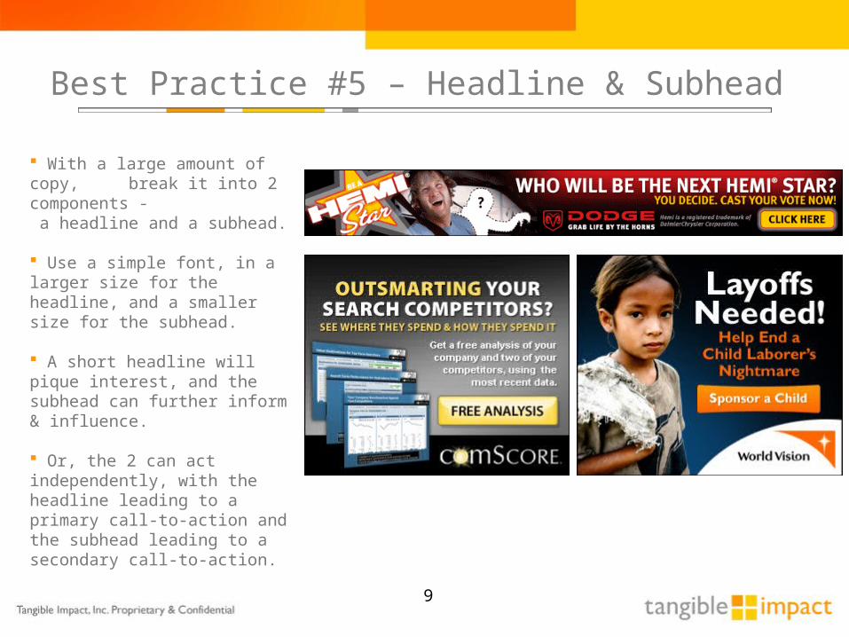
With a large amount of copy, break it into 2 components - a headline and a subhead.
Use a simple font, in a larger size for the headline, and a smaller size for the subhead.
A short headline will pique interest, and the subhead can further inform & influence.
Or, the 2 can act independently, with the headline leading to a primary call-to-action and the subhead leading to a secondary call-to-action.
Best Practice #5 – Headline & Subhead

10
How do you start a conversation? Posing a question will almost always engage and elicit response more readily than making a declarative statement.
2% increase in click thru - 46% increase in conversion
Best Practice #6 – Ask a Question

11
Control:
43% increase in leads25% decrease in the cost-per-lead
Test A:
The question centered on the child, instead of the school, generated far better response.
Ask questions directly. Use or imply the personal pronoun “you.”
Ask about personal facts, needs, preferences & concerns.
Appeal to the emotions.
Best Practice #7 – Get Personal

12
190% increase in trials.
The winning headline includes the credible, compelling & quantified claim of “over 4 million songs” instead of a general statement of “millions of songs”.
Mentioning a specific number makes you product or service concrete and strengthens the credibility of a claim.
Control: Test A:
Best Practice #8 – Quantify

13
Control:
68% increase in trials
Test:
The winning execution both visually & verbally communicated the key features of the service, and it revealed the attractively low price-point.
Best Practice #8 – Quantify

14
With a storyboard approach, make sure that each frame can be understood – independent of the frame before it. Each frame should present a compelling message and a call-to-action.
Your copy can consist of 2+ inter-related ideas or can be composed of a series of questions.
Consider the amount of time a consumer is likely to invest in any given interactive ad. Two or three frames will likely perform better than more elaborate storytelling.
This messaging approach performs best in targeted ad inventory, where your audience has a defined inclination for interest in your product or service.
Best Practice #9 – Standalone Storyboards

15
Would you have guessed correctly? Test instead.
Test Banner 1
42% increase in bookings
Test Banner 2
26% increase in bookings
Control Banner
Test Banner 3
26% increase in bookings
Best Practice #10 – Imagery Influences

16
Animate the copy. You want to draw attention to the one element that can always immediately incite reaction.
Get to the point. Avoid elaborate animations that delay the delivery of your core message. While intense animation can be very attractive, it’s not a persuasive element; it cannot compel response on its own.
When animating graphic elements, explore using them to reveal the text - in order to give both equal attention.
Keep a call-to-action accessible at all times. The CTA is the means of response; it is the catalyst for click-through.
Best Practice #11 – Animate the Point & Purpose

17
After clicking on a banner, a consumer invests only seconds to decide whether or not to interact with the linking page. Their continued interest depends on whether the page “fulfills the promise” of the banner ads.
Improve follow-through by giving banners and pages a similar look and feel. Keep colors, fonts and imagery consistent.
Message, too, must be maintained, with the page immediately reinforcing and or expanding upon the ideas presented in the banners.
Best Practice #12 – Banner/Page Synergy

18
Office: 614.792.3392
Mobile: 614.296.4327
tangibleimpact.com