1 investigating patterns in energy demand and consumption chenyu bing january 20, 2006
TRANSCRIPT

1
Investigating Patterns In Energy Demand and Consumption
Chenyu Bing January 20, 2006

2
Contents
• Brief Intro
• Introducing The Variables
• Single Variable Analysis
• Variable-to-variable Analysis
• Conclusions

3
Energy Demand and Consumption(1978-2003)
• Examining Canada’s energy demand and consumption patterns from 1978 to 2003
• Draw some conclusions based on the data

4
• We need energy to survive
• General knowledge tells us that…
Why This?
• Our energy usage and demands are on the rise
• Our current energy practices are unsustainable

5
• Energy conservation has fuelled continuous debates
• The quicker we raise our level of awareness, the more options we’ll have in preventing a future energy crisis…we don’t want to wait until all the energy is used up before realizing that there’s a problem

6
Measuring Energy
• 1 terajoule (TJ) is 1012 joules…
…or 1 000 000 000 000 J
• 1 TJ is just more than enough energy to light a 60W bulb nonstop for 528 years
• In this investigation we typically deal with hundred thousands to millions of terajoules.
(105 ~ 106 TJ or 1017 ~ 1018 J )

7
• Energy demand (1978 ~ 2003)
• Energy consumption (1995 ~ 2003)
Primary Variables
• General energy demand
• Industrial energy demand

8
Secondary Variables
-Perhaps…more people require more energy
-Perhaps…hotter economy requires more energy
• National Population
• National GDP

9
Other Factors / Areas of Investigation
• Time (In quarters or years)
• Industrial Sector
-How did our energy demand/consumption change over time?
-Which industrial sector(s) have demanded the most energy over the years?

10
The Conjecture
• This investigation is mostly open-minded exploration. However, there is one conjecture to be made:
• “Energy has been demanded in increasingly large quantities over the years.”

11
Single Variable Analysis
• Trend Increase Index
• Energy Demand
• Energy Consumption
• National Population
• National GDP
• General energy demand
• Industrial energy demand

12
Trend Increase Index
• An index can be used to estimate the accuracy of our previous conjecture (that energy demands have been on the rise over the years)

13
A = (1/3) * ( | (Xf - Mf) / Mf | + | (Xm – Mm) / Mm | + | (Xi – Mi) / Mi | )
• WhereA is a percentage expressing how accurate the conjecture was
Xi represents the average quarterly value in the initial year
Xm is the average quarterly value in the middle (time wise) year
Xf represents the average quarterly value in the final year
Mi represents the minimum of the data series
Mm represents the median of the data series
Mf represents the maximum of the data series

14
• …in other words, it compares:• Initial year’s energy demand against the
minimum energy demand
• Middle-year energy demand against the median energy demand
• Final year’s energy demand against the maximum energy demand
• Take a percentage error from each comparison and average them
• The smaller the result, the better the accuracy

15
• The following percentages resulted from the calculations:
• Industrial Demand: 13% error
• General Demand: 10% error
• There was insufficient data to apply the formula to our consumption levels
• The errors were not too large. This suggests that an increasing trend does exist.

16
General Energy Demand

17
• The median (2009803 TJ) and the mean (2017810 TJ) demand per quarter can give us a rough idea of our energy dependency over the years, as those figures are very close together
• The standard deviation is 15% of the mean, suggesting a chaotic distribution that is not normally distributed
• A standard distribution model will say that 68% of the data lie between 1709537 TJ to 2326083 TJ…if we normalize the data, which we won’t!
18
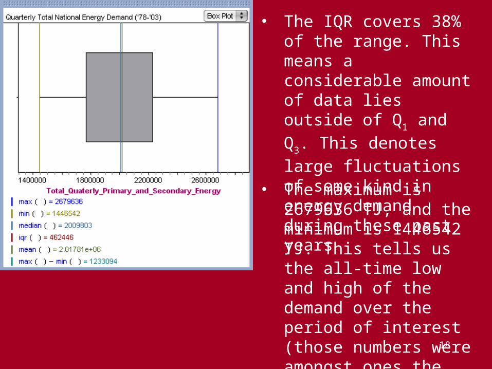
• The IQR covers 38% of the range. This means a considerable amount of data lies outside of Q1 and Q3.
This denotes large fluctuations of some kind in energy demand during these past years
• The maximum is 2679636 TJ, and the minimum is 1446542 TJ. This tells us the all-time low and high of the demand over the period of interest (those numbers were amongst ones the used in the index calculations, so they are useful)
19
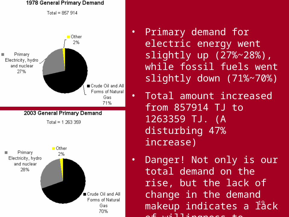
• Primary demand for electric energy went slightly up (27%~28%), while fossil fuels went slightly down (71%~70%)
• Total amount increased from 857914 TJ to 1263359 TJ. (A disturbing 47% increase)
• Danger! Not only is our total demand on the rise, but the lack of change in the demand makeup indicates a lack of willingness to change our ways

20
• Secondary demand for electric energy went slightly up (8%~12%), while petroleum went slightly down (88%~85%)
• This could be due to a rise in our technology
• Total demand increased from 1129202 TJ to 1185493 TJ. (A 5% increase)
• This is perhaps not a big reason for alarm, but we’ll still have to deal with energy shortages sooner or later
21
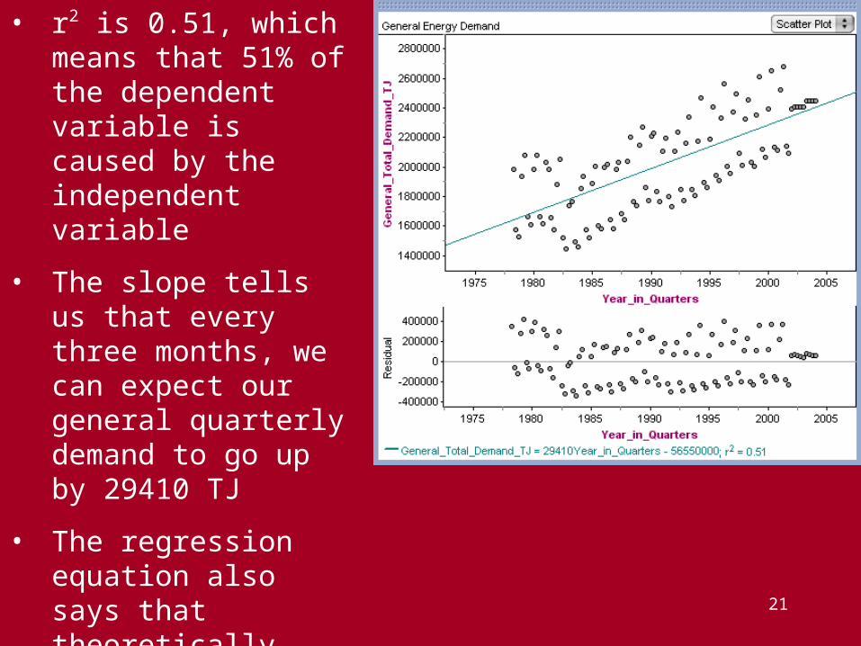
• r2 is 0.51, which means that 51% of the dependent variable is caused by the independent variable
• The slope tells us that every three months, we can expect our general quarterly demand to go up by 29410 TJ
• The regression equation also says that theoretically, 2000 years ago, we’d have a negative energy demand (suggests flaws in the model)

22
• We observe that the data is a better fit for two separate linear models.
• An obvious explanation for the data’s dual nature is that in the colder quarters of the years, we need a lot more energy to keep us warm.
• If we wanted to accurately predict the future, we can incorporate a periodic model into the positive linear one (perhaps give the linear function a sinusoidal vertical stretch), or we can have two separate regression lines.
• We can still use the old model to give us an idea though; we observe from the residual plot that the data tether about the line at about +/- 200000 TJ. Just input the year into the function, and give/take the difference as dictated by the season.
• In any case, we can predict that the demand will continue to see steady increase in the near future.

23
Industrial Energy Demand

24
• The median (513718 TJ) and the mean (509828 TJ) demand per quarter can give us a rough idea of our energy dependency over the years, as those figures are very close together
• The standard deviation is 10% of the mean, suggesting a mildly disorderly distribution that isn’t quite normal
• A standard distribution model will say that 68% of the data lie between 457729 TJ to 561527 TJ…if we normalize the data, which we won’t!

25
• The IQR covers 30% of the range. This means a considerable amount of data lies outside of Q1 and Q3.
This denotes large fluctuations of some kind in energy demand during these past years
• The maximum is 629432 TJ, and the minimum is 369726 TJ. This tells us the all-time low and high of the demand over the period of interest (those numbers were amongst ones the used in the index calculations, so they are useful)

26
• Primary demand for electric energy went slightly up (37%~43%), while natural gas went slightly down (59%~53%)
• Total amount increased from 323692 TJ to 479119 TJ. (A disturbing 48% increase)
• Danger! Not only is our industrial demand on the rise, but the lack of drastic changes in the demand makeup indicates the industries’ lack of willingness to change their ways

27
• Secondary demand for coke went slightly up (25%~32%), while petroleum went slightly down (75%~68%)
• This could be due to a rise in our technology
• Total demand increased from 189257 TJ to 99158 TJ. (A dramatic 48% decrease)
• This could mean that industries are running more efficiently, so they can save operating costs (and get along better with their local communities)

28
• r2 is 0.33, which means that 33% of the dependent variable is caused by the independent variable
• The slope tells us that every three months, we can expect our general quarterly demand to go up by 3980 TJ
• The regression equation also says that theoretically, 2000 years ago, we’d have a negative energy demand (suggests flaws in the model)

29
• Again the data is a better fit for two separate linear models.
• The data’s dual nature is due to the fact that in the colder quarters of the years, industries need more energy to maintain an industrially convenient temperature for their factories, plants, etc.
• If we wanted to accurately predict the future, we can use the two strategies aforementioned. However the trend here is not as clear-cut, so we may not get significant gains in accuracy.
• We can still use the old model to give us an idea; we observe from the residual plot that the data tether about the line at about +/- 40000 TJ. Just input the year into the function, and give/take the difference as dictated by the season.
• In any case, we can predict that the demand will continue to see steady increase in the near future.

30
• Note how these industrial figures are only a fraction of our general numbers. The lesson here is that one shouldn’t blame all the energy mismanagement/abuse on the heavy industries.
• A large chunk of any current energy situation may well be contributed by non-industrials, such as you and I. Everybody can make a difference, and it does not necessarily require the industries to clean up their acts first.

31
Energy Consumption

32
• The median (2562083813 TJ) and the mean (2563370000 TJ) demand per year can give us a rough idea of our energy dependency over the years, as those figures are very close together
• The data only covers annual figures from ’95 to ’03, so it’s not reasonable to model this with a normal distribution
• A standard distribution model will say that 68% of the data lie between 2527891500 TJ to 2598848500 TJ…if we normalize the data, which we certainly will not!

33
• The IQR covers 17% of the range. That is a poor coverage, and indicates an irregularly large spread
• The maximum is 2629013581 TJ, and the minimum is 2509741992 TJ. This tells us the all-time low and high of the demand over the period of interest (those numbers were amongst ones the used in the index calculations, so they are useful)

34
• A great deal of the energy going to the industries is consumed by primary metal manufacturing, paper manufacturing, chemical manufacturing, and petrol & coal products manufacturing. (20%, 32%, 10%, 14% respectively)

35
• There are several lessons to be learned here:
• Offices often buy paper in bulk, and their papers are often used in huge quantities (if not wasted). This large consumption creates a huge demand, which causes the industries to make more paper, and taxes nature’s energy reserves.
• Sure, Canada is rich in minerals, but it is still non-renewable. When the deposits run out…
• After all those years of awareness campaigns and whatnot, the industries are still reliant on non-renewable fuels. That is alarming.

36
• In this graph, the big drop from ’00 to ’01 came from the economic recession. As industries wilted, factories closed, and plants shut down, the energy consumption decreased
• This could potentially fuel the common-held belief that what’s bad for the environment is good for jobs, and vice versa. (That notion is incorrect; but since it’s not pertinent to the immediate topic, we omit the proof)
• From this we can learn that human activities can significantly influence energy consumption. You can make a difference!
• It is difficult to predict any future trends given this (insufficient) set of data

37
National Population

38
• The population increased almost perfectly linearly over the years. The coefficient of determination approaches 1
• Reproduction and immigration can explain this, but it’s still an unexpectedly good correlation
• The slope indicates that the population increases at roughly 315970 per year
• Trend suggests that future populations will continue to increase in this manner for at least another while
• However, future demographic changes may alter this trend

39
National GDP

40
• The national GDP increased linearly over the years
• This means that in general, our economy enjoyed steady improvements over this period
• The coefficient of determination is 0.99. This denotes an accurate linear trend in our GDP
• The line wavered a bit in the early and late 90’s, doubtlessly due to (partly, at least) the recessions
41
• The slope indicates that the GDP increases at roughly $36523 per year.
• The trend suggests that future GDP will continue to enjoy the ride, but realistically many factors could bring it to an end.
• It is interesting to note that the correlation model for GDP is very similar to that of our national population.

42
Observations

43
• Energy demand seems to be rising over time, so are our population and national GDP…are there strong relations independent of time?
• Energy consumption trends seems to be random…can we make some sense out of it?
• The variable-to-variable analysis will attempt to answer those questions.

44
Variable-to-variable Analysis
• General Energy Demand
• Industrial Energy Demand
• vs. National Population
• vs. National GDP
• vs. National Population
• vs. National GDP

45
• Energy Consumption
• vs. National GDP
• vs. National Population

46
General Energy Demand

47
General Demand vs. National Population
• r is +0.953, which indicates a very strong positive correlation
• r2 is 0.91, which means that 91% of the dependent variable is caused by the independent variable
• The standard error of the regression slope is 0.16, meaning that we can be reasonably confident with this model

48
• The slope tells us that for every additional person, we can expect our general demand to go up by 0.376 TJ.
• The regression equation also says that theoretically, when we have a population of zero, we’d have an energy demand of -2370000 TJ on an annual basis. This means that if we are all gone, our environment will finally have energy to spare. (It’s an intuitive stretch, but not really as crazy as it sounds.)
• There is definitely a strong positive upward trend that fits a linear model. This means that as our population goes up, we can expect/predict that our energy demand will go up at a steady rate.
• This means that any energy shortage problems due to population will likely not escalate out of hand in a hurry. Even as this planet swells with people, it’s note too late to do something to save the environment…if we become aware.

49
General Demand vs. National GDP
• r is +0.949, which indicates a very strong positive correlation
• r2 is 0.90, which means that 90% of the dependent variable is caused by the independent variable
• The standard error of the regression slope is 0.08, meaning that we can be quite confident with this model
50
• The slope tells us that for every $1 increase in our GDP, we can expect our general demand to go up by 0.764 TJ.
• The regression equation also says that theoretically, even if we have an annual GDP of zero, we’d still have an energy demand of 5950000 TJ on an annual basis.
• The lesson: at our bare minimum, we need energy, not money, to live. So, protect the environment and practice conservation!
• There is definitely a strong positive upward trend that fits a linear model. This means that as our GDP goes up, we can expect/predict that our energy demand will go up at a steady rate.
• This means that any energy problems due to GDP fluctuations will likely not escalate out of hand in a hurry.

51
Industrial Energy Demand

52
Industrial Demand vs. National Population
• r is +0.801, which indicates a strong positive correlation
• r2 is 0.64, which means that 64% of the dependent variable is caused by the independent variable
• The standard error of the regression slope is 1.93, meaning that we can’t be as confident with this model against its general demand counterpart

53
• The slope tells us that for every additional person, we can expect our industrial demand to go up by 0.051 TJ.
• The regression equation also says that theoretically, when we have a population of zero, we’d have an energy demand of 630000 TJ on an annual basis. (Suggests imperfections in the model.)
• There is positive upward trend that fits a linear model. This means that as our population goes up, we can expect that our energy demand will go up steadily.
• This means that any energy shortage problems due to population will likely not escalate out of hand in a hurry. However, we can observe a slight periodic tendency in the data, so the data still has a potential to fluctuate in the future.

54
Industrial Demand vs. National GDP
• r is +0.811, which indicates a fairly strong positive correlation
• r2 is 0.66, which means that 66% of the dependent variable is caused by the independent variable
• The standard error of the regression slope is 0.92, meaning that we can’t be as confident with this model against its general demand counterpart

55
• The slope tells us that for every $1 increase in our GDP, we can expect our industrial demand to go up by 0.105 TJ.
• The regression equation also says that theoretically, even if we have an annual GDP of zero, we’d still have an industrial energy demand of 1750000 TJ on an annual basis.
• In other words, when the demand reaches zero, the GDP will be very negative. (No pun intended.) This echoes a lesson aforementioned: energy and environment is a more basic requirement than money. Take heed.
• There is a reasonably strong positive upward trend that fits a linear model. This means that as our GDP goes up, we can expect/predict that our energy demand will go up at a steady rate. This means that any energy problems due to GDP fluctuations will likely not escalate out of hand in a hurry.

56
Energy Consumption

57
Consumption vs. National GDP
• The relation is completely nonexistent. This could be due to a lack of data for consumption.
• We cannot conclude anything from this graph.
58
Consumption vs. National Population
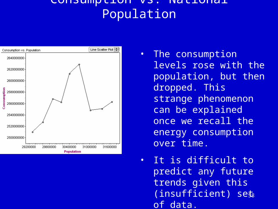
• The consumption levels rose with the population, but then dropped. This strange phenomenon can be explained once we recall the energy consumption over time.
• It is difficult to predict any future trends given this (insufficient) set of data.
59
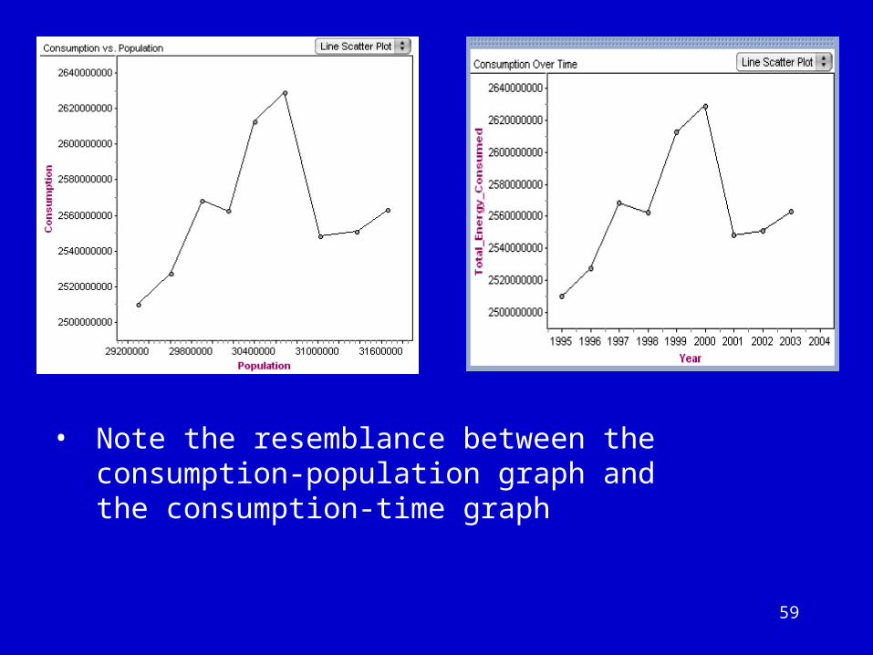
• Note the resemblance between the consumption-population graph and the consumption-time graph

60
Consumption vs. Population and Time
• It seems that however consumption is connected with population, it is related to time in the same way.
• It is obvious that population is a function of time, and not vice versa. But which truly impact consumption? Perhaps both?

61
• Since social, political, and economic events in a given year can impact consumption (ex. recession), we can conclude that “time” does affect consumption.
• The consumption-population graph does not lend itself to such explanations, but some critical thinking quickly tells us that population must affect consumption (i.e. more people consume more energy).
• Perhaps when the data bank accumulates more data from future years, a discernable pattern will emerge, allowing us to analyze trends and make predictions.

62
Conclusions

63
• Generally speaking, our demand for energy is definitely on the rise. This could be due to improved technologies, hotter economies, larger population, or a combination.
• There is still significant reliance on non-renewable energy such as fossil fuels; hydroelectric energy come from dams that disrupt the environment, and people have shown a lack of aptitude to control their energy cravings, as is evident in the various steady positive correlations encountered in the investigation.
• We need to continue to raise awareness and be prepared to prevent/deal with future energy shortages.

64
• There is insufficient data to predict reliable future trends for energy consumption.
• However, it should still be obvious that energy conservation should be practiced…

65
…for a brighter future.