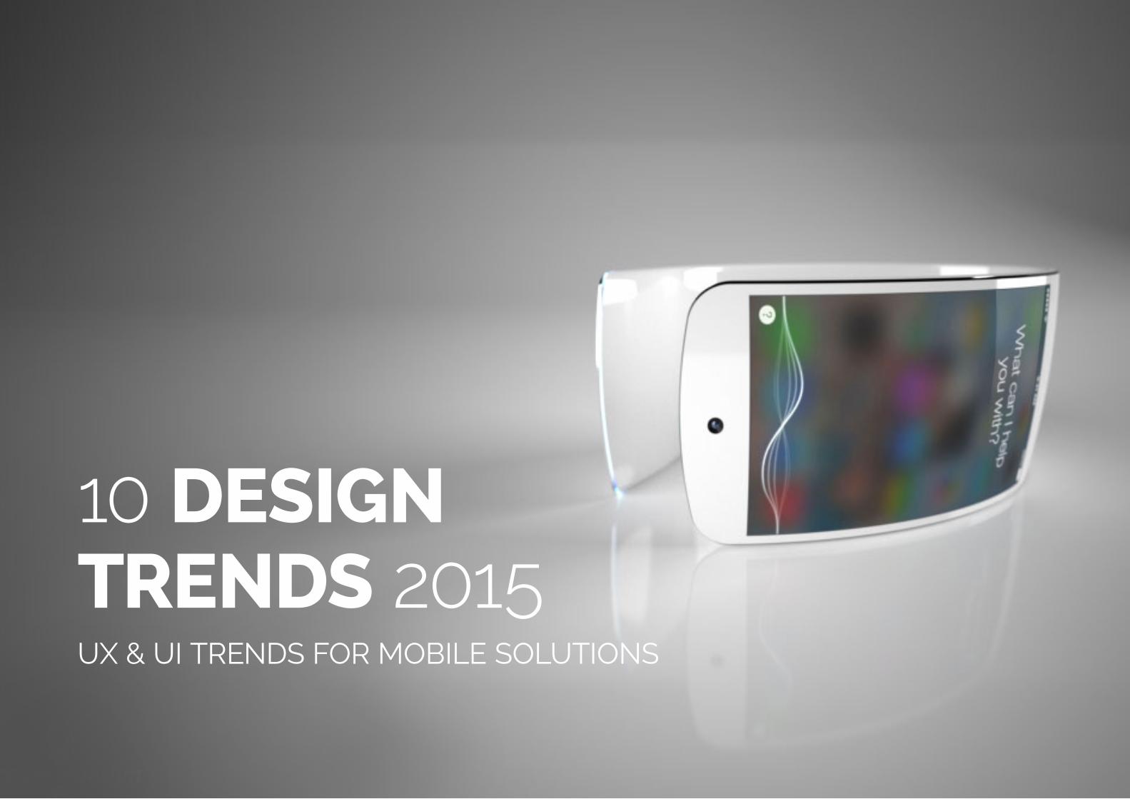
10 design trends 2015 - ux & ui trends for mobile solutions
TRANSCRIPT
(Replace with full screen background image)
10 DESIGN TRENDS 2015UX & UI TRENDS FOR MOBILE SOLUTIONS
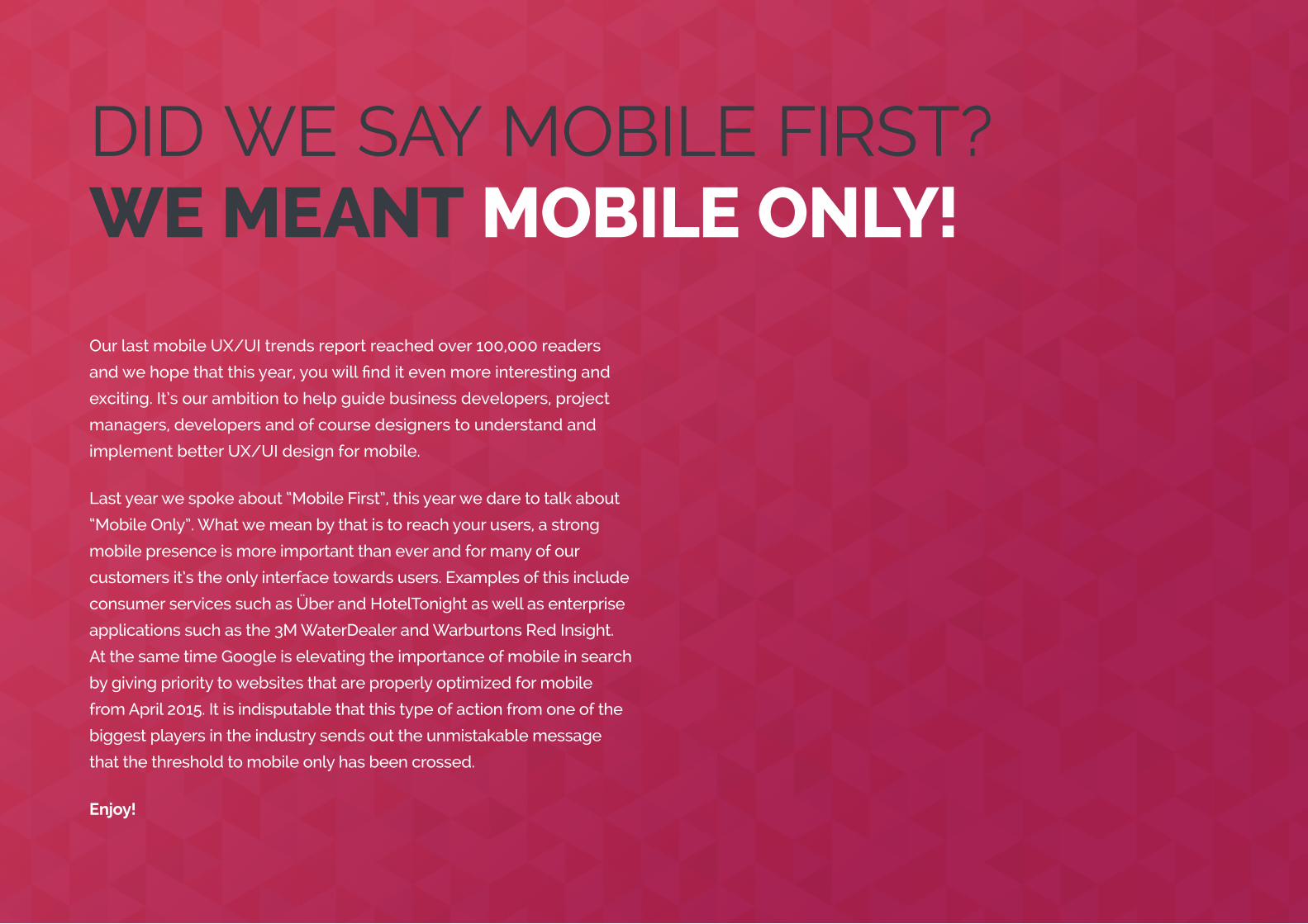
DID WE SAY MOBILE FIRST?WE MEANT MOBILE ONLY!
Our last mobile UX/UI trends report reached over 100,000 readers
and we hope that this year, you will find it even more interesting and
exciting. It’s our ambition to help guide business developers, project
managers, developers and of course designers to understand and
implement better UX/UI design for mobile.
Last year we spoke about “Mobile First”, this year we dare to talk about
“Mobile Only”. What we mean by that is to reach your users, a strong
mobile presence is more important than ever and for many of our
customers it’s the only interface towards users. Examples of this include
consumer services such as Über and HotelTonight as well as enterprise
applications such as the 3M WaterDealer and Warburtons Red Insight.
At the same time Google is elevating the importance of mobile in search
by giving priority to websites that are properly optimized for mobile
from April 2015. It is indisputable that this type of action from one of the
biggest players in the industry sends out the unmistakable message
that the threshold to mobile only has been crossed.
Enjoy!
(Replace with full screen background image)
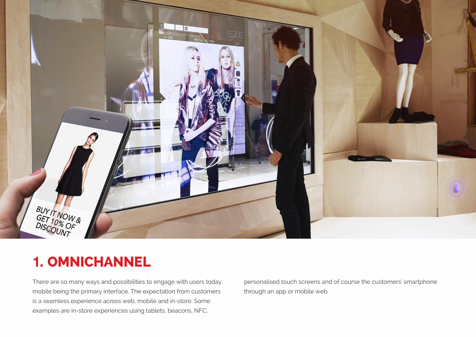
1. OMNICHANNELThere are so many ways and possibilities to engage with users today,
mobile being the primary interface. The expectation from customers
is a seamless experience across web, mobile and in-store. Some
examples are in-store experiences using tablets, beacons, NFC,
personalised touch screens and of course the customers’ smartphone
through an app or mobile web.
WHY DO IT?
An app or mobile web is a great start, but what is there beyond that?
With research and customer experience mapping we can understand
both business and user needs. Our job as UX/UI designers and
Business Strategists is to then make sure that the needs are met.
With all these possibilities to ensure a seamless experience, bear in
mind it’s not only about your customers or your competitors’ customers,
it’s about all users.
(Replace with full screen background image)
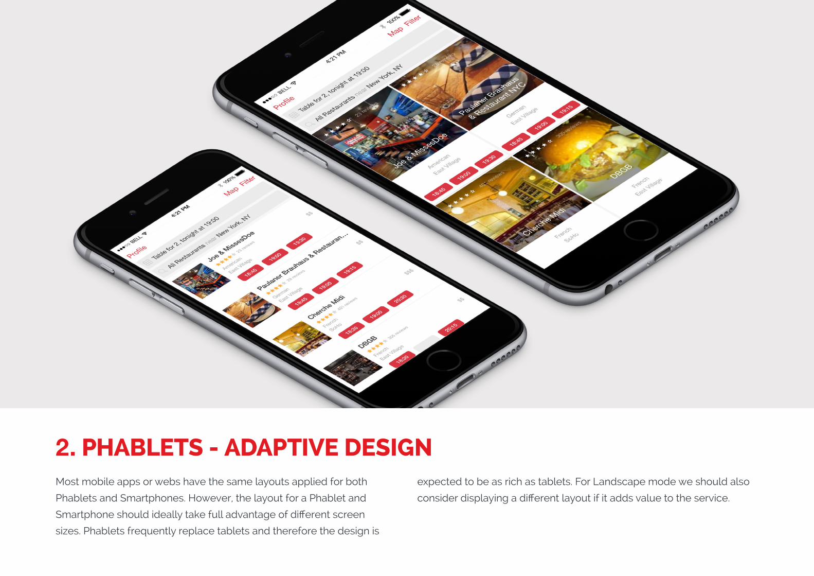
2. PHABLETS - ADAPTIVE DESIGNMost mobile apps or webs have the same layouts applied for both
Phablets and Smartphones. However, the layout for a Phablet and
Smartphone should ideally take full advantage of different screen
sizes. Phablets frequently replace tablets and therefore the design is
expected to be as rich as tablets. For Landscape mode we should also
consider displaying a different layout if it adds value to the service.
WHY DO IT?
The introduction of phablets has opened another door for adaptive
design. Whereas before we could have considered the smartphone
as more of an on-the-go device, and tablets perhaps more for leisure
or home use, the widespread adoption of the phablet has blurred this
line. This puts more challenges on UX/UI Designers, Developers and
budgets as we now need to consider the multiple use cases for the new
larger screen size, and ensure the best user experience can be created.
In reality, it’s about making the most of the new opportunities presented
by this in-between device, so always keep in mind how a phablet is
actually used.
(Replace with full screen background image)
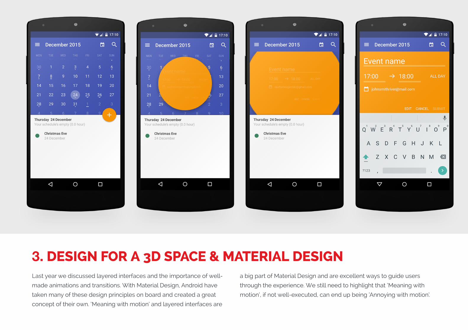
3. DESIGN FOR A 3D SPACE & MATERIAL DESIGNLast year we discussed layered interfaces and the importance of well-
made animations and transitions. With Material Design, Android have
taken many of these design principles on board and created a great
concept of their own. ‘Meaning with motion’ and layered interfaces are
a big part of Material Design and are excellent ways to guide users
through the experience. We still need to highlight that ‘Meaning with
motion’, if not well-executed, can end up being ‘Annoying with motion’.
WHY DO IT?
Designing for a 3D space and using layers in the z-axis gives the user
a very clear idea of the app’s hierarchy and is a great way to guide the
user throughout the experience. An example of guiding the user is the
highlighted Floating Action Button which clearly indicates where the
user needs to tap for the next step.
When applying ‘Meaning with motion’ we guide and clarify navigation
to the user, which actions the user has performed and which actions are
expected next. When implemented as part of the flow, the user learns
while using the app rather than from a tutorial meaning that app use
becomes intuitive.
(Replace with full screen background image)
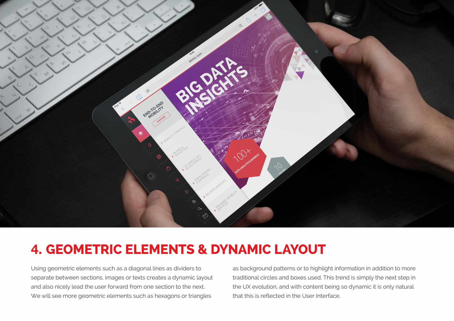
4. GEOMETRIC ELEMENTS & DYNAMIC LAYOUTUsing geometric elements such as a diagonal lines as dividers to
separate between sections, images or texts creates a dynamic layout
and also nicely lead the user forward from one section to the next.
We will see more geometric elements such as hexagons or triangles
as background patterns or to highlight information in addition to more
traditional circles and boxes used. This trend is simply the next step in
the UX evolution, and with content being so dynamic it is only natural
that this is reflected in the User Interface.
WHY DO IT?
It is natural for designers to try and break the mold and experiment
with new visual solutions. These trends appear frequently and while
many are adopted as they strike an aesthetic chord, not all have been
devised with improved functionality in mind. However, dynamic layouts
are something that have emerged recently to break standard layout
patterns and as a way to guide the user through the experience. This
approach needs to fit well with the brand and may not be suitable for all
solutions, nevertheless it is an interesting approach to consider.
(Replace with full screen background image)
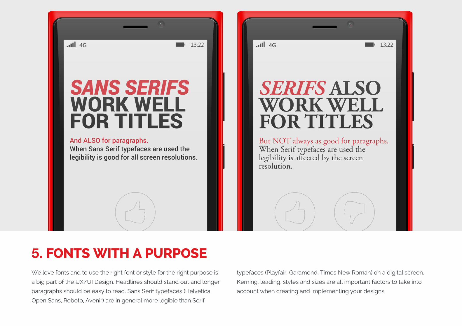
5. FONTS WITH A PURPOSEWe love fonts and to use the right font or style for the right purpose is
a big part of the UX/UI Design. Headlines should stand out and longer
paragraphs should be easy to read. Sans Serif typefaces (Helvetica,
Open Sans, Roboto, Avenir) are in general more legible than Serif
typefaces (Playfair, Garamond, Times New Roman) on a digital screen.
Kerning, leading, styles and sizes are all important factors to take into
account when creating and implementing your designs.
WHY DO IT?
The right use of fonts is as important as the right use of images,
colours, and icons to create hierarchy and contrast between headlines
and paragraphs, to organize the content and most importantly, for
readability and call to action.
Serif fonts for paragraphs are more readable for print and are used
almost “by default” for newspapers, magazines and books. However,
in digital the legibility when using Serif fonts decreases depending
on the screen resolutions. Even though many of the latest devices
have high screen resolutions, Sans Serif fonts are still often used and
recommended for digital formats.
(Replace with full screen background image)
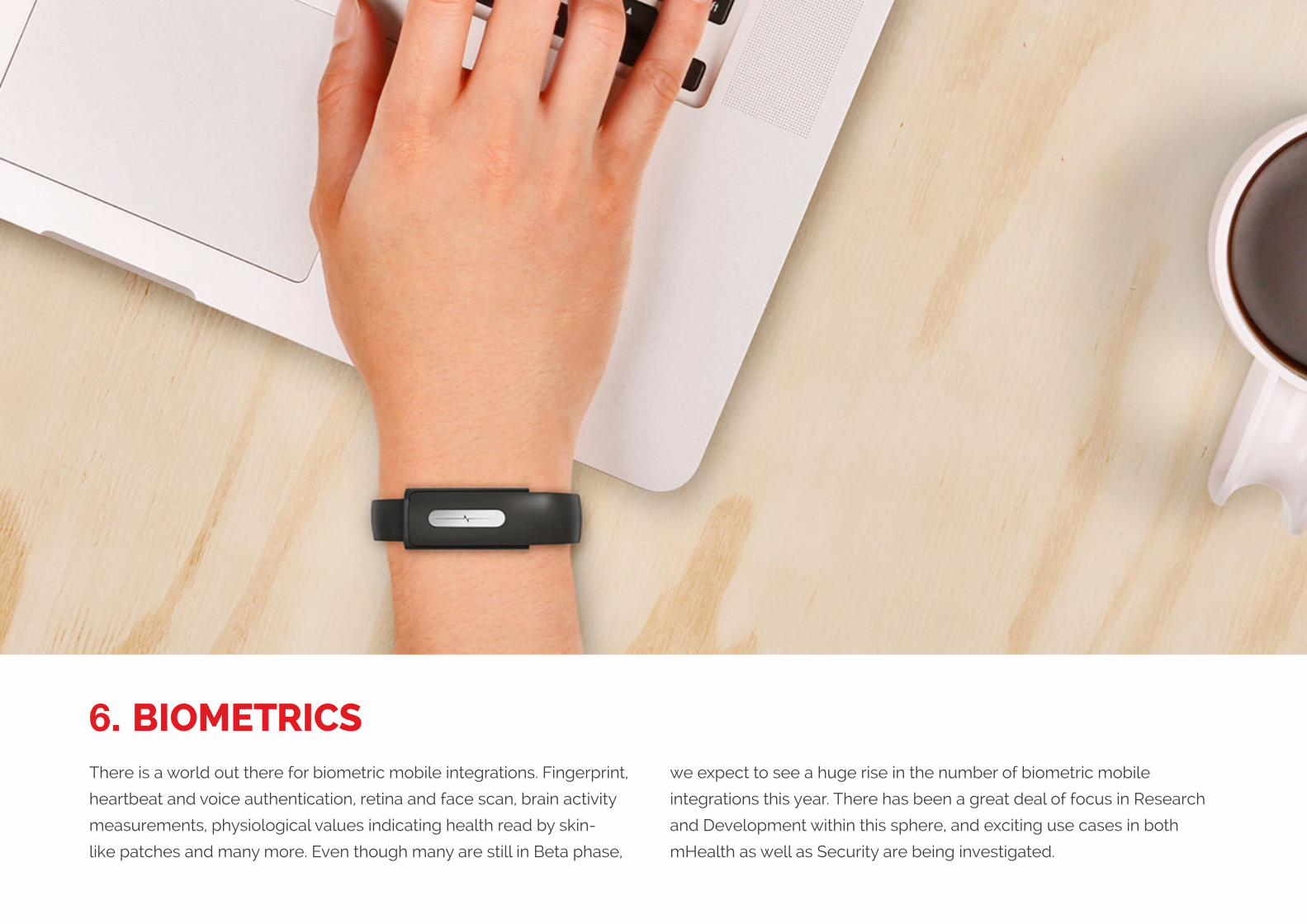
6. BIOMETRICSThere is a world out there for biometric mobile integrations. Fingerprint,
heartbeat and voice authentication, retina and face scan, brain activity
measurements, physiological values indicating health read by skin-
like patches and many more. Even though many are still in Beta phase,
we expect to see a huge rise in the number of biometric mobile
integrations this year. There has been a great deal of focus in Research
and Development within this sphere, and exciting use cases in both
mHealth as well as Security are being investigated.
WHY DO IT?
Biometric mobile integrations make us more efficient. Even though
fingerprint authentication is no longer 100% safe (Apple’s Touch ID was
hacked by photographing a user’s fingerprint from a glass surface and
using the captured image to verify the login credentials), it is still a very
efficient authentication method for mobile. Heartbeat authentication is
in Beta phase and seems to be 100% safe and just as efficient. This has
the ability to change the UX for any action which needs authentication,
such as payments, mobile banking or even as simple as a private log in.
Biometrics used for controlling your health is another step in the right
direction and is indicative of how technology is now becoming such an
integral part of our daily lives, that it becomes invisible. The constant
monitoring of health and fitness values will not impact on our daily
activities, but the the results and findings will allow us to address them
by changing our habits or take other measures. In the long-run, we are
looking at a future where the wide-ranging benefits will mean healthier
lives.
(Replace with full screen background image)
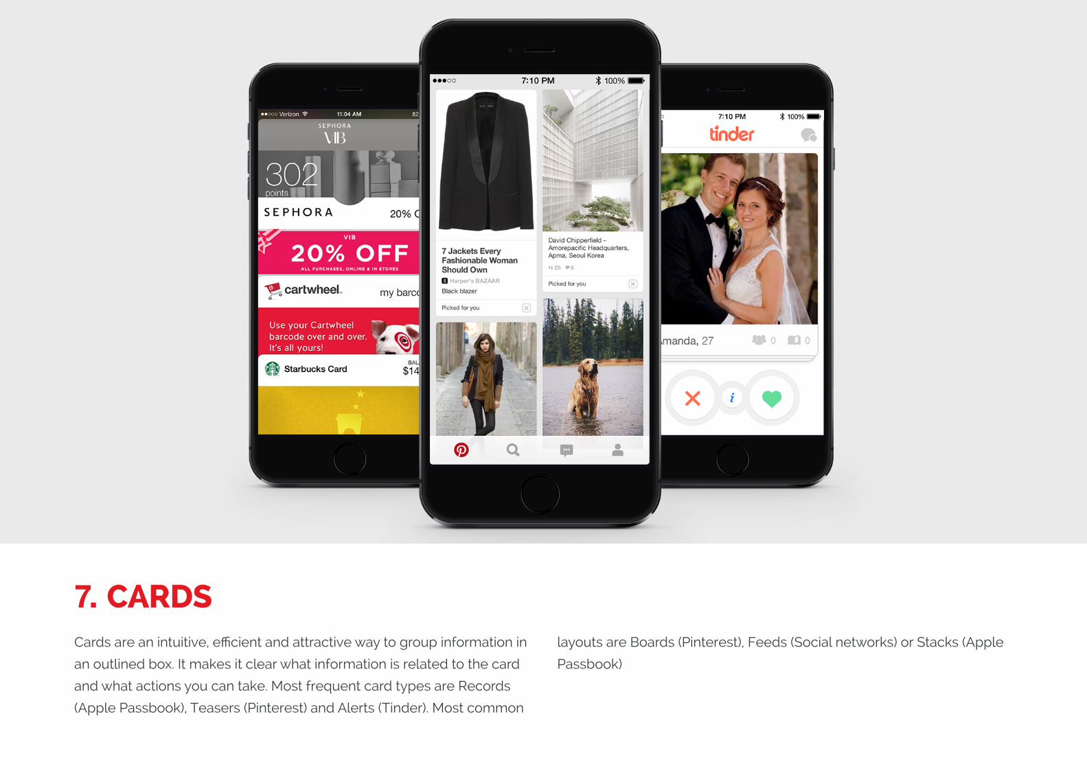
7. CARDSCards are an intuitive, efficient and attractive way to group information in
an outlined box. It makes it clear what information is related to the card
and what actions you can take. Most frequent card types are Records
(Apple Passbook), Teasers (Pinterest) and Alerts (Tinder). Most common
layouts are Boards (Pinterest), Feeds (Social networks) or Stacks (Apple
Passbook)
WHY DO IT?
Cards are used to group together information in a very intuitive way and
permits for a very fast UX, meaning users can easily scan through a lot
of content and pinpoint information that is relevant to them.
Cards should be used where it makes sense and once a card has
been selected by the user, the information should be highlighted
and become a point of focus. Pinterest is an example of a great Card
solution due to the simplicity of it and how intuitive it is to use. Having
removed the navbar, the app utilizes the full screen for displaying
content/cards. Navigation is thumb-focused: swipe and scroll to
browse through content, bottom tab bar to select categories, and also
the hidden but genious long press for action accessible throughout the
whole app. Simply a very well-made Teaser Card App.
(Replace with full screen background image)
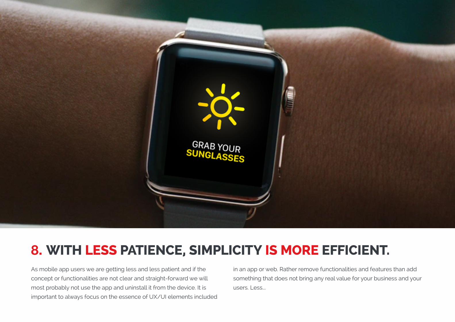
8. WITH LESS PATIENCE, SIMPLICITY IS MORE EFFICIENT. As mobile app users we are getting less and less patient and if the
concept or functionalities are not clear and straight-forward we will
most probably not use the app and uninstall it from the device. It is
important to always focus on the essence of UX/UI elements included
in an app or web. Rather remove functionalities and features than add
something that does not bring any real value for your business and your
users. Less...
WHY DO IT?
...is more. Solutions should be simple to use. Communicate with an
image, a short headline or video instead of long, often-ignored copy,
Use motions and hints to guide the user and always focus on few but
meaningful features that bring value to your business and to your users.
There is a lot of psychology involved in why it is important to keep it
simple. Here is an example. If you are given the option to choose 1 of
10 things you will probably have a harder time deciding which to select
than if you were only presented with three choices. You would also
probably not feel as comfortable after having made the choice as you
would have preferred choosing from fewer options. When choosing
from only three things you would probably feel more convinced you
had made the right choice as well as generally feeling better with
yourself about the decision.
(Replace with full screen background image)
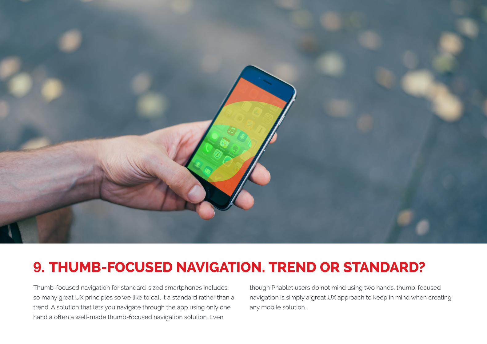
9. THUMB-FOCUSED NAVIGATION. TREND OR STANDARD?Thumb-focused navigation for standard-sized smartphones includes
so many great UX principles so we like to call it a standard rather than a
trend. A solution that lets you navigate through the app using only one
hand a often a well-made thumb-focused navigation solution. Even
though Phablet users do not mind using two hands, thumb-focused
navigation is simply a great UX approach to keep in mind when creating
any mobile solution.
WHY DO IT?
Since we all have different sized hands, with this approach we can
create a similar experience for all users. This great UX approach
includes user interaction principles such as:
1. Swipe to left and right to navigate through the app.
2. Scroll up and down to navigate, to close articles or to reload a page.
3. Different length swiping to access multiple options such as delete,
save, share or mark as read.
4. Bottom tab bar to switch between categories.
5. Long press to activate options such as share, like or access menu
and with a continued movement of the finger pressed, select the option.
(Replace with full screen background image)
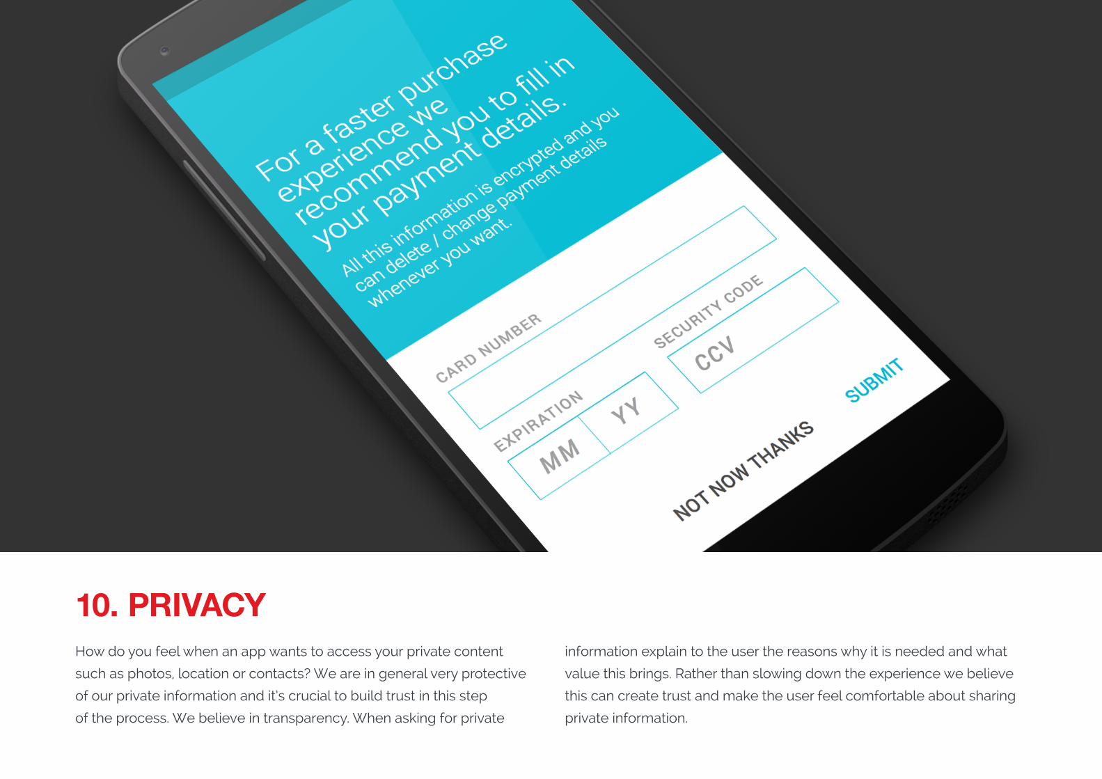
10. PRIVACYHow do you feel when an app wants to access your private content
such as photos, location or contacts? We are in general very protective
of our private information and it’s crucial to build trust in this step
of the process. We believe in transparency. When asking for private
information explain to the user the reasons why it is needed and what
value this brings. Rather than slowing down the experience we believe
this can create trust and make the user feel comfortable about sharing
private information.
WHY DO IT?
We believe that honesty and transparency are key in showing users
they can trust a solution. App users that feel comfortable sharing private
information and understand what they gain by sharing this information
will feel better about their experience and most likely stick with the app
and keep using it. When requesting a credit card number for an in-app
payment feature, explain the reasons why this data is required and what
the user gains by allowing access to their personal information.
BONUS SECTIONWHAT’S COMING!
To this year’s trends deck we have added a quick preview of what we
hope and believe we will see in the market this decade.
Exciting times!
(Replace with full screen background image)
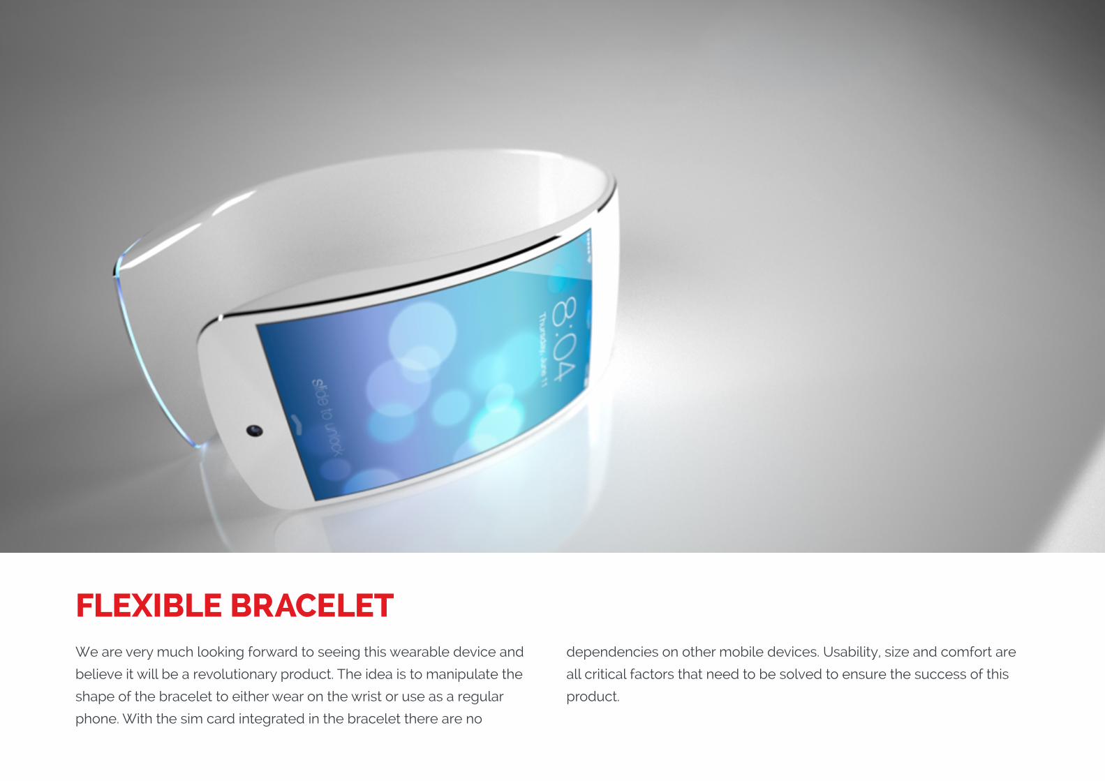
FLEXIBLE BRACELETWe are very much looking forward to seeing this wearable device and
believe it will be a revolutionary product. The idea is to manipulate the
shape of the bracelet to either wear on the wrist or use as a regular
phone. With the sim card integrated in the bracelet there are no
dependencies on other mobile devices. Usability, size and comfort are
all critical factors that need to be solved to ensure the success of this
product.
(Replace with full screen background image)
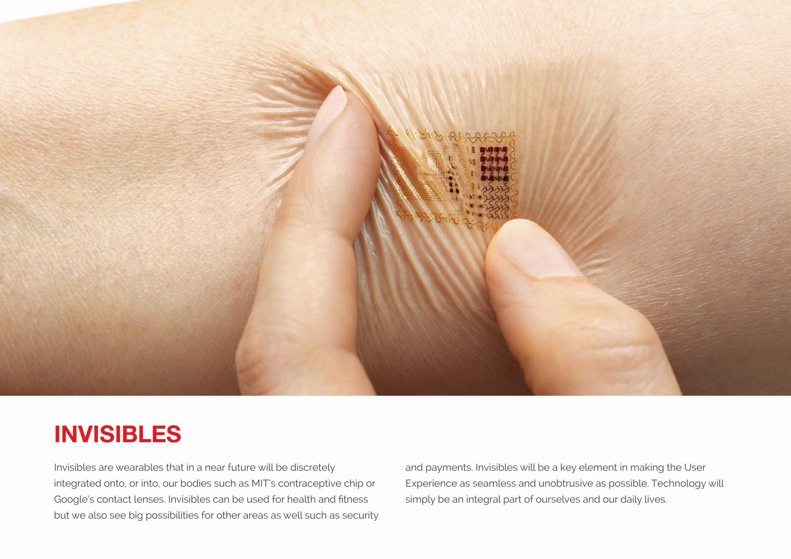
INVISIBLESInvisibles are wearables that in a near future will be discretely
integrated onto, or into, our bodies such as MIT’s contraceptive chip or
Google’s contact lenses. Invisibles can be used for health and fitness
but we also see big possibilities for other areas as well such as security
and payments. Invisibles will be a key element in making the User
Experience as seamless and unobtrusive as possible. Technology will
simply be an integral part of ourselves and our daily lives.
(Replace with full screen background image)
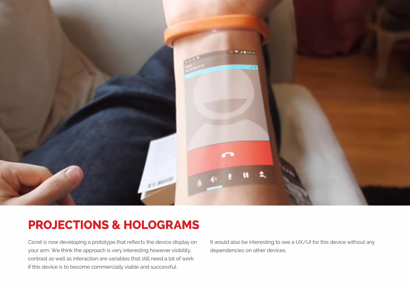
PROJECTIONS & HOLOGRAMSCicret is now developing a prototype that reflects the device display on
your arm. We think the approach is very interesting however visibility,
contrast as well as interaction are variables that still need a lot of work
if this device is to become commercially viable and successful.
It would also be interesting to see a UX/UI for this device without any
dependencies on other devices.
(Replace with full screen background image)
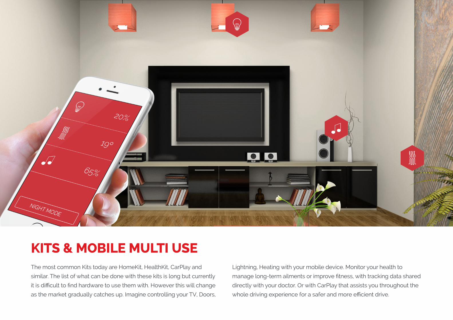
KITS & MOBILE MULTI USEThe most common Kits today are HomeKit, HealthKit, CarPlay and
similar. The list of what can be done with these kits is long but currently
it is difficult to find hardware to use them with. However this will change
as the market gradually catches up. Imagine controlling your TV, Doors,
Lightning, Heating with your mobile device. Monitor your health to
manage long-term ailments or improve fitness, with tracking data shared
directly with your doctor. Or with CarPlay that assists you throughout the
whole driving experience for a safer and more efficient drive.
(Replace with full screen background image)
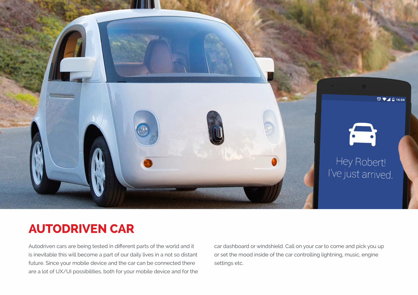
AUTODRIVEN CARAutodriven cars are being tested in different parts of the world and it
is inevitable this will become a part of our daily lives in a not so distant
future. Since your mobile device and the car can be connected there
are a lot of UX/UI possibilities, both for your mobile device and for the
car dashboard or windshield. Call on your car to come and pick you up
or set the mood inside of the car controlling lightning, music, engine
settings etc.
THE ONLY END-TO-END MOBILITY COMPANY IN THE WORLD.
A DMI COMPANY
web www.dminc.com