13a michael mann
TRANSCRIPT
MICHAELMANN
Portfolio
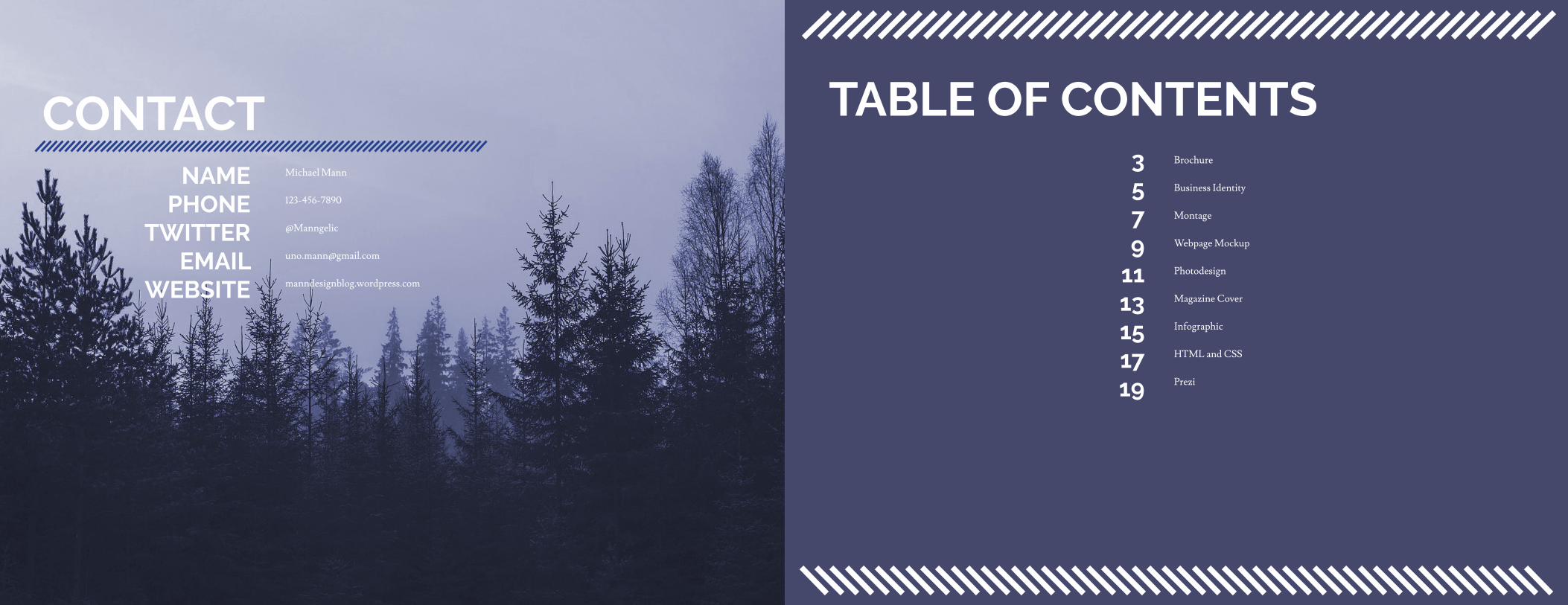
CONTACTNAME
PHONETWITTER
EMAILWEBSITE
Michael Mann
123-456-7890
@Manngelic
manndesignblog.wordpress.com
TABLE OF CONTENTS3579
1113151719
Brochure
Business Identity
Montage
Webpage Mockup
Photodesign
Magazine Cover
Infographic
HTML and CSS
Prezi
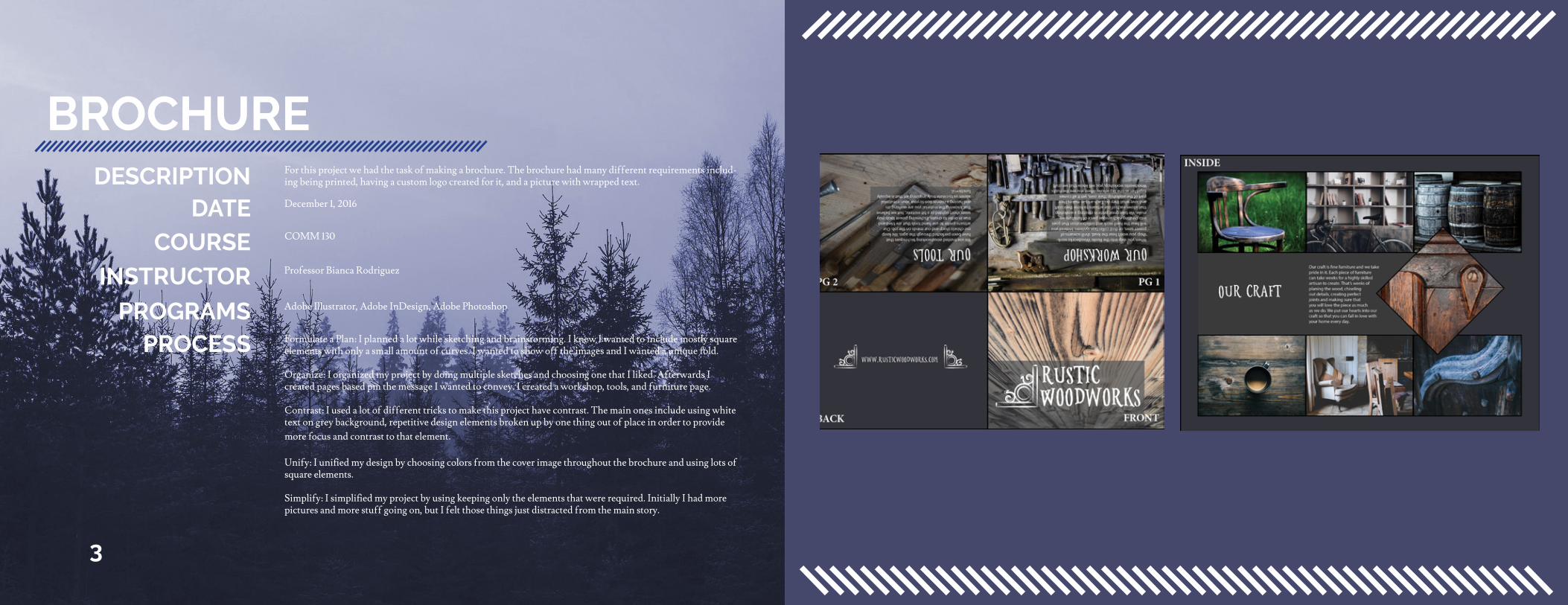
BROCHUREFor this project we had the task of making a brochure. The brochure had many different requirements includ-ing being printed, having a custom logo created for it, and a picture with wrapped text.DESCRIPTION
DATECOURSE
INSTRUCTOR
PROGRAMSPROCESS
December 1, 2016
Professor Bianca Rodriguez
COMM 130
Adobe Illustrator, Adobe InDesign, Adobe Photoshop
Formulate a Plan: I planned a lot while sketching and brainstorming. I knew I wanted to include mostly square elements with only a small amount of curves. I wanted to show off the images and I wanted a unique fold.
Organize: I organized my project by doing multiple sketches and choosing one that I liked. Afterwards I created pages based pm the message I wanted to convey. I created a workshop, tools, and furniture page.
Contrast: I used a lot of different tricks to make this project have contrast. The main ones include using white text on grey background, repetitive design elements broken up by one thing out of place in order to provide more focus and contrast to that element.
Unify: I unified my design by choosing colors from the cover image throughout the brochure and using lots of square elements.
Simplify: I simplified my project by using keeping only the elements that were required. Initially I had more pictures and more stuff going on, but I felt those things just distracted from the main story.
3
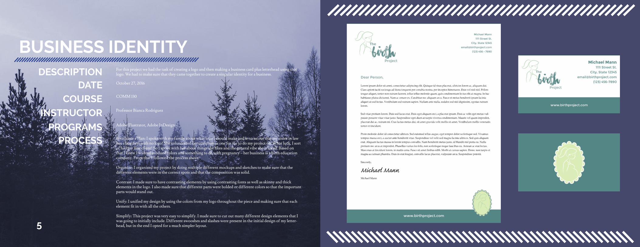
BUSINESS IDENTITY
5
For this project we had the task of creating a logo and then making a business card plus letterhead using that logo. We had to make sure that they came together to create a singular identity for a business.DESCRIPTION
DATECOURSE
INSTRUCTOR
PROGRAMSPROCESS
October 27, 2016
Professor Bianca Rodriguez
COMM 130
Adobe Illustrator, Adobe InDesign
Formulate a Plan: I spoke with my family about what logo I should make and it turns out that my sister in law has a business with no logo! She volunteered her company as one for me to do my project on. What luck, I sort of had my first client! So I spoke with her about things she likes and the general vibe she wanted. Based on that I knew I wanted subdued colors and something to do with pregnancy – her business is a birth education company. From that I followed the process above.
Organize: I organized my project by doing multiple different mockups and sketches to make sure that the different elements were in the correct spots and that the composition was solid.
Contrast: I made sure to have contrasting elements by using contrasting fonts as well as skinny and thick elements in the logo. I also made sure that different parts were bolded or different colors so that the important parts would stand out.
Unify: I unified my design by using the colors from my logo throughout the piece and making sure that each element fit in with all the others.
Simplify: This project was very easy to simplify. I made sure to cut out many different design elements that I was going to initially include. Different swooshes and slashes were present in the initial design of my letter-head, but in the end I opted for a much simpler layout.
MONTAGE
7
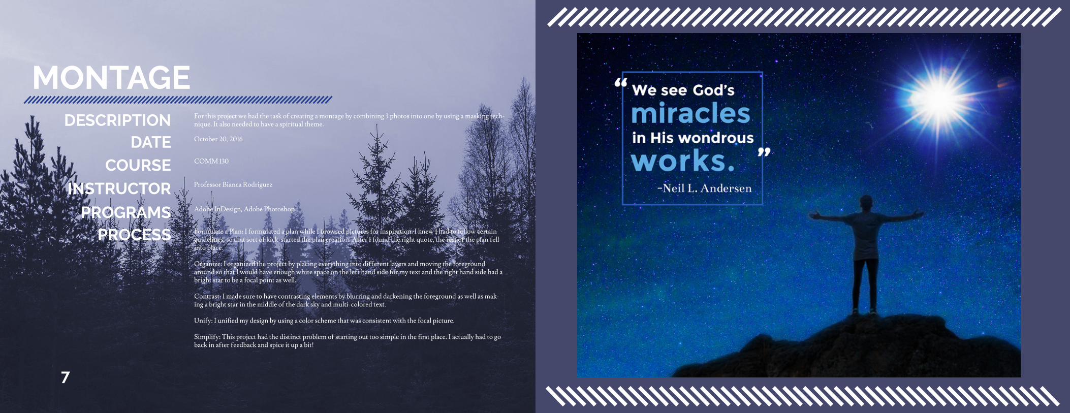
For this project we had the task of creating a montage by combining 3 photos into one by using a masking tech-nique. It also needed to have a spiritual theme.DESCRIPTION
DATECOURSE
INSTRUCTOR
PROGRAMSPROCESS
October 20, 2016
Professor Bianca Rodriguez
COMM 130
Adobe InDesign, Adobe Photoshop
Formulate a Plan: I formulated a plan while I browsed pictures for inspiration. I knew I had to follow certain guidelines, so that sort of kick-started the plan creation. After I found the right quote, the rest of the plan fell into place.
Organize: I organized the project by placing everything into different layers and moving the foreground around so that I would have enough white space on the left hand side for my text and the right hand side had a bright star to be a focal point as well.
Contrast: I made sure to have contrasting elements by blurring and darkening the foreground as well as mak-ing a bright star in the middle of the dark sky and multi-colored text.
Unify: I unified my design by using a color scheme that was consistent with the focal picture.
Simplify: This project had the distinct problem of starting out too simple in the first place. I actually had to go back in after feedback and spice it up a bit!
WEBPAGE MOCKUP
9
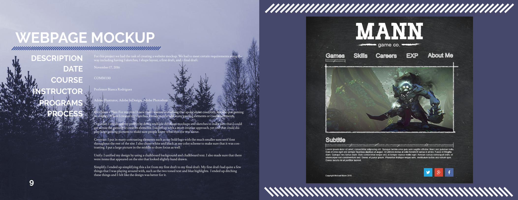
For this project we had the task of creating a website mockup. We had to meet certain requirements along the way including having 3 sketches, 1 shape layout, a first draft, and a final draft.DESCRIPTION
DATECOURSE
INSTRUCTOR
PROGRAMSPROCESS
November 17, 2016
Professor Bianca Rodriguez
COMM 130
Adobe Illustrator, Adobe InDesign, Adobe Photoshop
Formulate a Plan: For my plan I knew that I wanted something that spoke about creativity, but also put gaming on display. When I created mys ketches, I made sure to add many gaming elements or creative elements.
Organize: I organized my project by doing multiple different mockups and sketches to make sure that I could get across the gaming or creative elements. I ended up with a more creative approach, yet one that could dis-play large gaming pictures to make sure people knew what this site was about.
Contrast: I put in many contrasting elements such as my bold logo with the much smaller sans serif font throughout the rest of the site. I also chose white and black as my color scheme to make sure that it was con-trasting. I put a large picture in the middle to draw focus as well.
Unify: I unified my design by using a chalkboard background and chalkboard text. I also made sure that there were items that appeared on the site that looked slightly hand drawn.
Simplify: I ended up simplifying this a lot from my first draft to my final draft. My first draft had quite a few things that I was playing around with, such as the two toned text and blue highlights. I ended up ditching these things and I felt like the design was better for it.
PHOTODESIGN
11
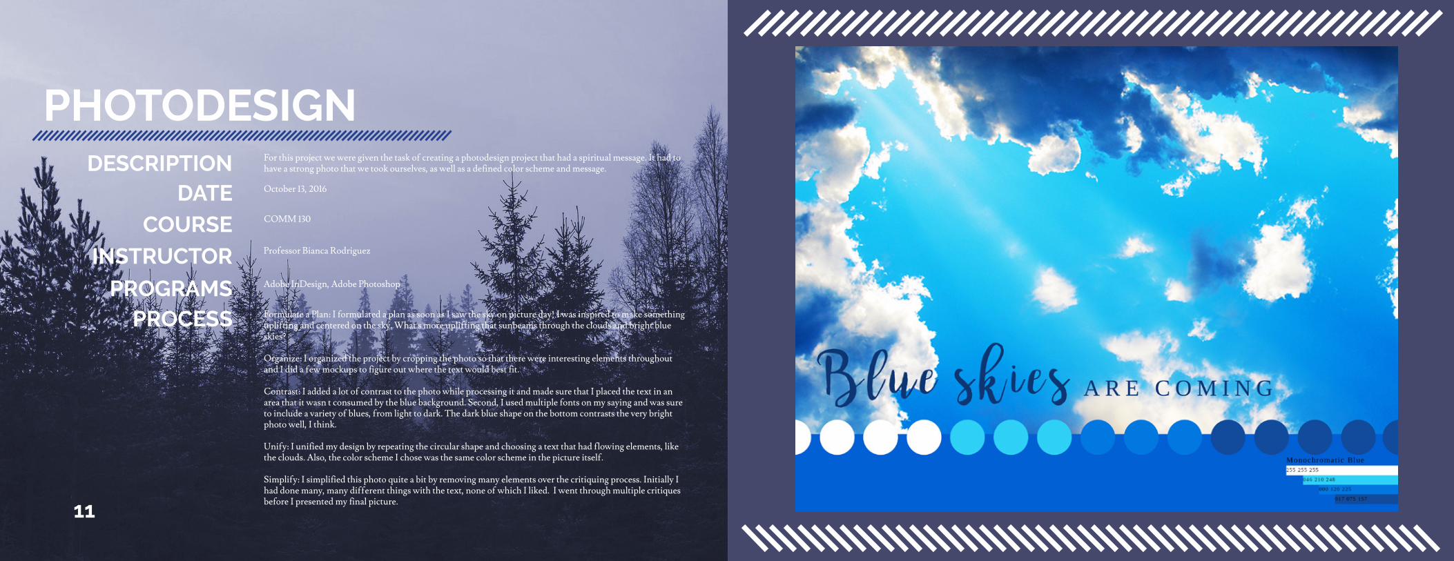
For this project we were given the task of creating a photodesign project that had a spiritual message. It had to have a strong photo that we took ourselves, as well as a defined color scheme and message.DESCRIPTION
DATECOURSE
INSTRUCTOR
PROGRAMSPROCESS
October 13, 2016
Professor Bianca Rodriguez
COMM 130
Adobe InDesign, Adobe Photoshop
Formulate a Plan: I formulated a plan as soon as I saw the sky on picture day! I was inspired to make something uplifting and centered on the sky. What’s more uplifting that sunbeams through the clouds and bright blue skies?
Organize: I organized the project by cropping the photo so that there were interesting elements throughout and I did a few mockups to figure out where the text would best fit.
Contrast: I added a lot of contrast to the photo while processing it and made sure that I placed the text in an area that it wasn’t consumed by the blue background. Second, I used multiple fonts on my saying and was sure to include a variety of blues, from light to dark. The dark blue shape on the bottom contrasts the very bright photo well, I think.
Unify: I unified my design by repeating the circular shape and choosing a text that had flowing elements, like the clouds. Also, the color scheme I chose was the same color scheme in the picture itself.
Simplify: I simplified this photo quite a bit by removing many elements over the critiquing process. Initially I had done many, many different things with the text, none of which I liked. I went through multiple critiques before I presented my final picture.
MAGAZINE COVER
13
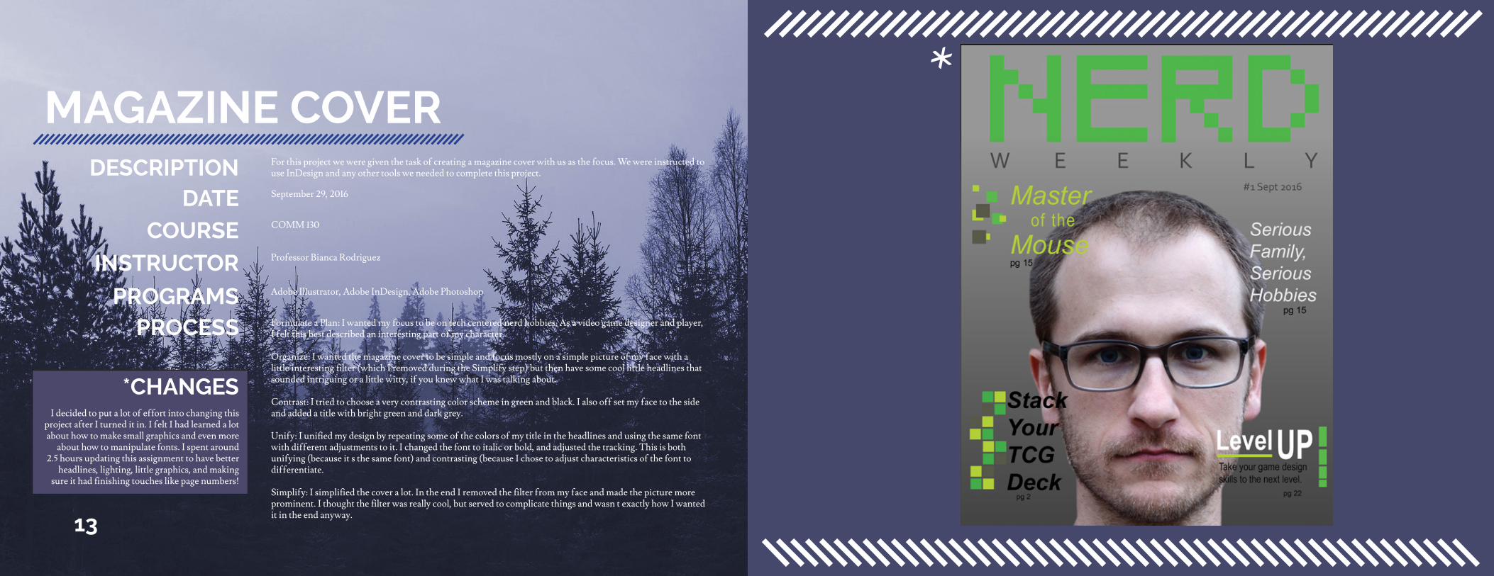
For this project we were given the task of creating a magazine cover with us as the focus. We were instructed to use InDesign and any other tools we needed to complete this project.DESCRIPTION
DATECOURSE
INSTRUCTOR
PROGRAMSPROCESS
September 29, 2016
Professor Bianca Rodriguez
COMM 130
Adobe Illustrator, Adobe InDesign, Adobe Photoshop
Formulate a Plan: I wanted my focus to be on tech centered nerd hobbies. As a video game designer and player, I felt this best described an interesting part of my character.
Organize: I wanted the magazine cover to be simple and focus mostly on a simple picture of my face with a little interesting filter (which I removed during the Simplify step) but then have some cool little headlines that sounded intriguing or a little witty, if you knew what I was talking about.
Contrast: I tried to choose a very contrasting color scheme in green and black. I also off set my face to the side and added a title with bright green and dark grey.
Unify: I unified my design by repeating some of the colors of my title in the headlines and using the same font with different adjustments to it. I changed the font to italic or bold, and adjusted the tracking. This is both unifying (because it’s the same font) and contrasting (because I chose to adjust characteristics of the font to differentiate.
Simplify: I simplified the cover a lot. In the end I removed the filter from my face and made the picture more prominent. I thought the filter was really cool, but served to complicate things and wasn’t exactly how I wanted it in the end anyway.
I decided to put a lot of effort into changing this project after I turned it in. I felt I had learned a lot about how to make small graphics and even more
about how to manipulate fonts. I spent around 2.5 hours updating this assignment to have better
headlines, lighting, little graphics, and making sure it had finishing touches like page numbers!
*CHANGES
*
INFOGRAPHIC
15
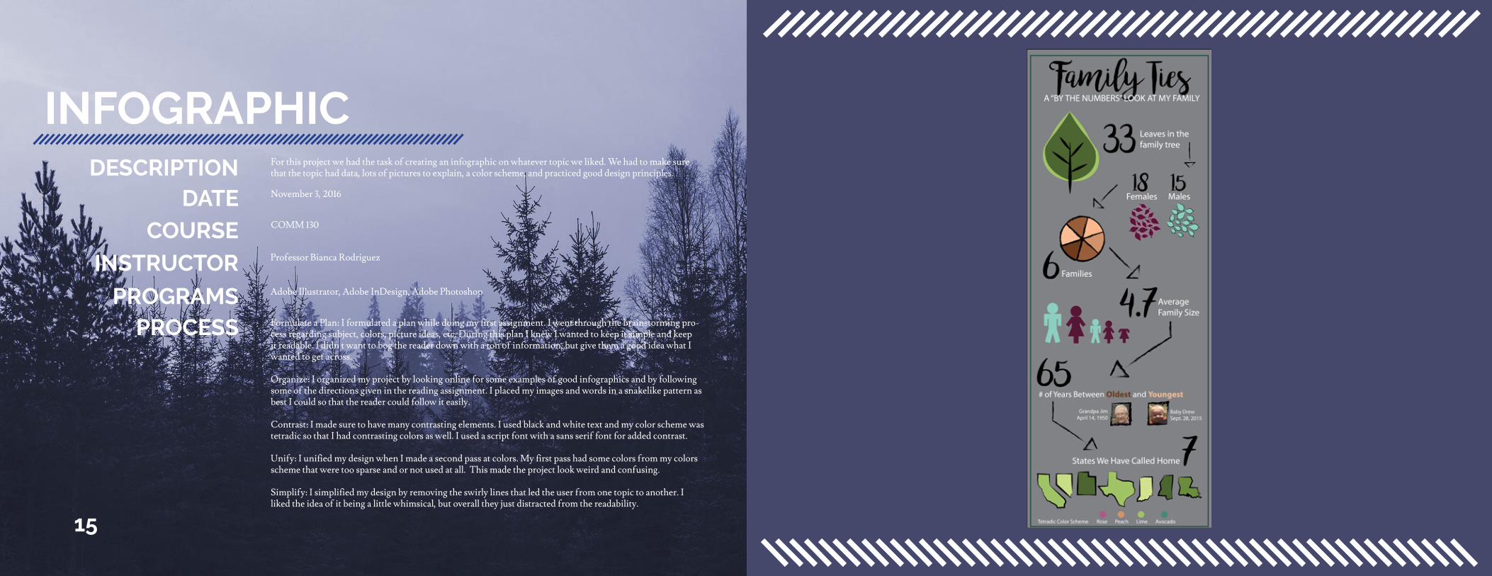
For this project we had the task of creating an infographic on whatever topic we liked. We had to make sure that the topic had data, lots of pictures to explain, a color scheme, and practiced good design principles.DESCRIPTION
DATECOURSE
INSTRUCTOR
PROGRAMSPROCESS
November 3, 2016
Professor Bianca Rodriguez
COMM 130
Adobe Illustrator, Adobe InDesign, Adobe Photoshop
Formulate a Plan: I formulated a plan while doing my first assignment. I went through the brainstorming pro-cess regarding subject, colors, picture ideas, etc. During this plan I knew I wanted to keep it simple and keep it readable. I didn’t want to bog the reader down with a ton of information, but give them a good idea what I wanted to get across.
Organize: I organized my project by looking online for some examples of good infographics and by following some of the directions given in the reading assignment. I placed my images and words in a snakelike pattern as best I could so that the reader could follow it easily.
Contrast: I made sure to have many contrasting elements. I used black and white text and my color scheme was tetradic so that I had contrasting colors as well. I used a script font with a sans serif font for added contrast.
Unify: I unified my design when I made a second pass at colors. My first pass had some colors from my colors scheme that were too sparse and or not used at all. This made the project look weird and confusing.
Simplify: I simplified my design by removing the swirly lines that led the user from one topic to another. I liked the idea of it being a little whimsical, but overall they just distracted from the readability.
HTML and CSS
17
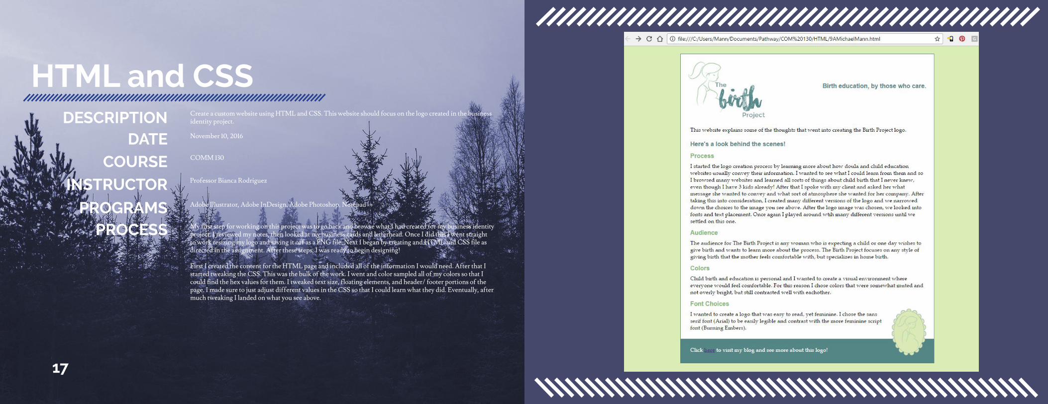
Create a custom website using HTML and CSS. This website should focus on the logo created in the business identity project.DESCRIPTION
DATECOURSE
INSTRUCTOR
PROGRAMSPROCESS
November 10, 2016
Professor Bianca Rodriguez
COMM 130
Adobe Illustrator, Adobe InDesign, Adobe Photoshop, Notepad++
My first step for working on this project was to go back and browse what I had created for my business identity project. I reviewed my notes, then looked at my business cards and letterhead. Once I did this I went straight to work resizing my logo and saving it off as a PNG file. Next I began by creating and HTML and CSS file as directed in the assignment. After these steps, I was ready to begin designing!
First I created the content for the HTML page and included all of the information I would need. After that I started tweaking the CSS. This was the bulk of the work. I went and color sampled all of my colors so that I could find the hex values for them. I tweaked text size, floating elements, and header/ footer portions of the page. I made sure to just adjust different values in the CSS so that I could learn what they did. Eventually, after much tweaking I landed on what you see above.
PREZI
19
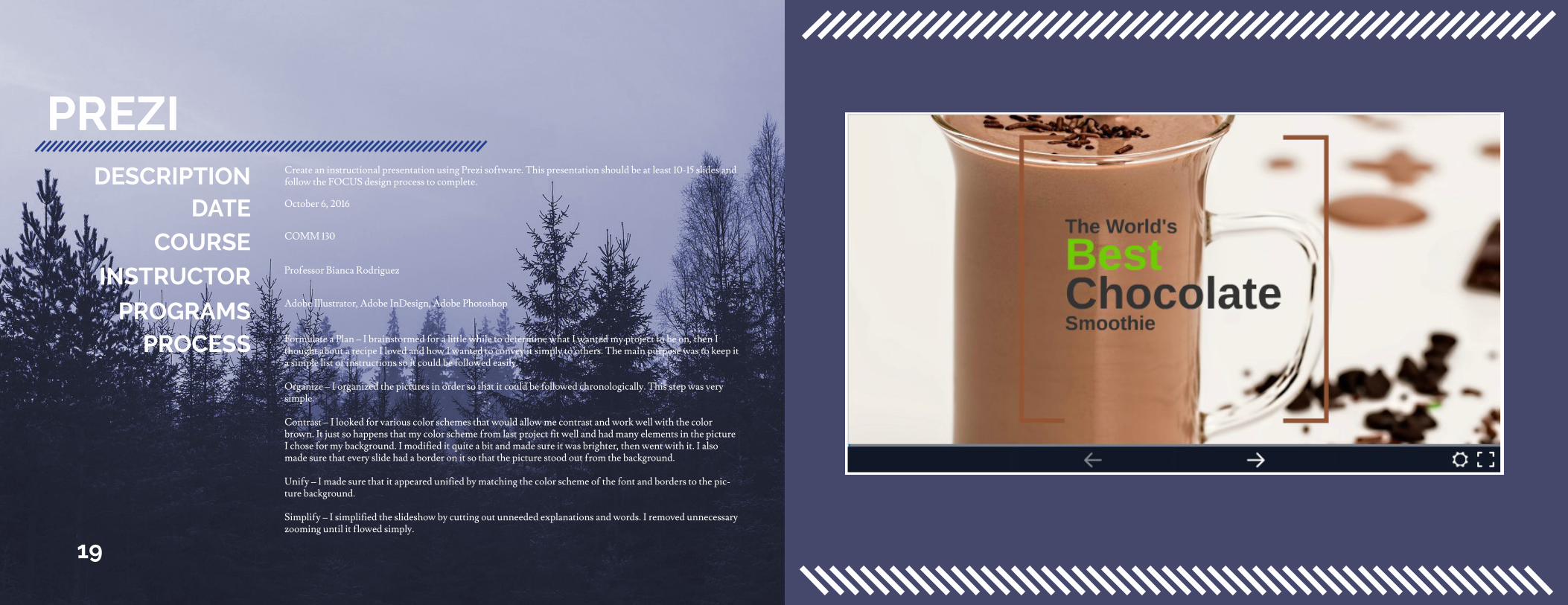
Create an instructional presentation using Prezi software. This presentation should be at least 10-15 slides and follow the FOCUS design process to complete.DESCRIPTION
DATECOURSE
INSTRUCTOR
PROGRAMSPROCESS
October 6, 2016
Professor Bianca Rodriguez
COMM 130
Adobe Illustrator, Adobe InDesign, Adobe Photoshop
Formulate a Plan – I brainstormed for a little while to determine what I wanted my project to be on, then I thought about a recipe I loved and how I wanted to convey it simply to others. The main purpose was to keep it a simple list of instructions so it could be followed easily.
Organize – I organized the pictures in order so that it could be followed chronologically. This step was very simple.
Contrast – I looked for various color schemes that would allow me contrast and work well with the color brown. It just so happens that my color scheme from last project fit well and had many elements in the picture I chose for my background. I modified it quite a bit and made sure it was brighter, then went with it. I also made sure that every slide had a border on it so that the picture stood out from the background.
Unify – I made sure that it appeared unified by matching the color scheme of the font and borders to the pic-ture background.
Simplify – I simplified the slideshow by cutting out unneeded explanations and words. I removed unnecessary zooming until it flowed simply.