20 principles: ui design
TRANSCRIPT
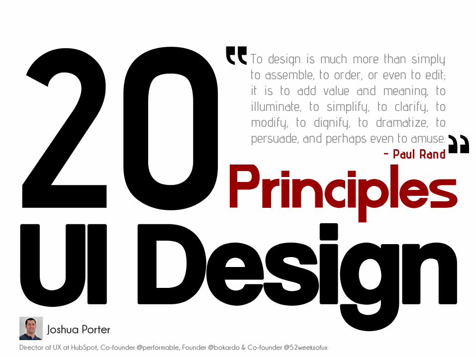
Principles
UI Design
To design is much more than simplyto assemble, to order, or even to edit;it is to add value and meaning, toilluminate, to simplify, to clarify, tomodify, to dignify, to dramatize, topersuade, and perhaps even to amuse.
- Paul Rand
“ “
Director of UX at HubSpot, Co-founder @performable, Founder @bokardo & Co-founder @52weeksofux
Joshua Porter
Clarity is job
Clarity is the first and most important job of any interface. To be effective usingan interface you've designed, people must be able to recognize what it is, careabout why they would use it, understand what the interface is helping theminteract with, predict what will happen when they use it, and then successfullyinteract with it. While there is room for mystery and delayed gratification ininterfaces, there is no room for confusion. Clarity inspires confidence and leadsto further use. One hundred clear screens is preferable to a single cluttered one.
Interfaces exist to enable interactionInterfaces exist to enable interaction between humans and our world. They canhelp clarify, illuminate, enable, show relationships, bring us together, pull usapart, manage our expectations, and give us access to services. The act ofdesigning interfaces is not Art. Interfaces are not monuments unto themselves.Interfaces do a job and their effectiveness can be measured. They are not justutilitarian, however. The best interfaces can inspire, evoke, mystify, and intensifyour relationship with the world.
Conserve attention at all costsWe live in a world of interruption. It's hard to read in peace anymore withoutsomething trying to distract us and direct our attention elsewhere. Attention isprecious. Don't litter the side of your applications with distractiblematerial…remember why the screen exists in the first place. If someone isreading let them finish reading before showing that advertisement (if you must).Honor attention and not only will your readers be happier, your results will bebetter. When use is the primary goal, attention becomes the prerequisite.Conserve it at all costs.
Keep users in control
Humans are most comfortable when they feel in control of themselves and theirenvironment. Thoughtless software takes away that comfort by forcing peopleinto unplanned interactions, confusing pathways, and surprising outcomes. Keepusers in control by regularly surfacing system status, by describing causation (ifyou do this that will happen) and by giving insight into what to expect at everyturn. Don't worry about stating the obvious…the obvious almost never is.
Direct manipulation is bestThe best interface is none at all, when we are able to directly manipulate the physical objects in ourworld. Since this is not always possible, and objects are increasingly informational, we createinterfaces to help us interact with them. It is easy to add more layers than necessary to an interface,creating overly-wrought buttons, chrome, graphics, options, preferences, windows, attachments, andother cruft so that we end up manipulating UI elements instead of what's important. Instead, strivefor that original goal of direct manipulation…design an interface with as little a footprint as possible,recognizing as much as possible natural human gestures. Ideally, the interface is so slight that theuser has a feeling of direct manipulation with the object of their focus.
One primary action per screenEvery screen we design should support a single action of real value to theperson using it. This makes it easier to learn, easier to use, and easier to add toor build on when necessary. Screens that support two or more primary actionsbecome confusing quickly. Like a written article should have a single, strongthesis, every screen we design should support a single, strong action that is itsraison d'etre.
Keep secondary actions secondaryScreens with a single primary action can have multiple secondary actions butthey need to be kept secondary! The reason why your article exists isn't so thatpeople can share it on Twitter…it exists for people to read and understand it.Keep secondary actions secondary by making them lighter weight visually orshown after the primary action has been achieved.
Provide a natural next stepVery few interactions are meant to be the last, so thoughtfully design a next stepfor each interaction a person has with your interface. Anticipate what the nextinteraction should be and design to support it. Just as we like in humanconversation, provide an opening for further interaction. Don't leave a personhanging because they've done what you want them to do…give them a naturalnext step that helps them further achieve their goals.
Appearance follows behaviourHumans are most comfortable with things that behave the way we expect. Otherpeople, animals, objects, software. When someone or something behavesconsistently with our expectations we feel like we have a good relationship withit. To that end designed elements should look like how they behave. In practicethis means that someone should be able to predict how an interface element willbehave merely by looking at it. If it looks like a button it should act like a button.Don't get cute with the basics of interaction…keep your creativity for higher orderconcerns.
Consistency matters
Following on the previous principle, screen elements should not appearconsistent with each other unless they behave consistently with each other.Elements that behave the same should look the same. But it is just as importantfor unlike elements to appear unlike (be inconsistent) as it is for like elements toappear consistent. In an effort to be consistent novice designers often obscureimportant differences by using the same visual treatment (often to re-use code)when different visual treatment is appropriate.
Strong visual hierarchies work bestA strong visual hierarchy is achieved when there is a clear viewing order to the visual elements on ascreen. That is, when users view the same items in the same order every time. Weak visualhierarchies give little clue about where to rest one's gaze and end up feeling cluttered and confusing.In environments of great change it is hard to maintain a strong visual hierarchy because visualweight is relative: when everything is bold, nothing is bold. Should a single visually heavy elementbe added to a screen, the designer may need to reset the visual weight of all elements to once againachieve a strong hierarchy. Most people don't notice visual hierarchy but it is one of the easiestways to strengthen (or weaken) a design.
Smart organization reduces cognitive loadAs John Maeda says in his book Simplicity, smart organization of screen elements canmake the many appear as the few. This helps people understand your interface easierand more quickly, as you've illustrated the inherent relationships of content in yourdesign. Group together like elements, show natural relationships by placement andorientation. By smartly organizing your content you make it less of a cognitive load onthe user…who doesn't have to think about how elements are related because you've doneit for them. Don't force the user to figure things out…show them by designing thoserelationships into your screens.
Highlight, don't determine, with colorThe color of physical things changes as light changes. In the full light of day wesee a very different tree than one outlined against a sunset. As in the physicalworld, where color is a many-shaded thing, color should not determine much inan interface. It can help, be used for highlighting, be used to guide attention, butshould not be the only differentiator of things. For long-reading or extendedscreen hours, use light or muted background colors, saving brighter hues foryour accent colors. Of course there is a time for vibrant background colors aswell, just be sure that it is appropriate for your audience.
Progressive disclosure
Show only what is necessary on each screen. If people are making a choice,show enough information to allow them the choice, then dive into details on asubsequent screen. Avoid the tendency to over-explain or show everything all atonce. When possible, defer decisions to subsequent screens by progressivelydisclosing information as necessary. This will keep your interactions more clear.
Help people inline
In ideal interfaces, help is not necessary because the interface is learnable andusable. The step below this, reality, is one in which help is inline and contextual,available only when and where it is needed, hidden from view at all other times.Asking people to go to help and find an answer to their question puts the onuson them to know what they need. Instead build in help where it is needed…justmake sure that it is out of the way of people who already know how to use yourinterface.
A crucial moment: the zero stateThe first time experience with an interface is crucial, yet often overlooked bydesigners. In order to best help our users get up to speed with our designs, it isbest to design for the zero state, the state in which nothing has yet occurred.This state shouldn't be a blank canvas…it should provide direction and guidancefor getting up to speed. Much of the friction of interaction is in that initialcontext…once people understand the rules they have a much higher likelihood ofsuccess.
Existing problems are most valuablePeople seek out solutions to problems they already have, not potential problemsor problems of the future. Therefore, resist creating interfaces for hypotheticalproblems, observe existing behavior and design to solve existing problems. Thisisn't as exciting as blue sky wondering but can be much more rewarding aspeople will actually use your interface.
Great design is invisibleA curious property of great design is that it usually goes unnoticed by the peoplewho use it. One reason for this is that if the design is successful the user canfocus on their own goals and not the interface…when they complete their goalthey are satisfied and do not need to reflect on the situation. As a designer thiscan be tough…as we receive less adulation when our designs are good. But greatdesigners are content with a well-used design…and know that happy users areoften silent.
Build on other design disciplinesVisual and graphic design, typography, copywriting, information architecture andvisualization…all of these disciplines are part of interface design. They can betouched upon or specialized in. Do not get into turf wars or look down on otherdisciplines: grab from them the aspects that help you do your work and push on.Pull in insights from seemingly unrelated disciplines as well…what can we learnfrom publishing, writing code, bookbinding, skateboarding, firefighting, karate?
Interfaces exist to be usedAs in most design disciplines, interface design is successful when people areusing what you've designed. Like a beautiful chair that is uncomfortable to sit in,design has failed when people choose not to use it. Therefore, interface designcan be as much about creating an environment for use as it is creating anartifact worth using. It is not enough for an interface to satisfy the ego of itsdesigner: it must be used!