2014 strategic housing market assessment the...
TRANSCRIPT
2014 Strategic Housing Market Assessment The Private Rented Market in North Tyneside

arc4 2
Table of Contents
1. Introduction ....................................................................................................................................................................................................................................................................................................... 5
2. The Evidence Base ............................................................................................................................................................................................................................................................................................ 6
The size of the sector .......................................................................................................................................................................................................................................................................................... 6
The growth in the sector ...................................................................................................................................................................................................................................................................................... 7
New properties coming onto the market .............................................................................................................................................................................................................................................................. 9
Property type and bed size ................................................................................................................................................................................................................................................................................ 12
Rent levels ........................................................................................................................................................................................................................................................................................................ 14
Affordability ....................................................................................................................................................................................................................................................................................................... 18
Properties let ..................................................................................................................................................................................................................................................................................................... 20
Rent differentials ............................................................................................................................................................................................................................................................................................... 21
Time to let property............................................................................................................................................................................................................................................................................................ 22
Rental yields ...................................................................................................................................................................................................................................................................................................... 23
3. In summary and conclusion ........................................................................................................................................................................................................................................................................... 24
Total stock ......................................................................................................................................................................................................................................................................................................... 24
Properties on the market ................................................................................................................................................................................................................................................................................... 24
Rent levels ........................................................................................................................................................................................................................................................................................................ 25
Affordability ....................................................................................................................................................................................................................................................................................................... 25
Property let ........................................................................................................................................................................................................................................................................................................ 25
Time to let a property ......................................................................................................................................................................................................................................................................................... 25
Rental yields ...................................................................................................................................................................................................................................................................................................... 26
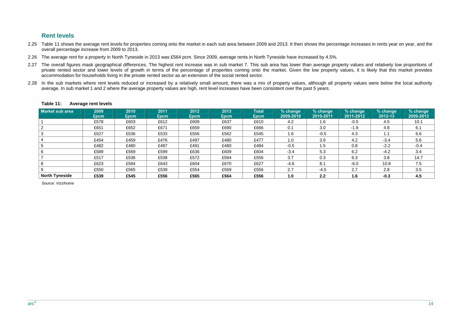
List of Tables
Table 1: Private Rented Sector by Ward ................................................................................................................................................................................................................................................................ 6
Table 2: Growth in PRS 2001-11 by Ward** .......................................................................................................................................................................................................................................................... 7
Table 3: Average Property Price by Ward .............................................................................................................................................................................................................................................................. 8
Table 4: Market sub areas ..................................................................................................................................................................................................................................................................................... 9
Table 5: Size of PRS in market sub areas ............................................................................................................................................................................................................................................................. 9
Table 6: Number of properties coming to market 2009-13 ................................................................................................................................................................................................................................... 10
Table 7: Number of properties coming to market (for rent) as percentage of PRS ............................................................................................................................................................................................... 11
Table 8: Type of property on market 2009-12 ...................................................................................................................................................................................................................................................... 12
Table 9: Number of properties coming to market 2009-12 by property size ......................................................................................................................................................................................................... 12
Table 10: The percentage of properties coming onto the market by type and size 2009-2013 ............................................................................................................................................................................... 13
Table 11: Average rent levels ................................................................................................................................................................................................................................................................................ 14
Table 12: Average rent change by type and size 2009-13 ..................................................................................................................................................................................................................................... 16
Table 13: Average rent change by sub market....................................................................................................................................................................................................................................................... 16

arc4 3
Table 14: Affordability by property size .................................................................................................................................................................................................................................................................. 18
Table 16: Income versus rental by property type and size .................................................................................................................................................................................................................................... 19
Table 15: Income versus rental by sub market....................................................................................................................................................................................................................................................... 19
Table 17: Average time to let by sub market .......................................................................................................................................................................................................................................................... 22
Table 18: Rental yields by Ward ............................................................................................................................................................................................................................................................................ 23
List of figures
Chart 1: The percentage growth in the Private Rented Sector 2001-2011 ............................................................................................................................................................................................................. 7
Chart 2: The percentage of properties coming onto the market by bed size 2009-2012 ....................................................................................................................................................................................... 12
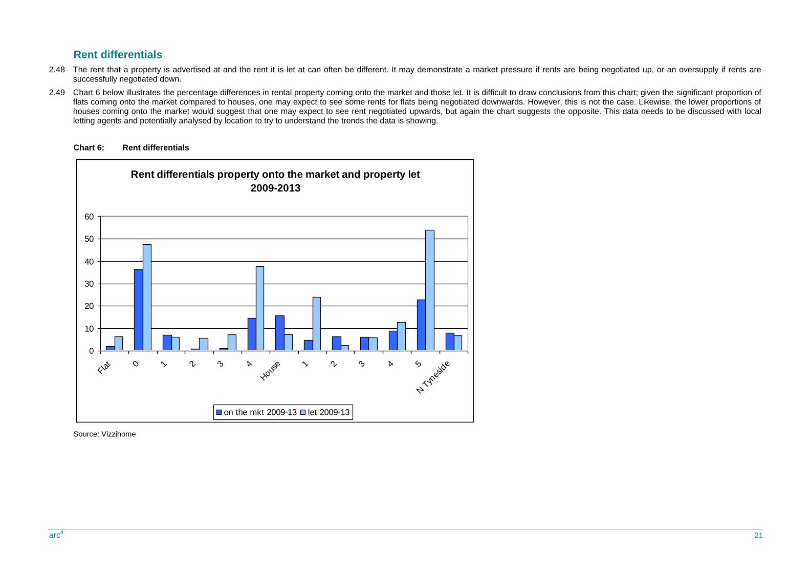
Chart 3: Average rent levels and rented stock ..................................................................................................................................................................................................................................................... 15
Chart 4: The percentage of properties within LHA caps 2009-2013 ..................................................................................................................................................................................................................... 18
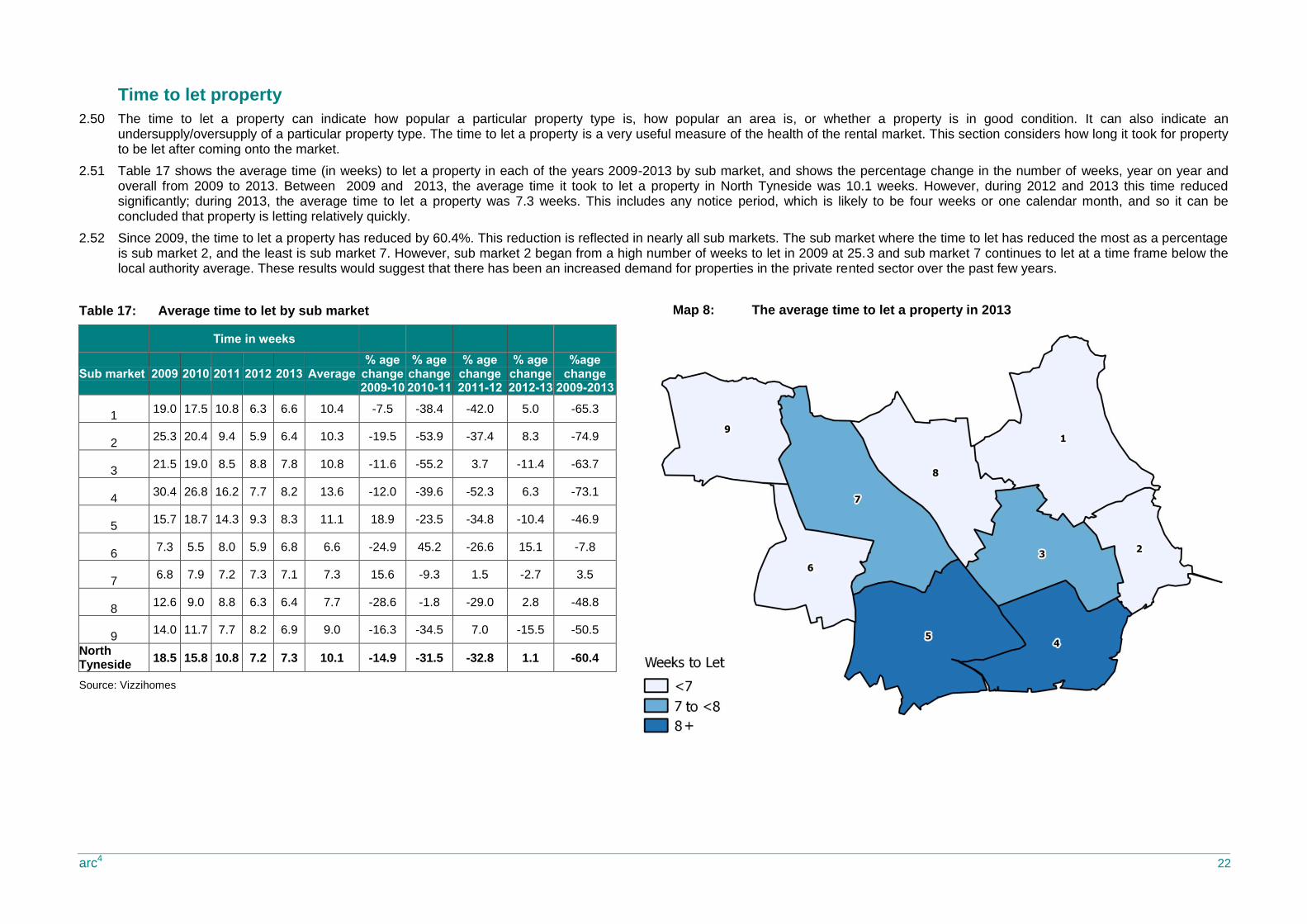
Chart 5: Properties onto the market and those let 2013 ....................................................................................................................................................................................................................................... 20
Chart 6: Rent differentials .................................................................................................................................................................................................................................................................................... 21
List of maps
Map 1: The location of the private rented sector .................................................................................................................................................................................................................................................. 6
Map 2: Location of market sub areas ................................................................................................................................................................................................................................................................... 9
Map 3: The increase in the number of properties coming onto the market 2009-2013 ....................................................................................................................................................................................... 10
Map 4: The number of the private rented homes coming onto the market as a percentage of the total private rented stock in 2013 .................................................................................................................. 11
Map 5: The average rent change 2009 to 2013 ................................................................................................................................................................................................................................................. 15
Map 6: The percentage change of rent levels for flats 2009-2013 xx ................................................................................................................................................................................................................. 17
Map 7: The percentage change of rent levels for houses 2009-2013 ................................................................................................................................................................................................................. 17
Map 8: The average time to let a property in 2013 ............................................................................................................................................................................................................................................. 22
arc4 4
Please note that in this report some of the tables include rounded figures. This can result in some column or row totals not adding up to
100 or to the anticipated row or column ‘total’ due to the use of rounded decimal figures. We include this description here as it covers all
tables and associated textual commentary included. If tables or figures are to be used in-house then we recommend the addition of a
similarly worded statement being included as a note to each table used.
arc4 Limited accepts no responsibility or liability for, and makes no representation or warranty with respect to, the accuracy or completeness of any third party information (including data) that is contained in this
document.
The information contained in this document is strictly confidential and is intended for the addressee only. The unauthorised use, disclosure, copying, alteration, distribution or communication to the public of this document or any part thereof is strictly prohibited.

arc4 5
1. Introduction
1.1 The Government’s Housing Strategy, published in November 20111, set out the Government’s plans to boost housing supply. It recognised an increasingly important role for the private rented sector (PRS), both in meeting people’s housing needs and in supporting economic growth by enabling people to move to take up jobs elsewhere and to respond to changing circumstances.
1.2 The private rented sector is growing; the recently published Census figures for 2011 confirmed that the sector now totals 18.1%, an increase of 31.2% from 13.8% in 2001. Increasing house prices pre 2007 and the struggling sales market after the economic down turn are both factors that have underpinned the growth of the rental market for both ‘active choice’ renters and ‘frustrated would-be’ homeowners. Tenure reform and less accessible social rented housing are also likely to be an increasing factor to the growth in the private rented sector; the sector clearly now plays a vital role in meeting housing needs as well as providing an alternative to homeownership.
1.3 Local authorities have an important role in ensuring that the private rented sector meets both these requirements. Balancing good quality supply with demand will help to stabilise rents, and encouraging good quality management will improve the reputation of the sector and encourage longer term lets and lower turnover. However, this is a challenging task where existing partners need to be encouraged to participate and new partners and investors need to be identified.
1.4 This report provides an evidence base around the scale, growth and performance of the private rented sector in North Tyneside since 2009. It utilises data from a number of secondary sources which are identified in the report. Vizzihome data is used extensively in this report and only includes private rented property that has been advertised and/or managed through a letting agent. Vizzihome claims to have access to in excess of 95% of that market. However, we are unable to confirm what percentage of the market private agents are responsible for.
1.5 The report provides a very useful evidence base on activity within the private letting market but it is not the only source of useful information. Discussions with local letting agents can add significant value to this report as they can often provide reasons for trends and patterns within the data.
1 Laying The Foundations; A Housing Strategy for England, 2011

arc4 6
2. The Evidence Base
The size of the sector
2.1 The Census 2011 confirms (Table 1) that there are 10,146 (11.1%) households living in the private rented sector (private landlord/ letting agent) in North Tyneside; this is lower than the national figure of 18.1%. The highest percentage is in Wallsend (22.8%) and the lowest is in St Mary’s (4.1%). The location of the private rented sector, by percentage of the market, is illustrated in Map 1.
2.2 There are six wards where the private rented sector is larger than the social rented sector, and these are Monkseaton North, Preston, St Mary’s, Tynemouth, Wallsend and Whitley Bay. In terms of numbers of units, Riverside has the largest private rented sector (1,219) and St Mary’s has the smallest (146).
Table 1: Private Rented Sector by Ward
Ward Owners No.
Social Housing Inc Intermediate
Housing No.
PRS from letting agent
or private landlord No.
PRS other e.g. living rent free
Total Owners %
Social Housing Inc Intermediate Housing %
PRS from letting agent
or private landlord %
PRS other e.g. living rent free
Battle Hill 3,270 1126 270 92 4758 68.7 23.7 5.7 1.9
Benton 3,316 918 350 92 4676 70.9 19.6 7.5 2.0
Camperdown 2,833 1413 294 80 4620 61.3 30.6 6.4 1.7
Chirton 2,412 1965 893 135 5405 44.6 36.4 16.5 2.5
Collingwood 3,182 1247 376 80 4885 65.1 25.5 7.7 1.6
Cullercoats 3,457 459 246 93 4255 81.2 10.8 5.8 2.2
Howdon 2,367 1994 557 111 5029 47.1 39.7 11.1 2.2
Killingworth 2,987 815 328 57 4187 71.3 19.5 7.8 1.4
Longbenton 2,616 1922 446 77 5061 51.7 38.0 8.8 1.5
Monkseaton North 3,178 235 275 53 3741 85.0 6.3 7.4 1.4
Monkseaton South 3,220 587 422 84 4313 74.7 13.6 9.8 1.9
Northumberland 2,612 682 205 83 3582 72.9 19.0 5.7 2.3
Preston 3,032 230 549 81 3892 77.9 5.9 14.1 2.1
Riverside 2,125 2368 1219 127 5839 36.4 40.6 20.9 2.2
St Mary's 3,344 42 146 55 3587 93.2 1.2 4.1 1.5
Tynemouth 3,388 833 880 175 5276 64.2 15.8 16.7 3.3
Valley 2,881 1271 463 99 4714 61.1 27.0 9.8 2.1
Wallsend 2,893 977 1188 159 5217 55.5 18.7 22.8 3.0
Weetslade 3,166 690 284 119 4259 74.3 16.2 6.7 2.8
Whitley Bay 2,857 277 755 110 3999 71.4 6.9 18.9 2.8
North Tyneside 59,136 20,051 10,146 1,962 91,295 64.8 22.0 11.1 2.1
Source: Census 2011
Map 1: The location of the private rented sector
arc4 7
The growth in the sector
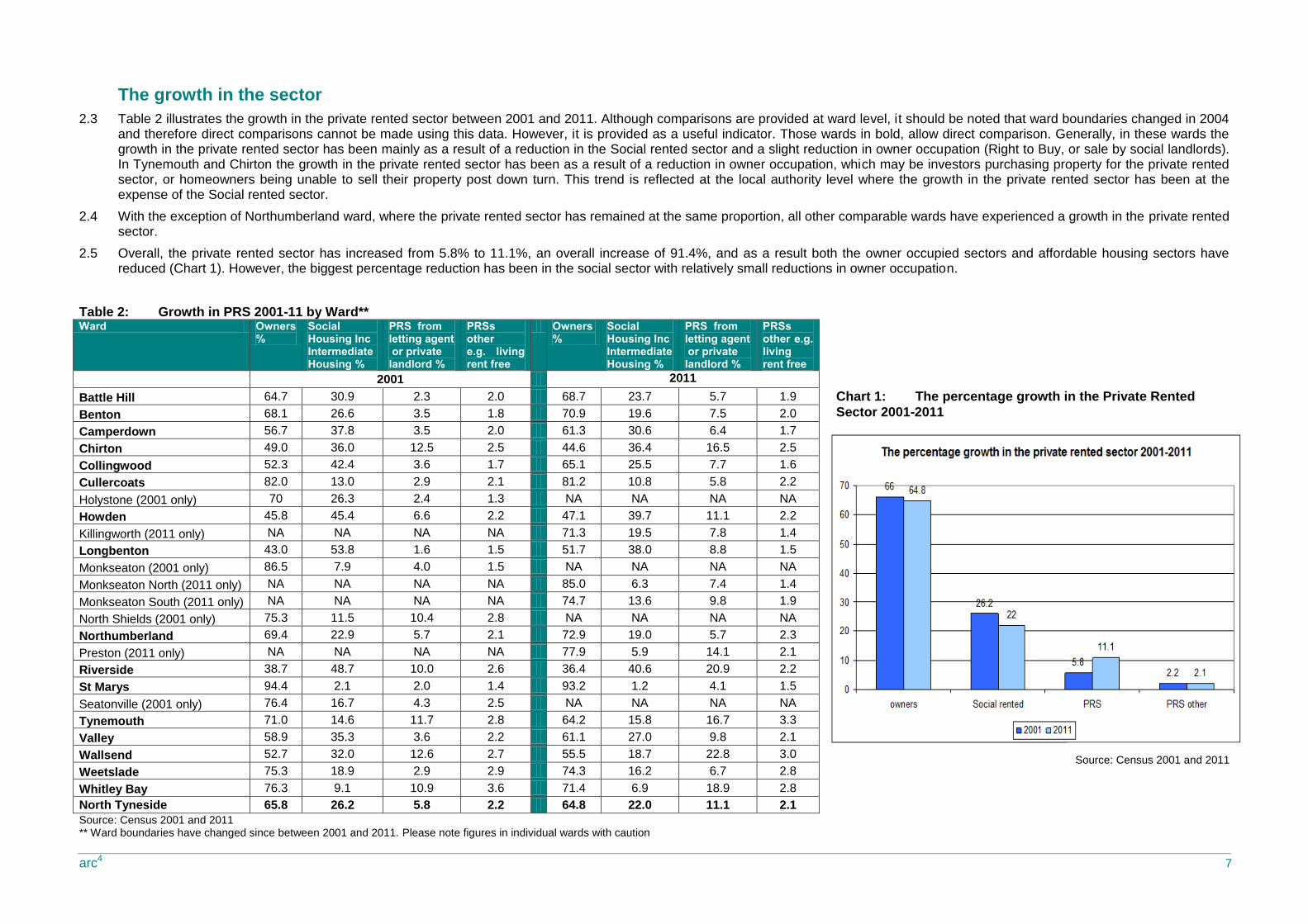
2.3 Table 2 illustrates the growth in the private rented sector between 2001 and 2011. Although comparisons are provided at ward level, it should be noted that ward boundaries changed in 2004 and therefore direct comparisons cannot be made using this data. However, it is provided as a useful indicator. Those wards in bold, allow direct comparison. Generally, in these wards the growth in the private rented sector has been mainly as a result of a reduction in the Social rented sector and a slight reduction in owner occupation (Right to Buy, or sale by social landlords). In Tynemouth and Chirton the growth in the private rented sector has been as a result of a reduction in owner occupation, which may be investors purchasing property for the private rented sector, or homeowners being unable to sell their property post down turn. This trend is reflected at the local authority level where the growth in the private rented sector has been at the expense of the Social rented sector.
2.4 With the exception of Northumberland ward, where the private rented sector has remained at the same proportion, all other comparable wards have experienced a growth in the private rented sector.
2.5 Overall, the private rented sector has increased from 5.8% to 11.1%, an overall increase of 91.4%, and as a result both the owner occupied sectors and affordable housing sectors have reduced (Chart 1). However, the biggest percentage reduction has been in the social sector with relatively small reductions in owner occupation.
Table 2: Growth in PRS 2001-11 by Ward** Ward Owners
% Social Housing Inc Intermediate Housing %
PRS from letting agent or private landlord %
PRSs other e.g. living rent free
Owners %
Social Housing Inc Intermediate Housing %
PRS from letting agent or private landlord %
PRSs other e.g. living rent free
2001 2011
Battle Hill 64.7 30.9 2.3 2.0 68.7 23.7 5.7 1.9
Benton 68.1 26.6 3.5 1.8 70.9 19.6 7.5 2.0
Camperdown 56.7 37.8 3.5 2.0 61.3 30.6 6.4 1.7
Chirton 49.0 36.0 12.5 2.5 44.6 36.4 16.5 2.5
Collingwood 52.3 42.4 3.6 1.7 65.1 25.5 7.7 1.6
Cullercoats 82.0 13.0 2.9 2.1 81.2 10.8 5.8 2.2
Holystone (2001 only) 70 26.3 2.4 1.3 NA NA NA NA
Howden 45.8 45.4 6.6 2.2 47.1 39.7 11.1 2.2
Killingworth (2011 only) NA NA NA NA 71.3 19.5 7.8 1.4
Longbenton 43.0 53.8 1.6 1.5 51.7 38.0 8.8 1.5
Monkseaton (2001 only) 86.5 7.9 4.0 1.5 NA NA NA NA
Monkseaton North (2011 only) NA NA NA NA 85.0 6.3 7.4 1.4
Monkseaton South (2011 only) NA NA NA NA 74.7 13.6 9.8 1.9
North Shields (2001 only) 75.3 11.5 10.4 2.8 NA NA NA NA
Northumberland 69.4 22.9 5.7 2.1 72.9 19.0 5.7 2.3
Preston (2011 only) NA NA NA NA 77.9 5.9 14.1 2.1
Riverside 38.7 48.7 10.0 2.6 36.4 40.6 20.9 2.2
St Marys 94.4 2.1 2.0 1.4 93.2 1.2 4.1 1.5
Seatonville (2001 only) 76.4 16.7 4.3 2.5 NA NA NA NA
Tynemouth 71.0 14.6 11.7 2.8 64.2 15.8 16.7 3.3
Valley 58.9 35.3 3.6 2.2 61.1 27.0 9.8 2.1
Wallsend 52.7 32.0 12.6 2.7 55.5 18.7 22.8 3.0
Weetslade 75.3 18.9 2.9 2.9 74.3 16.2 6.7 2.8
Whitley Bay 76.3 9.1 10.9 3.6 71.4 6.9 18.9 2.8
North Tyneside 65.8 26.2 5.8 2.2 64.8 22.0 11.1 2.1
Source: Census 2001 and 2011 ** Ward boundaries have changed since between 2001 and 2011. Please note figures in individual wards with caution
Chart 1: The percentage growth in the Private Rented
Sector 2001-2011
Source: Census 2001 and 2011
arc4 8
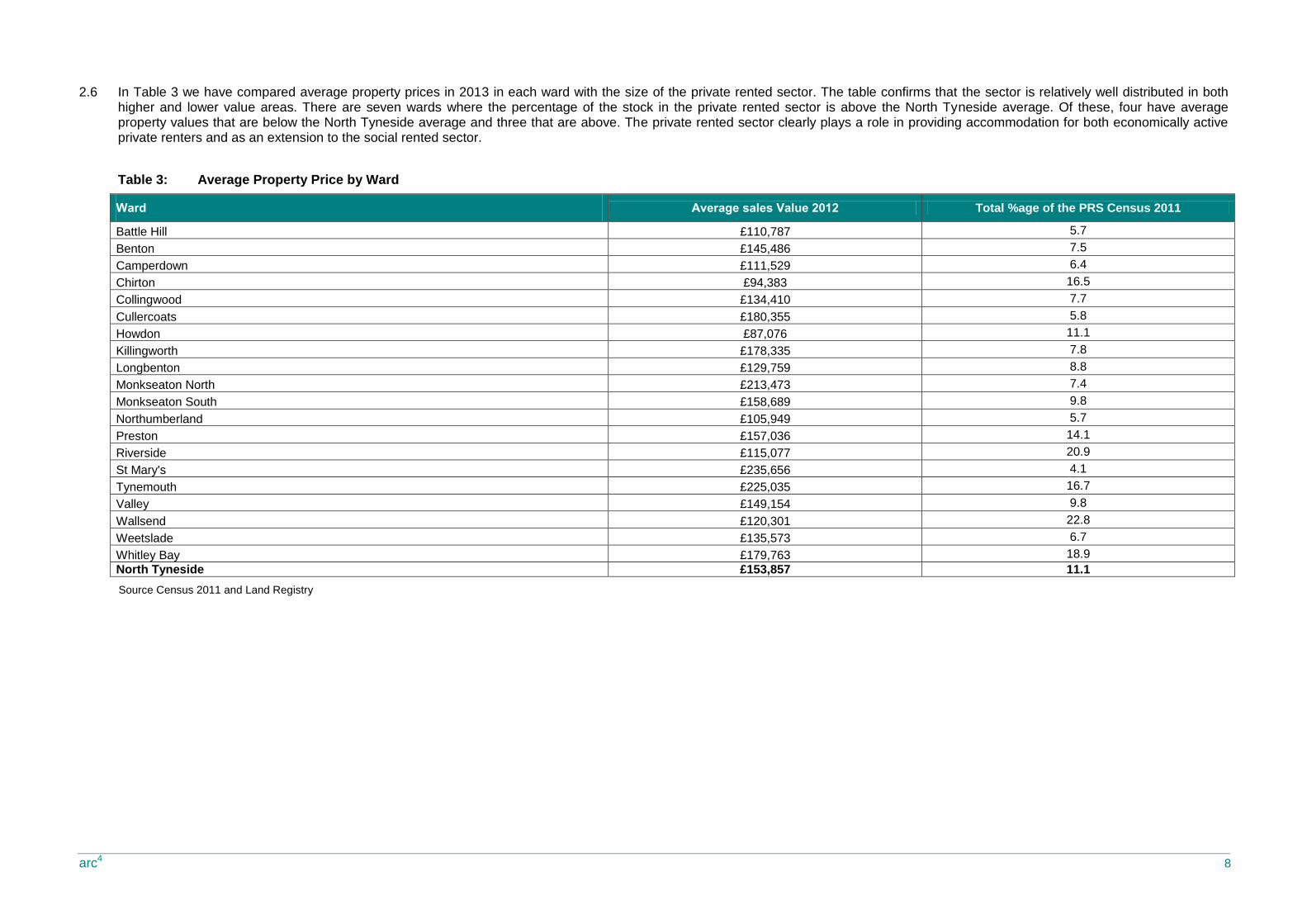
2.6 In Table 3 we have compared average property prices in 2013 in each ward with the size of the private rented sector. The table confirms that the sector is relatively well distributed in both higher and lower value areas. There are seven wards where the percentage of the stock in the private rented sector is above the North Tyneside average. Of these, four have average property values that are below the North Tyneside average and three that are above. The private rented sector clearly plays a role in providing accommodation for both economically active private renters and as an extension to the social rented sector.
Table 3: Average Property Price by Ward
Ward Average sales Value 2012 Total %age of the PRS Census 2011
Battle Hill £110,787 5.7
Benton £145,486 7.5
Camperdown £111,529 6.4
Chirton £94,383 16.5
Collingwood £134,410 7.7
Cullercoats £180,355 5.8
Howdon £87,076 11.1
Killingworth £178,335 7.8
Longbenton £129,759 8.8
Monkseaton North £213,473 7.4
Monkseaton South £158,689 9.8
Northumberland £105,949 5.7
Preston £157,036 14.1
Riverside £115,077 20.9
St Mary's £235,656 4.1
Tynemouth £225,035 16.7
Valley £149,154 9.8
Wallsend £120,301 22.8
Weetslade £135,573 6.7
Whitley Bay £179,763 18.9
North Tyneside £153,857 11.1
Source Census 2011 and Land Registry
arc4 9
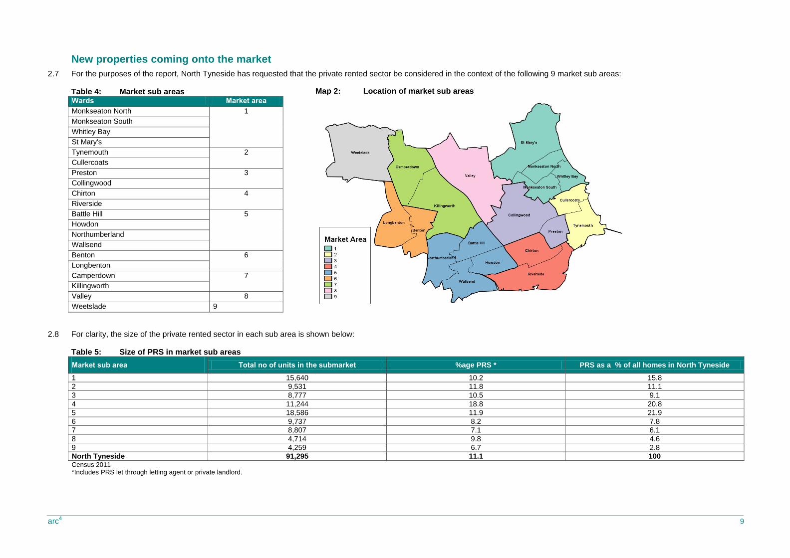
New properties coming onto the market
2.7 For the purposes of the report, North Tyneside has requested that the private rented sector be considered in the context of the following 9 market sub areas:
Table 4: Market sub areas Wards Market area
Monkseaton North 1
Monkseaton South
Whitley Bay
St Mary's
Tynemouth 2
Cullercoats
Preston 3
Collingwood
Chirton 4
Riverside
Battle Hill 5
Howdon
Northumberland
Wallsend
Benton 6
Longbenton
Camperdown 7
Killingworth
Valley 8
Weetslade 9
2.8 For clarity, the size of the private rented sector in each sub area is shown below:
Table 5: Size of PRS in market sub areas
Market sub area Total no of units in the submarket %age PRS * PRS as a % of all homes in North Tyneside
1 15,640 10.2 15.8
2 9,531 11.8 11.1
3 8,777 10.5 9.1
4 11,244 18.8 20.8
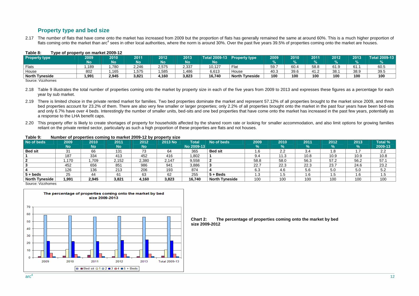
5 18,586 11.9 21.9
6 9,737 8.2 7.8
7 8,807 7.1 6.1
8 4,714 9.8 4.6
9 4,259 6.7 2.8
North Tyneside 91,295 11.1 100 Census 2011 *Includes PRS let through letting agent or private landlord.
Map 2: Location of market sub areas

arc4 10
2.9 Table 6 shows the actual number of properties coming onto the private rented market each year from 2009 to 2013 in each sub market (labelled 1-9)2. Overall, the total number of properties coming onto the market has increased from 1,991 in 2009, to 3,823 in 2013; an increase of 1,832 (92%). The total numbers coming onto the market has increased year on year to a peak of 4,160 in 2012 and 2013 seeing a reduction to 3,823.
2.10 It is important to test the reasons for these trends with local letting agents. There may be a number of reasons why an increasing number of properties come onto the market. Increasing numbers of properties in an area may be the result of a high churn, unpopular market where properties come up for rent regularly but tenants do not stay for long periods of time or it may be because investors are bringing additional properties to market. Conversely, where the number of properties is reducing, this may be because markets are settled and tenants are staying for long periods of time and so properties are not coming onto the market regularly. Given that the number of properties coming onto the market has reduced between 2012 and 2013, it may be worth discussing the potential reasons with local agents; the market may have seen growth over the past 2-3 years and is now stabilising. For example, it will be important to monitor trends over the coming years to try and identify the long term movement in the private rented market.
2.11 The sub market wards that have experienced the largest percentage increase in new properties coming onto the market since 2009 are 3, 4 and 5. These wards have also experienced significant growth in the private rented sector, and so it is likely that an element of this growth will be new properties coming onto the market. These wards are also those with lower than average property values and this would suggest that they provide an extension to the social rented sector.
2.12 Sub markets 1 and 2 have the wards with the higher than average property values, and although there has been growth in the number of new units coming onto the market, this has been at lower than North Tyneside growth levels.
2.13 The increase in the number of properties coming onto the market from 2009 in each market sub area is mapped in Map 3 below
Table 6: Number of properties coming to market 2009-13
Market sub area 2009 2010 2011 2012 2013 Total %age change
from 2009 to 2013 Total %age of the PRS Census 2011
1 313 474 555 602 510 2,454 62.9 10.2
2 212 305 452 501 392 1,862 84.9 11.8
3 152 232 340 356 313 1,393 106 10.5
4 327 455 663 702 725 2,872 121.7 18.8
5 433 586 746 859 894 3,518 106.4 11.9
6 208 334 408 461 370 1,781 77.8 8.2
7 142 234 294 336 261 1,267 83.0 7.1
8 126 223 233 237 229 1,048 81.7 9.8
9 78 102 130 106 129 545 65.3 6.7
North Tyneside 1,991 2,945 3,821 4,160 3,823 16,740 92 11.1
North Tyneside % 11.9 17.6 22.8 24.9 22.8 100
Source: Vizzihome and Census 2011
2 These properties were advertised through a private letting agent.
Map 3: The increase in the number of properties coming onto the market 2009-2013
arc4 11
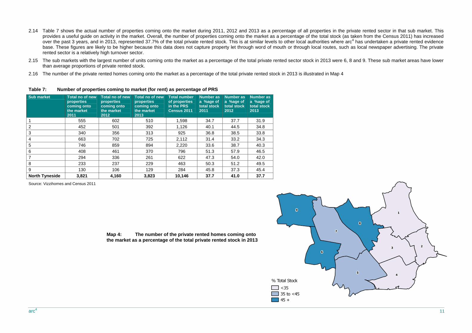
2.14 Table 7 shows the actual number of properties coming onto the market during 2011, 2012 and 2013 as a percentage of all properties in the private rented sector in that sub market. This provides a useful guide on activity in the market. Overall, the number of properties coming onto the market as a percentage of the total stock (as taken from the Census 2011) has increased over the past 3 years, and in 2013, represented 37.7% of the total private rented stock. This is at similar levels to other local authorities where arc4 has undertaken a private rented evidence base. These figures are likely to be higher because this data does not capture property let through word of mouth or through local routes, such as local newspaper advertising. The private rented sector is a relatively high turnover sector.
2.15 The sub markets with the largest number of units coming onto the market as a percentage of the total private rented sector stock in 2013 were 6, 8 and 9. These sub market areas have lower than average proportions of private rented stock.
2.16 The number of the private rented homes coming onto the market as a percentage of the total private rented stock in 2013 is illustrated in Map 4
Table 7: Number of properties coming to market (for rent) as percentage of PRS
Sub market Total no of new properties coming onto the market 2011
Total no of new properties coming onto the market 2012
Total no of new properties coming onto the market 2013
Total number of properties in the PRS Census 2011
Number as a %age of total stock 2011
Number as a %age of total stock 2012
Number as a %age of total stock 2013
1 555 602 510 1,598 34.7 37.7 31.9
2 452 501 392 1,126 40.1 44.5 34.8
3 340 356 313 925 36.8 38.5 33.8
4 663 702 725 2,112 31.4 33.2 34.3
5 746 859 894 2,220 33.6 38.7 40.3
6 408 461 370 796 51.3 57.9 46.5
7 294 336 261 622 47.3 54.0 42.0
8 233 237 229 463 50.3 51.2 49.5
9 130 106 129 284 45.8 37.3 45.4
North Tyneside 3,821 4,160 3,823 10,146 37.7 41.0 37.7
Source: Vizzihomes and Census 2011
Map 4: The number of the private rented homes coming onto
the market as a percentage of the total private rented stock in 2013
arc4 12
Property type and bed size
2.17 The number of flats that have come onto the market has increased from 2009 but the proportion of flats has generally remained the same at around 60%. This is a much higher proportion of flats coming onto the market than arc4 sees in other local authorities, where the norm is around 30%. Over the past five years 39.5% of properties coming onto the market are houses.
Table 8: Type of property on market 2009-12 Property type 2009
No 2010 No
2011 No
2012 No
2013 No
Total 2009-13 No
Property type 2009 %
2010 %
2011 %
2012 %
2013 %
Total 2009-13 %
Flats 1,189 1,780 2,246 2,575 2,337 10,127 Flat 59.7 60.4 58.8 61.9 61.1 60.5
House 802 1,165 1,575 1,585 1,486 6,613 House 40.3 39.6 41.2 38.1 38.9 39.5
North Tyneside 1,991 2,945 3,821 4,160 3,823 16,740 North Tyneside 100 100 100 100 100 100 Source: Vizzihomes
2.18 Table 9 illustrates the total number of properties coming onto the market by property size in each of the five years from 2009 to 2013 and expresses these figures as a percentage for each year by sub market.
2.19 There is limited choice in the private rented market for families. Two bed properties dominate the market and represent 57.12% of all properties brought to the market since 2009, and three bed properties account for 23.2% of them. There are also very few smaller or larger properties; only 2.2% of all properties brought onto the market in the past four years have been bed-sits and only 6.7% have over 4 beds. Interestingly the number of smaller units, bed-sits and one bed properties that have come onto the market has increased in the past few years, potentially as a response to the LHA benefit caps.
2.20 This property offer is likely to create shortages of property for households affected by the shared room rate or looking for smaller accommodation, and also limit options for growing families reliant on the private rented sector, particularly as such a high proportion of these properties are flats and not houses.
Table 9: Number of properties coming to market 2009-12 by property size No of beds 2009
No 2010 No
2011 No
2012 No
2013 No Total No 2009-13
No of beds 2009 %
2010 %
2011 %
2012 %
2013 %
Total % 2009-13
Bed sit 31 66 131 73 64 365 Bed sit 1.6 2.2 3.4 1.8 1.7 2.2
1 187 334 413 452 416 1,802 1 9.4 11.3 10.8 10.9 10.9 10.8
2 1,170 1,709 2,152 2,380 2,147 9,558 2 58.8 58.0 56.3 57.2 56.2 57.1
3 452 656 851 986 941 3,886 3 22.7 22.3 22.3 23.7 24.6 23.2
4 126 136 213 206 193 874 4 6.3 4.6 5.6 5.0 5.0 5.2
5 + beds 25 44 61 63 62 255 5 + Beds 1.3 1.5 1.6 1.5 1.6 1.5
North Tyneside 1,991 2,945 3,821 4,160 3,823 16,740 North Tyneside 100 100 100 100 100 100 Source: Vizzihomes
Chart 2: The percentage of properties coming onto the market by bed size 2009-2012
arc4 13
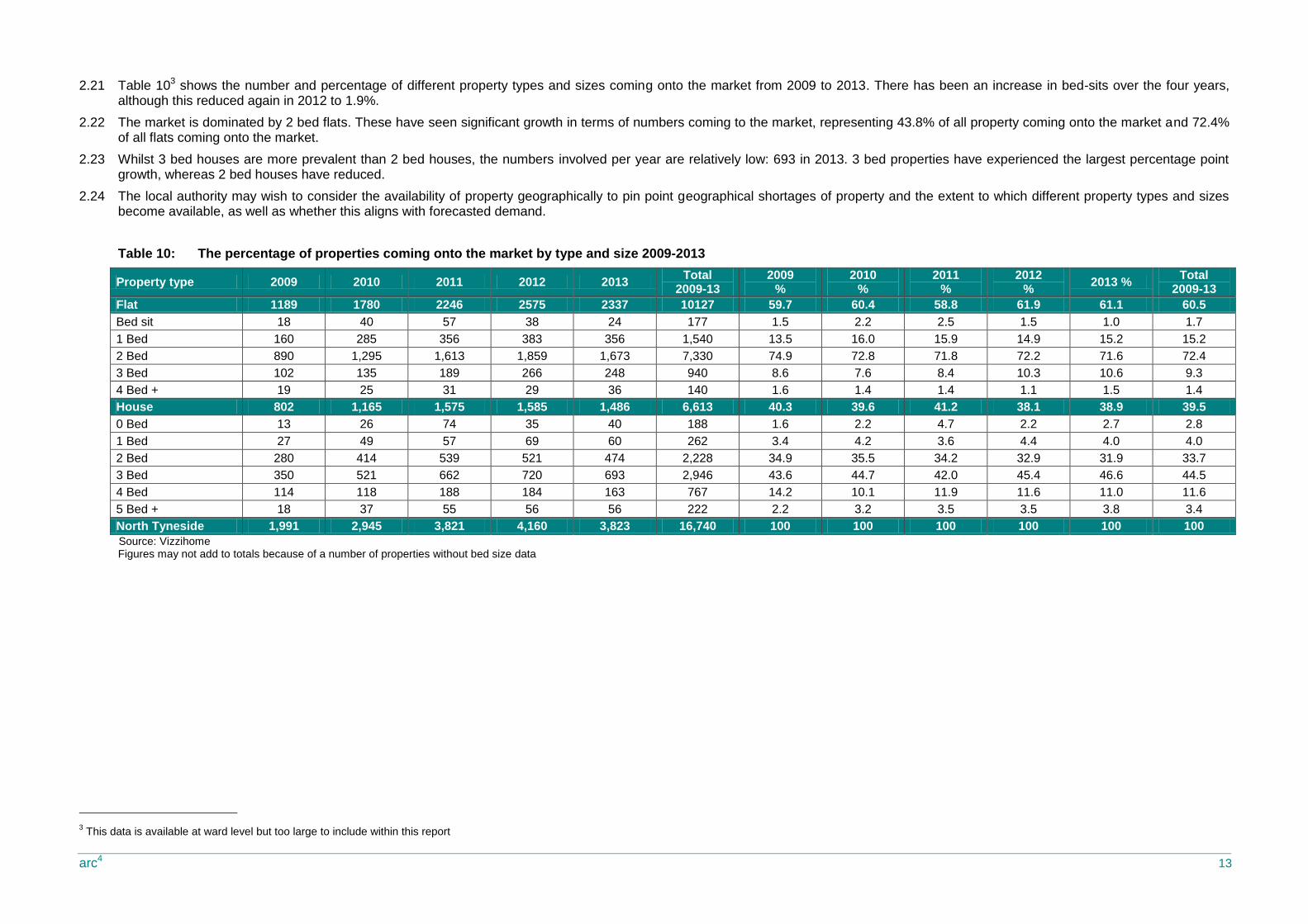
2.21 Table 103 shows the number and percentage of different property types and sizes coming onto the market from 2009 to 2013. There has been an increase in bed-sits over the four years, although this reduced again in 2012 to 1.9%.
2.22 The market is dominated by 2 bed flats. These have seen significant growth in terms of numbers coming to the market, representing 43.8% of all property coming onto the market and 72.4% of all flats coming onto the market.
2.23 Whilst 3 bed houses are more prevalent than 2 bed houses, the numbers involved per year are relatively low: 693 in 2013. 3 bed properties have experienced the largest percentage point growth, whereas 2 bed houses have reduced.
2.24 The local authority may wish to consider the availability of property geographically to pin point geographical shortages of property and the extent to which different property types and sizes become available, as well as whether this aligns with forecasted demand.
Table 10: The percentage of properties coming onto the market by type and size 2009-2013
Property type 2009 2010 2011 2012 2013 Total
2009-13 2009
% 2010
% 2011
% 2012
% 2013 %
Total 2009-13
Flat 1189 1780 2246 2575 2337 10127 59.7 60.4 58.8 61.9 61.1 60.5
Bed sit 18 40 57 38 24 177 1.5 2.2 2.5 1.5 1.0 1.7
1 Bed 160 285 356 383 356 1,540 13.5 16.0 15.9 14.9 15.2 15.2
2 Bed 890 1,295 1,613 1,859 1,673 7,330 74.9 72.8 71.8 72.2 71.6 72.4
3 Bed 102 135 189 266 248 940 8.6 7.6 8.4 10.3 10.6 9.3
4 Bed + 19 25 31 29 36 140 1.6 1.4 1.4 1.1 1.5 1.4
House 802 1,165 1,575 1,585 1,486 6,613 40.3 39.6 41.2 38.1 38.9 39.5
0 Bed 13 26 74 35 40 188 1.6 2.2 4.7 2.2 2.7 2.8
1 Bed 27 49 57 69 60 262 3.4 4.2 3.6 4.4 4.0 4.0
2 Bed 280 414 539 521 474 2,228 34.9 35.5 34.2 32.9 31.9 33.7
3 Bed 350 521 662 720 693 2,946 43.6 44.7 42.0 45.4 46.6 44.5
4 Bed 114 118 188 184 163 767 14.2 10.1 11.9 11.6 11.0 11.6
5 Bed + 18 37 55 56 56 222 2.2 3.2 3.5 3.5 3.8 3.4
North Tyneside 1,991 2,945 3,821 4,160 3,823 16,740 100 100 100 100 100 100
Source: Vizzihome Figures may not add to totals because of a number of properties without bed size data
3 This data is available at ward level but too large to include within this report
arc4 14
Rent levels
2.25 Table 11 shows the average rent levels for properties coming onto the market in each sub area between 2009 and 2013. It then shows the percentage increases in rents year on year, and the overall percentage increase from 2009 to 2013.
2.26 The average rent for a property in North Tyneside in 2013 was £564 pcm. Since 2009, average rents in North Tyneside have increased by 4.5%.
2.27 The overall figures mask geographical differences. The highest rent increase was in sub market 7. This sub area has lower than average property values and relatively low proportions of private rented sector and lower levels of growth in terms of the percentage of properties coming onto the market. Given the low property values, it is likely that this market provides accommodation for households living in the private rented sector as an extension of the social rented sector.
2.28 In the sub markets where rent levels reduced or increased by a relatively small amount, there was a mix of property values, although all property values were below the local authority average. In sub market 1 and 2 where the average property values are high, rent level increases have been consistent over the past 5 years.
Table 11: Average rent levels
Market sub area 2009 £pcm
2010 £pcm
2011 £pcm
2012 £pcm
2013 £pcm
Total £pcm
% change 2009-2010
% change 2010-2011
% change 2011-2012
% change 2012-13
% change 2009-2013
1 £578 £603 £612 £609 £637 £610 4.2 1.6 -0.5 4.5 10.1
2 £651 £652 £671 £659 £690 £666 0.1 3.0 -1.9 4.8 6.1
3 £527 £536 £533 £556 £562 £545 1.6 -0.5 4.3 1.1 6.6
4 £454 £459 £476 £497 £480 £477 1.0 3.9 4.2 -3.4 5.6
5 £482 £480 £487 £491 £480 £484 -0.5 1.5 0.8 -2.2 -0.4
6 £589 £569 £599 £636 £609 £604 -3.4 5.3 6.2 -4.2 3.4
7 £517 £536 £538 £572 £594 £556 3.7 0.3 6.3 3.8 14.7
8 £623 £594 £643 £604 £670 £627 -4.6 8.1 -6.0 10.8 7.5
9 £550 £565 £539 £554 £569 £556 2.7 -4.5 2.7 2.8 3.5
North Tyneside £539 £545 £556 £565 £564 £556 1.0 2.2 1.6 -0.3 4.5
Source: Vizzihome
arc4 15
Average rent levels and rented stock
-10
0
10
20
30
40
50
60
1 2 3 4 5 6 7 8 9
N T
ynes
ide
rent change 2012-13
no of properties coming onto the market as a percentage of all private rented stock
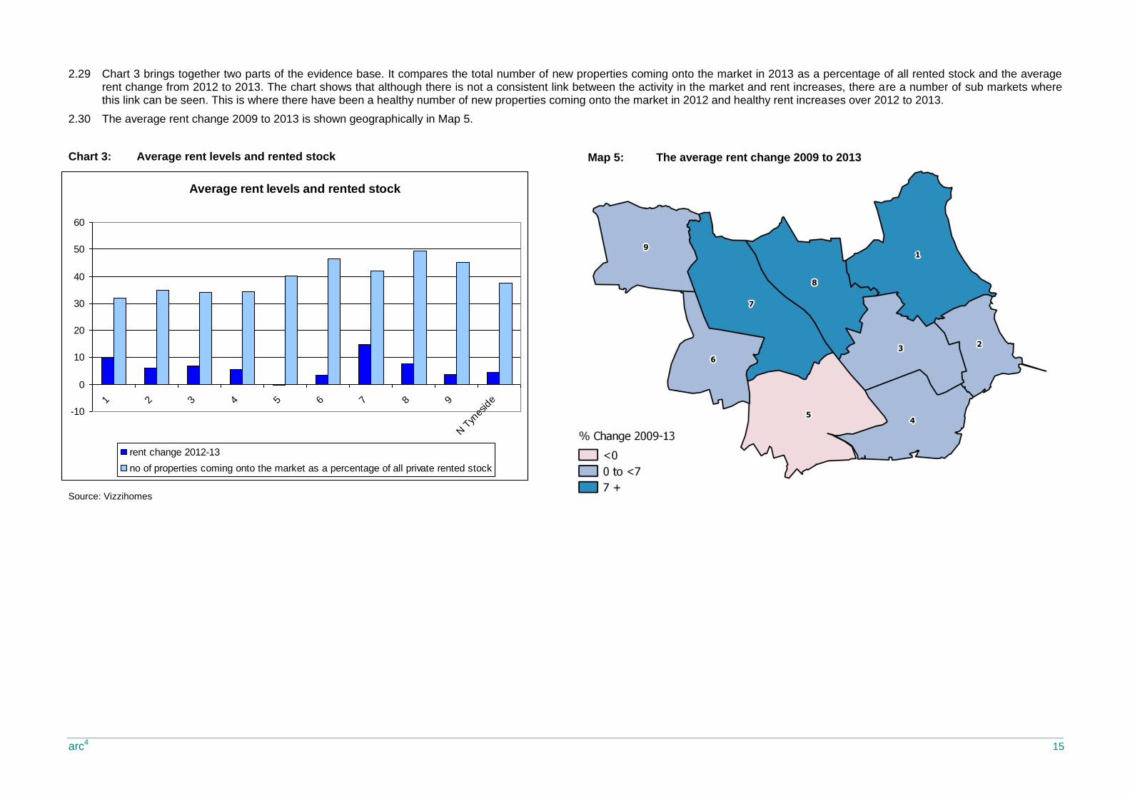
2.29 Chart 3 brings together two parts of the evidence base. It compares the total number of new properties coming onto the market in 2013 as a percentage of all rented stock and the average rent change from 2012 to 2013. The chart shows that although there is not a consistent link between the activity in the market and rent increases, there are a number of sub markets where this link can be seen. This is where there have been a healthy number of new properties coming onto the market in 2012 and healthy rent increases over 2012 to 2013.
2.30 The average rent change 2009 to 2013 is shown geographically in Map 5.
Chart 3: Average rent levels and rented stock
Source: Vizzihomes
Map 5: The average rent change 2009 to 2013
arc4 16
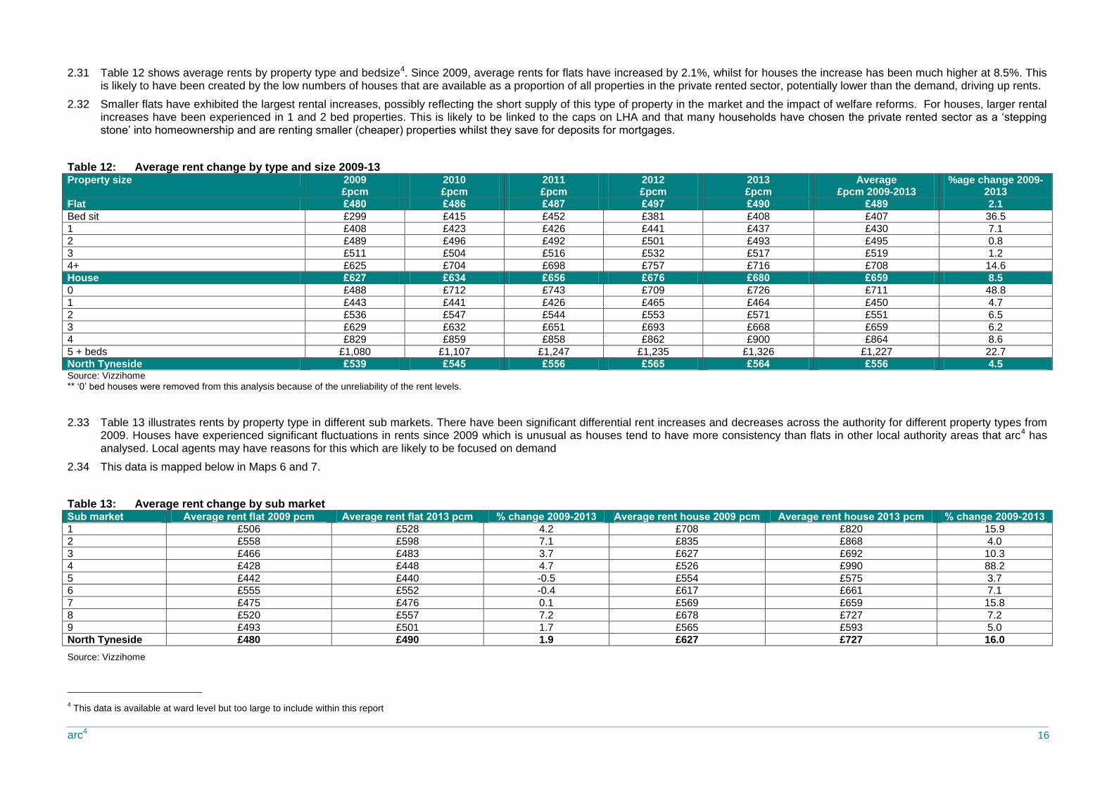
2.31 Table 12 shows average rents by property type and bedsize4. Since 2009, average rents for flats have increased by 2.1%, whilst for houses the increase has been much higher at 8.5%. This is likely to have been created by the low numbers of houses that are available as a proportion of all properties in the private rented sector, potentially lower than the demand, driving up rents.
2.32 Smaller flats have exhibited the largest rental increases, possibly reflecting the short supply of this type of property in the market and the impact of welfare reforms. For houses, larger rental increases have been experienced in 1 and 2 bed properties. This is likely to be linked to the caps on LHA and that many households have chosen the private rented sector as a ‘stepping stone’ into homeownership and are renting smaller (cheaper) properties whilst they save for deposits for mortgages.
Table 12: Average rent change by type and size 2009-13 Property size 2009
£pcm 2010 £pcm
2011 £pcm
2012 £pcm
2013 £pcm
Average £pcm 2009-2013
%age change 2009-2013
Flat £480 £486 £487 £497 £490 £489 2.1
Bed sit £299 £415 £452 £381 £408 £407 36.5
1 £408 £423 £426 £441 £437 £430 7.1
2 £489 £496 £492 £501 £493 £495 0.8
3 £511 £504 £516 £532 £517 £519 1.2
4+ £625 £704 £698 £757 £716 £708 14.6
House £627 £634 £656 £676 £680 £659 8.5
0 £488 £712 £743 £709 £726 £711 48.8
1 £443 £441 £426 £465 £464 £450 4.7
2 £536 £547 £544 £553 £571 £551 6.5
3 £629 £632 £651 £693 £668 £659 6.2
4 £829 £859 £858 £862 £900 £864 8.6
5 + beds £1,080 £1,107 £1,247 £1,235 £1,326 £1,227 22.7
North Tyneside £539 £545 £556 £565 £564 £556 4.5 Source: Vizzihome ** ‘0’ bed houses were removed from this analysis because of the unreliability of the rent levels.
2.33 Table 13 illustrates rents by property type in different sub markets. There have been significant differential rent increases and decreases across the authority for different property types from 2009. Houses have experienced significant fluctuations in rents since 2009 which is unusual as houses tend to have more consistency than flats in other local authority areas that arc4 has analysed. Local agents may have reasons for this which are likely to be focused on demand
2.34 This data is mapped below in Maps 6 and 7.
Table 13: Average rent change by sub market Sub market Average rent flat 2009 pcm Average rent flat 2013 pcm % change 2009-2013 Average rent house 2009 pcm Average rent house 2013 pcm % change 2009-2013
1 £506 £528 4.2 £708 £820 15.9
2 £558 £598 7.1 £835 £868 4.0
3 £466 £483 3.7 £627 £692 10.3
4 £428 £448 4.7 £526 £990 88.2
5 £442 £440 -0.5 £554 £575 3.7
6 £555 £552 -0.4 £617 £661 7.1
7 £475 £476 0.1 £569 £659 15.8
8 £520 £557 7.2 £678 £727 7.2
9 £493 £501 1.7 £565 £593 5.0
North Tyneside £480 £490 1.9 £627 £727 16.0
Source: Vizzihome
4 This data is available at ward level but too large to include within this report

arc4 17
Map 6: The percentage change of rent levels for flats 2009-2013 xx
Map 7: The percentage change of rent levels for houses 2009-2013

arc4 18
The percentage of properties within LHA caps 2009-2013
0
5
10
15
20
25
30
35
40
45
50
2009 2010 2011 2012 2013 2009-2013
Bed sit 1 2 3 4 5+ North Tyneside
Affordability
2.35 We have considered two types of affordability in North Tyneside. The affordability for households dependent on Local Housing Allowance and the affordability for economically active households.
2.36 We have reviewed all of the properties that came onto the market in each year from 2009 to 2013 (16,740) and compared the rent levels with the Local Housing Allowance caps for North Tyneside. We have then recorded the number of properties that were available within the LHA caps by bed size and expressed this as a percentage of all of that property type available. The results are shown in Table 14.5
2.37 Since 2009, only 19.8% of all properties coming to the market have been within the Local Housing Allowance caps. This increases to 37.7% for one bed properties but only 18.4%, 17.3% and 18% for 2, 3 and 4 bed properties respectively. It may be that landlords set rents ‘slightly’ above this level assuming that tenants will pay a ‘small’ amount toward the rent themselves. Further analysis may be required and discussions with local letting agents to confirm whether this is the case.
2.38 During the four year period, only twenty-five bed-sits/shared rooms were available within Local Housing Allowance levels, representing 6.8% of all properties. It is very likely that this type of property is available but not advertised through letting agents, but given that, it is also likely that it is of a lower quality and management standard than properties let through managing agents.
Table 14: Affordability by property size Bedsize 2009 2010 2011 2012 2013 2009-2013
No % No % No % No % No % No %
Bed sit 3 9.7 13 19.7 4 3.1 5 6.8 0 0.0 25 6.8
1 86 46.0 134 40.1 170 41.2 143 31.6 146 35.1 679 37.7
2 252 21.5 333 19.5 417 19.4 467 19.6 292 13.6 1761 18.4
3 106 23.5 128 19.5 140 16.5 181 18.4 117 12.4 672 17.3
4 26 20.6 23 16.9 41 19.2 31 15.0 36 18.7 157 18.0
5+ 6 24.0 4 9.1 6 9.8 4 6.3 5 8.1 25 9.8
North Tyneside 479 24.1 635 21.6 778 20.4 831 20.0 596 15.6 3,319 19.8 Source: Vizzihomes
2.39 Chart 4 illustrates the changing affordability levels for properties. Since 2009, there has been a reduction in the number of properties coming onto the market within the LHA caps and therefore choice has reduced for households dependent on LHA; this is most noticeable for smaller and larger properties.
Chart 4: The percentage of properties within LHA caps 2009-2013
Source: Vizzihomes
5 LHA Caps were only introduced in 2011 but for the purposes of this report we have assumed they have always been in place.

arc4 19
2.40 The LHA caps are forecast to increase by 1% in 2014 and 2015. Given overall previous rent increases, North Tyneside would continue to see a reduced proportion of properties affordable within LHA caps. However, because the rent increases vary in different locations it is likely that the North Tyneside market will become more polarised between properties managed within LHA and those for economically active households.
2.41 Table 15 illustrates the monthly and annual net income levels that would be required to rent a property in each sub market, if the rent accounted for 30% of household income. The rent levels are based on 2013 figures when lower quartile annual gross income was £18,392 and the average annual gross income was £26,3846.
2.42 There were no areas where households on lower quartile net incomes could afford average rent levels unless that used over 30% of their household income, although sub market 5 was relatively affordable.
2.43 All households earning average household earnings could afford average rent levels in the majority of areas within the 30% household income definition7.
2.44 The least affordable was sub market 2 and the most affordable was 5, based on average rents.
2.45 Table 16 shows the monthly and annual gross income levels that would be required to rent different property sizes. The rent levels are based on 2013 figures when lower quartile annual gross income was £18,392 and the average annual gross income was £26,3848. Households on lower quartile earnings could only afford bed-sits, one bed flats and houses, based on a definition of spending up to 30% of household income on rent. For average earnings, larger properties, consisting of three beds or more, can become unaffordable based on average rent levels9.
Table 15: Income versus rental by sub market
Sub market 2013 average rent levels £ pcm
Monthly Income required for rent to be within 30% of household net income
Annual net income
Rent that would be affordable for lower quartile income
Property size 2013 average rent levels pcm
Monthly Income required for rent to be within 30% of household gross income
Annual Gross income
Rent that would be affordable for lower quartile income
1 £637 £2,122 £25,468 £459 Flat £490 £1,633 £19,600 £459
2 £690 £2,301 £27,607 £459 0 £408 £1,360 £16,320 £459
3 £562 £1,873 £22,475 £459 1 £437 £1,457 £17,480 £459
4 £575 £1,918 £23,013 £459 2 £493 £1,643 £19,720 £459
5 £480 £1,600 £19,200 £459 3 £517 £1,723 £20,680 £459
6 £609 £2,031 £24,374 £459 4 + beds £716 £2,387 £28,640 £459
7 £594 £1,979 £23,743 £459 House £727 £2,423 £29,080 £459
8 £670 £2,232 £26,784 £459 1 £464 £1,547 £18,560 £459
9 £569 £1,898 £22,779 £459 2 £571 £1,903 £22,840 £459
North Tyneside £582 £1,940 £23,276 £459 3 £668 £2,227 £26,720 £459
Source: Vizzihomes, annual survey of hours and earnings - resident analysis ONS Crown Copyright Reserved [from Nomis on 6 January 2014]
4 £900 £3,000 £36,000 £459
5+ beds £1,326 £4,420 £53,040 £459
North Tyneside £582 £1,940 £23,276 £459
Source: Vizzihome
6 Annual survey of hours and earnings - resident analysis ONS Crown Copyright Reserved [from Nomis on 6 January 2014]
7 Averages will mask local geographical differences
8 ONS Crown Copyright Reserved
9 Averages will mask local geographical differences
Table 16: Income versus rental by property type and size
arc4 20
Properties let
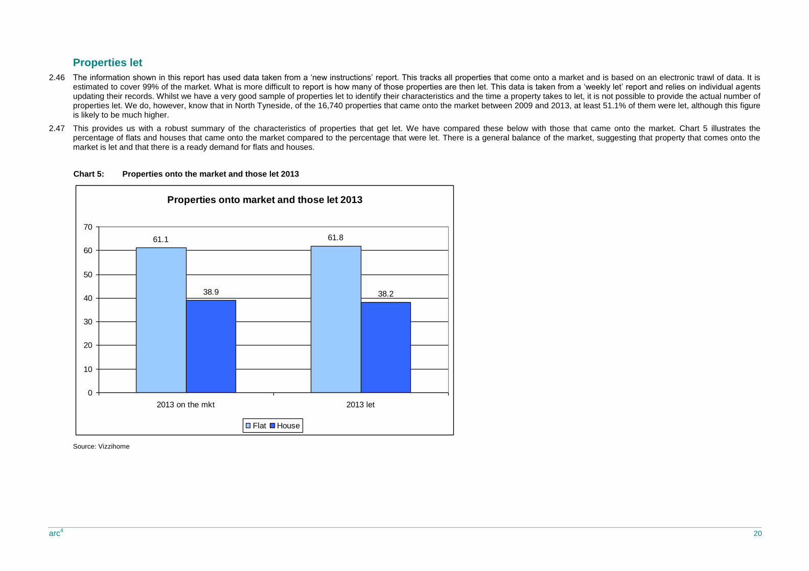
2.46 The information shown in this report has used data taken from a ‘new instructions’ report. This tracks all properties that come onto a market and is based on an electronic trawl of data. It is estimated to cover 99% of the market. What is more difficult to report is how many of those properties are then let. This data is taken from a ‘weekly let’ report and relies on individual agents updating their records. Whilst we have a very good sample of properties let to identify their characteristics and the time a property takes to let, it is not possible to provide the actual number of properties let. We do, however, know that in North Tyneside, of the 16,740 properties that came onto the market between 2009 and 2013, at least 51.1% of them were let, although this figure is likely to be much higher.
2.47 This provides us with a robust summary of the characteristics of properties that get let. We have compared these below with those that came onto the market. Chart 5 illustrates the percentage of flats and houses that came onto the market compared to the percentage that were let. There is a general balance of the market, suggesting that property that comes onto the market is let and that there is a ready demand for flats and houses.
Chart 5: Properties onto the market and those let 2013
Source: Vizzihome
Properties onto market and those let 2013
61.1 61.8
38.9 38.2
0
10
20
30
40
50
60
70
2013 on the mkt 2013 let
Flat House
arc4 21
Rent differentials
2.48 The rent that a property is advertised at and the rent it is let at can often be different. It may demonstrate a market pressure if rents are being negotiated up, or an oversupply if rents are successfully negotiated down.
2.49 Chart 6 below illustrates the percentage differences in rental property coming onto the market and those let. It is difficult to draw conclusions from this chart; given the significant proportion of flats coming onto the market compared to houses, one may expect to see some rents for flats being negotiated downwards. However, this is not the case. Likewise, the lower proportions of houses coming onto the market would suggest that one may expect to see rent negotiated upwards, but again the chart suggests the opposite. This data needs to be discussed with local letting agents and potentially analysed by location to try to understand the trends the data is showing.
Chart 6: Rent differentials
Source: Vizzihome
Rent differentials property onto the market and property let
2009-2013
0
10
20
30
40
50
60
Flat 0 1 2 3 4
Hous
e 1 2 3 4 5
N T
ynes
ide
on the mkt 2009-13 let 2009-13
arc4 22
Time to let property
2.50 The time to let a property can indicate how popular a particular property type is, how popular an area is, or whether a property is in good condition. It can also indicate an undersupply/oversupply of a particular property type. The time to let a property is a very useful measure of the health of the rental market. This section considers how long it took for property to be let after coming onto the market.
2.51 Table 17 shows the average time (in weeks) to let a property in each of the years 2009-2013 by sub market, and shows the percentage change in the number of weeks, year on year and overall from 2009 to 2013. Between 2009 and 2013, the average time it took to let a property in North Tyneside was 10.1 weeks. However, during 2012 and 2013 this time reduced significantly; during 2013, the average time to let a property was 7.3 weeks. This includes any notice period, which is likely to be four weeks or one calendar month, and so it can be concluded that property is letting relatively quickly.
2.52 Since 2009, the time to let a property has reduced by 60.4%. This reduction is reflected in nearly all sub markets. The sub market where the time to let has reduced the most as a percentage is sub market 2, and the least is sub market 7. However, sub market 2 began from a high number of weeks to let in 2009 at 25.3 and sub market 7 continues to let at a time frame below the local authority average. These results would suggest that there has been an increased demand for properties in the private rented sector over the past few years.
Table 17: Average time to let by sub market
Time in weeks
Sub market 2009 2010 2011 2012 2013 Average % age
change 2009-10
% age change 2010-11
% age change 2011-12
% age change 2012-13
%age change
2009-2013
1 19.0 17.5 10.8 6.3 6.6 10.4 -7.5 -38.4 -42.0 5.0 -65.3
2 25.3 20.4 9.4 5.9 6.4 10.3 -19.5 -53.9 -37.4 8.3 -74.9
3 21.5 19.0 8.5 8.8 7.8 10.8 -11.6 -55.2 3.7 -11.4 -63.7
4 30.4 26.8 16.2 7.7 8.2 13.6 -12.0 -39.6 -52.3 6.3 -73.1
5 15.7 18.7 14.3 9.3 8.3 11.1 18.9 -23.5 -34.8 -10.4 -46.9
6 7.3 5.5 8.0 5.9 6.8 6.6 -24.9 45.2 -26.6 15.1 -7.8
7 6.8 7.9 7.2 7.3 7.1 7.3 15.6 -9.3 1.5 -2.7 3.5
8 12.6 9.0 8.8 6.3 6.4 7.7 -28.6 -1.8 -29.0 2.8 -48.8
9 14.0 11.7 7.7 8.2 6.9 9.0 -16.3 -34.5 7.0 -15.5 -50.5
North Tyneside
18.5 15.8 10.8 7.2 7.3 10.1 -14.9 -31.5 -32.8 1.1 -60.4
Source: Vizzihomes
Map 8: The average time to let a property in 2013
arc4 23
Rental yields
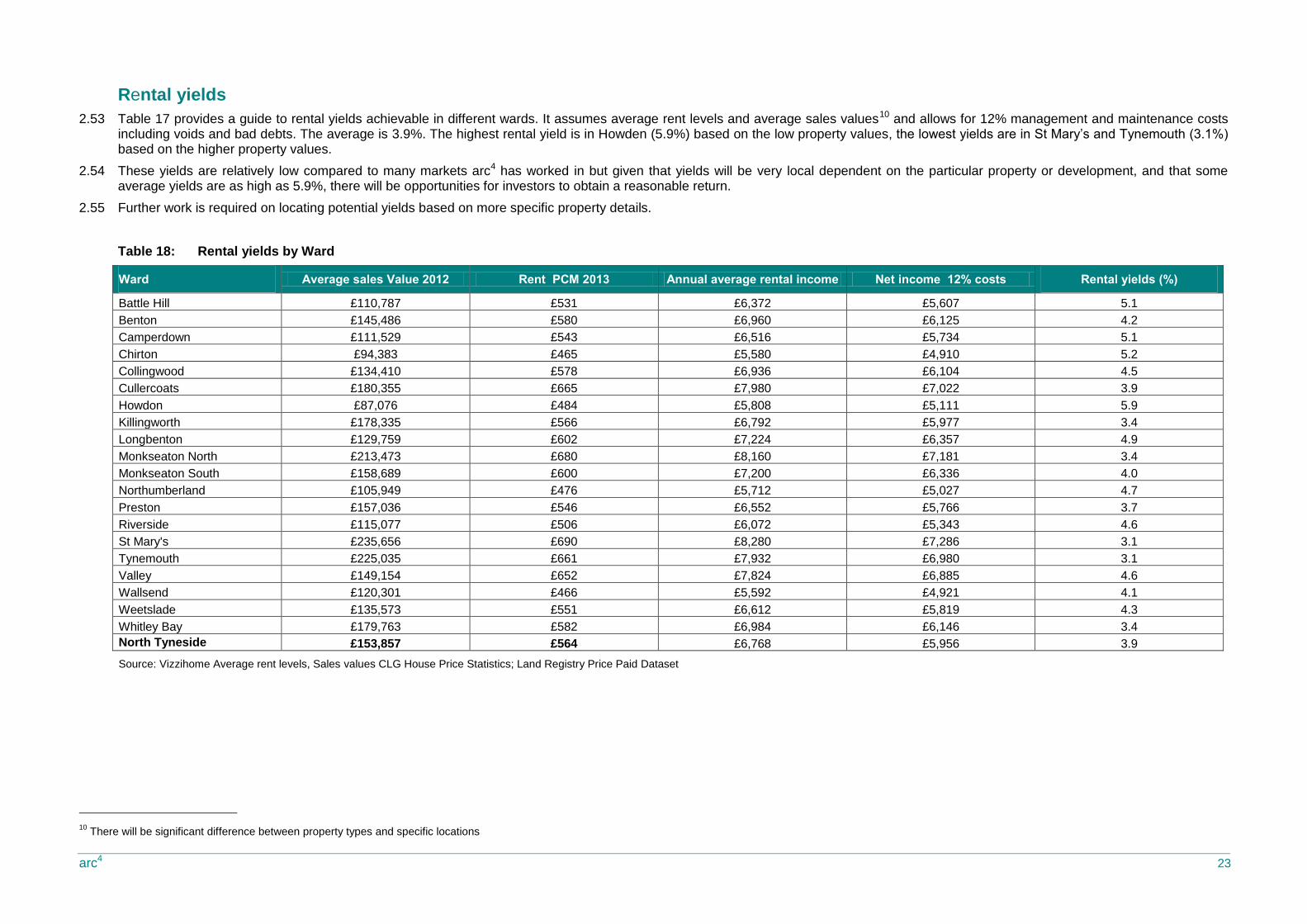
2.53 Table 17 provides a guide to rental yields achievable in different wards. It assumes average rent levels and average sales values10 and allows for 12% management and maintenance costs including voids and bad debts. The average is 3.9%. The highest rental yield is in Howden (5.9%) based on the low property values, the lowest yields are in St Mary’s and Tynemouth (3.1%) based on the higher property values.
2.54 These yields are relatively low compared to many markets arc4 has worked in but given that yields will be very local dependent on the particular property or development, and that some average yields are as high as 5.9%, there will be opportunities for investors to obtain a reasonable return.
2.55 Further work is required on locating potential yields based on more specific property details.
Table 18: Rental yields by Ward
Ward Average sales Value 2012 Rent PCM 2013 Annual average rental income Net income 12% costs Rental yields (%)
Battle Hill £110,787 £531 £6,372 £5,607 5.1
Benton £145,486 £580 £6,960 £6,125 4.2
Camperdown £111,529 £543 £6,516 £5,734 5.1
Chirton £94,383 £465 £5,580 £4,910 5.2
Collingwood £134,410 £578 £6,936 £6,104 4.5
Cullercoats £180,355 £665 £7,980 £7,022 3.9
Howdon £87,076 £484 £5,808 £5,111 5.9
Killingworth £178,335 £566 £6,792 £5,977 3.4
Longbenton £129,759 £602 £7,224 £6,357 4.9
Monkseaton North £213,473 £680 £8,160 £7,181 3.4
Monkseaton South £158,689 £600 £7,200 £6,336 4.0
Northumberland £105,949 £476 £5,712 £5,027 4.7
Preston £157,036 £546 £6,552 £5,766 3.7
Riverside £115,077 £506 £6,072 £5,343 4.6
St Mary's £235,656 £690 £8,280 £7,286 3.1
Tynemouth £225,035 £661 £7,932 £6,980 3.1
Valley £149,154 £652 £7,824 £6,885 4.6
Wallsend £120,301 £466 £5,592 £4,921 4.1
Weetslade £135,573 £551 £6,612 £5,819 4.3
Whitley Bay £179,763 £582 £6,984 £6,146 3.4
North Tyneside £153,857 £564 £6,768 £5,956 3.9
Source: Vizzihome Average rent levels, Sales values CLG House Price Statistics; Land Registry Price Paid Dataset
10
There will be significant difference between property types and specific locations
arc4 24
3. In summary and conclusion
3.1 This report has provided detailed information about the private rented market in North Tyneside since 2009.
Total stock
3.2 The Census 2011 confirms that there are 10,146 (11.1%) households living in the private rented sector (private landlord/ letting agent) in North Tyneside; this is lower than the national figure of 18.1%. The highest percentage is in Wallsend (22.8%) and the lowest St Mary’s (4.1%).
3.3 There are six wards where the private rented sector is larger than the social rented sector, and these are Monkseaton North, Preston, St Mary’s, Tynemouth, Wallsend and Whitley Bay. In terms of numbers of units, Riverside has the largest private rented sector (1,219) and St Mary’s has the smallest (146).
3.4 Overall, the private rented sector has increased by 5.3 percentage points to 11.13%, an overall increase of 91.4% since 2001?. As a result, both the owner occupied sectors and social rented sectors have reduced although the biggest percentage reduction has been in the social sector with relatively small reductions in owner occupation.
3.5 The sector is relatively well distributed in both higher and lower value areas. There are seven wards where the percentage of the stock in the private rented sector is above the North Tyneside average. Of these, four have average property values that are below the North Tyneside average, whilst three have values above. The private rented sector clearly plays a role in providing accommodation for both economically active private renters, and by extension, to the social rented sector.
Properties on the market
3.6 Overall, the total number of properties coming onto the market has increased from 1,991 in 2009 to 3,823 in 2013; an increase of 1,832 or 92%. The total number coming onto the market has increased year on year to a peak of 4,160 in 2012 and 2013 seeing a reduction to 3,823.
3.7 All in all, the number of properties coming onto the market as a percentage of the total stock (as taken from the Census 2011) has increased over the past three years, and in 2013 represented 37.7% of the total private rented stock. This is at similar levels to other local authorities where arc4 has undertaken a private rented evidence base. These figures are likely to be even higher, as this data does not capture property let through word of mouth or through local routes, such as local newspaper advertising. The private rented sector is a relatively high turnover sector.
3.8 The number of flats that have come onto the market has increased from 2009 but the proportion of flats has generally remained the same at around 60%. This is a much higher proportion of flats coming onto the market than arc4 sees in other local authorities, where the norm is around 30%. Over the past five years, 39.5% of properties coming onto the market are houses.
3.9 There is limited choice in the private rented market for families. Two bed properties dominate the market and represent 57.12% of all properties brought to the market since 2009, and three bed properties account for 23.2% of all properties. There are also very few smaller or larger properties; only 2.2% of all properties brought onto the market in the past four years have been bed-sits and only 6.7% have over 4 beds. Interestingly the number of smaller units, bed-sits and one bed properties that have come onto the market has increased in the past few years, potentially as a response to the LHA benefit caps.
3.10 This property offer is likely to create shortages of property for households affected by the shared room rate or looking for smaller accommodation and also limits options for growing families reliant on the private rented sector, particularly as such a high proportion of these properties are flats rather than houses.
3.11 The market is dominated by 2 bed flats, and this has seen significant growth in terms of numbers coming to the market. It represents 43.8% of all property coming onto the market and 72.4% of all flats coming onto the market.
3.12 Whilst 3 bed houses are more prevalent than 2 beds, the numbers available per year are relatively low: 693 in 2013. Three bed properties have experienced the largest percentage point growth, whereas two bed properties have reduced in percentage.
3.13 The local authority may wish to consider the availability of property geographically to pin point shortages of property in an area, the extent to which different property types and sizes become available and whether this aligns with forecasted demand.
arc4 25
Rent levels
3.14 The average rent for a property in North Tyneside in 2013 was £564 pcm. Since 2009, average rents in North Tyneside have increased by 4.5%.
3.15 The overall figures mask geographical differences. The highest rent increase was in sub market 7. This sub area has lower than average property values and relatively low proportions of private rented sector and lower levels of growth in terms of the percentage of properties coming onto the market. Given the low property values, it is likely that this market provides accommodation for households living in the private rented sector as an extension of the social rented sector.
3.16 In the sub markets where rent levels reduced or increased by a relatively small amount, there was a mix of property values, although all property values were below the local authority average. In sub market 1 and 2 where the average property values are high, rent level increases have been consistent over the past 5 years.
Affordability
3.17 Since 2009, only 19.8% of all properties coming onto the market have been within the Local Housing Allowance caps. This increases to 37.7% for one bed properties but only 18.4%, 17.3% and 18% for 2, 3 and 4 bed properties respectively. It may be that landlords set rents ‘slightly’ above this level assuming that tenants will pay a ‘small’ amount toward the rent themselves. Further analysis may be required and discussions with local letting agents to confirm whether this is the case.
3.18 During the four year period 2009 - 2013, only twenty-five bed-sits/shared rooms were available within Local Housing Allowance levels, representing 6.8% of all property. It is very likely that this type of property is available but not advertised through letting agents. However, it is also likely that it is of a lower quality and management standard than properties let through managing agents.
3.19 The LHA caps are forecast to increase by 1% in 2014 and 2015. Therefore, previous rent increases in North Tyneside would continue to see a reduced proportion of properties affordable within LHA caps. However, because the rent increases vary in different locations it is likely that the North Tyneside market will become more polarised between properties managed within LHA and those for economically active households.
3.20 This will create limited choices and geographies for households dependent on local housing allowance. It is likely to worsen, as local housing allowance is limited further through new government policy. Overall, the sector is low income and so the impact of welfare reforms will be significant. This may mean that:
o Landlords will leave the sector by choice or be forced to, if their properties are repossessed.
o Tenants may face illegal evictions.
o Homelessness presentations may increase.
o Landlords may be unable to afford to maintain their properties.
o There may be increased exported costs as a result of poor health and injury in the private rented sector as homes are not maintained and/or tenants cannot afford to heat them etc. This will impact on regional and local support services.
o The potential polarisation of the private rented sector into very poor quality and good quality, lower and higher rent levels.
3.21 There were no areas where households on lower quartile net incomes could afford average rent levels unless they used over 30% of their household income, although sub market 5 was relatively affordable. All households earning average household earnings could afford average rent levels in the majority of areas within the 30% household income definition. The least affordable was sub market 2 and the most affordable was sub market 5 based on average rents.
Property let
3.22 There is a general balance of the market between those property types that come onto the market and those let.
Time to let a property
3.23 Over 2009 to 2013, the average time it took to let property in North Tyneside was 10.1 weeks. However, during 2012 and 2013 this time reduced significantly, and during 2013, the average time to let property was 7.3 weeks. This includes any notice period, which is likely to be four weeks or one calendar month and so property is letting relatively quickly.
arc4 26
3.24 Since 2009, the time to let property has reduced by 60.4%. This reduction is reflected in nearly all sub markets. The sub market where the time to let has reduced the most as a percentage is sub market 2, and the least is sub market 7. However, sub market 2 began from a high number of weeks to let in 2009 (25.3) and sub market 7 continues to let at a time frame below the local authority average. These results would suggest that there has been an increased demand for properties in the private rented sector over the past few years.
Rental yields
3.25 The average yield is 3.9%. The highest rental yield is in Howden (5.9%) based on the low property values, the lowest yields are in St Mary’s and Tynemouth (3.1%) based on higher property values.
3.26 These yields are relatively low compared to many markets arc4 has worked in, but given that yields will be very local dependent on the particular property or development, and that some average yields are as high as 5.9%, there will be opportunities for investors to obtain a reasonable return. Further work is required on locating potential yields based on more specific property details.