207 - web designer - 2013
DESCRIPTION
css3 html5 webdesignTRANSCRIPT


f you’re looking to spice up your
next web project with impressive 3D
graphics and animations you’ll find
some great options available to you.
In the past you would have looked to
the likes of Flash or Shockwave to
serve your needs, but this required
the use of expensive authoring tools
and was reliant on obstructive plug-ins to get it up and
running. Thanks to the onward march of technology,
though, the bandwidth and graphics hardware required
to do it natively within the browser is widely available,
meaning you can kick Flash into touch and show
Shockwave the door. Turn to pages 40-49 to see how
you can create out of this word 3D e� ects for your web
designs using HTML5 Canvas and WebGL – it’s easier to
get started than you might think.
You might notice we’re making a few small changes
to the magazine to o� er you more tutorials and bigger
features. While we hope you like the changes we’ve
made so far, we have a few other tweaks and updates
planned over the coming issues so feel free to use it as
an opportunity to get your opinion heard. What
content do you like? What would you like to see more
of in future issues? Let us know by emailing us and
we’ll add your comments to the pool of ideas we’re
currently working on.
Enjoy the magazine!
WebGL ousts Shockwave in a Flash
Welcometo the issue
THE WEB DESIGNER MISSIONTo be the most accessible and
inspiring voice for the industry, offering cutting-edge features
and techniques vital tobuilding future-proof
online content
to the issue
Russell Barnes
ExcitographicPlotting the features that got us in a frenzy over the month…
Steve Jenkins, Features Editor
Russell Barnes, Editor
William Shum, Designer
Ben Martin, Sub Editor
Ras
pb
erry
Pi
Mo
del
A
Th
e n
ew S
lack
er
jQu
ery
Mo
bile
1.3
fo
r R
WD
Fro
m F
ollo
w
Fun
ctio
n
exp
erim
ents
HTC
On
e
Go
og
le W
eb F
on
ts
effe
cts
YouT
ub
e ch
ann
el
red
esig
n
Res
po
nsi
ve
typ
og
rap
hy
“ We were free to innovate in ways that would make other clients uncomfortable ”Fantasy Interactive walk us through the process of rebranding the USA Today website to mark the paper’s 30th anniversary.Page 22
“ Create out of this world 3D effects for your web designs – it’s easier to get started than you might think ”Follow us on Twitter for all the news & conversation @WebDesignerMag
Visit our blog for opinion, freebies & more www.webdesignermag.co.uk
Highlight
Turn over to the contents to discover what’s going to get you excited this issue…
meta _________________________________________________________________________ 3
<meta>welcome
I
“It’s the perfect tool for the Internet Of Things”
“You mean there’s more than one slacker here?!”
SXSW
In
tera
ctiv
e 20
13

4 __________________________________________________________________________meta
<meta>contributors
Imagine Publishing LtdRichmond House, 33 Richmond HillBournemouth, Dorset, BH2 6EZ☎ +44 (0)1202 586200Web: www.imagine-publishing.co.uk www.webdesignermag.co.uk www.greatdigitalmags.com
Magazine teamEditor Russell [email protected]
☎ 01202 586272
Editor In Chief Dave Harfi eldFeatures Editor Steve [email protected]
☎ 01202 586233
Designer Will ShumSenior Sub Editor Adam MillwardSub Editor Ben MartinPhotographer James SheppardHead of Publishing Aaron AsadiHead of Design Ross AndrewsContributorsLora Barnes, Harry Brignull, Charlotte Crooks, Richard Elliot, Matt Gifford, Sam Hampton-Smith, David Howell, Alison Innes, Newton Ribeiro De Oliveira, Rachel Shemilt, Mark Shuf� ebottom, Pete Simmons, Adam Smith, Tim Stone, Jeffrey Way & Greg Whitaker
AdvertisingDigital or printed media packs are available on request.
Head of Sales Hang Deretz
☎ 01202 [email protected]
Advertising Manager Jennifer Farrell
☎ 01202 [email protected]
Account Manager Rhian Carter
☎ 01202 [email protected]
Cover discHead of Digital Mat Toor Digital Projects Co-ordinator Steven LittonMultimedia Editor Matt [email protected]
InternationalWeb Designer is available for licensing. Contact the International department to discuss opportunities.
Head of International Licensing Cathy Blackman
☎ +44 (0) 1202 [email protected]
SubscriptionsHead of Subscriptions Lucy [email protected]
To order a subscription to Web Designer:
☎ 0844 848 8413 ☎ +44 1795 592 878Email: [email protected] subscription (UK) – £62.3013-issue subscription (Europe) – £7013-issue subscription (ROW) – £80
CirculationHead of Circulation Darren Pearce
☎ 01202 586200
ProductionProduction Director Jane Hawkins
☎ 01202 586200
FoundersGroup Managing Director Damian ButtGroup Finance & Commercial Director Steven BoydGroup Creative Director Mark Kendrick
Printing & DistributionPrinted by Wyndeham Heron Ltd, Bentalls Complex, Colchester Road, Heybridge, Maldon, Essex CM9 4NW
Distributed in the UK & Eire by Seymour Distribution, 2 East Poultry Avenue, London, EC1A 9PT ☎ 0207 429 4000
Distributed in Australia by Gordon & Gotch, Equinox Centre, 18 Rodborough Road, Frenchs Forest, NSW 2086 ☎ 61 2 9972 8800
Distributed in Rest of the World by Marketforce, Blue Fin Building, 110 Southwark Street, London SE1 0SU ☎ 0203 148 8105
DisclaimerThe publisher cannot accept responsibility for any unsolicited material lost or damaged in the post. All text and layout is the copyright of Imagine Publishing Ltd. Nothing in this magazine may be reproduced in whole or part without the written permission of the publisher. All copyrights are recognised and used speci� cally for the purpose of criticism and review. Although the magazine has endeavoured to ensure all information is correct at time of print, prices and availability may change. This magazine is fully independent and not af� liated in any way with the companies mentioned herein.
© Imagine Publishing Ltd 2013
ISSN 1477-3534
A Web Designer stalwart and keen supporter of web standards, Sam has
run his own design business for the last twelve years. This issue he takes
the reins of web-based 3D graphics and animation, and demonstrates the
power of HTML5, CSS, Canvas and WebGL. Page 40
This issue’s panel of expertsWelcome to that bit of the mag where we learn more about the featured writers and contributors…
“ Sam takes the reins of web-based 3D graphics and animation ”
Gotweb skills?
We’re always looking for the hottest web-design talent. Email
[email protected] examples of your creative work
Mark ShufflebottomMark is the programme leader of BA Hons Digital Media Design at Bournemouth University. This issue he tackles the Bootstrap framework and shows how to style the framework to create a bespoke look. Page 56
Matt GiffordMatt Gifford is a lead RIA consultant developer and industry author who specialises in ColdFusion and mobile development. This issue he tackles the art of creating interactive maps for mobile devices using the Leaflet.js library. Page 94
Tim StoneTim Stone is a front-end developer who graduated with a first-class degree in Interactive Media Production. This issue he demonstrates how to create your own custom RSS feed from multiple sources using Node.js Page 64
Richard ElliotRichard has been working in the industry for the past six years and loves to use the latest technologies. This issue he demonstrates how to integrate an eCommerce solution into your Facebook page with the help of StoreYa. Page 90
Jeffrey WayJeffrey is a developer, evangelist, instructor and author who works for Envato. This issue he takes up the challenge of demystifying REST, with a practical insight into the principles of implementing web APIs Page 84
Harry Brignull
Adam SmithAdam is the resident Photoshop expert. He loves nothing better than to demonstrate how to recreate the latest graphic technique. This issue Adam reveals how to create great-looking infographics to show data on the web. Page 74
David HowellDavid has over 20 years of experience in the industry, and this issue we sent him to interview viral games designers KoKo Digital. He takes a peek behind the scenes, and discovers how they operate and the secret of viral marketing. Page 30
Sam Hampton-Smith
Harry is a senior UX designer at Clearleft. He designs user-centred websites which are easy to use. This issue he reveals the persuasive and subtle tricks and techniques, aka dark patterns, that web businesses use to boost their conversion rates. Page 76


CREATE OUT OF
THIS WORLD
EFFECTS WITH
HTML5
CREATE OUT OF
THIS WORLD
EFFECTS WITH
HTML5ININININ
6 __________________________________________________________________________meta
<meta>inside issue 207
contentsCutting-edge features, techniques and inspiration for web creatives
Chat with the team and other readers and discuss the latest tech, trends and techniques. Here’s how to stay in touch… [email protected] @WebDesignerMag www.webdesignermag.co.uk
8 IE wants you back Microsoft is making fresh efforts to tempt web
designers back to Internet Explorer
10 Hybrid apps: HTML5’s way forward The HTML5 standard heads towards official
completion in 2014 – where are we now?
12 Comment: Woody Hayday The CEO of StormGate looks at how to get the best
from the client-freelancer relationship
14 Comment: Norm Johnson Mindshare’s global digital leader looks at using
‘big data’ to identify and adapt to customer behaviour
<header>Discussing the hottest topics from the web design world
16 Lightbox Three sites that make the web that bit better
22 Design diary: USA Today
The making of the 30th anniversary rebrand
30 Koko Digital: A passion for design We stop in at viral game developer Koko
Digital to learn how viral marketing as evolved
40 Cover: HTML5 in 3D Create out of this world effects with HTML5,
WebGL and Canvas
76 Dark Patterns Web Designer investigates the user-interface
techniques designed to trick users.
84 Demystifying REST A practical look into the principles of
implementing web APIs
98 Portfolio More rising stars in the web world
Inside…
Fi helps USA Today celebrate 30 years with a makeover
30
22USA Today
40Cover focus
CREATE OUT OF
CREATE OUT OF
CREATE OUT OF
CREATE OUT OF
CREATE OUT OF
CREATE OUT OF
CREATE OUT OF
CREATE OUT OF
CREATE OUT OF
CREATE OUT OF
CREATE OUT OF
CREATE OUT OF
CREATE OUT OF
CREATE OUT OF
CREATE OUT OF
CREATE OUT OF
CREATE OUT OF
CREATE OUT OF
CREATE OUT OF
CREATE OUT OF
CREATE OUT OF
CREATE OUT OF
CREATE OUT OF
CREATE OUT OF
CREATE OUT OF
header<header<headerheaderheaderheaderheaderheaderheaderheaderheader
Find out how far viral marketing has come Koko Digital
16
A great example of the power of HTML5 & CSS3Lightbox: The Good Man
meta _________________________________________________________________________ 7
<tutorials>Web gurus take you step-by-step through professional techniques
56 Customise the Bootstrap framework Make your site stand out from the crowd by adapting the default Bootrap framework to your needs
60 Rapid app creation with Sammy.js Create a fully-fledged JavaScript app in easy steps
64 Build a web-based RSS aggregator Use Node.js to build a Node app that fetches top stories
68 Create CSS3 badges with Arctext.js Create new CSS3 effects and styles that were previously only possible with an image editor
52 Comtemporary tiled mosaic layouts oscar-charlie.com
54 Create a fullscreen video background barrelny.com/recap/2012
72 Side-scrolling pages and navigation booreiland.nl
74 Make infographic web styles sfheat.com/latest
A dedicated section offering features and tutorials for advanced coders
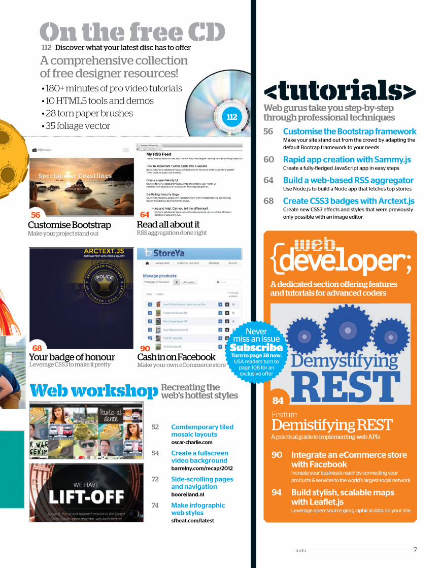
On the free CD
• 180+ minutes of pro video tutorials• 10 HTML5 tools and demos• 28 torn paper brushes• 35 foliage vector
A comprehensive collectionof free designer resources!
112 Discover what your latest disc has to offer
Recreating the web’s hottest stylesWeb workshop
112
68
Leverage CSS3 to make it prettyYour badge of honour
64
RSS aggregation done rightRead all about it
90
Make your own eCommerce storeCash in on Facebook
56
Make your project stand outCustomise Bootstrap
90 Integrate an eCommerce store with Facebook Increate your business’s reach by connecting your products & services to the world’s largest social network
94 Build stylish, scalable maps with Leaflet.js
Leverage open-source geographical data on your site
A practical guide to implementing web APIs
84Feature
Demistifying REST
Nevermiss an issue
Subscribe Turn to page 38 now.
USA readers turn to page 108 for anexclusive offer
SubscribeDemystifying
REST

8 _______________________________________________________________________header
newscomment
crowd source
Discussing the hottest topics in the web design worldIf you have a creative project, new web product or great designer story, contact the editorial desk
[email protected] @WebDesignerMag
<header>
The mere mention of Internet
Explorer can strike fear into
the hearts and minds of many
a designer and developer. Whether
Microso� likes it or not, IE has a stinker
of a reputation – especially among
designers and developers – that
precedes the browser. Plus, the legacy
of IE6 is still with us, but slowly and
surely the abomination is heading to
its � nal resting place.
To speed up the process and give
designers and developers a helping
hand, Microso� has released
modern.IE. What’s this, you are asking?
Well, it’s a set of free tools and
resources that will help users ‘spend
less time testing for the various
versions of Internet Explorer and more
time building what matters’. A
promising start, but it could be argued
that designers and developers
shouldn’t even have to think about
older versions of Internet Explorer.
Microso� should have got it right in the
� rst place and the problems
perpetrated by the browser wouldn’t
exist. However, this is an aside, and
those that still need to bring on board
testing procedures for Internet
Explorer can start here.
Modern.IE (www.modern.ie) is all
about making testing for Internet
Explorer just that little bit easier. It has
a whole set of tools, from simple
instant tools to more complex
cross-browser tools. The Scan a
webpage feature is as basic as it seems:
add a URL and wait to see what
common coding problems arise. Any
known issues are not simply displayed
and le� for the user to solve – help is at
hand. In our test, an old version of
jQuery was detected, and the site
suggested how to � x it and linked to
the jQuery site, which was both useful
and helpful. However, the more
useful option is the virtual tools.
Users can perform cross-browser
testing via Browser Stack, though this
is only a trial. Sitting conveniently
beside the testing tools are 20 tips for
‘coding with standards’. Read this with
an open mind.
There is no doubt that the modern.
IE site is a test bed for the browser, but
it is also something of a promotional
tool for IE10. Spending time on the site
helps ease the negative thoughts on
the browser. Whether or not it is
convincing enough to get you to
switch is another matter – and we
think we already know the answer. On
a quick note, Windows Vista users look
away, as IE10 is not supported. But, any
designer cannot simply dismiss a
browser based on its legacy – even
pone this terrible. Try IE10 and make
up your own mind, as some users
already have.
Commenter ‘Almost trustable’ had a
few words to say on the o� cial IE Blog,
including the following, “Everything
was going great with this article until
you pointed out that the site was
endorsing the addition of IE-only code.
This is the exact same sh__! That
caused a decade long browser that
developers walked out of with a
hatred for Internet Explorer! Have you
seriously not learned your lesson? As
YOU stated on your site developers
should strive to make their sites run
using STANDARDS based markup that
runs/renders in all browsers.” They
might not have a positive view on the
browser, but what do you think?
Microsoft is making a concerted effort to bring designers and developers back to the browser. Are you ready?
Is it time to let Internet Explorer back into your life?
Modern.IE is a test bed for the browser, but it is also a
promotional tool for IE10
[email protected] @WebDesignerMag [email protected] @WebDesignerMag [email protected] @WebDesignerMag
exist. However, this is an aside, and
those that still need to bring on board
testing procedures for Internet
Explorer can start here.
( ) is all
and helpful. However, the more
useful option is the virtual tools.
Users can perform cross-browser
testing via Browser Stack, though this
Microsoft is making a concerted effort to bring designers and developers back to the browser.
Is it time to let
Explorer back into your life?

header_______________________________________________________________________ 9
news<header>
Find news and feature items at www.webdesignermag.co.uk
Facebook introduce error alerts for
developers Testing is a critical part of the
development process, and errors will occur. Facebook has
introduced a new feature in the shape of Developer Alerts for
API errors. Should an app encounter abnormally high
error rates a alert is sent with error codes and descriptions.
mincssTwitter APIFacebook
Twitter adds new metadata for tweetsThe micro-blogging king has announced that it will be ‘adding new fields to tweet structures returned by the API’. This means developers will be able to target subsets of tweet collections more easily. Included is a new filter level attribute to help display only the most relevant tweets. Find out more via the Twitter blog (bit.ly/X5YNGx).
<news cloud>Bite-sized coverage of the month’s trending topics
The browser vendor pledges its support to WebKit
Clean up your CSS code with the neat tool
WordPressThe publishing platform updates its iOS app with Notifications On the Go
Opera
IE6 is a browser that still lingers in the far-� ung corners of the globe. Whether
designers and developers like it or not the ailing browser is still here.
Designers have the option to implement the necessary workarounds or, as
many do, simply ignore that fact that the browser even exists. There are pros and
cons for both options, and we know which one we like. However, the obvious
option for complete compatibility is to include the necessary workarounds.
Thankfully, the demise of IE 6 is coming ever closer. According to the Internet
Explorer 6 Countdown site (www.ie6countdown.com) only 6% of the world was
using the old browser in Jan 2013. To put this into perspective, this is nearly 5.5%
less than the year before. Plus, a whole host of countries have dropped below the
once elusive 1% mark, or the Champions circle as the site likes to call it. The latest
additions to the circle include Russia, Spain, Germany, Switzerland, Canada,
Netherlands, and the UK, which was at 0.9% at the time of writing.
HTML5 and CSS3 are the new gold standard. Since their gradual
implementation over the last year or so, these powerful upgrades to the key
coding languages have slimmed down work� ows everywhere and
empowered designers with an unparalleled level of control over their page
elements. For many, it is now an incredibly exciting time to be a programmer.
The HTML5 & CSS3 Genius Guide has been written by and for web
professionals, with the aim of raising standards everywhere through the
delivery of correct and crucial information about the new webscape.
Steve Jenkins, Web Designer features editor, said: “The HTML5 & CSS3
Genius guide is the perfect companion for web designers looking to take their
skills to a new level. Get up to speed with the latest industry techniques, tools
and frameworks. Join the responsive
design revolution, build standards-friendly
HTML and add stunning CSS3 styling to
stay ahead of the game.”
Packed with ideas, instruction and
inspiration, and a free CD containing
tutorial � les, video guides and bonus
content, this bookazine is all you need to
take your skills to the next level. The
HTML5 & CSS3 Genius Guide is now on
sale February 14 2013 at
www.imaginebookshop.co.uk and all
good retailers for £12.99.
Internet Explorer’s popularity and market share, is a long way from when it
was in its prime and the competition was scarce. Nowadays, the browser sits a
long way behind its main competitors Firefox and Chrome, but it still boasts a
decent slice of the market.
IE is still a valid companion for Windows and is still part of the reason that the
browser is still relatively popular. And, as the � gures show, its popularity is on the
rise, if very slowly. One of the reasons is that each new browser is more standards-
friendly than the last. It is unlikely that IE will ever get back to the heady heights
of its heyday. Not only does it have to contend with other well-established
browsers it has to contend with a legacy that it may never shake o� .
Sou
rce:
gs.
stat
cou
nte
r.co
m
IE6: the final countdown Code professionally for the new webscape
Who loves Internet Explorer?
Market share for Europe(January 2013)IE 9 - 15%IE 8 - 8%IE 7 - N/A
(January 2012)IE 9 - 12%IE 8 - 16%IE 7 - 3%
The main culpritsIE6 usage is well below 1% in a host of countries, but there are still a few that are propping up the overall figures. Here we list the top 5, by usage share in country, of Internet Explorer 6.
21%
4.7%3% 2.8% 2.7%
0%
5%
10%
15%
20%
25%
Ch
ina
Jap
an
Ind
ia
Sou
th K
orea
Vie
tnam
Out now: the HTML5 & CSS3 Genius Guide
Sou
rce:
htt
p://
ww
w.ie
6co
un
tdo
wn
.co
m
Readers TweetsWeb Designer posed the question What do you like, and what do you hate about Internet Explorer. Will it ever be your number one browser?Rishi @DesignSkew @WebDesignerMag LOL, never!! I like to work on Firefox, because of its lazinesss and firebug.
Kevin Barnes @helloiamkev @WebDesignerMag slowness to implement new standards, but still has a good market share. Will never be my no1! #IE
Charles Bannister @CJBannister @WebDesignerMag Anything’s possible but I can’t help but bear a grudge thanks to the years of separate, conditional stylesheets. #IE
cons for both options, and we know which one we like. However, the obvious
option for complete compatibility is to include the necessary workarounds.
Thankfully, the demise of IE 6 is coming ever closer. According to the Internet
Explorer 6 Countdown site (
using the old browser in Jan 2013. To put this into perspective, this is nearly 5.5%
less than the year before. Plus, a whole host of countries have dropped below the
once elusive 1% mark, or the Champions circle as the site likes to call it. The latest
additions to the circle include Russia, Spain, Germany, Switzerland, Canada,
Netherlands, and the UK, which was at 0.9% at the time of writing.Netherlands, and the UK, which was at 0.9% at the time of writing.
Internet Explorer’s popularity and market share, is a long way from when it
was in its prime and the competition was scarce. Nowadays, the browser sits a
long way behind its main competitors Firefox and Chrome, but it still boasts a
decent slice of the market.
Who loves Internet Explorer?
Market share for EuropeMarket share for Europe(January 2013)
The main culpritsIE6 usage is well below 1% in a host of countries, but there are still a few that are propping up the overall figures. Here we list the top 5, by usage share in country, of Internet Explorer 6.

Discussing the hottest topics in the web design worldnews<header>
10 _____________________________________________________________________header
Go digital at Great Digital MagsVisit the Imagine
Publishing supersite
greatdigitalmags.com
to get a digital copy of
Web Designer on your
favourite platformThere is now no excuse not to get your
favourite issue of Web Designer, or any
other Imagine title, on your favourite
digital device. Imagine Publishing has
been working hard to ensure that its
readers can get their hands on their
favourite magazine for their favourite
platform. Greatdigitalmags.com is
the cutting-edge digital magazine
superstore that brings together the
entire Web Designer collection and the
company portfolio. Whether you want
Web Designer, Advanced Photoshop,
Fantasy Artist, Digital Photographer,
Apps magazine, Android Magazine or
How It Works it can be found online.
The process for any device is simple
and straightforward. So, if you own a
Kindle Fire, iPad mini, Nook HD, Google
Nexus 7, Kobo, or even a desktop
computer make sure you pay a visit.
Head to www.greatdigitalmags.com,
select the platform of choice, select the
issue of choice and head to the desired
location to purchase.
Di� erent devices and di� erent
OSs make building and
developing apps for tablets and
smartphones an unwanted distraction.
Di� erent languages, lack of support, and
lack of compatibility all add to the mix,
which makes the process convoluted at
least. Vendors look for the best solution
for them and this is why we see the same
app making an appearance on di� erent
dates. iOS apps and Android apps are
typically native apps built using their
preferred platform. The issue is that
neither option works on the opposing
device. When building and developing for
devices, designers and developers want a
solution that has a viable presence on as
wide a range of platforms as possible.
The key to large-scale HTML5 adoption
could lie with hybrid apps. These are, as
the name suggests, the middle ground
between HTML5 and native apps. They
are written with the popular technologies
(HTML5, CSS, JavaScript) and do not rely
on native coding languages, specific
platform SDK’s, and tools.
They o� er far more
flexibility and eliminate the
need for web developers to
take up the mantle of
alternative coding languages,
not to mention the steep
learning curve.
The obvious advantage of
hybrid apps for web
developers is how quickly they
will be able to complete a new project.
Plus, they are more powerful than
standard mobile webapps, which lack the
capabilities of hybrid and native apps.
How do they work? In technical terms
they run inside a native container and
render the HTML and process any
JavaScript via the device’s browser
engine. E� ectively, this means that the
browser on the device is doing all the
hard work, which in turn means that an
app will pretty much work any device
whatever the platform or OS.
So the obvious advantages lie with
multiple platform support, use of device
capabilities (eg camera) and can be used
Hybrid apps: The way forward for HTML5 As the HTML5 standard heads towards official completion in 2014, buildingapps with HTML5, CSS and JavaScript is the way forward
HTML5 adoptionDesigners and developers are already actively developing with HTML5. The majority of those who are not are looking to in the very near future
There are plenty of designers and developers actively developing with HTML5, but it
could be construed this is not enough. The HTML5 specification is due for o� icial
completion in 2014, so there is no doubt that there will be better support across
platforms. This means that those who do not take up the HTML5 mantle are going to
get left behind.
o� line unlike a webapp. Where it does fall
down is in the arena of advanced
graphics typically found in native apps.
This one point will see many app builders
sticking with their current setup until
HTML5 matures to complete with
natively-built apps. With the o� icial
completion date for the HTML5
specification set to be 2014, it would seem
that hybrid apps are the way forward. The
HTML5 specification is only going to
mature, grow and eventually be the
choice for all apps.
One quick and easy way to join the
hybrid app revolution is to employ the
gratis services of PhoneGap. The free
open-source framework provides a host
of tools and guides to help build apps,
and the community is growing faster by
the day. To fully appreciate the power of
PhoneGap and capabilities of hybrid apps
visit the PhoneGap showcase at
phonegap.com/app.
Finally, Intel has joined the HTML5
revolution and released its HTML5 App
Porter Tool, currently in beta. What is it? It
is an application that helps mobile
application developers to port native iOS
code into HTML5, by automatically
translating portions of the original code
into HTML5. Check it out at software.
intel.com/en-us/html5.Source: bit.ly/St8eLf
6%No plans touse HTML5
31% Planning to use HTML5
63% Actively developing with HTML5


12 ______________________________________________________________________header
comment<header>
Freelancing is hitting new heights. More people than ever are leaving traditional employment in search of self-directed consulting. Whether you freelance or hire, this can
have profound effects on the way you do business.
Freelancing can open up new markets, and change prices and
costs. Freelancing can develop much more talent, talent which can
be easily accessed and verified through growing marketplaces. I’ve
spent time on both ends of the client-freelancer relationship – I still
freelance at StormGate for a portion of my time.
Freelancing is now a career choice; lots of people are breaking off
and setting up shop, but whether you’re a veteran consultant or
you’re just starting out, if you approach freelance work with a
youthful exploration you will uncover fruitful connections. Similar to
clients, freelancers can be more than just hires; they are often hard
working entrepreneurs and can offer other business value.
As a freelancer you have decided to offer a boutique service.
What you are producing may be boring business logic or beautiful
branding; whatever it is there is a distinct value beyond its delivery.
Your customers have come to you for an exceptional reason.
They like what you’ve done before. They have chosen you over
many other candidates. Winning freelance jobs has become like
battling through an interview process, and successful freelancers
must win jobs week after week.
In a way, freelancers are employees of multiple companies, but far
from in the traditional 9-5 sense. The bond between freelancer and
client is tenable, once established it’s often as strong as any
employment contract. Freelancers can feel an affinity with a
company; arguably they represent a new form of stakeholder. As
freelancers and as clients we are more connected than we think.
This connection is a two way relationship, which is totally different
to the employee-employer relationship. You are a boss and your
client is likely a boss and so you should see yourself as a deal maker.
Freelancers, you are actively doing business with your clients, not
just working for them, so practice business. Make deals.
Ever been part of a joint venture? Ever mentored? Ever been
mentored? Got the skills but not the ideas? The ideas but not the
skills? Look to your clients. Clients – think how you can share value
with your freelancers so you can both get a better result.
As a freelancer there is a level of professionalism you need to
maintain, but so many clients are open for a more leveraged form of
trade, friendship, and more.
Let me give you some examples. While freelancing I happened
across an interesting situation with one client. Mike has a personal
project that he is bootstrapping while working his 9-5. Aspects of his
project made for a very sellable WordPress plug-in but based on my
quote there was no scope within his budget. I proposed that I
develop the plug-in and we release it as a kind of experimental joint
venture. That plug-in is called Social Gallery (a ‘social lightbox’ for
WordPress.) Social Gallery has already sold more than 850 copies
and generated over $15,000. By releasing Social Gallery to a wider
market, Mike got his plug-in for free, and what’s more it’s made us
both many times the return it would have generated as a traditional
piece of client work. Mike has since become a good friend and
student and we continue to work together.
Another example shows the value of good service; David found
me through a referral, he had seen Social Gallery and liked my
development style. David wanted a series of plug-ins developed; he
had tried opting for cheap development options offshore but was
realising long lead times. David is also a veteran marketer (an area
I’m still mastering). By focusing on a fantastic turnaround I was able
to secure useful sessions of advice and marketing mentorship that I
doubt I could have found or afforded elsewhere, a fair trade and a
great example of win-win business.
I continue to meet situations such as these with new clients and
hires. Had I pursued only financial outcomes I would never have had
any of these experiences. I’d have made less, learnt far less towards
any mastery and I have no doubt I’d be less happy.
As clients, self-starting freelancers are invaluable, and what’s more
they could become employees, partners or students.
As freelancers, we can be flexible where big companies can’t, we
can care more about progress than profit, we can invest in ourselves
and we can freelance for happiness. There is flexibility in freelance.
Getting the most out of the client-freelancer relationship
The Flexibility of Freelance
Woody is CEO and lead developer at StormGate, an independent UK
development company specialising in rapid webapp development,
platform prototyping, and creative digital products
Woody Hayday
design

Start your free trial now, visit www.livedrive.com/prosuite
Cloud Storage for EveryoneEquivalent monthly price of a 2-year account*
14 DAY
FREE TRIAL
NO CREDIT CARD REQUIRED
Completely safe. Protected by military grade encryption.
Safe & secure
Access your � les from any web browser or any mobile device.
Access anywhere
Loads of features for Pro users - includingFTP and WebDAV.
Advanced features
5TB cloud storage sync’d between all your computers and devices.
Sync everything
Stream your music & movies to PC, Mac, iOS, Android and Kindle.
Media playback
Upload all of your � les, from up to5 computers, into the cloud.
Unlimited Backup
Keep ALL your filesKeep
ONLINELivedrive Pro Suitefrom just £7/month*

14 ______________________________________________________________________header
comment<header>
The term big data has become overused in recent months, in the same way cloud computing and green IT have been referenced in every other sentence of newspapers
and trade titles over the past few years. But what does big data actually mean for marketers? And more importantly, how can big
data be used in web development to enhance the visitor experience
and deliver on digital objectives such as driving up conversion rates
and increasing average basket values?
On a simple level it is about marketers using any data at their
disposal – sales, loyalty, media, social or third-party – to identify how
best to reach a target audience, whether offering sophisticated
promotions or other calls to action that take advantage of predicted
behaviours. There are many examples of where this is working
already – such as seasonal trends like brands responding to very hot
or cold weather with tailored pricing or promotions.
At Mindshare we call this adaptive marketing, and I firmly believe
that it will soon be commonplace, providing consumers with more
ways to benefit based on big data. This growing opportunity will also
allow web designers further chances to prove their worth when
creating personalised online experiences. Imagine a world in which
a website is different based on who is viewing it – you may already
argue that this is the case with personalised feeds on Facebook and
other social networks, but imagine if that personalised relevance
was transferred to every site you visit – offering you a completely
tailored shopping experience on an online supermarket site or a
one-to-one online clothes shopping experience. Exciting, isn’t it?
Cynics may claim that adaption for brands just creates the excuse
to sell more products, and that priced based adaptation such as the
hot and cold weather example I gave above means charging
customers more for a product when demand is high, but that is not
always the case. For instance, in June 2012, temperature-sensitive
vending machines with integrated thermometers for Coca-Cola’s
Limon & Nada lemonade drinks brand were installed across Spain.
The temperature was shown on a large display and cans were
priced at €2 when the temperature was below 25°C; at €1.40 for
temperatures of 26-29°C and €1 when it was over 30°C. Proof that
being ‘adaptive’ benefits everyone in the chain – the consumer gets
cheaper drinks, the brand sells more product.
I expect more and more companies to use dynamic pricing to sell
their products and not be out-done by their competitors as the use
of consumer data becomes an essential element of marketing.
So what impact does this have on web design? Simple; Online is
where all the data is coming from, so online is the place that stands
to benefit the most. On average we input 3,254 pieces of personal
information into databases every week! This is a great opportunity
for web designers to begin taking the personalised experience to
the next level with websites that use adaptive marketing techniques.
This can range from changing the products or prices displayed for
individual visitors based on a range of data points to developing an
entirely different journey for a consumer based on their digital
profiles. Different consumers react to different pricing, positions and
creative messages and in the future, web designers will be able to
provide them with experiences as individual as the consumers
themselves. The era of the one-size-fits-all website is over and
adaptive marketing is the future.
How to use ‘big data’ to identify and adapt to a customer’s online behaviour
Adaptive marketing – future of the web
Norm Johnston is global digital leader at Mindshare, a media
agency network with 113 offices in 82 countries from North
America, Latin America, Europe, Middle East, to Asia Pacific,
dedicated to competitive marketing advantages
for businesses
Norm Johnston
marketing
The era of the one-size-fits-all website is over
<Left>The Limon & Nada drink is a perfect example of adaptive marketing. As the temperature went up the price went down

SELL ONLINEBACKUP TO YOURCUSTOMERSJust £39.95unlimited customers
BACKUP TO YOURBACKUP TO YOUR
30 DAY
MONEY BACK
GUARANTEE
Get started now, visit www.livedrive.com/resellers
Questions? Call our team on 020 3137 6446
It’s so easy and it’s live instantly. Start selling today.
Get set up in minutes
Build your own products. Even brand the desktop software.
White label everything
Our online control panel is so simple to use. Add users in minutes.
Stay in control
You sell the simplest, most powerful online backup. Works on Windows and Mac.
State of the art online backup
Unlimited storage and bandwidth forall accounts.
No charge for storage or bandwidth
For customers that want more. Sell cloud sync and business cloud storage!
Plus more
You pay a � xed £39.95/month. Sell accounts at any price.
No charge per customer
per month for
16 ____________________________________________________________________ lightbox
Gallery of stunning web design
SITEOF THE
MONTH
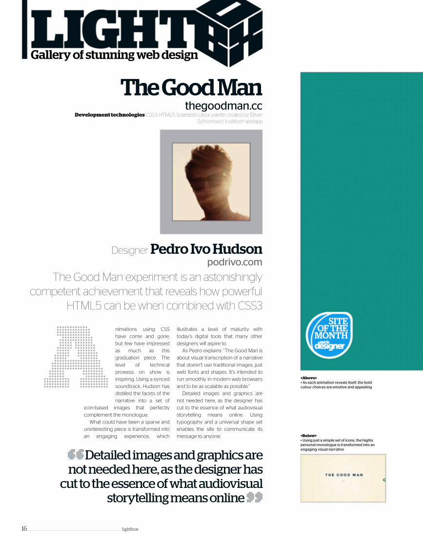
<Above>• As each animation reveals itself, the bold colour choices are emotive and appealing
<Below>• Using just a simple set of icons, the highly personal monologue is transformed into an engaging visual narrative
A
The Good Manthegoodman.cc
Designer Pedro Ivo Hudsonpodrivo.com
Development technologies CSS3, HTML5, Solarized colour palette created by Ethan Schoonover, IcoMoon webapp
nimations using CSS
have come and gone,
but few have impressed
as much as this
graduation piece. The
level of technical
prowess on show is
inspiring. Using a synced
soundtrack, Hudson has
distilled the facets of the
narrative into a set of
icon-based images that perfectly
complement the monologue.
What could have been a sparse and
uninteresting piece is transformed into
an engaging experience, which
illustrates a level of maturity with
today’s digital tools that many other
designers will aspire to.
As Pedro explains: “The Good Man is
about visual transcription of a narrative
that doesn’t use traditional images, just
web fonts and shapes. It’s intended to
run smoothly in modern web browsers
and to be as scalable as possible.”
Detailed images and graphics are
not needed here, as the designer has
cut to the essence of what audiovisual
storytelling means online. Using
typography and a universal shape set
enables the site to communicate its
message to anyone.
“ Detailed images and graphics are not needed here, as the designer has
cut to the essence of what audiovisual storytelling means online ”
The Good Man experiment is an astonishingly competent achievement that reveals how powerful
HTML5 can be when combined with CSS3
lightbox ____________________________________________________________________ 17
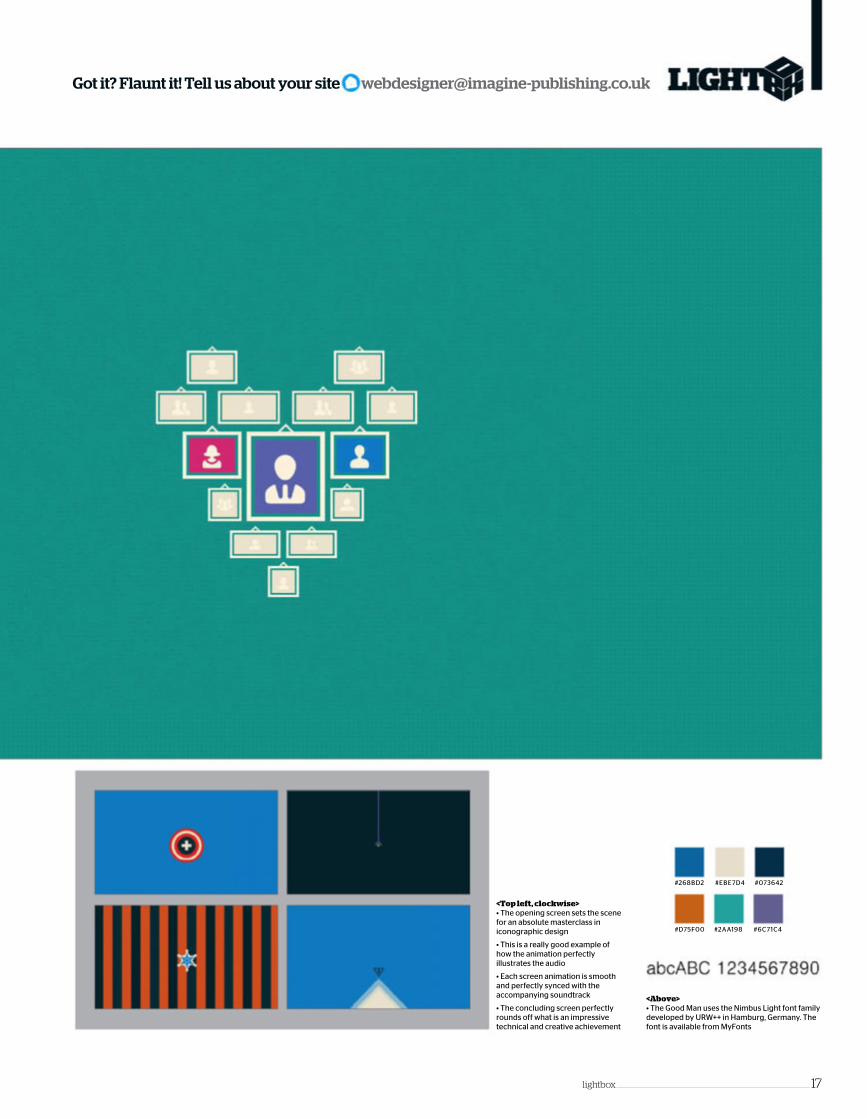
Got it? Flaunt it! Tell us about your site [email protected]
<Top left, clockwise>• The opening screen sets the scene for an absolute masterclass in iconographic design
• This is a really good example of how the animation perfectly illustrates the audio
• Each screen animation is smooth and perfectly synced with the accompanying soundtrack
• The concluding screen perfectly rounds off what is an impressive technical and creative achievement
#6C71C4#D75F00 #2AA198
#EBE7D4 #073642#268BD2
<Above>• The Good Man uses the Nimbus Light font family developed by URW++ in Hamburg, Germany. The font is available from MyFonts

18 ____________________________________________________________________ lightbox
Know a site that deserves to grace these pages? Tweet us now @WebDesignerMag
<Above>• The parallax scrolling design is the perfect user interface to impart how The Energy Trust has evolved as a company
#E8E8E8
#87AA5A
#0079A3
#004D6C
#CCF1F6
#F6DE81
<Top left, clockwise>
• Pollinate worked with an illustrator to create the background scenery representing the regions that The Energy Trust serves
• Each year includes insights into how The Energy Trust has helped its customers via a large, pop-open lightbox
• Many of the landscapes also contain localised energy information. This adds depth to the educational value of the interface
• Every year begins with an overview of achievements made. Rollover icons update the captions

lightbox ____________________________________________________________________19
E
The Energy Trust 10-Year Anniversaryenergytrust.org/timeline
Designer Pollinatepollinate.com
Development technologies SVG illustrations, CSS3, JavaScript namespacing, jQuery, Modernizr, SugarJS
nergy Trust of Oregon is an
independent nonprofit
organisation dedicated to
helping utility customers
benefit from saving energy
and generating renewable
sources. As part of its ten-
year anniversary in 2012, it
asked Pollinate to create an
interactive timeline to
highlight the milestones and
customer success stories,
including the development of programmes
and services that help utility customers make
energy-efficient and renewable energy
investments in their homes and businesses.
Using the now familiar scroll technique, the
design of this site uses subtle illustration that
showcases the achievements of the Energy
Trust in a context that is engaging and fun to
“ Parallax design lent itself well to the different landscapes that we wanted to highlight as well as to the timeline ”
An interactive timeline showcases the work of the Energy Trust of Oregon using a host of fun graphics and animation
interact with. As Pollinate explains: “We wanted
to keep the site fun and inviting, and to
encourage users to explore and learn about
the many services that the Energy Trust offers
to its customers across Oregon and north-
west Washington.
“Using a horizontally scrolling, parallax
design lent itself well to the different
landscapes that we wanted to highlight, as well
as to the timeline of events that Energy Trust
has been a part of. In short, the interactive
timeline turns ten years of history into a
[decade-long] roadtrip.”
As each year scrolls by, the viewer gains an
insight into how the Energy Trust has evolved
as a company. More engaging and certainly
more interesting than a traditional annual
report, more businesses should strive to
create online content that is as accomplished
and accessible as this.
<Above>• The overall styling of the site is a perfect fit with the client brief to bring their business to life online
<Above>• Developed by Tobias Frere-Jones, Interstate based on the signage alphabets of the US Federal Highway Administration, available from WebType
• Droid Sans Pro was designed by Steve Matteson and is available from MyFonts

20 __________________________________________________________________ lightbox
Know a site that deserves to grace these pages? Tweet us now @WebDesignerMag
<Above>• From the first screen, this site is a feast for the eyes that only continues to whet the appetite
D
Maki-sanwww.rollwithmakisan.com
Design Esther Goh, Jack TanProgramming Noel Chan,
Bagus Kuncoro Writing Eugene Tan
kinetic.com.sg
Development technologies HTML5 Boilerplate framework, jQuery, GreenSock animation library, SoundManager 2, CreateJS, History.js, CSS3
ynamic can
be an
overused
word in web
design, but it
fits perfectly
with Kinetic’s
approach. The
idea of this
website is
based on a
food concept,
where users can choose from different
Maki-san emoticons, animations and
music to create a custom animation.
Kinetic outlines its approach: “We
wanted a website that doesn’t just
provide the five Ws and one H. We
changed the game by creating a food
and beverage website that doesn’t use
real food shots to promote the food.
Instead, we engaged the user on the
same premise of customisation. So
while the store allows you to customise
maki with different ingredients, the
website allows the user to customise
the animation video with different
elements/ingredients.”
Relating the restaurant concept to a
similar customisation approach online
makes a strong connection between
the restaurant’s online and offline
presence. In addition, the handcrafted
feel of the website, the concept of
wabi-sabi (a Japanese aesthetic
centred on transience and
imperfection) is applied to the identity,
web interface and illustrations.
Few campaigns truly capture the
essence of a business’ branding.
Kinetic is an agency that has technical
ability in abundance, a strong client
understanding and a sense of fun – all
of which are reflected in this site.
“ Kinetic is an agency that has technical ability in abundance,
a strong client understanding and a sense of fun ”
The first DIY sushi restaurant in Singapore is paralleled with this
make-your-own-video site<Above>• Colour and movement dominate this site design. However, through all the visual and audio noise, it doesn’t lose sight of its core purpose
<Above>
• VAG Rounded was developed for the Volkswagen AG in 1979. VAG Rounded is a variation on 19th-century grotesque sans-serif designs, with interesting rounded terminals. The font is available from MyFonts
<Above>• The completed movie can be previewed and modified as much as you like before posting
#15290C
#77C5E9 #EDF0E2
#0D68A4
#D9CC24
#FCBD9E
<Above>• Audio and video segments come together to give visitors complete control over the animation they are creating

Company Number: 3913408 | Registered offi ce: Acton House, Perdiswell Park, Worcester WR3 7GD
With 4 out of 5 people preferring .co.uk
websites when searching online,
we think .co.uk is a great place to be.
If you want the perfect .co.uk domain to
get your website up and running quickly,
you know where we are.
Get in touch and let’s make your website our world too.
Domain Names
Web Hosting
Email Accounts
Website Builder
That picture up there? It’s Worcestershire. It’s in England. That’s where we are.
We’re names.co.uk and we provide everything
to get your website online, from domains to Web
Hosting. We’re UK based and so is our support team.
When you call us, you are calling real people, in
the same country as you. That’s important.
A NAMESCO BRAND
TALK 0845 363 6175
VISIT www.names.co.uk
EMAIL [email protected]

22 _____________________________________________________________ design diary
USA Today

design diary _____________________________________________________________ 23
he masses across
the globe have
always had a
vociferous appetite
towards the
consumption of
news and
information. Getting
the daily dose of the latest stories has long
been the domain of print, with national and
local broadsheets taking it to the people. A
newcomer by print news standards, USA
Today made its debut back in September
1982. From humble beginnings in the
Baltimore/Washington area, it took only three
years to reach the number two spot, and
jumped into the digital age in 1995 when the
internet was still in it infancy.
Its desire to forge ahead and absorb and
engage current technology set the scene for
the biggest redesign that the USA Today site
has ever seen. It was decided that the 30th
Tanniversary would provide the perfect
platform to give the web an online newspaper
experience that would lead the way for others
to follow. This was to be no tweak or minor
update, this was to be a new site that would
innovate and impress.
The Gannett Company, owner of USA
Today, went looking for a digital agency that
would match its ambition and settled on Fi,
aka Fantasy Interactive. Working out of its New
York office, Fi was very excited to be working
with such a prestigious publisher. Fi’s global
director of UX and strategy, Irene Pereyra,
reveals Fi’s first perceptions of the project.
“The inception of the project was timed to
USA Today’s biggest rebrand in its 30 year
history. The goal was to completely redesign
and re-architect the entire digital USA Today
experience including its traditional ad model.
So USA Today approached us in their 29th
year and informed us of their plan to
reposition their brand and redo all of their
Project USA Today Web www.usatoday.com Agency Fantasy Interactive
(Fi) Web www.f-i.com Duration One year People involved 18-22 Total Man Hours A dedicated team of
UX, design, development QA and production management for a 12 month engagement
Project Budget N/A
USA Today
The million-selling newspaper decided its 30th anniversary was the perfect platform
to reveal its online ambition. Fi was called in to innovate and architect the rebrand
A new frontier in digital publishing

basically wanted to do something that stood
head and shoulders above all other news sites.
Something completely new and innovative,
something that had never been done before.
“There were really two main things that
inspired us. One, from a digital perspective, we
wanted to bring the best of the tablet to the
desktop. We were very much inspired by the
iPad design and knew we wanted to create a
horizontal, app-like experience. When we
launched, users commented that they felt like
the best of the iPad was brought to the web.
“Two, from a user perspective, we wanted to
digitise the tactical feeling of actually holding a
newspaper and reading the section that
people were most interested in. People tend to
USA Today
24 _____________________________________________________________ design diary
COLOUR-CODED CATEGORIESUSA Today brings together a mass of information across a host of well thought out categories. How do they separate the content into instantly recognisable sections? With colour-coding
digital channels. Up until then, we had
developed content-rich sites before but
nothing remotely close to the amount of
information found on USA Today. But we were
determined to be just as innovative and
disruptive with our final design as we usually
are with all of our other work. In October 2011,
the project team met in Washington DC with
the client for the kick-o� meeting. We began
the discovery phase and explored the process
of news gathering and how journalists work.
The research alone for this redesign took a
huge five months.”
The first phase of a project is where ideas
are formulated, and USA Today took some
serious thinking as Pereyra explains, “We
We were very much inspired by the iPad design and knew we wanted to create a
horizontal, app-like experience<Above> The pages are reminiscent of a newspaper, but with all the multimedia functionality the web offers

design diary _____________________________________________________________ 25
USA Today
naturally divide the newspaper in the
morning. ‘You take the sports section. I’ll take
News.’ So we designed an architecture that
supported this natural habit.”
With such a massive project, both USA
Today’s parent company Gannett and Fi
needed to collaborate and communicate on a
regular basis to keep it on track.
Pereyra: “The collaboration between Fi and
Gannett was incredibly close. Gannett is the
parent company to USA Today. We did many
workshops down in McLean, Virginia and
they came up to New York City very often to
discuss the latest requirements and look at all
the work in progress. It’s not often that we
feel a hundred per cent philosophically
aligned with a client, so we felt extremely
lucky that we were both striving for the same
goal, and we were free to really innovate in
ways that sometimes would make other
clients uncomfortable. It was a true
collaboration from start to finish.
“What was really nice was that neither the
client nor we were overly concerned with
what other publishers were digitally doing. A
lot of clients have FOMO – fear of missing out
– so they ask agencies to imitate what’s
Name Irene PereyraTitle Global director of UX and strategy
Name Stephen CarpiTitle COO - Fi
Name Anton Repponen Title Global Creative Director - Fi
Name Erik KallevigTitle Global director of UX and strategy – Gannett
It’s been humbling to watch
the team at Gannett really
try to push the boundaries
and set the bar, and I’m
incredibly proud, that we at
Fi, as a relatively small
agency, have been part of a
redesign that was so
impactful for so many
users. We are all incredibly
proud of the work. It was
challenging, but the result
was worth it.
It was great to work with
such brave client partners.
Gannett had a simple yet
provocative vision to
change the way users read
the news, and that’s all we
needed for us to start
pushing forward. It was
rewarding to see the fruits
of our labour come to life. It
takes humans nine months
to create life. We took 12,
and we couldn’t be prouder.
It’s not often that we feel a hundred per cent
philosophically aligned… so we felt extremely lucky that we were both striving for the same goal, and we were free to innovate in ways that would make other clients uncomfortable

26 _____________________________________________________________ design diary
DESIGN CHALLENGESOne of the biggest challenges at the front-end was how to present
thousands of stories in a visually stimulating and aesthetically pleasing
layout. Fi’s global creative director Anton Repponen o� ers an insight.
“Design-wise, there were a lot of challenges.
We’re talking about a website where the publisher
posts over 300 updates an hour. Dealing with this
much information while displaying it beautifully was
a huge challenge. Working with a lot of text and
media and visualising it in the best way possible
isn’t an easy task. We knew we didn’t want the
website to look like an actual newspaper – that’s
something we felt would just be a Band-Aid
solution. It was really an experience in and of itself.
We abandoned old practices in terms of reading the
news and yet at the same time, the human
behaviour of looking at the news top-down remains.
We managed to modify the user interaction from
the way users typically read the news.”
LAUNCH SYNCHRONICITYThe new USA Today site had to go live on its 30th
anniversary. Irene Pereyra reveals there was no room
for manoeuvre. “USA Today approached us in their
29th year and informed us of their biggest rebrand
plans ever, timed to their 30th anniversary. They
engaged us to handle the digital work and Wol� Olins
with the branding work. While this was an extremely
interesting project, we were up against an immovable
deadline. You can’t celebrate your birthday a week
late. The redesign has been marked as quite a
paradigm shift to say the least, and the positive
response from both users and the media has been
overwhelming. With that being said, USA Today was
extremely smart in evolving every single channel in
perfect synchronicity timed to their 30th anniversary.
The orchestration created a lot of buzz. They took a
lot of risks and made some very bold decisions that
most large organisations would be afraid to take. It’s
quite incredible to see it pay o� in such a big way and
for us at Fi to have been a part of it, together with
Wol� Olins, is something we are all incredibly proud
of. It was a challenging year-long project, but the
result was worth every single late night at the o� ice.”
already out there. In this instance, both parties
never got distracted with such things and
focused on creating the best experience.”
The design and front-end duties for USA
Today were an undoubted challenge, and
behind the scenes was no di� erent. The sheer
scale of content being delivered meant that
serious considerations had to be given to the
delivery. Erik Kallevig, senior manager of UX
development at Gannett Digital, was part of
the team to ensure a smooth experience.
“Moving towards the native app experience
on the web introduces several challenges
rarely worried about with the traditional
approach. When pages used to load from
scratch, browser memory from the last page
was freed up and re-assigned to the new page,
which limited the impact of front-end memory
leaks. With the single-page app, we suddenly
had to free up memory ourselves to prevent
the app from slowing down over time.
“Transitions between pages had also now
become the domain of front-end code by
replacing the browser’s former responsibility
of tracking history and redrawing the screen.
This shift posed serious challenges in
DESIGN CHALLENGESOne of the biggest challenges at the front-end was how to present
thousands of stories in a visually stimulating and aesthetically pleasing
layout. Fi’s global creative director Anton Repponen o� ers an insight.
We’re talking about a website where the publisher
posts over 300 updates an hour. Dealing with this
much information while displaying it beautifully was
a huge challenge. Working with a lot of text and
media and visualising it in the best way possible
isn’t an easy task. We knew we didn’t want the
website to look like an actual newspaper – that’s
something we felt would just be a Band-Aid
solution. It was really an experience in and of itself.
We abandoned old practices in terms of reading the
news and yet at the same time, the human
behaviour of looking at the news top-down remains.
We managed to modify the user interaction from
the way users typically read the news.”
USA Today
<Right> Main image splashes are utilised on homepages to highlight top stories
e� iciently moving around big chunks of the
DOM and required tapping hardware
acceleration among other techniques.”
Overcoming the technical and design
challenges of a project is crucial to its success.
But, a completed project of the scale of USA
Today does not finish on the launch date. The
COO of Fi, Stephen Carpi, explains how
Gannett and Fi stayed together to make sure
that the project was completed as intended.
“Fi developers were embedded within the
Gannett technical team to assist in the
development and launch of the site. Our
producers worked closely with Gannett’s
technical manager and lead producer on a
daily basis. Some of the activities that made up
the process included daily scrums, weekly
status meetings, and prioritisation and tasking
of the development backlog. Additionally, our
developers remained on the project,
post-launch, for a number of weeks to assist
with intermittent bugs and/or refinements that
required additional support.”

ON YOUR TO-DO LIST TODAY. GET THE BROADBAND YOUR BUSINESS DESERVES. Call the number below, and feel free to ask any question you like. We can talk you through the process and reassure you on how simple it is to make the switch. And you can go online to see the difference BT Infinity for business has made to other companies. 30,000 businesses have already switched. We look forward to talking to you and making a difference to yours.
BT Infinity for businessMaking technology work for people.
It’s not just frustrating waiting for fi les to download or web pages to appear. It’s ineffi cient and expensive. Infi nity for business is as much as 8 times faster than UK average broadband. Imagine that for a moment. You’ll be downloading a big 200MB fi le in less than half a minute. Uploading 30 photos to your website in 25 seconds. ‘Time is money’, as the cliché goes, and you could be doing more with your time.
Research shows that superfast broadband fuels innovation in companies like yours**. People are using it to cut down on travelling to meetings by using high quality video conferencing. You can do it on your laptop, with no fancy equipment needed. And if you like to do your thinking outside the offi ce, you will have
free, unlimited access to our network of over 4.5 million Wi-fi hotspots. It means you and your people can connect when they’re in different places, just as easily as you do when you’re in the offi ce. Simply, you work in a better, more fl exible way.
1. INFINITY FOR BUSINESS CAN HELP PEOPLE GET MORE DONE.
2. IT’S LIKE A FAST LANE FOR YOUR BUSINESS.
3. FIBRE MAKES BUSINESSES MORE INNOVATIVE. FACT.
4. YOU’LL GET TECHNICAL SUPPORT, ROUND THE CLOCK.
5. THE COST? JUST £1.15 A DAY. NO REALLY.
You know that time of day when everything’s slower – you can’t get online quickly because everyone’s online? It doesn’t happen with BT Infi nity for business. It understands that you need to get things done urgently, so it’s like a VIP service for your business, because it’s consistently fast, even at the busiest times.
Our network is 99.9% reliable, and you’ll have a technical expert to speak to 24/7. Our experts specialise in businesses like yours and can help with technical niggles like setting up email, or Wi-fi connections. And, of course, the great advantage of being with BT is that we’ve worked with more businesses than anyone else.
Perhaps you think that superfast fi bre-optic broadband is too expensive. That’s not true. You can have BT Infi nity for business installed for free by our experts, and have it up and running for just £35 a month. When you think of the difference it could make to your working day - and the impact it could have on your company as a whole - it’s one of the easiest business decisions you’ll ever make.
There’s now enough research to prove that those businesses with superfast fi bre-optic broadband fi nd it transforms the way they work. It makes them faster, more effi cient, more innovative. The Government estimates that if UK businesses switch to fi bre broadband, it will add an extra £18 billion to the economy*. And you can have your slice of that for just £1.15 a day, with our BT Infi nity for business. Here are fi ve good reasons why your business could be better off with superfast fi bre-optic broadband.
BROADBAND IS BROADBAND IS BROADBAND, RIGHT? WRONG.
0800 345 7639 bt.com/superfastbusinessbroadband
*Federation of Small Businesses, referenced by Jeremy Hunt, Media keynote speech, 8 June 2010. **Getting up to speed: making superfast broadband a reality, NESTA policy briefi ng, January 2009. The speed to upload 30 photos is based on each photo being 2MB (60MB total fi le size). 8 times faster is based on BT Infi nity for business Option 2 maximum speed and UK average broadband speed from Ofcom report, August 2012. Broadband speed can be affected by a number of things: how far your business is from the fi bre cabinet as well as the wiring in your building. Not all lines in an Infi nity-enabled area can support the service. BT Infi nity for business may require a BT line or similar and a fi bre compatible router such as the BT Business Hub provided with Infi nity. Terms and conditions apply. The speeds provided by BT Infi nity for business are more consistent than standard broadband, giving you prioritised traffi c with 16Mb assured throughput at 90% of the internet busy period. You’ll need to be in range of a BT Wi-fi hotspot, have a wireless device and register for BT Wi-fi . Our Fair Use Policy and terms and conditions apply. £1.15 a day is based on BT Infi nity for business Option 2 for £35 a month on a 24 month contract.

© Larry Ewing
1&1 WEB HOSTING
DOMAINS | E-MAIL | WEB HOSTING | eCOMMERCE | SERVERS
WINDOWSOR LINUX1 WEB HOST, 2 OPERATING SYSTEMS – ENDLESS POSSIBILITIES!
®
* All 1&1 Web Hosting packages (Windows and Linux) free for the fi rst 6 months, then 1&1 Starter £2.49/month, 1&1 Standard £4.99/month, 1&1 Unlimited £6.99/month, 1&1 Business £9.99/month. 12 month minimum contract term applies. Visit 1and1.co.uk for full offer details, terms and conditions. Prices exclude VAT. Windows is a registered trademark of Microsoft® Corporation. Linux is a registered trademark of Linus Torvalds.

Your website data is stored simultaneously in two geographically separate high-performance 1&1 Data Centres, with automatic daily back-ups included.
MAXIMUM RELIABILITY
THE CHOICE IS YOURS!At 1&1 we provide advanced solutions for even the most demanding web projects – choose from our fl exible Windows and Linux hosting packages for the latest in technology and programming.
1&1 offers NEW: Microsoft® ASP.NET 4.0/4.5,the latest programming technology for developers, helping to create modern, professional websites with 1&1 Windows Web Hosting. Linux professionals benefi t from NEW: PHP 5.4 and PHPDev, plus unlimited access to 1&1 Click & Build Applications and more with 1&1 Linux Web Hosting.
1&1 Data Centres are powered by renewable energy, reducing our CO2 emissions by 30,000 tonnes every year!
1and1.co.ukCall 0844 335 1211 or buy online
1&1 employs over 1,500 internal developers to guarantee the continuous improvement of our products. You can manage your account easily wherever you are via the user-friendly 1&1 Control Panel, and get reliable 24/7 phone and e-mail support from our web hosting experts.
EXPERT SUPPORT
1&1 UnlimitedWindows
1&1 UnlimitedLinux
6MONTHSFREE!Then £6.99 per month*
6MONTHSFREE!Then £6.99 per month*
Unlimited Webspace
Unlimited Traffi c
1 FREE domain (choice of .co.uk, .me.uk or .org.uk)
Mobile Website Editing Software NetObjects Fusion® 1&1 Edition included
Facebook® and Bing™ vouchers worth £55
IPv6 ready
and much more …
NEW! ASP.NET/.NET Framework 4.0/4.5
NEW! PHP 5.4, PHPDev, Zend Framework, Perl, Python, Ruby, SSI
NEW! 5 MS SQL 2012databases (1 GB each)
100 MySQL 5 databases (1 GB each)
NEW! ASP.NET MVC 3 and 4, .NET, AJAX, LINQ, PHP 5, PHPDev, Perl, SSI NEW! Webspace Recovery
NEW! Dedicated app poolsUnlimited access to 65 Click & Build Applications including WordPress, Drupal™ and Joomla!®

30 �������������������������������������������������������������������� pro file30 �������������������������������������������������������������������� pro file

pro file ���������������������������������������������������������������������� 31
KOKO DIGITAL
pro file ���������������������������������������������������������������������� 31pro file ���������������������������������������������������������������������� 31
Koko is a multi-award winning digital agency. Started by
three Staffordshire
University graduates
in January 2007, Karl
Bloor, Stuart Howarth
and Chris Steele all
graduated with
first-class honours in
multimedia graphics.
All three of them left
university with a desire to build a design studio
where creativity was at the forefront of everything
it produced.
As founding director Karl Bloor explains: “I have
known Chris for a long time – we actually went to
college together where we studied general art and
design. After this I went to study product design at
Hertfordshire University with Chris doing a degree in
multimedia graphics.
“At the time I was passionate about product
design, but when I came back home and saw what
Chris was doing I became more interested in that
side of design. In fact I got so interested in what
Chris was doing I actually left my product design
course after two years and moved to Staffordshire
University where I studied multimedia graphics; and
that’s where I met Stuart.
“We all had the thought in our minds that we
wanted to leave university with first class honours
and an idea that we wanted to start an agency. What
we didn’t do was go straight from university to start
an agency. After graduation we all went our separate
ways and got some individual agency experience.
Web Designer visited leading viral game developer Koko Digital to gain an insight into
how viral marketing has evolved to mobile platforms, and how a chance meeting of minds
resulted in an industry-leading agency
who Koko Digital what Browser, social, and mobile gaming specialists,
passionate designs, developers with world-class
technical expertise where IC2, Keele Science &
Business Park, Keele, Staffordshire, ST5 5NHweb kokodigital.co.uk
Key clientsDorling Kindersley (DK),
Confused.com, Phones 4u,
McDonalds, Sony Pictures
A passion for design
“Of course as we had all done the same course at
university, we left with basically the same skillset.
Getting jobs in other agencies allowed us to pick up
not only practical experience, but also new skills. So
we did that for about three years before we actually
started Koko Digital. One of the agencies that I
worked with was doing a lot of viral marketing, which
at the time was really cutting edge. I could see that
viral was going to be big, but I couldn’t see many
agencies producing this work, which gave us the
idea that perhaps now was the time to think about
starting an agency that could produce viral games.”
Although Koko Digital began working on small
websites at first, its passion always lay in the games
industry. This was always the direction in which the
founders wanted to eventually take the company.
The use of games to promote a brand was a
relatively new market when the company was first
started, but with all the newfound expertise, it had a
real chance to shine.
The name Koko stood out from the very
beginning. The founders could try and justify their
choice, but the reality is that it was just a name that
they liked because it was short, snappy and they
believed it would be memorable. It didn’t hold any
profound importance or have any hidden meaning;
it was just cool.
It was clear from the outset that large brands
would only work with an agency that could provide
solid examples of their creative and technical skills.
Koko’s innovative idea was to approach a big charity.
“We had the idea to approach a charity to create a
game for them at no cost,” Bloor outlined.
“We approached the Make A Wish Foundation
and explained that we could create a viral game to
promote their work. We thought this would be a
great way of getting some high profile work into our
portfolio. All agencies that start out are always asked
for examples of their work when they pitch new
clients. The games for the charity gave us that
valuable portfolio material.
“Shortly after the game for the Make A Wish
Foundation began to get traffic, we were
approached by a large trade event organiser, who
had been let down by their viral game creators. The
game we created gave us a huge platform, where
the agency really took off.”
All of the partners in the business also knew that
their website would be a critical component of their
branding. Their initial site was developed with easy
maintenance and to have their portfolio at its heart.
“When we originally developed the site, we had
limited periods of time on which to work on it and
were also under pressure (albeit from ourselves) to
get something live as soon as possible. As a result of
this, the site was developed without much concern
for maintenance or expansion. It was purposely
designed to be very simple with regards to the
content and our main focus at the time was to build
a solid portfolio of work as soon as possible.

KOKO DIGITAL
Number of employees
3Koko partner with Sony Music to create the award winning game Parody Island featuring Chris Moyles.
Number of employees
8Tombs of Anubis game for tech shop Currys goes live to coincide with their Click 10 Photography Initiative.
Number of employees
5Red Bull’s Pit Boss game is launched to run alongside the 2008 Formula 1 Season.
32 ��������������������������������������������������������������������� pro file
Number of employees
7
be big, and today, the gaming market has moved
increasingly to smartphones and tablet PCs.
A business in the digital space will often be hired
based on the personality that the agency displays.
Does Koko have an ethos? “Koko has always been
driven to develop content that is aesthetically
beautiful for the end user, and although previous
games have featured the likes of James Bond,
zombies and Formula 1 cars, a game that we created
for a company called Shakespeare Country would
probably be one of the best to choose from,” said
co-founder Chris Steele.
“The game, called Romeo, was a platform game in
the same vein as Mario, and the premise of the
game was to guide Romeo safely through
Shakespeare Country in order to rescue Juliet. As
well as developing the entire platform game engine
from scratch, the attention to detail in the beautifully
rendered scenes and depth within the gameplay
itself is something we are very proud of in the office.”
And the fact that it has gone on to receive over
65,000,000 hits since launch and increased web
traffic to the client’s site by over 500% also suggests
“We always understood that our website was
crucial, acting as a permanent sales tool for Koko as
it allowed potential clients to gain an insight into us
as a business, both on a commercial and personal
level. Essentially it’s our portfolio of work, and
keeping it updated with most recent projects and
advancements here at Koko was always highly
important to us.
“Over time the current site has of course been
updated and amended slightly, but there was only
so much we could do with it in its current form.
Navigating the site has become problematic, as is
the task of updating it, especially as our product
offering has grown so much. The technology we
adopted for the site is also dated so we are currently
re-designing our site from the ground up. As our
brand grows, the website needs to grow with us.”
Koko has been fortunate since the agency began
to have had a steady stream of high-profile clients
that come to the agency for their creative talents
and their understanding of how the online and
mobile gaming market operates today. We realised
several years ago that viral marketing was going to
Number of employees
0
Koko Digital timelineEstablished 2007Founders Karl Bloor, Stuart Howarth and Chris Steele
Koko website launches and Lamb Chop Drop game for the Make-A-Wish Foundation goes live.
Koko launch Zombies Ate My Phone on Facebook with Phones 4u.
2007 2009 2010 20112008
“ We always understood that our website was crucial, acting as a sales tool for Koko as it allowed potential clients to gain an insight into us as a business, both on a commercial and personal level ”
Karl Bloor, Director and co-founder
First impressions count
<Above> Roy Lichtenstein’s
bold use of colour is a constant inspiration
for all in the office
<Right> The Adobe suite is an essential part of the designer’s toolkit

KOKO DIGITAL
Number of employees
10A YouTube masthead game launches to promote the 23rd Bond film, Skyfall.
Android version of the DK Quiz prepares for its launch.
pro file _____________________________________________________________________ 33
Number of employees
9
that the end users appreciated the time and effort
that was put into the campaign and were also
engaged with the brand.”
On the essential task of gaining new clients, Koko
uses a number of approaches: “Koko attracts new
clients using a variety of methods, and fortunately
we have managed to build a solid reputation in our
industry which means that a lot of our clients get in
touch with us directly, particularly when their
requirements involve games or game related
content, online or mobile” commented co-founder,
Stuart Howarth.
“We are firm believers in the power of building
relationships with people and it is this belief that has
allowed us to acquire a growing list of clients with
whom we have worked on multiple occasions over a
period of many years. As well as having a number of
clients that we work with on an ongoing basis, we
are often invited to pitch to new clients, and this is
something that we are very keen to get involved
with – although it does offer an opportunity to be a
little more selective. Another factor that helps us to
attract new clients is the success of our previous
2012 2013
viral and mobile games. Our campaigns have
collectively received well over 350,000,000 hits
worldwide, and this acts as a huge driver towards
procuring more project wins.
“There are a lot of agencies out there that have
similar skills to us. What differentiates us is that we
understand how the gaming mechanic can be
successfully applied to a client’s brief. We pitch
against a lot of big advertising agencies. The ad
agency might pitch some very creative ideas, but
sometimes, feedback from the client suggests that
they may not fully understand how the gaming
component of the brief will fit with their needs.
That’s our strength because we specialise in this
kind of game development.”
With such a diverse customer base, Koko is kept
busy with new projects. It’s vital to ensure that each
new account is understood in detail to ensure that
the client brief and expectations are met within the
budget that is set.
Bloor explained how a typical project is
approached: “Large-scale projects take between two
to three months to develop and would usually
involve up to six members of the team during its
production. While it depends on the type of work,
we always want to get as many members of the
team as possible to participate in the brainstorming
process in order to use their expertise and generate
as many ideas as we can.
“This process generally highlights a number of
concepts that we are happy with internally, and if the
brief is open with regards to the direction of the
concept, clients are usually given a couple of these
ideas in their most basic format. Once they have
chosen a preferred concept, we will then begin to
Running a week before the film release, the game
attracted a massive 16,569,045 views. The game was
designed to appeal to YouTube users, as Sony
Pictures wanted to use the latest mobile gaming
technology to connect with the younger audience
that recent Bond movies had been attracting.
Koko was hired to develop an innovative
rich-media ad. This innovation presented quite a few
technical challenges, as the game was designed to be
played within a YouTube masthead, with players
using their smart phones as the controller. This had
rarely been done before, so Koko was entering new
territory. The use of QR codes to create a connection
between the ad and the phone meant that testing
took a lot longer between each build.
The game was a huge success, with Google’s
Creative Sandbox stating: “55,210 click outs at a
0.33% Click Through Rate – far exceeding the
YouTube benchmark of 0.1%. 2,418 new game starts
and 1,252 game replays (156 of which replayed
between 3-5 times). A fantastic 15.98% interaction
rate – 11x higher than YouTube’s benchmark.”
The game also had to retain the highly polished
look and feel you would expect from a James Bond
game, but fit within a 2.5MB file size. This meant
carefully re-using assets where possible, and
optimising the quality of graphics and sounds
independently, depending on how frequently they
appear and their impact on the overall look and feel.
The ad placement had been booked to be
displayed on the homepage of YouTube on the
weekend the film was released, which meant that
Koko had to get the game developed and
successfully pass the required QA in little over three
weeks. It was certainly a challenge they enjoyed.
Shaken and stirred In association with Spinnaker, Koko Digital was asked to create a rich-media banner ad game to promote Skyfall
<Above> Youthful ideas promoting Bond’s aging spook

KOKO DIGITAL
34 ��������������������������������������������������������������������� pro file
What is clear is that as Koko has developed as an
agency, it has had to keep pace with the rapid
change in the technologies they use to deliver
projects to their expanding client portfolio. How has
Koko seen the viral games market change over the
last few years? Stuart explains:
“What we have found is that viral games have
definitely become more social. Initially games were
designed to raise brand awareness and drive traffic
to a website. Many of our clients still want this kind of
content, but as mobile and tablet PCs have arrived,
we have had to move with that, and now a huge
portion of the work that we do is on the mobile
platform. Today, we have had to support multiple
formats so brands can reach their customers.
plan the idea out in a much more detailed manner.
Although the development aspect usually accounts
for the largest portion of time for large-scale
projects, the planning can also take a substantial
amount of time and effort to make sure that the
idea we have presented can meet our client’s
expectations and objectives.
“Once a project becomes a live account, it is
immediately assigned a project lead and because
we are a relatively small team, this is usually one of
the directors who all have very ‘hands on’ roles
within the company. As well as being the project
lead, they would usually assume the role of creative
director/art director, working alongside designers,
illustrators/animators and developers.”
Koko has developed a strong relationship with DK
and has worked with the brand on numerous web
and mobile projects. To complement the hugely
popular online version of the DK Quiz, Koko were
asked to develop an iOS version operational on both
the iPhone and iPad, offering users a mobile
platform on which to engage with DK’s award-
winning content.
The strategy team worked extensively with DK to
plan out key functionality, developing effective
tactics to ensure a consistent user experience in line
with the online version. The creative team then
explored various opportunities to introduce key
elements that are unique to the mobile platform,
going above and beyond the expectations set out in
the original brief.
Key additions included the introduction of a
social turn-based multiplayer model, allowing users
to send challenges back and forth to friends from
the palm of their hand. Other elements included
various options for monetisation through the use of
in-game power ups and unlockable content.
The end result was a rich and engaging mobile
quiz with an abundance of diverse content.
Although the app has only been live for a short
period of time, the response from users has so far
been fantastic.
To date, the app has been downloaded over
250,000 times with over 6,500,000 quizzes played.
It has since been a top five fixture on the
educational games chart, and has already been
featured on the iTunes homepage in six countries,
as well as being in the What’s Hot section in 35.
As a result of its continuing success on the App
Store, DK have since asked Koko to expand the
reach of the app by
creating an
Android version,
which will be on
Google Play later
this year.
KEY PROJECT
DK Quiz bit.ly/YZHJB7
<Left> Social features add a competitive edge to the DK Quiz app
<Above> The game’s design utilises the screen real estate of the iPad
“ We still develop with Flash because of the ease with which we can distribute our games. There are thousands of Flash game portals ”
<Above> Graphics tablets are a
key component for creating in-game art

KOKO DIGITAL
pro file _____________________________________________________________________ 35
“We still develop with Flash simply because of the
ease with which we can distribute our games. There
are literally thousands of Flash game portals, so our
games can generate a lot of traffic relatively cheaply
for our clients. With HTML5 you gain the advantage
of being able to distribute to mobile devices, but you
can’t distribute that game as freely as you can with
existing formats.”
Steele also comments: “The experience we have
gained in the viral market enables us to use that as a
tool when we build social and mobile games for our
clients. Many of the games we now build will take
advantage of Facebook for instance, which offers the
social perspective where players can invite their
friends who are then integrated into the game. And
of course may of our clients want to use the game
we are designing to push consumers towards their
Facebook pages.
“Aside from the power and flexibility of the Flash
platform, it has endurance in the marketplace, and
the fact that it has been adopted the world over has
many benefits. As a result of the Flash platform
being around for what seems like an eternity now,
vast portals and communities exist all over the
internet where people can share and enjoy Flash
content. These communities are absolutely crucial to
Koko and in particular, the exposure they offer our
viral advergames.”
And with the burgeoning use of HTML5, how has
this impacted on Koko’s approach to their client
briefs? “At the moment we show clients what the
capabilities of HTML5 versus Flash are,” says Bloor.
“Clients that come to us talking about HTML5 need
to understand that this may mean that a project
requires additional marketing budget, mainly due to
the distribution infrastructure not being in place as it
is with Flash. Many of our clients are also asking for
native apps, or multiplatform apps. We also use tools
like Unity (unity3d.com/unity/multiplatform) for
instance because the Unity platform allows us to
create campaigns that can benefit from
multiplatform deployment. We’re also working with
other platforms like with Adobe Air for a similar
reason, but Flash is still appropriate for a lot of our
clients, particularly for browser based games.
“HTML5 has come quickly to the marketplace, but
from our perspective it’s just one of the tools we use
to deliver our client’s brief. The games we create are
always tied to the client’s budget and their stated
return on investment. This influences how we will
approach any given game. It would be ideal to have
a set of universal tools, but these are unlikely to
appear in the near future.”
This ease with which the agency has adapted to
the changing demands of their clients has meant
the Koko is a key agency in this field. A good
example is the work the agency has completed for
DK. “The DK quiz has been a phenomenal success.
When they approached us they initially wanted us to
look at developing their existing online quiz into a
mobile version. We took a good look at the existing
quiz and could see how the quiz could be improved
on mobile devices.
“ We are firm believers in power of building relationships with people and it is this belief that has allowed us to acquire a growing list of clients with whom we have worked on multiple occasions over a period of many years ”
Stuart Howarth, director and co-founder
Creating strong ties
In Zombies ate my Phone, players
control a central character,
helping them fight off hoards of
incoming undead. The game had
to feel fluid and be able to handle a
lot of sprites on the screen at one
time, which meant this campaign
had two main challenges.
The first was creating the raw
game engine that controlled and
handled the sprites. The enemies
had to react to the player’s
movements so they would follow.
This meant coding a complex
collision detection between the
player, AI, and bullets.
Instead of building an engine
from the ground up, Koko
modified a popular physics
engine called Box2D. They
removed the physical effects of
gravity and utilised its quick
collision detection algorithms,
which meant they could
concentrate on developing the AI
so the hoards were fluid and
responsive within the game.
The second challenge was
rendering this raw data into visual
game sprites. Koko developed
their own bitmap-rendering
engine that utilised bitmap
textures to draw the game to the
screen. By using bitmaps instead
of vectors, they could display
hundreds of zombies at any one
time while maintaining the
performance of the game and
keeping the user experience
fast-paced and exciting.
Zombies ate my phoneTo develop brand awareness and engage with potential clients, zombie hoards were enlisted by Phones 4u
“We took a long time with the client talking about
this and the game we produced complements the
online version extremely well, while offering users
new functionality on the mobile platform. We were
able to use our experience of developing games on
mobile devices, and offered the client ideas that they
followed. The success of that app has lead to two
new projects for them this year. We are able to pick
apart a client’s brief and understand what they want
to achieve.
“We have been lucky in that we have been able to
build a strong reputation in the gaming field –
particularly with online games – but our reputation in
mobile is growing too. What this has mean for us is
that a number of our clients initially came to us for
gaming content, but now we provide them with
<Above> A wall of 8-bit art
references the era of classic games

KOKO DIGITAL
36 _____________________________________________________________________ pro file
other types of content as well including websites
and apps. These relationships have now been
ongoing for a number of years.”
Website design is still a core service that Koko
provides. Responsive design now forms an
increasing part of the client briefs that Koko turn into
engaging web content. “Responsive Web Design is a
method that we have used for a number of projects,
and it is certainly something that we explore with
clients if the project in question is applicable. RWD
aims to give users the best experience possible on
their chosen device but inevitably, changing the way
that the information on a site is provided to the end
user means that their experience will di� er across
each platform.
“It’s important that we look at the purpose of the
site to determine what approach we take, because
o� ering the user a di� erent experience can
sometimes have negative connotations, particularly
when it is a site they are familiar with. It’s very easy
for an agency to assume that everyone who uses
the internet has the same knowledge and is aware
of the latest technologies or practices, particularly
when they might seem so simple, obvious, or
beneficial to some.
“It’s fair to say that many factors need to be
considered when looking at RWD, not least the
preferences or requirements of the client. Ultimately,
o� ering the user a choice to view the site in a more
familiar format if they wish means that each
individual can experience the web on their own
terms, keeping their experience positive.”
If you have ambitions to work for an agency like
Koko what’s the best approach? Stuart explains:
“When we advertise for new people we do get quite
a lot of interest. What we see is that the range of
skills is vast. For us, we are looking for people like us
that are driven and passionate. This comes through
in a strong portfolio. And of course we look for
people that will fit within our agency.
“Our first employee was a games artist that could
do animation and character design. We knew that
between the three of us, we had the foundation skills
to win accounts, but what we needed was to make
our games look better, and we knew that they could.
“What I would say is that we have hired people on
the strength of their portfolio even if we were
actually not hiring at the time. We could see that if
we didn’t hire them we would miss a great
opportunity to expand our talented team. I would
say that we don’t like cold calls from prospective
employees. We are busy, so we would rather see a
portfolio, which should really speak for itself.
“Choose the pieces carefully. If you have
something that is half-baked, don’t put it in. We’re
looking for quality. We always look at every portfolio
we are sent, and if it’s interesting it will be kept on
file. We do have a pool of freelancers that we use
occasionally so it’s always good to get your work in
front of an agency.
As a forward-focused agency, Koko always keeps
an eye on the myriad technical developments that
are occurring in the ever evolving marketplace.
“Without doubt more mobile – and especially tablets
– are a focus for our business as this is simply how
consumers are using the web and engaging with
content,” Bloor concluded. “Apple iOS may dominate
at the moment, but we are also focusing on the
alternative platforms as well. Android is massive and
will continue to expand with more and more devices
using that platform.
“The technology we have available is always
evolving. Last year we created a dual-screen game
for the James Bond movie Skyfall that used the
mobile phone as the controller. Our experience of
games development allowed us to develop a small
game that still had excellent gameplay.
“What’s next? Augmented reality could take o� if
the new digital glasses that are being developed by
Google and others become popular. The idea of
walking down the street while you’re playing a game
using these glasses is fascinating to us. It would be
possible to interact with real people in real-time, so
who knows where this will take us? The future of
gaming is certainly very exciting.”
WEB ............................................................. www.kokodigital.co.ukFOUNDERS ............................. Karl Bloor, Stuart Howarth .....................................................................................................and Chris SteeleYEAR FOUNDED ............................................................................. 2007CURRENT EMPLOYEES ................................................................. 10 LOCATION ................................................... Keele, Staffordshire
SERVICES
> Casual online games/apps> Mobile games/apps> Website development> Illustration> Animation
“ Apple iOS may dominate at the moment, but we are also focusing on the alternative platforms [Android] as well ”
“ The game, called Romeo, was a platform game in the same vein as Mario. As well as developing the entire platform game engine from scratch, the attention to detail in the beautifully rendered scenes and depth within the gameplay itself is something we are very proud of in the office ”
Chris Steele , director and co-founder
industry insight

Established for over 25 years
WHY SHOULD YOU CHOOSE OUR UNIQUE FLEXI LEASE?
iMAC 21.5” i5 2.7 GHZ
ONLY £1.45 PER DAY
CHEAPER THAN YOUR
DAILY COFFEE
RETURN
RETAIN
RENEW
after only 2 years you canreturn your equipment or...
your equipment until the end of the 3 year lease and own it for just £39 or...
your lease, get new equipment at a similar cost PLUS keep the equipment from your original Flexi-Lease

Subscriptions Voucher
■ YES! I would like to subscribe to Web Designer
Your detailsTitle First name
Surname
Address
Postcode Country
Telephone number
Mobile number Email address
Please complete your email address to receive news and special offers
Direct Debit Payment■ UK Direct Debit payment Pay only £25.15 every six issues (save 30%)
Payment detailsYOUR EXCLUSIVE READER PRICE 1 YEAR (13 ISSUES)
■ UK £62.30 (Save 20%) ■ Europe £70 ■ World £80
Cheque
■ I enclose a cheque for £ (made payable to Imagine Publishing Ltd)
Credit/Debit Card
■ Visa ■ MasterCard ■ Amex ■ Maestro
Card number Expiry date
Security number ■ ■ ■ (last three digits on the strip at the back of the card)
Issue number ■ ■ (if Maestro)
Signed
Date
Code: PAG207■ Tick this box if you do not wish to receive any promotional material from Imagine Publishing Ltd. ■ Tick this box if you do not wish to receive promotional material from other companies.Terms and conditions apply. We publish 13 issues a year. Your subscription will start from the next available issue unless otherwise indicated. Direct Debit guarantee details available on request. This offer expires without notice.
I would like my subscription to start from issue:
Web Designer Subscriptions Department, 800 Guillat Avenue, Kent Science Park, Sittingbourne, ME9 8GU, or email it to [email protected]
Instruction to your Bank orBuilding Society to pay by Direct Debit
Signature(s)
Date
Bank/Building Society account number
Instructions to your Bank or Building SocietyPlease pay Imagine Publishing Limited Direct Debits from the account detailed in this instruction subject to the safeguards assured by the Direct Debit guarantee. I understand that this instruction may remain with Imagine Publishing Limited and, if so, details will be passed on electronically to my Bank/Building Society
Branch sort code
Name(s) of account holder(s)
To: The Manager Bank/Building Society
Address
Postcode
Originator’s Identification Number
5 0 1 8 8 4
Reference Number
Name and full postal address of your Bank or Building Society
Please fill in the form and send it to: Imagine Publishing Limited, 800 Guillat Avenue, Kent Science Park, Sittingbourne, ME9 8GU
Return this order form to:
✔
Manage your subscription account online at www.imaginesubs.co.uk
Banks and Building Societies may not accept Direct Debit instructions for some types of account
OnlineOrder via credit or debit card, just visit:www.imaginesubs.co.uk/wedand enter code PAG207
TelephoneOrder by phone, just call:
0844 848 8413Overseas: +44 (0) 1795 592 878 and quote code PAG207
Post or emailPlease complete the form and post it to:Web Designer Subscriptions,800 Guillat Avenue,Kent Science Park,Sittingbourne, ME9 8GUAlternatively, scan and email the form to:[email protected]
THREE WAYS TO SUBSCRIBE
IMAGINESUBS.CO.UK
GO DIGITAL!
FOR ANDROID, MAC, PC iPHONE & iPAD
GREAT DIGITAL SUBSCRIPTIONOFFERS AVAILABLE AT:

The only magazine you need to design and develop stunning websites
Subscribe now and
SAVE 30%Let Web Designer unleash your creative side!
The only magazine you need to design and develop stunning websites
Dreamweaver, XHTML & CSS WordPress & microblogging
Photoshop & Illustrator Flash & ActionScript Plus site showcases
& exclusive interviews!
USA READERS
see page 108 for
exclusive
discounts


CREATE OUT OF
graphics and animation has long been possible on the web with the likes of
Shockwave or Flash – there’s always been the opportunity to deliver
high-quality 3D renders within the browser. But until recently, creating a
compelling 3D experience took expensive authoring tools, as well as
obtrusive browser plug-ins for rendering. But why? It’s partly because of the bandwidth demands associated with the amount of data required to render high-quality textures, intricate models and shapes, but also the need for powerful graphics, hardware and fast processors. Until now, these requirements were confined to a small percentage of desktop machines, but in the past couple of years that’s all changed: browser-based native 3D has o� icially arrived!
There are actually several di� erent complementary technologies that can be used to
Our 3D scene is rendered
entirely within a simple
<canvas> element on our
HTML page, using WebGL to
render the graphics within
the canvas. WebGL allows
us to take advantage of
hardware acceleration.
The globe is created
using a primitive sphere
– one of the built-in
shapes available through
the three.js library. As a
result, we only need just a
few lines of code to
generate the earth.
The star field in the
background of our scene is
procedurally generated
using a simple random
particle system that’s
nothing more than a
JavaScript array and a
series of flat circles drawn
into our scene.
The scene is animated using requestAnimationFrame() which offers better performance than setInterval() and also
conserves battery life when the page is not visible in the browser window.
We’ve used a simple graphical texture to make our sphere look like the earth. With additional lighting in our scene we could have had the planet appear to be lit by the sun too!
create 3D objects and scenes within your webpages – some you’ll already be familiar with, while others are a little more like dabbling with the dark arts if you haven’t encountered them before. The principle options are Canvas and WebGL, with the option to use CSS3 to create 3D e� ects.
WebGL itself isn’t actually a 3D system, rather it provides a method to talk to the graphics card of the host computer directly. This means that graphics produced and rendered using WebGL can be enormously impressive, but at the same time the raw code (normally using JavaScript) can be very challenging to pick up. In this feature we’re taking a look at the di� erent options for getting started with 3D in your webpages, and to simplify the development process we’ll use one of the most popular libraries available to abstract WebGL and make it user-friendly to generate simple scenes without having to understand every aspect of the underlying WebGL code.
graphics and animation has long been graphics and animation has long been possible on the web with the likes of
Shockwave or Flash – there’s always been the opportunity to deliver been the opportunity to deliver
high-quality 3D renders within the high-quality 3D renders within the high-quality 3D renders within the browser. But until recently, creating a browser. But until recently, creating a browser. But until recently, creating a browser. But until recently, creating a browser. But until recently, creating a
compelling 3D experience took compelling 3D experience took compelling 3D experience took compelling 3D experience took compelling 3D experience took expensive authoring tools, as well as expensive authoring tools, as well as expensive authoring tools, as well as expensive authoring tools, as well as expensive authoring tools, as well as
obtrusive browser plug-ins for rendering. obtrusive browser plug-ins for rendering. obtrusive browser plug-ins for rendering. obtrusive browser plug-ins for rendering. obtrusive browser plug-ins for rendering. But why? It’s partly because of the bandwidth But why? It’s partly because of the bandwidth But why? It’s partly because of the bandwidth But why? It’s partly because of the bandwidth But why? It’s partly because of the bandwidth demands associated with the amount of data demands associated with the amount of data demands associated with the amount of data demands associated with the amount of data demands associated with the amount of data required to render high-quality textures, intricate required to render high-quality textures, intricate required to render high-quality textures, intricate required to render high-quality textures, intricate models and shapes, but also the need for models and shapes, but also the need for models and shapes, but also the need for models and shapes, but also the need for models and shapes, but also the need for powerful graphics, hardware and fast processors. powerful graphics, hardware and fast processors. powerful graphics, hardware and fast processors. Until now, these requirements were confined to a Until now, these requirements were confined to a small percentage of desktop machines, but in the small percentage of desktop machines, but in the past couple of years that’s all changed: browser-past couple of years that’s all changed: browser-based native 3D has o� icially arrived!
There are actually several di� erent complementary technologies that can be used to complementary technologies that can be used to
Our 3D scene is rendered
entirely within a simple
<canvas> element on our
HTML page, using WebGL to
render the graphics within
the canvas. WebGL allows
us to take advantage of
hardware acceleration.
The globe is created
using a primitive sphere
– one of the built-in
shapes available through
the three.js library. As a
result, we only need just a
few lines of code to
generate the earth.
The star field in the
background of our scene is
procedurally generated
using a simple random
particle system that’s
nothing more than a
JavaScript array and a
series of flat circles drawn
into our scene.
The scene is animated using requestAnimationFrame() which offers better performance than setInterval() and also
conserves battery life when the page is not visible in the browser window.
We’ve used a simple graphical texture to make our sphere look like the earth. With additional lighting in our scene we could have had the planet appear to be lit by the sun too!
complementary technologies that can be used to complementary technologies that can be used to complementary technologies that can be used to
create 3D objects and scenes within your create 3D objects and scenes within your create 3D objects and scenes within your create 3D objects and scenes within your create 3D objects and scenes within your create 3D objects and scenes within your create 3D objects and scenes within your create 3D objects and scenes within your create 3D objects and scenes within your create 3D objects and scenes within your create 3D objects and scenes within your create 3D objects and scenes within your create 3D objects and scenes within your create 3D objects and scenes within your webpages – some you’ll already be familiar with, webpages – some you’ll already be familiar with, webpages – some you’ll already be familiar with, webpages – some you’ll already be familiar with, webpages – some you’ll already be familiar with, webpages – some you’ll already be familiar with, webpages – some you’ll already be familiar with, webpages – some you’ll already be familiar with, while others are a little more like dabbling with the while others are a little more like dabbling with the while others are a little more like dabbling with the while others are a little more like dabbling with the while others are a little more like dabbling with the while others are a little more like dabbling with the dark arts if you haven’t encountered them before. dark arts if you haven’t encountered them before. dark arts if you haven’t encountered them before. dark arts if you haven’t encountered them before. dark arts if you haven’t encountered them before. The principle options are Canvas and WebGL, with The principle options are Canvas and WebGL, with The principle options are Canvas and WebGL, with The principle options are Canvas and WebGL, with the option to use CSS3 to create 3D e� ects.
WebGL itself isn’t actually a 3D system, rather it WebGL itself isn’t actually a 3D system, rather it provides a method to talk to the graphics card of provides a method to talk to the graphics card of the host computer directly. This means that graphics produced and rendered using WebGL graphics produced and rendered using WebGL can be enormously impressive, but at the same can be enormously impressive, but at the same time the raw code (normally using JavaScript) can time the raw code (normally using JavaScript) can time the raw code (normally using JavaScript) can time the raw code (normally using JavaScript) can time the raw code (normally using JavaScript) can be very challenging to pick up. In this feature be very challenging to pick up. In this feature be very challenging to pick up. In this feature be very challenging to pick up. In this feature be very challenging to pick up. In this feature be very challenging to pick up. In this feature we’re taking a look at the di� erent options for we’re taking a look at the di� erent options for we’re taking a look at the di� erent options for we’re taking a look at the di� erent options for we’re taking a look at the di� erent options for we’re taking a look at the di� erent options for getting started with 3D in your webpages, and to getting started with 3D in your webpages, and to getting started with 3D in your webpages, and to getting started with 3D in your webpages, and to getting started with 3D in your webpages, and to getting started with 3D in your webpages, and to simplify the development process we’ll use one of simplify the development process we’ll use one of simplify the development process we’ll use one of simplify the development process we’ll use one of simplify the development process we’ll use one of simplify the development process we’ll use one of the most popular libraries available to abstract the most popular libraries available to abstract the most popular libraries available to abstract the most popular libraries available to abstract the most popular libraries available to abstract WebGL and make it user-friendly to generate WebGL and make it user-friendly to generate WebGL and make it user-friendly to generate WebGL and make it user-friendly to generate simple scenes without having to understand every simple scenes without having to understand every simple scenes without having to understand every simple scenes without having to understand every simple scenes without having to understand every simple scenes without having to understand every aspect of the underlying WebGL code.aspect of the underlying WebGL code.aspect of the underlying WebGL code.aspect of the underlying WebGL code.
feature _____________________________________________________________________41


We created our animated globe within a procedural starfield using nothing but WebGL and the three.js library. First, we used the sample
code from the three.js GitHub project to create a scene, camera, and renderer. This allowed us to choose WebGL as the rendering system, rather than relying on the Canvas API. Once we’d set up our scene, we drew a sphere using the built-in simple primitives available with the three.js library. With the sphere set up, we applied a texture to it using an image we found on the web to create the earth texture you’re familiar with.
Three.js makes it easy to add animation to the project by simply calling the requestAnimationFrame() method and passing in the name of our animation function. We opted for a straightforward rotation of the sphere, giving the impression of the earth spinning on its axis. Luckily, three.js also includes a shim for requestAnimationFrame, dealing with the browser di� erences in implementation.
Finally, we created a simple particle system using some basic random numbers and a lot of simple spheres rendered at a small size to represent stars. We’ve set each of our stars to use the same Z position. This is a bit of a cheat, but relative to the earth the stars shouldn’t alter their position, so we can get away with it as long as we’re not animating our camera and expecting to see a parallax e� ect in the stars.
The final result is a simple but e� ective 3D view featuring a basic textured primitive shape and simple animation. Because we’ve used the three.js library, we didn’t have to get too technical with generating materials and shaders – instead focussing on our scene’s design.
While WebGL itself is pretty inaccessible for novice users, by using a specialist library that abstracts a lot of the complexity it’s possible to very quickly generate a 3D scene that’s rendered by WebGL! In this tutorial we’re going to create a pseudo space scene. We’ll use a bit
of smoke and mirrors to generate the final piece, but the final result will be an impressive animation that features the earth rotating about its axis and a randomly generated star field. Once you’ve completed working through the steps below, you’ll have a good sense of how to create your own 3D scene and populate it with objects, apply textures, and create simple animations.
Getting started with WebGL and three.js is pretty straightforward; a few lines of code can generate impressive results!
01Download three.jsTo make it much easier to get started with WebGL, we’re going to use the
excellent three.js library. This abstracts a lot of the complexity associated with the WebGL API, and makes a light and simple task out of assigning renderers, shaders, cameras and objects to our 3D world. Download the library from github.com/mrdoob/three.js
02Create a simple pageWe only need the most basic of HTML pages to test our e� ect, so create that
now. You’ll want to include the three.js library you downloaded in step one, and a smattering of CSS to define the size of your canvas element.
001<!DOCTYPE html>002<html lang=”en”>003 <head>004 <meta charset=”UTF-8” />
005 <title>Create a 3D scene with WebGL and Three.js</title>
006 <script type=”text/javascript”
src=”scripts/jquery.js”></script>
007 <script type=”text/javascript”
src=”scripts/three.min.js”></script>
008 <style type=”text/css”>
009 body {
010 background-color: #000000;
011 margin: 0px;
012 overflow: hidden;
013 }
CREATE A 3D EARTH SCENE
HOW WE
MADE THE E
ARTH
WITH WEBGL
We created our animated globe within a procedural starfield using nothing but WebGL and the three.js library. First, we used the sample
code from the three.js GitHub project to create a scene, camera, and renderer. This allowed us to choose WebGL as the rendering system, rather than relying on the Canvas API. Once we’d set up our scene, we drew a sphere using the built-in simple primitives available with the three.js library. With the sphere set up, we applied a texture to it using an image we found on the web to create the earth texture you’re familiar with.
Three.js makes it easy to add animation to the project by simply calling the requestAnimationFrame() method and passing in the name of our animation function. We opted for a straightforward rotation of the sphere, giving the impression of the earth spinning on its axis. Luckily, three.js also includes a shim for requestAnimationFrame, dealing with the browser di� erences in implementation.
Finally, we created a simple particle system using some basic random numbers and a lot of simple spheres rendered at a small size to represent stars. We’ve set each of our stars to represent stars. We’ve set each of our stars to use the same Z position. This is a bit of a cheat, but relative to the earth the stars shouldn’t alter their position, so we can get away with it as long as we’re not animating our camera and expecting to see a parallax e� ect in the stars.
The final result is a simple but e� ective 3D view featuring a basic textured primitive shape and simple animation. Because we’ve used the three.js library, we didn’t have to get too technical with generating materials and shaders – instead focussing on our scene’s design.
While WebGL itself is pretty inaccessible for novice users, by using a specialist library that abstracts a lot of the complexity it’s possible to very quickly generate a 3D scene that’s rendered by WebGL! In this tutorial we’re going to create a pseudo space scene. We’ll use a bit
of smoke and mirrors to generate the final piece, but the final result will be an impressive animation that features the earth rotating about its axis and a randomly generated star field. Once you’ve completed working through the steps below, you’ll have a good sense of how to create your own 3D scene and populate it with objects, apply textures, and create simple animations.
Getting started with WebGL and three.js is pretty straightforward; a few lines of code can generate impressive results!
0101010101010101010101010101010101010101010101010101010101010101010101010101010101010101010101010101010101010101010101010101010101010101010101010101010101010101010101010101010101010101010101010101010101010101010101010101010101010101010101010101010101010101Download three.jsDownload three.jsDownload three.jsDownload three.jsTo make it much easier to get started To make it much easier to get started To make it much easier to get started To make it much easier to get started To make it much easier to get started To make it much easier to get started To make it much easier to get started with WebGL, we’re going to use the with WebGL, we’re going to use the with WebGL, we’re going to use the with WebGL, we’re going to use the
excellent three.js library. This abstracts a lot of the excellent three.js library. This abstracts a lot of the excellent three.js library. This abstracts a lot of the excellent three.js library. This abstracts a lot of the complexity associated with the WebGL API, and complexity associated with the WebGL API, and complexity associated with the WebGL API, and complexity associated with the WebGL API, and makes a light and simple task out of assigning makes a light and simple task out of assigning makes a light and simple task out of assigning makes a light and simple task out of assigning renderers, shaders, cameras and objects to our 3D renderers, shaders, cameras and objects to our 3D renderers, shaders, cameras and objects to our 3D renderers, shaders, cameras and objects to our 3D renderers, shaders, cameras and objects to our 3D renderers, shaders, cameras and objects to our 3D world. Download the library from world. Download the library from world. Download the library from github.com/github.com/github.com/github.com/mrdoob/three.js
020202020202020202020202020202020202020202020202020202020202020202020202020202020202020202020202020202020202020202020202020202020202020202020202020202020202020202020202020202020202020202020202020202020202020202020202020202020202020202020202020202Create a simple pageCreate a simple pageCreate a simple pageCreate a simple pageWe only need the most basic of HTML We only need the most basic of HTML We only need the most basic of HTML We only need the most basic of HTML We only need the most basic of HTML pages to test our e� ect, so create that
now. You’ll want to include the three.js library you downloaded in step one, and a smattering of CSS to define the size of your canvas element.
001<!DOCTYPE html>002<html lang=”en”>003 <head>004 <meta charset=”UTF-8” />
005 <title>Create a 3D scene with WebGL and Three.js</title>
006 <script type=”text/javascript”
src=”scripts/jquery.js”></script>
007 <script type=”text/javascript”
src=”scripts/three.min.js”></script>
008 <style type=”text/css”>
009 body {
010 background-color: #000000;
011 margin: 0px;
012 overflow: hidden;
013 }
CREATECREATE AA 3D3DEARTH SCENE
HOW WE
MADE THE E
ARTH
WITH WEBGL
CREATEMADE
THE EARTH
CREATEMADE
THE EARTH
CREATECREATECREATEMADE
THE EARTH
MADE THE E
ARTH
MADE THE E
ARTH
MADE THE E
ARTH
MADE THE E
ARTH
MADE THE E
ARTH
MADE THE E
ARTH
MADE THE E
ARTH
MADE THE E
ARTH
MADE THE E
ARTH
MADE THE E
ARTH
MADE THE E
ARTHCREATECREATECREATECREATECREATECREATECREATECREATECREATECREATE
feature ____________________________________________________________________43


CSS 3D Transforms■ For simple 3D effects rendered as part of
your website user interface, there’s no need to
go to the trouble to use WebGL to render your
content. Instead, you can take advantage of one
of the newer CSS specifications and use 3D
transformations and transitions to pull or push
your content around in 3D space. The premise
is simple: a series of properties are defined for
an element defining it ’s translation in 3D space
using the transform property to affect the item.
When combined with the transition property,
elements can be animated in response to user
interaction, resulting in index cards that flip over
in 3D space to reveal additional information
behind, or simple spinning 3D cubes.
The 3D transformation module of CSS3 is
already well supported by the most common
browsers including (amazingly) Internet Explorer
10, Firefox 10+, Chrome 12+ and Safari 4+.
Crucially, it ’s also supported by many mobile
handsets including iOS devices running Safari,
Blackberry browser, Android, and Firefox for
Android, but not Chrome.
Using CSS3 for 3D effectsIf you don’t need fancy lighting and textures, CSS is also becoming capable of rendering content in 3D space and can offer an easier solution to generating simple 3D effects in the browser
Five great CSS 3D examplesThe web is full of creative examples of CSS-generated 3D effects. We’ve picked five of our favourites below that help to showcase what’s possible using 3D transforms inside the browser
cordobo.com/wp-content/uploads/pure-css-animated-3d-super-mario■ This experiment recreates the famous Nintendo
character in 3D, while retaining the blocky nature of the
original 8-bit artwork!
www.keithclark.co.uk/labs/3dcss/demo■ Keith Clark has created
an entire 3D environment
in the style of a first-
person computer game to
demonstrate the
inarguable power of CSS!
developer.apple.com/safaridemos/showcase/transitions■ Apple’s Safari demos
show that simple 3D
transition effects can
create a highly
sophisticated feeling in
your user interface.
www.paulrhayes.com/experiments/pyramid■ Paul Hayes has created a
series of excellent CSS3D
demonstrations that
demonstrate how 3D
rendered in the browser
can be both clean and
efficient in code, but
effective on screen.
tympanus.net/Development/FullscreenImage3DE� ect■ This is just one in a series of
excellent 3D technical
demonstrations that can be found
on the tympanus.net website.
CSS 3D Transforms■ For simple 3D effects rendered as part of
your website user interface, there’s no need to
go to the trouble to use WebGL to render your
content. Instead, you can take advantage of one
of the newer CSS specifications and use 3D
transformations and transitions to pull or push
your content around in 3D space. The premise
is simple: a series of properties are defined for
an element defining it ’s translation in 3D space
using the transform property to affect the item.
When combined with the transition property,
elements can be animated in response to user
interaction, resulting in index cards that flip over
in 3D space to reveal additional information
behind, or simple spinning 3D cubes.
The 3D transformation module of CSS3 is
already well supported by the most common
browsers including (amazingly) Internet Explorer
10, Firefox 10+, Chrome 12+ and Safari 4+.
Crucially, it ’s also supported by many mobile
handsets including iOS devices running Safari,
Blackberry browser, Android, and Firefox for
Android, but not Chrome.
Using CSS3 for 3D effectsIf you don’t need fancy lighting and textures, CSS is also becoming capable of rendering content in 3D space and can offer an easier solution to generating simple 3D effects in the browser
Five great CSS 3D examplesThe web is full of creative examples of CSS-generated 3D effects. We’ve picked five of our Five great CSS 3D examplesThe web is full of creative examples of CSS-generated 3D effects. We’ve picked five of our Five great CSS 3D examplesfavourites below that help to showcase what’s possible using 3D transforms inside the browser
cordobo.com/wp-content/uploads/pure-css-animated-3d-super-mario■ This experiment recreates the famous Nintendo
character in 3D, while retaining the blocky nature of the
original 8-bit artwork!
www.keithclark.co.uk/labs/3dcss/demo■ Keith Clark has created
an entire 3D environment
in the style of a first-
person computer game to
demonstrate the
inarguable power of CSS!
developer.apple.com/safaridemos/showcase/transitions■ Apple’s Safari demos
show that simple 3D
transition effects can
create a highly
sophisticated feeling in
your user interface.
www.paulrhayes.com/experiments/pyramid■ Paul Hayes has created a
series of excellent CSS3D
demonstrations that
demonstrate how 3D
rendered in the browser
can be both clean and
efficient in code, but
effective on screen.
tympanus.net/Development/FullscreenImage3DE� ect■ This is just one in a series of
excellent 3D technical
demonstrations that can be found
on the tympanus.net website.
feature ____________________________________________________________________ 47


†Calls to 0800 numbers are free from BT landlines but charges may apply if you use another phone company, call from your mobile phone or call from abroad. Support is available in English only. Offer subject to website and business qualification.
Terms and conditions apply. Promotional credit can only be used for AdWords accounts that are less than 14 days old by advertisers with a billing address in the UK. In order to activate this offer, you need to enter the promotional code through the Billing tab in your account before 31/05/2013. Promotional codes have no promotional value and entry of the promotional code serves only to begin your qualification for the associated promotional credit. To qualify for the promotional credit you must accrue advertising charges in the amount of £25 within 31 days of entering your promotional code. For example, if you enter the code on 05/05/2013 you’ll have until 05/06/2013 to accrue advertising charges in the amount of £25. In all circumstances, you must enter your promotional code before 31/05/2013 in order to activate this offer. Your account must be successfully billed by AdWords and remain in good standing in order to qualify for a promotional credit. The promotional credit will be applied within approximately 5 days of your account reaching the threshold for accrued advertising charges specified above, as long as you’ve activated your account using the promotional code and fulfilled all requirements stated in the offer. Once applied, the promotional credit will appear on the Billing Summary page in your account. For the complete terms and conditions, see http://www.google.co.uk/adwords-voucherterms. Google Ireland Limited, a company incorporated under the laws of Ireland, with company registration number 368047 and registered office address at Gordon House, Barrow Street, Dublin 4, Ireland. Copyright 2013. Google and Google AdWords are trademarks of Google, Inc. and are registered in the US and other countries.
You know who wants a haircut?People searching for a haircut.
Maybe that’s why ads on Google work.
Visit google.co.uk/ads/turn25 or call 0800 169 0478† to get your account set up and optimised for free by the Google Ads Experts.
£25 is turned into £100 of online advertising*.
Voucher missing?Don’t worry, someone in your company may have beaten you to it. Track them down and
make sure their
Offer only available to businesses in the UK.

INSPIRINGBETTER
BUSINESS

Howard Durdle CTOFISCAL Technologies
Fasthosts has worked with inspiring businesses like FISCAL Technologiesfor over 13 years. The professional hosted IT solutions provide enhanced performance, increased e�ciency and state-of-the-art technology.
Find out more at:
fasthosts.co.uk/inspireor call 0808 1686 777
DEDICATED SERVERS • VIRTUAL PRIVATE SERVERS • WEB HOSTING • DOMAIN NAMES
EXCHANGE EMAIL • RESELLER HOSTING
“This is my story”
®
“Red tape inspired me.”
“I started programming when I was 10 years old. My dream was to work for the biggest technology companies in the world.
Years later having successfully worked for many of them, I started to get fed up with the amount of internal politics and red tape I dealt with day after day.It’s a cliché, but I really felt like a small cog in a big machine.
I craved to be part of a company where my ideas and passion meant something and above all made a di�erence in driving the business forward.
FISCAL Technologies gave me that opportunity to make it happen, and over the past four years I’m working harder than ever, but loving every minute of it.
Building relationships with trusted suppliers is essential to business growth.Our long partnership with Fasthosts has always delivered reliability, security and flexibility when we needed it the most.
The professional’s choice for hosted IT solutions

<tutorials>
web workshopNeed an inspirational site dissected? [email protected]
Tiled mosaic layouts with Oscar Charlieinspiration www.oscar-charlie.com
ne of the more recent trends in web design has been filling the web browser width with content. An extremely good
way of doing this is with
masonry layouts, which have
been covered in Web Designer
on previous occasions (see
issue 195 for masonry layouts with Google
Ventures). Oscar Charlie takes a variation of
the masonry layout and applies a grid
structure to a mosaic image layout.
The whole of this layout is one long,
endlessly sliding carousel. This provides a
great interface by which customers can move
through a lot of content in both a graphic and
visual way. The site has been designed
this way to link to an employee mobile
app, which allows for real-time
status and photo uploads. This
provides a simple and intuitive
way for customers and other
interested parties to
experience these uploads.
OThe web is the place you connect to your
audience. However, if the messages you
are sending are uninteresting, then you
won’t connect with anyone. Oscar Charlie
manages to make the browsing
experience fun and interesting in a way
that is novel to the end user. If you are
going to mess with browsing conventions
then you have to ensure the experience
presented is clearly better. Taking
inspiration from mobile app content,
which slides in and out, it has
connected its real-time information
to the web using the same sliding
in and out experience.
All one pageA recent trend is to have content load via Ajax, so there is only one page. This gives the impression of
changing pages when links are clicked, but the URL doesn’t change.
These techniques have been brought across from Flash developers who did similar.
ContentThe site’s content is easily accessible via a menu bar across the top of the page in the browser. The page is formatted specifically for the width and height of the browser.
ScrollMore information about this page is available farther down, which can be scrolled to. This is a slight drawback of the design as in this view it isn’t immediately obvious that there is more content.
Mosaic gridThis page of the site uses a mosaic grid to display the content. This is displayed as a continuously scrolling view pane.
SidewaysClicking on one of the tiles in this display causes the page to slide sideways with the new content sliding in from the right. This provides a pleasing way to slide back and forth between the new content, and is influenced by mobile navigation.
1
23
1 INSPIRATIONBringing real-time information to all
52 __________________________________________________________ web workshop
FadeHovering the mouse over one of the tiles causes the others to fade slightly. The hovered tile displays information about the image over the top, while a background tint makes the text easier to read.

Tiled mosaic layouts with Oscar Charlie<tutorials>
2 TECHNIQUE Develop a montage layout01 Get the library
Like most projects, we can kick start ours by
using jQuery and the Automatic Image Montage
plug-in, so download this from tympanus.net/
codrops/2011/08/30/automatic-image-montage.
Create a new HTML document in this folder, and in the
head section we’ll link to the stylesheet that will style
the images. You could add a border to each image, or
make them flush against each other here.
001 <link rel=”stylesheet” type=”text/ css” href=”css/style.css” />
02 Add page contentMove into the body section and we’ll create a
container div tag to hold everything. Inside here we’ll
add another div tag to hold the montage. Finally we add
the images. Feel free to add as many as you like here
– the image folder has 73 images named numerically.
The code for this step is on the resource disc.
03 Link to the libraryAfter the closing div tag of the container div, we
can add our links to the appropriate JavaScript libraries.
The first line of code links to the CDN jQuery library
online. The second links to the minified version of the
montage library that will power our layout here. The
code for this step is also on the CD.
04 Count the imagesHere our container for the montage is recorded
together with the number of images within the
montage, and each one is hidden from the display.
Then each of the images is looped through with a load
function to see if they have loaded into the browser.
001 $(function() { 002 var $container = $(‘#montage’), 003 $imgs = $container.find(‘img’) .hide(), 004 totalImgs = $imgs.length, 005 cnt = 0; 006 $imgs.each(function(i) {
007 var $img = $(this); 008 $(‘<img/>’).load(function() {
05 Display the montageOnce all images have loaded, they are made
visible again and arranged within the display to fill the
browser. Save the page and test in the browser to see
the images load in a style very similar to the website.
001 ++cnt; 002 if( cnt === totalImgs ) { 003 $imgs.show(); 004 $container.montage({ 005 fillLastRow : true, 006 alternateHeight : true, 007 alternateHeightRange : {min:180, max:240} 008 }); 009 } 010 }).attr(‘src’,$img.attr(‘src’)); 011 }); 012 }); 013 </script>
The Automatic Image Montage plug-in for jQuery is
very easy to use and can fill a webpage with images.
The plug-in contains a number of di� erent attributes
that allow the layout to be customised.
Grid systemsLaying out any information neatly on a grid is the key to all good design. This is done in traditional graphic design and is emulated in online grid systems such as 960.gs, Bootstrap, foundation, etc. Laying out a montage of images in a grid works well because it presents a lot of information in a clear way.Mark Shufflebottom
<comment>What our
experts think of the site
The Oscar Charlie website has a very
minimal header, but if you look very closely
there is some fine detail of ruled lines. Here
we show you how to make an image tile to
achieve the same e� ect.
3 TECHNIQUERe-create the header section
web workshop __________________________________________________________ 53
01 Open PhotoshopOpen Photoshop and create a new
document. As you can see we have made
this quite small, so it will load quickly and will
easily tile. Make your image 10 x 10px and
click OK to create. Once created, zoom in, as
it will be small on the screen.
02 Fill the backgroundChoose a dark grey like #333 as your
foreground colour and use the Paint Bucket
to fill the background. In the image, the grid
is shown only because the image is zoomed
in. Now choose a lighter grey as the
foreground colour, like #aaa.
03 Draw the lineSwitch to the Pencil tool and draw a
line across the bottom row of the grid, which
will lend a ruled line to the image. Save this
as a GIF and use CSS to conjure up the
background, and then simply repeat the
image in the background to ensure you get
the subtle lined e� ect.

54 __________________________________________________________ web workshop
Create a fullscreen video backgroundinspiration barrelny.com/recap/2012
arrel is a digital agency from New York, and like many agencies it enjoys showing off its design and development skills. The
2012 Recap element of the
site, chosen here, uses a full
screen video background.
The selected video clip shows an
everyday scene at the agency to help
emphasis who and what they are. The
short clip runs on a loop simply
repeating at the end of the clip. The
length of the clip is around 30 seconds,
but it is the size that is a more important
consideration. The bigger a clip the
longer it will take to load, so keeping it
short/small will help to ensure a more
enjoyable user experience.
There are various options for
creating a video background. There is
the more bespoke option of using
Video.js or BigVideo.js for one thing.
Alternatively, for those who do not have
the video they want, a video from
YouTube can be implemented.
BImplementing video backgrounds raises the
issue of compatibility. Obviously, Flash is no longer
an option for the vast majority of mobile browsers.
Instead, HTML5 video is the present and future,
and Video.js (videojs.com) is a great option for
implementing HTML5 video. Video.js is a
JavaScript and CSS library that makes it easier to
work with and build on HTML5 video. It provides a
common controls skin, fixes cross-browser
inconsistencies, and adds fullscreen functionality.
Another useful tool built on top of Video.js, is
BigVideo.js (dfcb.github.com/BigVideo.js). This is
a jQuery plug-in for creating big background
videos and images. This can play a single video, a
series of videos, or place a fullscreen fit to fill as a
moving background image.
1 TECHNOLOGYHTML5 video player
<tutorials>
web workshopNeed an inspirational site dissected? [email protected]
Transparent imageThe central logo is made up of the page name and the year. This is a PNG image that o� ers transparency to view the video, or background image underneath.
FullscreenThe background video is implemented using the Video.js and BigVideo.js libraries. This uses a fit to fill method that keeps the video’s original aspect ratio. When going narrow, the left and right side of the video is hidden as the video is centred.
1 32
Background imageThe background video is ideal for a desktop screen, but doesn’t work as well on mobile devices, especially smartphones. When viewed on a mobile device the video background is replaced by a fullscreen background image.
Absolute positioningTo allow for content to overlay the video, the containing div tag is positioned using the absolute value. This has a top and left value, which determines the position. To adjust for di� erent screen resolutions a percentage value is used instead of a fixed pixel value.
Text shadowThe body text under the main image has a subtle drop shadow applied to the paragraph <p> tag. The shadow uses the 1px value all round and uses 0 RGB values for the colour.
Start the recapThis button uses CSS selectors to achieve its look. Text-transform is set to upper case and a 1px border is applied for definition. It is positioned using relative, which means it’s relative to the main absolute positioned container.

web workshop __________________________________________________________ 55
01 Big divThe first step is to create a div to
contain the video. This will have a height
of 100% and a width of 100%. Add a new
div tag, <div id=”bigvid”></div>, to the body
and name it accordingly. Add a comment
to the closing tag for future reference.
001 <div id=”bigvid”> text will go in here 002 </div> <!-- // #bigvid -->
02 Video container CSSThe video container will need its
width and height set to 100%. In the head
of the page add a set of style tags. Inside,
add the selector name and then add the
height and width properties. Include the
background colour black, this will help
blend the video into the background
when it is not at full width.
001 #bigvid { 002 background-color: #F30; 003 height: 100%; 004 width: 100%; 005 }
03 Add videoHead to YouTube, select a video to
use click Share>Embed tab and copy the
iframe code and paste in the div tag
created in Step 1. Now set the width and
height to 100%. To hide YouTube
elements, eg the title bar, add parameters
after the video URL as shown. See
bit.ly/znAzhT for a full parameters list.
001 <div id=”bigvid”> 002 <iframe width=”100%” height=”100%” 003 src=”http://www.youtube. com/embed/MXh 3YRtTiGg?a utoplay=1;controls=0;sh owin fo=0” frameborder=”0” allowfullscreen> 004 </iframe> 005 </div><!-- // #bigvid -->
04 Go fullscreenSave the page and preview in your
preferred browser. The video will currently
have a space around it – set the body tag
to 0 padding and margins. Even though
the video is set to 100% on both height
and width, only the width is currently
observing the width value. Add
position:absolute to the video container
CSS to resolve.
001 #bigvid { 002 position: absolute; 003 background-color: #000; 004 height: 100%; 005 width: 100%; 006 }<!-- // #bigvid -->
05 Add an overlayTo overlay a div tag over the video
the div needs to be positioned using the
absolute value. Add a new div tag and
name appropriately. Now set the width
and height to 400px and set position to
absolute. Add a background colour, but
make sure that it is one that complements
the background video.
001 #start 002 { 003 position: absolute; 004 width: 400px; 005 height: 400px; 006 z-index: 1; 007 background-color: #000; 008 }
06 Styling and centringTo make the div created in the
previous step a circle, the border-radius
property is to be used. Add border-radius
and set to the width of the div tag to
400px. To position the circle, first add top:
30%. To centre the circle add left: 50%,
and margin-left to half the width with a
minus value, -200px. Finally add some
padding and text.
001 #start 002 { 003 position: absolute; 004 width: 400px; 005 height: 400px; 006 z-index: 1; 007 background-color: #000; 008 border-radius: 400px; 009 top: 30%; 010 left: 50%; 011 margin-left: -200px; 012 }
3 TECHNIQUE Create a YouTube video background
Create a fullscreen video background<tutorials>
Tech tip
Text shadowCSS3 allows users to add a host of e� ects to text, including text-shadow. The tag has widespread browser support, making it a viable alternative to a graphic. Plus, if a browser does not support text-shadow, the text will still be legible.
Text-shadow comprises of four elements: the vertical shadow, horizontal shadow, blur and colour. The first two are required, and in practicality so is the colour – though it’s not essential.
The vertical and horizontal data determine its position. Typically, both elements will have the same dimension for uniformity. These are commonly set to a small size, say 2px, to recreate the ‘Photoshop’ shadow. The colour is determined by the hexadecimal code, but will often be a grey, eg #999999. The final element is blur, which is determined by pixel size. Users can leave this out or set to 0px to have a sharp, blur-free shadow. The alternative is to select a subtle blur, say 2px again, or a more creative blur at 10-20px.
To add a text-shadow it’s just a matter of adding the vertical, horizontal and blur dimensions (in this order) followed by the hexadecimal code for the colour:
h1 {text-shadow: 2px 2px 0px #999999;}
Use minus values to push the shadow to the left and above the text.
h1 {text-shadow:-2px -2px 0px #999999;}
2 INSPIRATIONText and typographyThe front page is a simple, clean, and uncluttered
experience that uses the video background to
add some unique visual interest. The video is
black and white, which makes it easier to overlay
text while still retaining readability.
The Barrel site uses a single transparent PNG
graphic to create the header with two di� erent
fonts. A third font is used for the body text, which
incorporates a text shadow, again to make it more
readable. The font combination works well, thanks
to the di� erent weights, shadow, and the arc
added to the title.
VIDEO VISUAL Adding a fullscreen video background and updating at regular intervals keeps a visitor’s attention long enough to stay and check what else is on offer. The Barrel Recap page has short simple videos, but these are engaging enough to keep the viewer hooked.Steve Jenkins, features editor
<comment>What our
experts think of the site

56 ___________________________________________________________________ tutorials
<tutorials>Customising the Bootstrap framework
There are a tonne of sites using Bootstrap at the moment, make sure your site stands out from the rest by moving away from the default look
Customising the Bootstrap framework
tools | tech | trends Dreamweaverexpert Mark Shufflebottom
he rise of Bootstrap, or as it was
formerly known, Twitter
Bootstrap, has been phenomenal.
In case you are not aware, Bootstrap
is a responsive framework created
by two Twitter employees so that
they didn’t have to start from scratch
when starting web projects. The
problem is, there are many people
using it while not really having the
understanding that it is a starting point for projects, so we
have many sites with a Bootstrap look!
Bootstrap is built on LESS, so it can be customised using
that, but there are plenty of people who just want to get on
to using it and not bother with LESS or having to compile
via Node and command line. There is a customise page on
the Bootstrap site that enables a unique look to be created,
but if you change all the colours, there’s no way to save that
style – so if you want to download a newer version of
Bootstrap at some point in the future, you will lose that
unique look you have crafted. The acceptable way to create
a unique look is to download the base version of Bootstrap,
and then modify the features in a new CSS file, which is
what we’ll be doing.
On the CD• Start Folder• Finished Folder
01 Setting upCopy the start folder from the resource disc
onto your desktop and open ‘index.html’ in a code
editor such as Dreamweaver. In the head section add
the following links that provide the CSS for Bootstrap,
link to a custom font and our own style sheet that will
give us the unique look we want.
001 <link href=”css/Bootstrap.min.css” rel=”stylesheet” >
002 <link href=”css/Bootstrap-responsive.min. css” rel=”stylesheet”>
003 <link href=’http://fonts.googleapis.com/ css?family=Quando’ rel=’stylesheet’ type=’text/
css’>
004 <link href=’css/mystyle.css’
rel=’stylesheet’ type=’text/css’>
02 Link to the JavaScriptThe next part is to link up the JavaScript. Scroll
to the bottom of the document and there will be some
code inside <script> tags that power the Carousel. Just
above those lines add the code shown below that links
to the jQuery library and the Bootstrap library.
001 <script src=”https://ajax.googleapis.com/ ajax/libs/jquery/1.8.3/jquery.min.js”></script>
002 <script src=”js/Bootstrap.min.js”></script>
03 Open the CSS documentNow we are ready to start adding our content,
so open the file ‘mystyle.css’ – there is already some
code in there, but add the new code at the top. We will
change the font and background colour slightly, which
we will do in the body. Next we change the typeface for
the branding and h1 and h2 of the site to our custom
font from Google Web Fonts.
001 body { 002 color: #5a5a5a; 003 background-color:#fff; 004 } 005 .brand, h1, h2{ 006 font-family: ‘Quando’, serif;
007 }
04 Branding image problemsOne of the major problems with the site design
is that the branding image is too large for the header
and navigation section. In the code below we reduce
the size of this. We also start to give our navigation a
unique highlight colour to move away from the
traditional Bootstrap look.
001 .myImg{ 002 width: 35px;
003 height: auto;
004 } 005 a {color: #f5850c;} 006 a:hover {color: #960;}
05 Unique navigationNothing says Bootstrap quite like the navigation
bar, so let’s start giving this a completely new look. This
piece of code will give the drop menu an orange
background when it is selected. Add the following code
to the section of the stylesheet that is commented with
Customise the navbar.
001 .navbar .nav li.dropdown.open > .dropdown- toggle,
002 .navbar .nav li.dropdown.active > .dropdown-toggle,
003 .navbar .nav li.dropdown.open.active > .dropdown-toggle {
004 color: #fff; 005 background-color: #f5850c; 006 }
06 Drop down highlightsIf you move your mouse over the drop menu
you will see that the background here is still the default
blue, so we’ll change that by adding the next section of
the CSS that changes the highlight colour to orange.
We do this by overwriting the gradients of the original.
001 .dropdown-menu li > a:hover, 002 .dropdown-menu li > a:focus, .dropdown-
submenu:hover > a {
003 color: #ffffff; 004 text-decoration: none; 005 background-color: #f5850c; 006 background-image: none;
07 Finish the drop downThe remaining code that we add here
ensures that we cover every browser for the gradient
background images. Because the original CSS file from
Bootstrap has the background-image listed for each
T

tutorials ___________________________________________________________________ 57
<tutorials>Customising the Bootstrap framework
one, we have to set it back to none. Hopefully, one day,
we might be able to get rid of the multiple prefixes.
001 background-image: none; 002 background-image: none; 003 background-image: none; 004 background-image: none; 005 background-repeat: no-repeat; 006 filter: none;
08 Move the navigation downWe want the navigation bar moving down and
sitting in the white space at the top of the document a
little better than it currently does. The next section of
code moves this down, but the bar still has the default
gradient that makes it look so obviously like a
Bootstrap-based document. We will sort the gradient
out in the next step.
001 .navbar-wrapper {
002 position: absolute; 003 top: 0; 004 left: 0; 005 right: 0; 006 z-index: 10; 007 padding-top: 20px; 008 margin-bottom: -90px; 009 background-color: #FFF; 010 }
09 Remove the gradientsNow we’ll overwrite the gradient in the
navigation bar, so we’ll do that by overwriting the
default values of the nav bar with just white as the
background colour. As stated earlier, the only reason
this code is so large is because there are so many
di� erent browser prefixes required for this to work.
<Above> • As we start the project there are a number of visual issues that need to be styled, and we have the task of making the site look different from Bootstrap’s base theme
<Above> • The drop menu is fully styled, with the background of the selected item having the correct colour orange background
<Above • The Carousel is made larger so the space given to it fits better. The buttons that control the direction also have to be dropped down
<Above> • The logo is much smaller now, but the navigation bar still has the default look that tells users this is a Bootstrap template
Bootstrap has become so popular because it has elements such as Carousels built in. If these are not
required, the download can be customised to include
only the features necessary.
Many functions
built in
001 .navbar .navbar-inner { 002 border: 0; 003 background-image: none; 004 background-image: none; 005 background-image: none; 006 background-image: none; 007 background-image: none;
10 Finish the nav barWe also remove the drop shadow that is a very
default look of the Bootstrap theme. It’s probably worth
checking out at this stage how the changes look. Save
the file and load the page in your web browser. A few
simple modifications of the base Bootstrap theme are
already beginning to give us a unique look.
001 background-image: none; 002 -moz-box-shadow: none;

Firefox has a preview built in for web developers to view
di� erent-sized displays when emulating mobile and
tablet screen sizes.
58 ___________________________________________________________________ tutorials
<tutorials>
008 -moz-box-shadow: none; 009 box-shadow: none;
12 Starting the CarouselOne of the main problems you will notice as you
look at the page is that the Carousel isn’t quite big
enough to deal with our images or the content inside of
each of the slides. Add the code below to the CSS after
the comment Carousel base class. Save this and give
your browser a refresh to see the changes made.
001 .Carousel .item { 002 height: 550px;
13 Controlling the CarouselBecause we’ve made the Carousel larger the
controls need to be moved down to a more central
position because they are too close to the top at
present. We add the following CSS rule to keep
everything the same but just move the controls down
by 60px to sort out the problem.
001 timeline.timeline.date.push(tweet); }
002 deferred.resolve();
14 Highlighting the three imagesThe three images immediately below the
Carousel are going to be given greater emphasis now.
003 box-shadow: none;
004 filter: none;
005 }
11 Focus colour changeThe current page still has the highlight style that
has the default grey background. We’ll change that by
removing the inner shadow and changing the hover
and focus colour to the orange that we have used
elsewhere in the design of our navigation. Save the page
now and we are really moving away from the default
look of the standard theme.
001 .navbar .nav > .active > a, 002 .navbar .nav > .active > a:hover, 003 .navbar .nav > .active > a:focus { 004 color: #f5850c; 005 text-decoration: none; 006 background-color: #ffffff; 007 -webkit-box-shadow: none;
<Middle left> • The highlight section is made to have the image and headline centred within the column so that it fits neatly into the design
<Above> • The Carousel is finally optimised for mobile with the lead section of the caption used and the Carousel filling the width of the browser
<Bottom left> • The highlight section now fills the full extent of the browser width in the mobile version of the site. By default, Bootstrap adds 20px padding to the mobile version
Previewing responsive
designs
Customising the Bootstrap framework
<Above> • The section with three images is highlighted on the page by giving this section a different background image. Using CSS3 two images are added to give the design a gradient and quilted look

tutorials ___________________________________________________________________59
<tutorials>
We will do this by adding two background images,
which is a CSS3 feature. The first will give us a pattern
while the second will be a gradient. This will help to
define this section.
001 .hilite-wrapper{
002 background-image: url(../img/drop.png),
url(../img/diamond_upholstery.png);
003 background-position: left top, left top; 004 background-repeat: repeat-x, repeat; 005 padding: 50px 10px 80px 10px; 006 border-top-width: 1px; 007 border-top-style: solid; 008 border-top-color: #ccc;
15 Centre the heading and imageThe section is nicely highlighted with the
background, but we also want to centre both the image
and heading in each column. We could always just
centre everything in the column, but centred body text
is slightly harder to read for users’ eyes owing to the
ragged edge on the left. This code will just centre the
heading and image.
001 .hilite h2 { 002 font-weight: normal; 003 text-align: centre; 004 } 005 .hilite img{ 006 display: block;
007 margin: 0 auto;
008 }
16 Responsive CarouselIf we change the view of our design so that we
are at a tablet-sized display, you will see that the
Carousel has a large section of white underneath it. To
fix this, we’ll change the height slightly and some of the
positioning. Add the following code inside the @media
(max-width: 979px) { section of code.
001.Carousel .item { 002 height: 500px; 003 } 004 .Carousel img { 005 top: 100px; 006 width: auto; 007 } 008.Carousel-caption { 009 padding: 0 70px; 010 }
17 Phone-sized fixesWe just need to add some other fixes now to the
design when we are at the phone size. Change your
web browser viewport to a phone-sized display and you
will see there are a few problems. Add the following
code inside the @media (max-width: 767px) { section of
code. This fixes the margins of the Carousel.
Customising the Bootstrap framework
001 .Carousel { 002 margin-left: -20px;
003 margin-right: -20px;
004 }
18 Phone CarouselDespite the extra width to the Carousel there are
still some problems. Lets reduce the size of the Carousel
height and then set the width to be automatically sized
for the image. Add the following code immediately
under the last. This helps the image appear much
better. Next, to sort out the text.
001 .Carousel .item { 002 height: 300px;
003 } 004 .Carousel img { 005 width: auto;
006 }
19 Change the captionWith the addition of the following code we can
see much more of the caption as we’ve reduced our
width and moved the text up slightly. Despite these
changes for the better the text is just too large and
there is far too much of it, so let’s consider how we can
clear that up.
001 .Carousel-caption { 002 width: 65%;
003 margin-top: 120px;
004 }
20 Caption fixesWe’ll reduce the size of the caption text and
remove the lead text that is immediately under the
caption heading. Save this and check out the changes
in the document. Now you should be able to read the
heading much more clearly, especially without the
clutter of the other text.
001 .Carousel-caption h1 { 002 font-size: 25px;
003 } 004 .Carousel-caption .lead { 005 display: none; 006 }
21 Extend to the edgesThe highlight wrapper code is used to highlight
the three images in the footer section of the site. We’ll
widen those sections to take advantage of the full width
of the display in the smaller device by extending the
margins, as the base class for Bootstrap brings the
margins in by 20px.
001 .hilite-wrapper{ 002 margin-left: -20px;
003 margin-right: -20px;
004 }
22 Final fixFor the last part, we will add a little more space to
each entry in the highlight section and reduce the size
of the typography further down the page. With this in
place, save your file and you should see a fully
responsive Bootstrap site that starts to move away from
the default look and feel of the template.
001.hilite .span4 + .span4 { 002 margin-top: 40px; 003 } 004.featurette-heading { 005 font-size: 25px; 006 }
Tools to help theme BootstrapThere are some great online tools to
help you to create your theme for
Bootstrap in a simpler way. Style
Bootstrap (stylebootstrap.info) is
slightly better than the customise
Bootstrap main page, because it allows
the individual elements to be
previewed live. Unfortunately there is
no way to save what you create and it
is currently running a version behind
the main Bootstrap site.
Lavish (www.lavishbootstrap.com)
is an unusual tool in that you link to an
image and Lavish will magically
extract key colours from the image
and make your theme cSS out of those
colours. Unfortunately, it doesn’t allow
for the theme to be saved.
Bootstrap ThemeRoller
(www.Bootstrapthemeroller.com)
allows the user to theme up most
individual parts of the framework, and
unlike other tools that are available, it
allows the theme to be shared and
saved, so when Bootstrap updates you
can also recall your previously styled
theme and download again. Sadly, it is
not quite possible to customise all
aspects of the framework, so it still
requires manual tweaking.

Get sassy with Sammy.js and create a fully-fledged JavaScript application that’s compact but featureful
Rapid app development with Sammy.js
tools | tech | trends Dreamweaver (or web editor of choice)expert jQuery, Sammy.js, HTML5
hen it comes to
JavaScript frameworks,
the battlefield is
cluttered. But if you’re
looking for something
simpler, then look no
further than Sammy.js.
Sammy is inspired by
the Sinatra framework
and is stylistically similar.
It describes itself as ‘a small web framework with
class’, and is a slim 5.2kb compressed. Part of the
secret to its size is plug-ins, so only the parts you use
are active, enabling the core to stay incredibly light.
Sammy uses HTML5’s History API so you can link
to specific routes in your application like
http://localhost/#/web-designer. Routes contain
behaviour in a callback function that can render a
template, manipulate data, or do anything else you’d
want to do. In the example above, the route would be
#/web-designer, which could display a list of tutorials.
We’re going to build a small JavaScript app that will
display information from openbeerdatabase.com on
various ales and breweries, with images pulled in
through Flickr. We shall christen it ‘Beerhub’.
W
01 Include SammyThe latest version of Sammy is 0.7.2, and you can
either grab it from the site itself (sammyjs.org/
download) or through a package management system
(we’re using Bower through Yeoman). Sammy is
dependent on jQuery, so include that before Sammy,
and make an app file for our own logic to reside.
001 <script src=”components/jquery/jquery. js”></script>
002 <script src=”components/sammy/lib/min/ sammy-0.7.2.min.js”></script>
003 <script src=”scripts/app/app.js”></script>
02 Make a routeNow that our own dependencies are in place
we’ll initialise a new Sammy app, it’s possible to have
more than one Sammy app run at once, if you so desire.
In one fell swoop we can define a route and, within the
callback, tell it what to display. This is done with
templates; we’ll be using Handlebars.js.
001 var app = new Sammy(‘#main’, function() { 002 this.get(‘#/’, function(ctx) {
003 }); 004 app.run(‘#/’); 005 })(jQuery);
03 Integrate HandlebarsWe mentioned that Sammy uses plug-ins, and
templating is one of the scenarios where you’ll have to
include a plug-in, which makes sense given that you’re
unlikely to use multiple template engines within a single
application. this.use() goes within new Sammy. The
second parameter we pass is the file extension, so we’ll
reference <x>.hb, for example.
001 //app.js 002 this.use(‘Handlebars’, ‘hb’); 003 //index.html 004 <script src=”components/handlebars/ handlebars.js”></script>
005 <script src=”components/sammy/lib/plug- ins/sammy.handlebars.js”></script>
04 Make API requestBefore we can display anything in the template,
we’ll need our data. Make a JSON request with jQuery.
We’re actually requesting JSONP so need to specify a
callback function, which is what the last GET variable is
for. ctx is an abbreviation of render context – this
context tells the template what data to use when
fleshing out the template.
001 this.send($.getJSON,’http://api.
openbeerdatabase.com/v1/beers.json?callback=?’)
002 .then(function(response) { 003 ctx.beers = response.beers;
004 ctx.render(‘beers.hb’,ctx.beers).swap();
005 });
05 Handlebars templateBefore this will work we’ll have to write beers.hb.
With Handlebars we can quickly iterate over each
object returned ({{#beers}} would also iterate but #each
is more expressive) and embed them with HTML. We’ll
60 __________________________________________________________________ tutorials
<tutorials>Rapid app development with Sammy.js
On the CD• Sammy• Step Code
add a link in each beer to it’s own page identified by it’s
unique id; Beerhub will now list all the beverages.
001 {{#each beers}}
002 <article class=”beer” data-id=”{{id}}”> 003 <h3 class=”beer-name”><a href=”#/beer/
{{id}}”>{{name}}</a></h3>
004 <a href=”#/beer/{{id}}”><img class=”beer-
image”></a>
005 </article> 006 {{/each}}.
06 Second callWith relatively little e� ort we can now display
dynamic data in a very versatile way. The initial API
request only listed the first 50 items; to get the
remaining we’ll have to make another request and hope
that we can easily reuse the template and append the
content. We’re using Sammy’s send() method, which
maintains this as the render context.
001 if (response.pages > response.page) { 002 var page = response.page + 1;
003 this.send($.getJSON,’http://api.
openbeerdatabase.com/v1/beers.json?page=’+page
+’&callback=?’).then(function(data) {
004 });
005 }
07 Storage APISammy also o� ers a helpful storage API, which
binds storage to HTML elements; when the element
disappears, so does the store. You define which type of

tutorials ____________________________________________________________________61
<tutorials>Rapid app development with Sammy.js
storage is most applicable to the data you’re using,
session/localStorage, or simply in memory with a
variable. You can set these easily enough yourself but
Sammy provides a universal API for all of them, allowing
for easier management.
001 //index.html 002< script src=”components/sammy/lib/plug-ins/ sammy.storage.js”></script>//app.js
003 var beerStore = new Sammy. Store({name:’beers’, element:’#main’,
type:’session’});
004 ctx.beers = data.beers; 005 beerStore.set(‘beers’, ctx.beers);
08 Render and appendIn a single line we can render the same template
with the additional data and append it to the current list.
The use of the then() method ensures that the following
JavaScript will only be run after all the additional items
have been rendered. It does this by adding all functions
to a callback queue, processing them sequentially.
001 ctx.render(‘beers.hb’,ctx.beers). appendTo(app.$element()).then(function()
002 { 003 var beerNames = $(‘.beer-name’);
004 var beerNamesLength = beerNames.length;
005 //for loop 006 });
09 Get a termWe’re now going to get a picture from Flickr
based on a random word from the beer’s name. I don’t
recommend you do this in your own projects but it adds
a bit of flair to each product! We’ll also make a new store
using sessionStorage so that we can later get the same
Flickr URL to reuse with that product.
001 for (var i=0;i<beerNamesLength;i++) { 002 (function(i) { 003 var self = beerNames[i];
004 var text = $(self).text().split(‘ ‘);
10 Maths and beerThen it’s simply a case of making the request and
setting the src attribute to the thumbnail URL of the
Flickr image. We’re going to get a random image from
the list of results to mitigate the chances of products
showing the same image.
001 ctx.send($.getJSON,’http://api. flickr.com/services/rest/?method=flickr.
photos.search&extras=url_q&per_
page=25&media=photos&api_key=’+config.flickr+
’&format=json&tags=’+text[random]+’&jsoncallba
ck=?’).then(function(response) {
002 var rand = Math.floor(Math. random()*response.data.length-1);
003 $(self).siblings(‘a’).children(‘.beer- image’).attr(‘src’, response.data[rand].images.
thumbnail.url);
11 Get its idFinally, we’ll set each image with a key of its id
(obtained through jQuery’s attr() method) and the value
of the Flickr thumbnail URL, an identical process to
above but vital if we want to associate the image with
the product.
001 beerImages.set($(self).parent().attr(‘data- id’), response.data[rand].images.thumbnail.
url);
12 Route variablesMoving forwards, routes aren’t constrained to
simply being static. Using a colon you can denote that
the value is a variable and access it through this.params.
Now the browser can go to http://localhost/#/beer/4 and
have a result returned. Routes can also accept a regular
expression, making them very flexible.
<Anti-clockwise from top left> • The Sammy website and documentation is a rich source of information on the framework, and has links to join the community
• Sammy’s Handlebars integration makes it trivial to render multiple albums with a set template, next we just need images
• Pulling random images from Flickr’s photo search API can sometimes lead to some funny but relevant results!
• We now have the entire contents of the database at our disposal, Sammy also allows POSTing, which we’ll cover

62 ___________________________________________________________________ tutorials
<tutorials>Rapid app development with Sammy.js
001 this.get(‘#/beer/:id’, function() { 002 var id = this.params.id; 003 var ctx = this; });
13 Another API callWith the beer’s id we can make another API
request to fetch its description and render the new
template, swapping the contents of #main. It’s worth
noting that $element returns the element that the
application’s bound to, so you can easily reference it. We
also get the Flickr URL to display alongside the
description for some visual consistency.
001 $.getJSON(‘http://api.openbeerdatabase.com/ v1/beers/’+id+’.json?callback=?’, function(res)
{
002 ctx.beer = res; 003 ctx.image = beerImages.get(res.id); 004 ctx.render(‘beer.hb’,ctx.beer).swap(); 005 });
14 Handlebars templateAgain, we’ll have to write the beer.hb template
before this works, otherwise it’ll 404! This is simpler in
some respects than the first one, as we’re not iterating,
just inserting the object’s properties where we want
them. If you wanted to not escape HTML you can use
{{{property}}} (aka the triple-stash) and {{.}} is the
equivalent of this.
001 <div class=”beer-single”> 002 <h3 class=”beer-name”>{{name}}</h3> <p class=”beer-abv”>{{abv}}%</p>
003 <div class=”meta”>
004 <p>Brewed at <a href=”#/breweries/
{{brewery.id}}”>{{brewery.name}}</a></p>
005 </div> 006 <img class=”beer-image” src=”{{image}}”>
007 <h4>Why do I want it?</h4>
008 <p class=”beer-
description”>{{description}}</p>
009 </div>
15 Render breweriesWe’re quickly going to do a similar thing for
breweries so that we can list all the products from a
single brewery. The biggest change here is that we’re
not storing the results and the URL is slightly di� erent.
001 this.get(‘#/breweries’, function(ctx) { 002 $.getJSON(‘http://api.openbeerdatabase.com/ v1/breweries.json?callback=?’, function(r) {
003 ctx.breweries = r.breweries;
004 ctx.render(‘breweries.hb’,ctx.breweries).
swap();
005 }); 006 });
16 Multiple waysThis time we’ll use parseInt() on the parameter id
so that we can use it when filtering the results. You may
have noticed in previous examples we passed ctx as the
argument for the callback, but an equivalent way is to
set ctx as this.
001 this.get(‘#/breweries/:id’, function() { 002 var id = parseInt(this.params.id, 10); 003 var ctx = this;
004 });
17 Filter resultsFor a smooth finish we’ll filter the store of beers
we have and identify which have matching ids to the
brewery we’re viewing. The filter method makes a new
array from items that return true for a certain condition.
We then render and swap #main’s contents (we’re
getting good at this!)
001 $.getJSON(‘http://api.openbeerdatabase. com/v1/breweries/’+id+’.json?callback=?’,
function(r) {
002 var filteredBeer = beerStore.
get(‘beers’).filter(function(beer) {
003 return (beer.brewery.id === id);
004 });
005 ctx.beers = filteredBeer;
006 ctx.breweries = r.breweries;
007 ctx.render(‘brewery.hb’,ctx.breweries).
swap();
008 });
18 Simpler templatesThat’s all the routes finished for our simple
application, but lets push Sammy a bit more. Sammy
supports four HTTP request types (GET, POST, PUT, and
DELETE). This means that we can POST data from a
form straight into our Sammy application for use
elsewhere. Make a template called footer.hb with the
following content.
001 <footer class=”page-footer”> 002 <form action=”#/newsletter”
method=”post”>
003 <label>E-mail Address</label><br>
004 <input type=”email” name=”email”
placeholder=”[email protected]” required>
005 <input type=”submit” value=”Submit”>
006 </form>
007 </footer>
<Top right> • Thanks to Sammy’s storage API we can maintain the same image throughout the application
<Middle left> • POST data can be accessed the same way as route variables and allows you to capture POSTed data within your application
<Middle right> • Sammy’s custom events management removes many of the headaches found with creating custom events manually
<Right> • The before() and after() methods are useful for displaying a loader between loading views or checking a user is logged in
<Above> • With the custom ID we can render out information dynamically. The use of then() ensures that we don’t render any of the information prematurely

tutorials ___________________________________________________________________63
001 (function($) { 002 var app = new Sammy(‘#main’, function() {
003 this.use(‘Handlebars’, ‘hb’);
004 var beerImages = new Sammy.Store({
005 name: ‘images’,
006 element: ‘#main’,
007 type: ‘session’
008 });
009 this.get(‘#/’, function(ctx) {
010 this.send($.getJSON, ‘http://api.
openbeerdatabase.com/v1/beers.json?callback=?’)
011 .then(function(response) {
012 this.beers = response.beers;
013 beerStore.set(‘beers’, this.beers);
014 this.render(‘beers.hb’, this.beers).swap();
015 this.render(‘footer.hb’).
appendTo(app.$element());
016 });
017 });
018 this.get(‘#/beer/:id’, function(ctx) {
019 var id = this.params.id;
020 this.send($.getJSON, ‘http://api.
openbeerdatabase.com/v1/beers/’ + id +’.json?callback=?’)
021 .then(function(response) {
022 ctx.beer = response;
023 ctx.image = beerImages.get(response.id);
024 ctx.render(‘beer.hb’, ctx.beer).swap();
025 });
026 });
027 this.post(‘#/newsletter’, function(ctx) {
028 var email = this.params.email;
029 alert(‘Thanks, ‘ + email + ‘ has been added to
the list of awesome people’);
030 app.trigger(‘logged-in’, {email: email});
031 });
032 this.bind(‘logged-in’, function(e, data) {
033 alert(‘logged in’);
034 });
035 });
036 app.run(‘#/’);
037 })(jQuery);
Code libraryExamine a Skeleton Sammy.js AppYou can achieve a lot in few lines, if you’re outputting JSON code from your server, it’s a perfect accompaniment to your toolkit
Sammy has a universal storage API making storing of data bound to a specific element a cinch.
Access route variables with ease – this very simple technique is the key to allowing dynamic information to be displayed.
The argument passed to run() will be the first route that’s displayed – especially useful if you have multiple instances.
Send() is similar to jQuery’s when() and allows you to make arbitrary Ajax calls while ensuring order.
<tutorials>
19 POSTing dataJust like we’ve done with this.get() we can specify
post to only pick up when it is POSTed to, and have a
separate get on #/newsletter, too. In this case we’re just
going to alert the user a notification of thanks. A gotcha
that we found was that forms must be a child of the
element the app’s bound to in order for post to work.
001 this.post(‘#/newsletter’, function(ctx)
{
002 var email = ctx.params.email; 003 alert(‘Thanks, ‘+email+’ has been
added.’);
004 });
20 Event handlingSammy also has built-in event handling. The two
main methods are: bind, to set an event, in this case to
the application itself, and trigger, to fire it. For example,
say you wanted to log someone in once they submitted
their email address. In the post callback above we could
add app.trigger(‘logged-in’, {email: email});
001 this.bind(‘logged-in’, function(e, data) { 002 alert(‘logged in’);
003 console.log(e, data);
004 });
21 Before and AfterThere are three other special functions that
Sammy has, that we haven’t used in this app but are
worth knowing about. They are before(), after(), and
around(). If there is a common function that all of your
routes follow then you can use before(). Passing it an
argument, you can even exclude certain routes.
001 this.before(function(ctx) { 002 $(‘.loader’).show();
003 }); 004 this.after(function(ctx) { 005 $(‘.loader’).hide();
006 });
22 Around the routeThe around method puts the entire route inside a
callback, so you can check if that route should be
executed or if action needs to be taken beforehand in
order to render properly. It’s well worth checking out the
documentation (sammyjs.org/docs/api/0.7.2/all) and at
least scanning the available methods.
001 function checkStatus(callback) { 002 if (!loggedIn) {
003 //login then callback
004 } else
005 { 006 callback();
007 }
008 } 009 this.around(checkStatus);
Handlebars isn’t your only template engine available
when using Sammy: mustache, EJS, Hogan, Meld, and Pure are also supported,
so chances are there’ll be something you’re
familiar with.
Template choices
Rapid app development with Sammy.js

64 __________________________________________________________________ tutorials
<tutorials>Create a web-based RSS aggregator with Node.js
Learn how to build a Node app that fetches RSS feeds and compiles them into a single source
Create a web-based RSS aggregator with Node.js
tools | tech | trends Node.js, JavaScriptexpert Tim Stone
SS is a popular standard for updating
posts when people are subscribed to
a site’s RSS feed. If your site uses
WordPress then it has support built-in,
meaning that visitors are notified of
updated content immediately, but
there’s more to RSS than this. RSS allows content to be
transported from the shackles of its original markup and
delivered in a purer, more uniform way that allows others to
repurpose that content.
Using Node.js we’re going to create an aggregator of
RSS feeds that takes in multiple RSS sources and combines
them into a single feed. By the end of this tutorial you’ll be
able to generate an RSS feed that’s personalised with the
feeds that you want to read, the option to include a
description, and the option to include an image; all through
an easy-to-use web interface.
RSS is based on XML, a format that’s designed to be
both human and machine-readable. To aid this we’ll add a
touch of pizazz to our generated feed by including a choice
of styles. Most browsers see an RSS feed and don’t just
style it, they parse the RSS and deliver HTML – we will
simply be serving the RSS feed itself and styling that,
without going to the trouble of delivering HTML.
ROn the CD• RSS Creator
01 Set up appBefore we do anything at all, we need to sca� old
our Node.js app. We can do this by making a new file
called package.json and populating it with some basic
metadata about our project. The most important part is
specifying the dependencies that we’ll use, as it’ll fetch
all the libraries for us. Then we’ll run $ npm install in a
Terminal emulator.
001{ “name”: “rss-creator”, 002 “description”: “Build RSS feeds from
multiple sources”,
003 “version”: “0.0.1”,
004 “private”: true, 005 “dependencies” : { 006 “express”: “3.x”,
007 “libxmljs”: “0.6.x”,
008 “jade”: “0.28.x”,
009 “feedparser”: “0.11”
010 } 011 }
02 Require dependenciesCreate a file called ‘app.js’. In this we’re going to
require the libraries that we’ve listed as dependencies
and initialise a new app with express(). We’re going to
be using Jade as our templating engine; tell our app
where to look for files to serve to the client (public/);
and use bodyParser() to allow us to access POST data.
001 index.html 002 |-- js 003 +-- timeline.json
004 +-- app.js
005 |-- timeline 006 |-- css
007 |-- js
008 |-- lib
03 Render indexWe need to serve an index file, which will show a
form for the user to input which feeds they want. Node
automatically knows to look in the views folder so when
we tell it to ‘render index’ it knows that it’s looking in the
views folder for a file called index.jade.
001 var express = require(‘express’), 002 libxmljs = require(‘libxmljs’), 003 feedparser = require(‘feedparser’), 004 app = express(); 005 app.set(‘view engine’, ‘jade’); 006 app.use(express.static(‘public’)); 007 app.use(express.bodyParser()); 008 app.listen(3000);
04 Jade templateCreate a folder called ‘views’ and within it, a new
file called ‘index.jade’. The Jade syntax is very simple: the
triple exclamation mark tells the document which
DocType to use, and any HTML attributes can be added
within parentheses. In my style.css I’ve included Twitter
Bootstrap for some default styles.
001 !!! 5 002 html 003 head
004 title RSS Amalgamator
005 link(rel=’stylesheet’, href=’/styles
style.css’)
006 body
05 Create formUnder the body tag we’ll create the form using
the same principles as above. You can run your Node
app by running $ node app, you can then open up a
browser and view your rendered template at
http://localhost:3000/. We’ll be adding more to the form
later on.
001 form(action=’/construct’, method=’post’) 002 fieldset 003 input(type=’url’, placeholder=’URL 1’,
name=’url1’, id=’url1’)
004 input(type=’url’, placeholder=’URL 2’, name=’url2’, id=’url2’)
005 button.btn(type=’submit’) Construct Feed
06 Set up POST routeWe’ve told our form to POST the data to
/construct. We can fetch this data by setting up a new
route, but unlike the index where we wrote app.get()
we’ll use app.post(). I’ve set up some variables that will
be used to help work out what’s been done.
feedsProcessed will tell us how many feeds have been
analysed and numFeeds will let the application know
how many feeds there are to do.
001 app.post(‘/construct’, function(req, res) { 002 var amalgamatedFeeds = {

tutorials ___________________________________________________________________65
<tutorials>Create a web-based RSS aggregator with Node.js
<Clockwise from top left> • Initially we’ll limit ourselves to three feeds at a time, but we’ll soon add the ability to add more
• Our form is now fully fleshed-out with all of the options that we’ll allow users to configure
• By clicking the Add button and a few lines of JavaScript we can now add more URLs
• Our feed in it’s rawest form, CSS can be used to make this much more presentable and easier to digest
• Much better, our RSS feed is now as readable by a human as it is by a machine
003 articles: [],
004 sources: []
005 }, 006 feedsProcessed = 0,
007 numFeeds = 0;
008 });
07 Parse URLsWithin our construct callback we’re going to
iterate through the number of URLs the client has sent
us, req.body allows us access to the POST data as an
object. We’re using a Node library called feedparser
which fetches an RSS (or Atom) feed and then tells it to
run the analyse function once it’s completed parsing the
whole feed.
001 for (var url in req.body) { 002 if (url.match(/url/) && req.body[url]) { 003 numFeeds += 1;`
004 feedparser.parseUrl(req.body[url]).`
on(‘complete’, analyse);
005 } 006 }
08 Build article objectThe analyse function will push all the articles to
the amalgamatedFeeds.articles array. This trims the
article down to just the data that we need. At the end of
processing the feed we emit an event that tells our
program another feed has been fully processed.
001 function analyse(meta, articles)
002 { 003 for (var i = 0; i < req.body.number;
i++) {
004 if (articles[i]) {
005 var headline = articles[i].title;
006 var article = {
007 date: articles[i].date,
008 title: headline,
009 link: articles[i].link
010 };
011 012 amalgamatedFeeds.articles.
013 push(article);
014 }}app.emit(‘feed-processed’);}
09 Arrange by dateThis event increments the number of feeds
processed, and when this number is the same as the
number of feeds we’re expecting to have been passed
we sort all the articles by date so the newest ones are
first and oldest at the bottom (to reverse this, switch the
greater-than and less-than comparison operators).
001 app.on(‘feed-processed’, function() {
002 feedsProcessed += 1;
003 if (feedsProcessed === numFeeds) {
004 amalgamatedFeeds.articles
sort(function (a, b) {
005 a = new Date(a.date); b = new
Date(b.date);
006 return a > b ? -1 : a < b ? 1 : 0;
007 });
008 }
009 });
10 Expand formWe’re going to expand our form and add a touch
of JavaScript functionality. As well as a set number of
URLs, we’ll add an Add button, which will add more URL
fields. We’ll also allow users to select a light or dark
theme and allow them to control the number of articles
to fetch per source.
001 a.btn#add + 002 fieldset 003 label(for=’theme’) Theme: 004 select(name=’theme’) 005 option(value=’light’) Light
006 option(value=’dark’) Dark
007 fieldset

application/rss+xml is correct, but it can
cause some browsers to create an HTML
page. A workaround is to serve it as
application/xml.
66 __________________________________________________________________ tutorials
add the URL to our article object. Not all articles will
have images attached to them (even if there are images
in the article). Also we can’t display these images as RSS
is simply descriptive, not presentational. We can only
say where they are.
001 if (req.body.image) 002 { 003 if (articles[i].image)
004 { 005 article.image = articles[i].image.url;
006 }
007 }
14 Build the feedNow we come to the
matter of actually building a
new RSS feed from all of
those sources; we’re using
libxmljs, which is a wrapper
for LibXML. We create a new
XML document and new
nodes that describe what the
document is and what it contains.
001 function buildFeed(feeds) { 002 var doc = new libxmljs.Document();
003 doc.node(‘rss’).attr({version: ‘2.0’})
004 .node(‘channel’)
005 .node(‘title’, ‘My RSS Feed’).parent()
006 .node(‘description’, ‘This is a feed
comprised of ‘ + feeds.sources.join(‘, ‘) +
‘.’).parent()
007 .node(‘lastBuildDate’, Date().
toString()).parent()
008 .node(‘pubDate’, Date().toString()).
parent()
009 .node(‘ttl’, ‘1800’).parent();
010 }
15 Build articlesWe then loop through each article, adding it as
an item node. Going back to parent() means that the
nodes underneath it will not be children.
001 for (var i = 0; i < feeds.articles.length; i++)
{
002 doc.root().get(‘channel’).node(‘item’) 003 .node(‘title’, feeds.articles[i].title). parent()
004 .node(‘link’, feeds.articles[i].link). parent()
005 .node(‘pubDate’, feeds.articles[i].date). parent()
006 .node(‘image’, feeds.articles[i].image). parent()
007 .node(‘description’, feeds.articles[i]. snippet).parent();
008 }
16 Send it!The final part of the exercise is to set the
response header as XML, convert the libxmljs
document to a readable format by calling toString(), and
adding a stylesheet. Unfortunately, libxmljs doesn’t allow
the creation of new processing instruction nodes (ones
that start with <?) so this is done after it’s converted to a
string using replace().
001 res.header(‘Content-Type’, ‘application/ rss+xml’);
002 var stylesheet = ‘<?xml version=”1.0” 003 encoding=”UTF-8”?><?xml-stylesheet href=”/ 004 styles/’+req.body.theme+’.css” type=”text/ css”?>’;
005 var rss = doc.toString(); 006 rss = rss.replace(‘<?xml version=”1.0” 007 encoding=”UTF-8”?>’, stylesheet); 008 res.send(rss);
008 label(for=’number’) Number of articles: 009 input(type=’number’, value=’10’,
name=’number’, min=’0’)
010 label(for=’snippet’) Include Snippet? 011 input(type=’checkbox’, name=’snippet’,
id=’snippet’)
012 label(for=’image’) Include Image? 013 input(type=’checkbox’, name=’image’,
id=’image’)
014 button.btn(type=’submit’) Construct Feed 015 script(src=’/js/app.js’)
11 Click handlerThe client-side JavaScript is very simple, it adds a
click event listener to the Add button, and creates a new
input element and adds it to the end of the URL inputs.
The trickiest part is working out the index so we can
give it a unique number, we use
document.querySelectorAll to perform a CSS selector
query and increase that number by 1.
001 document.getElementById(‘add’). addEventListener(‘click’, function() {
002 var input = document.
createElement(‘input’);
003 var index = document.querySelectorAll(‘i
nput[type=”url”]’).length + 1;
004 input.setAttribute(‘name’, ‘url’ +
index);
005 input.setAttribute(‘placeholder’, ‘URL ‘
+ index);
006 input.setAttribute(‘type’, ‘url’);
007 document.getElementsByTagName(‘fieldset’)
[0].appendChild(input);
008 });
12 Add description snippetNow that the user can select to add a snippet of
the article we need to be able to deal with malformed
and unexpected HTML entities, as XML is a very strict
language. The snippet will be the first ten words of the
article, so we check what the tenth word is, get its index,
split it, then trim it.
001 if (req.body.snippet && articles[i]. description) {
002 var description = articles[i].
description;
003 description = description.replace(/
004 (<([^>]+)>)/ig,’’).replace(/&[^;]*\s/ig,
‘’).replace(/&/g,’&’).replace(/</g,’<’).
replace(/>/g,’>’).replace(/-/g,’’);
005 var nth = description.split(/\s+/)[10 - 1];
006 var to = description.indexOf(nth);
007 article.snippet = description.substr(0,
to).trim() + ‘...’; }
13 Add imageThe image is simpler than setting the
description. If there’s an image attached to the article,
Correct Content Type
Create a web-based RSS aggregator with Node.js
Prettify your RSS feeds without losing intent
Although RSS is usually only read by
an RSS reader, it doesn’t hurt to give it a
bit of styling for people viewing the
feed raw. Just like HTML, RSS can be
styled with CSS. Unlike HTML though,
browsers don’t have any default styles
for them (unless they repurpose the
feed completely into an HTML page
like Firefox, Opera, and Safari). This
means you have to declare which
elements to display at block-level, but
also gives you much flexibility with no
need for resets. A full example is
contained on the resource disc called
structure.css.
An example of styling RSS with CSS:
001 rss { 002 max-width: 960px;
003 margin: 0 auto;
004 font: 1em/1.5 ‘Helvetica
Neue’, sans-serif;
005 }
006 channel > title { 007 font-size: 2em; 008 display: block;
009 }


Create CSS3 badges with the Arctext.js plug-inCSS3 makes it possible to achieve a lot of effects that previously would have required an image editortools | tech | trends Dreamweaver, Photoshopexpert Sam Hampton-Smith
ne of the most
gratifying aspects of
CSS3 and the advent of
jQuery, is the manner
in which it has
unleashed the web
designer’s creativity to
come up with novel
approaches and
solutions to design
problems. CSS3 alone
isn’t enough to transform the web as we experience it
today, but when boundaries are pushed and new
ideas are developed, the result can become
mainstream with large-scale adoption (as with
CSS-only image galleries for example).
In this tutorial we’re creating a badge using CSS
and a jQuery plug-in to wrap the words along a
curved path. This isn’t going to become a common
technique in itself by any means, but the concepts
may get you thinking of fresh ideas and solutions to
user interface challenges, developing approaches
that could become mainstream tomorrow!
O
68 __________________________________________________________________ tutorials
<tutorials>Create CSS3 badges with the Arctext.js plug-in
<Above> • Our completed badge has three different elements containing curved text, including one that uses the built-in animation method within Arctext to change over time. We’ve used CSS3 animations to rotate the outside of the badge to accentuate the effect
Arctext uses its own built-in animation method rather
than attaching to the jQuery animation method, which means sadly you can’t use
queued animation.
Queued animation restrictions
On the CD• Completed HTML• CSS and Images

tutorials ___________________________________________________________________69
<tutorials>Create CSS3 badges with the Arctext.js plug-in
01 Create the HTMLOur final badge is going to incorporate CSS,
jQuery and some Photoshop work. First we need some
simple HTML elements to work with, so start off by
creating a badge container <div>, and within it place a
separate <div> for the badge top and the badge bottom,
with a final <div> for the centre of the badge. You can
find our starting HTML on the resource disc.
001 <body> 002 <div id=”container”>
003 <header>
004 <h1 id=”headline”>Arctext.js</h1>
005 <h2>Curving text with CSS3 &
jQuery</h2>
006 </header>
007 <section class=”sub” id=”sub2”>
008 <div id=”badge”>
009 <h3id=”badgetop”>Experience•the
•power</h3>
010 <h3id=”badgebottom”>Of•curved•
CSS3•text</h3>
011 <div id=”badgeinner”>POLICE</div>
012 </div>
013 <div class=”clr”></div>
014 </section>
015 <div class=”clr”></div>
016 </div>
017 </body>
02 Download ArctextTo achieve simple text along a path, we’re using
the Arctext plug-in for jQuery. This works by splitting
words in to individual letters and rotating each about a
central point, allowing the word to appear to curved
around that point. Download the plug-in from
tympanus.net/Development/Arctext.
03 Make the badgeWe’ll need some basic styles for our page – to
help define how the badge will look (although this is also
handled by the script for the curve of the text), as well as
the design around the badge. The first thing to do,
however, is create your badge graphics, so open
Photoshop and create a document that’s 400px square.
04 Circular selectionsFill your canvas with a dark blue colour (we used
#1A1A33 but you can find a shade you prefer if you wish),
and apply the noise filter by choosing Filters>Noise>Add
Noise. This will form the basis of the background to the
badge, but we need to create the outer ring of the
badge, leaving space for the text to slot in. Use the
marquee tool to create a circular selection that fills the
canvas as close as you can get to the edge.
05 Layer StylesWith your selection active, create a new layer and
fill the selection with any colour. Set the fill value of this
layer to 0% in the layers panel, then add a stroke layer
style by choosing Layer>Layer Styles>Stroke. Set the
stroke to be 1px, inside, and white.
06 Add starsRepeat the process to create a smaller ring inside
the first, and then use the shape tool to draw a star in a
gold colour. Position the star so that it will appear
between the two text phrases. Duplicate it and position
the copy on the other side of the canvas.
07 The inner badgeNow repeat the same process as in the previous
steps, this time creating the inner section of the badge.
The document should be 260px square instead of
400px, and you can add some ornamentation to suit
your own design – we added a gloss effect and a large
central star.
08 Create basic stylesNow that we’ve got our graphics ready, it’s time
to create the basic CSS styles that will position them
accordingly. Start with the overall badge by setting it to
be 400px in width and height. Add a border-radius value
of 200px to force it into a circular shape, and apply the
main badge graphic as a background.
001 #badge { 002 position: relative;
003 width: 400px;
Use FitText to squeeze words inArctext.js has been designed to work with FitText
– an open-source project that resizes your text to
fit it to a container’s width automatically. If you
render standard text using Arctext, the radius
can’t be less than half the word or phrase width
when rendered – which may lead to frustration
and the styling failing to render as you intended
when words are added, or the user resizes the
base font size in their browser. You can avoid this
by using the optional FitText support to apply
automatic text sizing, and this will also have the
fringe benefit of ensuring your text makes a
perfect 180 degree arc.
Get more information, samples and
demonstrations at the FitText project homepage,
which can be found at fittextjs.com, and view the
samples for Arctext to see how it integrates.

70 ������������������������������������������������������������������ tutorials
<tutorials>Create CSS3 badges with the Arctext.js plug-in
004 height: 400px;
005 background: #1a1a66 url(badgebg.jpg)
no-repeat top left;
006 border-radius: 200px;
007 color: #fff;
008 text-align: center;
009 }
09 Create the inner badgeUsing a similar approach, position and set the
inner badge area using a width and height of 260px and
a border-radius of half that – 130px – to achieve a circular
object. Apply the badge centre graphic as a background,
and use absolute positioning with margins to ensure the
centre appears in the exact middle of the main badge.
001 #badgeinner { 002 position: absolute;
003 top: 50%;
004 left: 50%;
005 margin-left: -130px;
006 margin-top: -130px;
007 background: #1a1a33 url(badgeinner.jpg)
no-repeat center center;
008 border-radius: 130px;
009 width: 260px;
010 height: 260px;
011 }
10 Get jQuery readyWe’re ready to try curving our text! Start off by
downloading and including the jQuery library and the
Arctext plug-in in the <head> section of your page, then
create a set of <script> tags and the standard
$(document).ready() function ready for our calls to the
Arctext plug-in methods. Note that jQuery 1.9 and above
no longer supports IE versions older than v9.
001 <script type=”text/JavaScript”
src=”scripts/jquery.js”></script>
002 <script type=”text/JavaScript”
src=”scripts/jquery.Arctext.js”></script>
003 <script type=”text/JavaScript”>
004 005 $(document).ready(function(){
006 });
007 </script>
11 Make it curve!Arctext works by calling the Arctext method on a
jQuery selection, and passing in a radius you’d like to
curve around. Additionally, you can specify the type of
curve you’d like to apply: 1 for a curve up, and -1 for a
curve down. Add the code shown to curve the top and
bottom badge text.
001 <script type=”text/JavaScript”
src=”scripts/jquery.js”></script>
002 <script type=”text/JavaScript”
src=”scripts/jquery.Arctext.js”></script>
003 <script type=”text/JavaScript”>
004 005 $(document).ready(function(){
006 $(“#badgetop”).Arctext({radius: 170,
dir: 1});
007 $(“#badgebottom”).Arctext({radius:
170, dir: -1});
008 });
009 </script>
12 Position with CSSIf you test your page you’ll notice that the curves
don’t line up with the badge very well. That’s no problem
though, we can fix this using CSS to position the top and
bottom text independently of each other. Add the code
shown below to your stylesheet to put this in place, and
then run a test again to see the text in the correct place
on your badge.
001 #badgetop { 002 width: 440px;
003 position: absolute;
004 top: -10px;
005 left: -20px;
006 text-align: center;
007 color: #dec705;
008 } 009 010 #badgebottom { 011 width: 440px;
012 position: absolute;
013 bottom: -10px;
014 left: -20px;
015 text-align: center;
016 color: #c4a704;
017 }
13 Animated centreWe can also apply animations using Arctext. Start by
applying the same call to Arctext as in the previous step,
then use the set method to add an animation to the text.
We’ll do this to the centre of our badge by adding the code
shown below immediately beneath our existing calls to the
Arctext() method.
001 $(“#badgeinner”).Arctext({radius:-
1,dir:1});
002 $(“#badgeinner”).Arctext(‘set’,{
003 radius: 200,
004 dir: 1,
005 animation: {
006 speed: 5000
007 }
008 });
14 Grab a web fontOur text is looking good, but it would look better
if we used a more appropriate font to suit our subject
matter. We can grab a suitable font from the Google
Web Fonts service – www.google.com/webfonts.
Choose one you like the look of and follow the
instructions to install it on your page.
15 Animate the badgeAlthough we’ve already got an animation, it
would be nice to make more of the curved text. We’ll
create a CSS animation and apply it to our badge to
maximize the effect! Start by adding the code shown to
create two different animations (our code is shown for
WebKit browsers, but you can also create Mozilla, IE and
Opera versions to suit).
001 @-webkit-keyframes rotatecw { 002 0% {
003 -webkit-transform: rotate(0deg);
004 }
005 100% {
006 -webkit-transform: rotate(359deg);
007 }
008 } 009 010 @-webkit-keyframes rotateccw { 011 0% {
012 -webkit-transform: rotate(0deg);
013 }
014 100% {
015 -webkit-transform: rotate(-359deg);
016 }
017 }
16 Apply the animationNow we’ve got the animations set up, we can
apply them to our badge with a simple line of CSS. We’ve
added a rotation to the badge overall, and then the
second animation to the inner badge. The two rotate in
opposite directions to give the impression that only the
outer ring of the badge is animated.
001 #badge { 002 font-size: 1.5em;
003 position: relative;
004 width: 360px;
005 height: 360px;
006 padding: 20px;
007 background: #1a1a66 url(badgebg.jpg)
no-repeat top left;
008 border-radius: 200px;

tutorials ____________________________________________________________________71
001 <style> 002 #badge {
003 font-size: 1.5em;
004 position: relative;
005 width: 360px;
006 height: 360px;
007 padding: 20px;
008 background: #1a1a66 url(badgebg.jpg)
no-repeat top left;
009 border-radius: 200px;
010 color: #fff;
011 text-align: center;
012 margin: 50px;
013 border: 4px solid #1a1a33;
014 box-shadow: 0px 0px 10px #000;
015 text-transform: uppercase;
016 -webkit-animation:rotatecw 10s linear;
017 }
018 019 #badgeinner {
020 position: absolute;
021 top: 50%;
022 left: 50%;
023 margin-left: -130px;
024 margin-top: -130px;
025 background: #1a1a33 url(badgeinner.jpg)
no-repeat center center;
026 box-shadow: 0px 0px 10px #000;
027 border-radius: 130px;
028 width: 260px;
029 height: 260px;
030 line-height: 120px;
031 font-size: 2em;
032 -webkit-animation:rotateccw 10s linear;
033 text-shadow: 0px 0px 10px #000;
034 }
035 036 @-webkit-keyframes rotatecw {
037 0% {
038 -webkit-transform: rotate(0deg);
039 }
040 100% {
041 -webkit-transform: rotate(359deg);
042 }
043 }
044 @-webkit-keyframes rotateccw {
045 0% {
046 -webkit-transform: rotate(0deg);
047 }
048 100% {
050 -webkit-transform: rotate(-359deg);
051 }
052 }
053 </style>
Code libraryStyle your badgeOur badge uses a combination of CSS, jQuery and Photoshop-generated PNG files to create a final effect that works on the page
We set up the outer bounds of the badge by using a border-radius value of exactly half the badge width and height. This results in a circular shape instead of a square.
We use CSS animations to rotate the badge entirely, but at the same time we rotate the centre of the badge in a counter-direction to make it appear that only the outer ring is rotating.
The inner elements are positioned absolutely – the words across the top to the top of the container, the bottom at the bottom, and the central text is in the middle!
<tutorials>
009 color: #fff;
010 text-align: center;
011 margin: 50px;
012 border: 4px solid #1a1a33;
013 box-shadow: 0px 0px 10px #000;
014 text-transform: uppercase;
015 -webkit-animation:rotatecw 10s linear;
016 } 017 018 #badgeinner { 019 position: absolute;
020 top: 50%;
021 left: 50%;
022 margin-left: -130px;
023 margin-top: -130px;
024 background: #1a1a33 url(badgeinner.jpg)
no-repeat center center;
025 box-shadow: 0px 0px 10px #000;
026 border-radius: 130px;
027 width: 260px;
028 height: 260px;
029 line-height: 120px;
030 font-size: 2em;
031 -webkit-animation:rotateccw 10s linear;
032 text-shadow: 0px 0px 10px #000;
033 }
17 Add a final polishWe can complete our design by creating a page
background in Photoshop and adding some additional
styling to our text to make it appear all upper-case. Add
the final styles shown, and then test in your browser to
make sure the completed design works as it should.
Tweak animation timings to suit your own preferences.
001 h1, h2 { 002 text-align: center;
003 text-transform: uppercase;
004 font-weight: normal;
005 margin: 0;
006 padding: 0;
007 } 008 009 h1 { 010 font-size: 4.5em;
011 color: #f4d006;
012 text-shadow: 0px 0px 10px #000;
013 } 014 015 016 #container { 017 position: relative;
018 width: 500px;
019 margin: auto;
020 font-size: 1.4em;
021 } 022 023 #badge h3 { 024 font-weight: normal;
025 }
This effect works particularly well if you combine it with
Web Fonts, but be aware of the slight time lag that fonts need to render as they have
to download first!
Google Web Fonts
Create CSS3 badges with the Arctext.js plug-in

72 __________________________________________________________ web workshop
<tutorials>
web workshopNeed an inspirational site dissected? [email protected]
Build a side-scrolling page with navigationinspiration www.booreiland.nl
orizontal and vertical scrolling pages are a very popular concept. Users can
embrace all the content
with a host of links to get to
further pages. On a base
level there are pages that
simply go vertically or
horizontally, but these simple versions
are instigated by the user. To ease
interaction a page can automatically
move to the next element at a
predetermined interval. Alternatively, a
navigation system can be introduced
to allow the user to take greater control
of the site. The added bonus of
introducing a menu is that users do not
need to wait for a page to
automatically move. The user
can interact with the menu
and make the decision on
where they want to go
instead of the decision
being made for them.
HAn extended font family gives a designer
far greater scope to work with. The more
weights and styles on o� er, the more
creative a designer can be with a single
font. Sans-serif fonts are currently very
popular, as they look good and are legible
on all screens. Adding a little weight to a
font gives it more presence and body and
can add more impact to a headline.
Modifying the letter-spacing and word-
spacing can further add to the individuality
of a font and make it more unique than its
standard counterparts. However,
designers need to be very careful not
to overdo the letter-spacing and
cause readability issues.
Rollover e� ectsRollover e� ects are used in
abundance on Booreiland.nl. There are plenty of background colour
changes (see technique), but it is the addition of neat touches that make the e� ect interesting. Subtle borders, font
colour changes and image resizing take the hover e� ects beyond the average.
Expanding menuThe menu icon is strategically placed in the top-left corner of the page, a common location for a site’s logo and a familiar position for users.
Web fontsFonts are critical to the design and style of a page and selecting the right weight, style and size for titles/headlines and a matching tagline is a delicate but essential process.
Hover buttonsAdding a hover e� ect to a button rollover is still a popular technique. It helps emphasis and informs the user that they are performing the right task.
Slide show e� ectsThese are more than straightforward left and right or up and down transitions. With a clever use of CSS transforms and transitions, the slides move diagonally.
Slide indicatorWhen watching a slide show there is little to indicate how many slides a user will need to view to get the full experience. A small indicator acts as a visual representation of the slide show’s current status.
NavigationFullscreen slide shows typically o� er various parameters to help display the di� erent slides. The addition of a back, pause and forward button give the viewer some control.
1 2
3
1 INSPIRATIONChunky text

web workshop __________________________________________________________ 73
Build a side-scrolling page with navigation<tutorials>
2 TECHNIQUE Create a side-scrolling site
01 Get code Vertical or horizontal scrolling sites are currently
very popular. To create the e� ect they involve a touch of
jQuery. To save on development time, there is a great
example that can be found at bit.ly/bD57s4. Download
the source code and add it to your desktop. Open the
index file in the editor of choice (we are using
Dreamweaver, but you can use whatever you choose).
02 Sort sections To customise the code to suit, the first thing to do
is strip out the reference code in the first div tag. The
code is broken down into main sections, but more can
be added. Each section is styled via a class and is
assigned an id to make each section unique. In our
example we are going to create to same size sections to
hold big images. Leave in the link list.
001 <div class=”section” id=”section1”> 002 <ul class=”nav”> 003 Xxxxxxxxxxxxxxxx 004 <li>Link</li> 005 <li><a href=”#section2”>Link</a></li> 006 <li><a href=”#section3”>Link</a></li> 007 </ul> 008 </div>
03 Add sections The basis of the site is the sections, so simply
copy and paste the code in the previous step and add
as many times as required, eg three sections, repeat
three times. Remember each section needs a unique id
so do not forget to change. Also, each section needs
the links amended. Eg, section 2 will leave its link blank,
while the other links go to the right section.
001 <div class=”section” id=”section2”> 002 <ul class=”nav”> 003 <li><a href=”#section1”>Link</a></li> 004 <li>Link</li> 005 <li><a href=”#section3”>Link</a></li> 006 </ul> 007 </div>
04 Resize to suit Now open style.css. By default, the body width is
set to 12,000px, and each section is 4,000px. This is a
third of the body width. If four equal sections are
required, divide by four (ie 3,000px). The dimensions
are open to interpretation. Change the body width and
section sizes to suit. Just make sure that section sizes
add up to the overall body width.
001 .section{ 002 margin:0px; 003 bottom:0px; 004 width:4000px; 005 float:left; 006 height:100%; 007 }
05 Get creative With the section size now determined, it is time
for us to populate each section. Add an image directly
after the opening div; class=”section” will push the links
to the bottom of the page. Alternatively, the image can
be placed at the bottom to put the links at the top.
Restyle the links to fit in with the style of the page via
the stylesheet.
001 <div class=”section” id=”section1”> 002 <ul class=”nav”> 003 <li>Link</li> 004 <li><a href=”#section2”>Link</a></li> 005 <li><a href=”#section3”>Link</a></li> 006 </ul> 007 <img src=”../Example/images/ screen01.jpg” alt=”” width=”1600” height=”900” /> 008 </div>
Fixed linksThe navigation links appear in each section. As an alternative the links can be added to a new div tag and placed in a fixed position. This could be at the top-left or top-right of the page.
The definition of high-resolution“For our new Booreiland site we decided to really focus on the content. By putting the complete menu behind the actual site, we basically had a full canvas at our disposal. It almost feels like we have created an app, and we made sure it works fluently on iPads – what’s more it looks super crisp on Retina display and high-definition screens.”Wimer Hazenberg, creative director at Booreiland
<comment>What our
experts think of the site
Add a div tagThe first step is to create a div tag
that will contain the necessary information.
Typically, this will be a repeated element so
ensure you make it a class. Add the following
HTML to create the div tag
<div class=”productbox”></div>
Hover e� ects are typically found on buttons
or similar elements to help emphasise a link.
The same principle can be added to
standard div tags so that the whole element
will change colour when the hover state is
called into action.
3 TECHNIQUEAdd a hover effect
01
Style div tagIn the head of the page, or style
sheet, add the properties and values, ie
height, width, to style the element in the
previous step. Make sure to add a
background colour – background-color:
#006699;
02
Hover effectTo create the hover e� ect a new
class needs to be created. This will
adopt the name of the div tag, ie
productbox with the hover element added
on the end. To complete the hover e� ect,
add the alternative background colour.
03
001 <div class=”productbox”> 002 HTML GOES HERE 003 </div> 004 <!-- //productbox-->
001 .productbox { 002 float: left; 003 height: 150px; 004 width: 500px; 005 background-color: #006699; 006 }
001 .productbox:hover 002 { 003 background-color: #9C3; 004 }

Sourcing your statsInfographics are fuelled by
data, which can be hard to come by. A useful hint would be not to rely
solely on user-generated content websites, such as Wikipedia. These are,
however, a great jump-o� point. Social media sites are a ho bed for discussion and opinion.
A Facebook poll can easily help populate data for more topical examples.
74 __________________________________________________________ web workshop
<tutorials>
web workshopNeed an inspirational site dissected? [email protected]
Infographic web stylesinspiration sfheat.com/latest
n case you aren’t familiar with this subject, an infographic is a visual representation of data that simplifies complex information quickly and clearly. ‘But how can that help me with my web
design?’ you ask.
Well, for one thing you can entertain
your viewers by presenting interesting
facts and statistics about your business. You can also
use your infographic to demonstrate the depth of
your industry knowledge to prospective clients. Many
people prefer reading a webpage while being visually
stimulated – it’s hard to look away without studying an
infographic more closely.
One-page and scrolling website formats are the
most compelling ways to present your designs. You’ll
be able to create a more enjoyable viewing experience,
as readers of your site digest a lot of information from
a relatively compact space. Recent technologies also
determine the styles associated with infographics –
responsive design certainly, and portable device
technology (namely Apple iOS) most likely, which
impedes the use of animation and rollovers, enforcing
coherent point and click (or tap) 2D design.
In most cases bold becomes best. Designers will
apply discernible shapes and structured layouts to
enhance the clarity of the illustrated info. This means
the use of plush icons, dials and charts, complemented
with the application of vivid colour combinations – no
more than four or five at a time. Gradients further
enhance the luscious looks of these illustrated
elements. In this Web Workshop we show you how
Photoshop tool and option sets can help you build
these infographic assets.
I
1
2Animated assets“Simple animations can improve your infographic design further, spinning dials or pop-up elements, for example. Of course, iOS prohibits the use of rollovers. Nevertheless the web finds a way. Making GIF animation is one way; find out more at www.alterplay.com, or you can also use the latest Adobe Edge software (html.adobe.com/edge/animate)”Adam Smith
<comment>What our
experts think of the site
Font size and weightNegative space is allowed to sit, with varying font sizes and weights adding to visual diversity without distracting from the content.
Colour combinationA five colour combination is applied in this infographic to create visual harmony through a systematic style.
Plush iconsIcons and logos may only be two-dimensional, but use conspicuous shapes to create combined with vivid colours to capture interest.
Scroll pageThis site prompts you to scroll vertically, in turn indicating this as a means to discover more information, thus creating a more interactive response.
Colour spectrumsThe colour spectrum e� ect is used vertically and is a great way to visually represent percentages in a cognitive fashion.

web workshop __________________________________________________________ 75
Infographic web styles<tutorials>
A luxuriant set of coloured charts and illustrations
deliver connections to your viewers in a much better
way than decidedly dry tables and figures can – it
makes sense that visual appeal can aid the transition of
information. Visitors will spend time looking back and
forth over an infographic full of these elements.
Those of you who use Photoshop can further
enhance some luscious transitional imagery by applying
a gradient. Use this to create a cold to hot (or vice versa)
colour spectrum, then combine it with some simple
filters to create a correlative looking chart. This can be
achieved in three quick and easy steps.
1 TECHNIQUECreate a spectrum coloured graph
It is easier to create illustrated dial charts with
CS6’s vector shape functionality and
integrated Stroke settings, but here we show
you how to do it using CS5’s Shape tool
options and Guides.
3 TECHNIQUEIllustrate a dial chart
Base dial elementSelect the Ellipse tool, hold Shift and
create a perfect circle in the centre. Place
guides to mark the centre. Click the attached
Vector mask thumbnail and activate Exclude
overlapping shape areas. Hold Shift+Alt and
drag from the centre of your shape.
01
Represent percentagesVisualise your percentage using a
coloured section. Create this by duplicating
your original shape and selecting an area
according to your percentage amount, using
the Polygonal Lasso tool. Add a Layer Mask.
02
Couple with iconsRepeat to create new sections and
represent multiple percentage values. Create
an illustrated key graph with plush icons to
support data and enhance interest with the
Pen Shape tool and Path area options.
03
So, what visual ingredients make up
the best infographics? Specific themes
will always have a bearing on the look
of your elements, but a few formulas
do stand out from the bunch.
The circular diagram is one. It’s
great at presenting percentages in a
far more visually stimulating way. Bar
charts are also common, normally
coupled with colour spectrums to
represent value amounts. Pictorial
elements feature regularly, allowing
readers to readily identify with
themes. Sans-serif styles lead the race
as the most popular.
2 INSPIRATIONPopular infographic elements
Draw your elementWe begin by selecting a continent map relating
to our data, which we have drawn using the Pen shape
tool. This means that your shape can be resized easily
at any time later on.
01
Horizontal gradientCreate a hot to cold/light to dark gradient style,
select the Gradient tool, and make sure this is set to
Linear Gradient style. Create a new layer, hold Shift and
apply your gradient horizontally.
Mosaic filterApply a Clipping Mask to your gradient layer and
make it more chart-like by applying Filter>Pixelate>
Mosaic. Set Cell Size to a size between 100 and 200
squares. Move your clipped gradient layer to reposition.
02 03

Dark Patterns are questionable user-interface
techniques that some web designers employ to nudge or
subtly trick users into doing things. They’re known to boost conversion
rates, but where does the slippery slope end? Harry Brignull investigates...
76 �������������������������������������������������������������������� feature

Back in the Seventies,
cognitive psychologists
started to realise that
all humans tend to
make the same
categories of mistakes,
which they named
cognitive biases. They had effectively
found a set of mental Achilles heals
that we’re all prone to.
It became obvious that this discovery
could be applied in different ways. We could
use this knowledge for the benefit of mankind,
to help avoid things like industrial accidents and
catastrophic errors in judgement – or we could
use it as a weapon of deception, to get one-up on
our fellow humans.
In about 2005, cognitive biases became a
hot topic in web design. What’s interesting is
the way we as an industry reacted to this
knowledge. Sadly, we didn’t turn the lens of
analysis on ourselves – we didn’t say ‘hey, what
does this mean about the way we make design
decisions?’ or ‘How can we prevent these
biases from tripping up our users?’. A lot of web
designers decided to go for the dark side and
asked ‘how can we exploit these biases? How
can we use them to really push our conversion
rates up?’
Like casino architects who install bright
lighting and hide clocks, or advertising
executives who sell products on half-truths, a
number of us have decided to apply our
new-found understanding of psychology to
create subtly deceptive user interfaces that
nudge or trick users into doing things - using
techniques now known as dark patterns.
Whether it’s low cost airlines that sneak travel
insurance into your basket, or eCommerce
sites that signs you up for
a monthly membership
through hidden small-print,
these tricks have started to
become increasingly common.
As an industry, we desperately
need to take a stance – which of
these patterns are acceptable, which
are borderline and which should be
outright banned?
How Do Dark Patterns work?The interesting thing about dark patterns is
that they are designed from the exact same
corpus of knowledge that we use to enhance
usability. This means that if you’re a good web
designer capable of creating great user
experiences, you probably already have the
know-how to create some very sinister dark
patterns. All you need to do is take the usability
principles you know and then invert them, as
shown in the table below.
resPectfulThe system should always keep users informed about what is going on, through appropriate feedback within reasonable time.
The system should speak the users’ language, with words, phrases and concepts familiar to the user, rather than system-oriented terms.
Users often choose system functions by mistake and will need a clearly marked ‘emergency exit’ to leave the unwanted state without having to go through an extended dialogue. Support undo and redo.
exPloitativeInstead of showing key status information, hide it out of sight. Do this with unclear labels, obtuse navigation and untimely messages.
Instead of ‘speaking the user’s language’ the system should use wording that appears to say one thing while really saying another.
Take advantage of your users’ natural capacity to make mistakes to have them accidentally complete actions that are beneficial to your business objectives, like agreeing to hand over information unawares.
visiBility of system status
user control anD freeDom
matcH Between system anD tHe real worlD
Dark Patterns
wHy Do Businesses use Dark Patterns?
Dark patterns typically boil down to a judgement about ethics.
There is always going to be a tension between what customers
want – low prices and outstanding service – and what
businesses want – namely maximizing profit. It’s no surprise
that businesses want to experiment with what’s possible.
After all, they often find combinations that customers find
acceptable. For example, it’s slightly manipulative that
supermarkets put bread and milk at the back of the store
to tempt people to walk past the rest of their stock but
people don’t tend to mind. IKEA takes this principle
even further, and turns the entire store into a maze
– customers might moan a little, but they keep flocking
back. Similarly, nightclubs often allow the queues
outside to run around the block even when they’re
not yet busy inside, just to attract more passers-by.
People seem to accept that it is something they
need to do to stay in business, and it’s just the cost
of being a customer with them.
The real allure to online businesses is that dark
patterns push conversion rates up. They tend to
win in A/B tests and, as far as the analytics data
goes, they appear to be a good thing. In reality
though, there are many things that analytics data
doesn’t capture. Whenever a customer notices that
they’ve been caught out by a dark pattern, they’ll
develop a negative opinion about the personality
of the brand. If that brand continues to try to take
advantage of the customer, they’ll begin to hate
them and they’ll spread that opinion among their
friends. Even if the company has no ethical qualms
and doesn’t mind being perceived as a bit low end,
there’s still a very real risk that customers will migrate
to a less frustrating competitor. After all, this is the
web – competitors are only one click away.
feature _____________________________________________________________________ 77
A Journey Map will reveal the exact points where ‘dark patterns’ will be integrated into a site
A/B testing compares two similar pages’ tools to gauge a user’s reaction. Sites with dark patterns typically score well but don’t take into account negative human reaction

____________________________________________ feature
DARK PATTERNS
BAIT AND SWITCHThis involves enticing users in with an
attractive sales pitch, only to reveal a far
less desirable outcome. Bait and switch is one
of the oldest tricks in the book, and it even
features in fairy tales like Rumpelstiltskin. In
spite of this familiarity, it’s still an e� ective trick
on the web. One popular implementation used
on travel sites is to hook the user in on a low
price, cleverly labelled with the prefix ‘From...’
then showing a high price when they select
their specific dates and configuration at a later
stage. An even more worrying variant of this is
allegedly being tested by some unscrupulous
online retailers (a type of ‘dynamic pricing’)
whereby the cost of tickets or other time-
sensitive items are automatically increased if
a user returns to a product detail page after
viewing it a few days previously – not because
of increased scarcity, but simply because of the
user’s behaviour pattern.
TRICK QUESTIONSTrick questions are one of
the most common types of
dark pattern, often seen in the marketing
communication options of registration forms.
Trick questions rely on the fact that people
usually scan web pages rather than reading
them word-for-word like a novel. For example,
since checkboxes are usually taken to have
a positive sentiment, some sites use double
negatives to flummox users and make them
believe they are opting out when they are
actually opting in to.
A tick usually means yes – except when
combined with a negative statement, tripping
up many users.
Another similar deceptive trick is to show
a series of marketing options but to alternate
the sentiment, so that ticking the checkbox
causes an opt-in on one line, and causes an
opt-out on another. Users have to really keep
on their toes to avoid being duped. Here
users are likely to be confused by the way the
sentiment is switched on di� erent lines.
Trick questions are known to boost
conversions, so they look impressive on
your analytics dashboard, but they lower the
quality of the lists generated. What’s more,
they can end up really irritating users, defining
the personality of your brand in their minds
as one that’s quite annoying. Arguably, if you
don’t mind being perceived as a seedy ‘price-
‘em cheap, stack-‘em high’ type of business
then this is just about okay, but on the other
hand, users only have a limited amount of
patience and your competitor isn’t far away.
FORCED CONTINUITYThis is a particularly devious trick that
involves getting users to sign up to a
paid monthly membership when they think
they are only buying a one-o� product.
One large fashion retailer in the USA has
recently had a class action lawsuit raised
against them for using this pattern. Their
implementation of the trick involved sticking
a clause in their terms and conditions which
stated that buying a single item would
automatically enrol customers into their VIP
membership program.
On its own that sounds benign enough, until
the customer checks their credit card to find a
repeating monthly charge of a certain amount
– a sum small enough to go unnoticed for quite
some time. Very cheeky indeed, and most likely
illegal in the UK.
Small print can be used to hide all sorts of
tricky clauses, but surely this is going too far?
SNEAK INTO BASKETThis pattern was
popularised by low-
cost airlines who have a habit
of sneaking insurance into
users’ baskets when they’re
trying to buy flights online.
Most eCommerce websites
show an upsell page prior in
their checkout flow, serving the purpose of enticing you into buying
extras and add-ons. For airlines, travel insurance has one of the best
profit margins among the upsells, so some sites subtly preselect this
option, requiring the user to take action to opt out, rather than to opt
in. This additional ‘cognitive friction’ is enough to push sales, and many
users don’t even realise they’ve bought insurance until it’s too late.
Often when they do realise, the price point is so low (usually around
£10) that they feel it’s barely worth the e� ort to call up and jump
through a load of hoops to cancel it.
If a user doesn’t stop to read the details here, they’ll end up buying
the insurance upsell without even realising.
78 ____________________________________________________________________ feature
DARK PATTERNS

feature __________________________________________________________
PRIVACY ZUCKERINGWhen social networks first appeared,
many consumers didn’t realise that ‘if
you’re not paying for the product, you are the
product’. It’s in a social network’s commercial
interests to collect your personal information
and expose it in ways that are commercially
beneficial, such as behavioural ad targeting,
using your face to endorse products, or
encouraging you to post about brands. However,
they need your legal permission to do this, so
how do they get around it? Funnily enough,
they don’t have a large button that says ‘sell my
personal details to advertisers’ – they’d go out
of business. Instead they obfuscate their user
interface in such a way that hides your settings
and makes it hard work for you to get the exact
level of privacy that you want. Of course there’s
nothing wrong with a business model that relies
on targeted advertising, but it needs to be to be
transparent and honest if it’s going to earn the
trust and respect of their user-base.
FRIEND SPAMApps and games ask for permission to
access to your account. Some exploit
this and secretly publish content as if it is
was written by you. One person gives an app
access to their account, it then publishes an
endorsement that appears to be written by
the user. Following this, a few of their friends
see the post, trust it as a reliable source,
they all register, and the app publishes more
endorsements. This permissions dialogue
is asking a user to allow a game to post
endorsements. But how can a user endorse
something they’ve yet to see?
ROACH MOTELThis is when a site has fantastic usability
in registration, but is di� icult to leave.
Most websites have a lot of attention focused
on perfecting their sign-up process, because
this is where membership revenue comes from.
However, churn is always a problem: a business
needs to keep the inflow higher than the outflow
or it will die. The best solution is to provide a
good service, tempting users to stay of their own
accord. However, the dark pattern approach is to
try to trap them, to generate more revenue from
recurring membership fees. For example, instead
of having a Cancel Account button, the business
could require the user to ring a call centre. This is
more e� ort, so the user might delay, generating
more revenue. When they do finally call, the call
centre operative can try to convince them to
stay, o� ering a last-ditch discount or freebie.
FARAWAY BILLIf an organisation hides a user’s bills,
then it’s easy for them to overspend.
This is a grey area, and it’s not clear if it is a
dark pattern in all cases. Under the premise
of green initiatives, many organisations have
switched to eBilling, where they need to log
in, navigate to the appropriate area, and click
through a number of menu items. This is
unlike the days of paper bills where all you
had to do was open an envelope. Since many
billing systems run on legacy software that is
hard to update, some might argue that this is
just bad design rather than actively nefarious.
Either way, more e� ort needs to be made to
communicate with end users.
USER PROFILE PRICE DISCRIMINATION
It’s easy for a server to find a user’s
location and platform, but is it ethical for
an eCommerce site to alter prices if they think
you’re rich? A recent Wall Street Journal article
(on.wsj.com/Tj1W2V) found that a number
of di� erent US eCommerce companies were
detecting users’ locations and serving up higher
prices to people in richer areas. The companies
argued that this was done simply to match the
prices in their local bricks-and-mortar stores.
Users were understandably upset when they
found out, because the price changes seemed
arbitrary and punitive – it’s not as if it was
costing the company any more to serve each
di� erent location. It’s interesting to consider
that price discrimination is a very grey area.
For example, people don’t mind the fact that
tickets go up in price nearer the date. In the UK
we’re used to paying more for electronic goods
than the USA. But it seems that profiling users
without their knowledge is an act that mixes
privacy concerns with unfair discrimination, and
many people find this too bitter a pill to swallow.
feature _____________________________________________________________________ 79
CONCLUSIONBack in the fifth century, Greek physicians
realised the power that came with their
newfound knowledge, so they wrote the
Hippocratic oath. Should we do the same in
web design? It’s clear that the combination of
applied psychology and user interface design
can be very powerful. Heavy-handed regulation
rarely ends well – we all know how the cookie
law panned out – so isn’t it time we take
matters into our own hands and agree
upon a set of rules to work by? One
thing’s for sure: if we continue
to ignore it, this problem
is only going to
get worse.
PRIVACY ZUCKERINGWhen social networks first appeared,
many consumers didn’t realise that ‘if
you’re not paying for the product, you are the
product’. It’s in a social network’s commercial
interests to collect your personal information
and expose it in ways that are commercially
beneficial, such as behavioural ad targeting,
using your face to endorse products, or
DARK PATTERNSDARK PATTERNSDARK PATTERNS
Mac users in affluent areas have been targeted by eCommerce companies, displaying higher prices for products

HARDWARE REVIEWS ANDROID HACKING HELP & ADVICE APP REVIEWS
UNLOCK THE POWER OF ANDROID
ON SALE NOW> Kindle Fire HD > 30 hacks & tweaks > Galaxy Note II > Security
w w w . l i t t l e g r e e n r o b o t . c o . u k
Available from all good
newsagents and supermarkets
TIPS & TRICKS
BUY YOUR ISSUE TODAYPrint edition available at www.imagineshop.co.uk
Digital edition available at www.greatdigitalmags.com
facebook.com/littlegreenrobot twitter.com/lgrobot
Available on the following platforms

Dedicated to the code-heavy side of modern online design
AIR ColdFusion FlexRuby PHP Google Dart JavaScript AS3
contents ___________________________________________________________________81
Develop stunning map interfaces using open source geographic data and Leaflet.js Page 94
Integrate an eCommerce solution into your Facebook page Page 90
An in-depth and practical insight into the principles behind implementing web APIs Page 84
Create a mobile-friendly interactive map
Build a Facebook shop with StoreYa
Demystifying
REST


Google Chrome’s developer tools can be used to, among other things, inspect the headers for a given request
WHAT IS REST?Hold on there, partner. Before we can jump into some
code examples, we should first discuss what REST, or
Representational State Transfer, refers to.
REST, defined over a decade ago by Roy Fielding in
his doctoral dissertation, provides a simple way to
organise interactions between systems, most frequently
through HTTP and the web browser. In hindsight, this
cohesion makes perfect sense: Roy is also one of the
principle authors of HTTP!
Let’s discuss URIs for a moment. A URI is essentially
an identifier for a resource. Consider the following:
001 GET /friends
We could call this a resource. When this route is
triggered, following the REST pattern, all friends
should be fetched, presumably from a database,
and presented.
But, how might we specify a request for just one
friend? How about:
001 GET /friends/joe
Very readable, isn’t it? That’s one of the key
components to a RESTful architecture. It allows for URI
structures, which are equally readable by both humans
and machines.
> Think of a resource as a plural noun. Contacts,
statuses, users, photos – all of these would be perfect
choices.
So far, we have hooks to identify a collection, as well as
a single element within that collection:
001 /friends 002 /friends/joe
In fact, you’ll find that these two segments are all that
you should ever need! We can then leverage the power
of HTTP to designate how the server should respond to
these URIs. Let us explain:
Every HTTP request specifies a method, or verb,
within the headers. You’re more than likely to be familiar
with a couple of them, such as GET and POST. Perhaps
an example is in order.
Open Google Chrome, and browse to net.tutsplus.
com. Next, open Chrome Developer Tools (via a
Ctrl/right-click), and view the Network tab. You may
potentially need to refresh the page to view the various
assets that have been fetched. Select the first item in
the list, and view the headers.
Wait a minute; even though we didn’t specify it, the
request method, GET, was automatically set! From this,
we can deduce (dear Watson) that GET is the default
verb when viewing webpages.
For any given URI, we may reference four di� erent
request methods: GET, POST, PUT, and DELETE.
001 GET /friends 002 POST /friends 003 PUT /friends 004 DELETE /friends
Essentially, these HTTP verbs instruct the server what
to do with the data indentified by the URI. Still
confused? You should be! An easy way to decipher
these verbs is to compare them to the common CRUD
acronym, or Create-Read-Update-Delete.
001 GET => READ 002 POST => CREATE 003 PUT => UPDATE 004 DELETE => DELETE
We’ve established that GET is the default request
method, but you’re certainly familiar with POST as well.
Have you ever created an HTML form that, when
submitted, POSTs the data to your server? Well, when
feature ____________________________________________________________________83

84____________________________________________________________________ feature
that form submits, the request method being used is
POST, not GET. As such, to add a new status to a tweets
table within your database, the form should POST to /
tweets, rather than something along the lines of /
tweets/addNewTweet.php.
In actual fact, a great way to search for a non-
RESTful application is to search for verbs in the URI.
The HTTP request method should define how the
server should interact with the URI, not a mass of
meaningless PHP files.
All of the following represent non-RESTful (and
poorly designed) URIs.
001 /tweets/addNewTweet.php 002 /friends/deleteFriendByName.php 003 /contacts/updateContact.php
To channel my younger self, yuck! Don’t do this.
However, this does raise the question: what would be
the correct URI to present a form to a user, for the
purposes of adding or editing a resource be?
In these situations, it makes a lot of sense to add
two more URIs.
001 GET /friends/new 002 GET /friends/joe/edit
The first path, /friends/new, should present a form to
the user to add a new friend. Upon the form’s
submission, a POST request should be used, as we are
adding a new friend.
For the second, /friends/joe/edit, this form should be
used to edit an existing record within our database.
When updating a resource, a PUT request is
appropriate.
> Wondering how to make PUT requests from an
HTML form? Stay tuned.
VERBSBefore we move forward with some concrete code
examples, let’s further solidify what each of these verbs
actually represent.
GETAs noted previously, GET is the HTTP request method
that we’re all most familiar with: the default verb. One
caveat, or best practice when it comes to GET requests,
is that they should always be treated as safe and
idempotent. In other words, a GET request should
be read-only.
It’s important to note that, as the engineer, you’re
free to do whatever you want, when these routes are
triggered. Nothing prohibits you from modifying data
on the server, when a GET request is triggered. It’s
merely a best practice to refrain from doing so.
> A safe method refers to one that will never modify
a resource. The term, idempotent, refers to a method
that’ll achieve the same result, regardless of how many
times it is requested. GET, PUT, and DELETE request
types are idempotent – if you’re following the rules.
POSTThe second request method that you’re likely familiar
with is POST. These days, this type is most often used
to designate when new data should be added to a
resource. For example, when adding a new friend, a
POST method would be the correct choice.
001 POST /friends
PUTTraditionally, a PUT request should be used when you
need to either create or update a resource. However,
perhaps as a result of Ruby on Rails conventions, in
most modern web applications, PUT is used exclusively
for updating a resource.
Let’s imagine that we need to update the age of our
friend, Joe. Upon updating his information, via a form,
the correct request method would be, PUT.
DELETEAs you might have guessed, DELETE should be used
when you need to delete the resource identified by a
particular URI. If we’re no longer friends with Susan,
following the principles of REST, she can be destroyed,
via a DELETE request.
001 DELETE /friends/susan
Once executed, all data associated with Susan should
be removed from the database.
IMPLEMENTATIONAll of this theory is great, but it’s ultimately useless if we
don’t understand how to apply this architecture to our
projects. Well, there are a few ways. In the following
section, we’ll use the popular Slim PHP framework to
organise the necessary routing. However, you’ll surely
find that most frameworks these days include some
form of RESTful integration, including Ruby on Rails
and Laravel.
To make use of Slim, the first step is to install it
through Composer. Wait, you’re not familiar with
Composer? Stop what you’re doing right this second
and research it. Composer allows us to leverage the
PHP community, by specifying and installing packages
that an application requires. No more having to reinvent
the wheel!
Installing Composer globally is a piece of cake – it
only requires two quick commands.
001 $ curl -s https://getcomposer.org/ installer | php
002 $ sudo mv composer.phar /usr/local/bin/ composer
That’s it! You now have access to the composer
command. The next step is to specify Slim as a required
package for your app. This can be accomplished, via a
composer.json file within the root of your project.
001 { 002 “require”: {
003 “slim/slim”: “2.*”
004 }
005 }
DEMYSTIFYING REST
Composer is a tool for dependency management in PHP – getcomposer.org

feature ____________________________________________________________________85
015 });
016 017 $app->get(‘/friends/:friend/edit’,
function($friend) {
echo ‘Show form to edit friend’
018 // Form should put to /friends/$friend
019 }); 020 021 $app->post(‘/friends’, function() {
echo ‘Add a new friend’;
022 });
023 024 $app->put(‘/friends/:friend’,
function($friend) {
echo ‘Update friend’;
025 });
026 027 $app->delete(‘/friends/:friend’,
function($friend) {
echo ‘Delete friend’;
028 });
029 030 $app->run();
When using Slim, we can specify the request method
that we wish to respond to, using $app->VERB. As such,
to delete the friend, Joe, we’d listen for a DELETE
request to /friends/joe, like so:
001 $app->delete(‘/friends/:friend’, function($friend) {
echo ‘Destroy friend’;
002 });
TESTING ROUTESIf you’re like me, your next thought might relate to how
you’re supposed to test PUT and DELETE methods. As
you might know, most browsers only natively provide
support for GET and POST. Making use of the other two
request methods requires a bit of trickery, which we’ll
review shortly.
Until then, the most user-friendly way to make
custom requests is through a Google Chrome
extension called Advanced Rest Client, available from
the Chrome Web Store here – bit.ly/WwwUVu. Once
installed, you can easily specify both a URI, as well as
the desired request method.
Slim is a PHP micro framework that helps you quickly write simple yet powerful web applications and APIs – slimframework.com
The Advanced REST Client extensions provides an easy mechanism to test URIs – bit.ly/WwwUVu
With this requirement set, we only need to run
composer install to download the necessary
dependencies. Easy!
Thanks to a few lines of code – and the PHP
community – we now have an elegant way to register
routes. Here’s a simple example, which you can place
within index.php.
001 <?php 002 003 require ‘vendor/autoload.php’;
004 005 $app = new \Slim\Slim();
006 007 $app->get(‘/friends’, function() {
008 echo ‘Fetching all friends’;
009 });
010 011 $app->run();
Remember, all this functionality comes free of charge!
Let’s now set up the necessary resourceful routes. We’ll
opt for simple echo statements to describe what sort of
action should be executed in a real-world application.
001 <?php 002 003 // Use Composer’s built-in autoloader
require ‘vendor/autoload.php’;
004 005 $app = new \Slim\Slim();
006 007 $app->get(‘/friends’, function() {
echo ‘Fetch all friends’;
008 });
009 010 $app->get(‘/friends/new’, function() {
echo ‘Show form to add a new friend’;
011 // Form should post to /friends
012 });
013 014 $app->get(‘/friends/:friend’,
function($friend) {
echo ‘Show single friend: ‘ . $friend;
Slim is a PHP micro framework that helps you quickly write simple yet powerful web applications and APIs – slimframework.com
Let’s now set up the necessary resourceful routes. We’ll
opt for simple echo statements to describe what sort of
action should be executed in a real-world application.
// Use Composer’s built-in autoloader
require ‘vendor/autoload.php’;
$app = new \Slim\Slim();
$app->get(‘/friends’, function() {
echo ‘Fetch all friends’;
$app->get(‘/friends/new’, function() {
echo ‘Show form to add a new friend’;
// Form should post to /friends
$app->get(‘/friends/:friend’,
“ The most user-friendly way to make custom requests is through a Chrome extension called Advanced Rest Client ”

CURLIf you’re somewhat comfortable in the command line,
it’s recommended that you instead leverage the power
of cURL to test these routes.
001 curl localhost:8888/friends -X GET
The X flag allows you to specify the request method
that should be used. Please note that, in the previous
snippet, we’re being explicit; the X flag is not necessary
for GET requests, as they are the default.
Here’s an example for testing a few routes. Keep in
mind that we’re using simple `echo` statements to
describe the action that should take place.
001 $ curl localhost:8888/friends -X GET 002 Getting all friends
003 004 $ curl localhost:8888/friends -X POST -d
‘name=Jane&age=30’
005 Add a new friend
006 007 $ curl localhost:8888/friends/jane -X
PUT -d ‘name=Jane&age=28’
008 Update friend, Jane
009 010 $ curl localhost:8888/friends/jane -X
DELETE
011 See ya, Jane
Modifying data on the server will surely require the new
data (likely obtained from a form). When using cURL,
key-value pairs may be specified using the -d flag:
001 $ curl localhost:8888/friends -X POST -d ‘name=Jane&age=30’
This command can be divided into three pieces:
1. What’s the URI?
2. What request method should be used?
3. What data should be passed to the server?
Using your server-side language of choice (in our case,
PHP), you can then fetch this POST data in the same
way that you normally would:
001 $app->post(‘/friends’, function() { 002 $name = $_POST[‘name’]; // Jane
003 $age = (int) $_POST[‘age’]; // 30
004 005 // Now, update the database
006 });
BROWSER SUPPORTOkay, we understand how to specify a request method
from the command line, but how might we do the
same thing from an HTML form? Unfortunately, we
can’t rely on:
001 <form method=”put”>
Our current crop of browsers do not provide native
support for these types of requests. The most common
solution is to apply a bit of trickery, via hidden inputs.
Using the Slim framework, here’s how we might go
about updating a friend.
001 <!-- /friends/susan/edit --> 002 <form action=”/friends/susan”
method=”post”>
003 ... other form fields here...
004 <input type=”hidden” name=”_METHOD”
value=”PUT”>
005 <input type=”submit” value=”Update
Susan”>
006 </form>
Notice that, technically, the request method is still set to
POST. However, behind the scenes, Slim will read the
hidden input’s value, and proceed accordingly,
dependent upon which verb is specified.
001 <input type=”hidden” name=”_METHOD” value=”PUT”>
You’ll certainly find that most frameworks follow a
similar pattern for specifying request types.
In this section, we reviewed but one framework’s
implementation of resourceful routing. As you’ll find,
though, the same is possible in most frameworks these
days. For example, if you’re a Laravel artisan, then you
might use the following syntax (as of version 4):
001 Route::resource(‘friends’,
‘FriendsController’);
This convenient resource method specifies that we
wish to generate the necessary routes for a friends
resource, and make FriendsController responsible for
handling the logic for each of these routes.
MANUAL IMPLEMENTATIONShould you wish to opt out of a framework, you can still
implement this functionality on your own.
Unfortunately, writing the necessary routing system
from scratch is beyond the scope of this tutorial.
However, here’s a few tips to get you started.
First, the most important question: how do we
determine what the associated verb for a particular
request is? If working along, create a new PHP file, and
add the following:
001 <?php 002 003 echo $_SERVER[‘REQUEST_METHOD’];
If you run this page in the browser, the output should
be GET. Excellent! Now, we have the necessary means
to detect the request method, and proceed, as needed.
The following snippet is decidedly elementary, and
will require better structure for your projects, but it can
be used as a starting point.
001 # What request method? 002 $verb = $_SERVER[‘REQUEST_METHOD’]; //
GET
003 004 # What’s the URI?
005 $uri = substr($_SERVER[‘REQUEST_URI’],
1); // friends/joe
006 007 # Create an array of the segments
008 $segments = explode(‘/’, $uri); //
[‘friends’, ‘joe’]
009 010 # Determine the controller name
011 $controller = $segments[0]; // friends
012 013 // Proceed as needed, based upon request
type
014 switch ($verb) {
015 case ‘GET’:
016 case ‘POST’:
017 case ‘PUT’:
018 case ‘DELETE’:
019 }
TESTINGThere are a variety of packages that make the process
of writing integration tests as simple as possible.
However, let’s keep it simple today and use PHP’s
built-in cURL library (libcurl) to put some of these routes
to the test.
The first step would be to initialize cURL, and specify
the desired URI. In our case, we’ll continue testing the
friends resource.
001 # Init curl, and specify the URI 002 $ch = curl_init(‘localhost:8888/
friends’);
Next, unless we’re testing the default GET request
method, we’ll need to specify the request type.“ There are a variety of packages that make the process of writing integration tests as simple as possible ”86 ___________________________________________________________________ feature
DEMYSTIFYING REST

001 # Specify HTTP verb (We’ll ignore the data for now)
002 curl_setopt($ch, CURLOPT_CUSTOMREQUEST,
‘POST’);
By default, this output will immediately be echoed. To
instead return the output to a variable, rather than
displaying it directly, we can make use of the CURLOPT_
RETURNTRANSFER setting.
001 // Return the output instead of displaying it directly
002 curl_setopt($ch, CURLOPT_RETURNTRANSFER,
true);
That should do it! We only need to execute the request,
and fetch the results.
001 $response = curl_exec($ch); // Add a new friend
002 $statusCode = curl_getinfo($ch)[‘http_
code’]; // 200
PHPUNITLet’s add this to a PHPUnit test – again keeping it
relatively simple for readability’s sake. We’ll simply
ensure that each route returns the proper 200 status
code, signifying that the request has completed
successfully. To dry things up, we’ll abstract the cURL
functionality away to its own method, request().
001 <?php // friendsTest.php 002 003 class FriendsTest extends PHPUnit_
Framework_TestCase {
004 protected $baseUrl =
‘localhost:8888/’;
005 006 public function
testFriendsCollection()
007 {
008 $request = $this->request(‘friends’,
‘GET’);
009 $this->assertEquals(‘200’, $request-
>statusCode);
010 }
011 012 public function testUpdateFriend()
013 {
014 $request = $this->request(‘friends/
frank’, ‘PUT’);
015 $this->assertEquals(‘200’, $request-
>statusCode);
016 }
017 018 protected function request($url, $verb
= ‘GET’)
019 {
020 $ch = curl_init($this->baseUrl .
$url);
021 curl_setopt($ch, CURLOPT_
CUSTOMREQUEST, $verb);
022 curl_setopt($ch, CURLOPT_
RETURNTRANSFER, true);
023
024 $response = new stdClass;
025 $response->data = curl_exec($ch);
026 $response->statusCode = curl_
getinfo($ch)[‘http_code’];
027 028 return $response;
029 }
030 }
Assuming that you have PHPUnit installed, run phpunit
friendsTest.php. If successful, you should see green! Feel
free to engage in a private victory dance.
To take things just one step further, it makes sense
to abstract that request method out to a base class
that your tests can then extend. Or even better, let a
highly tested (and functional) third-party tool handle
the legwork. You might want to consider Goutte
(github.com/fabpot/Goutte), which can be installed
through Composer.
001 { 002 “require”:
003 { 004 “slim/slim”: “2.*”,
005 “fabpot/goutte”: “1.0.*@dev”
006 }
007 }
Once installed (composer install), we can ignore the
manual cURL implementation from earlier, and instead
make excellent use of Goutte’s cleaner API, as is
demonstrated below:
001 <?php // friendsTest.php 002 003 require ‘vendor/autoload.php’;
004 005 use Goutte\Client;
006 007 class FriendsTest extends PHPUnit_
Framework_TestCase {
008 public function setUp()
009 {
010 $this->client = new Client;
011 }
012 013 public function
testFriendsCollection()
014
015 {
016 $this->client->request(‘GET’,
‘http://localhost:8888/friends’);
017 018 $response = $this->client-
>getResponse();
019
020 $this->assertEquals(‘200’,
$response->getStatus());
021 }
022 023 public function testAddFriend()
024 {
025 $this->client->request(‘POST’,
‘http://localhost:8888/friends’, []);
026 027 $response = $this->client-
>getResponse();
028 029 $this->assertEquals(200, $response-
>getStatus());
030 }
031 }
You wouldn’t be the first person to consider such tests
to be superfluous; however, I assure you that, as soon as
one of these tests failing saves you from a silly blunder,
you’ll instantly recognise their usefulness.
If you worked along with this article, it’s time for a
break. Go take a nap!
Apigee offers one of the most user-friendly introductions to REST on the web
To continue your education, the best guide for
learning REST comes courtesy of the folks at
Apigee. Their presentation, Teach a Dog to
Rest (blog.apigee.com/detail/restful_api_
design), compiles a mass of knowledge into a
mere twenty minutes. This is required viewing
for all beginners.
feature ____________________________________________________________________87


3 Choose a digital magazine or book
1 Visit the websiteGreatDigitalMags.com
4 Purchase in-store, download & enjoy!
2 Filter titles by your favourite store

Increase your business’s reach by connecting to the world’s largest social network
Integrate your eCommerce store with Facebook
tools | tech | trends Magento, Facebookexpert Richard Elliot
acebook is a platform that serves
many eCommerce purposes. From
large global corporations to small
family-run businesses, they are all
using Facebook to reach their
customers, promote their brands
and build their customer base. The
ability for the public to write their
own Facebook applications has once again seen the
many uses for Facebook grow even bigger.
StoreYa is a Facebook app that helps you integrate
your online store to your Facebook page, allowing you
to display your entire catalogue of products. Once
installed, you can sort, re-order and categorise your
products with the simple-to-use interface on the StoreYa
website. Your new Facebook store will include many
useful features – worth a mention are the Like and
Share buttons for each product. These buttons allow
your customers to promote specific products on their
own Facebook page. StoreYa boasts that you can
integrate your eCommerce store with your Facebook
page using their application in 30 seconds. We’ll be
putting that to the test using a Magento platform.
F
90 __________________________________________________________________ tutorials
On the CD• N/A
<tutorials>Integrate your eCommerce store with Facebook
01 Get a Facebook accountIf you’re not part of the 1 billion people with a Facebook account, go to
www.facebook.com and create one. It’s really simple to do and should only
take a few minutes. Make sure to follow the three main steps carefully and add
as many people as you can. Remember – the more friends you have, the
number of potential sales you could get is increased.
02 Create a fan pageIf you already have a Facebook account (or have just created one) you
now have to set up a fan page. A fan page is slightly di� erent from your
normal Facebook page and is primarily used to build a closer relationship with
your customers. Go to www.facebook.com/pages and click on the green
Create a Page button on the right of the screen.
03 Pick your page categoryThe first step towards creating your new Facebook fan page is
selecting the category that suits your needs, and is the most relevant to the
service and/or product you are selling. If you are a business that wants to
promote your products or services, then typically you would select the Local
Business or Place category. The other categories to choose from include:
Company, Organization or Institution, Brand or product, Artist, Band or Public
Figure, Entertainment, and Cause or community.
04 Describe your business Choose suitable profile and header images for your page. It’s probably
a good idea to use your company logo for the profile image and if you have
the Photoshop skills then create a collage of your most interesting products
for the header. A great example of this can be seen at www.facebook.com/
imagineshopuk. Next add a description and website URL to improve the
ranking of your page in the search results.

05 Develop your fan pageNow that the basics are in place it gives you a good foundation to build
on. Try sharing something, or perhaps promote a special offer you are
currently running. The more people your page is connected to on Facebook,
the more active and engaging it will be. Set an achievable goal of getting your
first 50 Page Likes. Get started by inviting your friends.
06 Register with StoreYaNow that your Facebook page is up and running, it’s time to set up the
StoreYa application. Head over to www.storeya.com and click on the Connect
with Facebook button. Logging in to StoreYa is done by connecting with
Facebook using your personal profile.
07 Create your Facebook storeFirst you need to select which eCommerce platform you are using. For
this example we will use Magento but the StoreYa application supports a wide
range of platforms including: Shopify, Amazon and WordPress to name but a
few. If your platform does not appear in the list then you can still upload your
products using the CSV export option.
08 Setting up the APIIn order for the StoreYa application to sync with your Magento store,
you first need to create an API User; this is done by creating an API role. Log in
to the Magento admin panel and navigate to System>Web Services>Roles.
This page lists the current API roles, and it is here that you will need to create
a new role.
09 Creating a new API roleClick Add New Role and give it a name of your choosing. It can be
anything, but a descriptive name such as ‘StoreYa API’ would be ideal. Next,
click on Role Resources, which is on the left-hand side, then select the All
option which appears in the drop-down list. Finally, click Save Role and the
new API role will be saved.
10 Create a new API UserNow that the role is created you need to create a user that will be
associated with this role. Click: System>Web Services>Users and you will be
presented with a form. Fill out all the fields on the form and bear in mind that
the API Username and API Key will be the username and password you will
use later, so make sure they are secure. Click Save User and then select the
role you created earlier.
tutorials ____________________________________________________________________91
Integrate your eCommerce store with Facebook
Check your product data
Be sure to monitor the statistical data provided by
StoreYa, and make sure your most popular products appear
on the landing page to maximise sales.

14 Run the export commandThe profile you created should now be shown in the profile list. When
you click on it you will be presented with a form filled with options. Choose a
file name for the CSV file and select where you want to export the file to. Be
aware that you cannot export this file to your local desktop; you can only
export it to the server on which the Magento store is hosted. Fill in the rest of
the fields, and hit Run Profile, which is in the left-hand navigation bar.
15 Upload the CSVFTP to your server and navigate to the directory you told Magento to
export the CSV file to. Copy it to your local machine and in your browser go to
www.storeya.com/register/magento-csv. Enter your store URL and upload
the CSV. A progress bar should appear, and once it has been uploaded hit the
Activate button. Your Facebook store should now be up and running!
92 ������������������������������������������������������������������� tutorials
<tutorials>Integrate your eCommerce store with Facebook
11 Using the API User and KeyIf the process was successful then you should see a green tick with a
confirmation message presented at the top-left of the screen. You can now use
the API User and API Key in the next step of the import process. Write them in
the fields provided and hit Continue.
12 Alternative syncing methodsIf you are using an older version of Magento then the API method may
not work. If you experienced any problems following the steps above then you
may want to consider using a Google base feed or manually exporting your
products to a CSV file that you can then upload manually.
13 Exporting the CSV file Go to the admin control panel and click System>Import/Export>Profiles.
Next you have to add a profile so click on the Add Profile button. Fill out the form
ensuring that the Entity Type drop down has the Product option selected and
the Profile Direction field displays Export. Hit the Save Profile button.

16 Check out your storeLog in to Facebook and navigate to your fan page – you should see a
Shop now button. Click on the button and it will take you to your new store.
You will see that the categories are listed along the top for easy navigation.
There is also a search bar that allows your Facebook users to search your
catalogue of products. The order in which the categories and products are
presented along with other customising options can all be managed by using
the admin section of the StoreYa website. Simply log in and start configuring!
17 Managing your storeWhen you get logged in you will be presented with a graph showing
the number of visitors you have had. When a few weeks/months have passed
this page will become increasingly useful as more data will be generated,
allowing you to see which of your products and categories are most popular.
18 Change the appearanceNext we will want to give our store some style and individuality. Click
Customize your store>Customization. From here you will be able to add a
header image, change colours, select the number of products per page, and
change the currency to that of your choosing. The easy-to-use interface
makes this process a breeze, and it also allows you to see what your changes
look like without having to navigate away to your Facebook page.
19 Customising your storeYou may want to change the order of the products on the landing
page of your store. To do this you can use the intuitive drag and drop system.
Click Manage store>Manage products. From this page you can perform a
variety of tasks such as editing product data, removing a product from your
store, and changing the order in which it appears.
tutorials ___________________________________________________________________93
Integrate your eCommerce store with Facebook
Don’t suffer in silence!
If you run into any difficulty while configuring your store,
Emma Harper at StoreYa headquarters is only an email away. Use the online contact
from to ask any questions.
20 Watch your sales increaseReaching out to a Facebook audience is a great way to raise your brand/
product awareness with an online community that may never have seen or
heard about what your business is selling. Having a direct link from your
Facebook page to your products removes the process of a potential customer
having to track down your eCommerce store and view your product
information the conventional way. Hopefully, over time you will see your sales
increase, as well as raised awareness of your products.

Develop stunning mapping interfaces using
open-source geographic data and Leaflet.js
Build stylish, scalable maps using Leaflet.jstools | tech | trends Code editorexpert Matt Gifford
aps and geographic location
data are a big part of our
online presence and
applications. More often than
not, maps tend to look similar,
as a single provider generates
them. This means your map
looks just like everyone else’s.
Let’s take a step back from the existing mapping
libraries available and investigate the small but powerful
Leaflet.js library. Used by a number of recognisable
organisations including Flickr, Meetup and foursquare,
Leaflet.js works wonderfully on desktop and mobile
devices, and makes use of modern HTML5 and CSS3
techniques, yet it’s still accessible on older browsers.
In this tutorial we will create a data-driven mapping
application to plot the location of London train stations.
We will see how we can build up the various layers of
the map, including the zoom and scale controls, and
we’ll obtain our geographic tiles for display from a
third-party client. We’ll also incorporate some simple
functions to update the style of the generated tiles
directly from our map interface.
M
94___________________________________________________________________ tutorials
<tutorials>Build stylish, scalable maps using Leaflet.js
On the CD• Starting project• Final project• Step code
01 Import ProjectCreate a new project or folder in your chosen code editor and import
the code from the starting_project directory on the resource disc. This
contains the default HTML page, stylesheets, and jQuery library. Alternatively,
you can create your own layout and transfer all of the required asset files to
incorporate your own design.
02 Include Leaflet.jsTo begin creating our map, we first need to reference the relevant
JavaScript files to include the Leaflet.js functionality. You can download the
files if you want to run them locally (available here: monkeh.me/8resh), but
we will take advantage of the hosted libraries and call them via the CDN. Place
these within the head of your document.
001 <link rel=”stylesheet” href=”http://cdn.leafletjs.com/ leaflet-0.4/leaflet.css” />
002 <!--[if lte IE 8]> 003 <link rel=”stylesheet” href=”http://cdn.leafletjs.com/ leaflet-0.4/leaflet.ie.css” /> <![endif]-->
004 <script src=”http://cdn.leafletjs.com/leaflet-0.4/leaflet. js”></script>
03 Map containerCreate a div element as the container for the map. Any specific ID
attribute value can be used for any number of elements – this means that you
can include multiple maps on one page, should you so wish. We’ll keep it
simple and call our container ‘map_holder’ so it’s easy to recognise and
remember. Place this within the main div element.
001 <div id=”main”>
002 <div id=”map_holder”></div>
003 </div>
04 CloudMade AccountThe Leaflet.js mapping tool needs access to tiles – the square images
that are pieced together to make the map. There are many tile providers out
there, and you can host your own server if you wish. For this tutorial, we will
use CloudMade. Head over to cloudmade.com, sign up for a free developer
account, and obtain your API key.
05 Global valuesCreate a new script tag block, into which we’ll place two global
variables. The first is the CloudMade API key, and the second is the default
style of map you would like to use – in this instance, we’re going for the Fresh
theme. We’ll then add in the jQuery ready() method, inside of which we’ll place
the rest of our code.
001 <script type=”text/javascript”> 002 003 var apiKey = ‘Your CloudMade API key’, 004 styleID = ‘997’; 005 006 $(document).ready(function() { 007 008 }); 009 </script>
06 Define boundariesOur map data will focus on central London, so we have no specific
requirements for the user to be able to view outside of a certain area. We can
generate two pairs of co-ordinates and set those as the defining boundary
box for our application, which will create a specific rectangular area on the
map, between the boundaries of which people can view.
001 var southWest = new L.LatLng(50.233152, -6.635742), 002 northEast = new L.LatLng(53.644638, 2.109375), 003 bounds = new L.LatLngBounds(southWest, northEast);

Open-source mapsNot only is Leaflet itself an open-
source project, the tiles it uses are more often than not generated using OpenStreetMap data. The
OSM initiative provides geographic data for free, which you can
download and serve yourself if you wish, or contribute to and
update. Find out more here: monkeh.me/s7h1n.
07 Initialize MapTo display our map on the page, we now need to initialize it and assign
it to the map container element. To do so, we’ll create a new map and set the
default view using a LatLon pair defaulting to central London. We’ll also set
the maxBounds using our bounds value, defined earlier.
001 var latlng = new L.LatLng(51.5171, 0.1062); 002 var map = new L.Map(‘map_holder’, 003 { 004 center: latlng, 005 zoom: 1, 006 maxBounds: bounds, 007 zoomControl: false 008 });
08 generateTileURLBefore we add any tiles to the map, create a function called
generateTileURL that will accept the API key and style ID variables. This will
generate the required string URL for inclusion in the map, and we can reuse
this method a little later on to change the style of the map tiles from a select
box element.
001 function generateTileURL(apiKey, styleID) { 002 return ‘http://{s}.tile.cloudmade.com/’ + apiKey + ‘/’ + styleID + ‘/256/{z}/{x}/{y}.png’;
003 }
09 Add tilesUsing the generateTileURL function with default values, we’ll also
create the text for the map attribution layer and set up the default values for
our map tiles, including the maximum zoom level. Here, we also detect if the
device has a high-definition display. If so, it will use four tiles of half the size to
utilise the higher resolution.
001 var cloudmadeUrl = generateTileURL(apiKey, styleID), 002 attribution = ‘Map data © OpenStreetMap contributors.’,
003 tileLayer = new L.TileLayer(
tutorials ___________________________________________________________________95
Build stylish, scalable maps using Leaflet.js
<Left to right>• Download a local copy of the Leaflet library, or access the files via the available content distribution network
• The CloudMade style editor lets you define a new custom style for your mapping interface, or use an existing one
004 cloudmadeUrl, 005 { 006 maxZoom: 18, 007 attribution:
attribution,
008 detectRetina: true 009 }); 010 011 tileLayer.addTo(map);
10 Custom zoomWe added zoomControl false to our map initialization method. By
default a control is added to the top-left. We can override this to suit our
layout by creating a new zoom control object and specifying the required
position from a list of predefined options. We then need to add this to our
map object like so.
001 var zoomControl = new L.Control.Zoom({ position: ‘topright’} );
002 zoomControl.addTo(map);
11 Display scaleWe can also create a new scale control object to accurately display
the scale of the map. Our attribution layer is positioned down on the
bottom-right of the map object, so we’ll position our scale control over on the
bottom-left and add this to the map using the same method as we have with
the zoom control.

001 var scaleControl = new L.Control.Scale({ position:‘bottomleft’ });
002 scaleControl.addTo(map);
12 Style selectionCreate a new select box form element before the map container,
setting the id attribute to styleSelector. This will hold the name and ID values
of the styles we would like to select from. This contains the default CloudMade
styles, but could also contain any custom styles you may have created
especially for your application.
001 <select id=”styleSelector”> 002 <option value=””>--- Select Style ---</option> 003 <option value=”2”>Fine Line</option> 004 <option value=”997”>Fresh</option> 005 <option value=”999”>Midnight Commander</option> 006 <option value=”3”>No Names</option> 007 <option value=”998”>Pale Dawn</option> 008 <option value=”8”>Red Alert</option> 009 <option value=”1”>The Original</option> 010 <option value=”7”>Tourist</option> 011 </select>
13 Change styleAdd an onchange handler within the jQuery script block. When a new
style is selected, this will set the ID value of the chosen style to the styleID
global variable, which we’ll pass through to our tile generation function to
update the URL. We then call the setUrl() method to update this value and
regenerate the tiles for display.
001 $(“#styleSelector”).bind(“change”, function() 002 { 003 if ($(“#styleSelector”).val() !== “”) { 004 styleID = $(“#styleSelector”).val(); 005 var revisedURL = generateTileURL(apiKey, styleID); 006 tileLayer.setUrl(revisedURL); 007 } 008 });
14 Track validationJumping back to the playTracks function, we have the returned track
array which we can now loop over. We first need to run a basic validation
against the track to make sure that we can play it, as it may be a local MP3 file
or not available within our specific geographic location.
001tracks.each_with_index do |track, i|
002 if track.available? 003 # more code to go here 004 else 005 puts ““#{track.name.gsub(“’”, 006 “\\\\’”)}” by “#{track.artist.name.gsub(“’”, “\\\\’”)}” not
available to
007 play. Skipping...\n”
15 Generate markersCreate a new function call addMarkers. This will accept the map object
and the stationData in JSON format. Looping over the data, we will create a
new Marker object for each station, setting the latitude, longitude and title, as
well as binding a Popup window to also display the title string, complete with
any HTML markup that may be included.
001 function addMarkers(map, stationData) { 002 for (var i = 0; i < stationData.length; i++) { 003 var a = stationData[i]; 004 var popupDetail = a[2]; 005 var title = popupDetail.replace(/(<([^>]+)>)/ig,””); 006 var marker = new L.Marker(new L.LatLng(a[0], a[1]), { title: title });
007 marker.bindPopup(popupDetail); 008 map.addLayer(marker); } 009 }
16 Add markersPlace a reference to the addMarkers function within the main mapping
code, after the zoom and scale controls, sending through the required
parameters. This will generate the markers and add each one onto the map.
96 __________________________________________________________________ tutorials
<Above>• After adding the markers to our map, we can see the condensed location of all the stations from our data
<Above>• Selecting a station from the drop-down list will force our map to zoom into and centre on that location
<tutorials>Build stylish, scalable maps using Leaflet.js

tutorials ___________________________________________________________________97
001 addMarkers(map, stationData);
17 Station selectorCreate a new select form element next to the style selector. Set the id
attribute for this to stationSelector and provide a default value for display. We’ll
use this to select a station, which in turn will prompt the map to pan, zoom
and centre itself upon the selected marker.
001 <select id=”stationSelector”><option>--- Select Station ---</ option></select>
18 Populate listWithin the jQuery block, let’s once again loop over the data available
from the stationData JSON. We’ll create a new option tag block with every
loop, setting the custom data attributes with the station’s geographic
co-ordinates, and the name of the station for visual reference. Finally, we’ll
append this string to the select element to display the data.
001 var stationOptions = “”; 002 003 for (var i = 0; i < stationData.length; i++) { 004 stationOptions += ‘<option data-latitude=”’ + stationData[i][0] + ‘” data-longitude=”’ + stationData[i][1] + ‘”>’ +
stationData[i][2] + ‘</option>’;
005 } 006 007 $(“#stationSelector”).append(stationOptions);
19 Set viewAdd a new onchange function that will obtain the latitude and
longitude from the data attributes for the selected station. This function will
then call the setView() method directly on the map, passing in the
co-ordinates and setting the zoom level from the maxZoom value we
added when instantiating the tile layer.
001 $(“#stationSelector”).bind(“change”, function() 002 { 003 var selectedStation = $(“#stationSelector :selected”); 004 if (selectedStation.attr(“data-latitude”) !== undefined 005 && selectedStation.attr(“data-longitude”) !== undefined) { 006 var thisLat = selectedStation.attr(“data-latitude”); 007 var thisLon = selectedStation.attr(“data-longitude”); 008 map.setView([thisLat, thisLon], map.getMaxZoom()); 009 } else { 010 map.setView(latlng, 1); 011 } 012 });
20 Using plug-insThere are many open-source plug-ins for integration with the Leaflet
mapping library, available from the plug-in list: leafletjs.com/plugins.html.
We’ll use the marker cluster plug-in to provide a much nicer, simplified view of
our generated markers on the map. Download the plug-in code and export
the contents of the dist folder into your project. The full code for this step can
be found on the resource disc.
21 Revise MarkersWith the cluster plug-in added to our page, we must make some small
changes to the addMarkers function. Firstly, we’ll create a new
MarkerClusterGroup object into which our markers will be placed. Finally we’ll
add the populated markers object as a layer onto the map, instead of the
individual station markers.
001 function addMarkers(map, stationData) 002 { 003 var markers = new L.MarkerClusterGroup(); 004 for (var i = 0; i < stationData.length; i++) { 005 var a = stationData[i]; 006 var popupDetail = a[2]; 007 var title = popupDetail.replace(/(<([^>]+)>)/ig,””); 008 var marker = new L.Marker(new L.LatLng(a[0], a[1]), { title: title });
009 marker.bindPopup(popupDetail); 010 markers.addLayer(marker); 011 } 012 map.addLayer(markers); 013 }
22 Improved visualsWith the addition of the marker cluster group, the mapping interface
has been improved. The markers are now grouped in clusters based on the
generated polylines from each marker’s geographic location, and the clusters
will update and animate whenever we zoom in our out of the map.
Mobile mappingIn this tutorial we have developed a simple application to
plot markers using our imported data structure. This could
be taken to the next level by incorporating generated
directions or routing information, accessing the user’s
current geographic location, and plotting the route to a
selected marker on the map.
Leaflet.js is perfectly suited for integration into mobile
applications – certainly when using HTML packaged apps
built using services like Adobe PhoneGap. Not only is it a
very small library to include in your project (approximately
28KB gzipped), it also provides some nice features to assist
you in user location discovery.
The API contains a locate() method, which can applied
directly onto the map object, and can be used to determine
the geographic position of the current user and zoom
directly in on their position if required. A working example of
this method, complete with custom callback handlers, can
be seen on the Leaflet.js site, here: monkeh.me/ufylh.
The API with this library is incredibly detailed. For a full
list of features, grab the documentation: monkeh.me/iurck.
Build stylish, scalable maps using Leaflet.js

98 ������������������������������������������������������������������portfolio
<portfolio>Championing the talents of independent web designers
01The Laughing Lion website is built on the WordPress platform, and displays the illustration work of the author along with Photoshop tips and tutorials
Jennifer is an illustrator from Dublin, and has been working in the web and graphic design field for over twelve years. She is a member
of Illustrators Ireland and is focusing on her
illustration career, which includes illustration for
children, exhibitions and websites.
Jennifer is a big WordPress fan, and her
website and blog, which has been in existence
since late 2005, is built on the platform. The site
is home to her portfolio, blog posts on design
and illustration inspiration, and well over 100
Photoshop and Illustrator tutorials.
Her love of WordPress has seen her work
with Automattic, completing a number of
illustrations and a design layout for a new
premium WordPress theme.
Sources of inspiration for Jennifer are books,
cinema and the outdoors. She is teetering on
the edge of a Pinterest addiction
(pinterest.com/laughinglion1) but has just
barely enough willpower to turn it off and get
some real-world inspiration through
photography and being outside. In addition to
keeping up with her own blog, she founded a
website called Zoo Tees in November 2011. This
site is home to her illustrated T-shirts, with
everything from cute animals to ray guns.
Jennifer currently teaches on a web and
graphic design course in Dublin – instructing in
Photoshop, Illustrator and design theory. Last
year she wrote a book on Adobe Muse via
Packt Publishing.
01 www.laughing-lion-design.com
Jennifer Farleyweb www.laughing-lion-design.com
Current role Illustrator and design instructor Education Master’s degree in digital media Expertise Photoshop, Illustrator, InDesign, Muse, Illustration,
graphic design, web design Clients Automattic, Natural History Museum Dublin,
Department of Education Ireland, Irish Web Awards, Kovet
Twitter @Laughing_Lion
02Zoo Tees, created in November 2011, is an eCommerce platform where visitors can browse and buy from a collection of Jennifer’s illustrated T-shirts.
03Animal ABC iBook is a multi-touch picture book for little ones on iOS devices, with colourful illustrations and sounds of each animal.
04A selection of Jennifer’s illustrative work has been made into a set of iPhone cases. There are four to choose from and offer her signature illustrative style.
05The illustrative style of Jennifer’s T-shirt range uses a bolder approach to appeal to a different audience, though her recognisable style shines through.
03 tinyurl.com/Animal-ABC
05 frank-stein.net
04 www.kovet.ie/collections/jennifer-farley
02 www.zoo-tees.com

FREE & INSTANT SETUP NO HIDDEN FEES EXCLUSIVE RESELLER DISCOUNTS
Call us now 0845 644 7750Find out more www.heartinternet.co.uk/reseller-hosting
w w w . h e a r t i n t e r n e t . c o . u kW e b h o s t i n g | R e s e l l e r h o s t i n g | V P S | S e r v e r s
The UK’s most advanced
RESELLER HOSTINGYOUR CLIENTS DESERVE
GREAT HOSTINGOur award-winning Reseller Hosting package has been developed for web designers, developers, freelancers, agencies and web professionals to provide clients with high performance, stable and secure hosting.
£34.99 per month
Increase your income and develop long lasting relationships with your clients.
100% YOUR BRANDCustomise every aspect of your reseller hosting with fully white label features
EXCLUSIVE RESELLER DISCOUNTS
Dedicated Servers, VPS and SSL Certificates
CREATE CUSTOM PLANSControl everything from web space and bandwidth to prices and features
UNLIMITED EVERYTHINGUnlimited web space and bandwidth to let you host as many sites as you want
CUSTOMER SUPPORT100% UK Support, 24 hours a day from our in-house customer support team
Hosted Exchange and Premium Email
Bulk Domain Names
25%OFF
50%OFF
30%OFF
Fromonly
100% UK SUPPORT 24/7

100 ����������������������������������������������������������������portfolio
David got into web design around 2002 and at the time was trying to become a graphic designer or an illustrator.
He says, “There is something I love about
web design. The web is an unlimited live canvas
with possibilities that no other surface or
medium can give you; the challenge is to use
those possibilities with imagination.”
Early on in his web design career he
discovered Flash, and fell in love with the tool.
Flash gave him the opportunity to express his
creativity beyond a static canvas, and he found
new ways for creating that he could never have
imagined before.
David believes that “Flash has had a major
role in web design evolution through the last
decade, even though there have always been
certain people that have negative opinions
about it.” He also believes that though we are
living the mobile devices age, with Flash
playing a different role – web design history
cannot be explained without Flash.
Sticking with the Flash theme, David says
that “Flash has inspired and encouraged me for
the last few years to create imaginative
interactive experiences for the web. Now it’s
time for HTML5 to take its place.” With the multi-
device era already here and hard to ignore, he
says he has to ‘move towards it’. However, David
also believes his experience using his ‘Flash
philosophy’ for creating websites with
imaginative and unconventional navigation and
interaction will be valuable in the next phase of
his design career.
01 Microsite
05 english.davidzuker.com
<portfolio> Web talent showcase
David Zukerweb www.davidzuker.com
Current role Freelance web designer, Flash animator and graphic designer
Education Degrees in graphic design and multimedia design, Madrid, Spain
Expertise Flash design and animation, Photoshop, Illustrator, digital tablet drawing
Clients Bourjois Paris, Adidas, Paramount Pictures, Dolce & Gabanna, Diesel, Max Factor, Sony
02 davidzuker.com/web/PSPtiles/index_en.html
03 Microsite
01Flash Microsite for Bourjois Paris. The intro was designed with a positive but innocent style in mind. Bird sounds were used to reinforce that vibe to the viewer.
02A proposal for the PSP Spanish site for PlayStation. The proposal needed to demonstrate how the content would be displayed and interact with the navigation.
03Flash Microsite for Diesel. The intro and navigation of the site made use of 3D vector elements produced with Swift 3D and re-edited within Flash.
04This version of the portfolio site is built using Flash, and uses rollover effects, pop-out images and fade in/out effects to showcase his work in a tidy way.
05The HTML version of the portfolio site uses a different approach to displaying the content. Each piece of work is displayed as a title and expands when clicked.
04 english.davidzuker.com

RETOUCHING DIGITAL PAINTING EXPERT TRICKS GRAPHICAL ART
IMAGE IS EVERYTHING
ON SALE NOW> Create space art > 20 CGI tips > Design commercial packaging
www.advancedphotoshop.co.uk
Available from all good
newsagents and supermarkets
PHOTOMANIPULATION
BUY YOUR ISSUE TODAYPrint edition available at www.imagineshop.co.uk
Digital edition available at www.greatdigitalmags.com
facebook.com/AdvancedPhotoshop twitter.com/advancedpshop
Available on the following platforms

Subject jQuery, JavaScript or otherFrom Simon Wylie
I am pretty new to web design and
Web Designer, and I am looking to
develop with jQuery and other
popular development. I really like
your developer section in the mag,
but I am not sure which language I
should be concentrating on. Or, do
I need to learn more than one?
Whatever, keep up the good work
and I will get back to you in the
future with some of my designs.
If you are a newcomer to the world of web design and development we would suggest that you first tackle HTML5 and jQuery. These are both key elements in the design and development process. Start with basics of HTML5 such as tags, before exploring its more inventive side such as local storage, geolocation, web forms, Canvas, audio, and video. These will be extremely useful. In addition to this, learning jQuery is a good
stepping stone for designers and developers alike. Web Designer is currently running a series of HTML5 and jQuery videos on its resource disc.
Subject Tablet – saviour or scrooge?
From Luke Quigley
With the Nexus 7, Kindle Fire, Nook,
and others all being affordable it is
inevitable that 2013 will see a far
larger percentage of consumers
accessing the web via their
favoured mobile device. What I
want to know is how will this affect
my current website. Do they all use
different browsers and how will my
site look on the different devices.
What should I do?
The introduction of different devices to the market brings back memories of the problems that used to infiltrate the desktop. The host of different devices will introduce a host of different resolutions. This means that your site will need
to cater for a host of resolutions. There are two paths to take here – go responsive or go custom. The responsive route will typically provide a quicker solution and cater for more devices. However, if you have something specific in mind for desktop, but something different for mobile, then choosing a custom option may prove to be a better solution in the long run.
Subject Disc destructionFrom @QLutfi
@WebDesignerMag please print a
blank paper inside the magazine
and stick the CD over it so when I
remove it will not destroy the mag!
The disc is an issue that we are aware of. We appreciate that it can tear the page. However, adding a blank page is not an option we have considered. The issue will be looked in to. Watch this space, and the back of the print edition.
crowd source<header>
Your emails, tweets, forum comments. The social network, but in printJoin the conversation as it happens on Twitter @WebDesignerMagComment on the news and opinion www.webdesignermag.co.ukEmail the editorial team at [email protected]
Crowdsource
Web KitDiscover the kit needed to help create inspirational and interactive web pages
102 ___________________________________________________________________header
I have a couple of sites that are currently fixed in their size. They do not shrink for mobile. I am looking to make them more mobile-friendly. Is there an easy way to get them ready for smartphones or will I need to start from the beginning and build them all over again so that they work on iPhones and iPads?
The simple answer is to introduce the viewport meta tag. Add the following piece of code into the head of the page.
001 <meta name=”viewport”
content=”width=device-width;”>
This will immediately shrink a site to fit on a screen. The next option is to adjust your current CSS and add a few media queries to different size screens (see Issue 204) The alternative is to start from the ground up. Try the following frameworks and themes: Twitter Bootstrap, 320 and Up and ThemeForest (www.themeforest.net).
Yeoman: A modern workflow for today’s web designersbit.ly/10i5eo3
Build a web server with Node.jsbit.ly/XRXklu
Create contemporary web ribbons with Photoshopbit.ly/WivduQ
Subject Responsive design, where do I start?From Kieran Smith
to cater for a host of resolutions. There are two paths to take here – go responsive or go custom. The responsive route will typically provide a quicker solution and
This will immediately shrink a site to fit on a
current CSS and add a few media queries to

We don’t keep secrets
Learn the truth about iPhone, iPad, Android, Photoshop andmore with the Tips & Tricks series’ expert advice and tutorials
TM
BUY YOUR COPY TODAYPrint edition available at www.imagineshop.co.uk
Digital edition available at www.greatdigitalmags.com
facebook.com/ImagineBookazines twitter.com/Books_Imagine
Available on the following platforms

• Unlimited websites• Unlimited bandwidth• Unlimited web space
Our web-hosting guide is brought to you in association with Fasthosts, the UK’s leading reseller web-hosting provider
• Use your own brand throughout• 24/7 expert UK-based support• No-risk trial – 3 months free
In association with
123-reg (www.123-reg.co.uk) Starter 0845 859 0018 £29.88 1GB 5GB 20 ✗ ✗ ✗ ✓ ✓ ✓ ✓ ✗
123-reg (www.123-reg.co.uk) Plus 0845 859 0018 £59.88 5GB 50GB 500 ✓ ✗ ✗ ✓ ✓ ✓ ✓ ✗
123-reg (www.123-reg.co.uk) Pro 0845 859 0018 £107.88 10GB 100GB 750 ✓ ✗ ✗ ✓ ✓ ✓ ✓ ✗
123-reg (www.123-reg.co.uk) Bus Pro 0845 859 0018 £179.88 20GB Unlimited 1,000 ✓ ✗ ✗ ✓ ✓ ✓ ✓ ✗
123-reg (www.123-reg.co.uk) Plus (MS) 0845 859 0018 £59.88 2GB 25GB 100 ✓ ✗ ✗ ✓ ✓ ✓ ✓ ✗
123-reg (www.123-reg.co.uk) Pro (MS) 0845 859 0018 £107.88 5GB 50GB 500 ✓ ✗ ✗ ✓ ✓ ✓ ✓ ✗
123-reg (www.123-reg.co.uk) Bus Pro (MS) 0845 859 0018 £179.88 10GB 150GB 1,000 ✓ ✗ ✗ ✓ ✓ ✓ ✓ ✗
2020Media (www.2020media.com) Light User 0870 321 2020 £45 20MB 1GB 3 ✓ ✓ ✓ ✓ ✓ ✓ ✓ ✗
2020Media (www.2020media.com) Everyday 0870 321 2020 £100 200MB 10GB 15 ✓ ✓ ✓ ✓ ✓ ✓ ✓ ✗
2020Media (www.2020media.com) Business/Pro 0870 321 2020 £275 500MB 20GB 50 ✓ ✓ ✓ ✓ ✓ ✓ ✓ ✗
2020Media (www.2020media.com) JAVA Tomcat 0870 321 2020 £300 100MB 3GB 15 ✓ ✓ ✓ ✓ ✓ ✓ ✓ ✗
2020Media (www.2020media.com) ASP.Net 0870 321 2020 £275 100MB 3GB 15 ✓ ✓ ✓ ✓ ✓ ✓ ✓ ✗
4D Data Centres (www.4dhosting.com) Bronze Package 0845 166 8386 £40 10MB 500MB 2 ✓ ✗ ✓ ✓ ✓ ✓ ✓ ✗
4D Data Centres (www.4dhosting.com) Silver Package 0845 166 8386 £64.99 20MB 2GB 10 ✓ ✗ ✓ ✓ ✓ ✓ ✓ ✗
4D Data Centres (www.4dhosting.com) Gold Package 0845 166 8386 £79.99 50MB 2GB 50 ✓ ✗ ✓ ✓ ✓ ✓ ✓ ✗
4D Data Centres (www.4dhosting.com) Titanium Package 0845 166 8386 £149.99 500MB 5GB 500 ✓ ✗ ✓ ✓ ✓ ✓ ✓ ✓
4D Data Centres (www.4dhosting.com) Reseller Package 0845 166 8386 £299.99 1GB 10GB 1,000 ✓ ✗ ✓ ✓ ✓ ✓ ✓ ✓
Blackfoot Hosting Ltd (www.blackfoot.co.uk) Home N/A £40 500MB 5GB 5 ✓ ✓ ✓ ✓ ✗ ✓ ✓ ✗
Blackfoot Hosting Ltd (www.blackfoot.co.uk) Business N/A £50 1GB 20GB 100 ✓ ✓ ✓ ✓ ✗ ✓ ✓ ✗
Blackfoot Hosting Ltd (www.blackfoot.co.uk) eCommerce N/A £100 2GB 40GB 200 ✓ ✓ ✓ ✓ ✗ ✓ ✓ ✗
Blackfoot Hosting Ltd (www.blackfoot.co.uk) Professional N/A £150 3GB 60GB 300 ✓ ✓ ✓ ✓ ✗ ✓ ✓ ✗
Blacknight (www.blacknight.com) Minimus 35359 918 3072 £45 10GB 200GB Unlimited ✓ ✓ ✓ ✓ ✓ ✓ ✓ ✗
Blacknight (www.blacknight.com) Medius 35359 918 3072 £79 20GB 400GB Unlimited ✓ ✓ ✓ ✓ ✓ ✓ ✓ ✗
Blacknight (www.blacknight.com) Maximus 35359 918 3072 £45 30GB 600GB Unlimited ✓ ✓ ✓ ✓ ✓ ✓ ✓ ✗
Bravo14 (http://bravo14.co.uk) Starter Linux N/A £130 2,000MB 2,000MB 10 ✓ ✓ ✓ ✓ ✗ ✓ ✓ ✓
Bravo14 (http://bravo14.co.uk) Starter Windows N/A £20 2,000MB 2,000MB 10 ✓ ✓ ✓ ✓ ✗ ✓ ✓ ✓
Bravo14 (http://bravo14.co.uk) Business Linux N/A £45 4,000MB 4,000MB 4,000 ✓ ✓ ✓ ✓ ✗ ✓ ✓ ✓
Bravo14 (http://bravo14.co.uk) Business Windows N/A £45 4,000MB 4,000MB 4,000 ✓ ✓ ✓ ✓ ✗ ✓ ✓ ✓
Bravo14 (http://bravo14.co.uk) Ultimate Linux N/A £60 Unlimited Unlimited Unlimited ✓ ✓ ✓ ✓ ✗ ✓ ✓ ✓
Bravo14 (http://bravo14.co.uk) Ultimate Windows N/A £60 Unlimited Unlimited Unlimited ✓ ✓ ✓ ✓ ✗ ✓ ✓ ✓
catalyst2 (www.catalyst2.com/web-hosting) Mega Deal 0800 107 79 79 11.99 250MB 2GB 1 ✓ ✓ ✓ ✓ ✓ ✓ ✓ ✗
catalyst2 (www.catalyst2.com/web-hosting) Mega Plus 0800 107 79 79 29.99 400MB 10GB 10 ✓ ✓ ✓ ✓ ✓ ✓ ✓ ✗
catalyst2 (www.catalyst2.com/web-hosting) Power 0800 107 79 79 49.99 750MB 20GB 50 ✓ ✓ ✓ ✓ ✓ ✓ ✓ ✗
catalyst2 (www.catalyst2.com/web-hosting) Power Plus 0800 107 79 79 89.99 1000MB 40GB 100 ✓ ✓ ✓ ✓ ✓ ✓ ✓ ✗
catalyst2 (www.catalyst2.com/web-hosting) Power Xtra 0800 107 79 79 129.99 1500MB 80GB 150 ✓ ✓ ✓ ✓ ✓ ✓ ✓ ✗
Designwasp (http://designwasp.com) Starter 0844 372 9848 £30 3GB 20GB 1,000 ✓ ✓ ✗ ✓ ✗ ✓ ✓ ✗
Designwasp (http://designwasp.com) Home 0844 372 9848 £40 10GB 50GB 10,000 ✓ ✓ ✗ ✓ ✗ ✓ ✓ ✗
Designwasp (http://designwasp.com) Business 0844 372 9848 £60 Unlimited Unlimited Unlimited ✓ ✓ ✗ ✓ ✗ ✓ ✓ ✗
SHO
PP
ING
CA
RT
NAME AND URL PAC
KA
GE
DA
TAB
ASE
SU
PP
OR
T
PH
ON
E N
UM
BE
R
CO
ST P
ER
YE
AR
WE
B S
PAC
E
MO
NT
HLY
BA
ND
WID
TH
PO
P3
AC
CO
UN
TS
VIR
US
FIL
TE
R
FIR
EW
ALL
PH
ON
E S
UP
PO
RT
EM
AIL
SU
PP
OR
T
WE
B C
ON
TR
OL
PAN
EL
SER
VIC
E L
EV
EL
AG
RE
EM
EN
T
Whether you’re a hosting firm keen to promote your products or a happy customer who wants a favourite provider to be listed, drop us a line with the details!
Got a dealyou think we
should list?
Hosting listingsKeep an eye on the latest packages and deals with our comprehensive list of service providers
104 ________________________________________________________hosting listings
Unlimited Web Hosting PackStarter Web Hosting PackBudget Web Hosting PackWordPress Web Hosting Pack
Drupal Web Hosting PackJoomla! Web Hosting Pack osCommerce Web Hosting Pack
ZenCart Web Hosting PackPrestaShop Web Hosting Pack
N/AN/AN/AN/AN/AN/AN/AN/AN/A
£60£30£12£24£24£24£24£24£24
Unlimited5GB1GB5GB5GB5GB5GB5GB5GB
Unlimited2GB1GB2GB2GB2GB2GB2GB2GB
Unlimited100
5100100100100100100
✓ ✓ ✓ ✓ ✗ ✓ ✓ ✗
✓ ✓ ✓ ✓ ✗ ✓ ✓ ✗
✓ ✗ ✓ ✓ ✗ ✓ ✓ ✗
✓ ✓ ✓ ✓ ✗ ✓ ✓ ✗
✓ ✓ ✓ ✓ ✗ ✓ ✓ ✗
✓ ✓ ✓ ✓ ✗ ✓ ✓ ✗
✓ ✓ ✓ ✓ ✗ ✓ ✓ ✗
✓ ✓ ✓ ✓ ✗ ✓ ✓ ✗
✓ ✓ ✓ ✓ ✗ ✓ ✓ ✗
111WebHost .com
111webhost.com111WebHost.com
1&1 Starter (Linux) 0844 335 12 11 £29.88 5GB Unlimited 1,000 ✓ ✗ ✓ ✓ ✓ ✓ ✓ ✗
1&1 Standard (Linux) 0844 335 12 11 £59.88 50GB Unlimited 3,000 ✓ ✓ ✓ ✓ ✓ ✓ ✓ ✗
1&1 Standard (Windows) 0844 335 12 11 £71.88 50GB Unlimited 3,000 ✓ ✗ ✓ ✓ ✓ ✓ ✓ ✗
1&1 Unlimited (Linux) 0844 335 12 11 £83.88 Unlimited Unlimited 5,000 ✓ ✓ ✓ ✓ ✓ ✓ ✓ ✗
1&1 Unlimited (Windows) 0844 335 12 11 £107.88 Unlimited Unlimited 5,000 ✓ ✗ ✓ ✓ ✓ ✓ ✓ ✗
1&1 Business (Linux) 0844 335 12 11 £119.88 Unlimited Unlimited Unlimited ✓ ✓ ✓ ✓ ✓ ✓ ✓ ✗
1&1 Business (Windows) 0844 335 12 11 £155.88 Unlimited Unlimited Unlimited ✓ ✗ ✓ ✓ ✓ ✓ ✓ ✗
www.1and1.co.uk1 & 1 Internet Ltd

Designwasp (http://designwasp.com) Windows Unlimited 0844 372 9848 £60 Unlimited Unlimited Unlimited ✓ ✓ ✗ ✓ ✗ ✓ ✓ ✗
Designwasp (http://designwasp.com) Windows Home 0844 372 9848 £40 10GB 50GB 1,000 ✓ ✓ ✗ ✓ ✗ ✓ ✓ ✗
Designwasp (http://designwasp.com) CheapHost 0844 372 9848 £10 300MB 100MB 5 ✗ ✗ ✗ ✓ ✗ ✗ ✓ ✗
Digital Gibbon Ltd (http://digitalgibbon.com) Personal 01865 589 990 £12 1GB Unlimited 10 ✓ ✗ ✗ ✓ ✓ ✓ ✓ ✗
Digital Gibbon Ltd (http://digitalgibbon.com) Personal Plus 01865 589 990 £48 Unlimited Unlimited 50 ✓ ✗ ✗ ✓ ✓ ✓ ✓ ✗
Digital Gibbon Ltd (http://digitalgibbon.com) Business 01865 589 990 £108 5GB Unlimited 1000 ✓ ✓ ✗ ✓ ✓ ✓ ✓ ✗
Digital Gibbon Ltd (http://digitalgibbon.com) Business Professional 01865 589 990 £132 Unlimited Unlimited Unlimited ✓ ✓ ✗ ✓ ✓ ✓ ✓ ✗
Domaincheck (www.domaincheck.co.uk) Bronze Linux 0191 261 2252 £30 100MB 1GB 5 ✗ ✓ ✓ ✓ ✓ ✓ ✓ ✓
Domaincheck (www.domaincheck.co.uk) Gold Linux 0191 261 2252 £100 500MB 5GB 25 ✓ ✓ ✓ ✓ ✓ ✓ ✓ ✓
Domaincheck (www.domaincheck.co.uk) Bronze Windows 0191 261 2252 £30 100MB 1GB 5 ✗ ✓ ✓ ✓ ✓ ✓ ✓ ✓
Domaincheck (www.domaincheck.co.uk) Gold Windows 0191 261 2252 £100 500MB 5GB 25 ✓ ✓ ✓ ✓ ✓ ✓ ✓ ✓
Donhost (www.donhost.co.uk) Reseller Unix 0845 226 5566 £399.99 Unlimited Unlimited Unlimited ✓ ✗ ✓ ✓ ✓ ✓ ✓ ✗
Donhost (www.donhost.co.uk) Reseller Windows 0845 226 5566 £499.99 Unlimited Unlimited Unlimited ✓ ✗ ✓ ✓ ✓ ✓ ✓ ✗
Donhost (www.donhost.co.uk) Enterprise 0845 226 5566 £89.99 1GB 2GB 250 ✓ ✗ ✓ ✓ ✓ ✓ ✓ ✗
Donhost (www.donhost.co.uk) Commerce 0845 226 5566 £179.99 2GB 5GB 500 ✓ ✗ ✓ ✓ ✓ ✓ ✓ ✗
Donhost (www.donhost.co.uk) Designer 0845 226 5566 £119.99 1GB 2GB 250 ✓ ✗ ✓ ✓ ✓ ✓ ✓ ✗
Donhost (www.donhost.co.uk) Developer 0845 226 5566 £259.99 2GB 5GB 500 ✓ ✗ ✓ ✓ ✓ ✓ ✓ ✗
eHosting (www.ehosting.com) Starter 0844 999 4100 £23.88 1GB 25GB 10 ✗ ✗ ✗ ✗ ✗ ✓ ✓ ✓
eHosting (www.ehosting.com) Personal 0844 999 4100 £59.88 2.5GB Unlimited 50 ✓ ✗ ✗ ✗ ✗ ✓ ✓ ✓
eHosting (www.ehosting.com) Expert 0844 999 4100 £95.88 5GB Unlimited 250 ✓ ✗ ✗ ✗ ✗ ✓ ✓ ✓
eHosting (www.ehosting.com) Virtual 0844 999 4100 £227.88 50GB Unlimited Unlimited ✓ ✗ ✗ ✗ ✓ ✓ ✓ ✓
Equiphase (www.equiphase.net) Bronze 0121 314 4865 £30 200MB 2GB 10 ✓ ✓ ✗ ✓ ✗ ✓ ✓ ✓
Equiphase (www.equiphase.net) Silver 0121 314 4865 £42 400MB 5GB 20 ✓ ✓ ✗ ✓ ✗ ✓ ✓ ✓
Equiphase (www.equiphase.net) Gold 0121 314 4865 £72 800MB 10GB 100 ✓ ✓ ✗ ✓ ✗ ✓ ✓ ✓
Equiphase (www.equiphase.net) Platinum 0121 314 4865 £114 1,200MB 40GB 200 ✓ ✓ ✓ ✓ ✓ ✓ ✓ ✓
Eurofasthost.com (www.eurofasthost.com) Email Only 02380 249 823 £40 1GB 2GB 10 ✗ ✗ ✓ ✓ ✓ ✓ ✓ ✓
Eurofasthost.com (www.eurofasthost.com) Essential 02380 249 823 £75 2GB 5GB 10 ✗ ✗ ✓ ✓ ✓ ✓ ✓ ✓
Eurofasthost.com (www.eurofasthost.com) Superior 02380 249 823 £140 5GB 10GB 25 ✓ ✓ ✓ ✓ ✓ ✓ ✓ ✓
Eurofasthost.com (www.eurofasthost.com) Premium 02380 249 823 £250 10GB 25GB 100 ✓ ✓ ✓ ✓ ✓ ✓ ✓ ✓
Evohosting (www.evohosting.co.uk) Starter N/A £29.99 500MB 1GB 3 ✓ ✓ ✓ ✓ ✗ ✓ ✓ ✓
Evohosting (www.evohosting.co.uk) Home N/A £54.99 2.5GB 30GB 50 ✓ ✓ ✓ ✓ ✗ ✓ ✓ ✓
Evohosting (www.evohosting.co.uk) Business N/A £79.99 6.5GB Unlimited Unlimited ✓ ✓ ✓ ✓ ✗ ✓ ✓ ✓
Evohosting (www.evohosting.co.uk) eCommerce N/A £159.99 30GB Unlimited Unlimited ✓ ✓ ✓ ✓ ✗ ✓ ✓ ✓
Giacom (www.giacom.com) Business Pro 0800 542 7500 £199 100MB 2GB 100 ✓ ✓ ✓ ✓ ✓ ✓ ✓ ✓
Heart Internet (www.heartinternet.co.uk) Starter Professional 0845 644 7750 £29.80 2.5GB 10GB 1,000 ✗ ✗ ✗ ✓ ✗ ✓ ✓ ✓
Heart Internet (www.heartinternet.co.uk) Home Professional 0845 644 7750 £89.99 10GB 50GB 10,000 ✓ ✓ ✗ ✓ ✗ ✓ ✓ ✓
Heart Internet (www.heartinternet.co.uk) Business Professional 0845 644 7750 £129.99 Unlimited Unlimited Unlimited ✓ ✓ ✗ ✓ ✗ ✓ ✓ ✓
Heart Internet (www.heartinternet.co.uk) Reseller Professional 0845 644 7750 £299.99 Unlimited Unlimited Unlimited ✓ ✓ ✗ ✓ ✗ ✓ ✓ ✓
Hostway (www.hostway.co.uk) Silver 0808 180 1880 £79.50 150MG 3GB 5 ✗ Option ✓ ✓ ✗ ✓ ✓ ✗
Hostway (www.hostway.co.uk) Gold 0808 180 1880 £139.50 300MB 5GB 10 ✓ Option ✓ ✓ ✓ ✓ ✓ ✗
Hostway (www.hostway.co.uk) Gold Plus 0808 180 1880 £189.50 450MB 10GB 30 ✓ Option ✓ ✓ ✓ ✓ ✓ ✗
Hostway (www.hostway.co.uk) Platinum 0808 180 1880 £359.50 600MB 20GB 50 ✓ Option ✓ ✓ ✓ ✓ ✓ ✗
Hostway (www.hostway.co.uk) Platinum Plus 0808 180 1880 £599.50 1.2GB 40GB 10 ✓ Option ✓ ✓ ✓ ✓ ✓ ✗
Hostway (www.hostway.co.uk) Email Plus 0808 180 1880 £49.95 50MB N/A 5 N/A N/A N/A ✓ ✗ ✓ ✓ ✗
ICUK www.icukhosting.co.uk Professional 0845 009 9175 £30 250MB 1GB 50 ✓ ✓ option ✓ ✓ ✓ ✓ ✗
ICUK www.icukhosting.co.uk Advanced 0845 009 9175 £50 2GB 2.5GB 150 ✓ ✓ option ✓ ✓ ✓ ✓ ✗
ICUK www.icukhosting.co.uk Enterprise 0845 009 9175 £80 2GB 500MB Unlimited ✓ ✓ option ✓ ✓ ✓ ✓ ✗
ICUK www.icukhosting.co.uk Professional Plus 0845 009 9175 £90 500MB 5GB 100 ✓ ✓ option ✓ ✓ ✓ ✓ ✗
ICUK www.icukhosting.co.uk Premium Plus 0845 009 9175 £150 1GB 12.5GB 500 ✓ ✓ option ✓ ✓ ✓ ✓ ✗
ICUK www.icukhosting.co.uk Enterprise Plus 0845 009 9175 £300 2GB 20GB Unlimited ✓ ✓ option ✓ ✓ ✓ ✓ ✗
In association with Get your listing highlighted! Contact Rhian [email protected] +44 (0)1202 586421
Lite Hosting (Linux)Standard Hosting (Linux & MS)Pro Hosting (Linux & MS)Ultimate Hosting (Linux & MS)Ultimate Reseller (Linux & MS)
0800 024 29310800 024 29310800 024 29310800 024 29310800 024 2931
£14.99£34.99£49.99£199.99£299.98
500MB2.5GB10GB100GB100GB
5 GB20GB150GB1000GB1000GB
1025
100UnlimitedUnlimited
✓ ✓ ✓ ✓ ✓ ✓ ✓ ✓
✓ ✓ ✓ ✓ ✓ ✓ ✓ ✓
✓ ✓ ✓ ✓ ✓ ✓ ✓ ✓
✓ ✓ ✓ ✓ ✓ ✓ ✓ ✓
✓ ✓ ✓ ✓ ✓ ✓ ✓ ✓
Tsohostwww.tsohost.com
Featured host of the month: Netcetera www.netcetera.co.ukGetting more out of one of our quality listed hosting providersNetcetera is a long-established and experienced hosting provider who has been around since 1996. It provides solutions with managed web hosting services, dedicated servers and cloud hosting services. The award-winning company boasts a 16,000 square foot ISO27001 certified Data Centre facility located in the Isle
of Man. They offer a £1 Hosting trial for those who want to try before they buy. Developer packages are powered by the latest Microsoft ASP.NET 4.5 platform, and include 1GB of web space for just £2.99 a month. Ideal for newbies, designers and developers who want a quick, simple and cheap hosting solution..
hosting listings _______________________________________________________ 105
hosting listings
SHO
PP
ING
CA
Rt
NAME AND URL PAC
KA
GE
DA
tAB
ASE
SU
PP
OR
t
PH
ON
E N
UM
BE
R
CO
St P
ER
yE
AR
WE
B S
PAC
E
MO
Nt
HLy
BA
ND
WID
tH
PO
P3
AC
CO
UN
tS
VIR
US
fIL
tE
R
fIR
EW
ALL
PH
ON
E S
UP
PO
Rt
EM
AIL
SU
PP
OR
t
WE
B C
ON
tR
OL
PAN
EL
SER
VIC
E L
EV
EL
AG
RE
EM
EN
t

ICUK www.icukhosting.co.uk Reseller Windows 0845 009 9175 £200 Unlimited Unlimited Unlimited ✓ ✓ option ✓ ✓ ✓ ✓ ✗
ICUK www.icukhosting.co.uk Reseller Linux 0845 009 9175 £200 Unlimited Unlimited Unlimited ✓ ✓ option ✓ ✓ ✓ ✓ ✗
ICUK www.icukhosting.co.uk Reseller Enterprise 0845 009 9175 £500 Unlimited Unlimited Unlimited ✓ ✓ option ✓ ✓ ✓ ✓ ✗
JAB Web Hosting (www.jabwebhosting.com) Mail – M105 0800 043 0153 £15.17 256MB 3GB 50 ✗ ✗ ✗ ✓ ✓ ✓ ✓ ✓
JAB Web Hosting (www.jabwebhosting.com) Home – H25 0800 043 0153 £24.47 1GB 8GB 50 ✓ ✗ ✗ ✓ ✓ ✓ ✓ ✓
JAB Web Hosting (www.jabwebhosting.com) Professional - P55 0800 043 0153 £45 2GB 15GB 75 ✓ ✓ ✗ ✓ ✓ ✓ ✓ ✓
JAB Web Hosting (www.jabwebhosting.com) Reseller – R25 0800 043 0153 £97.88 2GB 30GB 250 ✓ ✓ ✗ ✓ ✓ ✓ ✓ ✓
JAB Web Hosting (www.jabwebhosting.com) Reseller – R105 0800 043 0153 £271.60 4GB Unlimited Unlimited ✓ ✓ ✗ ✓ ✓ ✓ ✓ ✓
LCN (www.lcn.com) Blog 01438 342 490 £20 100MB 1GB 5 ✗ ✗ ✓ ✓ ✓ ✓ ✓ ✓
LCN (www.lcn.com) Starter 01438 342 490 £30 1GB 1GB 10 ✗ ✗ ✓ ✓ ✓ ✓ ✓ ✓
LCN (www.lcn.com) Starter 01438 342 490 £30 1GB 1GB 10 ✗ ✗ ✓ ✓ ✓ ✓ ✓ ✓
LCN (www.lcn.com) Dynamic 01438 342 490 £50 2GB 2GB 20 ✓ ✓ ✓ ✓ ✓ ✓ ✓ ✓
LCN (www.lcn.com) Premium 01438 342 490 £80 5GB 5GB 50 ✓ ✓ ✓ ✓ ✓ ✓ ✓ ✓
LCN (www.lcn.com) Unlimited 01438 342 490 £120 Unlimited Unlimited Unlimited ✓ ✓ ✓ ✓ ✓ ✓ ✓ ✓
LD Hosts (http://ldhosts.co.uk) LD Budget (Linux) 07891 235858 £11.88 1GB 1GB 500 ✓ ✓ ✗ ✓ ✓ ✓ ✓ ✗
LD Hosts (http://ldhosts.co.uk) LD Home (Linux) 07891 235858 £23.88 10GB 10GB 5,000 ✓ ✓ ✗ ✓ ✓ ✓ ✓ ✗
LD Hosts (http://ldhosts.co.uk) LD Pro (Linux) 07891 235858 £41.88 50GB 50GB 20,000 ✓ ✓ ✗ ✓ ✓ ✓ ✓ ✗
LD Hosts (http://ldhosts.co.uk) LD Unlimited (Linux) 07891 235858 £60 Unlimited Unlimited Unlimited ✓ ✓ ✗ ✓ ✓ ✓ ✓ ✗
LD Hosts (http://ldhosts.co.uk) Windows Home 07891 235858 £17.88 2GB 2GB 1,000 ✓ ✓ ✗ ✓ ✓ ✓ ✓ ✗
LD Hosts (http://ldhosts.co.uk) Windows Unlimited 07891 235858 £60 Unlimited Unlimited Unlimited ✓ ✓ ✗ ✓ ✓ ✓ ✓ ✗
Media Temple (http://mediatemple.net) Shared-Server Pro +1 310 841 5500 £64 2GB 1TB 1,000 ✓ ✓ ✓ ✓ ✓ ✓ ✓ ✓
Media Temple (http://mediatemple.net) Shared-Server Advanced +1 310 841 5500 £109 5GB 1.5TB 5,000 ✓ ✓ ✓ ✓ ✓ ✓ ✓ ✓
Namesco (www.names.co.uk) Business 0845 363 3632 £149.99 2,000MB 20GB 100 ✗ ✗ ✓ ✓ ✓ ✓ ✓ ✓
Namesco (www.names.co.uk) Business Plus 0845 363 3632 £89.99 3,000MB 30GB 200 ✓ ✓ ✓ ✓ ✓ ✓ ✓ ✓
Namesco (www.names.co.uk) Designer 0845 363 3632 £239.88 1GB 20GB 200 ✓ ✓ ✓ ✓ ✓ ✓ ✓ ✓
Namesco (www.names.co.uk) Designer Plus 0845 363 3632 £479.88 Unlimited 30GB Unlimited ✓ ✓ ✓ ✓ ✓ ✓ ✓ ✓
• Unlimited websites• Unlimited bandwidth• Unlimited web space
Our web-hosting guide is brought to you in association with Fasthosts, the UK’s leading reseller web-hosting provider
• Use your own brand throughout• 24/7 expert UK-based support• No risk trial – 3 months free
In association with
• Unlimited websites• Unlimited bandwidth• Unlimited web space
• Use your own brand throughout• 24/7 expert UK-based support• No-risk trial – 3 months free
In association with
Continued…
Hosting listingsKeep an eye on the latest packages and deals with our comprehensive list of service providers
The best resources for youSelecting your ideal package is largely
determined by the kinds of resources and quantity of features you require from your hosting solution. Key criteria like web space and monthly bandwidth are important for those services likely to be subjected to heavy amounts of traffic, which is why package solutions for enterprise applications are typically much more expensive. The general rule of thumb is not to buy more than you need or underestimate potential requirements…
1Competitive and reliableThe hosting market is big business and
hosting providers do try to drive prices down in a bid to entice your custom. Use our chart to compare costs, but be sure to visit the vendor websites to keep track of the latest deals, as they change. Remember that low price should not always be a deciding factor and that paying a premium for a more reliable, trusted and experienced vendor can offer you much better value for money in the long term.
2Putting you in controlModern hosting is all about giving
customers the power to set up, monitor and maintain their web space with minimal fuss. Most commercial vendors offer access to award-winning and intuitive control panels that enable you to log in remotely and intuitively tweak your account, without the need to relay complicated instructions down the phone. Be sure to find out from your potential host as much as you can about the control panel and request a demo.
3Fantastic customer supportIf all else fails and you need some
extra help to get your hosting back online, then a commitment to future customer support is key. Many vendors offer a service-level agreement which outlines what you can expect here, however most will be more explicit about whether phone support is included or email contact is preferred. Think about what you need for peace of mind and factor good, comprehensive technical support against the price.
4Golden rules to top hosting We identify and explain the key criteria for success…
SHo
PP
ING
CA
RT
NAME AND URL PAC
KA
GE
DA
TAB
ASE
SU
PP
oR
T
PH
oN
E N
UM
BE
R
Co
ST P
ER
yE
AR
WE
B S
PAC
E
Mo
NT
HLy
BA
ND
WID
TH
Po
P3
AC
Co
UN
TS
VIR
US
fIL
TE
R
fIR
EW
ALL
PH
oN
E S
UP
Po
RT
EM
AIL
SU
PP
oR
T
WE
B C
oN
TR
oL
PAN
EL
SER
VIC
E L
EV
EL
AG
RE
EM
EN
T
106 ��������������������������������������������������������hosting listings
DEVELoPERoNERESELLERVM500 Server2200DC Server3000DC Server2600QC Server
0800 061 28010800 061 28010800 061 28010800 061 28010800 061 28010800 061 28010800 061 2801
£32.89£109.99£274.89
£300£720
£1,200£1,800
1GB5GB
Unlimited20GB160GB
2x500GB2x500GB
UnlimitedUnlimitedUnlimitedUnlimitedUnlimitedUnlimitedUnlimited
50010001000
UnlimitedUnlimitedUnlimitedUnlimited
✓ ✓ ✓ ✓ ✓ ✓ ✓ ✓
✓ ✓ ✓ ✓ ✓ ✓ ✓ ✓
✓ ✓ ✓ ✓ ✓ ✓ ✓ ✓
✓ ✓ ✓ ✓ ✓ ✓ ✓ ✓
✓ ✓ ✓ ✓ ✓ ✓ ✓ ✓
✓ ✓ ✓ ✓ ✓ ✓ ✓ ✓
✓ ✓ ✓ ✓ ✓ ✓ ✓ ✓
Netcetera www.netcetera.co.uk
Discover what an enhanced listing can do for your business. Contact Richard on: +44 (0)1202 586436
EMAIL oNLySTARTERHoME PRoBUSINESS
01604 212 90401604 212 90401604 212 90401604 212 904
£11.99£36.99£59.99
£109.99
2.5GB10GB25GB
Unlimited
15GB150GB
UnlimitedUnlimited
10UnlimitedUnlimitedUnlimited
✗ ✗ ✓ ✓ ✓ ✓ ✓ ✓
✗ ✗ ✓ ✓ ✓ ✓ ✓ ✓
✓ ✓ ✓ ✓ ✓ ✓ ✓ ✓
✓ ✓ ✓ ✓ ✓ ✓ ✓ ✓NameHOG www.namehog.net


TERMS & CONDITIONS
Subscribe now and get
The only magazine you need to design and develop stunning websites
4 ISSUES FREE*
SPECIAL
OFFER
USA readers
OnlineOrder by visiting:
www.imaginesubs.co.uk/wedand enter USA to get this exclusive offer!
TelephoneOrder by phone, just call:
+44 (0) 1795 592 878and quote USA
Subscribe now
Telephone+44 (0) 1795 592 878
www.imaginesubs.co.uk/wed
Subscribe now
TERMS & CONDITIONS
www.imaginesubs.co.uk/wed
*This is a US subscription o� er; please don’t forget to quote USA when ordering. You will actually be charged £80 sterling for an annual subscription. This is equivalent to $128 at the time of writing, althoughthe exchange rate may vary. Four free issues refers to the newsstandprice of $14.99 for 13 issues totalling $194.87, compared with $128 for a subscription. Your subscription will start from the next available issue. Latest o� er is based on newsstand price of $14.99 per issue comparedwith $9.85 through this o� er.This offer expires 30 June 2013.

Classif ied Adver t is ing 01202 586421
1and1.co.ukCall 0844 335 1211 or buy online
DOMAINS | E-MAIL | WEB HOSTING | eCOMMERCE | SERVERS
FULL DNS CONTROLComplete DNS and Contact Management via our easy-to-use 1&1 Control Panel
1&1 DOMAIN APPCheck and register domains on-the-go
SUPPORT24/7 phone and e-mail support
With more than 11 million customer contracts, over £2 billion in annual turnover, 5000 employees, 18 million registered domains and 5 high-performance data centres, we are one of the world’s largest web hosts and a leading domain registrar.
TRUST THE UK’s NO. 1
Included with all 1&1 Domains:
■ Subdomain creation and redirection■ Masked URL Forwarding
.co.uk
.com
.info
.net
.org
.co
Starting at
£0.99fi rst year*
1&1 DOMAINSSECURE YOUR DOMAIN AND SAVE!
* Offers apply to fi rst year of registration. Second year and subsequent years will be charged at the regular price. Visit www.1and1.co.uk for full offer details, terms and conditions. Prices exclude VAT.

Classif ied Adver t is ing
Capture+Optimise your checkout process with Capture+, the next generation of International Address Finder.
The de-facto choice for address look-up, second to none.
Graze.com
• Auto predicts addresses
• Supports over 240 countries
• Find addresses on your mobile
Call us: 0800 047 0495 or visit: www.postcodeanywhere.com/capture
01202 586421
Contact Rhian On
To Advertise In
Let Mr MoneyPig do the hard work!Accountants for web developers & IT professionals
Annual AccountsCompany TaxPersonal TaxXero Geeks
Affordable monthly fees!
www.7accounts.com

Classif ied Adver t is ing 01202 586421
INSPIRINGBETTER
BUSINESS
“Mr Scaife inspired me.” “This is my story”
“ Behind the scenes, we require a technology provider to ensureour clients get the best possible experience. Fasthosts infrastructureis reliable, secure and supported by real experts. They have helpedus become UK market leaders and are successfully supporting ourinternational growth plans.”
Glenn Elliott CEO & Founder. Asperity Employee Benefits
Find out more at 0808 1686 777DEDICATED SERVERS • VIRTUAL PRIVATE SERVERS • WEB HOSTING • DOMAIN NAMES • EXCHANGE EMAIL • RESELLER HOSTING
®
fasthosts.co.uk/inspire or call
showing no signs of slowing down.
At high school I was always trying new business ideas, fromrunning the school tuck shop to toy manufacturing, whichwas encouraged by my physics teacher, Mr Scaife.
We took my business idea - selling crisps to local o�ces -to the bank. Armed with a cheque book and a £50 overdraft,I immediately knew I wanted to run my own business.
Leaving the crisps behind me, I now run an industry-leadingemployee benefits business with o�ces in London, Australiaand New York and thanks to an excellent team we are


THE LATEST NEWS ESSENTIAL GUIDES EXPERT OPINIONINDUSTRY INSIGHT
FOR THE GNU GENERATIONwww.linuxuser.co.uk
Available from all good
newsagents & supermarkets
today
DEFINITIVE REVIEWS
BUY YOUR ISSUE TODAYPrint edition available at www.imagineshop.co.uk
Digital edition available at www.greatdigitalmags.com
facebook.com/LinuxUserUK twitter.com/LinuxUserMag
ON SALE NOW:» 10 amazing Raspberry Pi projects » Secure your network
Available on the following platforms


Shopping Cart and Internet Marketing System www.romancart.com01225 588000
Order FulfilmentSend your stock to our warehouse and we’llsend it out to your customers for you.
Get Paid EasilyIntegration with all major payment methods, including PayPal and Amazon.
24/7 SupportIf you need help setting up your RomanCartaccount or online store, contact our dedicatedand helpful UK support team.
RomanCart PaymentsAccept card payments with built in payment gateway. From only 9p/transaction. No monthly or annual fees.
Mobile Shopping CartMobile cart and checkout process pages includedwith all RomanCart merchant packages.
Deliver Your OrdersBook courier collection and delivery directly from your RomanCart Control Panel.
Marketing ToolsBuilt in email marketing and affiliate marketing software.
Use RomanCart For...Websites. Telephone Sales.Mail Order. Invoices.Proformas. Quotes.
eBayList items on eBay remotely from your RomanCart Control Panel. Manage all of your eBay and website sales from one place.
Drop-down Floating CartYour customers stay on your site as they additems to their carts via a drop-down floating cart fixed in the top-right corner of their screens.
RomanCart turns any websiteinto an online store in
less than 5 minutes
Increase number of sales
Increase the amount yourcustomers spend on each order
Increase the number of times your customersreturn to your website to buy from you again
Try RomanCart FREE for 6 monthsSign up at www.romancart.com using promotional code SELLMORE2013