3 chapter 3: descriptive statistics: numerical...
TRANSCRIPT
PRINTED BY: Lucille McElroy <[email protected]>. Printing is for personal, private use only. No part of this book may be reproduced or transmitted without publisher's prior permission. Violators will be prosecuted.
CHAPTER 3: Descriptive Statistics: Numerical Methods100
3
Essentials of Business Statistics, 4th Edition Page 1 of 110

PRINTED BY: Lucille McElroy <[email protected]>. Printing is for personal, private use only. No part of this book may be reproduced or transmitted without publisher's prior permission. Violators will be prosecuted.
Learning Objectives
When you have mastered the material in this chapter, you will be able to:
_ Compute and interpret the mean, median, and mode.
_ Compute and interpret the range, variance, and standard deviation.
_ Use the Empirical Rule and Chebyshev’s Theorem to describe variation.
_ Compute and interpret percentiles, quartiles, and box-and-whiskers displays.
_ Compute and interpret covariance, correlation, and the least squares line (Optional).
_ Compute and interpret weighted means and the mean and standard deviation of grouped data (Optional).
_ Compute and interpret the geometric mean (Optional).
Chapter Outline
3.1 Describing Central Tendency
3.2 Measures of Variation
3.1
3.2
Essentials of Business Statistics, 4th Edition Page 2 of 110
PRINTED BY: Lucille McElroy <[email protected]>. Printing is for personal, private use only. No part of this book may be reproduced or transmitted without publisher's prior permission. Violators will be prosecuted.3.2 Measures of Variation
3.3 Percentiles, Quartiles, and Box-and-Whiskers Displays
3.4 Covariance, Correlation, and the Least Squares Line (Optional)
3.5 Weighted Means and Grouped Data (Optional)
3.6 The Geometric Mean (Optional)
In this chapter we study numerical methods for describing the important aspects of a set of measurements. If the measurements are values of a quantitative variable, we often describe (1) what a typical measurement might be and (2) how the measurements vary, or differ, from each other. For example, in the car mileage case we might estimate (1) a typical EPA gas mileage for the new midsize model and (2) how the EPA mileages vary from car to car. Or, in the marketing research case, we might estimate (1) a typical bottle design rating and (2) how the bottle design ratings vary from consumer to consumer.
Taken together, the graphical displays of Chapter 2 and the numerical methods of this chapter give us a basic understanding of the important aspects of a set of measurements. We will illustrate this by continuing to analyze the car mileages, payment times, bottle design ratings, and cell phone usages introduced in Chapters 1 and 2.
3.1: Describing Central Tendency
_ Compute and interpret the mean, median, and mode.
The mean, median, and mode
In addition to describing the shape of the distribution of a sample or population of measurements, we also describe the data set’s central tendency. A measure of central tendency represents the center or middle of the data. Sometimes we think of a measure of central tendency as a typical value. However, as we will see, not all measures of central tendency are necessarily typical values.
One important measure of central tendency for a population of measurements is the population mean. We define it as follows:
100
101
3.3
3.3.1
Essentials of Business Statistics, 4th Edition Page 3 of 110
PRINTED BY: Lucille McElroy <[email protected]>. Printing is for personal, private use only. No part of this book may be reproduced or transmitted without publisher's prior permission. Violators will be prosecuted.mean. We define it as follows:
The population mean, which is denoted µ and pronounced mew, is the average of the population measurements.
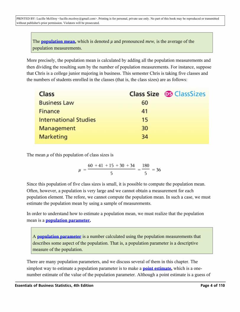
More precisely, the population mean is calculated by adding all the population measurements and then dividing the resulting sum by the number of population measurements. For instance, suppose that Chris is a college junior majoring in business. This semester Chris is taking five classes and the numbers of students enrolled in the classes (that is, the class sizes) are as follows:
The mean µ of this population of class sizes is
µ = _ = _ = 3660 + 41 + 15 + 30 + 34
51805
Since this population of five class sizes is small, it is possible to compute the population mean. Often, however, a population is very large and we cannot obtain a measurement for each population element. The refore, we cannot compute the population mean. In such a case, we must estimate the population mean by using a sample of measurements.
In order to understand how to estimate a population mean, we must realize that the population mean is a population parameter.
A population parameter is a number calculated using the population measurements that describes some aspect of the population. That is, a population parameter is a descriptive measure of the population.
There are many population parameters, and we discuss several of them in this chapter. The simplest way to estimate a population parameter is to make a point estimate, which is a one-number estimate of the value of the population parameter. Although a point estimate is a guess of a population parameter’s value, it should not be a blind guess. Rather, it should be an educated
Essentials of Business Statistics, 4th Edition Page 4 of 110
PRINTED BY: Lucille McElroy <[email protected]>. Printing is for personal, private use only. No part of this book may be reproduced or transmitted without publisher's prior permission. Violators will be prosecuted.number estimate of the value of the population parameter. Although a point estimate is a guess of
a population parameter’s value, it should not be a blind guess. Rather, it should be an educated guess based on sample data. One sensible way to find a point estimate of a population parameter is to use a sample statistic.
A sample statistic is a number calculated using the sample measurements that describes some aspect of the sample. That is, a sample statistic is a descriptive measure of the sample.
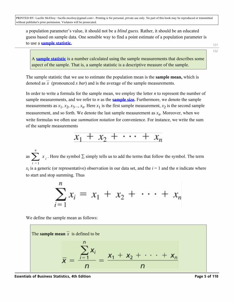
The sample statistic that we use to estimate the population mean is the sample mean, which is denoted as _ (pronounced x bar) and is the average of the sample measurements.x
In order to write a formula for the sample mean, we employ the letter n to represent the number of sample measurements, and we refer to n as the sample size. Furthermore, we denote the sample measurements as x1, x2, x3..., xn. Here x1 is the first sample measurement, x2 is the second sample measurement, and so forth. We denote the last sample measurement as xn. Moreover, when we write formulas we often use summation notation for convenience. For instance, we write the sum of the sample measurements
as _ _ . Here the symbol ∑ simply tells us to add the terms that follow the symbol. The term
xi is a generic (or representative) observation in our data set, and the i = 1 and the n indicate where to start and stop summing. Thus
∑∑i = 1
n
x i
We define the sample mean as follows:
The sample mean _ is defined to bex
101
102
Essentials of Business Statistics, 4th Edition Page 5 of 110

PRINTED BY: Lucille McElroy <[email protected]>. Printing is for personal, private use only. No part of this book may be reproduced or transmitted without publisher's prior permission. Violators will be prosecuted.
and is the point estimate of the population mean µ.
EXAMPLE 3.1: The Car Mileage Case_3.3.1.1
3.3.1.1
Essentials of Business Statistics, 4th Edition Page 6 of 110
PRINTED BY: Lucille McElroy <[email protected]>. Printing is for personal, private use only. No part of this book may be reproduced or transmitted without publisher's prior permission. Violators will be prosecuted.
In order to offer its tax credit, the federal government has decided to define the “typical” EPA combined city and highway mileage for a car model as the mean µ of the population of EPA combined mileages that would be obtained by all cars of this type. Here, using the mean to represent a typical value is probably reasonable. We know that some individual cars will get mileages that are lower than the mean and some will get mileages that are above it. However, because there will be many thousands of these cars on the road, the mean mileage obtained by these cars is probably a reasonable way to represent the model’s overall fuel economy. Therefore, the government will offer its tax credit to any automaker selling a midsize model equipped with an automatic transmission that achieves a mean EPA combined mileage of at least 31 mpg.
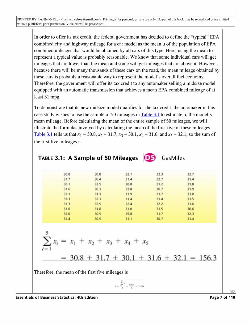
To demonstrate that its new midsize model qualifies for the tax credit, the automaker in this case study wishes to use the sample of 50 mileages in Table 3.1 to estimate µ, the model’s mean mileage. Before calculating the mean of the entire sample of 50 mileages, we will illustrate the formulas involved by calculating the mean of the first five of these mileages. Table 3.1 tells us that x1 = 30.8, x2 = 31.7, x3 = 30.1, x4 = 31.6, and x5 = 32.1, so the sum of the first five mileages is
TABLE 3.1: A Sample of 50 Mileages _ GasMiles
Therefore, the mean of the first five mileages is
102Essentials of Business Statistics, 4th Edition Page 7 of 110
PRINTED BY: Lucille McElroy <[email protected]>. Printing is for personal, private use only. No part of this book may be reproduced or transmitted without publisher's prior permission. Violators will be prosecuted.
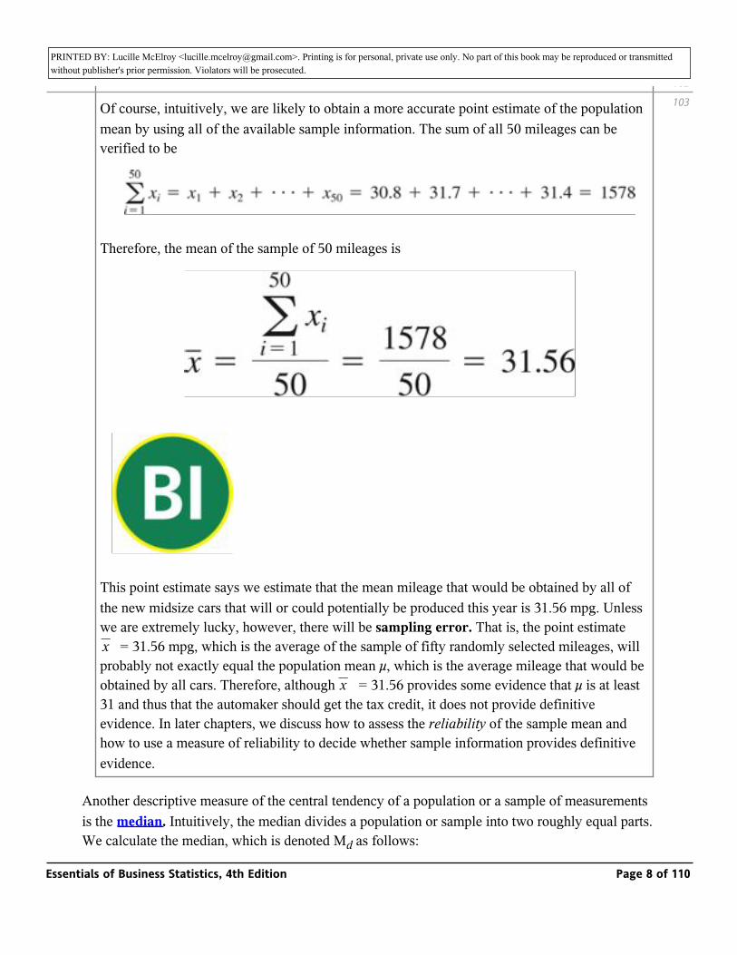
Of course, intuitively, we are likely to obtain a more accurate point estimate of the population mean by using all of the available sample information. The sum of all 50 mileages can be verified to be
Therefore, the mean of the sample of 50 mileages is
_
This point estimate says we estimate that the mean mileage that would be obtained by all of the new midsize cars that will or could potentially be produced this year is 31.56 mpg. Unless we are extremely lucky, however, there will be sampling error. That is, the point estimate _ = 31.56 mpg, which is the average of the sample of fifty randomly selected mileages, will probably not exactly equal the population mean µ, which is the average mileage that would be obtained by all cars. Therefore, although _ = 31.56 provides some evidence that µ is at least 31 and thus that the automaker should get the tax credit, it does not provide definitive evidence. In later chapters, we discuss how to assess the reliability of the sample mean and how to use a measure of reliability to decide whether sample information provides definitive evidence.
x
x
Another descriptive measure of the central tendency of a population or a sample of measurements is the median. Intuitively, the median divides a population or sample into two roughly equal parts. We calculate the median, which is denoted Md as follows:
102
103
Essentials of Business Statistics, 4th Edition Page 8 of 110
PRINTED BY: Lucille McElroy <[email protected]>. Printing is for personal, private use only. No part of this book may be reproduced or transmitted without publisher's prior permission. Violators will be prosecuted.We calculate the median, which is denoted Md as follows:
Consider a population or a sample of measurements, and arrange the measurements in increasing order. The median, Md, is found as follows:
1 If the number of measurements is odd, the median is the middlemost measurement in the ordering.
2 If the number of measurements is even, the median is the average of the two middlemost measurements in the ordering.
For example, recall that Chris’s five classes have sizes 60, 41, 15, 30, and 34. To find the median of the population of class sizes, we arrange the class sizes in increasing order as follows:
Because the number of class sizes is odd, the median of the population of class sizes is the middlemost class size in the ordering. Therefore, the median is 34 students (it is circled).
As another example, suppose that in the middle of the semester Chris decides to take an additional class—a sprint class in individual exercise. If the individual exercise class has 30 students, then the sizes of Chris’s six classes are (arranged in increasing order):
Because the number of classes is even, the median of the population of class sizes is the average of the two middlemost class sizes, which are circled. Therefore, the median is (30 + 34)/2 = 32 students. Note that, although two of Chris’s classes have the same size, 30 students, each observation is listed separately (that is, 30 is listed twice) when we arrange the observations in increasing order.
As a third example, if we arrange the sample of 50 mileages in Table 3.1 in increasing order, we find that the two middlemost mileages—the 25th and 26th mileages—are 31.5 and 31.6. It follows that the median of the sample is 31.55. Therefore, we estimate that the median mileage that would be obtained by all of the new midsize cars that will or could potentially be produced this year is 31.55 mpg. The Excel output in Figure 3.1 shows this median mileage, as well as the previously calculated mean mileage of 31.56 mpg. Other quantities given on the output will be discussed later in this chapter.
103
104
Essentials of Business Statistics, 4th Edition Page 9 of 110

PRINTED BY: Lucille McElroy <[email protected]>. Printing is for personal, private use only. No part of this book may be reproduced or transmitted without publisher's prior permission. Violators will be prosecuted.later in this chapter.
A third measure of the central tendency of a population or sample is the mode, which is denoted M0.
The mode, Mo, of a population or sample of measurements is the measurement that occurs most frequently.
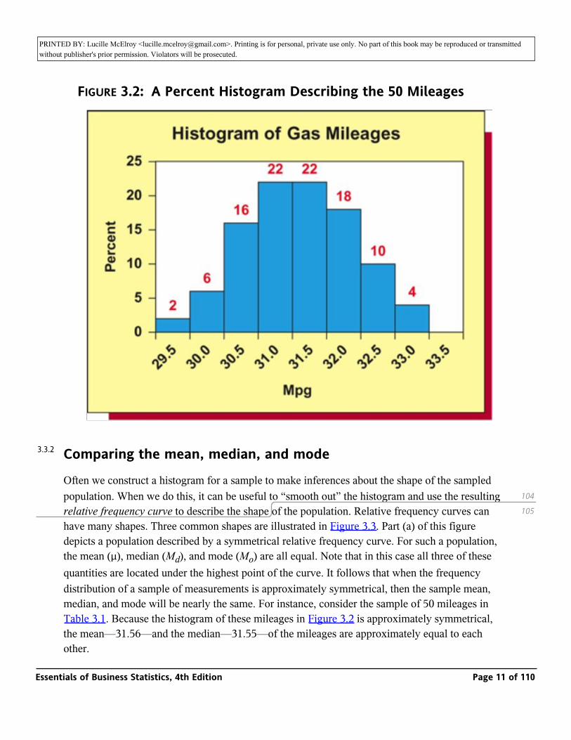
For example, the mode of Chris’s six class sizes is 30. This is because more classes (two) have a size of 30 than any other size. Sometimes the highest frequency occurs at more than one measurement. When this happens, two or more modes exist. When exactly two modes exist, we say the data are bimodal. When more than two modes exist, we say the data are multimodal. If data are presented in classes (such as in a frequency or percent histogram), the class having the highest frequency or percent is called the modal class. For example, Figure 3.2 shows a histogram of the car mileages that has two modal classes—the class from 31.0 mpg to 31.5 mpg and the class from 31.5 mpg to 32.0 mpg. Since the mileage 31.5 is in the middle of the modal classes, we might estimate that the population mode for the new midsize model is 31.5 mpg. Or, alternatively, because the Excel output in Figure 3.1 tells us that the mode of the sample of 50 mileages is 31.4 mpg (it can be verified that this mileage occurs five times in Table 3.1), we might estimate that the population mode is 31.4 mpg. Obviously, these two estimates are somewhat contradictory. In general, it can be difficult to define a reliable method for estimating the population mode. Therefore, although it can be informative to report the modal class or classes in a frequency or percent histogram, the mean or median is used more often than the mode when we wish to describe a data set’s central tendency by using a single number. Finally, the mode is a useful descriptor of qualitative data. For example, we have seen in Chapter 2 that the most frequently sold 2006 Jeep model at the Cincinnati Jeep dealership was the Jeep Liberty, which accounted for 31.87 percent of Jeep sales.
FIGURE 3.1: Excel Output of Statistics Describing the 50 Mileages
Essentials of Business Statistics, 4th Edition Page 10 of 110
PRINTED BY: Lucille McElroy <[email protected]>. Printing is for personal, private use only. No part of this book may be reproduced or transmitted without publisher's prior permission. Violators will be prosecuted.
FIGURE 3.2: A Percent Histogram Describing the 50 Mileages
Comparing the mean, median, and mode
Often we construct a histogram for a sample to make inferences about the shape of the sampled population. When we do this, it can be useful to “smooth out” the histogram and use the resulting relative frequency curve to describe the shape of the population. Relative frequency curves can have many shapes. Three common shapes are illustrated in Figure 3.3. Part (a) of this figure depicts a population described by a symmetrical relative frequency curve. For such a population, the mean (µ), median (Md), and mode (Mo) are all equal. Note that in this case all three of these quantities are located under the highest point of the curve. It follows that when the frequency distribution of a sample of measurements is approximately symmetrical, then the sample mean, median, and mode will be nearly the same. For instance, consider the sample of 50 mileages in Table 3.1. Because the histogram of these mileages in Figure 3.2 is approximately symmetrical, the mean—31.56—and the median—31.55—of the mileages are approximately equal to each other.
104
105
3.3.2
Essentials of Business Statistics, 4th Edition Page 11 of 110
PRINTED BY: Lucille McElroy <[email protected]>. Printing is for personal, private use only. No part of this book may be reproduced or transmitted without publisher's prior permission. Violators will be prosecuted.other.
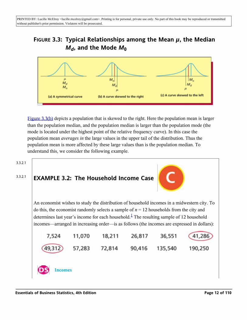
FIGURE 3.3: Typical Relationships among the Mean µ, the Median Md, and the Mode M0
Figure 3.3(b) depicts a population that is skewed to the right. Here the population mean is larger than the population median, and the population median is larger than the population mode (the mode is located under the highest point of the relative frequency curve). In this case the population mean averages in the large values in the upper tail of the distribution. Thus the population mean is more affected by these large values than is the population median. To understand this, we consider the following example.
EXAMPLE 3.2: The Household Income Case_
An economist wishes to study the distribution of household incomes in a midwestern city. To do this, the economist randomly selects a sample of n = 12 households from the city and determines last year’s income for each household.1 The resulting sample of 12 household incomes—arranged in increasing order—is as follows (the incomes are expressed in dollars):
_ Incomes
3.3.2.1
3.3.2.1
Essentials of Business Statistics, 4th Edition Page 12 of 110
PRINTED BY: Lucille McElroy <[email protected]>. Printing is for personal, private use only. No part of this book may be reproduced or transmitted without publisher's prior permission. Violators will be prosecuted.
_ Incomes
Because the number of incomes is even, the median of the incomes is the average of the two middlemost incomes, which are enclosed in ovals. Therefore, the median is (41,286 + 49,312)/2 = $45,299. The mean of the incomes is the sum of the incomes, 737,076, divided by 12, or $61,423. Here, the mean has been affected by averaging in the large incomes $135,540 and $190,250 and thus is larger than the median. The median is said to be resistant to these large incomes because the value of the median is affected only by the position of these large incomes in the ordered list of incomes, not by the exact sizes of the incomes. For example, if the largest income were smaller—say $150,000—the median would remain the same but the mean would decrease. If the largest income were larger—say $300,000—the median would also remain the same but the mean would increase. Therefore, the median is resistant to large values but the mean is not. Similarly, the median is resistant to values that are much smaller than most of the measurements. In general, we say that the median is resistant to extreme values.
Figure 3.3(c) depicts a population that is skewed to the left. Here the population mean is smaller than the population median, and the population median is smaller than the population mode. In this case the population mean averages in the small values in the lower tail of the distribution, and the mean is more affected by these small values than is the median. For instance, in a survey several years ago of 20 Decision Sciences graduates at Miami University, 18 of the graduates had obtained employment in business consulting that paid a mean salary of about $43,000. One of the graduates had become a Christian missionary and listed his salary as $8,500, and another graduate was working for his hometown bank and listed his salary as $10,500. The two lower salaries decreased the overall mean salary to about $39,650, which was below the median salary of about $43,000.
When a population is skewed to the right or left with a very long tail, the population mean can be substantially affected by the extreme population values in the tail of the distribution. In such a case, the population median might be better than the population mean as a measure of central tendency. For example, the yearly incomes of all people in the United States are skewed to the right with a very long tail. Furthermore, the very large incomes in this tail cause the mean yearly income to be inflated above the typical income earned by most Americans. Because of this, the median income is more representative of a typical U.S. income.
When a population is symmetrical or not highly skewed, then the population mean and the population median are either equal or roughly equal, and both provide a good measure of the population central tendency. In this situation, we usually make inferences about the population mean because much of statistical theory is based on the mean rather than the median.
105
106
Essentials of Business Statistics, 4th Edition Page 13 of 110
PRINTED BY: Lucille McElroy <[email protected]>. Printing is for personal, private use only. No part of this book may be reproduced or transmitted without publisher's prior permission. Violators will be prosecuted.mean because much of statistical theory is based on the mean rather than the median.
EXAMPLE 3.3: The Marketing Research Case _
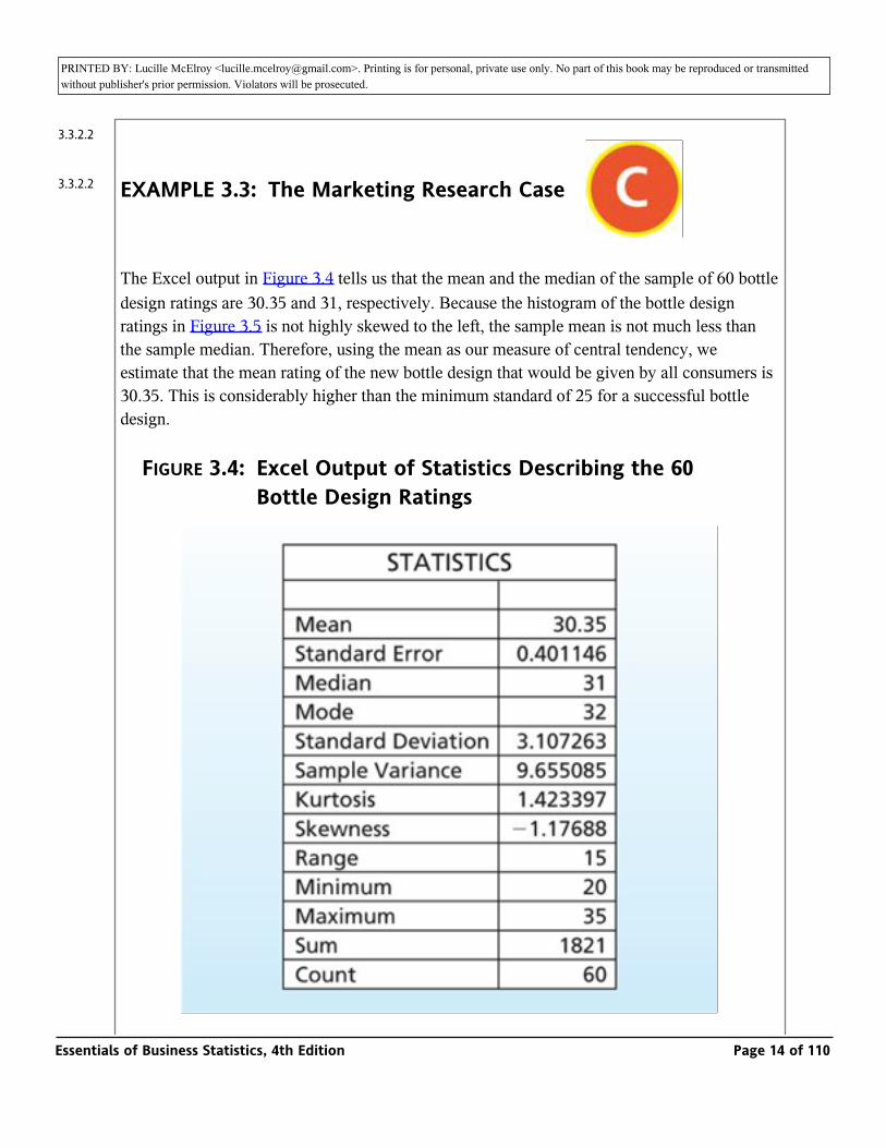
The Excel output in Figure 3.4 tells us that the mean and the median of the sample of 60 bottle design ratings are 30.35 and 31, respectively. Because the histogram of the bottle design ratings in Figure 3.5 is not highly skewed to the left, the sample mean is not much less than the sample median. Therefore, using the mean as our measure of central tendency, we estimate that the mean rating of the new bottle design that would be given by all consumers is 30.35. This is considerably higher than the minimum standard of 25 for a successful bottle design.
FIGURE 3.4: Excel Output of Statistics Describing the 60 Bottle Design Ratings
3.3.2.2
3.3.2.2
Essentials of Business Statistics, 4th Edition Page 14 of 110
PRINTED BY: Lucille McElroy <[email protected]>. Printing is for personal, private use only. No part of this book may be reproduced or transmitted without publisher's prior permission. Violators will be prosecuted.
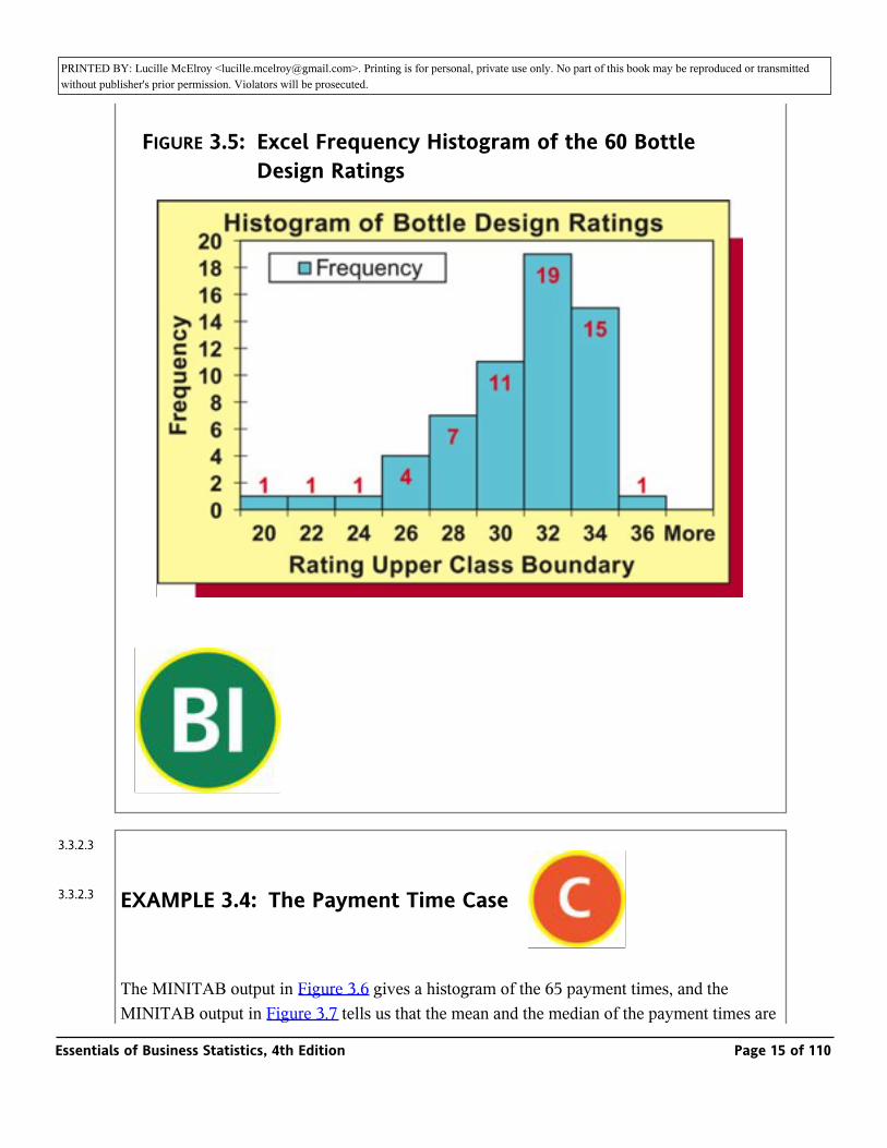
FIGURE 3.5: Excel Frequency Histogram of the 60 Bottle Design Ratings
_
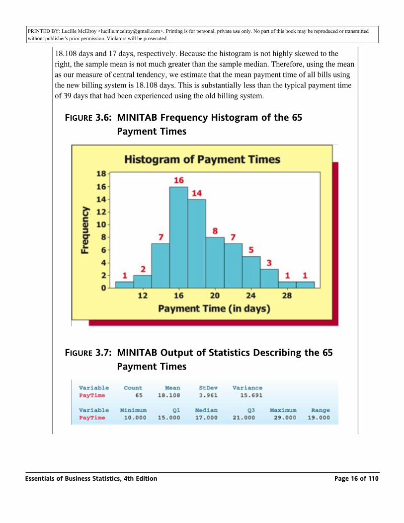
EXAMPLE 3.4: The Payment Time Case _
The MINITAB output in Figure 3.6 gives a histogram of the 65 payment times, and the MINITAB output in Figure 3.7 tells us that the mean and the median of the payment times are 18.108 days and 17 days, respectively. Because the histogram is not highly skewed to the
3.3.2.3
3.3.2.3
Essentials of Business Statistics, 4th Edition Page 15 of 110
PRINTED BY: Lucille McElroy <[email protected]>. Printing is for personal, private use only. No part of this book may be reproduced or transmitted without publisher's prior permission. Violators will be prosecuted.MINITAB output in Figure 3.7 tells us that the mean and the median of the payment times are
18.108 days and 17 days, respectively. Because the histogram is not highly skewed to the right, the sample mean is not much greater than the sample median. Therefore, using the mean as our measure of central tendency, we estimate that the mean payment time of all bills using the new billing system is 18.108 days. This is substantially less than the typical payment time of 39 days that had been experienced using the old billing system.
FIGURE 3.6: MINITAB Frequency Histogram of the 65 Payment Times
FIGURE 3.7: MINITAB Output of Statistics Describing the 65 Payment Times
Essentials of Business Statistics, 4th Edition Page 16 of 110

PRINTED BY: Lucille McElroy <[email protected]>. Printing is for personal, private use only. No part of this book may be reproduced or transmitted without publisher's prior permission. Violators will be prosecuted.
_
106
107
Essentials of Business Statistics, 4th Edition Page 17 of 110

PRINTED BY: Lucille McElroy <[email protected]>. Printing is for personal, private use only. No part of this book may be reproduced or transmitted without publisher's prior permission. Violators will be prosecuted.
EXAMPLE 3.5: The Cell Phone Case _
Remember that if the cellular cost per minute for the random sample of 100 bank employees is over 18 cents per minute, the bank will benefit from automated cellular management of its calling plans. Last month’s cellular usages for the 100 randomly selected employees are given in Table 1.4 (page 9), and a dot plot of these usages is given in the page margin. If we add together the usages, we find that the 100 employees used a total of 46,625 minutes. Furthermore, the total cellular cost incurred by the 100 employees is found to be $9,317 (this total includes base costs, overage costs, long distance, and roaming). This works out to an average of $9,317/46,625 = $.1998, or 19.98 cents per minute. Because this average cellular cost per minute exceeds 18 cents per minute, the bank will hire the cellular management service to manage its calling plans.
_
To conclude this section, note that the mean and the median convey useful information about a population having a relative frequency curve with a sufficiently regular shape. For instance, the mean and median would be useful in describing the mound-shaped, or single-peaked, distributions in Figure 3.3. However, these measures of central tendency do not adequately describe a double-peaked distribution. For example, the mean and the median of the exam scores in the double-peaked distribution of Figure 2.12 (page 48) are 75.225 and 77. Looking at the distribution, neither the mean nor the median represents a typical exam score. This is because the exam scores really have no central value. In this case the most important message conveyed by the double-peaked distribution is that the exam scores fall into two distinct groups.
Exercises for Section 3.1CONCEPTS
3.3.2.4
3.3.2.4
3.3.2.5
Essentials of Business Statistics, 4th Edition Page 18 of 110
PRINTED BY: Lucille McElroy <[email protected]>. Printing is for personal, private use only. No part of this book may be reproduced or transmitted without publisher's prior permission. Violators will be prosecuted.
CONCEPTS
_
3.1 Explain the difference between each of the following:
a A population parameter and its point estimate.
b A population mean and a corresponding sample mean.
3.2 Explain how the population mean, median, and mode compare when the population’s relative frequency curve is
a Symmetrical.
b Skewed with a tail to the left.
c Skewed with a tail to the right.
METHODS AND APPLICATIONS
3.3 Calculate the mean, median, and mode of each of the following populations of numbers:
a 9, 8, 10, 10, 12, 6, 11, 10, 12, 8
b 110, 120, 70, 90, 90, 100, 80, 130, 140
3.4 Calculate the mean, median, and mode for each of the following populations of numbers:
a 17, 23, 19, 20, 25, 18, 22, 15, 21, 20
b 505, 497, 501, 500, 507, 510, 501
3.5 THE VIDEO GAME SATISFACTION RATING CASE _ VideoGame
Recall that Table 1.7 (page 13) presents the satisfaction ratings for the XYZ-Box game system that have been given by 65 randomly selected purchasers. Figures 3.8 and 3.11(a) give the MINITAB and Excel outputs of statistics describing the 65 satisfaction ratings.
107
108
Essentials of Business Statistics, 4th Edition Page 19 of 110
PRINTED BY: Lucille McElroy <[email protected]>. Printing is for personal, private use only. No part of this book may be reproduced or transmitted without publisher's prior permission. Violators will be prosecuted.satisfaction ratings.
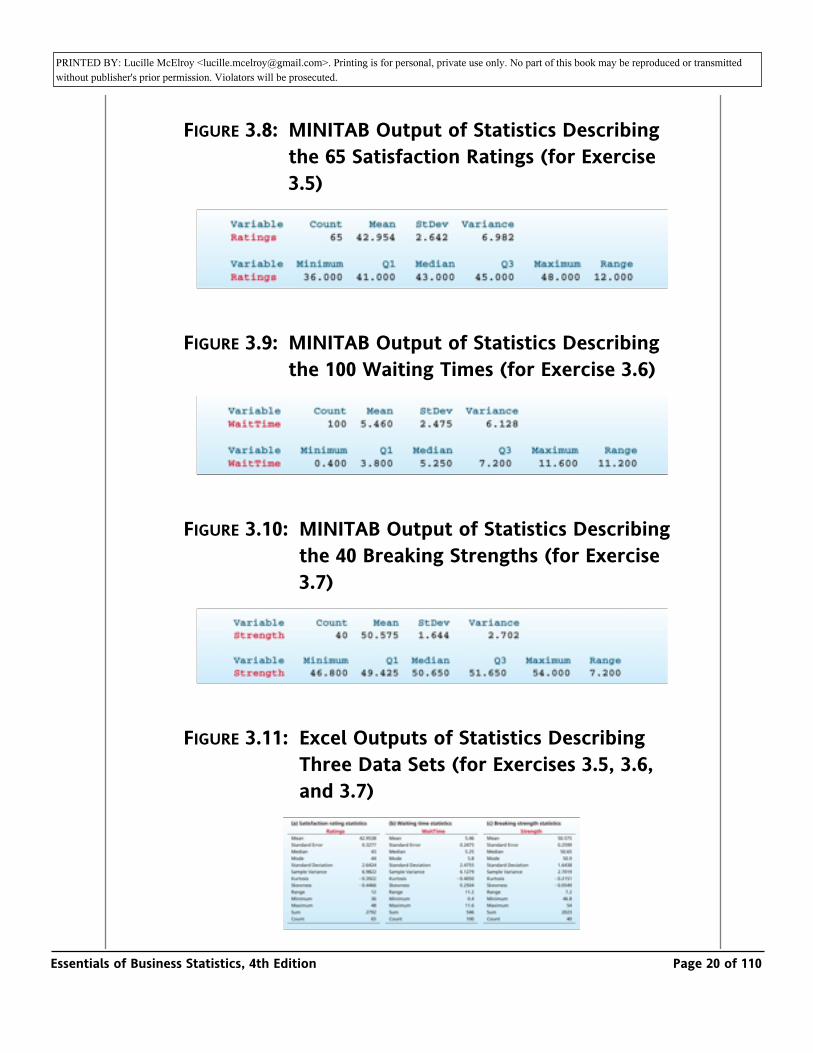
FIGURE 3.8: MINITAB Output of Statistics Describing the 65 Satisfaction Ratings (for Exercise 3.5)
FIGURE 3.9: MINITAB Output of Statistics Describing the 100 Waiting Times (for Exercise 3.6)
FIGURE 3.10: MINITAB Output of Statistics Describing the 40 Breaking Strengths (for Exercise 3.7)
FIGURE 3.11: Excel Outputs of Statistics Describing Three Data Sets (for Exercises 3.5, 3.6, and 3.7)
Essentials of Business Statistics, 4th Edition Page 20 of 110
PRINTED BY: Lucille McElroy <[email protected]>. Printing is for personal, private use only. No part of this book may be reproduced or transmitted without publisher's prior permission. Violators will be prosecuted.
a Find the sample mean on the outputs. Does the sample mean provide some evidence that the mean of the population of all possible customer satisfaction ratings for the XYZ-Box is at least 42? (Recall that a “very satisfied” customer gives a rating that is at least 42.) Explain your answer.
b Find the sample median on the outputs. How do the mean and median compare? What does the histogram in Figure 2.15 (page 52) tell you about why they compare this way?
3.6 THE BANK CUSTOMER WAITING TIME CASE _ WaitTime
Recall that Table 1.8 (page 13) presents the waiting times for teller service during peak business hours of 100 randomly selected bank customers. Figures 3.9 and 3.11(b) give the MINITAB and Excel outputs of statistics describing the 100 waiting times.
a Find the sample mean on the outputs. Does the sample mean provide some evidence that the mean of the population of all possible customer waiting times during peak business hours is less than six minutes (as is desired by the bank manager)? Explain your answer.
b Find the sample median on the outputs. How do the mean and median compare? What does the histogram in Figure 2.16 (page 53) tell you about why they compare this way?
3.7 THE TRASH BAG CASE _ TrashBag
Consider the trash bag problem. Suppose that an independent laboratory has tested 30-gallon trash bags and has found that none of the 30-gallon bags currently on the market has a mean breaking strength of 50 pounds or more. On the basis of these results, the producer of the new, improved trash bag feels sure that its 30-gallon bag will be the strongest such bag on the market if the new trash bag’s mean breaking strength can be shown to be at least 50 pounds. Recall that Table 1.9 (page 14) presents the breaking strengths of 40 trash bags of the new type that were selected during a 40-hour pilot production run. Figures 3.10 and 3.11(c) give the MINITAB and Excel outputs of statistics describing the 40 breaking strengths.
Essentials of Business Statistics, 4th Edition Page 21 of 110
PRINTED BY: Lucille McElroy <[email protected]>. Printing is for personal, private use only. No part of this book may be reproduced or transmitted without publisher's prior permission. Violators will be prosecuted.and Excel outputs of statistics describing the 40 breaking strengths.
a Find the sample mean on the outputs. Does the sample mean provide some evidence that the mean of the population of all possible trash bag breaking strengths is at least 50 pounds? Explain your answer.
b Find the sample median on the outputs. How do the mean and median compare? What does the histogram in Figure 2.17 (page 53) tell you about why they compare this way?
3.8 Lauren is a college sophomore majoring in business. This semester Lauren is taking courses in accounting, economics, management information systems, public speaking, and statistics. The sizes of these classes are, respectively, 350, 45, 35, 25, and 40. Find the mean and the median of the class sizes. What is a better measure of Lauren’s “typical class size”—the mean or the median?
Exercises 3.9 through 3.13 refer to information in Table 3.2, which gives data concerning lifestyles in the United States and eight other countries. In each exercise (a) compute the appropriate mean and median; (b) compare the mean and median and explain what they say about skewness; (c) construct a dot plot and discuss what the dot plot says about skewness and whether this agrees with how the mean and median compare; (d) discuss how the
United States compares to the mean and median. _
LifeStyle
TABLE 3.2: Data Comparing Lifestyles in the U.S.
and Eight Other Countries_
LifeStyle
108
109
Essentials of Business Statistics, 4th Edition Page 22 of 110
PRINTED BY: Lucille McElroy <[email protected]>. Printing is for personal, private use only. No part of this book may be reproduced or transmitted without publisher's prior permission. Violators will be prosecuted.
3.9 Analyze the data concerning voters in Table 3.2 as described above. _
LifeStyle
3.10 Analyze the data concerning income tax rates in Table 3.2 as described above.
_ LifeStyle
3.11 Analyze the data concerning video rentals in Table 3.2 as described above.
_ LifeStyle
3.12 Analyze the data concerning PCs in Table 3.2 as described above. _
LifeStyle
3.13 Analyze the data concerning religion in Table 3.2 as described above._
LifeStyle
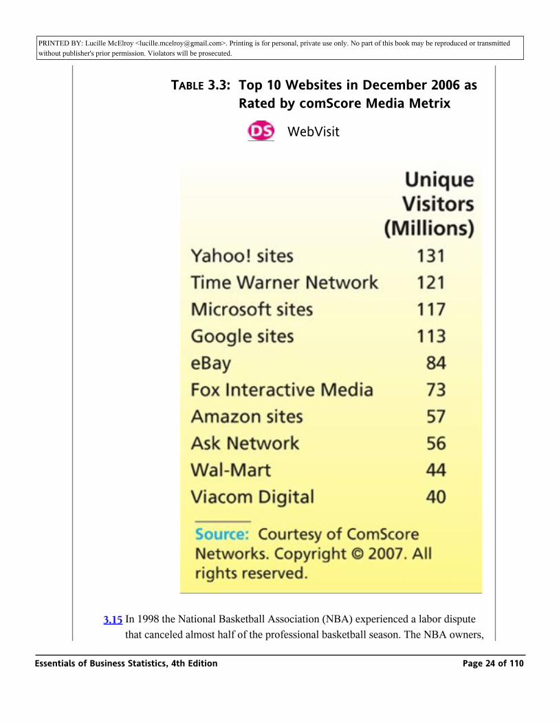
3.14 Table 3.3 gives the number of unique visitors during December 2006 to the top 10 websites as rated by comScore Media Metrix, a division of comScore Networks, Inc. Compute the mean and median for the website data and compare them. What
do they say about skewness? _ WebVisit
Essentials of Business Statistics, 4th Edition Page 23 of 110
PRINTED BY: Lucille McElroy <[email protected]>. Printing is for personal, private use only. No part of this book may be reproduced or transmitted without publisher's prior permission. Violators will be prosecuted.
do they say about skewness? _ WebVisit
TABLE 3.3: Top 10 Websites in December 2006 as Rated by comScore Media Metrix
_ WebVisit
3.15 In 1998 the National Basketball Association (NBA) experienced a labor dispute that canceled almost half of the professional basketball season. The NBA owners, who were worried about escalating salaries because several star players had
Essentials of Business Statistics, 4th Edition Page 24 of 110
PRINTED BY: Lucille McElroy <[email protected]>. Printing is for personal, private use only. No part of this book may be reproduced or transmitted without publisher's prior permission. Violators will be prosecuted.that canceled almost half of the professional basketball season. The NBA owners,
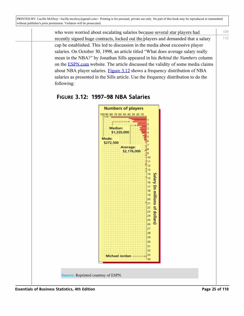
who were worried about escalating salaries because several star players had recently signed huge contracts, locked out the players and demanded that a salary cap be established. This led to discussion in the media about excessive player salaries. On October 30, 1998, an article titled “What does average salary really mean in the NBA?” by Jonathan Sills appeared in his Behind the Numbers column on the ESPN.com website. The article discussed the validity of some media claims about NBA player salaries. Figure 3.12 shows a frequency distribution of NBA salaries as presented in the Sills article. Use the frequency distribution to do the following:
FIGURE 3.12: 1997–98 NBA Salaries
Source: Reprinted courtesy of ESPN.
109
110
Essentials of Business Statistics, 4th Edition Page 25 of 110
PRINTED BY: Lucille McElroy <[email protected]>. Printing is for personal, private use only. No part of this book may be reproduced or transmitted without publisher's prior permission. Violators will be prosecuted.
a Compare the mean, median, and mode of the salaries and explain the relationship. Note that the minimum NBA salary at the time of the lockout was $272,500.
b Noting that 411 NBA players were under contract, estimate the percentage of players who earned more than the mean salary; more than the median salary.
c Below we give three quotes from news stories cited by Sills in his article. Comment on the validity of each statement.
“Last year, the NBA middle class made an average of $2.6 million. On that scale, I’d take the NBA lower class.”—Houston Chronicle
“The players make an obscene amount of money—the median salary is well over $2 million!”—St. Louis Post Dispatch
“The players want us to believe they literally can’t ‘survive’ on $2.6 million a year, the average salary in the NBA.”—Washington Post
3.2: Measures of Variation
Range, variance, and standard deviation
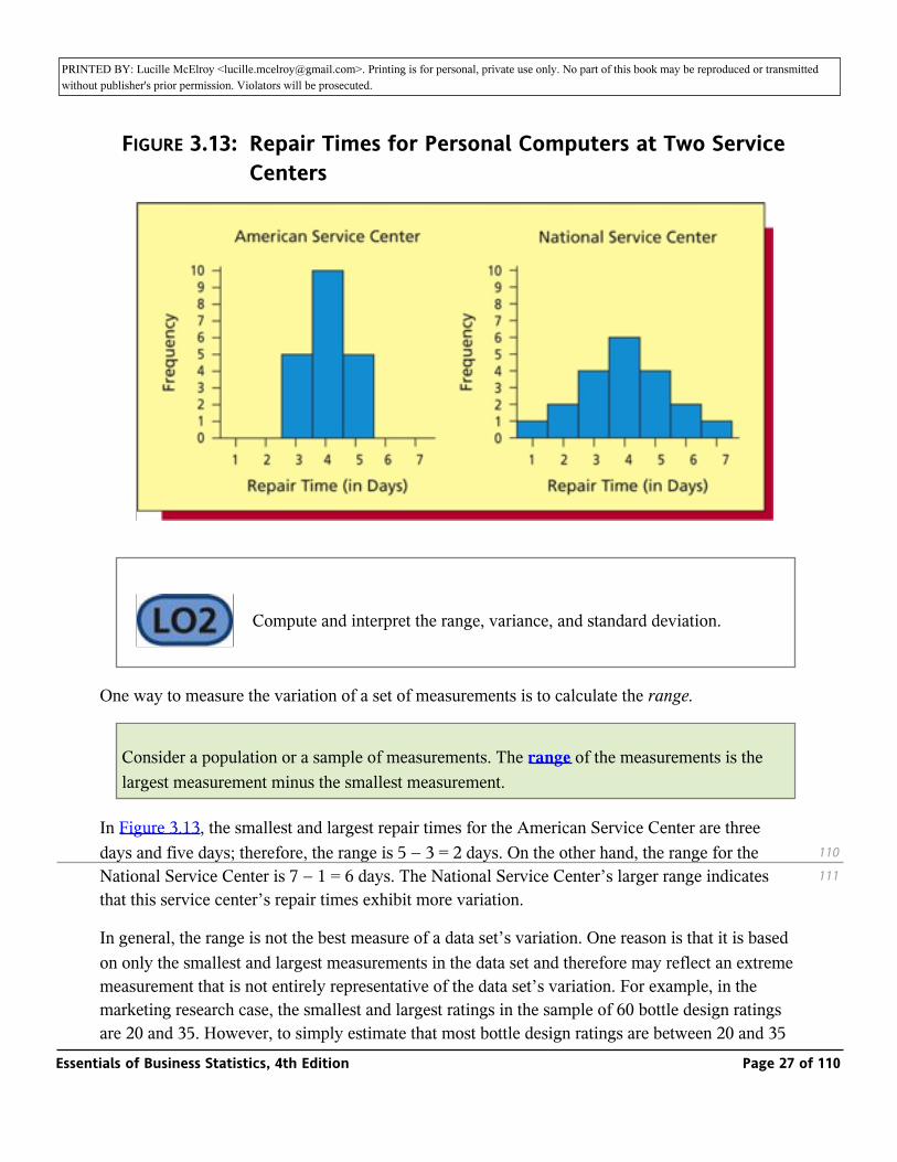
In addition to estimating a population’s central tendency, it is important to estimate the variation of the population’s individual values. For example, Figure 3.13 shows two histograms. Each portrays the distribution of 20 repair times (in days) for personal computers at a major service center. Because the mean (and median and mode) of each distribution equals four days, the measures of central tendency do not indicate any difference between the American and National Service Centers. However, the repair times for the American Service Center are clustered quite closely together, whereas the repair times for the National Service Center are spread farther apart (the repair time might be as little as one day, but could also be as long as seven days). Therefore, we need measures of variation to express how the two distributions differ.
3.4
3.4.1
Essentials of Business Statistics, 4th Edition Page 26 of 110
PRINTED BY: Lucille McElroy <[email protected]>. Printing is for personal, private use only. No part of this book may be reproduced or transmitted without publisher's prior permission. Violators will be prosecuted.we need measures of variation to express how the two distributions differ.
FIGURE 3.13: Repair Times for Personal Computers at Two Service Centers
_ Compute and interpret the range, variance, and standard deviation.
One way to measure the variation of a set of measurements is to calculate the range.
Consider a population or a sample of measurements. The range of the measurements is the largest measurement minus the smallest measurement.
In Figure 3.13, the smallest and largest repair times for the American Service Center are three days and five days; therefore, the range is 5 − 3 = 2 days. On the other hand, the range for the National Service Center is 7 − 1 = 6 days. The National Service Center’s larger range indicates that this service center’s repair times exhibit more variation.
In general, the range is not the best measure of a data set’s variation. One reason is that it is based on only the smallest and largest measurements in the data set and therefore may reflect an extreme measurement that is not entirely representative of the data set’s variation. For example, in the marketing research case, the smallest and largest ratings in the sample of 60 bottle design ratings are 20 and 35. However, to simply estimate that most bottle design ratings are between 20 and 35 misses the fact that 57, or 95 percent, of the 60 ratings are at least as large as the minimum rating
110
111
Essentials of Business Statistics, 4th Edition Page 27 of 110
PRINTED BY: Lucille McElroy <[email protected]>. Printing is for personal, private use only. No part of this book may be reproduced or transmitted without publisher's prior permission. Violators will be prosecuted.are 20 and 35. However, to simply estimate that most bottle design ratings are between 20 and 35
misses the fact that 57, or 95 percent, of the 60 ratings are at least as large as the minimum rating of 25 for a successful bottle design. In general, to fully describe a population’s variation, it is useful to estimate intervals that contain different percentages (for example, 70 percent, 95 percent, or almost 100 percent) of the individual population values. To estimate such intervals, we use the population variance and the population standard deviation.
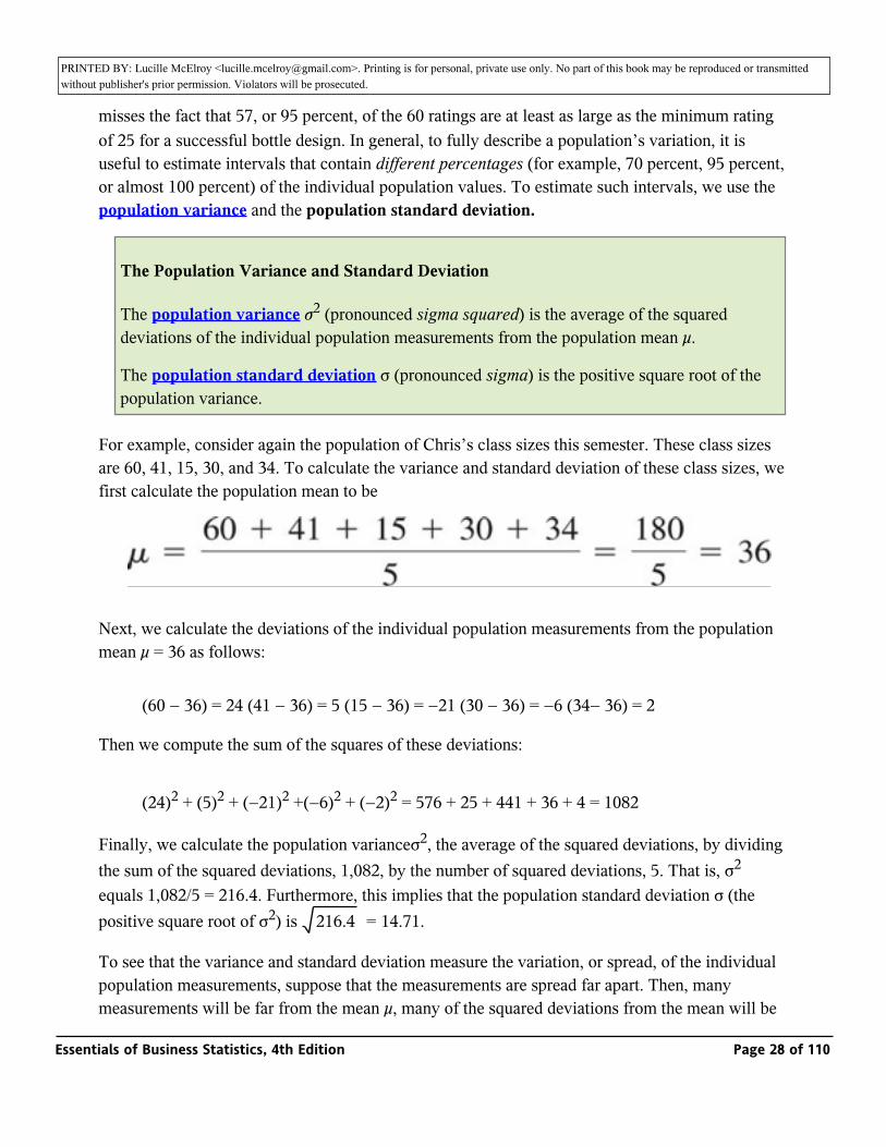
The Population Variance and Standard Deviation
The population variance σ2 (pronounced sigma squared) is the average of the squared deviations of the individual population measurements from the population mean µ.
The population standard deviation σ (pronounced sigma) is the positive square root of the population variance.
For example, consider again the population of Chris’s class sizes this semester. These class sizes are 60, 41, 15, 30, and 34. To calculate the variance and standard deviation of these class sizes, we first calculate the population mean to be
Next, we calculate the deviations of the individual population measurements from the population mean µ = 36 as follows:
(60 − 36) = 24 (41 − 36) = 5 (15 − 36) = −21 (30 − 36) = −6 (34− 36) = 2
Then we compute the sum of the squares of these deviations:
(24)2 + (5)2 + (−21)2 +(−6)2 + (−2)2 = 576 + 25 + 441 + 36 + 4 = 1082
Finally, we calculate the population varianceσ2, the average of the squared deviations, by dividing the sum of the squared deviations, 1,082, by the number of squared deviations, 5. That is, σ2 equals 1,082/5 = 216.4. Furthermore, this implies that the population standard deviation σ (the positive square root of σ2) is _ = 14.71.216.4
To see that the variance and standard deviation measure the variation, or spread, of the individual population measurements, suppose that the measurements are spread far apart. Then, many measurements will be far from the mean µ, many of the squared deviations from the mean will be large, and the sum of squared deviations will be large. It follows that the average of the squared
Essentials of Business Statistics, 4th Edition Page 28 of 110
PRINTED BY: Lucille McElroy <[email protected]>. Printing is for personal, private use only. No part of this book may be reproduced or transmitted without publisher's prior permission. Violators will be prosecuted.measurements will be far from the mean µ, many of the squared deviations from the mean will be
large, and the sum of squared deviations will be large. It follows that the average of the squared deviations—the population variance—will be relatively large. On the other hand, if the population measurements are clustered close together, many measurements will be close to µ, many of the squared deviations from the mean will be small, and the average of the squared deviations—the population variance—will be small. Therefore, the more spread out the population measurements, the larger is the population variance, and the larger is the population standard deviation.
To further understand the population variance and standard deviation, note that one reason we square the deviations of the individual population measurements from the population mean is that the sum of the raw deviations themselves is zero. This is because the negative deviations cancel the positive deviations. For example, in the class size situation, the raw deviations are 24, 5, −21, −6, and −2, which sum to zero. Of course, we could make the deviations positive by finding their absolute values. We square the deviations instead because the resulting population variance and standard deviation have many important interpretations that we study throughout this book. Since the population variance is an average of squared deviations of the original population values, the variance is expressed in squared units of the original population values. On the other hand, the population standard deviation—the square root of the population variance—is expressed in the same units as the original population values. For example, the previously discussed class sizes are expressed in numbers of students. Therefore, the variance of these class sizes is σ2 = 216.4 (students)2, whereas the standard deviation is σ = 14.71 students. Since the population standard deviation is expressed in the same units as the population values, it is more often used to make practical interpretations about the variation of these values.
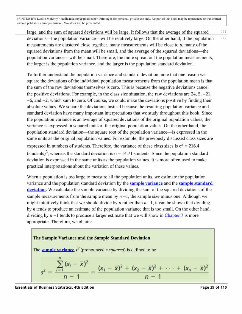
When a population is too large to measure all the population units, we estimate the population variance and the population standard deviation by the sample variance and the sample standard deviation. We calculate the sample variance by dividing the sum of the squared deviations of the sample measurements from the sample mean by n −1, the sample size minus one. Although we might intuitively think that we should divide by n rather than n −1, it can be shown that dividing by n tends to produce an estimate of the population variance that is too small. On the other hand, dividing by n −1 tends to produce a larger estimate that we will show in Chapter 7 is more appropriate. Therefore, we obtain:
The Sample Variance and the Sample Standard Deviation
The sample variance s2 (pronounced s squared) is defined to be
111
112
Essentials of Business Statistics, 4th Edition Page 29 of 110
PRINTED BY: Lucille McElroy <[email protected]>. Printing is for personal, private use only. No part of this book may be reproduced or transmitted without publisher's prior permission. Violators will be prosecuted.
and is the point estimate of the population variance σ.
The sample standard deviation s = _ is the positive square root of the sample variance and is the point estimate of the population standard deviation σ.
_s2
EXAMPLE 3.6: The Car Mileage Case _
To illustrate the calculation of the sample variance and standard deviation, we begin by considering the first five mileages in Table 3.1 (page 103): x1 = 30.8, x2 = 31.7, x3 = 30.1, x4 = 31.6, and x5= 32.1. Since the mean of these five mileages is _ = 31.26 it follows thatx
Therefore, the variance and the standard deviation of the sample of the first five mileages are
Of course, intuitively, we are likely to obtain more accurate point estimates of the population variance and standard deviation by using all the available sample information. Recall that the mean of all 50 mileages is _ = 31.56. Using this sample mean, it can be verified thatx
112
113
3.4.1.1
3.4.1.1
Essentials of Business Statistics, 4th Edition Page 30 of 110
PRINTED BY: Lucille McElroy <[email protected]>. Printing is for personal, private use only. No part of this book may be reproduced or transmitted without publisher's prior permission. Violators will be prosecuted.
Therefore, the variance and the standard deviation of the sample of 50 mileages are
Notice that the Excel output in Figure 3.1 (page 104) gives these quantities. Here s2 = .6363 and s = .7977 are the point estimates of the variance, σ2, and the standard deviation, σ, of the population of the mileages of all the cars that will be or could potentially be produced. Furthermore, the sample standard deviation is expressed in the same units (that is, miles per gallon) as the sample values. Therefore s = .7977 mpg.
Before explaining how we can use s2 and s in a practical way, we present a formula that makes it easier to compute s2. This formula is useful when we are using a handheld calculator that is not equipped with a statistics mode to compute s2.
The sample variance can be calculated using the computational formula
EXAMPLE 3.7: The Payment Time Case _
Consider the sample of 65 payment times in Table 2.4 (page 42). Using these data, it can be verified that
3.4.1.2
3.4.1.2
Essentials of Business Statistics, 4th Edition Page 31 of 110
PRINTED BY: Lucille McElroy <[email protected]>. Printing is for personal, private use only. No part of this book may be reproduced or transmitted without publisher's prior permission. Violators will be prosecuted.
Therefore,
and s = _ = _ = 3.9612 days (see the MINITAB output in Figure 3.7 on page 107).
_s2
15.69135
A practical interpretation of the standard deviation: The Empirical Rule
_ Use the Empirical Rule and Chebyshev’s Theorem to describe variation.
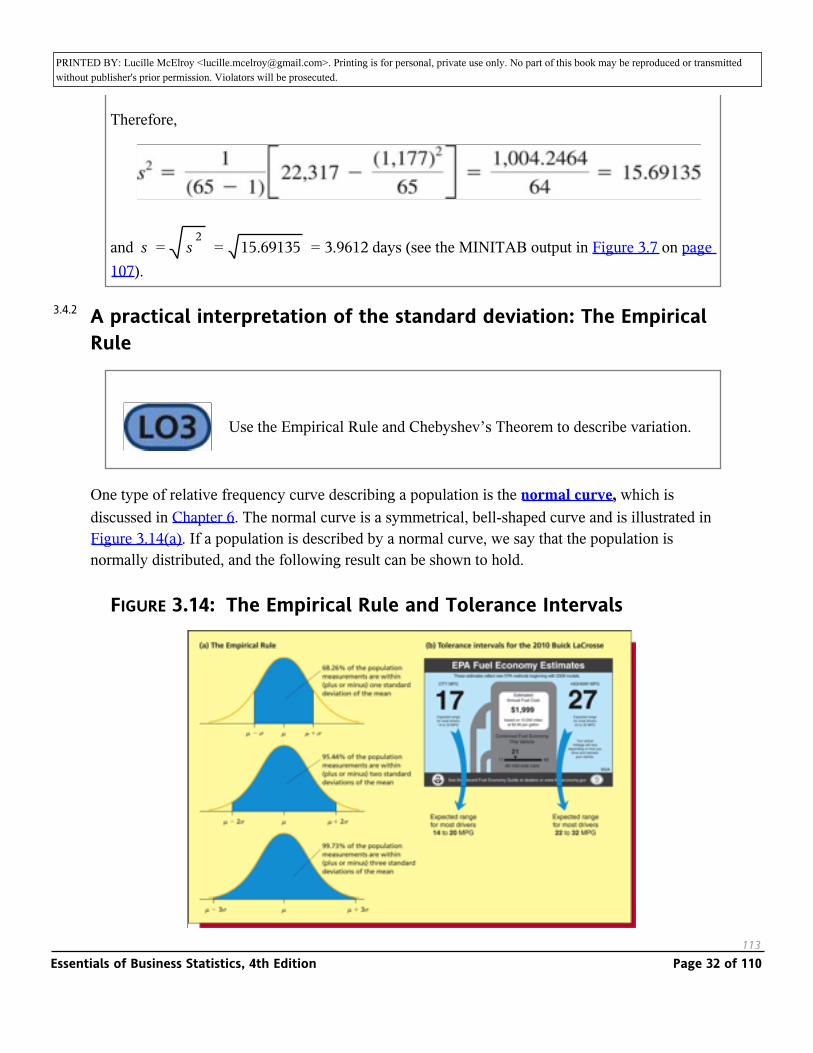
One type of relative frequency curve describing a population is the normal curve, which is discussed in Chapter 6. The normal curve is a symmetrical, bell-shaped curve and is illustrated in Figure 3.14(a). If a population is described by a normal curve, we say that the population is normally distributed, and the following result can be shown to hold.
FIGURE 3.14: The Empirical Rule and Tolerance Intervals
113
3.4.2
Essentials of Business Statistics, 4th Edition Page 32 of 110
PRINTED BY: Lucille McElroy <[email protected]>. Printing is for personal, private use only. No part of this book may be reproduced or transmitted without publisher's prior permission. Violators will be prosecuted.
The Empirical Rule for a Normally Distributed Population
If a population has mean M and standard deviation σ and is described by a normal curve, then, as illustrated in Figure 3.14(a),
1 68.26 percent of the population measurements are within (plus or minus) one standard deviation of the mean and thus lie in the interval [µ − σ, µ + σ] = [µ ± σ]
2 95.44 percent of the population measurements are within (plus or minus) two standard deviations of the mean and thus lie in the interval [µ − 2σ, µ + 2σ] = [µ ± 2σ]
3 99.73 percent of the population measurements are within (plus or minus) three standard deviations of the mean and thus lie in the interval [µ − 3σ, µ + 3σ] = [µ ± 3σ]
In general, an interval that contains a specified percentage of the individual measurements in a population is called a tolerance interval. It follows that the one, two, and three standard deviation intervals around µ given in (1), (2), and (3) are tolerance intervals containing, respectively, 68.26 percent, 95.44 percent, and 99.73 percent of the measurements in a normally distributed population. Often we interpret the three-sigma interval [µ ± 3σ] to be a tolerance interval that contains almost all of the measurements in a normally distributed population. Of course, we usually do not know the true values of µ and σ. Therefore, we must estimate the tolerance intervals by replacing µ and σ in these intervals by the mean _ and standard deviation s of a sample that has been randomly selected from the normally distributed population.
x
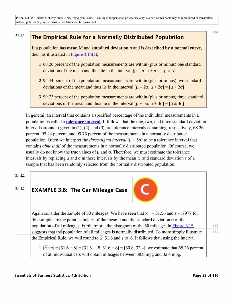
EXAMPLE 3.8: The Car Mileage Case _
Again consider the sample of 50 mileages. We have seen that _ = 31.56 and s = .7977 for this sample are the point estimates of the mean µ and the standard deviation σ of the population of all mileages. Furthermore, the histogram of the 50 mileages in Figure 3.15 suggests that the population of all mileages is normally distributed. To more simply illustrate the Empirical Rule, we will round to _ 31.6 and s to .8. It follows that, using the interval
x
x
1 [_ ±s] = [31.6 ±.8] = [31.6 − .8, 31.6 +.8] = [30.8, 32.4], we estimate that 68.26 percent of all individual cars will obtain mileages between 30.8 mpg and 32.4 mpg.x
113
114
114
115
3.4.2.1
3.4.2.2
3.4.2.2
Essentials of Business Statistics, 4th Edition Page 33 of 110
PRINTED BY: Lucille McElroy <[email protected]>. Printing is for personal, private use only. No part of this book may be reproduced or transmitted without publisher's prior permission. Violators will be prosecuted.of all individual cars will obtain mileages between 30.8 mpg and 32.4 mpg.
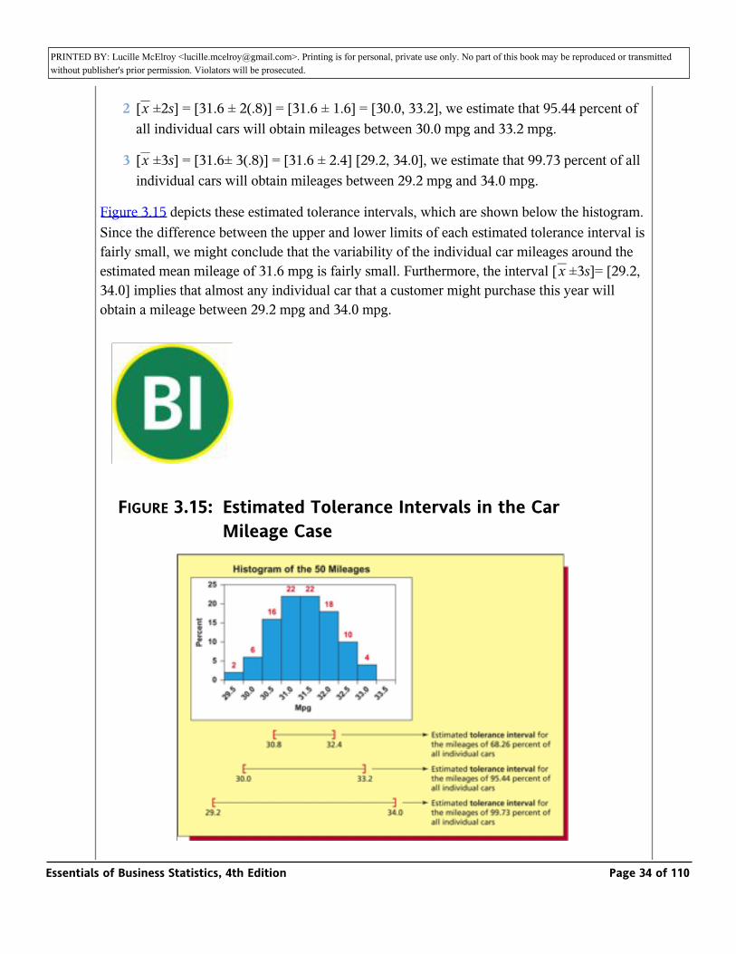
2 [_ ±2s] = [31.6 ± 2(.8)] = [31.6 ± 1.6] = [30.0, 33.2], we estimate that 95.44 percent of all individual cars will obtain mileages between 30.0 mpg and 33.2 mpg.x
3 [_ ±3s] = [31.6± 3(.8)] = [31.6 ± 2.4] [29.2, 34.0], we estimate that 99.73 percent of all individual cars will obtain mileages between 29.2 mpg and 34.0 mpg.x
Figure 3.15 depicts these estimated tolerance intervals, which are shown below the histogram. Since the difference between the upper and lower limits of each estimated tolerance interval is fairly small, we might conclude that the variability of the individual car mileages around the estimated mean mileage of 31.6 mpg is fairly small. Furthermore, the interval [_ ±3s]= [29.2, 34.0] implies that almost any individual car that a customer might purchase this year will obtain a mileage between 29.2 mpg and 34.0 mpg.
x
_
FIGURE 3.15: Estimated Tolerance Intervals in the Car Mileage Case
Essentials of Business Statistics, 4th Edition Page 34 of 110

PRINTED BY: Lucille McElroy <[email protected]>. Printing is for personal, private use only. No part of this book may be reproduced or transmitted without publisher's prior permission. Violators will be prosecuted.
Before continuing, recall that we have rounded _ and s to one decimal point accuracy in order to simplify our initial example of the Empirical Rule. If, instead, we calculate the Empirical Rule intervals by using _ = 31.56 and s = .7977 and then round the interval endpoints to one decimal place accuracy at the end of the calculations, we obtain the same intervals as obtained above. In general, however, rounding intermediate calculated results can lead to inaccurate final results. Because of this, throughout this book we will avoid greatly rounding intermediate results.
x
x
We next note that if we actually count the number of the 50 mileages in Table 3.1 that are contained in each of the intervals [_ ±s] = [30.8, 32.4], [_ ±2s] = [30.0, 33.2], and [_ ±3s = [29.2, 34.0], we find that these intervals contain, respectively, 34, 48, and 50 of the 50 mileages. The corresponding sample percentages—68 percent, 96 percent, and 100 percent—are close to the theoretical percentages—68.26 percent, 95.44 percent, and 99.73 percent—that apply to a normally distributed population. This is further evidence that the population of all mileages is (approximately) normally distributed and thus that the Empirical Rule holds for this population.
x x x
115
116
Essentials of Business Statistics, 4th Edition Page 35 of 110

PRINTED BY: Lucille McElroy <[email protected]>. Printing is for personal, private use only. No part of this book may be reproduced or transmitted without publisher's prior permission. Violators will be prosecuted.
To conclude this example, we note that the automaker has studied the combined city and highway mileages of the new model because the federal tax credit is based on these combined mileages. When reporting fuel economy estimates for a particular car model to the public, however, the EPA realizes that the proportions of city and highway driving vary from purchaser to purchaser. Therefore, the EPA reports both a combined mileage estimate and separate city and highway mileage estimates to the public. Figure 3.14(b) presents a window sticker that summarizes these estimates for the 2010 Buick LaCrosse equipped with a six-cylinder engine and an automatic transmission. The city mpg of 17 and the highway mpg of 27 given at the top of the sticker are point estimates of, respectively, the mean city mileage and the mean highway mileage that would be obtained by all such 2010 LaCrosses. The expected city range of 14 to 20 mpg says that most LaCrosses will get between 14 mpg and 20 mpg in city driving. The expected highway range of 22 to 32 mpg says that most LaCrosses will get between 22 mpg and 32 mpg in highway driving. The combined city and highway mileage estimate for the LaCrosse is 21 mpg.
Skewness and the Empirical Rule
The Empirical Rule holds for normally distributed populations. In addition:
The Empirical Rule also approximately holds for populations having mound-shaped (single-peaked) distributions that are not very skewed to the right or left.
In some situations, the skewness of a mound-shaped distribution can make it tricky to know whether to use the Empirical Rule. This will be investigated in the end-of-section exercises. When a distribution seems to be too skewed for the Empirical Rule to hold, it is probably best to describe the distribution’s variation by using percentiles, which are discussed in the next section.
Chebyshev’s Theorem
If we fear that the Empirical Rule does not hold for a particular population, we can consider using Chebyshev’s Theorem to find an interval that contains a specified percentage of the individual measurements in the population. Although Chebyshev’s Theorem technically applies to any population, we will see that it is not as practically useful as we might hope.
3.4.3
3.4.4
Essentials of Business Statistics, 4th Edition Page 36 of 110
PRINTED BY: Lucille McElroy <[email protected]>. Printing is for personal, private use only. No part of this book may be reproduced or transmitted without publisher's prior permission. Violators will be prosecuted.population, we will see that it is not as practically useful as we might hope.
Chebyshev’s Theorem
Consider any population that has mean µ and standard deviation σ. Then, for any value of k greater than 1, at least 100(1− 1/k2)% of the population measurements lie in the interval. [µ ± Kσ].
For example, if we choose k equal to 2, then at least 100(1 − 1/22)% = 100(3/4)% = 75% of the population measurements lie in the interval [µ±2σ]. As another example, if we choose k equal to 3, then at least 100(1 −1/32)% = 100(8/9)% = 88.89% of the population measurements lie in the interval [µ ± 3σ]. As yet a third example, suppose that we wish to find an interval containing at least 99.73 percent of all population measurements. Here we would set 100(1− 1/k2)% equal to 99.73%, which implies that (1− 1/k2) .= 9973. If we solve for k, we find that k = 19.25. This says that at least 99.73 percent of all population measurements lie in the interval [µ ± 19.25σ]. Unless σ is extremely small, this interval will be so long that it will tell us very little about where the population measurements lie. We conclude that Chebyshev’s Theorem can help us find an interval that contains a reasonably high percentage (such as 75 percent or 88.89 percent) of all population measurements. However, unless σ is extremely small, Chebyshev’s Theorem will not provide a useful interval that contains almost all (say, 99.73 percent) of the population measurements.
Although Chebyshev’s Theorem technically applies to any population, it is only of practical use when analyzing a non-mound-shaped (for example, a double-peaked) population that is not very skewed to the right or left. Why is this? First, we would not use Chebyshev’s Theorem to describe a mound-shaped population that is not very skewed because we can use the Empirical Rule to do this. In fact, the Empirical Rule is better for such a population because it gives us a shorter interval that will contain a given percentage of measurements. For example, if the Empirical Rule can be used to describe a population, the interval [µ ± 3σ] will contain 99.73 percent of all measurements. On the other hand, if we use Chebyshev’s Theorem, the interval [µ ± 19.25σ] is needed. As another example, the Empirical Rule tells us that 95.44 percent of all measurements lie in the interval [µ ± 2σ], whereas Chebyshev’s Theorem tells us only that at least 75 percent of all measurements lie in this interval.
It is also not appropriate to use Chebyshev’s Theorem—or any other result making use of the population standard deviation σ—to describe a population that is very skewed. This is because, if a population is very skewed, the measurements in the long tail to the left or right will inflate σ. This implies that tolerance intervals calculated using σ will be so long that they are of little use. In this case, it is best to measure variation by using percentiles, which are discussed in the next section.
116
117
3.4.4.1
Essentials of Business Statistics, 4th Edition Page 37 of 110
PRINTED BY: Lucille McElroy <[email protected]>. Printing is for personal, private use only. No part of this book may be reproduced or transmitted without publisher's prior permission. Violators will be prosecuted.the next section.
z-scores
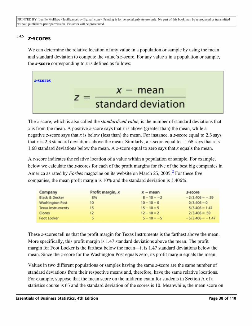
We can determine the relative location of any value in a population or sample by using the mean and standard deviation to compute the value’s z-score. For any value x in a population or sample, the z-score corresponding to x is defined as follows:
z-scores
The z-score, which is also called the standardized value, is the number of standard deviations that x is from the mean. A positive z-score says that x is above (greater than) the mean, while a negative z-score says that x is below (less than) the mean. For instance, a z-score equal to 2.3 says that x is 2.3 standard deviations above the mean. Similarly, a z-score equal to −1.68 says that x is 1.68 standard deviations below the mean. A z-score equal to zero says that x equals the mean.
A z-score indicates the relative location of a value within a population or sample. For example, below we calculate the z-scores for each of the profit margins for five of the best big companies in America as rated by Forbes magazine on its website on March 25, 2005.2 For these five companies, the mean profit margin is 10% and the standard deviation is 3.406%.
These z-scores tell us that the profit margin for Texas Instruments is the farthest above the mean. More specifically, this profit margin is 1.47 standard deviations above the mean. The profit margin for Foot Locker is the farthest below the mean—it is 1.47 standard deviations below the mean. Since the z-score for the Washington Post equals zero, its profit margin equals the mean.
Values in two different populations or samples having the same z-score are the same number of standard deviations from their respective means and, therefore, have the same relative locations. For example, suppose that the mean score on the midterm exam for students in Section A of a statistics course is 65 and the standard deviation of the scores is 10. Meanwhile, the mean score on the same exam for students in Section B is 80 and the standard deviation is 5. A student in Section
3.4.5
Essentials of Business Statistics, 4th Edition Page 38 of 110

PRINTED BY: Lucille McElroy <[email protected]>. Printing is for personal, private use only. No part of this book may be reproduced or transmitted without publisher's prior permission. Violators will be prosecuted.statistics course is 65 and the standard deviation of the scores is 10. Meanwhile, the mean score on
the same exam for students in Section B is 80 and the standard deviation is 5. A student in Section A who scores an 85 and a student in Section B who scores a 90 have the same relative locations within their respective sections because their z-scores, (85− 65)/10 = 2 and (90− 80)5 = 2, are equal.
The coefficient of variation
Sometimes we need to measure the size of the standard deviation of a population or sample relative to the size of the population or sample mean. The coefficient of variation, which makes this comparison, is defined for a population or sample as follows:
The coefficient of variation compares populations or samples having different means and different standard deviations. For example, Morningstar.com3 gives the mean and standard deviation4 of the returns for each of the Morningstar Top 25 Large Growth Funds. As given on the Morningstar website, the mean return for the Strong Advisor Select A fund is 10.39 percent with a standard deviation of 16.18 percent, while the mean return for the Nations Marisco 21st Century fund is 17.7 percent with a standard deviation of 15.81 percent. It follows that the coefficient of variation for the Strong Advisor fund is (16.18/10.39) × 100 = 155.73, and that the coefficient of variation for the Nations Marisco fund is (15.81/17.7) × 100 = 89.32. This tells us that, for the Strong Advisor fund, the standard deviation is 155.73 percent of the value of its mean return. For the Nations Marisco fund, the standard deviation is 89.32 percent of the value of its mean return.
In the context of situations like the stock fund comparison, the coefficient of variation is often used as a measure of risk because it measures the variation of the returns (the standard deviation) relative to the size of the mean return. For instance, although the Strong Advisor fund and the Nations Marisco fund have comparable standard deviations (16.18 percent versus 15.81 percent), the Strong Advisor fund has a higher coefficient of variation than does the Nations Marisco fund (155.73 versus 89.32). This says that, relative to the mean return, the variation in returns for the Strong Advisor fund is higher. That is, we would conclude that investing in the Strong Advisor fund is riskier than investing in the Nations Marisco fund.
Exercises for Section 3.2
CONCEPTS
117
118
3.4.6
3.4.6.1
Essentials of Business Statistics, 4th Edition Page 39 of 110

PRINTED BY: Lucille McElroy <[email protected]>. Printing is for personal, private use only. No part of this book may be reproduced or transmitted without publisher's prior permission. Violators will be prosecuted.
CONCEPTS
_
3.16 Define the range, variance, and standard deviation for a population.
3.17 Discuss how the variance and the standard deviation measure variation.
3.18 The Empirical Rule for a normally distributed population and Chebyshev’s Theorem have the same basic purpose. In your own words, explain what this purpose is.
METHODS AND APPLICATIONS
3.19 Consider the following population of five numbers: 5, 8, 10, 12, 15. Calculate the range, variance, and standard deviation of this population.
3.20 Table 3.4 (at the top of the next page) gives the percentage of homes sold during the fourth quarter of 2006 that a median income household could afford to purchase at the prevailing mortgage interest rate for six Texas metropolitan areas. The data were compiled by the National Association of Home Builders. Calculate the range, variance, and standard deviation of this population of affordability
percentages. _ HouseAff
TABLE 3.4: Housing Affordability in Texas (for Exercise 3.20)
_ HouseAff
Essentials of Business Statistics, 4th Edition Page 40 of 110
PRINTED BY: Lucille McElroy <[email protected]>. Printing is for personal, private use only. No part of this book may be reproduced or transmitted without publisher's prior permission. Violators will be prosecuted.
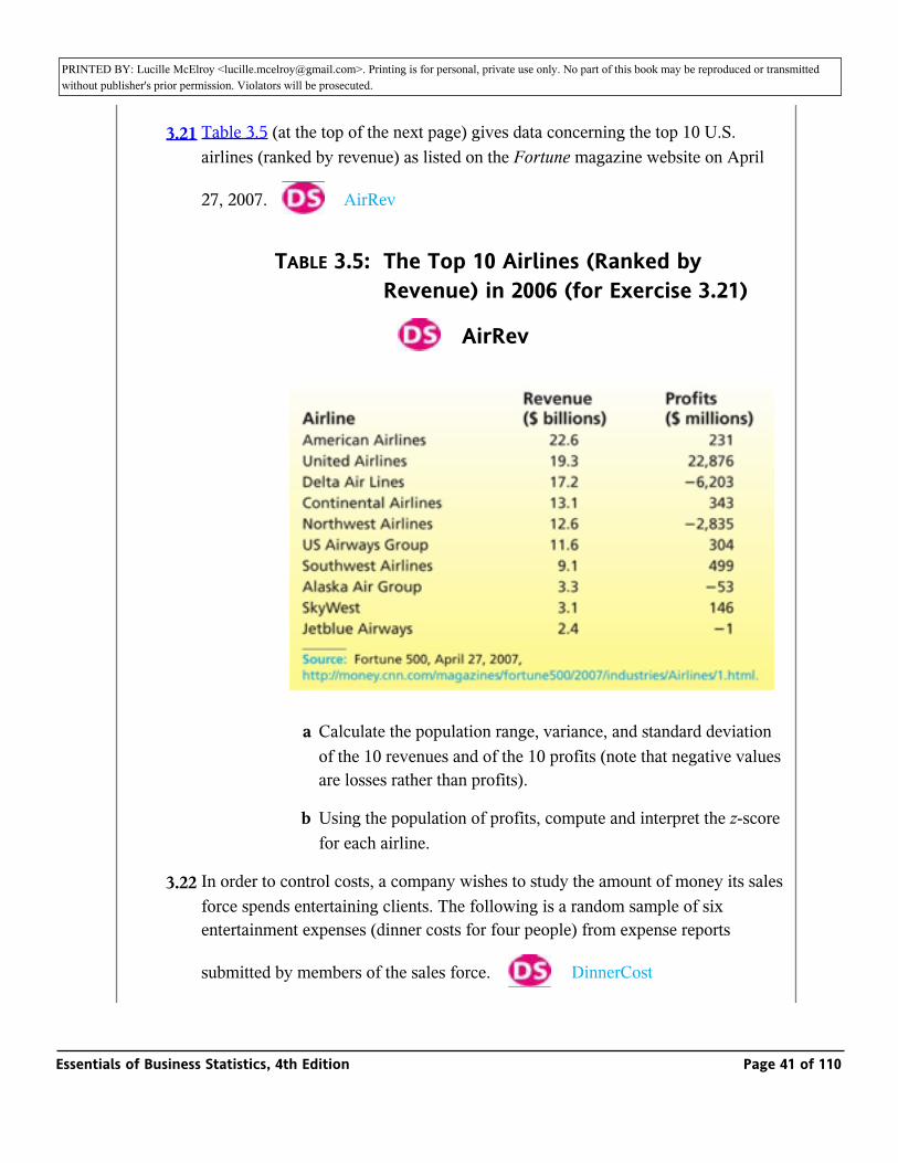
3.21 Table 3.5 (at the top of the next page) gives data concerning the top 10 U.S. airlines (ranked by revenue) as listed on the Fortune magazine website on April
27, 2007._ AirRev
TABLE 3.5: The Top 10 Airlines (Ranked by Revenue) in 2006 (for Exercise 3.21)
_ AirRev
a Calculate the population range, variance, and standard deviation of the 10 revenues and of the 10 profits (note that negative values are losses rather than profits).
b Using the population of profits, compute and interpret the z-score for each airline.
3.22 In order to control costs, a company wishes to study the amount of money its sales force spends entertaining clients. The following is a random sample of six entertainment expenses (dinner costs for four people) from expense reports
submitted by members of the sales force. _ DinnerCost
Essentials of Business Statistics, 4th Edition Page 41 of 110
PRINTED BY: Lucille McElroy <[email protected]>. Printing is for personal, private use only. No part of this book may be reproduced or transmitted without publisher's prior permission. Violators will be prosecuted.
submitted by members of the sales force. _ DinnerCost
$157 $132 $109 $145 $125 $139
a Calculate _ , s2 and s for the expense data. In addition, show that the two different formulas for calculating s2 give the same result.
x
b Assuming that the distribution of entertainment expenses is approximately normally distributed, calculate estimates of tolerance intervals containing 68.26 percent, 95.44 percent, and 99.73 percent of all entertainment expenses by the sales force.
c If a member of the sales force submits an entertainment expense (dinner cost for four) of $190, should this expense be considered unusually high (and possibly worthy of investigation by the company)? Explain your answer.
d Compute and interpret the z-score for each of the six entertainment expenses.
3.23 THE TRASH BAG CASE _ TrashBag
The mean and the standard deviation of the sample of 40 trash bag breaking strengths are and _ = 50.575 s = 1.6438.x
a What does the histogram in Figure 2.17 (page 53) say about whether the Empirical Rule should be used to describe the trash bag breaking strengths?
b Use the Empirical Rule to calculate estimates of tolerance intervals containing 68.26 percent, 95.44 percent, and 99.73 percent of all possible trash bag breaking strengths.
c Does the estimate of a tolerance interval containing 99.73 percent of all breaking strengths provide evidence that almost any bag a customer might purchase will have a breaking strength that exceeds 45 pounds? Explain your answer.
d How do the percentages of the 40 breaking strengths in Table 1.9 (page 14) that actually fall into the intervals [_ ± s], [_ ± 3s] and compare to those given by the Empirical Rule? Do these comparisons indicate that the statistical inferences you made in parts b and c are reasonably valid?
x x
118
119
Essentials of Business Statistics, 4th Edition Page 42 of 110
PRINTED BY: Lucille McElroy <[email protected]>. Printing is for personal, private use only. No part of this book may be reproduced or transmitted without publisher's prior permission. Violators will be prosecuted.statistical inferences you made in parts b and c are reasonably valid?
3.24 THE BANK CUSTOMER WAITING TIME CASE _ WaitTime
The mean and the standard deviation of the sample of 100 bank customer waiting times are _ = 50.575 and s = 2.475.x
a What does the histogram in Figure 2.16 (page 53) say about whether the Empirical Rule should be used to describe the bank customer waiting times?
b Use the Empirical Rule to calculate estimates of tolerance intervals containing 68.26 percent, 95.44 percent, and 99.73 percent of all possible bank customer waiting times.
c Does the estimate of a tolerance interval containing 68.26 percent of all waiting times provide evidence that at least two-thirds of all customers will have to wait less than eight minutes for service? Explain your answer.
d How do the percentages of the 100 waiting times in Table 1.8 (page 13) that actually fall into the intervals [_ ±s],[_ ± 2s, and [_ ± 3s] compare to those given by the Empirical Rule? Do these comparisons indicate that the statistical inferences you made in parts b and c are reasonably valid?
x x x
3.25 THE VIDEO GAME SATISFACTION RATING CASE _
VideoGame
The mean and the standard deviation of the sample of 65 customer satisfaction ratings are _ = 42.95 and s = 2.6424.x
a What does the histogram in Figure 2.15 (page 52) say about whether the Empirical Rule should be used to describe the satisfaction ratings?
b Use the Empirical Rule to calculate estimates of tolerance intervals containing 68.26 percent, 95.44 percent, and 99.73 percent of all possible satisfaction ratings.
c Does the estimate of a tolerance interval containing 99.73 percent of all satisfaction ratings provide evidence that 99.73 percent of all customers will give a satisfaction rating for the XYZ-Box game system that is at least 35 (the minimal rating of a “satisfied” customer)? Explain your answer.
Essentials of Business Statistics, 4th Edition Page 43 of 110
PRINTED BY: Lucille McElroy <[email protected]>. Printing is for personal, private use only. No part of this book may be reproduced or transmitted without publisher's prior permission. Violators will be prosecuted.(the minimal rating of a “satisfied” customer)? Explain your answer.
d How do the percentages of the 65 customer satisfaction ratings in Table 1.7 (page 13) that actually fall into the intervals [_ ±s,[_ ±2s] and [_ ±3s] and compare to those given by the Empirical Rule? Do these comparisons indicate that the statistical inferences you made in parts b and c are reasonably valid?
x x x
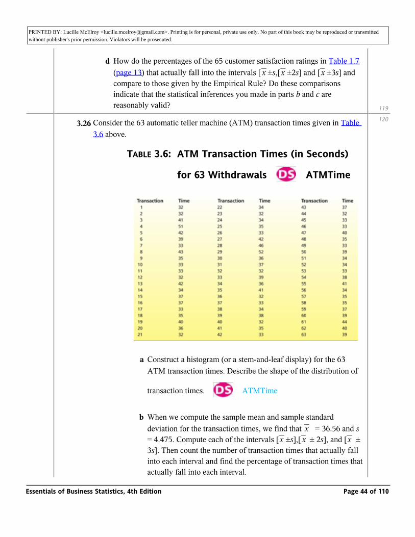
3.26 Consider the 63 automatic teller machine (ATM) transaction times given in Table 3.6 above.
TABLE 3.6: ATM Transaction Times (in Seconds)
for 63 Withdrawals _ ATMTime
a Construct a histogram (or a stem-and-leaf display) for the 63 ATM transaction times. Describe the shape of the distribution of
transaction times. _ ATMTime
b When we compute the sample mean and sample standard deviation for the transaction times, we find that _ = 36.56 and s = 4.475. Compute each of the intervals [_ ±s],[_ ± 2s], and [_ ± 3s]. Then count the number of transaction times that actually fall into each interval and find the percentage of transaction times that actually fall into each interval.
xx x x
119
120
Essentials of Business Statistics, 4th Edition Page 44 of 110
PRINTED BY: Lucille McElroy <[email protected]>. Printing is for personal, private use only. No part of this book may be reproduced or transmitted without publisher's prior permission. Violators will be prosecuted.actually fall into each interval.
c How do the percentages of transaction times that fall into the intervals [_ ±s], [_ ±2s], and [_ ±3s] compare to those given by the Empirical Rule? How do the percentages of transaction times that fall into the intervals [_ ±2s] and [_ ±3s] compare to those given by Chebyshev’s Theorem?
x x x
x x
d Explain why the Empirical Rule does not describe the transaction times extremely well.
3.27 The Morningstar Top Fund lists at the Morningstar.com website give the mean yearly return and the standard deviation of the returns for each of the listed funds. As given by Morningstar.com on March 17, 2005, the RS Internet Age Fund has a mean yearly return of 10.93 percent with a standard deviation of 41.96 percent; the Franklin Income A fund has a mean yearly return of 13 percent with a standard deviation of 9.36 percent; the Jacob Internet fund has a mean yearly return of 34.45 percent with a standard deviation of 41.16 percent.
a For each mutual fund, find an interval in which you would expect 95.44 percent of all yearly returns to fall. Assume returns are normally distributed.
b Using the intervals you computed in part a, compare the three mutual funds with respect to average yearly returns and with respect to variability of returns.
c Calculate the coefficient of variation for each mutual fund, and use your results to compare the funds with respect to risk. Which fund is riskier?
3.3: Percentiles, Quartiles, and Box-and-Whiskers Displays
_ Compute and interpret percentiles, quartiles, and box-and-whiskers displays.
Percentiles, quartiles, and five-number displays
In this section we consider percentiles and their applications. We begin by defining the p th percentile.
3.5
3.5.1
Essentials of Business Statistics, 4th Edition Page 45 of 110
PRINTED BY: Lucille McElroy <[email protected]>. Printing is for personal, private use only. No part of this book may be reproduced or transmitted without publisher's prior permission. Violators will be prosecuted.percentile.
For a set of measurements arranged in increasing order, the p th percentile is a value such that p percent of the measurements fall at or below the value, and (100 − p) percent of the measurements fall at or above the value.
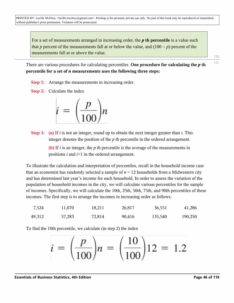
There are various procedures for calculating percentiles. One procedure for calculating the p th percentile for a set of n measurements uses the following three steps:
Step 1: Arrange the measurements in increasing order.
Step 2: Calculate the index
Step 3: (a) If i is not an integer, round up to obtain the next integer greater than i. This integer denotes the position of the p th percentile in the ordered arrangement.
(b) If i is an integer, the p th percentile is the average of the measurements in positions i and i+1 in the ordered arrangement.
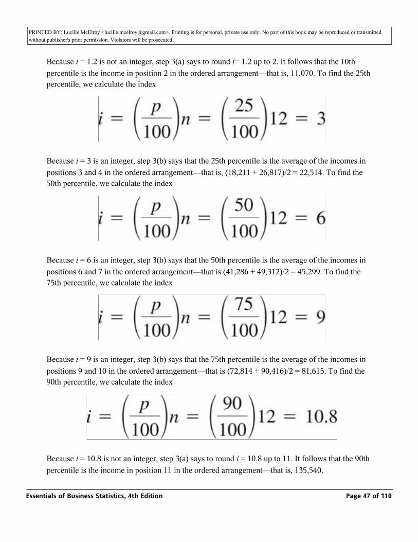
To illustrate the calculation and interpretation of percentiles, recall in the household income case that an economist has randomly selected a sample of n = 12 households from a Midwestern city and has determined last year’s income for each household. In order to assess the variation of the population of household incomes in the city, we will calculate various percentiles for the sample of incomes. Specifically, we will calculate the 10th, 25th, 50th, 75th, and 90th percentiles of these incomes. The first step is to arrange the incomes in increasing order as follows:
7,524 11,070 18,211 26,817 36,551 41,286
49,312 57,283 72,814 90,416 135,540 190,250
To find the 10th percentile, we calculate (in step 2) the index
120
121
Essentials of Business Statistics, 4th Edition Page 46 of 110
PRINTED BY: Lucille McElroy <[email protected]>. Printing is for personal, private use only. No part of this book may be reproduced or transmitted without publisher's prior permission. Violators will be prosecuted.
Because i = 1.2 is not an integer, step 3(a) says to round i= 1.2 up to 2. It follows that the 10th percentile is the income in position 2 in the ordered arrangement—that is, 11,070. To find the 25th percentile, we calculate the index
Because i = 3 is an integer, step 3(b) says that the 25th percentile is the average of the incomes in positions 3 and 4 in the ordered arrangement—that is, (18,211 + 26,817)/2 = 22,514. To find the 50th percentile, we calculate the index
Because i = 6 is an integer, step 3(b) says that the 50th percentile is the average of the incomes in positions 6 and 7 in the ordered arrangement—that is (41,286 + 49,312)/2 = 45,299. To find the 75th percentile, we calculate the index
Because i = 9 is an integer, step 3(b) says that the 75th percentile is the average of the incomes in positions 9 and 10 in the ordered arrangement—that is (72,814 + 90,416)/2 = 81,615. To find the 90th percentile, we calculate the index
Because i = 10.8 is not an integer, step 3(a) says to round i = 10.8 up to 11. It follows that the 90th percentile is the income in position 11 in the ordered arrangement—that is, 135,540.
Essentials of Business Statistics, 4th Edition Page 47 of 110
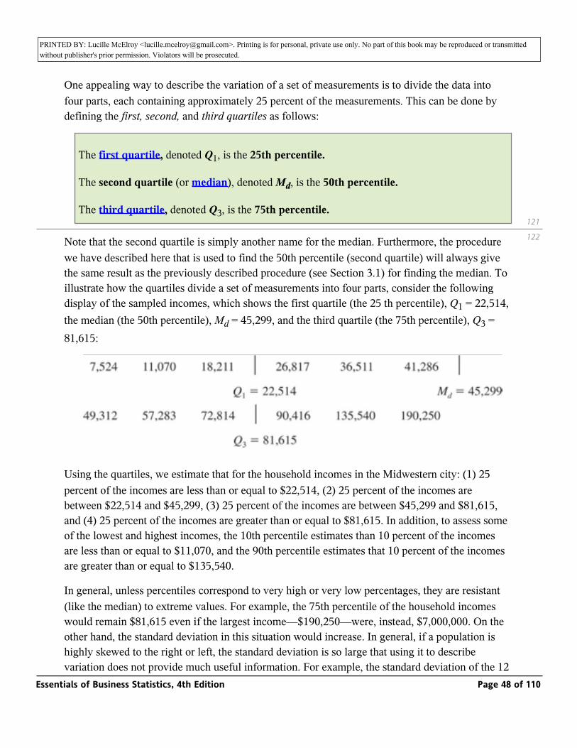
PRINTED BY: Lucille McElroy <[email protected]>. Printing is for personal, private use only. No part of this book may be reproduced or transmitted without publisher's prior permission. Violators will be prosecuted.percentile is the income in position 11 in the ordered arrangement—that is, 135,540.
One appealing way to describe the variation of a set of measurements is to divide the data into four parts, each containing approximately 25 percent of the measurements. This can be done by defining the first, second, and third quartiles as follows:
The first quartile, denoted Q1, is the 25th percentile.
The second quartile (or median), denoted Md, is the 50th percentile.
The third quartile, denoted Q3, is the 75th percentile.
Note that the second quartile is simply another name for the median. Furthermore, the procedure we have described here that is used to find the 50th percentile (second quartile) will always give the same result as the previously described procedure (see Section 3.1) for finding the median. To illustrate how the quartiles divide a set of measurements into four parts, consider the following display of the sampled incomes, which shows the first quartile (the 25 th percentile), Q1 = 22,514, the median (the 50th percentile), Md = 45,299, and the third quartile (the 75th percentile), Q3 = 81,615:
Using the quartiles, we estimate that for the household incomes in the Midwestern city: (1) 25 percent of the incomes are less than or equal to $22,514, (2) 25 percent of the incomes are between $22,514 and $45,299, (3) 25 percent of the incomes are between $45,299 and $81,615, and (4) 25 percent of the incomes are greater than or equal to $81,615. In addition, to assess some of the lowest and highest incomes, the 10th percentile estimates than 10 percent of the incomes are less than or equal to $11,070, and the 90th percentile estimates that 10 percent of the incomes are greater than or equal to $135,540.
In general, unless percentiles correspond to very high or very low percentages, they are resistant (like the median) to extreme values. For example, the 75th percentile of the household incomes would remain $81,615 even if the largest income—$190,250—were, instead, $7,000,000. On the other hand, the standard deviation in this situation would increase. In general, if a population is highly skewed to the right or left, the standard deviation is so large that using it to describe variation does not provide much useful information. For example, the standard deviation of the 12 household incomes is inflated by the large incomes $135,540 and $190,250 and can be calculated
121
122
Essentials of Business Statistics, 4th Edition Page 48 of 110
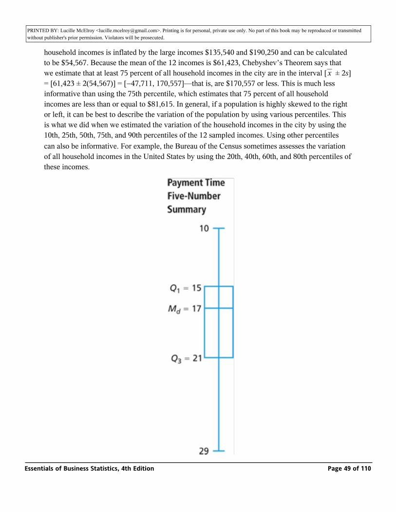
PRINTED BY: Lucille McElroy <[email protected]>. Printing is for personal, private use only. No part of this book may be reproduced or transmitted without publisher's prior permission. Violators will be prosecuted.variation does not provide much useful information. For example, the standard deviation of the 12
household incomes is inflated by the large incomes $135,540 and $190,250 and can be calculated to be $54,567. Because the mean of the 12 incomes is $61,423, Chebyshev’s Theorem says that we estimate that at least 75 percent of all household incomes in the city are in the interval [_ ± 2s] = [61,423 ± 2(54,567)] = [−47,711, 170,557]—that is, are $170,557 or less. This is much less informative than using the 75th percentile, which estimates that 75 percent of all household incomes are less than or equal to $81,615. In general, if a population is highly skewed to the right or left, it can be best to describe the variation of the population by using various percentiles. This is what we did when we estimated the variation of the household incomes in the city by using the 10th, 25th, 50th, 75th, and 90th percentiles of the 12 sampled incomes. Using other percentiles can also be informative. For example, the Bureau of the Census sometimes assesses the variation of all household incomes in the United States by using the 20th, 40th, 60th, and 80th percentiles of these incomes.
x
Essentials of Business Statistics, 4th Edition Page 49 of 110

PRINTED BY: Lucille McElroy <[email protected]>. Printing is for personal, private use only. No part of this book may be reproduced or transmitted without publisher's prior permission. Violators will be prosecuted.
We sometimes describe a set of measurements by using a five-number summary. The summary consists of (1) the smallest measurement; (2) the first quartile, Q1; (3) the median, Md; (4) the third quartile, Q3; and (5) the largest measurement. It is easy to graphically depict a five-number summary. For example, the MINITAB output in Figure 3.16 below tells us that for the 65 payment times, the smallest payment time is 10, Q1 = 15, Md = 17, Q3 = 21, and the largest payment time is 29. It follows that a graphical depiction of this five-number summary is as shown in the page margin. Notice that we have drawn a vertical line extending from the smallest payment time to the largest payment time. In addition, a rectangle is drawn that extends from Q1 to Q3, and a horizontal line is drawn to indicate the location of the median. The summary divides the payment times into four parts, with the middle 50 percent of the payment times depicted by the rectangle. The summary indicates that the largest 25 percent of the payment times is more spread out than the smallest 25 percent of the payment times, and that the second-largest 25 percent of the payment times is more spread out than the second-smallest 25 percent of the payment times. Overall, the summary indicates that the payment times are somewhat skewed to the right.
As another example, it can be shown that for the 60 bottle design ratings, the smallest rating is 20, Q1 = 29, Md = 31, Q3 = 33, and the largest rating is 35. It follows that a graphical depiction of this five-number summary is also as shown in the page margin. The summary shows that the smallest 25 percent of the ratings is more spread out than any of the other quarters of the ratings, and that the other three quarters are equally spread out. Overall, the summary shows that the bottle design ratings are skewed to the left. In addition, it can be verified that the 5th percentile of the ratings is 25. This says that we estimate that 95 percent of all consumers would give the new bottle design ratings that are at least as large as the minimum rating of 25 for a successful bottle design.
Using the first and third quartiles, we define the interquartile range to be IQR = Q3 − Q1. This quantity can be interpreted as the length of the interval that contains the middle 50 percent of the measurements. For instance, the interquartile range of the 65 payment times is Q3 − Q1 = 21 − 15 =6. This says that we estimate that the middle 50 percent of all payment times fall within a range that is six days long.
122
123
Essentials of Business Statistics, 4th Edition Page 50 of 110
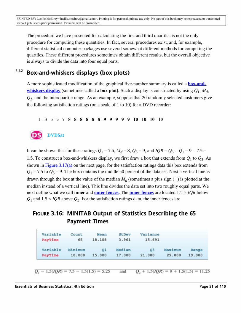
PRINTED BY: Lucille McElroy <[email protected]>. Printing is for personal, private use only. No part of this book may be reproduced or transmitted without publisher's prior permission. Violators will be prosecuted.
The procedure we have presented for calculating the first and third quartiles is not the only procedure for computing these quantities. In fact, several procedures exist, and, for example, different statistical computer packages use several somewhat different methods for computing the quartiles. These different procedures sometimes obtain different results, but the overall objective is always to divide the data into four equal parts.
Box-and-whiskers displays (box plots)
A more sophisticated modification of the graphical five-number summary is called a box-and-whiskers display (sometimes called a box plot). Such a display is constructed by using Q1, Md, Q3, and the interquartile range. As an example, suppose that 20 randomly selected customers give the following satisfaction ratings (on a scale of 1 to 10) for a DVD recorder:
1 3 5 5 7 8 8 8 8 8 8 9 9 9 9 9 10 10 10 10
_ DVDSat
It can be shown that for these ratings Q1 = 7.5, Md = 8, Q3 = 9, and IQR = Q3 − Q1 = 9 − 7.5 = 1.5. To construct a box-and-whiskers display, we first draw a box that extends from Q1 to Q3. As shown in Figure 3.17(a) on the next page, for the satisfaction ratings data this box extends from Q1 = 7.5 to Q3 = 9. The box contains the middle 50 percent of the data set. Next a vertical line is drawn through the box at the value of the median Md (sometimes a plus sign (+) is plotted at the median instead of a vertical line). This line divides the data set into two roughly equal parts. We next define what we call inner and outer fences. The inner fences are located 1.5 × IQR below Q1 and 1.5 × IQR above Q3. For the satisfaction ratings data, the inner fences are
FIGURE 3.16: MINITAB Output of Statistics Describing the 65 Payment Times
3.5.2
Essentials of Business Statistics, 4th Edition Page 51 of 110
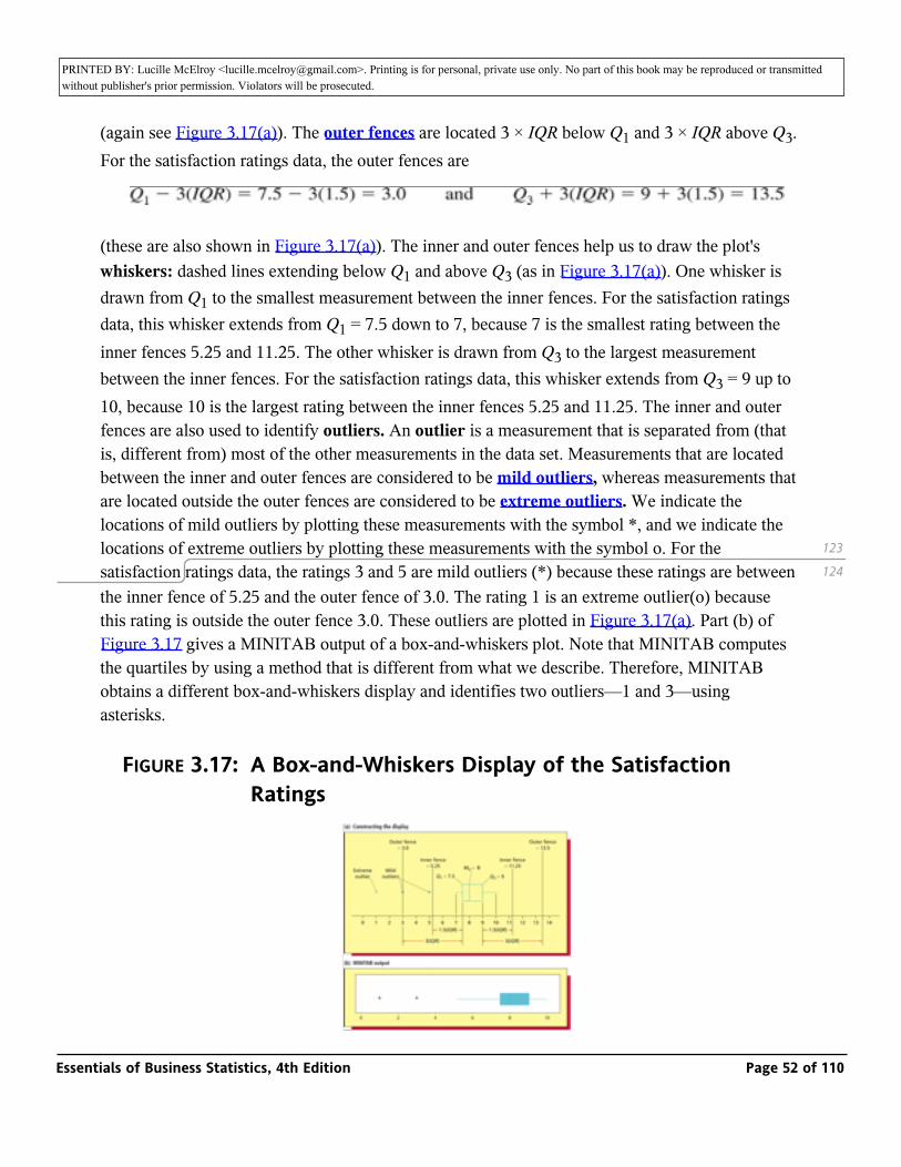
PRINTED BY: Lucille McElroy <[email protected]>. Printing is for personal, private use only. No part of this book may be reproduced or transmitted without publisher's prior permission. Violators will be prosecuted.
(again see Figure 3.17(a)). The outer fences are located 3 × IQR below Q1 and 3 × IQR above Q3. For the satisfaction ratings data, the outer fences are
(these are also shown in Figure 3.17(a)). The inner and outer fences help us to draw the plot's whiskers: dashed lines extending below Q1 and above Q3 (as in Figure 3.17(a)). One whisker is drawn from Q1 to the smallest measurement between the inner fences. For the satisfaction ratings data, this whisker extends from Q1 = 7.5 down to 7, because 7 is the smallest rating between the inner fences 5.25 and 11.25. The other whisker is drawn from Q3 to the largest measurement between the inner fences. For the satisfaction ratings data, this whisker extends from Q3 = 9 up to 10, because 10 is the largest rating between the inner fences 5.25 and 11.25. The inner and outer fences are also used to identify outliers. An outlier is a measurement that is separated from (that is, different from) most of the other measurements in the data set. Measurements that are located between the inner and outer fences are considered to be mild outliers, whereas measurements that are located outside the outer fences are considered to be extreme outliers. We indicate the locations of mild outliers by plotting these measurements with the symbol *, and we indicate the locations of extreme outliers by plotting these measurements with the symbol o. For the satisfaction ratings data, the ratings 3 and 5 are mild outliers (*) because these ratings are between the inner fence of 5.25 and the outer fence of 3.0. The rating 1 is an extreme outlier(o) because this rating is outside the outer fence 3.0. These outliers are plotted in Figure 3.17(a). Part (b) of Figure 3.17 gives a MINITAB output of a box-and-whiskers plot. Note that MINITAB computes the quartiles by using a method that is different from what we describe. Therefore, MINITAB obtains a different box-and-whiskers display and identifies two outliers—1 and 3—using asterisks.
FIGURE 3.17: A Box-and-Whiskers Display of the Satisfaction Ratings
123
124
Essentials of Business Statistics, 4th Edition Page 52 of 110
PRINTED BY: Lucille McElroy <[email protected]>. Printing is for personal, private use only. No part of this book may be reproduced or transmitted without publisher's prior permission. Violators will be prosecuted.
We now summarize how to construct a box-and-whiskers plot.
Constructing a Box-and-Whiskers Display (Box Plot)
1 Draw a box that extends from the first quartile Q1 to the third quartile Q3. Also draw a vertical line through the box located at the median Md.
2 Determine the values of the inner fences and outer fences. The inner fences are located 1.5 × IQR below Q1 and 1.5 × IQR above Q3. That is, the inner fences are
The outer fences are located 3 × IQR below Q1 and 3 × IQR above Q3. That is, the outer fences are
3 Draw whiskers as dashed lines that extend below Q1 and above Q3. Draw one whisker from Q1 to the smallest measurement that is between the inner fences. Draw the other whisker from Q3 to the largest measurement that is between the inner fences.
4 Measurements that are located between the inner and outerfences are called mild outliers. Plot these measurements using the symbol *.
5 Measurements that are located outside the outer fences are called extreme outliers. Plot these measurements using the symbol o.
When interpreting a box-and-whiskers display, keep several points in mind. First, the box (between Q1 and Q3) contains the middle 50 percent of the data. Second, the median (which is inside the box) divides the data into two roughly equal parts. Third, if one of the whiskers is longer than the other, the data set is probably skewed in the direction of the longer whisker. Last, observations designated as outliers should be investigated. Understanding the root causes behind the outlying observations will often provide useful information. For instance, understanding why several of the satisfaction ratings in the box plot of Figure 3.17 are substantially lower than the great majority of the ratings may suggest actions that can improve the DVD recorder manufacturer's product and/or service. Outliers can also be caused by inaccurate measuring, reporting, or plotting of the data. Such possibilities should be investigated, and incorrect data should be adjusted or eliminated.
124
125
3.5.2.1
Essentials of Business Statistics, 4th Edition Page 53 of 110
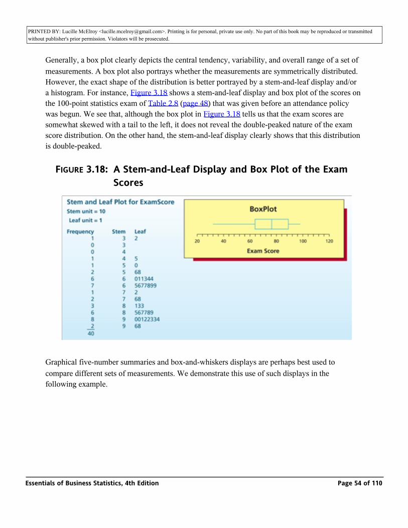
PRINTED BY: Lucille McElroy <[email protected]>. Printing is for personal, private use only. No part of this book may be reproduced or transmitted without publisher's prior permission. Violators will be prosecuted.should be adjusted or eliminated.
Generally, a box plot clearly depicts the central tendency, variability, and overall range of a set of measurements. A box plot also portrays whether the measurements are symmetrically distributed. However, the exact shape of the distribution is better portrayed by a stem-and-leaf display and/or a histogram. For instance, Figure 3.18 shows a stem-and-leaf display and box plot of the scores on the 100-point statistics exam of Table 2.8 (page 48) that was given before an attendance policy was begun. We see that, although the box plot in Figure 3.18 tells us that the exam scores are somewhat skewed with a tail to the left, it does not reveal the double-peaked nature of the exam score distribution. On the other hand, the stem-and-leaf display clearly shows that this distribution is double-peaked.
FIGURE 3.18: A Stem-and-Leaf Display and Box Plot of the Exam Scores
Graphical five-number summaries and box-and-whiskers displays are perhaps best used to compare different sets of measurements. We demonstrate this use of such displays in the following example.
Essentials of Business Statistics, 4th Edition Page 54 of 110
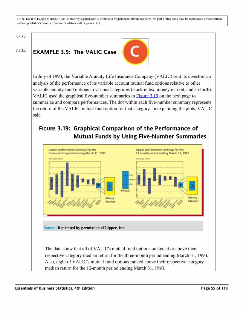
PRINTED BY: Lucille McElroy <[email protected]>. Printing is for personal, private use only. No part of this book may be reproduced or transmitted without publisher's prior permission. Violators will be prosecuted.following example.
EXAMPLE 3.9: The VALIC Case _
In July of 1993, the Variable Annuity Life Insurance Company (VALIC) sent its investors an analysis of the performance of its variable account mutual fund options relative to other variable annuity fund options in various categories (stock index, money market, and so forth). VALIC used the graphical five-number summaries in Figure 3.19 on the next page to summarize and compare performances. The dot within each five-number summary represents the return of the VALIC mutual fund option for that category. In explaining the plots, VALIC said
FIGURE 3.19: Graphical Comparison of the Performance of Mutual Funds by Using Five-Number Summaries
Source: Reprinted by permission of Lipper, Inc.
The data show that all of VALIC's mutual fund options ranked at or above their respective category median return for the three-month period ending March 31, 1993. Also, eight of VALIC's mutual fund options ranked above their respective category median return for the 12-month period ending March 31, 1993.
3.5.2.2
3.5.2.2
Essentials of Business Statistics, 4th Edition Page 55 of 110
PRINTED BY: Lucille McElroy <[email protected]>. Printing is for personal, private use only. No part of this book may be reproduced or transmitted without publisher's prior permission. Violators will be prosecuted.median return for the 12-month period ending March 31, 1993.
Notice that the lengths of the graphical five-number summaries indicate performance variability for the various funds. For example, while the median three-month returns for Midcap Index funds and Small Cap Index funds are similar, the returns for Small Cap funds are more variable. Also, in general, three-month returns for funds of all types are more variable than 12-month returns.
Exercises for Section 3.3CONCEPTS
_
3.28 Explain each of the following in your own words: a percentile; the first quartile, Q1; the third quartile, Q3; and the interquartile range, IQR.
3.29 Discuss how a box-and-whiskers display is used to identify outliers.
METHODS AND APPLICATIONS
3.30 Suppose that 20 randomly selected customers give the following satisfaction ratings (on a scale of 1 to 10) for a DVD recorder.
1 3 5 5 7 8 8 8 8 8 8 9 9 9 9 9 10 10 10 10
_ DVDSat
Find the first quartile, the median, and the third quartile for these data. Construct a
five-number summary. _ DVDSat
_ DrSalary
3.31 Thirteen internists in the Midwest are randomly selected, and each internist is asked to report last year's income. The incomes obtained (in thousands of dollars) are 152, 144, 162, 154, 146, 241, 127, 141, 171, 177, 138, 132, 192. Find:
125
1263.5.2.3
Essentials of Business Statistics, 4th Edition Page 56 of 110

PRINTED BY: Lucille McElroy <[email protected]>. Printing is for personal, private use only. No part of this book may be reproduced or transmitted without publisher's prior permission. Violators will be prosecuted.are 152, 144, 162, 154, 146, 241, 127, 141, 171, 177, 138, 132, 192. Find:
_ DrSalary
a The 90th percentile.
b The median.
c The first quartile.
d The third quartile.
e The 10th percentile.
f The interquartile range.
g Develop a five-number summary and a box-and-whiskers display.
3.32 In the book Business Research Methods, Donald R. Cooper and C. William Emory present box-and-whiskers plots comparing the net profits of firms in five different industry sectors. Each plot (for a sector) was constructed using net profit figures for a sample of firms from the Forbes 500s. Figure 3.20 gives the five box-and-whiskers plots.
FIGURE 3.20: Box-and-Whiskers Plots Comparing Net Profits for Five Industry Sectors (for Exercise 3.32)
Data from: “The Forbes 500s Annual Directory,” Forbes, April 30, 1990, pp. 221-434.
Source: D. R. Cooper and C. W. Emory, Business Research Methods, p. 409. Copyright © 1995. Reprinted by permission of McGraw-Hill Companies, Inc.
Essentials of Business Statistics, 4th Edition Page 57 of 110

PRINTED BY: Lucille McElroy <[email protected]>. Printing is for personal, private use only. No part of this book may be reproduced or transmitted without publisher's prior permission. Violators will be prosecuted.
a Using the plots in Figure 3.20, write an analysis comparing net profits for the five sectors. Compare central tendency, variability, skewness, and outliers.
b For which sectors are net profits most variable? Least variable?
c Which sectors provide opportunities for the highest net profits?
3.33 On its website, the Statesman Journal newspaper (Salem, Oregon, 2005) reports mortgage loan interest rates for 30-year and 15-year fixed-rate mortgage loans for a number of Willamette Valley lending institutions. Of interest is whether there is any systematic difference between 30-year rates and 15-year rates (expressed as annual percentage rate or APR) and, if there is, what is the size of that difference. The table below displays the 30-year rate and the 15-year rate for each of nine lending institutions. Also given is the difference between the 30-year rate and the 15-year rate for each lending institution. To the right of the table are given side-by-side MINITAB box-and-whiskers plots of the 30-year rates and the 15-year rates and a MINITAB box-and-whiskers plot of the differences between the rates. Use the box-and-whiskers plots to compare the 30-year rates and the 15-year rates.
Also, calculate the average of the differences between the rates. _
Mortgage
_ Mortgage
126
127
Essentials of Business Statistics, 4th Edition Page 58 of 110
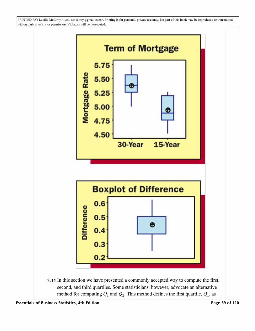
PRINTED BY: Lucille McElroy <[email protected]>. Printing is for personal, private use only. No part of this book may be reproduced or transmitted without publisher's prior permission. Violators will be prosecuted.
_ Mortgage
3.34 In this section we have presented a commonly accepted way to compute the first, second, and third quartiles. Some statisticians, however, advocate an alternative method for computing Q1 and Q3. This method defines the first quartile, Q1, as what is called the lower hinge and defines the third quartile, Q3, as the upper Essentials of Business Statistics, 4th Edition Page 59 of 110
PRINTED BY: Lucille McElroy <[email protected]>. Printing is for personal, private use only. No part of this book may be reproduced or transmitted without publisher's prior permission. Violators will be prosecuted.method for computing Q1 and Q3. This method defines the first quartile, Q1, as
what is called the lower hinge and defines the third quartile, Q3, as the upper hinge. In order to calculate these quantities for a set of n measurements, we first arrange the measurements in increasing order. Then, if n is even, the lower hinge is the median of the smallest n/2 measurements, and the upper hinge is the median of the largest n/2 measurements. If n is odd, we insert Md into the data set to obtain a set of n + 1 measurements. Then the lower hinge is the median of the smallest (n + 1)/2 measurements, and the upper hinge is the median of the largest (n + 1)/2 measurements.
a Consider the random sample of n = 20 customer satisfaction ratings:
Using the method presented on pages 121 and 122 of this section, find Q1 and Q3. Then find the lower hinge and the upper hinge for the satisfaction
ratings. How do your results compare? _ DVDSat
b Consider the following random sample of n = 11 doctors’ salaries (in thousands of dollars):
_ DrSalary2
127 132 138 141 146 152 154 171 177 192 241
Using the method presented on pages 121 and 122 of this section, find Q1 and Q3. The median of the 11 salaries is Md= 152. If we insert this median into the data set, we obtain the following set of n+ 1 = 12 salaries:
Find the lower hinge and the upper hinge for the salaries. Compare your values of Q1 and Q3 with the lower and upper hinges.
127
128
Essentials of Business Statistics, 4th Edition Page 60 of 110
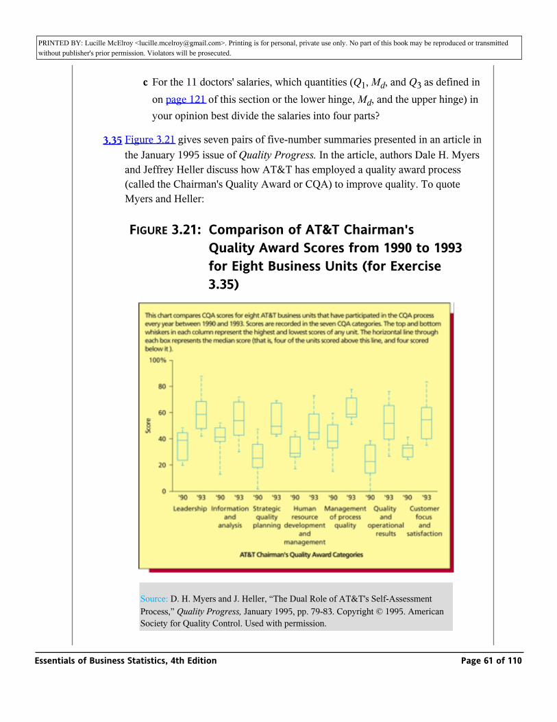
PRINTED BY: Lucille McElroy <[email protected]>. Printing is for personal, private use only. No part of this book may be reproduced or transmitted without publisher's prior permission. Violators will be prosecuted.values of Q1 and Q3 with the lower and upper hinges.
c For the 11 doctors' salaries, which quantities (Q1, Md, and Q3 as defined in on page 121 of this section or the lower hinge, Md, and the upper hinge) in your opinion best divide the salaries into four parts?
3.35 Figure 3.21 gives seven pairs of five-number summaries presented in an article in the January 1995 issue of Quality Progress. In the article, authors Dale H. Myers and Jeffrey Heller discuss how AT&T has employed a quality award process (called the Chairman's Quality Award or CQA) to improve quality. To quote Myers and Heller:
FIGURE 3.21: Comparison of AT&T Chairman's Quality Award Scores from 1990 to 1993 for Eight Business Units (for Exercise 3.35)
Source: D. H. Myers and J. Heller, “The Dual Role of AT&T's Self-Assessment Process,” Quality Progress, January 1995, pp. 79-83. Copyright © 1995. American Society for Quality Control. Used with permission.
Essentials of Business Statistics, 4th Edition Page 61 of 110

PRINTED BY: Lucille McElroy <[email protected]>. Printing is for personal, private use only. No part of this book may be reproduced or transmitted without publisher's prior permission. Violators will be prosecuted.
In 1989, AT&T began searching for a systematic process to achieve two major goals: aligning its business management systems more closely with customers' needs and integrating quality principles into every business practice. AT&T wanted this new process to be based on clear and quantifiable standards so that its key building blocks—the business units and divisions—could objectively assess the strengths and shortcomings of their operations.
Within a year, AT&T took its first major step into the world of objective self-assessment. The New Jersey-based telecommunications giant created a Chairman's Quality Award (CQA) process modeled after the Malcolm Baldrige National Quality Award process.
Using clear and objective criteria, the CQA process helps units and divisions assess their business performance and share their most successful practices with each other. It also provides feedback that helps them identify their strengths and opportunities for improvement.
A business unit (department, division, etc.) that chooses to participate in the award program is examined and scored in seven categories—leadership, information and analysis, strategic quality planning, human resource development and management, management of process quality, quality and operational results, and customer focus and satisfaction.
In order to track AT&T's improvement from 1990 to 1993, the company identified eight business units that participated in the award process every year from 1990 to 1993. For each award category (leadership and so on), a five-number display of the eight business units' 1990 scores was compared to a five-number display of their 1993 scores. The two five-number displays (1990 and 1993) are given for all seven categories in Figure 3.21. Use this figure to answer the following:
a Based on central tendency, which categories showed improvement from 1990 to 1993?
b Based on central tendency, which categories showed the most improvement from 1990 to 1993? Which showed the least improvement?
128
129
Essentials of Business Statistics, 4th Edition Page 62 of 110
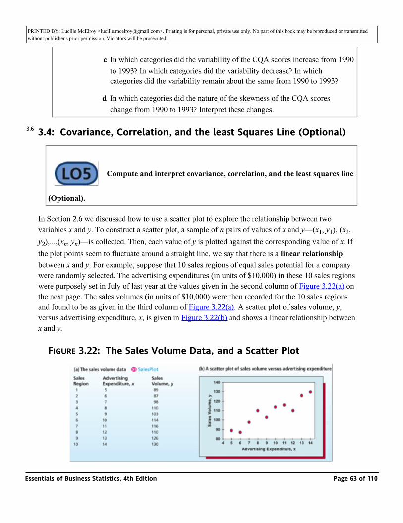
PRINTED BY: Lucille McElroy <[email protected]>. Printing is for personal, private use only. No part of this book may be reproduced or transmitted without publisher's prior permission. Violators will be prosecuted.from 1990 to 1993? Which showed the least improvement?
c In which categories did the variability of the CQA scores increase from 1990 to 1993? In which categories did the variability decrease? In which categories did the variability remain about the same from 1990 to 1993?
d In which categories did the nature of the skewness of the CQA scores change from 1990 to 1993? Interpret these changes.
3.4: Covariance, Correlation, and the least Squares Line (Optional)
_ Compute and interpret covariance, correlation, and the least squares line
(Optional).
In Section 2.6 we discussed how to use a scatter plot to explore the relationship between two variables x and y. To construct a scatter plot, a sample of n pairs of values of x and y—(x1, y1), (x2, y2),...,(xn, yn)—is collected. Then, each value of y is plotted against the corresponding value of x. If the plot points seem to fluctuate around a straight line, we say that there is a linear relationship between x and y. For example, suppose that 10 sales regions of equal sales potential for a company were randomly selected. The advertising expenditures (in units of $10,000) in these 10 sales regions were purposely set in July of last year at the values given in the second column of Figure 3.22(a) on the next page. The sales volumes (in units of $10,000) were then recorded for the 10 sales regions and found to be as given in the third column of Figure 3.22(a). A scatter plot of sales volume, y, versus advertising expenditure, x, is given in Figure 3.22(b) and shows a linear relationship between x and y.
FIGURE 3.22: The Sales Volume Data, and a Scatter Plot
3.6
Essentials of Business Statistics, 4th Edition Page 63 of 110
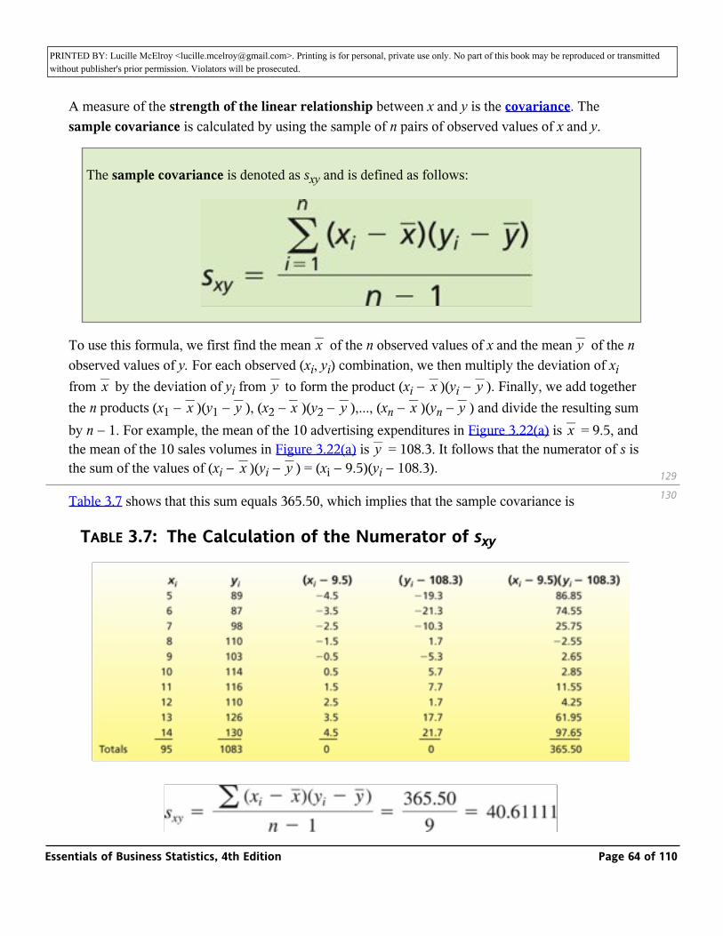
PRINTED BY: Lucille McElroy <[email protected]>. Printing is for personal, private use only. No part of this book may be reproduced or transmitted without publisher's prior permission. Violators will be prosecuted.
A measure of the strength of the linear relationship between x and y is the covariance. The sample covariance is calculated by using the sample of n pairs of observed values of x and y.
The sample covariance is denoted as sxy and is defined as follows:
To use this formula, we first find the mean _ of the n observed values of x and the mean _ of the n observed values of y. For each observed (xi, yi) combination, we then multiply the deviation of xi from _ by the deviation of yi from _ to form the product (xi − _ )(yi − _ ). Finally, we add together the n products (x1 − _ )(y1 − _ ), (x2 − _ )(y2 − _ ),..., (xn − _ )(yn − _ ) and divide the resulting sum by n − 1. For example, the mean of the 10 advertising expenditures in Figure 3.22(a) is _ = 9.5, and the mean of the 10 sales volumes in Figure 3.22(a) is _ = 108.3. It follows that the numerator of s is the sum of the values of (xi − _ )(yi − _ ) = (xi − 9.5)(yi − 108.3).
x y
x y x yx y x y x y
xy
x y
Table 3.7 shows that this sum equals 365.50, which implies that the sample covariance is
TABLE 3.7: The Calculation of the Numerator of sxy
129
130
Essentials of Business Statistics, 4th Edition Page 64 of 110
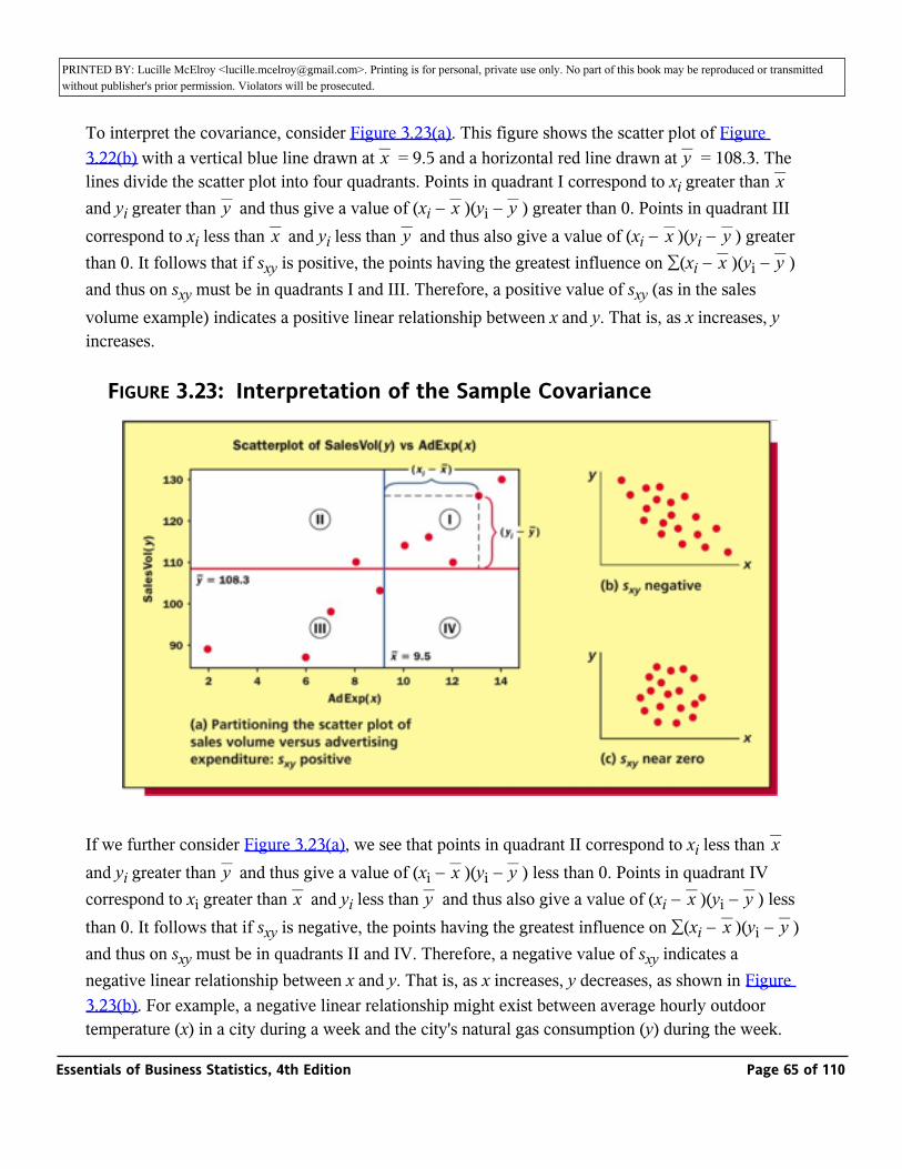
PRINTED BY: Lucille McElroy <[email protected]>. Printing is for personal, private use only. No part of this book may be reproduced or transmitted without publisher's prior permission. Violators will be prosecuted.
To interpret the covariance, consider Figure 3.23(a). This figure shows the scatter plot of Figure 3.22(b) with a vertical blue line drawn at _ = 9.5 and a horizontal red line drawn at _ = 108.3. The lines divide the scatter plot into four quadrants. Points in quadrant I correspond to xi greater than _ and yi greater than _ and thus give a value of (xi − _ )(yi − _ ) greater than 0. Points in quadrant III correspond to xi less than _ and yi less than _ and thus also give a value of (xi − _ )(yi − _ ) greater than 0. It follows that if sxy is positive, the points having the greatest influence on ∑(xi − _ )(yi − _ ) and thus on sxy must be in quadrants I and III. Therefore, a positive value of sxy (as in the sales volume example) indicates a positive linear relationship between x and y. That is, as x increases, y increases.
x yx
y x yx y x y
x y
FIGURE 3.23: Interpretation of the Sample Covariance
If we further consider Figure 3.23(a), we see that points in quadrant II correspond to xi less than _ and yi greater than _ and thus give a value of (xi − _ )(yi − _ ) less than 0. Points in quadrant IV correspond to xi greater than _ and yi less than _ and thus also give a value of (xi − _ )(yi − _ ) less than 0. It follows that if sxy is negative, the points having the greatest influence on ∑(xi − _ )(yi − _ ) and thus on sxy must be in quadrants II and IV. Therefore, a negative value of sxy indicates a negative linear relationship between x and y. That is, as x increases, y decreases, as shown in Figure 3.23(b). For example, a negative linear relationship might exist between average hourly outdoor temperature (x) in a city during a week and the city's natural gas consumption (y) during the week. That is, as the average hourly outdoor temperature increases, the city's natural gas consumption
xy x y
x y x yx y
Essentials of Business Statistics, 4th Edition Page 65 of 110
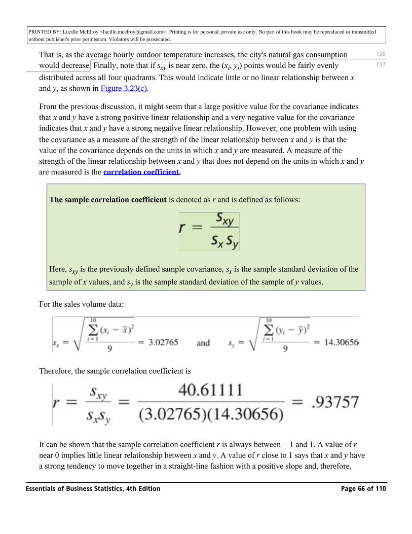
PRINTED BY: Lucille McElroy <[email protected]>. Printing is for personal, private use only. No part of this book may be reproduced or transmitted without publisher's prior permission. Violators will be prosecuted.temperature (x) in a city during a week and the city's natural gas consumption (y) during the week.
That is, as the average hourly outdoor temperature increases, the city's natural gas consumption would decrease. Finally, note that if sxy is near zero, the (xi, yi) points would be fairly evenly distributed across all four quadrants. This would indicate little or no linear relationship between x and y, as shown in Figure 3.23(c).
From the previous discussion, it might seem that a large positive value for the covariance indicates that x and y have a strong positive linear relationship and a very negative value for the covariance indicates that x and y have a strong negative linear relationship. However, one problem with using the covariance as a measure of the strength of the linear relationship between x and y is that the value of the covariance depends on the units in which x and y are measured. A measure of the strength of the linear relationship between x and y that does not depend on the units in which x and y are measured is the correlation coefficient.
The sample correlation coefficient is denoted as r and is defined as follows:
Here, sxy is the previously defined sample covariance, sx is the sample standard deviation of the sample of x values, and sy is the sample standard deviation of the sample of y values.
For the sales volume data:
Therefore, the sample correlation coefficient is
It can be shown that the sample correlation coefficient r is always between − 1 and 1. A value of r near 0 implies little linear relationship between x and y. A value of r close to 1 says that x and y have a strong tendency to move together in a straight-line fashion with a positive slope and, therefore, that x and y are highly related and positively correlated. A value of r close to—1 says that x and y
130
131
Essentials of Business Statistics, 4th Edition Page 66 of 110
PRINTED BY: Lucille McElroy <[email protected]>. Printing is for personal, private use only. No part of this book may be reproduced or transmitted without publisher's prior permission. Violators will be prosecuted.a strong tendency to move together in a straight-line fashion with a positive slope and, therefore,
that x and y are highly related and positively correlated. A value of r close to—1 says that x and y have a strong tendency to move together in a straight-line fashion with a negative slope and, therefore, that x and y are highly related and negatively correlated. Note that if r = 1, the (x, y) points fall exactly on a positively sloped straight line, and, if r = − 1, the (x, y) points fall exactly on a negatively sloped straight line. For example, since r = .93757 in the sales volume example, we conclude that advertising expenditure (x) and sales volume (y) have a strong tendency to move together in a straight-line fashion with a positive slope. That is, x and y have a strong positive linear relationship.
We next note that the sample covariance sxy is the point estimate of the population covariance, which we denote as σxy, and the sample correlation coefficient r is the point estimate of the population correlation coefficient, which we denote as ρ. To define σxy and ρ, let µx and σx denote the mean and the standard deviation of the population of all possible x values, and let µy and σy denote the mean and the standard deviation of the population of all possible y values. Then, σxy is the average of all possible values of (x − µx)(y − µy), and ρ equals σxy/(σxσy). Similar to r, ρ is always between − 1 and 1.
After establishing that a strong positive or a strong negative linear relationship exists between two variables x and y, we might wish to predict y on the basis of x. This can be done by drawing a straight line through a scatter plot of the observed data. Unfortunately, however, if different people visually drew lines through the scatter plot, their lines would probably differ from each other. What we need is the “best line” that can be drawn through the scatter plot. Although there are various definitions of what this best line is, one of the most useful best lines is the least squares line. The least squares line will be discussed in detail in Chapter 13. For now, we will say that, intuitively, the least squares line is the line that minimizes the sum of the squared vertical distances between the points on the scatter plot and the line.
It can be shown that the slope b1 (defined as rise/run) of the least squares line is given by the equation
In addition, the y-intercept b0 of the least squares line (where the line intersects the y-axis when x equals 0) is given by the equation
131
132
Essentials of Business Statistics, 4th Edition Page 67 of 110
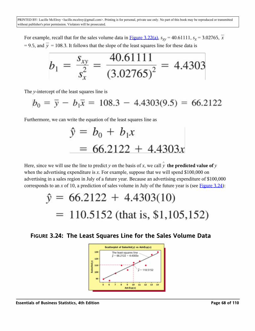
PRINTED BY: Lucille McElroy <[email protected]>. Printing is for personal, private use only. No part of this book may be reproduced or transmitted without publisher's prior permission. Violators will be prosecuted.
For example, recall that for the sales volume data in Figure 3.22(a), sxy = 40.61111, sx = 3.02765, _ = 9.5, and _ = 108.3. It follows that the slope of the least squares line for these data is
xy
The y-intercept of the least squares line is
Furthermore, we can write the equation of the least squares line as
Here, since we will use the line to predict y on the basis of x, we call _ the predicted value of y when the advertising expenditure is x. For example, suppose that we will spend $100,000 on advertising in a sales region in July of a future year. Because an advertising expenditure of $100,000 corresponds to an x of 10, a prediction of sales volume in July of the future year is (see Figure 3.24):
y^
FIGURE 3.24: The Least Squares Line for the Sales Volume Data
Essentials of Business Statistics, 4th Edition Page 68 of 110
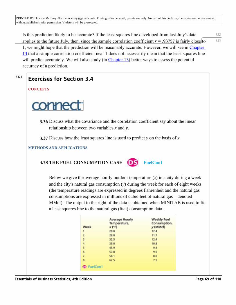
PRINTED BY: Lucille McElroy <[email protected]>. Printing is for personal, private use only. No part of this book may be reproduced or transmitted without publisher's prior permission. Violators will be prosecuted.
Is this prediction likely to be accurate? If the least squares line developed from last July's data applies to the future July, then, since the sample correlation coefficient r = .93757 is fairly close to 1, we might hope that the prediction will be reasonably accurate. However, we will see in Chapter 13 that a sample correlation coefficient near 1 does not necessarily mean that the least squares line will predict accurately. We will also study (in Chapter 13) better ways to assess the potential accuracy of a prediction.
Exercises for Section 3.4CONCEPTS
_
3.36 Discuss what the covariance and the correlation coefficient say about the linear relationship between two variables x and y.
3.37 Discuss how the least squares line is used to predict y on the basis of x.
METHODS AND APPLICATIONS
3.38 THE FUEL CONSUMPTION CASE _ FuelCon1
Below we give the average hourly outdoor temperature (x) in a city during a week and the city's natural gas consumption (y) during the week for each of eight weeks (the temperature readings are expressed in degrees Fahrenheit and the natural gas consumptions are expressed in millions of cubic feet of natural gas—denoted MMcf). The output to the right of the data is obtained when MINITAB is used to fit a least squares line to the natural gas (fuel) consumption data.
132
133
3.6.1
Essentials of Business Statistics, 4th Edition Page 69 of 110
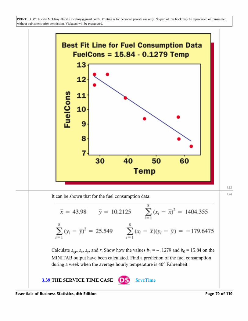
PRINTED BY: Lucille McElroy <[email protected]>. Printing is for personal, private use only. No part of this book may be reproduced or transmitted without publisher's prior permission. Violators will be prosecuted.
It can be shown that for the fuel consumption data:
Calculate sxy, sx, sy, and r. Show how the values b1 = − .1279 and b0 = 15.84 on the MINITAB output have been calculated. Find a prediction of the fuel consumption during a week when the average hourly temperature is 40° Fahrenheit.
3.39 THE SERVICE TIME CASE _ SrvcTime
133
134
Essentials of Business Statistics, 4th Edition Page 70 of 110
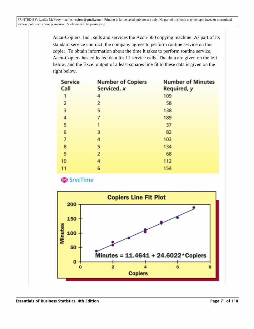
PRINTED BY: Lucille McElroy <[email protected]>. Printing is for personal, private use only. No part of this book may be reproduced or transmitted without publisher's prior permission. Violators will be prosecuted.
THE SERVICE TIME CASE _ SrvcTime
Accu-Copiers, Inc., sells and services the Accu-500 copying machine. As part of its standard service contract, the company agrees to perform routine service on this copier. To obtain information about the time it takes to perform routine service, Accu-Copiers has collected data for 11 service calls. The data are given on the left below, and the Excel output of a least squares line fit to these data is given on the right below.
Essentials of Business Statistics, 4th Edition Page 71 of 110
PRINTED BY: Lucille McElroy <[email protected]>. Printing is for personal, private use only. No part of this book may be reproduced or transmitted without publisher's prior permission. Violators will be prosecuted.
a The sample correlation coefficient r can be calculated to equal .9952 for the service time data. What does this value of r say about the relationship between x and y?
b Predict the service time for a future service call on which five copiers will be serviced.
3.5: Weighted Means and Grouped Data (Optional)
_ Compute and interpret weighted means and the mean and standard
deviation of grouped data (Optional).
Weighted means
In Section 3.1 we studied the mean, which is an important measure of central tendency. In order to calculate a mean, we sum the population (or sample) measurements, and then divide this sum by the number of measurements in the population (or sample). When we do this, each measurement counts equally. That is, each measurement is given the same importance or weight.
Sometimes it makes sense to give different measurements unequal weights. In such a case, a measurement's weight reflects its importance, and the mean calculated using the unequal weights is called a weighted mean.
We calculate a weighted mean by multiplying each measurement by its weight, summing the resulting products, and dividing the resulting sum by the sum of the weights:
Weighted Mean
The weighted mean equals
where
3.7
3.7.1
Essentials of Business Statistics, 4th Edition Page 72 of 110
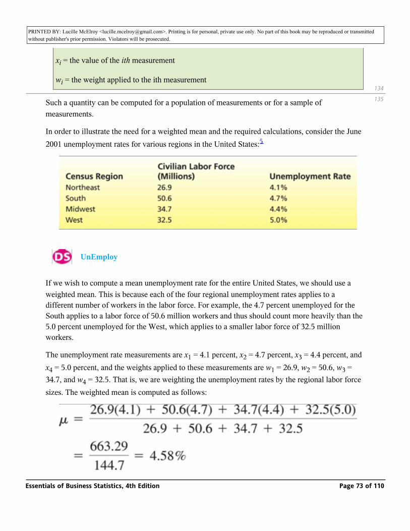
PRINTED BY: Lucille McElroy <[email protected]>. Printing is for personal, private use only. No part of this book may be reproduced or transmitted without publisher's prior permission. Violators will be prosecuted.where
xi = the value of the ith measurement
wi = the weight applied to the ith measurement
Such a quantity can be computed for a population of measurements or for a sample of measurements.
In order to illustrate the need for a weighted mean and the required calculations, consider the June 2001 unemployment rates for various regions in the United States:5
_ UnEmploy
If we wish to compute a mean unemployment rate for the entire United States, we should use a weighted mean. This is because each of the four regional unemployment rates applies to a different number of workers in the labor force. For example, the 4.7 percent unemployed for the South applies to a labor force of 50.6 million workers and thus should count more heavily than the 5.0 percent unemployed for the West, which applies to a smaller labor force of 32.5 million workers.
The unemployment rate measurements are x1 = 4.1 percent, x2 = 4.7 percent, x3 = 4.4 percent, and x4 = 5.0 percent, and the weights applied to these measurements are w1 = 26.9, w2 = 50.6, w3 = 34.7, and w4 = 32.5. That is, we are weighting the unemployment rates by the regional labor force sizes. The weighted mean is computed as follows:
134
135
Essentials of Business Statistics, 4th Edition Page 73 of 110
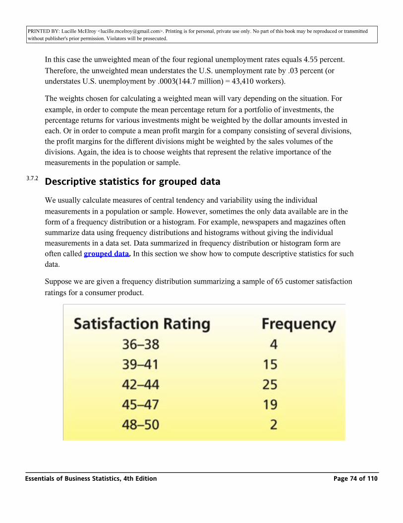
PRINTED BY: Lucille McElroy <[email protected]>. Printing is for personal, private use only. No part of this book may be reproduced or transmitted without publisher's prior permission. Violators will be prosecuted.
In this case the unweighted mean of the four regional unemployment rates equals 4.55 percent. Therefore, the unweighted mean understates the U.S. unemployment rate by .03 percent (or understates U.S. unemployment by .0003(144.7 million) = 43,410 workers).
The weights chosen for calculating a weighted mean will vary depending on the situation. For example, in order to compute the mean percentage return for a portfolio of investments, the percentage returns for various investments might be weighted by the dollar amounts invested in each. Or in order to compute a mean profit margin for a company consisting of several divisions, the profit margins for the different divisions might be weighted by the sales volumes of the divisions. Again, the idea is to choose weights that represent the relative importance of the measurements in the population or sample.
Descriptive statistics for grouped data
We usually calculate measures of central tendency and variability using the individual measurements in a population or sample. However, sometimes the only data available are in the form of a frequency distribution or a histogram. For example, newspapers and magazines often summarize data using frequency distributions and histograms without giving the individual measurements in a data set. Data summarized in frequency distribution or histogram form are often called grouped data. In this section we show how to compute descriptive statistics for such data.
Suppose we are given a frequency distribution summarizing a sample of 65 customer satisfaction ratings for a consumer product.
3.7.2
Essentials of Business Statistics, 4th Edition Page 74 of 110
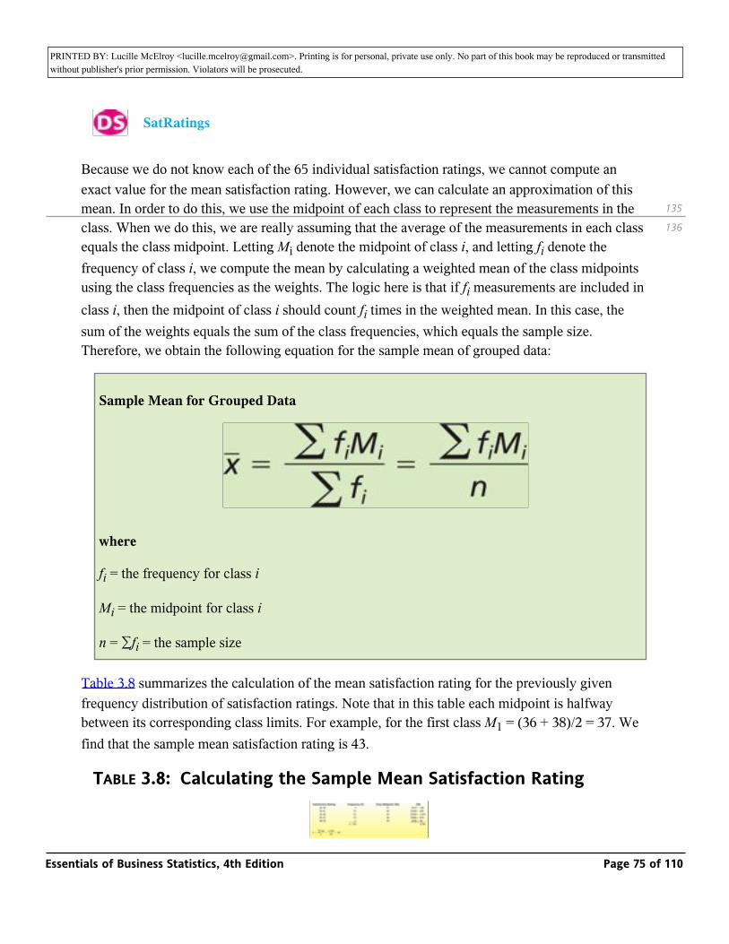
PRINTED BY: Lucille McElroy <[email protected]>. Printing is for personal, private use only. No part of this book may be reproduced or transmitted without publisher's prior permission. Violators will be prosecuted.
_ SatRatings
Because we do not know each of the 65 individual satisfaction ratings, we cannot compute an exact value for the mean satisfaction rating. However, we can calculate an approximation of this mean. In order to do this, we use the midpoint of each class to represent the measurements in the class. When we do this, we are really assuming that the average of the measurements in each class equals the class midpoint. Letting Mi denote the midpoint of class i, and letting fi denote the frequency of class i, we compute the mean by calculating a weighted mean of the class midpoints using the class frequencies as the weights. The logic here is that if fi measurements are included in class i, then the midpoint of class i should count fi times in the weighted mean. In this case, the sum of the weights equals the sum of the class frequencies, which equals the sample size. Therefore, we obtain the following equation for the sample mean of grouped data:
Sample Mean for Grouped Data
where
fi = the frequency for class i
Mi = the midpoint for class i
n = ∑fi = the sample size
Table 3.8 summarizes the calculation of the mean satisfaction rating for the previously given frequency distribution of satisfaction ratings. Note that in this table each midpoint is halfway between its corresponding class limits. For example, for the first class M1 = (36 + 38)/2 = 37. We find that the sample mean satisfaction rating is 43.
TABLE 3.8: Calculating the Sample Mean Satisfaction Rating
135
136
Essentials of Business Statistics, 4th Edition Page 75 of 110
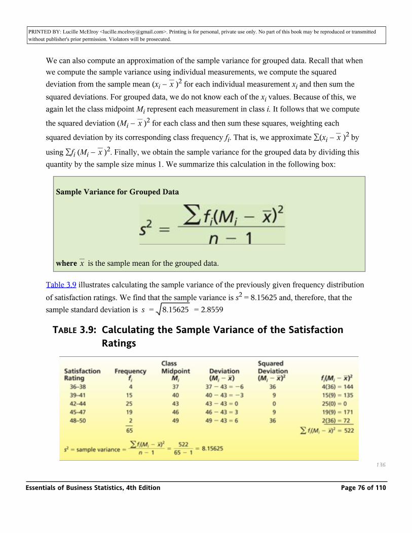
PRINTED BY: Lucille McElroy <[email protected]>. Printing is for personal, private use only. No part of this book may be reproduced or transmitted without publisher's prior permission. Violators will be prosecuted.
We can also compute an approximation of the sample variance for grouped data. Recall that when we compute the sample variance using individual measurements, we compute the squared deviation from the sample mean (xi − _ )2 for each individual measurement xi and then sum the squared deviations. For grouped data, we do not know each of the xi values. Because of this, we again let the class midpoint Mi represent each measurement in class i. It follows that we compute
the squared deviation (Mi − _ )2 for each class and then sum these squares, weighting each
squared deviation by its corresponding class frequency fi. That is, we approximate ∑(xi − _ )2 by
using ∑fi (Mi − _ )2. Finally, we obtain the sample variance for the grouped data by dividing this quantity by the sample size minus 1. We summarize this calculation in the following box:
x
x
x
x
Sample Variance for Grouped Data
where _ is the sample mean for the grouped data.x
Table 3.9 illustrates calculating the sample variance of the previously given frequency distribution of satisfaction ratings. We find that the sample variance is s2 = 8.15625 and, therefore, that the sample standard deviation is s = _ = 2.85598.15625
TABLE 3.9: Calculating the Sample Variance of the Satisfaction Ratings
136
Essentials of Business Statistics, 4th Edition Page 76 of 110
PRINTED BY: Lucille McElroy <[email protected]>. Printing is for personal, private use only. No part of this book may be reproduced or transmitted without publisher's prior permission. Violators will be prosecuted.
Finally, although we have illustrated calculating the mean and variance for grouped data in the context of a sample, similar calculations can be done for a population of measurements. If we let N be the size of the population, the grouped data formulas for the population mean and variance are given in the following box:
Exercises for Section 3.5
CONCEPTS
_
3.40 Consider calculating a student's grade point average using a scale where 4.0 represents an A and 0.0 represents an F. Explain why the grade point average is a weighted mean. What are the xi values? What are the weights?
3.41 When we perform grouped data calculations, we represent the measurements in a class by using the midpoint of the class. Explain the assumption that is being made when we do this.
3.42 When we compute the mean, variance, and standard deviation using grouped data, the results obtained are approximations of the population (or sample) mean, variance, and standard deviation. Explain why this is true.
METHODS AND APPLICATIONS
3.43 According to the Morningstar.com website, the 2004 total return percentages for
several popular funds were as follows _ FundReturns
136
137
3.7.2.1
Essentials of Business Statistics, 4th Edition Page 77 of 110
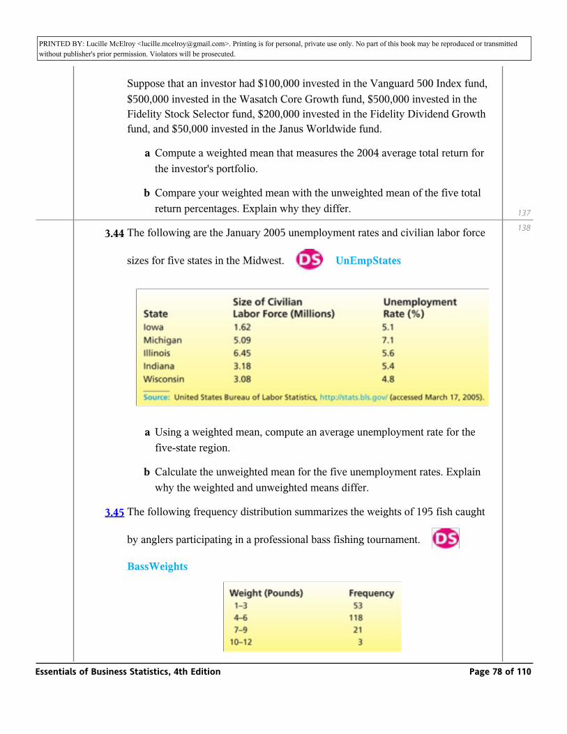
PRINTED BY: Lucille McElroy <[email protected]>. Printing is for personal, private use only. No part of this book may be reproduced or transmitted without publisher's prior permission. Violators will be prosecuted.
Suppose that an investor had $100,000 invested in the Vanguard 500 Index fund, $500,000 invested in the Wasatch Core Growth fund, $500,000 invested in the Fidelity Stock Selector fund, $200,000 invested in the Fidelity Dividend Growth fund, and $50,000 invested in the Janus Worldwide fund.
a Compute a weighted mean that measures the 2004 average total return for the investor's portfolio.
b Compare your weighted mean with the unweighted mean of the five total return percentages. Explain why they differ.
3.44 The following are the January 2005 unemployment rates and civilian labor force
sizes for five states in the Midwest. _ UnEmpStates
a Using a weighted mean, compute an average unemployment rate for the five-state region.
b Calculate the unweighted mean for the five unemployment rates. Explain why the weighted and unweighted means differ.
3.45 The following frequency distribution summarizes the weights of 195 fish caught
by anglers participating in a professional bass fishing tournament. _
BassWeights
137
138
Essentials of Business Statistics, 4th Edition Page 78 of 110
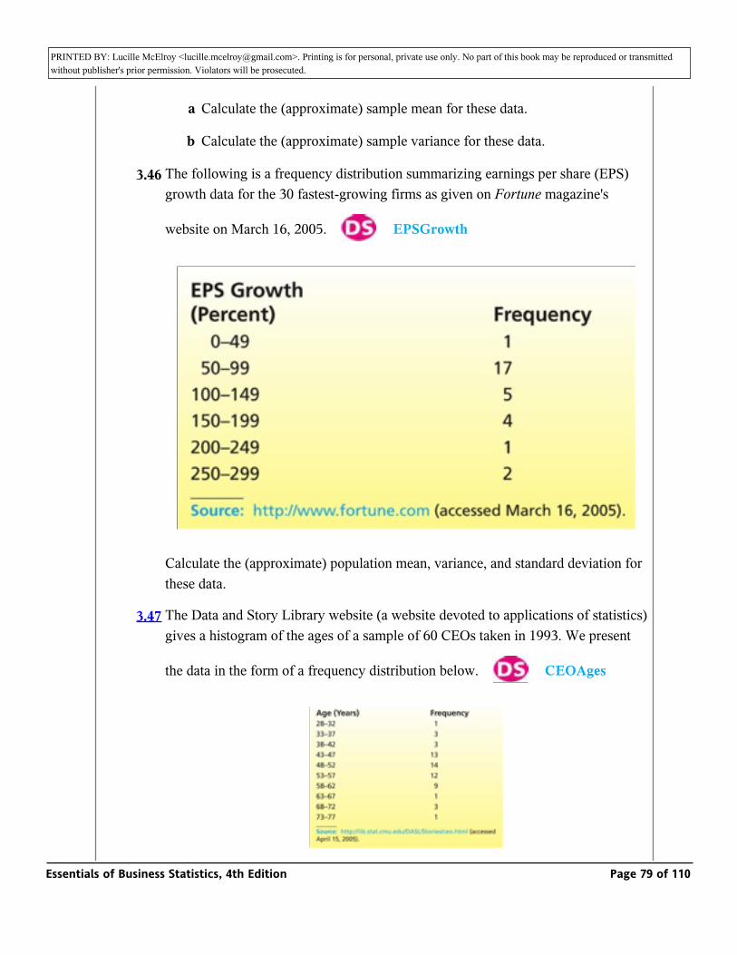
PRINTED BY: Lucille McElroy <[email protected]>. Printing is for personal, private use only. No part of this book may be reproduced or transmitted without publisher's prior permission. Violators will be prosecuted.
a Calculate the (approximate) sample mean for these data.
b Calculate the (approximate) sample variance for these data.
3.46 The following is a frequency distribution summarizing earnings per share (EPS) growth data for the 30 fastest-growing firms as given on Fortune magazine's
website on March 16, 2005. _ EPSGrowth
Calculate the (approximate) population mean, variance, and standard deviation for these data.
3.47 The Data and Story Library website (a website devoted to applications of statistics) gives a histogram of the ages of a sample of 60 CEOs taken in 1993. We present
the data in the form of a frequency distribution below. _ CEOAges
Essentials of Business Statistics, 4th Edition Page 79 of 110
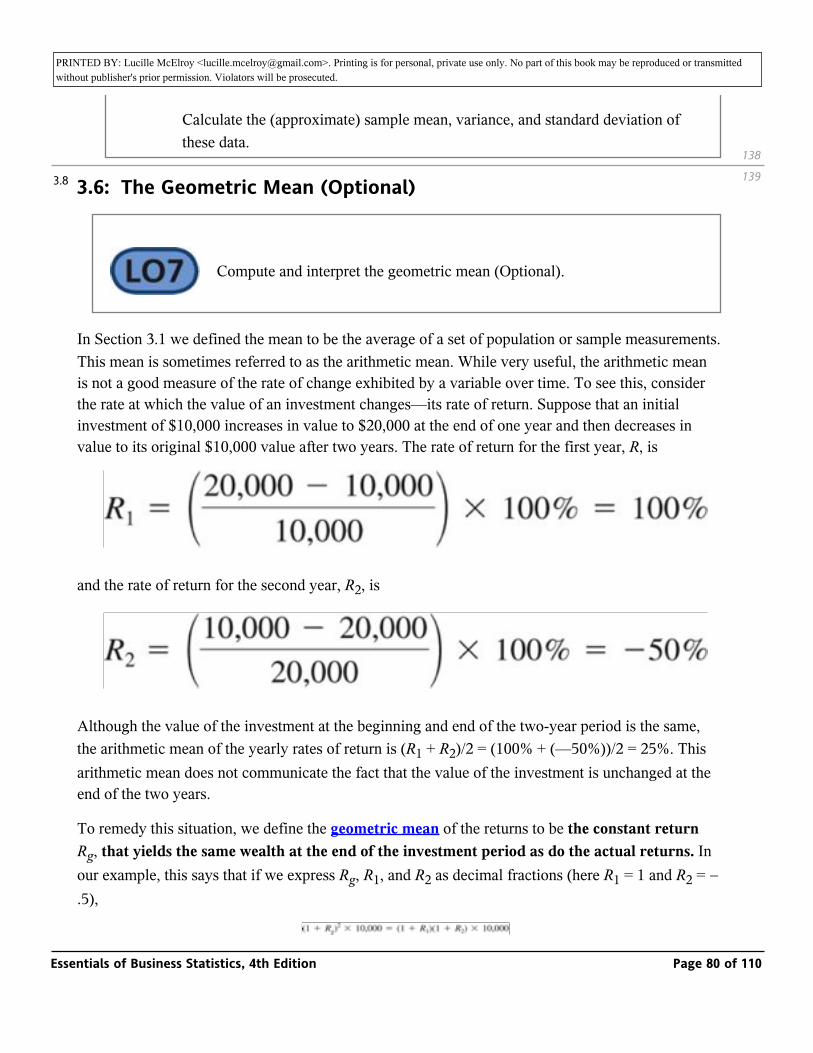
PRINTED BY: Lucille McElroy <[email protected]>. Printing is for personal, private use only. No part of this book may be reproduced or transmitted without publisher's prior permission. Violators will be prosecuted.
Calculate the (approximate) sample mean, variance, and standard deviation of these data.
3.6: The Geometric Mean (Optional)
_ Compute and interpret the geometric mean (Optional).
In Section 3.1 we defined the mean to be the average of a set of population or sample measurements. This mean is sometimes referred to as the arithmetic mean. While very useful, the arithmetic mean is not a good measure of the rate of change exhibited by a variable over time. To see this, consider the rate at which the value of an investment changes—its rate of return. Suppose that an initial investment of $10,000 increases in value to $20,000 at the end of one year and then decreases in value to its original $10,000 value after two years. The rate of return for the first year, R, is
and the rate of return for the second year, R2, is
Although the value of the investment at the beginning and end of the two-year period is the same, the arithmetic mean of the yearly rates of return is (R1 + R2)/2 = (100% + (—50%))/2 = 25%. This arithmetic mean does not communicate the fact that the value of the investment is unchanged at the end of the two years.
To remedy this situation, we define the geometric mean of the returns to be the constant return Rg, that yields the same wealth at the end of the investment period as do the actual returns. In our example, this says that if we express Rg, R1, and R2 as decimal fractions (here R1 = 1 and R2 = − .5),
138
1393.8
Essentials of Business Statistics, 4th Edition Page 80 of 110
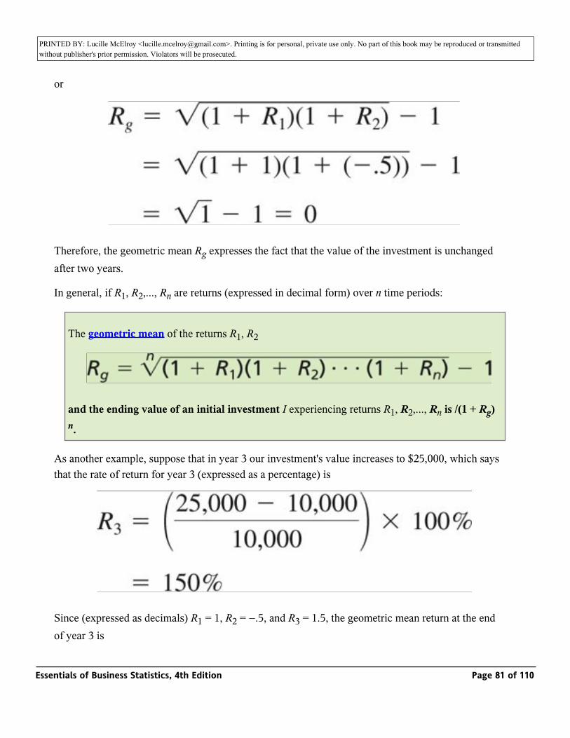
PRINTED BY: Lucille McElroy <[email protected]>. Printing is for personal, private use only. No part of this book may be reproduced or transmitted without publisher's prior permission. Violators will be prosecuted.
or
Therefore, the geometric mean Rg expresses the fact that the value of the investment is unchanged after two years.
In general, if R1, R2,..., Rn are returns (expressed in decimal form) over n time periods:
The geometric mean of the returns R1, R2
and the ending value of an initial investment I experiencing returns R1, R2,..., Rn is /(1 + Rg)n.
As another example, suppose that in year 3 our investment's value increases to $25,000, which says that the rate of return for year 3 (expressed as a percentage) is
Since (expressed as decimals) R1 = 1, R2 = −.5, and R3 = 1.5, the geometric mean return at the end of year 3 is
Essentials of Business Statistics, 4th Edition Page 81 of 110
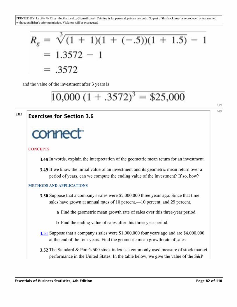
PRINTED BY: Lucille McElroy <[email protected]>. Printing is for personal, private use only. No part of this book may be reproduced or transmitted without publisher's prior permission. Violators will be prosecuted.of year 3 is
and the value of the investment after 3 years is
Exercises for Section 3.6
_
CONCEPTS
3.48 In words, explain the interpretation of the geometric mean return for an investment.
3.49 If we know the initial value of an investment and its geometric mean return over a period of years, can we compute the ending value of the investment? If so, how?
METHODS AND APPLICATIONS
3.50 Suppose that a company's sales were $5,000,000 three years ago. Since that time sales have grown at annual rates of 10 percent,—10 percent, and 25 percent.
a Find the geometric mean growth rate of sales over this three-year period.
b Find the ending value of sales after this three-year period.
3.51 Suppose that a company's sales were $1,000,000 four years ago and are $4,000,000 at the end of the four years. Find the geometric mean growth rate of sales.
3.52 The Standard & Poor's 500 stock index is a commonly used measure of stock market performance in the United States. In the table below, we give the value of the S&P 500 index on the first day of market trading for each year from 2000 to 2005.
139
1403.8.1
Essentials of Business Statistics, 4th Edition Page 82 of 110
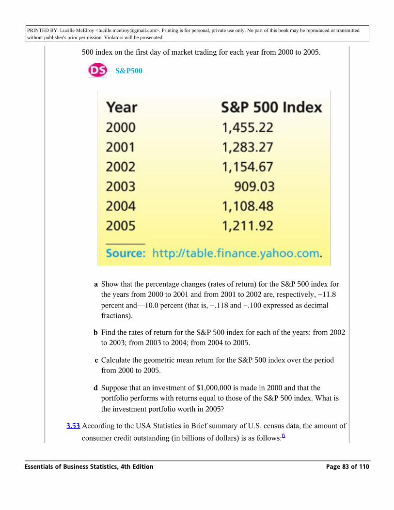
PRINTED BY: Lucille McElroy <[email protected]>. Printing is for personal, private use only. No part of this book may be reproduced or transmitted without publisher's prior permission. Violators will be prosecuted.performance in the United States. In the table below, we give the value of the S&P
500 index on the first day of market trading for each year from 2000 to 2005.
_ S&P500
a Show that the percentage changes (rates of return) for the S&P 500 index for the years from 2000 to 2001 and from 2001 to 2002 are, respectively, −11.8 percent and—10.0 percent (that is, −.118 and −.100 expressed as decimal fractions).
b Find the rates of return for the S&P 500 index for each of the years: from 2002 to 2003; from 2003 to 2004; from 2004 to 2005.
c Calculate the geometric mean return for the S&P 500 index over the period from 2000 to 2005.
d Suppose that an investment of $1,000,000 is made in 2000 and that the portfolio performs with returns equal to those of the S&P 500 index. What is the investment portfolio worth in 2005?
3.53 According to the USA Statistics in Brief summary of U.S. census data, the amount of consumer credit outstanding (in billions of dollars) is as follows:6
Essentials of Business Statistics, 4th Edition Page 83 of 110

PRINTED BY: Lucille McElroy <[email protected]>. Printing is for personal, private use only. No part of this book may be reproduced or transmitted without publisher's prior permission. Violators will be prosecuted.consumer credit outstanding (in billions of dollars) is as follows:6
1990: $789 1995: $1,096 2000: $1,534
a Find the geometric mean five-year rate of increase in consumer credit outstanding.
b Use the geometric mean rate of increase to project the amount of consumer credit outstanding in 2005.
Chapter Summary
We began this chapter by presenting and comparing several measures of central tendency. We defined the population mean and we saw how to estimate the population mean by using a sample mean. We also defined the median and mode, and we compared the mean, median, and mode for symmetrical distributions and for distributions that are skewed to the right or left. We then studied measures of variation (or spread). We defined the range, variance, and standard deviation, and we saw how to estimate a population variance and standard deviation by using a sample. We learned that a good way to interpret the standard deviation when a population is (approximately) normally distributed is to use the Empirical Rule, and we studied Chebyshev's Theorem, which gives us intervals containing reasonably large fractions of the population units no matter what the population's shape might be. We also saw that, when a data set is highly skewed, it is best to use percentiles and quartiles to measure variation, and we learned how to construct a box-and-whiskers plot by using the quartiles.
After learning how to measure and depict central tendency and variability, we presented several optional topics. First, we discussed several numerical measures of the relationship between two variables. These included the covariance, the correlation coefficient, and the least squares line. We then introduced the concept of a weighted mean and also explained how to compute descriptive statistics for grouped data. Finally, we showed how to calculate the geometric mean and demonstrated its interpretation.
Glossary of Terms
box-and-whiskers display (box plot):
A graphical portrayal of a data set that depicts both the central tendency and variability of the data. It is constructed using Q1, Md, and Q3. (pages 123, 124)
140
141
3.9
3.10
Essentials of Business Statistics, 4th Edition Page 84 of 110
PRINTED BY: Lucille McElroy <[email protected]>. Printing is for personal, private use only. No part of this book may be reproduced or transmitted without publisher's prior permission. Violators will be prosecuted.
central tendency:
A term referring to the middle of a population or sample of measurements. (page 101)
Chebyshev's Theorem:
A theorem that (for any population) allows us to find an interval that contains a specified percentage of the individual measurements in the population. (page 116)
coefficient of variation:
A quantity that measures the variation of a population or sample relative to its mean. (page 117)
correlation coefficient:
A numerical measure of the linear relationship between two variables that is between —1 and 1. (page 131)
covariance:
A numerical measure of the linear relationship between two variables that depends upon the units in which the variables are measured. (page 129)
Empirical Rule:
For a normally distributed population, this rule tells us that 68.26 percent, 95.44 percent, and 99.73 percent, respectively, of the population measurements are within one, two, and three standard deviations of the population mean. (page 114)
extreme outlier (in a box-and-whiskers display):
Measurements located outside the outer fences. (page 124)
first quartile (denoted Q1):
A value below which approximately 25 percent of the measurements lie; the 25th percentile. (page 121)
Essentials of Business Statistics, 4th Edition Page 85 of 110
PRINTED BY: Lucille McElroy <[email protected]>. Printing is for personal, private use only. No part of this book may be reproduced or transmitted without publisher's prior permission. Violators will be prosecuted.
geometric mean:
The constant return (or rate of change) that yields the same wealth at the end of several time periods as do actual returns. (page 139)
grouped data:
Data presented in the form of a frequency distribution or a histogram. (page 135)
inner fences (in a box-and-whiskers display):
Points located 1.5 × IQR below Q1 and 1.5 × IQR above Q3. (page 124)
interquartile range (denoted IQR):
The difference between the third quartile and the first quartile (that is, Q3 − Q1). (page 123)
least squares line:
The line that minimizes the sum of the squared vertical differences between points on a scatter plot and the line. (page 132)
measure of variation:
A descriptive measure of the spread of the values in a population or sample. (page 110)
median (denoted Md):
A measure of central tendency that divides a population or sample into two roughly equal parts. (page 103)
mild outlier (in a box-and-whiskers display):
Measurements located between the inner and outer fences. (page 124)
Essentials of Business Statistics, 4th Edition Page 86 of 110
PRINTED BY: Lucille McElroy <[email protected]>. Printing is for personal, private use only. No part of this book may be reproduced or transmitted without publisher's prior permission. Violators will be prosecuted.
mode (denoted M0):
The measurement in a sample or a population that occurs most frequently. (page 104)
mound-shaped:
Description of a relative frequency curve that is “piled up in the middle.” (page 116)
normal curve:
A bell-shaped, symmetrical relative frequency curve. We will present the exact equation that gives this curve in Chapter 6. (page 113)
outer fences (in a box-and-whiskers display):
Points located 3 × IQR below Q1 and 3 × IQR above Q3.(page 124)
percentile:
The value such that a specified percentage of the measurements in a population or sample fall at or below it. (page 120)
point estimate:
A one-number estimate for the value of a population parameter. (page 101)
population mean (denoted µ):
The average of a population of measurements. (page 101)
population parameter:
A descriptive measure of a population. It is calculated using the population measurements. (page 101)
Essentials of Business Statistics, 4th Edition Page 87 of 110
PRINTED BY: Lucille McElroy <[email protected]>. Printing is for personal, private use only. No part of this book may be reproduced or transmitted without publisher's prior permission. Violators will be prosecuted.
population standard deviation (denoted σ):
The positive square root of the population variance. It is a measure of the variation of the population measurements. (page 111)
population variance (denoted σ2):
The average of the squared deviations of the individual population measurements from the population mean. It is a measure of the variation of the population measurements. (page 111)
range:
The difference between the largest and smallest measurements in a population or sample. It is a simple measure of variation. (page 110)
sample mean (denoted
_ ): The average of the measurements in a sample. It is the point estimate of the population mean. (page 102)x
sample size (denoted n):
The number of measurements in a sample. (page 102)
sample standard deviation (denoted s):
The positive square root of the sample variance. It is the point estimate of the population standard deviation. (page 112)
sample statistic:
A descriptive measure of a sample. It is calculated from the measurements in the sample. (page 102)
Essentials of Business Statistics, 4th Edition Page 88 of 110
PRINTED BY: Lucille McElroy <[email protected]>. Printing is for personal, private use only. No part of this book may be reproduced or transmitted without publisher's prior permission. Violators will be prosecuted.
sample variance (denoted s2):
A measure of the variation of the sample measurements. It is the point estimate of the population variance. (page 112)
third quartile (denoted Q3):
A value below which approximately 75 percent of the measurements lie; the 75th percentile. (page 121)
tolerance interval:
An interval of numbers that contains a specified percentage of the individual measurements in a population. (page 114)
weighted mean:
A mean where different measurements are given different weights based on their importance. (page 134)
z-score (of a measurement):
The number of standard deviations that a measurement is from the mean. This quantity indicates the relative location of a measurement within its distribution. (page 117)
Important Formulas
The population mean, µ: page 101
The sample mean, _ : page 102x
The median: page 103
The mode: page 104
The population range: page 110
The population variance, σ2 : page 111
The population standard deviation, σ: page 111
3.11
Essentials of Business Statistics, 4th Edition Page 89 of 110
PRINTED BY: Lucille McElroy <[email protected]>. Printing is for personal, private use only. No part of this book may be reproduced or transmitted without publisher's prior permission. Violators will be prosecuted.The population standard deviation, σ: page 111
The sample variance, s2 : pages 112 and 113
The sample standard deviation, s: page 112
Computational formula for s2 : page 113
The Empirical Rule: page 114
Chebyshev's Theorem: page 116
z-score: page 117
The coefficient of variation: page 117
The p th percentile: pages 120, 121
The quartiles: page 121
The sample covariance: page 129
The sample correlation coefficient: page 131
The least squares line: page 132
The weighted mean: page 134
Sample mean for grouped data: page 136
Sample variance for grouped data: page 136
Population mean for grouped data: page 137
Population variance for grouped data: page 137
The geometric mean: page 139
Supplementary Exercises
_
3.54 In the book Modern Statistical Quality Control and Improvement, Nicholas R. Farnum presents data concerning the elapsed times from the completion of medical lab tests until the results are recorded on patients' charts. Table 3.10 gives the times it took (in hours) to deliver and chart the results of 84 lab tests over one week. Use the techniques of this and
141
142
3.12
Essentials of Business Statistics, 4th Edition Page 90 of 110
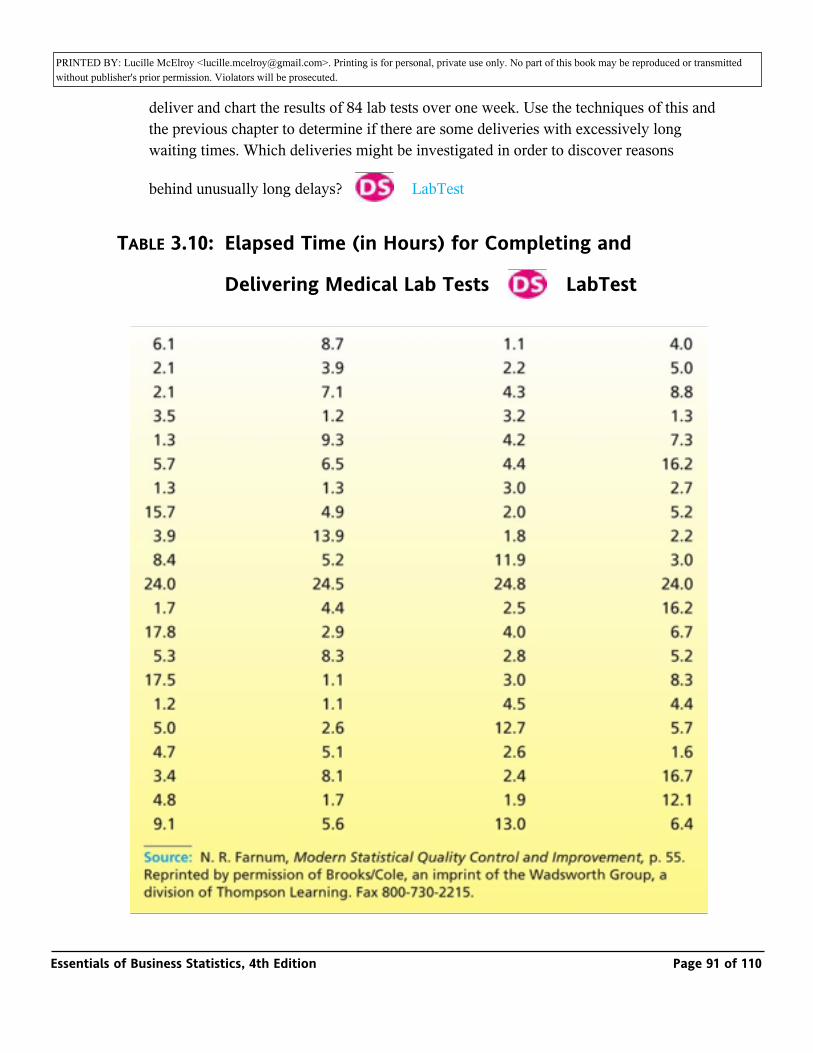
PRINTED BY: Lucille McElroy <[email protected]>. Printing is for personal, private use only. No part of this book may be reproduced or transmitted without publisher's prior permission. Violators will be prosecuted.the results are recorded on patients' charts. Table 3.10 gives the times it took (in hours) to
deliver and chart the results of 84 lab tests over one week. Use the techniques of this and the previous chapter to determine if there are some deliveries with excessively long waiting times. Which deliveries might be investigated in order to discover reasons
behind unusually long delays?_ LabTest
TABLE 3.10: Elapsed Time (in Hours) for Completing and
Delivering Medical Lab Tests _ LabTest
Essentials of Business Statistics, 4th Edition Page 91 of 110
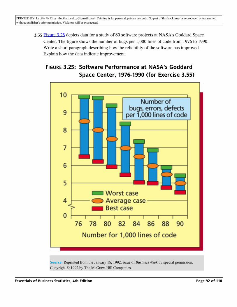
PRINTED BY: Lucille McElroy <[email protected]>. Printing is for personal, private use only. No part of this book may be reproduced or transmitted without publisher's prior permission. Violators will be prosecuted.
3.55 Figure 3.25 depicts data for a study of 80 software projects at NASA's Goddard Space Center. The figure shows the number of bugs per 1,000 lines of code from 1976 to 1990. Write a short paragraph describing how the reliability of the software has improved. Explain how the data indicate improvement.
FIGURE 3.25: Software Performance at NASA's Goddard Space Center, 1976-1990 (for Exercise 3.55)
Source: Reprinted from the January 15, 1992, issue of BusinessWeek by special permission. Copyright © 1992 by The McGraw-Hill Companies.
Essentials of Business Statistics, 4th Edition Page 92 of 110
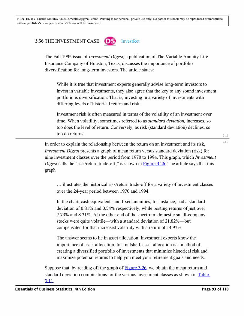
PRINTED BY: Lucille McElroy <[email protected]>. Printing is for personal, private use only. No part of this book may be reproduced or transmitted without publisher's prior permission. Violators will be prosecuted.
3.56 THE INVESTMENT CASE _ InvestRet
The Fall 1995 issue of Investment Digest, a publication of The Variable Annuity Life Insurance Company of Houston, Texas, discusses the importance of portfolio diversification for long-term investors. The article states:
While it is true that investment experts generally advise long-term investors to invest in variable investments, they also agree that the key to any sound investment portfolio is diversification. That is, investing in a variety of investments with differing levels of historical return and risk.
Investment risk is often measured in terms of the volatility of an investment over time. When volatility, sometimes referred to as standard deviation, increases, so too does the level of return. Conversely, as risk (standard deviation) declines, so too do returns.
In order to explain the relationship between the return on an investment and its risk, Investment Digest presents a graph of mean return versus standard deviation (risk) for nine investment classes over the period from 1970 to 1994. This graph, which Investment Digest calls the “risk/return trade-off,” is shown in Figure 3.26. The article says that this graph
… illustrates the historical risk/return trade-off for a variety of investment classes over the 24-year period between 1970 and 1994.
In the chart, cash equivalents and fixed annuities, for instance, had a standard deviation of 0.81% and 0.54% respectively, while posting returns of just over 7.73% and 8.31%. At the other end of the spectrum, domestic small-company stocks were quite volatile—with a standard deviation of 21.82%—but compensated for that increased volatility with a return of 14.93%.
The answer seems to lie in asset allocation. Investment experts know the importance of asset allocation. In a nutshell, asset allocation is a method of creating a diversified portfolio of investments that minimize historical risk and maximize potential returns to help you meet your retirement goals and needs.
Suppose that, by reading off the graph of Figure 3.26, we obtain the mean return and standard deviation combinations for the various investment classes as shown in Table 3.11.
142
143
Essentials of Business Statistics, 4th Edition Page 93 of 110
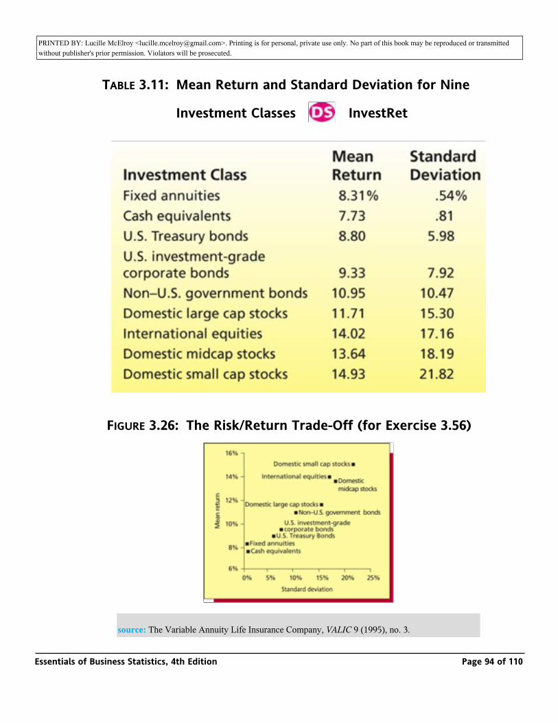
PRINTED BY: Lucille McElroy <[email protected]>. Printing is for personal, private use only. No part of this book may be reproduced or transmitted without publisher's prior permission. Violators will be prosecuted.3.11.
TABLE 3.11: Mean Return and Standard Deviation for Nine
Investment Classes _ InvestRet
FIGURE 3.26: The Risk/Return Trade-Off (for Exercise 3.56)
source: The Variable Annuity Life Insurance Company, VALIC 9 (1995), no. 3.
Essentials of Business Statistics, 4th Edition Page 94 of 110
PRINTED BY: Lucille McElroy <[email protected]>. Printing is for personal, private use only. No part of this book may be reproduced or transmitted without publisher's prior permission. Violators will be prosecuted.
Further suppose that future returns in each investment class will behave as they have from 1970 to 1994. That is, for each investment class, regard the mean return and standard deviation in Table 3.11 as the population mean and the population standard deviation of all possible future returns. Then do the following:
a Assuming that future returns for the various investment classes are mound-shaped, for each investment class compute intervals that will contain approximately 68.26 percent and 99.73 percent of all future returns.
b Making no assumptions about the population shapes of future returns, for each investment class compute intervals that will contain at least 75 percent and 88.89 percent of all future returns.
c Assuming that future returns are mound-shaped, find
(1) An estimate of the maximum return that might be realized for each investment class.
(2) An estimate of the minimum return (or maximum loss) that might be realized for each investment class.
d Assuming that future returns are mound-shaped, which two investment classes have the highest estimated maximum returns? What are the estimated minimum returns (maximum losses) for these investment classes?
e Assuming that future returns are mound-shaped, which two investment classes have the smallest estimated maximum returns? What are the estimated minimum returns for these investment classes?
f Calculate the coefficient of variation for each investment class and compare the investment classes with respect to risk. Which class is riskiest? Least risky?
3.57 THE UNITED KINGDOM INSURANCE CASE
Figure 3.27 summarizes information concerning insurance expenditures of households in the United Kingdom in 1993.
a Approximately what percentage of households spent money to buy life insurance?
b What is the approximate average expenditure (in UKL) per household on life insurance? Note: the averages given in Figure 3.27 are for households that spend in the class.
143
144
Essentials of Business Statistics, 4th Edition Page 95 of 110
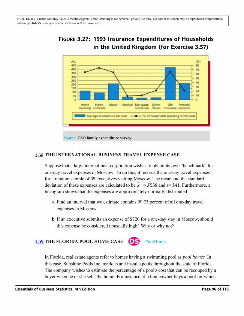
PRINTED BY: Lucille McElroy <[email protected]>. Printing is for personal, private use only. No part of this book may be reproduced or transmitted without publisher's prior permission. Violators will be prosecuted.the class.
FIGURE 3.27: 1993 Insurance Expenditures of Households in the United Kingdom (for Exercise 3.57)
Source: CSO family expenditure survey.
3.58 THE INTERNATIONAL BUSINESS TRAVEL EXPENSE CASE
Suppose that a large international corporation wishes to obtain its own “benchmark” for one-day travel expenses in Moscow. To do this, it records the one-day travel expenses for a random sample of 35 executives visiting Moscow. The mean and the standard deviation of these expenses are calculated to be _ = $538 and s= $41. Furthermore, a histogram shows that the expenses are approximately normally distributed.
x
a Find an interval that we estimate contains 99.73 percent of all one-day travel expenses in Moscow.
b If an executive submits an expense of $720 for a one-day stay in Moscow, should this expense be considered unusually high? Why or why not?
3.59 THE FLORIDA POOL HOME CASE _ PoolHome
In Florida, real estate agents refer to homes having a swimming pool as pool homes. In this case, Sunshine Pools Inc. markets and installs pools throughout the state of Florida. The company wishes to estimate the percentage of a pool's cost that can be recouped by a buyer when he or she sells the home. For instance, if a homeowner buys a pool for which the current purchase price is $30,000 and then sells the home in the current real estate
Essentials of Business Statistics, 4th Edition Page 96 of 110
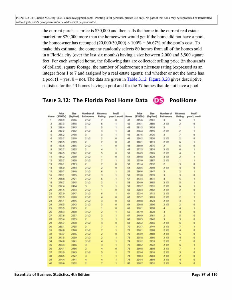
PRINTED BY: Lucille McElroy <[email protected]>. Printing is for personal, private use only. No part of this book may be reproduced or transmitted without publisher's prior permission. Violators will be prosecuted.buyer when he or she sells the home. For instance, if a homeowner buys a pool for which
the current purchase price is $30,000 and then sells the home in the current real estate market for $20,000 more than the homeowner would get if the home did not have a pool, the homeowner has recouped (20,000/30,000) × 100% = 66.67% of the pool's cost. To make this estimate, the company randomly selects 80 homes from all of the homes sold in a Florida city (over the last six months) having a size between 2,000 and 3,500 square feet. For each sampled home, the following data are collected: selling price (in thousands of dollars); square footage; the number of bathrooms; a niceness rating (expressed as an integer from 1 to 7 and assigned by a real estate agent); and whether or not the home has a pool (1 = yes, 0 = no). The data are given in Table 3.12. Figure 3.28 gives descriptive statistics for the 43 homes having a pool and for the 37 homes that do not have a pool.
TABLE 3.12: The Florida Pool Home Data _ PoolHome
Essentials of Business Statistics, 4th Edition Page 97 of 110
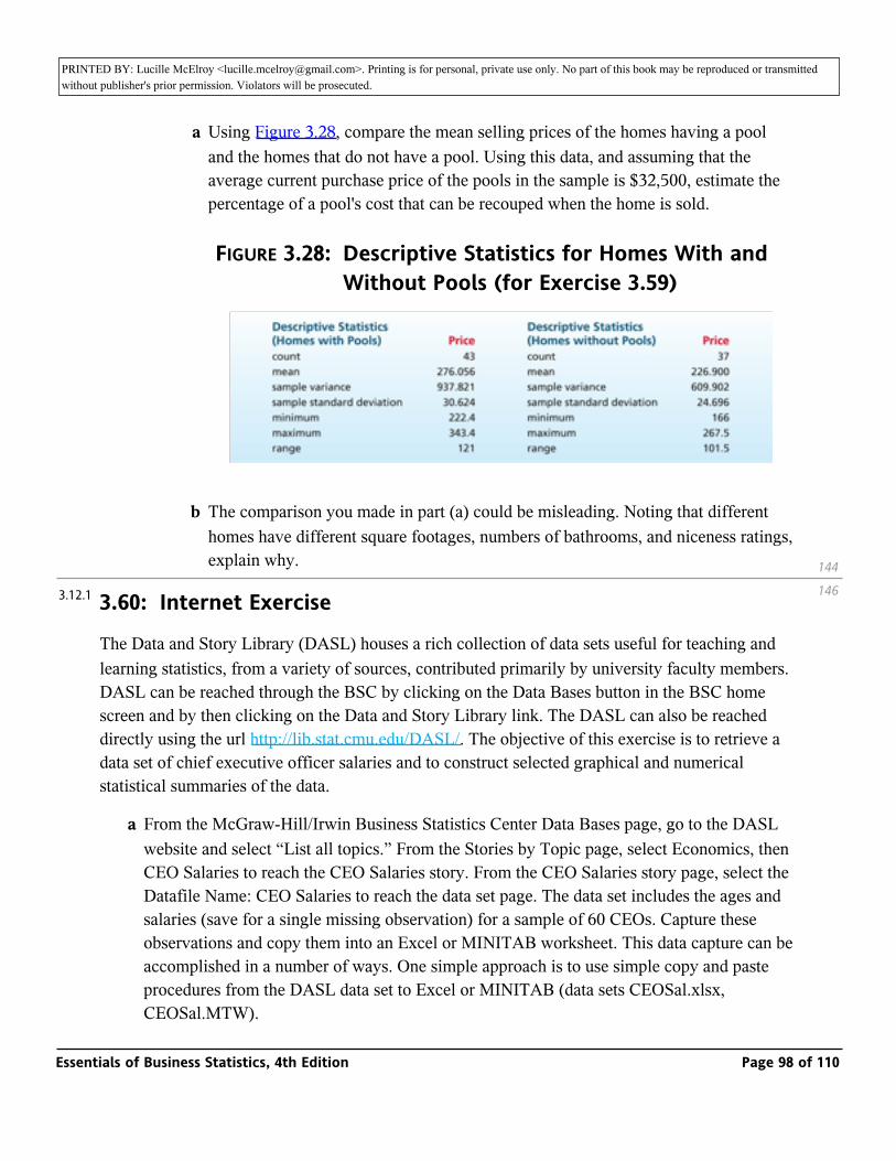
PRINTED BY: Lucille McElroy <[email protected]>. Printing is for personal, private use only. No part of this book may be reproduced or transmitted without publisher's prior permission. Violators will be prosecuted.
a Using Figure 3.28, compare the mean selling prices of the homes having a pool and the homes that do not have a pool. Using this data, and assuming that the average current purchase price of the pools in the sample is $32,500, estimate the percentage of a pool's cost that can be recouped when the home is sold.
FIGURE 3.28: Descriptive Statistics for Homes With and Without Pools (for Exercise 3.59)
b The comparison you made in part (a) could be misleading. Noting that different homes have different square footages, numbers of bathrooms, and niceness ratings, explain why.
3.60: Internet Exercise
The Data and Story Library (DASL) houses a rich collection of data sets useful for teaching and learning statistics, from a variety of sources, contributed primarily by university faculty members. DASL can be reached through the BSC by clicking on the Data Bases button in the BSC home screen and by then clicking on the Data and Story Library link. The DASL can also be reached directly using the url http://lib.stat.cmu.edu/DASL/. The objective of this exercise is to retrieve a data set of chief executive officer salaries and to construct selected graphical and numerical statistical summaries of the data.
a From the McGraw-Hill/Irwin Business Statistics Center Data Bases page, go to the DASL website and select “List all topics.” From the Stories by Topic page, select Economics, then CEO Salaries to reach the CEO Salaries story. From the CEO Salaries story page, select the Datafile Name: CEO Salaries to reach the data set page. The data set includes the ages and salaries (save for a single missing observation) for a sample of 60 CEOs. Capture these observations and copy them into an Excel or MINITAB worksheet. This data capture can be accomplished in a number of ways. One simple approach is to use simple copy and paste procedures from the DASL data set to Excel or MINITAB (data sets CEOSal.xlsx, CEOSal.MTW).
144
1463.12.1
Essentials of Business Statistics, 4th Edition Page 98 of 110
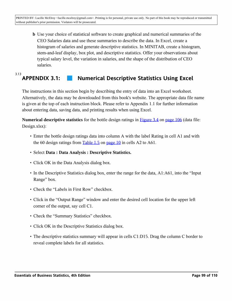
PRINTED BY: Lucille McElroy <[email protected]>. Printing is for personal, private use only. No part of this book may be reproduced or transmitted without publisher's prior permission. Violators will be prosecuted.CEOSal.MTW).
b Use your choice of statistical software to create graphical and numerical summaries of the CEO Salaries data and use these summaries to describe the data. In Excel, create a histogram of salaries and generate descriptive statistics. In MINITAB, create a histogram, stem-and-leaf display, box plot, and descriptive statistics. Offer your observations about typical salary level, the variation in salaries, and the shape of the distribution of CEO salaries.
APPENDIX 3.1: _ Numerical Descriptive Statistics Using Excel
The instructions in this section begin by describing the entry of data into an Excel worksheet. Alternatively, the data may be downloaded from this book's website. The appropriate data file name is given at the top of each instruction block. Please refer to Appendix 1.1 for further information about entering data, saving data, and printing results when using Excel.
Numerical descriptive statistics for the bottle design ratings in Figure 3.4 on page 106 (data file: Design.xlsx):
• Enter the bottle design ratings data into column A with the label Rating in cell A1 and with the 60 design ratings from Table 1.5 on page 10 in cells A2 to A61.
• Select Data : Data Analysis : Descriptive Statistics.
• Click OK in the Data Analysis dialog box.
• In the Descriptive Statistics dialog box, enter the range for the data, A1:A61, into the “Input Range” box.
• Check the “Labels in First Row” checkbox.
• Click in the “Output Range” window and enter the desired cell location for the upper left corner of the output, say cell C1.
• Check the “Summary Statistics” checkbox.
• Click OK in the Descriptive Statistics dialog box.
• The descriptive statistics summary will appear in cells C1:D15. Drag the column C border to reveal complete labels for all statistics.
3.13
Essentials of Business Statistics, 4th Edition Page 99 of 110
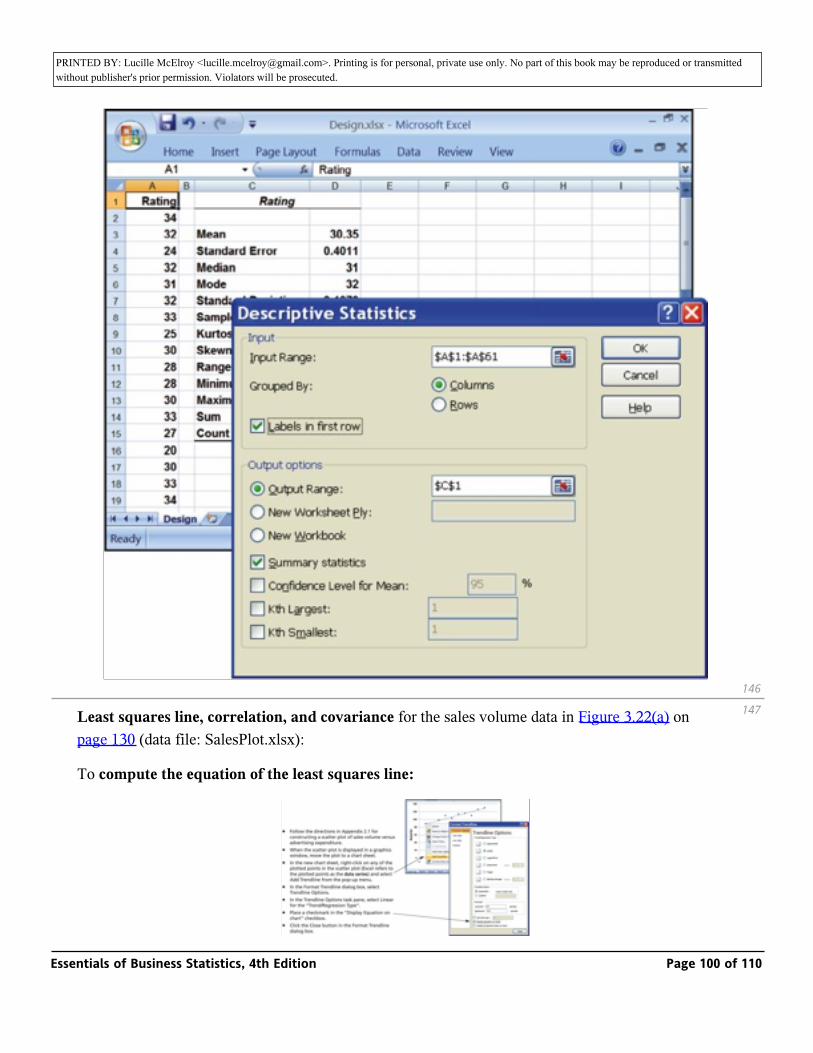
PRINTED BY: Lucille McElroy <[email protected]>. Printing is for personal, private use only. No part of this book may be reproduced or transmitted without publisher's prior permission. Violators will be prosecuted.reveal complete labels for all statistics.
Least squares line, correlation, and covariance for the sales volume data in Figure 3.22(a) on page 130 (data file: SalesPlot.xlsx):
To compute the equation of the least squares line:
146
147
Essentials of Business Statistics, 4th Edition Page 100 of 110
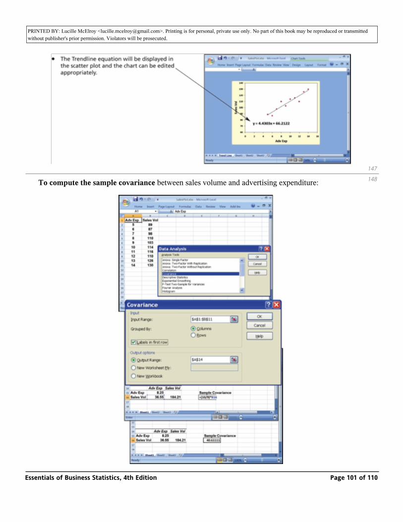
PRINTED BY: Lucille McElroy <[email protected]>. Printing is for personal, private use only. No part of this book may be reproduced or transmitted without publisher's prior permission. Violators will be prosecuted.
To compute the sample covariance between sales volume and advertising expenditure:
147
148
Essentials of Business Statistics, 4th Edition Page 101 of 110
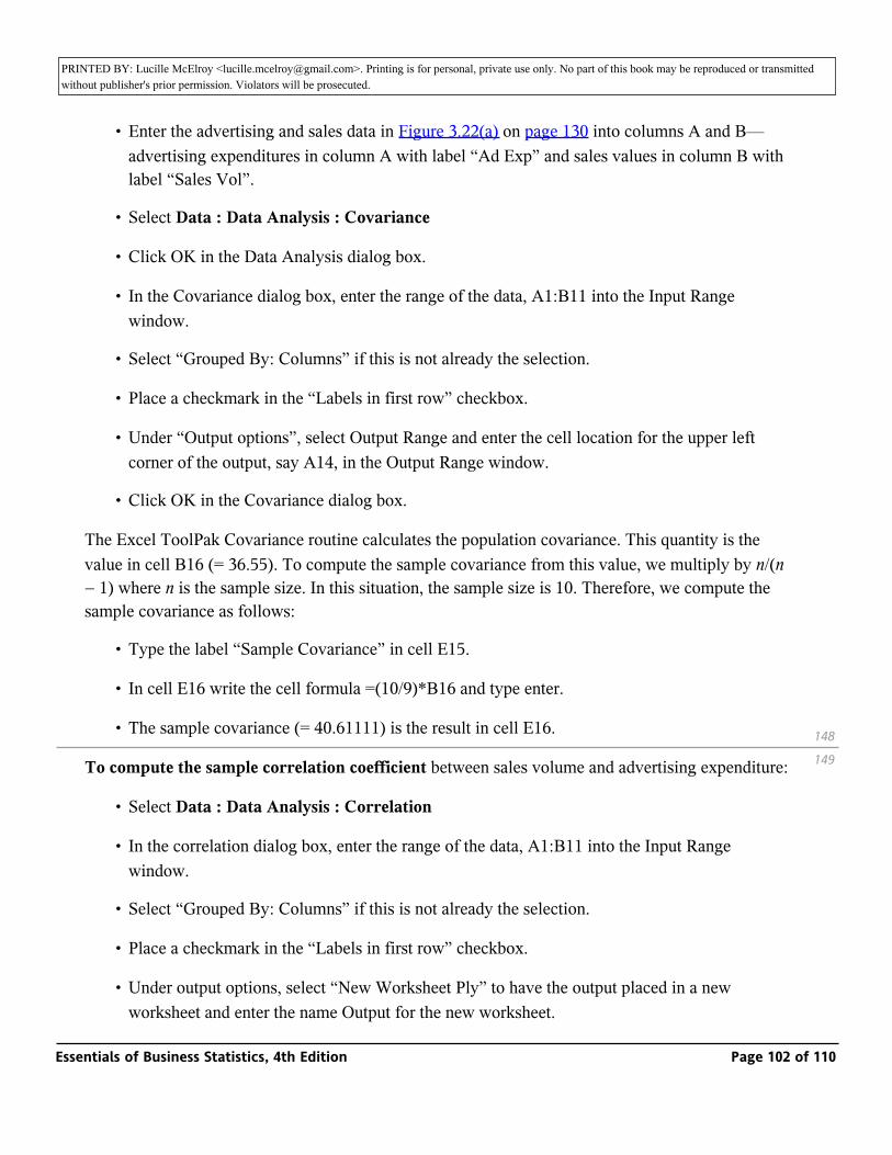
PRINTED BY: Lucille McElroy <[email protected]>. Printing is for personal, private use only. No part of this book may be reproduced or transmitted without publisher's prior permission. Violators will be prosecuted.
• Enter the advertising and sales data in Figure 3.22(a) on page 130 into columns A and B—advertising expenditures in column A with label “Ad Exp” and sales values in column B with label “Sales Vol”.
• Select Data : Data Analysis : Covariance
• Click OK in the Data Analysis dialog box.
• In the Covariance dialog box, enter the range of the data, A1:B11 into the Input Range window.
• Select “Grouped By: Columns” if this is not already the selection.
• Place a checkmark in the “Labels in first row” checkbox.
• Under “Output options”, select Output Range and enter the cell location for the upper left corner of the output, say A14, in the Output Range window.
• Click OK in the Covariance dialog box.
The Excel ToolPak Covariance routine calculates the population covariance. This quantity is the value in cell B16 (= 36.55). To compute the sample covariance from this value, we multiply by n/(n − 1) where n is the sample size. In this situation, the sample size is 10. Therefore, we compute the sample covariance as follows:
• Type the label “Sample Covariance” in cell E15.
• In cell E16 write the cell formula =(10/9)*B16 and type enter.
• The sample covariance (= 40.61111) is the result in cell E16.
To compute the sample correlation coefficient between sales volume and advertising expenditure:
• Select Data : Data Analysis : Correlation
• In the correlation dialog box, enter the range of the data, A1:B11 into the Input Range window.
• Select “Grouped By: Columns” if this is not already the selection.
• Place a checkmark in the “Labels in first row” checkbox.
• Under output options, select “New Worksheet Ply” to have the output placed in a new worksheet and enter the name Output for the new worksheet.
148
149
Essentials of Business Statistics, 4th Edition Page 102 of 110
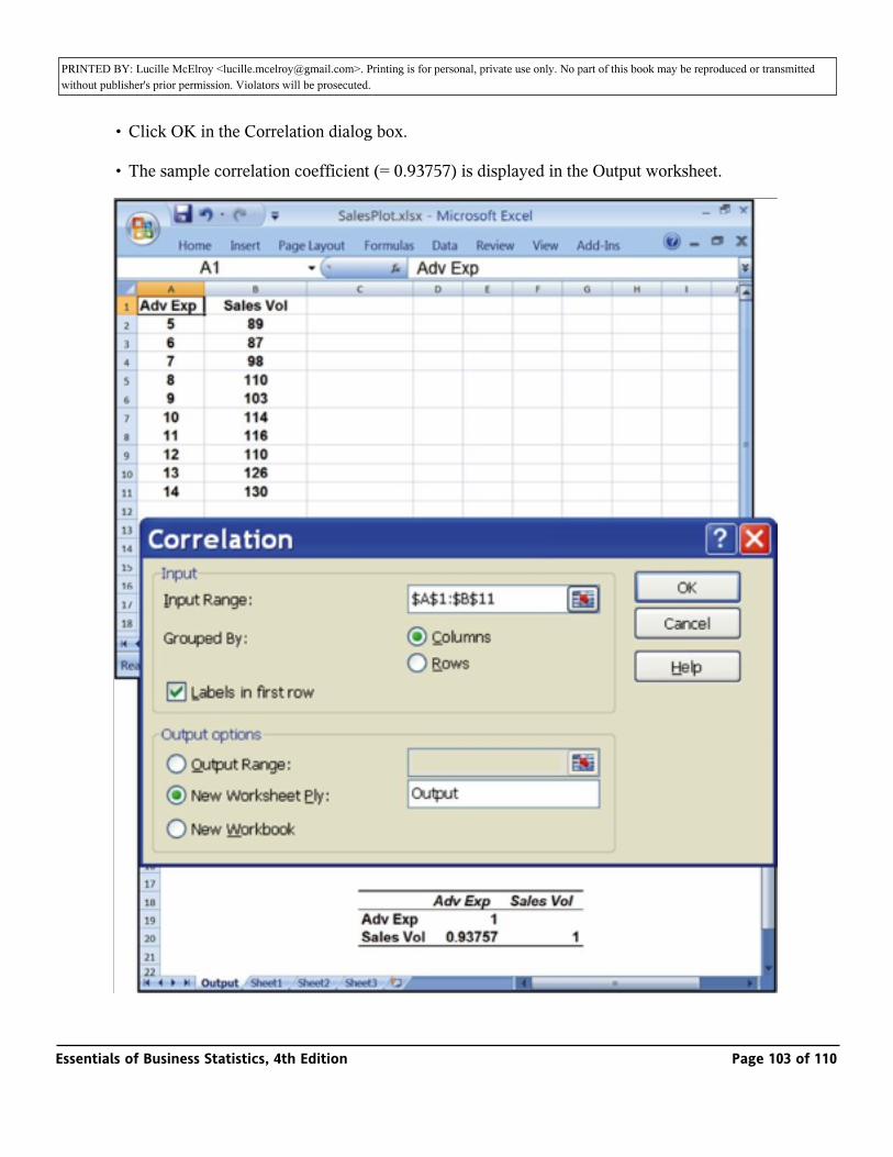
PRINTED BY: Lucille McElroy <[email protected]>. Printing is for personal, private use only. No part of this book may be reproduced or transmitted without publisher's prior permission. Violators will be prosecuted.worksheet and enter the name Output for the new worksheet.
• Click OK in the Correlation dialog box.
• The sample correlation coefficient (= 0.93757) is displayed in the Output worksheet.
Essentials of Business Statistics, 4th Edition Page 103 of 110
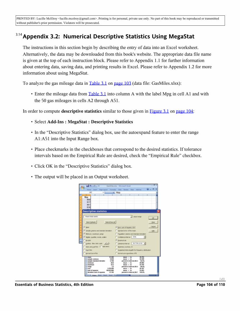
PRINTED BY: Lucille McElroy <[email protected]>. Printing is for personal, private use only. No part of this book may be reproduced or transmitted without publisher's prior permission. Violators will be prosecuted.
Appendix 3.2: Numerical Descriptive Statistics Using MegaStat
The instructions in this section begin by describing the entry of data into an Excel worksheet. Alternatively, the data may be downloaded from this book's website. The appropriate data file name is given at the top of each instruction block. Please refer to Appendix 1.1 for further information about entering data, saving data, and printing results in Excel. Please refer to Appendix 1.2 for more information about using MegaStat.
To analyze the gas mileage data in Table 3.1 on page 103 (data file: GasMiles.xlsx):
• Enter the mileage data from Table 3.1 into column A with the label Mpg in cell A1 and with the 50 gas mileages in cells A2 through A51.
In order to compute descriptive statistics similar to those given in Figure 3.1 on page 104:
• Select Add-Ins : MegaStat : Descriptive Statistics
• In the “Descriptive Statistics” dialog box, use the autoexpand feature to enter the range A1:A51 into the Input Range box.
• Place checkmarks in the checkboxes that correspond to the desired statistics. If tolerance intervals based on the Empirical Rule are desired, check the “Empirical Rule” checkbox.
• Click OK in the “Descriptive Statistics” dialog box.
• The output will be placed in an Output worksheet.
149
3.14
Essentials of Business Statistics, 4th Edition Page 104 of 110
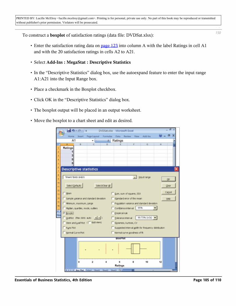
PRINTED BY: Lucille McElroy <[email protected]>. Printing is for personal, private use only. No part of this book may be reproduced or transmitted without publisher's prior permission. Violators will be prosecuted.
To construct a boxplot of satisfaction ratings (data file: DVDSat.xlsx):
• Enter the satisfaction rating data on page 123 into column A with the label Ratings in cell A1 and with the 20 satisfaction ratings in cells A2 to A21.
• Select Add-Ins : MegaStat : Descriptive Statistics
• In the “Descriptive Statistics” dialog box, use the autoexpand feature to enter the input range A1:A21 into the Input Range box.
• Place a checkmark in the Boxplot checkbox.
• Click OK in the “Descriptive Statistics” dialog box.
• The boxplot output will be placed in an output worksheet.
• Move the boxplot to a chart sheet and edit as desired.
149
150
Essentials of Business Statistics, 4th Edition Page 105 of 110
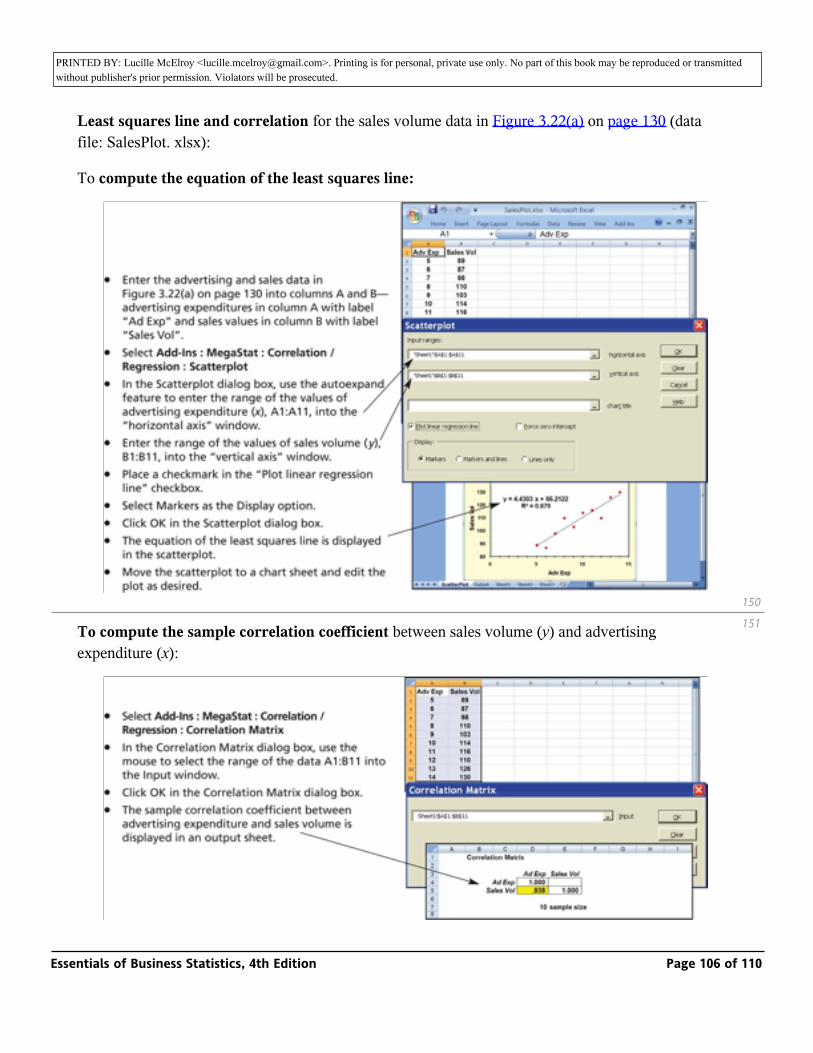
PRINTED BY: Lucille McElroy <[email protected]>. Printing is for personal, private use only. No part of this book may be reproduced or transmitted without publisher's prior permission. Violators will be prosecuted.
Least squares line and correlation for the sales volume data in Figure 3.22(a) on page 130 (data file: SalesPlot. xlsx):
To compute the equation of the least squares line:
To compute the sample correlation coefficient between sales volume (y) and advertising expenditure (x):
150
151
Essentials of Business Statistics, 4th Edition Page 106 of 110
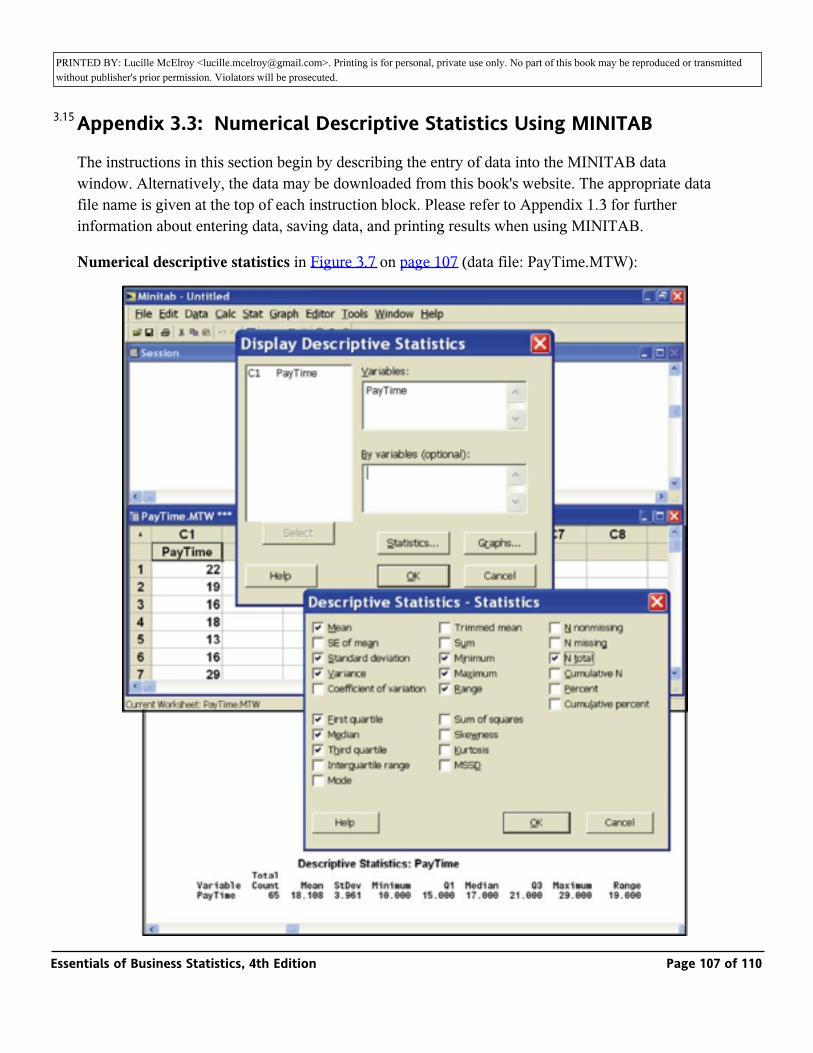
PRINTED BY: Lucille McElroy <[email protected]>. Printing is for personal, private use only. No part of this book may be reproduced or transmitted without publisher's prior permission. Violators will be prosecuted.
Appendix 3.3: Numerical Descriptive Statistics Using MINITAB
The instructions in this section begin by describing the entry of data into the MINITAB data window. Alternatively, the data may be downloaded from this book's website. The appropriate data file name is given at the top of each instruction block. Please refer to Appendix 1.3 for further information about entering data, saving data, and printing results when using MINITAB.
Numerical descriptive statistics in Figure 3.7 on page 107 (data file: PayTime.MTW):
3.15
Essentials of Business Statistics, 4th Edition Page 107 of 110

PRINTED BY: Lucille McElroy <[email protected]>. Printing is for personal, private use only. No part of this book may be reproduced or transmitted without publisher's prior permission. Violators will be prosecuted.
• Enter the payment time data from Table 2.4 (page 42) into column C1 with variable name PayTime.
• Select Stat : Basic Statistics : Display Descriptive Statistics.
• In the Display Descriptive Statistics dialog box, select the variable Paytime into the Variables window.
• In the Display Descriptive Statistics dialog box, click on the Statistics button.
• In the “Descriptive Statistics—Statistics” dialog box, enter checkmarks in the checkboxes corresponding to the desired descriptive statistics. Here we have checked the mean, standard deviation, variance, first quartile, median, third quartile, minimum, maximum, range, and N total checkboxes.
• Click OK in the “Descriptive Statistics—Statistics” dialog box.
• Click OK in the Display Descriptive Statistics dialog box.
• The requested descriptive statistics are displayed in the session window.
Box plot similar to Figure 3.17(b) on page 124 (data file DVDSat.MTW):
151
152
Essentials of Business Statistics, 4th Edition Page 108 of 110
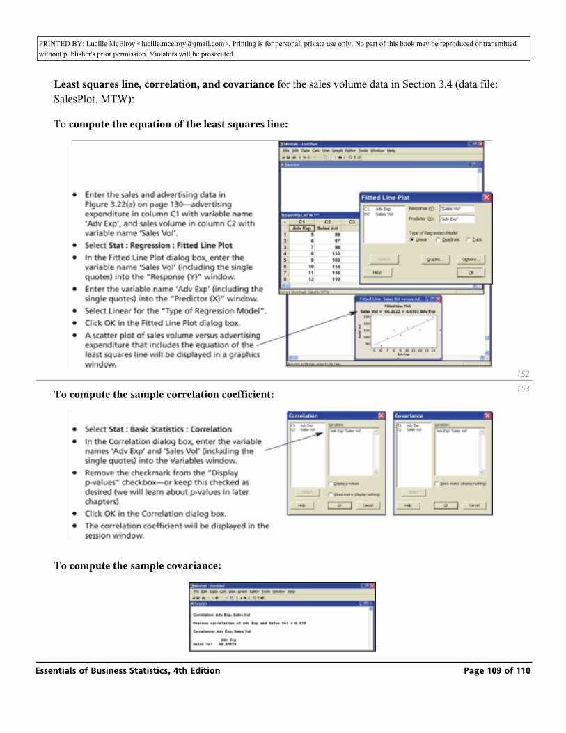
PRINTED BY: Lucille McElroy <[email protected]>. Printing is for personal, private use only. No part of this book may be reproduced or transmitted without publisher's prior permission. Violators will be prosecuted.
Least squares line, correlation, and covariance for the sales volume data in Section 3.4 (data file: SalesPlot. MTW):
To compute the equation of the least squares line:
To compute the sample correlation coefficient:
To compute the sample covariance:
152
153
Essentials of Business Statistics, 4th Edition Page 109 of 110
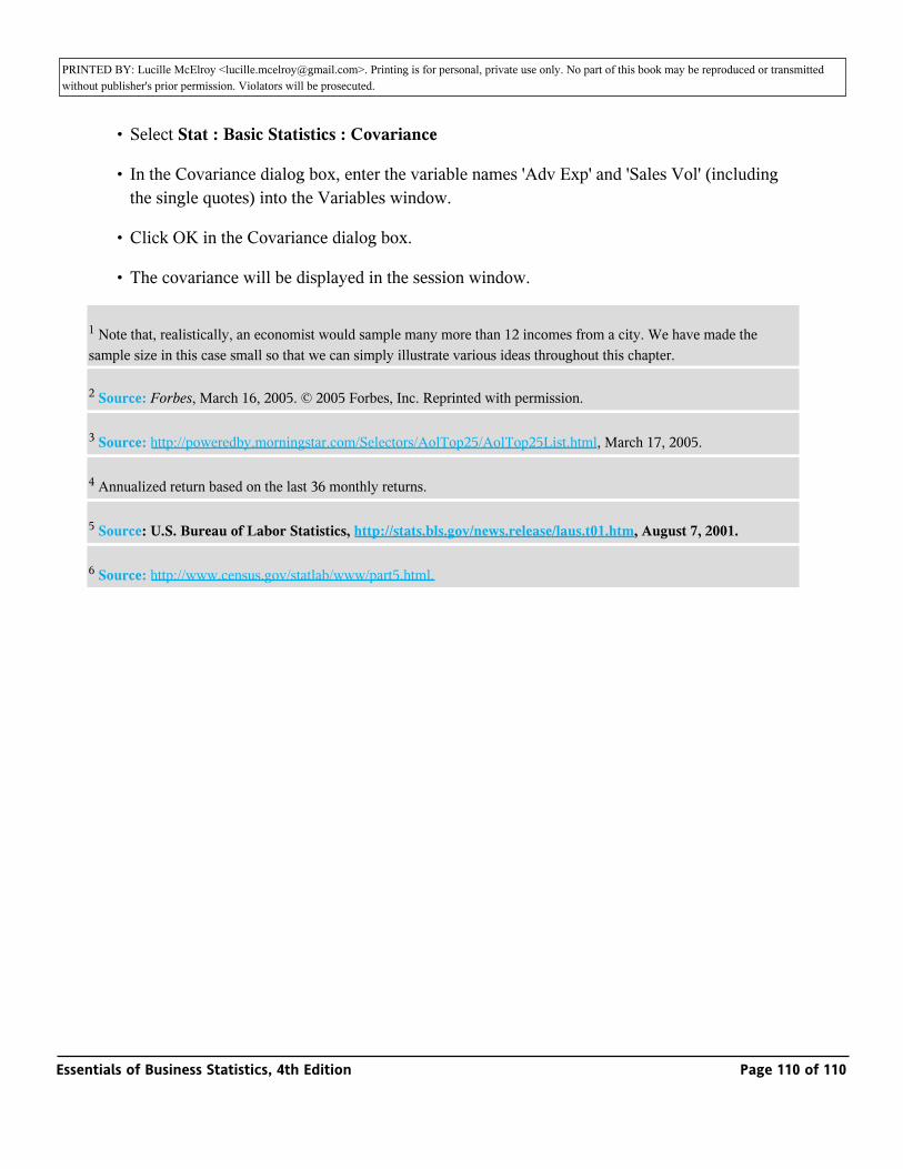
PRINTED BY: Lucille McElroy <[email protected]>. Printing is for personal, private use only. No part of this book may be reproduced or transmitted without publisher's prior permission. Violators will be prosecuted.
• Select Stat : Basic Statistics : Covariance
• In the Covariance dialog box, enter the variable names 'Adv Exp' and 'Sales Vol' (including the single quotes) into the Variables window.
• Click OK in the Covariance dialog box.
• The covariance will be displayed in the session window.
1 Note that, realistically, an economist would sample many more than 12 incomes from a city. We have made the sample size in this case small so that we can simply illustrate various ideas throughout this chapter.
2 Source: Forbes, March 16, 2005. © 2005 Forbes, Inc. Reprinted with permission.
3 Source: http://poweredby.morningstar.com/Selectors/AolTop25/AolTop25List.html, March 17, 2005.
4 Annualized return based on the last 36 monthly returns.
5 Source: U.S. Bureau of Labor Statistics, http://stats.bls.gov/news.release/laus.t01.htm, August 7, 2001.
6 Source: http://www.census.gov/statlab/www/part5.html.
Essentials of Business Statistics, 4th Edition Page 110 of 110