3d to 3d: new dimensions of data representation
TRANSCRIPT

3D to 3D: New Dimensions of Data Representation
VISUAL ANALYTICS LABORATORY
Dr. Sara Diamond, OCAD University
ISS, Immersive Visualization

OCAD UNIVERSITY The University of the Imagination
140 years old.
The largest and most comprehensive art, design and media university in Canada and 3rd largest in North America. 4700 UG and graduate students.
Grounded in historical focus on art, design, media, and cultural and social theory.

Visual Analytics Lab
R & D activities focus on four main areas
• Visual Design: Developing new ways to tell stories with data through unique visual representations is the key research focus of the lab. Depiction of complex patterns and relationships through appealing visuals enables better information delivery.
• Analytic Methods: VAL’s researchers design software and methods that guide users in exploring and gaining valuable information from visual representations. By these visualizations, users can create and test hypotheses, communicate results, and challenge assumptions.
• Natural User Interactions: At VAL, the team explores emerging multimodal techniques and hardware for developing natural interfaces that brings users closer to their data than ever before. The team creates new interactive visual environments for the web, mobile devices, and desktop applications.
• User Experience: The ultimate goal of VAL is to help people work with information. The user-centered design approach used in the lab includes collaborating closely with users to understand their problems, test solutions, and deliver usable and useful software products.
Overview

Visual Analytics Lab
Director: Dr. Sara Diamond
Research Faculty:
Dr. Isabel Meirelles
Dr. Martha Ladly
Dr. Patricio Davila
Greg Van Alstyne
Jeremy Bowes
Dr. Peter Coppin
Karin Von Ompstead
Francis Le Bouthillier
Research Fellows:
Dr. Steve Szigeti
Dr. Ana Jofre
Dr. Carl Skelton
Team Members

Data Analysis with a Tangible Interface
Szigeti, S., Stevens, A., Tu, R., Jofre, A., Gebhardt, A., Chevalier, F., Lee, J. & Diamond, S. (2014) Output to Input: Concepts for
Physical Data Representations and Tactile User Interfaces. Proceedings of CHI14 Works‐in‐Progress (Toronto, ON).
Users generate graphs of radio station data by placing objects onto a table. Objects control which radio station we view as
well as how the data is broken down.
Visual Analytics Lab

Data Analysis with a Tangible Interface
Users generate graphs of radio station data by placing objects onto a table. In this test, the data is
embedded into the tangible interface, as the size of each representative radio station block is related to
how many listeners it has and the amount of minutes listened.
Visual Analytics Lab

Data Analysis with a Tangible Interface
Jofre, A. Szigeti, S., Tiefenbach-Keller, S., Dong, L.-X., Tomé, F., Czarnowski, D., Diamond, S. (2015) "A Tangible User Interface
for Interactive Data Visualization" Proceedings of the 2015 Conference of the Center for Advanced Studies on Collaborative
Research. IBM Corp., CASCON2015, November 2-4, 2015, Toronto, Ontario.
Users generate graphs of radio station data by placing objects onto a table – 2nd prototype. Objects control which radio
station we view as well as whether to view the station’s number of listeners or minutes listened or both. The data can
further be broken down by age and gender by placing each of the representative objects on the table.
Visual Analytics Lab

Data Analysis with a Tangible Interface
Users generate graphs of radio station data by placing objects onto a table. Objects control which radio
station we view as well as whether to view the station’s number of listeners or minutes listened or
both. The data can further be broken down by age and gender.
Visual Analytics Lab

Data Analysis with a Tangible Interface
Fully functional prototype of the tangible interface presented at CHI Interactivity 2016 (San Jose May 7-
12, 2016).
Jofre, A., Szigeti, S., Tiefenbach-Keller, S., Dong, L.-X., Diamond, S. “Manipulating Tabletop Objects to
Interactively Query a Database” (2016) CHI’16 Extended Abstracts (Chi 2016 San Jose May 7-12)
Visual Analytics Lab

Data Analysis with a Tangible Interface
Our tangible user interface has applications in education contexts.
Jofre, A., Szigeti, S., Diamond, S. "Citizen engagement through tangible data representation" Foro de
Educación (January-June 2016) vol. 14, n. 20
Visual Analytics Lab

Generic Tangible Front-End for Manipulating Visualizations on a BrowserAna Jofre, Stephen Teifenbach-Keller, Lan-Xi Dong, Steve Szigeti, Sara Diamond

http://protium-labs.co/Tuio.js/file:///Users/ajofre/Desktop/TUIOTableau_Visualization-CHI.html
Part 1:
b) TUIO protocol for Javascript and Tableau

Part 2:
Presentation Models for NLOGIC Data
The ‘Persona’ Model
Use the attributes to build a persona.
Visualize the data for each persona.


Token Action
Visualization Response
Show/hide data subset
Place token on the table (or remove it)
Move token to designated region
Part 1:a) tangible ‘language’ – some translation with Tableau’s interface
Rotate token (within designated region)
Display details on selected data
Place widget on the table
Change view of the data
Highlight data subset

Visually filtering high-dimensional dataAna Jofre, Lan-Xi Dong, Stephen Teifenbach-Keller, Steve Szigeti, Sara Diamond (OCAD University)
Omar Grant, Matthew Kyan (York University)


iCity: Urban Informatics for Sustainable Metropolitan Growth
A 4-year Translational Research Initiative Supported by The Ontario Research Excellence
Fund Round 7
Visual Analytics Lab iCity

iCity concept of city systems as nested structures

Modeling systems relationships

Betaville and Story Facets visualization tools
• Design Approach• Communication Centered
• Collaboration- Minded
• Visual Data/Model Integration• Able to link qualitative data
• Real-time “what-ifs”
• Changing/historical data and data ontologies
• Provenance

Betaville and StoryFacets
• Visualization Techniques
• Interactive Computing
• Overview + Detail
• Geospatial Visualization
• Info vis
• Comparative Visualization
• White Boxes
• Ontology
• Models – transparency
• Provenance - retrievability

Betaville = Experiential + Data

Urban Development Process

Compare Photo View…

…With the Betaville View

…Including the Future!

See Above and Below Grade

Navigate Inside and Out

Betaville: City 3D + City Data

Betaville: New WebGL Client
Runs in Any HTML5 Browser

ESRI CityEngine: Open City 3D

Betaville + CityEngine: Building Experiences of the Future, Now

StoryFacetsOverview

StoryFacetsStory (slideshow) facet – Star Wars character height

StoryFacetsLinked back to trail facet

Tag CloudDig Sites
Municipality = Écija OR Marchena
Grouped by Ceramic
Component
GraphTrailProvenance & chart parameterization

Home Location of Respondents

StudentMove TO

Relationships commute time and school engagement
• Percentage coming to campus daily by distance of commute
• One way commute and involvement in school: pick courses by commute time, commute discourages coming to campus, commute discourages extracurricular activity

Cost of housing
The decision was out of my control
Ability to walk or bike to campus
Housing qualities (space, yard, ...)
Proximity to public transit
Being near friends and family
Amenities of neighbourhood (shops, parks, houses,
...)
Other
Walkability of neighbourhood
Crime and safety
Video Student MoveTO
• Betaville – where are students located and what is their destiny?
• StoryFacets – factors in considering a new home…

Student MoveTO: Data We Need to Understand

2.5D Models: Data <> Mapping

Partner Suite: Data Visualiztion +
Fusion = StoryFacets

AR: See It On Location

VR: Bringing Game Tech to Real
Stakes
<>

Visual Analytics Lab
Research Questions
Urban Analytics Systems
3D visualization of data (Betaville)
ESRI – AR/VR applications
Presentation and Analytics – StoryFacets (GraphTrails)
StudentMoveTO – comparative use of visualization
Team Members

Big Data Research, Analytics and Information Network (BRAIN)
Subproject title: Interactive Visualization of Large Data Sets
Data and ApplicationsDatabase framework Visualizations
Research Goal for December 2016:
Create a prototype of an interactive visualization tool that:1) couples to Skydive’s existing system, and2) fulfills a need for the brain research community.

SkydiveAna Jofre, Steve Szigeti, Sara Diamond (OCAD University)
Piotr Lasek, Nasim Rasavi, Parke Godfrey (York University)

Identify needs of brain research community:
• Survey current software technologies in the field: what is lacking?• Establish contact and relationship with researchers at Baycrest.• Idea iteration

Survey of existing software for Brain Image analysis
Isocaps1) Matlab ISOCAPS

2) MANGO

3) AFNI
AFNI

FSL SUMA
4) FSL
5) SUMA

MRICRON6) MRIcron

Given what is out there, what can we contribute?
We have explored two possible directions:
1. Create a visualization that allows users to view many brains (overview and pan), which still allows users to view detail on a single brain (zoom).
2. Create visualizations for abstracted brain data (Connectome network diagrams).

1. Create a visualization that allows users to view many brains.
What can we add?• Skydive lends the ability to rapidly pan and
zoom over a large database
• Our visualization can include algorithms that sort the data by visual features.This could be useful for technicians reviewing the scans.
Example: Using Python’s OpenCV library, images can be sorted by Histogram of Gradients (HOG) features.
Problems: - Leads to software that is too specialized – not generalizable - Matching computer-perceived features to human-perceived
features is a difficult machine learning problem.

2. Convert fMRI data to connectome data
Problem is transformed into a network visualization problem.
Some Advantages:
- Network visualizations are applicable and of interest across disciplines: solution can can be applied across domains.
- Taps into a hot research topic
J Neurophysiol. 2010 Jan; 103(1): 297–321.Published online 2009 Nov 4. doi: 10.1152/jn.00783.2009
Image from:


Front. Neuroinform., 28 November 2012 | http://dx.doi.org/10.3389/fninf.2012.00028

Existing Software for Imaging 3d bio networks: ARENA 3D
What can we add to this?- Skydive capabilities (explore large networks)- Calculate connectivity while visualizing the network:
- Currently, connectivity is first calculated separately, then resulting network is viewed. Maybe we can build a system that bundles these steps?
- Raw data is similar in structure to urban taxi pick up and drop off data, already demonstrated in Skydive.
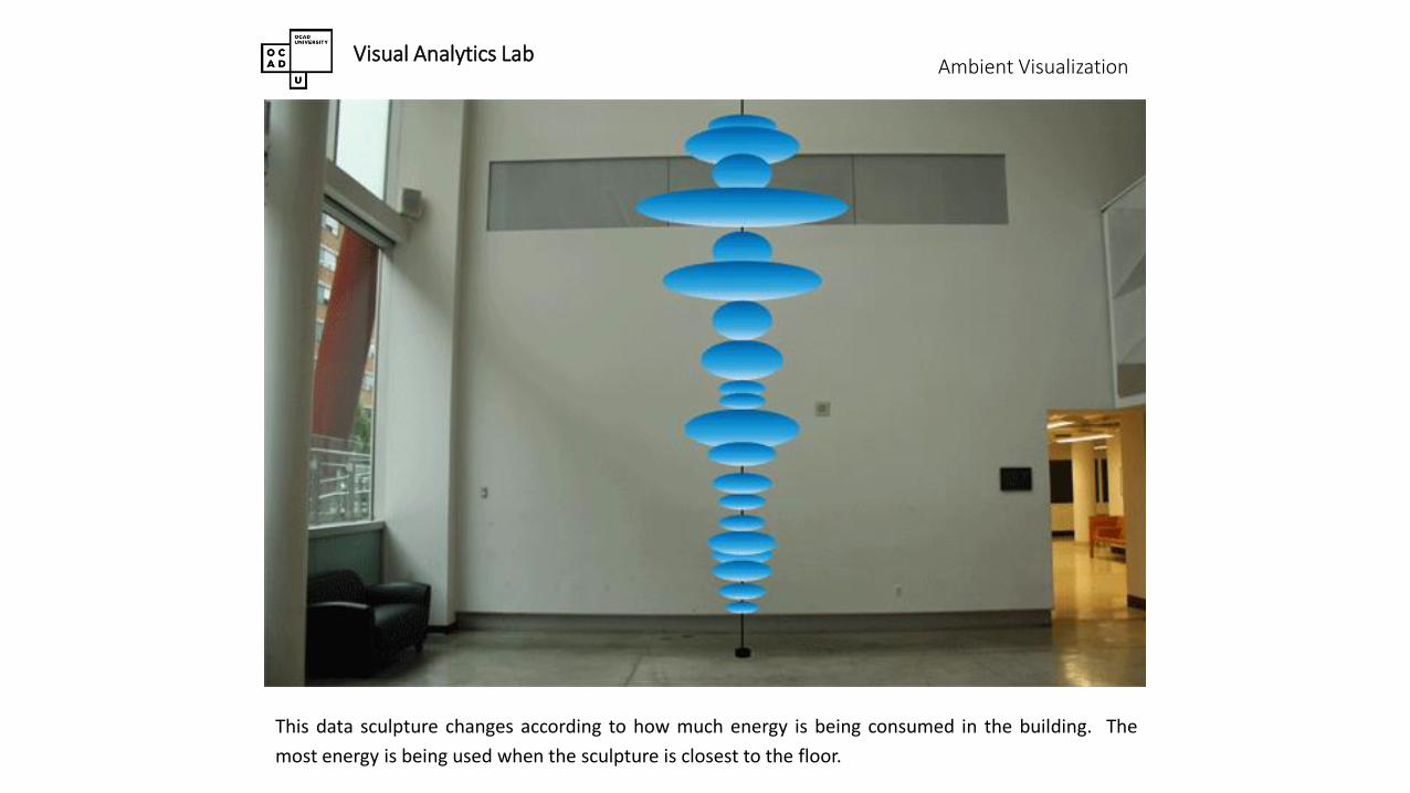
Ambient Visualization
This data sculpture changes according to how much energy is being consumed in the building. The
most energy is being used when the sculpture is closest to the floor.
Visual Analytics Lab

Ambient Visualization
This data sculpture changes according to how much energy is being consumed in the building. The
cloud becomes greyer as more energy is consumed.
Visual Analytics Lab

Ambient Visualization
This data sculpture proposal changes according to how much energy is being consumed in the building.
The electrical outlets express concern when too much energy is being consumed.
Visual Analytics Lab

Ambient Visualization
This data sculpture proposal changes according to how much energy is being consumed in the building.
The battery symbol becomes fully charged when energy use is high.
Visual Analytics Lab

Patricio Davila: Public VisualizationsVisual Analytics Lab

Patricio Davila: Public VisualizationsVisual Analytics Lab

Patricio Davila: Public VisualizationsVisual Analytics Lab

Patricio Davila: Public VisualizationsVisual Analytics Lab

Martha Ladly: The CBC Newsworld Holodeck
The CBC Newsworld Holodeck is an interactive video installation that allows users to browse and search
a massive digitized “big data” collection of 24-hour news from the CBC, Canada’s national broadcaster,
which spans a 24-year period from 1989-2013.
Visual Analytics Lab

74Sculpture Saving Lives