7. evaluation(3)
TRANSCRIPT

FMP EVALUATION

RESEARCH I think my strengths of my research was analysing the
different front covers and double page spread I managed to pick out all of the different conventions of a magazine and double page spread. I then was able to add all of these common conventions into my own front cover and double page spread, this really helped me think about what I was going to add in to my own work.
I think the weakness of my research was been able to fill in and collect information for my audience profile, this is a key part to the research as you need to know who you want your audience to be for you to decide on colour schemes, plug, buzzwords, masthead etc.

PLANNING My strengths of my planning will be drawing and drafting my two
layouts by doing this it helped me plan out how I wanted my front cover and double page spread to look by including all of the conventions that I found out in my research. This then helped my when it cam to making my final product as I already have an idea of how I wanted it to look, I changed a few this like the way some of the text was placed but I still included a lot of what I have drafted.
My weaknesses of planning would be making my schedule for the next 8 days of production, as I had no idea what was going to happen when my work corrupted so I went of schedule a little bit but I managed to get all of my work done I just didn’t have time to go extra pages for my magazine. Also filling in the contingency planning and props & locations as it is very hard to think of every potential issue that could happen and think of how you can resolve the problem if something does happen I also forgot to add things in so I had to back and make sure that they was all full and all correct.

TIME MANAGEMENT I think I managed my time well and I managed to get
everything in on time, I don’t think I would as I lost my Photoshop files so I had to re-do them again but I managed to get it all in on time and get the magazine front cover and double page spread finished. From getting a head of research and planning I was able to do the Photoshop files if I was behind I don’t think I would have managed to get them in on time.

TECHNICAL QUALITIESSimilaritiesThey isn’t much that is the same between my magazine and the existing product but the main headline are in the same place across the image this is telling use who the main headline is about and who it is as they is an image of the, the way that its placed on the models is like they are telling the audience themselves what they are going to be talking about. They have also got the issue number in the same place, this is easy for the audience to see but small enough so I doesn’t takeover.
Differences They is a lot of differences in these two magazines and that’s not a bad thing because every magazine needs to me original and if every magazine was the same then everyone would get bored of seeing the same lay out etc. They expect to see something new when buying a magazine even if it’s the smallest thing. For example my magazine has a barcode, price, plug and more I have a lot of cover lines, give a ways and my image is small but big enough where as the existing magazine has a bigger image taking up half of the space so no room for loads of text, they is a little near her hand but not as much as I’ve added in.
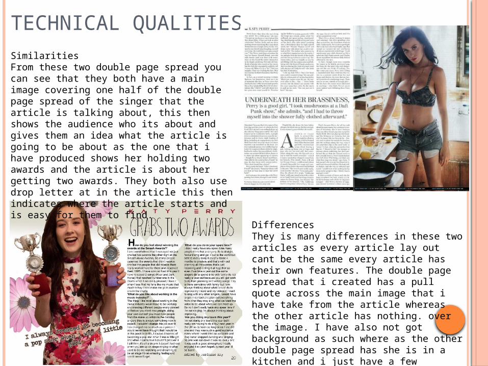
TECHNICAL QUALITIESSimilarities From these two double page spread you can see that they both have a main image covering one half of the double page spread of the singer that the article is talking about, this then shows the audience who its about and gives them an idea what the article is going to be about as the one that i have produced shows her holding two awards and the article is about her getting two awards. They both also use drop letter at in the article this then indicates where the article starts and is easy for them to find.
DifferencesThey is many differences in these two articles as every article lay out cant be the same every article has their own features. The double page spread that i created has a pull quote across the main image that i have take from the article whereas the other article has nothing. over the image. I have also not got background as such where as the other double page spread has she is in a kitchen and i just have a few flowers.

AESTHETIC QUALITIES
o I think my work looks good, I think this is because I have used all of the common conventions making it clear that I have created a double page spread and a front cover, the think I like the most about my magazine front cover will have to be how I have created the masthead ‘SMASH’ and made it look like it have been smashed I think this just gives it a bit more of an effect. The thing I like the most about my double page spread it how I have created the pull line and placed the flowers behind the model, I think these little things just make the double page spread with out them it look plain and boring. This also is a common convention for a double page spread to have a pull line that has been take out on the article that will interest the audience.

AUDIENCE APPEAL
o I have made sure that I have met my audience criteria by making sure the language, fonts, colour scheme is all suitable for teenagers girls aged 15 to 24. I have done this by researching into what this age range are interested in and what they expect to see on a music magazine. I have used pinks for the main colour on the magazine this is a stereotypical colour for girls and fits I well with the model as she is wearing a dress with pink flowers on. I have also used a variety of fonts I have used mainly handwriting fonts I think this opens up to the audience and its almost like Katy Perry her self has wrote it making it more personal.

PEER FEEDBACK

FEEDBACK 1 What did you like about the product?
The main image is a high quality which makes it professional. It is also a mid shot which works well with the cover layout.
The fonts chosen are effective and work well with the genre of the magazine and the artists.
The cover lines are catchy and well worded with effective use of buzz words. The DPS ties well with the image and headline with the repetition of
‘grabbing two’ The article is well written and the pull quote and drops caps make the whole
piece tie together.
What improvements could have been made to the product? More variety of images (models) could have been used to show
variety. Spacing in between the article sections would allow the reader to
navigate through the article easier. Editorial line could have been keyed to the right for professional
conventions.

FEEDBACK 2 What did you like about the product?
You seem to have a high level of photography skills and brilliant eye for colour.
The font that is used on this magazine is very effective in the way of attracting the audience.
The layout of the magazine is well planned out and has all the common conventions of what a magazine should have.
The title of the magazine is a interesting font grabbing the attention of the audience.
What improvements could have been made to the product? Try and introduce more images, not just of celebrities but of
anyone. You might find it effective if you used more of a variety of colours
to contrast with the beautiful pinks and peaches.

FEEDBACK 3 What did you like about the product? What I like about this product is that the front cover is
very eye catching and I think it will attract your target audience and I think the front cover tells you a lot about the magazine before you even open it, and also the font and background fit really well together.
What improvements could have been made to the product? I think improvements that could be made are that
you could add a flower on to your double page spread and on the front cover where it says “Katy Perry” is a different colour on the double page spread so they could both be the same colour.

PEER FEEDBACK SUMMARY What do you agree with from your peer
feedback? I agree with mostly everything that people have said I
think that they is little things that I could improve but this wouldn’t stop my magazine been viewed by the public.
What do you disagree with from your peer feedback? I disagree with adding in flowers on the front cover
as it is already full with information and looks fine with out. I also disagree with making Katy Perry the same colour on my front cover as in my article I have taken how she shows her name off on the internet and albums and used it for the article to add in some personal touches.

PEER FEEDBACK SUMMARYI think if i was to do this magazine front cover and double page spread again i would take in to count that i should add more images of different people and not just stick to one model this is the only main this that i would change other little bits i would also change like making sure the spaces in between the articles was the same making sure its all in the right place. apart from them little bits i wouldn't change anything i think that it has all of the common conventions of a magazine and they isn't also that you can change. its just little bits but these wouldn't effect it been put on the market.