7 steps to a great logo
DESCRIPTION
Everything You Need To Know About How To Choose, Use and Protect Your Logo !TRANSCRIPT

7 Steps To A Great Logo
Everything You Need To Know About How To Choose, Use And Protect Your Logo !
Copyright2012 www.smallbusinesslogos.co.uk

CONTENTS
1. What Makes A Great Logo Design
2. The Top 10 Most Memorable Logos
3. Logo Trends & Design Tips
4. How To Use Your Logo
5. How To Gauge The Effectiveness Of Your Logo
6. How To Protect Your Logo
7. My Favourite Logo’s : The Entrepreneurs View

1.What makes a great logo design? Our designers discuss what makes a logo design work... A great logo won’t determine whether your business sinks or swims; but it will certainly
provide a fantastic springboard. A logo gives the outside a world an instant visual
impression of your brand; a good one is worth a thousand words, and plenty more
besides.
It’s not easy conjuring an image that captures your vision and emphasises your
company’s strengths. Every entrepreneur has a picture in their own head of what their
company stands for, but how does one commit this picture to paper? This question has
baffled entrepreneurs since ancient times, when Romans and Egyptians daubed adverts
onto walls and posters.
To help you turn the image in your head into a commercial reality, we asked our
designers what exactly makes a great logo. They came up with seven different answers,
each of which is equally valid. When you’re designing your logo, you may wish to use
these ‘magnificent seven’ characteristics as a checklist, to measure the potency and
viability of your image.
1. It is unique If you copy other logos, or go for a design which has already been popular, it won’t fly.
At best, people will think you are cheap and unoriginal. At worst, other companies will
sue you. So it really doesn’t pay to nick someone else’s idea; and it’s far more fun to
come up with your own.
2. It can be described A good logo is always easy to describe. Pretty much everyone can explain what the
McDonalds, Nike and Adidas logos look like, because the images are simple, clear and
eye-catching.
If you want to generate word of mouth around your logo, people need to be able to talk
about it – it’s crucial that you allow your followers to tell their friends about you.
3. It suits your purpose When designing your logo, you need to think clearly about what you want it to do. The
purpose of your logo will depend on the type of company you are, and the effect you
are trying to achieve.
Some logos serve as a figurehead for their brand, such as KFC’s world-famous Colonel
Sanders. Others provide a symbol of aspirational exclusivity, like the Audi or Mercedes
badges. Some are little more than a visual signature, such as a Kellogg’s ‘K’.
4. It suits your target audience Your audience should determine the style and tone of your logo. If, for example, you’re
running a bodybuilding gym, your target audience will probably be men with a macho
edge; a delicate logo with subtle colours and elaborate fonts probably won’t cut the
mustard here. Likewise a grown-up, colourless typeface won’t suit a business aimed at
kids, like a nursery or toy shop.
5. It works across your target media If you advertise in, or contribute to a variety of print and online media, your logo will
need to be extremely versatile. If your logo relies on colour, it may lose its effectiveness
in black and white; equally, if it’s highly detailed, it may lose some of its effect when you
shrink it down.
Ideally, you should be able to adapt your logo to company stationery, internal and
external correspondence, and even corporate merchandise.
6. It reflects your entire offering Your logo must represent your whole company; not just a part of it. It must embrace all
your key products and services, not just a few of them. And it must be able to evolve to
fit the products and services you plan to add in the future.
7. It defines your key characteristics Think about your company’s mission statement – what are your core values? What do
you want your business to achieve? Think about your achievements so far, and your key
strengths. Each of these core features and attributes make up your company’s DNA, and
should play a crucial role in shaping your logo.

2.The Top 10 Most Memorable Logos as Voted by Start Up Business Owners !
1. The Apple Logo
The Apple logo works so well because of its instantly recognisable shape. Having the
bite out of the side means there’s no doubt that it is in fact an “apple”, and gives the
image scale. Its silver colour is the logo’s way of representing what it actually does
(computing). Apple has no need for lettering to spell out the company name because
the image says it all. It’s clean, modern and extremely easy to reproduce.
Did you know: the Apple logo started life as an image of Sir Isaac Newton sitting under
an apple tree with the text: Apple Computer Inc. The story of Newton and his “eureka”
moment certainly foreshadows and parallels Apple’s own innovative approach and
success.

2. The BBC Logo
The BBC logo comprises 3 identical solid black squares, each of which contains one
letter of the word ‘BBC’. Its simplicity and strength ensures it’s easy to remember and
works well on TV, online and in print as it’s incredibly easy to reproduce. It also works
well when it’s both very small and blown up extremely large. The logo perfectly
complements the BBC’s long heritage as a trusted British brand.
3. The Nike Logo
The Nike swoosh is clean, simple, suggestive of movement - which is really important
for a sports fashion brand – and, most importantly, works incredibly well on the side of
a training shoe. In fact, that’s how the Nike swoosh was born: the designer was asked
to come up with a shoe stripe.
Did you know: the designer of the Nike swoosh was initially paid only $35 for her
design.
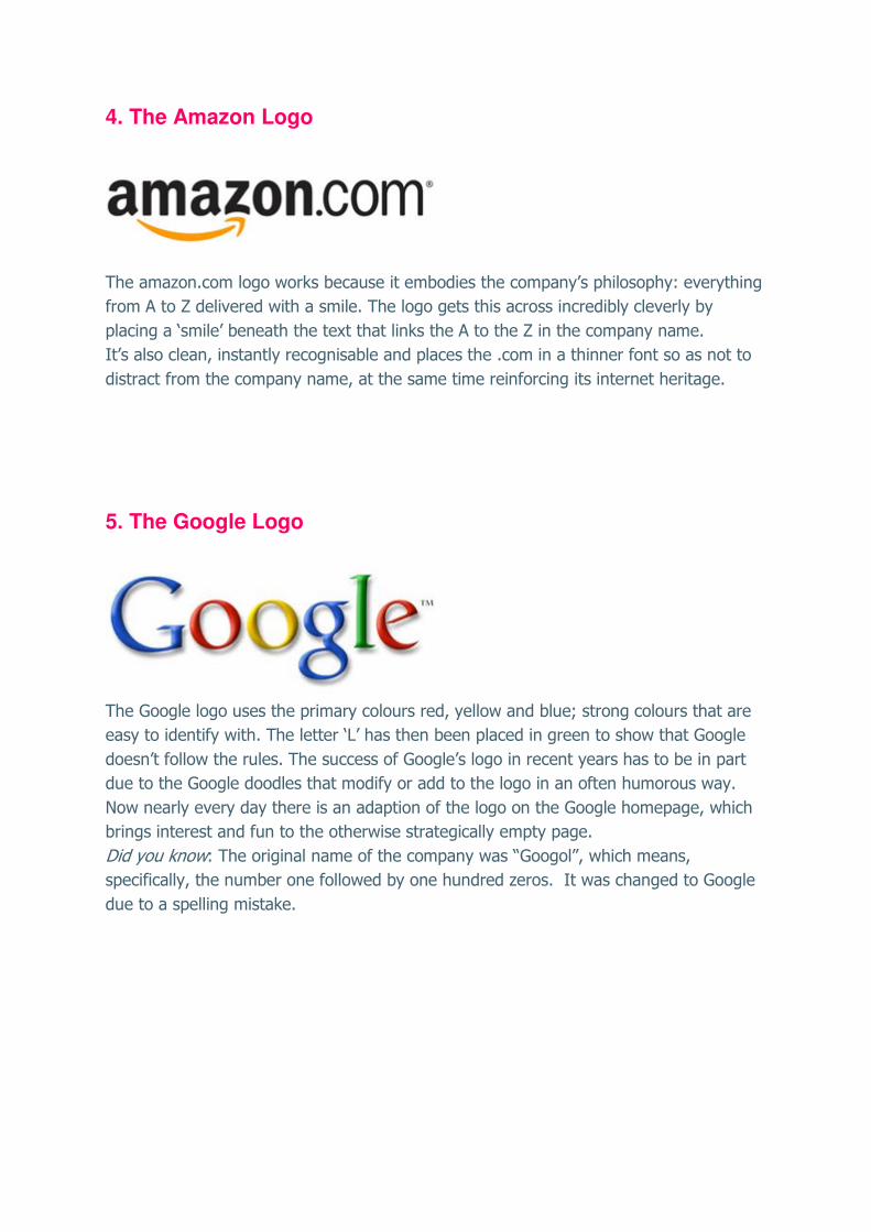
4. The Amazon Logo
The amazon.com logo works because it embodies the company’s philosophy: everything
from A to Z delivered with a smile. The logo gets this across incredibly cleverly by
placing a ‘smile’ beneath the text that links the A to the Z in the company name.
It’s also clean, instantly recognisable and places the .com in a thinner font so as not to
distract from the company name, at the same time reinforcing its internet heritage.
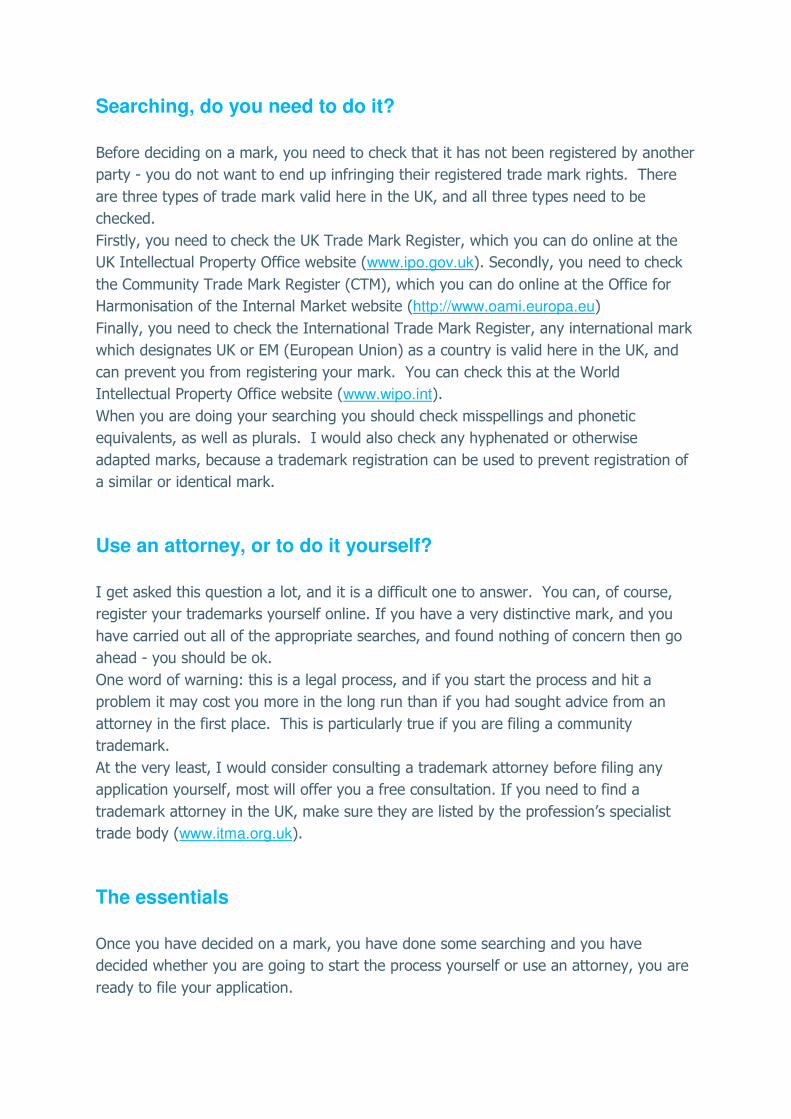
5. The Google Logo
The Google logo uses the primary colours red, yellow and blue; strong colours that are
easy to identify with. The letter ‘L’ has then been placed in green to show that Google
doesn’t follow the rules. The success of Google’s logo in recent years has to be in part
due to the Google doodles that modify or add to the logo in an often humorous way.
Now nearly every day there is an adaption of the logo on the Google homepage, which
brings interest and fun to the otherwise strategically empty page.
Did you know: The original name of the company was “Googol”, which means,
specifically, the number one followed by one hundred zeros. It was changed to Google
due to a spelling mistake.

6. The London Underground Logo
The circular London Underground symbol instantly recalls the tunnels of the Tube. The
round shape is in fact the ‘O’ of the font used for the text in the logo, which makes it
directly proportional to, and in sync with, the text itself. It’s an incredibly simple and
effective use of font that applies to every aspect of the logo design. It is now one of the
most recognisable logos in London (and even globally) because it’s the sign for every
Tube station and bus stop in the city.
7. The UPS Logo

The fairly radical change in the UPS logo in 2003 caused some controversy. The new
logo, however, may show that the ill feeling has disappeared since it makes it into our
top 10. The yellow and brown tones of the UPS logo are seen all over the distinctive UPS
delivery vans: the brown is symbolic of packaging and parcels, and the new logo has
taken on a bevelled 3D effect that, coupled with the shield shape, gives it the look of a
security firm. Perhaps security was something UPS wanted to place more emphasis on
as the company grew.
8. The American Express Logo
It’s all about the squares and block lettering with American Express. The use of squares
suggests strength and trust, while the white edging around the letters and the light glow
seen in the top left of the blue square brings the otherwise plain logo to life - and could
be said to suggest optimism.

9. The Sky Logo
A simple logo that has been used a number of times very successfully for brand
extension. Think SkyNews, SkyHD, SkyMovies; the list goes on. Blue is an obvious colour
choice given the company name, yet the treatment conjures up a feeling of movement
and technology due to the highlighting on the letters and the shine on either end of the
‘S’ and ‘Y’ which leaves the ‘K’ much darker.
10. The HSBC Logo
HSBC is the only logo in the top 10 using a very traditional serif font that looks like type
from a book or newspaper (for example). The use of a serif font is much more common
in the business and finance world as it’s suggestive of authority and tradition. The
hexagonal red and white symbol highlights uniformity
Did you know: the symbol was influenced by the traditional Hong Kong flags of the
19th century
So that concludes our top ten. We hope you found our analysis helpful.

3.Logo trends and design tips Taken from the Most Memorable Top Ten Logos survey above
We’ve taken a close look at what made our top ten so super successful and distilled that
into a helpful checklist of things to think about when producing your logo.
A simple logo design that’s easily reproduced
The top 10 all have simple, bold designs. Overly fussy design can confuse customers
and make the logos hard to commit to memory. Think about how your logo might be
reproduced. Will it need to go through a fax machine? Will it work enlarged on a
billboard/poster as well as scaled down on a business card? Remember, simple is often
best.
No straplines or lengthy text
The top 10 companies have the luxury that their brands are well known, so they don’t
need to include a strapline or slogan. Start-ups and small businesses may well need one,
especially if their business purpose isn’t immediately obvious from the company name.
That said, they should be short, punchy and memorable; ideally, three to four words
maximum.
Use colour to communicate a message Just like Apple uses silver to suggest technology and Google uses colour to represent
that they don’t always follow the rules, think about what colour can help you to
communicate one of your key business messages.
Multi-media logos The top 10 logos are all frequently seen on TV, in print, on the internet, on billboards
and in shop windows, to name but a few. Think about where your logo will be used and
make sure you tell the designer so they can factor this into the design.
A logo that tells a story Being clever with your logo is hard to get right and hard to communicate well. However,
when it does work it can be pure genius, as in the case of the Amazon logo that cleverly
links the ‘A ‘to the ‘Z’ with a smile and in doing so communicates the company’s
philosophy very neatly.
A logo that works on a product Think Nike. Does your logo need to work on packaging or indeed on the product itself?
Let your designer know this at the outset. And request a mock-up so you can ensure the
logo really does work in situ.

Internet logos Many online retailers and companies whose primary business is online choose to
incorporate the .com or .co.uk into their company logo. Think about whether your
business will remain online and what you want your customers to remember. If it’s all
about driving traffic to your website consider including the .com
Symbols that represent what your business does Start-ups and small businesses should consider the various uses for icons and symbols.
Often they can instantly convey what the business does; for example, a plumber might
choose a tap, or a baker might choose a cake. Other symbols may be more abstract and
simply representative of a quality; for example, a planet shape may suggest
sustainability and being socially responsible. In the instance of the London Underground,
the ‘O’ shape works because it’s suggestive of the tunnel shape.
The use of shape This is another important one. Square shapes suggest strength; symmetrical shapes
suggest rationality and responsibility. Irregular shapes can be more fun and quirky.
Whatever shape you choose, again think about how and where it will be used and make
sure it works where it will appear most often.
Brand extension When starting out you may have big plans for your company and maybe product
development is in your growth plan. So will your logo transfer to a new product well?
Will the brand name work? Will the logo work as it is, or will it need to be adapted and
is that easy to do? Sky is a great example of how a very simple starting point has been
used to allow the easy addition of new product offerings: SkyNews, SkyHD, and so on.
Logo re-draw / re-invention Maybe you’re at the point when you’d like a new company logo. Perhaps your logo is
looking too tired and out of date; perhaps it doesn’t reflect what your company does
anymore. Whatever the reason for wanting the change, be very clear about what you
want to do and what you want the new logo to say. And remember that every time you
change your logo you are asking your existing customers to identify with a new brand.
So consider that perhaps a subtle change once in a while is better than a re-brand.

4. How to use your logo Our very own Peter Shaw explains what to think about before designing your logo and your brand. A logo is never seen in complete isolation. If it is on a sign on your building, the building
itself will say an awful lot about your brand. On a business card the quality of the card
and ink will speak volumes. When you design your logo you need to consider all the
different ways that it will be applied: packaging, brochures, website, emails, letterhead,
business cards, signage, vehicles, uniforms and so on. The combination of these various
elements and the way they are designed and produced constitute your brand identity.
If you already have some loyal customers you already have a recognised brand and by
definition you already have a brand identity, however strong or weak that might be.
Your brand identity should reflect the qualities that your customers associate with your
brand and it is certainly worthwhile spending some time and effort ensuring that your
brand identity works as strongly as possible in support of your brand. A great brand
identity can’t substitute for brand delivery, but it can help to set expectations and
consolidate positive customer attitudes.
A useful exercise to fire your imagination about your brand identity is to flick through
some magazines, selecting images, words and colours that you think have the type of
associations you would like your brand to have. This is a very useful exercise when
briefing a designer and don’t be afraid to say what brand identities you admire and why.
Of course the creation of a brand identity that can be applied across all aspects of your
business can be a significant job requiring some serious design talent, however, whether
you decide to invest in a graphic designer’s time or create it yourself there are a few
principles to follow:
1. Don’t chop and change. You will live with your brand identity day in and day out but your customers will not. So
remember that until your brand is a national favourite people will need to see it again
and again before it becomes familiar. Stick with your chosen logo and accompanying
identity design until you can see a very good customer-driven reason to change it.
2. Two typefaces Choice of typeface is a very important part of creating a great brand identity. You
should have two typefaces, no more, one more distinctive for use in headlines on your
website on brochures, signage, uniforms and so on and one simpler typeface more

applicable for copy and everyday use in letters, emails etc. The two typefaces need to
sit well together and will become a recognisable part of your identity. Incidentally,
websites have particular needs for body copy and will default to something simple like
Arial, but for captions and headlines on your website you can use fancier typefaces by
applying those words as image files.
3. Colour control A brand will typically have one or two primary colours that it is recognised for, for
example Virgin’s red or Lloyd TSB’s green and black. A brand will also have secondary
colours that can be used in combination with the primary colours. Choose those colours
carefully and try to stick with them. Specify the exact make up of each colour through
the Pantone colour reference system that is used by all designers and/or colour
breakdowns using RGB and CMYK, according to whether the application is digital or
print. It is critically important that your colours are consistent and when printing make
sure that your printer shows you samples of the type of paper and finish because they
have a big impact on the final colour. If it is a big print run go to the printer’s facility
and see the first run-offs coming off the printing press and check them with your colour
masters, the printer can easily adjust colours then and there if they are not right.
4. Be careful where you put it Set some rules on the way that the logo can be shown, how small it can go, how it can
work in black and white, which colours it must not be put against, how it works with
your strapline if you have one and so on. If you have other brands that your logo is
shown with consider how best those relationships work. This is meat and drink to a
competent graphic designer.
5. Don’t be a fashion victim It is very important that your brand identity feels right for today, but be careful not to
create a look and feel that will rapidly date. Even fashion brands have brand identities
that outlast many a season’s trends.
In summary, think of your logo as a beautiful watch and your brand identity as the
clothes, shoes and haircut of the person who wears it. The watch will only make a great
impression if everything else around it looks great too.

5. How to gauge the effectiveness of your logo Peter Shaw, our resident branding expert, looks at ways to measure how successful your brand is The marketing genius John Wanamaker, the man who in the late nineteenth century
pioneered the concept of the department store, famously said “Half the money I spend
on advertising is wasted; the trouble is I don’t know which half”.
Well over 100 years on and this statement still resonates with anyone trying to
understand the impact of their marketing efforts. The influence of brand identity on
sales performance cannot be overstated as it directly impacts perceptions of existing
and potential customers, employees, partners and suppliers.
Brand identity consists of the logo, brand colours and all the various designed elements,
including: packaging, signage, uniforms, retail space, web, advertising, brochures,
vehicles and more. Assessing the effectiveness of such a multifaceted entity is not
straight forward but arguably essential for a business to optimise its marketing efforts.
The DBA (Design Business Association) is a not-for-profit organisation established to
promote the commercial effectiveness of good design. The DBA runs an annual awards
programme to showcase design that has been proven to meet significant commercial
objectives, sales growth being the major consideration. To get a sense of how a strong
brand identity can impact sales performance it’s worth a few minutes scanning some of
the case studies on the Design Effectiveness Awards website :
www.effectivedesign.org.uk
While many of the brands in these case studies are famous the principle of good design
having a direct impact on commercial success holds true for any brand-led business. The
principle sitting at the heart of these effectiveness awards is the ‘before and after’ test:
Can improved design be proven to have grown sales, or other key commercial metrics
such as awareness, propensity to purchase and so on ?
These awards require a lot of effort, very rigorous measurements and proven data,
however the principles hold good for an internal ‘before and after’ assessment of the
effectiveness of your brand design.

Sales figures are what most of us would focus on when assessing the impact of an
effective brand identity, but you can also measure the ‘before and after’ effect in terms
of customer enquiries, retail footfall, job enquiries and even competitor response
– if your competition are spurred into action they clearly believe that you have upped
your game.
If you haven’t recently re-designed your brand identity you can get a sense of how
strong it is by talking to your customers. Make sure that they aren’t looking at any
elements of your brand identity and ask them to describe it to you.
If they have difficulty recalling your identity it could probably be improved to impact
your sales performance. You can of course deploy a research agency if you want some
more robust and specific information on how your brand identity is performing.
If you are a start-up and creating a new brand it would be worthwhile showing your
new logo to some prospective clients, partners, suppliers and of course your colleagues,
and ask them their views. You should of course assess those views in the context of
your intended brand message. The logo and brand identity surrounding it are your
decision and you shouldn’t be pushed off track if your conviction is strong, but some
external objectivity is usually no bad thing.
We quite rightly have our customers front of mind when we think brand, but don’t
underestimate the importance of your brand identity to your colleagues, it is very
important that they feel pride and ownership of it. A great identity will motivate
everyone in the business and make it easy for them to tell your brand story.

6. How to protect your logo Karen Hensman, of Innovate IP (www.innovateip.co.uk), tells us how to secure the cornerstone of your identity Why do you need to protect your logo? Before I start to talk about how to protect your logo I thought it would be worth
spending some time addressing why you need to protect it.
Ask yourself: how valuable is your product or service brand to you? If it is worth selling,
it is worth stealing, and it CAN happen to you. A trademark registration is a little like an
insurance policy which will help you if you are unlucky enough to be copied by a third
party. It will help you stop such a third party without the need for lengthy, expensive
legal battles.
As an aside, if your mark is highly creative it may qualify for copyright protection in the
UK. However, this will only protect you if you can demonstrate that there has been
copying, that you own the logo to start with and that your logo predates the copy.
If your logo is valuable to you, I strongly recommend that you consider registering it as
a trade mark.
What is registerable as a trade mark? Trade marks can take many forms: logos, words, 3D shapes, colours… in fact anything
that can be represented graphically. In order to be registerable, your mark has to be
distinctive and not descriptive of the type of product or service that you offer. For
example, the mark SOAP would not be registerable for soap or toiletries, because
members of the public need to use the word SOAP to describe the product. It is not fair
for one company to have a monopoly right on a normal dictionary word which is
essential to describe the product or service itself.
The only exception to this is when the mark is highly visually distinctive. For example, if
you were to use the name SOAP with a dominant and eye-catching logo, so that the
most distinctive element is the look of the logo itself and not the word, this would be
allowed. You would not be able to stop anyone using the name SOAP, but you would
be able to stop anyone using a similar visual logo.
Searching, do you need to do it? Before deciding on a mark, you need to check that it has not been registered by another
party - you do not want to end up infringing their registered trade mark rights. There
are three types of trade mark valid here in the UK, and all three types need to be
checked.
Firstly, you need to check the UK Trade Mark Register, which you can do online at the
UK Intellectual Property Office website (www.ipo.gov.uk). Secondly, you need to check
the Community Trade Mark Register (CTM), which you can do online at the Office for
Harmonisation of the Internal Market website (http://www.oami.europa.eu)
Finally, you need to check the International Trade Mark Register, any international mark
which designates UK or EM (European Union) as a country is valid here in the UK, and
can prevent you from registering your mark. You can check this at the World
Intellectual Property Office website (www.wipo.int).
When you are doing your searching you should check misspellings and phonetic
equivalents, as well as plurals. I would also check any hyphenated or otherwise
adapted marks, because a trademark registration can be used to prevent registration of
a similar or identical mark.
Use an attorney, or to do it yourself? I get asked this question a lot, and it is a difficult one to answer. You can, of course,
register your trademarks yourself online. If you have a very distinctive mark, and you
have carried out all of the appropriate searches, and found nothing of concern then go
ahead - you should be ok.
One word of warning: this is a legal process, and if you start the process and hit a
problem it may cost you more in the long run than if you had sought advice from an
attorney in the first place. This is particularly true if you are filing a community
trademark.
At the very least, I would consider consulting a trademark attorney before filing any
application yourself, most will offer you a free consultation. If you need to find a
trademark attorney in the UK, make sure they are listed by the profession’s specialist
trade body (www.itma.org.uk).
The essentials Once you have decided on a mark, you have done some searching and you have
decided whether you are going to start the process yourself or use an attorney, you are
ready to file your application.

The next step is to decide how widely you want to protect. Are you just looking at the
UK, or do you need protection in wider Europe? Only you will know what is right for
your business. A community trademark is around 2.5 times the price of a UK mark, and
the registration process takes between 9 and 12 months, as opposed to 4-5 months for
a British equivalent. However, you get protection in all 27 countries of the EU.
Trademarks are registered by class, so you will need to classify the goods and services
on which you are going to use the mark. There are 45 classes and a good classification
guide can be found on the UK Intellectual Property Office website (www.ipo.gov.uk)
You should consider the name you wish to show as the owner of the trademark, always
keeping in mind that a trademark is a type of property. If you are a limited company,
and register your mark in the name of the company, it would transfer to the new owner
as an asset of the business if and when you sell up. The owner of the trade mark must
be a legal entity.
Summary Most of the work you need to do will go into deciding what you are going to protect and
how distinctive your mark should be, carrying out some searching and then making the
choice as to whether you are going to seek external help. Whatever you decide, enjoy
the process and know that, at the end, you will have the protection you need should a
third party copy you.

7. My favourite logos: the entrepreneur’s view We asked a group of business owners to name their favourite logos. Here’s what they said… Joe Cohen, Seatwave I am a huge fan of the work of Saul Bass, who's kind of the Walt Disney of logos. His
works are classic and timeless and really convey a feeling about the brand. The
Soundcloud logo is very much in the Bass style; the image tells you about music and the
cloud, and the use of orange really stands out.
Another favourite is Mendeley. Again, this is very similar to Bass' Westinghouse logo, but
it really conveys the feeling around the connection with the M. It also evokes atomic
models, which gets you to the science.
Finally, I can’t leave out Santander. The flame on the red background maybe tells us too
much about the health of the banking industry today! Seriously, I can't tell you why it
resonates for me - maybe they've just exposed it to me so much, or maybe it's my
mortgage!
Nicko Williamson, Climatecars Monocle is great due to its clean design, and application on the branding. This is a great
new brand, and it seems to be widening its application from magazines to clothing, and
now radio.
I also really like B&B Italia for its slick Italian design (exactly what Italy does best) and
Tods - I’m a big fan of the brand and their shoes. The brand says quality and
craftsmanship. Finally Hermes expresses classic French design, luxury at its best.
Alistair Mitchell, Huddle Can we say ours?! Apart from that, I'd say Bentley. Not just because I love cars, but
because in the 'Flying B' they portray luxury, historic origins, motorsport heritage, speed
and that essential Britishness - not bad in just a single letter!

Charlie Mullins, Pimlico Plumbers First, I’d like to highlight our own Pimlico Logo, since I have spent 32 years building it in
to something that represents the ethos of Pimlico Plumbers; quality workmanship and
transparency of pricing, all delivered by courteous polite and efficient engineers.
Next is the logo of The Prince’s Trust, the most impressive charity in the UK, responsible
for giving a chance to kids from similar backgrounds to myself, and one that is present
on every one of my 150 strong fleet of vans.
Finally, I’d like to mention Capital FM – the voice of London, the radio station that
brightens up the day for millions of people in the capital, and another organisation that
does loads for charity.
Warren Bennett, A Suit That Fits I know I'm biased, but I'm actually really proud of A Suit That Fits' logo. Last August, we
unveiled a re-brand; we'd been working with branding agency Brandhouse to create a
new look and feel for A Suit That Fits to reflect the quality of the product and service we
offer as well as the accessibility of our brand. Our logo is a pin with our name through it
- we're delighted with it and embroider it into every single suit we produce!
I also like how the Innocent Smoothies logo communicates the brand as local and
friendly. It's simple but striking and works really well with the brand messages. Another
favourite is Apple – one of the most iconic modern-day logos, and very strong visually,
as much thanks to its forward-thinking and innovative product offering as its design.
Finally, I’ve always been very fond of the bold but retro Leica logo. I can't put my finger
on why, the white on red in that font just works so well and oozes simple, focused
quality.
Thank you for reading our 7 Steps To a Great Logo report, we hope you have found it
helpful and that it has given you some useful information to think about before getting a
new logo for your business.
To view examples of our logos please visit :
http://www.smallbusinesslogos.co.uk/Home/our-logo-portfolio.aspx
To view our logo packages please visit :
http://www.smallbusinesslogos.co.uk/Home/Logo-packages.aspx
To speak to someone please ring : 0800 840 5485
To contact us any other way please visit :
http://www.smallbusinesslogos.co.uk/Home/Helpful-info/Contact-us.aspx
www.smallbusinesslogos.co.uk