a) log2(pm/mm) histograms by...
TRANSCRIPT
0.0 0.2 0.4 0.6 0.8 1.0
−4
−2
02
4
a) log2(PM/MM) Histograms by log2(PMxMM)
log2(PMxMM) quantile
log2
(PM
/MM
)
−5.7 −5.1 −4.4 −3.8 −3.1 −2.5 −1.8 −1.2 −0.5 0.2 0.8 1.5 2.1 2.8 3.4 4.1 4.7 5.4
b) low (0%−25%) abundance
050
0010
000
1500
0
−5.7 −5.1 −4.4 −3.8 −3.1 −2.5 −1.8 −1.2 −0.5 0.2 0.8 1.5 2.1 2.8 3.4 4.1 4.7 5.4
c) medium (25−75%) abundance
050
0010
000
1500
020
000
−5.7 −5.1 −4.4 −3.8 −3.1 −2.5 −1.8 −1.2 −0.5 0.2 0.8 1.5 2.1 2.8 3.4 4.1 4.7 5.4
d) high (75%−95%) abundance
050
010
0015
0020
0025
0030
0035
00
−5.7 −5.1 −4.4 −3.8 −3.1 −2.5 −1.8 −1.2 −0.5 0.2 0.8 1.5 2.1 2.8 3.4 4.1 4.7 5.4
e) very (95%−100%) high abundance
020
040
060
080
0
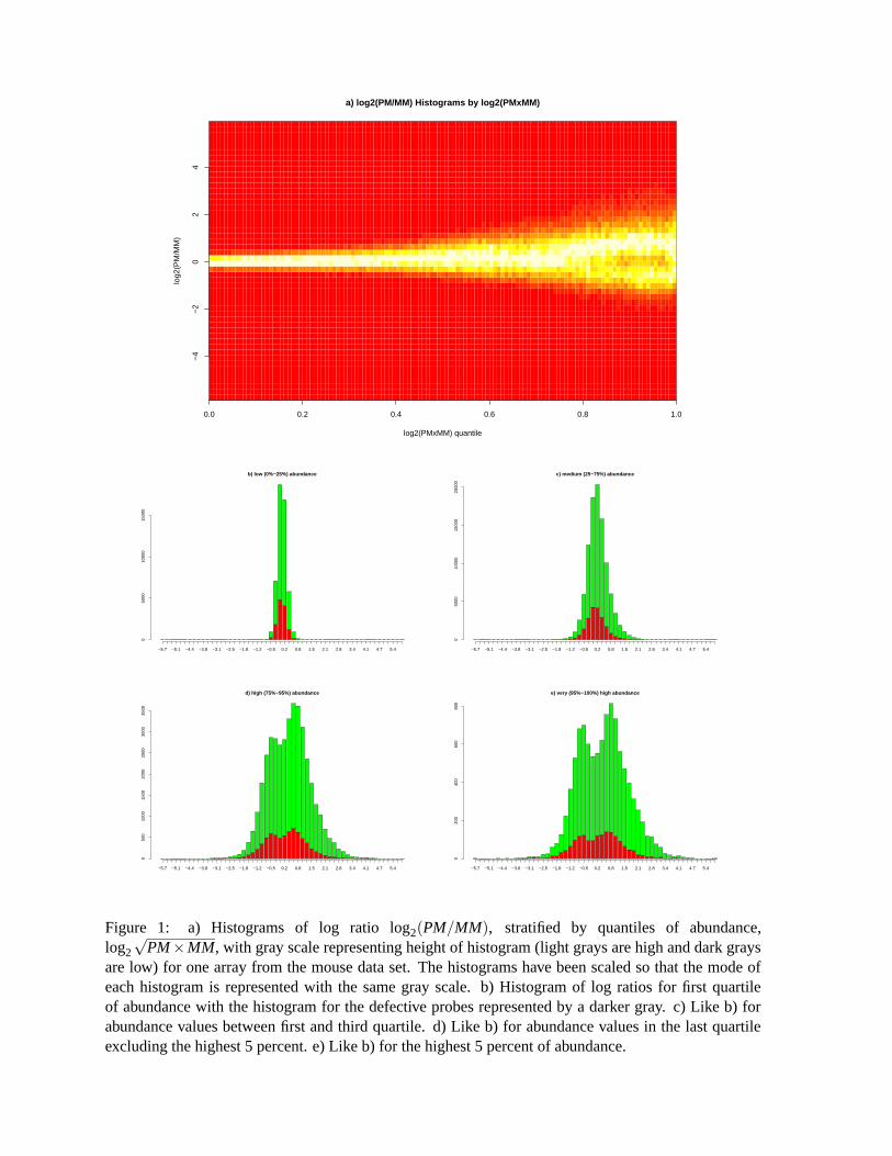
Figure 1: a) Histograms of log ratio log2(PM/MM), stratified by quantiles of abundance,log2
√PM×MM, with gray scale representing height of histogram (light grays are high and dark grays
are low) for one array from the mouse data set. The histograms have been scaled so that the mode ofeach histogram is represented with the same gray scale. b) Histogram of log ratios for first quartileof abundance with the histogram for the defective probes represented by a darker gray. c) Like b) forabundance values between first and third quartile. d) Like b) for abundance values in the last quartileexcluding the highest 5 percent. e) Like b) for the highest 5 percent of abundance.
050100150200250
b) R
aw P
M−M
M d
ata
Con
cent
ratio
ns
1.25
2.5
57.
510
20
050100150200250
d) P
M−M
M d
ata
afte
r no
rmal
izat
ion
Con
cent
ratio
ns
1.25
2.5
57.
510
20
68101214
a) R
aw P
M d
ata
Con
cent
ratio
ns
1.25
2.5
57.
510
20
68101214
c) N
orm
aliz
ed P
M d
ata
Con
cent
ratio
ns
1.25
2.5
57.
510
20
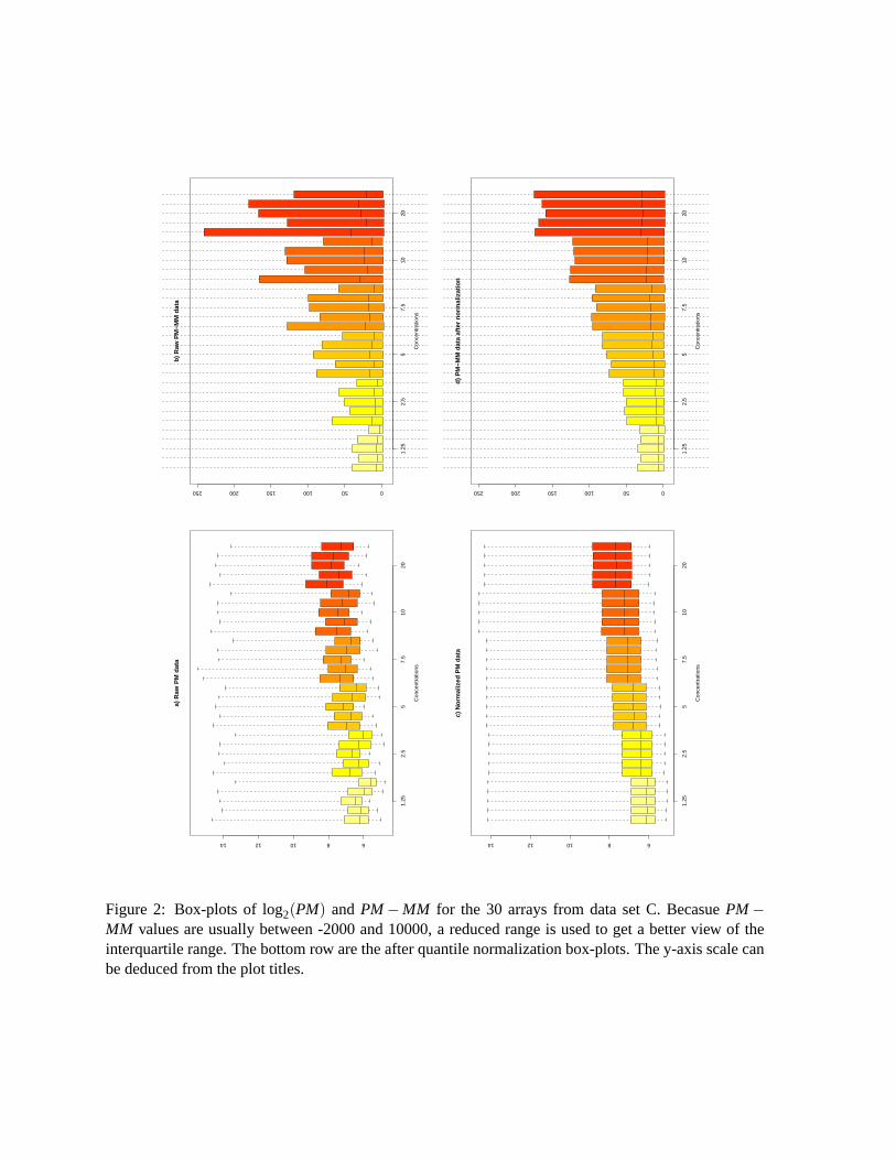
Figure 2: Box-plots of log2(PM) and PM−MM for the 30 arrays from data set C. Becasue PM−MM values are usually between -2000 and 10000, a reduced range is used to get a better view of theinterquartile range. The bottom row are the after quantile normalization box-plots. The y-axis scale canbe deduced from the plot titles.
02
46
810
12
−8−6−4−2024
c) lo
g(P
M−M
M)
befo
re n
orm
aliz
atio
n
A
M
02
46
810
12
−8−6−4−2024
d) lo
g(P
M−M
M)
afte
r no
rmal
izat
ion
A
M
68
1012
−2−1012
a) lo
g(P
M)
bef
ore
no
rmal
izat
ion
A
M
68
1012
−2−1012
b)l
og
(PM
) af
ter
no
rmal
izat
ion
A
M
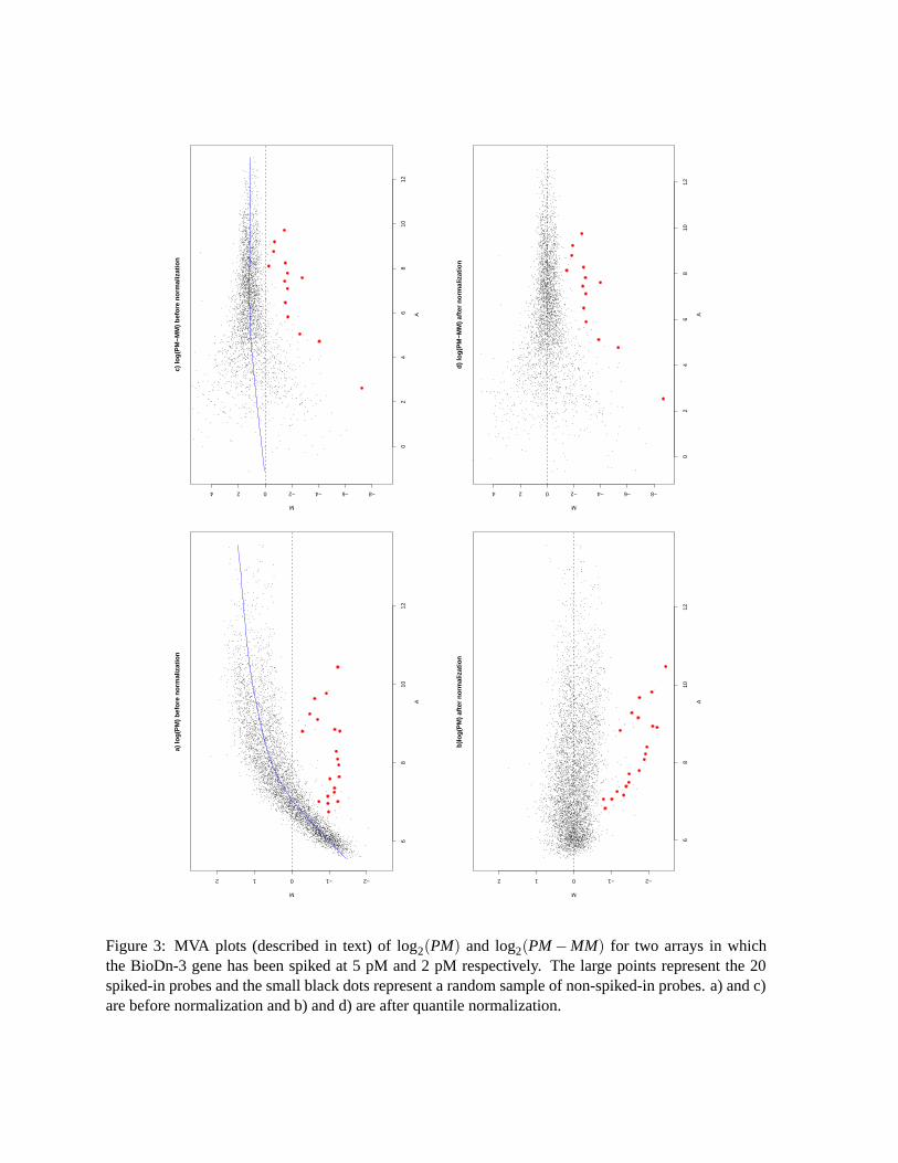
Figure 3: MVA plots (described in text) of log2(PM) and log2(PM−MM) for two arrays in whichthe BioDn-3 gene has been spiked at 5 pM and 2 pM respectively. The large points represent the 20spiked-in probes and the small black dots represent a random sample of non-spiked-in probes. a) and c)are before normalization and b) and d) are after quantile normalization.
0.5
1.0
2.0
5.0
10.0
20.0
50.0
100.
0
0.5
1.0
2.0
5.0
10.0
20.0
c) P
M/M
M
conc
entr
atio
n
PM/MM
0.5
1.0
1.5
2.0
2.5
3.0
−40
0
−20
00
200
400
600
800
050
100
150
0
2000
4000
6000
8000
conc
entr
atio
n
PM−MM
d) P
M−
MM
0.5
1.0
2.0
5.0
10.0
20.0
50.0
100.
0
2050100
200
500
1000
2000
5000
1000
0
2000
0
a) P
M
conc
entr
atio
n
PM
0.5
1.0
2.0
5.0
10.0
20.0
50.0
100.
0
2050100
200
500
1000
2000
5000
1000
0
2000
0
b)
MM
conc
entr
atio
n
MM
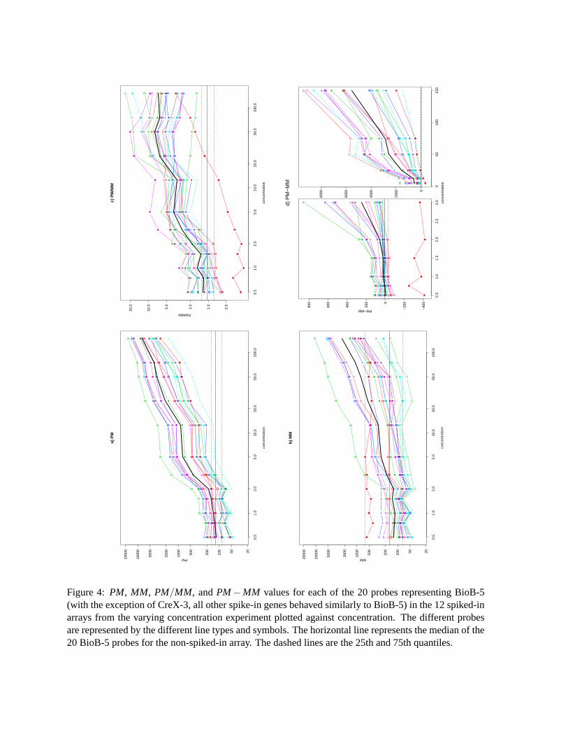
Figure 4: PM, MM, PM/MM, and PM−MM values for each of the 20 probes representing BioB-5(with the exception of CreX-3, all other spike-in genes behaved similarly to BioB-5) in the 12 spiked-inarrays from the varying concentration experiment plotted against concentration. The different probesare represented by the different line types and symbols. The horizontal line represents the median of the20 BioB-5 probes for the non-spiked-in array. The dashed lines are the 25th and 75th quantiles.
c) c
on
cen
trat
ion
of
0.75
MM
Density
050
100
150
200
250
300
0.00
0
0.00
5
0.01
0
0.01
5
0.02
0
0.02
5
d)
con
cen
trat
ion
of
1
MM
Density
050
100
150
200
250
300
0.00
0
0.00
5
0.01
0
0.01
5
a) c
on
cen
trat
ion
of
0
MM
Density
050
100
150
200
250
300
0.00
0
0.00
5
0.01
0
0.01
5
0.02
0
b)
con
cen
trat
ion
of
0.5
MM
Density
050
100
150
200
250
300
0.00
0
0.00
5
0.01
0
0.01
5
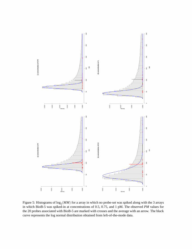
Figure 5: Histograms of log2(MM) for a array in which no probe-set was spiked along with the 3 arraysin which BioB-5 was spiked-in at concentrations of 0.5, 0.75, and 1 pM. The observed PM values forthe 20 probes associated with BioB-5 are marked with crosses and the average with an arrow. The blackcurve represents the log normal distribution obtained from left-of-the-mode data.
1.25 5 7.5 10 20 2.5 5 7.5 10 20 2.5 5 7.5 10 20 2.5 5 7.5 10 20
110
100
1000
1000
0
a) Expression
concentrationsAvDiff MAS 5.0 MBEI RMA
1 10 100 1000 10000
0.2
0.5
1.0
2.0
5.0
10.0
20.0
50.0
100.0
200.0
500.0
Expression
Sta
ndar
d D
evia
tion
betw
een
Rep
licat
es
b) Standard deviation vs. average expression
AvDiffMAS 5.0MBEIRMA
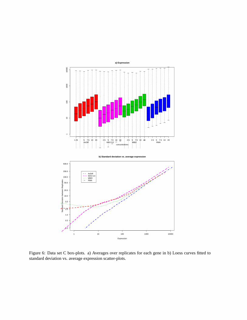
Figure 6: Data set C box-plots. a) Averages over replicates for each gene in b) Loess curves fitted tostandard deviation vs. average expression scatter-plots.
−5 0 5 10
−5
05
a) AvDiff MVA plot
A
M
1
2
3
4
5
67
89
10
11
−2 0 2 4
−5
05
10
b) AvDiff QQ−plot
reference quantiles
obse
rved
qua
ntile
s
1
2
3
4
5
67
89
10
11
−2 0 2 4 6 8 10 12
−5
05
c) MAS 5.0 MVA plot
A
M
1
2
3
4
5
678
9
1011
−4 −2 0 2 4
−5
05
d) MAS 5.0 QQ−plot
reference quantiles
obse
rved
qua
ntile
s
1
2
3
4
5
67 8
9
10
11
0 2 4 6 8 10 12
−5
05
e) Li and Wong’s θ MVA plot
A
M
1
23
4 5
67
89
10
11
−2 0 2 4
−6
−4
−2
02
46
8
f) Li and Wong’s θ QQ−plot
reference quantiles
obse
rved
qua
ntile
s
1
2
3
45
67
8
910
11
2 4 6 8 10 12
−5
05
g) RMA MVA plot
A
M
1
2 3
4 5
678
9
10
11
−4 −2 0 2 4
−4
−2
02
46
h) RMA QQ−plot
reference quantiles
obse
rved
qua
ntile
s
1
2 3
45
6
78
9
10
11
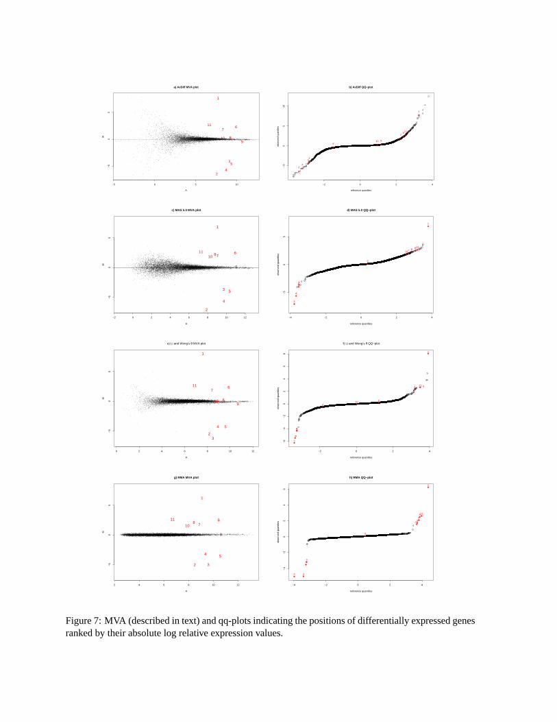
Figure 7: MVA (described in text) and qq-plots indicating the positions of differentially expressed genesranked by their absolute log relative expression values.
500 1000 2000 5000 10000 20000
1050
100
500
1000
5000
SD vs. Avg for PM
Avg
SD
s
9 10 11 12 13 14 15
0.0
0.5
1.0
1.5
SD vs. Avg for log2(PM)
Avg
SD
s
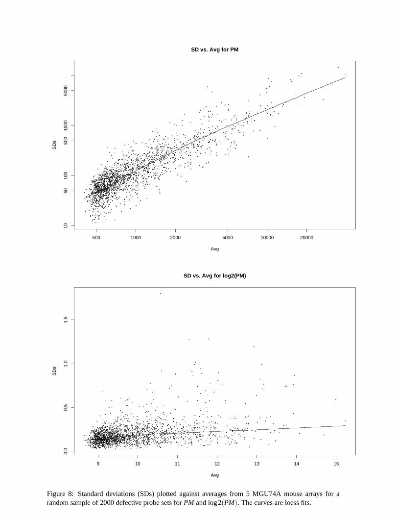
Figure 8: Standard deviations (SDs) plotted against averages from 5 MGU74A mouse arrays for arandom sample of 2000 defective probe sets for PM and log2(PM). The curves are loess fits.
8
10
12
14
log2(Intensity) for PM (green) and MM (red)
1 2 1 2 1 2 1 2Exp Cond 1 Exp Cond 2 Exp Cond 3 Exp Cond 4
Scanner/Fluidic Station 2 Scanner/Fluidic Station 1
9
10
11
12
13
14
15
16
log2(Intensity) for PM (green) and MM (red) after normalization
1 2 1 2 1 2 1 2Exp Cond 1 Exp Cond 2 Exp Cond 3 Exp Cond 4
Scanner/Fluidic Station 2 Scanner/Fluidic Station 1
1 2 1 2 1 2 1 2
−4
−2
0
2
4
log2(PM/MM)
Exp Cond 1 Exp Cond 2 Exp Cond 3 Exp Cond 4Scanner/Fluidic Station 2 Scanner/Fluidic Station 1
1 2 1 2 1 2 1 2
−4
−2
0
2
4
log2(PM/MM) after normalization
Exp Cond 1 Exp Cond 2 Exp Cond 3 Exp Cond 4Scanner/Fluidic Station 2 Scanner/Fluidic Station 1
1 2 1 2 1 2 1 2
−40000
−20000
0
20000
40000
Intensity for PM−MM
Exp Cond 1 Exp Cond 2 Exp Cond 3 Exp Cond 4Scanner/Fluidic Station 2 Scanner/Fluidic Station 1
1 2 1 2 1 2 1 2
−20000
0
20000
40000
Intensity for PM−MM after normalization
Exp Cond 1 Exp Cond 2 Exp Cond 3 Exp Cond 4Scanner/Fluidic Station 2 Scanner/Fluidic Station 1
1 2 1 2 1 2 1 2
0
1000
2000
3000
4000
Intensity for PM−MM (close−up)
Exp Cond 1 Exp Cond 2 Exp Cond 3 Exp Cond 4Scanner/Fluidic Station 2 Scanner/Fluidic Station 1
1 2 1 2 1 2 1 2
0
1000
2000
3000
4000
Intensity for PM−MM (close−up) after normalization
Exp Cond 1 Exp Cond 2 Exp Cond 3 Exp Cond 4Scanner/Fluidic Station 2 Scanner/Fluidic Station 1
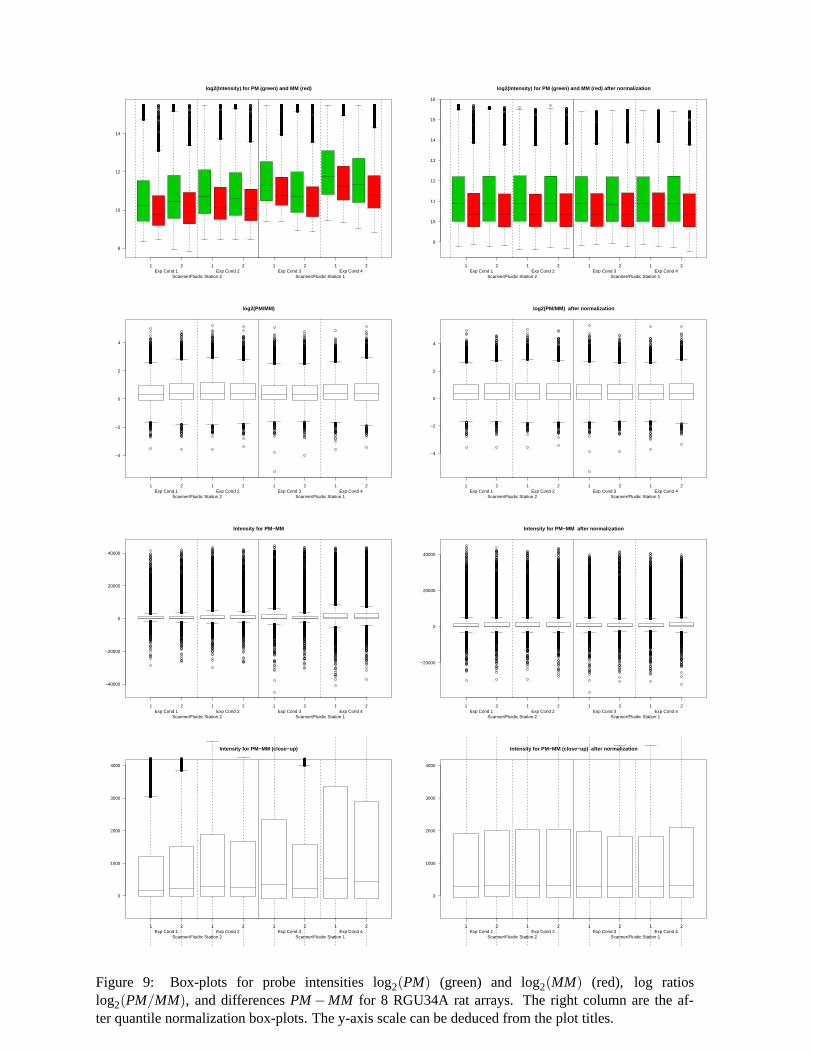
Figure 9: Box-plots for probe intensities log2(PM) (green) and log2(MM) (red), log ratioslog2(PM/MM), and differences PM−MM for 8 RGU34A rat arrays. The right column are the af-ter quantile normalization box-plots. The y-axis scale can be deduced from the plot titles.
Exp
Con
1, r
ep1
910
1112
1314
15
−201234
0.30
8
910
1112
1314
15
−3−1123
0.46
8
910
1112
1314
15
−20123
0.46
8
910
1112
1314
−101234
0.45
3
Exp
Con
1, r
2
910
1112
1314
15
−3−2−101
0.47
2
910
1112
1314
15
−2.5−1.5−0.50.5
0.48
2
910
1112
1314
15
−1012
0.41
6
Exp
Con
2, r
1
910
1112
1314
15
−1.00.01.0
0.28
1
910
1112
1314
15
−1.00.01.02.0
0.57
1
Exp
Con
2, r
2
910
1112
1314
15
−1.00.01.02.0
0.56
7E
xp C
on 3
A
M
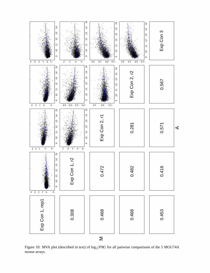
Figure 10: MVA plot (described in text) of log2(PM) for all pairwise comparisons of the 5 MGU74Amouse arrays.
Exp
Con
1, r
ep1
910
1112
1314
15
−201234
0.31
9
910
1112
1314
15
−3−11234
0.41
4
910
1112
1314
15
−101234
0.37
5
910
1112
1314
15
−101234
0.44
7
Exp
Con
1, r
2
910
1112
1314
15
−2−1012
0.39
5
910
1112
1314
15
−1.5−0.50.51.5
0.36
3
910
1112
1314
15
−1012
0.42
8
Exp
Con
2, r
1
910
1112
1314
15
−1.00.01.0
0.25
7
910
1112
1314
15
−1.00.01.0
0.39
9
Exp
Con
2, r
2
910
1112
1314
15
−1.00.01.0
0.36
0E
xp C
on 3
A
M
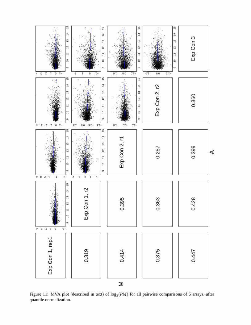
Figure 11: MVA plot (described in text) of log2(PM) for all pairwise comparisons of 5 arrays, afterquantile normalization.
−2 0 2 4 6 8 10 12
−3
−2
−1
01
23
a) AvDiff before normalization
A
M
−2 0 2 4 6 8 10 12
−3
−2
−1
01
23
b) AvDiff after normalization
A
M
−2 0 2 4 6 8 10 12
−3
−2
−1
01
23
c) Li and Wong’s θ before normalization
A
M
0 2 4 6 8 10 12
−3
−2
−1
01
23
d) Li and Wong’s θ after normalization
A
M
0 1 2 3
−3
−2
−1
01
23
e) Avg.Log.Ratio before normalization
A
M
0 1 2 3
−3
−2
−1
01
23
f) Avg.Log.Ratio after normalization
A
M
2 4 6 8 10 12
−3
−2
−1
01
23
g) Average log(PM−BG) before normalization
A
M
2 4 6 8 10 12
−3
−2
−1
01
23
h) Average log(PM−BG) after normalization
A
M
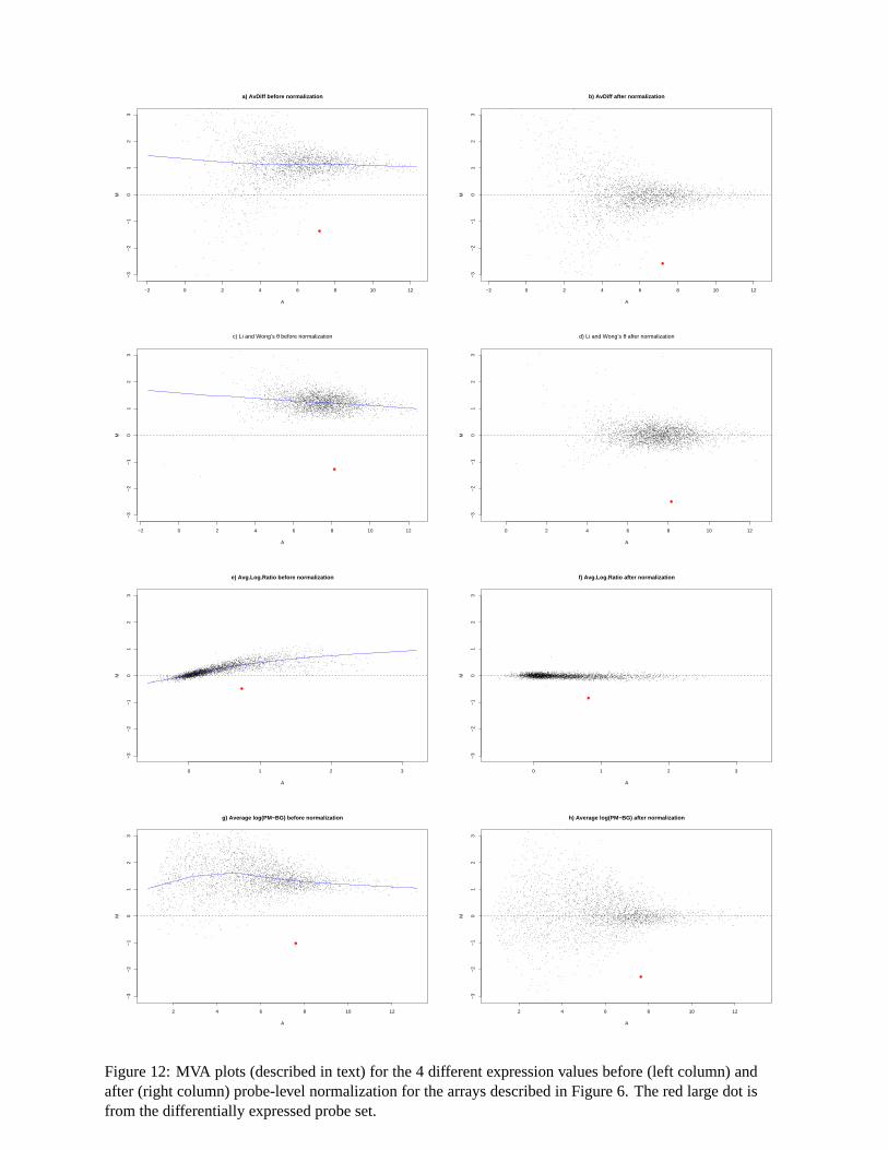
Figure 12: MVA plots (described in text) for the 4 different expression values before (left column) andafter (right column) probe-level normalization for the arrays described in Figure 6. The red large dot isfrom the differentially expressed probe set.
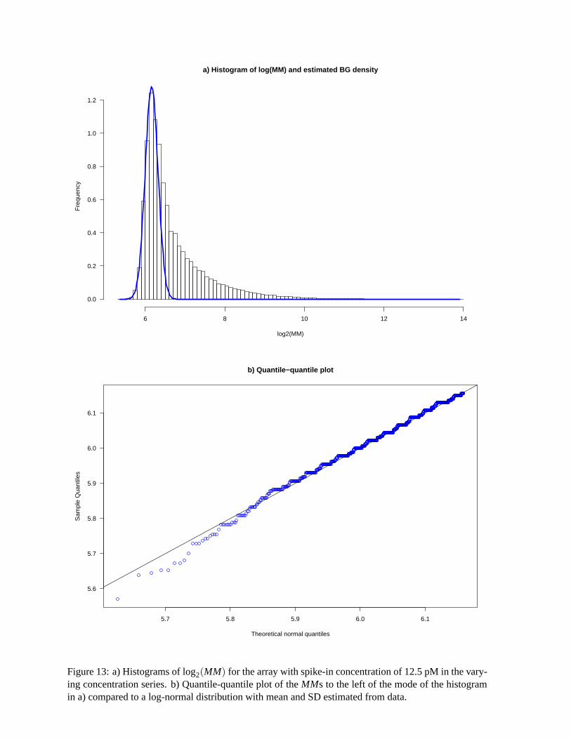
a) Histogram of log(MM) and estimated BG density
log2(MM)
Fre
quen
cy
6 8 10 12 14
0.0
0.2
0.4
0.6
0.8
1.0
1.2
5.7 5.8 5.9 6.0 6.1
5.6
5.7
5.8
5.9
6.0
6.1
b) Quantile−quantile plot
Theoretical normal quantiles
Sam
ple
Qua
ntile
s
Figure 13: a) Histograms of log2(MM) for the array with spike-in concentration of 12.5 pM in the vary-ing concentration series. b) Quantile-quantile plot of the MMs to the left of the mode of the histogramin a) compared to a log-normal distribution with mean and SD estimated from data.
0.5
1.0
2.0
5.0
10.0
20.0
50.0
100.
0
110100
1000
1000
0
c) L
i and
Won
g’s
, M
BE
I θ
Con
cent
ratio
n
Expression estimates
β̂=
1
R2
=0.
96
0.5
1.0
2.0
5.0
10.0
20.0
50.0
100.
0
110100
1000
1000
0
d
) R
MA
Con
cent
ratio
n
Expression estimates
β̂=
1
R2
=0.
97
0.5
1.0
2.0
5.0
10.0
20.0
50.0
100.
0
110100
1000
1000
0
a) A
vDif
f af
ter
qu
anti
le n
orm
aliz
atio
n
Con
cent
ratio
n
Expression estimates
β̂=
1.1
R2
=0.
96
0.5
1.0
2.0
5.0
10.0
20.0
50.0
100.
0
110100
1000
1000
0
b)
MA
S 5
.0 a
fter
Gen
ech
ip n
orm
aliz
atio
n
Con
cent
ratio
n
Expression estimates
β̂=
1.1
R2
=0.
97
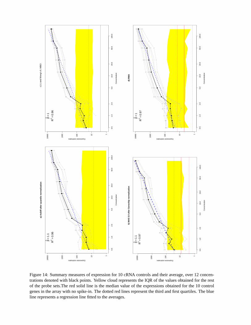
Figure 14: Summary measures of expression for 10 cRNA controls and their average, over 12 concen-trations denoted with black points. Yellow cloud represents the IQR of the values obtained for the restof the probe sets.The red solid line is the median value of the expressions obtained for the 10 controlgenes in the array with no spike-in. The dotted red lines represent the third and first quartiles. The blueline represents a regression line fitted to the averages.
−10
−5
05
10
a) Model estimate compared to observed variance
Concentrations
log(
σ̂2S
D2 )
1.25 2.5 5 7.5 10 20
−5 0 5 10 15
−6
−4
−2
02
46
b) Li and Wong model
log(Expression Estimate)
log(
σ̂2S
D2 )
−5 0 5 10 15
−6
−4
−2
02
46
c) BG + Signal model
log(Expression Estimate)
log(
σ̂2S
D2 )
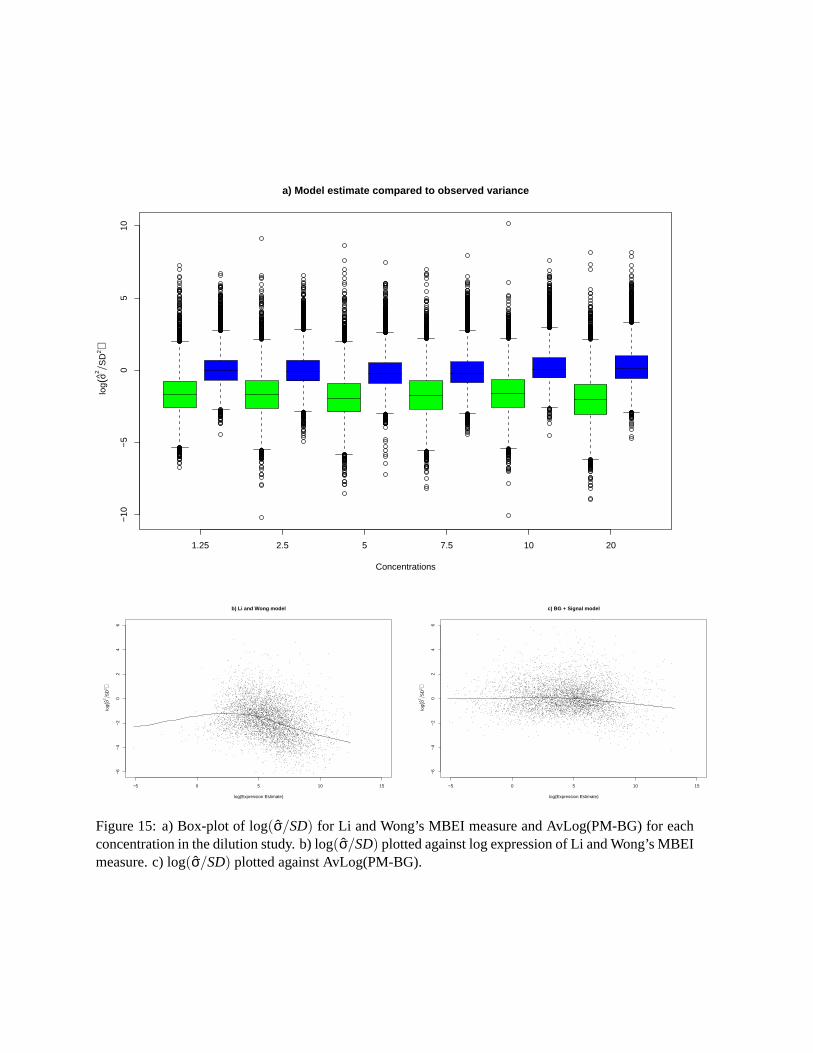
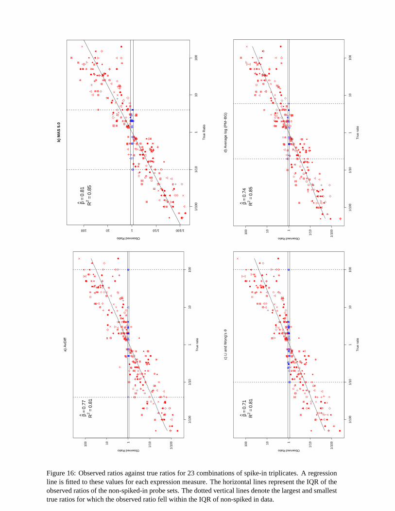
Figure 15: a) Box-plot of log(σ̂/SD) for Li and Wong’s MBEI measure and AvLog(PM-BG) for eachconcentration in the dilution study. b) log(σ̂/SD) plotted against log expression of Li and Wong’s MBEImeasure. c) log(σ̂/SD) plotted against AvLog(PM-BG).
b)
MA
S 5
.0
Tru
e R
atio
Observed Ratio
1/10
01/
101
1010
0
1/1001/10110100
β̂=
0.81
R2
=0.
85
d) A
vera
ge lo
g (P
M−
BG
)
Tru
e ra
tio
Observed Ratio
1/10
01/
101
1010
0
1/10
0
1/1011010
0β̂
=0.
74R
2=
0.85
a) A
vDiff
Tru
e ra
tio
Observed Ratio
1/10
01/
101
1010
0
1/10
0
1/10110100
β̂=
0.77
R2
=0.
81
c) L
i and
Won
g’s
θ
Tru
e ra
tio
Observed Ratio
1/10
01/
101
1010
0
1/10
0
1/10110100
β̂=
0.71
R2
=0.
81
Figure 16: Observed ratios against true ratios for 23 combinations of spike-in triplicates. A regressionline is fitted to these values for each expression measure. The horizontal lines represent the IQR of theobserved ratios of the non-spiked-in probe sets. The dotted vertical lines denote the largest and smallesttrue ratios for which the observed ratio fell within the IQR of non-spiked in data.