a national web conference on optimizing the … optimizing the presentation and visualization of...
TRANSCRIPT

A National Web Conference on Optimizing the Presentation and Visualization of Health Data
for Patients and Providers
Presented by:Brian J. Zikmund-Fisher, Ph.D.
Genevieve Melton-Meaux, M.D., Ph.D.
Moderated by:
Chun-Ju (Janey) Hsiao, Ph.D.
Agency for Healthcare Research and Quality
May 30, 2017

Agenda
• Welcome and Introductions
• Presentations
• Q&A Session With Presenters
• Instructions for Obtaining CME Credits
Note: After today’s Webinar, a copy of the slides willbe emailed to all participants.
2

AHRQ’s Mission
To produce evidence to make health care safer, higher quality, more accessible, equitable, and affordable, and work within the U.S. Department of Health and Human Services and with other partners to make sure that the evidence is understood and used.
3

How AHRQ Makes a
Difference
• AHRQ invests in research and evidence to understand how to make health care safer and improve quality.
• AHRQ creates materials to teach and train health care systems and professionals to catalyzeimprovements in care.
• AHRQ generates measures and data used to track and improve performance and evaluate progress of the U.S. health system.
4

Presenter and Moderator
DisclosuresThe following presenters and moderator have no financial interests to disclose:
• Brian J. Zikmund-Fisher, Ph.D.• Chun-Ju (Janey) Hsiao, Ph.D.
Genevieve Melton-Meaux, M.D., Ph.D. would like to disclose that her spouse works for Abbott Medical. Conflict of interest was resolved through peer review of content.
This continuing education activity is managed and accredited by the Professional Education Services Group (PESG), in cooperation with AHRQ, AFYA, and RTI.
PESG, AHRQ, AFYA, and RTI staff have no financial interests to disclose.
Commercial support was not received for this activity.
5

How to Submit a Question
• At any time during thepresentation, type your question into the “Q&A”section of your WebEx Q&A panel.
• Please address your questions to “All Panelists” in the drop-down menu.
• Select “Send” to submit yourquestion to the moderator.
• Questions will be read aloudby the moderator.
6

Learning Objectives
At the conclusion of this activity, the participant will be able to do the following:
1) Describe the challenges patients face in understanding medical test data and present evidence-based methods to overcome these barriers and help patients make sense of the data, manage their health, and make choices about their care.
2) Describe findings around EHR navigator usage and clinical note organization with usability studies to support improved provider workflow.
7

Getting Beyond “I’ll Tell You When to Worry”:
Designing Intuitively Meaningful Test Result Displays
Brian J. Zikmund-Fisher, Ph.D.University of Michigan
Department of Health Behavior & Health EducationDepartment of Internal Medicine
Center for Bioethics & Social Sciences in MedicineHealth Informatics Program
@bzikmundfisher
8
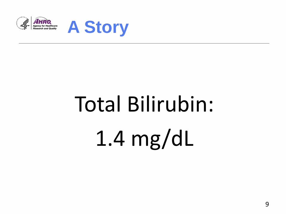
A Story
Total Bilirubin:
1.4 mg/dL
9

A Story
“Don’t worry!”
“I’ll tell you when to worry.”
10

Information
Evaluability
Hsee, 1996, Organizational Behavior & Human Decision Processes.Hsee, et al., 1999, Psychological Bulletin.Zikmund-Fisher, et al., 2004, Medical Decision Making. 11

Decision Making
• Hard-to-evaluate data require reference standards to be meaningful.
– Such data are generally ignored unless comparative data are provided.
Hsee, 1996, Organizational Behavior & Human Decision Processes.Hsee, et al., 1999, Psychological Bulletin.Zikmund-Fisher, et al., 2004, Medical Decision Making. 12

Patient Portals
• Increasing direct access to test results
13

Can Patients Use This?
14

Patient Portals
• Increasing direct access to test results.
• However, the value of that data comes in its meaning.
– Recognizing out-of-range values is the first, essential step to meaningful use.
15

What Is Out of Range?
16

Can People Identify Test
Results as Out of Range?
• Type 2 diabetes scenario
– Task: To determine if Hemoglobin A1c was outside the Standard Range
• 1817 adults age 40-70
– Demographically diverse Internet panel
– Measured health literacy and numeracy
Zikmund-Fisher BJ, Exe NL, Witteman HO. Numeracy and literacy independently predict patients’ ability to identify out-of-range test results. Journal of Medical Internet Research, 2014. 17

Test Results
• Participants received tables of:
– CBC counts
– CBC differential %s
– Hemoglobin A1c
– Renal panel
• Tables included standard range but did not include high/low flags.
Zikmund-Fisher BJ, Exe NL, Witteman HO. Numeracy and literacy independently predict patients’ ability to identify out-of-range test results. Journal of Medical Internet Research, 2014. 18

Zikmund-Fisher BJ, Exe NL, Witteman HO. Numeracy and literacy independently predict patients’ ability to identify out-of-range test results. Journal of Medical Internet Research 2014;16(8):e187.
19

Effects of Numeracy and
Literacy
Zikmund-Fisher BJ, Exe NL, Witteman HO. Numeracy and literacy independently predict patients’ ability to identify out-of-range test results. Journal of Medical Internet Research, 2014. 20

Experimental Design
• A1c level
– 7.1%
– 8.4%
Zikmund-Fisher BJ, Exe NL, Witteman HO. Numeracy and literacy independently predict patients’ ability to identify out-of-range test results. Journal of Medical Internet Research, 2014. 21

Estimated Likelihood of
Calling a Doctor
Zikmund-Fisher BJ, Exe NL, Witteman HO. Numeracy and literacy independently predict patients’ ability to identify out-of-range test results. Journal of Medical Internet Research, 2014. 22

Improving Test Result
Displays
• Collaborators:
– Angela Fagerlin (U. Utah)
– Aaron M. Scherer (U. Iowa)
– Holly O. Witteman (U. Laval)
– Jacob Solomon (U. Michigan)
– Beth A. Tarini (U. Iowa)
– Nicole L. Exe (U. Michigan)
• Funding: AHRQ (R01 HS021681)
23

Tables
Zikmund-Fisher BJ, et al. Graphics help patients distinguish between urgent and non-urgent deviations in laboratory test results. Journal of the American Medical Informatics Association 2017;24(3):520-528. 24

Table vs. Number Line
Zikmund-Fisher BJ, et al. Graphics help patients distinguish between urgent and non-urgent deviations in laboratory test results. Journal of the American Medical Informatics Association 2017;24(3):520-528. 25

Lines With More Meaning
Zikmund-Fisher BJ, et al. Graphics help patients distinguish between urgent and non-urgent deviations in laboratory test results. Journal of the American Medical Informatics Association 2017;24(3):520-528. 26

Does Format Affect
Sensitivity to Test Results?
• Medication management scenario
– Viewing online the results of multiple blood tests ordered after a doctor’s visit
• 1620 adults age 18+
– Demographically diverse Internet panel
27Zikmund-Fisher BJ, et al. Graphics help patients distinguish between urgent and non-urgent deviations in laboratory test results. Journal of the American Medical Informatics Association 2017;24(3):520-528.

Design
• Display format (between subject)
• Test type (within subject)
– Platelet count
– Alanine Aminotransferase (ALT)
– Serum Creatinine
Zikmund-Fisher BJ, et al. Graphics help patients distinguish between urgent and non-urgent deviations in laboratory test results. Journal of the American Medical Informatics Association 2017;24(3):520-528. 28

Design
• Display format (between subject)
• Test type (within subject)
• Test result (within subject)
– Near-normal (minimal incremental risk)
– Extreme (substantial risk)
Zikmund-Fisher BJ, et al. Graphics help patients distinguish between urgent and non-urgent deviations in laboratory test results. Journal of the American Medical Informatics Association 2017;24(3):520-528. 29

Comparing Test Results
Near-Normal
Extreme
Zikmund-Fisher BJ, et al. Graphics help patients distinguish between urgent and non-urgent deviations in laboratory test results. Journal of the American Medical Informatics Association 2017;24(3):520-528. 30

% With No Difference in
Perceived Urgency
Platelets(135 vs 25 x109/L)
ALT(80 vs 360 U/L)
Creatinine(2.2 vs 3.4 mg/dl)
Table 26.5 56.3 43.7
Zikmund-Fisher BJ, et al. Graphics help patients distinguish between urgent and non-urgent deviations in laboratory test results. Journal of the American Medical Informatics Association 2017;24(3):520-528. 31

% With No Difference in
Perceived Urgency
Platelets(135 vs 25 x109/L)
ALT(80 vs 360 U/L)
Creatinine(2.2 vs 3.4 mg/dl)
Table 26.5 56.3 43.7
Simple Line 17.5 21.3 27.7
Block Line 19.0 20.2 28.7
Gradient Line 15.8 14.8 24.0
Zikmund-Fisher BJ, et al. Graphics help patients distinguish between urgent and non-urgent deviations in laboratory test results. Journal of the American Medical Informatics Association 2017;24(3):520-528. 32

Ongoing Design Research
33Scherer AM, Witteman HO, Solomon J, Fagerlin A, Exe NL, Zikmund-Fisher BJ. Improving understanding of test results by substituting (not adding) goal ranges. Poster presentation to the Society for Medical Decision Making, Vancouver, BC, Canada, October 23, 2016.

Ongoing Design Research
Scherer AM, Witteman HO, Solomon J, Fagerlin A, Exe NL, Zikmund-Fisher BJ. Improving understanding of test results by substituting (not adding) goal ranges. Poster presentation to the Society for Medical Decision Making, Vancouver, BC, Canada, October 23, 2016. 34

Ongoing Design Research
Scherer AM, Witteman HO, Solomon J, Fagerlin A, Exe NL, Zikmund-Fisher BJ. Improving understanding of test results by substituting (not adding) goal ranges. Poster presentation to the Society for Medical Decision Making, Vancouver, BC, Canada, October 23, 2016. 35

Ongoing Design Research
Scherer AM, Witteman HO, Solomon J, Fagerlin A, Exe NL, Zikmund-Fisher BJ. Improving understanding of test results by substituting (not adding) goal ranges. Poster presentation to the Society for Medical Decision Making, Vancouver, BC, Canada, October 23, 2016. 36

% With A1c=6.2% Wanting
Next Result to Be Higher
0
20
40
60
80
100
No Goal Goal w/ StandardRange
Goal Only% s
tating t
hat th
eir n
ext
test
valu
e
should
be h
igher
Simplified Blocks
Scherer AM, Witteman HO, Solomon J, Fagerlin A, Exe NL, Zikmund-Fisher BJ. Improving understanding of test results by substituting (not adding) goal ranges. Poster presentation to the Society for Medical Decision Making, Vancouver, BC, Canada, October 23, 2016. 37

The Problem
• How to get people to react more to extremely out-of-range values
38

The Problem
• How to get people to react more to extremely out-of-range values
• How to get people to react LESS to mildly out-of-range values
– Often not clinically concerning
– However, may provoke patient anxiety or calls
39

Early Version
Zikmund-Fisher BJ, Scherer A, Witteman HO, et al. Providing harm anchors in visual displays of test results mitigates patient concern about nearly normal values. Oral presentation to the Society for Medical Decision Making, Vancouver, BC, Canada, October 24, 2016. 40

Refined Simple Design
Zikmund-Fisher BJ, Scherer A, Witteman HO, et al. Providing harm anchors in visual displays of test results mitigates patient concern about nearly normal values. Oral presentation to the Society for Medical Decision Making, Vancouver, BC, Canada, October 24, 2016. 41

Harm Anchor Design
Zikmund-Fisher BJ, Scherer A, Witteman HO, et al. Providing harm anchors in visual displays of test results mitigates patient concern about nearly normal values. Oral presentation to the Society for Medical Decision Making, Vancouver, BC, Canada, October 24, 2016. 42

Three Tests
Platelet Count (PLT)
Alanine Aminotransferase (ALT)
Serum Creatinine (SCR)
Zikmund-Fisher BJ, Scherer A, Witteman HO, et al. Providing harm anchors in visual displays of test results mitigates patient concern about nearly normal values. Oral presentation to the Society for Medical Decision Making, Vancouver, BC, Canada, October 24, 2016. 43

Can Harm Anchors Change
Affect Test Interpretation?
• Medication management scenario
• 794 U.S. adults
– Same demographically diverse online panel
Zikmund-Fisher BJ, Scherer A, Witteman HO, et al. Providing harm anchors in visual displays of test results mitigates patient concern about nearly normal values. Oral presentation to the Society for Medical Decision Making, Vancouver, BC, Canada, October 24, 2016. 44

Design
• Format (between subject)
– Simple design vs. harm anchors
• Test results (within subject)
– Initially values “near” to standard range
• PLT=135, ALT=80, SCR=2.2
– Repeat with “far” / extreme values
• PLT=25, ALT=360, SCR=3.4
Zikmund-Fisher BJ, Scherer A, Witteman HO, et al. Providing harm anchors in visual displays of test results mitigates patient concern about nearly normal values. Oral presentation to the Society for Medical Decision Making, Vancouver, BC, Canada, October 24, 2016. 45

Harm Anchors Reduced
Alarm Re: Near Values…
SimpleDesign
Harm Anchors
P-value
PLT = 135 x109 3.72 3.69 .77
ALT = 80 U/L 4.00 3.11 <.001
SCR = 2.2 mg/dl 4.11 3.55 <.001
“How alarming does this [TEST NAME] result feel to you?”Response scale: 1 “Not at all” – 6 “Very”
Zikmund-Fisher BJ, Scherer A, Witteman HO, et al. Providing harm anchors in visual displays of test results mitigates patient concern about nearly normal values. Oral presentation to the Society for Medical Decision Making, Vancouver, BC, Canada, October 24, 2016. 46

…But Did Not Impact
Reactions to Extreme Values
SimpleDesign
Harm Anchors
P-value
PLT = 25 x109/L 5.28 5.09 .06
ALT = 360 U/L 5.45 5.36 .26
SCR = 3.4 mg/dl 5.81 5.73 .33
“How alarming does this [TEST NAME] result feel to you?”Response scale: 1 “Not at all” – 6 “Very”
Zikmund-Fisher BJ, Scherer A, Witteman HO, et al. Providing harm anchors in visual displays of test results mitigates patient concern about nearly normal values. Oral presentation to the Society for Medical Decision Making, Vancouver, BC, Canada, October 24, 2016. 47

Increased Sensitivity
1
2
3
4
5
6
Near Value Extreme Value
Perc
eive
d A
larm
Simple Harm Anchor
Zikmund-Fisher BJ, Scherer A, Witteman HO, et al. Providing harm anchors in visual displays of test results mitigates patient concern about nearly normal values. Oral presentation to the Society for Medical Decision Making, Vancouver, BC, Canada, October 24, 2016. 48

Desire to Contact MD
Urgently
• Harm anchors reduced respondents’ desire to contact a doctor urgently or go to the hospital.
SimpleDesign
Harm Anchors
P-value
PLT = 135 x109 50.0% 44.2% .10
ALT = 80 U/L 55.8% 34.7% <.001
SCR = 2.2 mg/dl 56.7% 35.2% <.001
Zikmund-Fisher BJ, Scherer A, Witteman HO, et al. Providing harm anchors in visual displays of test results mitigates patient concern about nearly normal values. Oral presentation to the Society for Medical Decision Making, Vancouver, BC, Canada, October 24, 2016. 49

What Do We Want Patients
Comparing Themselves to?
Standard Range
vs.Harm
Anchor
50

What Do We Want Patients
Comparing Themselves to?
Standard Range
vs.Harm
Anchor
What’s Normal
vs.What’s
Dangerous
51

Challenges
• Selection of
– Scale endpoints
–Category boundaries
–Action / harm thresholds
• Acceptance of responsibility
52

Providing the right number
does NOT guarantee
the right message.
53


Supporting Providers With EHR Navigators and Clinical
Note Organization
Genevieve Melton-Meaux, M.D., Ph.D.Associate Professor of Surgery and Health Informatics Core
Faculty – University of MinnesotaChief Health Information Officer – Fairview Health Services and
University of Minnesota Physicians55

Learning Objectives
• At the end of this presentation, the learner should be able to do the following:
– Understand the importance of usability testing for EHR functionality, like navigators and balancing standardization with flexibility for optimal usage.
– Appreciate how the order of sections within electronic progress notes impacts the usability and experience of reviewing patient notes.
56

Background
• EHR systems are increasingly ubiquitous. – Healthcare systems progressively leverage EHRs to
help provide more reliable care.
– Value-based programs and at-risk contracts.
– Meaningful Use (MU)/Advancing Care Information.
• User satisfaction with EHRs remains low.– Poorly designed user interfaces.
– Increased focus needed on understanding human factors, workflow processes, and usability principles.
57

“Usability Testing of Two
Ambulatory EHR Navigators”
Applied Clinical Informatics. 2016 Jun 15;7(2):502-15. doi: 10.4338/ACI-2015-10-RA-0129. eCollection 2016.
Gretchen Hultman MPH1, Jenna Marquard PhD4, Elliot Arsoniadis MD1,2, Pamela Mink J. PhD, MPH5, Rubina Rizvi MBBS, MS1, Tim Ramer, MD3, Saif Khairat, PhD,5 Keri Fickau,6
Genevieve B. Melton MD, PhD1,2,6
1Institute for Health Informatics, 2Department of Surgery, and 3Department of Family Medicine; University of Minnesota, Minneapolis, MN4 College of Engineering, University of Massachusetts Amherst, Amherst, MA 5Division of Applied Research, Allina Health, Minneapolis, MN Carolina Informatics Program, University of North Carolina, Chapel Hill, NC 6Fairview Health Services, Minneapolis, MN
No disclosures
58

Our Context
• Ambulatory clinics at a tertiary care medical center upgraded commercial EHR.
• Clinic staff identified several issues with existing navigator. – Options and functionality had been added to the
navigator without removing other options.
– Long list that required extensive scrolling.
– Included several infrequently used options.
• Resulted in an effort to redesign the navigator with clinician feedback.
User-Centered Design With Usability Testing59

Study Objectives
• Examine the usability of an original and optimized navigator in the ambulatory setting.
• Determine if using the redesigned navigator had a positive impact on clinicians’ ability to complete MU tasks.
60

The Redesign Process
61
• Directly involved in design and testing.
Clinician Feedback
• Input sought from nurse managers and nurse assistants.
Feedback From Other
Clinicians
• Multiple specialty providers and informatician.
• Identified key tasks by role most important for ambulatory care.
Initial Group
Sessions
• Clinicians met with developers individually over several weeks.
• Tested different iterations of the navigator.
Individual Sessions

62
“Old” Navigator
• Opened by clicking button labeled visit navigator
• Also the default screen shown when opening a patient’s chart
• Consisted of column of items divided into domains – Sample items: chief complaint, meds, and
orders
• Additional options available in column at left
Figure 1: Screenshot of a portion of the original ambulatory navigator (© 2015 Epic Systems Corporation. Used with permission).

63
“New” Navigator
Figure 2: Screenshot of a portion of the original ambulatory navigator (© 2015 Epic Systems Corporation. Used with permission).
• “Intake” button and “charting” buttons instead of “visit navigator” button
– “Intake” options intended for use by rooming staff
– “Charting” options intended for use by clinicians
• Options displayed at the top instead of along the side
• Left-hand column options reduced

Participants and Setting
• Convenience sample (n=8) of resident physicians in 2nd to 4th year of training.
• Residents were experienced users of the inpatient setting of the EHR.
• Were naive users not familiar with this ambulatory navigator.
– Unfamiliar with both versions
64
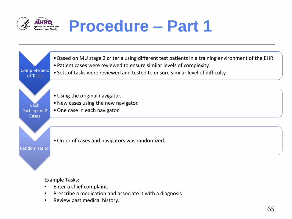
Procedure – Part 1
Complete Sets of Tasks
• Based on MU stage 2 criteria using different test patients in a training environment of the EHR.
• Patient cases were reviewed to ensure similar levels of complexity.
• Sets of tasks were reviewed and tested to ensure similar level of difficulty.
Each Participant 2
Cases
• Using the original navigator.
• New cases using the new navigator.
• One case in each navigator.
Randomization
• Order of cases and navigators was randomized.
Example Tasks:• Enter a chief complaint.• Prescribe a medication and associate it with a diagnosis. • Review past medical history.
65

Procedure – Part 2
Think Aloud Procedure
• Participants verbalized thoughts using a “think aloud” procedure during each patient case.
Single Ease Question
• After each case, participants completed a single ease question.
System Usability Survey
• After each navigator, participants completed the system usability survey (SUS).
Final Survey
• Participants completed a final survey with demographic questions and feedback about the cases, the navigators, and the overall experience.
66

Analysis
• Quantitative– Time to complete case
– Perceived complexity
– Perceived usability
• Navigation pathway– Examined the pathways and button clicks participants
took to locate areas of the EHR to perform the tasks.
• Qualitative – Session recordings were reviewed and coded for
themes.
67

Results: Time to Task and
Perceived Workload Old vs. New Time to Complete Patient Case
0
2
4
6
8
10
Alison Grace Hank Kristin Maggie
Ave
rage
Tim
e to
Co
mp
lete
Cas
e (m
inu
tes)
Old vs. New Perceived Workload
0
1
2
3
4
5
6
7
Alison Grace Hank Kristin Maggie
Old
vs.
Ne
w P
erc
eiv
ed
Wo
rklo
ad
OldNavigatorVersion
NewNavigatorVersion
68

Qualitative Analysis:
Themes
• All participants encountered problems and experienced confusion.
• Preferences varied widely between the two navigators. – Links on top vs. side
– Scrolling through a long list but having all the options in one spot vs. having a short list of options but having to search around for additional items
• The separate menus for “intake” and “charting” introduced confusion in the new navigator.
69

Pathway Analysis
Old Navigator Pathways New Navigator Pathways
70

Pathway Analysis
• Many different pathways available, even for simple tasks – Participants use many different pathways based on preferences. – Options were available to participants that they did not use.– Participants used unanticipated pathways or “workarounds.”
• Using the search function • Searching the “more activities” list
• High-level navigation patterns different depending on navigator – In “old navigator,” participants used options in left-hand column. – In “new navigator,” some options were removed and
participants were forced to use other pathways.
71

Discussion
• User-centered design of navigators is important.– Impacted ability to perform tasks – Influenced navigation patterns and overall experience
• Tension between flexibility and standard workflow.
• Confusion was common, regardless of navigator. – All participants experienced struggles while
completing tasks, even when they reported that the task was easy.
– Indicates that training with standardization of workflow may be beneficial.
72

Limitations and Next
Steps
• Limitations
– Small sample size with only resident physicians at single institution
– Study conducted in a laboratory setting
• Next steps
– Training component
– Examine with other user groups in more naturalistic conditions
73

Takeaways
• User-centered design is important but insufficient when designing EHR functionality and associated workflows.
• Flexibility in EHRs creates confusion.
– Must be balanced with standard workflows.
– Training to workflow and not functionality may provide a bridge.
74

“When, Why, and How Physicians
Optimally Read Electronic Progress
Notes: A Mixed-Methods Evaluation”
In review
Gretchen M. Hultman, MPH1, Jenna L. Marquard, PhD2, Osadebamwen Ighile, MBBS, MS1, Oladimeji Farri MBBS, PhD3, Elizabeth Lindemann, BS4, Elliot Arsoniadis, MD1,4, Serguei Pakhomov PhD1,5, Genevieve B. Melton, MD, PhD1,4
1 Institute for Health Informatics, 4Department of Surgery, 4College of Pharmacy, University of Minnesota, Minneapolis, MN3Philps Research-North America, Cambridge, MA2 College of Engineering, University of Massachusetts, Amherst, MA
No disclosures
75

Background
• Progress notes – Key for communication about and synthesis of patients– Typically follow SOAP format (Subjective, Objective,
Assessment, Plan) – Established by Dr. Lawrence Weed in the 1960s as part of the
Problem Oriented Medical Record (POMR) framework
• Electronic progress notes– Longer than paper notes and time consuming to create– Often contain extraneous or inaccurate information– Assessment and plan (A/P) section considered most valuable
but at end of a note requiring scrolling to locate
• Unclear how to make the most vital information in notes available and easy to find
76

Rationale & Objectives
Rationale: Challenges with electronic progress notes point to an existing need to improve physicians’ experience using clinical notes.
Some have suggested that the A/P sections should be moved to the top of the note (including writing in APSO format).
Study Objective:
Gain insight into when, why, and how clinicians read electronic progress notes.
77

Participants and Setting
• EHR system prototype designed to look like CPRS/VistA
– Office setting using a desktop computer
– TURF software used to record the sessions
• Convenience sample of 23 mid-level residents
78

Patient Case Design
• 4 de-identified patient cases – Designed to be realistic and of similar complexity. – 9 progress notes per case.– Patient cases presented in the same order.
• Notes formatted in four orders– 1. SOAP – 2. APSO– 3. SAPO– 4. Mixed (3 SOAP, 3 APSO, and 3 SAPO)
• Note format randomized Latin Squares design– All participants saw all 4 note formats.
79

80
Methods
Prototype EHR opened to notes section Mixed Methods Analysis
For each patient case, participants:
Reviewed the case as they
normally would
Provided a verbal summary of the
case
Filled out NASA-TLX workload
instrument
Actual note reading patterns- Experimental data- Scrolling analysis
After completing all four cases, participants:
Completed an exit interview
Completed an exit questionnaire
Perceived note reading patterns- Interview data- Questionnaire data

Perceived Patterns:
Interviews
• Start reading a patient note at either the Subjective or the Assessment and Plan sections.– “Typically, when assessing a patient note for any given
specialty, I’ll look at their HPI or initial subjective assessment, then go and jump to the assessment and plan.”
– “If I’m looking at a specific clinical note, a lot of the time I’ll look for the assessment and plan first, and then kind of see how they came to that conclusion by reviewing their history and then other things.”
81

Perceived Patterns:
Interviews
• Skip a variety of information, including:– Past medical history, past surgical history, vitals,
labs, medications, review of systems, imaging, exam, physical findings, and generally anything that looks auto-populated.
• Frustration with auto-populated data and “note bloat”– “How they auto-populate different things like the
medications that sometimes, the redundancies in that, they sometimes decrease efficiency.”
82

Perceptions on Progress
Note Section Importance
HoHow w wweell ll ddoeoes s eeachach sesectioctionn pprrovioviddee infinformaormationtion yyouou nneeeedd??
0
5
10
15
20
25
Subjective Objective Assessment Plan Other
Tota
l
0
5
10
15
20
25
Subjective Objective Assessment Plan Other
Tota
l
VeVery welry welll
SoSommeewhawhat t wellwell
NNeiteithherer wwell ell nnoror ppoorlyoorly
SoSommewhaewhat t ppooororllyy
ververVery y y pppooooororrlyllyy
83

Perceptions on Other Sections
With Valuable Information
What types of information are most valuable?
84
6
1
14
1 1
7
8
2
1
4
1
3
6
3
1
4
4
1 4 3
3
6
3
2
1
31
8 7
2
1
110
5
10
15
20
25
Priority 5
Priority 4
Priority 3
Priority 2
Priority 1

Self-Reported Information
Barriers
How severe are different information barriers?
85
0
5
10
15
20
25
Theinformation Ineed is not in
the notes
I can’t find the information I need in the
notes
Information inthe notes is
poorlydisplayed ordifficult tointerpret
There is toomuch
information inthe notes
Information inthe notes is not
accurate
Others don’t record
information in the notes
consistently
Severe barrier
Large barrier
Moderate barrier
Slight barrier
Not a barrier

Experiment Note Reading
Patterns
Note Order
Reading Time in Minutes (stdev)
Verbal Summary Time in Minutes
(stdev)
Average Workload
Score (stdev)
Proportion Scrolling
SOAP 11.6 (4.95) 2.1 (1.66) 30.6 (10.57) 61%
APSO 10.6 (1.85) 1.9 (1.49) 31.3 (8.75) 60%
SAPO 11.3 (2.29) 2.3 (1.62) 31.9 (7.04) 57%
Mix 12.5 (2.12) 2.1 (1.04) 31.7 (7.78) 59%
Average 11.5 (2.08) 2.1 (1.46) 31.4 (8.52) 59%
86

Key Experiment Findings
• Significant difference in time to review
– APSO took the least time.
– Mixed took the most time.
• No significant difference in time to summarize cases
• No significant difference in workload score between orders
– SOAP notes had lowest workload score.
87

Discussion
A/P were highly valued.
Participants often read these sections first.
Almost all participants rated these sections as providing information they needed either Very Well or Somewhat Well.
Most recent Assessment and Plan rated as one of the most valuable sections.
Participants stated many problems with notes.
Most participants rated all information barriers as either Moderate, Large, or Severe barriers.
Negative impacts of auto-populated data and “note bloat” –including ignoring data.
88

Discussion
• Should notes be reordered?
– Mixed note formats took participants longest to read.
• Now common because of customized note templates.
• Separate note creation format from note reading format?
– APSO notes were read most quickly.
• But was that because information at the end of the note was ignored?
• Followup eye-tracker analysis.
• No significant impact on perceived workload and time to summarize cases.
89

Acknowledgements
• This work was supported by the Agency for Healthcare Research and Quality Award #R01HS022085 and the National Science Foundation Award #CMMI-1234070.
• Thank you!
90


How to Submit a Question
• At any time during thepresentation, type your question into the “Q&A”section of your WebEx Q&A panel.
• Please address your questions to “All Panelists” in the drop-down menu.
• Select “Send” to submityour question to the moderator.
• Questions will be readaloud by the moderator.
92

Obtaining CME/CE Credits
If you would like to receive continuing education credit for this activity, please visit
http://hitwebinar.cds.pesgce.com/eindex.php
93