a picture is worth a thousand words_mathilda eloff
TRANSCRIPT
A picture is worth a thousand words
NumbersMathilda Eloff
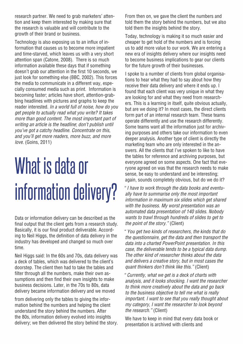
2012I’m a quali-fied graphic designer and was initially employed at a research agency for the pure purpose of formatting PowerPoint
presentations. In the five years that I’ve worked with researchers, I’ve developed a huge interest and passion for market research. I’ve started exploring different ways to deliver data to clients so that the numbers make more sense to marketers. Up to now, research agencies haven’t seen the purpose of having an internal graphic design department, but facing technological challenges, maybe it should be considered.
This paper looks into the way we current-ly communicate research and questions the method of current communication. It challenges the industry to think more creatively about the research and pack-age research to speak the language of the client and the marketer. If you are ex-pecting an academically precise research paper, don’t, because that’s the point. I’m not a researcher; I’m a creative thinker, so sit up and listen to what I’ve got to say.
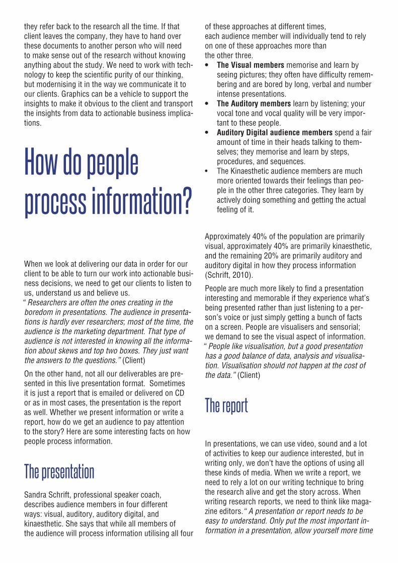
“The truth isn’t the truth until people believe you, and they can’t believe you if they don’t know what you’re saying, and they can’t know what you’re saying if they don’t listen to you, and they won’t listen to you if you’re not interesting, and you won’t be interesting unless you say things imaginatively, originally, freshly.”
Bill Bernbach (Sullivan, 1998)
We devote a lot of time, effort, money and thinking to making our research absolutely perfect. From the proposal to the analysis, every-thing is precisely planned. Once the fieldwork is complete, we spend a lot of time making sure all the numbers are valid and correct. Once complete, the analysis is done and we’re ready to present the re-sults to our clients. But... Will your client understand you? Will your audience know what you’re saying? Will you be interesting? Will the data turn into insights? Will your client action your insights? Can the results be easily integrated into their business?
We live in a digital age where technology is making it very fast and easy to get hold of data or information about what people think. Almost anyone can post a question on the web, and you would almost instantly find a response. It’s great for saving time and money, but if it’s this easy, how valuable will the work of the research industry become? With this in mind, the industry is facing the challenge of proving to marketers the value of investing in a
research partner. We need to grab marketers’ atten-tion and keep them interested by making sure that the research is valuable and will contribute to the growth of their brand or business.
Technology is also exposing us to an influx of in-formation that causes us to become more impatient and time-starved, which leaves us with a very short attention span (Catone, 2008). There is so much information available these days that if something doesn’t grab our attention in the first 10 seconds, we just look for something else (BBC, 2002). This forces the media to communicate in a different way, espe-cially consumed media such as print. Information is becoming faster; articles have short, attention-grab-bing headlines with pictures and graphs to keep the reader interested. In a world full of noise, how do you get people to actually read what you write? It takes more than good content. The most important part of writing an article is the headline; don’t publish until you’ve got a catchy headline. Concentrate on this, and you’ll get more readers, more buzz, and more love. (Goins, 2011)
What is data or information delivery?Data or information delivery can be described as the final output that the client gets from a research study. Basically, it is our final product deliverable. Accord-ing to Neil Higgs, the definition of data delivery in the industry has developed and changed so much over time.
Neil Higgs said: In the 60s and 70s, data delivery was a deck of tables, which was delivered to the client’s doorstep. The client then had to take the tables and filter through all the numbers, make their own as-sumptions and then find their own insights to make business decisions. Later, in the 70s to 80s, data delivery became information delivery and we moved
from delivering only the tables to giving the infor-mation behind the numbers and helping the client understand the story behind the numbers. After the 80s, information delivery evolved into insights delivery; we then delivered the story behind the story.
From then on, we gave the client the numbers and told them the story behind the numbers, but we also told them the insights behind the story.
Today, technology is making it so much easier and cheaper to get hold of the numbers and is forcing us to add more value to our work. We are entering a new era of insights delivery where our insights need to become business implications to gear our clients for the future growth of their businesses.
I spoke to a number of clients from global organisa-tions to hear what they had to say about how they receive their data delivery and where it ends up. I found that each client was very unique in what they are looking for and what they need from research-ers. This is a learning in itself, quite obvious actually, but are we doing it? In most cases, the direct clients form part of an internal research team. These teams operate differently and use the research differently. Some teams want all the information just for archiv-ing purposes and others take our information to even deeper analysis. Another type of client is directly the marketing team who are only interested in the an-swers. All the clients that I’ve spoken to like to have the tables for reference and archiving purposes, but everyone agreed on some aspects. One fact that eve-ryone agreed on was that the research needs to make sense, be easy to understand and be interesting; again, sounds completely obvious, but do we do it?
“I have to work through the data books and eventu-ally have to summarise only the most important information in maximum six slides which get shared with the business. My worst presentation was an automated data presentation of 140 slides. Nobody wants to trawl through hundreds of slides to get to the point of the story.” (Client)
“You get two kinds of researchers, the kinds that do the questionnaire, get the data and then transport the data into a charted PowerPoint presentation. In this case, the deliverable tends to be a typical data dump. The other kind of researcher thinks about the data and delivers a creative story, but in most cases the quant thinkers don’t think like this.” (Client)
“Currently, what we get is a deck of charts with analysis, and it looks shocking. I want the researcher to think more creatively about the data and go back to the business objective to tell me what is really important. I want to see that you really thought about my category, I want the researcher to look beyond the research.” (Client)
We have to keep in mind that every data book or presentation is archived with clients and
they refer back to the research all the time. If that client leaves the company, they have to hand over these documents to another person who will need to make sense out of the research without knowing anything about the study. We need to work with tech-nology to keep the scientific purity of our thinking, but modernising it in the way we communicate it to our clients. Graphics can be a vehicle to support the insights to make it obvious to the client and transport the insights from data to actionable business implica-tions.
How do people process information?
When we look at delivering our data in order for our client to be able to turn our work into actionable busi-ness decisions, we need to get our clients to listen to us, understand us and believe us. “Researchers are often the ones creating in the boredom in presentations. The audience in presenta-tions is hardly ever researchers; most of the time, the audience is the marketing department. That type of audience is not interested in knowing all the informa-tion about skews and top two boxes. They just want the answers to the questions.” (Client)
On the other hand, not all our deliverables are pre-sented in this live presentation format. Sometimes it is just a report that is emailed or delivered on CD or as in most cases, the presentation is the report as well. Whether we present information or write a report, how do we get an audience to pay attention to the story? Here are some interesting facts on how people process information.
The presentationSandra Schrift, professional speaker coach, describes audience members in four differentways: visual, auditory, auditory digital, and kinaesthetic. She says that while all members ofthe audience will process information utilising all four
of these approaches at different times,each audience member will individually tend to rely on one of these approaches more thanthe other three.• The Visual members memorise and learn by
seeing pictures; they often have difficulty remem-bering and are bored by long, verbal and number intense presentations.
• The Auditory members learn by listening; your vocal tone and vocal quality will be very impor-tant to these people.
• Auditory Digital audience members spend a fair amount of time in their heads talking to them-selves; they memorise and learn by steps, procedures, and sequences.
• The Kinaesthetic audience members are much more oriented towards their feelings than peo-ple in the other three categories. They learn by actively doing something and getting the actual feeling of it.
Approximately 40% of the population are primarily visual, approximately 40% are primarily kinaesthetic, and the remaining 20% are primarily auditory and auditory digital in how they process information (Schrift, 2010).
People are much more likely to find a presentation interesting and memorable if they experience what’s being presented rather than just listening to a per-son’s voice or just simply getting a bunch of facts on a screen. People are visualisers and sensorial; we demand to see the visual aspect of information. “People like visualisation, but a good presentation has a good balance of data, analysis and visualisa-tion. Visualisation should not happen at the cost of the data.” (Client)
The report
In presentations, we can use video, sound and a lot of activities to keep our audience interested, but in writing only, we don’t have the options of using all these kinds of media. When we write a report, we need to rely a lot on our writing technique to bring the research alive and get the story across. When writing research reports, we need to think like maga-zine editors. “A presentation or report needs to be easy to understand. Only put the most important in-formation in a presentation, allow yourself more time
for analysis. Research studies need at least three levels of analysis to filter out only the most important information.” (Client)
Imagine your favourite magazine, with the same front cover every single month, only different inside info snippets. Inside the magazine, there are no pictures, no catchy headlines or titles, only subtitles and text. The information might be interesting, but the ques-tion is, would it sell? Editors and authors have to rely on creative writing and visuals to bring their stories to people and bring their stories to life. If they don’t, will the story be interesting? Will people read it? Will they believe it? Will they buy it?
“I’m in favour of headlines in my presentations and every headline should lead into each other so that the story starts broad and become more focused towards the end of the presentation.” (Client)
Researchers are journalists in their own right. We get a brief, we structure the questions, we gather the in-formation, we find the evidence and we communicate the story to our clients. For our clients to believe us and listen to us, we need to write like Bernbach says, “imaginatively, originally, freshly”. We should adapt our thinking, writing and delivery to speak the cli-ent’s language. Our reports should look and feel like magazine articles. Not only will clients enjoy reading it, they will actually want to distribute it within their businesses and it would make archiving easier.
Marrying two completely different languagesResearchers are highly intelligent people; they think about data in a very scientific way and get very easily absorbed by a world of numbers which drives the research to lose its human touch. Every number and skew is a piece of a puzzle that fits together to build a story. Too many presentations or data deliverables are lacking the story behind the numbers. Researchers need to think more creatively in
order to deliver better, useful information to their clients instead of just delivering num-bers. “Keep the presentation as short as pos-sible without compromising the data.” (Client)
I’ve learnt from speaking to clients that researchers tend to write and present in a research language. I’ve also learnt that the marketers who attend the presentations don’t understand that language and are very easily bored with presentations that contain just a bunch of facts and numbers on a screen. “I can never just take out certain information from any research presentation and send that off to market-ing, the research presentations are in research language so I need to read through the presentation and then translate it into marketers’ language.” (Client)
The industry needs a bridge between these two languages. When researchers get so absorbed by the numbers and analysis, they need to get out of that very scientific culture into a relaxed free-spirited environment which will inspire them to think more open-mindedly about the numbers. A creative de-partment or graphics team can be this exact envi-ronment that researchers need to snap out of that world of numbers.
Always remember, creative thinking is not neces-sarily drawing pictures or designing structures. Creative thinking might involve problem-solving and we need to recognise that this new era of research delivery is pressurising researchers to become crea-tive problem solvers.
How do we get the creative juices flowing?
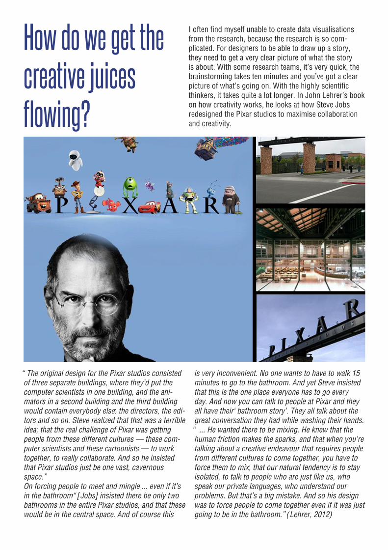
I often find myself unable to create data visualisations from the research, because the research is so com-plicated. For designers to be able to draw up a story, they need to get a very clear picture of what the story is about. With some research teams, it’s very quick, the brainstorming takes ten minutes and you’ve got a clear picture of what’s going on. With the highly scientific thinkers, it takes quite a lot longer. In John Lehrer’s book on how creativity works, he looks at how Steve Jobs redesigned the Pixar studios to maximise collaboration and creativity.
“The original design for the Pixar studios consisted of three separate buildings, where they’d put the computer scientists in one building, and the ani-mators in a second building and the third building would contain everybody else: the directors, the edi-tors and so on. Steve realized that that was a terrible idea; that the real challenge of Pixar was getting people from these different cultures — these com-puter scientists and these cartoonists — to work together, to really collaborate. And so he insisted that Pixar studios just be one vast, cavernousspace.” On forcing people to meet and mingle ... even if it’s in the bathroom “[Jobs] insisted there be only two bathrooms in the entire Pixar studios, and that these would be in the central space. And of course this
is very inconvenient. No one wants to have to walk 15 minutes to go to the bathroom. And yet Steve insisted that this is the one place everyone has to go every day. And now you can talk to people at Pixar and they all have their ‘bathroom story’. They all talk about the great conversation they had while washing their hands.“ ... He wanted there to be mixing. He knew that the human friction makes the sparks, and that when you’re talking about a creative endeavour that requires people from different cultures to come together, you have to force them to mix; that our natural tendency is to stayisolated, to talk to people who are just like us, who speak our private languages, who understand our problems. But that’s a big mistake. And so his design was to force people to come together even if it was just going to be in the bathroom.” (Lehrer, 2012)
To get researchers to think more creatively, we need them to engage with people other than researchers. “Researchers have to find their creativity by expos-ing themselves to a creative environment.” (Client)People get inspiration from other people, but currently, research teams work within the sameteams every day and if they don’t work within those teams, they work with other researchers. Creativity needs a few nutrients to keep it alive.
Fresh ideas don’t like repetition John Hunt describes it this way. “We are creatures of habit. And habit can serve its purpose. It’s great not to have to stop and think every morning whether your underpants go on before or after your trousers. But habit can also become so deeply ingrained, it produces a mental gridlock. If something new can-not be processed through pre-existing channels, it is rejected.
It’s very difficult to get a fresh idea through those addicted to routine. Their thinking grooves have become ruts. They don’t see doing the same thing over and over again for a long period of time as habit. They prefer words like consistency and conti-nuity. They aren’t just comfortable with year-on-year sameness, they’re proud of it.” (Hunt, 2009)
Creativity needs freedom “Ideas don’t happen in a vacuum. They’re sensi-tive to the environment and often take their cues from the prevailing mood. If you have a room full of scared people, they will tend to give you stiff, small ideas. Fear might be a strong catalyst for entrench-ing obedience, but it’s a lousy motivator for fresh thinking.” (Hunt, 2009)
Creative thinking is positive When finding a fresh idea, don’t think of the how. First find your idea, then find a way to make it hap-pen. Constantly asking how is a sign of fear to trysomething new. “An idea can’t be bossed into exist-ence. It has to be coaxed into light. In my experi-ence, that’s more likely to happen if the atmosphere is easy and a few smiles are scattered around the room. It’s an enigma, but many great ideas happen when you’re not trying too hard.” (Hunt, 2009)
Creativity does not have hierarchy Inspiration comes from everywhere and anywhere.“Anyone can have an idea. If we are all supposed to be equal before the law, we are even more equal before the idea.” (Hunt, 2009)
Creativity comes from true passion People perform better in something they’re passion-ate about and it is the same with designers. I’ve often found that if designers aren’t passionate or interested about a subject, the design outputs are dull.
Graham Sweet writes on how Brand Union as a creative company is working on becoming a greater company:
“Build a culture, not a company. Your biggest assets are your people, so rather than focusing on build-ing a company, shift your gaze to your culture. Your culture will define your company and have a domino effect on your most valuable assets. Solve problems, not briefs. This is easier said than done, your clients will fight you, internally it might even cause some discomfort and that’s all good. Don’t fight the friction, use it.
Collaborate. Sure you can sell anything but we’ve come to realise that working with other creative spe-cialists challenges us, delivers a better solution and saves us all some frustration. Hire thinkers: Inter-esting people that are willing to challenge and push past normality are the lifeblood of creativity. They are hard to find, so keep pushing until you find them and maybe even look outside of the industry.
Don’t charge for things that don’t matter. When you charge for something you add value to it. We don’t believe that a beautiful logo will solve a business problem so we’ve stopped charging for it. ‘Greater than’ will come from adding the right elements to the equation. It’s time. The longer we all sit around talk-ing about everything that is changing, the greater the chance that nothing will change.” (Sweet, 2012)
Not all researchers have the ability to think creatively; this is why it is so important for research agencies to pull in creative thinkers to stimulate and inspire other researchers to think differently. Why should we package insights or data?
Why should we package insights or data?
EASIER.
2.it
distributionmust make
INFORM.
1.the
packaging
needs to EASY.
3.
or archivingWarehousing
should beSELL.
4.
needs toit
“Never underestimate the importance of packaging. Marketers often measure consumer brand perceptions and ignore the pack. Yet we know from the way that consumers react to unbranded products that packaging plays a huge role in reinforcing consumer perceptions. Packaging helps to drive the way consumers experi-ence a product. Yet, we spend little time researching the connections between packaging and the direct experience of the product.” (Rice & Hofmeyr, 2000)
This is what we tell our clients, but are we practising what we preach with our own products? If we are, why and how are we doing it?
Soroka describes packaging as the science, art and technology of enclosing or protecting products for dis-tribution, storage, sale and use. Packaging also refers to the process of design, evaluation, and production of packages. Packaging can be described as a coor-
dinated system of preparing goods for transport, warehousing, logistics, sale and end use. Pack-aging contains, protects, preserves, transports, informs and sells (Soroka, 2002).
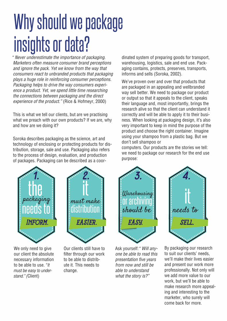
We’ve proven over and over that products that are packaged in an appealing and wellbranded way sell better. We need to package our product or output so that it appeals to the client, speaks their language and, most importantly, brings the research alive so that the client can understand it correctly and will be able to apply it to their busi-ness. When looking at packaging design, it’s also very important to keep in mind the purpose of the product and choose the right container. Imagine using your shampoo from a plastic bag. But we don’t sell shampoo or computers. Our products are the stories we tell: we need to package our research for the end use purpose:
We only need to give our client the absolute necessary information to be able to use. “It must be easy to under-stand.” (Client)
Our clients still have to filter through our work to be able to distrib-ute it. This needs to change.
Ask yourself: “Will any-one be able to read this presentation five years from now and still be able to understand what the story is?”
By packaging our research to suit our clients’ needs, we’ll make their lives easier and present our work more professionally. Not only will we add more value to our work, but we’ll be able to make research more appeal-ing and interesting to the marketer, who surely will come back for more.
Take Caxton for example, a huge publishing house with a number of different magazines on shop shelves. Customers might not even know that they’re buying two completely different magazines from the same publishing house. Caxton under-stands their readers and has found that they need to brand and write completely differently to their different target markets.
We can compare our clients to this: each and every client is unique with their own business issues and their own culture. To be a better research partner, we need to understand the client’s business thor-oughly and customise our thinking and writing method as well as our packaging so that it suits the client’s style. “I want my research partner to become proactive in my business. If the research agency gets a better understanding of our day-to-day business issue, they’ll be able to deliver what are the most important business factors to dis-cuss.” (Client)
How do we package insights?Currently, we are all used to delivering our presen-tations and reports in PowerPoint or sometimes in Word document format. These contain all the data which is shown in graphs as well as key analysis and summaries. Why are we doing it this way? Can we add value to our packaging? Is there a gap for change?
The invention of PowerPoint was a major break-through in data delivery and is a very cost- effective and easy-to-use tool to package data, but it can also easily take us back to the 60s era of data delivery. PowerPoint is a great tool for data delivery, but re-searchers should be careful that it’s used effectively to communicate the research and that the delivery doesn’t end up being a data dump.
In my experience in working with researchers, I’ve found that very often, charting time is crunch time in all projects. We only have about a week to get all data analysed and packaged to be delivered to clients. So, when we get the tables, we try and get it into PowerPoint as fast as possible. Do not be
mistaken and throw PowerPoint out of the window, it is a very powerful tool. We just have to get back to the basics of analysing the numbers before we even start charting to be able to communicate the research effectively. We need to start acting like journalists and editors; we need to find a story, look for the support-ing evidence in the data set as well as secondary data sources and deliver meaningful business stories to our clients. “Ask yourself: If I was the client, what would I want to know from this study?” (Client). In this new era of data delivery, we need to be very care-ful of what they call “death by PowerPoint”.
“The main goal of data visualization is its ability to visualize data, communicating information clearly and effectively. It doesn’t mean that data visualization needs to look boring to be functional or extremely sophisticated to look beautiful. To convey ideas ef-fectively, both aesthetic form and functionality need to go hand in hand, providing insights into a rather sparse and complex data set by communicating its key aspects in a more intuitive way” (Friedman, 2008). Data visualisation is one way of packaging data that is becoming more popular within the re-search industry. Researchers often misinterpret the term “data visualisation”. When we package data, there’s a clear difference between inserting pictures into a presentation and making the presentation visual.
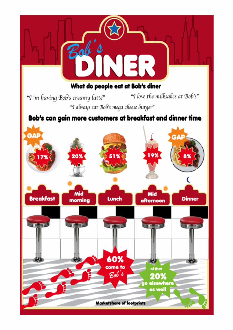
Here’s a good example. I worked on a presentation recently, which mainly consisted of tables. It was the correct information for a researcher to understand, but the audience didn’t consist of researchers, it was the brand team. The client felt that the brand team would be bored with the presentation and requested the presentation to be more visual. The research team added some pictures, because to them the numbers were visual enough. Researchers are used to looking at those numbers, they can visualise what they mean, but the brand team can’t. This is when the graphics team had to jump in by listening to the story and step by step unravelling the story behind each number. Only then could we visualise the story and paint the pictures to help tell the story. The presenter’s re-sponse: “I’m actually excited to present this now!” Data visualisation is not inserting pictures in a pres-entation. It is rather taking the numbers, transporting them into a written or spoken story and only then finding very relevant images to support that story.
How about trying something new, why always Pow-erPoint? Up to now, the research industry hasn’t explored any different way of packaging insights.
It’s always a charted presentation or report. How about packaging a proposal on a cereal box or delivering a presentation as a game? It sounds crazy, but it’s possible. Your audience get the op-portunity to interact and experience the presenta-tion. If you’re only delivering a proposal or tender and you aren’t presenting it, the packaging is your most powerful communication tool. You have to rely on your product delivery for your client to experience the category way before the research process even starts. Our clients want the assur-ance that we care about their business as much as we care about our own and by packaging their information in such a way, we show them that we really care.
Taking a closer look behind the picturesWhen we package information, especially when working with research, there are some key facts to consider in being able to communicate the story effectively. By making use of all design elements in a good balance, we’ll be able to succeed in making data visual without compromising the numbers. The key fact which we always need to keep in mind is that we need to tell a story.
ColourCurrently, we are used to charting in our branded templates or clients’ branded templates, which have been set up with the company’s pre-ap-proved colours. Colours are psychological; every colour has a different personality which makes it an extremely powerful design element to get messages across. Data visualisation cannot be restricted to a certain set of colours. By knowing the physiological and cultural meaning of different colours, we can use them to tell more powerful stories. We need to think like journalists. Our story and the way we tell it, will become our branding. If we want to succeed in this new data visualisation era, we need to explore all different tools that we can use to make it work, and we cannot be hand-cuffed to so many rules and restrictions.
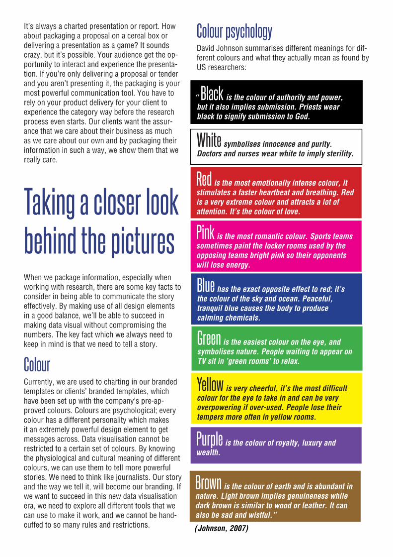
Colour psychologyDavid Johnson summarises different meanings for dif-ferent colours and what they actually mean as found by US researchers:
“Black is the colour of authority and power, but it also implies submission. Priests wear black to signify submission to God.
White symbolises innocence and purity. Doctors and nurses wear white to imply sterility.
Red is the most emotionally intense colour, it stimulates a faster heartbeat and breathing. Red is a very extreme colour and attracts a lot of attention. It’s the colour of love.
Pink is the most romantic colour. Sports teams sometimes paint the locker rooms used by the opposing teams bright pink so their opponents will lose energy.
Blue has the exact opposite effect to red; it’s the colour of the sky and ocean. Peaceful, tranquil blue causes the body to produce calming chemicals.
Green is the easiest colour on the eye, and symbolises nature. People waiting to appear on TV sit in ’green rooms’ to relax.
Yellow is very cheerful, it’s the most difficult colour for the eye to take in and can be very overpowering if over-used. People lose their tempers more often in yellow rooms.
Purple is the colour of royalty, luxury and wealth.
Brown is the colour of earth and is abundant in nature. Light brown implies genuineness while dark brown is similar to wood or leather. It can also be sad and wistful.”
(Johnson, 2007)
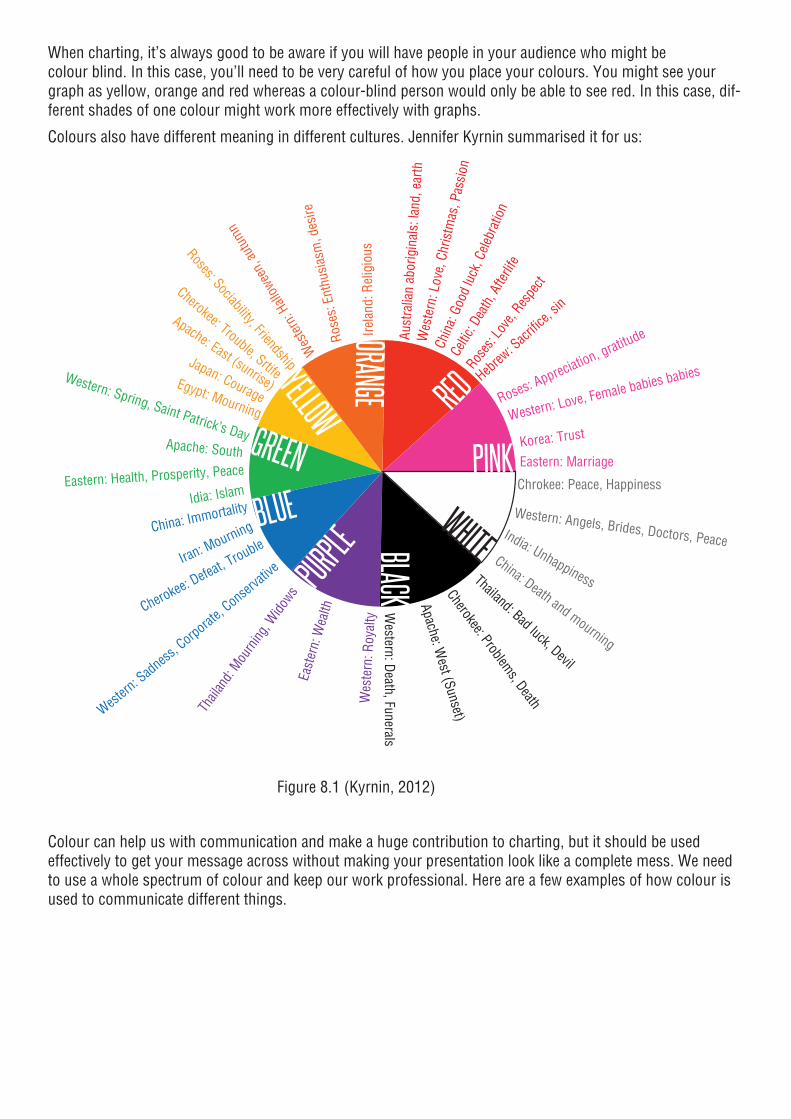
When charting, it’s always good to be aware if you will have people in your audience who might be colour blind. In this case, you’ll need to be very careful of how you place your colours. You might see your graph as yellow, orange and red whereas a colour-blind person would only be able to see red. In this case, dif-ferent shades of one colour might work more effectively with graphs.
Colours also have different meaning in different cultures. Jennifer Kyrnin summarised it for us:
PINK
WHITEBLACKPURPLE
BLUE
GREENYELLOW
ORANGE RED Roses: Appreciation, gratitude
Western: Love, Female babies babies
Eastern: MarriageKorea: Trust
Wes
tern
: Lov
e, C
hris
tmas
, Pas
sion
Aust
ralia
n ab
orig
inal
s: la
nd, e
arth
Chin
a: G
ood
luck
, Cele
brat
ion
Celtic
: Dea
th, A
fterli
fe
Hebrew
: Sacr
ifice,
sin
Roses
: Lov
e, Res
pect
Irela
nd: R
elig
ious
Rose
s: E
nthu
sias
m, d
esire
Wes
tern:
Hall
owee
n, au
tum
n
Roses: Sociability, Friendship
Cherokee: Trouble, Srtife
Apache: East (sunrise)
Japan: CourageEgypt: Mourning
Apache: South
Idia: IslamEastern: Health, Prosperity, Peace
Western: Spring, Saint Patrick’s Day
Cherokee: Defeat, TroubleChina: Immortality
Iran: Mourning
Western
: Sadness
, Corporat
e, Conser
vative
Thail
and:
Mourn
ing, W
idows
East
ern:
Wea
lth
Wes
tern
: Roy
alty
Chrokee: Peace, Happiness
China: Death and mourning
India: Unhappiness
Western: Angels, Brides, Doctors, Peace
Western: Death, Funerals
Apache: West (Sunset)
Cherokee: Problems, Death
Thailand: Bad luck, Devil
Figure 8.1 (Kyrnin, 2012)
Colour can help us with communication and make a huge contribution to charting, but it should be used effectively to get your message across without making your presentation look like a complete mess. We need to use a whole spectrum of colour and keep our work professional. Here are a few examples of how colour is used to communicate different things.
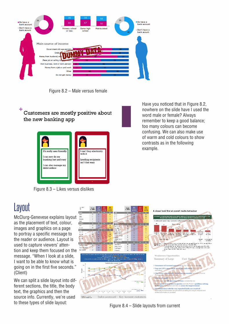
Figure 8.2 – Male versus female
Have you noticed that in Figure 8.2, nowhere on the slide have I used the word male or female? Always remember to keep a good balance; too many colours can become confusing. We can also make use of warm and cold colours to show contrasts as in the following example.
Figure 8.3 – Likes versus dislikes
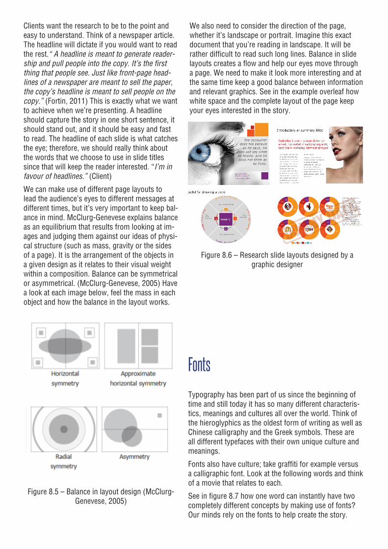
LayoutMcClurg-Genevese explains layout as the placement of text, colour, images and graphics on a page to portray a specific message to the reader or audience. Layout is used to capture viewers’ atten-tion and keep them focused on the message. “When I look at a slide, I want to be able to know what is going on in the first five seconds.” (Client)
We can split a slide layout into dif-ferent sections, the title, the body text, the graphics and then the source info. Currently, we’re used to these types of slide layout:
Figure 8.4 – Slide layouts from current
Clients want the research to be to the point and easy to understand. Think of a newspaper article. The headline will dictate if you would want to read the rest. “A headline is meant to generate reader-ship and pull people into the copy. It’s the first thing that people see. Just like front-page head-lines of a newspaper are meant to sell the paper, the copy’s headline is meant to sell people on the copy.” (Fortin, 2011) This is exactly what we want to achieve when we’re presenting. A headline should capture the story in one short sentence, it should stand out, and it should be easy and fast to read. The headline of each slide is what catches the eye; therefore, we should really think about the words that we choose to use in slide titles since that will keep the reader interested. “I’m in favour of headlines.” (Client)
We can make use of different page layouts to lead the audience’s eyes to different messages at different times, but it’s very important to keep bal-ance in mind. McClurg-Genevese explains balance as an equilibrium that results from looking at im-ages and judging them against our ideas of physi-cal structure (such as mass, gravity or the sides of a page). It is the arrangement of the objects in a given design as it relates to their visual weight within a composition. Balance can be symmetrical or asymmetrical. (McClurg-Genevese, 2005) Have a look at each image below, feel the mass in each object and how the balance in the layout works.
Figure 8.5 – Balance in layout design (McClurg-Genevese, 2005)
We also need to consider the direction of the page, whether it’s landscape or portrait. Imagine this exact document that you’re reading in landscape. It will be rather difficult to read such long lines. Balance in slide layouts creates a flow and help our eyes move through a page. We need to make it look more interesting and at the same time keep a good balance between information and relevant graphics. See in the example overleaf how white space and the complete layout of the page keep your eyes interested in the story.
Figure 8.6 – Research slide layouts designed by a graphic designer
Fonts
Typography has been part of us since the beginning of time and still today it has so many different characteris-tics, meanings and cultures all over the world. Think of the hieroglyphics as the oldest form of writing as well as Chinese calligraphy and the Greek symbols. These are all different typefaces with their own unique culture and meanings.
Fonts also have culture; take graffiti for example versus a calligraphic font. Look at the following words and think of a movie that relates to each.
See in figure 8.7 how one word can instantly have two completely different concepts by making use of fonts? Our minds rely on the fonts to help create the story.
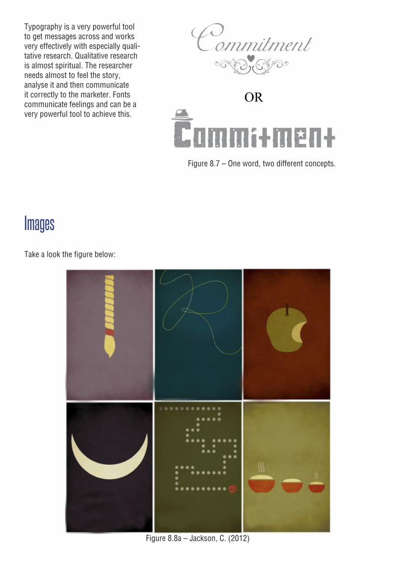
Typography is a very powerful tool to get messages across and works very effectively with especially quali-tative research. Qualitative research is almost spiritual. The researcher needs almost to feel the story, analyse it and then communicate it correctly to the marketer. Fonts communicate feelings and can be a very powerful tool to achieve this.
Figure 8.7 – One word, two different concepts.
Images
Take a look the figure below:
Figure 8.8a – Jackson, C. (2012)
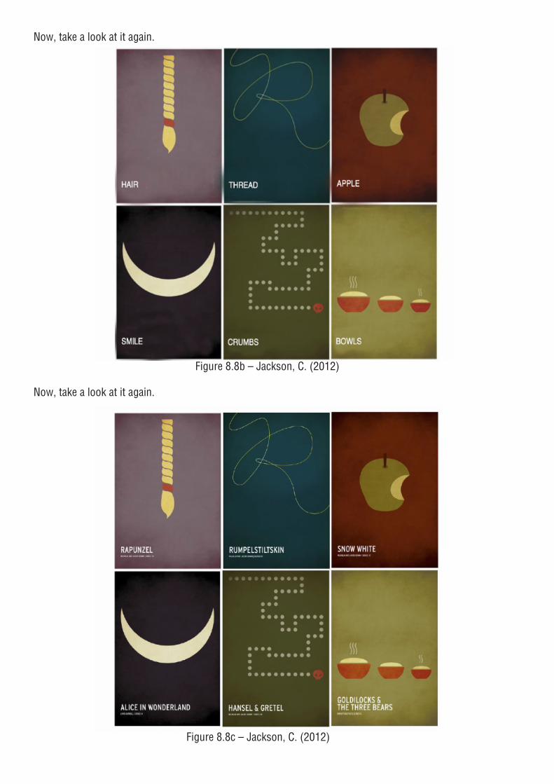
Now, take a look at it again.
Figure 8.8b – Jackson, C. (2012)
Now, take a look at it again.
Figure 8.8c – Jackson, C. (2012)
See how important it is to choose the correct supporting image with what you are trying to say and how your mind connects the word, the image and the story? What if we didn’t know the story: would “Snow White” together with an apple make any sense? The truth is, our clients don’t know our stories until we tell them the stories. Now it becomes a bit trickier to find the correct image to bring the story to life, but once a client is familiar with the story, the image will stick to it and the story will be more memorable. I remember when I was little, my mom took me to my very first movie at the cinema. We went to see The Little Mermaid. Being Afrikaans-speaking, I didn’t understand one word, but I knew exactly what was happening. I didn’t know the name of the movie, but I remem-bered that we watched the fish girl and her friends.
“Qualitative research in the industry is a major prob-lem. I received a qualitative presentation the other day which did not even have one single picture in. Qual needs to be visualised, I want to see what my target consumer looks like. I want to know exactly what his or her lifestyle looks like.” (Client)
When we’re working with research, we have to keep in mind that our work is archived and used over and over again. It is very important that there’s a good balance between pictures and information and that the pictures don’t replace information. Some might argue and say that images are a distraction from what is being presented, but we’re living in a century where information needs to happen faster and by making use of the correct images, we will be able to achieve this. It is up to us to use the right images with the right information. Pictures do not always equal im-ages.
Symbols
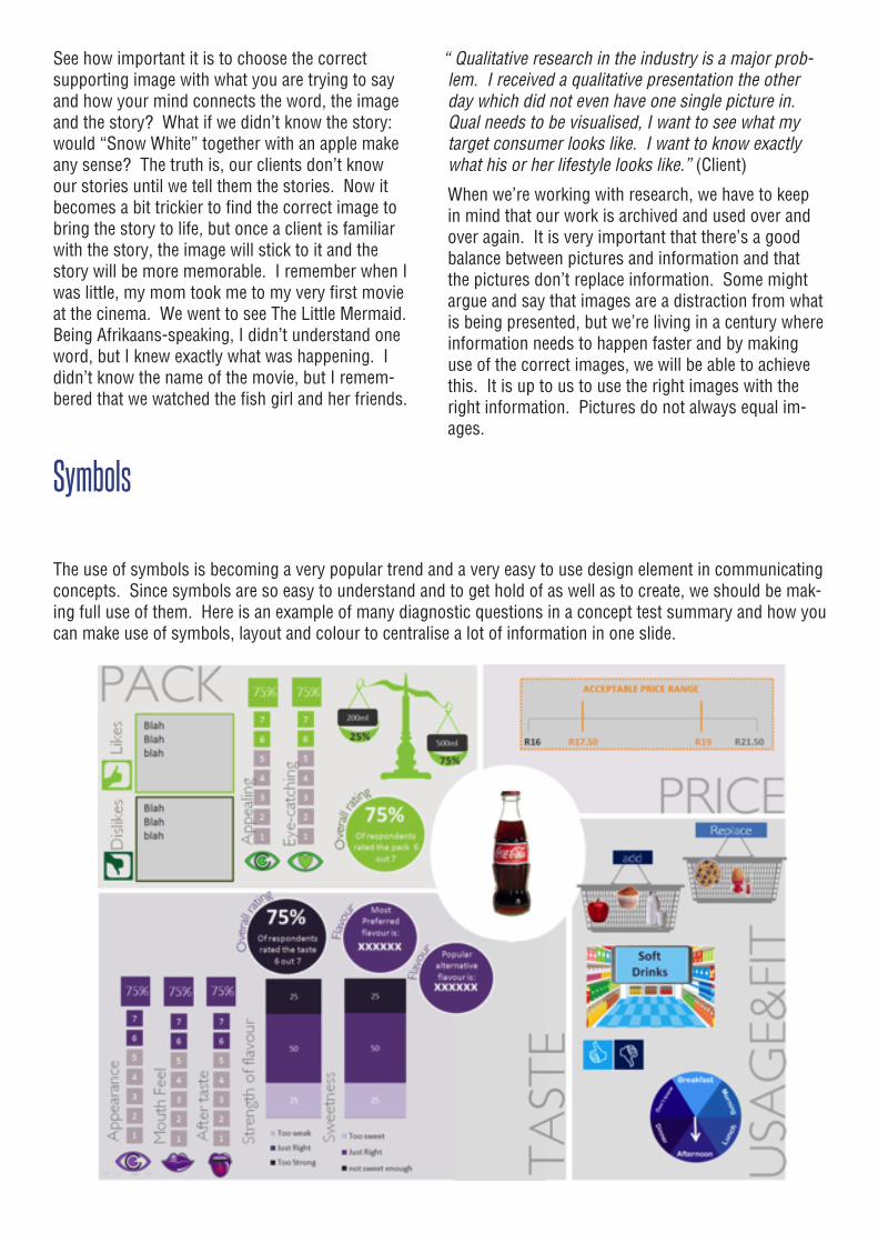
The use of symbols is becoming a very popular trend and a very easy to use design element in communicating concepts. Since symbols are so easy to understand and to get hold of as well as to create, we should be mak-ing full use of them. Here is an example of many diagnostic questions in a concept test summary and how you can make use of symbols, layout and colour to centralise a lot of information in one slide.
GraphsGraphs (aka, researchers’ happy place) are our main communication tool when charting presentations. We are all very familiar with graphs and how to use them and we do so quite effectively as all data outputs are charted presentations. Be careful of graphs. PowerPoint makes it very easy to produce graphs and therefore drives us into a habit of only producing graphs, which leads to data dumping and very old school research output. If we are going to drop all our data into graphs, we might as well just deliver the tables in data books.
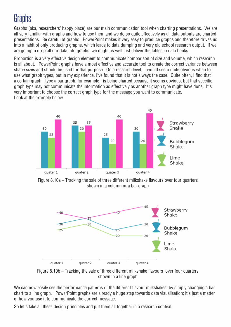
Proportion is a very effective design element to communicate comparison of size and volume, which research is all about. PowerPoint graphs have a most effective and accurate tool to create the correct variance between shape sizes and should be used for that purpose. On a research level, it would seem quite obvious when to use what graph types, but in my experience, I’ve found that it is not always the case. Quite often, I find that a certain graph - type a bar graph, for example - is being charted because it seems obvious, but that specific graph type may not communicate the information as effectively as another graph type might have done. It’s very important to choose the correct graph type for the message you want to communicate. Look at the example below.
Figure 8.10a – Tracking the sale of three different milkshake flavours over four quarters shown in a column or a bar graph
Figure 8.10b – Tracking the sale of three different milkshake flavours over four quarters shown in a line graph
We can now easily see the performance patterns of the different flavour milkshakes, by simply changing a bar chart to a line graph. PowerPoint graphs are already a huge step towards data visualisation; it’s just a matter of how you use it to communicate the correct message.
So let’s take all these design principles and put them all together in a research context.
In conclusionThe days when research was all about delivering data, finding the numbers and skews, are long gone. The research agency has become a “must have” business partner to every single company who wants to survive these days. We need to get inside our client’s business to be able to under-stand their needs thoroughly. By doing that, we’ll be able to deliver much more than just numbers and facts.
Research agencies can benefit from a visual design team which allows researchers more time to un-derstand the research in the context of the client’s business and enables them to tell more powerful, business-related stories. Being a very underdevel-oped area within the research industry, the other challenge that we’re facing is that graphic design-ers do not get any training in research. This means that the design team needs to get a fair amount of training to be able to understand the research language before they can assist the research team to think more creatively. “I want my presentations to be visual; the more visual the better, just don’t lose the important message.” (Client)
The research industry needs to innovate towards this new era of data delivery. “Researchers need to allow themselves more time to go through three levels of analysis to get the most important facts out of the data” (Client). Time is always an issue, but it also causes us to lose value and that is one thing we shouldn’t compromise on. The analysis stage is where the most important story lies. “I only want to see the most important informa-tion. If something is not important, don’t show it to me.” (Client)
I’ve put together a few pointers that I’ve learned from clients as well as research teams:
1. Take the time to analyse the data and find the story before you run to PowerPoint. Pictures are a distraction when you don’t have your story straight. Leave the pictures to the pros and take the time to find your story. “I don’t mind pic-tures, but they shouldn’t be gap-fillers. Then they start to be a distraction from what’s going on in the slide.” (Client)
2. Tell your story to someone who’s not a researcher.
3. Can’t get to the bottom of the story? Get up and out of your number environment and move into a creative space, then go back to the numbers. Think of Jobs’ experiment with the Pixar bath-rooms.
4. Don’t present facts and figures, tell a story. Pres-entation audiences are visualisers, they want to experience a presentation. Entertain and engage with your audience.
5. Package your product for its purpose and al-ways be relevant. Would you package cereal in a shampoo bottle? Our product is our story; pack-age it to tell that story.
As Albert Einstein said: “Insanity: doing the same thing over and over again and expecting different re-sults”. Nothing will change if we don’t try new things. It will just drive us to habit. Our habits are our com-fort zones, we need to step out of that to achieve new things, and remember Bernbach.
“The truth isn’t the truth until people believe you, and they can’t believe you if they don’t know what you’re saying, and they can’t know what you’re saying if they don’t listen to you, and they won’t listen to you if you’re not interesting, and you won’t be interesting unless you say things imaginatively, originally, freshly.”
Bill Bernbach (Sullivan, 1998)
ReferencesCatone, J. (2008). “What the Heck Happened to our Attention Spans?”. URL:http://www.sitepoint.com/what-the-heck-happened-to-our-attention-spans/.html. Accessed on 15 January 2012.
BBC. (2002). “Turning into digital goldfish”. URL: http://news.bbc.co.uk/2/hi/science/na-ture/1834682.stm. Accessed on 15 January 2012.
Schrift, S. (2010). “Four Different Ways People Process Your Information”. URL: http://schrift.com/blog/archives/217. Accessed on 4 March 2012.
Lehrer, J. (2012). “Imagine: How Crea-tivity Works”. URL: http://www.npr.org/2012/03/19/148777350/how-creativity-works-its-all-in-your-imagination.html. Accessed on 18 April 2012.
Soroka. (2002). “Fundamentals of Packaging Technology”,URL: http://en.wikipedia.org/wiki/Packaging_and_labeling#cite_ref-0. Accessed on 30 March 2012.
Sullivan, L. (1998). “Hey whipple, squeeze this.” John Wiley & Sons, Inc.
Jackson, C. (2012). “From Rapunzel to The Little Red Riding Hood, Beloved Children’s Classics as Minimalist Posters, Maria Popova”. URL: http://www.brainpickings.org/index.php/2012/02/27/childrens-book-posters/.html. Accessed on 3 April 2012.
Hofmeyr, J & Rice, B. (2000). “Commitment-led marketing”, John Wiley & Sons Ltd.
Hunt, J. (2009). “The art of the idea and how it can change your life”. Zebra Press.
Friedman, V. (2008). “Data Visualization and Infographics.” URL: http://www.smashingmaga-zine.com/2008/01/14/monday-inspiration-data-visualization-and-infographics/. Accessed on 7 May 2012.
McClurg-Genevese, J.D. (2005). “The Principles of Design.” URL: http://www.digital-web.com/articles/principles_of_design/. Accessed on 2 May 2012.
Johnson, D. (2007). “Do different colors affect your mood?” URL: http://www.infoplease.com/spot/colors1.html. Accessed on 2 May 2012.
Entrepreneur Media. (2012). URL: Inchttp://www.entre-preneur.com/encyclopedia/term/82326.html. Accessed on 5 April 2012.
Kyrnin, J. (2012). “Visual Color Symbolism Chart by Culture”. URL: http://webdesign.about.com/od/colorcharts/l/bl_colorculture.htm. Accessed on 25 April 2012.
Sweet, G. (2012). “If our industry is changing, why hasn’t anything changed?”. Brand Union.
Goins, J (2011). “5 Easy Tricks to Help You Write Catchy Headlines”. URL: http://goinswriter.com/catchy-headlines/ Accessed on 3 May 2012
Fortin, M (2011). “Write Magnetic Headlines With These 7 Tips”. URL: http://michelfortin.com/write-magnetic-headlines-with-these-7-tips/ Accessed on 7 May 2012