a university-wide responsive redesign rob goldberg director, web communications, drexel university...
TRANSCRIPT

A University-wide Responsive Redesign
Rob GoldbergDirector, Web Communications, Drexel

About me
• Director of Web Communications at Drexel University
• Consider myself a "deseloper"
• Dangerous around databases; you lost at me at "joins" and I have never used node.js
• Background in document and website planning in the medical and environmental engineering fields

Drexel Background
• Private university in West Philadelphia
• 25K students (5k of these online)
• 14 colleges and schools (medical, law, public health)
• Best known for engineering and co-op program, which is a (mostly) paid, required internship program.
• We have one tree . . . so we couldn't do "a girl with a guitar under a tree" marketing if even if we wanted to.

Our Brand• Brash, fast paced
• Technologically forward
• City as a campus
• Entrepreneurial, experiential

Our Web Universe
• Core marketing site of about 200 pages
• 14 college/school sites
• 35 "provostial" sites
• 25 administrative sites
• No content Intranet, other than a loose collection of Sharepoint sites.
• Analytics not integrated; governance loose. I chair a Webmasters' group. I approve all new sites in the CMS.
• WE HAVE TOO MANY SITES . . .

The Team
• Director of Web Communications, me
• One point five additional developers under me.
• Sigh . . .
• However, there are about 10 other staffers in our IT shop who build site skeletons, train CMS users, and develop CMS components.
• Departments are expected to maintain their own content but . . .

Agile-ish approach
• Frequent short meetings with defined agendas
• Used Basecamp for review of deliverables
• Engaged Navigation Arts of McLean, VA, a shop with tons of experience creating new navigation patterns in large sites, also Sitecore partner.
• The site Won a 2013 Webby for the design in the School/University category
How We Chose Responsive• Based on Analytics (mobile now consistently 10
percent of traffic; up from 7 percent in April 2012)
• Our brand: technological, forward-thinking, urban
• Governance issues mean very few people maintain a lot of sites - so one content codebase very important
• Multi-platform world (The New Multi-Screen World Study, Google; Online access in a multiplatform world, Pew Internet)

Fewest breakpoints while still addressing high resolution
• Mobile - <740 px• Portrait - min-width:740px• Landscape - min-width:1020px• Computer - min-width:1260px

Why care about those super high res displays?
• They belong to thought leaders.
• They are increasingly common.
• Recently, in typical months, 50% of visits are on screens with 1280 px horizontal or much higher.

Tablet traffic significant (core site)

Our Technical Approach• Performance on mobile platforms important• Via javascript, we look at screen.width and serve up
an appropriately sized background image.• In this context, screen.width is the max number of
pixels the device can display in a horizontal dimension (a "browser object")
• Desktop users essentially get only the largest background that is resized at the different views
• Three additional sizes are prepared for each hero shot (landing pages only) and are served up only on those devices
• We listen to window resize and scale the full backgrounds to either 100% width or height

Want to geek out more?
• We dynamically insert an img tag that is built on data attributes on the noscript tag.
• Want more? Firebug script.js on a top level page.
• Bottom line: no double download and no server dependency!

How about source order?
• In one instance, we had to check for "hasTouch" in modernizer and then use the jQuery insert.before function to shuffle a div that contained an H1.
• Otherwise, it made no sense on mobile.

Some Labor Involved• We have to prepare and "art-direct" four
background images for each page with a hero shot.
• Could not use server-side because they are all different aspect ratios!

Our Creative Approach• Full screen immersive approach
• Images with a sense of depth
• You are here
• Stowable panels and a fixed footer
• Calls to action in a drawer and information up top
• Calls to action are Yellow
• These are carried over into departments but footer is now sticky not fixed and is not expandable

The Footer
• Fixed at the bottom of the viewport for core site
• This was to keep those tasks in the core site footer visible.
• Sticky for departmental sites, which essentially positions the footer at the bottom of the window when the content is shallow but acts like a normal footer when the content is tall.

For Departments/Colleges• Two alternatives: banner and bannerless.
• Just not realistic to expect certain stakeholders to have a site that appears to be a sub-section of a main site.
• Example of a banner-ed subsite
• Example of an administrative sub-site

Many Pitfalls Here

Fixed width versus . . .
They love the image banner and the fixed layout . . .

Responsive
Every component on this page is responsive.
. . . But the IE8 user does not see this or even see the valiue of this labor.
• The core website was easy because it was small enough that cut and paste was our migration tool
• Existing sites challenges:
• Some content not structured: often one big blob
• "How hard could it be?"
• "All the content's in the database."
• Kitchen sink IA; this stuff should be in the (non-existent) Intranet
We Tried to Make the Robots Do It

Some tricks
• CMS migration tool maps as much as it can.
• Gets you about 60 Percent there.
• You still have to custom code the home and sidebars.
• Sidebar Hell: need them because widest view is now 1200 px, so MUST limit line length
• Since we have too many sites, some are thinly filled with content and to get the site owner to think about a sidebar for each page would be fruitless
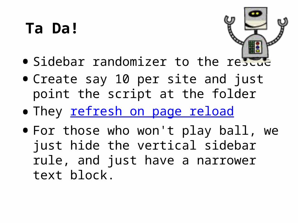
Ta Da!
• Sidebar randomizer to the rescue
• Create say 10 per site and just point the script at the folder
• They refresh on page reload
• For those who won't play ball, we just hide the vertical sidebar rule, and just have a narrower text block.

Internal promotion
• I chair a 40-person webmasters' group
• Demoed the approach, and many are eager to use the new responsive approach.
• Send out emails via a listserv
• http://drexel.edu/identity
• Barcamps with pico projector and free food
• This is cheaper than departmental room rental fees!

Sad Trombone

Learn from our Blunders• Who owns the content?
• Make a spreadsheet and hold people to it.
• Last-minute negotiations about main nav labeling
• IE8 lives on in the C Suite
• Aaaaarrrrrrrggggh
• No universal PC drive image
• University as a loose affiliation of warring fiefdoms
• My cudgel: "One University" as a pillar of our strategic plan

The ROI
• Time on page - no change
• Bounce rate - no change
• Total applications to Drexel increased
• (Problem here is that huge internal traffic obscures changes in true customers' traffic)
• So, filtering out internal
• "It Looks Legit"

Lessons Learned• Let the C suite know this will take more time
• Hire a consultant committed to clean and well commented code.
• Internal PR as to the benefits of responsive is crucial.
• Internal messaging about just what responsive is
• Think out your IE support strategy and policy from the get go.
• Try to anticipate some of the governance gotchas, e.g., not enough room in the design for what (powerful) people want to jam in there.
• My motto: "You have to live to fight another day."