accelerometer data analysis and presentation · pdf fileoctave band root-mean-square...
TRANSCRIPT
Accelerometer Data Analysis and
Presentation Techniques
Melissa J. B. Rogers, Kenneth Hrovat, Kevin McPherson*,
Milton E. Moskowitz, Timothy Reckart
Tal-Cut Company at NASA Lewis Research Center, Cleveland, Ohio 44135
*NASA Lewis Research Center, Cleveland, Ohio 44135
September 1997
https://ntrs.nasa.gov/search.jsp?R=19970034695 2018-05-02T06:55:00+00:00Z

ACCELEROMETER DATA ANALYSIS AND PRESENTATION TECHNIQUES
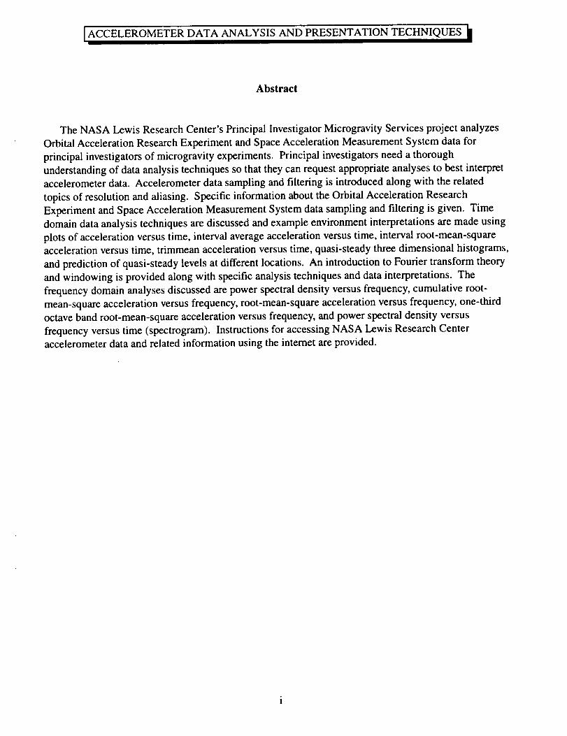
Abstract
The NASA Lewis Research Center's Principal Investigator Microgravity Services project analyzes
Orbital Acceleration Research Experiment and Space Acceleration Measurement System data for
principal investigators of microgravity experiments. Principal investigators need a thorough
understanding of data analysis techniques so that they can request appropriate analyses to best interpret
accelerometer data. Accelerometer data sampling and filtering is introduced along with the related
topics of resolution and aliasing. Specific information about the Orbital Acceleration Research
Experiment and Space Acceleration Measurement System data sampling and filtering is given. Time
domain data analysis techniques are discussed and example environment interpretations are made using
plots of acceleration versus time, interval average acceleration versus time, interval root-mean-square
acceleration versus time, trimmean acceleration versus time, quasi-steady three dimensional histograms,
and prediction of quasi-steady levels at different locations. An introduction to Fourier transform theory
and windowing is provided along with specific analysis techniques and data interpretations. The
frequency domain analyses discussed are power spectral density versus frequency, cumulative root-
mean-square acceleration versus frequency, root-mean-square acceleration versus frequency, one-third
octave band root-mean-square acceleration versus frequency, and power spectral density versus
frequency versus time (spectrogram). Instructions for accessing NASA Lewis Research Center
accelerometer data and related information using the internet are provided.
ACCELEROMETERDATA ANALYSIS AND PRESENTATIONTECHNIQUES
Acronym List
accel
acea
gg
aggnew
aggOARE
aIlcw
aOARE
aromew
arotOARE
avg
CG
cumRMS
dF
dT
f
ffhigh
fNf
s
ftp
g
gRMS
Hz
J
k
L
LSLE
m
M
N
acceleration
acceleration
acceleration
acceleration
acceleration
acceleration
acceleration
acceleration
vector magnitude
at the Orbiter center of gravity, mapped from OARE
due to gravity gradient effects
due to gravity gradient effects at a new location
due to gravity gradient effects at OARE location
at a new location, mapped from OARE
at OARE location
due to rotational effects at a new location
acceleration due to rotational effects at OARE location
subscript denoting average value
center of gravity
subscript denoting cumulative RMS value
frequency resolution (Hertz)
time resolution/sampling interval (seconds)
frequency (Hertz)
filter cutoff frequency (Hertz)
index for upper frequency of frequency band (Hertz)
index for lower frequency of frequency band (Hertz)
Nyquist frequency (Hertz)
time series sampling frequency (samples per second)
file transfer protocol
acceleration due to gravity at Earth's surface (9.8 rn/s 2)
root-mean-square acceleration level
Hertz
number of time series intervals used in frequency domain analyses
(N-l)/2 ifN is odd; (N/2)+l ifN is even
Life Sciences Laboratory Equipment
subscript for Fourier series; abbreviation for mAf
number of points in time series interval used in analysis
total number of points in a time series
ii
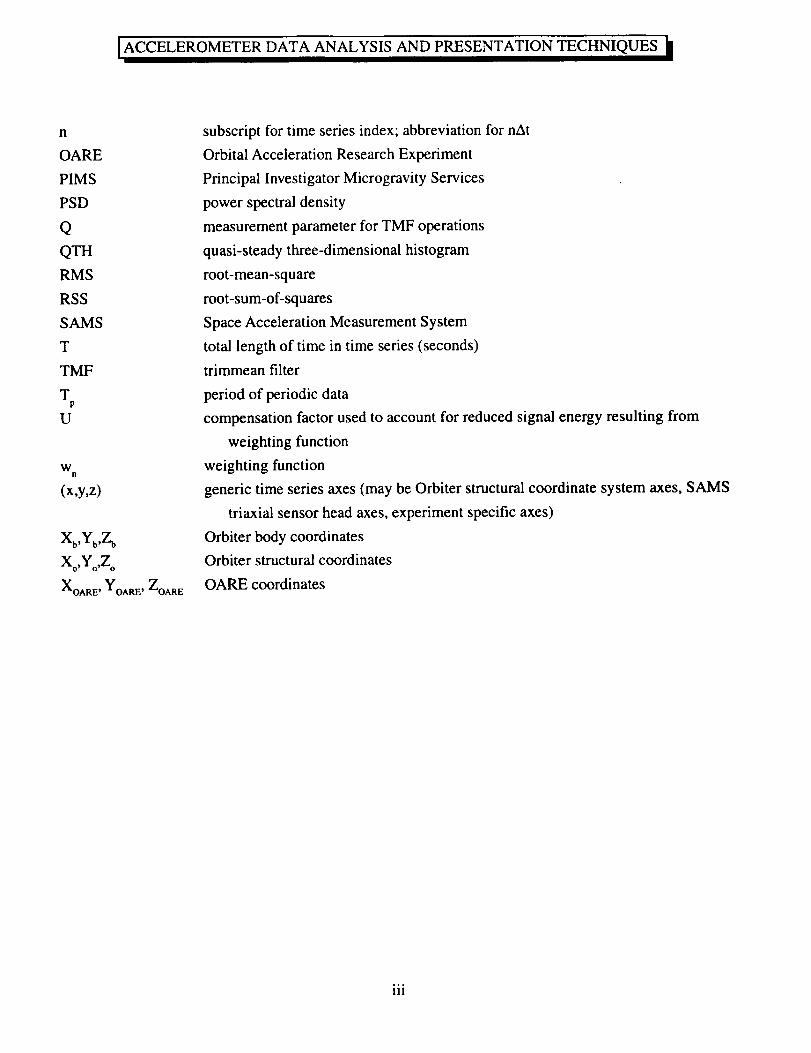
n
OARE
PIMS
PSD
Q
QTH
RMS
RSS
SAMS
T
TMF
TP
U
WB
(x,y,z)
Xb,Yb,Z b
Xo,Yo,Z o
XOARE' YOARE' ZOARE
subscript for time series index; abbreviation for nAt
Orbital Acceleration Research Experiment
Principal Investigator Microgravity Services
power spectral density
measurement parameter for TMF operations
quasi-steady three-dimensional histogram
root-mean-square
root-sum-of-squares
Space Acceleration Measurement System
total length of time in time series (seconds)
trimmean filter
period of periodic data
compensation factor used to account for reduced signal energy resulting from
weighting function
weighting function
generic time series axes (may be Orbiter structural coordinate system axes, SAMS
triaxial sensor head axes, experiment specific axes)
Orbiter body coordinates
Orbiter structural coordinates
OARE coordinates
111
I ACCELEROMETER DATA ANALYSIS AND PRESENTATION TECHNIQUES It
Table of Contents
Abstract ........................................................................................................................................................ i
Abbreviations and Acronyms ..................................................................................................................... iiTable of Contents ....................................................................................................................................... iv
List of Tables .............................................................................................................................................. v
List of Figures ............................................................................................................................................. v1. Introduction ......................................................................................................................................... 1
2. Data Analysis and Presentation Techniques ........................................................................................ 1
2.1 Data Sampling, Frequency Limits, Resolution, and Aliasing ........................................................ 2
2.1.1 General Notes ......................................................................................................................... 2
2.1.20ARE and SAMS Sampling and Filtering ............................................................................. 3
2.2 Time Domain Analysis .................................................................................................................. 42.2.1 Acceleration versus Time ........................................................................................................ 4
2.2.2 Interval Average Acceleration versus Time ............................................................................ 5
2.2.3 Interval Root-Mean-Square Acceleration versus Time ........................................................... 62.2.4 Trimmean Acceleration versus Time ...................................................................................... 6
2.2.5 Quasi-steady Three-dimensional Histogram .......................................................................... 7
2.2.6 Mapping of OARE Data to Alternate Locations ..................................................................... 8
2.3 Fourier Transform Theory and Windowing ................................................................................... 8
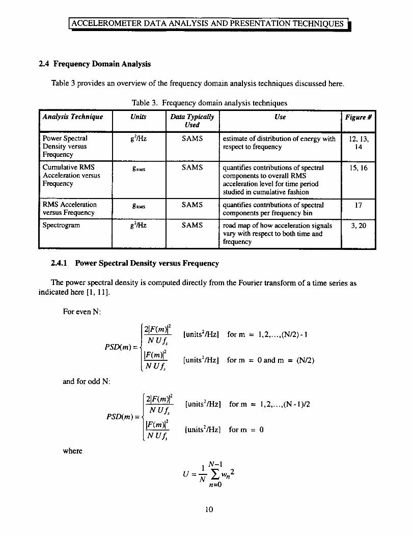
2.4 Frequency Domain Analysis ........................................................................................................ 10
2.4.1 Power Spectral Density versus Frequency ............................................................................ 10
2.4.2 Cumulative RMS Acceleration versus Frequency ................................................................ 11
2.4.3 Root-Mean-Square Acceleration versus Frequency ............................................................. 12
2.4.4 One Third Octave Band RMS Acceleration versus Frequency ............................................ 12
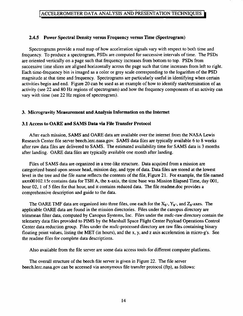
2.4.5 Power Spectral Density versus Frequency versus Time (Spectrogram) ............................... 14
3. Microgravity Measurement and Analysis Information on the Internet .............................................. 14
3.1 Access to OARE and SAMS Data via File Transfer Protocol ..................................................... 14
3.2 Microgravity Measurement and Analysis WWW Pages ............................................................. 15
4. Summary ............................................................................................................................................ 15
5. References ......................................................................................................................................... 16
iv
_ELEROMETER DATA ANALYSIS AND PRESENTATION TECHNIQUES
List of Tables
Table
Table
Table
Table
1. SAMS filter cutoffs and sampling frequencies .......................................................................... 3
2. Time domain analysis techniques .............................................................................................. 4
3. Frequency domain analysis ..................................................................................................... 10
4. Table of 1/3 octave frequency bands ....................................................................................... 13
List of Figures
Figure
Figure
Figure
Figure
Figure
Figure 6.
Figure 7.
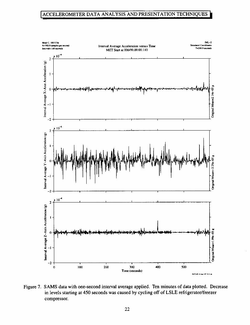
Figure 8.
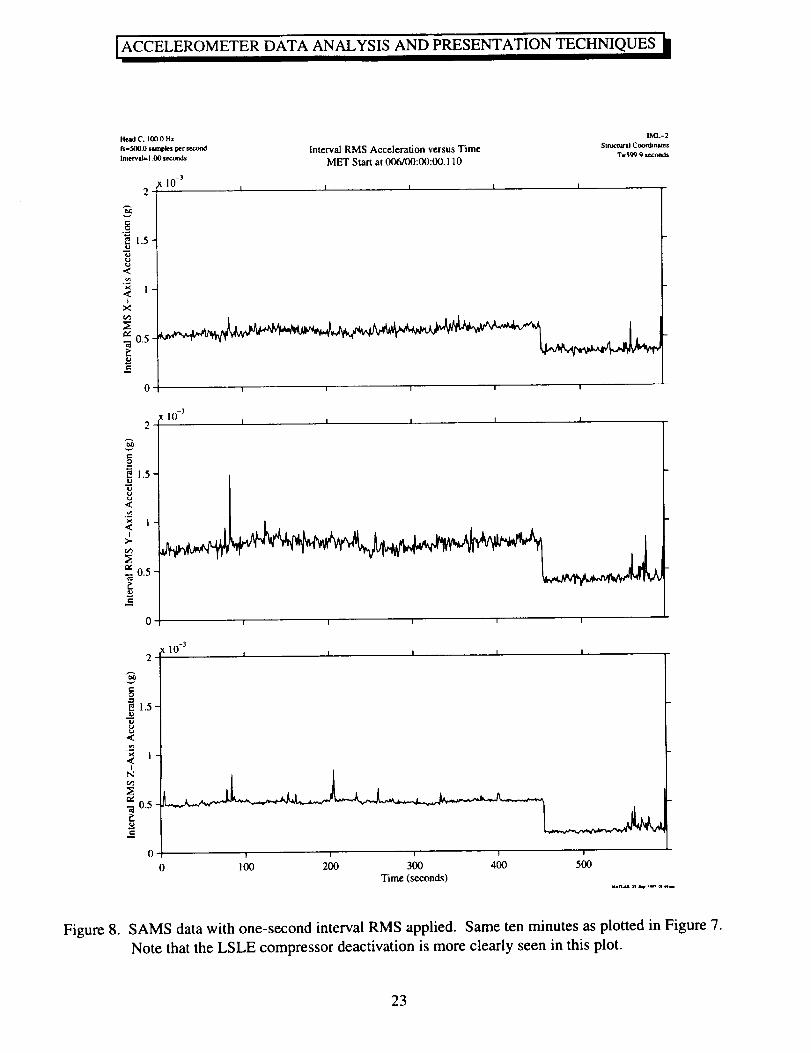
Figure 9.
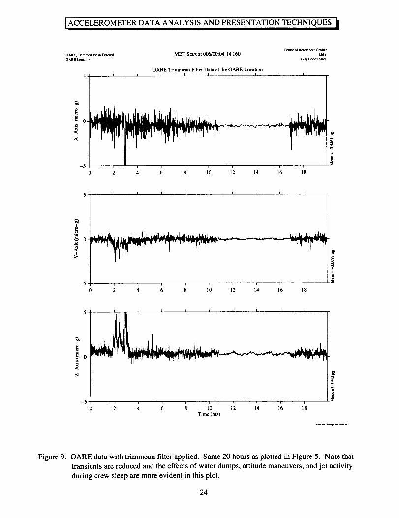
Figure 10.
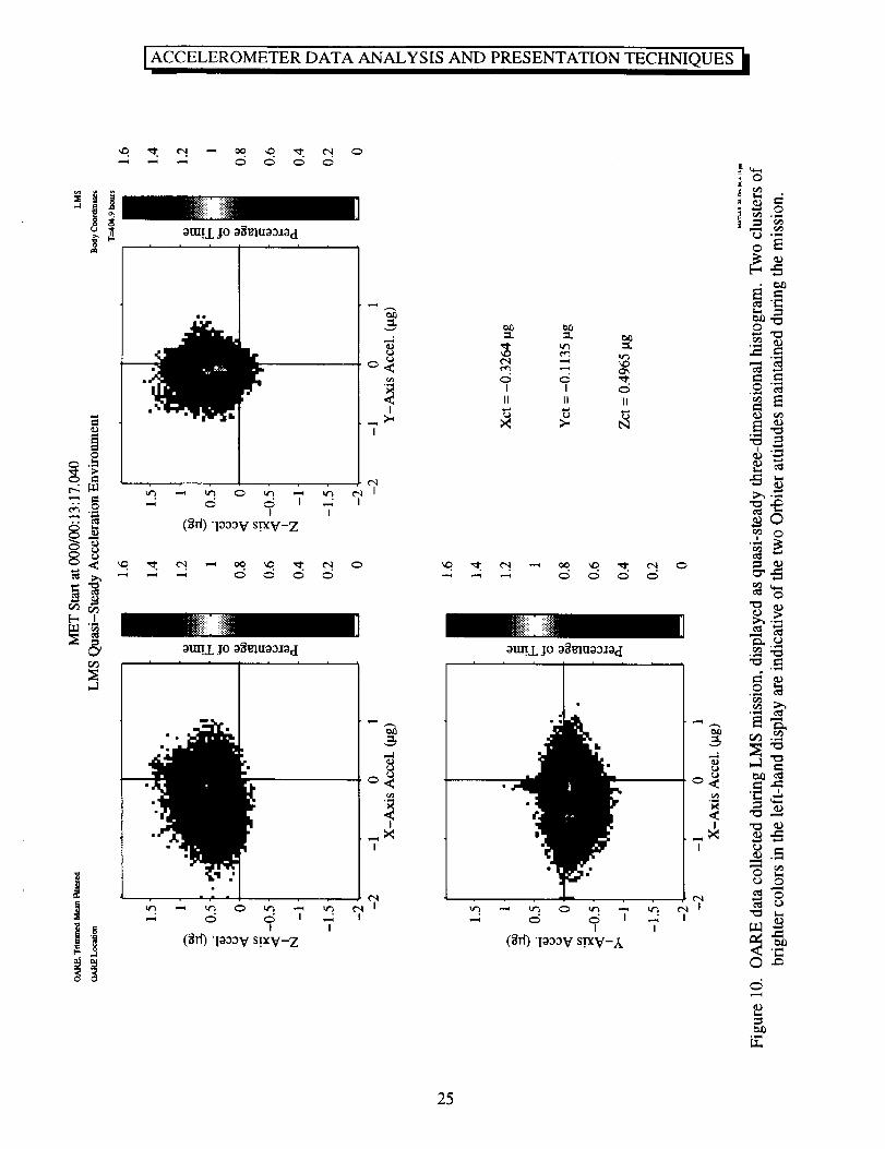
Figure 11.
Figure 12.
Figure 13.
Figure 14.
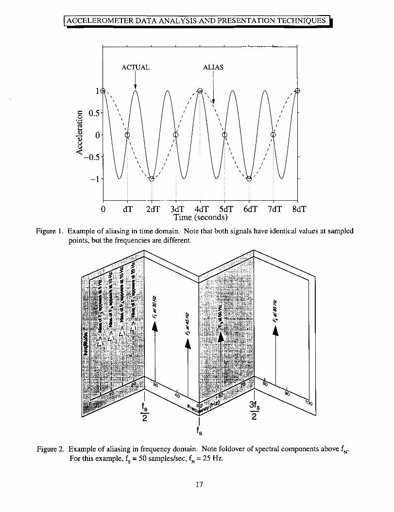
1. Example of aliasing in time domain. Note that both signals have identical
values at sampled points, but the frequencies are different ................................................. 17
2. Example of aliasing in frequency domain. Note foldover of spectral components
above fN" For this example, fs = 50 samples/sec, fN = 25 Hz .............................................. 17
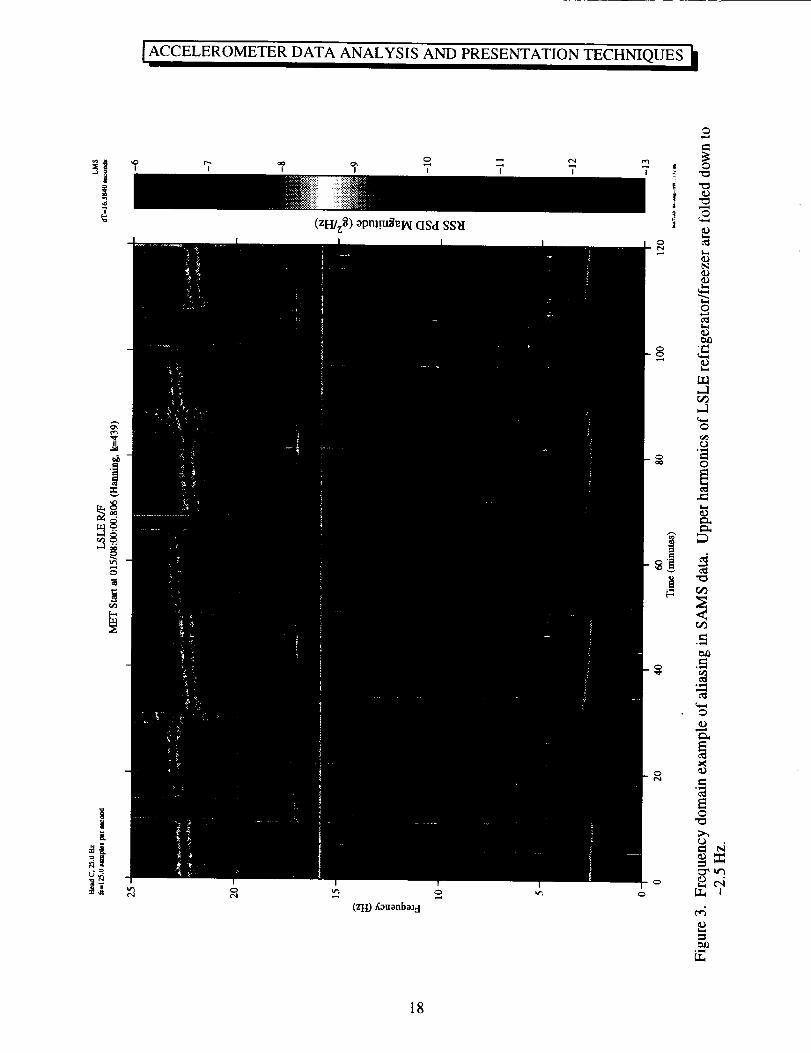
3. Frequency domain example of aliasing in SAMS data. Upper harmonics of LSLE
refrigerator/freezer are folded down to -2.5 Hz .................................................................. 18
4. SAMS acceleration versus time plot. One minute's worth of data ........................................ 19
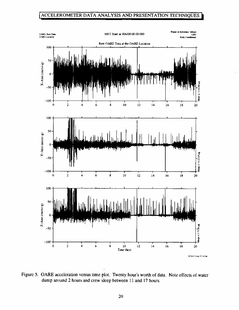
5. OARE acceleration versus time plot. Twenty hour's worth of data. Note effects
of water dump around 2 hours and crew sleep between 11 and 17 hours ........................... 20
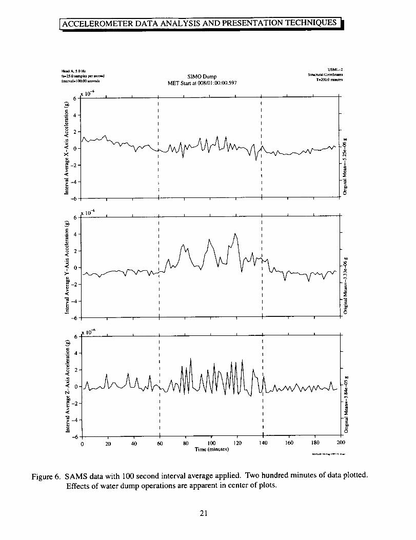
SAMS data with 100 second interval average applied. Two hundred minutes of
data plotted. Effects of water dump operations are apparent in center of plots .................. 21
SAMS data with one-second interval average applied. Ten minutes of data plotted.
Decrease in levels starting at 450 seconds was caused by cycling off of
LSLE refrigerator/freezer compressor ................................................................................. 22
SAMS data with one-second interval RMS applied. Same ten minutes as plotted
in Figure 7. Note that the LSLE compressor deactivation is more clearly
seen in this plot .................................................................................................................... 23
OARE data with trimmean filter applied. Same 20 hours as plotted in Figure 5.
Note that transients are reduced and the effects of water dumps, attitude
maneuvers, and jet activity during crew sleep are more evident in this plot ....................... 24
OARE data collected during LMS mission, displayed as quasi-steady
three-dimensional histogram. Two clusters of brighter colors in the left-hand
display are indicative of the two Orbiter attitudes maintained during the mission ............. 25
OARE data with trimmean filter applied. Same 20 hours of data plotted in
Figure 5, here mapped to the AGHF (Spacelab) location .................................................... 26
Illustration of spectral leakage obscuring the frequency component at 16.68 Hz ................. 27
Power spectral density calculated using five minutes of SAMS data. No spectral
averaging used ..................................................................................................................... 28
Power spectral density calculated using five minutes of SAMS data. The data
were divided into nine consecutive segments and the PSDs for the nine
segments were averaged together point by point. Compare to Figure 13
which was not averaged ....................................................................................................... 29
V
ACCELEROMETER DATA ANALYSIS AND PRESENTATION TECHNIQUES
Figure 15.
Figure 16.
Figure 17.
Figure 18.
Figure 19.
Figure 20.
Figure 21.
Figure 22.
SAMS data displayed as cumulative RMS acceleration versus frequency. Same
time period as displayed in Figure 14. Note steps appear in plots at excited
frequencies ........................................................................................................................... 30
Individual axes of SAMS data displayed as cumulative RMS acceleration versus
frequency. Same period as previous figure ......................................................................... 31
SAMS data displayed as gRMSversus frequency. RMS levels computed
for 0.1 Hz wide bands. Same time period as figures 14-16 ................................................ 32
RSS one third octave RMS acceleration versus frequency using 100 seconds of
SAMS data. Bold line is current ISS vibratory requirements curve ................................... 33
Three axes of SAMS data plotted as one third octave RMS acceleration
versus frequency. Same time period as Figure 18 .............................................................. 34
Power spectral density versus frequency versus time for two hours of SAMS data.
Three axes PSDs were combined using RSS prior to creation of spectrogram. Note
cessation of 80 Hz TEMPUS pump 33 minutes into plot and regular cycling of
LSLE compressor about 22 Hz (and upper harmonics) ...................................................... 35
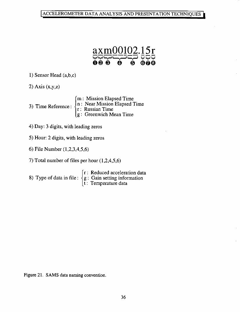
SAMS data naming convention .............................................................................................. 36
Accessing acceleration data via the Internet from beech.lerc.nasa.gov ................................. 37
vi
ACCELEROMETERDATA ANALYSIS AND PRESENTATIONTECHNIQUES
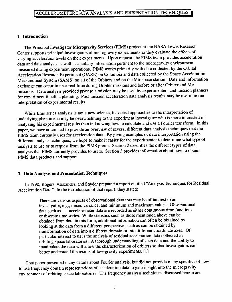
I. Introduction
The Principal Investigator Microgravity Services (PIMS) project at the NASA Lewis Research
Center supports principal investigators of microgravity experiments as they evaluate the effects of
varying acceleration levels on their experiments. Upon request, the PIMS team provides acceleration
data and data analysis as well as ancillary information pertinent to the microgravity environment
measured during experiment operations. PIMS works primarily with data collected by the Orbital
Acceleration Research Experiment (OARE) on Columbia and data collected by the Space Acceleration
Measurement System (SAMS) on all of the Orbiters and on the Mir space station. Data and information
exchange can occur in near real-time during Orbiter missions and before or after Orbiter and Mir
missions. Data analysis provided prior to a mission may be used by experimenters and mission planners
for experiment timeline planning. Post-mission acceleration data analysis results may be useful in the
interpretation of experimental results.
While time series analysis is not a new science, its varied approaches to the interpretation of
underlying phenomena may be overwhelming to the experiment investigator who is more interested in
analyzing his experimental results than in knowing how to calculate and use a Fourier transform. In this
paper, we have attempted to provide an overview of several different data analysis techniques that the
PIMS team currently uses for acceleration data. By giving examples of data interpretation using the
different analysis techniques, we hope to make it easier for the experimenter to determine what type of
analysis to use or to request from the PIMS group. Section 2 describes the different types of data
analysis that PIMS currently provides to users. Section 3 provides information about how to obtain
PIMS data products and support.
2. Data Analysis and Presentation Techniques
In 1990, Rogers, Alexander, and Snyder prepared a report entitled "Analysis Techniques for Residual
Acceleration Data" In the introduction of that report, they stated:
There are various aspects of observational data that may be of interest to an
investigator, e.g., mean, variance, and minimum and maximum values. Observationaldata such as... accelerometer data are recorded as either continuous time functions
or discrete time series. While statistics such as those mentioned above can be
obtained from data in this form, additional information can often be obtained by
looking at the data from a different perspective, such as can be obtained bytransformation of data into a different domain or into different coordinate axes. Of
particular interest to us is the analysis of residual acceleration data collected in
orbiting space laboratories. A thorough understanding of such data and the ability to
manipulate the data will allow the characterization of orbiters so that investigators canbetter understand the results of low-gravity experiments. [ 1]
That paper presented many details about Fourier analysis, but did not provide many specifics of how
to use frequency domain representations of acceleration data to gain insight into the microgravity
environment of orbiting space laboratories. The frequency analysis techniques discussed herein are
ACCELEROMETERDATA ANALYSIS AND PRESENTATIONTECHNIQUES
mainly extensions of the Fourier analysis and coordinate transformation methods discussed in [ 1]. Many
of the current methods used were derived based on experimenters' requests for a particular piece of
information. While there are limits to what information can be obtained from acceleration time series,
these basic techniques have given us a rather thorough understanding of the microgravity environment of
Earth-orbiting laboratories.
2.1 Data Sampling, Frequency Limits, Resolution, and Aliasing
2.1.1 General Notes
In the analysis of time series, certain restrictions are imposed by the length of the data window being
analyzed and by the sampling rate, fs, used when digitizing continuous data. For a time series segment
of length T seconds (N total points), the fundamental period of the segment is assumed to be T, even
though the series is not necessarily periodic. This periodicity assumption is intrinsic to the calculation of
the Fourier transform, which is the basis for all spectral analysis discussed in this paper. The finest
frequency resolution obtainable is dF=fs/N. A lower value of dF is considered better resolution than a
higher value of dE As seen from the expression above, for a given sampling rate, the frequency
resolution improves as the number of data points analyzed increases (that is, as a longer segment of data
is analyzed). However, there is a trade-off between frequency resolution and spectral variance.
Improved frequency resolution comes at the expense of increased spectral variance. The longer the time
frame is, the greater the possibility that the spectral content has varied within the segment considered.
This is especially true for non-stationary data such as these acceleration measurements recorded on
dynamic microgravity platforms. The desire to perform a frequency analysis over a relatively long time
period can be achieved by dividing the period into several equal-length blocks and then computing the
power spectral density (PSD) of each block. The PSDs for each block can then be laid out in the form of
a spectrogram to show intensity versus frequency versus time or they can be averaged to form a single
PSD plot, representative of the longer time period. PSDs, spectrograms, and spectral averaging will bediscussed later in this document.
Two pieces of information define one segment of time series data: the length of the segment, T, and
the sampling interval, dT, used in the acquisition of data. The sampling interval used must be
appropriate for the data of interest because it determines the highest frequency component which can be
faithfully reconstructed in spectral calculations. This value, fN, is known as the Nyquist frequency where
fN = l/(2dT) = N/(2T)=fJ2. Spectral analysis of a time series as described above is confined to the
frequency limits 0 < f < fN- While sampling theory dictates that the data sampling rate be at least two
times the highest frequency present in the phenomenon being studied, SAMS typically samples at five
times the highest frequency of interest. Attenuation of frequencies below the Nyquist is achieved by
means of an anti-aliasing lowpass filter.
From a signal processing point of view, selection of the anti-aliasing lowpass filter's cutoff frequency
should be based on the investigator's concern about spectral components less than or equal to the
selected cutoff frequency, ft. This does not mean that structures and materials at the measurement
location will not be subjected to the "neglected" portion of the acceleration spectrum above the cutoff
frequency. Rather, it was decided a priori that the experiment is not significantly sensitive to these
2
ACCELEROMETERDATA ANALYSIS AND PRESENTATION TECHNIQUES
higher frequency components. Despite lowpass filtering of the data prior to digitization, the acceleration
spectrum may contain spectral components above the Nyquist frequency which are strong enough that
they are not sufficiently attenuated. This leads to high frequency components being folded-over or
aliased to lower frequency artifacts in the frequency regime below fN. This is illustrated in Figures I and
2. While some aliasing is manifest on occasion in SAMS data, it is not commonplace and is typically
easy to identify, as seen in Figure 3.
2.1.2 OARE and SAMS Sampling and Filtering
OARE data are sampled at a rate of 10 samples per second following application of a 0.9 Hz lowpass
filter to the XOARE axis data and a 0.1 Hz lowpass filter to the YOARE and ZOARE axis data. The
technology of the OARE system allows interpretation of the microgravity environment for the frequency
range from 0 Hz up to 1 Hz with a precision of 0.003 micro-g for XOARE and from 0 Hz up to 0.1 Hz
with a precision of 0.0046 micro-g for YOARE and ZOARE •
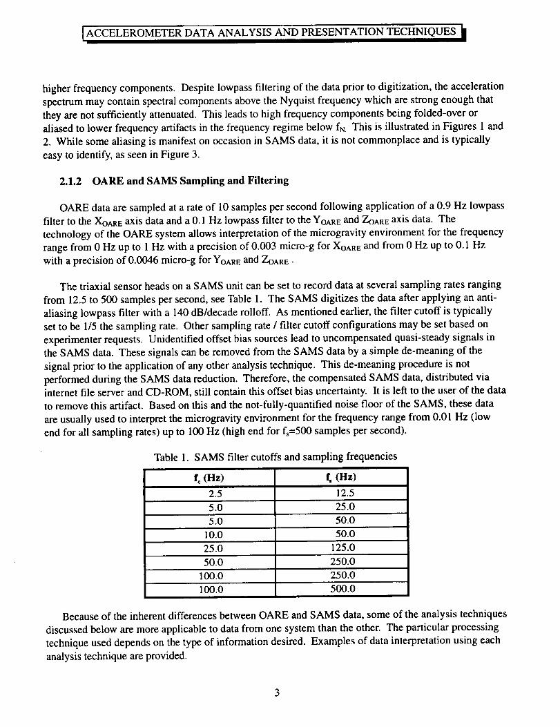
The triaxial sensor heads on a SAMS unit can be set to record data at several sampling rates ranging
from 12.5 to 500 samples per second, see Table 1. The SAMS digitizes the data after applying an anti-
aliasing lowpass filter with a 140 dB/decade rolloff. As mentioned earlier, the filter cutoff is typically
set to be 1/5 the sampling rate. Other sampling rate / filter cutoff configurations may be set based on
experimenter requests. Unidentified offset bias sources lead to uncompensated quasi-steady signals in
the SAMS data. These signals can be removed from the SAMS data by a simple de-meaning of the
signal prior to the application of any other analysis technique. This de-meaning procedure is not
performed during the SAMS data reduction. Therefore, the compensated SAMS data, distributed viainternet file server and CD-ROM, still contain this offset bias uncertainty. It is left to the user of the data
to remove this artifact. Based on this and the not-fully-quantified noise floor of the SAMS, these data
are usually used to interpret the microgravity environment for the frequency range from 0.01 Hz (low
end for all sampling rates) up to 100 Hz (high end for fs=500 samples per second).
Table 1. SAMS
f, (nz)
2.5
filter cutoffs and sampling frequencies
f, (nz)
12.5
100.0
5.0 25.0
5.0 50.0
10.0 50.0
25.0 125.0
50.0 250.0
100.0 250.0
500.0
Because of the inherent differences between OARE and SAMS data, some of the analysis techniques
discussed below are more applicable to data from one system than the other. The particular processing
technique used depends on the type of information desired. Examples of data interpretation using each
analysis technique are provided.
ACCELEROMETER DATA ANALYSIS AND PRESENTATION TECHNIQUES
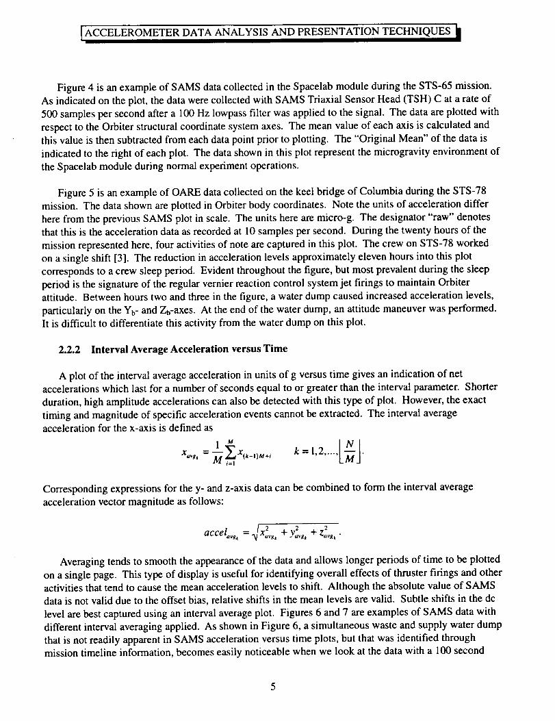
2.2 Time Domain Analysis
The time domain data analysis techniques are acceleration versus time, interval average acceleration
versus time, interval root-mean-square (RMS) acceleration versus time, quasi-steady three-dimensional
histogram (QTH) of acceleration data, trimmean filtered (TMF) acceleration versus time, and prediction
of quasi-steady levels at different locations. All of these options, except the histogram, can be presented
on a per axis basis or as a vector magnitude. The quasi-steady histogram and trimmean filtered
acceleration calculations are usually prepared using OARE data. Table 2 provides an overview of the
time domain analysis techniques discussed here.
Analysis Technique
Acceleration versusTime
Interval AverageAcceleration versusTime
Interval RMSAcceleration versusTime
TrimmeanAcceleration versusTime
Quasi-steadyThree-dimensional
Histogram
Mapping of OAREData
Table 2.
Units
g or fraction of g
g or fraction of g
g or fraction of g
g or fraction of g
percentage oftime and g orfraction of g
g or fraction of g
Data TypicallyUsed
Time domain analysis techniques
Use
OARE
SAMS
SAMS
SAMS
OARE
OARE
OARE
precise accounting of variation ofacceleration magnitude as a functionof time
indication of net accelerations lastingfor time period > interval parameter
measure of oscillatory content in data
smooth data and reject transient,higher magnitude contributions
summarize acceleration vector
magnitude and direction
predict quasi-steady environment atlocations other than OARE sensor
Figure #
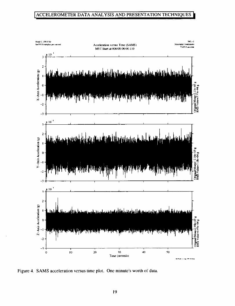
4,5
6,7
9,11
10
11
2.2.1 Acceleration versus Time
Acceleration magnitude versus time plots show acceleration in units of g versus time. Among the
time domain plots discussed in this document, this one yields the most precise accounting of the
variation of acceleration magnitude as a function of time. The length of time represented in a plot is
usually determined by the focus of the investigation. The sampling rate of the data also influences the
plot length. Useful displays can be produced from a couple hours' worth of OARE and lower frequency
SAMS data, while SAMS data collected at 25 samples per second or more can best be displayed for
periods on the order of seconds or minutes. If a data sampling rate is 125 samples per second, a ten
minute plot will have 75000 points. Printing these data with a standard printer at 600 dots per inch
requires a 125 inch long paper [2]. This situation is typically avoided, because acceleration versus time
plots of SAMS data are usually used to investigate the microgravity environment related to transient or
short-lived oscillatory events such as thruster firings or the start-up or shut-down of vibratory equipment.
[ACCELEROMETER DATA ANALYSIS AND PRESENTATION TECHNIQUES _l
Figure 4 is an example of SAMS data collected in the Spacelab module during the STS-65 mission.
As indicated on the plot, the data were collected with SAMS Triaxial Sensor Head (TSH) C at a rate of
500 samples per second after a 100 Hz lowpass filter was applied to the signal. The data are plotted with
respect to the Orbiter structural coordinate system axes. The mean value of each axis is calculated and
this value is then subtracted from each data point prior to plotting. The "Original Mean" of the data is
indicated to the right of each plot. The data shown in this plot represent the microgravity environment of
the Spacelab module during normal experiment operations.
Figure 5 is an example of OARE data collected on the keel bridge of Columbia during the STS-78
mission. The data shown are plotted in Orbiter body coordinates. Note the units of acceleration differ
here from the previous SAMS plot in scale. The units here are micro-g. The designator "raw" denotes
that this is the acceleration data as recorded at 10 samples per second. During the twenty hours of the
mission represented here, four activities of note are captured in this plot. The crew on STS-78 worked
on a single shift [3]. The reduction in acceleration levels approximately eleven hours into this plot
corresponds to a crew sleep period. Evident throughout the figure, but most prevalent during the sleep
period is the signature of the regular vernier reaction control system jet firings to maintain Orbiter
attitude. Between hours two and three in the figure, a water dump caused increased acceleration levels,
particularly on the Yb- and Zb-axes. At the end of the water dump, an attitude maneuver was performed.
It is difficult to differentiate this activity from the water dump on this plot.
2.2.2 Interval Average Acceleration versus Time
A plot of the interval average acceleration in units of g versus time gives an indication of net
accelerations which last for a number of seconds equal to or greater than the interval parameter. Shorter
duration, high amplitude accelerations can also be detected with this type of plot. However, the exact
timing and magnitude of specific acceleration events cannot be extracted. The interval average
acceleration for the x-axis is defined as
x,,,.#,= ---_x_k_ils_+i__ k = 1,2..... .
Corresponding expressions for the y- and z-axis data can be combined to form the interval average
acceleration vector magnitude as follows:
X 2 2 2accel,,_, = _/ ,,v_ + Y,,_, + z,,v_ •
Averaging tends to smooth the appearance of the data and allows longer periods of time to be plotted
on a single page. This type of display is useful for identifying overall effects of thruster firings and other
activities that tend to cause the mean acceleration levels to shift. Although the absolute value of SAMS
data is not valid due to the offset bias, relative shifts in the mean levels are valid. Subtle shifts in the dc
level are best captured using an interval average plot. Figures 6 and 7 are examples of SAMS data with
different interval averaging applied. As shown in Figure 6, a simultaneous waste and supply water dump
that is not readily apparent in SAMS acceleration versus time plots, but that was identified through
mission timeline information, becomes easily noticeable when we look at the data with a 100 second
ACCELEROMETERDATA ANALYSIS AND PRESENTATIONTECHNIQUES
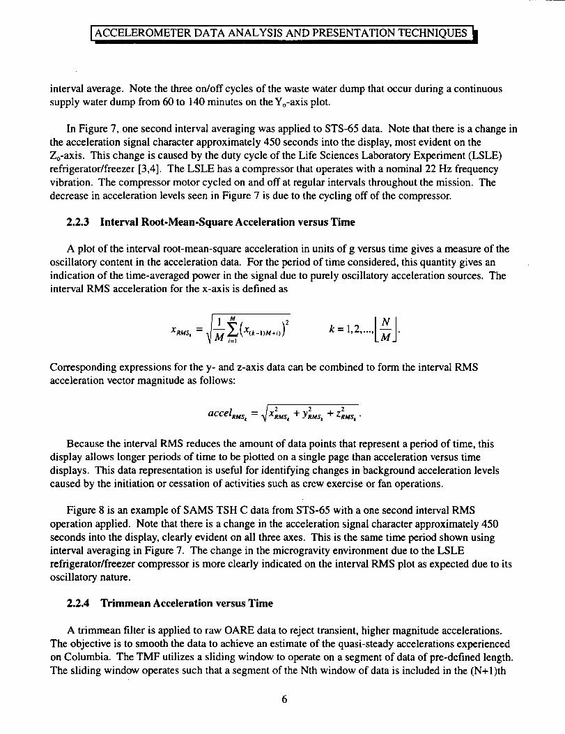
intervalaverage.Notethethreeon/off cyclesof thewastewaterdumpthatoccurduringacontinuoussupplywaterdumpfrom 60to 140minuteson theYo-axisplot.
In Figure7, onesecondintervalaveragingwasappliedto STS-65data. Note thatthereis achangeintheaccelerationsignalcharacterapproximately450secondsinto thedisplay,mostevidenton theZo-axis.This changeis causedby thedutycycleof theLife SciencesLaboratoryExperiment(LSLE)refrigerator/freezer[3,4]. TheLSLE hasa compressorthatoperateswith a nominal22Hz frequencyvibration. Thecompressormotorcycledonandoff at regularintervalsthroughoutthemission. Thedecreasein accelerationlevelsseenin Figure7 is dueto thecycling off of thecompressor.
2.2.3 Interval Root-Mean-Square Acceleration versus Time
A plot of the interval root-mean-square acceleration in units of g versus time gives a measure of the
oscillatory content in the acceleration data. For the period of time considered, this quantity gives an
indication of the time-averaged power in the signal due to purely oscillatory acceleration sources. Theinterval RMS acceleration for the x-axis is defined as
(x,k 2
Corresponding expressions for the y- and z-axis data can be combined to form the interval RMS
acceleration vector magnitude as follows:
._/ 2 2accelRMs ' 2 + YRMS,+"- XRMSt ZRMSt •
Because the interval RMS reduces the amount of data points that represent a period of time, this
display allows longer periods of time to be plotted on a single page than acceleration versus time
displays. This data representation is useful for identifying changes in background acceleration levels
caused by the initiation or cessation of activities such as crew exercise or fan operations.
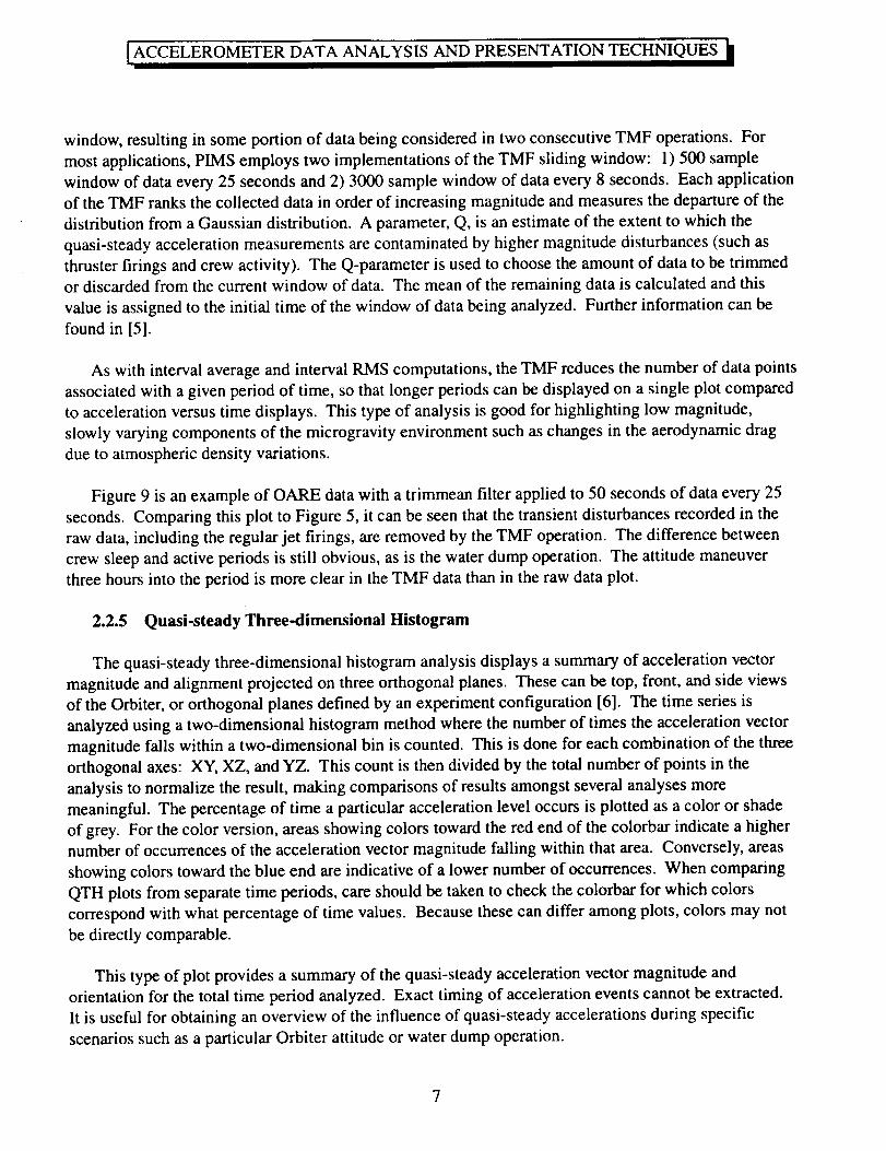
Figure 8 is an example of SAMS TSH C data from STS-65 with a one second interval RMS
operation applied. Note that there is a change in the acceleration signal character approximately 450
seconds into the display, clearly evident on all three axes. This is the same time period shown using
interval averaging in Figure 7. The change in the microgravity environment due to the LSLE
refrigerator/freezer compressor is more clearly indicated on the interval RMS plot as expected due to its
oscillatory nature.
2.2.4 Trimmean Acceleration versus Time
A trimmean filter is applied to raw OARE data to reject transient, higher magnitude accelerations.
The objective is to smooth the data to achieve an estimate of the quasi-steady accelerations experienced
on Columbia. The TMF utilizes a sliding window to operate on a segment of data of pre-defined length.
The sliding window operates such that a segment of the Nth window of data is included in the (N+l)th
6
ACCELEROMETERDATA ANALYSIS AND PRESENTATIONTECHNIQUES
window,resultingin someportionof databeingconsideredin two consecutiveTMF operations.Formostapplications,PIMSemploystwo implementationsof theTMF sliding window: 1)500samplewindowof dataevery25secondsand2) 3000samplewindowof dataevery8 seconds.Eachapplicationof theTMF ranksthecollecteddatain orderof increasingmagnitudeandmeasuresthedepartureof thedistributionfrom aGaussiandistribution. A parameter,Q, is anestimateof theextentto whichthequasi-steadyaccelerationmeasurementsarecontaminatedby highermagnitudedisturbances(suchasthrusterfirings andcrewactivity). TheQ-parameteris usedto choosetheamountof datato betrimmedor discardedfrom thecurrentwindow of data.The meanof theremainingdatais calculatedandthisvalueis assignedto theinitial time of thewindowof databeinganalyzed.Furtherinformationcanbefoundin [5].
As with intervalaverageandintervalRMScomputations,theTMF reducesthenumberof datapointsassociatedwith agivenperiodof time, sothatlongerperiodscanbedisplayedon asingleplot comparedto accelerationversustime displays.This typeof analysisis goodfor highlighting low magnitude,slowlyvaryingcomponentsof the microgravityenvironmentsuchaschangesin theaerodynamicdragdueto atmosphericdensityvariations.
Figure9 is anexampleof OARE datawith atrimmeanfilter appliedto 50secondsof dataevery25seconds.Comparingthisplot to Figure5, it canbeseenthatthetransientdisturbancesrecordedin therawdata,includingtheregularjet firings,areremovedby theTMF operation.Thedifferencebetweencrewsleepandactiveperiodsis still obvious,asis thewaterdumpoperation.Theattitudemaneuverthreehoursinto theperiodis moreclearin theTMF datathanin therawdataplot.
2.2.5 Quasi-steady Three-dimensional Histogram
The quasi-steady three-dimensional histogram analysis displays a summary of acceleration vector
magnitude and alignment projected on three orthogonal planes. These can be top, front, and side views
of the Orbiter, or orthogonal planes defined by an experiment configuration [6]. The time series is
analyzed using a two-dimensional histogram method where the number of times the acceleration vector
magnitude falls within a two-dimensional bin is counted. This is done for each combination of the three
orthogonal axes: XY, XZ, and YZ. This count is then divided by the total number of points in the
analysis to normalize the result, making comparisons of results amongst several analyses more
meaningful. The percentage of time a particular acceleration level occurs is plotted as a color or shade
of grey. For the color version, areas showing colors toward the red end of the colorbar indicate a higher
number of occurrences of the acceleration vector magnitude falling within that area. Conversely, areas
showing colors toward the blue end are indicative of a lower number of occurrences. When comparing
QTH plots from separate time periods, care should be taken to check the colorbar for which colors
correspond with what percentage of time values. Because these can differ among plots, colors may not
be directly comparable.
This type of plot provides a summary of the quasi-steady acceleration vector magnitude and
orientation for the total time period analyzed. Exact timing of acceleration events cannot be extracted.
It is useful for obtaining an overview of the influence of quasi-steady accelerations during specific
scenarios such as a particular Orbiter attitude or water dump operation.
ACCELEROMETERDATA ANALYSIS AND PRESENTATIONTECHNIQUES
Figure 10 shows a quasi-steady three-dimensional histogram representation of the entire STS-78
mission. The roughly oval, dark blue areas on the three planes of the Orbiter represent the variation of
the quasi-steady environment during the mission. The two clusters of color within the ovals are
representative of the quasi-steady microgravity environment during the two attitudes in which the
Orbiter was maintained during the mission [3, 6].
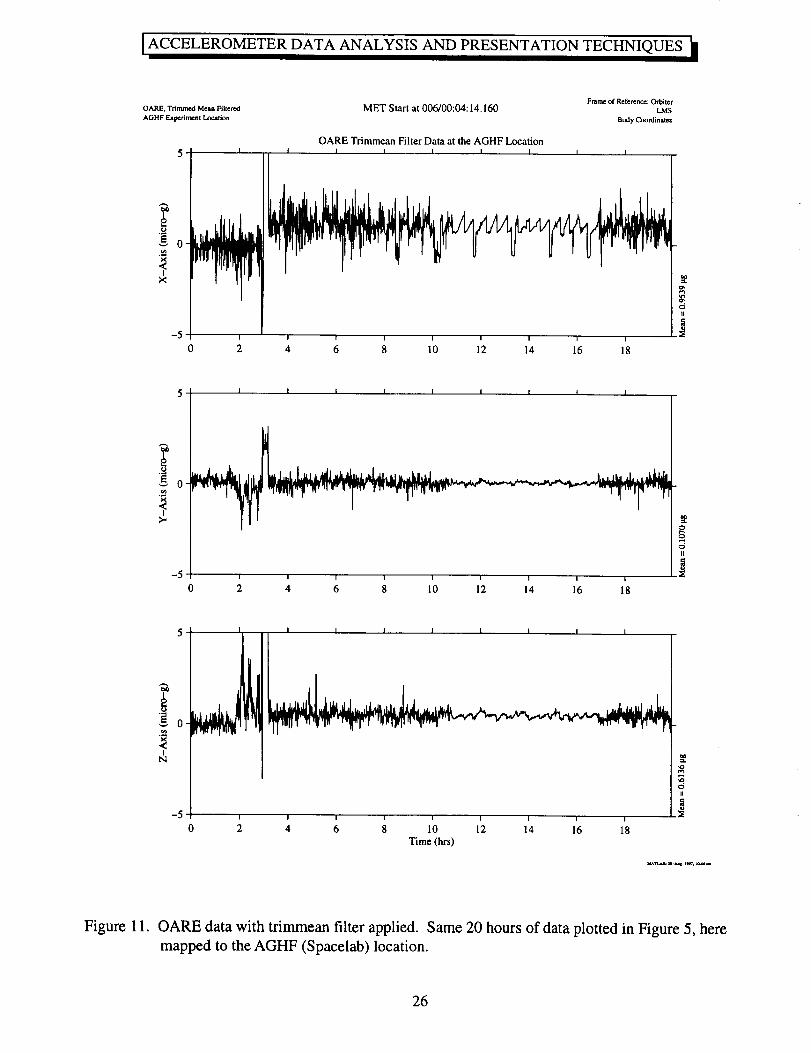
2.2.6 Mapping of OARE Data to Alternate Locations
Several components of the quasi-steady microgravity environment are easy to predict based on the
location being studied, the location of the Orbiter center of gravity (CG), and the Orbiter rotational rates
and angles. The atmospheric drag is assumed to be relatively constant for all locations within the
Orbiter (this is a rigid-body assumption). Using this assumption, quasi-steady acceleration data
collected by OARE can be mapped to other locations in the Orbiter. This mapping is a prediction of
what the microgravity environment would be at the alternate location, knowing the acceleration levels at
OARE, the distance between OARE and the Orbiter CG (leading to gravity gradient effects, agOARE), the
distance between the CG and the location of interest (leading to gravity gradient effects, agg,_w), and the
Orbiter body rotational rates during the period of interest (leading to rotational effects, am) [7, 8].
The data are mapped from the OARE location to the Orbiter CG
aCG = aOARE- aggOARE- arotOAR E
and subsequently from the Orbiter CG to the new location
anew=acG+aggnew+arotnew
This mapping is typically performed in conjunction with the application of a trimmean filter,
therefore effects of rotational rate and angle data sampling are smoothed out. Figure 11 shows the data
displayed in Figure 9 mapped from the OARE location to the location of the Advanced Gradient Heating
Facility in the Spacelab module [3]. Note that the sawblade effect caused by the attitude-maintenance
jet firings is more prevalent in the Xb-axis at this location because it is further removed from the Orbiter
CG (along the Xb-axis) than the OARE location.
2.3 Fourier Transform Theory and Windowing
Transformation of data to the frequency domain is done to gain more insight about the microgravity
environment and to help identify acceleration sources. Analyses that transform data into the frequency
domain result in displays of acceleration power spectral density versus frequency, RMS acceleration
versus frequency, cumulative RMS acceleration versus frequency, one third octave band RMS
acceleration versus frequency, and power spectral density versus frequency versus time (spectrogram).
Any of these frequency domain analysis techniques typically performed on SAMS data can be applied to
raw OARE data, if desired.
ACCELEROMETERDATA ANALYSIS AND PRESENTATIONTECHNIQUES
Fouriertransformationis acommonmeansof studyingtimeseriesdatain thefrequencydomain.FollowingFouriertheory,afunctionf(t), with fundamentalperiod2nandsatisfyingDirichlet conditions,canberepresentedby aninfinite seriesof sinusoids,aFourierseries[1,9-12]. DiscreteFouriertransformationisaway to calculatetheFouriercoefficientsof agiventime series.For thetimeseriesIn,n--0,1,2..... N-1,thediscreteFouriertransformof fnis
N-I
F m -- ____fne -j2xnm/N
n=0
m =0,1,2 ..... (N- 1).
Fast Fourier Transform methods are designed to efficiently compute the values of Fm shown above.
The fundamental information obtained from Fourier transformation is the relative magnitudes of the
various sinusoidal signals that compose the time series. A knowledge of the predominate disturbing
frequencies in the microgravity environment is often of interest to experiment investigators. The Fourier
transformation is the basis for the power spectral density and other frequency domain analyses discussed
in the following section.
When performing frequency domain analyses of data, different types of filters can be applied to
achieve different effects. For example, lowpass filters can be applied to accelerometer data to remove
higher frequency disturbances that an investigator knows will not affect the experimental results.
Bandpass filters can be employed to focus an analysis on a specific, typically narrow, region of the
acceleration spectrum. Comb filters enable rejection of a specific frequency and its harmonics. The
choice of filter and design of appropriate filter parameters permits the desired manipulation of the data
set. No type of filtering after data collection, however, can remove the aliasing effects of improperly
sampled data.
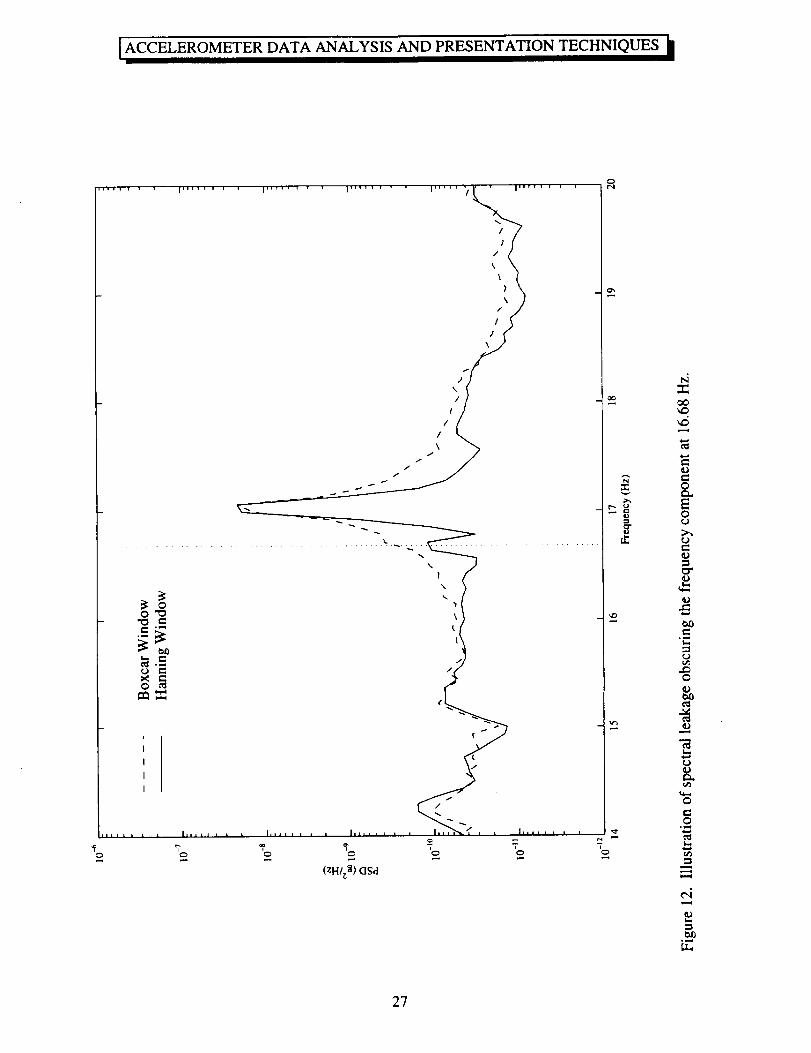
In addition to the type of filtering mentioned above, a weighting function can be applied to the time
series before spectral analysis is performed to address the problem of spectral leakage. Spectral leakage
will arise in the analysis of periodic data with period Tp if the length of the record being analyzed, T, is
not an integer number of Tp periods as assumed in Fourier theory. In order to suppress spectral leakage,
it is common to introduce a weighting function that tapers the time series data to eliminate
discontinuities at the beginning and end of the record. In acceleration data analysis, a Hanning window
is typically used to reduce spectral leakage and thus show features more clearly [ 10-12]. Unless
otherwise stated, all the frequency domain analysis displays shown here have had a Hanning window
applied. When no windowing is applied to a time series, it is often said that a boxcar window was used.
This offers no signal tapering and thus has no effect on spectral leakage.
As demonstrated in Figure 12, when a non-integer number of periods is used to compute the PSD
using a boxcar window (the dashed curve), the smearing of a strong spectral component, in this case the
Ku-band antenna at about 17 Hz, over the surrounding frequency bins can render close, somewhat
weaker components, like the one at 16.68 Hz, virtually undetectable. For comparison, see the solid line
in Figure 12 for a PSD of the same dataset using a Hanning window. Notice the spectral peak at 16.68
Hz is now clearly evident.
ACCELEROMETER DATA ANALYSIS AND PRESENTATION TECHNIQUES
2.4 Frequency Domain Analysis
Table 3 provides an overview of the frequency domain analysis techniques discussed here.
Analysis Technique
Power SpectralDensity versusFrequency
Cumulative RMSAcceleration versus
Frequency
Units
Table 3. Frequency domain analysis techniques
Use
g_lHz
Data TypicallyUsed
SAMS
SAMSgRMS
estimate of distribution of energy withrespect to frequency
quantifies contributions of spectralcomponents to overall RMSacceleration level for time periodstudied in cumulative fashion
Figure #
12, 13,14
15, 16
RMS Acceleration gRMS SAMS quantifies contributions of spectral 17versus Frequency components per frequency bin
Spectrogram g z/I-Iz SAMS 3, 20road map of how acceleration signalsvary with respect to both time andfrequency
2.4.1 Power Spectral Density versus Frequency
The power spectral density is computed directly from the Fourier transform of a time series as
indicated here [ 1, 11 ].
For even N:
[ 2[F(m)l 2
ovf PSD(m)=[lF(m)[Z
tOUr,
and for odd N:
[units2/Hz] for m =
[units2/Hz] for m =
l, 2 ..... (N/2) - 1
0 and m = (N/2)
PSD(m) =
2lF(m)l 2
NUL
[F(m)l2
NU4
[units2/Hz] for m
[units2/Hz] for m
= 1,2 ..... (N- 1)/2
=0
where
1 N-1
U=_- ___Wn 2n=O
10
ACCELEROMETER DATA ANALYSIS AND PRESENTATION TECHNIQUES k
is the compensation factor [12] used to account for the attenuation of the signal imposed by the
weighting function, w,, applied to suppress spectral leakage. The PSD has units of (units of original
function)VHz. For SAMS data, these units are g2/Hz. This method for computation of the PSD is
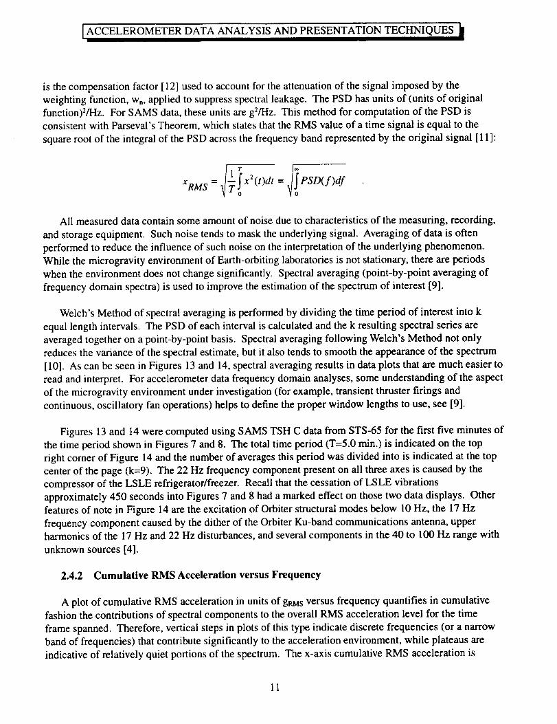
consistent with Parseval's Theorem, which states that the RMS value of a time signal is equal to the
square root of the integral of the PSD across the frequency band represented by the original signal [ 11]:
XRM S _T!X2(t)dt= PSD(f)df
All measured data contain some amount of noise due to characteristics of the measuring, recording,
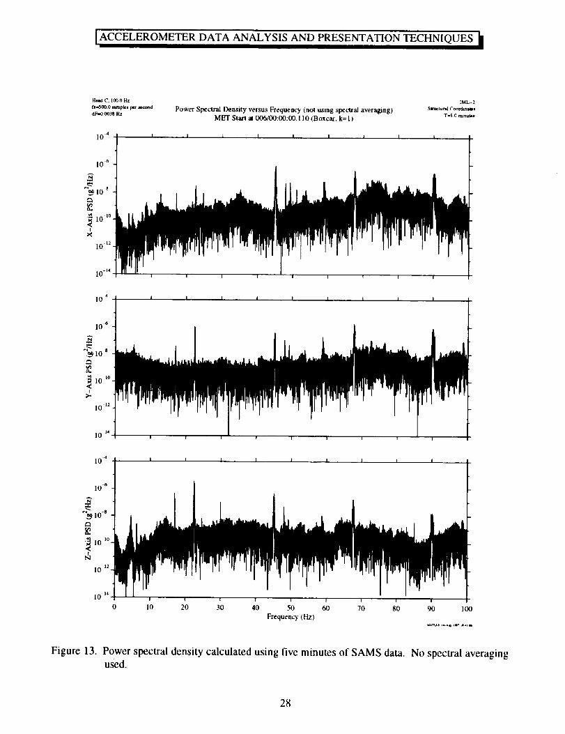
and storage equipment. Such noise tends to mask the underlying signal. Averaging of data is often
performed to reduce the influence of such noise on the interpretation of the underlying phenomenon.
While the microgravity environment of Earth-orbiting laboratories is not stationary, there are periods
when the environment does not change significantly. Spectral averaging (point-by-point averaging of
frequency domain spectra) is used to improve the estimation of the spectrum of interest [9].
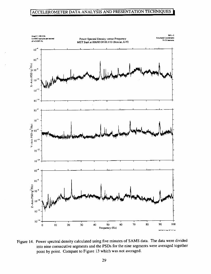
Welch's Method of spectral averaging is performed by dividing the time period of interest into k
equal length intervals. The PSD of each interval is calculated and the k resulting spectral series are
averaged together on a point-by-point basis. Spectral averaging following Welch's Method not only
reduces the variance of the spectral estimate, but it also tends to smooth the appearance of the spectrum
[10]. As can be seen in Figures 13 and 14, spectral averaging results in data plots that are much easier to
read and interpret. For accelerometer data frequency domain analyses, some understanding of the aspect
of the microgravity environment under investigation (for example, transient thruster firings and
continuous, oscillatory fan operations) helps to define the proper window lengths to use, see [9].
Figures 13 and 14 were computed using SAMS TSH C data from STS-65 for the first five minutes of
the time period shown in Figures 7 and 8. The total time period (T=5.0 min.) is indicated on the top
right corner of Figure 14 and the number of averages this period was divided into is indicated at the top
center of the page (k=9). The 22 Hz frequency component present on all three axes is caused by the
compressor of the LSLE refrigerator/freezer. Recall that the cessation of LSLE vibrations
approximately 450 seconds into Figures 7 and 8 had a marked effect on those two data displays. Other
features of note in Figure 14 are the excitation of Orbiter structural modes below 10 Hz, the 17 Hz
frequency component caused by the dither of the Orbiter Ku-band communications antenna, upper
harmonics of the 17 Hz and 22 Hz disturbances, and several components in the 40 to 100 Hz range with
unknown sources [4].
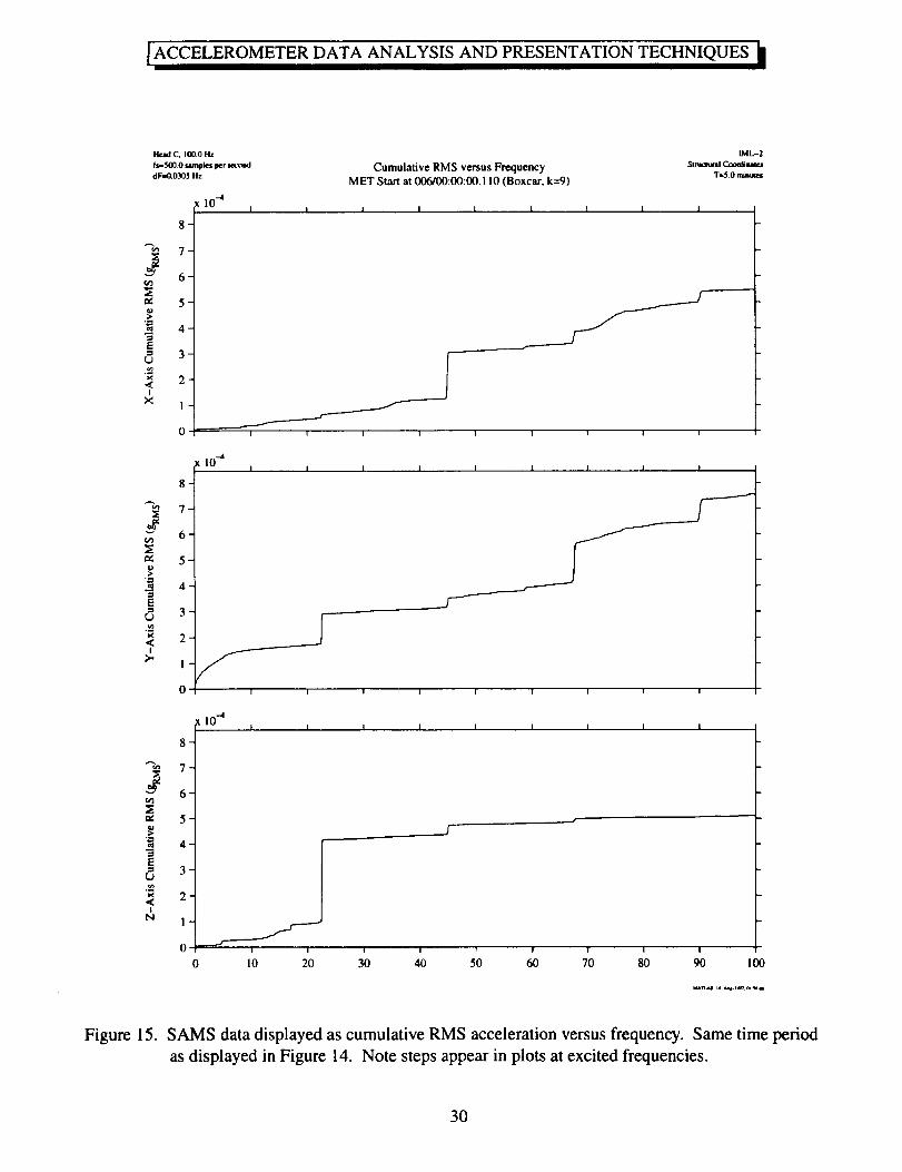
2.4.2 Cumulative RMS Acceleration versus Frequency
A plot of cumulative RMS acceleration in units of gRMS versus frequency quantifies in cumulative
fashion the contributions of spectral components to the overall RMS acceleration level for the time
frame spanned. Therefore, vertical steps in plots of this type indicate discrete frequencies (or a narrow
band of frequencies) that contribute significantly to the acceleration environment, while plateaus are
indicative of relatively quiet portions of the spectrum. The x-axis cumulative RMS acceleration is
11
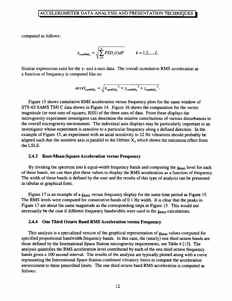
ACCELEROMETERDATA ANALYSIS AND PRESENTATIONTECHNIQUES
computed as follows:
Xc,,_Ms_ = PSDx ( i)dF k=l,2 ..... L.
Similar expressions exist for the y- and z-axis data. The overall cumulative RMS acceleration as
a function of frequency is computed like so:
= _ 2 + Ycu_ms_ 2 + 2accelcumRMS_ X cu,nRMS_ ZcuraRMS_
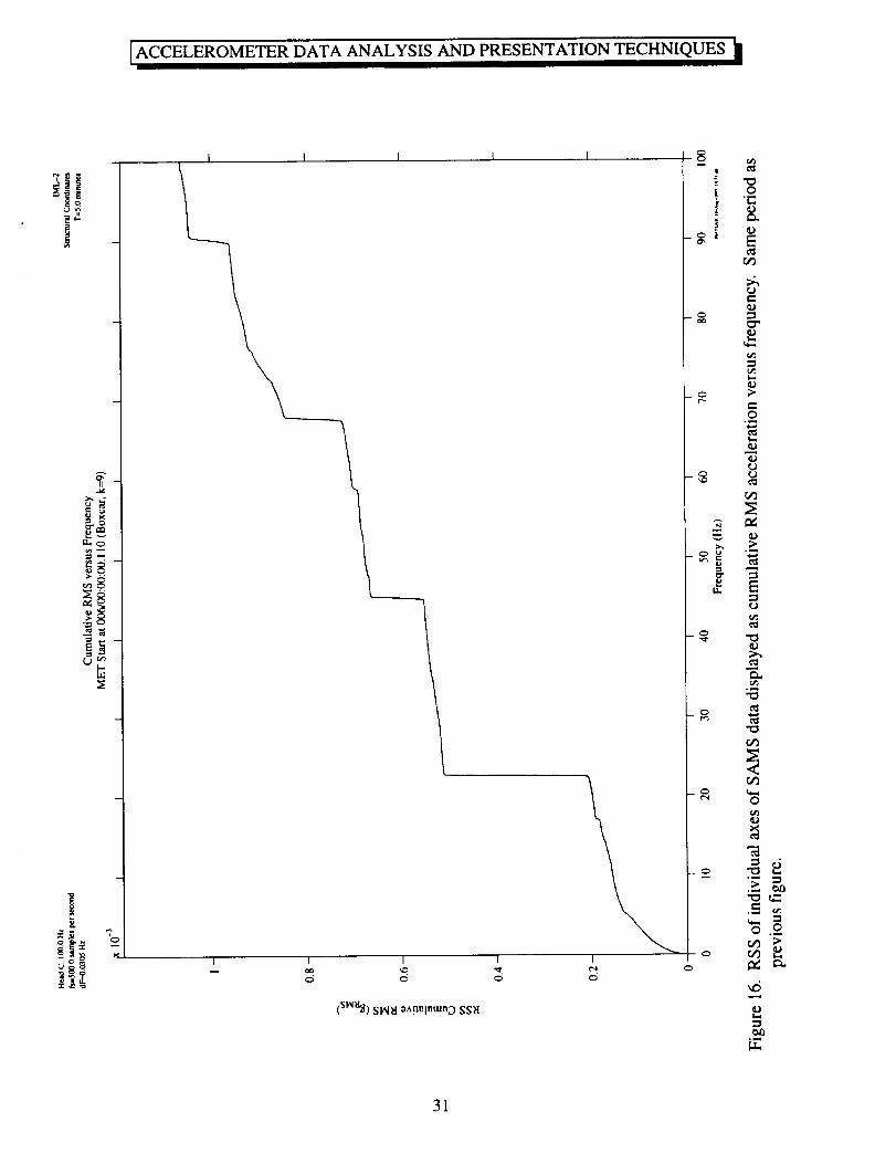
Figure 15 shows cumulative RMS acceleration versus frequency plots for the same window of
STS-65 SAMS TSH C data shown in Figure 14. Figure 16 shows the computation for the vector
magnitude (or root-sum-of-squares, RSS) of the three axes of data. From these displays the
microgravity experiment investigator can determine the relative contributions of various disturbances to
the overall microgravity environment. The individual axis displays may be particularly important to an
investigator whose experiment is sensitive to a particular frequency along a defined direction. In the
example of Figure 15, an experiment with an axial sensitivity to 22 Hz vibrations should probably be
aligned such that the sensitive axis is parallel to the Orbiter Xo which shows the minimum effect fromthe LSLE.
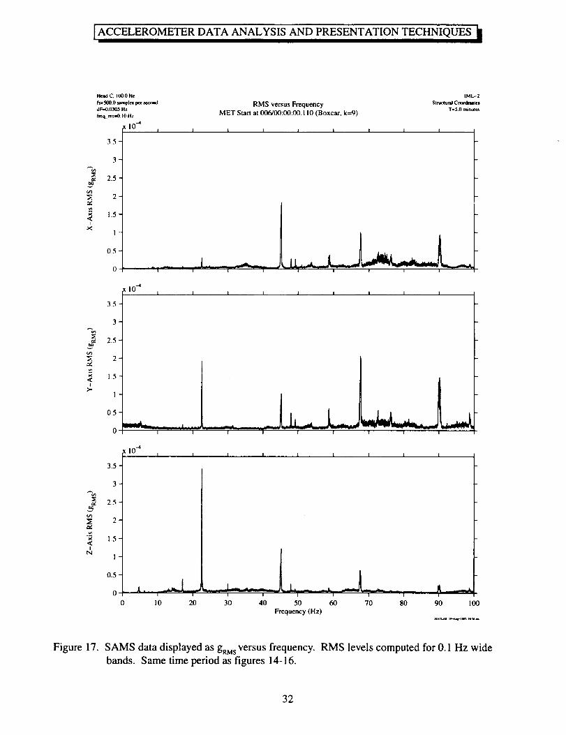
2.4.3 Root-Mean-Square Acceleration versus Frequency
By dividing the spectrum into k equal-width frequency bands and computing the gaMs level for each
of these bands, we can then plot these values to display the RMS acceleration as a function of frequency.
The width of these bands is defined by the user and the results of this type of analysis can be presented
in tabular or graphical form.
Figure 17 is an example of a gRMS versus frequency display for the same time period as Figure 15.
The RMS levels were computed for consecutive bands of 0.1 Hz width. It is clear that the peaks in
Figure 17 are about the same magnitude as the corresponding steps in Figure 15. This would not
necessarily be the case if different frequency bandwidths were used in the gRidS calculations.
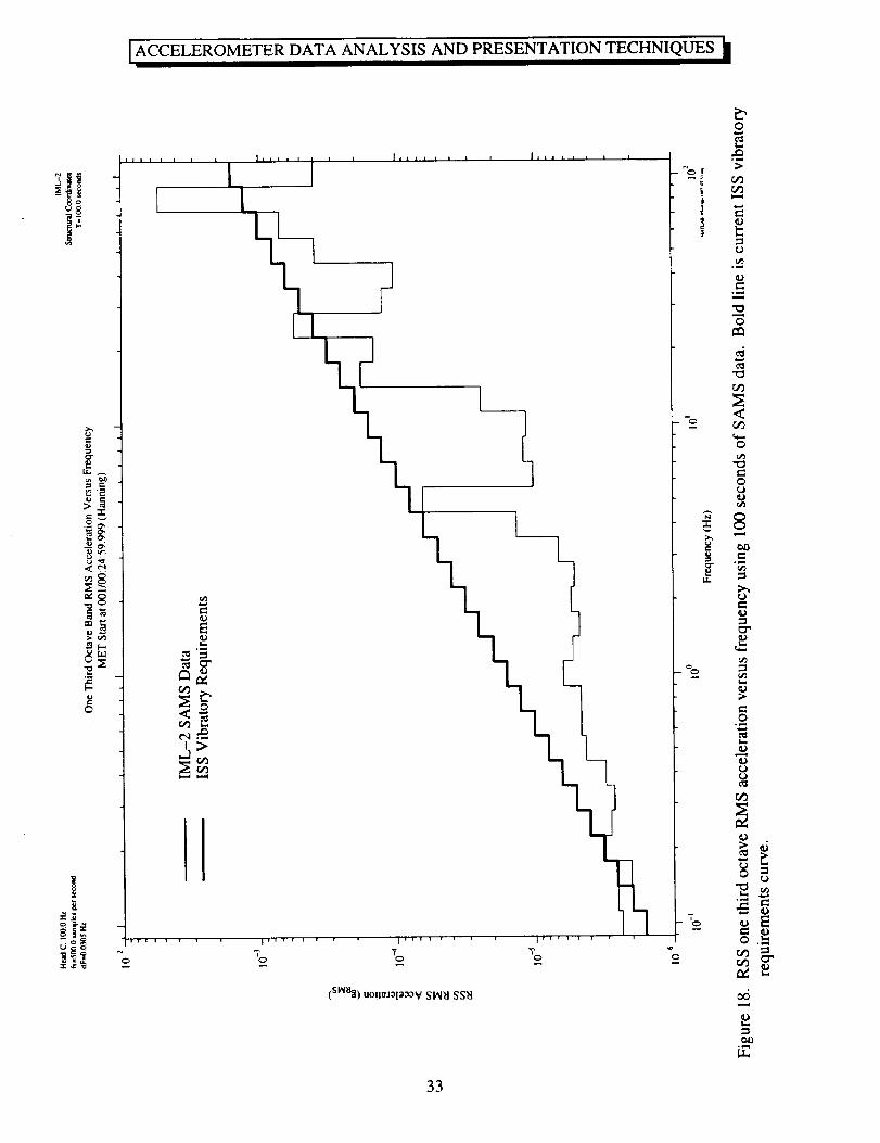
2.4.4 One Third Octave Band RMS Acceleration versus Frequency
This analysis is a specialized version of the graphical representation of gRidS values computed for
specified proportional bandwidth frequency bands. In this case, the (nearly) one third octave bands are
those defined by the International Space Station microgravity requirements, see Table 4 [13]. The
analysis quantifies the RMS acceleration level contributed by each of the one third octave frequency
bands given a 100 second interval. The results of the analysis are typically plotted along with a curve
representing the International Space Station combined vibratory limits to compare the acceleration
environment to these prescribed limits. The one third octave band RMS acceleration is computed asfollows:
12
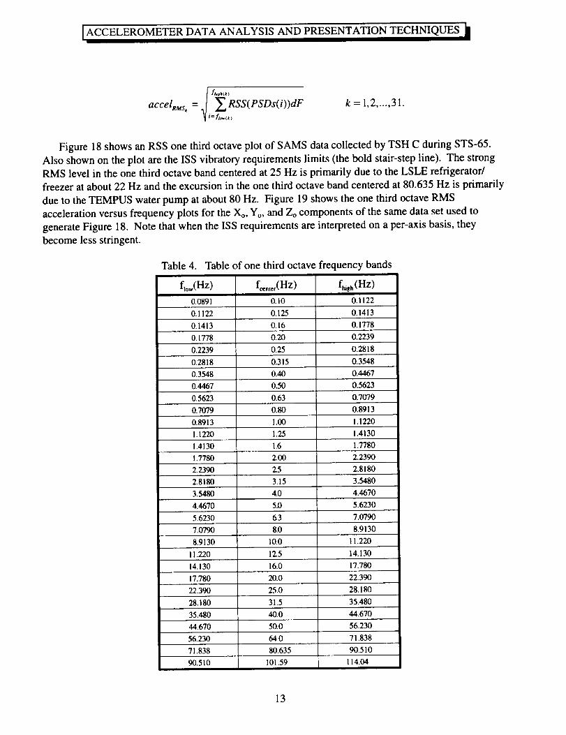
ACCELEROMETERDATA ANALYSIS AND PRESENTATIONTECHNIQUES
I f<b(k)accelRus, = _ RSS(PSDs(i))dF
i= fto,,(k )
k=l,2 ..... 31.
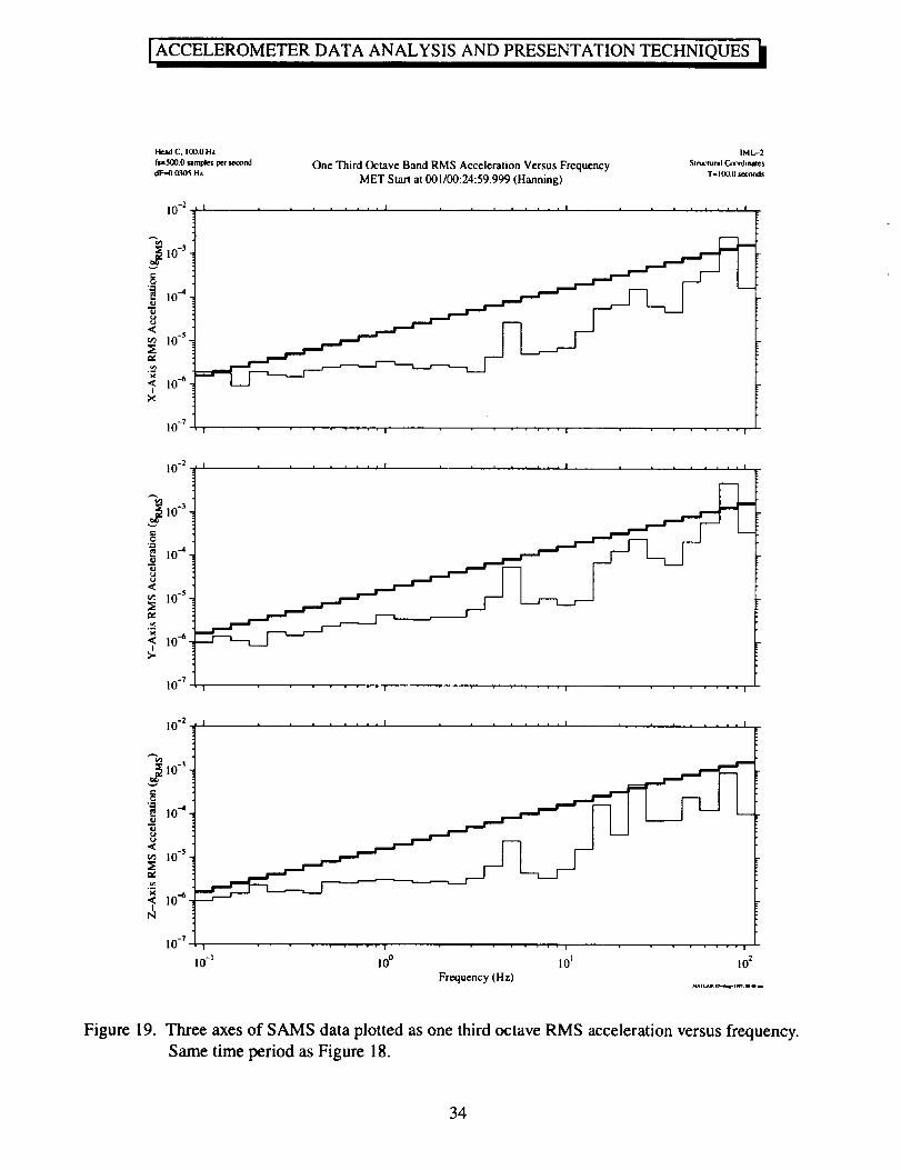
Figure 18 shows an RSS one third octave plot of SAMS data collected by TSH C during STS-65.
Also shown on the plot are the ISS vibratory requirements limits (the bold stair-step line). The strong
RMS level in the one third octave band centered at 25 Hz is primarily due to the LSLE refrigerator/
freezer at about 22 Hz and the excursion in the one third octave band centered at 80.635 Hz is primarily
due to the TEMPUS water pump at about 80 Hz. Figure 19 shows the one third octave RMS
acceleration versus frequency plots for the Xo, Yo, and Zo components of the same data set used to
generate Figure 18. Note that when the ISS requirements are interpreted on a per-axis basis, they
become less stringent.
Table 4.
f,ow(Hz)
0.0891
Table of one third octave frequency bands
fhish ( HZ )
0.1122
0.1122 0.125 0.1413
0.1413 0.16 0.1778
0.1778 0.20 0.2239
0.2239 0.25 0.2818
0.2818 0.3 i 5 0.3548
0.40 0.44670.3548
0.4467 0.50
0.5623 0.63
0.7079 0.80
0.8913 1.00
1.1220 1.25
i.4130 1.6
1.7780 2.00
2.2390 2.5
90.510
0.5623
0.7079
0.8913
1.1220
1.4130
1.7780
2.2390
2.8180
2.8180 3.15 3.5480
3.5480 4.0 4.4670
4.4670 5.0 5.6230
5.6230 6.3 7.0790
7.0790 8.0
8.9130 10.0
8.9130
11.220
101.59
11.220 12.5 14.130
14.130 16.0 17.780
17.780 20.0 22.390
22.390 25.0 28.180
28.180 31.5 35.480
35.480 40.0 44.670
44.670 50.0 56.230
56.230 64.0 71.838
71.838 80.635 90.510
114.04
13
ACCELEROMETERDATA ANALYSIS AND PRESENTATIONTECHNIQUES
2.4.5 Power Spectral Density versus Frequency versus Time (Spectrogram)
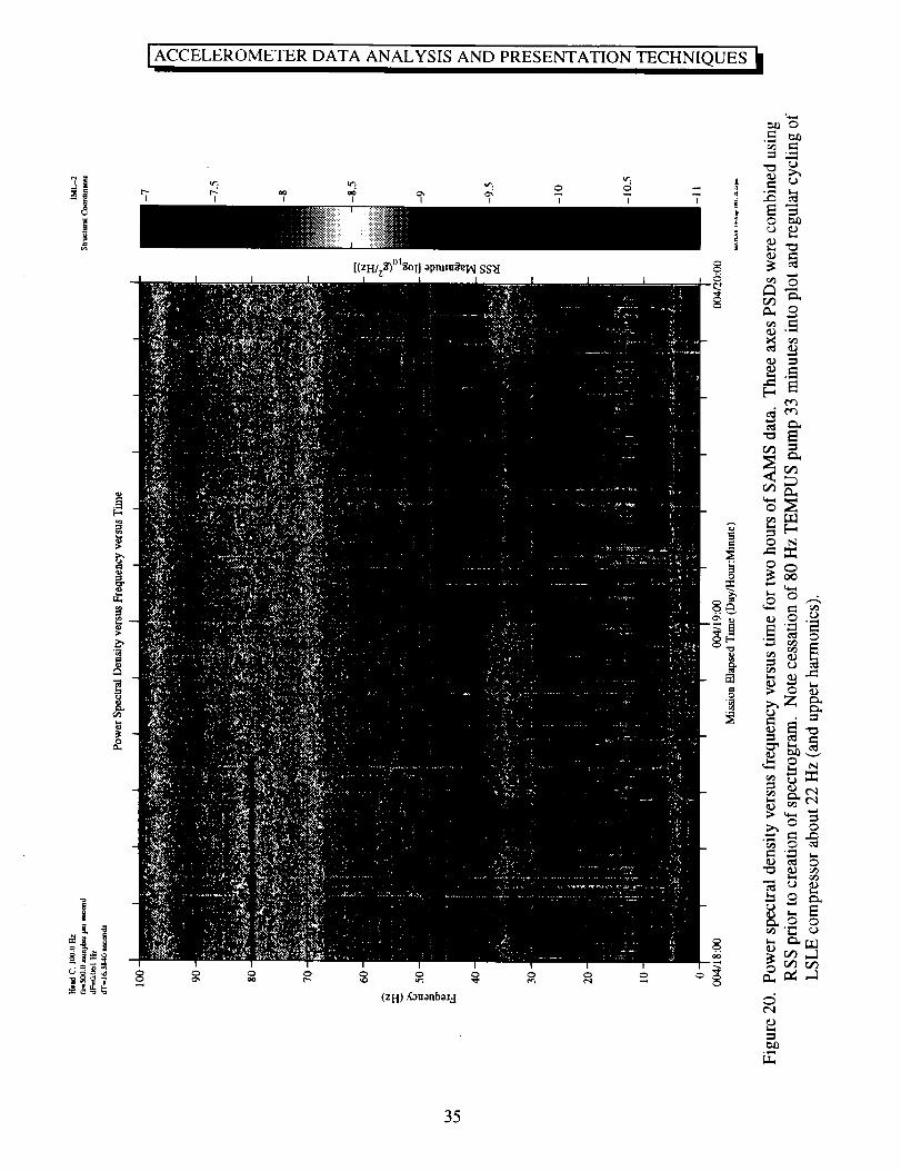
Spectrograms provide a road map of how acceleration signals vary with respect to both time and
frequency. To produce a spectrogram, PSDs are computed for successive intervals of time. The PSDs
are oriented vertically on a page such that frequency increases from bottom to top. PSDs from
successive time slices are aligned horizontally across the page such that time increases from left to right.
Each time-frequency bin is imaged as a color or grey scale corresponding to the logarithm of the PSD
magnitude at that time and frequency. Spectrograms are particularly useful in identifying when certain
activities begin and end. Figure 20 can be used as an example of how to identify start/termination of an
activity (see 22 and 80 Hz regions of spectrogram) and how the frequency components of an activity can
vary with time (see 22 Hz region of spectrogram).
3. Microgravity Measurement and Analysis Information on the Internet
3.1 Access to OARE and SAMS Data via File Transfer Protocol
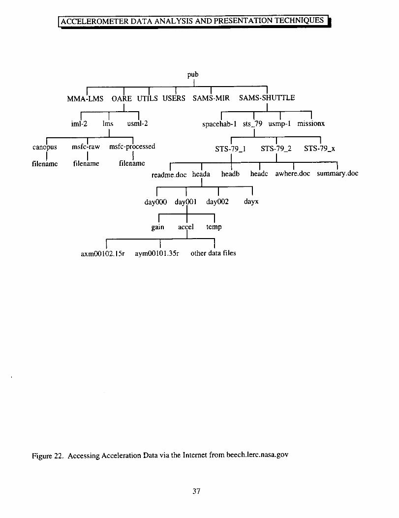
After each mission, SAMS and OARE data are available over the internet from the NASA Lewis
Research Center file server beech.lerc.nasa.gov. SAMS data files are typically available 6 to 8 weeks
after raw data files are delivered to SAMS. The estimated availability time for SAMS data is 3 months
after landing. OARE data files are typically available one month after landing.
Files of SAMS data are organized in a tree-like structure. Data acquired from a mission are
categorized based upon sensor head, mission day, and type of data. Data files are stored at the lowest
level in the tree and the file name reflects the contents of the file, Figure 21. For example, the file named
axm00102.15r contains data for TSH A, the x-axis, the time base was Mission Elapsed Time, day 001,
hour 02, 1 of 5 files for that hour, and it contains reduced data. The file readme.doc provides a
comprehensive description and guide to the data.
The OARE TMF data are organized into three files, one each for the Xb-, Yb-, and Zb-axes. The
applicable OARE data are found in the mission directories. Files under the canopus directory are
trimmean filter data, computed by Canopus Systems, Inc. Files under the msfc-raw directory contain the
telemetry data files provided to PIMS by the Marshall Space Flight Center Payload Operations Control
Center data reduction group. Files under the msfc-processed directory are raw files containing binary
floating point values, listing the MET (in hours), and the x, y, and z axis acceleration in micro-g's. See
the readme files for complete data descriptions.
Also available from the file server are some data access tools for different computer platforms.
The overall structure of the beech file server is given in Figure 22. The file server
beech.lerc.nasa.gov can be accessed via anonymous file transfer protocol (ftp), as follows:
14
ACCELEROMETERDATA ANALYSIS AND PRESENTATION TECHNIQUES
a) Establish an ftp connection to the beech file server.
b) Login: anonymous
c) Password: guest
d) Change the directory to pub
e) List the files and directories in the pub directory. There are at least five directories at this level:
OARE, SAMS-MIR, SAMS-SHUTTLE, UTILS, and USERS.
f) Change to the directory of choice.
g) Change the directory to the mission of interest, for example: usml-2
h) List the files and directories for the specific mission chosen in the previous step.
i) Use the data file structure to find the files of interest.
j) Enable binary transfer mode.
k) Transfer the data files of interest.
If you encounter difficulty in accessing the data using the file server, please send an electronic mail
message to the internet address below. Please describe the nature of the difficulty and a description of
the hardware and software you are using to access the file server.
Upon request, the PIMS team can provide SAMS data on CD-ROM media. Contact the internet address
above for more information.
3.2 Microgravity Measurement and Analysis WWW Pages
The Principal Investigator Microgravity Services, Space Acceleration Measurement System, and
Orbital Acceleration Research Experiment projects are all part of the NASA Lewis Research Center's
Microgravity Measurements and Analysis Project. More information about these and related projects is
available at the URL given below.
http://www.lerc.nasa.gov/WWW/MMAP
4. Summary
Numerous time and frequency domain analysis techniques have been introduced. Examples of
SAMS and OARE data interpretation using these techniques are given so that microgravity
experimenters are better able to use accelerometer data in experiment planning and in the analysis of
their experimental results.
15
ACCELEROMETERDATA ANALYSIS AND PRESENTATIONTECHNIQUES
5. References
[1] Rogers, M.J.B., J.I.D. Alexander, R.S. Snyder: Analysis Techniques for Residual
Acceleration Data. NASA TM- 103507, July 1990.
[21 Liberman, E.M., J.C. Acevedo: Setting Standards in Microacceleration Data Archiving,
Dissemination and Microacceleration Information Presentation. Joint Xth European and Vlth
Russian Symposium on Physical Sciences in Microgravity, St. Petersburg, Russia, 15-21 June
1997.
[3] Hakimzadeh, R., K. Hrovat, K.M. McPherson, M.E. Moskowitz, M.J.B. Rogers: Summary
Report of Mission Acceleration Measurements for STS-78. NASA TM-107401, January1997.
[4] Rogers, M.J.B., R. DeLombard: Summary Report of Mission Acceleration Measurements
for STS-65. NASA TM-106871, March 1995.
[51 DeWet, T., J.W.J. VanWyk: Efficiency and Robustness of Hogg's Adaptive Trim Means.
Commun. Stastist.-Theor. Meth., A8(2), pp. 117-128, 1979.
[6] DeLombard, R., K. McPherson, M. Moskowitz, K. Hrovat: Comparison Tools for Assessing
the Microgravity Environment of Missions, Carriers and Conditions. NASA TM-107446,
April 1997.
[7] Blanchard, R.C., J.Y. Nicholson, J.R. Ritter: Absolute Acceleration Measurements on
STS-50 from the Orbital Acceleration Research Experiment (OARE).
Microgravity Sci. Technol., VII/I, pp. 60-67, 1994.
[8] Blanchard, R.C., J.Y. Nicholson: Orbiter Rarefied-Flow Reentry Measurements from the
OARE on STS-62. NASA TM-110182, June 1995.
[9] Karl, J.H.: An Introduction to Digital Signal Processing. Academic Press, Inc., San Diego,
1989.
[10] Oppenheim, A.V., R.W. Schafer: Digital Signal Processing. Prentice-Hall, Inc., Englewood
Cliffs, 1975.
[11] Bendat, J.S., A.G. Piersoh Random Data, 2nd edition. John Wiley & Sons, New York, 1986.
[12] Ifeachor, E.C., B.W. Jervis: Digital Signal Processing--A Practical Approach.
Addison-Wesley Publishing Company, Wokingham, England, 1993.
[13] NASA System Specification for the International Space Station, Specification Number SSP
41000E, July 1996.
16
ACCELEROMETER DATA ANALYSIS AND PRESENTATION TECHNIQUES
= 0.5.2.¢=.1
c_
--, 0©
<-0.5
-1
I I I I I I
ACTUAL
\\
b
ALIAS
\
l II
11
I
Figure 1.
Figure 2.
0 dT 2dT 3dT 4dT 5dT 6dT 7dT 8dTTime (seconds)
Example of aliasing in time domain. Note that both signals have identical values at sampled
points, but the frequencies are different.
2 ] 2 "_
fs
Example of aliasing in frequency domain. Note foldover of spectral components above fN-
For this example, fs = 50 samples/sec, fN = 25 Hz.
17
I ACCELEROMETER DATA ANALYSIS AND PRESENTATION TECHNIQUES II
,-4
i
C,
[.-,
||rt
,,?
(ZH/z$) apm!uSeIAI(ISd SS}I
|r,
Q¢q
8
¢',1
C
I-.t
q)
Q
L,
,--1r,¢),-d
orj_
t...
r,¢)
©
E
= t4
t.r.,
kr.,
18
ACCELEROMETER DATA ANALYSIS AND PRESENTATION TECHNIQUES
Head C_ 100.O Hz IML-2
f_;O0.Oslmpl¢¢pet ,econd Acceleration versus Time (SAMS) sw_,_a co_,_ntm,MET Start at 006100:00:00.110 T-59.9 .conds
I I I 1 1
I I I I I
<(o
Ibd
-2
-3
I0 _3
2
1
0
I I I 1 1
0 I 0 20 30 40
Time (seconds
50
Figure 4. SAMS acceleration versus time plot. One minute's worth of data.
19
OARE. Raw D_ta
OAR E Laeal_on
100
MET Start at 006/00:00:00.000
Raw OARE Data at the OARE Location
Frlu_e _S[Re.fetem:_:OrbslIr
LMS
Bod_" CooRlm_
I I | I
50
-=
0
<I
-50
-I00
0 2 4 6 8 10 12 14 16 18
_t
II
20
I00
I I
2 4
I I I I I I
i i i i i I
6 8 lO 12 14 16 18
I!
I1
1[
20
100
50-
o-
Ib,a
-50 -
-I00
I I I I
i I ! i i i
0 2 4 6 8 10 12 14
Time (hrs)
II
I I
16 18 20
Figure 5. OARE acceleration versus time plot. Twenty hour's worth of data. Note effects of water
dump around 2 hours and crew sleep between 11 and 17 hours.
2O
)METER DATA ANALYSIS AND PRESENTATION TECHNIQUES
Head A, 3.0 Hz
f_2.5.0 _mples Per _xm(I
latcrval.100.00 _eond_
10 -6
6 I
_m 4-
<
<, O-Ng_-2-
<
_-4-
-6
SIMO DumpMET Start at 008/01:00:00.597
USML-2
St r, at.l_aril Cootdi_u
T-2flO.0 minutes
I I I I I I
I
I
I
I
I
, , t , , , I , ,
6
._ 4-
_ 2-
<
o
M
--6
[ 10 -6I I I i I I I I
I
I
I
I
I
I
I I I I I I I 1 I
I I t
_?
o_
,]
cO
10-6I i I i
2,<on
"< 0N
I
0
, , I , , , I , ,20 40 60 80 100 120 140 160 180
Time (minutes)200
Figure 6. SAMS data with 100 second interval average applied. Two hundred minutes of data plotted.
Effects of water dump operations are apparent in center of plots.
21
ACCELEROMETER DATA ANALYSIS AND PRESENTATION TECHNIQUES
Interval Average Acceleration versus TimeMET Start at 006/00:00:00.110
I I 1 I I
I 1 I I I
10-4I I I I I
O
m
.<
-70>.
-2
2
.=
u<
< 0I
N
<-I
"d
N
-2
1I I 1 I I
10 -4I I I I I
i.r.0
0 100 200 300 400 500
Time (seconds)
Figure 7. SAMS data with one-second interval average applied. Ten minutes of data plotted. Decrease
in levels starting at 450 seconds was caused by cycling off of LSLE refrigerator/freezer
compressor.
22
[ACCELEROMETER DATA ANALYSIS AND PRESENTATION TECHNIQUES It
Interval RMS Acceleration versus Time
MET Start at 006/00:00:00.110
I I 1 I I
c-O
1.5
<
x 1<I
0.5
10 -3I I I I I
I I I I I
v
cO,..n
u<
<I
N
N
|.5-
0.5
10 -31 I I I I
! I I I I
0 100 200 300 400 500
Time (seconds)_na, l _-.r,_+,r+ Ol++m
Figure 8. SAMS data with one-second interval RMS applied. Same ten minutes as plotted in Figure 7.
Note that the LSLE compressor deactivation is more clearly seen in this plot.
23
ACCELEROMETERDATA ANALYSIS AND PRESENTATIONTECHNIQUES
Fmr, e of Reference: O'_oilcz
OARE, TnramedMeanFilleted MET Start at 006/00:04:14.160 t.MsOARE Location Body Cxx!_linlues
OARE Trimmean Filter Data at the OARE LocationI I I I I
5 I
.o_0i<,
-5 t
0 2
| ! I
I ! i I I i i I
4 6 8 10 12 14 16 18
YII
u_
!
>.
0-
-5 I I I i I I I I i
0 2 4 6 8 10 12 14 16 18
5'II
"_0.M
IS
-5 t I I i I I I I I
2 4 6 8 10 12 14 16 18Time (hrs)
Figure 9. OARE data with trimmean filter applied. Same 20 hours as plotted in Figure 5. Note that
transients are reduced and the effects of water dumps, attitude maneuvers, and jet activity
during crew sleep are more evident in this plot.
24
ACCELEROMETER DATA ANALYSIS AND PRESENTATION TECHNIQUES
J
_,0 e,O
¢'q _ ',D
II li II
_m3.,Ljo _Swluoo._od
etO-s
I
i
t'q
,--.4 _ _ I ,-_ II I
(Sd) "Ioo3V sTxv-x
_-_e_ .,,-_
e"
• _
_._.
___'N
• "_
_',_
.,_'
_._ ._
"_.N
"r_
_O.w.l
25
[ACCELEROMETER DATA ANALYSIS AND PRESENTATION TECHNIQUES Ill
Fmrne of Reference: Orbiter
OARE, TrimmedMca.Filtered MET Start at 006100:04:14.160 t_sAGHF _perin_nt Location Body Coordinates
OARE Trimmean Filter Data at the AGHF LocationI I I I I
"_ 0-
X
-5 i
0 2
I I I
[I
I I ] I I I I I
4 6 8 10 12 14 16 18
II
:2
I>.
-5
I I i I I I I I I
dII
I I I I I I I I I
0 2 4 6 8 10 12 14 16 18
It,,t
-5 !0
I I I I I I I I I
!
I I I I I I I I I
2 4 6 8 10 12 14 16 18
Time (hrs)
Figure 11. OARE data with trimmean filter applied. Same 20 hours of data plotted in Figure 5, here
mapped to the AGHF (Spacelab) location.
26
ACCELEROMETER DATA ANALYSIS AND PRESENTATION TECHNIQUES
C,
' I' ...... ' I ........ I.... '' ' ' I...... IL' I' ......
O't:l
t,--, .-, t 1
_=. _"_ ,v
°°; <I
it t l i • I llll l I I l l lllll l i i l fill, I I l I _/
C,eq
o0
ItJ==
dC
it%
0 '_ C, 0
(ZH/zS) QSd
a::oo
,,6
O
EO
I::T'
.,t2
¢xOt.-,
:::1
0'3
O
Call
O
O
I,,,,,d
oi
ix0
27
ACCELEROMETER DATA ANALYSIS AND PRESENTATION TECHNIQUES
H¢._I C. I00,0 Hz IML-2
f..6oo.o ,_ap_., p,_ ,,¢o,,d Power Spectral Density versus Frequency (not u_ing spectral averaging) s,r_t_-_ coorami_
dr--o.ooJsnz MET Start al 006/00:00:00.110 (Boxcar, k=l ) T=5o rmnu'_,_
10 -4 I I I I I I I I I
10 -14
10 _
10 6
10 s
10 -IoI
10 i2
10 14
I I I I I I I I I
10" 14
0 10 20 30 40 50 60 70 80 90 100
Frequency (Hz)
Figure 13. Power spectral density calculated using five minutes of SAMS data. No spectral averagingused.
28
ACCELEROMETERDATA ANALYSIS AND PRESENTATIONTECHNIQUES
Held C. 10(I.O Hz IML,-2
f_300 0 samples per _nd Power Spectral Density versus Frequency sm,,:_,_l c,_,,ai_sT=5.0 minul u
or-,.oo3o_ Hz MET Start at 006/00:00:00.110 (Boxcar. k=9)
10 .4 1 I I I I I I t I
10 -6
,'_ i0-_
e_
_ lO-IO
I
X
i0 -_2
]0 -14
10 _I I I I I I I I I I
I0 -_
_i0 -_
"2 10 -I°
<I
i0 -:z
]0 -14 I I I I I I I I I
10.4 I, I I I I 1 I I I
10 -6
_ 10 -_
_ i0-_o<
IN
i0 -12 .
10 -I'1
0
I I i i I i I i i
I0 20 30 40 50 60 70 80 90 100
Frequency (Hz)
Figure 14. Power spectral density calculated using five minutes of SAMS data. The data were divided
into nine consecutive segments and the PSDs for the nine segments were averaged together
point by point. Compare to Figure 13 which was not averaged.
29
Head C, 100.0 Hz
fro,500.0 samples per se_)nd
dF=0.0305 Hz
1041
8
7
6
" 5
_ 4
_E 3
"_ 2I
x 1
0
Cumulative RMS versus FrequencyMET Start at 006/00:00:00.1 I0 (Boxcar, k=9)
I I I 1 I I I I
f___.___J-
JI I I I I
IML-2
Stnglural Cotmliute_
T=5.0 minutes
j-----f
8-
6-
"" 5->o
4-Et_ 3-.m
_< 2-<CI
I
0
104I I I I I I I I I
Ff
i I
f
S
| I I I I I I I l
JI I
10 20I I I I I I I
30 40 50 60 70 80 90 100
Figure 15. SAMS data displayed as cumulative RMS acceleration versus frequency. Same time period
as displayed in Figure 14. Note steps appear in plots at excited frequencies.
30
ACCELEROMETER DATA ANALYSIS AND PRESENTATION TECHNIQUES
u_
U-O
3-
c_
L)
t/d
E¢
I I I I I
I I I I I
0
(S14_I,_) SI_I_! a^.nelntunD SS_I
I
"13OL_
_J
_hCJe-
{3"
L.
t-
.o
L.
¢J
Iv
cj
¢u
"El
O
O
c_
O
°"_
"13 t=
O._c/_ ;"
L_
31
ACCELEROMETERDATA ANALYSIS AND PRESENTATIONTECHNIQUES
Head C. 100.0 Hz
fs=5_O.O samples per iecood
dF-O.0305 Hz
keo._res,4). I0 Hz
x 10 -.4I
3.5-
3-
,,, 2.5-b_
:_ 2-,..,,
1.5-I
xI
0,5
0 " -i_
RMS versus FrequencyMET Start at 006/00:00:00.110 (Boxcar, k=9)
IML--2
SIn.Clund CotwdiHles
T=5.0 minmes
I I I I I I I I
a_[_ ._= , , , _._.:_ , _L.
y.
I
>.
3.5-
3-
2.5-
2-
1.5-
I
0.5
0-
10 .-4 t L .L J I. I. k .L l
C¢
<I
N
3.5-
3-
2.5-
2-
1.5-
I
0.5
0 -
0
10 -4I I I I I I I I
AI I I I I"
I0 20 70 80 90 1O0
l i I I
30 40 50 60
Frequency (Hz)
I
Figure 17. SAMS data displayed as gRMsversus frequency. RMS levels computed for 0.1 Hz wide
bands• Same time period as figures 14-16.
32
]ACCELEROMETER DATA ANALYSIS AND PRESENTATION TECHNIQUES II
t-
>#
o©
_t
t3 •
o"T
(s_) uo!leJalaaaV SI,_I_ISS8
O
0
o
o6
33
ACCELEROMETER DATA ANALYSIS AND PRESENTATION TECHNIQUES
Head C, t00.0 Hz IML--2
f_,,5oo.oamp_ _, _,a,_ One Third Octave Band RM S Acceleration Versus Frequency str_-_ral Co_i_tes
aF,.O.O3OSHz MET Start at 001/00:24:59.999 (Hanning) T.IOO0seconds
10-2
i0-3
"_ I0 _
<
<: i0 _I
x
10 -7..... ! .... I
10-2
,_10 -3,
2 I0 _.o
"dU
10 -s
,_ 10 4I
>.
10 .7.... I .... I .... I
10 -2
A
a_10 -3,
"_ 10"4o
10 -s
< 10 "_ .I
N
lO=_
.... I .... I , i , i , | , I
.... 1 .... l .... I
i0 -z i0 ° I0 i 102
Frequency (Hz)_TtAJ _m.q-i_ rmm.
Figure 19. Three axes of SAMS data plotted as one third octave RMS acceleration versus frequency.
Same time period as Figure 18.
34
ACCELEROMETERDATA ANALYSIS AND PRESENTATIONTECHNIQUES
I
itl
"i
8
i,:2
o
_°oq _
:::t
_m
0..=_
0 •
• c_ O
_._ _
r_ r_
35
[ ACCELEROMETER DATA ANALYSIS AND PRESENTATION TECHNIQUES h
1) Sensor Head (a,b,c)
2) Axis (x,y,z)
axm00102.15r00 • 0 _ ®OQ
Im : Mission Elapsed Time• Jn : Near Mission Elapsed Time
3) Time Reference |r : Russian Time
[g : Greenwich Mean Time
4) Day: 3 digits, with leading zeros
5) Hour: 2 digits, with leading zeros
6) File Number (1,2,3,4,5,6)
7) Total number of files per hour (1,2,4,5,6)
(if: Reduced acceleration data8) Type of data in file" Gain setting information
Temperature data
Figure 21. SAMS data naming convention.
36
ACCELEROMETER DATA ANALYSIS AND PRESENTATION TECHNIQUES
pub
II I I I I I
MMA-LMS OARE UTILS USERS SAMS-MIR SAMS-SHUTTLE
I II I I I I I
iml-2 Ires usml-2 spacehab-1 sts_79 usmp-I
I msfc!rawcanopus
I Ifilename filename
Imissionx
I i ! I i imsfc-processed STS-79_1 STS-79_2 STS-79_x
I [ Ifilename [ I i [ I
readme.doc heada headb headc awhere.doc
II I I I
day000 daYl001 day002
I [ Igain accel temp
II I I
axm00102.15r aym00101.35r other data files
dayx
Isummary.doc
Figure 22. Accessing Acceleration Data via the Internet from beech.lerc.nasa.gov
37
Form Approved
REPORT DOCUMENTATION PAGE OMBNo.0704-0188Public repoding burden for this collection of Inlotmation is estimated to average I hour per response, including the time for reviewing instructicns, searching existing data sources,gathering and maintaining the data needed, and compieling end reviewing the collection of information. Send corrtmefltl r_rding Ibis burden estimate or any olher aspect of thiscollection ol inlormetion, including luggestions for reducing this burden, to Washinglon Headquarters Services, Directorate lot Informition Operations Ind Reporls, 1215 JeffersonDavis HighwIy, Suite 1204, Arlington, VA 222024302, end to the Office of Management and Budget, Paperwork Reduction Project (0704-0188), Washington, DC 20503.
1. AGENCY USE ONLY (Leave blank) 2. REPORT DATE 3. REPORT TYPE AND DATES COVERED
September 1997 Technical Memorandum
4. TITLE AND SUBTITLE 5. FUNDING NUMBERS
Accelerometer Data Analysis and Presentation Techniques
i6. AUTHOR(S)
Melissa J.B. Rogers, Kenneth Hrovat, Kevin McPherson, Milton E. Moskowitz,
and Timothy Reckart
7. PERFORMINGORGANIZATIONNAME(S)ANDADDRESS(ES)
National Aeronautics and Space AdministrationLewis Research Center
Cleveland, Ohio 44135-3191
9. SPONSORING/MONITORINGAGENCYNAME(S)ANDADDRESS(ES)
National Aeronautics and Space Administration
Washington, DC 20546-0001
WU-963-60-0D
8. PERFORMING ORGANIZATION
REPORT NUMBER
E-10937
10. SPONSORING/MONITORING
AGENCY REPORT NUMBER
NASA TM- 113173
11. SUPPLEMENTARY NOTES
Melissa J.B. Rogers, Kenneth Hrovat, Milton E. Moskowitz, and Timothy Reckart, Tat-Cut Company, 24831 Lorain Road,
Suite 203, North Olmsted, Ohio 44070; Kevin McPherson, NASA Lewis Research Center. Responsible person, KevinMcPherson, organization code 6727, (216) 433--6182.
12a. DISTRIBUTION/AVAILABILITY STATEMENT
Unclassified - Unlimited
Subject Categories 20, 35, and 18
This publication is available from the NASA Center for AeroSpace Information, (301) 621-0390
12b. DISTRIBUTION CODE
13. ABSTRACT (Maximurn 2OO worde)
The NASA Lewis Research Center's Principal Investigator Microgravity Services project analyzes Orbital Acceleration
Research Experiment and Space Acceleration Measurement System data for principal investigators of microgravity
experiments. Principal investigators need a thorough understanding of data analysis techniques so that they can request
appropriate analyses to best interpret accelerometer data. Accelerometer data sampling and filtering is introduced along
with the related topics of resolution and aliasing. Specific information about the Orbital Acceleration Research Experiment
and Space Acceleration Measurement System data sampling and filtering is given. Time domain data analysis techniques
are discussed and example environment interpretations are made using plots of acceleration versus time, interval average
acceleration versus time, interval root-mean-square acceleration versus time, trimmean acceleration versus time,
quasi-steady three dimensional histograms, and prediction of quasi-steady levels at different locations. An introduction to
Fourier transform theory and windowing is provided along with specific analysis techniques and data interpretations. The
frequency domain analyses discussed are power spectral density versus frequency, cumulative root-mean-square accelera-
tion versus frequency, root-mean-square acceleration versus frequency, one-third octave band root-mean-square accelera-
tion versus frequency, and power spectral density versus frequency versus time (spectrogram). Instructions for accessing
NASA Lewis Research Center accelerometer data and related information using the internet are provided.
14. SUBJECTTERMS
Accelerometer; Data analysis; Time domain; Frequency domain;
Microgravity environment
17. SECURITY CLASSIFICATIONOF REPORT
Unclassified
111. SECURITY CLASSIFICATIONOF THIS PAGE
Unclassified
NSN 7540-01-280-5500
19. SECURITY CLASSIFICATIONOF ABSTRACT
Unclassified
15. NUMBER OF PAGES
4616. PRICE CODE
A03
20. LIMITATION OF ABSTRACT
Standard Form 298 (Rev. 2-89)
Prescribed by ANSI Std. Z39-18298-102