accessible document guidelines · web viewmicrosoft word 2010 accessibility checker microsoft word...
TRANSCRIPT

Accessible Document Guidelines 1.0A good way to think of document accessibility is to treat it in the same way we consider spelling and grammar. It should be built into a document, not added on afterwards. By incorporating these guidelines, your document will not only be inclusive, it will be professional, clear, and easy to understand.
Microsoft Word 2010 Accessibility CheckerMicrosoft Word 2010 has a built in accessibility checker that works much like a spell check. It is not a full check, but it does check some these guidelines. Note: Will need to saved in .docx format to work
1. Select File Tab2. Select Info3. Select Check For Issues4. Select Check Accessibility
1Questions, Comments or Queries? Contact: [email protected]

Accessible Document Guidelines Summary
Fonts (Page 3-5)1. Use Arial and Myriad Pro for internal and external communications. 2. Minimum size is 12pt.
Default large print size is 18ptLine spacing of 1.2 font size
3. Do not use ornate fonts. 4. Avoid using italics.5. Avoid using block capitals.6. Avoid using underlining.7. Use bold text to emphasize text without reducing readability.8. Use descriptive hyperlinks.9. Documents should have a Flesch Reading score of 60 (Plain Text).
Images (Page 6-8)1. All images in a Microsoft Word document require alternate text.2. All graphs, flow charts and diagrams require a text or tactile equivalent. 3. Do not use text boxes in Microsoft Word.4. Do not use scanned PDF files.
Layout (Page 9-11)1. Text must meet the WCAG AAA colour contrast standard.2. Avoid mixing colour contrast.3. Left align text. Avoid using centred headings and mixing text alignment.4. Use a vertical line to indicate separate columns. 5. Repeat visual elements.6. Items relating to each other should be grouped close together. 7. Ensure paper is thick, non-glossy and bound so it can be laid flat
Tables (Page 12-13)1. Avoid using merged cells 2. Avoid using blank rows and columns3. Consider reading order of tables4. Add bookmarks for table headers
Headings (Page 14)1. Use Heading styles to format Microsoft Word documents
2

Fonts
1. TypefacesUse Arial and Myriad Pro for internal and external communications.
Arial12 pt. The quick brown fox jumped over the lazy dogs
18 pt. The quick brown fox jumped over the lazy dogsMyriad Pro12 pt. The quick brown fox jumped over the lazy dogs18 pt. The quick brown fox jumped over the lazy dogs
2. Size When writing to an individual, use their preferred typeface and size.For documents for a general audience use…
Minimum size is 12pt PowerPoint minimum 32pt Default large print size is 18pt Line spacing of 1.2 font size
3. Ornate typefacesDo not use ornate fonts.
For example, do not use fonts such as …Gigi, Brush Script, Curlz MT, Stencil, Papyrus, Jokerman and ChillerTypes of typefacesTypefaces fall into two broad categories, Serif and Sans Serif. Serif fonts are widely used for text because they were considered easier to read than sans-serif fonts in print. However, scientific studys on this topic has been inconclusive.
Serif (with little lines)
Sans Serif (without little lines)
3

4. ItalicsAvoid using italics.
With some typefaces, the italic letters are different from the regular letters. The characters are usually thinner and more ornate, making them more difficult to read (Figure 1).
Figure 1
5. Block CapitalsAvoid using block capitals. There are different theories as to why we find capitalised text difficult to read. In 1886 James Catrell came up with the idea that we use word shapes help to identify words. More recently, the work by Kenneth Paap and Keith Raynor on eye movement and reading cognition suggest the act of reading is more complex.
Regardless of the theories, capitalized text is considered harder to read because we are not used to reading in all caps. Also, many regard capitalized text as shouting. These are the primary reasons for avoiding all caps text.
6. UnderliningAvoid using underlining.
Underlining text can create problems due to the the cross over with the “descenders” (figure 3) of the characters (the bits of g, y, j, p and q that hang down below the baseline)
Figure 2
7. BoldUse bold text to emphasize text without reducing readability
8. HyperlinksUse descriptive hyperlinks
4

Hyperlinks are used as a form of navigation for screen reader users. How they are formatted can affect the accessibility of a document. It is important that link text is descriptive and makes sense. For example
Visit the Human Rights Commission Not Click here to visit the HRC website
9. Plain EnglishDocuments should have a Flesch Reading score of 60 (Plain Text)
The Flesch Reading Ease measures textual difficulty, which indicates how easy a text is to read. This measure does not measure the complexity of the subject; it measures how difficult a piece of text is to read. By factoring aspects such as word length and syllables, a numerical value is given. The higher the score the easier it is to read.
There is a built in tool to measure Flesch reading ease in Microsoft Word. However, it is not set by default. Follow these instructions below to set it to check your document by default.
1. Select File tab2. Select Options3. Select Proofing4. Check Show readability statistics checkbox
Tips for Plain English writing Split long sentences into shorter ones. Target complex words and replace with two word combinations.
E.g. ‘establishment’ into ‘setting up’
5

Images
1. Alt TextAll images in a Microsoft Word document require alternate text.
Alternate text (or alt text) is required for screen reader users to access text equivalents in place of the image. A text equivalent does not require a full description of every detail. A good way to think of alt text is to imagine you are describing the image to someone over the phone.
Alt text is different from a caption, as the alt text is read out when the screen reader gets to the image. A caption may not be in the right reading order, and it may not be clear the caption is referring to the image. For example, if the caption is something like “figure 1”.
Alt text example
Too little: Dog
Just Right: Sam the guide dog puppy runs through the field
Too much: Sam the golden Labrador guide dog puppy wearing a red coat running towards the camera through a field of grass with two types of daisy.
6

How to Add Alt Text to Images in Microsoft Word and Outlook
1. Right click image (Select 2. Select Format Picture…3. Select Alt Text4. Fill out Description
Images Must Be “In Line With Text” The Wrap Text properties of an image change the relationship between the text and the image. For the alt text to work, the image needs to set to ‘in line with text’ (Figure 4). This does limit the placement features of word, but a screen reader is unable to pick up the alt text details if this option is not used.
Figure 3
7

2. Graphs, Flow Charts and DiagramsAll graphs, flow charts and diagrams require a text or tactile equivalent.
Graphs, flow charts and diagrams can be difficult to describe with text. With graphs, include a simple table of data that will be able to be read by screen readers. In some cases, a bulleted list can be used for a simple chart. If the image is complex, consider creating a tactile copy for blind people and those with low vision.
3. Text BoxesDo not use text boxes in Microsoft Word
Screen readers cannot access text boxes in Word. For similar reasons to why images have to be inline, screen readers simply cannot read the content in a text box or a shape with text in it.
4. PDFDo not use scanned PDF files.
A scanned PDF document using a photocopier is completely inaccessible. The photocopier is effectively taking a photograph of each page and storing them within the document. As a result, there is no text in the document for the screen reader to use to read.
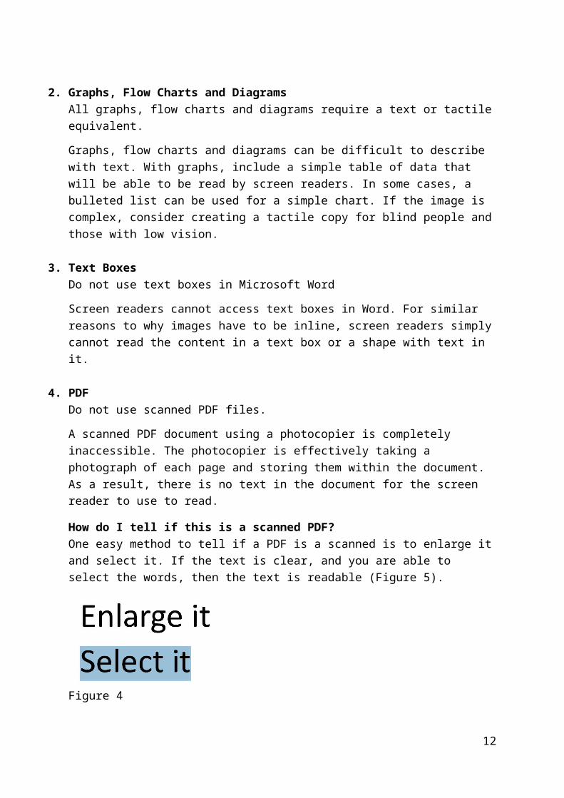
How do I tell if this is a scanned PDF?One easy method to tell if a PDF is a scanned is to enlarge it and select it. If the text is clear, and you are able to select the words, then the text is readable (Figure 5).
Figure 4
If the text is pixelated and you cannot select the words then it is a scanned document (Figure 6).
Figure 5
If you have any problems, contact the Digital Accessibility team at [email protected]
8

Layout
1. Colour ContrastText must meet the WCAG AAA colour contrast standard.
Good examples are black or dark blue text on a white or yellow background, or white/yellow text on a black/dark blue background. Using light text on a dark background can help to reduce glare.
Preferences for colour contrast are varied for different eye conditions. As a result, there is no one colour combination that gives the best result for everyone. If it is known, use the preferred options of the person you are communicating with.
For a general audience, we can effectively measure colour contrast with a tool called the Colour Contrast Analyser (Figure 7). This provides a pass/fail assessment against international standards (Web Content Accessibility Guidelines). Although the tool is primarily for assessing screen accessibility, it is an effective tool for documents intended for print.
Figure 6
For more information about this tool, contact the digital accessibility team [email protected]
2. Mixing Colour ContrastAvoid mixing colour contrast.
Most low vision adaptive technology comes with an option to reverse or modify colours to suit people’s needs. It is common to use the negative setting as it reduces
9

the amount of white and as a result reduces glare. Mixing colour contrast prevents people with low vision to be able to maintain these settings.
Figure 8 shows a table that uses white on black text for the heading, and white on black for the text. Next to the table is the same table with negative settings. The heading is now black on white background, creating more glare around the text of the heading.
Figure 7
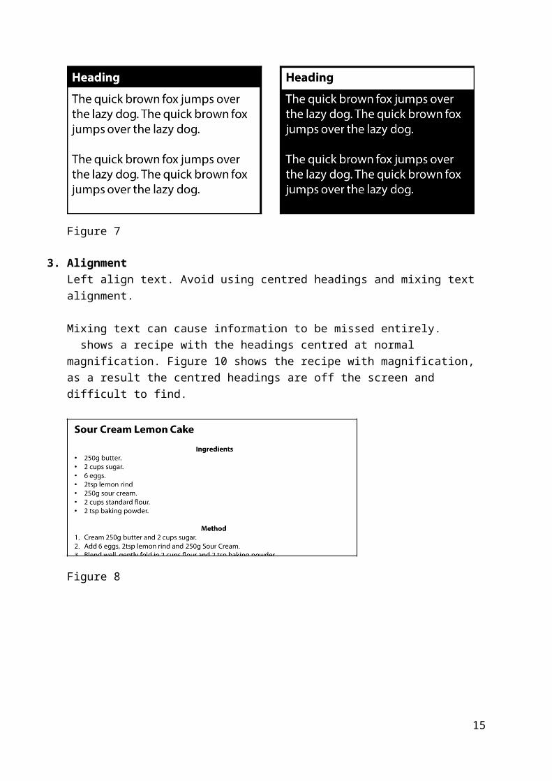
3. AlignmentLeft align text. Avoid using centred headings and mixing text alignment.
Mixing text can cause information to be missed entirely. shows a recipe with the headings centred at normal magnification. Figure 10 shows the recipe with magnification, as a result the centred headings are off the screen and difficult to find.
Figure 8
10

Figure 9
4. ColumnsUse a vertical line to indicate separate columns.
When using magnification a vertical line can help indicate that you are navigating to another column. This gives a clue to move to the next line. If you are unable to use a vertical line, use plenty of white space between columns
5. RepetitionRepeat visual elements, this develops organisation and strengthens unity.
A common example is using bullet points. Using different visual elements can be confusing to the reader as it can be interpreted as a different topic or subject. Using the same bullet point creates consistency within the document.
6. ProximityItems relating to each other should be grouped close together.
Readers will naturally link text that is close together. Separating text can add clarity the text is a different subject or topic.
7. Printing and bindingEnsure paper is thick, non-glossy and bound so it can be laid flat
Paper or lamination must not be glossy. Some partially sighted people experience light aversion, so glare must be avoided.
Paper must be thick enough to minimise show-through from the other side.
Choose a binding method that lets the document open flat. This is more effective for readers using magnification technology.
11
Tables
1. Merged cells Avoid using merged cells
Merged cells within tables can make navigation using a screen reader very confusing. While technically accessible, a table used for layout is can be difficult to comprehend using a screen reader. For example, the table below is read out as...
“Non-uniform table, “Title” row 1 of 3 column 1 of 2, “Date” Column 2 of 2, “Name” row 2 of 3, number of columns changed from 2 to 3, “Code” column 2 of 3, “Currency” column 3 of 3, “Address” row 3 of 3 column 1 of 3, “Country” column 2 of 3, “Reference” column 3 of 3”
TitleDate
Name Code Currency
Address Country Reference
Changing this table so that it is small, simple and symmetrical will make this table easier to comprehend and navigate. The following table will be easier to navigate.
Form DetailsName
Date
Currency
Address
Code
Reference
2. Blank columns and rowsAvoid using blank rows and columns
Blanks rows and columns can be interpreted as the end of a table. Tables with blank areas can also be difficult to navigate to find data even if the information is accessible.
12

3. Reading order of tablesScreen readers read tables from left to right. For example, in the table below it would be read out as “Basement up toilets flush must” not “Basement toilets must flush up”
Basement up
toilets flush
must
Each line of information in a table should have its own row. The table below shows a table with 2 rows, however there is multiple lines of text in the cells in row 2. This would read out as “Maths, English, Physics” then “Tuesday, Monday, Friday” and finally “10:00, 12:00, 10:30”
Class Day TimeMathsEnglishPhysics
TuesdayMondayFriday
10:0012:0010:30
The following table has correct formatting; each line of information has its own table row.
Class Day TimeMaths Tuesday 10:00English Monday 12:00Physics Friday 10:30
4. Add bookmarks for table headers If a table has both row and column headings insert a bookmark named ‘title’ in
column 1 row 1. If a table has column headings only, insert a bookmark named “ColumnTitle”
in row 1 If a table has row headings only, insert a bookmark named “RowTitle” in
Column 1
13

Headings
1. StylesUse Heading styles to format Microsoft Word documents
A good heading structure is probably the most important accessibility consideration in most Word documents.
Headings must be formatted using styles in Word, rather than simply changing the visual appearance of the text by making it bigger or applying bold.
Styles are not an accessibility tool; it is how Microsoft meant for you to format documents. It is the most efficient method of formatting documents.
While there are many styles within Word, screen reader users only use the Heading styles for navigation.
Marking headings correctly means that…
You can use features in Word that rely on heading codes, like adding a table of contents, creating hyperlinks automatically and using the Navigation Pane.
Screen reader users can use headings to navigate using the headings as a list of contents to scan the document
The document can be converted into an accessible PDF file, braille, large print and synthetic audio more quickly and efficiently.
Note: Styles can be modified by right clicking (or using the context menu key) and selecting Modify. These changes will affect every instance of the style throughout the document. If you modify a heading, it will still be readable by a screen reader.
14
Resources Consulted CNIB Clear Print guidelines Print Round Table guidelines European Blind Union guidelines WebAIM Word Document guidelines RNIB Word document formatting guidelines American Printing House for the Blind guidelines Accessible Digital Office Document Project British Dyslexia Style Guide Web Content Accessibility Guidelines (WCAG 2.0) Microsoft Create Accessible Word Document Guidelines Microsoft: Article on Word recognition
http://www.microsoft.com/typography/ctfonts/wordrecognition.aspx
15