additional copies of this report are available on the … copies of this report are available on the...
TRANSCRIPT


Additional copies of this report are available on the American Hospital Association’s web site at www.aha.org

TRENDWATCH CHARTBOOK2016Trends Affecting Hospitals and Health Systems

TrendWatch, produced by the American Hospital Association, highlights
important trends in the hospital and health care field. TrendWatch products
include a series of reports, released each year, that provide up-to-date
information on health and hospital trends, and this Chartbook.
The American Hospital Association (AHA) is the national organization that represents and serves all types of hospitals, health care networks, and their patients and communities. Close to 5,000 institutional, 600 associate, and 40,000 personal members come together to form the AHA.
Copyright © 2016 by the American Hospital Association. All Rights Reserved.
American Hospital AssociationTwo CityCenter, Suite 400800 10th Street, NWWashington, DC 20001-4956202.638.1100www.aha.org

TRENDWATCH CHARTBOOK 2016
TABLE OF CONTENTS
CHAPTER 1: Trends in the Overall Health Care Market 1
Chart 1.1: Total National Health Expenditures, 1980 – 2014 3
Chart 1.2: Percent Change in Total National Health Expenditures, 3 1994 – 2014
Chart 1.3: Per Capita National Health Expenditures, 1980 – 2014 4
Chart 1.4: National Health Expenditures as a Percentage of 4Gross Domestic Product, 1994 – 2014
Chart 1.5: National Expenditures for Health Services and 5Supplies by Category, 1980 and 2014
Chart 1.6: Percent Change in National Expenditures for 6 Health Services and Supplies by Category, 2013 – 2014
Chart 1.7: Percent Change in National Expenditures for Selected 7Health Services and Supplies, 2004 – 2014
Chart 1.8: National Health Expenditures, 1980 – 2024 7
Chart 1.9: Consumer Out-of-pocket Payments for National Health 8Expenditures, 1994 – 2014
Chart 1.10: Total Prescription Drug Spending, 1980 – 2014 8
Chart 1.11: Growth in Total Prescription Drug Spending as a 9Percentage of Total Growth in National Health Expenditures, 1994 – 2014
Chart 1.12: Consumer Out-of-pocket Spending vs. Private Health 9Insurance Spending for Prescription Drugs, 1994 – 2014
Chart 1.13: Distribution of National Health Expenditures by Source 10of Payment, 1980, 2000, and 2014
Chart 1.14: Distribution of Health Insurance Coverage, Percentage of 10Population Covered by Payer, 1990, 2013, and 2014
Chart 1.15: Number and Percent Uninsured, 1994 – 2014 11
Chart 1.16: Average Percent Uninsured by State, 2013 – 2014 11
Chart 1.17: Medicare Enrollees, 1995 – 2015 12
Chart 1.18: Medicaid Enrollees, 1990, 1995, 2000 – 2016 12
Chart 1.19: National CHIP Enrollment, FY 1999 – FY 2014 13
Chart 1.20: Percent Change in CHIP Enrollment By State, 13FY 2013 – FY 2014
i
Trends Affecting Hospitals and Health Systems

TRENDWATCH CHARTBOOK 2016
Chart 1.21: Percentage of Employees with Employer-based 14Coverage Who Can Choose Conventional, PPO, HMO, POS, and HDHP/SO Plans, 1988 – 2015
Chart 1.22: Distribution of Employer-sponsored Health Insurance 14Enrollment by Type of Plan, 1988 – 2015
Chart 1.23: Percentage of Medicare Beneficiaries Enrolled in 15Medicare Managed Care, 1995 – 2015
Chart 1.24: Percent Growth in Medicare Spending per 15Beneficiary vs. Private Health Insurance Spending per Enrollee, 1994 – 2014
Chart 1.25: Percentage of Medicaid Beneficiaries Enrolled in 16Medicaid Managed Care, 1992 – 2011 and 2013
Chart 1.26: Percentage of Medicaid Beneficiaries Enrolled in 16Medicaid Managed Care by State, 2013
Chart 1.27: Status of State Medicaid Expansion Decisions, 2016 17
Chart 1.28: Total Effectuated Enrollment in Health Insurance Marketplace 17by Metal Level
Chart 1.29: Annual Change in Health Insurance Premiums, 2000 – 2015 18
Chart 1.30: Managed Care Plan Average Operating Margins, 1998 – 2015 18
Chart 1.31: Operating Margins of the Top Insurers, 2013 – 2015 19
CHAPTER 2: Organizational Trends 20
Chart 2.1: Number of Community Hospitals, 1994 – 2014 23
Chart 2.2: Number of Beds and Number of Beds per 1,000 23Persons, 1994 – 2014
Chart 2.3: Beds per 1,000 by State, 2014 24
Chart 2.4: Number of Hospitals in Health Systems, 2004 – 2014 24
Chart 2.5: Number of Medicare-certified Ambulatory 25Surgical Centers, 2009 – 2014
Chart 2.6: Percentage of Hospitals with Physician Affiliates by 25Type of Relationship, 2004 – 2014
Chart 2.7: Percentage of Hospitals with Insurance Products by 26Type of Insurance, 2004 – 2014
Chart 2.8: Percentage of Hospitals Offering “Non-hospital” 26Services, 2004 – 2014
Chart 2.9: Announced Hospital Mergers and Acquisitions, 271998 – 2015
ii
Trends Affecting Hospitals and Health Systems

TRENDWATCH CHARTBOOK 2016
CHAPTER 3: Utilization and Volume 29
Chart 3.1: Inpatient Admissions in Community Hospitals, 311994 – 2014
Chart 3.2: Total Inpatient Days in Community Hospitals, 311994 – 2014
Chart 3.3: Inpatient Admissions per 1,000 Persons, 321994 – 2014
Chart 3.4: Inpatient Days per 1,000 Persons, 1994 – 2014 32
Chart 3.5: Average Length of Stay in Community Hospitals, 331994 – 2014
Chart 3.6: Average Length of Stay in Community Hospitals 33by State, 2014
Chart 3.7: Emergency Department Visits and Emergency 34Departments in Community Hospitals, 1994 – 2014
Chart 3.8: Hospital Emergency Department Visits per 1,000 34Persons, 1994 – 2014
Chart 3.9: Total Hospital Outpatient Visits in Community Hospitals, 351994 – 2014
Chart 3.10: Hospital Outpatient Visits per 1,000 Persons, 351994 – 2014
Chart 3.11: Percentage Share of Inpatient vs. Outpatient Surgeries, 361994 – 2014
CHAPTER 4: Trends in Hospital Financing 37
Chart 4.1: Percentage of Hospitals with Negative Total and 39Operating Margins, 1995 – 2014
Chart 4.2: Aggregate Total Hospital Margins and Operating Margins, 391994 – 2014
Chart 4.3: Distribution of Outpatient vs. Inpatient Revenues, 401994 – 2014
Chart 4.4: Annual Change in Hospital Operating Revenue and 40Expenses per Adjusted Admission, 1994 – 2014
Chart 4.5: Distribution of Hospital Cost by Payer Type, 411980, 2000, and 2014
Chart 4.6: Aggregate Hospital Payment-to-cost Ratios for Private 42Payers, Medicare, and Medicaid, 1994 – 2014
Chart 4.7: Hospital Payment Shortfall Relative to Costs for 42Medicare, Medicaid and Other Government, 1997 – 2014
iii
Trends Affecting Hospitals and Health Systems

TRENDWATCH CHARTBOOK 2016
Chart 4.8: Income from Investments and Other Non-operating 41Gains as a Percentage of Total Net Revenue, 1994 – 2014
Chart 4.9: Number of Bond Rating Upgrades and Downgrades, 41Not-for-profit Health Care, 1995 – 2015
Chart 4.10: Median Average Age of Plant, 1994 – 2014 42
Chart 4.11: Percent Change in Employment Cost Index, All Private 42 Service Industries, All Health Services and Hospitals, 2006 – 2015
CHAPTER 5: Workforce 45
Chart 5.1: Total Number of Active Physicians per 1,000 Persons, 471980 – 2013
Chart 5.2: Total Number of Active Physicians per 1,000 Persons 47by State, 2013
Chart 5.3: Number of Physicians and Dentists Employed by 48Community Hospitals, 1999 – 2014
Chart 5.4: Medical and Dental Residents in Training in Community 48Hospitals, 1994 – 2014
Chart 5.5: Total Full-time Equivalent Employees Working in Hospitals, 491994 – 2014
Chart 5.6: Full-time Equivalent Employees per Adjusted Admission, 491994 – 2014
Chart 5.7: Number of RN Full-time Equivalent Employees and RN 50FTEs per Adjusted Admission, 1993 – 2014
Chart 5.8: RN Full-time Equivalent as a Percentage of Total Hospital 50Full-time Equivalents, 1994 – 2014
Chart 5.9: Percent Distribution of RN Workforce by Age Group, 2015 51
Chart 5.10: RN Employment by Type of Provider, 2015 51
Chart 5.11: Number of Physicians by Age, 1980, 1990, 2000 and 2013 52
Chart 5.12: Annual Percentage Change in Entry Level Baccalaureate 52 Nursing Enrollment, 1995 – 2015
Chart 5.13: National Supply and Demand Projections for FTE RNs, 53 2018 – 2025
iv
Trends Affecting Hospitals and Health Systems

TRENDWATCH CHARTBOOK 2016
CHAPTER 6: The Economic Contribution of Hospitals 55
Chart 6.1: National Health Expenditures as a Percentage of Gross Domestic 57Product and Breakdown of National Health Expenditures, 2014
Chart 6.2: Number of Full-time and Part-time Hospital Employees, 571994 – 2014
Chart 6.3: Impact of Community Hospitals on U.S. Economy 58(in $ billions), 2014
Chart 6.4: Hospital Employment vs. Employment in Other 58Industries, 2015
Chart 6.5: Average Weekly Earnings of Workers, Hospitals vs. 59All Service-providing Industries, 1995 – 2015
Chart 6.6: Hospital Employment by Occupation Type, 2015 59
Chart 6.7: Percent Change in Employment, Seasonally-adjusted: 60 Hospitals vs. All Industries (Total Non-farm), 2013 – 2015
Chart 6.8: Percent of Total Regional Employment by Hospitals, 602014
Chart 6.9: Impact of Community Hospitals on U.S. Jobs 61(in millions), 2014
Chart 6.10: Percent of Hospital Costs by Type of Expense, 2015 61
Chart 6.11: Hospital Impact on Sectors of the U.S. Economy 62 (in $ billions), 2014
Chart 6.12: Impact of Community Hospitals on U.S. Economy; All States, 63 DC, and Total U.S., 2014
CHAPTER 7: Community Health Indicators 65
Chart 7.1: U.S. Population Trends and Projections by Age, 671980 – 2060
Chart 7.2: U.S. Population Trends and Projections by Race, 672015 – 2060
Chart 7.3: Age-adjusted Death Rates, Selected Causes, by Race, 682014
Chart 7.4: Percent of People with Chronic Conditions by Number 68and Sex, 2013
Chart 7.5: Percent of Fee-for-Service Medicare Beneficiaries with 69Chronic Conditions, 2014
Chart 7.6: Number of Persons with Asthma, 1980 – 2014 69
Chart 7.7: Percent of Adults with Hypertension by Sex, 1988 – 1994 70and 2011 – 2014
v
Trends Affecting Hospitals and Health Systems

TRENDWATCH CHARTBOOK 2016
Chart 7.8: Percent of Adults Who Are Overweight and Obese, 701960 – 2014
Chart 7.9: Percent of Expenses Used by People with Chronic 71Conditions by Service Type, 2013
Chart 7.10: Percent of Spending for Individuals with Chronic 71Conditions by Insurance Status, 2013
Chart 7.11: Percent of Medicare Fee-for-Service Beneficiaries vs. Percent 72of Medicare Spending, by Number of Chronic Conditions, 2014
Chart 7.12: Percent of Medicare Fee-for-Service Spending on Chronic 72Conditions, by Type of Service, 2010
Chart 7.13: Percent Uninsured by Race, 1984 – 2014 73
Chart 7.14: Percent of Adults with No Usual Source of Care by 73Race, 1997 – 2014
Chart 7.15: Percent of Adults with No Usual Source of Care by 74Insurance Status, 1997 – 2014
Chart 7.16: Percent of Children with No Usual Source of Care by 74Race, 1997 – 2014
Chart 7.17: Percent of Children with No Usual Source of Care by 75Insurance Status, 1997 – 2014
Chart 7.18: Percent of Individuals with No Health Care Visits by Race, 75Insurance Status, 1997 and 2014
Chart 7.19: Percent of Children with No Health Care Visits by Race, 76Insurance Status, 1998 and 2014
Chart 7.20: Percent of Children with No Dental Visits by Race, Poverty 76Status, 1997 and 2014
Chart 7.21: Percent of Children Vaccinated by Race, Poverty Status, 772009 and 2014
Chart 7.22: Percent of Women Receiving Mammography by Race, 77Poverty Status, 1994 and 2013
Chart 7.23: Percent of Adults with Chronic Conditions by Insurance Type, 782012
Chart 7.24: Total Expenditures on Top 10 Most Costly Conditions Among 78Adults by Sex, 2013
Chart 7.25: 30-Day Readmission Rate for Medicare Fee-for-Service 79Beneficiaries by Number of Chronic Conditions, 2014
vi
Trends Affecting Hospitals and Health Systems

TRENDWATCH CHARTBOOK 2016
LIST OF APPENDICES
APPENDIX 1: Supplementary Data Tables, Trends in the Overall Health Care A-3Market
Table 1.1: Total National Health Expenditures, 1980 – 2014 A-4
Table 1.2: Percent Change in National Expenditures for Selected A-5Health Services and Supplies, 2004 – 2014
Table 1.3: National Health Expenditures, 1980 – 2024 A-6
Table 1.4: Consumer Out-of-pocket Payments for National Health A-7Expenditures, 1994 – 2014
Table 1.5: Growth in Total Prescription Drug Spending as a A-8Percentage of Total Growth in National Health Expenditures, 1994 – 2014
Table 1.6: Consumer Out-of-pocket Spending vs. Private Health A-9Insurance Spending for Prescription Drugs, 1994 – 2014
Table 1.7: Number and Percent Uninsured, 1994 – 2014 A-10
Table 1.8: Average Percent Uninsured by State, 2013 – 2014 A-11
Table 1.9: Medicaid Enrollees, 1990, 1995, 2000 – 2016 A-12
Table 1.10: Percent Change in CHIP Enrollment by State, A-13FY 2013 – FY 2014
Table 1.11: Percentage of Employees with Employer-based A-14Coverage Who Can Choose Conventional, PPO, HMO, POS, and HDHP/SO Plans, 1988 – 2015
Table 1.12: Percent Distribution of Employer-sponsored Health A-14Insurance Enrollment by Type of Plan, 1988 – 2015
Table 1.13: Growth in Medicare Spending per Beneficiary vs. A-15Private Health Insurance Spending per Enrollee, 1994 – 2014
Table 1.14: Percentage of Medicaid Beneficiaries Enrolled in A-16Medicaid Managed Care by State, 2011 and 2013
Table 1.15: Operating Margins of the Top Insurers, 2013 – 2015 A-17
APPENDIX 2: Supplementary Data Tables, Organizational Trends A-19
Table 2.1: Number of Community Hospitals, 1994 – 2014 A-20
Table 2.2: Number of Beds and Number of Beds per 1,000 A-21Persons, 1994 – 2014
vii
Trends Affecting Hospitals and Health Systems

TRENDWATCH CHARTBOOK 2016
Table 2.3: Beds per 1,000 Persons by State, 2013 and 2014 A-22
Table 2.4: Percentage of Hospitals with Physician Affiliates by A-23Type of Relationship, 2004 – 2014
Table 2.5: Percentage of Hospitals with Insurance Products by A-23Type of Insurance, 2004 – 2014
Table 2.6: Percentage of Hospitals Offering “Non-hospital” A-24Services, 2004 – 2014
APPENDIX 3: Supplementary Data Tables, Utilization and Volume A-25
Table 3.1: Trends in Inpatient Utilization in Community A-26Hospitals, 1994 – 2014
Table 3.2: Average Length of Stay in Community Hospitals A-27by State, 2013 and 2014
Table 3.3: Emergency Department Visits, Emergency A-28Department Visits per 1,000 Persons and Number of Emergency Departments, 1994 – 2014
Table 3.4: Outpatient Utilization in Community Hospitals, A-291994 – 2014
APPENDIX 4: Supplementary Data Tables, Trends in Hospital Financing A-31
Table 4.1: Aggregate Total Hospital Margins and Operating Margins; A-32Percentage of Hospitals with Negative Total Margins;and Aggregate Non-operating Gains as aPercentage of Total Net Revenue, 1994 – 2014
Table 4.2: Distribution of Inpatient vs. Outpatient Revenues, A-331994 – 2014
Table 4.3: Annual Change in Hospital Operating Revenue and A-34Expenses per Adjusted Admission, 1994 – 2014
Table 4.4: Aggregate Hospital Payment-to-cost Ratios for A-35Private Payers, Medicare, and Medicaid, 1994 – 2014
Table 4.5: Hospital Payment Shortfall Relative to Costs for Medicare, A-36Medicaid, and Other Government, 1997 – 2014
viii
Trends Affecting Hospitals and Health Systems

TRENDWATCH CHARTBOOK 2016
APPENDIX 5: Supplementary Data Tables, Workforce A-37
Table 5.1: Total Number of Active Physicians per 1,000 Persons A-38by State, 2012 and 2013
Table 5.2: Number of Physicians and Dentists Employed by A-39Community Hospitals, 1999 – 2014
Table 5.3: Medical and Dental Residents in Training in Community A-40Hospitals, 1994 – 2014
Table 5.4: Total Full-time Equivalent Employees Working in A-41Hospitals and Full-time Equivalents per Adjusted Admission, 1994 – 2014
Table 5.5: Number of RN Full-time Equivalent Employees, A-42RN Full-time Equivalent Employees per Adjusted Admission and RN Full-time Equivalents as a Percentage of Total FTEs, 1994 – 2014
Table 5.6: Number of Physicians by Age, 1980, 1990, 2000 and 2013 A-43
Table 5.7: RN Employment by Type of Provider, 2015 A-43
Table 5.8: Percent Distribution of RN Workforce by Age Group, 2015 A-44
Table 5.9: National Supply and Demand Projections for FTE RNs, A-452018 – 2025
APPENDIX 6: Supplementary Data Tables, The Economic Contribution of A-47Hospitals
Table 6.1: Number of Full-time and Part-time Hospital A-48Employees, 1994 – 2014
Table 6.2: Hospital Employment vs. Employment in Other A-49Industries, 2015
Table 6.3: Average Weekly Earnings of Workers, Hospitals vs. A-50All Service-providing Industries, 1995 – 2015
APPENDIX 7: Supplementary Data Tables, Community Health Indicators A-51
Table 7.1: U.S. Population Trends and Projections by A-52Age, 1980 – 2060
Table 7.2: U.S. Population Trends and Projections by A-53Race, 2015 – 2060
ix
Trends Affecting Hospitals and Health Systems

TRENDWATCH CHARTBOOK 2016
Table 7.3: Age-adjusted Death Rates, Selected Causes, by A-54Race, 2014
Table 7.4: Number of Persons with Asthma, 1980 – 2014 A-54
Table 7.5: Percent of Adults Who Are Overweight and A-55Obese, 1960 – 2014
Table 7.6: Percent Uninsured by Race, 1984 – 2014 A-55
Table 7.7: Percent of Persons with No Usual Source of A-56Care by Race, 1997 – 2014
GLOSSARY A-57
x
Trends Affecting Hospitals and Health Systems

TRENDWATCH CHARTBOOK 2016
ACKNOWLEDGEMENTSThere are many people who made significant contributions toward the completion of this report. Presented below is a list of individuals who were actively involved in the production of the TrendWatch Chartbook 2016.
Protima Advani
Jared Alves
Biruk Bekele
Fred Bentley
Diane Norris
Roshal Patel
Caroline Steinberg
Gabe Sullivan
Michael Ward
Ken Williams
xi
Trends Affecting Hospitals and Health Systems


Trends in the Overall Health Care Market
CHAPTER 1

TRENDWATCH CHARTBOOK 2016

TRENDWATCH CHARTBOOK 2016Trends in the Overall Health Care Market
Chart 1.1: Total National Health Expenditures, 1980 – 2014(1)
Chart 1.2: Percent Change in Total National Health Expenditures, 1994 – 2014(1)
Source: Centers for Medicare & Medicaid Services, Office of the Actuary. Data released December 3, 2015.(1) CMS completed a benchmark revision in 2009, introducing changes in methods, definitions and source data that are
applied to the entire time series (back to 1960). For more information on this revision, see http://www.cms.gov/nationalhealthexpenddata/downloads/benchmark2009.pdf.
(2) Expressed in 1980 dollars; adjusted using the overall Consumer Price Index for Urban Consumers.
5.5%
5.6%
5.2% 5.
7% 5.8% 6.
4% 7.1%
8.5%
9.6%
8.5%
7.3%
6.8%
6.5%
6.5%
4.6%
3.9%
4.0%
3.9%
3.8%
2.9%
5.3%
0%
2%
4%
6%
8%
10%
12%
94 95 96 97 98 99 00 01 02 03 04 05 06 07 08 09 10 11 12 13 14
Per
cent
Cha
nge
Inflation Adjusted(2)
$200
$700
$1,200
$1,700
$2,200
$2,700
$3,200
80 81 82 83 84 85 86 87 88 89 90 91 92 93 94 95 96 97 98 99 00 01 02 03 04 05 06 07 08 09 10 11 12 13 14
Bill
ions
3

TRENDWATCH CHARTBOOK 2016Trends in the Overall Health Care Market
Chart 1.3: Per Capita National Health Expenditures, 1980 – 2014(1)
Source: Centers for Medicare & Medicaid Services, Office of the Actuary. Data released December 3, 2015.(1) CMS completed a benchmark revision in 2009, introducing changes in methods, definitions and source data that are
applied to the entire time series (back to 1960). For more information on this revision, see http://www.cms.gov/nationalhealthexpenddata/downloads/benchmark2009.pdf.
(2) Expressed in 1980 dollars; adjusted using the overall Consumer Price Index for Urban Consumers.
Chart 1.4: National Health Expenditures as a Percentage of Gross Domestic Product, 1994 – 2014(1)
Source: Centers for Medicare & Medicaid Services, Office of the Actuary. Data released December 3, 2015.(1) CMS completed a benchmark revision in 2009, introducing changes in methods, definitions and source data that are
applied to the entire time series (back to 1960). For more information on this revision, see http://www.cms.gov/nationalhealthexpenddata/downloads/benchmark2009.pdf.
Inflation Adjusted(2)
$0
$1,000
$2,000
$3,000
$4,000
$5,000
$6,000
$7,000
$8,000
$9,000
$10,000
80 81 82 83 84 85 86 87 88 89 90 91 92 93 94 95 96 97 98 99 00 01 02 03 04 05 06 07 08 09 10 11 12 13 14
Per
Cap
ita A
mou
nt
13.7
%
13.9
%
13.8
%
13.7
%
13.7
%
13.8
%
13.3
%
14.0
%
14.8
%
15.4
%
15.5
%
15.5
%
15.6
%
15.9
%
16.3
%
17.3
%
17.3
%
17.4
%
17.3
%
17.3
%
17.5
%
0%
2%
4%
6%
8%
10%
12%
14%
16%
18%
20%
94 95 96 97 98 99 00 01 02 03 04 05 06 07 08 09 10 11 12 13 14
Per
cent
age
of G
DP
4

TRENDWATCH CHARTBOOK 2016Trends in the Overall Health Care Market
Hospital Care, 42.7% Hospital Care, 33.8%
Physician Services, 20.3%
Physician Services, 21.0%
Other Professional, 7.1%
Other Professional, 6.9%
Home Health Care, 1.0%
Home Health Care, 2.9%
Prescription Drugs, 5.1%
Prescription Drugs, 10.3%
Other Medical Durables and Non-durables, 5.9% Other Medical Durables and
Non-durables, 3.6%
Nursing Home Care, 6.5%
Nursing Home Care, 5.4%
Other, 11.4%Other, 16.1%
1980 2014
(4)
(3)
Chart 1.5: National Expenditures for Health Services and Supplies(1) by Category, 1980 and 2014(2)
Source: Centers for Medicare & Medicaid Services, Office of the Actuary. Data released December 3, 2015.(1) Excludes medical research and medical facilities construction.(2) CMS completed a benchmark revision in 2009, introducing changes in methods, definitions and source data that are applied
to the entire time series (back to 1960). For more information on this revision, see http://www.cms.gov/nationalhealthexpenddata/downloads/benchmark2009.pdf.
(3) “Other” includes net cost of insurance and administration, government public health activities, and other personal health care.(4) “Other professional” includes dental and other non-physician professional services.
$235.5B $2,877.4B
(4)
(3)
5

TRENDWATCH CHARTBOOK 2016Trends in the Overall Health Care Market
4.8%
12.1% 12.2%
4.1% 3.8%4.6%
3.8% 3.6%2.8%
0%
1%
2%
3%
4%
5%
6%
7%
8%
9%
10%
11%
12%
13%
Home HealthCare
Admin. & NetCost of Private
HealthInsurance
PrescriptionDrugs
Hospital Care Other PhysicianServices
OtherProfessional
Nursing HomeCare
Other MedicalDurables andNon-durables
Per
cent
Cha
nge
Chart 1.6: Percent Change in National Expenditures for Health Services and Supplies(1) by Category, 2013 – 2014(2)
Source: Centers for Medicare & Medicaid Services, Office of the Actuary. Data released December 3, 2015.(1) Excludes medical research and medical facilities construction.(2) CMS completed a benchmark revision in 2009, introducing changes in methods, definitions and source data that are
applied to the entire time series (back to 1960). For more information on this revision, see http://www.cms.gov/nationalhealthexpenddata/downloads/benchmark2009.pdf.
(3) “Other” includes government public health activities and other personal health care.(4) “Other professional” includes dental and other non-physician professional services.
All Health Services &
Supplies, 5.5%
(3)(4)
6

TRENDWATCH CHARTBOOK 2016Trends in the Overall Health Care Market
Chart 1.7: Percent Change in National Expenditures for Selected Health Services and Supplies, 2004 – 2014(1)
Source: Centers for Medicare & Medicaid Services, Office of the Actuary. Data released December 3, 2015.(1) CMS completed a benchmark revision in 2009, introducing changes in methods, definitions and source data that are
applied to the entire time series (back to 1960). For more information on this revision, see http://www.cms.gov/nationalhealthexpenddata/downloads/benchmark2009.pdf.
Chart 1.8: National Health Expenditures,(1) 1980 – 2024(2)
Source: Centers for Medicare & Medicaid Services, Office of the Actuary. Data released July 2015.(1) Years 2014 – 2024 are projections.(2) CMS completed a benchmark revision in 2009, introducing changes in methods, definitions and source data that are
applied to the entire time series (back to 1960). For more information on this revision, see http://www.cms.gov/nationalhealthexpenddata/downloads/benchmark2009.pdf.
-5%
0%
5%
10%
15%
20%
04 05 06 07 08 09 10 11 12 13 14
Per
cent
Cha
nge
Admin. & Net Cost of Private Health InsuranceHome Health CareHospital CareNursing Home CarePrescription Drugs
$0$500
$1,000$1,500$2,000$2,500$3,000$3,500$4,000$4,500$5,000$5,500
80 90 00 01 02 03 04 05 06 07 08 09 10 11 12 13 14 15 16 17 18 19 20 21 22 23 24
Bill
ions
7

TRENDWATCH CHARTBOOK 2016Trends in the Overall Health Care Market
Chart 1.9: Consumer Out-of-pocket Payments for National Health Expenditures, 1994 – 2014(1)
Source: Centers for Medicare & Medicaid Services, Office of the Actuary. Data released December 3, 2015.(1) CMS completed a benchmark revision in 2009, introducing changes in methods, definitions and source data that are
applied to the entire time series (back to 1960). For more information on this revision, see http://www.cms.gov/nationalhealthexpenddata/downloads/benchmark2009.pdf.
Chart 1.10: Total Prescription Drug Spending, 1980 – 2014(1)
Source: Centers for Medicare & Medicaid Services, Office of the Actuary. Data released December 3, 2015.(1) CMS completed a benchmark revision in 2009, introducing changes in methods, definitions and source data that are
applied to the entire time series (back to 1960). For more information on this revision, see http://www.cms.gov/nationalhealthexpenddata/downloads/benchmark2009.pdf.
(2) Expressed in 1980 dollars; adjusted using the overall Consumer Price Index for All Urban Consumers.
$0
$40
$80
$120
$160
$200
$240
$280
$320
$360
94 95 96 97 98 99 00 01 02 03 04 05 06 07 08 09 10 11 12 13 14
Billi
ons
Inflation Adjusted
$0
$40
$80
$120
$160
$200
$240
$280
$320
80 81 82 83 84 85 86 87 88 89 90 91 92 93 94 95 96 97 98 99 00 01 02 03 04 05 06 07 08 09 10 11 12 13 14
Bill
ions
(2)
8

TRENDWATCH CHARTBOOK 2016Trends in the Overall Health Care Market
Chart 1.11: Growth in Total Prescription Drug Spending as a Percentage of Total Growth in National Health Expenditures, 1994 – 2014(1)
Source: Centers for Medicare & Medicaid Services, Office of the Actuary. Data released December 3, 2015.(1) CMS completed a benchmark revision in 2009, introducing changes in methods, definitions and source data that are
applied to the entire time series (back to 1960). For more information on this revision, see http://www.cms.gov/nationalhealthexpenddata/downloads/benchmark2009.pdf.
Chart 1.12: Consumer Out-of-pocket Spending vs. Private Health Insurance Spending for Prescription Drugs, 1994 – 2014(1)
Source: Centers for Medicare & Medicaid Services, Office of the Actuary. Data released December 3, 2015.(1) CMS completed a benchmark revision in 2009, introducing changes in methods, definitions and source data that are
applied to the entire time series (back to 1960). For more information on this revision, see http://www.cms.gov/nationalhealthexpenddata/downloads/benchmark2009.pdf.
Out-of-pocket
Private Health Insurance
$0$10$20$30$40$50$60$70$80$90
$100$110$120$130$140
94 95 96 97 98 99 00 01 02 03 04 05 06 07 08 09 10 11 12 13 14
Bill
ions
0%
5%
10%
15%
20%
25%
94 95 96 97 98 99 00 01 02 03 04 05 06 07 08 09 10 11 12 13 14
Per
cent
age
of T
otal
Gro
wth
9

TRENDWATCH CHARTBOOK 2016Trends in the Overall Health Care Market
Chart 1.13: Distribution of National Health Expenditures by Source of Payment, 1980, 2000, and 2014(1)
Source: Centers for Medicare & Medicaid Services, Office of the Actuary. Data released December 3, 2015.(1) CMS completed a benchmark revision in 2009, introducing changes in methods, definitions and source data that are
applied to the entire time series (back to 1960). For more information on this revision, see http://www.cms.gov/nationalhealthexpenddata/downloads/benchmark2009.pdf.
Chart 1.14: Distribution of Health Insurance Coverage, Percentage of Population Covered by Payer, 1990, 2013, and 2014
Source: US Census Bureau, Current Population Survey, 2015 Annual and Social Economic Supplement. Data released September 2015. Table HI01. Health Insurance Coverage Status and Type of Coverage by Selected Characteristics: 2014.Link: http://www.census.gov/hhes/www/hlthins/data/incpovhlth/2014/index.html.
14.6% 16.4% 20.4%
10.2%14.8%
16.8%17.5%
14.7%14.2%
27.1%33.5%
32.7%7.8%
6.1%5.1%22.8% 14.5% 10.9%
1980 2000 2014
$ 255.3B $ 3,031.3B$ 1,369.7B
10.4%
4.5%
19.5%
16.0%
66.0%
13.3%
4.5%
17.5%
15.6%
64.1%
13.9%
4.0%
9.7%
13.0%
73.2%
0% 10% 20% 30% 40% 50% 60% 70% 80%
Uninsured
Other Government
Medicaid
Medicare
Private
Out-of-Pocket
Other Private
Private Insurance
Other Government
Total Medicaid
Total Medicare
10
1990
2013
2014

TRENDWATCH CHARTBOOK 2016Trends in the Overall Health Care Market
Chart 1.15: Number and Percent Uninsured, 1994 – 2014
Source: US Census Bureau, Health Insurance Coverage in the United States: 2014. Data released September 2015. Figure 1. Uninsured Rate 2008 to 2014. Link: https://www.census.gov/content/dam/Census/library/publications/2015/demo/p60-253.pdf.
Chart 1.16: Average Percent Uninsured by State, 2013 – 2014
Source: US Census Bureau, Health Insurance in the United States: 2014. Data released September 2015. Link: https://www.census.gov/content/dam/Census/library/publications/2015/demo/p60-253.pdf.
0%
2%
4%
6%
8%
10%
12%
14%
16%
18%
0
5
10
15
20
25
30
35
40
45
50
55
94 95 96 97 98 99 00 01 02 03 04 05 06 07 08 09 10 11 12 13 14
Per
cent
of T
otal
Pop
ulat
ion
Num
ber o
f Uni
nsur
ed (M
illio
ns)
Number Percent
11
< 10.0%10.0% - 14.9%15.0% - 19.9%≥ 20.0%
RI 9.5%DE 8.5%DC 5.9%

TRENDWATCH CHARTBOOK 2016Trends in the Overall Health Care Market
Chart 1.17: Medicare Enrollees,(1) 1995 – 2015
Source: Centers for Medicare & Medicaid Services. Medicare Enrollment: National Trends, 1966 – 2005; Medicare Aged and Disabled Enrollees by Type of Coverage. CMS, Office of the Actuary. Email correspondence with CMS staff (for years 2001 – 2015).(1) Hospital insurance (Part A) enrollees and/or Supplementary Medical Insurance (Part B) enrollees, including enrollees with
Medicare Advantage; includes all persons (aged and disabled).
Chart 1.18: Medicaid Enrollees,(1) 1990, 1995, 2000 – 2016
Source: Congressional Budget Office. Data released March 2016. Detail of Spending and Enrollment for CBO’s March 2016 Baseline: Medicaid. Link: https://www.cbo.gov/sites/default/files/51301-2016-03-Medicaid.pdf. (1) Does not include CHIP enrollees.(2) In 1997, the Other Title XIX category was dropped and the enrollees therein were subsumed in the remaining categories.
Other Title XIX enrollees referred to others who received Medicaid benefits.(3) For 2014 onward, CBO changed from reporting annual enrollment to average monthly enrollment. Therefore, category
values are derived from the total ever enrolled.
Aged
Blind/Disabled
Children
Adults
Other Title XIX(2)
24.1
35.644.5
48.5 50.8 52.457.2 58.6 60.8 60.4 62.1
67.6 67.7 67.071.0 72.0
80.0
97.0 98.0
0
10
20
30
40
50
60
70
80
90
100
90 95 00 01 02 03 04 05 06 07 08 09 10 11 12 13 14 15 16
Mill
ions
37.5
38.1
38.4
38.8
39.1
39.7
40.1
40.5
41.2
41.9
42.6
43.4
44.4
45.5
46.6
47.7
48.9 50
.9 52.5
53.8
55.0
05
1015202530354045505560
95 96 97 98 99 00 01 02 03 04 05 06 07 08 09 10 11 12 13 14 15
Mill
ions
12
(3)

TRENDWATCH CHARTBOOK 2016Trends in the Overall Health Care Market
Chart 1.19: National CHIP Enrollment,(1,2) FY 1999 – FY 2014
Source: Centers for Medicare & Medicaid Services. Data released July 2015. Number of Children Ever Enrolledby Program Type. Link: http://www.medicaid.gov/chip/downloads/fy-2014-childrens-enrollment-report.pdf.(1) Number of children enrolled at any point in the year.(2) 2009 figure reflects revised data released by Centers for Medicare & Medicaid Services on February 1, 2011.
Chart 1.20: Percent Change in CHIP Enrollment by State, FY 2013 – FY 2014
Source: Centers for Medicare & Medicaid Services. Data released July 2015. Number of Children Ever Enrolledby Program Type. Link: http://www.medicaid.gov/chip/downloads/fy-2014-childrens-enrollment-report.pdf.
2.0
3.3
4.65.4
6.0 6.1 6.26.7
7.1 7.4 7.7 7.7 8.0 8.18.5
8.1
0.0
1.0
2.0
3.0
4.0
5.0
6.0
7.0
8.0
9.0
FY 99 FY 00 FY 01 FY 02 FY 03 FY 04 FY 05 FY 06 FY 07 FY 08 FY 09 FY 10 FY 11 FY 12 FY 13 FY 14
Mill
ions
13
RI -16.7%DE 41.5%DC -21.8%
< -20%
10% - 19%1% - 9%
0% - -9%
20% - 29%≥ 30%
-10% - -19%

TRENDWATCH CHARTBOOK 2016Trends in the Overall Health Care Market
Conventional
PPO
HMO
POS
HDHP/SO
0%
20%
40%
60%
80%
100%
1988 1996 1999 2002 2005 2006 2007 2008 2009 2010 2011 2012 2013 2014 2015
Chart 1.21: Percentage of Employees with Employer-based Coverage Who Can Choose Conventional, PPO, HMO, POS, and HDHP/SO Plans, 1988 – 2015
Source: The Kaiser Family Foundation and Health Research and Educational Trust. Data Released 2015. Employer Health Benefits: 1999, 2002, 2006, 2007, 2008, 2009, 2010, 2011, 2012, 2013, 2014 and 2015. Link: http://kff.org/report-section/ehbs-2015-section-four-types-of-plans-offered/.KPMG Survey of Employer-Sponsored Health Benefits: 1988, 1996. PPO: Preferred Provider Organization; HMO: Health Maintenance Organization(1) Conventional plans refer to traditional indemnity plans.(2) Point-of-service plans not separately identified in 1988. (3) In 2006, the survey began asking about HDHP/SO, high deductible health plans with a savings option.
Chart 1.22: Distribution of Employer-sponsored Health Insurance Enrollment by Type of Plan, 1988 – 2015
Source: The Kaiser Family Foundation and Health Research and Educational Trust. Data Released 2015. Employer Health Benefits: 1999, 2002, 2005, 2006, 2007, 2008, 2009, 2010, 2011, 2012, 2013, 2014 and 2015.Link: http://kff.org/report-section/ehbs-2015-section-five-market-shares-of-health-plans/.KPMG Survey of Employer-Sponsored Health Benefits: 1988, 1996.PPO: Preferred Provider Organization; HMO: Health Maintenance Organization (1) Conventional plans refer to traditional indemnity plans.(2) Point-of-service plans not separately identified in 1988. (3) In 2006, the survey began asking about HDHP/SO, high-deductible health plans with a savings option.
(3)
(2)
(1)
14
0%
20%
40%
60%
80%
100%
1988 1996 1999 2002 2005 2006 2007 2008 2009 2010 2011 2012 2013 2014 2015
Conventional PPO HMO POS HDHP/SO(2) (3)(1)

TRENDWATCH CHARTBOOK 2016Trends in the Overall Health Care Market
-2%
0%
2%
4%
6%
8%
10%
12%
94 95 96 97 98 99 00 01 02 03 04 05 06 07 08 09 10 11 12 13 14(3)
Chart 1.23: Percentage of Medicare Beneficiaries Enrolled in Medicare Managed Care,1995 – 2015
Source: Centers for Medicare & Medicaid Services, Office of the Actuary. Email correspondence with CMS staff in February 2016.
Chart 1.24: Percent Growth in Medicare Spending per Beneficiary vs. Private Health Insurance Spending per Enrollee, 1994 – 2014(1,2)
Source: Centers for Medicare & Medicaid Services, Office of the Actuary. Data released December 3, 2015.(1) CMS completed a benchmark revision in 2009, introducing changes in methods, definitions and source data that are applied
to the entire time series (back to 1960). For more information on this revision, see http://www.cms.hhs.gov/NationalHealthExpendData/downloads/tables.pdf.
(2) Data reflects spending on benefits commonly covered by Medicare and Private Health Insurance.(3) CMS no longer includes the National Health Expenditure (NHE) table used to calculate growth in Medicare spending from
1994-2013. Data for 2014 reflects calculations using current NHE tables as recommended by CMS in email correspondence.
Private Health Insurance
Medicare
8%
10% 13
% 16% 17%
17%
15%
13%
12%
12% 13%
17% 20
% 22% 24
% 25%
25% 27
% 28% 30
% 32%
0%3%6%9%
12%15%18%21%24%27%30%33%36%
95 96 97 98 99 00 01 02 03 04 05 06 07 08 09 10 11 12 13 14 15
Per
cent
age
of B
enef
icia
ries
15

TRENDWATCH CHARTBOOK 2016Trends in the Overall Health Care Market
Chart 1.25: Percentage of Medicaid Beneficiaries Enrolled in Medicaid Managed Care, 1992 – 2011 and 2013
CMS has not released data for 2012 total Medicaid managed care enrollment. Source: Centers for Medicare & Medicaid Services, Office of the Actuary. Medicaid Managed Care Enrollment Report released October 2015.Link: https://www.medicaid.gov/medicaid-chip-program-information/by-topics/data-and-systems/medicaid-managed-care/medicaidmanaged-care-enrollment-report.html.
Chart 1.26: Percentage of Medicaid Beneficiaries Enrolled in Medicaid Managed Care by State, 2013
Source: Centers for Medicare & Medicaid Services, Office of the Actuary. Medicaid Managed Care Enrollment Report as of July 1, 2013. Link: https://www.medicaid.gov/medicaid-chip-program-information/by-topics/data-and-systems/medicaid-managed-care/Medicaid-managed-care-enrollment-report.html.
12% 14%
23%29%
40%
48%54% 56% 56% 57% 58% 59% 61% 63% 65% 64%
71% 72% 71%74%72%
0%
10%
20%
30%
40%
50%
60%
70%
80%
92 93 94 95 96 97 98 99 00 01 02 03 04 05 06 07 08 09 10 11 13
Per
cent
age
of B
enef
icia
ries
16
25% - 49%50% - 74%75% - 100%
1% - 24%0%
RI 74.9%DE 84.4%DC 67.7%

TRENDWATCH CHARTBOOK 2016Trends in the Overall Health Care Market
Chart 1.27: Status of State Medicaid Expansion Decisions, 2016
Source: Kaiser Family Foundation. Data released March 2016. Current Status of State Medicaid Expansion Decisions. Link: http://kff.org/health-reform/state-indicator/state-activity-around-expanding-medicaid-under-the-affordable-care-act/.Chart added in Chartbook 2016.Note: AR, IA, IN, MI, MT, and NH are pursuing alternative expansion models.
Chart 1.28: Total Effectuated Enrollment in Health Insurance Marketplace by Metal Level
Source: 1. Centers for Medicare & Medicaid Services. Data released December 2015. Effectuated Enrollment Snapshot. Link: https://www.cms.gov/Newsroom/MediaReleaseDatabase/Fact-sheets/2016-Fact-sheets-items/2016-03-11.html. 2. ASPE Issue Brief. Health Insurance Marketplace 2015 Open Enrollment Period: December Enrollment Report. Data Released December 2014. Link: https://aspe.hhs.gov/sites/default/files/pdf/76806/ib_2014mar_enrollment.pdf.Note: The 2014 enrollment comes from enrollment numbers as of March 2014 while the 2015 enrollment information comes from enrollment numbers as of December 2015. Chart added in Chartbook 2016.
Expanded Eligibility Not Expanded
Catastrophic, 0.5%
Bronze, 18.4% Bronze, 20.4%
Silver, 63.4% Silver, 68.3%
Gold, 10.8%Gold, 7.4%
Platinum, 6.4% Platinum, 3.5%
0%
10%
20%
30%
40%
50%
60%
70%
80%
90%
100%
2014 2015
Per
cent
Enr
ollm
ent
Catastrophic, 1.1%
17

TRENDWATCH CHARTBOOK 2016Trends in the Overall Health Care Market
Chart 1.29: Annual Change in Health Insurance Premiums, 2000 – 2015
Source: The Kaiser Family Foundation and Health Research and Educational Trust. Data released September 2015. Link: http://kff.org/report-section/ehbs-2015-section-one-cost-of-health-insurance/.Chart 1.27 in 2015 and earlier years’ Chartbooks.
Chart 1.30: Managed Care Plan Average Operating Margins,(1)
1998 – 2015
Source: YCharts data used for 2014 and 2015. Company documents of publicly traded managed care plans used for 1997 – 2013. (1) Represents earnings before interest and taxes over net revenues for the total service lines of the 11 largest publicly traded
managed care plans. Chart 1.28 in 2015 and earlier years’ Chartbooks.
11.2%
9.7%
13.3%13.3%
9.7% 9.4%
5.5% 5.5%4.7%
5.5%
3.0%
9.5%
4.5%3.9%
3.0%4.2%
0%
4%
8%
12%
16%
2000 2001 2002 2003 2004 2005 2006 2007 2008 2009 2010 2011 2012 2013 2014 2015
Ann
ual P
erce
nt C
hang
e
4.4%3.8% 3.9%
4.9%
5.8%
6.9%
7.8%
6.6%7.1%
7.5%
5.6%5.0%
6.3% 6.5%
5.1% 5.3%4.8%5.1%
0%
1%
2%
3%
4%
5%
6%
7%
8%
9%
10%
98 99 00 01 02 03 04 05 06 07 08 09 10 11 12 13 14 15
Ave
rage
Ope
ratin
g M
argi
ns
18

TRENDWATCH CHARTBOOK 2016Trends in the Overall Health Care Market
Chart 1.31: Operating Margins of the Top Insurers, 2013 – 2015
Source: YCharts data used for 2014 and 2015. Data from FactSet Research Systems Inc. used in 2012, 2013, and earlier years’ Chartbooks. (1) Wellpoint in 2014 and earlier years’ Chartbooks. In December 2014, Wellpoint changed its name to Anthem. Chart 1.29 in 2015 and earlier years’ Chartbooks.
6.7%
8.0% 7.9%
6.7%
5.0%
7.3%
5.9%
7.9%
9.5%
4.5%
8.1%
5.9%
7.0%
8.8%
4.5%
0%
2%
4%
6%
8%
10%
Aetna Anthem UnitedHealthGroup
Cigna Humana
Ope
ratin
g M
argi
n
2013 2014 2015
19

TRENDWATCH CHARTBOOK 2016

Organizational Trends
CHAPTER 2

TRENDWATCH CHARTBOOK 2016

TRENDWATCH CHARTBOOK 2016Organizational Trends
Number of Beds
Number of Beds per 1,000
0.0
0.5
1.0
1.5
2.0
2.5
3.0
3.5
4.0
4.5
0
200,000
400,000
600,000
800,000
1,000,000
1,200,000
94 95 96 97 98 99 00 01 02 03 04 05 06 07 08 09 10 11 12 13 14
Bed
s pe
r Tho
usan
d
Bed
sChart 2.1: Number of Community Hospitals,(1) 1994 – 2014
Source: Analysis of American Hospital Association Annual Survey data, 2014, for community hospitals.(1) All non-federal, short-term general and specialty hospitals whose facilities and services are available to the public.(2) Data on the number of urban and rural hospitals in 2004 and beyond were collected using coding different from previous
years to reflect new Centers for Medicare & Medicaid Services wage area designations.
Chart 2.2: Number of Beds and Number of Beds per 1,000 Persons, 1994 – 2014
Source: Analysis of American Hospital Association Annual Survey data, 2014, for community hospitals.
All Hospitals
Urban Hospitals
Rural Hospitals
0
1,000
2,000
3,000
4,000
5,000
6,000
7,000
94 95 96 97 98 99 00 01 02 03 04 05 06 07 08 09 10 11 12 13 14
Hos
pita
ls
(2)
(2)
23

TRENDWATCH CHARTBOOK 2016Organizational Trends
Source: Analysis of American Hospital Association Annual Survey data, 2014, for community hospitals. (1) Hospitals that are part of a corporate body that may own and/or manage health provider facilities or
health-related subsidiaries, as well as non-health-related facilities including freestanding and/or subsidiary corporations.
2,400
2,500
2,600
2,700
2,800
2,900
3,000
3,100
3,200
2004 2005 2006 2007 2008 2009 2010 2011 2012 2013 2014
Hos
pita
lsChart 2.3: Beds per 1,000 Persons by State, 2014
Source: Analysis of American Hospital Association Annual Survey data, 2014, for community hospitals. US Census Bureau: National and State Population Estimates, July 1, 2014. Link: http://www.census.gov/popest/data/state/totals/2014/index.html.
RI 2.14DE 2.20DC 5.38
3 – 3.992 – 2.99<2
4 – 4.99> 5
Chart 2.4: Number of Hospitals in Health Systems,(1) 2004 – 2014
24

TRENDWATCH CHARTBOOK 2016Organizational Trends
Chart 2.5: Number of Medicare-certified Ambulatory Surgical Centers, 2009 – 2014
Source: Medicare Payment Advisory Commission. (March 2016). Report to Congress: Medicare Payment Policy.Link: http://www.medpac.gov/documents/reports/march-2016-report-to-the-congress-medicare-payment-policy.pdf?sfvrsn=2.
Chart 2.6: Percentage of Hospitals with Physician Affiliates(1)
by Type of Relationship, 2004 – 2014
Source: Analysis of American Hospital Association Annual Survey data, 2014, for community hospitals. (1) A hospital is considered to have a physician relationship if the relationship exists as part of the hospital or a
system or network of which the hospital is a part.Chart 2.7 in 2009 and earlier years’ Chartbooks.
0%
5%
10%
15%
20%
25%
30%
04 05 06 07 08 09 10 11 12 13 14
Per
cent
age
of H
ospi
tals
Group Practice without Walls
Management Service Organization
Independent Practice Association
Physician Hospital Organization
5,039 5,152 5,228 5,307 5,343 5,446
0
1,000
2,000
3,000
4,000
5,000
6,000
2009 2010 2011 2012 2013 2014
Am
bula
tory
Sur
gica
l Cen
ters
25

TRENDWATCH CHARTBOOK 2016Organizational Trends
Chart 2.7: Percentage of Hospitals with Insurance Products by Type of Insurance, 2004 – 2014
Source: Analysis of American Hospital Association Annual Survey data, 2014, for community hospitals. Chart 2.8 in 2009 and earlier years’ Chartbooks.
Chart 2.8: Percentage of Hospitals Offering “Non-hospital” Services,(1)
2004 – 2014
Source: Analysis of American Hospital Association Annual Survey data, 2014, for community hospitals. (1) Includes services offered in hospital, health system, network or joint venture.Chart 2.9 in 2009 and earlier years’ Chartbooks.
0%
10%
20%
30%
40%
50%
60%
70%
80%
04 05 06 07 08 09 10 11 12 13 14
Per
cent
age
of H
ospi
tals
0%
5%
10%
15%
20%
25%
30%
04 05 06 07 08 09 10 11 12 13 14
Per
cent
age
of H
ospi
tals
Indemnity Fee for Service
Health Maintenance Organization
Preferred Provider Organization
Meals on Wheels
Hospice
Home Health Services
Skilled Nursing Facility
Other Long Term Care
Assisted Living Facility
26

TRENDWATCH CHARTBOOK 2016Organizational Trends
139110
86 8358
3859 51 57 58 60
5272
93107
8899 102
287
175
132118
101
56
236
88
249
149
78 80
125
160
242
293
175
265
0
50
100
150
200
250
300
350
98 99 00 01 02 03 04 05 06 07 08 09 10 11 12 13 14 15
Number of Deals Number of Hospitals
Chart 2.9: Announced Hospital Mergers and Acquisitions, 1998 – 2015
Source: Irving Levin Associates, Inc. (2016). The Health Care Services Acquisition Report, Twenty-Second Edition.(1) In 2004, the privatization of Select Medical Corp., an operator of long-term and acute-care hospitals, and divestiture of hospitals
by Tenet Healthcare Corporation helped to increase the number of hospitals affected. (2) In 2006, the privatization of Hospital Corporation of America, Inc. affected 176 acute-care hospitals. The acquisition was the
largest health care transaction ever announced.(3) In 2013, consolidation of several investor-owned systems resulted in a large number of hospitals involved in acquisition activity.Chart 2.10 in 2009 and earlier years’ Chartbooks.
(1) (2) (3)
27

TRENDWATCH CHARTBOOK 2016

Utilization and Volume
CHAPTER 3

TRENDWATCH CHARTBOOK 2016

TRENDWATCH CHARTBOOK 2016Utilization and Volume
Chart 3.1: Inpatient Admissions in Community Hospitals, 1994 – 2014
Source: Analysis of American Hospital Association Annual Survey data, 2014, for community hospitals.
Chart 3.2: Total Inpatient Days in Community Hospitals, 1994 – 2014
Source: Analysis of American Hospital Association Annual Survey data, 2014, for community hospitals.
27
28
29
30
31
32
33
34
35
36
37
94 95 96 97 98 99 00 01 02 03 04 05 06 07 08 09 10 11 12 13 14
Mill
ions
100
140
180
220
94 95 96 97 98 99 00 01 02 03 04 05 06 07 08 09 10 11 12 13 14
Mill
ions
31

TRENDWATCH CHARTBOOK 2016Utilization and Volume
Chart 3.3: Inpatient Admissions per 1,000 Persons, 1994 – 2014
Source: Analysis of American Hospital Association Annual Survey data, 2014, for community hospitals. US Census Bureau: National and State Population Estimates, July 1, 2014. Link: http://www.census.gov/popest/data/national/asrh/2014/index.html.
Chart 3.4: Inpatient Days per 1,000 Persons, 1994 – 2014
Source: Analysis of American Hospital Association Annual Survey data, 2014, for community hospitals. US Census Bureau: National and State Population Estimates, July 1, 2014. Link: http://www.census.gov/popest/data/national/asrh/2014/index.html.
0
20
40
60
80
100
120
140
94 95 96 97 98 99 00 01 02 03 04 05 06 07 08 09 10 11 12 13 14
Inpa
tient
Adm
issi
ons
per T
hous
and
0
200
400
600
800
1,000
94 95 96 97 98 99 00 01 02 03 04 05 06 07 08 09 10 11 12 13 14
Inpa
tient
Day
s pe
r Tho
usan
d
32

TRENDWATCH CHARTBOOK 2016Utilization and Volume
Chart 3.5: Average Length of Stay in Community Hospitals, 1994 – 2014
Source: Analysis of American Hospital Association Annual Survey data, 2014, for community hospitals.
Chart 3.6: Average Length of Stay in Community Hospitals by State, 2014
Source: Analysis of American Hospital Association Annual Survey data, 2014, for community hospitals.
6.7
6.5
6.2
6.1
6.0
5.9
5.8
5.7
5.7
5.7
5.6
5.6
5.6
5.5
5.5
5.4
5.4
5.4
5.4
5.4 5.5
0
1
2
3
4
5
6
7
8
9
94 95 96 97 98 99 00 01 02 03 04 05 06 07 08 09 10 11 12 13 14
Day
s
33
5.0 to 5.9 Days4.0 to 4.9 Days
6.0 to 7.9 Days> 8 Days
RI 5.0 DaysDE 5.3 DaysDC 7.3 Days

TRENDWATCH CHARTBOOK 2016Utilization and Volume
Chart 3.7: Emergency Department Visits and Emergency Departments(1)
in Community Hospitals, 1994 – 2014
Source: Analysis of American Hospital Association Annual Survey data, 2014, for community hospitals. (1) Defined as hospitals reporting ED visits in the AHA Annual Survey.
Chart 3.8: Hospital Emergency Department Visits per 1,000 Persons,1994 – 2014
Source: Analysis of American Hospital Association Annual Survey data, 2014, for community hospitals. US Census Bureau: National and State Population Estimates, July 1, 2014. Link: http://www.census.gov/popest/data/national/asrh/2014/index.html.
3,500
3,700
3,900
4,100
4,300
4,500
4,700
4,900
5,100
80859095
100105110115120125130135140
94 95 96 97 98 99 00 01 02 03 04 05 06 07 08 09 10 11 12 13 14
Em
erge
ncy
Dep
artm
ents
Num
ber o
f ED
Vis
its (M
illio
ns)
ED Visits Emergency Departments
250
270
290
310
330
350
370
390
410
430
450
94 95 96 97 98 99 00 01 02 03 04 05 06 07 08 09 10 11 12 13 14
Vis
its p
er T
hous
and
34

TRENDWATCH CHARTBOOK 2016Utilization and Volume
Chart 3.10: Hospital Outpatient Visits per 1,000 Persons, 1994 – 2014
Source: Analysis of American Hospital Association Annual Survey data, 2014, for community hospitals. US Census Bureau: National and State Population Estimates, July 1, 2014. Link: http://www.census.gov/popest/data/national/asrh/2014/index.html.Chart 3.13 in 2013 and earlier years’ Chartbooks.
Chart 3.9: Total Hospital Outpatient Visits in Community Hospitals,1994 – 2014
Source: Analysis of American Hospital Association Annual Survey data, 2014, for community hospitals.Chart 3.12 in 2013 and earlier years’ Chartbooks.
0
100
200
300
400
500
600
700
800
94 95 96 97 98 99 00 01 02 03 04 05 06 07 08 09 10 11 12 13 14
Mill
ions
0
500
1,000
1,500
2,000
2,500
94 95 96 97 98 99 00 01 02 03 04 05 06 07 08 09 10 11 12 13 14
Vis
its p
er T
hous
and
35

TRENDWATCH CHARTBOOK 2016Utilization and Volume
Chart 3.11: Percentage Share of Inpatient vs. Outpatient Surgeries,1994 – 2014
Source: Analysis of American Hospital Association Annual Survey data, 2014, for community hospitals. Chart 3.14 in 2013 and earlier years’ Chartbooks.
0%
20%
40%
60%
80%
100%
93 94 95 96 97 98 99 00 01 02 03 04 05 06 07 08 09 10 11 12 13
Per
cent
age
of S
urge
ries
36
Inpatient Surgeries
Outpatient Surgeries

Trends in Hospital Financing
CHAPTER 4

TRENDWATCH CHARTBOOK 2016

TRENDWATCH CHARTBOOK 2016Trends in Hospital Financing
0%
5%
10%
15%
20%
25%
30%
35%
40%
45%
95 96 97 98 99 00 01 02 03 04 05 06 07 08 09 10 11 12 13 14
Chart 4.1: Percentage of Hospitals with Negative Total and Operating Margins, 1995 – 2014
Source: Analysis of American Hospital Association Annual Survey data, 2014, for community hospitals.
Chart 4.2: Aggregate Total Hospital Margins(1) and Operating Margins,(2)
1994 – 2014
Source: Analysis of American Hospital Association Annual Survey data, 2014, for community hospitals. (1) Total Hospital Margin is calculated as the difference between total net revenue and total expenses divided by total net revenue.(2) Operating Margin is calculated as the difference between operating revenue and total expenses divided by operating revenue.
Negative Operating Margin
Negative Total Margin
Total Margin
Operating Margin
0%
2%
4%
6%
8%
10%
94 95 96 97 98 99 00 01 02 03 04 05 06 07 08 09 10 11 12 13 14
39

TRENDWATCH CHARTBOOK 2016Trends in Hospital Financing
0%
10%
20%
30%
40%
50%
60%
70%
80%
90%
100%
94 95 96 97 98 99 00 01 02 03 04 05 06 07 08 09 10 11 12 13 14
Per
cent
age
of R
even
ueChart 4.3: Distribution of Outpatient vs. Inpatient Revenues, 1994 – 2014
Source: Analysis of American Hospital Association Annual Survey data, 2014, for community hospitals.
Chart 4.4: Annual Change in Hospital Operating Revenue and Expenses per Adjusted Admission,(1) 1994 – 2014
Source: Analysis of American Hospital Association Annual Survey data, 2014, for community hospitals. (1) An aggregate measure of workload reflecting the number of inpatient admissions, plus an estimate of the volume of outpatient
services, expressed in units equivalent to an inpatient admission in terms of level of effort.
Gross Inpatient Revenue
Gross Outpatient Revenue
-2%
0%
2%
4%
6%
8%
10%
94 95 96 97 98 99 00 01 02 03 04 05 06 07 08 09 10 11 12 13 14
Change in Total Expenses Change in Operating Revenue
40

TRENDWATCH CHARTBOOK 2016Trends in Hospital Financing
Chart 4.5: Distribution of Hospital Cost by Payer Type, 1980, 2000, and 2014
Source: Analysis of American Hospital Association Annual Survey data, 2014, for community hospitals.(1) Non-patient represents costs for cafeterias, parking lots, gift shops and other non-patient care operating services and are not
attributed to any one payer.(2) Uncompensated care represents bad debt expense and charity care, at cost.(3) Private payer formulas were updated in 2014 to account for the change in bad debt calculations,
which is now reported as a deduction from revenue rather than an expense. (4) Percentages were rounded, so they do not add to 100 percent in all years.
Medicare, 34.6% Medicare, 38.3% Medicare, 40.2%
Medicaid, 9.6%
Medicaid, 12.8%
Medicaid, 17.6%Other Government, 6.1%
Other Government, 1.4%
Other Government, 1.7%
Private Payer, 41.8% Private Payer, 38.7%Private Payer,(3) 33.1%
Uncompensated Care,(2) 5.1%
Uncompensated Care,(2) 6.0%
Uncompensated Care,(2) 5.3%
Non-patient,(1) 2.7% Non-patient,(1) 2.8% Non-patient,(1) 2.1%
1980 2000 2014(4) (4) (4)
41

TRENDWATCH CHARTBOOK 2016Trends in Hospital Financing
-$60-$55-$50-$45-$40-$35-$30-$25-$20-$15-$10-$5$0$5
97 98 99 00 01 02 03 04 05 06 07 08 09 10 11 12 13 14
Bill
ions
Chart 4.6: Aggregate Hospital Payment-to-cost Ratios for Private Payers, Medicare, and Medicaid, 1994 – 2014
Source: Analysis of American Hospital Association Annual Survey data, 2014, for community hospitals. (1) Includes Medicaid Disproportionate Share payments.(2) Includes Medicare Disproportionate Share payments.
Chart 4.7: Hospital Payment Shortfall Relative to Costs for Medicare, Medicaid and Other Government, 1997 – 2014(1)
Source: Analysis of American Hospital Association Annual Survey data, 2014, for community hospitals. (1) Costs reflect a cap of 1.0 on the cost-to-charge ratio.
MedicareMedicaidOther Government
70%
80%
90%
100%
110%
120%
130%
140%
150%
94 95 96 97 98 99 00 01 02 03 04 05 06 07 08 09 10 11 12 13 14
Private Payer
Medicare(2)
Medicaid(1)
42

TRENDWATCH CHARTBOOK 2016Trends in Hospital Financing
95 96 97 98 99 00 01 02 03 04 05 06 07 08 09 10 11 12 13 14 15
Chart 4.8: Income from Investments and Other Non-operating Gains(1) as a Percentage of Total Net Revenue, 1994 – 2014
Source: Analysis of American Hospital Association Annual Survey data, 2014, for community hospitals. (1) Non-operating gains include income from non-operating activities, including investments, endowments and extraordinary
gains, as well as the value of non-realized gains from investments.
Chart 4.9: Number of Bond Rating Upgrades and Downgrades, Not-for-profit Health Care, 1995 – 2015
Source: Email correspondence with Moody’s Investors Services.
Upgrades
Downgrades
43
-10
-30
-50
-70
70
50
30
10
-1.0%
0.0%
1.0%
2.0%
3.0%
4.0%
5.0%
94 95 96 97 98 99 00 01 02 03 04 05 06 07 08 09 10 11 12 13 14
Perc
enta
ge o
f Tot
al N
et R
even
ue

TRENDWATCH CHARTBOOK 2016Trends in Hospital Financing
Chart 4.10: Median Average Age of Plant, 1994 – 2014
Source: Optum, Almanac of Hospital Financial and Operating Indicators, 2005, 2008, 2009, 2010, 2011, 2013, 2014, 2015 and 2016 and CHIPS, The Almanac of Hospital and Financial Operating Indicators, 1994 and 1996-7.
Chart 4.11: Percent Change in Employment Cost Index,(1) All Private Service Industries, All Health Services and Hospitals, 2006 – 2015(2)
Source: Bureau of Labor Statistics, Employment Cost Index, 12 months ending December 2015. Link: www.bls.gov.(1) Total compensation.(2) Data represent annualized 12 month percent change.
8.6 8.8 8.9 9.2 9.3 9.2 9.4 9.7 9.8 9.8 9.8 9.9 9.8 9.8 9.6 9.8 10.1 10.3 10.1 10.210.9
0
2
4
6
8
10
12
94 95 96 97 98 99 00 01 02 03 04 05 06 07 08 09 10 11 12 13 14
Year
s
44
0%
1%
2%
3%
4%
5%
06 07 08 09 10 11 12 13 14 15
All Private Service Industries
Hospitals All Health Services

Workforce
CHAPTER 5

TRENDWATCH CHARTBOOK 2016

TRENDWATCH CHARTBOOK 2016Workforce
Chart 5.1: Total Number of Active Physicians per 1,000 Persons,1980 – 2013
Source: National Center for Health Statistics. Health, United States, 1982, 1996-97, 1999, 2000, 2001, 2002, 2003, 2004, 2005, 2006, 2007, 2008, 2009, 2010, 2011, 2012, 2013, 2014, and 2015. Hyattsville, MD.(1) 1980 does not include doctors of osteopathy.(2) 2004 and later years include both federal and non-federal physicians. Prior to 2003, data included only non-federal
physicians.
Chart 5.2: Total Number of Active Physicians(1) per 1,000 Persons by State, 2013
Source: National Center for Health Statistics. (2016). Health, United States, 2015. Hyattsville, MD.(1) Includes active federal and non-federal doctors of medicine and active doctors of osteopathy.
1.92.1
2.22.4
2.6 2.6 2.52.7 2.6 2.7 2.7 2.7 2.8 2.7 2.7 2.8 2.8 2.9
0.0
0.5
1.0
1.5
2.0
2.5
3.0
80 85 90 95 00 01 02 03 04 05 06 07 08 09 10 11 12 13
Phy
sici
ans
per T
hous
and
47
2 – 2.50< 2
3 – 3.99> 4
2.51 – 2.99
RI 4.02DE 2.74DC 7.47

TRENDWATCH CHARTBOOK 2016Workforce
Chart 5.3: Number of Physicians and Dentists(1) Employed by Community Hospitals, 1999 – 2014
Source: Analysis of American Hospital Association Annual Survey data, 2014, for community hospitals.(1) Includes full-time and part-time physicians, dentists, medical interns and residents, and dental interns and residents.
Chart 5.4: Medical and Dental Residents(1) in Training in Community Hospitals, 1994 – 2014
Source: Analysis of American Hospital Association Annual Survey data, 2014, for community hospitals.(1) Includes full-time equivalent interns and residents.Chart 5.3 in 2014 and earlier years’ Chartbooks.
0
15,000
30,000
45,000
60,000
75,000
90,000
105,000
120,000
94 95 96 97 98 99 00 01 02 03 04 05 06 07 08 09 10 11 12 13 14
Res
iden
ts
48
0
50,000
100,000
150,000
200,000
250,000
300,000
99 00 01 02 03 04 05 06 07 08 09 10 11 12 13 14
Phy
sici
ans
and
Den
tists

TRENDWATCH CHARTBOOK 2016Workforce
Chart 5.5: Total Full-time Equivalent Employees Working in Hospitals, 1994 – 2014
Source: Analysis of American Hospital Association Annual Survey data, 2014, for community hospitals.Chart 5.4 in 2014 and earlier years’ Chartbooks.
Chart 5.6: Full-time Equivalent Employees per Adjusted Admission,(1)
1994 – 2014
Source: Analysis of American Hospital Association Annual Survey data, 2014, for community hospitals. (1) An aggregate measure of workload reflecting the number of inpatient admissions, plus an estimate of the volume of outpatient
services, expressed in units equivalent to an inpatient admission in terms of level of effort.Chart 5.5 in 2014 and earlier years’ Chartbooks.
0.00
0.01
0.02
0.03
0.04
0.05
0.06
0.07
0.08
0.09
94 95 96 97 98 99 00 01 02 03 04 05 06 07 08 09 10 11 12 13 14
FTE
s pe
r Adj
uste
d A
dmis
sion
49
0.0
0.5
1.0
1.5
2.0
2.5
3.0
3.5
4.0
4.5
5.0
94 95 96 97 98 99 00 01 02 03 04 05 06 07 08 09 10 11 12 13 14
Mill
ions

TRENDWATCH CHARTBOOK 2016Workforce
Chart 5.7: Number of RN Full-time Equivalent Employees and RN FTEs per Adjusted Admission, 1994 – 2014
Source: Analysis of American Hospital Association Annual Survey data, 2014, for community hospitals.RN: Registered Nurse; FTE: Full-time Equivalent.Chart 5.6 in 2014 and earlier years’ Chartbooks.
Chart 5.8: RN Full-time Equivalents as a Percentage of Total Hospital Full-time Equivalents, 1994 – 2014
Source: Analysis of American Hospital Association Annual Survey data, 2014, for community hospitals.RN: Registered Nurse; FTE: Full-time Equivalent.Chart 5.7 in 2014 and earlier years’ Chartbooks.
20%21%22%23%24%25%26%27%28%29%30%31%32%
94 95 96 97 98 99 00 01 02 03 04 05 06 07 08 09 10 11 12 13 14
Per
cent
age
of H
ospi
tal F
TEs
50
0.010
0.012
0.014
0.016
0.018
0.020
0.022
0.024
0
200
400
600
800
1,000
1,200
1,400
1,600
94 95 96 97 98 99 00 01 02 03 04 05 06 07 08 09 10 11 12 13 14
RN
FTE
s pe
r Adj
uste
d A
dmis
sion
Thou
sand
s of
RN
FTE
s
RN FTEs RN FTEs per Adjusted Admission

TRENDWATCH CHARTBOOK 2016Workforce
Chart 5.10: RN Employment by Type of Provider, 2015
Source: Email correspondence with the Bureau of Labor Statistics. (1) Category includes general medical and surgical hospitals, psychiatric and substance abuse hospitals and specialty hospitals.(2) Category includes nursing care facilities, residential care facilities, continuing care retirement communities and assisted living
facilities and other residential care facilities.(3) Category includes home healthcare services, elementary and secondary schools, individual and family services, community food
and housing services and vocational rehabilitation services.(4) Category includes but is not limited to offices of physicians, dentists, and other health practitioners, state and local government
designations, outpatient care centers, educational support services, health and personal care stores, insurance carriers, junior colleges, colleges, universities, professional schools, technical and trade schools and other schools and instruction.
Chart added in 2016.
61.4%
7.3%9.0%
22.3%
0%
20%
40%
60%
80%
100%
2015
Per
cent
age
of R
Ns
51
All Other(4)
Public/Community Health(3)
Nursing Home/Extended Care Facilities(2)
Hospitals(1)
Chart 5.9: Percent Distribution of RN Workforce by Age Group, 2015
Source: National Council of State Boards of Nursing. National Nursing Workforce Study 2015. Link: https://www.ncsbn.org/workforce.htm.Chart added in 2016.
9.5%
19.4%
20.9%
25.1%
25.1%
0%
10%
20%
30%
40%
50%
60%
70%
80%
90%
100%
2015
Per
cent
age
of R
Ns
50s
40s
20s
60s and older
30s

TRENDWATCH CHARTBOOK 2016Workforce
Chart 5.12: Annual Percentage Change in Entry Level Baccalaureate Nursing Enrollment, 1995 – 2015
Source: Email correspondence with the American Association of Colleges of Nursing. Chart 5.11 in 2014 and earlier years’ Chartbooks.
2.6%
-6.2%-6.6%
-5.5%-4.6%
-2.1%
3.7%
8.1%
16.6%
14.1%
9.6%7.6%
5.4%
2.2%3.6%
5.7%5.1%2.7%2.2%
4.2%3.1%
-10%
-5%
0%
5%
10%
15%
20%
95 96 97 98 99 00 01 02 03 04 05 06 07 08 09 10 11 12 13 14 15
52
Chart 5.11: Number of Physicians(1) by Age, 1980, 1990, 2000 and 2013
Source: American Medical Association. (2015 Edition). Physician Characteristics and Distribution in the U.S. (1) Includes inactive physicians and residents.Chart 5.8 in 2014 and earlier years’ Chartbooks.
45-54
300
200
100
0
100
200
300
400
500
Under 35
35-44
55-64
65 & Over
Age
45
and
over
Age
und
er 4
4
Num
ber o
f Phy
sici
ans
(Tho
usan
ds)
Age Group
400
600
700
1980 1990 20132000

TRENDWATCH CHARTBOOK 2016Workforce
Chart 5.13: National Supply and Demand Projections for FTE RNs,2018 – 2025
Source: Copyrighted and published by Project HOPE/Health Affairs as Buerhaus PI, Auerbach DI, Staiger DO. The Recent Surge In Nurse Employment: Causes and Implications. Health Affairs, 2009; 28(4):w657-68. The published article is archived and available online at www.healthaffairs.org.Chart 5.12 in 2014 and earlier years’ Chartbooks.
53
2,400
2,500
2,600
2,700
2,800
2,900
3,000
3,100
3,200
2018 2019 2020 2021 2022 2023 2024 2025
FTE
s (T
hous
ands
)
RN FTE Demand
RN FTE Supply
Shortage of about 260,000 nurses in 2025

TRENDWATCH CHARTBOOK 2016

The Economic Contribution of Hospitals
CHAPTER 6

TRENDWATCH CHARTBOOK 2016

TRENDWATCH CHARTBOOK 2016The Economic Contribution of Hospitals
4.04.14.24.34.44.54.64.74.84.95.05.15.25.35.45.55.6
94 95 96 97 98 99 00 01 02 03 04 05 06 07 08 09 10 11 12 13 14
Mill
ions
Chart 6.1: National Health Expenditures as a Percentage of Gross Domestic Product and Breakdown of National Health Expenditures, 2014
Source: Centers for Medicare & Medicaid Services, Office of the Actuary. Data released December 3, 2015.(1) Percentages were rounded, so they may not sum to 100 percent.
Chart 6.2: Number of Full-time and Part-time Hospital Employees,1994 – 2014
Source: Analysis of American Hospital Association Annual Survey data, 2014, for community hospitals.
$3.03 Trillion(1)
Nursing Home Care, 5.1%
Physician Services, 19.9%
Other, 33.1%
Prescription Drugs, 9.8%
Hospital Care, 32.1%
Other Sectors, 82.5%
U.S. GDP 2014
Health Care Expenditures,
17.5%
57

TRENDWATCH CHARTBOOK 2016The Economic Contribution of Hospitals
0
1,500
3,000
4,500
6,000
Full-serviceRestaurants
GeneralMedical &SurgicalHospitals
Limited-serviceEatingPlaces
EmploymentServices
GroceryStores
Offices ofPhysicians
BuildingEquipmentContractors
DepartmentStores
Thou
sand
s of
Em
ploy
ees
$943
$1,852
$550
$809
$392
Impact of Expenditureson the Economy
Impact of Wages & Salaries
Chart 6.3: Impact of Community Hospitals on U.S. Economy (in $ billions), 2014
Source: Analysis, using BEA RIMS-II (1997/2006) multipliers, released in 2008, applied to 2014 American Hospital Association Annual Survey data. Note: Multipliers released in 2010 and subsequent years no longer include the national level multipliers needed for this chart. The sum of the direct and ripple effect may be less than or greater than the total contribution due to rounding.
Chart 6.4: Hospital Employment vs. Employment in Other Industries, 2015
Source: Department of Labor, Bureau of Labor Statistics, Current Employment Statistics (CES) Survey, customized tables. Data released 2016. Link: http://www.bls.gov/ces.(1) Does not include public hospitals.
Direct Effect
Ripple Effect
Total Contribution
58
$2,661
(1)

TRENDWATCH CHARTBOOK 2016The Economic Contribution of Hospitals
49.4
105.7
108.8
124.1
173.3
192.1
258.1
642.8
694.8
2,926.4
0 500 1,000 1,500 2,000 2,500 3,000 3,500
Installation, Maintenance and Repair
Community and Social Services
Business and Financial Operations
Food Preparation and Serving
Building and Grounds Cleaning and Maintenance
Management
Other Occupations
Health Care Support
Office and Administrative Support
Health Care Practitioner and Technical
Number of Employees (Thousands)
Hospitals
All Service-providing Industries
$0$100$200$300$400$500$600$700$800$900
$1,000$1,100$1,200
95 96 97 98 99 00 01 02 03 04 05 06 07 08 09 10 11 12 13 14 15
Ave
rage
Wee
kly
Ear
ning
s
Chart 6.5: Average Weekly Earnings of Workers, Hospitals(1) vs. All Service-providing Industries, 1995 – 2015
Source: Department of Labor, Bureau of Labor Statistics, Current Employment Statistics (CES) Survey, customized tables. Data released 2016. Link: http://www.bls.gov/ces. (1) Includes physicians employed by hospitals.(2) Does not include public hospitals.
Chart 6.6: Hospital Employment by Occupation Type, 2015(1)
Source: Department of Labor, Bureau of Labor Statistics, May 2015 National Industry-Specific Occupational Employment and Wage Estimates. Data released May 2016. Link: http://www.bls.gov/oes/2015/may/naics4_622100.htm.(1) Does not include public hospitals.
59
(2)

TRENDWATCH CHARTBOOK 2016The Economic Contribution of Hospitals
0.0%
-0.1% -0.1% -0.1% -0.1%
0.3% 0.3%
0.5%
0.7%0.8%
1.2%
0.9%
0.5%0.4% 0.4% 0.4%
0.5%0.6% 0.5%
0.6%
0.4%0.5%
0.4%
-1.2%
-0.8%
-0.4%
0.0%
0.4%
0.8%
1.2%
Qtr 1 Qtr 2 Qtr 3 Qtr 4 Qtr 1 Qtr 2 Qtr 3 Qtr 4 Qtr 1 Qtr 2 Qtr 3 Qtr 4
Qua
rterly
(3-M
onth
) Per
cent
Cha
nge
Hospitals All Industries (Total Non-farm)
Chart 6.7: Percent Change in Employment, Seasonally-adjusted: Hospitals vs. All Industries (Total Non-farm), 2013 – 2015
Source: Department of Labor, Bureau of Labor Statistics. Data released 2016. Link: http://www.bls.gov/ces.(1) Does not include public hospitals.
Chart 6.8: Percent of Total Regional Employment(1) by Hospitals, 2014
Source: Analysis of American Hospital Association 2014 Annual Survey data and 2014 total non-farm employment data from the Bureau of Labor Statistics.(1) Does not include farm employment.
2013 20152014
60
(1)
0.6%
NewEngland
Mid-Atlantic
East North Central
West North Central
West South Central
Mountain
Pacific
EastSouth
Central
South Atlantic
7.5%
7.4%
7.6%
10.1%
9.2%
10.5%
8.5%
9.6%
10.5%

TRENDWATCH CHARTBOOK 2016The Economic Contribution of Hospitals
15.7
10.1
5.6
Total Jobs
Ripple Effect
Direct Jobs
Chart 6.9: Impact of Community Hospitals on U.S. Jobs (in millions), 2014
Source: Analysis, using BEA RIMS-II (1997/2006) multipliers, released in 2008, applied to 2014 American Hospital Association Annual Survey data. Note: Multipliers released in 2010 and subsequent years no longer include the national level multipliers needed for this chart. The sum of the direct and ripple effect may be less than or greater than the total contribution due to rounding.
Chart 6.10: Percent of Hospital Costs(1) by Type of Expense, 2015
Source: AHA analysis of Centers for Medicare and Medicaid Services data, using base year 2010 weights.(1) Does not include capital.(2) Includes postage and telephone expenses.
Prescription Drugs, 6.9%
Other Services, 19.8%Wages and
Benefits,59.1%
Other Products (e.g., Food, Medical
Instruments), 14.1%
61
Professional Liability Insurance, 1.2%
Utilities, 2.1%
All Other: Labor Intensive, 3.7%
Professional Fees, 9.1%
All Other: Non-labor Intensive, 3.7%(2)

TRENDWATCH CHARTBOOK 2016The Economic Contribution of Hospitals
Industry Economic ImpactHealth care and social assistance $936.0Manufacturing $398.6Real estate and rental and leasing $252.0Finance and insurance $170.0Professional, scientific and technical services $110.6Retail trade $108.7Wholesale trade $87.1Information $87.0Transportation and warehousing $82.8Administrative and waste management services $82.4Accommodation and food services $68.3Other services $66.7Management of companies and enterprises $53.5Utilities $47.3Agriculture, forestry, fishing and hunting $39.1Educational services $21.4Arts, entertainment, and recreation $19.0Mining $16.8Construction $13.2Total(1) $2,660.6
Chart 6.11: Hospital Impact on Sectors of the U.S. Economy (in $ billions), 2014
Source: Analysis, using BEA RIMS-II (1997/2006) multipliers, released in 2008, applied to 2014 American Hospital Association Annual Survey data. Note: Multipliers released in 2010 and subsequent years no longer include the national level multipliers needed for this chart.(1) Industries may not sum to total due to rounding.
62

TRENDWATCH CHARTBOOK 2016The Economic Contribution of Hospitals
State Name
Number of Hospital
Jobs (FT and PT)
Multiplier for Employment
Effect of Hospital Jobs
on Total Jobs in State Economy
Percent of Total Employment Supported by
Hospital Employment
Hospital Payroll and
Benefits ($ millions)
Multiplier for Earnings
Effect of Hospital Payroll and
Benefits on Total Labor Income ($
millions)
Hospital Expenditures ($ millions)
Multiplier for Output
Effect of Hospital Expenditures on
Total State Economic Output
($ millions)Alabama 84,611 2.079 175,906 9.15% $3,819 1.7018 $6,500 $9,893 1.9581 $19,371Alaska 11,585 1.8209 21,095 6.25% $971 1.5084 $1,465 $1,933 1.6902 $3,267Arizona 82,709 2.3555 194,821 7.59% $6,082 1.8374 $11,175 $12,985 2.1261 $27,607Arkansas 50,632 1.9136 96,889 8.15% $2,680 1.5997 $4,287 $5,977 1.822 $10,890California 507,427 2.318 1,176,216 7.52% $44,749 1.9165 $85,762 $88,682 2.2728 $201,557Colorado 74,978 2.4897 186,673 7.59% $5,569 1.9486 $10,851 $11,973 2.3092 $27,648Connecticut 66,232 2.0117 133,239 8.00% $5,190 1.7212 $8,933 $10,341 2.0123 $20,810Delaware 21,683 1.9901 43,151 9.86% $1,683 1.6222 $2,730 $2,946 1.896 $5,586District of Columbia 26,953 1.445 38,947 5.17% $2,200 1.3111 $2,885 $4,112 1.3255 $5,451Florida 292,454 2.3311 681,740 8.71% $19,459 1.861 $36,214 $42,852 2.1636 $92,714Georgia 147,295 2.397 353,066 8.50% $9,206 1.9791 $18,219 $19,975 2.3483 $46,907Hawaii 18,773 2.1568 40,490 6.48% $1,643 1.6739 $2,751 $3,148 1.9346 $6,091Idaho 32,218 1.9785 63,743 9.73% $1,867 1.5848 $2,959 $3,793 1.7774 $6,741Illinois 245,497 2.4502 601,517 10.24% $16,401 1.9941 $32,705 $35,124 2.3954 $84,136Indiana 128,039 2.1545 275,860 9.26% $8,088 1.7956 $14,522 $18,020 2.117 $38,147Iowa 67,818 1.94 131,567 8.50% $4,020 1.6312 $6,557 $8,130 1.8636 $15,151Kansas 55,019 1.9551 107,568 7.72% $3,485 1.6648 $5,802 $6,954 1.9393 $13,486Kentucky 80,582 2.0961 168,908 9.09% $5,154 1.7387 $8,962 $11,788 2.0339 $23,976Louisiana 94,312 1.9657 185,389 9.36% $5,047 1.6768 $8,463 $11,225 1.8967 $21,290Maine 37,866 2.1824 82,639 13.67% $2,533 1.7195 $4,355 $4,635 1.9704 $9,134Maryland 106,185 2.1257 225,717 8.62% $6,858 1.7995 $12,341 $14,188 2.0943 $29,713Massachusetts 182,008 2.1554 392,300 11.49% $12,238 1.8414 $22,536 $25,350 2.1615 $54,794Michigan 211,462 2.2084 466,993 11.17% $13,505 1.7985 $24,289 $27,710 2.0806 $57,654Minnesota 144,672 2.3135 334,699 11.90% $8,848 1.8985 $16,797 $16,529 2.2692 $37,507Mississippi 58,423 1.9128 111,752 9.98% $3,489 1.5867 $5,536 $7,188 1.8038 $12,966Missouri 137,689 2.2182 305,422 11.17% $8,749 1.8133 $15,865 $19,368 2.1196 $41,052Montana 24,184 1.9376 46,859 10.33% $1,484 1.5591 $2,313 $2,855 1.7394 $4,967Nebraska 40,037 1.9857 79,501 8.00% $2,447 1.6901 $4,135 $5,246 1.9373 $10,164Nevada 27,950 2.1133 59,067 4.86% $2,140 1.6515 $3,533 $4,538 1.8842 $8,551New Hampshire 32,557 1.9934 64,899 10.02% $2,344 1.7389 $4,076 $4,251 1.9705 $8,376New Jersey 141,806 2.3152 328,309 8.29% $10,499 1.8983 $19,931 $20,673 2.2661 $46,846New Mexico 28,428 2.0327 57,786 7.05% $1,992 1.5896 $3,167 $4,088 1.7795 $7,274New York 430,196 2.0184 868,308 9.56% $37,711 1.7145 $64,656 $67,347 2.0531 $138,270North Carolina 176,477 2.3204 409,497 9.89% $10,908 1.8534 $20,217 $23,207 2.1718 $50,401North Dakota 24,270 1.7353 42,116 9.13% $1,529 1.5059 $2,302 $3,187 1.6797 $5,352Ohio 283,399 2.2654 642,012 12.04% $19,367 1.8839 $36,485 $38,333 2.22 $85,099Oklahoma 57,699 2.0298 117,117 7.08% $3,505 1.714 $6,008 $7,888 1.9574 $15,440Oregon 60,775 2.2899 139,169 8.08% $4,916 1.7295 $8,501 $9,957 2.0018 $19,931Pennsylvania 278,903 2.1853 609,487 10.53% $18,005 1.8898 $34,025 $38,946 2.2382 $87,168Rhode Island 20,627 2.0375 42,028 8.81% $1,742 1.6876 $2,940 $3,168 1.946 $6,164South Carolina 75,150 2.2585 169,726 8.71% $4,655 1.7889 $8,327 $10,299 2.0964 $21,591South Dakota 22,715 1.8318 41,609 9.83% $1,500 1.5429 $2,315 $2,967 1.7327 $5,141Tennessee 111,657 2.2411 250,235 8.89% $6,927 1.8666 $12,929 $15,522 2.1996 $34,143Texas 348,995 2.4344 849,593 7.36% $25,404 1.9848 $50,423 $55,220 2.3815 $131,506Utah 42,290 2.3376 98,857 7.44% $2,467 1.8828 $4,645 $5,617 2.2145 $12,439Vermont 15,711 1.9806 31,117 10.04% $1,235 1.6102 $1,989 $2,101 1.8045 $3,792Virginia 113,044 2.0562 232,441 6.16% $8,157 1.7237 $14,061 $17,727 2.0209 $35,824Washington 109,033 2.1884 238,608 7.76% $8,779 1.762 $15,469 $17,791 2.0515 $36,497West Virginia 44,317 1.8144 80,409 10.55% $2,631 1.5332 $4,034 $5,514 1.6921 $9,330Wisconsin 111,397 2.0998 233,911 8.22% $7,730 1.7576 $13,587 $16,299 2.0262 $33,026Wyoming 9,874 1.6319 16,113 5.51% $711 1.4039 $998 $1,310 1.541 $2,018
United States* 5,598,613 2.8048 15,702,990 11.28% $392,318 2.4031 $942,780 $808,869 3.2896 $2,660,856
Chart 6.12: Impact of Community Hospitals on U.S. Economy; All States, DC, and Total U.S., 2014
Source: Analysis, using BEA RIMS-II (2002/2010) multipliers for hospital NAICS Code 622000, released 2015, applied to American Hospital Association Annual Survey data for 2014. Hospital jobs are total part time and full time jobs. Hospital labor income is defined as payroll plus benefits. The percent of total employment supported by direct and indirect hospital employmentis based on 2013 BLS data. Expenditures are defined as total expenditures minus bad debt. In previous years, expenditures were defined as net patient revenue plus other operating revenue.*Multipliers released in 2010 and subsequent years no longer include the national level multipliers needed for the U.S. summary row. BEA RIMS-II (1997/2006) multipliers released in 2008 and applied to 2013 AHA annual survey data were used instead.
63

TRENDWATCH CHARTBOOK 2016

Community Health Indicators
CHAPTER 7

TRENDWATCH CHARTBOOK 2016

TRENDWATCH CHARTBOOK 2016Community Health Indicators
Chart 7.1: U.S. Population Trends and Projections by Age, 1980 – 2060(1)
Chart 7.2: U.S. Population Trends and Projections by Race, 2015 – 2060(1)
Source: U.S. Department of Commerce, Bureau of the Census. Projections of the Population by Sex, Race, and Hispanic Origin for the United States: 2015-2060. (1) Years 2015 through 2060 are projections. (2) All other includes American Indian, Native Alaskan, Native Hawaiian, other Pacific Islander and two or more races. (3) Black, Asian and all other categories include Hispanic and non-Hispanic individuals.
Source: U.S. Department of Commerce, Bureau of the Census. Projections of the Population by Sex and Age for the United States: 2015-2060. (1) Years 2015 through 2060 are projections.
All other(2, 3)
Asian(3)
White, Hispanic
Black(3)
White, Non-Hispanic
0
100
200
300
400
500
2015 2020 2025 2030 2035 2040 2045 2050 2055 2060
Mill
ions
85+ Years
65-84 Years
20-64 Years
0-19 Years0
50
100
150
200
250
300
350
400
450
500
1980 1990 2000 2010 2015 2020 2025 2030 2035 2040 2045 2050 2055 2060
Mill
ions
67

TRENDWATCH CHARTBOOK 2016Community Health Indicators
Chart 7.4: Percent of People with Chronic Conditions by Number and Sex,(1) 2013
Source: Analysis of 2013 Medical Expenditure Panel Survey data. (1) The analysis was based on the following study: Anderson, G. (2010). Chronic Care: Making the Case for Ongoing Care.
Johns Hopkins University and the Robert Wood Johnson Foundation. There were two distinct differences between this analysis and the study’s methodologies. First, this analysis used the Chronic Conditions as defined by the Agency for Healthcare Research and Quality Medical Expenditure Panel Survey (MEPS) documentation. Second, it solely relied on MEPS 2013 data and did not use the two additional data sources that were referenced in the Anderson 2010 study (i.e., three opinion telephone surveys commissioned by the Partnership for Solutions and designed by Johns Hopkins and the 1996 Survey of Income and Program Participation data for characteristics of family caregivers).
Chart 7.3: Age-adjusted Death Rates, Selected Causes, by Race, 2014
Source: National Center for Health Statistics. (2016). Health, United States, 2015. Hyattsville, MD.(1) Racial categories include individuals of both Hispanic and non-Hispanic origin.
0
50
100
150
200
250
Diseases of theHeart
MalignantNeoplasms
CerebrovascularDisease
Chronic LowerRespiratoryDiseases
Diabetes Influenza andPneumonia
HIV Infection
Dea
ths
per 1
00,0
00 P
opul
atio
n
Cause of Death
WhiteBlackAll Persons
(1)
(1)
42.6%
20.0%
11.8% 9.5%6.7%
9.3%
42.1%
21.7%
12.6%9.0%
6.4%8.3%
43.2%
18.5%
11.1% 10.0%7.1%
10.2%
0 1 2 3 4 5+
Perc
ent o
f In
divi
dual
s
Number of Chronic Conditions
Total
Male
Female
68

TRENDWATCH CHARTBOOK 2016Community Health Indicators
Chart 7.5: Percent of Fee-for-Service Medicare Beneficiaries with Chronic Conditions, 2014
Source: Centers for Medicare & Medicaid Services. Medicare Chronic Condition Dashboard. Data released January 7, 2016. Available at: https://www.cms.gov/Research-Statistics-Data-and-Systems/Statistics-Trends-and-Reports/Chronic-Conditions/CCDashboard.html. (1) Chronic obstructive pulmonary disease.Previously Percent of People with Chronic Conditions by Type, 2006. Source: Anderson, G. (2010). Chronic Care: Making the Case for Ongoing Care. Johns Hopkins University and the Robert Wood Johnson Foundation.
Chart 7.6: Number of Persons with Asthma, 1980 – 2014
Source: Centers for Disease Control and Prevention. (2002). Surveillance of Asthma – United States, 1980-1999. National Center for Health Statistics. National Health Interview Survey 2001, 2005, 2006, 2007, 2008, 2009, 2010, 2011, 2012 and 2013, and 2014.
0.2%3.7%3.8%
5.0%5.9%
7.8%8.0%
10.0%11.0%
13.7%16.2%16.6%
26.7%27.0%
29.4%44.7%
55.1%
0% 10% 20% 30% 40% 50% 60%
Autism DisordersStroke
Schizophrenia and Other Psychotic DisordersAsthma
OsteoporosisAtrial Fibrillation
CancerAlzheimer's Disease/Dementia
COPDHeart Failure
DepressionChronic Kidney Disease
DiabetesIschemic Heart Disease
ArthritisHyperlipidemia
Hypertension
Percent of Fee-for-Service Medicare Beneficiaries
5
10
15
20
25
30
35
40
45
1980 1990 2000 2006 2007 2008 2009 2010 2011 2012 2013 2014
Mill
ions
of P
erso
ns
69
(1)

TRENDWATCH CHARTBOOK 2016Community Health Indicators
Chart 7.7: Percent of Adults with Hypertension by Sex,(1) 1988 – 1994 and 2011 – 2014
Source: National Center for Health Statistics. (2016). Health, United States, 2015. Hyattsville, MD.(1) Data are age-adjusted to 2000 standard population.
Chart 7.8: Percent of Adults Who Are Overweight and Obese,(1)
1960 – 2014
Source: National Center for Health Statistics. (2016). Health, United States, 2015. Hyattsville, MD.(1) Data are age-adjusted to 2000 standard population.(2) Overweight includes obese.
26.4%24.4%
31.0%29.7%
Male Female
Per
cent
of A
dults
Age
s 20
+
1988-19942011-2014
Overweight
Obese
0%
10%
20%
30%
40%
50%
60%
70%
80%
1960-1962 1976-1980 1988-1994 1999-2002 2003-2006 2009-2012 2011-2014
Per
cent
of A
dults
Age
s 20
-74
(2)
70

TRENDWATCH CHARTBOOK 2016Community Health Indicators
Chart 7.9: Percent of Expenses Used by People with Chronic Conditions by Service Type,(1) 2013
Source: Analysis of 2013 Medical Expenditure Panel Survey data. (1) The analysis was based on the following study: Anderson, G. (2010). Chronic Care: Making the Case for Ongoing Care. Johns
Hopkins University and the Robert Wood Johnson Foundation. There were two distinct differences between this analysis and the study’s methodologies. First, this analysis used the Chronic Conditions as defined by the Agency for Healthcare Research and Quality Medical Expenditure Panel Survey (MEPS) documentation. Second, it solely relied on MEPS 2013 data and did not use the two additional data sources that were referenced in the Anderson 2010 study (i.e., three opinion telephone surveys commissioned by the Partnership for Solutions and designed by Johns Hopkins and the 1996 Survey of Income and Program Participation data for characteristics of family caregivers).
Chart 7.10: Percent of Spending for Individuals with Chronic Conditions by Insurance Status,(1) 2013
Source: Analysis of 2013 Medical Expenditure Panel Survey data. (1) The analysis was based on the following study: Anderson, G. (2010). Chronic Care: Making the Case for Ongoing Care.
Johns Hopkins University and the Robert Wood Johnson Foundation. There were two distinct differences between this analysis and the study’s methodologies. First, this analysis used the Chronic Conditions as defined by the Agency for Healthcare Research and Quality Medical Expenditure Panel Survey (MEPS) documentation. Second, it solely relied on MEPS 2013 data and did not use the two additional data sources that were referenced in the Anderson 2010 study (i.e., three opinion telephone surveys commissioned by the Partnership for Solutions and designed by Johns Hopkins and the 1996 Survey of Income and Program Participation data for characteristics of family caregivers).
94% 93%84% 83%
Home Health Care Visits Prescription Drugs Inpatient Hospital Stays Physician Visits
Per
cent
of E
xpen
ses
Type of Service
99%
99%
100%
71%
79%
84%
0% 20% 40% 60% 80% 100%
Ages 65+ with Medicare andMedicaid
Ages 65+ with Medicare andSupplemental Insurance
Ages 65+ with MedicareOnly
Medicaid Beneficiaries
Privately Insured
Uninsured
Percent of Spending
71

TRENDWATCH CHARTBOOK 2016Community Health Indicators
Chart 7.11: Percent of Medicare Fee-for-Service Beneficiaries vs. Percent of Medicare Spending, by Number of Chronic Conditions,(1) 2014
Source: Centers for Medicare & Medicaid Services. Medicare Chronic Condition Dashboard. Data released January 7, 2016. Availableat: https://www.cms.gov/Research-Statistics-Data-and-Systems/Statistics-Trends-and-Reports/Chronic-Conditions/CCDashboard.html. (1) Includes 15 CMS identified chronic conditions.(2) Percentages were rounded, so they do not add to 100 percent.Previously Percent of Population vs. Percent of Spending, by Number of Chronic Conditions, 2006. Source: Anderson, G. (2010). Chronic Care: Making the Case for Ongoing Care. Johns Hopkins University and the Robert Wood Johnson Foundation.
Chart 7.12: Percent of Medicare Fee-for-Service Spending on Chronic Conditions, by Type of Service,(1) 2010
0 to 1 Chronic Condition, 35%
0 to 1 Chronic Condition, 7%
2 to 3 Chronic Conditions, 30%
2 to 3 Chronic Conditions, 18%
4 to 5 Chronic Conditions, 21%
4 to 5 Chronic Conditions, 26%
6+ Chronic Conditions, 15%
6+ Chronic Conditions, 49%
Source: Centers for Medicare & Medicaid Services. Chronic Conditions Among Medicare Beneficiaries Chartbook 2012. Available at: http://www.cms.gov/Research-Statistics-Data-and-Systems/Statistics-Trends-and-Reports/Chronic-Conditions/Downloads/2012Chartbook.pdf. (1) Includes 15 CMS identified chronic conditions.(2) PAC = Post-Acute Care.(3) E&M = Evaluation & Management.(4) DME = Durable Medical Equipment.Chart added in Chartbook 2013. Replaced: Working Age Adults with Activity Limitations Due to Chronic Conditions, by Condition and Age, 2006-2007. Source: National Center for Health Statistics. (2010). Health, United States, 2009. Hyattsville, MD.
41%
34%
26%
19%
24%
16%
10%
5%
2%
3%
5%
7%
10%
15%
19%
21%
8%
10%
11%
12%
4%
7%
10%
13%
4%
6%
8%
9%
7%
9%
11%
14%
0% 100%
6+ ChronicConditions
4 to 5Chronic
Conditions
2 to 3Chronic
Conditions
0 to 1Chronic
Conditions
Inpatient PAC Hospice Outpatient E&M Procedures Imaging and Testing DME & All Other Part B
$20.0B
$57.2B
$86.0B
$141.8B
72
(2) (3) (4)
(2) (2)Percent of Medicare SpendingPercent of Beneficiaries

TRENDWATCH CHARTBOOK 2016Community Health Indicators
Chart 7.13: Percent Uninsured by Race, 1984 – 2014
Source: National Center for Health Statistics. (2016). Health, United States, 2015. Hyattsville, MD(1) Includes individuals of non-Hispanic origin only.(2) Includes individuals of Hispanic and non-Hispanic origin.
Chart 7.14: Percent of Adults with No Usual Source of Care by Race, 1997 – 2014
Source: National Center for Health Statistics. (2016). Health, United States, 2015. Hyattsville, MD.(1) Includes individuals of non-Hispanic origin only.(2) Includes individuals of Hispanic and non-Hispanic origin.
White(1)
Black(1)
Asian(2)
Hispanic
All
0%
10%
20%
30%
40%
1984 1989 1995 2000 2009 2010 2011 2012 2013 2014
Per
cent
of P
opul
atio
n U
nder
Age
65
White(1)
Black(1)
Asian(2)
Hispanic
10%
15%
20%
25%
30%
35%
40%
1997-1998
1999-2000
2001-2002
2003-2004
2005-2006
2006-2007
2007-2008
2008-2009
2009-2010
2010-2011
2011-2012
2012-2013
2013-2014
Per
cent
of A
dults
Age
s 18
-64
73

TRENDWATCH CHARTBOOK 2016Community Health Indicators
Chart 7.15: Percent of Adults with No Usual Source of Care by Insurance Status, 1997 – 2014
Source: National Center for Health Statistics. (2016). Health, United States, 2015. Hyattsville, MD.
Chart 7.16: Percent of Children with No Usual Source of Care by Race, 1997 – 2014
Source: National Center for Health Statistics. (2016). Health, United States, 2015. Hyattsville, MD.(1) Includes individuals of Hispanic and non-Hispanic origin. (2) Includes individuals of non-Hispanic origin only.
11% 11% 9% 9% 10% 10% 10% 10% 11% 10% 11% 11% 11%
47%49% 49% 50%
53% 53% 52% 54% 56% 54% 54% 54% 53%
1997-1998
1999-2000
2001-2002
2003-2004
2005-2006
2006-2007
2007-2008
2008-2009
2009-2010
2010-2011
2011-2012
2012-2013
2013-2014
Per
cent
of A
dults
Age
s 18
-64
Insured Uninsured
White(2)
Black(2)Asian(1)
Hispanic
0%
5%
10%
15%
1997-1998
1999-2000
2001-2002
2003-2004
2005-2006
2006-2007
2008-2009
2009-2010
2010-2011
2011-2012
2012-2013
2013-2014
Per
cent
of C
hild
ren
Und
er 1
8 Ye
ars
74

TRENDWATCH CHARTBOOK 2016Community Health Indicators
Chart 7.17: Percent of Children with No Usual Source of Care by Insurance Status, 1997 – 2014
Source: National Center for Health Statistics. (2016). Health, United States, 2015. Hyattsville, MD.
Chart 7.18: Percent of Individuals with No Health Care Visits by Race, Insurance Status, 1997 and 2014
Source: National Center for Health Statistics. (2016). Health, United States, 2015. Hyattsville, MD.(1) Includes individuals of non-Hispanic origin only.(2) Includes individuals of Hispanic and non-Hispanic origin.
4% 4% 3% 3% 3% 3% 3% 3% 3% 2% 3% 2%
28%29% 29% 29%
31% 31%30% 29% 28% 28%
27% 26%
1997-1998
1999-2000
2001-2002
2003-2004
2005-2006
2006-2007
2008-2009
2009-2010
2010-2011
2011-2012
2012-2013
2013-2014
Per
cent
of C
hild
ren
Und
er 1
8 Ye
ars Insured Uninsured
Race Insurance Status
15%17%
23%25%
14%
34%
13% 15%17%
22%
13%
39%
White Black Asian Hispanic Insured Uninsured
Per
cent
of I
ndiv
idua
ls
1997 2014
75
(1) (2)(1)

TRENDWATCH CHARTBOOK 2016Community Health Indicators
24%
31% 30%
39% 38% 38%
24%
14%16%17%
21%19%
22% 22%
16%
10%
White Black Asian Hispanic <100%FPL
100-199%FPL
200-399%FPL
≥400% FPL
Per
cent
of C
hild
ren
2-17
Yea
rs
1997 2014
Chart 7.19: Percent of Children with No Health Care Visits by Race, Insurance Status, 1998 and 2014
Source: National Center for Health Statistics. (2016). Health, United States, 2015. Hyattsville, MD.(1) Includes individuals of non-Hispanic origin only.(2) Includes individuals of Hispanic and non-Hispanic origin.
Chart 7.20: Percent of Children with No Dental Visits by Race, Poverty Status, 1997 and 2014
Source: National Center for Health Statistics. (2016). Health, United States, 2015. Hyattsville, MD.(1) Includes individuals of non-Hispanic origin only.(2) Includes individuals of Hispanic and non-Hispanic origin. (3) FPL = federal poverty level.
11%
15%16%
19%
10% 10% 10%
29%
7% 9% 9%12%
8% 7% 8%
27%
White Black Asian Hispanic AnyInsurance
PrivateInsurance
Medicaid Uninsured
Perc
ent o
f Chi
ldre
n U
nder
18
Year
s 1998 2014
Race Insurance Status
Race Poverty Status
76
(1) (2)
(1) (2)(1)
(3)
(1)

TRENDWATCH CHARTBOOK 2016Community Health Indicators
61%64%
56%52%
44%
49%
65%
74%
68% 67% 67%
61%
50%
57%
66%
77%
White Black Asian Hispanic <100% FPL 100-199%FPL
200-399%FPL
>400% FPL
Per
cent
of W
omen
Ove
r Age
40
1994 2013
45%
40% 39%
46%
41%
46%
73%
65%70%
74%
66%
75%
White Black Asian Hispanic Below FPL At or AboveFPL
Per
cent
of C
hild
ren
19-3
5 M
onth
s
of A
ge
2009 2014
(4)(3) (3) (3)
Chart 7.21: Percent of Children Vaccinated(1) by Race, Poverty Status, 2009(2) and 2014
Source: National Center for Health Statistics. (2016). Health, United States, 2015. Hyattsville, MD.(1) Vaccinations include DTP, Polio, MMR, Hib, Hepatitis B, Varicella and PCV.(2) Classification methodology changed for the Influenza Type B vaccine—before January 2009, NIS did not distinguish between
Hib vaccine product types, so children who received three doses of the vaccine that required four doses were misclassified asfully vaccinated.
(3) Includes individuals of non-Hispanic origin only. (4) FPL = federal poverty level.
Chart 7.22: Percent of Women(1) Receiving Mammography(2) by Race, Poverty Status, 1994 and 2013
Source: National Center for Health Statistics. (2016). Health, United States, 2015. Hyattsville, MD.(1) Women over 40 years of age.(2) Indicates use of mammography in two years prior to 1994 and 2013.(3) Includes individuals of non-Hispanic origin only. (4) Includes individuals of Hispanic and non-Hispanic origin.(5) FPL = federal poverty level.
Race Poverty Status
Poverty StatusRace
77
(5)(3) (3) (4)

TRENDWATCH CHARTBOOK 2016Community Health Indicators
Chart 7.23: Percent of Adults(1) with Chronic Conditions by Insurance Type, 2012
Source: Centers for Disease Control and Prevention. Multiple Chronic Conditions Among US Adults: A 2012 Update. Available at:http://www.cdc.gov/pcd/issues/2014/13_0389.htm. (1) Includes individuals 18 years of age and above.(2) Public health insurance includes Medicaid, Children’s Health Insurance Program and Medicare.(3) Other health insurance includes state-sponsored health plans, other government programs and military health plans.Chart added in Chartbook 2016.
Chart 7.24: Total Expenditures on Top 10 Most Costly Conditions Among Adults(1) by Sex, 2013
Source: Agency for Healthcare Research and Quality. Center for Financing, Access, and Cost Trends. Household Component of theMedical Expenditure Panel Survey, 2013. Available at: https://meps.ahrq.gov/mepsweb/. (1) Only includes adults ages 18 and older. (2) Normal birth/live born and systemic lupus and connective tissues disorders are not included among the top ten most costly
conditions for males.(3) Back Problems and Hyperlipidemia are not included among the top ten most costly conditions for females. Chart added in Chartbook 2016.
52.5%
27.6%
49.1%65.9%
25.3%
24.2%
26.8%
20.4%13.1%
21.4%
13.2%8.7%
9.4%26.9%
10.8% 4.9%
0%
20%
40%
60%
80%
100%
Private Public Other Uninsured
No Chronic Conditions 1 Chronic Condition 2 Chronic Conditions 3+ Chronic Conditions
$46$45 $43
$41 $40 $40 $39
$30$26 $26 $23
$16
$44
$28 $29
$50
$31
$24
$31
$21
$10
$18 $18
Billi
ons
of D
olla
rs
Female
Male
(2) (3)
78
Diabetes Hyper-tension
Hyperlip-idemia(3)
COPD, Asthma
Mental Disorders
Osteo-arthritis
Cancer Back Problems(3)
Normal birth/Live
born(2)
Systemic lupus and connective
tissues disorders(2)
Trauma-related
Disorders
Heart Conditions

TRENDWATCH CHARTBOOK 2016Community Health Indicators
Chart 7.25: 30-Day Readmission Rate for Medicare Fee-for-Service Beneficiaries by Number of Chronic Conditions,(1) 2014
Source: Centers for Medicare & Medicaid Services. Medicare Chronic Condition Dashboard. Data released January 7, 2016. Available at: https://www.cms.gov/Research-Statistics-Data-and-Systems/Statistics-Trends-and-Reports/Chronic-Conditions/CCDashboard.html. (1) Includes 15 CMS identified chronic conditions.Chart added in Chartbook 2013.
79
7.7%9.1%
12.0%
23.1%
0 - 1 2 - 3 4 - 5 6+

TRENDWATCH CHARTBOOK 2016

APPENDICES

TRENDWATCH CHARTBOOK 2016

Supplementary Data Tables Trends in the Overall Health Care Market
APPENDIX 1

TRENDWATCH CHARTBOOK 2016Supplementary Data Tables, Trends in the Overall Health Care Market
Year
Total National Health ExpendituresPrescription Drugs TotalTotal Per Capita
Nominal Dollars
(billions)Real Dollars(2)
(billions)Nominal Dollars Real Dollars(2)
Nominal Dollars
(billions)Real Dollars(2)
(billions)1980 $255.3 $255.3 $1,110 $1,110 $12.0 $12.01981 $296.2 $268.5 $1,271 $1,152 $13.4 $12.11982 $334.0 $285.2 $1,421 $1,214 $15.0 $12.81983 $367.8 $304.3 $1,552 $1,284 $17.3 $14.31984 $405.0 $321.2 $1,695 $1,344 $19.6 $15.61985 $442.9 $339.2 $1,830 $1,402 $21.8 $16.71986 $474.7 $356.9 $1,945 $1,463 $24.3 $18.31987 $516.5 $374.7 $2,100 $1,523 $26.9 $19.51988 $579.3 $403.5 $2,336 $1,627 $30.6 $21.31989 $644.8 $428.5 $2,569 $1,707 $34.8 $23.11990 $721.4 $454.8 $2,840 $1,791 $40.3 $25.41991 $788.1 $476.8 $3,066 $1,855 $44.4 $26.91992 $854.1 $501.6 $3,285 $1,929 $47.0 $27.61993 $916.6 $522.7 $3,485 $1,987 $49.6 $28.31994 $967.2 $537.8 $3,636 $2,022 $53.0 $29.51995 $1,021.6 $552.4 $3,812 $2,061 $59.8 $32.31996 $1,074.4 $564.3 $3,965 $2,082 $68.1 $35.81997 $1,135.5 $583.0 $4,144 $2,128 $77.6 $39.91998 $1,202.0 $607.6 $4,339 $2,194 $88.5 $44.71999 $1,278.3 $632.2 $4,582 $2,266 $104.6 $51.72000 $1,369.7 $655.4 $4,857 $2,324 $121.0 $57.92001 $1,486.7 $691.7 $5,217 $2,427 $139.0 $64.72002 $1,629.2 $746.2 $5,677 $2,600 $157.9 $72.32003 $1,768.2 $791.8 $6,097 $2,731 $176.7 $79.12004 $1,896.5 $827.3 $6,473 $2,823 $192.8 $84.12005 $2,024.5 $854.2 $6,863 $2,896 $205.1 $86.62006 $2,157.0 $881.6 $7,238 $2,958 $224.1 $91.62007 $2,296.2 $912.5 $7,628 $3,032 $235.6 $93.62008 $2,402.6 $919.5 $7,903 $3,025 $241.4 $92.42009 $2,496.4 $958.8 $8,158 $3,133 $252.7 $97.12010 $2,595.7 $980.9 $8,400 $3,174 $253.0 $95.62011 $2,696.6 $987.8 $8,671 $3,176 $258.7 $94.82012 $2,799.0 $1,004.5 $8,914 $3,199 $259.1 $93.02013 $2,879.9 $1,018.7 $9,114 $3,224 $265.3 $93.82014 $3,031.3 $1,055.1 $9,532 $3,318 $297.7 $103.6
A-4
Table 1.1: Total National Health Expenditures, 1980 – 2014(1)
Source: Centers for Medicare & Medicaid Services, Office of the Actuary. Data released December 3, 2015. (1) CMS completed a benchmark revision in 2009, introducing changes in methods, definitions and source data that are applied to
the entire time series (back to 1960). For more information on this revision, see http://www.cms.gov/nationalhealthexpenddata/downloads/benchmark2009.pdf.
.(2) Expressed in 1980 dollars; adjusted using the overall Consumer Price Index for Urban Consumers.
Data for Charts 1.1, 1.3 and 1.10

TRENDWATCH CHARTBOOK 2016Supplementary Data Tables, Trends in the Overall Health Care Market
A-5
Table 1.2: Percent Change in National Expenditures for Selected Health Services and Supplies, 2004 – 2014(1)
Source: Centers for Medicare & Medicaid Services, Office of the Actuary. Data released December 3, 2015.(1) CMS completed a benchmark revision in 2009, introducing changes in methods, definitions and source data that are applied to the
entire time series (back to 1960). For more information on this revision, see http://www.cms.gov/nationalhealthexpenddata/downloads/benchmark2009.pdf.
Data for Chart 1.7
Year Hospital CarePrescription
Drugs
Admin. & Net Cost of Private
Health Insurance Home Health CareNursing Home
Care2004 7.5% 9.2% 7.2% 11.1% 5.2%
2005 7.6% 6.4% 6.4% 10.5% 6.3%
2006 7.0% 9.2% 9.8% 5.5% 4.3%
2007 6.3% 5.2% 4.0% 10.4% 8.1%
2008 5.2% 2.5% -2.0% 8.4% 4.1%
2009 6.9% 4.7% -1.0% 8.1% 4.1%
2010 5.1% 0.1% 9.5% 5.5% 2.9%
2011 4.3% 2.2% 5.0% 3.6% 4.2%
2012 5.8% 0.2% 2.7% 4.4% 1.0%
2013 3.5% 2.4% 5.8% 3.3% 1.3%
2014 4.1% 12.2% 12.1% 4.8% 3.6%

TRENDWATCH CHARTBOOK 2016Supplementary Data Tables, Trends in the Overall Health Care Market
A-6
Table 1.3: National Health Expenditures,(1) 1980 – 2024(2)
Source: Centers for Medicare & Medicaid Services, Office of the Actuary. Data released September 2015.(1) Years 2014 – 2023 are projections.(2) CMS completed a benchmark revision in 2009, introducing changes in methods, definitions and source data
that are applied to the entire time series (back to 1960). For more information on this revision, see http://www.cms.gov/nationalhealthexpenddata/downloads/benchmark2009.pdf.
Data for Chart 1.8
Year Expenditures (billions)1980 $255.81990 $724.32000 $1,378.02001 $1,494.62002 $1,638.12003 $1,778.32004 $1,905.72005 $2,034.82006 $2,167.22007 $2,303.92008 $2,414.12009 $2,505.82010 $2,604.12011 $2,705.32012 $2,817.32013 $2,919.12014 $3,080.12015 $3,243.52016 $3,402.62017 $3,586.62018 $3,785.52019 $4,020.02020 $4,273.82021 $4,542.52022 $4,825.42023 $5,119.42024 $5,425.1

TRENDWATCH CHARTBOOK 2016Supplementary Data Tables, Trends in the Overall Health Care Market
A-7
Table 1.4: Consumer Out-of-pocket Payments for National Health Expenditures, 1994 – 2014(1)
Source: Centers for Medicare & Medicaid Services, Office of the Actuary. Data released December 3, 2015.(1) CMS completed a benchmark revision in 2009, introducing changes in methods, definitions and source data
that are applied to the entire time series (back to 1960). For more information on this revision, see http://www.cms.gov/nationalhealthexpenddata/downloads/benchmark2009.pdf.
Data for Chart 1.9
YearPayment (billions)
1994 $142.01995 $144.81996 $150.41997 $161.41998 $176.91999 $187.72000 $199.02001 $206.32002 $219.32003 $235.72004 $248.72005 $264.12006 $273.72007 $290.62008 $295.82009 $294.62010 $299.52011 $309.72012 $318.72013 $325.52014 $329.8

TRENDWATCH CHARTBOOK 2016Supplementary Data Tables, Trends in the Overall Health Care Market
Table 1.5: Growth in Total Prescription Drug Spending as a Percentage of Total Growth in National Health Expenditures, 1994 – 2014(1)
Source: Centers for Medicare & Medicaid Services, Office of the Actuary. Data released December 3, 2015.(1) CMS completed a benchmark revision in 2009, introducing changes in methods, definitions and source data
that are applied to the entire time series (back to 1960). For more information on this revision, see http://www.cms.gov/nationalhealthexpenddata/downloads/benchmark2009.pdf.
Data for Chart 1.11
Year Percentage1994 6.85%1995 12.40%1996 15.76%1997 15.63%1998 16.35%1999 21.05%2000 18.01%2001 15.35%2002 13.28%2003 13.48%2004 12.60%2005 9.62%2006 14.30%2007 8.30%2008 5.45%2009 12.02%2010 0.33%2011 5.62%2012 0.40%2013 7.60%2014 21.42%
A-8

TRENDWATCH CHARTBOOK 2016Supplementary Data Tables, Trends in the Overall Health Care Market
A-9
Table 1.6: Consumer Out-of-pocket Spending vs. Private Health Insurance Spending for Prescription Drugs, 1994 – 2014(1)
Source: Centers for Medicare & Medicaid Services, Office of the Actuary. Data released December 3, 2015.(1) CMS completed a benchmark revision in 2009, introducing changes in methods, definitions and source data
that are applied to the entire time series (back to 1960). For more information on this revision, see http://www.cms.gov/nationalhealthexpenddata/downloads/benchmark2009.pdf.
Data for Chart 1.12
YearOut-of-pocket Payment
(billions)Private Health Insurance
(billions)1994 $23.176 $19.2091995 $23.201 $24.4811996 $24.241 $30.1141997 $25.709 $36.2101998 $27.519 $42.6471999 $30.481 $52.0742000 $33.648 $61.1082001 $36.350 $71.1572002 $40.807 $79.7542003 $45.466 $87.0092004 $48.145 $95.1032005 $51.326 $102.1062006 $51.213 $101.9602007 $52.160 $106.8572008 $49.621 $109.7052009 $49.060 $116.1362010 $45.251 $116.1282011 $45.452 $117.1602012 $45.221 $113.2852013 $43.547 $114.3792014 $44.722 $127.288

TRENDWATCH CHARTBOOK 2016Supplementary Data Tables, Trends in the Overall Health Care Market
A-10
Table 1.7: Number and Percent Uninsured, 1994 – 2014
Source: US Census Bureau, Health Insurance Coverage in the United States: 2014. Data released September 2015. Figure 1. Uninsured Rate: 2008 to 2014. https://www.census.gov/content/dam/Census/library/publications/2015/demo/p60-253.pdf.
Data for Chart 1.15
Year Number (millions) Percent1994 39.7 15.2%
1995 40.6 15.4%
1996 41.7 15.6%
1997 43.4 16.1%
1998 44.3 16.3%
1999 40.2 14.5%
2000 39.8 14.2%
2001 41.2 14.6%
2002 43.6 15.2%
2003 45.0 15.6%
2004 43.5 14.9%
2005 44.8 15.3%
2006 47.0 15.8%
2007 45.7 15.3%
2008 46.3 15.4%
2009 49.0 16.7%
2010 49.9 16.3%
2011 48.6 15.7%
2012 48.0 15.4%
2013 41.8 13.3%
2014 33.0 10.4%

TRENDWATCH CHARTBOOK 2016Supplementary Data Tables, Trends in the Overall Health Care Market
A-11
Table 1.8: Average Percent Uninsured by State, 2013 – 2014
Source: US Census Bureau, Health Insurance in the United States: 2014. Data released September 2015. Link: https://www.census.gov/content/dam/Census/library/publications/2015/demo/p60-253.pdf.
Data for Chart 1.16
StateAverage Percent
Uninsured StateAverage Percent
UninsuredAlabama 12.9 Montana 15.3Alaska 17.8 Nebraska 10.5Arizona 15.4 Nevada 17.9Arkansas 13.9 New Hampshire 9.9California 14.8 New Jersey 12.1Colorado 12.2 New Mexico 16.6Connecticut 8.2 New York 9.7Delaware 8.5 North Carolina 14.4District of Columbia 5.9 North Dakota 9.1Florida 18.3 Ohio 9.7Georgia 17.3 Oklahoma 16.5Hawaii 6.0 Oregon 12.2Idaho 14.9 Pennsylvania 9.1Illinois 11.2 Rhode Island 9.5Indiana 12.9 South Carolina 14.7Iowa 7.2 South Dakota 10.5Kansas 11.2 Tennessee 12.9Kentucky 11.4 Texas 20.6Louisiana 15.7 Utah 13.3Maine 10.7 Vermont 6.1Maryland 9.0 Virginia 11.6Massachusetts 3.5 Washington 11.6Michigan 9.7 West Virginia 11.3Minnesota 7.0 Wisconsin 8.2Mississippi 15.8 Wyoming 12.7Missouri 12.3

TRENDWATCH CHARTBOOK 2016Supplementary Data Tables, Trends in the Overall Health Care Market
YearAged
(millions)
Blind/ Disabled (millions)
Children (millions)
Adults (millions)
Other Title XIX(2)
(millions)Total
(millions)1990 3.2 3.7 11.2 6.0 1.1 24.1
1995 4.2 6.0 17.6 7.8 0.6 35.6
2000 4.6 7.5 22.0 10.4 44.5
2001 4.8 8.0 23.7 12.0 48.5
2002 4.5 7.9 25.5 12.9 50.8
2003 4.8 8.3 25.3 14.0 52.4
2004 5.1 8.9 27.8 15.4 57.2
2005 5.4 9.4 28.3 15.5 58.6
2006 5.5 9.8 29.5 16.0 60.8
2007 5.6 9.6 29.5 15.7 60.4
2008 5.6 9.6 30.6 16.3 62.1
2009 5.8 10.0 34.4 17.4 67.6
2010 5.5 10.4 33.5 18.3 67.7
2011 5.0 11.0 33.0 18.0 67.0
2012 6.0 11.0 34.0 20.0 71.0
2013 6.0 11.0 34.0 21.0 72.0
2014 6.3 11.3 38.8 23.8 80.0
2015 7.7 12.8 42.1 34.5 97.0
2016 7.6 12.7 42.0 35.6 98.0
A-12
Table 1.9: Medicaid Enrollees,(1) 1990, 1995, 2000 – 2016
Source: Congressional Budget Office. Data released March 2016. Detail of Spending and Enrollment for CBO’s March 2016 Baseline: Medicaid. Link: https://www.cbo.gov/sites/default/files/51301-2016-03-Medicaid.pdf.(1) Does not include CHIP enrollees.(2) In 1997, the Other Title XIX category was dropped and the enrollees therein were subsumed in the remaining categories. Other
Title XIX enrollees referred to others who received Medicaid benefits.(3) For 2014 onward, CBO changed from reporting annual enrollment to average monthly enrollment. Therefore, category values are
derived from the total ever enrolled.(4) Parts may not sum to total due to rounding.
Data for Chart 1.18
(4)
(3)

TRENDWATCH CHARTBOOK 2016Supplementary Data Tables, Trends in the Overall Health Care Market
A-13
Table 1.10: Percent Change in CHIP Enrollment by State, FY 2013 – FY 2014
Source: Centers for Medicare & Medicaid Services. Data released July 2015. Number of Children Ever Enrolledby Program Type. Link: http://www.medicaid.gov/chip/downloads/fy-2014-childrens-enrollment-report.pdf.
Data for Chart 1.20
StatePercent Change
FY 13 - FY 14 StatePercent Change
FY 13 - FY 14Alabama -7.0% Montana 11.2%
Alaska -41.7% Nebraska 1.2%
Arizona -32.3% Nevada 60.2%
Arkansas -8.4% New Hampshire -10.2%
California -2.0% New Jersey 2.2%
Colorado 38.8% New Mexico 71.2%
Connecticut 4.9% New York -10.0%
Delaware 41.5% North Carolina -9.2%
District of Columbia -21.8% North Dakota -55.4%
Florida -10.4% Ohio -29.8%
Georgia -14.3% Oklahoma 11.4%
Hawaii -1.5% Oregon -14.8%
Idaho -1.1% Pennsylvania -3.2%
Illinois -3.6% Rhode Island -16.7%
Indiana 0.7% South Carolina 4.7%
Iowa -0.3% South Dakota -10.0%
Kansas -3.4% Tennessee 6.0%
Kentucky -26.9% Texas 0.7%
Louisiana -9.1% Utah 21.5%
Maine -7.6% Vermont -19.5%
Maryland 1.3% Virginia -5.3%
Massachusetts -15.0% Washington -3.3%
Michigan 16.1% West Virginia 10.2%
Minnesota -6.4% Wisconsin 4.5%
Mississippi -13.5% Wyoming 3.2%
Missouri -6.6%

TRENDWATCH CHARTBOOK 2016Supplementary Data Tables, Trends in the Overall Health Care Market
A-14
Table 1.11: Percentage of Employees with Employer-based Coverage Who Can Choose Conventional, PPO, HMO, POS, and HDHP/SO Plans, 1988 – 2015
Table 1.12: Percent Distribution of Employer-sponsored Health Insurance Enrollment by Type of Plan, 1988 – 2015
Source: The Kaiser Family Foundation and Health Research and Educational Trust. Data released 2015. Employer Health Benefits:1999, 2002, 2006, 2007, 2008, 2009, 2010, 2011, 2012, 2013, 2014 and 2015. Link: http://kff.org/report-section/ehbs-2015-section-four-types-of-plans-offered/. KPMG Survey of Employer-Sponsored Health Benefits: 1988, 1996.HMO: Health Maintenance Organization; PPO: Preferred Provider Organization. (1) Conventional plans refer to traditional indemnity plans.(2) Point-of-service plans not separately identified in 1988. (3) In 2006, the survey began asking about HDHP/SO, high deductible health plans with a savings option.
Data for Chart 1.21
Source: The Kaiser Family Foundation and Health Research and Educational Trust. Data released 2014. Employer Health Benefits:1999, 2002, 2006, 2007, 2008, 2009, 2010, 2011, 2012, 2013, 2014 and 2015. Link: http://kff.org/report-section/ehbs-2015-section-five-market-shares-of-health-plans/. KPMG Survey of Employer-Sponsored Health Benefits: 1988, 1996. (1) Conventional plans refer to traditional indemnity plans.(2) Point-of-service plans not separately identified in 1988. (3) In 2006, the survey began asking about HDHP/SO, high-deductible health plans with a savings option. (4) Totals may not sum to 100 percent due to rounding.
Data for Chart 1.22
1988 1996 1999 2002 2006 2007 2008 2009 2010 2011 2012 2013 2014 2015
Conventional(1) 90% 52% 26% 14% 10% 10% 8% 5% 6% 7% 4% 4% 3% 2%
PPO 18% 45% 62% 74% 79% 79% 77% 80% 79% 76% 75% 76% 77% 72%
HMO 46% 64% 56% 50% 43% 42% 41% 44% 42% 39% 37% 34% 31% 32%
POS(2) 30% 45% 34% 23% 21% 24% 19% 14% 16% 14% 13% 13% 16%
HDHP/SO(3) 14% 18% 25% 28% 32% 40% 39% 43% 45% 51%
1988 1996 1999 2002 2006 2007 2008 2009 2010 2011 2012 2013 2014 2015
Conventional(1) 73% 27% 10% 4% 3% 3% 2% 1% 1% 1% <1% <1% <1% 1%
PPO 11% 28% 39% 52% 60% 57% 58% 60% 58% 55% 56% 57% 58% 52%
HMO 16% 31% 28% 27% 20% 21% 20% 20% 19% 17% 16% 14% 13% 14%
POS(2) 14% 24% 18% 13% 13% 12% 10% 8% 10% 9% 9% 8% 10%
HDHP/SO(3) 4% 5% 8% 8% 13% 17% 19% 20% 20% 24%

TRENDWATCH CHARTBOOK 2016Supplementary Data Tables, Trends in the Overall Health Care Market
A-15
Table 1.13: Growth in Medicare Spending per Beneficiary vs. Private Health Insurance Spending per Enrollee, 1994 – 2014(1,2,3)
Source: Centers for Medicare & Medicaid Services, Office of the Actuary. Data released December 3, 2014.(1) CMS completed a benchmark revision in 2009, introducing changes in methods, definitions and source data that are applied to the
entire time series (back to 1960). For more information on this revision, see http://www.cms.gov/nationalhealthexpenddata/downloads/benchmark2009.pdf.
(2) Data reflects spending on benefits commonly covered by Medicare and Private Health Insurance.(3) CMS no longer includes the National Health Expenditure (NHE) table used to calculate growth in Medicare spending from 1994-
2013. Data for 2014 reflects calculations using current NHE tables as recommended by CMS in email correspondence.
Data for Chart 1.24
YearGrowth in Medicare Spending
per Beneficiary
Growth in Private Health Insurance Spending per
Enrollee1994 7.6% 1.7%1995 7.2% 1.6%1996 4.6% 1.6%1997 4.2% 3.3%1998 0.3% 4.8%1999 2.8% 4.4%2000 3.2% 6.1%2001 8.4% 8.8%2002 5.4% 9.3%2003 4.9% 9.8%2004 6.7% 8.1%2005 5.8% 6.7%2006 3.5% 6.4%2007 2.6% 5.2%2008 4.6% 6.3%2009 3.2% 7.3%2010 0.3% 4.9%2011 1.4% 4.6%2012 0.3% 5.5%2013 -0.6% 2.9%20143 1.7% 0.1%

TRENDWATCH CHARTBOOK 2016Supplementary Data Tables, Trends in the Overall Health Care Market
A-16
Table 1.14: Percentage of Medicaid Beneficiaries Enrolled in Medicaid Managed Care by State, 2011 and 2013
Sources: 1. Centers for Medicare & Medicaid Services, Office of the Actuary. Medicaid Managed Care Enrollment Report as of June 30, 2010 and July 1, 2013. Link: https://www.medicaid.gov/medicaid-chip-program-information/by-topics/data-and systems/medicaid-managed-care/medicaid-managed-care-enrollment-report.html. 2. The Kaiser Family Foundation. State Health Facts. Total Medicaid Managed Care Enrollment. Link: http://kff.org/medicaid/state-indicator/total-medicaid-mc-enrollment/.
Data for Chart 1.26
State% Enrolled
State% Enrolled
11 13 11 13Alabama 61.1% 59.5% Montana 76.1% 65.5%Alaska 0.0% 0.0% Nebraska 85.1% 75.7%Arizona 88.7% 84.4% Nevada 83.6% 54.9%Arkansas 78.4% 77.7% New Hampshire 0.0% 0.0%California 60.1% 67.4% New Jersey 77.7% 87.9%Colorado 94.6% 95.3% New Mexico 72.8% 74.5%Connecticut 68.6% 0.00% New York 76.7% 75.5%Delaware 80.5% 84.4% North Carolina 83.2% 76.1%District of Columbia 67.4% 67.7% North Dakota 63.6% 55.7%Florida 63.8% 62.8% Ohio 75.4% 69.8%Georgia 91.3% 65.4% Oklahoma 86.5% 73.4%Hawaii 98.7% 98.7% Oregon 98.2% 90.2%Idaho 100.0% 94.6% Pennsylvania 81.5% 54.0%Illinois 67.8% 70.5% Rhode Island 68.6% 74.9%Indiana 70.3% 68.0% South Carolina 100.0% 63.8%Iowa 91.1% 82.2% South Dakota 75.8% 74.8%Kansas 87.4% 82.5% Tennessee 100.0% 100.0%Kentucky 89.4% 84.6% Texas 70.7% 77.3%Louisiana 65.3% 87.6% Utah 99.8% 98.5%Maine 49.3% 61.5% Vermont 58.5% 56.5%Maryland 74.6% 79.4% Virginia 58.2% 67.8%Massachusetts 53.1% 64.1% Washington 88.1% 67.3%Michigan 88.4% 71.1% West Virginia 51.0% 52.8%Minnesota 65.7% 70.2% Wisconsin 63.7% 62.8%Mississippi 87.2% 77.5% Wyoming 0.0% 0.0%Missouri 97.7% 97.2% Nation 74.2% 71.7%

TRENDWATCH CHARTBOOK 2016
Source: YCharts data used for 2014 and 2015. Data from FactSet Research Systems Inc. used in 2012, 2013, and earlier years’ Chartbooks. (1) Wellpoint in 2014 and earlier years’ Chartbooks. In December 2014, Wellpoint changed its name to Anthem.
Data for Chart 1.31
Supplementary Data Tables, Trends in the Overall Health Care Market
A-17
Table 1.15: Operating Margins of the Top Insurers, 2013 – 2015
2013 2014 2015
Aetna 6.7% 7.3% 8.1%Anthem(1) 8.0% 5.9% 5.9%United HealthCare 7.9% 7.9% 7.0%Cigna 6.7% 9.5% 8.8%Humana 5.0% 4.5% 4.5%

TRENDWATCH CHARTBOOK 2016

Supplementary Data TablesOrganizational Trends
APPENDIX 2

TRENDWATCH CHARTBOOK 2016Supplementary Data Tables, Organizational Trends
Table 2.1: Number of Community Hospitals,(1) 1994 – 2014
Source: Analysis of American Hospital Association Annual Survey data, 2014, for community hospitals.(1) All non-federal, short-term general and specialty hospitals whose facilities and services are available to the public.(2) Data on the number of urban and rural hospitals in 2004 and beyond were collected using coding different from previous years to
reflect new Centers for Medicare & Medicaid Services wage area designations.
Data for Charts 2.1 and 2.4
Year All Hospitals Urban(2) Rural(2)In Health System
1994 5,229 2,993 2,236 -1995 5,194 2,958 2,236 -1996 5,134 2,908 2,226 -1997 5,057 2,852 2,205 -1998 5,015 2,816 2,199 -1999 4,956 2,767 2,189 2,5242000 4,915 2,740 2,175 2,5422001 4,908 2,742 2,166 2,5802002 4,927 2,749 2,178 2,6062003 4,895 2,729 2,166 2,6262004 4,919 2,916 2,003 2,6682005 4,936 2,927 2,009 2,7162006 4,927 2,926 2,001 2,7552007 4,897 2,900 1,997 2,7302008 5,010 3,012 1,998 2,8682009 5,008 3,011 1,997 2,9212010 4,985 2,998 1,987 2,9412011 4,973 2,989 1,984 3,0072012 4,999 3,019 1,980 3,1002013 4,974 3,003 1,971 3,1442014 4,926 3,071 1,855 3,183
A-20

TRENDWATCH CHARTBOOK 2016Supplementary Data Tables, Organizational Trends
Table 2.2: Number of Beds and Number of Beds per 1,000 Persons, 1994 – 2014
Source: Analysis of American Hospital Association Annual Survey data, 2014, for community hospitals.
Data for Chart 2.2
Year Number of Beds Beds per 1,0001994 901,056 3.461995 871,976 3.321996 862,352 3.251997 853,287 3.191998 839,988 3.111999 829,575 3.042000 823,560 2.932001 825,966 2.902002 820,653 2.852003 813,307 2.802004 808,127 2.752005 802,311 2.712006 802,658 2.682007 800,892 2.662008 808,069 2.662009 805,593 2.622010 804,943 2.602011 797,403 2.562012 800,566 2.552013 795,603 2.522014 786,874 2.47
A-21

TRENDWATCH CHARTBOOK 2016Supplementary Data Tables, Organizational Trends
Table 2.3: Beds per 1,000 Persons by State, 2013 and 2014
Source: Analysis of American Hospital Association Annual Survey data, 2014, for community hospitals.US Census Bureau: National and State Population Estimates, July 1, 2014. Link: http://www.census.gov/popest/data/state/totals/2014/index.html.
Data for Chart 2.3
StateBeds per 1,000 Persons
StateBeds per 1,000 Persons
13 14 13 13Alabama 3.13 3.08 Montana 3.67 3.60Alaska 2.12 2.22 Nebraska 3.63 3.55Arizona 2.01 1.98 Nevada 2.03 1.95Arkansas 3.19 3.13 New Hampshire 2.12 2.14California 1.83 1.79 New Jersey 2.40 2.30Colorado 1.96 1.96 New Mexico 1.83 1.81Connecticut 2.17 2.17 New York 2.86 2.80Delaware 2.20 2.19 North Carolina 2.30 2.22District of Columbia 5.58 5.38 North Dakota 4.04 4.25Florida 2.72 2.69 Ohio 2.87 2.90Georgia 2.47 2.42 Oklahoma 2.95 2.90Hawaii 2.01 2.02 Oregon 1.72 1.70Idaho 2.08 2.03 Pennsylvania 3.05 2.98Illinois 2.46 2.45 Rhode Island 2.14 2.13Indiana 2.63 2.61 South Carolina 2.67 2.53Iowa 3.18 3.13 South Dakota 4.92 4.79Kansas 3.45 3.45 Tennessee 3.12 3.06Kentucky 3.19 3.17 Texas 2.33 2.28Louisiana 3.36 3.24 Utah 1.80 1.77Maine 2.62 2.54 Vermont 1.92 1.92Maryland 2.09 2.01 Virginia 2.18 2.19Massachusetts 2.46 2.38 Washington 1.75 1.70Michigan 2.53 2.46 West Virginia 3.80 3.70Minnesota 2.73 2.67 Wisconsin 2.22 2.20Mississippi 4.29 4.17 Wyoming 3.30 3.14Missouri 3.13 3.07
A-22

TRENDWATCH CHARTBOOK 2016Supplementary Data Tables, Organizational Trends
Table 2.4: Percentage of Hospitals with Physician Affiliates(1) by Type of Relationship, 2004 – 2014
Source: Analysis of American Hospital Association Annual Survey data, 2014, for community hospitals.(1) A hospital is considered to have a physician relationship if the relationship exists as part of the hospital or a system or network of
which the hospital is a part.Table 2.5 in 2009 and earlier years’ Chartbooks.
Data for Chart 2.6
04 05 06 07 08 09 10 11 12 13 14Physician Hospital Organization 19% 19% 19% 19% 18% 16% 16% 16% 16% 16% 16%
Independent Practice Association 15% 14% 14% 13% 12% 12% 11% 10% 10% 10% 10%
Management Service Organization 9% 9% 9% 9% 9% 9% 9% 9% 9% 9% 8%
Group Practice without Walls 3% 4% 3% 3% 3% 3% 3% 3% 3% 4% 4%
Table 2.5: Percentage of Hospitals with Insurance Products by Type of Insurance, 2004 – 2014
Source: Analysis of American Hospital Association Annual Survey data, 2014, for community hospitals. Table 2.6 in 2009 and earlier years’ Chartbooks.
Data for Chart 2.7
04 05 06 07 08 09 10 11 12 13 14Preferred Provider Organization 18% 19% 18% 17% 14% 14% 15% 15% 12% 14% 14%
Health Maintenance Organization 14% 14% 13% 13% 12% 12% 12% 13% 13% 14% 14%
Indemnity or Fee for Service 6% 6% 6% 6% 5% 5% 5% 5% 4% 5% 6%
A-23

TRENDWATCH CHARTBOOK 2016Supplementary Data Tables, Organizational Trends
Table 2.6: Percentage of Hospitals Offering “Non-hospital” Services,(1) 2004 – 2014
Source: Analysis of American Hospital Association Annual Survey data, 2014, for community hospitals.(1) Includes services offered in hospital, health system, network or joint venture.Table 2.7 in 2009 and earlier years’ Chartbooks.
Data for Chart 2.8
04 05 06 07 08 09 10 11 12 13 14Home Health Service 64% 63% 63% 63% 61% 61% 60% 60% 60% 60% 61%Skilled Nursing Facility 43% 42% 42% 41% 40% 39% 37% 37% 38% 37% 38%
Other Long-term Care 14% 14% 14% 14% 14% 14% 12% 12% 14% 12% 14%
Assisted Living 16% 16% 16% 15% 15% 15% 15% 15% 15% 14% 14%Hospice 59% 60% 62% 63% 62% 62% 61% 62% 64% 64% 65%Meals on Wheels 24% 23% 23% 22% 22% 21% 21% 20% 20% 21% 21%
A-24

Supplementary Data TablesUtilization and Volume
APPENDIX 3

TRENDWATCH CHARTBOOK 2016Supplementary Data Tables, Utilization and Volume
Table 3.1: Trends in Inpatient Utilization in Community Hospitals, 1994 – 2014
Source: Analysis of American Hospital Association Annual Survey data, 2014, for community hospitals. US Census Bureau: National and State Population Estimates, July 1, 2014. Link: http://www.census.gov/popest/data/national/asrh/2014/index.html.
Data for Charts 3.1, 3.2, 3.3, 3.4, 3.5 and 3.11
Year
Inpatient Admissions in
Community Hospitals
Inpatient Admissions
per 1,000
Total Inpatient Days in
Community Hospitals
Inpatient Days per 1,000
Inpatient Surgeries
Average Length of Stay
1994 30,718,136 118.0 207,180,278 796.0 9,833,938 6.71995 30,945,357 117.8 199,876,367 760.7 9,700,613 6.51996 31,098,959 117.2 193,747,004 730.4 9,545,612 6.21997 31,576,960 118.0 192,504,015 719.3 9,509,081 6.11998 31,811,673 117.8 191,430,450 709.0 9,735,705 6.01999 32,359,042 118.7 191,884,270 703.7 9,539,593 5.92000 33,089,467 117.6 192,420,368 683.7 9,729,336 5.82001 33,813,589 118.7 194,106,316 681.6 9,779,583 5.72002 34,478,280 119.7 196,690,099 682.7 10,105,010 5.72003 34,782,742 119.6 196,649,769 676.2 9,940,922 5.72004 35,086,061 119.5 197,564,172 672.8 10,050,346 5.62005 35,238,673 119.2 197,073,770 666.4 10,097,271 5.62006 35,377,659 118.2 196,366,512 655.9 10,095,683 5.62007 35,345,986 117.3 194,549,348 645.7 10,189,630 5.52008 35,760,750 117.6 196,078,468 644.9 10,105,156 5.52009 35,527,377 115.7 192,656,804 627.5 10,100,980 5.42010 35,149,427 113.7 189,593,349 613.5 9,954,821 5.42011 34,843,085 111.8 187,072,013 600.4 9,638,467 5.42012 34,422,071 109.7 185,423,035 590.7 9,513,598 5.42013 33,609,083 106.3 182,370,189 576.9 9,147,264 5.42014 33,066,720 103.7 180,456,434 565.9 9,015,467 5.5
A-26

TRENDWATCH CHARTBOOK 2016Supplementary Data Tables, Utilization and Volume
Table 3.2: Average Length of Stay in Community Hospitals by State, 2013 and 2014
Source: Analysis of American Hospital Association Annual Survey data, 2014, for community hospitals.
Data for Chart 3.6
StateAverage Length of Stay
StateAverage Length of Stay
13 14 13 14Alabama 5.3 5.3 Montana 8.6 8.6Alaska 6.5 7.0 Nebraska 6.7 6.8Arizona 4.5 4.6 Nevada 5.5 5.5Arkansas 5.2 5.1 New Hampshire 5.3 5.4California 5.1 5.1 New Jersey 5.1 5.2Colorado 5.3 5.2 New Mexico 4.6 4.7Connecticut 5.5 5.6 New York 6.8 6.9Delaware 5.1 5.3 North Carolina 5.7 5.5District of Columbia 7.1 7.3 North Dakota 7.0 7.0Florida 5.0 5.0 Ohio 4.9 5.0Georgia 6.4 6.5 Oklahoma 5.4 5.5Hawaii 6.9 6.9 Oregon 4.3 4.4Idaho 4.8 4.9 Pennsylvania 5.6 5.5Illinois 4.8 5.0 Rhode Island 5.1 5.0Indiana 5.2 5.2 South Carolina 5.7 5.6Iowa 6.1 6.1 South Dakota 9.2 9.2Kansas 6.6 6.4 Tennessee 5.5 5.4Kentucky 5.2 5.3 Texas 5.2 5.3Louisiana 5.4 5.5 Utah 4.3 4.3Maine 5.6 5.7 Vermont 6.3 6.3Maryland 5.0 5.0 Virginia 5.7 5.7Massachusetts 5.3 5.5 Washington 4.6 4.7Michigan 5.1 5.1 West Virginia 5.8 6.0Minnesota 6.0 6.1 Wisconsin 5.0 5.0Mississippi 6.6 6.7 Wyoming 8.4 8.7Missouri 5.2 5.2
A-27

TRENDWATCH CHARTBOOK 2016Supplementary Data Tables, Utilization and Volume
Table 3.3: Emergency Department Visits, Emergency Department Visits per 1,000 Persons and Number of Emergency Departments, 1994 – 2014
Source: Analysis of American Hospital Association Annual Survey data, 2014, for community hospitals. US CensusBureau: National and State Population Estimates, July 1, 2014. Link: http://www.census.gov/popest/data/national/asrh/2014/index.html. (1) Defined as hospitals reporting ED visits in the AHA Annual Survey.
Data for Charts 3.7 and 3.8
Year ED Visits (millions) ED Visits per 1,000Emergency
Departments(1)
1994 90.5 348 4,9601995 94.7 360 4,9231996 93.1 351 4,8841997 92.8 347 4,8131998 94.8 351 4,7711999 99.5 365 4,6792000 103.1 366 4,6502001 106.0 372 4,6212002 110.0 382 4,6202003 111.0 382 4,5702004 112.6 383 4,5952005 114.8 388 4,6112006 118.4 395 4,5872007 120.8 401 4,5652008 123.0 405 4,6132009 127.3 415 4,5942010 127.2 412 4,5642011 129.5 415 4,4612012 133.2 424 4,4602013 133.6 423 4,4402014 136.3 428 4,408
A-28

TRENDWATCH CHARTBOOK 2016Supplementary Data Tables, Utilization and Volume
Table 3.4: Outpatient Utilization in Community Hospitals, 1994 – 2014
Source: Analysis of American Hospital Association Annual Survey data, 2014, for community hospitals.
Data for Charts 3.9, 3.10 and 3.11
YearTotal Outpatient
VisitsOutpatient Visits
per 1,000Outpatient Surgeries
1994 382,780,358 1,470.6 13,154,8381995 413,748,403 1,574.6 13,462,3041996 439,863,107 1,658.3 14,023,6511997 450,140,010 1,681.9 14,678,2901998 474,193,468 1,756.3 15,593,6141999 495,346,286 1,816.5 15,845,4922000 521,404,976 1,852.8 16,383,3742001 538,480,378 1,890.8 16,684,7262002 556,404,212 1,931.1 17,361,1762003 563,186,046 1,936.7 17,165,6162004 571,569,334 1,946.4 17,351,4902005 584,428,736 1,976.1 17,445,5872006 599,553,025 2,002.5 17,235,1412007 603,300,374 2,002.4 17,146,3342008 624,098,296 2,052.6 17,354,2822009 641,953,442 2,091.0 17,357,5342010 651,423,717 2,107.8 17,357,1772011 656,078,942 2,105.6 17,269,2452012 674,971,331 2,150.2 17,297,6332013 677,951,120 2,144.5 17,418,7732014 693,106,685 2,173.7 17,386,061
A-29

TRENDWATCH CHARTBOOK 2016

Supplementary Data Tables Trends in Hospital Financing
APPENDIX 4

TRENDWATCH CHARTBOOK 2016Supplementary Data Tables, Trends in Hospital Financing
Source: Analysis of American Hospital Association Annual Survey data, 2014, for community hospitals. (1) Total Hospital Margin is calculated as the difference between total net revenue and total expenses divided by total net revenue.(2) Operating Margin is calculated as the difference between operating revenue and total expenses divided by operating revenue.
Data for Charts 4.1, 4.2 and 4.8
Year
Aggregate Total Hospital
Margins
Aggregate Operating Margins
Percent of Hospitals with Negative Total
Margins
Percent of Hospitals with
Negative Operating Margins
Aggregate Non-operating
Gains as a Percentage of
Total Net Revenue
1994 4.8% 3.4% 22.4% 1.5%1995 5.6% 3.9% 20.4% 28.0% 1.8%1996 6.7% 4.6% 19.4% 27.7% 2.3%1997 6.7% 4.0% 20.4% 28.9% 2.7%1998 5.8% 3.1% 26.6% 36.1% 2.8%1999 4.6% 2.1% 32.5% 41.9% 2.6%2000 4.6% 2.0% 32.0% 42.2% 2.6%2001 4.2% 2.7% 29.4% 36.7% 1.6%2002 4.4% 3.7% 29.3% 33.4% 0.8%2003 4.8% 3.3% 29.9% 35.9% 1.5%2004 5.2% 3.6% 26.5% 33.4% 1.7%2005 5.3% 3.7% 25.4% 32.0% 1.7%2006 6.0% 4.0% 24.3% 31.8% 2.1%2007 6.9% 4.3% 21.6% 30.2% 2.7%2008 2.6% 3.3% 32.4% 32.8% -0.7%2009 5.0% 4.4% 27.5% 30.1% 0.6%2010 7.2% 5.5% 22.8% 28.3% 1.8%2011 7.0% 5.5% 24.0% 28.4% 1.6%2012 7.8% 6.5% 21.3% 25.9% 1.4%2013 7.9% 5.7% 24.0% 30.5% 2.3%2014 8.3% 6.4% 23.3% 29.9% 2.0%
A-32
Table 4.1: Aggregate Total Hospital Margins(1) and Operating Margins(2); Percentage of Hospitals with Negative Total Margins; and Aggregate Non-operating Gains as a Percentage of Total Net Revenue, 1994 – 2014

TRENDWATCH CHARTBOOK 2016Supplementary Data Tables, Trends in Hospital Financing
Source: Analysis of American Hospital Association Annual Survey data, 2014, for community hospitals.
Data for Chart 4.3
Year Gross Outpatient Revenue Gross Inpatient Revenue1994 28% 72%1995 30% 70%1996 31% 69%1997 33% 67%1998 33% 67%1999 34% 66%2000 35% 65%2001 35% 65%2002 35% 65%2003 35% 65%2004 36% 64%2005 37% 63%2006 38% 62%2007 38% 62%2008 40% 61%2009 41% 59%2010 42% 58%2011 43% 57%2012 44% 56%2013 45% 55%2014 46% 54%
A-33
Table 4.2: Distribution of Inpatient vs. Outpatient Revenues, 1994 – 2014

TRENDWATCH CHARTBOOK 2016Supplementary Data Tables, Trends in Hospital Financing
Source: Analysis of American Hospital Association Annual Survey data, 2014, for community hospitals.(1) An aggregate measure of workload reflecting the number of inpatient admissions, plus an estimate of the volume of outpatient
services, expressed in units equivalent to an inpatient admission in terms of level of effort.
Data for Chart 4.4
Year
Expenses per Adjusted
Admission
Operating Revenue per Adjusted Admission
Percent Change Expenses
Percent Change Operating Revenue
1994 $6,230 $6,446 1.6% 2.5%1995 $6,216 $6,466 -0.2% 0.3%1996 $6,225 $6,522 0.2% 0.9%1997 $6,262 $6,526 0.6% 0.1%1998 $6,386 $6,589 2.0% 1.0%1999 $6,509 $6,647 1.9% 0.9%2000 $6,668 $6,806 2.5% 2.4%2001 $6,980 $7,172 4.7% 5.4%2002 $7,355 $7,636 5.4% 6.5%2003 $7,796 $8,065 6.0% 5.6%2004 $8,166 $8,469 4.7% 5.0%2005 $8,535 $8,865 4.5% 4.7%2006 $8,970 $9,345 5.1% 5.4%2007 $9,377 $9,797 4.5% 4.8%2008 $9,788 $10,123 4.4% 3.3%2009 $10,045 $10,503 2.6% 3.7%2010 $10,313 $10,917 2.7% 3.9%2011 $10,533 $11,146 2.1% 2.1%2012 $11,221 $12,004 6.5% 7.7%2013 $11,651 $12,359 3.8% 3.0%2014 $12,015 $12,843 3.1% 3.9%
A-34
Table 4.3: Annual Change in Hospital Operating Revenue and Expenses per Adjusted Admission,(1) 1994 – 2014

TRENDWATCH CHARTBOOK 2016Supplementary Data Tables, Trends in Hospital Financing
Source: Analysis of American Hospital Association Annual Survey data, 2014, for community hospitals.(1) Includes Medicare Disproportionate Share payments.(2) Includes Medicaid Disproportionate Share payments.
Data for Chart 4.6
Year Medicare(1) Medicaid(2) Private Payer1994 96.9% 93.7% 124.4%1995 99.4% 94.0% 124.0%1996 102.4% 94.9% 121.6%1997 103.7% 96.0% 117.5%1998 101.9% 96.6% 115.8%1999 100.0% 95.7% 115.1%2000 99.1% 94.5% 115.7%2001 98.4% 95.8% 116.5%2002 97.9% 96.1% 119.0%2003 95.3% 92.3% 122.3%2004 91.9% 89.9% 128.9%2005 92.3% 87.1% 129.4%2006 91.3% 85.8% 130.3%2007 90.6% 87.9% 132.2%2008 90.9% 88.7% 128.3%2009 90.1% 89.0% 134.1%2010 92.4% 92.8% 133.5%2011 91.4% 94.7% 134.5%2012 85.9% 88.9% 148.9%2013 87.9% 89.8% 143.6%2014 88.5% 90.0% 143.7%
A-35
Table 4.4: Aggregate Hospital Payment-to-cost Ratios for Private Payers, Medicare, and Medicaid, 1994 – 2014

TRENDWATCH CHARTBOOK 2016Supplementary Data Tables, Trends in Hospital Financing
Source: Analysis of American Hospital Association Annual Survey data, 2014, for community hospitals.(1) Costs reflect a cap of 1.0 on the cost-to-charge ratio.
Data for Chart 4.7
YearMedicare (billions)
Medicaid (billions)
Other Government (billions)
1997 $4.3 -$1.6 -$0.71998 $2.3 -$1.4 -$0.61999 -$0.1 -$1.9 -$0.42000 -$1.4 -$2.6 -$0.52001 -$2.4 -$2.1 -$0.72002 -$3.4 -$2.3 -$0.62003 -$8.1 -$5.0 -$0.52004 -$15.0 -$7.1 -$0.52005 -$15.5 -$9.8 -$0.42006 -$18.6 -$11.3 $1.12007 -$21.5 -$10.4 $1.42008 -$21.9 -$10.5 $1.22009 -$25.2 -$11.3 $0.42010 -$20.1 -$7.8 $0.42011 -$23.8 -$6.0 $0.02012 -$42.3 -$13.7 -$1.32013 -$37.9 -$13.2 -$1.52014 -$37.3 -$14.2 -$1.1
A-36
Table 4.5: Hospital Payment Shortfall Relative to Costs for Medicare, Medicaid, and Other Government, 1997 – 2014(1)

Supplementary Data TablesWorkforce
APPENDIX 5

TRENDWATCH CHARTBOOK 2016Supplementary Data Tables, Workforce
A-38
Table 5.1: Total Number of Active Physicians(1) per 1,000 Persons by State, 2012 and 2013
Source: National Center for Health Statistics. (2016). Health, United States, 2015. Hyattsville, MD.(1) Includes active federal and non-federal doctors of medicine and active doctors of osteopathy.
Data for Chart 5.2
State
Physicians per 1,000 Persons
State
Physicians per 1,000 Persons
12 13 12 13Alabama 2.18 2.24 Montana 2.24 2.31Alaska 2.42 2.50 Nebraska 2.48 2.60Arizona 2.42 2.55 Nevada 1.96 2.03Arkansas 2.09 2.15 New Hampshire 3.06 3.20California 2.69 2.78 New Jersey 3.25 3.35Colorado 2.76 2.91 New Mexico 2.41 2.52Connecticut 3.76 3.84 New York 3.83 3.94Delaware 2.64 2.74 North Carolina 2.54 2.64District of Columbia 7.38 7.47 North Dakota 2.50 2.53Florida 2.65 2.72 Ohio 2.95 3.14Georgia 2.23 2.34 Oklahoma 2.15 2.23Hawaii 2.97 3.08 Oregon 2.91 3.07Idaho 1.84 1.92 Pennsylvania 3.31 3.51Illinois 2.87 3.01 Rhode Island 3.82 4.02Indiana 2.26 2.33 South Carolina 2.34 2.41Iowa 2.20 2.32 South Dakota 2.38 2.46Kansas 2.45 2.54 Tennessee 2.68 2.77Kentucky 2.33 2.46 Texas 2.23 2.32Louisiana 2.68 2.72 Utah 2.19 2.26Maine 3.20 3.37 Vermont 3.62 3.82Maryland 3.95 4.09 Virginia 2.72 2.81Massachusetts 4.46 4.70 Washington 2.74 2.84Michigan 3.01 3.15 West Virginia 2.60 2.71Minnesota 3.03 3.11 Wisconsin 2.73 2.79Mississippi 1.86 1.95 Wyoming 1.92 1.95Missouri 2.74 2.89

TRENDWATCH CHARTBOOK 2016Supplementary Data Tables, Workforce
Table 5.2: Number of Physicians and Dentists(1) Employed by Community Hospitals, 1999 – 2014
Source: Analysis of American Hospital Association Annual Survey data, 2014, for community hospitals.(1) Includes full-time and part-time physicians, dentists, medical interns and residents, and dental interns and residents.
Data for Chart 5.3
Year Residents1999 159,034 2000 158,057 2001 157,312 2002 161,467 2003 159,801 2004 169,251 2005 173,544 2006 179,420 2007 194,641 2008 199,289 2009 208,382 2010 212,418 2011 225,771 2012 233,025 2013 244,830 2014 249,191
A-39

TRENDWATCH CHARTBOOK 2016Supplementary Data Tables, Workforce
Table 5.3: Medical and Dental Residents(1) in Training in Community Hospitals, 1994 – 2014
Source: Analysis of American Hospital Association Annual Survey data, 2014, for community hospitals.(1) Includes full-time equivalent interns and residents.Table 5.2 in 2014 and earlier years’ Chartbooks.
Data for Chart 5.4
Year Residents1994 74,0271995 78,1371996 77,1601997 75,3981998 78,3451999 77,7962000 77,4112001 77,7312002 78,7152003 77,8132004 84,6282005 83,8232006 85,3202007 92,3112008 90,5432009 94,7292010 95,2702011 99,4582012 102,9042013 107,029 2014 109,309
A-40

TRENDWATCH CHARTBOOK 2016Supplementary Data Tables, Workforce
Table 5.4: Total Full-time Equivalent Employees Working in Hospitals and Full-time Equivalents per Adjusted Admission,(1) 1994 – 2014
Source: Analysis of American Hospital Association Annual Survey data, 2014, for community hospitals.(1) An aggregate measure of workload reflecting the number of inpatient admissions, plus an estimate of the volume of outpatient
services, expressed in units equivalent to an inpatient admission in terms of level of effort.Table 5.3 in 2014 and earlier years’ Chartbooks.
Data for Charts 5.5 and 5.6
Year FTE Personnel FTE per Adjusted Admission1994 3,690,905 0.0831995 3,707,958 0.0811996 3,724,843 0.0791997 3,789,752 0.0781998 3,831,068 0.0771999 3,837,964 0.0752000 3,911,412 0.0732001 3,987,274 0.0732002 4,069,495 0.0722003 4,108,628 0.0712004 4,147,941 0.0702005 4,256,899 0.0702006 4,343,480 0.0712007 4,465,028 0.0722008 4,549,560 0.0712009 4,584,624 0.0702010 4,599,752 0.0702011 4,649,615 0.0702012 4,730,948 0.0702013 4,786,087 0.0712014 4,754,880 0.071
A-41

TRENDWATCH CHARTBOOK 2016Supplementary Data Tables, Workforce
Table 5.5: Number of RN Full-time Equivalent Employees, RN Full-time Equivalent Employees per Adjusted Admission and RN Full-time Equivalents as a Percentageof Total FTEs, 1994 – 2014
YearRN FTEs
(thousands)RN FTEs per Adjusted
AdmissionRN FTEs as a Percent
of Total FTEs1994 890.9 0.0201 24.1%1995 893.7 0.0195 24.1%1996 895.1 0.0190 24.0%1997 901.2 0.0185 23.8%1998 929.7 0.0186 24.3%1999 938.1 0.0182 24.4%2000 957.6 0.0179 24.5%2001 958.0 0.0174 24.0%2002 988.1 0.0174 24.3%2003 1,021.3 0.0177 24.9%2004 1,053.1 0.0179 25.4%2005 1,094.2 0.0181 25.7%2006 1,138.6 0.0185 26.2%2007 1,191.2 0.0192 26.7%2008 1,228.4 0.0192 27.0%2009 1,268.7 0.0194 27.7%2010 1,293.9 0.0197 28.1%2011 1,313.6 0.0197 28.3%2012 1,351.2 0.0200 28.6%2013 1,366.4 0.0204 28.5%2014 1,398.3 0.0208 29.4%
Source: Analysis of American Hospital Association Annual Survey data, 2013, for community hospitals.Table 5.4 in 2014 and earlier years’ Chartbooks.
Data for Charts 5.7 and 5.8
A-42

TRENDWATCH CHARTBOOK 2016Supplementary Data Tables, Workforce
Table 5.7: RN Employment by Type of Provider, 2015
Source: Email correspondence with the Bureau of Labor Statistics. (1) Category includes general medical and surgical hospitals, psychiatric and substance abuse hospitals and specialty hospitals.(2) Category includes nursing care facilities, residential care facilities, continuing care retirement communities and assisted living
facilities and other residential care facilities.(3) Category includes home healthcare services, elementary and secondary schools, individual and family services, community food
and housing services and vocational rehabilitation services.(4) Category includes but is not limited to offices of physicians, dentists, and other health practitioners, state and local government
designations, outpatient care centers, educational support services, health and personal care stores, insurance carriers, juniorcolleges, colleges, universities, professional schools, technical and trade schools and other schools and instruction.
Chart added in 2016.
Data for Chart 5.10
2015Percent Employed by Hospitals(1) 61.4%
Percent Employed by Nursing Homes/Extended Care Facilities(2)
7.3%
Percent Employed by Public/Community Health(3) 9.0%
All Other(4) 22.3%
A-43
Table 5.6: Number of Physicians(1) by Age, 1980, 1990, 2000 and 2013
Source: American Medical Association. (2015 Edition). Physician Characteristics and Distribution in the US.(1) Includes inactive physicians and residents. Previously Table 5.5 in 2014 and earlier years’ Chartbooks.
Data for Chart 5.9
Age Group 1980 1990 2000 2013Under 35 128,506 134,872 136,704 155,29435-44 118,840 184,743 211,873 221,00345-54 88,063 116,803 201,646 215,37455-64 68,239 83,614 118,608 212,59865 & Over 64,031 95,389 144,939 241,641Total # of Physicians 467,679 615,421 813,770 1,045,910
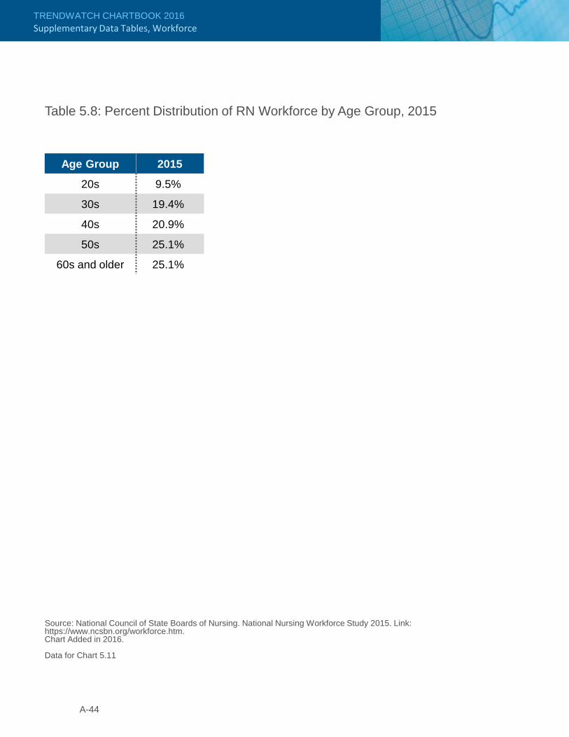
TRENDWATCH CHARTBOOK 2016Supplementary Data Tables, Workforce
Table 5.8: Percent Distribution of RN Workforce by Age Group, 2015
Source: National Council of State Boards of Nursing. National Nursing Workforce Study 2015. Link: https://www.ncsbn.org/workforce.htm.Chart Added in 2016.
Data for Chart 5.11
Age Group 2015
20s 9.5%
30s 19.4%
40s 20.9%
50s 25.1%
60s and older 25.1%
A-44

TRENDWATCH CHARTBOOK 2016Supplementary Data Tables, Workforce
Table 5.9: National Supply and Demand Projections for FTE RNs, 2018 – 2025
Source: Copyrighted and published by Project HOPE/Health Affairs as Buerhaus PI, Auerbach DI, Staiger DO. The Recent Surge In Nurse Employment: Causes and Implications. Health Affairs, 2009; 28(4):w657-68. The published article is archived and available online at www.healthaffairs.org.Table 5.8 in 2014 and earlier years’ Chartbooks.
Data for Chart 5.13
Year RN FTE Supply RN FTE Demand2018 2,703,969 2,719,954 2019 2,716,771 2,771,930 2020 2,727,231 2,824,900 2021 2,737,616 2,874,900 2022 2,750,080 2,924,900 2023 2,771,303 2,974,900 2024 2,790,241 3,024,900 2025 2,816,303 3,074,900
A-45

TRENDWATCH CHARTBOOK 2016

Supplementary Data TablesThe Economic Contribution of Hospitals
APPENDIX 6

TRENDWATCH CHARTBOOK 2016Supplementary Data Tables, The Economic Contribution of Hospitals
Table 6.1: Number of Full-time and Part-time Hospital Employees, 1994 – 2014
Source: Analysis of American Hospital Association Annual Survey data, 2014, for community hospitals.
Data for Chart 6.2
YearEmployees (thousands)
1994 4,347.81995 4,384.81996 4,397.91997 4,495.51998 4,536.41999 4,544.42000 4,652.92001 4,713.42002 4,818.12003 4,876.72004 4,922.92005 5,047.12006 5,152.12007 5,287.52008 5,379.92009 5,405.62010 5,416.72011 5,480.32012 5,579.42013 5,580.12014 5,598.6
A-48

TRENDWATCH CHARTBOOK 2016Supplementary Data Tables, The Economic Contribution of Hospitals
A-49
Table 6.2: Hospital Employment vs. Employment in Other Industries, 2015
Source: Department of Labor, Bureau of Labor Statistics, Current Employment Statistics (CES) Survey, customized tables. Data released 2016. Link: http://www.bls.gov/ces.(1 ) Does not include public hospitals.
Data for Chart 6.4
TitleEmployment (thousands)
Full-service Restaurants 5,215.2
General Medical & Surgical Hospitals(1) 4,514.3
Limited-service Eating Places 4,094.3
Employment Services 3,540.3
Grocery Stores 2,684.6
Offices of Physicians 2,533.4
Building Equipment Contractors 1,930.2
Department Stores 1,329.7

TRENDWATCH CHARTBOOK 2016Supplementary Data Tables, The Economic Contribution of Hospitals
A-50
Table 6.3: Average Weekly Earnings of Workers, Hospitals(1) vs. All Service-providing Industries, 1995 – 2015
Source: Department of Labor, Bureau of Labor Statistics, Current Employment Statistics (CES) Survey, customized tables. Data released 2016. Link: http://www.bls.gov/ces. (1) Includes physicians employed by hospitals.(2) Does not include public hospitals.
Data for Chart 6.5
Year Hospitals(2)All Service-providing
Industries
1995 $488.68 $364.14
1996 $499.54 $376.72
1997 $518.48 $394.77
1998 $535.47 $412.78
1999 $547.33 $427.30
2000 $569.90 $445.00
2001 $608.41 $460.32
2002 $638.23 $473.10
2003 $674.34 $483.89
2004 $715.12 $493.67
2005 $762.07 $509.58
2006 $794.24 $532.84
2007 $876.80 $689.40
2008 $920.70 $708.77
2009 $946.11 $718.28
2010 $980.15 $733.96
2011 $1,009.52 $755.20
2012 $1,028.91 $774.14
2013 $1,052.42 $787.96
2014 $1,074.90 $806.08
2015 $1,118.08 $827.16

Supplementary Data TablesCommunity Health Indicators
APPENDIX 7

TRENDWATCH CHARTBOOK 2016Supplementary Data Tables, Community Health Indicators
A-52
Table 7.1: U.S. Population Trends and Projections by Age, 1980 – 2060(1)
Source: U.S. Department of Commerce, Bureau of the Census. Projections of the Population by Sex and Age for the United States: 2015-2060. (1) Years 2015 through 2060 are projections.
Data for Chart 7.1
Year
Population 0-19 Years (thousands)
Population 20-64 Years
(thousands)
Population 65-84 Years
(thousands)
Population 85+ Years(thousands)
1980 72,416 128,631 23,306 2,1931990 71,322 146,146 28,162 3,0802000 80,473 165,957 30,752 4,2402010 83,268 185,210 34,775 5,4932015 82,110 191,429 41,526 6,3042020 82,625 195,439 49,715 6,7262025 83,673 197,742 58,438 7,4822030 84,767 200,527 64,977 9,1312035 86,153 204,951 67,324 11,9082040 87,135 210,741 67,711 14,6342045 87,967 216,717 67,453 17,2592050 88,992 221,342 69,024 18,9712055 90,267 224,675 73,016 19,4552060 91,610 227,022 78,441 19,724

TRENDWATCH CHARTBOOK 2016Supplementary Data Tables, Community Health Indicators
A-53
Table 7.2: U.S. Population Trends and Projections by Race, 2015 – 2060(1)
Year
White, Non-Hispanic(thousands)
Black(2)
(thousands)
White, Hispanic(thousands)
Asian(2)
(thousands)All Other(2,3)
(thousands)
2015 198,354 42,456 55,092 17,538 13,0062020 199,400 44,590 61,590 19,869 14,6872025 199,867 46,725 68,150 22,278 16,5062030 199,403 48,768 74,810 24,726 18,4482035 197,810 50,678 81,490 27,175 20,5042040 195,197 52,485 88,133 29,603 22,6842045 191,919 54,244 94,674 31,997 25,0002050 188,419 56,007 101,064 34,359 27,4592055 185,039 57,817 107,307 36,686 30,0662060 181,930 59,693 113,398 38,965 32,823
Source: U.S. Department of Commerce, Bureau of the Census. Projections of the Population by Sex, Hispanic Origin, and Race for the United States: 2015-2060.(1) Years 2015 through 2060 are projections. (2) Black, Asian, and All Other categories include individuals of Hispanic and non-Hispanic origin.(3) All Other includes American Indian, Native Alaskan, Native Hawaiian, other Pacific Islander and two or more races.
Data for Chart 7.2

TRENDWATCH CHARTBOOK 2016Supplementary Data Tables, Community Health Indicators
A-54
Table 7.4: Number of Persons with Asthma, 1980 – 2014
YearTotal
(millions)
1980 6.981990 10.312000 22.702006 34.132007 34.012008 38.432009 39.932010 39.192011 39.502012 39.982013 37.332014 40.46
Source: Centers for Disease Control and Prevention (2002). “Asthma Surveillance – United States, 1980-1999.” National Center for Health Statistics. National Health Interview Survey 2001, 2006, 2007, 2008, 2009, 2010, 2011, 2012, 2013 and 2014.
Data for Chart 7.6
Table 7.3: Age-adjusted Death Rates, Selected Causes, by Race, 2014
Source: National Center for Health Statistics. (2016). Health, United States, 2015. Hyattsville, MD.(1) Racial categories include individuals of both Hispanic and non-Hispanic origin.
Data for Chart 7.3
Cause of DeathAll Persons(per 100,000)
White(1)
(per 100,000)Black(1)
(per 100,000)
Diseases of the Heart 167.0 165.9 206.3Malignant Neoplasms 161.2 161.9 185.6Cerebrovascular Disease 36.5 35.2 49.7Chronic Lower Respiratory Diseases 40.5 43.1 28.4
Diabetes 20.9 19.3 37.3Influenza and Pneumonia 15.1 15.1 16.1HIV Infection 2.0 1.1 8.3

TRENDWATCH CHARTBOOK 2016Supplementary Data Tables, Community Health Indicators
A-55
Year All White(2) Black(2) Asian(3) Hispanic1984 14.5% 11.9% 19.7% 18.5% 29.5%1989 15.6% 12.1% 21.5% 16.9% 33.7%1995 16.1% 13.0% 17.9% 18.6% 31.4%2000 17.0% 12.5% 19.5% 17.6% 35.6%2009 17.5% 13.2% 18.8% 16.2% 32.9%2010 18.2% 13.7% 20.7% 17.1% 32.0%2011 17.2% 12.9% 18.8% 16.5% 31.1%2012 16.9% 12.7% 17.8% 16.8% 30.4%2013 16.7% 12.2% 18.8% 14.2% 30.7%2014 13.3% 9.7% 13.5% 10.8% 25.5%
Source: National Center for Health Statistics. (2016). Health, United States, 2015. Hyattsville, MD.(1) Data for population under age 65.(2) Includes individuals of non-Hispanic origin only.(3) Includes individuals of Hispanic and non-Hispanic origin.
Data for Chart 7.13
Table 7.6: Percent Uninsured by Race,(1) 1984 – 2014
Table 7.5: Percent of Adults Who Are Overweight and Obese,(1) 1960 – 2014
Source: National Center for Health Statistics. (2016). Health, United States, 2015. Hyattsville, MD.(1) Data are adjusted to 2000 standard population.(2) Overweight includes obese.
Data for Chart 7.8
Years Overweight(2) Obese1960-1962 44.8% 13.3%1976-1980 47.4% 15.1%1988-1994 56.0% 22.9%1999-2002 65.1% 30.4%2003-2006 66.7% 33.4%2009-2012 68.7% 35.3%2011-2014 69.5% 36.4%

TRENDWATCH CHARTBOOK 2016Supplementary Data Tables, Community Health Indicators
A-56
Table 7.7: Percent of Persons with No Usual Source of Care by Race, 1997 – 2014
Source: National Center for Health Statistics. (2016). Health, United States, 2015. Hyattsville, MD.(1) Includes individuals of non-Hispanic origin only.(2) Includes individuals of Hispanic and non-Hispanic origin.
Data for Charts 7.14, 7.16
Year White(1) Black(1) Asian(2) Hispanic
Adults, Ages 18 – 64
1997-1998 15.4 19.3 21.7 30.4
1999-2000 14.9 19.2 22.1 32.6
2001-2002 13.1 16.8 20.1 32.5
2003-2004 14.0 18.1 19.3 32.9
2005-2006 14.8 19.2 17.9 35.1
2006-2007 15.2 18.9 17.3 34.3
2007-2008 15.1 20.2 17.8 32.5
2008-2009 16.0 21.4 19.4 32.8
2009-2010 16.8 22.2 20.8 33.3
2010-2011 15.8 22.1 20.8 33.3
2011-2012 15.5 21.6 20.8 33.6
2012-2013 16.0 21.3 19.9 32.6
2013-2014 15.0 19.6 18.1 28.9
Children Under 18 Years
1997-1998 4.5 8.8 10.7 13.2
1999-2000 4.7 7.6 10.0 14.2
2001-2002 3.4 6.6 11.2 13.5
2003-2004 3.2 6.2 7.7 11.4
2005-2006 3.3 5.4 7.7 11.5
2006-2007 4.0 4.9 7.1 11.3
2008-2009 4.1 5.7 5.1 9.4
2009-2010 3.8 5.4 6.1 9.5
2010-2011 3.1 5.4 5.8 7.9
2011-2012 2.9 4.5 5.6 6.2
2012-2013 3.0 3.9 5.3 6.5
2013-2014 2.5 3.8 4.6 6.5

GLOSSARY

TRENDWATCH CHARTBOOK 2016Trends Affecting Hospitals and Health Systems
Adjusted Admission – An aggregate measure of workload reflecting the sum of admissions and equivalent admissions attributed to outpatient services. The number of equivalent admissions attributed to outpatient services is derived by multiplying admissions by the ratio of outpatient revenue to inpatient revenue.
Assisted Living – Special combination of housing, supportive services, personalized assistance and health care designed to respond to the individual needs of those who require assistance in activities of daily living. Supportive services are available, 24 hours a day, to meet scheduled and unscheduled needs, in a way that promotes maximum independence and dignity for each resident and encourages the involvement of a resident’s family, neighbors and friends.
Average Age of Plant – Accumulated depreciation divided by current depreciation expense.
Community Hospitals – Nonfederal, short-term general, and special hospitals whose facilities and services are available to the public (e.g., obstetrics and gynecology; eye; ear, nose, and throat; rehabilitation; orthopedic; and other individually described specialty services).
FTE per Adjusted Admission – The number of full-time equivalent staff, converted to the number of employees who work full-time divided by the number of adjusted admissions.
Group Practice without Walls – Hospital sponsored physician group. The group shares administrative expenses, although the physicians remain independent practitioners.
Health System – Hospitals belonging to a corporate body that owns and/or manages health provider facilities or health-related subsidiaries. The system may also own non-health-related facilities.
Home Health Service – Service providing nursing, therapy, and health related home-maker or social services in the patient’s home.
Horizontal Integration – Merging of two or more firms at the same level of production in some formal, legal relationship. In hospital networks, this may refer to the grouping of several hospitals, outpatient clinics with the hospital, or a geographic network of various health care services.
Hospice – Program providing palliative care, chiefly medical relief of pain and supportive services, addressing the emotional, social, financial, and legal needs of terminally ill patients and their families. This care can be provided in a variety of settings, both inpatient and at home.
Hospital Income from Investments and Other Non-operating Gains – Income not associated with the central operations of the hospital facility. Non-operating gains include income from non-operating activities, including investments, endowments and extraordinary gains, as well as the value of non-realized gains from investments.
Hospital Total Net Revenue – Net patient revenue plus all other revenue, including contributions, endowment revenue, governmental grants, and all other payments not made on behalf of individual patients.
Hospital Operating Margin – Difference between operating revenue and operating expenses divided by operating revenue; excludes non-operating revenue.
Hospital Total Margin – Difference between total net revenue and total expenses divided by total net revenue.
Independent Practice Association (IPA) – Legal entity that holds managed care contracts and contracts with physicians to provide care either on a fee-for-service or capitated basis.
Inpatient Surgery – Surgical services provided to patients who remain in the hospital overnight.
A-58

TRENDWATCH CHARTBOOK 2016Trends Affecting Hospitals and Health Systems
A-59
Outpatient Visit – Visit by a patient not lodged in the hospital while receiving medical, dental, or other services. Each patient visit to a discrete unit constitutes one visit regardless of the number of diagnostic and/or therapeutic treatments received. Total outpatient visits should include all clinic visits, referred visits, observation services, outpatient surgeries and emergency room visits.
Payment-to-cost Ratio – Ratio illustrating the relationship between hospital payments and costs; a ratio equal to “1” reflects payments at 100 percent of costs.
Physician Hospital Organization (PHO)
Closed PHO – Joint venture between a hospital and physicians who have been selected on the basis of cost-effectiveness and/or high quality. The PHO can act as a unified agent in managed care contracting, own a managed care plan, own and operate ambulatory care centers or ancillary services projects, or provide administrative services to physician members.
Open PHO – Joint venture between a hospital and all members of the medical staff who wish to participate. The open PHO can act as a unified agent in managed care contracting, own a managed care plan, own and operate ambulatory care centers or ancillary services projects, or provide administrative services to physician members.
Private Pay Margin – Difference between revenue from non-government payers and expenses associated with treating private pay patients, divided by revenue from non-government payers.
Skilled Nursing Facility – Institution, or part of an institution, which is primarily engaged in providing to residents a certain level of skilled nursing care and/or rehabilitation services for the injured, disabled, or sick.
Long Term Care – Package of services provided to those who are aged, chronically ill, or disabled. Services are delivered for a sustained period to individuals who have a demonstrated need, usually measured by functional dependency.
Management Services Organization (MSO) –Corporation often owned by the hospital or a physician/hospital joint venture that provides management services to one or more medical group practices. As part of a full-services management agreement, the MSO purchases the tangible assets of the practices and leases them back, employs all non-physician staff and provides all supplies/administrative systems for a fee.
Meals on Wheels – Hospital sponsored program which delivers meals to people, usually the elderly, who are unable to prepare their own meals. Low cost, nutritional meals are delivered to individuals’ homes on a regular basis.
Medicaid Margin – Difference between revenue from Medicaid and expenses associated with treating Medicaid patients, divided by revenue from Medicaid.
Medicare Margin – Difference between revenue from Medicare and expenses associated with treating Medicare patients, divided by revenue from Medicare.
Niche Providers – Providers that focus on a specific set of medical services, a particular population, or a limited set of medical conditions.
Non-patient Hospital Costs – Costs not associated with direct patient care, such as the costs of running cafeterias, parking lots and gift shops.
Outpatient Surgery – Scheduled surgical services provided to patients who do not remain in the hospital overnight. In the AHA Annual Survey, outpatient surgery may be performed in operating suites also used for inpatient surgery, specially designated surgical suites for outpatient surgery or procedure rooms within an outpatient care facility.

TRENDWATCH CHARTBOOK 2016Trends Affecting Hospitals and Health Systems
A-60
Uncompensated Care – Care provided by hospitals for which hospitals do not receive payment.
Underwriting – A health insurer or health plan accepts responsibility for paying the health care services of covered individuals in exchange for dollars, usually referred to as premiums. When a health insurer collects more in premiums than it pays in claim costs and administrative expenses, an underwriting gain is said to occur. If the total expenses exceed the premium dollars collected, an underwriting loss occurs.
Underwriting Cycle – Repeating pattern of gains and losses within the insurance industry.
Vertical Integration – Organization of production whereby one business entity controls or owns all stages of the production and distribution of goods or services. In health care, vertical integration can take different forms but most often refers to physicians, hospitals and health plans combining their organizations or processes in some manner to increase efficiencies and competitive strength or to improve quality of care. Integrated delivery systems or healthcare networks are generally vertically integrated.