advanced css -...
TRANSCRIPT

Advanced CSSSlava Kim

CSS is simple! But is it?
You have some boxes on the screen
Boxes have text
Use CSS to change colors and move boxes slightly away from each other
… are we done yet?

Web in 1994
Most of you were not born yet
I was in my mom’s belly
HTML was only used to decorate academic papers published online
CSS is created to bring more richness to the web
Sometimes gifs of dancing babies inserted, too (jk that’s in 1996)

Web today

Web today - complicated layouts

Web today - pseudo 3D

Web today - animation
https://tympanus.net/Development/ModalWindowEffects/

Web today - Mobile Responsive Design

Feelz

Today’s topics
Box model
Layouts ⇐ this one is big
Animations
Responsive Layouts
Box Model

Box model
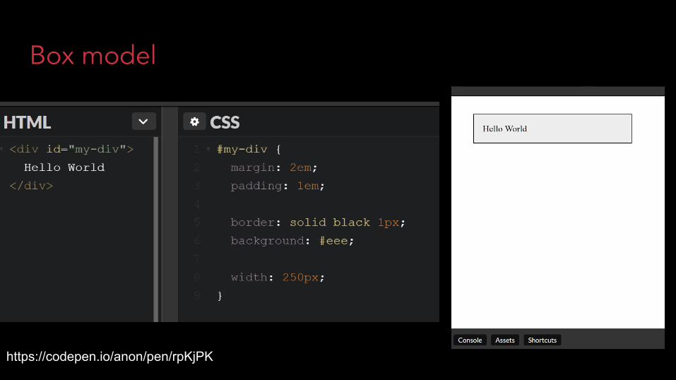
Box model
https://codepen.io/anon/pen/rpKjPK

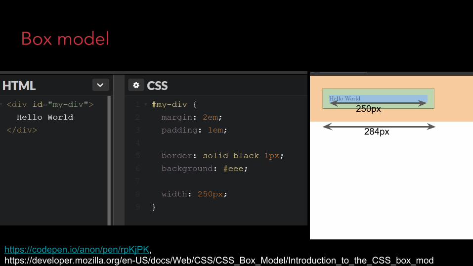
Box model
https://codepen.io/anon/pen/rpKjPKhttps://developer.mozilla.org/en-US/docs/Web/CSS/CSS_Box_Model/Introduction_to_the_CSS_box_model
paddingmargin
border
Box model
https://codepen.io/anon/pen/rpKjPK, https://developer.mozilla.org/en-US/docs/Web/CSS/CSS_Box_Model/Introduction_to_the_CSS_box_model
250px
284px

Who will win?
1st grade math 1 CSS boi

box-sizing
https://codepen.io/anon/pen/goKmGW

Solution 1: remove paddinghttps://codepen.io/anon/pen/aEKJLe

Solution 2: use box-sizing: border-boxhttps://developer.mozilla.org/en-US/docs/Web/CSS/box-sizinghttps://codepen.io/anon/pen/LerWeV

Layouts

Layouts basics in CSS
http://learnlayout.com/

Layouts basics in CSS
http://learnlayout.com/

Layouts basics in CSShttp://learnlayout.com/
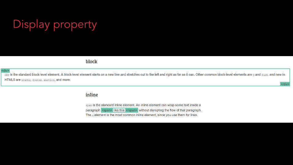
Display property

Display property
Block - big block that stretches a lot, always has a new line
Inline - an element that is part of text, size is always proportional to text
Inline-block - stays within text, but can have its own size independent from text
None - hidden from the page
Flex - flexbox, special stuff
Grid - grid, special stuff
http://learnlayout.com/display.html

position: fixed
Always at the certain place relative to screen
Positioned with left, right, top, bottom
https://codepen.io/anon/pen/xpzqvZ

position: relative
Position the element relative to where it would be normally.
Positioned with left, right, top, bottom

position: absolute
Position the element absolutely relative to another element’s position.
Finds first ancestor that’s positioned non-statically.
Positioned with left, right, top, bottom

floats
You can mark an element to “float” to a side
Usually is useful for images to be embedded into the text
Not great for layouts, tends to break a lot of things, needs a “clear”, etc
http://learnlayout.com/float.html

Common task: center DIV
There is a trick that a lot of people use
Make left/right margin equal to “auto”
This will center the block element
https://codepen.io/anon/pen/jYKRwZ

Flexbox
A fairly new standard that is now available in most browsers
Simplifies a lot of layout tasks
Delegates a lot of layout computation to the browser as the DOM changes
https://css-tricks.com/snippets/css/a-guide-to-flexbox/
https://codepen.io/anon/pen/QaxPpO


Flexbox
You can let boxes grow more, or less, or not even grow at all.
The size will be recalculated as the containing div changes its size.
https://codepen.io/anon/pen/QaxPpO


https://css-tricks.com/snippets/css/a-guide-to-flexbox/

https://philipwalton.github.io/solved-by-flexbox/

Animations in CSS

Libraries for CSS Animations
Animate.CSS
Cssanimation.io
Hover.css
etc

Simple Transition
https://codepen.io/anon/pen/GyBjzW

Simple Transition

Simple Transition
Append a new element to DOM
Trigger the reflow
Add the transition class
Without reflow, browser will batch operations together and animation will omitted.
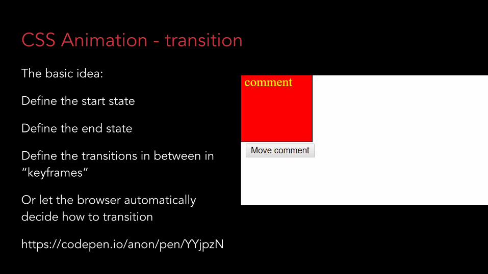
CSS Animation - transition
The basic idea:
Define the start state
Define the end state
Define the transitions in between in “keyframes”
Or let the browser automatically decide how to transition
https://codepen.io/anon/pen/YYjpzN

CSS Animation - transition

CSS Animation - transition

CSS Animation - transition

CSS Animation - keyframes


More about CSS Animations
https://developer.mozilla.org/en-US/docs/Web/CSS/CSS_Transitions/Using_CSS_transitions
https://developer.mozilla.org/en-US/docs/Web/CSS/@keyframes

Responsive Layouts

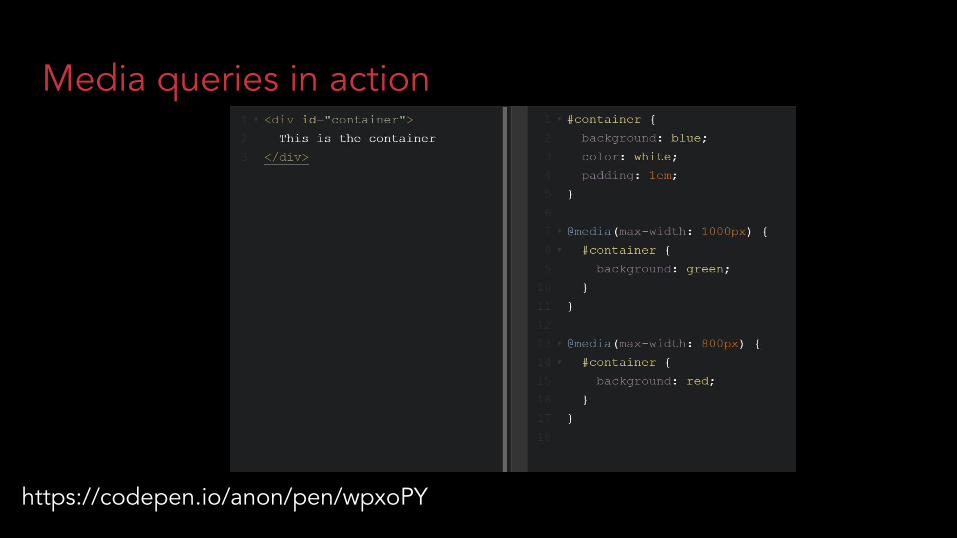
Media queries
Media queries allow you to run certain CSS only if:
- The device screen is at least certain size- The device supports hovering (with a mouse)- The device supports colors- … Speech input, aspect ratio, etc

Media queries in action
https://codepen.io/anon/pen/wpxoPY

Responsive layout example
https://codepen.io/anon/pen/PEBbeB

Responsive layout example
https://codepen.io/anon/pen/PEBbeB
On smaller screen sizes turn the columns into sections by changing the Flexbox direction from “row” to “column”.
You can imagine hiding certain columns, reordering them, separating unimportant content, etc


Debugger in Chrome
Chrome has a special button to simulate different screen sizes, aspect ratios and presets of devices
Open devtools
Click on the small device icon

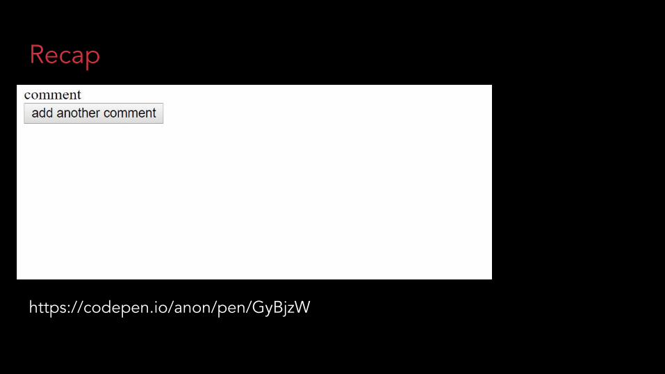
Recap

Recap
paddingmargin
border

Recap

Recap
http://learnlayout.com/
Recap
https://codepen.io/anon/pen/GyBjzW
Media queries in action
https://codepen.io/anon/pen/wpxoPY