advanced data visualization techniques using sas€¦ · 2 advanced data visualization techniques...
TRANSCRIPT
Advanced Data Visualization Techniques
Using SAS®
Jesse Pratt
sas.com/books
The correct bibliographic citation for this manual is as follows: Pratt, Jesse. 2018. Advanced Data Visualization Techniques Using SAS®. Cary, NC: SAS Institute Inc.
Advanced Data Visualization Techniques Using SAS®
Copyright © 2018, SAS Institute Inc., Cary, NC, USA
978-1-63526-248-3 (Hardcopy) 978-1-63526-723-5 (Web PDF) 978-1-63526-721-1 (epub) 978-1-63526-722-8 (mobi)
All Rights Reserved. Produced in the United States of America.
For a hard copy book: No part of this publication may be reproduced, stored in a retrieval system, or transmitted, in any form or by any means, electronic, mechanical, photocopying, or otherwise, without the prior written permission of the publisher, SAS Institute Inc.
For a web download or e-book: Your use of this publication shall be governed by the terms established by the vendor at the time you acquire this publication.
The scanning, uploading, and distribution of this book via the Internet or any other means without the permission of the publisher is illegal and punishable by law. Please purchase only authorized electronic editions and do not participate in or encourage electronic piracy of copyrighted materials. Your support of others’ rights is appreciated.
U.S. Government License Rights; Restricted Rights: The Software and its documentation is commercial computer software developed at private expense and is provided with RESTRICTED RIGHTS to the United States Government. Use, duplication, or disclosure of the Software by the United States Government is subject to the license terms of this Agreement pursuant to, as applicable, FAR 12.212, DFAR 227.7202-1(a), DFAR 227.7202-3(a), and DFAR 227.7202-4, and, to the extent required under U.S. federal law, the minimum restricted rights as set out in FAR 52.227-19 (DEC 2007). If FAR 52.227-19 is applicable, this provision serves as notice under clause (c) thereof and no other notice is required to be affixed to the Software or documentation. The Government’s rights in Software and documentation shall be only those set forth in this Agreement.
SAS Institute Inc., SAS Campus Drive, Cary, NC 27513-2414
October 2018
SAS® and all other SAS Institute Inc. product or service names are registered trademarks or trademarks of SAS Institute Inc. in the USA and other countries. ® indicates USA registration.
Other brand and product names are trademarks of their respective companies.
SAS software may be provided with certain third-party software, including but not limited to open-source software, which is licensed under its applicable third-party software license agreement. For license information about third-party software distributed with SAS software, refer to http://support.sas.com/thirdpartylicenses.
Contents
Chapter 1: Introduction and Best Practices
Chapter 2: Maximizing Visual Impact Using PROC SGPLOT
Chapter 3: Augmenting Data Displays Using the Graph Template Language
Chapter 4: Bringing Statistical Graphics to Life Using Animation
Chapter 5: Introduction to HTML Programming
Chapter 6: Using HTML to Enhance SAS Statistical Graphics
Appendix A
About This Book
Description This book focuses on best graphing practices, customization, and interactivity. The first chapter goes into detail about best practices when designing and creating a data display, and these are reiterated throughout subsequent chapters. So often there are specific requirements that a graph needs, such as customizing legends, user-defined markers for scatterplots, graph sizes and DPI, annotations, just to name a few. This book details such customizations. Interactivity plays a large part in increasing the effectiveness and engagement of a graph. A chapter on animation will, in explicit detail, show how to create dynamic data displays and give tips on how to design them. The addition of HTML to SAS graphics opens up a whole new world to interactivity, such as zooming in on graphs and creating interactive dashboards that can be published to a website. Just to use an example from the healthcare industry, while static graphs are still (and will remain) a necessity for investigators, there is an increasing demand for active displays that can be used by providers in preparation for, and even during, clinic visits. Building an interactive dashboard and being able to post it to a website like SharePoint, for example, would give these clinicians real time access to these displays.
About the Author Jesse Pratt is a research database programmer for the Cincinnati Children's Hospital Medical Center.
Chapter 2: Maximizing Visual Impact Using PROC SGPLOT
Introduction ........................................................................................................................................................................ 1 Example: Eliminating Dimensions – Bubble Plot ............................................................................................... 2 Example: Eliminating Dimensions – Text Plot .................................................................................................... 3 Example: Eliminating Dimensions - Heat Map .................................................................................................. 5 Example: Spaghetti Plot ........................................................................................................................................ 6 Example: Two Grouping Variables ...................................................................................................................... 9 Example: The Attribute Map .............................................................................................................................. 10
Annotation in PROC SGPLOT ....................................................................................................................................... 15 Example: Inserting an Image Using Annotation ............................................................................................. 16 Example: Inserting a Watermark Using Annotation ....................................................................................... 19 Example: Modifying Axes through Annotation .............................................................................................. 20
Axis Tools ........................................................................................................................................................................ 22 Example: Axis Breaks .......................................................................................................................................... 22 Example: Splitting Values .................................................................................................................................. 24
Axis Tables ...................................................................................................................................................................... 27 Example: Simple Forest Plot .............................................................................................................................. 27 Example: Forest Plot with Subgroups .............................................................................................................. 29
Customizing Markers - The SYMBOLIMAGE Statement .......................................................................................... 32 Summary and a Look Forward ..................................................................................................................................... 34
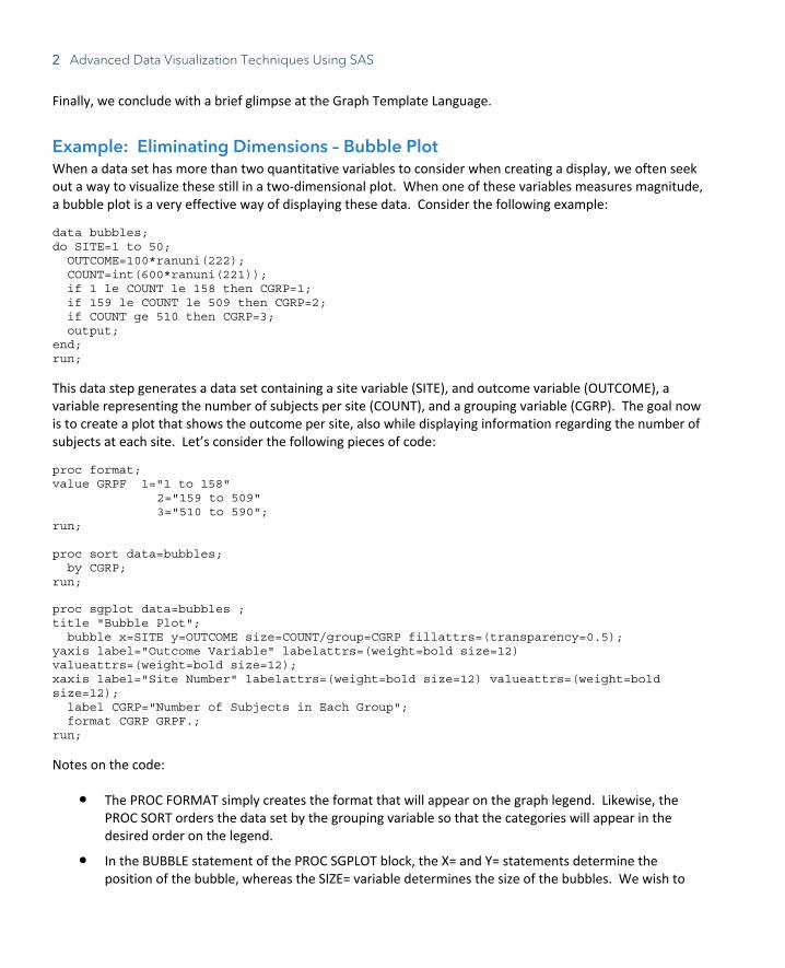
Introduction In the first chapter, we considered principles that help our graphic displays be more effective, efficient, and engaging and presented an example to demonstrate how an effective series of graphs can assist in solving a complex problem. The SGPLOT procedure in SAS lends itself very well to creating such displays, and this chapter focuses on SAS programming techniques using this procedure that assist in doing just that.
This chapter will be devoted to customization of data displays by considering:
● Eliminating dimensions in order simplify data displays
● Options and customizations for grouping data
● Annotation
● Customization and modifications of axes
● Forest plots using axis tables
● Using user-defined markers in scatterplots
2 Advanced Data Visualization Techniques Using SAS
Finally, we conclude with a brief glimpse at the Graph Template Language.
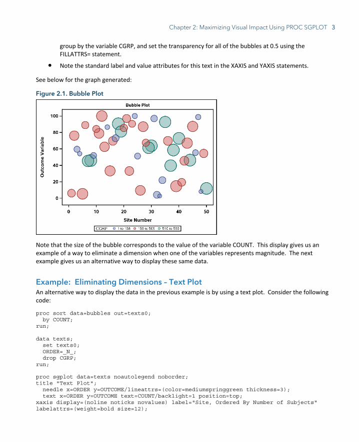
Example: Eliminating Dimensions – Bubble Plot When a data set has more than two quantitative variables to consider when creating a display, we often seek out a way to visualize these still in a two-dimensional plot. When one of these variables measures magnitude, a bubble plot is a very effective way of displaying these data. Consider the following example:
data bubbles; do SITE=1 to 50; OUTCOME=100*ranuni(222); COUNT=int(600*ranuni(221)); if 1 le COUNT le 158 then CGRP=1; if 159 le COUNT le 509 then CGRP=2; if COUNT ge 510 then CGRP=3; output; end; run;
This data step generates a data set containing a site variable (SITE), and outcome variable (OUTCOME), a variable representing the number of subjects per site (COUNT), and a grouping variable (CGRP). The goal now is to create a plot that shows the outcome per site, also while displaying information regarding the number of subjects at each site. Let’s consider the following pieces of code:
proc format; value GRPF 1="1 to 158" 2="159 to 509" 3="510 to 590"; run; proc sort data=bubbles; by CGRP; run;
proc sgplot data=bubbles ; title "Bubble Plot"; bubble x=SITE y=OUTCOME size=COUNT/group=CGRP fillattrs=(transparency=0.5); yaxis label="Outcome Variable" labelattrs=(weight=bold size=12) valueattrs=(weight=bold size=12); xaxis label="Site Number" labelattrs=(weight=bold size=12) valueattrs=(weight=bold size=12); label CGRP="Number of Subjects in Each Group"; format CGRP GRPF.; run;
Notes on the code:
● The PROC FORMAT simply creates the format that will appear on the graph legend. Likewise, the PROC SORT orders the data set by the grouping variable so that the categories will appear in the desired order on the legend.
● In the BUBBLE statement of the PROC SGPLOT block, the X= and Y= statements determine the position of the bubble, whereas the SIZE= variable determines the size of the bubbles. We wish to
Chapter 2: Maximizing Visual Impact Using PROC SGPLOT 3
group by the variable CGRP, and set the transparency for all of the bubbles at 0.5 using the FILLATTRS= statement.
● Note the standard label and value attributes for this text in the XAXIS and YAXIS statements.
See below for the graph generated:
Figure 2.1. Bubble Plot
Note that the size of the bubble corresponds to the value of the variable COUNT. This display gives us an example of a way to eliminate a dimension when one of the variables represents magnitude. The next example gives us an alternative way to display these same data.
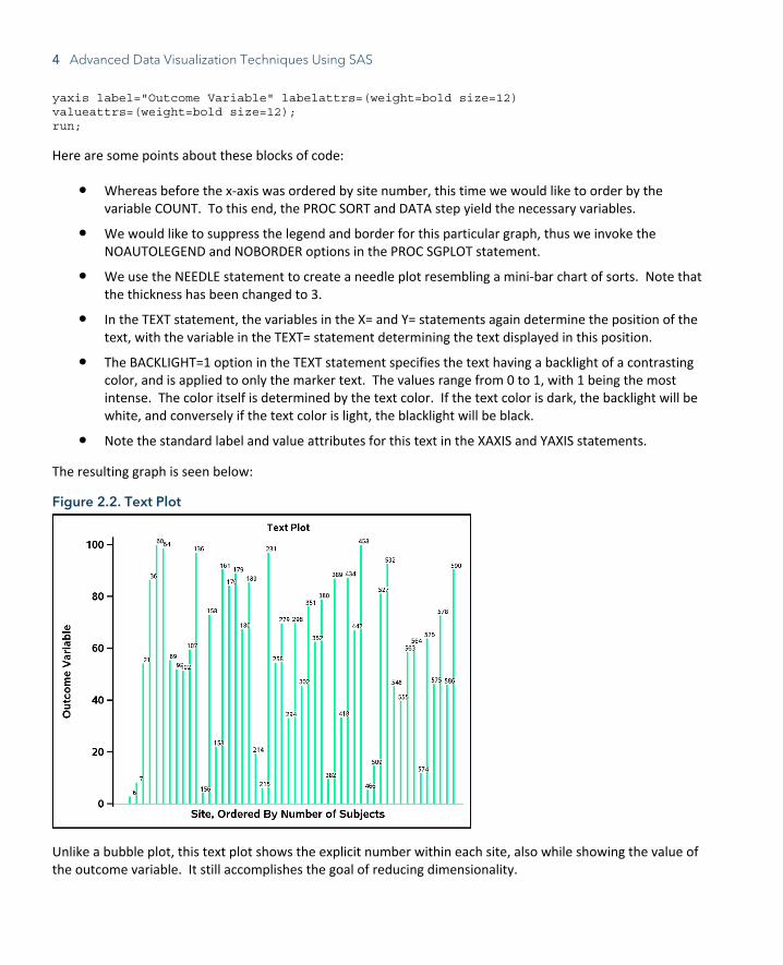
Example: Eliminating Dimensions – Text Plot An alternative way to display the data in the previous example is by using a text plot. Consider the following code:
proc sort data=bubbles out=texts0; by COUNT; run; data texts; set texts0; ORDER=_N_; drop CGRP; run;
proc sgplot data=texts noautolegend noborder; title "Text Plot"; needle x=ORDER y=OUTCOME/lineattrs=(color=mediumspringgreen thickness=3); text x=ORDER y=OUTCOME text=COUNT/backlight=1 position=top; xaxis display=(noline noticks novalues) label="Site, Ordered By Number of Subjects" labelattrs=(weight=bold size=12);
4 Advanced Data Visualization Techniques Using SAS
yaxis label="Outcome Variable" labelattrs=(weight=bold size=12) valueattrs=(weight=bold size=12); run;
Here are some points about these blocks of code:
● Whereas before the x-axis was ordered by site number, this time we would like to order by the variable COUNT. To this end, the PROC SORT and DATA step yield the necessary variables.
● We would like to suppress the legend and border for this particular graph, thus we invoke the NOAUTOLEGEND and NOBORDER options in the PROC SGPLOT statement.
● We use the NEEDLE statement to create a needle plot resembling a mini-bar chart of sorts. Note that the thickness has been changed to 3.
● In the TEXT statement, the variables in the X= and Y= statements again determine the position of the text, with the variable in the TEXT= statement determining the text displayed in this position.
● The BACKLIGHT=1 option in the TEXT statement specifies the text having a backlight of a contrasting color, and is applied to only the marker text. The values range from 0 to 1, with 1 being the most intense. The color itself is determined by the text color. If the text color is dark, the backlight will be white, and conversely if the text color is light, the blacklight will be black.
● Note the standard label and value attributes for this text in the XAXIS and YAXIS statements.
The resulting graph is seen below:
Figure 2.2. Text Plot
Unlike a bubble plot, this text plot shows the explicit number within each site, also while showing the value of the outcome variable. It still accomplishes the goal of reducing dimensionality.
Chapter 2: Maximizing Visual Impact Using PROC SGPLOT 5
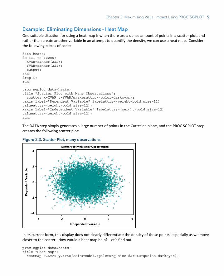
Example: Eliminating Dimensions - Heat Map One suitable situation for using a heat map is when there are a dense amount of points in a scatter plot, and rather than create another variable in an attempt to quantify the density, we can use a heat map. Consider the following pieces of code:
data heats; do i=1 to 10000; XVAR=rannor(222); YVAR=rannor(221); output; end; drop i; run;
proc sgplot data=heats; title "Scatter Plot with Many Observations"; scatter x=XVAR y=YVAR/markerattrs=(color=darkcyan); yaxis label="Dependent Variable" labelattrs=(weight=bold size=12) valueattrs=(weight=bold size=12); xaxis label="Independent Variable" labelattrs=(weight=bold size=12) valueattrs=(weight=bold size=12); run;
The DATA step simply generates a large number of points in the Cartesian plane, and the PROC SGPLOT step creates the following scatter plot:
Figure 2.3. Scatter Plot, many observations
In its current form, this display does not clearly differentiate the density of these points, especially as we move closer to the center. How would a heat map help? Let’s find out:
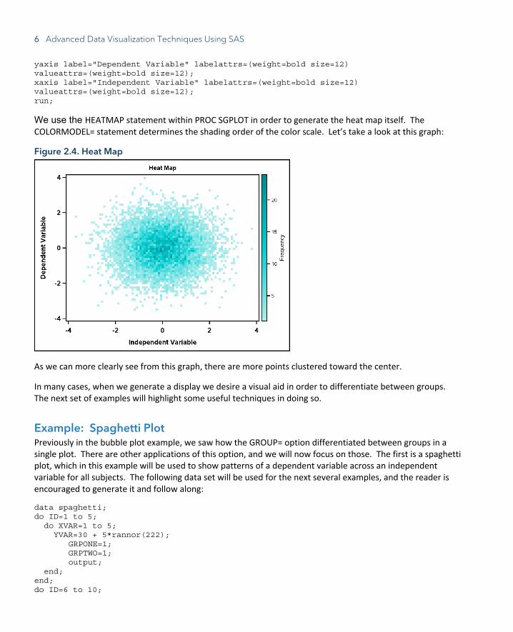
proc sgplot data=heats; title "Heat Map"; heatmap x=XVAR y=YVAR/colormodel=(paleturquoise darkturquoise darkcyan);
6 Advanced Data Visualization Techniques Using SAS
yaxis label="Dependent Variable" labelattrs=(weight=bold size=12) valueattrs=(weight=bold size=12); xaxis label="Independent Variable" labelattrs=(weight=bold size=12) valueattrs=(weight=bold size=12); run;
We use the HEATMAP statement within PROC SGPLOT in order to generate the heat map itself. The COLORMODEL= statement determines the shading order of the color scale. Let’s take a look at this graph:
Figure 2.4. Heat Map
As we can more clearly see from this graph, there are more points clustered toward the center.
In many cases, when we generate a display we desire a visual aid in order to differentiate between groups. The next set of examples will highlight some useful techniques in doing so.
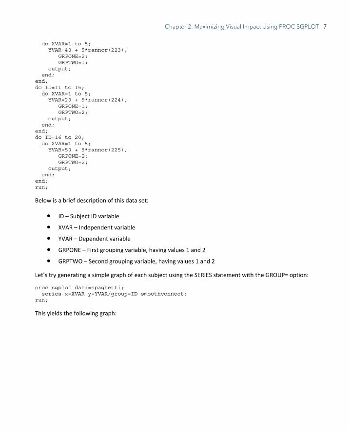
Example: Spaghetti Plot Previously in the bubble plot example, we saw how the GROUP= option differentiated between groups in a single plot. There are other applications of this option, and we will now focus on those. The first is a spaghetti plot, which in this example will be used to show patterns of a dependent variable across an independent variable for all subjects. The following data set will be used for the next several examples, and the reader is encouraged to generate it and follow along:
data spaghetti; do ID=1 to 5; do XVAR=1 to 5; YVAR=30 + 5*rannor(222); GRPONE=1; GRPTWO=1; output; end; end; do ID=6 to 10;
Chapter 2: Maximizing Visual Impact Using PROC SGPLOT 7
do XVAR=1 to 5; YVAR=40 + 5*rannor(223); GRPONE=2; GRPTWO=1; output; end; end; do ID=11 to 15; do XVAR=1 to 5; YVAR=20 + 5*rannor(224); GRPONE=1; GRPTWO=2; output; end; end; do ID=16 to 20; do XVAR=1 to 5; YVAR=50 + 5*rannor(225); GRPONE=2; GRPTWO=2; output; end; end; run;
Below is a brief description of this data set:
● ID – Subject ID variable
● XVAR – Independent variable
● YVAR – Dependent variable
● GRPONE – First grouping variable, having values 1 and 2
● GRPTWO – Second grouping variable, having values 1 and 2
Let’s try generating a simple graph of each subject using the SERIES statement with the GROUP= option:
proc sgplot data=spaghetti; series x=XVAR y=YVAR/group=ID smoothconnect; run;
This yields the following graph:

8 Advanced Data Visualization Techniques Using SAS
Figure 2.5. Spaghetti Plot
While this graph accomplishes the goal of showing the pattern of each subject over each value of the independent variable, the appearance of the lines and legend is cumbersome and distracts from the message of the graph. How can this graph be made more effective? Let’s see:
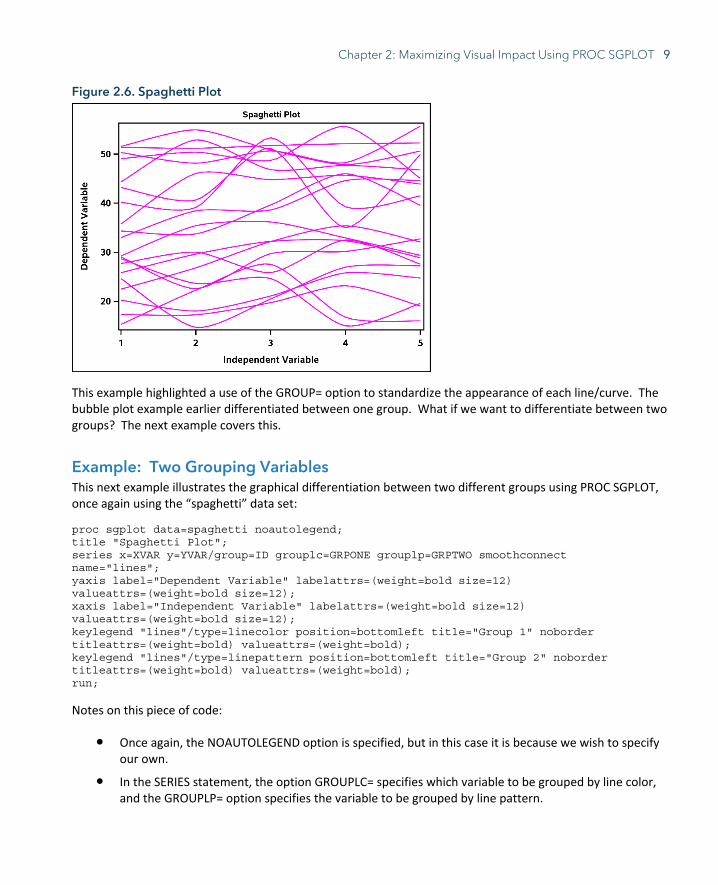
proc sgplot data=spaghetti noautolegend; title "Spaghetti Plot";
series x=XVAR y=YVAR/group=ID lineattrs=(color=fuchsia pattern=solid) smoothconnect; yaxis label="Dependent Variable" labelattrs=(weight=bold size=12) valueattrs=(weight=bold size=12); xaxis label="Independent Variable" labelattrs=(weight=bold size=12) valueattrs=(weight=bold size=12);
run;
Before looking at the results of this code, let’s note a few points:
● The legend in this case provides only extraneous detail to the display, so we invoke the NOAUTOLEGEND option.
● The SMOOTHCONNECT option in the SERIES statement specifies that a smoothed curve be used to connect each point instead of a jagged line.
● Also in the SERIES statement, we specify that all lines have the same color and pattern in the LINEATTRS= option.
The code gives us the following graph, much more effective and aesthetically pleasing:
Chapter 2: Maximizing Visual Impact Using PROC SGPLOT 9
Figure 2.6. Spaghetti Plot
This example highlighted a use of the GROUP= option to standardize the appearance of each line/curve. The bubble plot example earlier differentiated between one group. What if we want to differentiate between two groups? The next example covers this.
Example: Two Grouping Variables This next example illustrates the graphical differentiation between two different groups using PROC SGPLOT, once again using the “spaghetti” data set:
proc sgplot data=spaghetti noautolegend; title "Spaghetti Plot"; series x=XVAR y=YVAR/group=ID grouplc=GRPONE grouplp=GRPTWO smoothconnect name="lines"; yaxis label="Dependent Variable" labelattrs=(weight=bold size=12) valueattrs=(weight=bold size=12); xaxis label="Independent Variable" labelattrs=(weight=bold size=12) valueattrs=(weight=bold size=12); keylegend "lines"/type=linecolor position=bottomleft title="Group 1" noborder titleattrs=(weight=bold) valueattrs=(weight=bold); keylegend "lines"/type=linepattern position=bottomleft title="Group 2" noborder titleattrs=(weight=bold) valueattrs=(weight=bold); run;
Notes on this piece of code:
● Once again, the NOAUTOLEGEND option is specified, but in this case it is because we wish to specify our own.
● In the SERIES statement, the option GROUPLC= specifies which variable to be grouped by line color, and the GROUPLP= option specifies the variable to be grouped by line pattern.
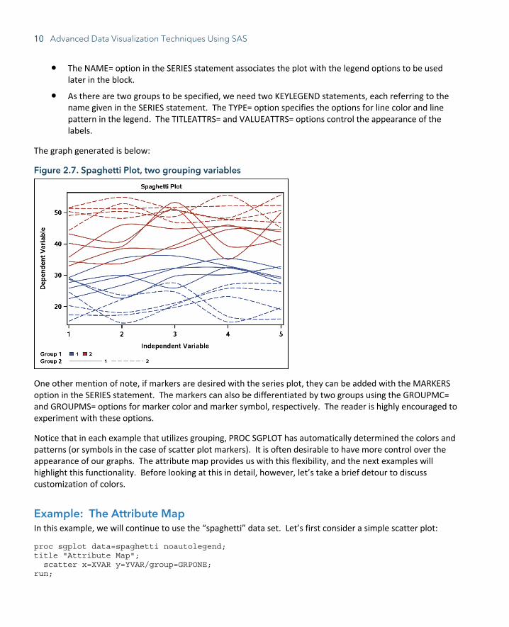
10 Advanced Data Visualization Techniques Using SAS
● The NAME= option in the SERIES statement associates the plot with the legend options to be used later in the block.
● As there are two groups to be specified, we need two KEYLEGEND statements, each referring to the name given in the SERIES statement. The TYPE= option specifies the options for line color and line pattern in the legend. The TITLEATTRS= and VALUEATTRS= options control the appearance of the labels.
The graph generated is below:
Figure 2.7. Spaghetti Plot, two grouping variables
One other mention of note, if markers are desired with the series plot, they can be added with the MARKERS option in the SERIES statement. The markers can also be differentiated by two groups using the GROUPMC= and GROUPMS= options for marker color and marker symbol, respectively. The reader is highly encouraged to experiment with these options.
Notice that in each example that utilizes grouping, PROC SGPLOT has automatically determined the colors and patterns (or symbols in the case of scatter plot markers). It is often desirable to have more control over the appearance of our graphs. The attribute map provides us with this flexibility, and the next examples will highlight this functionality. Before looking at this in detail, however, let’s take a brief detour to discuss customization of colors.
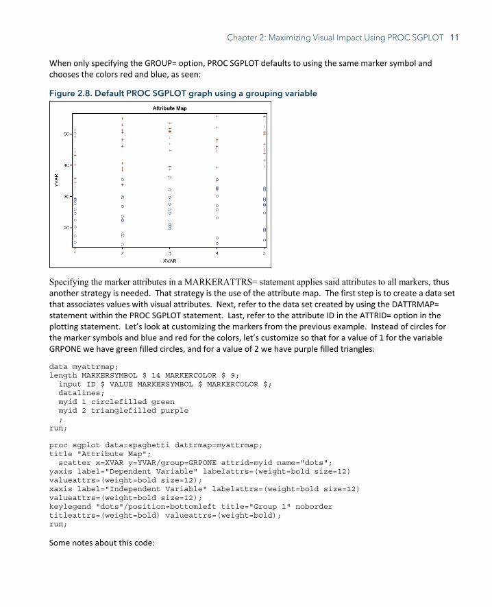
Example: The Attribute Map In this example, we will continue to use the “spaghetti” data set. Let’s first consider a simple scatter plot:
proc sgplot data=spaghetti noautolegend; title "Attribute Map"; scatter x=XVAR y=YVAR/group=GRPONE; run;
Chapter 2: Maximizing Visual Impact Using PROC SGPLOT 11
When only specifying the GROUP= option, PROC SGPLOT defaults to using the same marker symbol and chooses the colors red and blue, as seen:
Figure 2.8. Default PROC SGPLOT graph using a grouping variable
Specifying the marker attributes in a MARKERATTRS= statement applies said attributes to all markers, thus another strategy is needed. That strategy is the use of the attribute map. The first step is to create a data set that associates values with visual attributes. Next, refer to the data set created by using the DATTRMAP= statement within the PROC SGPLOT statement. Last, refer to the attribute ID in the ATTRID= option in the plotting statement. Let’s look at customizing the markers from the previous example. Instead of circles for the marker symbols and blue and red for the colors, let’s customize so that for a value of 1 for the variable GRPONE we have green filled circles, and for a value of 2 we have purple filled triangles:
data myattrmap; length MARKERSYMBOL $ 14 MARKERCOLOR $ 9; input ID $ VALUE MARKERSYMBOL $ MARKERCOLOR $; datalines; myid 1 circlefilled green myid 2 trianglefilled purple ; run;
proc sgplot data=spaghetti dattrmap=myattrmap; title "Attribute Map"; scatter x=XVAR y=YVAR/group=GRPONE attrid=myid name="dots"; yaxis label="Dependent Variable" labelattrs=(weight=bold size=12) valueattrs=(weight=bold size=12); xaxis label="Independent Variable" labelattrs=(weight=bold size=12) valueattrs=(weight=bold size=12); keylegend "dots"/position=bottomleft title="Group 1" noborder titleattrs=(weight=bold) valueattrs=(weight=bold); run;
Some notes about this code:
12 Advanced Data Visualization Techniques Using SAS
● Since the values of the attribute variables in the MYATTRMAP data set are character, we want to be sure to specify their lengths.
● The ID variable specifies which attribute map is being used. For this example, we have only one.
● The VALUE variable specifies the values of the grouping variable to associate each attribute with. In this case, we are using the values of 1 and 2 for the variable GRPONE.
● The MARKERSYMBOL and MARKERCOLOR variables are used to specify the attributes associated with each group, in this case symbols and colors, respectively. The values of these variables must be recognizable keywords.
● In the PROC SGPLOT statement, DATTRMAP=MYATTRMAP refers to the attribute map data set created above.
● The ATTRID= option in the SCATTER statement refers to the attribute map to be used, as given by the value of the ID variable.
● The NAME= option and subsequent KEYLEGEND statement allow us to customize the legend.
The following graph is the result:
Figure 2.9. Application of the attribute map
It should be noted that while we only considered marker attributes in this example, any style attribute can be used as long as it is with the appropriate type of plot. The following table lists some commonly used attributes and the variable names needed to use them in an attribute data set:
Chapter 2: Maximizing Visual Impact Using PROC SGPLOT 13
Table 2.1. Commonly used plotting attributes
Plot Type Attributes Attribute Map Variable Name
Scatter Color Size Symbol
MARKERCOLOR MARKERSIZE MARKERSYMBOL
Series Color Pattern Thickness
LINECOLOR LINEPATTERN LINETHICKNESS
Bar/Box Color Pattern Thickness Transparency
LINECOLOR, FILLCOLOR LINEPATTERN LINETHICKNESS FILLTRANSPARENCY
Text Color TEXTCOLOR
Example: Multiple Attribute Maps In this example, we will look at a more complex attribute map data set containing two attribute maps. We will first look at the data set and attribute map data set requirements. Here is the code to generate both data sets: data attrex2; input DIAG $ TRT TRT2 RESP LOWER UPPER; datalines; A 0 0 1132 566 2264 B 0 0 547 273 1094 A 1 1 211 105 422 B 1 1 193 96 386 AB 0 0 356 178 712 AB 1 1 142 71 284 ; run; data myattrmap2; length value $ 6 fillcolor $ 14 linecolor $ 14 ; input ID $ value $ fillcolor $ linecolor $ ; datalines; myid 1 yellowgreen yellowgreen myid 0 orchid orchid myid2 1 . darkolivegreen myid2 0 . indigo ; run;
A few key notes about this code:
• In the data set to be graphed, we need to duplicate the grouping variables for as many attribute maps as we wish to have. In this case, that number is two, and our variables are TRT and TRT2.
14 Advanced Data Visualization Techniques Using SAS
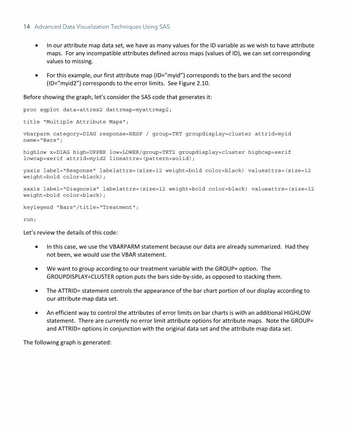
• In our attribute map data set, we have as many values for the ID variable as we wish to have attribute maps. For any incompatible attributes defined across maps (values of ID), we can set corresponding values to missing.
• For this example, our first attribute map (ID=”myid”) corresponds to the bars and the second (ID=”myid2”) corresponds to the error limits. See Figure 2.10.
Before showing the graph, let’s consider the SAS code that generates it:
proc sgplot data=attrex2 dattrmap=myattrmap2;
title "Multiple Attribute Maps";
vbarparm category=DIAG response=RESP / group=TRT groupdisplay=cluster attrid=myid name="Bars";
highlow x=DIAG high=UPPER low=LOWER/group=TRT2 groupdisplay=cluster highcap=serif lowcap=serif attrid=myid2 lineattrs=(pattern=solid);
yaxis label="Response" labelattrs=(size=12 weight=bold color=black) valueattrs=(size=12 weight=bold color=black);
xaxis label="Diagnosis" labelattrs=(size=12 weight=bold color=black) valueattrs=(size=12 weight=bold color=black);
keylegend "Bars"/title="Treatment";
run;
Let’s review the details of this code:
• In this case, we use the VBARPARM statement because our data are already summarized. Had they not been, we would use the VBAR statement.
• We want to group according to our treatment variable with the GROUP= option. The GROUPDISPLAY=CLUSTER option puts the bars side-by-side, as opposed to stacking them.
• The ATTRID= statement controls the appearance of the bar chart portion of our display according to our attribute map data set.
• An efficient way to control the attributes of error limits on bar charts is with an additional HIGHLOW statement. There are currently no error limit attribute options for attribute maps. Note the GROUP= and ATTRID= options in conjunction with the original data set and the attribute map data set.
The following graph is generated:
Chapter 2: Maximizing Visual Impact Using PROC SGPLOT 15
Figure 2.10. Multiple Attribute Maps
One final note on attribute maps, when displaying data with multiple groups, there are options for those as well, namely the LCATTRID, LPATTRID, MCATTRID, and MSATTRID statements. The reader is highly encouraged to explore these options as an exercise.
Annotation in PROC SGPLOT Starting with version 9.3, the Statistical Graphics procedures provided a way of adding annotations to graphical output, including text and labels, shapes, and images. There are two main steps required to do this. First, an annotation data set needs to be created, and then the PROC SGPLOT code needs to be modified to use the annotation data set. This section will provide examples to assist in accomplishing this.
In order to make the creation of the annotation data sets more user-friendly, there are a series of SAS macros available. In order to use these macros, we must first call the %SGANNO macro. This is a system macro, and thus we may call it anywhere in the code outside of a DATA step or a procedure. These macros are described in the table below:
Table 2.2. Statistical Graphics annotation macros
Macro Name Description
%SGANNO_HELP For the macros below, calling this macro using the syntax %SGANNO_HELP(macro name) writes a message to the log outlining the syntax of the specified macro.
%SGARROW Draws an arrow of specified length at a specified location.
%SGIMAGE Displays an image from a specified file.
16 Advanced Data Visualization Techniques Using SAS
Macro Name Description
%SGLINE Draws a line from one specified point to another.
%SGOVAL Draws an oval around a specified point using a specified length and width.
%SGPOLYCONT Continues drawing a polygon or line that was initially started with the %SGPOLYGON or %SGPOLYLINE macros, respectively; specifies each successive point in the polygon or polyline.
%SGPOLYGON Specifies the initial point of a polygon to draw.
%SGPOLYLINE Specifies the beginning point of a series of connected line segments.
%SGRECTANGLE Draws a rectangle around a specified point using a specified length and width.
%SGTEXT Puts text in the graphical display.
%SGTEXTCONT Continues the text started by the %SGTEXT macro.
Let’s consider a simple example where we wish to insert an image into a graph.
Example: Inserting an Image Using Annotation Consider the following data set and corresponding PROC SGPLOT code and graph:
data axes; do i=1 to 12; XVAR=intnx("month","1Dec2015"d,i,"b"); YVAR=80 + 10*rannor(223); DEN=int(600*ranuni(223)); MONTHYR=put(XVAR,monyy5.); DENC=put(DEN,3.); XAXIS=trim(left(MONTHYR))||" (n="||trim(left(DENC)) || ")"; output; end; format XVAR date9.; drop i DEN MONTHYR DENC; run;
proc sgplot data=axes noautolegend; title "Modifying Axes"; series x=XVAR y=YVAR/markers markerattrs=(color=firebrick symbol=circlefilled) lineattrs=(color=firebrick pattern=solid); yaxis label="Dependent Variable" labelattrs=(weight=bold size=12) valueattrs=(weight=bold size=12);
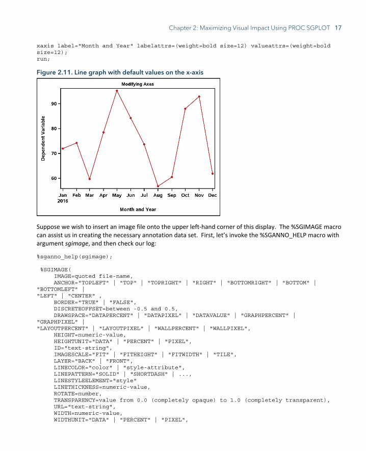
Chapter 2: Maximizing Visual Impact Using PROC SGPLOT 17
xaxis label="Month and Year" labelattrs=(weight=bold size=12) valueattrs=(weight=bold size=12); run;
Figure 2.11. Line graph with default values on the x-axis
Suppose we wish to insert an image file onto the upper left-hand corner of this display. The %SGIMAGE macro can assist us in creating the necessary annotation data set. First, let’s invoke the %SGANNO_HELP macro with argument sgimage, and then check our log:
%sganno_help(sgimage); %SGIMAGE( IMAGE=quoted file-name, ANCHOR="TOPLEFT" | "TOP" | "TOPRIGHT" | "RIGHT" | "BOTTOMRIGHT" | "BOTTOM" | "BOTTOMLEFT" | "LEFT" | "CENTER" , BORDER="TRUE" | "FALSE", DISCRETEOFFSET=between -0.5 and 0.5, DRAWSPACE="DATAPERCENT" | "DATAPIXEL" | "DATAVALUE" | "GRAPHPERCENT" | "GRAPHPIXEL" | "LAYOUTPERCENT" | "LAYOUTPIXEL" | "WALLPERCENT" | "WALLPIXEL", HEIGHT=numeric-value, HEIGHTUNIT="DATA" | "PERCENT" | "PIXEL", ID="text-string", IMAGESCALE="FIT" | "FITHEIGHT" | "FITWIDTH" | "TILE", LAYER="BACK" | "FRONT", LINECOLOR="color" | "style-attribute", LINEPATTERN="SOLID" | "SHORTDASH" | ..., LINESTYLEELEMENT="style" LINETHICKNESS=numeric-value, ROTATE=number, TRANSPARENCY=value from 0.0 (completely opaque) to 1.0 (completely transparent), URL="text-string", WIDTH=numeric-value, WIDTHUNIT="DATA" | "PERCENT" | "PIXEL",
18 Advanced Data Visualization Techniques Using SAS
X1=numeric-value, X1SPACE="DATAPERCENT" | "DATAPIXEL" | "DATAVALUE" | "GRAPHPERCENT" | "GRAPHPIXEL" | "LAYOUTPERCENT" | "LAYOUTPIXEL" | "WALLPERCENT" | "WALLPIXEL", XAXIS="X" | "X2", XC1="text-string", Y1=numeric-value, Y1SPACE="DATAPERCENT" | "DATAPIXEL" | "DATAVALUE" | "GRAPHPERCENT" | "GRAPHPIXEL" | "LAYOUTPERCENT" | "LAYOUTPIXEL" | "WALLPERCENT" | "WALLPIXEL", YAXIS="Y" | "Y2", YC1="text-string", RESET="ALL" ) Note all parameters also honor variable names.
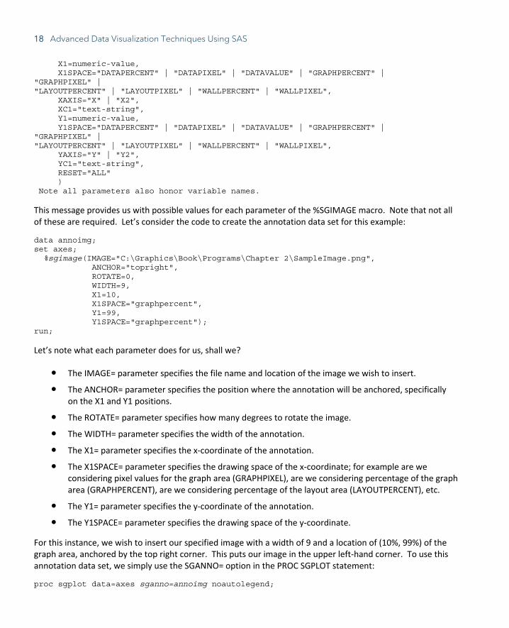
This message provides us with possible values for each parameter of the %SGIMAGE macro. Note that not all of these are required. Let’s consider the code to create the annotation data set for this example:
data annoimg; set axes; %sgimage(IMAGE="C:\Graphics\Book\Programs\Chapter 2\SampleImage.png", ANCHOR="topright", ROTATE=0, WIDTH=9, X1=10, X1SPACE="graphpercent", Y1=99, Y1SPACE="graphpercent"); run;
Let’s note what each parameter does for us, shall we?
● The IMAGE= parameter specifies the file name and location of the image we wish to insert.
● The ANCHOR= parameter specifies the position where the annotation will be anchored, specifically on the X1 and Y1 positions.
● The ROTATE= parameter specifies how many degrees to rotate the image.
● The WIDTH= parameter specifies the width of the annotation.
● The X1= parameter specifies the x-coordinate of the annotation.
● The X1SPACE= parameter specifies the drawing space of the x-coordinate; for example are we considering pixel values for the graph area (GRAPHPIXEL), are we considering percentage of the graph area (GRAPHPERCENT), are we considering percentage of the layout area (LAYOUTPERCENT), etc.
● The Y1= parameter specifies the y-coordinate of the annotation.
● The Y1SPACE= parameter specifies the drawing space of the y-coordinate.
For this instance, we wish to insert our specified image with a width of 9 and a location of (10%, 99%) of the graph area, anchored by the top right corner. This puts our image in the upper left-hand corner. To use this annotation data set, we simply use the SGANNO= option in the PROC SGPLOT statement:
proc sgplot data=axes sganno=annoimg noautolegend;
Chapter 2: Maximizing Visual Impact Using PROC SGPLOT 19
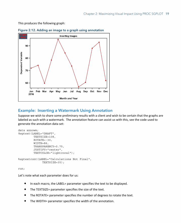
This produces the following graph:
Figure 2.12. Adding an image to a graph using annotation
Example: Inserting a Watermark Using Annotation Suppose we wish to share some preliminary results with a client and wish to be certain that the graphs are labeled as such with a watermark. The annotation feature can assist us with this, see the code used to generate the annotation data set:
data annowm; %sgtext(LABEL="DRAFT", TEXTSIZE=108, ROTATE=-30, WIDTH=86, TRANSPARENCY=0.75, JUSTIFY="center", TEXTCOLOR="lightcoral");
%sgtextcont(LABEL="Calculations Not Final", TEXTSIZE=35);
run;
Let’s note what each parameter does for us:
● In each macro, the LABEL= parameter specifies the text to be displayed.
● The TEXTSIZE= parameter specifies the size of the text.
● The ROTATE= parameter specifies the number of degrees to rotate the text.
● The WIDTH= parameter specifies the width of the annotation.

20 Advanced Data Visualization Techniques Using SAS
● The TRANSPARENCY= parameter specifies the transparency of the text, with 0 being completely opaque and 1 being completely transparent.
● The JUSTIFY= parameter specifies the justification of the text (left, right, center, etc.).
● The TEXTCOLOR= parameter specifies the color of the text.
● In the %SGTEXTCONT macro, we only specify parameters that we wish to change, in this case the text verbiage and the size.
Once again, we use the SGANNO= option in the PROC SGPLOT statement to refer to the annotate data set we created:
proc sgplot data=axes sganno=annowm noautolegend;
This produces the following graph:
Figure 2.13. Inserting a water mark using annotation
Example: Modifying Axes through Annotation In this final annotation example, we will investigate how to customize axis appearance using annotate data sets. Suppose that instead of the current appearance on the x-axis, we want to include a numerical value of a variable “n”, along with the month and year in the label. Not only that, suppose that we also would like to rotate the values by 45 degrees. Let’s investigate the code to accomplish this:
data anno; set axes; %sgtext(ANCHOR="right", ROTATE=45, LABEL=XAXIS, X1=XVAR, Y1=-8, WIDTH=50,

Chapter 2: Maximizing Visual Impact Using PROC SGPLOT 21
TEXTSIZE=12, TEXTWEIGHT="BOLD", X1SPACE="datavalue", Y1SPACE="datapercent"); run;
We have a few differences in this code than we did in the previous examples:
● Instead of quoted text in the LABEL= parameter, we gave the name of a character variable. This will insert values of said variable as the text.
● Instead of a numeric value in the X1= parameter, we gave the name of the variable according to where we would like the text positioned.
● Note that we use “datavalue” as the value of the X1SPACE= parameter, as we wish to place our labels at specific points where data occur.
We also have a couple of slight differences in our PROC SGPLOT code:
proc sgplot data=axes sganno=anno pad=(bottom=20%) noautolegend; title "Modifying Axes"; series x=XVAR y=YVAR/markers markerattrs=(color=firebrick symbol=circlefilled) lineattrs=(color=firebrick pattern=solid); yaxis label="Dependent Variable" labelattrs=(weight=bold size=12) valueattrs=(weight=bold size=12); xaxis display=(nolabel novalues); run;
● Note the addition of the PAD= option in the PROC SGPLOT statement. In this case, we add 20% of white space below the graph in order to fit the annotation.
● Note that in the XAXIS statement, we are suppressing the values and label from the x-axis with the DISPLAY= option. This is done so that the original values are hidden, so as not to interfere with the annotation.
Note the modified graph:
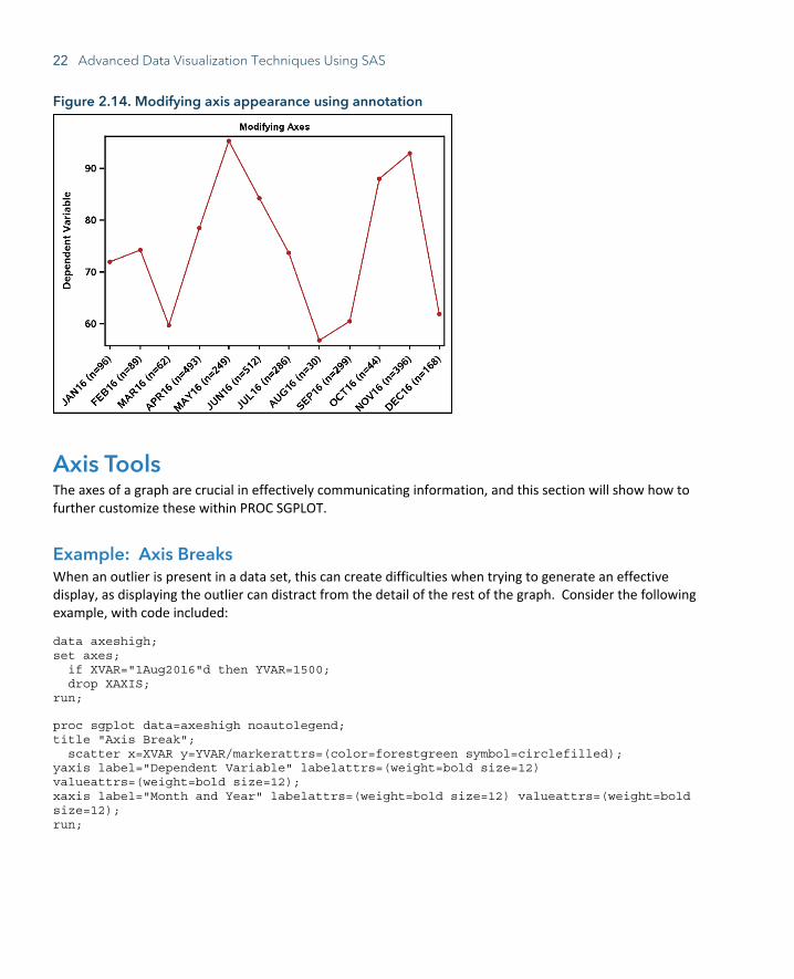
22 Advanced Data Visualization Techniques Using SAS
Figure 2.14. Modifying axis appearance using annotation
Axis Tools The axes of a graph are crucial in effectively communicating information, and this section will show how to further customize these within PROC SGPLOT.
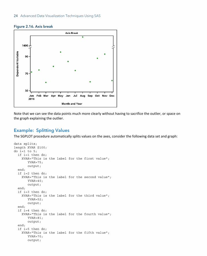
Example: Axis Breaks When an outlier is present in a data set, this can create difficulties when trying to generate an effective display, as displaying the outlier can distract from the detail of the rest of the graph. Consider the following example, with code included:
data axeshigh; set axes; if XVAR="1Aug2016"d then YVAR=1500; drop XAXIS; run;
proc sgplot data=axeshigh noautolegend; title "Axis Break"; scatter x=XVAR y=YVAR/markerattrs=(color=forestgreen symbol=circlefilled); yaxis label="Dependent Variable" labelattrs=(weight=bold size=12) valueattrs=(weight=bold size=12); xaxis label="Month and Year" labelattrs=(weight=bold size=12) valueattrs=(weight=bold size=12); run;
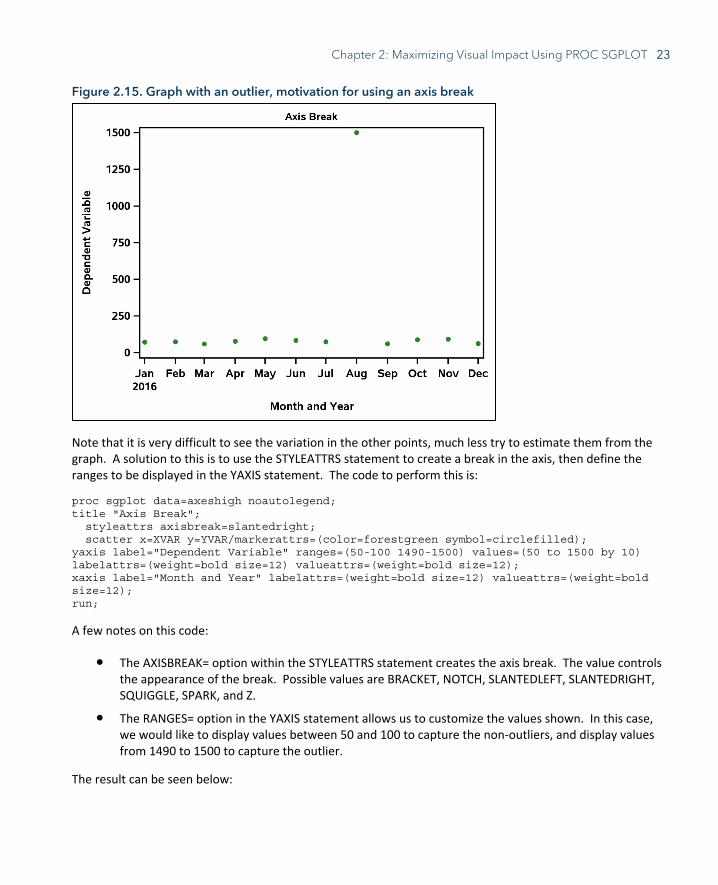
Chapter 2: Maximizing Visual Impact Using PROC SGPLOT 23
Figure 2.15. Graph with an outlier, motivation for using an axis break
Note that it is very difficult to see the variation in the other points, much less try to estimate them from the graph. A solution to this is to use the STYLEATTRS statement to create a break in the axis, then define the ranges to be displayed in the YAXIS statement. The code to perform this is:
proc sgplot data=axeshigh noautolegend; title "Axis Break"; styleattrs axisbreak=slantedright; scatter x=XVAR y=YVAR/markerattrs=(color=forestgreen symbol=circlefilled); yaxis label="Dependent Variable" ranges=(50-100 1490-1500) values=(50 to 1500 by 10) labelattrs=(weight=bold size=12) valueattrs=(weight=bold size=12); xaxis label="Month and Year" labelattrs=(weight=bold size=12) valueattrs=(weight=bold size=12); run;
A few notes on this code:
● The AXISBREAK= option within the STYLEATTRS statement creates the axis break. The value controls the appearance of the break. Possible values are BRACKET, NOTCH, SLANTEDLEFT, SLANTEDRIGHT, SQUIGGLE, SPARK, and Z.
● The RANGES= option in the YAXIS statement allows us to customize the values shown. In this case, we would like to display values between 50 and 100 to capture the non-outliers, and display values from 1490 to 1500 to capture the outlier.
The result can be seen below:
24 Advanced Data Visualization Techniques Using SAS
Figure 2.16. Axis break
Note that we can see the data points much more clearly without having to sacrifice the outlier, or space on the graph explaining the outlier.
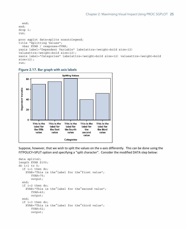
Example: Splitting Values The SGPLOT procedure automatically splits values on the axes, consider the following data set and graph:
data splits; length XVAR $100; do i=1 to 5; if i=1 then do; XVAR="This is the label for the first value"; YVAR=75; output; end; if i=2 then do; XVAR="This is the label for the second value"; YVAR=40; output; end; if i=3 then do; XVAR="This is the label for the third value"; YVAR=52; output; end; if i=4 then do; XVAR="This is the label for the fourth value"; YVAR=81; output; end; if i=5 then do; XVAR="This is the label for the fifth value"; YVAR=70; output;
Chapter 2: Maximizing Visual Impact Using PROC SGPLOT 25
end; end; drop i; run;
proc sgplot data=splits noautolegend; title "Splitting Values"; vbar XVAR / response=YVAR; yaxis label="Dependent Variable" labelattrs=(weight=bold size=12) valueattrs=(weight=bold size=12); xaxis label="Categories" labelattrs=(weight=bold size=12) valueattrs=(weight=bold size=12); run;
Figure 2.17. Bar graph with axis labels
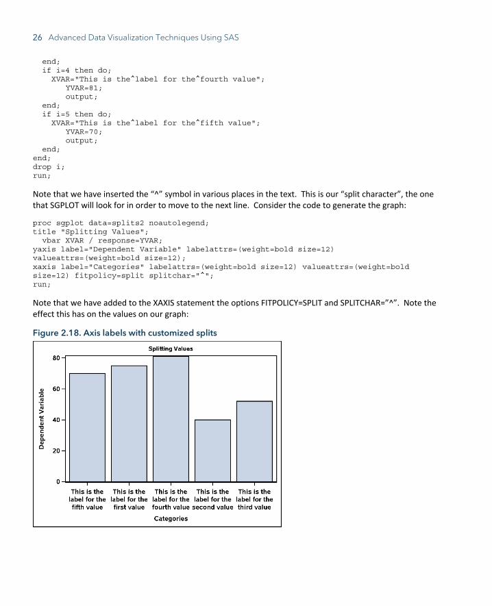
Suppose, however, that we wish to split the values on the x-axis differently. This can be done using the FITPOLICY=SPLIT option and specifying a “split character”. Consider the modified DATA step below:
data splits2; length XVAR $100; do i=1 to 5; if i=1 then do; XVAR="This is the^label for the^first value"; YVAR=75; output; end; if i=2 then do; XVAR="This is the^label for the^second value"; YVAR=40; output; end; if i=3 then do; XVAR="This is the^label for the^third value"; YVAR=52; output;
26 Advanced Data Visualization Techniques Using SAS
end; if i=4 then do; XVAR="This is the^label for the^fourth value"; YVAR=81; output; end; if i=5 then do; XVAR="This is the^label for the^fifth value"; YVAR=70; output; end; end; drop i; run;
Note that we have inserted the “^” symbol in various places in the text. This is our “split character”, the one that SGPLOT will look for in order to move to the next line. Consider the code to generate the graph:
proc sgplot data=splits2 noautolegend; title "Splitting Values"; vbar XVAR / response=YVAR; yaxis label="Dependent Variable" labelattrs=(weight=bold size=12) valueattrs=(weight=bold size=12); xaxis label="Categories" labelattrs=(weight=bold size=12) valueattrs=(weight=bold size=12) fitpolicy=split splitchar="^"; run;
Note that we have added to the XAXIS statement the options FITPOLICY=SPLIT and SPLITCHAR=”^”. Note the effect this has on the values on our graph:
Figure 2.18. Axis labels with customized splits
Chapter 2: Maximizing Visual Impact Using PROC SGPLOT 27
Axis Tables The axis table functionality within PROC SGPLOT provides a powerful way to display data in tabular form along with a graphical display. This section will cover the syntax for the axis table statements and provide an application in the form of creating a forest plot. We will focus on the YAXISTABLE statement, but do note that syntax for the XAXISTABLE statement is analogous.
The YAXISTABLE statement allows us to display a data table to the right or left of the plot. The syntax is as follows:
yaxistable <variable names>/<options>;
Each variable listed corresponds to one column of the table. All options specified are applied to each variable. Below are a handful of useful options, but the reader is highly encouraged to consult the SAS documentation for a full list.
● The Y= option specifies which variable to align the table values to the Y axis.
● The LOCATION= option specifies whether the table is placed inside or outside of the axis area. Possible values are “inside” or “outside”.
● The POSITION= option specifies whether the table is placed on the left or right side of the graph. Possible values, obviously, are “left” or “right”.
● The VALUEATTRS= option controls the appearance of the values in the table, such as whether the text is bold, the font size and type, etc.
● The NOMISSINGCHAR option displays missing numerical values as a blank space as opposed to “.”.
Example: Simple Forest Plot The following example illustrates an application of this statement in the creation of a forest plot, with the table displaying the odds ratios and confidence limits. Let’s first generate the data set:
data forest; input CATEGORY $9. OR LCL UCL GRP; datalines; Variable1 0.509 0.317 1.121 0 Variable2 0.792 0.447 1.353 0 Variable3 0.373 0.096 0.664 0 Variable4 0.081 0.009 0.213 0 Variable5 1.392 0.745 3.342 0 Variable6 0.612 0.303 0.944 0 Variable7 0.954 0.772 1.245 0 Variable8 0.602 0.459 0.779 0 Overall 0.643 . . 1 ; run;
We want to display the marker for the “Overall” value of the CATEGORY variable different from the other values, thus we have the grouping variable “GRP”. We will use an attribute map to control the appearances, and the data set to do so is given by:
data forestmap;
28 Advanced Data Visualization Techniques Using SAS
length markersymbol $ 14 markercolor $ 9; input ID $ value markersymbol $ markercolor $; datalines; myid 0 squarefilled royalblue myid 1 diamondfilled red ; run;
We want the “Overall” value to be red with a filled diamond shape, and the others to be black with a filled square shape. Now that we have our prerequisite data sets, let’s examine the PROC SGPLOT code:
proc sgplot data=forest dattrmap=forestmap noautolegend; title "Forest Plot"; scatter x=OR y=CATEGORY/group=GRP attrid=myid xerrorlower=LCL xerrorupper=UCL; yaxistable OR LCL UCL/y=CATEGORY location=inside position=right valueattrs=(size=10 weight=bold) nomissingchar; refline 1 100 / axis=x noclip; refline 0.01 0.1 10 / axis=x lineattrs=(pattern=shortdash) transparency=0.5 noclip; yaxis display=(noticks nolabel) fitpolicy=none valueshalign=left colorbands=even colorbandsattrs=(color=royalblue transparency=0.8) valueattrs=(size=10 weight=bold) reverse; xaxis type=log max=100 minor display=(nolabel) valueattrs=(size=10 weight=bold); run;
Let’s discuss the code:
● Note the same attribute map statements from the previous attribute map example, namely the DATTRMAP= statement in the PROC SGPLOT statement and the ATTRID= option in the SCATTER statement.
● Also in the SCATTER statement are the XERRORUPPER= and XERRORLOWER= options, which create error bars for the points.
● The YAXISTABLE statement specifies that the variables for the odds ratio and confidence limits are displayed in the table. We want the table displayed inside the graph, to the right, with bold values of font size 10, and we wish missing values to be displayed as blanks.
● The NOCLIP option in the REFLINE statements ensures that the axis extends to contain the lines.
● To assist with visibility, and thus effectiveness, efficiency, and engagement of the display, we add color bands in the YAXIS statement. The COLORBANDS=EVEN option specifies that even-numbered lines are shaded, and the COLORBANDSATTRS= option controls the appearance of the bands. The REVERSE option specifies that the values are displayed in descending order.
● Often times with forest plots, a logarithmic scale is desirable. The TYPE=LOG option in the XAXIS statement specifies this, with the MINOR option adding the appropriate tick marks to the log axis.
With all of this in mind, let’s see what the final graph looks like:
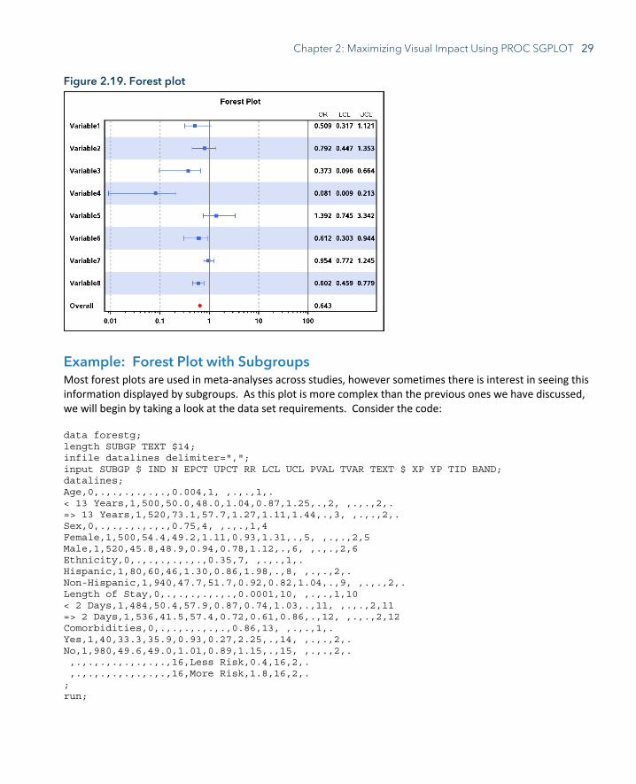
Chapter 2: Maximizing Visual Impact Using PROC SGPLOT 29
Figure 2.19. Forest plot
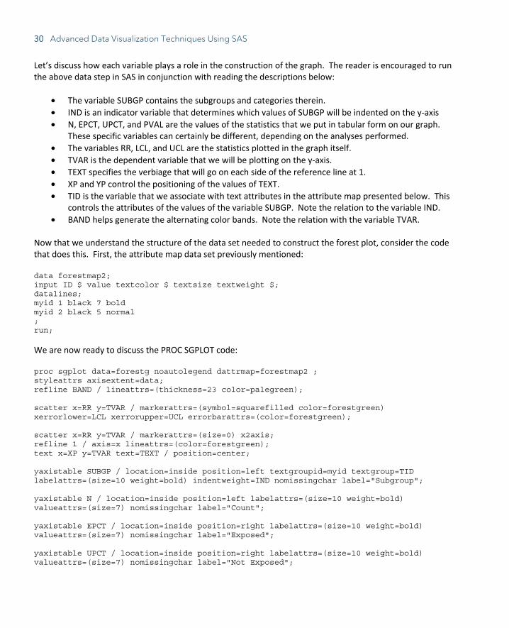
Example: Forest Plot with Subgroups Most forest plots are used in meta-analyses across studies, however sometimes there is interest in seeing this information displayed by subgroups. As this plot is more complex than the previous ones we have discussed, we will begin by taking a look at the data set requirements. Consider the code: data forestg; length SUBGP TEXT $14; infile datalines delimiter=","; input SUBGP $ IND N EPCT UPCT RR LCL UCL PVAL TVAR TEXT $ XP YP TID BAND; datalines; Age,0,.,.,.,.,.,.,0.004,1, ,.,.,1,. < 13 Years,1,500,50.0,48.0,1.04,0.87,1.25,.,2, ,.,.,2,. => 13 Years,1,520,73.1,57.7,1.27,1.11,1.44,.,3, ,.,.,2,. Sex,0,.,.,.,.,.,.,0.75,4, ,.,.,1,4 Female,1,500,54.4,49.2,1.11,0.93,1.31,.,5, ,.,.,2,5 Male,1,520,45.8,48.9,0.94,0.78,1.12,.,6, ,.,.,2,6 Ethnicity,0,.,.,.,.,.,.,0.35,7, ,.,.,1,. Hispanic,1,80,60,46,1.30,0.86,1.98,.,8, ,.,.,2,. Non-Hispanic,1,940,47.7,51.7,0.92,0.82,1.04,.,9, ,.,.,2,. Length of Stay,0,.,.,.,.,.,.,0.0001,10, ,.,.,1,10 < 2 Days,1,484,50.4,57.9,0.87,0.74,1.03,.,11, ,.,.,2,11 => 2 Days,1,536,41.5,57.4,0.72,0.61,0.86,.,12, ,.,.,2,12 Comorbidities,0,.,.,.,.,.,.,0.86,13, ,.,.,1,. Yes,1,40,33.3,35.9,0.93,0.27,2.25,.,14, ,.,.,2,. No,1,980,49.6,49.0,1.01,0.89,1.15,.,15, ,.,.,2,. ,.,.,.,.,.,.,.,.,16,Less Risk,0.4,16,2,. ,.,.,.,.,.,.,.,.,16,More Risk,1.8,16,2,. ; run;
30 Advanced Data Visualization Techniques Using SAS
Let’s discuss how each variable plays a role in the construction of the graph. The reader is encouraged to run the above data step in SAS in conjunction with reading the descriptions below:
• The variable SUBGP contains the subgroups and categories therein. • IND is an indicator variable that determines which values of SUBGP will be indented on the y-axis • N, EPCT, UPCT, and PVAL are the values of the statistics that we put in tabular form on our graph.
These specific variables can certainly be different, depending on the analyses performed. • The variables RR, LCL, and UCL are the statistics plotted in the graph itself. • TVAR is the dependent variable that we will be plotting on the y-axis. • TEXT specifies the verbiage that will go on each side of the reference line at 1. • XP and YP control the positioning of the values of TEXT. • TID is the variable that we associate with text attributes in the attribute map presented below. This
controls the attributes of the values of the variable SUBGP. Note the relation to the variable IND. • BAND helps generate the alternating color bands. Note the relation with the variable TVAR.
Now that we understand the structure of the data set needed to construct the forest plot, consider the code that does this. First, the attribute map data set previously mentioned: data forestmap2; input ID $ value textcolor $ textsize textweight $; datalines; myid 1 black 7 bold myid 2 black 5 normal ; run;
We are now ready to discuss the PROC SGPLOT code: proc sgplot data=forestg noautolegend dattrmap=forestmap2 ; styleattrs axisextent=data; refline BAND / lineattrs=(thickness=23 color=palegreen); scatter x=RR y=TVAR / markerattrs=(symbol=squarefilled color=forestgreen) xerrorlower=LCL xerrorupper=UCL errorbarattrs=(color=forestgreen); scatter x=RR y=TVAR / markerattrs=(size=0) x2axis; refline 1 / axis=x lineattrs=(color=forestgreen); text x=XP y=TVAR text=TEXT / position=center; yaxistable SUBGP / location=inside position=left textgroupid=myid textgroup=TID labelattrs=(size=10 weight=bold) indentweight=IND nomissingchar label="Subgroup"; yaxistable N / location=inside position=left labelattrs=(size=10 weight=bold) valueattrs=(size=7) nomissingchar label="Count"; yaxistable EPCT / location=inside position=right labelattrs=(size=10 weight=bold) valueattrs=(size=7) nomissingchar label="Exposed"; yaxistable UPCT / location=inside position=right labelattrs=(size=10 weight=bold) valueattrs=(size=7) nomissingchar label="Not Exposed";
Chapter 2: Maximizing Visual Impact Using PROC SGPLOT 31
yaxistable PVAL / location=inside position=right labelattrs=(size=10 weight=bold) valueattrs=(size=7) nomissingchar label="P-Value"; yaxis reverse display=none colorbands=odd colorbandsattrs=(color=palegreen transparency=0.5) offsetmin=0; xaxis display=(nolabel) values=(0 to 2.5 by 0.5); x2axis label="Risk Ratio" labelattrs=(size=10 weight=bold) display=(noline noticks novalues); run; Let’s discuss this block of code:
• In the STYLEATTRS statement, for this example, the AXISEXTENT=DATA option prevents a box from being around the plot.
• Both the first REFLINE statement and YAXIS statement create the alternating green bands across subgroups.
• The first SCATTER statement plots the point estimates and confidence limits. • The second SCATTER statement and the X2AXIS statement are responsible for generating the “Risk
Ratio” title. • The second REFLINE statement draws the reference line at 1. • The TEXT statement writes the verbiage “Less Risk” and “More Risk” on each respective side of the
reference line. • The first YAXISTABLE statement generates the column for the subgroups and controls the appearance
of the individual entries. The TEXTGROUPID= and TEXTGROUP= options are analogous, respectively, to the ATTRID= and GROUP= options previously covered in the attribute map discussion. The INDENTWEIGHT= option controls which values are indented.
• The remaining YAXISTABLE statements generate the rest of the tabulated values. The following graph gives us the finished sub-grouped forest plot:
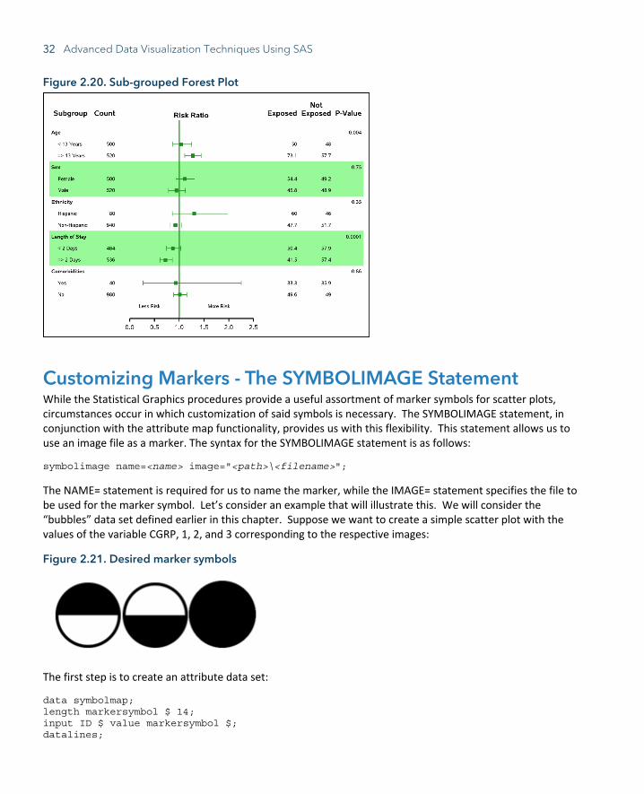
32 Advanced Data Visualization Techniques Using SAS
Figure 2.20. Sub-grouped Forest Plot
Customizing Markers - The SYMBOLIMAGE Statement While the Statistical Graphics procedures provide a useful assortment of marker symbols for scatter plots, circumstances occur in which customization of said symbols is necessary. The SYMBOLIMAGE statement, in conjunction with the attribute map functionality, provides us with this flexibility. This statement allows us to use an image file as a marker. The syntax for the SYMBOLIMAGE statement is as follows:
symbolimage name=<name> image="<path>\<filename>";
The NAME= statement is required for us to name the marker, while the IMAGE= statement specifies the file to be used for the marker symbol. Let’s consider an example that will illustrate this. We will consider the “bubbles” data set defined earlier in this chapter. Suppose we want to create a simple scatter plot with the values of the variable CGRP, 1, 2, and 3 corresponding to the respective images:
Figure 2.21. Desired marker symbols
The first step is to create an attribute data set:
data symbolmap; length markersymbol $ 14; input ID $ value markersymbol $; datalines;
Chapter 2: Maximizing Visual Impact Using PROC SGPLOT 33
myid 1 Top myid 2 Bottom myid 3 Full ; run;
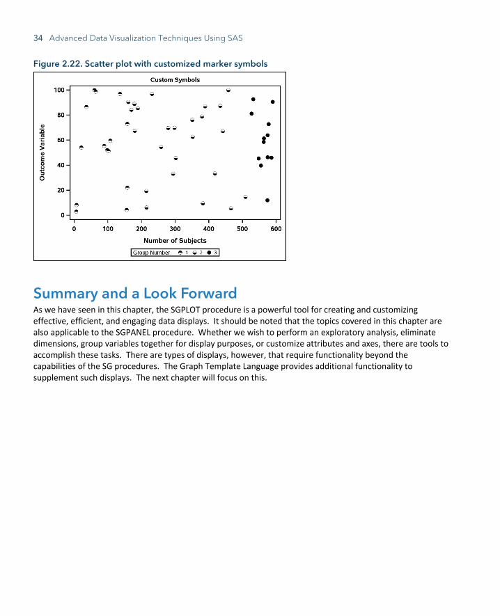
Note that the values of the MARKERSYMBOL variable are not typical SAS marker symbols, but rather names given to the customized markers. Let’s see how this impacts the PROC SGPLOT code:
proc sgplot data=bubbles noautolegend dattrmap=symbolmap; title "Custom Symbols"; symbolimage name=Top image="C:\Graphics\Book\Top.png"; symbolimage name=Bottom image="C:\Graphics\Book\Bottom.png"; symbolimage name=Full image="C:\Graphics\Book\Full.png"; scatter x=COUNT y=OUTCOME/group=CGRP attrid=myid markerattrs=(size=10) name="dots"; yaxis label="Outcome Variable" labelattrs=(weight=bold size=12) valueattrs=(weight=bold size=12); xaxis label="Number of Subjects" labelattrs=(weight=bold size=12) valueattrs=(weight=bold size=12); keylegend "dots" / title="Group Number"; run;
Notes on this code:
● Note the familiar attribute map syntax in the PROC SGPLOT and SCATTER statements.
● We need a separate SYMBOLIMAGE statement for each customized marker. Also notice that the values in each NAME= statement corresponds to the respective values in the attribute map data set defined above.
● When customizing symbols, it is especially helpful to define a legend, specified by the NAME= option in the SCATTER statement and the KEYLEGEND statement.
The graph below is the result:
34 Advanced Data Visualization Techniques Using SAS
Figure 2.22. Scatter plot with customized marker symbols
Summary and a Look Forward As we have seen in this chapter, the SGPLOT procedure is a powerful tool for creating and customizing effective, efficient, and engaging data displays. It should be noted that the topics covered in this chapter are also applicable to the SGPANEL procedure. Whether we wish to perform an exploratory analysis, eliminate dimensions, group variables together for display purposes, or customize attributes and axes, there are tools to accomplish these tasks. There are types of displays, however, that require functionality beyond the capabilities of the SG procedures. The Graph Template Language provides additional functionality to supplement such displays. The next chapter will focus on this.

SAS and all other SAS Institute Inc. product or service names are registered trademarks or trademarks of SAS Institute Inc. in the USA and other countries. ® indicates USA registration. Other brand and product names are trademarks of their respective companies. © 2017 SAS Institute Inc. All rights reserved. M1588358 US.0217
Be among the fi rst to know about new books, special events, and exclusive discounts.
support.sas.com/newbooks
Share your expertise. Write a book with SAS.support.sas.com/publish
sas.com/booksfor additional books and resources.
Ready to take your SAS® and JMP®skills up a notch?