album covers
TRANSCRIPT
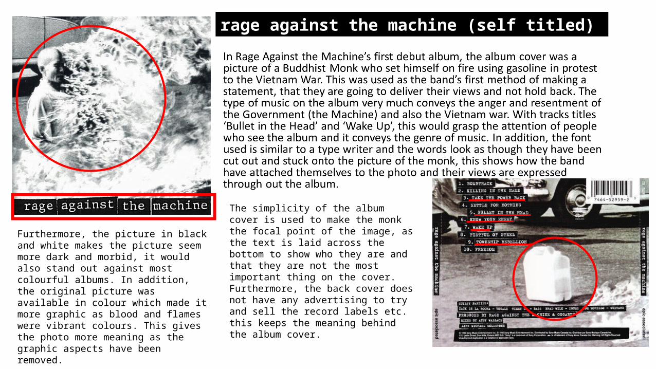
The simplicity of the album cover is used to make the monk the focal point of the image, as the text is laid across the bottom to show who they are and that they are not the most important thing on the cover. Furthermore, the back cover does not have any advertising to try and sell the record labels etc. this keeps the meaning behind the album cover.
Furthermore, the picture in black and white makes the picture seem more dark and morbid, it would also stand out against most colourful albums. In addition, the original picture was available in colour which made it more graphic as blood and flames were vibrant colours. This gives the photo more meaning as the graphic aspects have been removed.
rage against the machine (self titled)
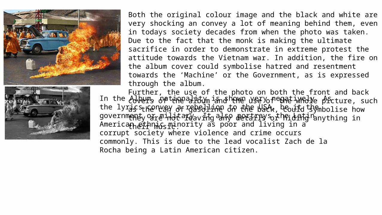
Both the original colour image and the black and white are very shocking an convey a lot of meaning behind them, even in todays society decades from when the photo was taken. Due to the fact that the monk is making the ultimate sacrifice in order to demonstrate in extreme protest the attitude towards the Vietnam war. In addition, the fire on the album cover could symbolise hatred and resentment towards the ‘Machine’ or the Government, as is expressed through the album. Further, the use of the photo on both the front and back covers of the album and the use of the whole picture, such as the can of gasoline on the back, could symbolise how they are not leaving any details or hiding anything in their music.
In the Album, nationality is shown very negatively. As the lyrics convey a rebellion to the USA, be it the government or military. It also portrays the Latin American ethnic minority as poor and living in a corrupt society where violence and crime occurs commonly. This is due to the lead vocalist Zach de la Rocha being a Latin American citizen.
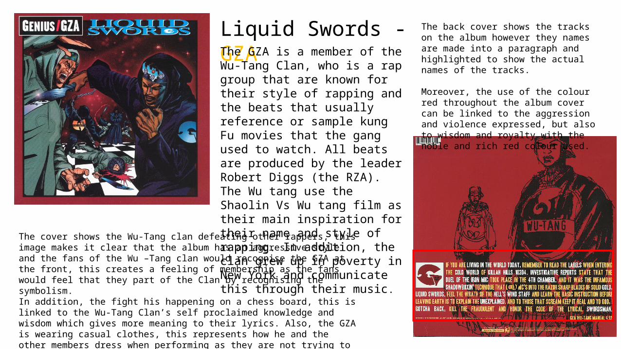
Liquid Swords - GZAThe GZA is a member of the Wu-Tang Clan, who is a rap group that are known for their style of rapping and the beats that usually reference or sample kung Fu movies that the gang used to watch. All beats are produced by the leader Robert Diggs (the RZA). The Wu tang use the Shaolin Vs Wu tang film as their main inspiration for their name and style of rapping. In addition, the clan grew up in poverty in New York and communicate this through their music.
The cover shows the Wu-Tang clan defeating other rappers, this image makes it clear that the album has an aggressive style and the fans of the Wu –Tang clan would recognise the GZA at the front, this creates a feeling of membership as the fans would feel that they part of the Clan by recognising the symbolism. In addition, the fight his happening on a chess board, this is linked to the Wu-Tang Clan’s self proclaimed knowledge and wisdom which gives more meaning to their lyrics. Also, the GZA is wearing casual clothes, this represents how he and the other members dress when performing as they are not trying to show off and appear rich, but rather try to stay as real as possible to make it more relatable to listeners who were in the same position as them.
The back cover shows the tracks on the album however they names are made into a paragraph and highlighted to show the actual names of the tracks.
Moreover, the use of the colour red throughout the album cover can be linked to the aggression and violence expressed, but also to wisdom and royalty with the noble and rich red colour used.
cv
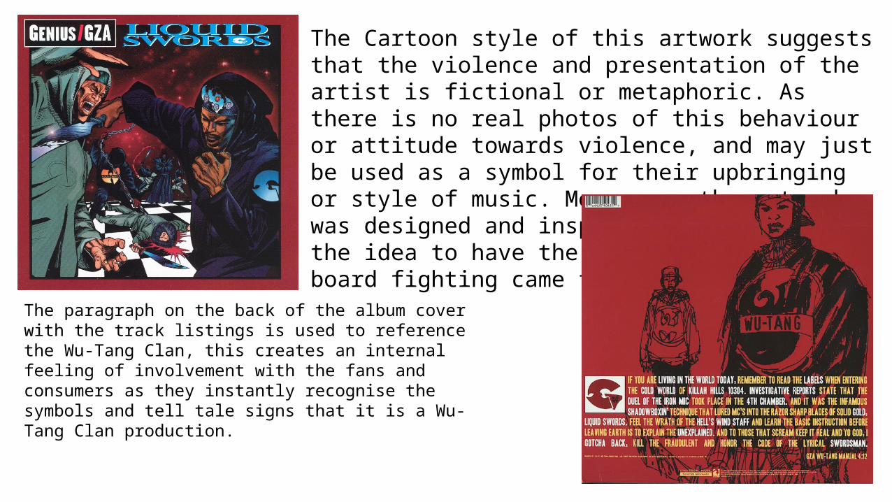
The Cartoon style of this artwork suggests that the violence and presentation of the artist is fictional or metaphoric. As there is no real photos of this behaviour or attitude towards violence, and may just be used as a symbol for their upbringing or style of music. Moreover, the artwork was designed and inspired by the Gza and the idea to have the pieces of a chess board fighting came from the artist.
The paragraph on the back of the album cover with the track listings is used to reference the Wu-Tang Clan, this creates an internal feeling of involvement with the fans and consumers as they instantly recognise the symbols and tell tale signs that it is a Wu-Tang Clan production.
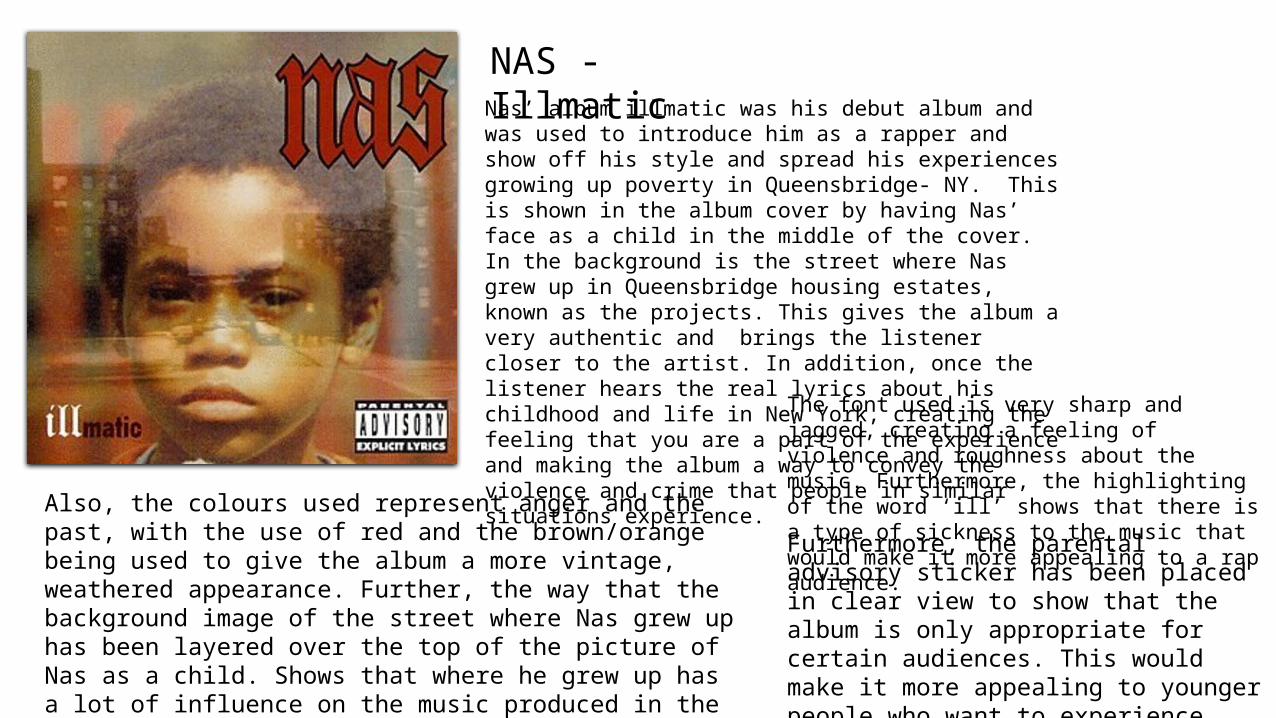
NAS - IllmaticNas’ album illmatic was his debut album and was used to introduce him as a rapper and show off his style and spread his experiences growing up poverty in Queensbridge- NY. This is shown in the album cover by having Nas’ face as a child in the middle of the cover. In the background is the street where Nas grew up in Queensbridge housing estates, known as the projects. This gives the album a very authentic and brings the listener closer to the artist. In addition, once the listener hears the real lyrics about his childhood and life in New York, creating the feeling that you are a part of the experience and making the album a way to convey the violence and crime that people in similar situations experience.
The font used is very sharp and jagged, creating a feeling of violence and roughness about the music. Furthermore, the highlighting of the word ‘ill’ shows that there is a type of sickness to the music that would make it more appealing to a rap audience.
Furthermore, the parental advisory sticker has been placed in clear view to show that the album is only appropriate for certain audiences. This would make it more appealing to younger people who want to experience music with more attitude and aggression.
Also, the colours used represent anger and the past, with the use of red and the brown/orange being used to give the album a more vintage, weathered appearance. Further, the way that the background image of the street where Nas grew up has been layered over the top of the picture of Nas as a child. Shows that where he grew up has a lot of influence on the music produced in the album and gives the people who see the area and recognise it, a feeling of unity and involvement with the artist.
Metallica - …And Justice For All
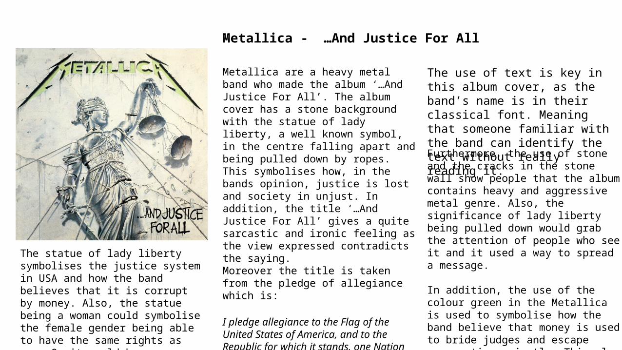
Metallica are a heavy metal band who made the album ‘…And Justice For All’. The album cover has a stone background with the statue of lady liberty, a well known symbol, in the centre falling apart and being pulled down by ropes. This symbolises how, in the bands opinion, justice is lost and society in unjust. In addition, the title ‘…And Justice For All’ gives a quite sarcastic and ironic feeling as the view expressed contradicts the saying. Moreover the title is taken from the pledge of allegiance which is:
I pledge allegiance to the Flag of the United States of America, and to the Republic for which it stands, one Nation under God, indivisible, with liberty and justice for all.
This could be seen as disrespectful, but also a rise against authority that could interest consumers.
The use of text is key in this album cover, as the band’s name is in their classical font. Meaning that someone familiar with the band can identify the text without really reading it.
Furthermore, the use of stone and the cracks in the stone wall show people that the album contains heavy and aggressive metal genre. Also, the significance of lady liberty being pulled down would grab the attention of people who see it and it used a way to spread a message.
In addition, the use of the colour green in the Metallica is used to symbolise how the band believe that money is used to bride judges and escape persecution unjustly. This also is the reason why there is money falling from the scales of justice.
The statue of lady liberty symbolises the justice system in USA and how the band believes that it is corrupt by money. Also, the statue being a woman could symbolise the female gender being able to have the same rights as men. Or it could be seen as women being portrayed as consolidative figures in society.