an introduction to spatial autocorrelation analysis with geoda luc
TRANSCRIPT
An Introduction to Spatial Autocorrelation Analysis with GeoDa
Luc Anselin Spatial Analysis Laboratory
Department of Agricultural and Consumer Economics University of Illinois, Urbana-Champaign
http://sal.agecon.uiuc.edu/ June 16, 2003
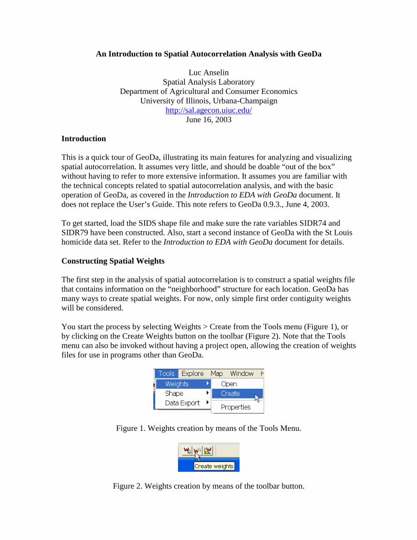
Introduction This is a quick tour of GeoDa, illustrating its main features for analyzing and visualizing spatial autocorrelation. It assumes very little, and should be doable “out of the box” without having to refer to more extensive information. It assumes you are familiar with the technical concepts related to spatial autocorrelation analysis, and with the basic operation of GeoDa, as covered in the Introduction to EDA with GeoDa document. It does not replace the User’s Guide. This note refers to GeoDa 0.9.3., June 4, 2003. To get started, load the SIDS shape file and make sure the rate variables SIDR74 and SIDR79 have been constructed. Also, start a second instance of GeoDa with the St Louis homicide data set. Refer to the Introduction to EDA with GeoDa document for details. Constructing Spatial Weights The first step in the analysis of spatial autocorrelation is to construct a spatial weights file that contains information on the “neighborhood” structure for each location. GeoDa has many ways to create spatial weights. For now, only simple first order contiguity weights will be considered. You start the process by selecting Weights > Create from the Tools menu (Figure 1), or by clicking on the Create Weights button on the toolbar (Figure 2). Note that the Tools menu can also be invoked without having a project open, allowing the creation of weights files for use in programs other than GeoDa.
Figure 1. Weights creation by means of the Tools Menu.
Figure 2. Weights creation by means of the toolbar button.

2
A Creating Weights dialog box appears, which contains all the options available in GeoDa (Figure 3). Note the three parts to the dialog. The top part requires the specification of the input file (a shape file), the output file (the spatial weights file) as well as an ID variable that identifies each location uniquely. The latter is used to ensure that the entries in the weights file match the proper entries in the data base. The middle part of the dialog pertains to contiguity weights constructed from the information in a boundary file (shape file). Both Rook and Queen types of contiguity can be constructed, as well as files containing higher order contiguity. The bottom part of the dialog deals with the construction of distance based spatial weights from x-y coordinates. The latter can be the coordinates in a point shape file or any x-y variables contained in the data set. Euclidean as well as great circle (arc) distance is supported, although the arc distance is only approximate. Using these distances, weights can be derived from distance bands or based on k-nearest neighbor relations.
Figure 3. Creating weights dialog. To build a weights file incorporating rook contiguity for the North Carolina counties, first click on the open file icon and select SIDS.shp as the input file. Next, click on the save file icon and enter a name for the weights file, say sidr1 (the file will get a file extension of .gal). Thirdly, enter FIPSNO as the ID variable and check Rook as the type of contiguity (see Figure 4). Finally, click on Create to launch the process: a progress bar will appear and indicate when the file has been created. The weights file will appear in the current working directory and is now available for use in analysis.

3
Figure 4. Rook contiguity weights construction. Practice Experiment with creating other types of weights, such as queen-based contiguity or higher order contiguity. To create distance-based weights, it is easiest to compute the centroids for the polygons first (right click on the map and select Add Centroids to Table). Also make sure you create one or two spatial weights files for use with the St. Louis data set. You will need those in the analysis of spatial autocorrelation. Spatial Weights Characteristics Before embarking on the computation of spatial autocorrelation statistics, it is good practice to check the spatial weights for the presence of “islands” (unconnected observations) and other undesirable characteristics. A histogram with the distribution of the number of neighbors for a given weights file is obtained by selecting Tools > Weights > Properties or by clicking on the Weights Characteristics toolbar button. This invokes a dialog where you need to specify the weights file (Figure 5).
Figure 5. Input file dialog for weights characteristics. After you specify the weights file, a histogram appears that shows the distribution of the observations according to how many neighbors they have. Note that the default number of categories for the histogram of seven is often not a good choice in this case. For the NC counties, use the Options to set the number of categories to nine, as in Figure 6. The most effective use of this diagram is to link it with a map. For example, in Figure 6, the bar with four connections is selected in the histogram and the matching locations shown in the map.

4
Figure 6. Location of counties with four neighbors in the rook weights file. Since all graphs and maps are linked, you can also find out further characteristics of the selected counties in the table (use Promote to collect them all at the top of the table). Alternatively, you can select a county in the map and find out how many neighbors it has in the weights file, as illustrated in Figure 7.
Figure 7. Neighbor characteristics for a selected county. Practice Use the Weight Characteristics functionality to find out the distribution of neighbors for the weights you created in the St. Louis data set. Make sure to change the number of categories so that each covers only one cardinality of neighbors. Combine selection in the map and/or in the histogram with a lookup in the table. Compare the neighbor structure for a given county in two spatial weights files.
5
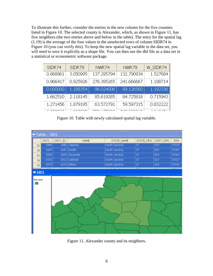
Constructing Spatially Lagged Variables A spatially lagged variable (a sum of spatial weights multiplied with values for observations at neighboring locations) is an essential part of any analysis of spatial autocorrelation. GeoDa computes this on the fly, so you don’t have to create a spatial lag variable explicitly. However, you may wish to export a spatially lagged variable to a statistical package, say to include as an instrumental variable in a regression. You can add spatial lags for any variable in your data set using the Table Calculation options. With the table for the SIDS data active, right click and select Add Column (or use the Options menu). In the dialog, specify a meaningful name for a spatial lag of SIDR74, say W_SIDR74. Note that before you can compute the lag, you must create an empty column in the table to contain it. Also, you must make sure a spatial weights file has been “opened” If there is no weights file active, this must be done explicitly (click on the Open Weights toolbar button and specify the file name). In the table, right click and select Field Calculation. You will need to click on the third tab for “Lag Operations” as in Figure 8. Next, select W_SIDR74 as the “Result in the drop down list, make sure the correct weights file is specified and choose SIDR74 as the “Variable.” Click on OK to create the new variable. Its values will be added in the new column.
Figure 8. Lag operation tab in Field Calculation dialog.
Figure 9. Field Calculation dialog for spatial lag computation.
6
To illustrate this further, consider the entries in the new column for the five counties listed in Figure 10. The selected county is Alexander, which, as shown in Figure 11, has five neighbors (the two entries above and below in the table). The entry for the spatial lag (1.19) is the average of the four values in the unselected rows of column SIDR74 in Figure 10 (you can verify this). To keep the new spatial lag variable in the data set, you will need to save it explicitly as a shape file. You can then use the dbf file as a data set in a statistical or econometric software package.
Figure 10. Table with newly calculated spatial lag variable.
Figure 11. Alexander county and its neighbors.
7
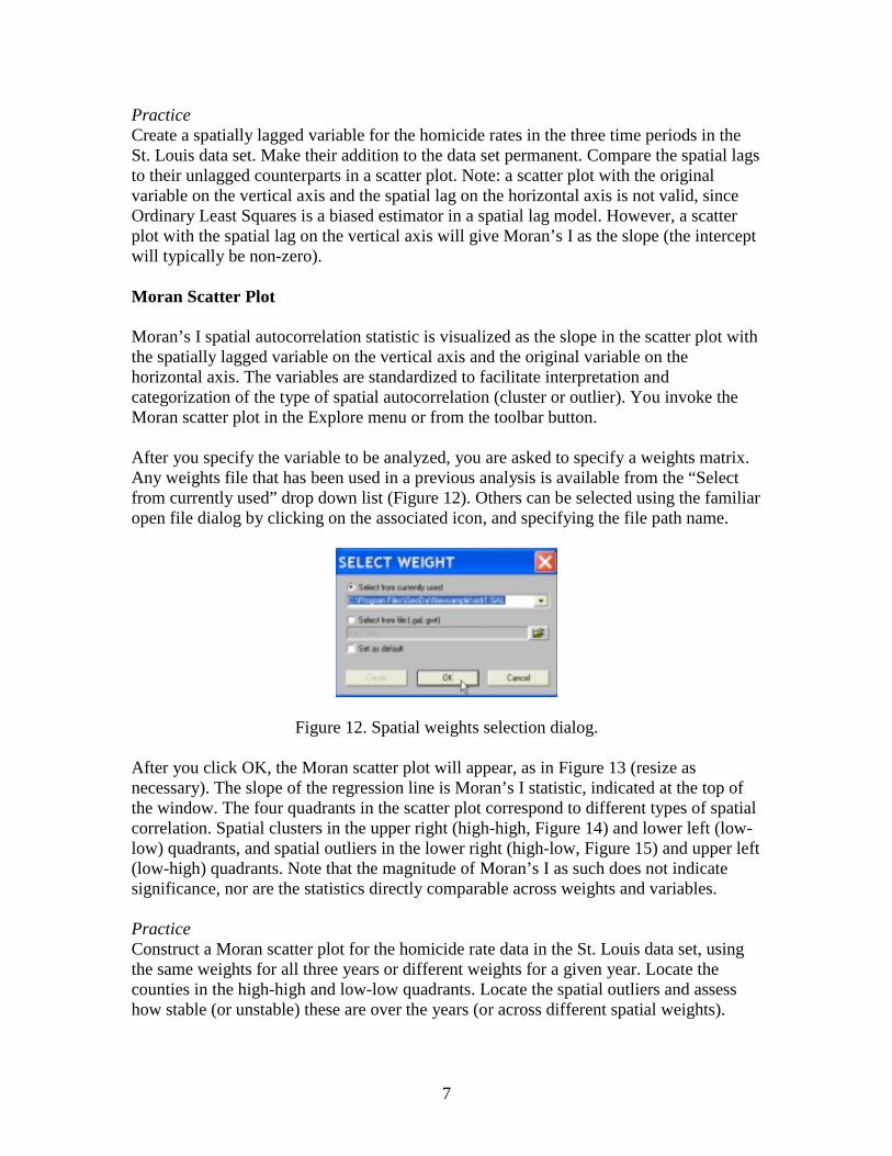
Practice Create a spatially lagged variable for the homicide rates in the three time periods in the St. Louis data set. Make their addition to the data set permanent. Compare the spatial lags to their unlagged counterparts in a scatter plot. Note: a scatter plot with the original variable on the vertical axis and the spatial lag on the horizontal axis is not valid, since Ordinary Least Squares is a biased estimator in a spatial lag model. However, a scatter plot with the spatial lag on the vertical axis will give Moran’s I as the slope (the intercept will typically be non-zero). Moran Scatter Plot Moran’s I spatial autocorrelation statistic is visualized as the slope in the scatter plot with the spatially lagged variable on the vertical axis and the original variable on the horizontal axis. The variables are standardized to facilitate interpretation and categorization of the type of spatial autocorrelation (cluster or outlier). You invoke the Moran scatter plot in the Explore menu or from the toolbar button. After you specify the variable to be analyzed, you are asked to specify a weights matrix. Any weights file that has been used in a previous analysis is available from the “Select from currently used” drop down list (Figure 12). Others can be selected using the familiar open file dialog by clicking on the associated icon, and specifying the file path name.
Figure 12. Spatial weights selection dialog. After you click OK, the Moran scatter plot will appear, as in Figure 13 (resize as necessary). The slope of the regression line is Moran’s I statistic, indicated at the top of the window. The four quadrants in the scatter plot correspond to different types of spatial correlation. Spatial clusters in the upper right (high-high, Figure 14) and lower left (low-low) quadrants, and spatial outliers in the lower right (high-low, Figure 15) and upper left (low-high) quadrants. Note that the magnitude of Moran’s I as such does not indicate significance, nor are the statistics directly comparable across weights and variables. Practice Construct a Moran scatter plot for the homicide rate data in the St. Louis data set, using the same weights for all three years or different weights for a given year. Locate the counties in the high-high and low-low quadrants. Locate the spatial outliers and assess how stable (or unstable) these are over the years (or across different spatial weights).

8
Figure 13. Moran scatterplot for SIDS death rates in 74.
Figure 14. High-High spatial clusters in the Moran scatterplot.
Figure 15. High-Low spatial outliers in the Moran scatterplot.

9
Moran Scatter Plot Extras To assess the significance of the Moran’s I statistic against a null hypothesis of no spatial autocorrelation, GeoDa uses a permutation procedure. You invoke this from the Options menu (Options > Randomization) or by right clicking on the graph and specifying the number of permutations that will be used. For example, in Figure 16, 999 is selected. In most situations 999 will be sufficient to obtain a stable result. Since each set of permutations is based on a different series of random numbers, the results will not be exactly replicable. After choosing the number of permutations, a window appears that illustrates the empirical distribution of the statistic under the null hypothesis, as in Figure 17. The window also indicates a pseudo significance value and some summary statistics (the observed Moran’s I, the theoretical expected value, the mean of the reference distribution and the standard deviation of the reference distribution). Click on the Run button to generate another set of permuted values. This allows you to assess the “stability” of the pseudo significance value and is particularly useful when you choose a small number for the permutations, such as 99.
Figure 16. Selection of number of permutations.
Figure 17. Empirical reference distribution of Moran’s I under the null hypothesis.
10
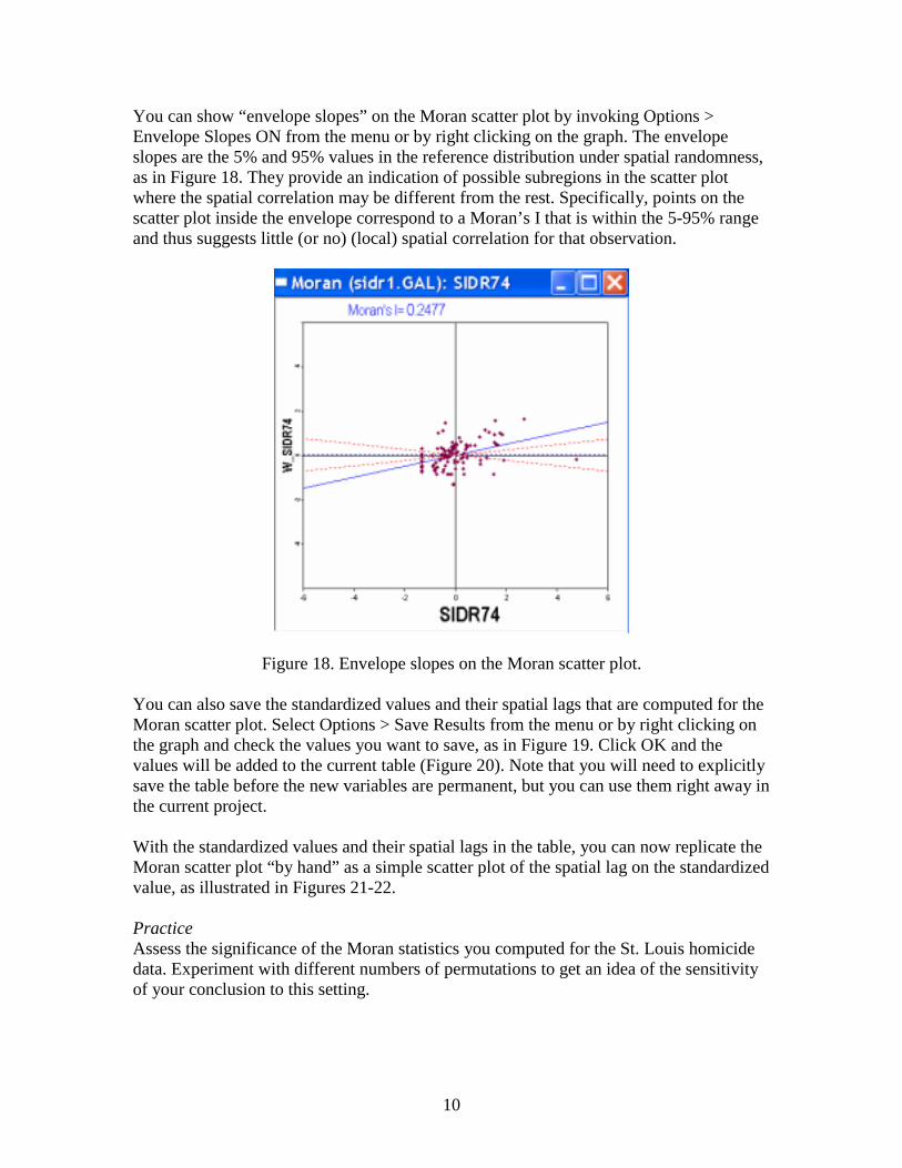
You can show “envelope slopes” on the Moran scatter plot by invoking Options > Envelope Slopes ON from the menu or by right clicking on the graph. The envelope slopes are the 5% and 95% values in the reference distribution under spatial randomness, as in Figure 18. They provide an indication of possible subregions in the scatter plot where the spatial correlation may be different from the rest. Specifically, points on the scatter plot inside the envelope correspond to a Moran’s I that is within the 5-95% range and thus suggests little (or no) (local) spatial correlation for that observation.
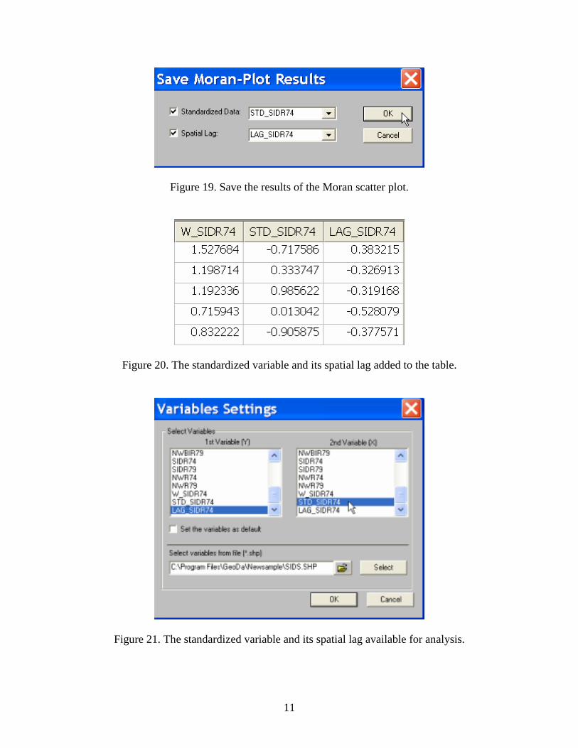
Figure 18. Envelope slopes on the Moran scatter plot. You can also save the standardized values and their spatial lags that are computed for the Moran scatter plot. Select Options > Save Results from the menu or by right clicking on the graph and check the values you want to save, as in Figure 19. Click OK and the values will be added to the current table (Figure 20). Note that you will need to explicitly save the table before the new variables are permanent, but you can use them right away in the current project. With the standardized values and their spatial lags in the table, you can now replicate the Moran scatter plot “by hand” as a simple scatter plot of the spatial lag on the standardized value, as illustrated in Figures 21-22. Practice Assess the significance of the Moran statistics you computed for the St. Louis homicide data. Experiment with different numbers of permutations to get an idea of the sensitivity of your conclusion to this setting.
11
Figure 19. Save the results of the Moran scatter plot.
Figure 20. The standardized variable and its spatial lag added to the table.
Figure 21. The standardized variable and its spatial lag available for analysis.

12
Figure 22. Scatter plot of spatial lag and standardize variate. Moran Scatter Plot for Rates When spatial autocorrelation statistics are computed for rates, such as SIDR74, they are based on an assumption of constant variance. This is usually violated when the rates are for areas with greatly different populations. GeoDa implements the Assuncao-Reis Empirical Bayes standardization to correct for this (Statistics in Medicine 1999). You start this procedure by selecting the corresponding item in the Explore menu (Figure 23), or by clicking on the toolbar button (the scatter plot with an R in it).
Figure 23. Moran’s I for Empirical Bayes standardized rates.

13
Next, you need to select the variables, both the “events” (SID74) as well as the “base” (BIR74), as in Figure 24. After specifying the spatial weights file, click OK and the variance adjusted Moran Scatter Plot appears, as in Figure 25. Its functionality is the same as the standard Moran Scatter Plot so you can do a permutation test, etc. Practice Compute the EB Moran’s I for the homicide rates in the St. Louis example and compare to the results for the raw rates. Does your “qualitative” conclusion change substantially?
Figure 24. Selection of event and base variable for EB rate Moran Scatter Plot.
Figure 25. Moran Scatter Plot for EB standardized rates.
14
Bivariate Moran Scatter Plot
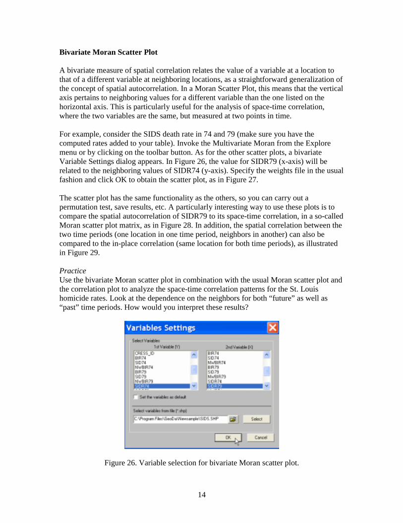
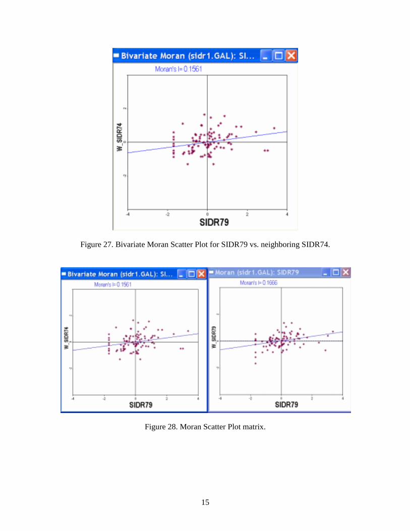
A bivariate measure of spatial correlation relates the value of a variable at a location to that of a different variable at neighboring locations, as a straightforward generalization of the concept of spatial autocorrelation. In a Moran Scatter Plot, this means that the vertical axis pertains to neighboring values for a different variable than the one listed on the horizontal axis. This is particularly useful for the analysis of space-time correlation, where the two variables are the same, but measured at two points in time. For example, consider the SIDS death rate in 74 and 79 (make sure you have the computed rates added to your table). Invoke the Multivariate Moran from the Explore menu or by clicking on the toolbar button. As for the other scatter plots, a bivariate Variable Settings dialog appears. In Figure 26, the value for SIDR79 (x-axis) will be related to the neighboring values of SIDR74 (y-axis). Specify the weights file in the usual fashion and click OK to obtain the scatter plot, as in Figure 27. The scatter plot has the same functionality as the others, so you can carry out a permutation test, save results, etc. A particularly interesting way to use these plots is to compare the spatial autocorrelation of SIDR79 to its space-time correlation, in a so-called Moran scatter plot matrix, as in Figure 28. In addition, the spatial correlation between the two time periods (one location in one time period, neighbors in another) can also be compared to the in-place correlation (same location for both time periods), as illustrated in Figure 29. Practice Use the bivariate Moran scatter plot in combination with the usual Moran scatter plot and the correlation plot to analyze the space-time correlation patterns for the St. Louis homicide rates. Look at the dependence on the neighbors for both “future” as well as “past” time periods. How would you interpret these results?
Figure 26. Variable selection for bivariate Moran scatter plot.
15
Figure 27. Bivariate Moran Scatter Plot for SIDR79 vs. neighboring SIDR74.
Figure 28. Moran Scatter Plot matrix.

16
Figure 29. Moran Scatter Plot matrix and serial correlation. LISA Maps Local measures of spatial autocorrelation are implemented as LISA maps for the univariate case as well as for the bivariate and standardized rate case. All three work in the same fashion. They are invoked from the Explore menu or by clicking the corresponding toolbar button. Next, you select the variable (or variables, for the bivariate and rate case) and specify the spatial weights file, in the usual way. The third dialog is specific to the LISA functionality and allows you to specify which windows you want to create (Figure 30). You must check the options in the dialog in order to activate them. At a minimum, you should have the “significance map” and the “cluster map.” The “box plot” is useful to identify outliers in local measures of spatial correlation, but is not needed in a first analysis. Similarly, the Moran scatter plot will typically already be open and checking this option will simply duplicate it. The results with all four options checked are shown in Figure 31 (after tiling the windows). The significance map shows the locations with a significant Local Moran in different shades of green, depending on the degree of significance. The cluster map (LISA map) shows the significant locations by type of association. Right clicking on either of these maps allows you to redo the permutation calculations to assess the sensitivity of the findings to the random permutations used (recommended). The maps are linked to all other graphs and maps in the standard fashion.
Figure 30. LISA windows dialog.

17
Figure 31. LISA maps and graphs. You can add the results of the LISA analysis to the table, by invoking Option > Save Results or right clicking on the map (and selecting Save Results). This opens a dialog that lets you select the variables you want to add and specify a variable name (defaults are listed, but they can be overwritten). The three options are the Local Moran statistic for each location (LISA indices), the indicator for the type of spatial autocorrelation (Clusters) and the significance or p-value for the Local Moran statistic (Figure 32). The cluster indicators take on five values: 0 for not significant, 1 for high-high, 2 for low-low, 3 for high-low and 4 for low-high. After clicking the OK button, the selected variables are added as new columns to the table, as in Figure 33. As before, these additions do not become permanent until the table has been saved. The new variables can be used in customized queries and selections. For example, you can select any cut off for a significance level. Sort the p-value column in ascending order and drag-select up to the desired level. Since the table is linked to the maps, the selection shading indicates which of the counties in the LISA map would remain identified with your chosen significance level. Practice Construct the LISA maps for the St. Louis homicide rates. Assess the sensitivity of the identified spatial clusters and spatial outliers to the significance level (try with several randomizations). Try to formulate a tentative hypothesis about which clusters/outliers are stable over time and which change. Experiment by bringing in the employment and
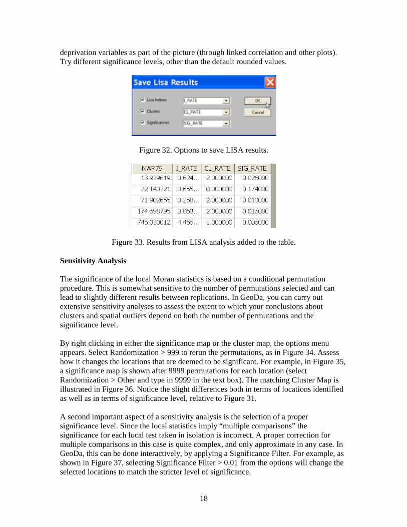
18
deprivation variables as part of the picture (through linked correlation and other plots). Try different significance levels, other than the default rounded values.
Figure 32. Options to save LISA results.
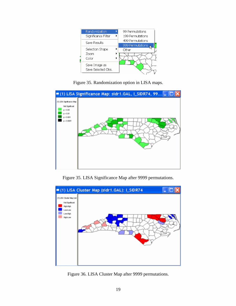
Figure 33. Results from LISA analysis added to the table. Sensitivity Analysis The significance of the local Moran statistics is based on a conditional permutation procedure. This is somewhat sensitive to the number of permutations selected and can lead to slightly different results between replications. In GeoDa, you can carry out extensive sensitivity analyses to assess the extent to which your conclusions about clusters and spatial outliers depend on both the number of permutations and the significance level. By right clicking in either the significance map or the cluster map, the options menu appears. Select Randomization > 999 to rerun the permutations, as in Figure 34. Assess how it changes the locations that are deemed to be significant. For example, in Figure 35, a significance map is shown after 9999 permutations for each location (select Randomization > Other and type in 9999 in the text box). The matching Cluster Map is illustrated in Figure 36. Notice the slight differences both in terms of locations identified as well as in terms of significance level, relative to Figure 31. A second important aspect of a sensitivity analysis is the selection of a proper significance level. Since the local statistics imply “multiple comparisons” the significance for each local test taken in isolation is incorrect. A proper correction for multiple comparisons in this case is quite complex, and only approximate in any case. In GeoDa, this can be done interactively, by applying a Significance Filter. For example, as shown in Figure 37, selecting Significance Filter > 0.01 from the options will change the selected locations to match the stricter level of significance.
19
Figure 35. Randomization option in LISA maps.
Figure 35. LISA Significance Map after 9999 permutations.
Figure 36. LISA Cluster Map after 9999 permutations.

20
In Figure 38, the LISA cluster map corresponding to Figure 36 is shown for a significance cut off value of 0.01. Typically, for a stricter level like 0.01 or 0.001, there is much less variability between the results for different permutation sets. Note that you much have at least 999 permutations to obtain meaningful indications of significance at 0.001. Practice Assess the sensitivity of the results of your St Louis analysis to the number of permutations and the significance cut off. Check how the results become more stable for a stricter significance level. Change the number of permutations from 99 to 999 and 9999. Use these insights to formulate some tentative conclusions about clusters and outliers.
Figure 37. Significance Filter in LISA maps.
Figure 38. LISA Cluster Map for p < 0.01.