analysis of covers
TRANSCRIPT

The masthead on this cover is bold and at the top of the page. This makes it stand out and be the first thing that you see. The masthead also uses a bright red colour to grab people’s attention. NME magazine’s masthead has a consistent font and style. Their masthead rarely changes and always keeps its simplistic design. The NME masthead is recognisable and is clearly visible on a magazine rack.
The colours for NME magazine are usually simple and use a limited amount of colours. On this issue the colours are red, white and black. These colours work very well together and do not take away focus from the celebrities. They are also eye catching and attractive.
The main cover line is a simple and basic. However it suits the the rest of the cover and is clear to read. I really like the style of font as it uses large capital text but is not too in your face. The cover lines work well together and make the magazine look sophisticated and of a good quality. NME tend to use bold and clear texts and colours for the cover lines. However this does not take the attention away from the masthead. NME’s cover lines usually consist of names of bands.
The way that the magazine is laid out shows that it is stylish. It does this by the way that it is presented on the cover and because it is not all cluttered together.
The bar code is placed in the bottom right corner. I like that the barcode is discreet and not too visible.
The main images is the centre point and the focus of the magazine cover. NME do this for most of their magazine apart from a limited few. The images feature all members of the band Arctic Monkeys. To most readers, this band is ver recognisable and interesting even if the reader is not a big fan of the artists. On this cover NME have decided to put each band member in their own section. I think by doing this it gives each of them their own identity instead of just being know for the band.
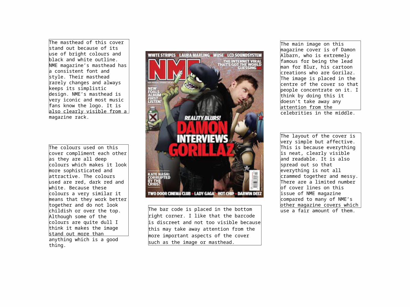
The masthead of this cover stand out because of its use of bright colours and black and white outline. NME magazine’s masthead has a consistent font and style. Their masthead rarely changes and always keeps its simplistic design. NME’s masthead is very iconic and most music fans know the logo. It is also clearly visible from a magazine rack.
The colours used on this cover compliment each other as they are all deep colours which makes it look more sophisticated and attractive. The colours used are red, dark red and white. Because these colours a very similar it means that they work better together and do not look childish or over the top. Although some of the colours are quite dull I think it makes the image stand out more than anything which is a good thing.
The bar code is placed in the bottom right corner. I like that the barcode is discreet and not too visible because this may take away attention from the more important aspects of the cover such as the image or masthead.
The main image on this magazine cover is of Damon Albarn, who is extremely famous for being the lead man for Blur, his cartoon creations who are Gorilaz. The image is placed in the centre of the cover so that people concentrate on it. I think by doing this it doesn't take away any attention from the celebrities in the middle.
The layout of the cover is very simple but affective. This is because everything is neat, clearly visible and readable. It is also spread out so that everything is not all crammed together and messy. There are a limited number of cover lines on this issue of NME magazine compared to many of NME’s other magazine covers which use a fair amount of them.

The masthead for this cover is located in top left hand corner and is the iconic Q that the magazine always use. The colours for the masthead are eye catching because they use a clear white font on a bright red background to emphasize to title. Q’s masthead is very recognisable and most people know who they are.
The colours for this cover are very simple as they only use two main covers which are red and white. It also has a hint of black and gold which makes the magazine look more appealing. The colours work well together because they are both bright but do not over-power the whole cover.
The bar code is place in the middle on the right hand side. They did this so it would blend in with the white background and not be too noticeable to audience.
The main image on the cover is of the band Blur who are a very successful and iconic group. The image is placed in the centre of the mag and is the first thing that you look at. Q decided not to go for a busy background as it might take away some of the attention from Blur. I think by doing this it allows the audience to focus on the band without any distractions.
The lay out of the magazine is a typical style of Q who often use this sort of layout. It allows you to see everything clearly and is not all cluttered together or messy. Q often have a sophisticated style to their layout to make it look more professional and appealing to customers.