analysis of empire film magazine
DESCRIPTION
Analysis of Empire Film MagazineTRANSCRIPT

Analysis of EMPIRE Film Magazine. Talia Donoghue

EMPIRE Film Magazine After more than 20 years of being the world’s best movie magazine, Empire is now the
BIGGEST movie magazine in the World. This international domination – outselling all its rivals globally by an average of 2 to 1 – is down to Empire’s continued commitment to delivering movie fans the greatest monthly experience, telling them which movies to get excited about and why.
Empire is the 2nd biggest UK men’s monthly magazine
Dominates the UK film market with over 70% circulation share, outselling its nearest competitor by almost 100,000 copies
Empire has over 57,000 subscribers
47% think that the Empire brand is better than all or most other magazines
With the mainstream magazine, iPad, empireonline.com, social media and our international editions, Empire reaches over 2.5 MILLION of the most dedicated movie fans on the planet.

The Empire Reader& demographics

Below shows the readership of Empire. It is clear that my audience would not be suitable for this type of magazine. However the films which they use within their magazines will have conventions that I shall need to use within my own.

Empire Magazine Brand

Media PackageFrom this image below, provided by EMPIRE in their media pack, it is apparent that they do not specialise in producing magazines for thriller movies. However as I have hybridised my product to become action/mystery thriller, some of the sub-genres are the same of which EMPIRE produces. As it was difficult to find a horror magazine front cover, I have focused on the action side so that I can gain knowledge of the conventions and use them within my own.
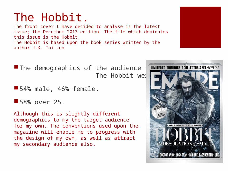
The Hobbit.The front cover I have decided to analyse is the latest issue; the December 2013 edition. The film which dominates this issue is the Hobbit. The Hobbit is based upon the book series written by the author J.K. Toilken
The demographics of the audience for The Hobbit were:
54% male, 46% female.
58% over 25.
Although this is slightly different demographics to my the target audience for my own. The conventions used upon the magazine will enable me to progress with the design of my own, as well as attract my secondary audience also.
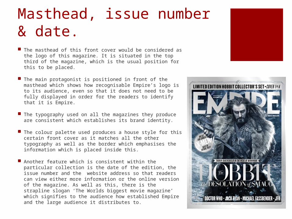
Masthead, issue number & date. The masthead of this front cover would be considered as
the logo of this magazine. It is situated in the top third of the magazine, which is the usual position for this to be placed.
The main protagonist is positioned in front of the masthead which shows how recognisable Empire’s logo is to its audience, even so that it does not need to be fully displayed in order for the readers to identify that it is Empire.
The typography used on all the magazines they produce are consistent which establishes its brand identity.
The colour palette used produces a house style for this certain front cover as it matches all the other typography as well as the border which emphasises the information which is placed inside this.
Another feature which is consistent within the particular collection is the date of the edition, the issue number and the website address so that readers can view either more information or the online version of the magazine. As well as this, there is the strapline slogan ‘The Worlds biggest movie magazine’ which signifies to the audience how established Empire and the large audience it distributes to.

Main image. The immediate focus on the front cover is the main
image of one of the main protagonists within The Hobbit. This character will be recognised by the audience so from this they will be able to identify what film this edition of Empire is for. It also acts as foregrounding due to the costume, props, facial expression etc. as it makes the audience think.
The actor is using direct mode of address which creates a relationship between him and the audience as the eye-contact makes it seem as though he is looking at you. The aggressive facial expression connotes that this character is supposedly the villain in the film.
The prop use of the sword denotes the genre of the movie; action. Science-fiction is another genre of this which is slightly shown through the interesting colour palette. Moreover this colours may have been used to connote the cold personality of the character.
Although the main image covers part of the masthead due to its established and developed brand, the vital information is placed on top of the image.

Main cover line.
The main cover line on this front cover is the name of the film. Particularly as The Hobbit is part of a trilogy it is of very important to identify which of the three it is.
Empire magazine has created its own logo in the four-part edition collection. This not only establishes their brand as Empire but also their branding with The Hobbit film.
The title is the largest feature on the page and is almost as striking as the main image. Its capitalisation also emphasises the name of the film, which the reader will find eye-catching.
The colour scheme used for this is the same as the rest of the typography. It is silver however has a glossy-look due to the slight transparency in some parts making the front cover seem more prestige as a collectible.

‘Sticker’.
The ‘sticker’ is placed within the left third of the page and is under the arm of the protagonist, so seem almost immediately as the image is one of the most striking features.
It is outlined in a circular shape which has been superimposed on top of the image, and bordered in the same colour of which the entire front cover is outlined. This helps to establish its house style and brand identity.
Within this the main phrase that can be seen is ‘X-MEN’ this is enlarged as this is what will grab the readers attention, as if the readers are also fanatics of X-Men then it will most likely entice the consumer to purchase.
This feature acts as a ‘tag’ as it makes it seem like an exclusive article by its separation from the cover line.

Bottom third; cover line. The bottom third is placed at the very bottom of the
front cover. Within this section there is a ‘plus!’ area which denotes other articles within this edition of the magazine.
The typography of this section is capitalised and bolded which makes the phrases stand out against the dark background, this emphasises these which is particularly important to entice further members of the audience.
The ‘plus!’ phrase however it very difficult to see as it is coloured in a white font which sinks in with light background. Furthermore even if this cannot be seen it is still clear that the other films and actors noted are further articles inside as this is usually the position which additional important features are placed; another convention.

The magazine which I have analysed is a part of a four sequence collection, which means that the same edition of the magazine has four different front covers which is designed to be a collectible that fanatics can purchase. This acts as a Unique Spelling Point for the magazine.
The first two have the same house style colour palette, but different to the last two, however their colour scheme is the same also.
All editions have the glossy-look cover which also adds to the aesthetics, enticing the fanatics to purchase all four even more due to the appeal to the eye.
It is said that 77% of the audience will buy all four editions, despite them containing the exact same articles, this just shows that fanatics are really interested in collectibles which is something I shall consider.
This had previously been done with another series of The Hobbit.

Detail of basis content in Empire

Continued…