analysis of kerrang magazine: front cover, contents page and dps
TRANSCRIPT
Analysing front cover, contents page and double page spread of an Indie magazine
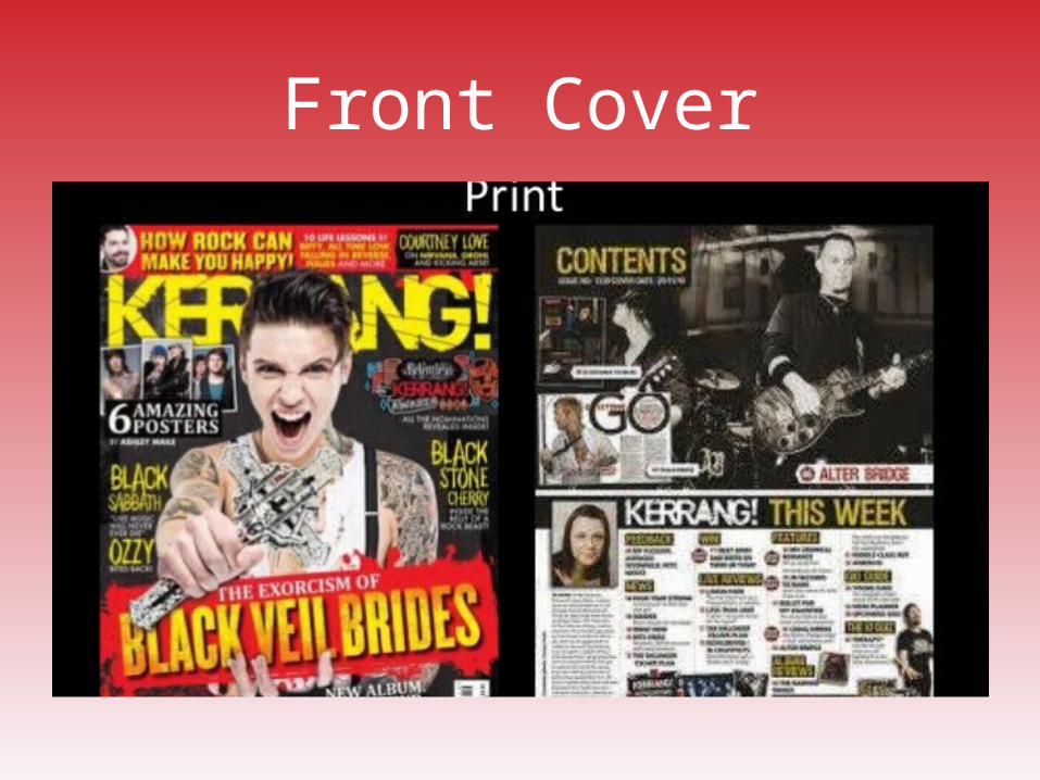
Front Cover
Analysis of front cover and contents page: colours
The background photograph for the front cover is dominated by black and white colours, however other colours are added through editing and the text used. Through my research I know that black and white are the main colours for Indie artists as this is their main colour for clothing etc. The colours added over the top are bright and stand out, this is to exaggerate the feelings of a typical Indie artist; for example, the connotations of red are angry, rebellious etc. On the other hand, they also use yellow to also show they are happy, outgoing characters as well. This front cover, like many other Indie magazines, only has a few colours, usually a ¾ colours pallet that consist of black and white, then yellow and/or red is also used the majority of the time.
Mise-en-sceneProps- As I know from my research, there aren’t usually many props used in Indie magazines; in this case there is only one used. The man on the front is holding a cross object which has the connotations of a rebellious character, which matches the connotations of the colours and the stereotypes of the characteristics of an Indie artists. Clothing- The character is also wearing what seems to be a white vest and some kind of black strap. The colours black and white are used again for the clothing to match the other colours in the background. This also matches the stereotypes of an Indie artists as they are known to wear vests and the colour also matches the stereotype.Tattoos- The tattoos shown on the character also match the sterotypes of an Indie artist, not so much the tattoo, however the connotations of tattoos on younger people are known to include a rebellious person who doesn’t think of the consequences. The tattoos are also black which, again, is a colour associated with the genre.Emotions of character- The character on the front cover does look happy, which goes against the props and dark colours of the background, however I know from my research that Indie artists are happy characters, but also rebellious and feel like no-one cares for them. This intrigues the readers as they will want to understand the feelings of the character
Double Page Spread
Analysis of double page spread- colours
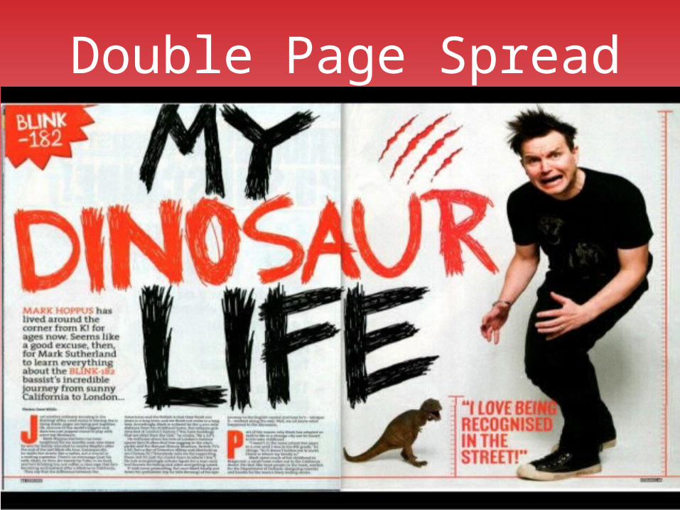
This double page spread has stuck to the conventions of a three colour pallet that consist of black, white and red. As I have seen from pretty much every Indie magazine, the character in the background is wearing only black and white coloured clothing; moreover, the background only consists of black and white colouring. The text used over the top of the background has a lot of red in it, to stand out from the background and like most magazines, shows the behaviour and attitude of a typical Indie artist.
Mise-en-sceneProps- Like the front cover, there is only one prop used in the image of the double page spread and as I know from my research, this sticks to the conventions of most Indie magazines that they have minimal props, usually one or two if they actually use any. The prop used in this image is a small dinosaur model, this could be used to again show the feelings and emotions of a typical Indie artist. I believe this because the dinosaur is small but aggressive and full of emotions, this could be used to portray to the reader that Indie artists have much bigger emotions than the body they are inside, and that is shown in their music.Clothing- The character in this image is wearing only black clothes with a bit of white. This again sticks to the conventions of a typical Indie artist as they like black and white clothing to show off their rebellious attitude.Character- The lead singer of Blink 182, Thomas Delonge, is the only character used in this image. As he is a very popular name in the Indie genre, many people will recognise his face and know who he is, therefore he doesn’t need any obvious props to show that he is a singer in a band.Text- The font of text used in this double page spread looks like a child has drawn it as it is very scruffy. This could be another way to portray to the reader the rebellious and a kind of ‘I don’t care’ attitude. The fonts, along with the colour of the text (black and red) go together well to show the attitude of a typical Indie artists. This is because the black shows the rebellious attitude, however the red goes with it as the connotations of red are anger, danger etc.