analysis of use of typography in the title sequences
DESCRIPTION
This is an analysis of the typography used in thriller opening sequences. By Louisa Collins-MarshTRANSCRIPT
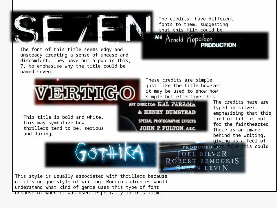
The font of this title seems edgy and unsteady creating a sense of unease and discomfort. They have put a pun in this, 7, to emphasise why the title could be named seven.
This title is bold and white, this may symbolize how thrillers tend to be, serious and daring.
This style is usually associated with thrillers because of it’s unique style of writing. Modern audiences would understand what kind of genre uses this type of font because of when it was used, especially in this film.
The credits have different fonts to them, suggesting that this film could be confusing at times.
These credits are simple just like the title however it may be used to show how simple but effective this type of font can be.
The credits here are typed in silver, emphasising that this kind of film is not for the fainthearted. There is an image behind the writing, giving us a feel of what film this could be.

The title in the theatrical release poster was designed with a stencil look and a font called Lost Highway is very similar to the lettering style.
This text is very plain. This could be because the director might what the audience to question on why it is. Also it could have been used because it may raise suspicion about the type of genre that it is.
This type of font creates a sense of unease because of its block and bold font, this could reflect the title and the film.
These credits are simple but yet effective especially when the letter ‘c’ is looking like its being dripped in some sort of liquid. This creates a feeling of suspicion because we are not getting any clues about the film.
This is the same font as the title but its more spaced out, this could be because the creator might want the audience to acknowledge the people who made it more.
This text is the same as the title but it seems as though it is fading into the darkness in the background. This may symbolize how dark the film is.