analyzing data in prosensus multivariate - cheric · analyzing data in prosensus multivariate (c)...
TRANSCRIPT

1
(c) 2004-2013, ProSensus, Inc.
ProSensus Multivariate Data Course
Analyzing data in ProSensus Multivariate
(c) 2004-2013, ProSensus, Inc.
Generalized Workflow
• Work main menus from left to right
Use File->New Project to get started
Use Edit to edit the project data
Use Model to manage and build your models
Use Analyze to access the various plots for understanding your model
Use Monitor to build online monitoring charts for models containing batch trajectories

2
(c) 2004-2013, ProSensus, Inc.
Generalized Workflow
Prepare data in the
proper format
Start a project.
File > New Project
Import blocks of data
Specify a model. Include/exclude blocks,
variables, and observations.
Fit the model.
Model > Active Model > Autofit / Add Component
Plot Results
Analyze
Scores, Loadings, SPE, Hotelling’s T2, etc.
Outliers in scores?
Model->New Model AsRemove observations from training set / specify prediction set
No outliers?
Continue
Interpret model (plots), and relate to process knowledge
Edit->Prediction SetsView scores, SPE, HT2, etc., on prediction sets.
(c) 2004-2013, ProSensus, Inc.
1. Prepare data
• Data should generally be set up in a tabular format with each row representing an observation and each column a variable. Secondary ID columns are also allowed, and can be used for categorical, indicator, or descriptive variables
• Several file types are supported, including Excel, Matlab, .csv (for Matlab import see the ProMV help)
• Multiple worksheets in the same Excel file may be imported at once; you will be prompted to select the worksheet(s) if more than one exists
• The import tool will attempt to identify which row and column contain the primary ID’s for variables and observations respectively. These can also be specified manually

3
(c) 2004-2013, ProSensus, Inc.
2a. Start a project and import data
• File->New Project
• To import blocks that are in standard format, select Standard Blocks -> Edit -> Import from File
• To import blocks that are in batch format, select Batch Blocks -> Import Batch Block
• Each worksheet will be a separate block
(c) 2004-2013, ProSensus, Inc.
2b. Data Specification
• The data specification window will appear once for each block
• Select columns to mark as primary and secondary ID’s
• Red highlights missing data values (text values will be red unless you define the column as a secondary ID)
• Select rows to include/exclude or mark as variable ID’s

4
(c) 2004-2013, ProSensus, Inc.
2c. Project Data Editor
• The data specification window will appear after importing is complete
• Browse the time-series plots of each variable, and their histograms
• Screen for obvious extreme outliers
• Trim or windsorize variables
(c) 2004-2013, ProSensus, Inc.
3a. Model specification
• Model specification window automatically comes up for a new project or select Model -> New Model
• Specify blocks to be included/excluded– All blocks included by default

5
(c) 2004-2013, ProSensus, Inc.
3b. Model specification
• Specify variables to be included/ excluded.– Select variables individually or use (Ctrl + click or Shift + click)– Click either Include or Exclude
– Move between blocks using the dropdown list at the top left
(c) 2004-2013, ProSensus, Inc.
3c. Model specification
• Specify observations to be included– this set of observations is called the training set– select observations individually or use (Ctrl + click or Shift + click)– click either Include or Exclude

6
(c) 2004-2013, ProSensus, Inc.
4. Specify prediction set
• Edit->Prediction Set– Click <Create new prediction set> from the drop down menu– Name the prediction set– Choose observations to be included in the prediction set
(c) 2004-2013, ProSensus, Inc.
5. Fit the model
• Add a component by clicking the button on the model toolbar
• Or, auto-fit the model by selecting Autofit
• Observe the R2 and Q2 values to assess the quality of the model.
6. Analyze the model
• Use the Analyze menu
• Scores -- scatter plot, t1-t2 and t1-u1 & t2-u2 (PLS)
• Loadings -- scatter plot (p1-p2 for PCA, w*c1-w*c2 for PLS)
• Squared Prediction Error (SPE) -- line plot
• Contribution plots to interpret interesting observations, e.g.
outliers, jumps

7
(c) 2004-2013, ProSensus, Inc.
7. Outliers in the score plots or in the SPE plot
• Select outliers and press
• This brings up the Model specification window
• Make any other changes to variables / observations and select OK
• Fit the new model & interpret it. Look at patterns, trends, clusters, etc. in the score space
• Inspect the loading plots to interpret the above patterns
• Look at SPE
• What do the patterns say about the objective of the investigation?
(c) 2004-2013, ProSensus, Inc.
8. Predictions: New Data, Prediction Set
• If you skipped step 4, specify prediction sets
• In any plot dialog, the prediction set(s) will be available to plot, along with the training set. Training and prediction sets can be plotted separately or together in the same plot.
• The quick plot toolbar generates plots with the training set only
• Each set is plotted with a different colour/symbol

8
(c) 2004-2013, ProSensus, Inc.
ProSensus Multivariate Data Course
PCA assignments(Day 1)
(c) 2004-2013, ProSensus, Inc.
PCA assignments
There are 3 assignments for PCA modeling.
1. Foods: An introductory example to PCA modeling.
2. LDPE: Multivariate monitoring of the quality of a polymer product.
3. Wafer: Modeling and monitoring the thickness of silicon wafers.

9
(c) 2004-2013, ProSensus, Inc.
Foods: The dataset [Foods.xls]
• The dataset contains the relative consumption information of 20 food items across 16 European countries.
• Each column shows the percentage of households that normally use each food item.
• Each row shows the relative consumption of one country.
(c) 2004-2013, ProSensus, Inc.
Foods: Objective of the study
Repeat the analysis on the foods dataset that was demonstrated in class:
1. Fit a PCA model to the data (3 components)
2. Create these plots and interpret them:
a) score plots (t1 vs t2; t2 vs t3; t1 vs t3)
b) loading plots (p1 vs p2; p2 vs p3; p1 vs p3)
c) loading bi-plot (t1 vs t2)
d) SPE plots
3. What variation does the third component capture?
4. What conclusions can we draw from the SPE plot after fitting 3 PCs?
5. Which variables contribute to the difference of England and Ireland from
the other countries? [Use a contribution plot]
The aim of this study is to examine the similarities and differences between the 16 countries.

10
(c) 2004-2013, ProSensus, Inc.
Foods: t1 vs t2
The score plot shows 3 groups of countries:
Scandinavian countries (in the green ellipse),
Countries from South Europe (in the blue ellipse),
A third, more diffuse, group from central Europe (in the red ellipse)
Model Summary: Model Summary: 3 3 PC’sPC’s
(c) 2004-2013, ProSensus, Inc.
From the loading plot, we see that the consumption of garlic and olive oil are
correlated, as well as the consumption of frozen fish & crisp bread.
Foods: p1 vs p2

11
(c) 2004-2013, ProSensus, Inc.
Loading Bi-Plot t1 vs t2
By super-imposing the loading and score plot, we see that Italy and Spain consume a lot of olive oil and garlic, and little frozen fish, for example.
(c) 2004-2013, ProSensus, Inc.
Foods: t1 vs t3
The third principal component separates England and Ireland from the other
countries.
12
(c) 2004-2013, ProSensus, Inc.
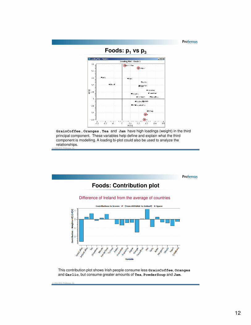
GrainCoffee , Oranges , Tea and Jam have high loadings (weight) in the third
principal component. These variables help define and explain what the third
component is modelling. A loading bi-plot could also be used to analyze the
relationships.
Foods: p1 vs p3
(c) 2004-2013, ProSensus, Inc.
This contribution plot shows Irish people consume less GrainCoffee, Oranges
and Garlic, but consume greater amounts of Tea, PowderSoup and Jam.
Difference of Ireland from the average of countries
Foods: Contribution plot

13
(c) 2004-2013, ProSensus, Inc.
Foods: Contribution plot
This contribution plot shows English people consume less GrainCoffee and
Garlic, but consume greater amounts of InstandCoffe, TinSoup,
TinnedFruit and Jam.
Difference of England from the average of countries
(c) 2004-2013, ProSensus, Inc.
This contribution plot shows that the Mediterranean countries (Spain & Italy) eat less Tea, Potato, FrozenFish,FrozenVeg,and CrispBread and more Garlic
and OliveOil than the Scandinavian countries (Denmark, Norway, Finland,
Sweden) .
Difference between the Mediterranean and Scandinavian countries
Foods: Contribution plot

14
(c) 2004-2013, ProSensus, Inc.
Foods: SPE plot after fitting 3 PCs
Conclusion: Except Holland, most observations are below the 95% confidence limit,
i.e., most follow the same correlation structure (are close to the model’s plane).
Remember: we expect 5 observations out of 100 to “normally” exceed the limit.
(c) 2004-2013, ProSensus, Inc.
LDPE: Low Density Polyethylene process
Reactor 1 Reactor 2Tin and Fi1
z1 z2
Tmax1 Tmax2Fi2
Tout1 Tout2 Conv
Mw
Mn
LCB
SCBTcin1 Tcin2Press
We will use the the complete data set in a later exercise. For this assignment, we only focus on the 5 final product properties (quality space). However,
the operating conditions in the reactors will influence this quality space.
There are 54 rows of measurements ordered in time. These are taken around
the reactor and they line-up with the corresponding product quality space.
15
(c) 2004-2013, ProSensus, Inc.
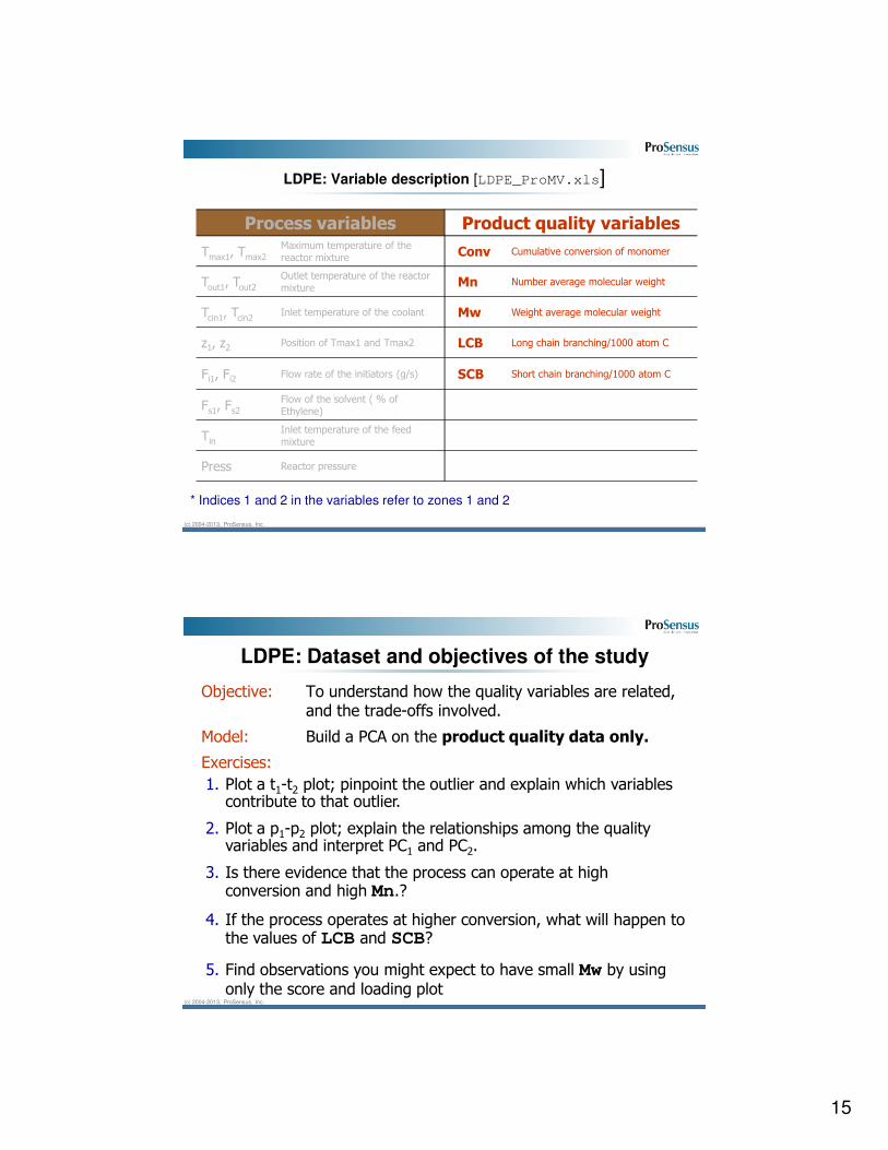
LDPE: Variable description [LDPE_ProMV.xls]
Process variables Product quality variables
Tmax1, Tmax2
Maximum temperature of the reactor mixture Conv Cumulative conversion of monomer
Tout1, Tout2 Outlet temperature of the reactor mixture Mn Number average molecular weight
Tcin1, Tcin2 Inlet temperature of the coolant Mw Weight average molecular weight
z1, z2 Position of Tmax1 and Tmax2 LCB Long chain branching/1000 atom C
Fi1, Fi2Flow rate of the initiators (g/s) SCB Short chain branching/1000 atom C
Fs1, Fs2
Flow of the solvent ( % of Ethylene)
Tin
Inlet temperature of the feed mixture
Press Reactor pressure
* Indices 1 and 2 in the variables refer to zones 1 and 2
(c) 2004-2013, ProSensus, Inc.
LDPE: Dataset and objectives of the study
Objective: To understand how the quality variables are related, and the trade-offs involved.
Model: Build a PCA on the product quality data only.
Exercises:
1. Plot a t1-t2 plot; pinpoint the outlier and explain which variables contribute to that outlier.
2. Plot a p1-p2 plot; explain the relationships among the quality variables and interpret PC1 and PC2.
3. Is there evidence that the process can operate at high conversion and high Mn.?
4. If the process operates at higher conversion, what will happen to the values of LCB and SCB?
5. Find observations you might expect to have small Mw by using only the score and loading plot

16
(c) 2004-2013, ProSensus, Inc.
LDPE: Summary of the PCA model
This model has
excellent fit (R2)
and very high
predictive
performance (Q2)
for the overall
model
The same
applies to the R2
and Q2 values for
each variable in
the model.
(c) 2004-2013, ProSensus, Inc.
LDPE: t1 vs t2
There is a trend observed in going from observation 51 to 54.

17
(c) 2004-2013, ProSensus, Inc.
LDPE: p1 vs p2
The 1st component mainly explains the variation in Conv, LCB, and SCB and Mn.
The Conv, LCB and SCB variables are tightly correlated with each other. This group together
are negatively correlated (along the arrows) with Mn.
The 2nd component explains a bit of Mn and SCB, but mainly explains Mw.
(c) 2004-2013, ProSensus, Inc.
LDPE: p1 vs p2
Because Conv, and Mn are negatively correlated, we cannot increase the conversion and
number average molecular weight (Mn) simultaneously – a trade-off is required.
Operation at higher conversion (high Conv) implies that LCB and SCB values will also increase,
because this group of variables in the red circle are correlated together.

18
(c) 2004-2013, ProSensus, Inc.
Understanding the loadings
Prove to yourself that Conv, LCB, and SCB are positively correlated with each
other, and negatively correlated with Mn, by creating the following custom plots:
(c) 2004-2013, ProSensus, Inc.
Wafer: The silicon wafer dataset [Wafer.xls]
This dataset was part of a quality control program. One silicon wafer was sampled from each tray of wafers after a certain processing step.
Successive samples from 184 trays were taken and the thickness of a layer was measured at 9 locations on the wafer.
These locations, illustrated in the following figure, were consistently used for each wafer in every tray.
G7
G2 G3
G1
G4
G6
G9
G8
G5

19
(c) 2004-2013, ProSensus, Inc.
Wafer: Objectives of the study
1. Build a PCA model using all observations. Use autofit.
2. Pinpoint some outliers in the data and identify why they are outliers. Exclude these outliers and rebuild the model.
3. What % of the total variation is explained by the first PC? - by the second and the third?
4. Make a bar plot of the first loading vector (p1) and explain what this tells you about the nature of the variation in the first PC score (t1). Plot this first PC (t1) vs. time order (NUM vs t1). Does it show any unusual behavior?
5. Redo question 4 for the second PC.
6. Based on your PCA model, can you suggest where you might start to try to reduce variability in this manufacturing process.
Perform a PCA on these data in order to isolate the major
sources of variation:
(c) 2004-2013, ProSensus, Inc.
Wafer: Summary of the preliminary PCA model

20
(c) 2004-2013, ProSensus, Inc.
Wafer: t1 vs t2 scatter plot
Wafers 39, 40, 111,155 are outliers. Why? Use contribution plots to identify this.
(c) 2004-2013, ProSensus, Inc.
Wafer: Contribution plots to observations 39 and 40
Observations 39 and 40 are thicker than average at all 9 measurement locations

21
(c) 2004-2013, ProSensus, Inc.
Wafer: Contribution plots to observations 111 & 150
Wafer 111 is thicker at all interiorpoints (G1 to G5) and at point G6.
Wafer 155 is thicker at point G6.
(c) 2004-2013, ProSensus, Inc.
Wafer: The PCA model (after excluding 4 outliers)
Score plot:
(R2X)PC1 = 82.8%
(R2X)PC2 = 4.8%
R2 and Q2

22
(c) 2004-2013, ProSensus, Inc.
Wafer: p1 vs p2 scatter plot
• The loadings plot shows how measurements from each location on the disc are combined to give a score value.
• Measurements at location G8 dominate and define the model’s second component, PC2.
(c) 2004-2013, ProSensus, Inc.
Wafer: Bar plots of p1 and p2
All values of p1 are around 0.32. This indicates that all 9 variables
contribute equally to the values in t1. Score, t1 approximates the
average thickness of the layers.
The p2 bar plot indicates that score, t2 is dominated mostly by the
G8 values.

23
(c) 2004-2013, ProSensus, Inc.
Wafer: Time-series plot of t1
Note the large variation in the latter trays (within the green boundary). It is high,
then low, then high again, indicating that over-compensation for the thickness
problem is occurring.
(c) 2004-2013, ProSensus, Inc.
Wafer: Time-series plot of t2
An increasing trend in the t2 values for the later trays, indicate the thickness at
location G8 is increasing.

24
(c) 2004-2013, ProSensus, Inc.
Wafer: Reducing process variability
Since 82% of the process variability is in the first component, and because all the rest of the variability is independent (orthogonal) to this direction, it implies that reduction in this variation should be tackled first.
The “up and down” behaviour in the t1 time-series plot indicates over-compensation from run to run in the wafer production.
The current rule used to determine the degree of compensation for subsequent runs should be investigated, and this compensation ratio should be decreased.
The next largest source of variability, phenomenon at location G8 on the wafer, should be tackled after this issue.
(c) 2004-2013, ProSensus, Inc.
PLS assignments(Day 2)
ProSensus Multivariate Data Course

25
(c) 2004-2013, ProSensus, Inc.
Day 2 assignments
There are 3 assignments for day 2.
1. LDPE: Process analysis, and quality prediction of a polymer reactor train
2. LDPE: Monitoring of the LDPE process
3. Kamyr: Building and using a soft-sensor model
(c) 2004-2013, ProSensus, Inc.
Low Density Polyethylene process schematic
A heat-releasing reaction takes place in 2 consecutive reactors: ethylene and
a solvent are fed, together with an initiator, into the first section. This is
repeated in the second reactor.
The operating conditions in both reactors influence the molecular properties of
the LDPE polymer produced, which must be controlled in order to obtain
desirable LPDE characteristics.
Tin and Fi1
z1 z2
Tmax1 Tmax2Fi2
Tout1 Tout2 Conv
Mw
Mn
LCB
SCBTcin1 Tcin2Press
Reactor 1 Reactor 2

26
(c) 2004-2013, ProSensus, Inc.
LDPE: Variables in the LDPE reactor
Process variables Product quality variables
Tmax1, Tmax2
Maximum temperature of the reactor mixture Conv Cumulative conversion of monomer
Tout1, Tout2 Outlet temperature of the reactor mixture Mn Number average molecular weight
Tcin1, Tcin2 Inlet temperature of the coolant Mw Weight average molecular weight
z1, z2 Position of Tmax1 and Tmax2 LCB Long chain branching/1000 atom C
Fi1, Fi2Flow rate of the initiators (g/s) SCB Short chain branching/1000 atom C
Fs1, Fs2
Flow of the solvent ( % of Ethylene)
Tin
Inlet temperature of the feed mixture
Press Reactor pressure
* Indices 1 and 2 in the variables refer to reactors 1 and 2
(c) 2004-2013, ProSensus, Inc.
LDPE: PLS exercise
Use the data in LDPE_ProMV.xls [first 49 observations, with 14 X-variables and 5 Y-variables in each observation]
Build a PLS model on the first 49 observations (use auto fit). Then use these questions as a guide to better understand the data and the PLS model:– What is the R2 (R2X and R2Y) and Q2 of the overall model ?
– How well are each of the Y’s modeled ? (R2 and Q2 for each variable)
– Score plots interpretation:
• What is different about observation 8 (vs. the rest of the data)
• Observations 35 and 36 are far apart on the score plot, which indicates a rather sudden process change. Which variables are related to this change?
– Hotelling’s T2:
• The model has 7 components. We could plot all different combinations of tivs tj score plots, or we can plot a single Hotelling’s T2 plot. What do you see in this plot?

27
(c) 2004-2013, ProSensus, Inc.
LDPE: PLS exercise
– The loading plots:
• Plot a w*1 vs w*2 plot (describes the X-space)
• Then plot a c1 vs c2 plot (describes the Y-space)
• Now plot a w*c1 vs w*c2 plot (links the X- and Y-spaces)
– What relationships do you see among the Y’s in the c1-c2 plot? Are they similar to those seen from the PCA model you built before ?
– What X variable conditions lead to high levels of these Y-variables: Conv, LCB,
SCB and low Mn?
– What X variable conditions lead to high Mw in the quality space?
– Examine the VIP plot. Which variables are important to the overall model ?
– Look at the observed vs. predicted plot for some of the quality variables, for example, Mw and LCB.
– Plot coefficient plots for Mw and LCB to determine the effect of X-space variables on these quality variables. Does the interpretation agree with the results from the w*c plots?
– Run model explorer tool to examine the effects on Y of moving in the latent variable space, and look at the predicted changes in X’s needed to accomplish this.
(c) 2004-2013, ProSensus, Inc.
LDPE: Summary of the PLS model
This model has 7 components, even thought the first two components
explain most of the overall variability.
The higher components add incremental improvement to predictions of the
specific X- and Y-variables.

28
(c) 2004-2013, ProSensus, Inc.
LDPE: Summary of the PLS model
All Y variables are well explained (R2) and reliably predicted (Q2), with
Mw having slightly lower values than the others.
(c) 2004-2013, ProSensus, Inc.
LDPE: t1 vs t2 score plot
All observations seem adequate – no overly strong outliers. Recall that we expect
5 observations out of 100 to naturally lie outside of the elliptical confidence region.

29
(c) 2004-2013, ProSensus, Inc.
LDPE: Contribution plot for observation 8
Observation 8 had higher values of Tin and z2 while simultaneously lower recorded
values of Tmax2 and z1.
(c) 2004-2013, ProSensus, Inc.
LDPE: Contribution plot from observation 35 to 36
The change in going from observation 35 to 36 was mainly due to increased levels
of Tin and Tmax1 and decreased values of z1.

30
(c) 2004-2013, ProSensus, Inc.
LDPE: Hotelling’s T2 plot
None of the observations appear unusual or show up as outliers.
(c) 2004-2013, ProSensus, Inc.
This first component mainly describes variation in these variables: Tmax1, TMax2, ,
Fi1, Fi2, z1, and z2.
The second component describes variation in Tin, and while the other variables are
not heavily loaded in these components, they have greater weights in the other PCs.
LDPE: w*1 vs w*2
This plot shows the
relationships among the
X-variables.

31
(c) 2004-2013, ProSensus, Inc.
LDPE: c1 vs c2
This plot shows the
relationships among the
Y-variables.
This plot is very similar to the PCA loadings plot generated in a previous assignment.
The first component mainly explains the variation in Conv, LCB, and SCB, and Mn.
Mw dominates the second component and has little correlation to the other quality
variables in the first component.
(c) 2004-2013, ProSensus, Inc.
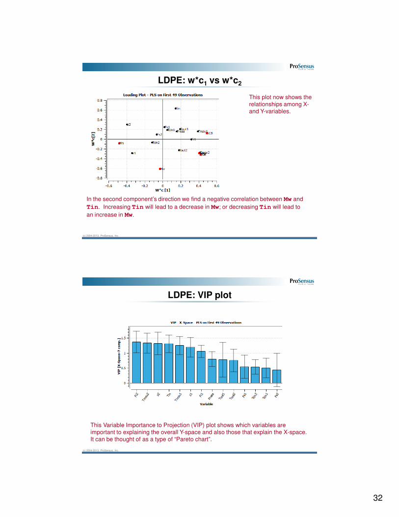
LDPE: w*c1 vs w*c2
This plot now shows the
relationships among X-
and Y-variables.
We see several relationships here: Tmax1, TMax2, Fi1, and Fi2 are strongly
related to the Conversion, LCB, and SCB outcomes. To increase the level of these
outcomes we can operate the reactor at increased levels of Tmax1, TMax2, Fi1,
and Fi2. But, to be consistent with the model we have to also decrease the reactor
hotspots, z1, and z2, and accept a decreased level in the Mn outcome.
32
(c) 2004-2013, ProSensus, Inc.
LDPE: w*c1 vs w*c2
This plot now shows the
relationships among X-
and Y-variables.
In the second component’s direction we find a negative correlation between Mw and
Tin. Increasing Tin will lead to a decrease in Mw; or decreasing Tin will lead to
an increase in Mw.
(c) 2004-2013, ProSensus, Inc.
LDPE: VIP plot
This Variable Importance to Projection (VIP) plot shows which variables are
important to explaining the overall Y-space and also those that explain the X-space.
It can be thought of as a type of “Pareto chart”.

33
(c) 2004-2013, ProSensus, Inc.
LDPE: Observed vs. predicted for Mw and Conv
This prediction of these final product quality variables is very good.
(c) 2004-2013, ProSensus, Inc.
LDPE: Coefficient for Mw and LCB
The coefficients for Mw show that Tin in the main predictor, with minor weights on a
few other variables. This corresponds to the weights seen in the w*c2 direction earlier.
The coefficients for LCB show that Tmax2, z2, and initiator flows, Fi1 and Fi2, as
well as pressure are important. This agrees with the w*c1 loading direction earlier.

34
(c) 2004-2013, ProSensus, Inc.
Process monitoring using the LDPE case study
We will use the same LDPE dataset for process monitoring this time.
Recall, that one of the requirements for a monitoring model is to build the model from common-cause operation.
1. Use the PLS model built from the first 49 observations under common-cause operation.
Set up various process monitoring charts using the PLS model. We use the t-scores, Hotelling’s T2 and SPE charts to monitor the process. If we detect a problem we examine it with contribution plots.
2. Now use observations 49 to 54 as a prediction set
Where do you detect problems, and which variables appear to contribute to the out-of-control alarms?
(c) 2004-2013, ProSensus, Inc.
LDPE: Building the monitoring model
SPE shows some moderate
outliers. Remember that we
expect 5/100 observations
to fall above the 95% limit.
For this exercise, assume
you have investigated the
moderate outliers and have
decided that they belong in
the training data (ie. are
part of “normal” operation)
Recall from the previous
exercise that no unusual
observations were detected in
the range of observation 1 to
49, in Hotelling’s T2 plot.

35
(c) 2004-2013, ProSensus, Inc.
LDPE: t1 vs t2 for training and prediction sets
Point 49 was the last point in the training data set. Notice the big jump from 49 to 50
and then the drift from point 51 to 54. This drift leads to abnormal product quality.
(c) 2004-2013, ProSensus, Inc.
LDPE: Hotelling’s T2 for training and prediction sets
Hotelling’s T2 plot shows that point 54 lies outside the region of typical process
operation.

36
(c) 2004-2013, ProSensus, Inc.
LDPE: SPE for training and prediction sets
The SPE plot detects broken correlation structure. In this case, and it is fairly
typical, the broken correlation structure signal appears before the Hotelling’s T2
alarm is flagged.
(c) 2004-2013, ProSensus, Inc.
LDPE: Contribution plot for observation 54
Use the contribution plot, and find the t1-t2 contribution from observation 51 to 54.
The model shows that Tmax2 decreased, while z2 increased.
This implies that the reactor hot-spot shifted further down the length of the reactor,
while the hot-spot temperature decreased at the same time.

37
(c) 2004-2013, ProSensus, Inc.
Model Exploration Tool
• Use the Model Explorer Tool to investigate new points in the LDPE model built in Day 2, Lab 1.
• Add a few new points from different sections of the score plot
– Explore what is different between the points in the X and Y data blocks
• To use the Model Explorer tool:
(c) 2004-2013, ProSensus, Inc.
Model Exploration Tool
location on score plot
save data from current pointer position
view different data blocks
X & Y values at the chosen
point
view the variables
scaled

38
(c) 2004-2013, ProSensus, Inc.
Example: Kamyr pulp digester
Kaymr pulp digester,
Weyerhauser, Alberta
Hourly data collected over 8
months under closed-loop
control
300 observations, of 21 process
measurements
Wood chips enter from the top, and are steamed in this “pressure cooker” type vessel.
From: http://www.pulpandpaper-technology.com/
(c) 2004-2013, ProSensus, Inc.
Kamyr: measurements available
Y variable:
Y-Kappa : Kappa Number = degree of delignification. High Kappa implies high lignin content.
X variables:1. ChipRate-4 : Chip meter rate. Determines retention time of the chips in the digester.2. BF-CMratio : Blow flow to CM ratio keeps the digester chip level constant and stable.3. BlowFlow : The amount of pulp discharged at the bottom of the digester.4. ChipLevel-4 : The digester chip level at the top of digester, chip level below liquor5. T-upperExt-2 : The temperature of black liquor extracted from the upper extraction outlet.6. T-lowerExt-2 : The temperature of the black liquor extracted from the lower extraction outlet7. Uczaa-3 : The active alkali of liquor in the upper cook zone = NaOH+Na2S expressed as Na2O8. WhiteFlow-4 : The flow of fresh white liquor to the top of the digester, manipulated relative to ChipRate.9. AAWhiteSt-4 : The active alkali charge in white liquor is a measure of the strength of the white liquor10. AA-Wood-4 : Active alkali to wood ratio, used to control the digester.11. ChipMoisture-4 : Moisture content of the wood chips. Measured before they enter the pre-steaming vessel.12. SteamFlow-4 : The flow rate of steam to the pre-steaming vessel. Low chip moisture <-> high steam flow.13. Lower-HeatT-3 : Lower heater temperature. Used for temperature control of the chips before cooking stage.14. Upper-HeatT-3 : Upper heater temperature. Used to heat the chips before lower heating zone.15. ChipMass-4 : The chip mass feed rate is given in units of mass per time16. WeakLiquorF : The total flow of the weak wash liquor to the bottom of the digester.17. BlackFlow-2 : The amount of black liquor extracted from the cooking zone.19. WeakWashF : Flow of weak wash liquor to the bottom of digester. 19. SteamHeatF-3 : The steam flow rate to the upper and lower heaters to heat the wood chips.20. T-Top-Chips-4 : The temperature of the wood chips in the very top of the digester.21. SulphidityL-4 : The fresh white Liquor sulphidity is Na2S / (NaOH + Na2S) in %, expressed as Na2O
For reference. The main point is that we have to create a soft-sensor for Y-Kappa, using data from the
other 21 process measurements.

39
(c) 2004-2013, ProSensus, Inc.
Kamyr : Objectives
1. Fit a PLS model to predict Kappa number (Y-Kappa) using all 21 process measurements as input (X) variables.
[Find any outlier’s, investigate, and exclude them – if necessary]
2. Examine the loading (w*c) plots: which measurements are strongly related to Kappa number?
3. Examine the coefficients: does this agree with w*c
4. Make a time series plot of the observed (YVar) and predicted (YPred) of Kappa number.
5. To account for the effect of unsteady state (dynamic) behavior, rebuild the model including one lagged value of Y-Kappa
– Create a new model, and include the lagged tag; Y-Kappa_Lag1
– Is the model better? Is the effect of the lagged Y kappa large?
– Confirm this with VIP and a coefficient plot.
– Repeat this with the second lag: Y-Kappa_Lag2
(c) 2004-2013, ProSensus, Inc.
Kamyr : The initial PLS model
The initial model looks promising (A=6):
high R2Y = 0.712
and high Q2 = 0.680
But we should first investigate the scores, SPE and Hotelling’s T2 plots
and unusual observations.

40
(c) 2004-2013, ProSensus, Inc.
Kamyr : Finding unusual observations
After excluding this observation we obtain a slightly simpler model (A=4):
R2Y = 0.693
Q2 = 0.664
Is this Q2 acceptable? Given that R2Y and Q2 are so close, and that we
have used cross-validation to fit the model, we are likely explaining
all systematic variation possible.
(c) 2004-2013, ProSensus, Inc.
Kamyr : loadings plot (w*c)
Variables strongly
related to Y-Kappa:
ChipLevel4
Uczaa-3
BF-CMratio
SteamHeatF
SteamFlow
WhiteFlow
These variables
can be found using
the VIP plot also.

41
(c) 2004-2013, ProSensus, Inc.
Kamyr : VIP plot
The largest VIP’s (left) also show the strongest
relationships in the loadings plot (below).
(c) 2004-2013, ProSensus, Inc.
Kamyr : Coefficient plot (sorted)

42
(c) 2004-2013, ProSensus, Inc.
Kamyr : Observed and predicted time-series
The general trends shows pretty good agreement, and no large differences.
(c) 2004-2013, ProSensus, Inc.
Kamyr : Adding a lag
• Right-click Model 2 and click New Model As
• In the model dialog box select the “Lags” tab and then select the “Y” data block. Select Y-Kappa, 1 and the arrow, OK, and proceed with model building.

43
(c) 2004-2013, ProSensus, Inc.
Kamyr : after adding a lag
The lagged variable is now the most important
variable in the model, and has improved the
prediction ability (A=4):
R2Y = 0.775
Q2 = 0.757
(c) 2004-2013, ProSensus, Inc.
Without a lag With a single lag
Kamyr : effect of adding a lag

44
(c) 2004-2013, ProSensus, Inc.
ProSensus Multivariate Data Course
Day 3 Assignments
(c) 2004-2013, ProSensus, Inc.
Assignments for Day 3
Iris: Classification assignment: perform classification on a well-known dataset.
Quality: Classification assignment on data from a chemical manufacturer (herbicide).
Batch: Analysis of data with batch trajectories.

45
(c) 2004-2013, ProSensus, Inc.
Iris: Classification [Iris_ProMV.xls]
The traditional dataset consists of 50 observations on 3 iris varieties1. We have augmented this dataset with 10 measurements taken from roses growing in the garden of a ProSensus employee.
50 obs: Iris setosa : 25 training + 25 testing
50 obs: Iris versicolor : 25 training + 25 testing
50 obs: Iris virginica : 25 training + 25 testing
10 obs: Rose : 10 testing samples
4 measurements per observation
http://en.wikipedia.org/wiki/Iris_versicolor
(c) 2004-2013, ProSensus, Inc.
Iris: Objective
The objective of this exercise is to build three classification models on this dataset:
1. An unsupervised multivariate model (a single PCA model)
2. A supervised multivariate model (a single PLS-DA model)
*Instructions for creating SIMCA (Soft independent modeling by class analogy) models for this data set can be found in the “Additional Labs” section, if you have time.
Exercise
A. Build your models using the 75 training samples (3 x 25 samples)
B. Test your models using the remaining 85 observations.
• What is the misclassification rate for each method?
• Do both methods identify the “new” Rose class?

46
(c) 2004-2013, ProSensus, Inc.
A single PCA Model – some instructions
• Import the IRIS block. While importing, be sure to define the Variety column as secondary Ids.
• As you build the model, exclude the “rose” observations and also exclude every second observation by the following steps:
1
. 2
3
(c) 2004-2013, ProSensus, Inc.
A single PCA Model – instructions continued
• To create the prediction set, go to Edit � Prediction set, select create
new prediction set, and give it an appropriate name such as ‘PCA prediction set’
• Include all observations that weren’t in the training PCA model by the following steps:
1. 2
3
4

47
(c) 2004-2013, ProSensus, Inc.
How to show a color-coded score plot for each class in ProMV
Right click in
the plot and
then click
‘’properties’’
(c) 2004-2013, ProSensus, Inc.
A single PCA model
t1 vs. t2 for the 75 training samples
Use autofit, you will get a model with 2 components

48
(c) 2004-2013, ProSensus, Inc.
A single PCA model
t1 vs. t2 when projecting the 85 testing samples to the model
Most rose samples are outside the 95% confidence limit in the
t1 vs t2 scatter plot.
(c) 2004-2013, ProSensus, Inc.
A single PCA model
Hotelling’s T2 and SPE plots of the 85 testing samples
Here, SPE is a better indicator than Hotelling’s T2, i.e. it shows more
clearly that the roses belong to a new class not represented in the model.

49
(c) 2004-2013, ProSensus, Inc.
A single PLS-DA model
• To build this model, follow the steps below. For each class, ProMV creates one binary column. The binary columns form the Y matrix.
(c) 2004-2013, ProSensus, Inc.
A single PLS-DA model
w*c plots show what defines a class, and the between-class relationships
So we likely have an Iris Setosa if we have (i) sepals that are shorter than the other species(ii) petals that are narrower and shorter

50
(c) 2004-2013, ProSensus, Inc.
A single PLS-DA model
Hotelling’s T2 and SPE plots of the 85 testing samples when projected to the PLS-DA model
Rose samples are far beyond 99% confidence limits in the SPE plot.
(c) 2004-2013, ProSensus, Inc.
A single PLS-DA model
SetosaSetosa VersicolorVersicolor VirginicaVirginica SetosaSetosa VersicolorVersicolor VirginicaVirginica
SetosaSetosa VersicolorVersicolor VirginicaVirginica•The 25 Setosa samples and most of the 25
Virginica samples can be correctly classified
based on the prediction of the binary Y variables
for Setosa and Virginica.
•However, it is difficult to separate Versicolor
samples from the other two just based on the
prediction of the binary Y variable for the
Versicolor class.
Prediction vs observation of the 3 binary Y variables for the testing dataset (Rose samples are
excluded in the following plots)

51
(c) 2004-2013, ProSensus, Inc.
Classification Assignment 2 : [Quality_ProMV.xls]
This example is from an agricultural chemical manufacturer (herbicide). They use 11 measurements from the final product to assess if the product is in-specification or out of spec.
The variables:
Y1 to Y7 : organic group concentrations
Y8 to Y10: physical properties
Y11: weight % of solvent in final product
The data are from 3 classes:
Class 1: Good, within specification product
Class 2: Out of specification product
Class 3: Acceptable, but has high residual solvent
(c) 2004-2013, ProSensus, Inc.
Quality data from a lab : Features of the data set
No change in
Y7 for on-spec
product, but
off-spec
product also
has zero
values
sometimes
Fair amount of
missing data
These data are
typical of industrial
quality data

52
(c) 2004-2013, ProSensus, Inc.
Quality data from a lab : Objectives
1. Plot the data, one variable at a time, and prove to yourself thatyou cannot identify on-spec and off-spec products on aunivariate basis.
2. Build a single PCA model (unsupervised model)
- ensure that there are no outliers in the dataset
- does the PCA model show a good separation between the classes?
3. Build a single PLS-DA model (supervised model)
- has the separation between classes improved?
(c) 2004-2013, ProSensus, Inc.
Quality data from a lab : Univariate analysis : Question 1
From the plots below (for variables Y1, Y2, Y9,and Y11), it is difficult, and likely impossible to differentiate between the classes by using one variable. The next few slides will show that multivariate analysis provides much better separation.
Y1
Y9
Y2
Y11
Note: These plots are created under Analyze – Raw Data Using the Quality Block

53
(c) 2004-2013, ProSensus, Inc.
Quality data from a lab : Question 2
Create PCA model: Fit 2 components
Check for Outliers: From the SPE and Hotelling T2 plots, no major outliers are observed
(c) 2004-2013, ProSensus, Inc.
Quality data from a lab : PCA on all data
The score plot shows (t1 vs t2) on all the data shows separation between off-spec product and the other 2 classes. High-solvent product is difficult to separate from on-spec product using PCA on all data.
54
(c) 2004-2013, ProSensus, Inc.
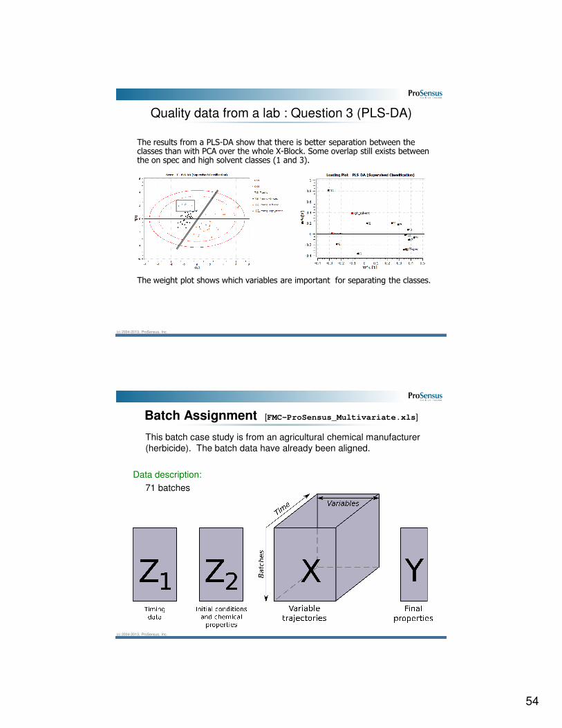
The results from a PLS-DA show that there is better separation between the classes than with PCA over the whole X-Block. Some overlap still exists between the on spec and high solvent classes (1 and 3).
The weight plot shows which variables are important for separating the classes.
Quality data from a lab : Question 3 (PLS-DA)
(c) 2004-2013, ProSensus, Inc.
Batch Assignment [FMC-ProSensus_Multivariate.xls]
This batch case study is from an agricultural chemical manufacturer
(herbicide). The batch data have already been aligned.
Data description:
71 batches

55
(c) 2004-2013, ProSensus, Inc.
TICTIC
PIC
Heating medium
Collector tank
Dryer tank
Agitator
The trajectories, X-block: 11 tags
1. Level in collector
10. Dryer temperature
9. Dryer temperature SP
Manuallydetermined
8. Jacket temperature
7. Jacket temperature SP
3. Dryer pressure
2. Differential pressure
4. Power5. Torque resistance6. Speed
11. Alignment timing
(c) 2004-2013, ProSensus, Inc.
FMC data : exercise
1. Import the data set from the FMC template file, FMC_ProSensus_Multivariate.xls:
• The Z blocks of landmark information: Timing Data and Initial Conditions
• The X block of batch trajectories
• The Y block of final quality measurements
– Include the column called “Batch Outcome” as a Secondary ID
2. Perform a PCA on the quality variables (Y-space): to understand how the batches are clustered, in terms of final quality. Use autofit.
• Identify the location of these batches in the score space:
• In-spec batches: 1 to 33
• Out-of-spec batches: 34 to 61
• In-spec with high solvent batches: 62 to 71
• Can you visually separate these batches in the t1-t2 score space?

56
(c) 2004-2013, ProSensus, Inc.
FMC data : exercise
3. Build a new model including the Z1, Z2, X and Y blocks in a single, multiblock PLS model with two components.
• Plot the raw trajectories for each class of batch; i.e. plot the trajectories for batch 1, 34 and 62 on the same plot. Can you see any noticeable difference between these 3 types of batches (in particular, the Dryer Temperature)?
• Plot the SPE and T2 plots. Which observations violate the limits?
4. Exclude these observations and rebuild the model.
• Use 2 components for this model.
• Build monitoring charts for some of the batches that were excluded.
• Look at the monitoring charts for the batches that were excluded, as well as, for one of the good batches (say, batch 19)
(c) 2004-2013, ProSensus, Inc.
FMC data : import data
Using ProSensus Multivariate. Start a new project and then import the data
as follows:
Standard Blocks → Edit → Import from File
File→New Project
Batch Blocks → Import Batch Block

57
(c) 2004-2013, ProSensus, Inc.
FMC data : import standard blocks
After starting a new project, import the standard blocks as follows:
New Project → Standard Blocks → Edit → Import from File
Set the Primary & Secondary IDsSelect only standard blocks
(c) 2004-2013, ProSensus, Inc.
FMC data : import trajectories
Using ProSensus Multivariate, import trajectories. Click on “Batch Blocks”.
Batch Blocks→ Import Batch Blocks
Set the Primary, Phase & Secondary IDsSelect only batch blocks

58
(c) 2004-2013, ProSensus, Inc.
Specify data blocks
• New Model window is shown immediately after importing data.
• Run PCA on Y-space. Exclude all blocks except “Final Responses”
• Click on the checkboxes under the “Include?” column to include/exclude blocks
• Click Ok to continue, and use autofit to build the model.
(c) 2004-2013, ProSensus, Inc.
Score plot analysis
Change colouring to Secondary IDs to view separation of On-Spec to Off-
spec batches in the score space.
On-spec/Off-spec batches can be visually separated in the t1-t2 space. Do
the other latent variables help with this separation?
59
(c) 2004-2013, ProSensus, Inc.
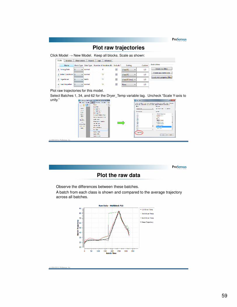
Plot raw trajectories
Click Model → New Model. Keep all blocks. Scale as shown:
Plot raw trajectories for this model.
Select Batches 1, 34, and 62 for the Dryer_Temp variable tag. Uncheck “Scale Y-axis to
unity.”
(c) 2004-2013, ProSensus, Inc.
Plot the raw data
Observe the differences between these batches.
A batch from each class is shown and compared to the average trajectory
across all batches.

60
(c) 2004-2013, ProSensus, Inc.
Multi-block scores
Add two components to this model and look at the T1-T2 score plot.
Note that observation 34 is outside of the 99% Hotelling’s T2 ellipse.
(c) 2004-2013, ProSensus, Inc.
Multi-block residuals and Hotelling’s T2
View Squared Prediction Error Plot for the overall data (overall data = all of
the blocks together). Note the points above 95% limit. Then view Hotelling’s
T2 for the overall data.

61
(c) 2004-2013, ProSensus, Inc.
Exclude suspicious batches
Select observations 20, 34, and 48 in the SPE plot, then select observations
56 and 58 in T2 plot. With all 5 observations selected, click
to exclude them from the next model.
(c) 2004-2013, ProSensus, Inc.
Document the model & Create prediction set
Expand the ‘Name’ field in the model list and double click on the empty field beside ‘Notes’ to enter some notes about this model.
Create a prediction set with the same 5 observations (Edit->Prediction Sets)

62
(c) 2004-2013, ProSensus, Inc.
View the new model and predicted batches
In order to have the option to show a prediction set, use the Analyze menu
rather than the plotting toolbar. Select both the training and prediction sets
to view in a T2 vs T1 score plot
(c) 2004-2013, ProSensus, Inc.
View the new model and predicted batches
For this new model, look at the Hotelling’s T2 plot. Select both your training
set and prediction set for plotting.

63
(c) 2004-2013, ProSensus, Inc.
Viewing the new model and predicted batches
Now look at SPE. Similarly, select both worksets. Click on the Zoom tool
(Magnifying glass) to zoom in to the lower region. Left click and drag a box
to zoom in and then right click to zoom out.
(c) 2004-2013, ProSensus, Inc.
Compute monitoring limits
Compute monitoring limits for this model. Click Monitor → Compute
Monitoring Limits. Use the block order shown below.

64
(c) 2004-2013, ProSensus, Inc.
Online monitoring of a good batch
Look at the online monitoring charts for a known good observation. Click
Monitor → Online Batch Monitoring Simulations. Select observation 19.
Select the following plot types as shown: Evolving SPE, Instantaneous SPE,
HT2, Scores 1 and 2. Click the down-arrow to add these plots to the list of
online monitoring plots.
(c) 2004-2013, ProSensus, Inc.
Online monitoring of a good batch
Look at the online monitoring charts for a known good observation.
65
(c) 2004-2013, ProSensus, Inc.
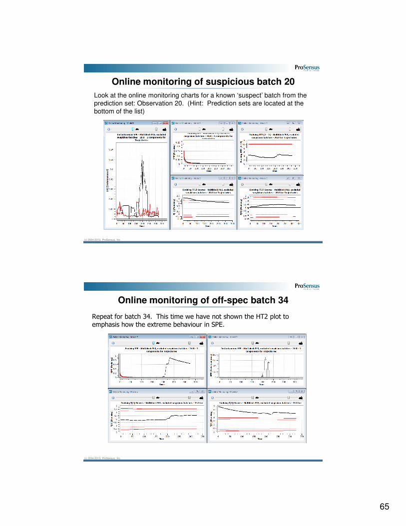
Online monitoring of suspicious batch 20
Look at the online monitoring charts for a known ‘suspect’ batch from the
prediction set: Observation 20. (Hint: Prediction sets are located at the
bottom of the list)
(c) 2004-2013, ProSensus, Inc.
Online monitoring of off-spec batch 34
Repeat for batch 34. This time we have not shown the HT2 plot to emphasis how the extreme behaviour in SPE.

66
(c) 2004-2013, ProSensus, Inc.
Diagnose high SPE
Close all monitoring windows and go back to Monitor->Online Batch Monitoring Simulations. Choose all 3 SPE plots for batch 34.
(c) 2004-2013, ProSensus, Inc.
Diagnose high SPE
Grab the time slider with the mouse and move it to the time where the highest peak occurs on the Instantaneous SPE plot.
The contribution plot displays the reason for this peak.

67
(c) 2004-2013, ProSensus, Inc.
Alignment tool
• ProMV includes a batch data Alignment Tool to help quickly align batch data.
• It has several features to help with:
– Adding/removing/editing event tags.
– Customizing how each phase is aligned (Indicator variable, percent of range).
– Easy viewing of pre/post alignment data to verify results
– Batch trajectory feature extraction (mean, max, min, slope within each phase per variable).
• Short demonstration of how alignment can be performed using the Alignment Tool.
(c) 2004-2013, ProSensus, Inc.
Alignment Tool Demo
• Start a new project and import batch trajectories.
– Change the file type to Matlab and select the file “FMC_ ProMV_Unaligned.mat” from the provided USB (Day 3).
– Choose “Trajectories”. You will be notified that the file contains unaligned batch data.

68
(c) 2004-2013, ProSensus, Inc.
Alignment Tool Demo
• Step 1: Set Reference Batch
Toggle between batch-
view and variable-view.
Browse through the
batches to find one that
represents a typical
batch.
Legend. Left-click a
legend item to toggle it
off/on. Right-click the
legend to toggle all items
at once.
Click here to mark the
current batch as the
reference batch.
Batch View Variable View
Message Center: The purpose of this screen is to look at the data from the different batches in your dataset
and pick one that represents all the expected characteristics of a normal batch. It is expected that such a
batch will be of average duration and that the shapes of all the trajectory variables will be representative (i.e.,
what is expected when the nominal batch recipe is executed under typical processing conditions -- typical raw
material characteristics, typical environmental conditions, etc.).
(c) 2004-2013, ProSensus, Inc.
Alignment Tool Demo
• Step 1: Set Reference Batch (variable-view)
Once the reference batch is set,
it will show as a bold black line in
the variable view.
Toggle between
batch-view and
variable-view.
Browse through
variables to see
how their
trajectories vary
from batch to
batch.

69
(c) 2004-2013, ProSensus, Inc.
Alignment Tool Demo
• Step 2: Set Reference Batch Events
List of events.
Click one to
activate it for
moving,
deleting,
including or
excluding.
Always read the message centre! It will guide you through the process.
Message Center: The
reference batch has
been set. You can now
add, move, or delete
events in the reference
batch, and your changes
will be propagated to the
rest of the data set.
(c) 2004-2013, ProSensus, Inc.
Alignment Tool Demo – Add, Move, Exclude
• To move an event, first click it in the list of events and then click the new location in the plot. Continue to click in the plot until you are happy with the position. Then, click other events in the list of events to reposition them as well.
• To include, exclude, or delete an event, first click it in the list of events and then click the include, exclude, or delete button.
• To add a new event click on the “Add Event” button and then click the location in your plot for the new event.
• Clicking the “Scale to Unity” check box is useful for viewing all variables on an equal basis.

70
(c) 2004-2013, ProSensus, Inc.
Alignment Tool Demo
• Step 3: Review Events for Other Batches
List of events.
Click one to
activate it for
moving.
If you made changes to the
events of the reference batch in
Step 2, you must review the
placement of events in every
batch before continuing to the
next step.
Message Center: No
changes have been
made to the dataset’s
events. You can tweak
event placements for
each batch on this step,
or, if your event
placement is
satisfactory, you can
move on to the next
step.
(c) 2004-2013, ProSensus, Inc.
Alignment Tool Demo – Set phase warping
• Step 4: Set Warping
Always read the message centre! It will guide you through the process.
Message Center: For
each phase, select the
warping method.
Currently you can
choose between Linear
or Dynamic warping,
and all phases must
have the same choice.
For Linear warping,
choose the variable to
warp against (Clock
Time is the default).
Next, for either warping
method choose the
percent of range value,
which is the step size (in
percent of total duration
for that phase). (Number
of points per phase =
100 / percent of range.)
Dynamic batch alignment is an
advanced topicwhich is covered
in our batch course.

71
(c) 2004-2013, ProSensus, Inc.
Alignment Tool Demo – Alignment Summary
Batch Mode View Variable Mode View
When satisfied with the alignment, click “Next”, or click “Back” and try a different warping method or adjust event placement, etc.
(c) 2004-2013, ProSensus, Inc.
Alignment Tool Demo – Extract Features
• Extracted features will be added as a separate block in the model.
Click “Add” to add landmark
features to the list.
To remove items, click on the item
in the table and click “Remove”
Click “Finish” when complete.
Select variable
of interest
Select phase of
interest
Select features
of interest

72
(c) 2004-2013, ProSensus, Inc.
Alignment Tool Demo – Conclusion
• The Alignment Tool provides a simple yet powerful method to align batch data for analysis in PLS or PCA models.
– Easy addition/removal/modification of event tags, which help with proper alignment.
• Extract important features from the batch, which can aid in analysis
– Variables/Phases of interest can have several parameters extracted.
– The feature data are automatically generated and placed in a separate block.
(c) 2004-2013, ProSensus, Inc.
Phone: (905) 304-9433
Email: [email protected]
Web site: http://www.prosensus.ca
Contact detailsContact details