ancillary presentation
TRANSCRIPT
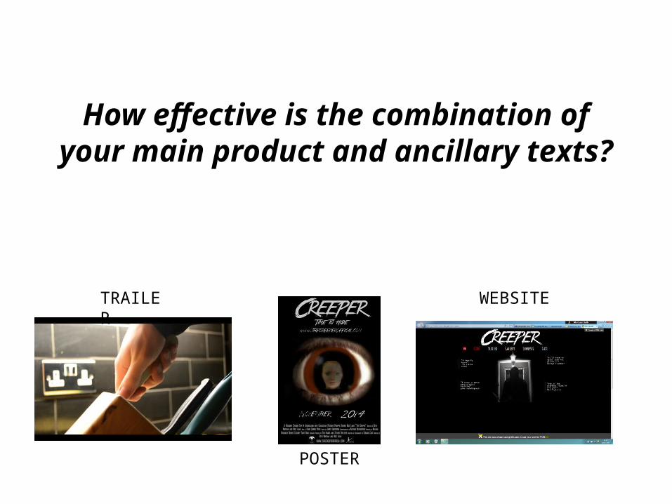
How effective is the combination of your main product and ancillary texts?
TRAILER
POSTER
WEBSITE

I believe that the combination of our main product and my ancillary texts have been both effective and successful because I have linked and related them to each other. Each of my media texts are linked together, for example they all contain the same obvious title *click now*
This allows them to link the three (poster, trailer and website). When they see this font and title on the trailer, they can then relate it to the poster and website, where they will be able to find out more information, this creates an effective combination between the main product and ancillary text.

A reoccurring convention used in the main product was the missing identity of the antagonist. To effectively link the ancillary text with the trailer, I carried on with this convention on the poster and website too.
This is an example of the antagonists hidden identity. You only ever see his hand, boots or back of body. I used this scene (which is repeated in the trailer to make it stand out) as inspiration for the website and poster.
As you can see here, I used the fearful expression shown in the print screen above to link the poster with the trailer.
And here, where I have used the antagonists back-facing position on the website background.

The first thing you see of Creeper (antagonist) is his eye, peeking through and spying on the protagonist. This will stick with he audience as it is the first harrowing scene and is the turning point where the music turns more sinister and things start to go wrong.
So I decided to use this scene for my poster. The eye would stand out and remind the audience of the trailer they had seen and effectively links them together
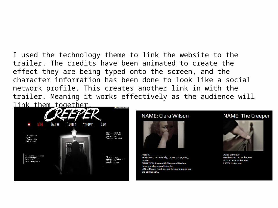
I used the technology theme to link the website to the trailer. The credits have been animated to create the effect they are being typed onto the screen, and the character information has been done to look like a social network profile. This creates another link in with the trailer. Meaning it works effectively as the audience will link them together.
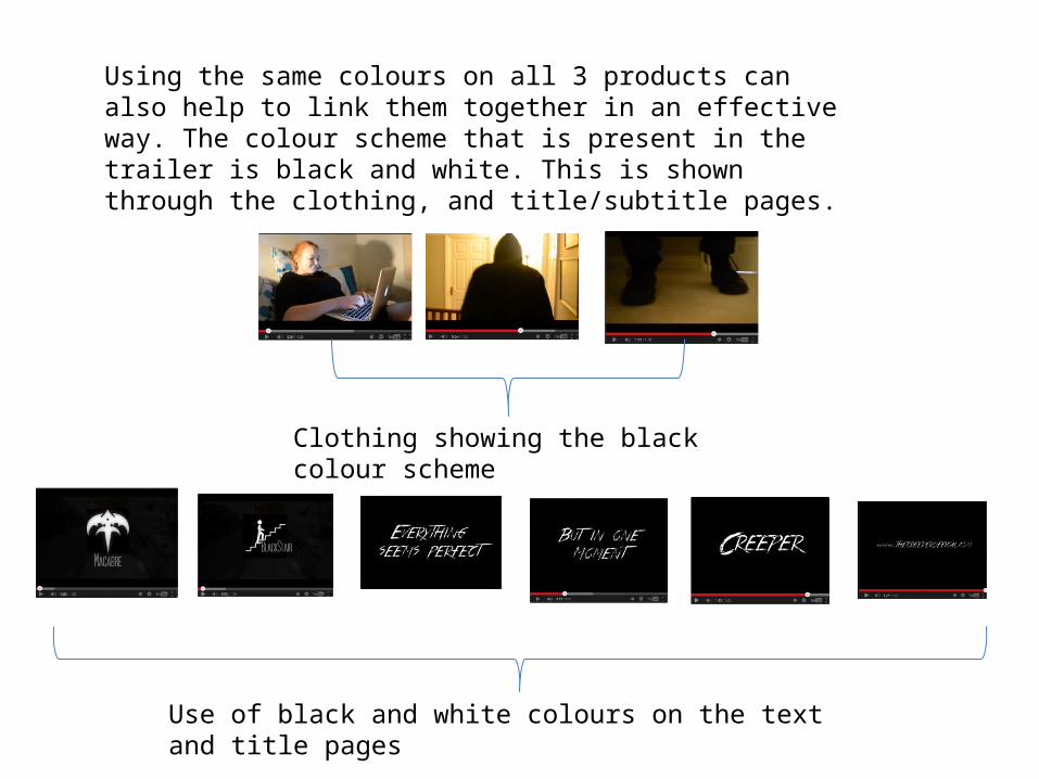
Using the same colours on all 3 products can also help to link them together in an effective way. The colour scheme that is present in the trailer is black and white. This is shown through the clothing, and title/subtitle pages.
Clothing showing the black colour scheme
Use of black and white colours on the text and title pages

I used this colour scheme on both ancillary products to create an effective link between them all. It is arguably the most important link to make, as colours stand out above anything else, and can grab the readers attention.
Here are the ancillary products, using the colour scheme shown on the previous slide.