ap studio art - college board · · 2017-07-01ap ® studio art 2007–2008 professional...
TRANSCRIPT
AP ®
Studio Art
2007–2008 Professional Development Workshop Materials
Special Focus: Breadth in the AP Portfolios
The College Board: Connecting Students to College Success
Th e College Board is a not-for-profi t membership association whose mission is to connect students
to college success and opportunity. Founded in 1900, the association is composed of more than
5,000 schools, colleges, universities, and other educational organizations. Each year, the College
Board serves seven million students and their parents, 23,000 high schools, and 3,500 colleges
through major programs and services in college admissions, guidance, assessment, fi nancial aid,
enrollment, and teaching and learning. Among its best-known programs are the SAT®, the PSAT/
NMSQT®, and the Advanced Placement Program® (AP®). Th e College Board is committed to
the principles of excellence and equity, and that commitment is embodied in all of its programs,
services, activities, and concerns.
For further information, visit www.collegeboard.com.
Page 8: Morris, William (1834–1896). Th e Well at the World’s End. 1896. Wood cut and letterpress.
Victoria & Albert Museum, London, Great Britain. © Victoria & Albert Museum, London/Art
Resource, NY. Reprinted with permission.
Page 9: Mackintosh, Charles Rennie (1868–1928). Stylized Flowers and Chequerwork. 1915–1923.
Pencil and watercolor on paper laid on board, 23.9 × 20.3 cm. Hunterian Museum and Art Gallery,
Glasgow, Scotland. © Textile design from Hunterian Online Photo Library. Reprinted with
permission.; Mackintosh, Charles Rennie (1868–1928). Orange and Purple Spirals. 1915–1923.
Pencil, watercolor and gouache on paper, 48.6 × 38.3 cm. Hunterian Museum and Art Gallery,
Glasgow, Scotland. © Textile design from Hunterian Online Photo Library. Reprinted with
permission.; Mackintosh, Charles Rennie (1868–1928). Wave Pattern. 1915–1923. Pencil and
watercolor on paper, 49.2 × 37.8 cm. Hunterian Museum and Art Gallery, Glasgow, Scotland. ©
Textile design from Hunterian Online Photo Library. Reprinted with permission.
Page 10: Wright, Frank Lloyd (1867–1959). Leaded Glass Window for the Avery Coonley Playhouse,
Riverside, Illinois. 1912. Stained glass, 219.1 × 71.1 × 5.1 cm. Riverside, Illinois. © 2007 Artists
© 2007 Th e College Board. All rights reserved. College Board, Advanced Placement Program, AP,
AP Central, AP Vertical Teams, Pre-AP, SAT, and the acorn logo are registered trademarks of the
College Board. AP Potential and connect to college success are trademarks owned by the College
Board. All other products and services may be trademarks of their respective owners. Visit the
College Board on the Web: www.collegeboard.com.
ii
Th e College Board wishes to acknowledge all the third party sources and content that have been
included in these materials. Sources not included in the captions or body of the text are listed here.
We have made every eff ort to identify each source and to trace the copyright holders of all materials.
However, if we have incorrectly attributed a source or overlooked a publisher, please contact us and
we will make the necessary corrections.
(continued on next page)
iii
Rights Society (ARS), New York/Frank Lloyd Wright Foundation. Reproduction, including
downloading of Frank Lloyd Wright works is prohibited by copyright laws and international
conventions without the express written permission of Artists Rights Society (ARS), New York.
Reprinted with permission.; Wright, Frank Lloyd (1867–1959). Wool Rug for the F.C. Bogk House,
Milwaukee, Wisconsin. 1916. Wool. Milwaukee, Wisconsin. © 2007 Artists Rights Society (ARS),
New York/Frank Lloyd Wright Foundation. Reproduction, including downloading of Frank Lloyd
Wright works is prohibited by copyright laws and international conventions without the express
written permission of Artists Rights Society (ARS), New York. Reprinted with permission.
Page 11: Harunobu, Suzuki (1724–1770). Girl with a Lantern. 1767. Woodcut print on paper,
280 × 208 mm. Rijksmuseum, Amsterdam. © Print from Rijksmuseum, Amsterdam. Reprinted with
permission.; Cherét, Jules (1836–1932). Poster for “Papier à cigarettes Job”. 1896–1900. Lithographed
poster, 124 × 88 cm. Miriam and Ira D. Wallach Division, Th e New York Public Library, New York,
NY, U.S.A. © Th e New York Public Library/Art Resource, NY. Reprinted with permission.
Page 12: Bonnard, Pierre (1867–1947). Th e Laundry-Maid. 1896. Lithograph printed in color,
11 5/8 × 7 7/8 in. Th e Museum of Modern Art, New York, NY, U.S.A. Digital Image © Th e Museum
of Modern Art/Licensed by SCALA/Art Resource, NY. Reprinted with permission.; Toulouse-
Lautrec, Henri (1864–1901). Divan Japonais. 1893. Lithograph printed in color, 31 5/8 × 23 7/8 in.
Th e Museum of Modern Art, New York, NY, U.S.A. Digital Image © Th e Museum of Modern Art/
Licensed by SCALA/Art Resource, NY. Reprinted with permission.
Page 13: Vuillard, Jean Edouard (1868–1940). Interior with Hanging Lamp. 1899. Lithograph
printed in color, 13 ¾ × 11 in. Th e Museum of Modern Art, New York, NY, U.S.A. © 2007 Artists
Rights Society (ARS), New York/Museum of Modern Art, New York. Reprinted with permission.;
Doesburg, Th eo van (1883–1931). Rhythm of a Russian Dance. 1918. Oil on canvas, 53 ½ × 24 ¼
in. Th e Museum of Modern Art, New York, NY, U.S.A. Digital Image © Th e Museum of Modern
Art/Licensed by SCALA/Art Resource, NY. Reprinted with permission.
Page 14: Mondrian, Piet (1872–1944). Composition 1916. 1916. Oil on canvas with wood strip at
bottom edge, 119 × 75.1 cm (46 7/8 × 29 5/8 inches). Solomon R. Guggenheim Museum, New York.
49.1229. Reprinted with permission.; Behrens, Peter (1868–1940). Th e Kiss. 1898. Woodcut on thin
laid paper, 27.14 × 21.43 cm. Los Angeles County Museum of Art. © 2007 Artists Rights Society
(ARS), New York/VG Bild-Kunst, Bonn. Reprinted with permission.
Page 15: Munch, Edvard (1863–1944). Madonna. 1895–1902. Woodcut printed in color,
23 ¾ × 17 ½ in. Th e Museum of Modern Art, New York, NY, U.S.A. Digital Image © Th e Museum of
Modern Art/Licensed by SCALA/Art Resource, NY. Reprinted with permission.; Moser, Koloman
(1868–1918). Poster for the 13th Secessionist Exhibition. 1902. Reproduced by permission from
Philip Meggs, A History of Graphic Design (Hoboken, NJ: John Wiley & Sons, Inc., 1998), 218.
Page 16: Klimt, Gustav (1862–1918). Th e Hostile Powers (from the Beethoven Frieze). 1902.
Casein paint on plaster, 34.14 × 2.15 m. Oesterreichische Galerie im Belvedere, Vienna, Austria.
iv
© Erich Lessing/Art Resource, NY. Reprinted with permission.; Kokoschka, Oskar (1886–1980).
Self Portrait: Poster Design for Der Sturm. 1911. Lithograph poster. Kunstbibliothek, Staatliche
Museen zu Berlin, Berlin, Germany. © Bildarchiv Preussischer Kulturbesitz/Art Resource, NY.
Reprinted with permission. Page 17: Malevich, Kazimir (1878–1935). Suprematist Painting. 1915.
Oil on canvas, 101.5 × 62 cm. Stedelijk Museum, Amsterdam, Th e Netherlands. © Art Resource, NY.
Reprinted with permission.; Lissitzky, Lazar El (1890–1941). Hit the Whites with the Red Wedge.
1919. Lithographed poster. © Snark/Art Resource, NY. Reprinted with permission.
Page 18: Rodchenko, Alexander (1891–1956). Poster for Rezinotrest, the State Trust of the Rubber
Industry. 1923. 45 × 60 cm. Rodchenko Archive, Moscow, Russia. © Scala/Art Resource, NY.
Reprinted with permission.; Stenberg, Georgii (1900–1933) and Vladimir Stenberg (1899–1982).
Chelovek’s Kinoapparatom. 1929. Lithograph, 39 ½ × 27 ¼ in. Th e Museum of Moden Art, New
York, NY, U.S.A. Digital Image © Th e Museum of Modern Art/Licensed by SCALA/Art Resource,
NY. Reprinted with permission.
Page 19: Kandinsky, Wassily (1866–1944). Composition X. 1939. Oil on canvas, 130 × 195 cm.
Kunstsammlung Nordrhein-Westfalen, Dusseldorf, Germany. © Painting from K21 Kunstsammlung
Nordrhein-Westfalen. Reprinted with permission.; Kandinsky, Wassily (1866–1944).
Yellow-Red-Blue. 1925. Oil on canvas, 128 × 201.5 cm. Musee National d’Art Moderne, Centre
Georges Pompidou, Paris, France. © CNAC/MNAM/Dist. Réunion des Musées Nationaux/Art
Resource, NY. Reprinted with permission.
Page 20: Schmidt, Joost (1893–1948). Staatliches Bauhaus Ausstellung (National Bauhaus
Exhibition). 1923. Lithograph, 26 ¼ × 18 5/8 in. Th e Museum of Modern Art, New York, NY, U.S.A.
Digital Image © Th e Musuem of Modern Art/Licensed by SCALA/Art Resource, NY. Reprinted with
permission.; Klee, Paul (1879–1940). Th e Window. 1922. Oil. © 2007 Artists Rights Society (ARS),
New York. Reproduction, including downloading of Paul Klee works is prohibited by copyright
laws and international conventions without the express written permission of Artists Rights Society
(ARS), New York. Reprinted with permission.
Page 21: Gropius, Walter (1883–1969). Th e Dessau Bauhaus building seen from the southeast. © 2007
Artists Rights Society (ARS), New York/Bauhaus-Archiv, Berlin. Reproduction, including downloading
of Walter Gropius works is prohibited by copyright laws and international conventions without the
express written permission of Artists Rights Society (ARS), New York. Reprinted with permission.;
Gropius, Walter (1883–1969). Façade of the east unit, student residences. 1925–1926. © 2007 Artists
Rights Society (ARS), New York/Bauhaus-Archiv, Berlin. Reproduction, including downloading of
Walter Gropius works is prohibited by copyright laws and international conventions without the express
written permission of Artists Rights Society (ARS), New York. Reprinted with permission.; Breuer,
Marcel (1902–1981). Armchair, Model B3. 1927–1928. Chrome-plated tubular steel with canvas slings,
28 1/8 × 30 ¼ × 27 ¾ in. Th e Museum of Modern Art, New York, NY, U.S.A. Digital Image © Th e
Museum of Modern Art/Licensed by SCALA/Art Resource, NY. Reprinted with permission.
v
Page 22: Breuer, Marcel (1902–1981). B32 “Cesca” Side Chair. 1928. Chrome-plated tubular steel,
wood and cane, 31 ½ × 17 ½ × 18 ¾ in. Th e Museum of Modern Art, New York, NY, U.S.A. Digital
Image © Th e Museum of Modern Art/Licensed by SCALA/Art Resource, NY. Reprinted with
permission.; Moholy-Nagy, László (1895–1946). Title page for “fi lm und foto” exhibition catalog.
1929. Staatliche Museen, Berlin, Germany. © 2007 Artists Rights Society (ARS), New York/Staatliche
Museen, Berlin. Reproduction, including downloading of Laszlo Moholy-Nagy works is prohibited
by copyright laws and international conventions without the express written permission of Artists
Rights Society (ARS), New York. Reprinted with Permission.
Page 23: Moholy-Nagy, László (1895–1946). Untitled silver-gelatin photogram. 1922. Staatliche
Museen, Berlin, Germany. © 2007 Artists Rights Society (ARS), New York/Staatliche Museen,
Berlin. Reproduction, including downloading of Laszlo Moholy-Nagy works is prohibited by
copyright laws and international conventions without the express written permission of Artists
Rights Society (ARS), New York. Reprinted with Permission.; Bayer, Herbert (1900–1985).
Lithographed Poster for the Section Allemande, Paris Exposition. 1930. Lithograph. © 2007 Artists
Rights Society (ARS), New York/BILD-KUNST. Reproduction, including downloading of Herbert
Bayer works is prohibited by copyright laws and international conventions without the express
written permission of Artists Rights Society (ARS), New York. Reprinted with permission.
Page 24: Bayer, Herbert (1900–1985). Design for a newspaper kiosk. 1924. Gouache and collage. ©
2007 Artists Rights Society (ARS), New York/BILD-KUNST. Reproduction, including downloading
of Herbert Bayer works is prohibited by copyright laws and international conventions without the
express written permission of Artists Rights Society (ARS), New York. Reprinted with permission.;
Albers, Josef (1888–1976). Structural Constellation. 1950. Machine-engraved vinylite. © 2007 Artists
Rights Society (ARS), New York/BILD-KUNST. Reproduction, including downloading of Herbert
Bayer works is prohibited by copyright laws and international conventions without the express
written permission of Artists Rights Society (ARS), New York. Reprinted with permission.
Page 25: Albers, Josef (1888–1976). Homage to the Square. 1962. Screenprint, 11 1/16 × 11 in. Th e
Museum of Modern Art, New York, NY, U.S.A. Digital Image © Th e Museum of Modern Art/
Licensed by SCALA/Art Resource, NY. Reprinted with Permission.
Images provided by Vivian Moreira Komando, Barbara Sunday and all student artwork are reprinted
here with permission.

1
Special Focus: Breadth in the AP Portfolio
Forward .......................................................................................................................3
Review Committee/Editor/Acknowledgments .......................................................3
Editor’s Introduction—The Idea of Breadth
Steve Willis ............................................................................................................4
A Brief History of the Elements and Principles of Design
Ken Daley and Heather Bryant ............................................................................7
Artistic Inspiration to Create Breadth
Vivian Moreira Komando ...................................................................................26
Creating Breadth Through Artistic Inspiration
Vivian Moreira Komando ...................................................................................30
Homelessness
Barry Lucy ...........................................................................................................38
Images: Lost and Found
Barbara Ann Sunday ..........................................................................................46
It’s a Roll of the Dice
Joann Winkler .....................................................................................................67
About the Editor/Contributors ................................................................................74
Table of Contents

2
Special Focus: Breadth in the AP Portfolio
Important Note
Th e following set of materials is organized around a particular set theme, or “special focus,”
that refl ects important topics in the AP® Studio Art course. Th e materials are intended to
provide teachers with resources and classroom ideas relating to these topics. Th e special
focus, as well as the specifi c content of the materials, cannot and should not be taken as an
indication that a particular topic will appear on the AP Exam.
3
Forward
Breadth in the AP Portfolio is a resource for both inexperienced and veteran high school
AP teachers that focuses on various pragmatic approaches designed to assist teachers and
students to successfully negotiate the Breadth section of each portfolio. Each of the authors is
a university faculty member who teaches equivalent courses or is an experienced AP teacher
who is involved in portfolio evaluation and brings a wealth of experience to this document.
Additionally, these educators represent a variety of pedagogical and curricular approaches,
geographic locations, budgets, and school demographics.
Th ese educators off er practical strategies that have been developed over years of experience
that can be adapted for the many diff erent types of AP classrooms. And, most certainly,
appropriate adjustments by each individual AP teacher will be necessary in order to meet the
specifi c needs of individual students, and the particular community and cultural diff erences
found in the AP classrooms across the globe.
Review Committee
Patricia Lamb, Polk County Schools, Lakeland, Florida
Raul Acero, Sage College of Albany, Albany, New York
Jerry Stefl , Th e School of the Art Institute, Chicago, Illinois
Editor
Steve Willis, Missouri State University, Springfi eld, Missouri
Acknowledgments
Th is publication would not have been possible without the stalwart support of the College
Board, and the assistance of Trevor Packer, executive director of the Advanced Placement
Program®; Allison Clark, director of History Curriculum and Content Development and
project director for AP History Redesign, June Shikatani, coordinator for Curriculum and
Content Development, and the many other people involved in this publication but not listed
within.
Forward
4
Special Focus: Breadth in the AP Portfolio
Editor’s Introduction
The Idea of Breadth
Steve Willis
Regardless of how contemporary art education moves to redefi ne itself for the Advanced
Placement Program® (AP®) visual arts educators and AP students, important issues such as
how a comprehensive visual arts education is defi ned, how visual arts educators can embrace
the diversity of idea, practice, and population, and ultimately, what composes a quality and
comprehensive visual arts education for all students will naturally arise.
Within the potential for reinvention or maintenance of art education programs in light of
legislative mandates, standard accountability systems, and a vigorous dialogue of defi ning
art education, some educators promote visual culture in art education, which certainly is
a complicated issue about how art forms can be understood and valued. Minimally, Paul
Duncum (2002) recommends that “We can take up visual culture as an urgent matter
to consider” (p. 21). Other educators resist this direction in education and promote a
philosophy that art is restricted (Kahmni, 2004) to the more traditional forms that have
historically been brought forward. And, concurrently, other educators promote a diff erent
view of what constitutes a comprehensive understanding through “pedagogy [that] illustrates
the relational and situational construction of—or better, improvisation on—cultural
knowledge” (McNally, 2004).
Terry Barrett (2003) off ers strategies to help students and faculty understand the
critical components necessary for denotation and connotation of images found in their
contemporary society. Th ese conversations can create some diffi culties for art educators
and their corresponding students, whether actively involved in the AP Program or teaching
other art courses. However, these conversations can prove benefi cial to both AP Studio Art
educators and their students in that these opinions can be adapted to provide important
currency to buy information in classroom conversations so the students can understand and
decide about the nuances of visual information, what constitutes the value of an art image,
who values it, and how art is evaluated.
Th e process of education must follow information that supports, defends, or accuses other
information; artists must decide what is important to them. For instance, a person might
investigate historical references to discover what has prefaced the current perception. In
the AP portfolio, a student would fi nd this process obvious in Section II: Concentration;
however, important personal artistic discoveries can be made within Section III: Breadth.
And, it may be within the artistic discoveries found in the Breadth section that the student
begins to understand the complexities of the visual language.
As every form of study involves a specifi c language that is shared commonly, one would
expect to fi nd a visual vocabulary in the AP portfolio, and more specifi cally, a focused use of
5
that vocabulary in the Breadth section. Th is, of course, does not mean that these discoveries
are exclusive to this section of the portfolio, but inclusive in art forms whether from a
cultural paradigm, a historical reference, or personal voice; the vocabulary necessary to
visualize must be evident.
In the AP portfolio evaluation, Readers1 are asked to verify student competencies in the
visual vocabulary and to substantiate the evaluation of what evidence is presented. In
this process, Readers look for the use of visual structure, technical acuity, and conceptual
development. Particularly in the Breadth section, these competencies present themselves as
the ubiquitous elements and principles of common artistic vocabulary found in the United
States. Since the AP portfolio allows individual approaches to these visual competencies,
specifi c approaches are left to the invention of the AP faculty and student. Certainly, AP
portfolio pedagogy is directed by the classroom and community constituency, the materials
available in the classroom, and the particular abilities of the educator. No approach is valued
over another.
According to the College Board’s AP Studio Art Course Description, 2007, the Breadth
section of the 2-D portfolio asks the student to “demonstrate an understanding of the
principles of design including unity/variety, balance, emphasis, contrast, rhythm, repetition,
proportion/scale, and fi gure/ground relationship” (p. 11). In the drawing portfolio, similar
expectations of breadth are noted, requiring students to show evidence of “conceptual,
perceptual, expressive, and technical range . . . . [and] demonstrate a variety of drawing skills
and approaches” (p. 20). And, in the 3-D portfolio Breadth section, students are asked to
show evidence of their understanding of unity/variety, balance, emphasis, contrast, rhythm,
repetition, proportion/scale, and fi gure/ground relationship and conceptual, perceptual,
expressive, and technical range in “concept, form, and materials as they pertain to three-
dimensional design” (p. 16). Th ough daunting at fi rst, students have successfully negotiated
this section with noteworthy uniqueness and individuality.
Approaches to the Breadth section vary greatly, and from speaking with many veteran
AP educators, the Breadth section is taught as a preface to the Concentration section.
However, others approach breadth through the concentration that the student selects early
in the program. Both approaches are valuable and each AP teacher will determine which
philosophy is best in the day-to-day context of the classroom.
Whether taught in advance of the Concentration or within it, the idea of Breadth must
be fully explored and developed. Breadth should not be a by-product of another pursuit.
Breadth requires specifi c knowledge and skills that must be evidenced in the portfolio. In
approaching Breadth, one might consider the adoption of the Th ree Cs: concept (ideation),
composition (visual organization), and craft smanship (technical acuity). In this approach,
all three have equal value and each supports the others in the fi nal gestalt of image-making.
1. Even though portfolio evaluators do not “read” comparatively to history or English, the label “Reader” moves across all AP Examinations.
Editor’s Introduction
6
Special Focus: Breadth in the AP Portfolio
Th is may help students understand that merely because they like the idea, the idea itself
may not necessarily compensate for a lack of compositional and technical qualities. Equally,
an excellent technical accomplishment may fall short of the highest evaluation if idea and
structure are absent.
Some specifi c teacher-directed exercises emphasizing the interaction of the elements and
principles may contribute to deeper student comprehension and more sophisticated imagery.
For example, in an interaction with the principle of repetition, one could include: tenebrism,
a specifi c color palette (i.e., quadratic), juxtaposition of semiotics, and asymmetry. In this
manner, it is not just an exercise in repetition, but, allows for the student’s artistic statement
to be empowered with personal, aesthetic decisions. Not to exclude simple and direct
exercises, which can be excellent, but complicated, multi-directional and multidimensional
issues may allow for more individual student exploration in how these issues are defi ned.
Consequently, the issues set forth in this type of curriculum and pedagogy may produce
unexpected excellence as a result of the dynamics of the student’s visual exploration and
critical dialogue in pursuit of the summative visual product.
In conclusion, it has been obvious to me over the past decades with my involvement with the
AP Program as an AP teacher, AP teacher trainer, and an AP Reader that excellence in art
as it is provided in the AP portfolio continues to grow and evolve within the United States
and other countries. Th rough the dedication of the growing AP faculty to the understanding
and application of the rigorous AP Studio Art program, students continue to provide clear
evidence of visual art competencies and individual artistic voices involving and manipulating
technique, organization, and ideation.
Clearly, when students think analytically and critically, make discerning decisions with
sophisticated nuances, and develop a personal aesthetic, a quality education is present. To
me, this is the quality education that should be promoted for every student in every school
who chooses to accept the challenges and rigor of the AP Studio Art program.
References
Barrett, Terry. (2003). Interpreting visual culture. Art Education, March, 2 (56), 7–12.
Duncum, Paul. (2002). Visual culture art education: Why, what and how. Journal of Art and Design Education, February, 1 (21), 14–23.
Kamhi, M. M. (2004). Rescuing art from visual culture studies. Art Education Policy Review, September/October, 1 (106), 25–31.
McNally, M. D. (2004). Indigenous pedagogy in the classroom: A service learning model for discussion. American Indian Quarterly, Summer/Fall, 1 & 3 (28), 604–617.
7
A Brief History of the Elements and Principles of Design
Ken Daley and Heather Bryant
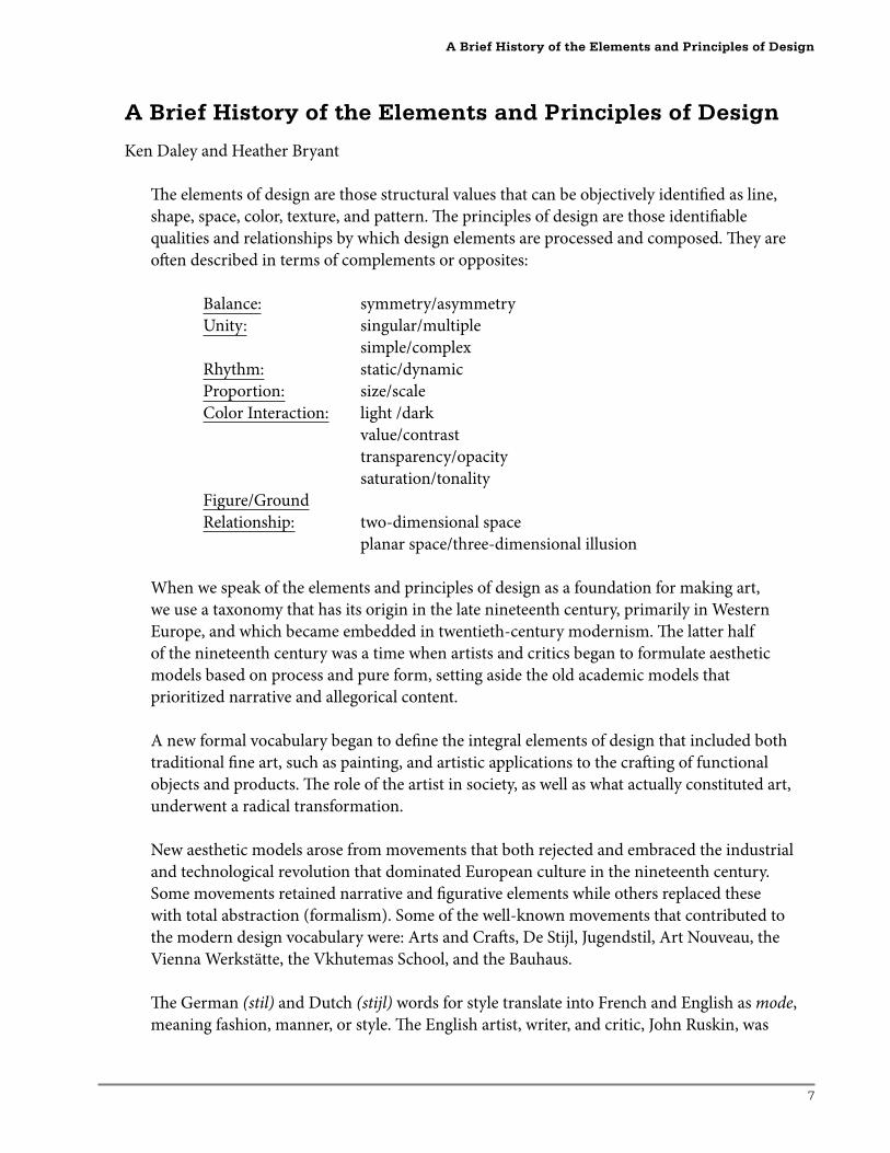
Th e elements of design are those structural values that can be objectively identifi ed as line,
shape, space, color, texture, and pattern. Th e principles of design are those identifi able
qualities and relationships by which design elements are processed and composed. Th ey are
oft en described in terms of complements or opposites:
Balance: symmetry/asymmetry
Unity: singular/multiple
simple/complex
Rhythm: static/dynamic
Proportion: size/scale
Color Interaction: light /dark
value/contrast
transparency/opacity
saturation/tonality
Figure/Ground
Relationship: two-dimensional space
planar space/three-dimensional illusion
When we speak of the elements and principles of design as a foundation for making art,
we use a taxonomy that has its origin in the late nineteenth century, primarily in Western
Europe, and which became embedded in twentieth-century modernism. Th e latter half
of the nineteenth century was a time when artists and critics began to formulate aesthetic
models based on process and pure form, setting aside the old academic models that
prioritized narrative and allegorical content.
A new formal vocabulary began to defi ne the integral elements of design that included both
traditional fi ne art, such as painting, and artistic applications to the craft ing of functional
objects and products. Th e role of the artist in society, as well as what actually constituted art,
underwent a radical transformation.
New aesthetic models arose from movements that both rejected and embraced the industrial
and technological revolution that dominated European culture in the nineteenth century.
Some movements retained narrative and fi gurative elements while others replaced these
with total abstraction (formalism). Some of the well-known movements that contributed to
the modern design vocabulary were: Arts and Craft s, De Stijl, Jugendstil, Art Nouveau, the
Vienna Werkstätte, the Vkhutemas School, and the Bauhaus.
Th e German (stil) and Dutch (stijl) words for style translate into French and English as mode,
meaning fashion, manner, or style. Th e English artist, writer, and critic, John Ruskin, was
A Brief History of the Elements and Principles of Design
8
Special Focus: Breadth in the AP Portfolio
one of the fi rst to use the word modern and published a major work in 1843 entitled Modern
Painters. However, Ruskin’s context for the term was in the revival of traditional styles by
such artists as the Pre-Raphaelites. Th e French began using the term moderne not only to
describe the fl ourishing new art “nouveau,” but also any aspect of culture that was newly
fashionable or up-to-date. Hence, the general adaptation of the term modern as a rubric
for all art movements and aesthetic models that was considered avant-garde: Stil � Stijl �
Style � Mode � Modernism.
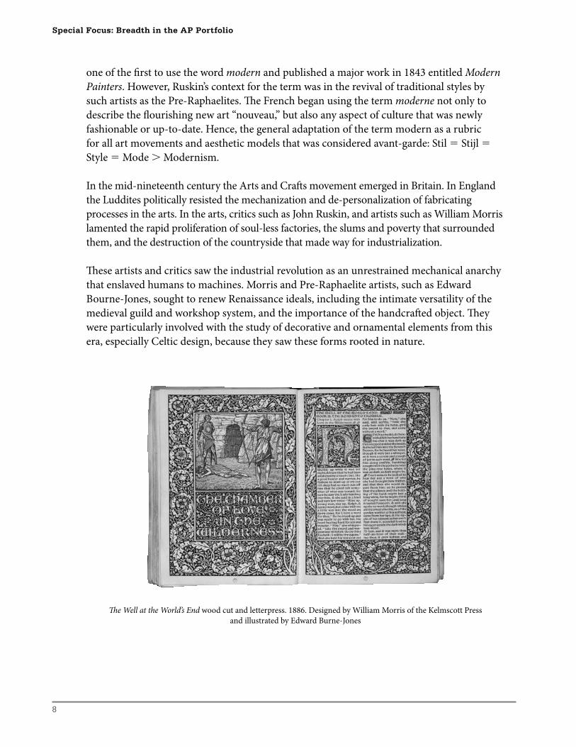
In the mid-nineteenth century the Arts and Craft s movement emerged in Britain. In England
the Luddites politically resisted the mechanization and de-personalization of fabricating
processes in the arts. In the arts, critics such as John Ruskin, and artists such as William Morris
lamented the rapid proliferation of soul-less factories, the slums and poverty that surrounded
them, and the destruction of the countryside that made way for industrialization.
Th ese artists and critics saw the industrial revolution as an unrestrained mechanical anarchy
that enslaved humans to machines. Morris and Pre-Raphaelite artists, such as Edward
Bourne-Jones, sought to renew Renaissance ideals, including the intimate versatility of the
medieval guild and workshop system, and the importance of the handcraft ed object. Th ey
were particularly involved with the study of decorative and ornamental elements from this
era, especially Celtic design, because they saw these forms rooted in nature.
Th e Well at the World’s End wood cut and letterpress. 1886. Designed by William Morris of the Kelmscott Press
and illustrated by Edward Burne-Jones
9
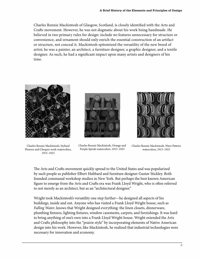
Charles Rennie Mackintosh of Glasgow, Scotland, is closely identifi ed with the Arts and
Craft s movement. However, he was not dogmatic about his work being handmade. He
believed in two primary rules for design: include no features unnecessary for structure or
convenience, and ornament should only enrich the essential construction of an artifact
or structure, not conceal it. Mackintosh epitomized the versatility of the new breed of
artist; he was a painter, an architect, a furniture designer, a graphic designer, and a textile
designer. As such, he had a signifi cant impact upon many artists and designers of his
time.
A Brief History of the Elements and Principles of Design
Charles Rennie Mackintosh, Stylised
Flowers and Chequer work watercolors,
1915–1923
Charles Rennie Mackintosh, Orange and
Purple Spirals watercolors, 1915–1923Charles Rennie Mackintosh, Wave Pattern
watercolors, 1915–1923
Th e Arts and Craft s movement quickly spread to the United States and was popularized
by such people as publisher Elbert Hubbard and furniture designer Gustav Stickley. Both
founded communal workshop studios in New York. But perhaps the best known American
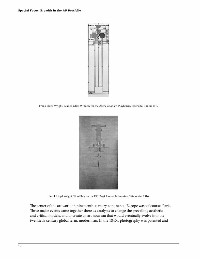
fi gure to emerge from the Arts and Craft s era was Frank Lloyd Wright, who is oft en referred
to not merely as an architect, but as an “architectural designer.”
Wright took Mackintosh’s versatility one step further—he designed all aspects of his
buildings, inside and out. Anyone who has visited a Frank Lloyd Wright house, such as
Falling Water, knows that Wright designed everything: the linen closets, dinnerware,
plumbing fi xtures, lighting fi xtures, window casements, carpets, and furnishings. It was hard
to bring anything of one’s own into a Frank Lloyd Wright house. Wright extended the Arts
and Craft s philosophy into the “prairie style” by incorporating elements of Native American
design into his work. However, like Mackintosh, he realized that industrial technologies were
necessary for innovation and economy.
10
Special Focus: Breadth in the AP Portfolio
Frank Lloyd Wright, Leaded Glass Window for the Avery Coonley Playhouse, Riverside, Illinois 1912
Frank Lloyd Wright, Wool Rug for the F.C. Bogk House, Milwaukee, Wisconsin, 1916
Th e center of the art world in nineteenth-century continental Europe was, of course, Paris.
Th ree major events came together there as catalysts to change the prevailing aesthetic
and critical models, and to create an art nouveau that would eventually evolve into the
twentieth-century global term, modernism. In the 1840s, photography was patented and
11
it quickly displaced the painters’ need to create super-real, highly modeled surfaces that
depicted realist subjects and narratives.
In the 1860s, a printer and painter named Jules Cherét introduced color lithographic
printing technology, and the graphic arts suddenly became a signifi cantly popular medium.
Before Cherét fi lled the streets of Paris with his colorful posters, artists considered graphic
art processes as merely secondary craft s that were commercial in nature, and therefore
unworthy of consideration as “fi ne arts.” Now the processes became a source of inspiration
for formal expression, much of which was inherent in their technical applications.
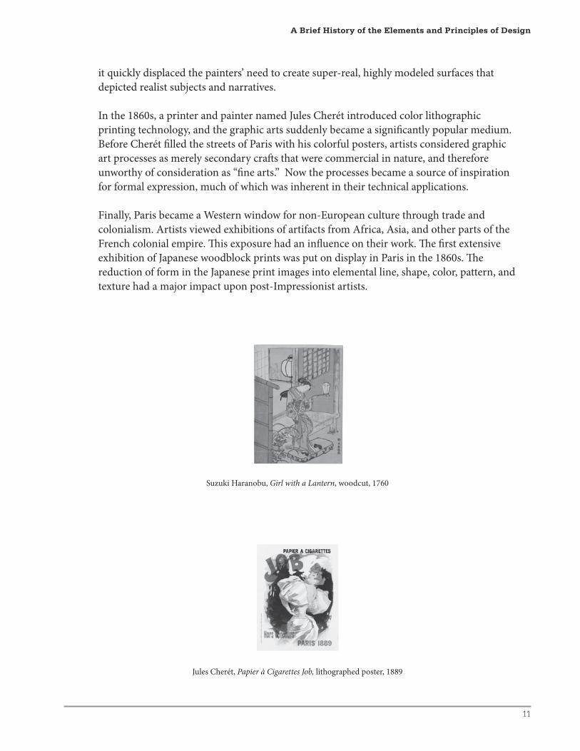
Finally, Paris became a Western window for non-European culture through trade and
colonialism. Artists viewed exhibitions of artifacts from Africa, Asia, and other parts of the
French colonial empire. Th is exposure had an infl uence on their work. Th e fi rst extensive
exhibition of Japanese woodblock prints was put on display in Paris in the 1860s. Th e
reduction of form in the Japanese print images into elemental line, shape, color, pattern, and
texture had a major impact upon post-Impressionist artists.
Suzuki Haranobu, Girl with a Lantern, woodcut, 1760
Jules Cherét, Papier à Cigarettes Job, lithographed poster, 1889
A Brief History of the Elements and Principles of Design
12
Special Focus: Breadth in the AP Portfolio
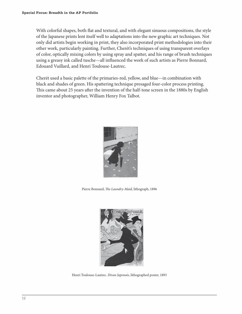
With colorful shapes, both fl at and textural, and with elegant sinuous compositions, the style
of the Japanese prints lent itself well to adaptations into the new graphic art techniques. Not
only did artists begin working in print, they also incorporated print methodologies into their
other work, particularly painting. Further, Cherét’s techniques of using transparent overlays
of color, optically mixing colors by using spray and spatter, and his range of brush techniques
using a greasy ink called tusche—all infl uenced the work of such artists as Pierre Bonnard,
Edouard Vuillard, and Henri Toulouse-Lautrec.
Cherét used a basic palette of the primaries-red, yellow, and blue—in combination with
black and shades of green. His spattering technique presaged four-color process printing.
Th is came about 25 years aft er the invention of the half-tone screen in the 1880s by English
inventor and photographer, William Henry Fox Talbot.
Pierre Bonnard, Th e Laundry-Maid, lithograph, 1896
Henri Toulouse-Lautrec. Divan Japonais, lithographed poster, 1893
13
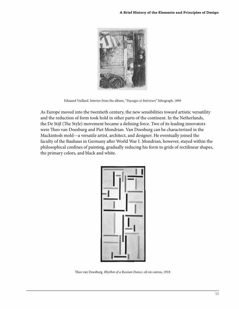
Edoaurd Vuillard. Interior from the album, “Paysages et Intérieurs” lithograph, 1899
As Europe moved into the twentieth century, the new sensibilities toward artistic versatility
and the reduction of form took hold in other parts of the continent. In the Netherlands,
the De Stijl (Th e Style) movement became a defi ning force. Two of its leading innovators
were Th eo van Doesburg and Piet Mondrian. Van Doesburg can be characterized in the
Mackintosh mold—a versatile artist, architect, and designer. He eventually joined the
faculty of the Bauhaus in Germany aft er World War I. Mondrian, however, stayed within the
philosophical confi nes of painting, gradually reducing his form to grids of rectilinear shapes,
the primary colors, and black and white.
Th eo van Doesburg. Rhythm of a Russian Dance, oil on canvas, 1918
A Brief History of the Elements and Principles of Design
14
Special Focus: Breadth in the AP Portfolio
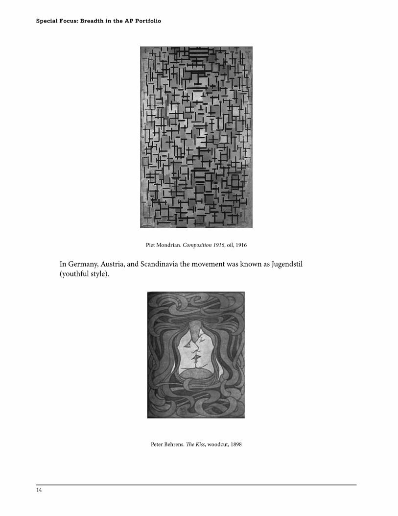
Piet Mondrian. Composition 1916, oil, 1916
In Germany, Austria, and Scandinavia the movement was known as Jugendstil
(youthful style).
Peter Behrens. Th e Kiss, woodcut, 1898
15
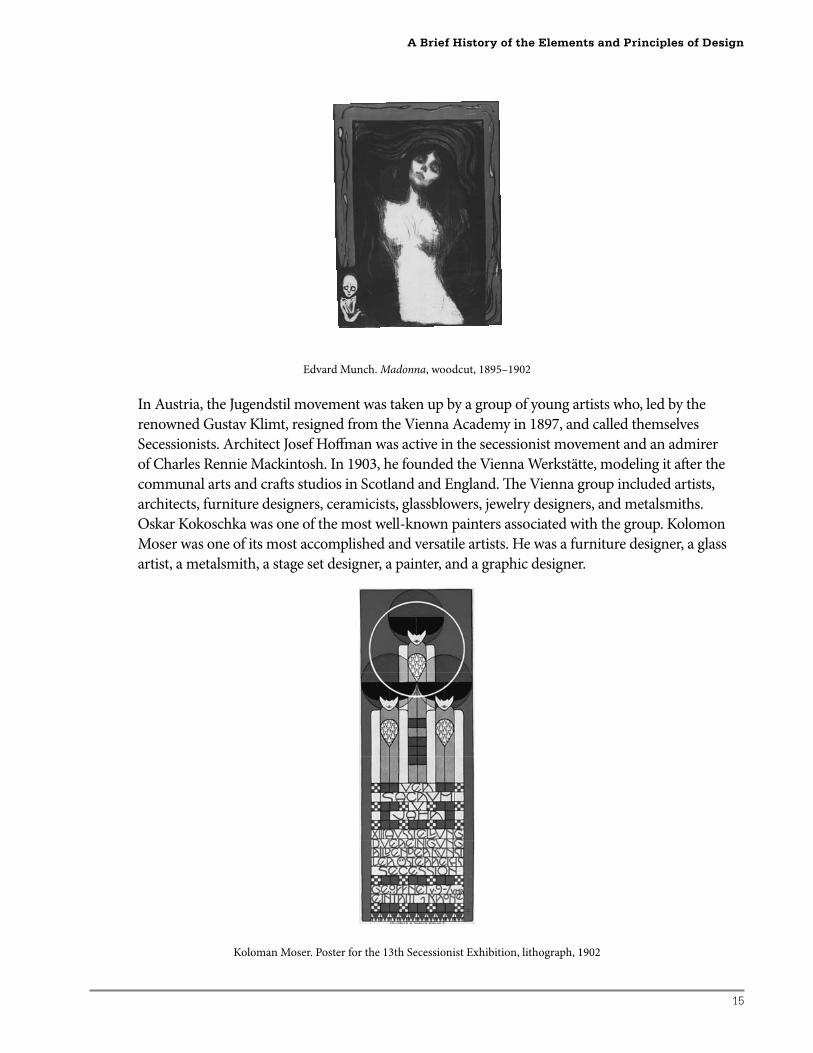
Edvard Munch. Madonna, woodcut, 1895–1902
In Austria, the Jugendstil movement was taken up by a group of young artists who, led by the
renowned Gustav Klimt, resigned from the Vienna Academy in 1897, and called themselves
Secessionists. Architect Josef Hoff man was active in the secessionist movement and an admirer
of Charles Rennie Mackintosh. In 1903, he founded the Vienna Werkstätte, modeling it aft er the
communal arts and craft s studios in Scotland and England. Th e Vienna group included artists,
architects, furniture designers, ceramicists, glassblowers, jewelry designers, and metalsmiths.
Oskar Kokoschka was one of the most well-known painters associated with the group. Kolomon
Moser was one of its most accomplished and versatile artists. He was a furniture designer, a glass
artist, a metalsmith, a stage set designer, a painter, and a graphic designer.
Koloman Moser. Poster for the 13th Secessionist Exhibition, lithograph, 1902
A Brief History of the Elements and Principles of Design
16
Special Focus: Breadth in the AP Portfolio
Gustav Klimt. Th e Hostile Powers (from the Beethoven Frieze), casein paint on plaster, 1902
Oskar Kokoschka. Self Portrait: Poster Design for Der Sturm, lithograph poster, 1911
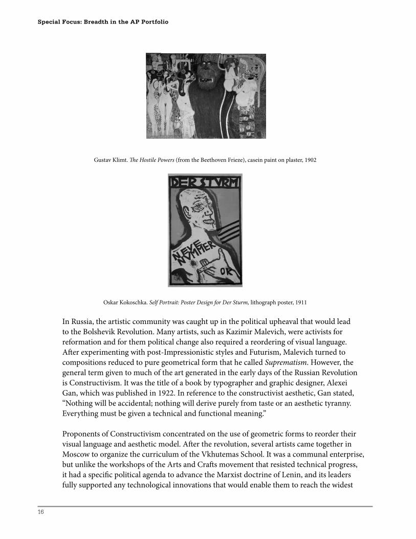
In Russia, the artistic community was caught up in the political upheaval that would lead
to the Bolshevik Revolution. Many artists, such as Kazimir Malevich, were activists for
reformation and for them political change also required a reordering of visual language.
Aft er experimenting with post-Impressionistic styles and Futurism, Malevich turned to
compositions reduced to pure geometrical form that he called Suprematism. However, the
general term given to much of the art generated in the early days of the Russian Revolution
is Constructivism. It was the title of a book by typographer and graphic designer, Alexei
Gan, which was published in 1922. In reference to the constructivist aesthetic, Gan stated,
“Nothing will be accidental; nothing will derive purely from taste or an aesthetic tyranny.
Everything must be given a technical and functional meaning.”
Proponents of Constructivism concentrated on the use of geometric forms to reorder their
visual language and aesthetic model. Aft er the revolution, several artists came together in
Moscow to organize the curriculum of the Vkhutemas School. It was a communal enterprise,
but unlike the workshops of the Arts and Craft s movement that resisted technical progress,
it had a specifi c political agenda to advance the Marxist doctrine of Lenin, and its leaders
fully supported any technological innovations that would enable them to reach the widest
17
audience. Th e department in the Vkhutemas responsible for advertising the political agenda
was called the Institute of Artistic Culture, or INKhUK. Alexander Rodchenko, who was the
head of the Vkhutemas School during the 1920s, stated that “Construction is the appropriate
utilization of primary material properties . . . the only fully authentic construction is a
designed object or structure in real space.”
Art had to be utilitarian and, accordingly, the school emphasized industrial design, product
design, and graphic design. It is interesting to note that one of the most useful and enduring
design products to come out of the Vkhutemas was the folding chair. Since much of the new
political agenda was spread by speakers going from town to town on trains, a large number
of chairs could be carried on the trains to accommodate the crowds that would come to hear
the speakers. Film was also an important propaganda tool for the revolution as well as for
entertainment. Th e Stenberg Brothers, Georgii and Vladimir, were innovative designers who
specialized in fi lm and cultural posters.
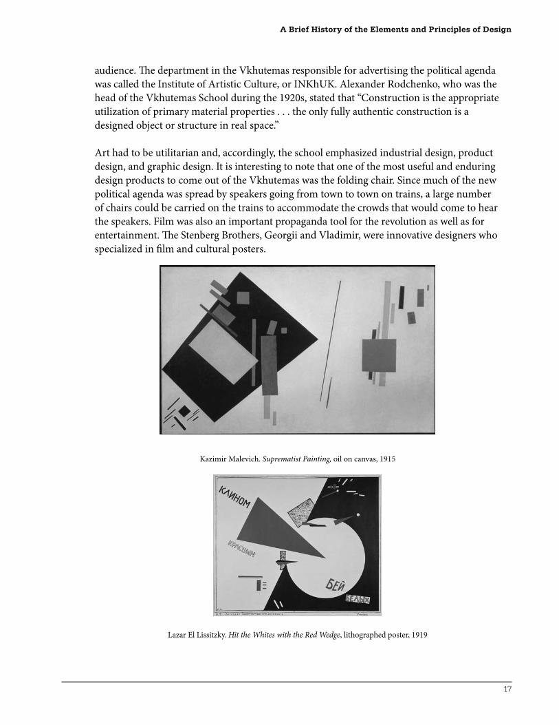
Kazimir Malevich. Suprematist Painting, oil on canvas, 1915
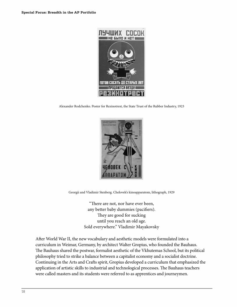
Lazar El Lissitzky. Hit the Whites with the Red Wedge, lithographed poster, 1919
A Brief History of the Elements and Principles of Design
18
Special Focus: Breadth in the AP Portfolio
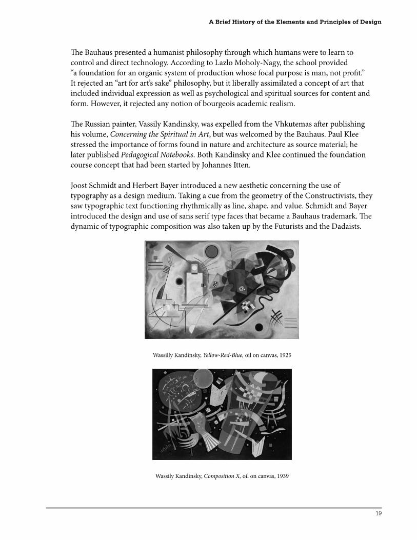
Alexander Rodchenko. Poster for Rezinotrest, the State Trust of the Rubber Industry, 1923
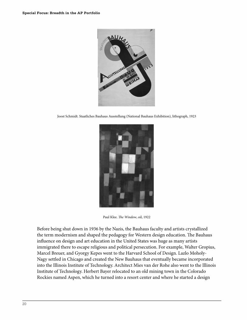
Georgii and Vladimir Stenberg. Chelovek’s kinoapparatom, lithograph, 1929
“Th ere are not, nor have ever been,
any better baby dummies (pacifi ers).
Th ey are good for sucking
until you reach an old age.
Sold everywhere.” Vladimir Mayakovsky
Aft er World War II, the new vocabulary and aesthetic models were formulated into a
curriculum in Weimar, Germany, by architect Walter Gropius, who founded the Bauhaus.
Th e Bauhaus shared the postwar, formalist aesthetic of the Vkhutemas School, but its political
philosophy tried to strike a balance between a capitalist economy and a socialist doctrine.
Continuing in the Arts and Craft s spirit, Gropius developed a curriculum that emphasized the
application of artistic skills to industrial and technological processes. Th e Bauhaus teachers
were called masters and its students were referred to as apprentices and journeymen.
19
Th e Bauhaus presented a humanist philosophy through which humans were to learn to
control and direct technology. According to Lazlo Moholy-Nagy, the school provided
“a foundation for an organic system of production whose focal purpose is man, not profi t.”
It rejected an “art for art’s sake” philosophy, but it liberally assimilated a concept of art that
included individual expression as well as psychological and spiritual sources for content and
form. However, it rejected any notion of bourgeois academic realism.
Th e Russian painter, Vassily Kandinsky, was expelled from the Vhkutemas aft er publishing
his volume, Concerning the Spiritual in Art, but was welcomed by the Bauhaus. Paul Klee
stressed the importance of forms found in nature and architecture as source material; he
later published Pedagogical Notebooks. Both Kandinsky and Klee continued the foundation
course concept that had been started by Johannes Itten.
Joost Schmidt and Herbert Bayer introduced a new aesthetic concerning the use of
typography as a design medium. Taking a cue from the geometry of the Constructivists, they
saw typographic text functioning rhythmically as line, shape, and value. Schmidt and Bayer
introduced the design and use of sans serif type faces that became a Bauhaus trademark. Th e
dynamic of typographic composition was also taken up by the Futurists and the Dadaists.
Wassilly Kandinsky, Yellow-Red-Blue, oil on canvas, 1925
Wassily Kandinsky, Composition X, oil on canvas, 1939
A Brief History of the Elements and Principles of Design
20
Special Focus: Breadth in the AP Portfolio
Joost Schmidt. Staatliches Bauhaus Ausstellung (National Bauhaus Exhibition), lithograph, 1923
Paul Klee. Th e Window, oil, 1922
Before being shut down in 1936 by the Nazis, the Bauhaus faculty and artists crystallized
the term modernism and shaped the pedagogy for Western design education. Th e Bauhaus
infl uence on design and art education in the United States was huge as many artists
immigrated there to escape religious and political persecution. For example, Walter Gropius,
Marcel Breuer, and Gyorgy Kepes went to the Harvard School of Design. Lazlo Moholy-
Nagy settled in Chicago and created the New Bauhaus that eventually became incorporated
into the Illinois Institute of Technology. Architect Mies van der Rohe also went to the Illinois
Institute of Technology. Herbert Bayer relocated to an old mining town in the Colorado
Rockies named Aspen, which he turned into a resort center and where he started a design
21
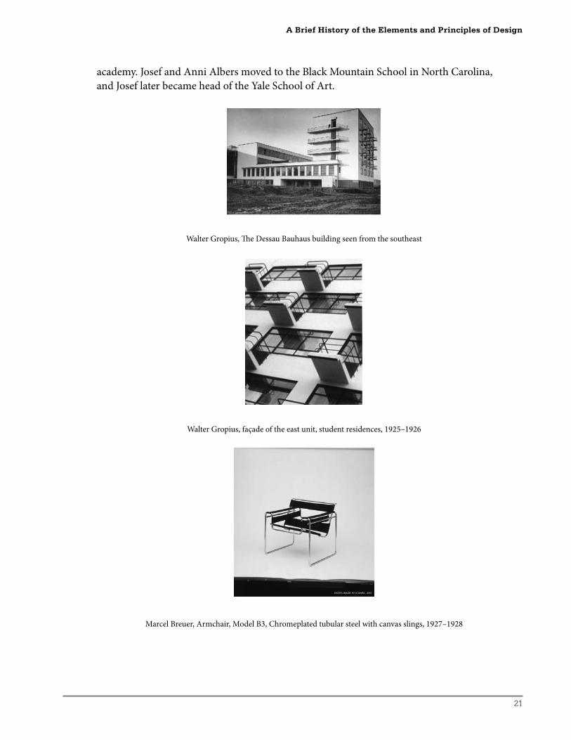
academy. Josef and Anni Albers moved to the Black Mountain School in North Carolina,
and Josef later became head of the Yale School of Art.
Walter Gropius, Th e Dessau Bauhaus building seen from the southeast
Walter Gropius, façade of the east unit, student residences, 1925–1926
Marcel Breuer, Armchair, Model B3, Chromeplated tubular steel with canvas slings, 1927–1928
A Brief History of the Elements and Principles of Design
22
Special Focus: Breadth in the AP Portfolio
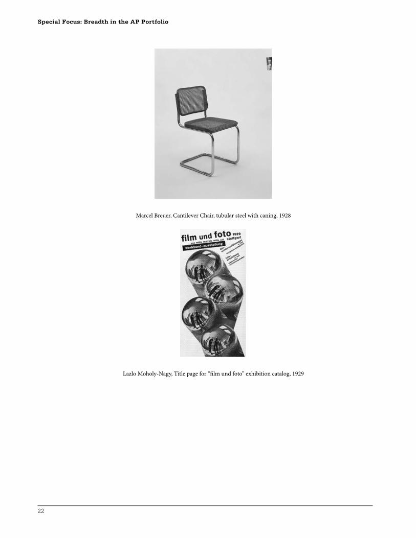
Marcel Breuer, Cantilever Chair, tubular steel with caning, 1928
Lazlo Moholy-Nagy, Title page for “fi lm und foto” exhibition catalog, 1929
23
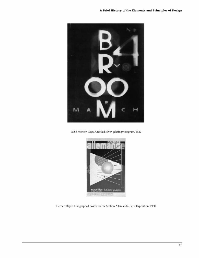
Lázló Moholy-Nagy, Untitled silver-gelatin photogram, 1922
Herbert Bayer, lithographed poster for the Section Allemande, Paris Exposition, 1930
A Brief History of the Elements and Principles of Design
24
Special Focus: Breadth in the AP Portfolio
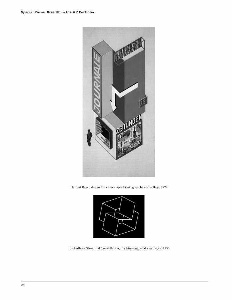
Herbert Bayer, design for a newspaper kiosk, gouache and collage, 1924
Josef Albers, Structural Constellation, machine-engraved vinylite, ca. 1950
25
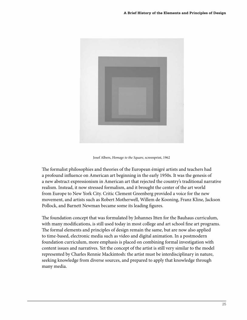
Josef Albers, Homage to the Square, screenprint, 1962
Th e formalist philosophies and theories of the European émigré artists and teachers had
a profound infl uence on American art beginning in the early 1950s. It was the genesis of
a new abstract expressionism in American art that rejected the country’s traditional narrative
realism. Instead, it now stressed formalism, and it brought the center of the art world
from Europe to New York City. Critic Clement Greenberg provided a voice for the new
movement, and artists such as Robert Motherwell, Willem de Kooning, Franz Kline, Jackson
Pollock, and Barnett Newman became some its leading fi gures.
Th e foundation concept that was formulated by Johannes Itten for the Bauhaus curriculum,
with many modifi cations, is still used today in most college and art school fi ne art programs.
Th e formal elements and principles of design remain the same, but are now also applied
to time-based, electronic media such as video and digital animation. In a postmodern
foundation curriculum, more emphasis is placed on combining formal investigation with
content issues and narratives. Yet the concept of the artist is still very similar to the model
represented by Charles Rennie Mackintosh: the artist must be interdisciplinary in nature,
seeking knowledge from diverse sources, and prepared to apply that knowledge through
many media.
A Brief History of the Elements and Principles of Design
26
Special Focus: Breadth in the AP Portfolio
Artistic Inspiration to Create Breadth
Vivian Moreira Komando
Contemporary artists and art history can inspire the AP Studio Art student. Inspiration is
pertinent to the personal investigation of artwork created for the Breadth section of the AP
Studio Art portfolio. It can be used as a mode to move beyond the class project to fulfi ll the
Breadth requirement.
By using artistic inspiration, students can develop a critical eye for their own artwork. Th is
critical look can incorporate personal vision and investigation catalyzed by the analysis of
how other artists (professionals and peers) use color, line, form, and space with other art
elements and principles to develop composition.
“Creativity is not the fi nding of a thing,
but the making something out of it aft er it is found.”
James Russell Lowell, American poet and critic
Since the AP Studio Art program off ers the opportunity to challenge the art student to work
at a higher level, it may pose a challenge to the art instructor. Th e instructor must work at a
higher level, which may pose a challenge to some art instructors to raise the bar in terms of
the quality of work as well as the quality of thought.
Teaching students to develop their strengths in art may mean taking the time to expose
them to the vision and passion of various artists as a means of bringing inspiration into the
art room. Due to the rigorous requirements for any of the three AP Studio Art portfolios
and the time constraints a teacher works under, it may seem a diffi cult request to add to the
AP class curriculum through the avenue of art history. But when working with students to
create the Breadth section of their portfolio, it is advantageous to explore and analyze how
diff erent contemporary artists use, investigate, manipulate, and appropriate the elements and
principles of design to create work that exhorts the artist’s vision. Additionally, both teacher
and students can utilize the investigation and discussion of the artist’s manipulation of ideas
to create a visual image. As students learn to express themselves through an image that
refl ects their underlying thought, understanding how other artists view and interpret the
world around them can add an additional impact to the creative process.
Th e purpose of exposing students to the works of various artists is not to produce a set of
cookie-cutter assignments and projects, but rather to expose students to a variety of ways
of using the elements and principles that may not have been considered previously. Th is
approach can strengthen the student’s work by taking aspects of the works of others and
incorporating these elements or principles into their own work, while at the same time
defi ning the student’s personal style. Introducing students to artists’ works may give them
insights to their own work. As students evaluate the works presented they can consider how
27
the use of similar elements within their own compositions will aff ect what they are trying
to create. In the analysis of such work, it should not be overlooked how that artist came to
create the work. What was the artist thinking? What was the artist trying to convey? Was the
artist trying to make a social impact? What is the function of the art viewed? Th ese should
also be perspectives from which the student artist creates.
Inspiration may be many things, and may be initiated by exposure to new ideas or
venues not previously considered. Defi nitions for inspiration include “a product of creative
thinking and work, arousal of the mind to creativity” (http://wordnet.princeton.edu/perl/
webwn?s=inspiration), “an agency, such as a person or work of art, that moves the intellect or
emotions or prompts action or invention; something, such as a sudden creative act or idea, that
is inspired” (http://www.answers.com/topic/inspiration), and lastly, “a sudden intuition as part
of solving a problem” (http://dictionary.reference.com/browse/inspiration).
As I work with my own students to develop the Breadth section, I search for artists’ images
that will provoke responses and provide new insights on how the students may use the
elements and principles of design. By exposing my students to artists who make color dance,
masterly manipulate space, or command the use of line, I am developing within the students a
foundation as well as the ability to solve their own visual problems. Th is is inspiration at work.
I also believe that to empower my students as they create, they should be knowledgeable
about techniques. I can bring a cake to class that is absolutely delicious, but I cannot expect
my students to make their own cake if I have not shown them how to bake. I do not wish to
create a “paint by numbers” class, but I highly value skills and techniques used masterfully to
create art.
I also value individual and personal expression. I believe expression is enhanced when my
students know how to manipulate artistic tools to personal artistic advantage. I want my
students to know the rules before they break them. I wish to enable their expression, not
hinder it. How can they solve the visual problems they wish to explore if they are frustrated
because their techniques or skills are lacking? Inspiration can mix student motivation with the
tools and techniques taught in class so that they can bake their own delicious cake stimulated
by analyzing previous artists and their images. A question arises here as to whether teaching
art involves imitation or imagination. Imitation may serve to train a skill, where imagination
shows the soul’s eye. An image is said to be beautiful if it perfectly represents a thing, even if
that thing is ugly (Aquinas, p. 27). Art making may be dependent on the constructive as well
as the creative. It is a spiritual marriage that unites the artist’s intent with the media (Maritain,
p. 33). In my class I want to teach my students to see, and to me this is emphasized by the
importance I place upon analyzing artwork by asking, “Why does this work?”
In learning to see how other artists use the elements and principles, I believe my students are
appropriating their own use of the elements and principles. In other words, they are being
inspired. Th rough the study of great art, inspiration becomes an intuitive and creative tool.
Artistic Inspiration to Create Breadth
28
Special Focus: Breadth in the AP Portfolio
Looking at the work of Betty LaDuke and analyzing the application of paint, compositional
space, layering, transformative imagery, and color usage may be some of what a student
appropriates in their own style of expression. Th is appropriation may then become an
intuitive manner of working and expressing for future works.
At the introduction of a lesson, I may teach a new technique, rely on a previously taught
technique, ask questions, or provide some inspiration by introducing artists and their work.
More importantly, I like to think that I provoke. Th is is where I believe my students’ art making
comes from—the provocation to search for an answer, to confront the challenge I pose.
I want my students to search for their answers. Robert Henri (1923) said, “We are not here to
do what has already been done” (p.16). I want my students to fi nd new answers and expand
upon what has been done. As my students’ teacher, I feel it is very important to build upon
experiences and, more important, to expand this experience. If I do not give my students this
opportunity, I feel I am denying my students’ growth. I know that part of my job is to create
these experiences for my students. Th is means I may need to research artists and the focus of
their work as I present lessons to my students. I believe that guiding my students to fi nd how
the elements of art and principles of design work within other artists’ works will be aff ecting
their own work. Th is foundation in a lesson leads them to make something out of what
they fi nd as we analyze as a class and they appropriate the information individually. Th is is
creativity enhanced by inspiration.
Can we teach creativity? I prefer to think we can by nourishing and enhancing experiences in
the art room. It is not that my students lack creativity. I believe they just do not know where it
has been stored. I believe each student has a reservoir where experiences are stored. Artistic
reservoirs need to be replenished and nurtured (Cameron and Bryan). Introducing information
about artists and their works adds to these reservoirs. Th e process of creation starts from
inspiration with a thought, then words, then actions that are derived from this reservoir.
I want to challenge my students as they create. I need to inspire them and the best way I can
do this is to introduce them to new ways of seeing and creating by examining the works of
other artists. Examining these works also broadens the range of work they can create for the
Breadth section of the AP Studio Art portfolio.
Th is means I need to research before presenting lessons. I oft en look to contemporary and modern
artists to inspire my students. My job is to create valid and authentic experiences that investigate
the creative process and to teach students that inspiration can play a role in the creative process. If
I do not give my students this opportunity, i.e., vision, I am denying my students growth. I believe
that my students should investigate, analyze, experiment, and discover as they create.
My role as an art educator is to select experiences to engage my students and to replenish
their souls and their artistic vision. I show them bits and pieces, and they analyze how the
29
pieces make the whole. Th en we expand upon the investigation when I ask them to create,
utilizing what they have analyzed. Th is is not always an easy task. To me, Dewey exemplifi ed
this when he said that growth depends upon the presence of diffi culty to be overcome by the
exercise of intelligence (p. 79).
References
Aquinas, T., as cited in M. Rader, ed. (1973). A modern book of aesthetics. An anthology. 4th ed. New York: Holt, Rinehart & Winston. p. 27.
Cameron, J., and Bryan, M. (1992). The artist’s way. New York: G.P. Putnam’s Sons.
Dewey, J. (1963). Experience and education. Rev. ed. New York: Macmillan Publishing Company.
Henri, R. (1958). The art spirit. Rev. ed. New York: Harper & Row. (Original work published in 1923.)
Maritain, J., as cited in M. Rader, ed. (1973). A modern book of aesthetics. An anthology. 4th ed. New York: Holt, Rinehart & Winston. p. 33.
Rader, M., ed. (1973). A modern book of aesthetics. An anthology. 4th ed. New York: Holt, Rinehart & Winston.
Teacher Resources
Post-Modernism Artists and Art
http://www.the-artists.org/MovementView.cfm?id=33137B47%2DB7C7%2DDEF2%2D0AE
4B4E34B638168
Artists
Mike Bidlo, Judy Chicago, Daniel Flahiff , Hans Haacke, Jenny Holzer, Mary Kelly, Barbara
Kruger, Louise Lawler, Sherrie Levine, Javier Mariscal, Alessandro Mendini, Charles Willard
Moore, Richard Prince, Aldo Rossi, David Salle, Julian Schnabel, Cindy Sherman, Ettore Sottsass,
Philippe Starck, Robert Venturi, Jeff Wall, Andrew Webb, Wolfgang Weingart, Varda Yoran.
Modern and Contemporary Art
http://www.metmuseum.org/toah/hi/st_modern_art.htm
Post-Modernism and Post-Modernity
http://www.infed.org/biblio/b-postmd.htm
Artistic Inspiration to Create Breadth
30
Special Focus: Breadth in the AP Portfolio
Creating Breadth Through Artistic Inspiration
Vivian Moreira Komando
Lesson Plan
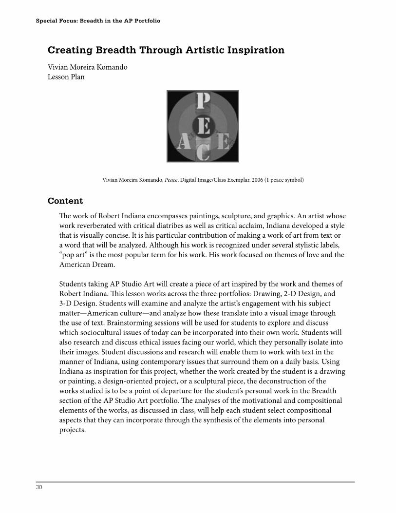
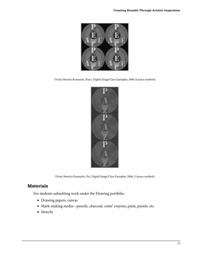
Vivian Moreira Komando, Peace, Digital Image/Class Exemplar, 2006 (1 peace symbol)
Content
Th e work of Robert Indiana encompasses paintings, sculpture, and graphics. An artist whose
work reverberated with critical diatribes as well as critical acclaim, Indiana developed a style
that is visually concise. It is his particular contribution of making a work of art from text or
a word that will be analyzed. Although his work is recognized under several stylistic labels,
“pop art” is the most popular term for his work. His work focused on themes of love and the
American Dream.
Students taking AP Studio Art will create a piece of art inspired by the work and themes of
Robert Indiana. Th is lesson works across the three portfolios: Drawing, 2-D Design, and
3-D Design. Students will examine and analyze the artist’s engagement with his subject
matter—American culture—and analyze how these translate into a visual image through
the use of text. Brainstorming sessions will be used for students to explore and discuss
which sociocultural issues of today can be incorporated into their own work. Students will
also research and discuss ethical issues facing our world, which they personally isolate into
their images. Student discussions and research will enable them to work with text in the
manner of Indiana, using contemporary issues that surround them on a daily basis. Using
Indiana as inspiration for this project, whether the work created by the student is a drawing
or painting, a design-oriented project, or a sculptural piece, the deconstruction of the
works studied is to be a point of departure for the student’s personal work in the Breadth
section of the AP Studio Art portfolio. Th e analyses of the motivational and compositional
elements of the works, as discussed in class, will help each student select compositional
aspects that they can incorporate through the synthesis of the elements into personal
projects.
31
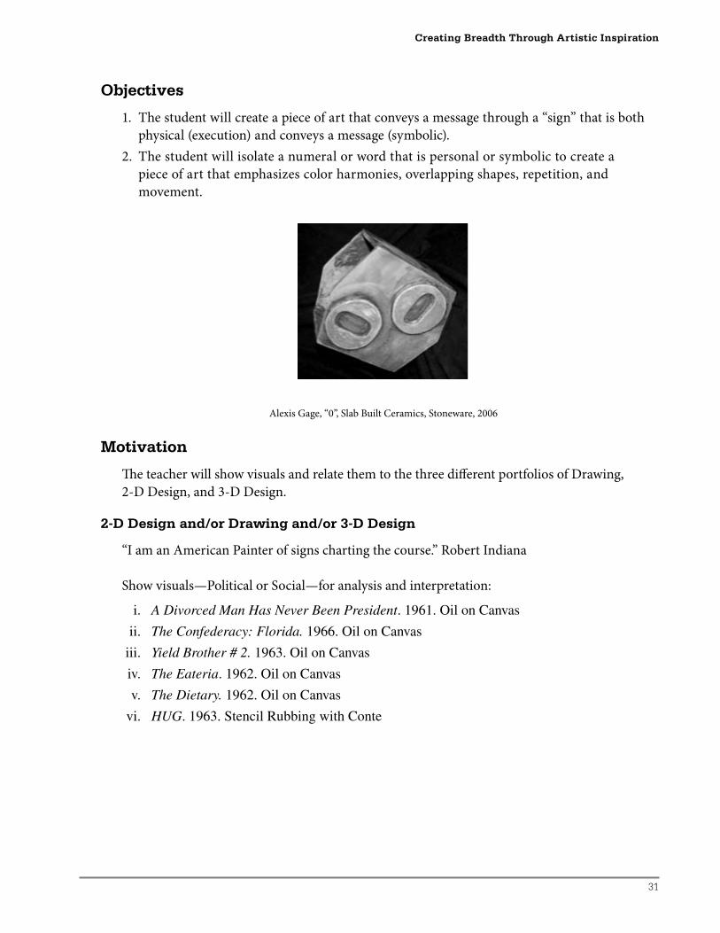
Objectives
1. The student will create a piece of art that conveys a message through a “sign” that is both
physical (execution) and conveys a message (symbolic).
2. The student will isolate a numeral or word that is personal or symbolic to create a
piece of art that emphasizes color harmonies, overlapping shapes, repetition, and
movement.
Alexis Gage, “0”, Slab Built Ceramics, Stoneware, 2006
Motivation
Th e teacher will show visuals and relate them to the three diff erent portfolios of Drawing,
2-D Design, and 3-D Design.
2-D Design and/or Drawing and/or 3-D Design
“I am an American Painter of signs charting the course.” Robert Indiana
Show visuals—Political or Social—for analysis and interpretation:
i. A Divorced Man Has Never Been President. 1961. Oil on Canvas
ii. The Confederacy: Florida. 1966. Oil on Canvas
iii. Yield Brother # 2. 1963. Oil on Canvas
iv. The Eateria. 1962. Oil on Canvas
v. The Dietary. 1962. Oil on Canvas
vi. HUG. 1963. Stencil Rubbing with Conte
Creating Breadth Through Artistic Inspiration
32
Special Focus: Breadth in the AP Portfolio
2-D Design and/or Drawing
“When I did that painting, I had no idea its theme would occupy most of my life.” Robert Indiana
Show visuals—American Dream—for analysis and interpretation:
i. The American Dream. 1960–61. Oil on Canvas
ii. The Demuth American Dream #5. 1963. Oil on Canvas
iii. American Dream. 1986. Etching, Aquatint, Drypoint, and Stencil
iv. The Golden Future of America.1976. Serigraph
3-D Design
“I thought of myself as a painter and a poet and became a sculptor because the potential raw
materials were lying outside my studio door.” Robert Indiana
Show visuals and discuss design, materials, and symbolism:
i. Floats and set designs a. Freedom Float (show sides of the fl oat). 1976. Papiers Colles b. The Mother of All. 1976. Papiers Colles
ii. Sculpture—with corresponding painting or graphic print a. LOVE. 1966. Aluminum/LOVE. 1966 Oil on Canvas/AHAVA. 1977. b. ART. 1972. Polychrome Aluminum/ART. 1972. Oil on Canvas
Additional images for discussion as needed:
Class Image Resource Text: Weinhardt, Carl J. Jr. (1990). Robert Indiana. New York: Harry N. Abrams Inc. Publishers. ISBN 0-8109-1116-7.
Group of Twelve Constructions. C.1960
Four Winds. 1964. Lithograph
Parrot. 1967. Acrylic on Canvas
Jesus Saves. 1969-70. Oil on Canvas
Th e American LOVE Wall. 1972. Oil on Canvas
Decade: Autoportrait 1961. 1972. Oil on Canvas
Picasso. 1974. Oil on Canvas
Mother of Exiles. 1986. Etching and Aquatint
LOVE Wall. 1988. Oil on Canvas
Aft er class discussions, students will make three sketches for their projects incorporating
design elements as found in the works of Robert Indiana. Th e sketches should emphasize
a “sign” aspect, isolate a number or text, and incorporate personal symbolic meaning.
Considerations include use of color, overlapping shapes, repetition, movement, stencil motifs,
and positive/negative space. Considerations should also be made regarding media used to
execute the project, i.e., silkscreen, colored pencil, collage, digital, or mixed media. Sketches
should be critiqued individually with the teacher and as a class. Critical conversations should
be ongoing during the project execution and terminate with a fi nal critique.
33
Vivian Moreira Komando, Peace, Digital Image/Class Exemplar, 2006 (4 peace symbols)
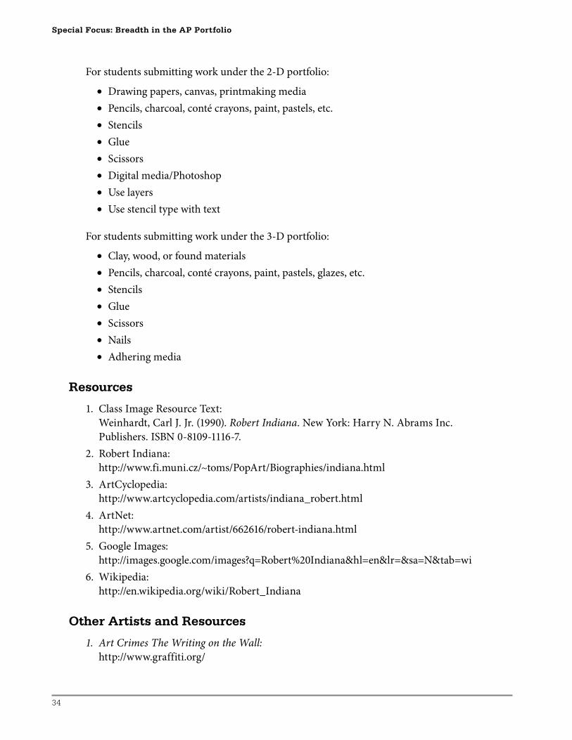
Vivian Moreira Komando, Paz, Digital Image/Class Exemplar, 2006, (3 peace symbols)
Materials
For students submitting work under the Drawing portfolio:
• Drawing papers, canvas
• Mark-making media—pencils, charcoal, conte’ crayons, paint, pastels, etc.
• Stencils
Creating Breadth Through Artistic Inspiration
34
Special Focus: Breadth in the AP Portfolio
For students submitting work under the 2-D portfolio:
• Drawing papers, canvas, printmaking media
• Pencils, charcoal, conté crayons, paint, pastels, etc.
• Stencils
• Glue
• Scissors
• Digital media/Photoshop
• Use layers
• Use stencil type with text
For students submitting work under the 3-D portfolio:
• Clay, wood, or found materials
• Pencils, charcoal, conté crayons, paint, pastels, glazes, etc.
• Stencils
• Glue
• Scissors
• Nails
• Adhering media
Resources
1. Class Image Resource Text:
Weinhardt, Carl J. Jr. (1990). Robert Indiana. New York: Harry N. Abrams Inc.
Publishers. ISBN 0-8109-1116-7.
2. Robert Indiana:
http://www.fi.muni.cz/~toms/PopArt/Biographies/indiana.html
3. ArtCyclopedia:
http://www.artcyclopedia.com/artists/indiana_robert.html
4. ArtNet:
http://www.artnet.com/artist/662616/robert-indiana.html
5. Google Images:
http://images.google.com/images?q=Robert%20Indiana&hl=en&lr=&sa=N&tab=wi
6. Wikipedia:
http://en.wikipedia.org/wiki/Robert_Indiana
Other Artists and Resources
1. Art Crimes The Writing on the Wall:
http://www.graffiti.org/
35
2. Mel Bochner:
http://www.google.com/search?hl=en&lr=&q=MEL+BOCHNER
3. Jenny Holzer:
http://www.google.com/search?hl=en&sa=X&oi=spell&resnum=0&ct=result&cd=1&q=Je
nny+Holzer&spell=1
4. Jasper Johns:
http://www.google.com/search?hl=en&q=jasper+Johns&btnG=Google+Search
5. Barbara Kruger:
http://www.google.com/search?hl=en&lr=&q=Barbara+Kruger
6. Text Based Art/ASCII:
http://www.princetononline.com/groups/iad/links/ascii.html
Vocabulary
A. Aesthetics: Artistic sensibility, having a heightened sensitivity to beauty.
B. Harmony: Refers to a way of combining elements of art to accent their similarities and combine the parts into a whole.
C. Unity: The quality of wholeness or oneness that is achieved through the effective use of the elements and principles of design.
D. Balance: Proportion of parts or areas in a design arranged to create a feeling of stability in a work.
E. Positive Space: Filled space; a dominant area.
F. Negative Space: Empty space; a subordinate area.
G. Overlapping: Layers, placement over or under.
H. Symbolism: Rejection of the purely visual; to use symbols for underlying meaning.
I. Stencil: Template, design cut from stiff paper in order to reproduce a design.
References for Terms
1. ArtLex Art Dictionary - http://www.artlex.com/
2. Dictionary - http://www.dictionary.com
Evaluation
Using the following criteria for grading purposes, students will:
1. Instill personal symbolic meaning to work created.
2. Participate in class discussions, analyses, and critiques.
3. Analyze compositional design elements and principles (class discussion and/or
comments in art journal).
4. Draw three preliminary sketches for project execution.
Creating Breadth Through Artistic Inspiration
36
Special Focus: Breadth in the AP Portfolio
5. Critique project designs with teacher.
6. Select one design after the critique for the project.
7. Use appropriate media for project execution according to which AP Studio Art portfolio
work will be submitted.
8. Incorporate elements into their own work as analyzed in the work of Robert Indiana
(synthesis).
9. Construct a piece that possesses aesthetic sensibility.
10. Construct a piece that has incorporated harmony, unity, and balance.
11. Demonstrate mastery of technique and craftsmanship.
12. Partake in final class critique.
AP Rubric/Breadth
Th e student demonstrates accomplishment in a variety of forms, materials, techniques, and
content.
http://www.collegeboard.com/prod_downloads/ap/students/studioart/ap04_sg_studioart.pdf
Score of 6: EXCELLENT BREADTH
• Th e works address a wide range of design issues and is of excellent quality.
• Th e works demonstrate active, successful engagement with principles of design.
• Th e works show inventiveness or originality.
• Th e works use the elements and principles in sensitive or evocative ways.
• Materials are used well.
• Color is used with confi dence.
Score of 5: STRONG BREADTH
• Th e works address a range of design issues.
• Th e quality of the works is strong.
• Th e works demonstrate an active engagement with principles of design, although there
may be inconsistencies in the degree of success.
• Most works go beyond the level of design exercises.
• Some works demonstrate successful experimentation and/or risk-taking.
• Th e use of materials is appropriate to the problems addressed and technique is generally
strong.
• Th e link between form and content is strong.
• Th e works show a strong understanding of color theory.
37
Score of 4: GOOD BREADTH
• Works show engagement with design issues.
• Degree of success in solving design problems may vary.
• Range of design problems may be somewhat limited.
• Range of design problems may be very limited, despite strong to excellent quality.
• Works may appear as successful solutions to design exercises, but not go beyond
that level.
• Works may demonstrate experimentation or risk-taking with varying degrees of
success.
• Technique and use of materials show an emerging sense of competence.
• Works show an awareness of color theory.
• Th ere is some relationship between form and content.
URGE students with work at or below Level Th ree on the rubric to resubmit work with
corrections that moves the artwork into the 4, 5, or 6 range.
Formative Assessment and Adaptability
To meet the learning needs of each student:
1. Monitor student progress.
2. Allow flexibility that meets the learning style of the individual student.
3. Assess students’ learning to use for instructional purposes as the lesson progresses.
4. Allow approaches from personal viewpoints and unique perspectives.
Creating Breadth Through Artistic Inspiration
38
Special Focus: Breadth in the AP Portfolio
Homelessness
Barry Lucy
Lesson Plan
Persons who are homeless are simultaneously ubiquitous and invisible. Students are asked
to investigate the homeless situation locally and globally, research possible solutions, and
prepare visual, textual, and oral conversations from independent research and personal
perspectives. Th ese research-based conversations are expected to be able to move across the
Breadth section in all three AP Studio Art portfolios. Students are asked to create a visual
response to the plight of homeless populations in our communities.
Specifi cally, in the Breadth sections for the three portfolios, students were asked to respond
to the experience of homelessness from as personal a perspective as possible in discussions
of their own personal encounters with homeless people in their own and other communities.
Of particular concern for us were the homeless children sheltered at the Jardin de los Niños
in Las Cruces, New Mexico. For additional inspiration, I shared my own experience of
meeting a homeless person living at the back of a stage in an unused concert shell in East
River Park in New York City, New York. We also discussed the idea of shells as shell-ters,
etymologically:
Shell (n.) O.E. sciell, scill, Anglian scell “seashell, eggshell,” related to O.E. scealu “shell, husk,” Meaning “structure for a band or orchestra” is attested from 1938. (etymonline.com)
Shelter (n.) 1585, “structure affording protection,” possibly an alteration of M.E. sheltron, sheldtrume “roof or wall formed by locked shields,” meaning “temporary lodging for homeless poor” is first recorded 1890 in Salvation Army jargon.
Sheltered “protected from the usual hardships of life” is from 1888. (etymonline.com)
Alternative approaches to presenting the impact of homelessness might include written
or taped interviews with shelter residents, case workers or volunteers, and peer-shared,
traditional, or Web-based research data.
References
Outsiders and Others Gallery, Homeless Awareness Show, Minneapolis, MN.
El Jardin de los Niños, Homeless Children’s Shelter, Las Cruces, NM.
Simon, Paul, and Ladysmith Black Mambazo. (1986). “Homeless,” in Graceland. Sound recording.
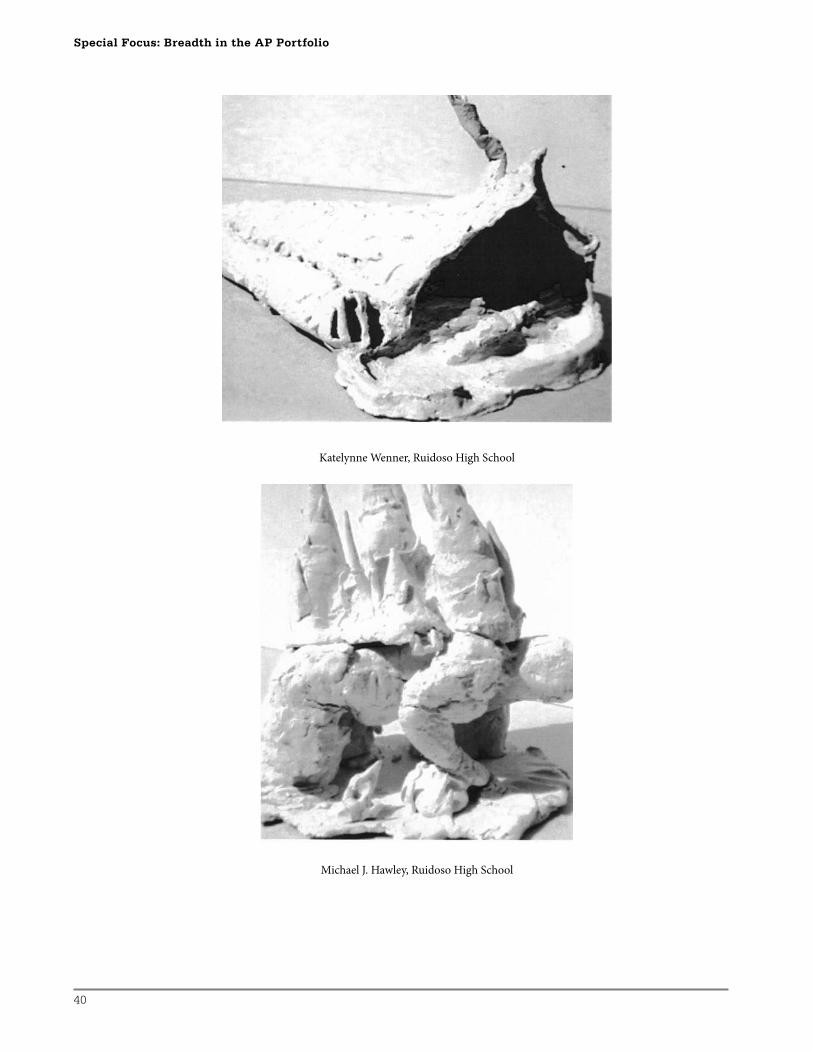
3-D Breadth
Th e 3-D portfolio Breadth problem was to incorporate spatial and textural elements in
a sculpture-as-shelter. Students were asked to research and brainstorm traditional and
39
contemporary ideas about architectural and natural spaces as shelters before preparing
sketches of their designs. Specifi c emphasis was placed on the principles of containing
space and the container itself, as well as the textural and tactile qualities of the medium of
paperclay.
Process
Students were required to do a series of thumbnail preparatory sketches for their sculptures
before mixing their paperclay and constructing their ideas. Emphasis was placed on
the elements and principles of occupied and unoccupied space and texture in their
constructions. Finalized sculptures were fi red unglazed to further emphasize the spatial and
textural elements. Th e recipe for paperclay is as follows:
Fabrication of paperclay includes equal parts toilet paper pulp to sloppy clay (clay too wet to be hand-workable). Any earthenware, raku, or stoneware clay body will do. To prepare, blend toilet paper scraps and enough warm water to make toilet paper smooth and mix with an equal amount by approximate weight of sloppy clay. Pug this mixture by hand until relatively homogeneous. The cellulose fibers of the paper serve to strengthen the mixture, retard shrinkage when dry, and burn out easily when fired. The paperclay mixture can be poured onto a cafeteria tray or plaster bat for drying, then cut and cemented with some reserved sloppy paperclay (wet on dry) to create slab constructions, or kept at a wedgeable stage and coiled or used in other hand-building techniques. Damp paperclay may be stored in plastic sealable bags, but note that refrigeration will prevent decomposition of the paper fibers and the accompanying odor.
Formative Assessment
Might include, but not be limited to:
• Th umbnail sketches
• Paperclay fabrication
• Degree of construction technique and craft smanship
• One-on-one, in-process conversations
• Individual and group critique
• References to journal
Summative Assessment
Final, rubrics-based, peer/instructor assessment. A keyword mini-rubric (see page 44)
based on the College Board Scoring Guidelines for AP Studio Art portfolios was used, and
discrepancies in peer scoring of over two discriminate scores were resolved by discussion
and instructor guidance (see rubrics at: http://apcentral.collegeboard.com/apc/public/
repository/_ap06_studioart_sg.pdf).
Homelessness
40
Special Focus: Breadth in the AP Portfolio
Katelynne Wenner, Ruidoso High School
Michael J. Hawley, Ruidoso High School
41
2-D Breadth
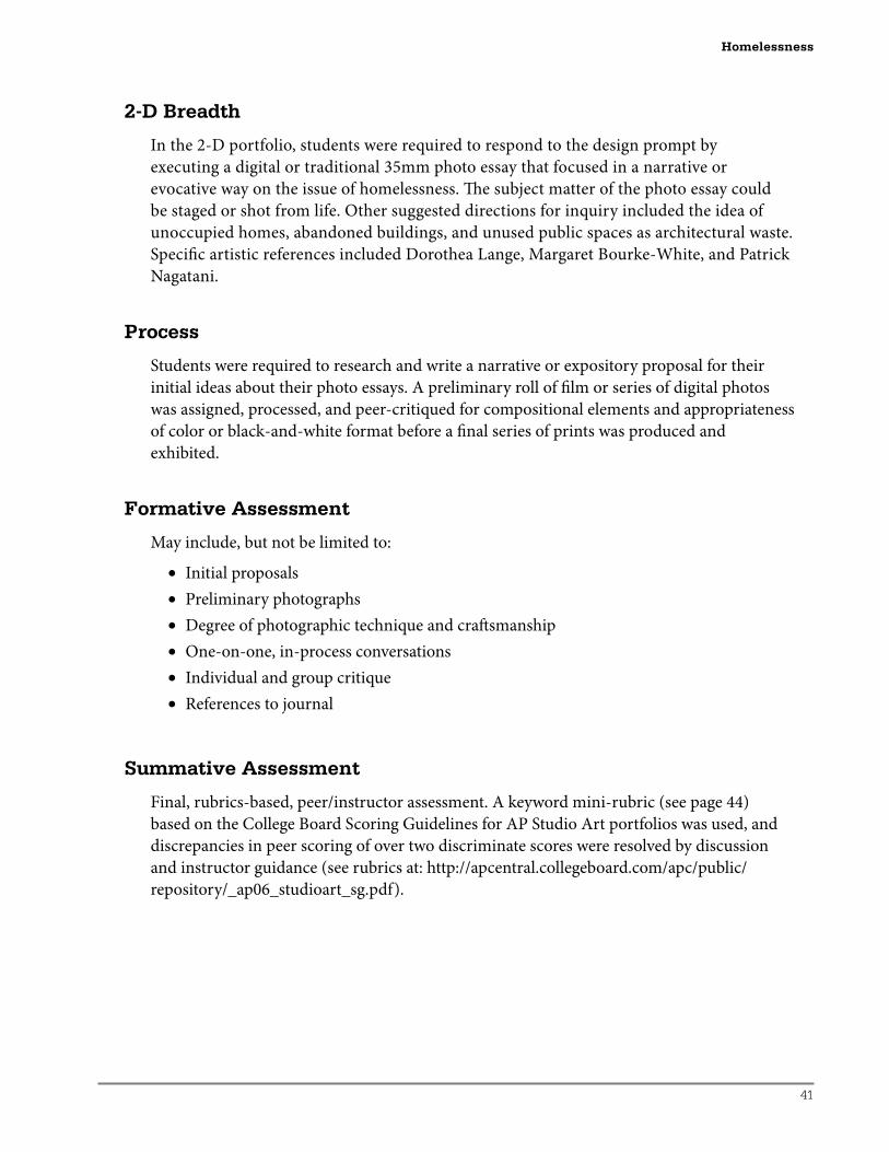
In the 2-D portfolio, students were required to respond to the design prompt by
executing a digital or traditional 35mm photo essay that focused in a narrative or
evocative way on the issue of homelessness. Th e subject matter of the photo essay could
be staged or shot from life. Other suggested directions for inquiry included the idea of
unoccupied homes, abandoned buildings, and unused public spaces as architectural waste.
Specifi c artistic references included Dorothea Lange, Margaret Bourke-White, and Patrick
Nagatani.
Process
Students were required to research and write a narrative or expository proposal for their
initial ideas about their photo essays. A preliminary roll of fi lm or series of digital photos
was assigned, processed, and peer-critiqued for compositional elements and appropriateness
of color or black-and-white format before a fi nal series of prints was produced and
exhibited.
Formative Assessment
May include, but not be limited to:
• Initial proposals
• Preliminary photographs
• Degree of photographic technique and craft smanship
• One-on-one, in-process conversations
• Individual and group critique
• References to journal
Summative Assessment
Final, rubrics-based, peer/instructor assessment. A keyword mini-rubric (see page 44)
based on the College Board Scoring Guidelines for AP Studio Art portfolios was used, and
discrepancies in peer scoring of over two discriminate scores were resolved by discussion
and instructor guidance (see rubrics at: http://apcentral.collegeboard.com/apc/public/
repository/_ap06_studioart_sg.pdf).
Homelessness
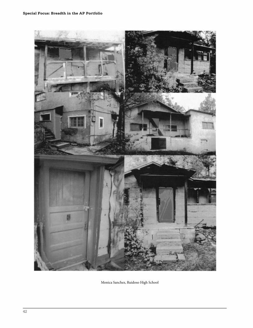
42
Special Focus: Breadth in the AP Portfolio
Monica Sanchez, Ruidoso High School

43
Drawing Breadth
In the Drawing portfolio, students were asked to respond to the issue of homelessness by
creating a drawing based on a collaborative still life they had arranged in a shopping cart.
Still life items were to include one item per student that they felt would be essential for their
survival if they were to fi nd themselves homeless. Discussions prior to execution of the
drawing included the student’s choice of media and ground (surface) and revolved around
the projection of events that could culminate in a state of homelessness.
Process
Possible compositional layouts were sketched in thumbnails before proceeding to the actual
drawing. Sample gradation scales were also assigned, with emphasis on media and ground
appropriate to the nature of the subject. Students were asked to consider using drawing
materials and surfaces that would be available to a homeless artist. Suggested possibilities
included but were not limited to charcoal briquettes, earth pigments, Skittles, cardboard, and
scrap paper bags.
Formative Assessment
May include, but not be limited to:
• Participation in collaborative still life setup
• Initial thumbnails and media brainstorming
• Midpoint critique
• One-on-one, in-process conversations
• Individual and group critique
• References to journal
Summative Assessment
Final, rubrics-based, peer/instructor assessment. A keyword mini-rubric (see page 44)
based on the College Board Scoring Guidelines for AP Studio Art portfolios was used, and
discrepancies in peer scoring of over two discriminate scores were resolved by discussion
and instructor guidance (see rubrics at: http://apcentral.collegeboard.com/apc/public/
repository/_ap06_studioart_sg.pdf).
Homelessness
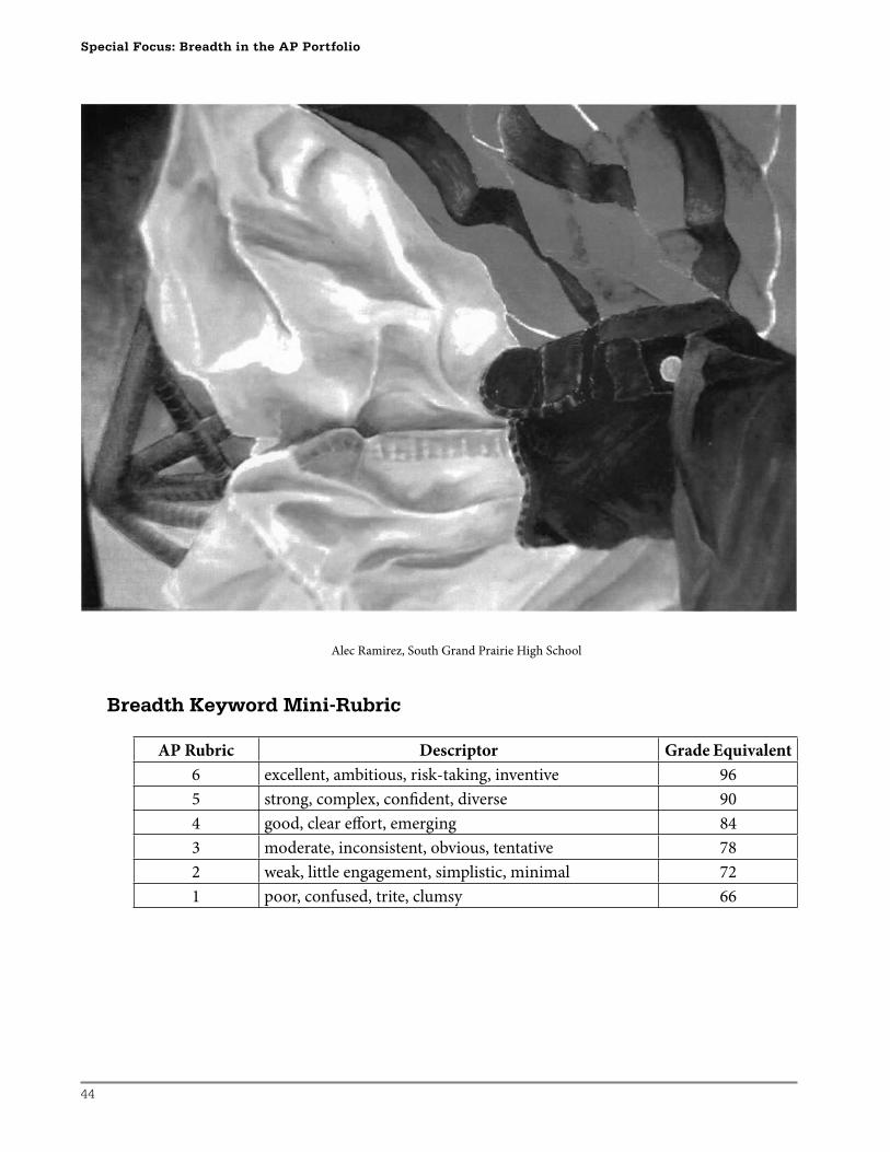
44
Special Focus: Breadth in the AP Portfolio
Alec Ramirez, South Grand Prairie High School
Breadth Keyword Mini-Rubric
AP Rubric Descriptor Grade Equivalent
6 excellent, ambitious, risk-taking, inventive 96
5 strong, complex, confi dent, diverse 90
4 good, clear eff ort, emerging 84
3 moderate, inconsistent, obvious, tentative 78
2 weak, little engagement, simplistic, minimal 72
1 poor, confused, trite, clumsy 66
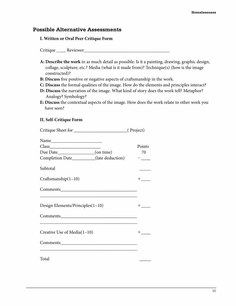
45
Possible Alternative Assessments
I. Written or Oral Peer Critique Form
Critique ____ Reviewer_____________________________________
A: Describe the work in as much detail as possible: Is it a painting, drawing, graphic design,
collage, sculpture, etc.? Media (what is it made from)? Technique(s) (how is the image
constructed)?
B: Discuss fi ve positive or negative aspects of craft smanship in the work.
C: Discuss the formal qualities of the image. How do the elements and principles interact?
D: Discuss the narration of the image. What kind of story does the work tell? Metaphor?
Analogy? Symbology?
E: Discuss the contextual aspects of the image. How does the work relate to other work you
have seen?
II. Self-Critique Form
Critique Sheet for _______________________( Project)
Name______________________
Class______________________ Points
Due Date________________(on time) 70
Completion Date__________(late deduction) �____
Subtotal _____
Craft smanship(1–10) �____
Comments_________________________________
__________________________________________
Design Elements/Principles(1–10) �____
Comments_________________________________
__________________________________________
Creative Use of Media(1–10) �____
Comments_________________________________
__________________________________________
Total _____
Homelessness
46
Special Focus: Breadth in the AP Portfolio
Images: Lost and Found
Barbara Ann Sunday
Lesson Plan
On a variety of levels, the notion of “lost and found” can have both powerful and individual
meaning for teenagers. In this lesson series, students are asked to observe specifi c objects,
employ guided image development strategies, and fi nd personal visual solutions. Th ey are
encouraged to go beyond observation in developing personal ideation. Th e intent of each of
these lessons is to build student confi dence in dealing with issues and problems pertinent to
the Breadth section of each of the three AP Studio Art portfolios.
Drawing Breadth:Lost-and-Found Images—A Focus on Elaboration/Omission
Th is sequence strikes at the central issues of “drawing as mark-making.” I have found that this
strategy increases student awareness and confi dence in using elaboration in drawing. Th e ability
to use elaboration in a subtle way is an indicator of quality in drawing. It not only leads to viewer
engagement, it also provides insight into what the student has been thinking and discovering
as the work develops. While a successful result from this plan will contribute to a Breadth
collection, this plan can be extended to provide a stimulus for a Concentration development.
Instructional Goals
Th e student will:
• Explore a range of mark-making techniques while creating a drawing based on
observation of a hand tool.
• Employ lost and found edges as an image development strategy.
• Explore forms of elaboration in the ideation process.
Supplies/Budget Concerns
• 18'' � 24'' or larger sheets of white or neutral drawing paper that has a rough surface.
Large sheets of manila are good for this, charcoal paper is ideal, and newsprint will
work. 24'' � 36'' sheets folded in half avoids the continual use of fi xative, as the folded
surface serves as protection while work is under way. Also, the rectangular format is
very complementary to the production of slides.
• Conté crayon, charcoal, and/or chalk pastels in neutral shades and black
• Sketchbook
• A collection of various hand tools such as kitchen gadgets, woodworking, or garden-
ing implements. Old and used tools that tend to have more character are good for this.
Th ose which have several positions in use such as an egg beater or a vise are excellent.
Students might be asked to collect these ahead of time.
47
Reference
• Examples of the work of Jim Dine, such as his tool series or paintbrush images, provide
an excellent resource for this approach. For appropriate images, search for his name on
the Web or locate some of the many publications containing reproductions of his work.
Th rough discussion, students identify examples of lost-and-found edges and speculate
on how the many layers of images might have been created.
Introduction/Pre-Experience
In a sketchbook, students are asked to work nonfi guratively with dry media on a double-page
surface. Th ey are asked to see what the material will do when subjected to a variety of mark-
making techniques alone and in combination.
In these mark-making experiments, students are instructed to aim for maximum variety in
both putting down and taking up the dry media. Eraser blending, transferred texture, the use
of a mask, templates, and stencil techniques could be demonstrated to further increase the
range of possibilities and depth of knowledge. Student examples demonstrating repetition,
variation, lost-and-found edges, layering, animation, and viewpoint should be discussed and
shared.
Development of Project
1. On an 18'' � 24'' sheet of rough drawing paper, students are advised to draw a 1'' border
around the format. The finished work will be two inches smaller than the paper. This
will allow for mounting or a tiny mat should this piece become a Quality AP Studio Art
portfolio piece.
2. Students are asked to select a tool and examine it to discover how it is to be held, used,
and moved to complete a task. On the paper, plan how the tool might be recorded.
Students are reminded of ideation strategies that they might employ to complete this
work. Because they are particularly relevant to this project, ideation strategies such as
magnification, placement, repetition, viewpoint, and superimposition should be reviewed
at this point. By taking the time to do this, students are sensitized to the kinds of choices
and decisions they can make, as well as the differing results that can be anticipated.
3. Students are advised to lightly record the basic shape and begin to play with negative
and positive space and consider repeated views or positions. Students are reminded
to revisit the experimental page in the sketchbook to search for appropriate mark-
making techniques to apply to various areas of the composition. A sense of movement
or animation might be achieved as students elaborate on exterior and interior space to
complete a composition.
4. Students are asked to plan to let the mark-making take over to blur and then refine
the image. If the tool has a variety of positions, angles, and viewpoints, these might be
superimposed in a lost-and-found manner.
Images: Lost and Found
48
Special Focus: Breadth in the AP Portfolio
Variations for Differentiated Instruction
1. Reference to the work of Jim Dine might be introduced very early on in this project to
assist students who learn best when examples are discussed. However, some students
might find the reference most useful at a mid-project development stage when a personal
mark-making vocabulary has become stale, while others might benefit most from this
reference nearing the end of the finished piece.
2. Students who are reluctant to initiate the project can be encouraged by the fact that the
dry marks can be made very lightly at first. In addition, they can be moved and managed
once they are applied.
3. Students who find the subject overwhelming can be encouraged to get started by
asking them to record just a small portion of the tool in a magnified view. They can be
instructed to perhaps select just the most important part.
4. Students will evidence various levels of mark-making confidence when it comes to
showing variety. Some students will have a natural grasp of the idea and make excellent
choices in matching marks to image development, while others may have difficulty in
translating the verbal directions into a range of mark-making. For these students, success
in evidencing variety can be achieved with a greater reliance on physical techniques. For
example, they can be shown that a range of marks can be acquired in both negative and
positive areas by the use of texture transfer. At the simplest level, texture can be acquired
by placing the drawing paper on a textural surface such as a grill, wire mesh, or burlap
fabric and rubbing areas of the desired texture into selected portions of the image. Also,
a template might be created. For example, a zig-zag edge on a piece of cardboard can be
used as a stencil to repeat, echo, and elaborate in recording the edge of a saw.
5. Some students achieve great success in this simply by using their hands and fingertips to
achieve a range of marks. The application of dry media can be likened to the application
of facial make-up with smooth transitions and areas with lots of contrast.
6. A few students might be ready for an additional challenge in completing this project,
while others may benefit from the creation of a series of related pieces. Providing an
engaging extension for individual students might be a result of asking questions such as:
— Might certain hand tools be selected and placed in order to metaphorically become a “lost-and-found” portrait of a specifi c person?
— Could images of implements be transformed to convey a work ethic, love of a job, or a passion for a skill/hobby?
— Is it possible to evoke a sense of a work site or an industrial change, or to commemorate an event through recordings of hand tools?
Formative Assessment Checklist
As students initiate the project, they will need to be reminded to:
• Describe the direction of marks within a format.
• Identify a suitable, focal point location.
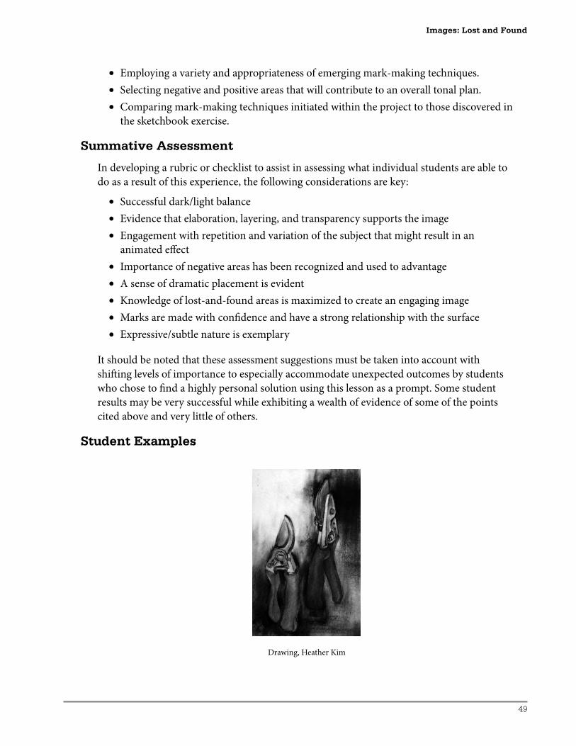
49
• Employing a variety and appropriateness of emerging mark-making techniques.
• Selecting negative and positive areas that will contribute to an overall tonal plan.
• Comparing mark-making techniques initiated within the project to those discovered in
the sketchbook exercise.
Summative Assessment
In developing a rubric or checklist to assist in assessing what individual students are able to
do as a result of this experience, the following considerations are key:
• Successful dark/light balance
• Evidence that elaboration, layering, and transparency supports the image
• Engagement with repetition and variation of the subject that might result in an
animated eff ect
• Importance of negative areas has been recognized and used to advantage
• A sense of dramatic placement is evident
• Knowledge of lost-and-found areas is maximized to create an engaging image
• Marks are made with confi dence and have a strong relationship with the surface
• Expressive/subtle nature is exemplary
It should be noted that these assessment suggestions must be taken into account with
shift ing levels of importance to especially accommodate unexpected outcomes by students
who chose to fi nd a highly personal solution using this lesson as a prompt. Some student
results may be very successful while exhibiting a wealth of evidence of some of the points
cited above and very little of others.
Student Examples
Drawing, Heather Kim
Images: Lost and Found
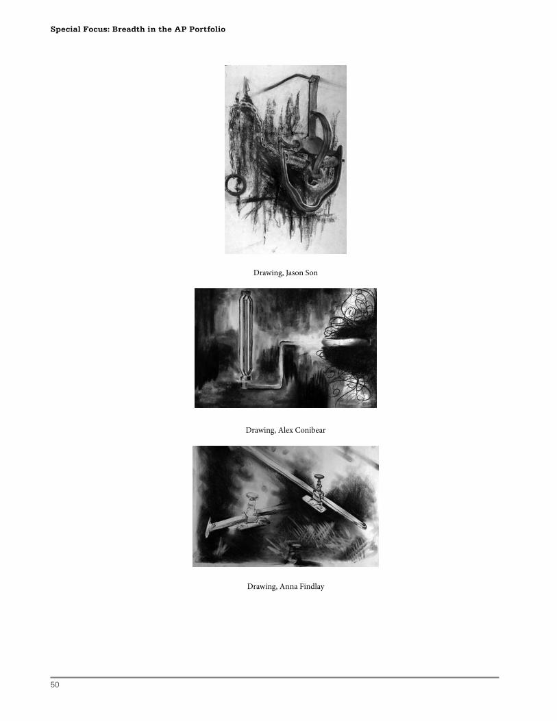
50
Special Focus: Breadth in the AP Portfolio
Drawing, Jason Son
Drawing, Alex Conibear
Drawing, Anna Findlay
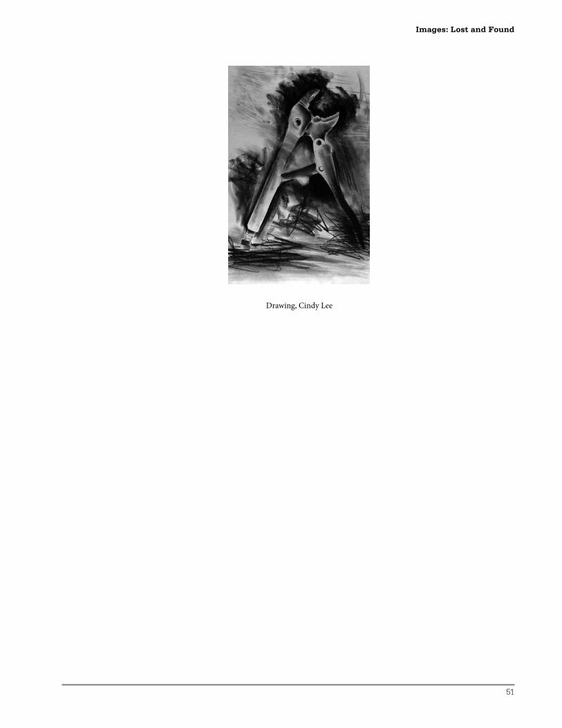
51
Drawing, Cindy Lee
Images: Lost and Found
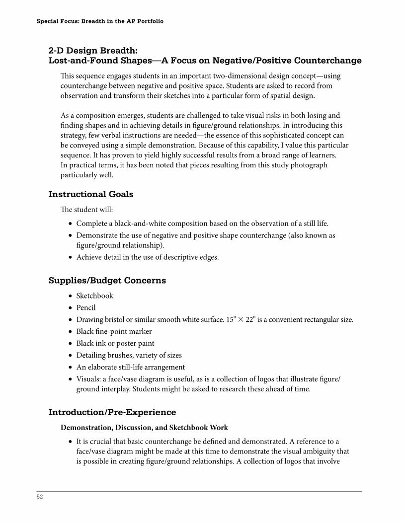
52
Special Focus: Breadth in the AP Portfolio
2-D Design Breadth:Lost-and-Found Shapes—A Focus on Negative/Positive Counterchange
Th is sequence engages students in an important two-dimensional design concept—using
counterchange between negative and positive space. Students are asked to record from
observation and transform their sketches into a particular form of spatial design.
As a composition emerges, students are challenged to take visual risks in both losing and
fi nding shapes and in achieving details in fi gure/ground relationships. In introducing this
strategy, few verbal instructions are needed—the essence of this sophisticated concept can
be conveyed using a simple demonstration. Because of this capability, I value this particular
sequence. It has proven to yield highly successful results from a broad range of learners.
In practical terms, it has been noted that pieces resulting from this study photograph
particularly well.
Instructional Goals
Th e student will:
• Complete a black-and-white composition based on the observation of a still life.
• Demonstrate the use of negative and positive shape counterchange (also known as
fi gure/ground relationship).
• Achieve detail in the use of descriptive edges.
Supplies/Budget Concerns
• Sketchbook
• Pencil
• Drawing bristol or similar smooth white surface. 15'' � 22'' is a convenient rectangular size.
• Black fi ne-point marker
• Black ink or poster paint
• Detailing brushes, variety of sizes
• An elaborate still-life arrangement
• Visuals: a face/vase diagram is useful, as is a collection of logos that illustrate fi gure/
ground interplay. Students might be asked to research these ahead of time.
Introduction/Pre-Experience
Demonstration, Discussion, and Sketchbook Work
• It is crucial that basic counterchange be defi ned and demonstrated. A reference to a
face/vase diagram might be made at this time to demonstrate the visual ambiguity that
is possible in creating fi gure/ground relationships. A collection of logos that involve
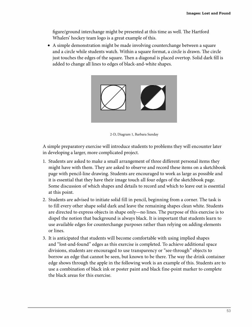
53
fi gure/ground interchange might be presented at this time as well. Th e Hartford
Whalers’ hockey team logo is a great example of this.
• A simple demonstration might be made involving counterchange between a square
and a circle while students watch. Within a square format, a circle is drawn. Th e circle
just touches the edges of the square. Th en a diagonal is placed overtop. Solid dark fi ll is
added to change all lines to edges of black-and-white shapes.
2-D, Diagram 1, Barbara Sunday
A simple preparatory exercise will introduce students to problems they will encounter later
in developing a larger, more complicated project.
1. Students are asked to make a small arrangement of three different personal items they
might have with them. They are asked to observe and record these items on a sketchbook
page with pencil-line drawing. Students are encouraged to work as large as possible and
it is essential that they have their image touch all four edges of the sketchbook page.
Some discussion of which shapes and details to record and which to leave out is essential
at this point.
2. Students are advised to initiate solid fill in pencil, beginning from a corner. The task is
to fill every other shape solid dark and leave the remaining shapes clean white. Students
are directed to express objects in shape only—no lines. The purpose of this exercise is to
dispel the notion that background is always black. It is important that students learn to
use available edges for counterchange purposes rather than relying on adding elements
or lines.
3. It is anticipated that students will become comfortable with using implied shapes
and “lost-and-found” edges as this exercise is completed. To achieve additional space
divisions, students are encouraged to use transparency or “see-through” objects to
borrow an edge that cannot be seen, but known to be there. The way the drink container
edge shows through the apple in the following work is an example of this. Students are to
use a combination of black ink or poster paint and black fine-point marker to complete
the black areas for this exercise.
Images: Lost and Found
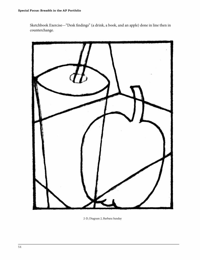
54
Special Focus: Breadth in the AP Portfolio
Sketchbook Exercise—“Desk fi ndings” (a drink, a book, and an apple) done in line then in
counterchange.
2-D, Diagram 2, Barbara Sunday
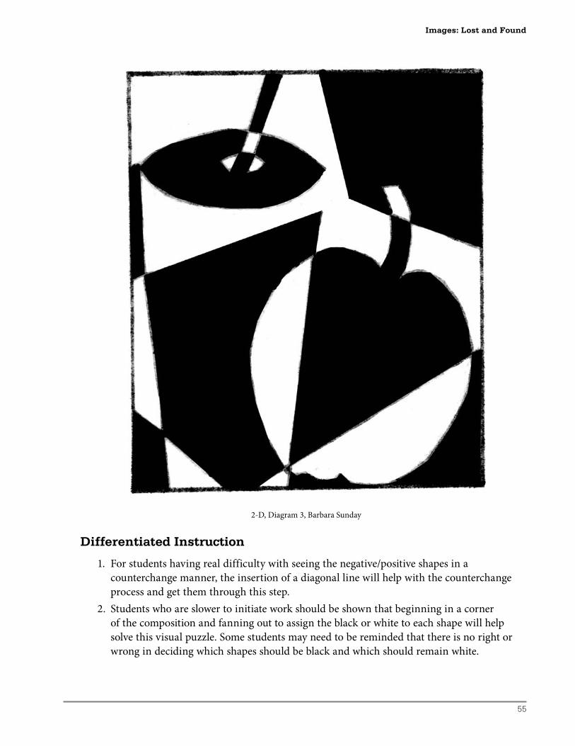
55
2-D, Diagram 3, Barbara Sunday
Differentiated Instruction
1. For students having real difficulty with seeing the negative/positive shapes in a
counterchange manner, the insertion of a diagonal line will help with the counterchange
process and get them through this step.
2. Students who are slower to initiate work should be shown that beginning in a corner
of the composition and fanning out to assign the black or white to each shape will help
solve this visual puzzle. Some students may need to be reminded that there is no right or
wrong in deciding which shapes should be black and which should remain white.
Images: Lost and Found
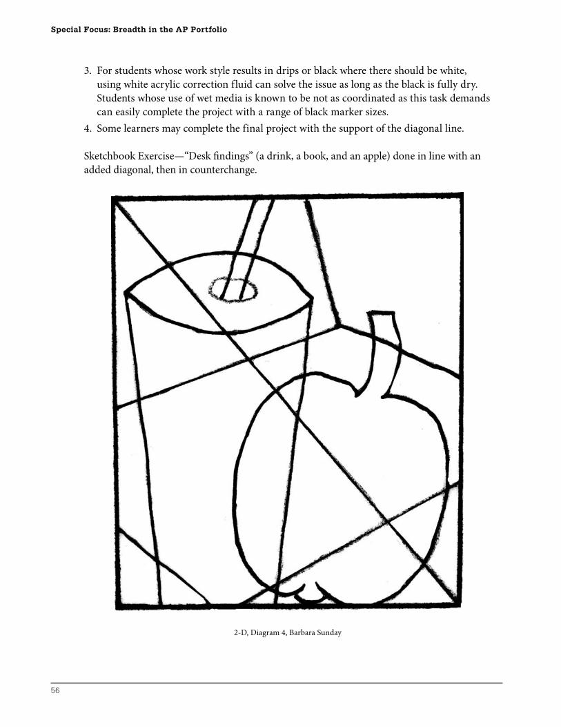
56
Special Focus: Breadth in the AP Portfolio
3. For students whose work style results in drips or black where there should be white,
using white acrylic correction fluid can solve the issue as long as the black is fully dry.
Students whose use of wet media is known to be not as coordinated as this task demands
can easily complete the project with a range of black marker sizes.
4. Some learners may complete the final project with the support of the diagonal line.
Sketchbook Exercise—“Desk fi ndings” (a drink, a book, and an apple) done in line with an
added diagonal, then in counterchange.
2-D, Diagram 4, Barbara Sunday
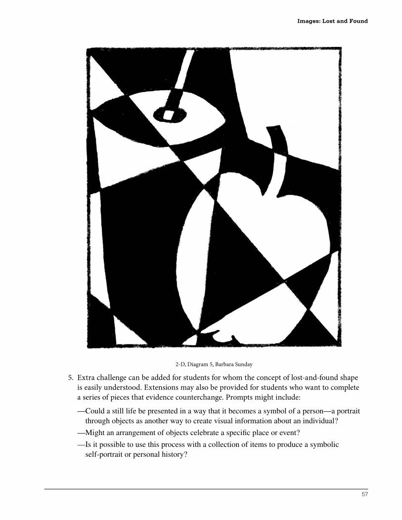
57
2-D, Diagram 5, Barbara Sunday
5. Extra challenge can be added for students for whom the concept of lost-and-found shape
is easily understood. Extensions may also be provided for students who want to complete
a series of pieces that evidence counterchange. Prompts might include:
— Could a still life be presented in a way that it becomes a symbol of a person—a portrait through objects as another way to create visual information about an individual?
—Might an arrangement of objects celebrate a specifi c place or event?
— Is it possible to use this process with a collection of items to produce a symbolic self-portrait or personal history?
Images: Lost and Found
58
Special Focus: Breadth in the AP Portfolio
Development
• Again in the sketchbook, students are asked to use a viewfi nder through which to
examine a still-life arrangement that has been installed in the classroom. Students are
asked to select and zero-in on a portion of the arrangement that is found to be visually
interesting. Th ey are advised to have a focal point that is not right in the middle and to
consider which forms touch all four edges of their chosen view. Students are required
to record six thumbnail ideas in this manner in 3'' � 4'' formats in the sketchbook.
Th is is done with pencil and clean line—every line describing an enclosed shape. Each
minicomposition should have a good variety of forms evident and have a focal point
that is not in a corner or in the geometrical center. Given these criteria, students are
asked to select the most successful composition and discuss it as a project plan for a
negative/positive development. Th e rectangular format approximates the proportions
not only of a slide but also of the shape of the AP portfolio should this project result in
an example of Quality for the AP presentation.
• Th e most successful plan for each student is then scaled up on a larger sheet of illustration
surface. With light pencil lines, students may have to refer back to the original still life for
details and edges. Working right up to and off all four edges of the paper is essential to
the success of this project. Students are then instructed to carefully shade out shapes that
they plan to fi ll with black in pencil and keep white shapes very clean and tidy.
• Th e problem to solve is in trying to express the entire composition in shape only—aiming
for no lines in the fi nal work. Th is may mean putting two black shapes adjacent to each
other, or losing a shape for a while and defi ning it later. It is anticipated that this will
lead to decisions about detail and ambiguity. Students are to be reminded that they have
opportunities to make personal choices and create lots of detail while establishing the
defi ning edges of objects. Students are asked to fi ll in the black as they did in the sketchbook
sample when they are confi dent that the design works. Small black spaces can be fi lled
with a fi ne-line marker. Larger spaces can be fi lled with fl at black paint or ink with an
appropriately sized brush.
Formative Assessment Checklist
When the scaled-up and pencil fi ll of the best plan is complete, students will need to be
reminded to:
• Identify that the image “reads” as a still-life composition.
• Compare the scaled-up version with the sketchbook work to identify and remedy areas
that are not visually successful.
• Apply a basic understanding of counterchange in using black-and-white shapes—few or
no lines are evident in the developed image.
• Identify the focal area and examine it for detail and suitable position.
• Compare 50 percent white, 50 percent black–with black in background/foreground and
white in background/foreground.
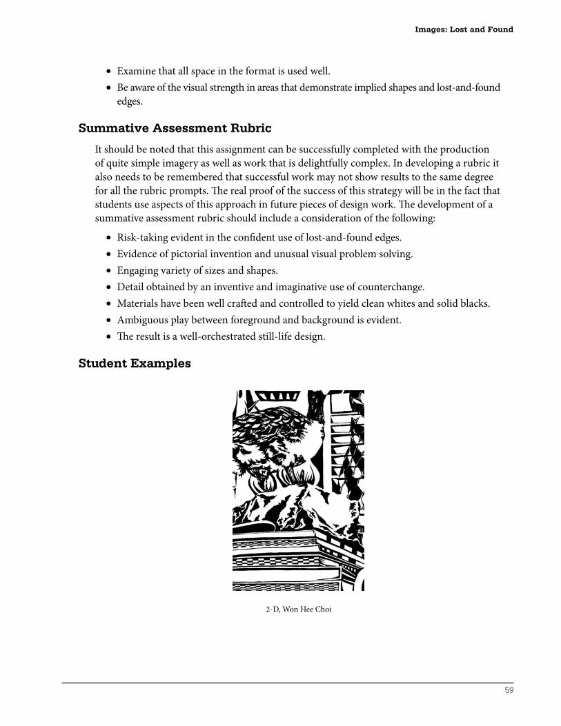
59
• Examine that all space in the format is used well.
• Be aware of the visual strength in areas that demonstrate implied shapes and lost-and-found
edges.
Summative Assessment Rubric
It should be noted that this assignment can be successfully completed with the production
of quite simple imagery as well as work that is delightfully complex. In developing a rubric it
also needs to be remembered that successful work may not show results to the same degree
for all the rubric prompts. Th e real proof of the success of this strategy will be in the fact that
students use aspects of this approach in future pieces of design work. Th e development of a
summative assessment rubric should include a consideration of the following:
• Risk-taking evident in the confi dent use of lost-and-found edges.
• Evidence of pictorial invention and unusual visual problem solving.
• Engaging variety of sizes and shapes.
• Detail obtained by an inventive and imaginative use of counterchange.
• Materials have been well craft ed and controlled to yield clean whites and solid blacks.
• Ambiguous play between foreground and background is evident.
• Th e result is a well-orchestrated still-life design.
Student Examples
2-D, Won Hee Choi
Images: Lost and Found
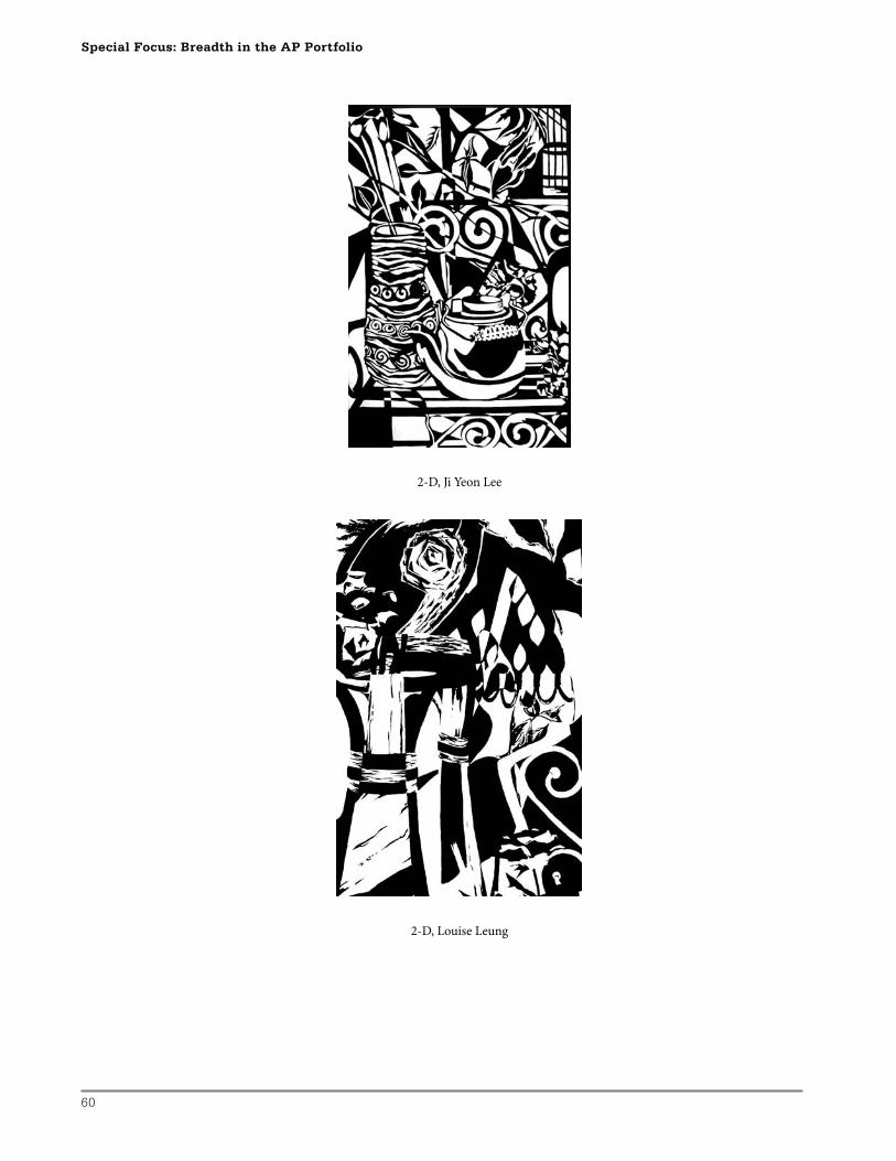
60
Special Focus: Breadth in the AP Portfolio
2-D, Ji Yeon Lee
2-D, Louise Leung
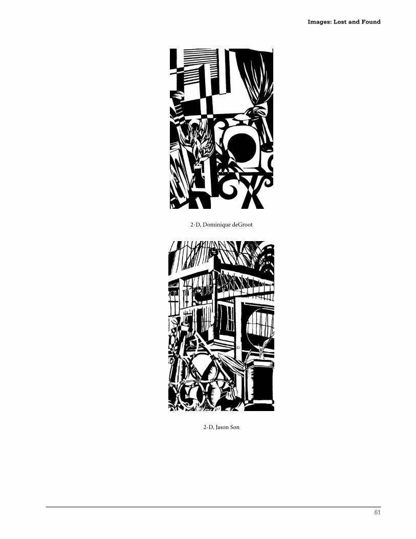
61
2-D, Dominique deGroot
2-D, Jason Son
Images: Lost and Found
62
Special Focus: Breadth in the AP Portfolio
3-D Design Breadth:Lost-and-Found Meaning—A Focus on Ambiguity
Th is strategy involves purposeful ambiguity. Students are challenged to identify, deconstruct,
and reconstruct common forms in order to achieve a meaningful visual double take.
Students will need to develop a sense of how much manipulation is necessary to achieve a
transformation that will “read” in diff erent ways for the viewer. Th ey will also need to be
both resourceful and expressive. It is anticipated that students might discover an opportunity
to make a cultural or social comment through this “lost-and-found” strategy. I have chosen
to include this sequence because it provides an opportunity to explore viewer impact and to
discuss three-dimensional forms on diff erent levels of encounter. In addition, it also allows a
reference to an African-American Harlem artist and a Canadian First Nations contemporary
artist whose three-dimensional pieces are becoming quite well known.
Instructional Goals
Th e student will:
• Create a three-dimensional mask form.
• Demonstrate knowledge of and ability to use deconstruction and assemblage.
• Explore ambiguity in the creation of a mask form from the transformation of common
objects that take new meanings.
Supplies/Budget Concerns
• A collection of images of masks
Th ese visuals could be researched by students to prepare for the introduction of this
sequence. Individual students may have very particular reasons for selecting athletic
masks, fi nding specifi c historical examples, or perhaps bringing an actual mask of
cultural importance.
• Glue/adherents
• Scissors/cutters
• Mounting materials
• Findings
A wide variety of items can be considered as suitable “fi ndings,” but students must have the
available technology to cut, reassemble, and join their chosen items in a 3-D manner. In
addition, fi ndings for this project should be common objects that are very similar or identical
in shape and construction. Items can include old cameras, chairs, toys, shoes, appliances,
snorkeling gear, work gloves, milk jugs, baseball caps, clocks, fast-food containers, tools, etc.
Th e list is endless and the search will require some degree of initiative and individual student
selections. As students make choices for their collections, they should be reminded to make
decisions based on 3-D possibilities rather than relief or 2-D collage ideas.
63
Introduction/Pre-Experience Using References and Cited Works
Th rough research into completed works by two artists, students are sensitized to the key
concepts in this project. Two contemporary artists whose materials are transformed or
reclaimed from common objects include African-American installation artist, David
Hammons, and Canadian First Nations artist, Brian Jungen. David Hammons lives in
Harlem in New York City, and Brian Jungen is a member of the Doig River Band of the
Dunne-za Nation, Canada. Information on both these artists can be found on Web sites
by using their names to initiate a search. For example, one might start an informational
search about David Hammons at http://www.artcyclopedia.com/artists/hammons_david.
html. Information regarding Brian Jungen can be found at http://www.nativeonline.com/
brian.htm, as well as many other locations. Key in discussing social comments through
familiar objects for this project sequence would be “High Falutin’” (also known as “Spirit
Catcher”) with strong basketball references, and “Hood” by David Hammons. Of equal
importance is the “Prototype for New Understanding” series (completed with 2002 Nike
athletic footwear) and the (whale) Skeleton Series fashioned from white plastic outdoor
chairs by Brian Jungen. Both artists include humorous and playfully presented work that
contains references with which teenagers will easily identify. Th rough discussion, students
can be guided to discover a more serious side in the work of both artists. Much deeper
issues and social/political commentary in these works can be revealed. It is anticipated that
students will develop their understanding of visual ambiguity in three-dimensional work
and try to incorporate levels of meaning as they make formative decisions regarding their
own pieces.
Development
1. Students are asked to acquire a collection of related, found common objects.
2. Students are told that their project will involve the creation of a mask. A resource
collection of ancient and modern as well as cross-cultural examples of mask images
would be helpful at this stage. Students are asked to identify main characteristics
common to mask forms and review the important purposes of mask creation. Key
points to bring out of this discussion would include masks as face/head coverings and
purposes such as protection, transformation, concealment, cleansing, and spiritual
representations. Because this project will result in a 3-D form, students are also asked to
classify the available mask examples to identify which embody maximum attributes of
3-D form.
3. Students amass and sort their chosen found materials. This process is time consuming
and might need to overlap other studio work.
4. Students are asked to recall key attributes of masks and find elements in their collected
objects that could form recognizable characteristics of masks. These suggestions might
be quite humorous, fanciful, and visually playful. For example, in a collection of athletic
shoes, a tongue of a shoe can actually be the tongue of a mask.
Images: Lost and Found
64
Special Focus: Breadth in the AP Portfolio
5. Based on the discussion regarding the key artists cited above, students are asked to have
two trigger words or concepts that are especially chosen to represent two issues on two
different levels that match the chosen found object theme. One level can be obvious
and entertaining, for instant recognition, while a second level makes a more serious
social statement. For example, a collection of athletic shoes fashioned into a mask could
trigger ideas of fun and recreation, while also making a comment on social loyalty to
a particular brand, or perhaps express concern about sweatshop factories. A collection
of milk jugs might be skillfully and humorously refashioned to mimic a Dogon Rabbit
mask. The translucent eeriness of the reformed jugs might invoke a message that too
much plastic is entering the environment on a global scale.
6. Students are reminded that the mask is the conveyance or metaphor for two levels of
meaning.
7. Students are encouraged to work with juxtaposition as they make decisions about cutting
and reassembling bits and pieces of their findings. For students who are slow to become
involved, it is helpful to have them base the work on one form. These students could be
advised to harvest parts from a second finding to add to the main form to create the
mask form and develop the meanings.
Differentiated Instruction
1. For some students, approaching an assignment of this nature is actually easier if there
are fewer decisions to be made. Students who are hesitant to start work because of
the seemingly overwhelming initial decisions that need to be made might find the
assignment less daunting if it is based on given materials.
2. Students encountering difficulty with the duality of material and mask references might
cope much better if they are provided with a specific or very limited number of cross-
cultural mask examples to inspire their transformation process.
3. Very keen students might wish to take this lesson strategy as a prompt to initiate an AP
3-D Concentration study. Through individual mentoring, such students can develop a
plan of action establishing personal goals, progression/limitation strategies, and levels of
meaning on their own terms.
Formative Assessment Checklist
As students initiate the project, they should be reminded of the need to:
• Demonstrate sensitivity to materials and detail.
• Identify the development of a mask image.
• Apply the appropriate trigger word ideas carried through in visual form.
• Compare and contrast visual connections to both an obvious and a deeper level of
interpretation.
• Lose and fi nd elements.
• Limit selections to suit intent.
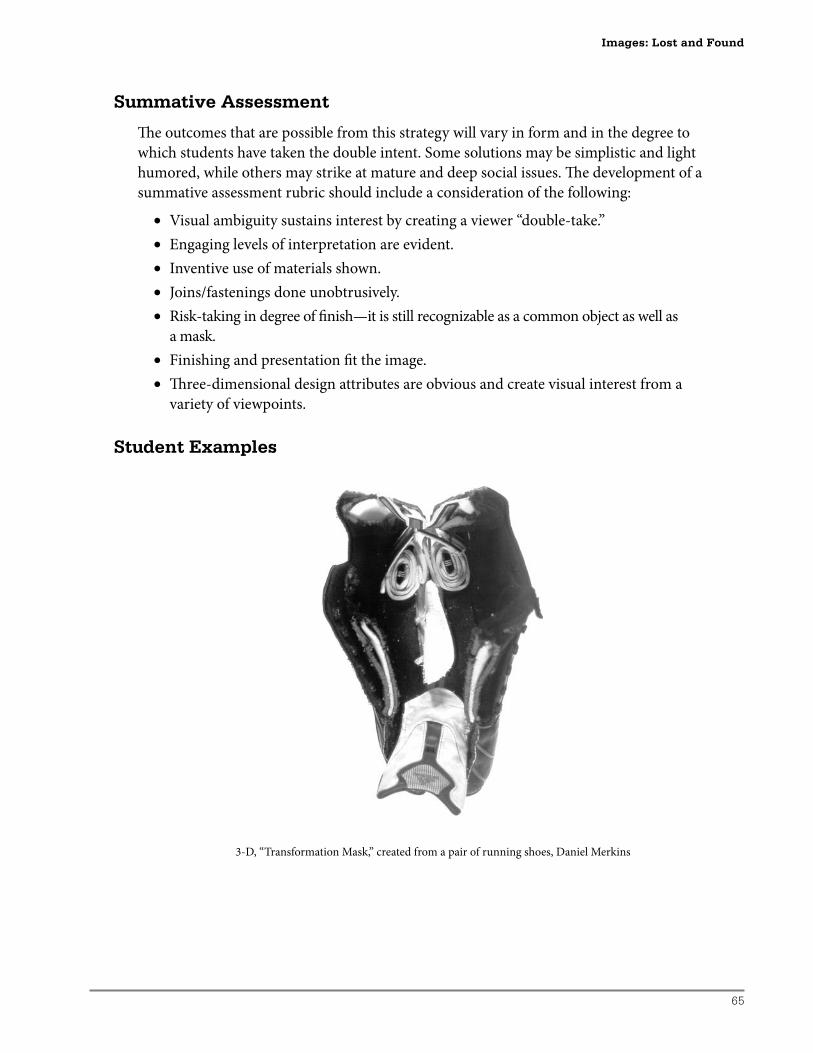
65
Summative Assessment
Th e outcomes that are possible from this strategy will vary in form and in the degree to
which students have taken the double intent. Some solutions may be simplistic and light
humored, while others may strike at mature and deep social issues. Th e development of a
summative assessment rubric should include a consideration of the following:
• Visual ambiguity sustains interest by creating a viewer “double-take.”
• Engaging levels of interpretation are evident.
• Inventive use of materials shown.
• Joins/fastenings done unobtrusively.
• Risk-taking in degree of fi nish—it is still recognizable as a common object as well as
a mask.
• Finishing and presentation fi t the image.
• Th ree-dimensional design attributes are obvious and create visual interest from a
variety of viewpoints.
Student Examples
3-D, “Transformation Mask,” created from a pair of running shoes, Daniel Merkins
Images: Lost and Found
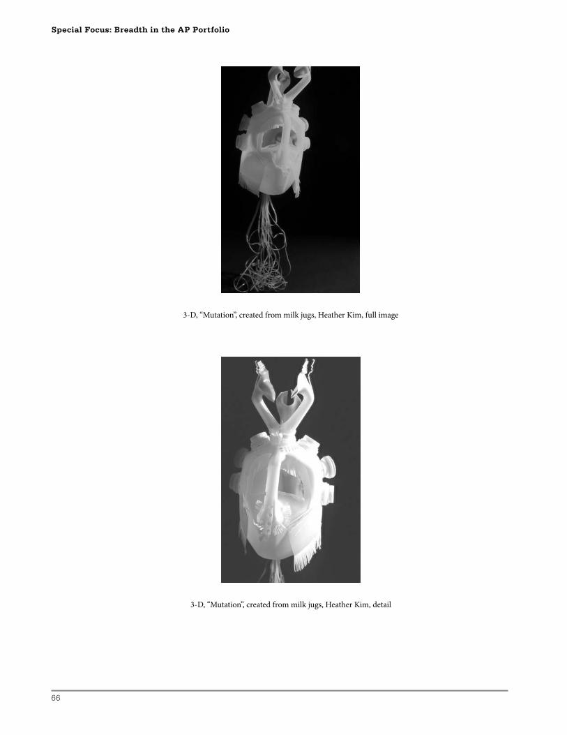
66
Special Focus: Breadth in the AP Portfolio
3-D, “Mutation”, created from milk jugs, Heather Kim, full image
3-D, “Mutation”, created from milk jugs, Heather Kim, detail
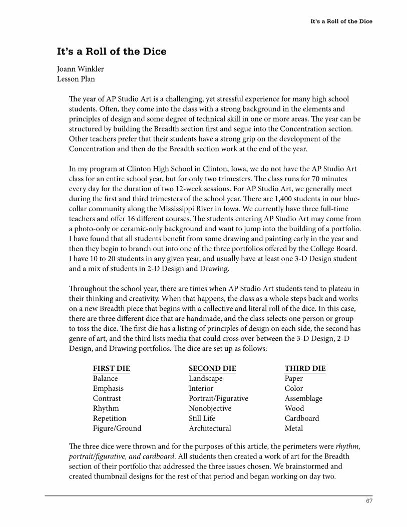
67
It’s a Roll of the Dice
Joann Winkler
Lesson Plan
Th e year of AP Studio Art is a challenging, yet stressful experience for many high school
students. Oft en, they come into the class with a strong background in the elements and
principles of design and some degree of technical skill in one or more areas. Th e year can be
structured by building the Breadth section fi rst and segue into the Concentration section.
Other teachers prefer that their students have a strong grip on the development of the
Concentration and then do the Breadth section work at the end of the year.
In my program at Clinton High School in Clinton, Iowa, we do not have the AP Studio Art
class for an entire school year, but for only two trimesters. Th e class runs for 70 minutes
every day for the duration of two 12-week sessions. For AP Studio Art, we generally meet
during the fi rst and third trimesters of the school year. Th ere are 1,400 students in our blue-
collar community along the Mississippi River in Iowa. We currently have three full-time
teachers and off er 16 diff erent courses. Th e students entering AP Studio Art may come from
a photo-only or ceramic-only background and want to jump into the building of a portfolio.
I have found that all students benefi t from some drawing and painting early in the year and
then they begin to branch out into one of the three portfolios off ered by the College Board.
I have 10 to 20 students in any given year, and usually have at least one 3-D Design student
and a mix of students in 2-D Design and Drawing.
Th roughout the school year, there are times when AP Studio Art students tend to plateau in
their thinking and creativity. When that happens, the class as a whole steps back and works
on a new Breadth piece that begins with a collective and literal roll of the dice. In this case,
there are three diff erent dice that are handmade, and the class selects one person or group
to toss the dice. Th e fi rst die has a listing of principles of design on each side, the second has
genre of art, and the third lists media that could cross over between the 3-D Design, 2-D
Design, and Drawing portfolios. Th e dice are set up as follows:
FIRST DIE SECOND DIE THIRD DIE
Balance Landscape Paper
Emphasis Interior Color
Contrast Portrait/Figurative Assemblage
Rhythm Nonobjective Wood
Repetition Still Life Cardboard
Figure/Ground Architectural Metal
Th e three dice were thrown and for the purposes of this article, the perimeters were rhythm,
portrait/fi gurative, and cardboard. All students then created a work of art for the Breadth
section of their portfolio that addressed the three issues chosen. We brainstormed and
created thumbnail designs for the rest of that period and began working on day two.
It’s a Roll of the Dice
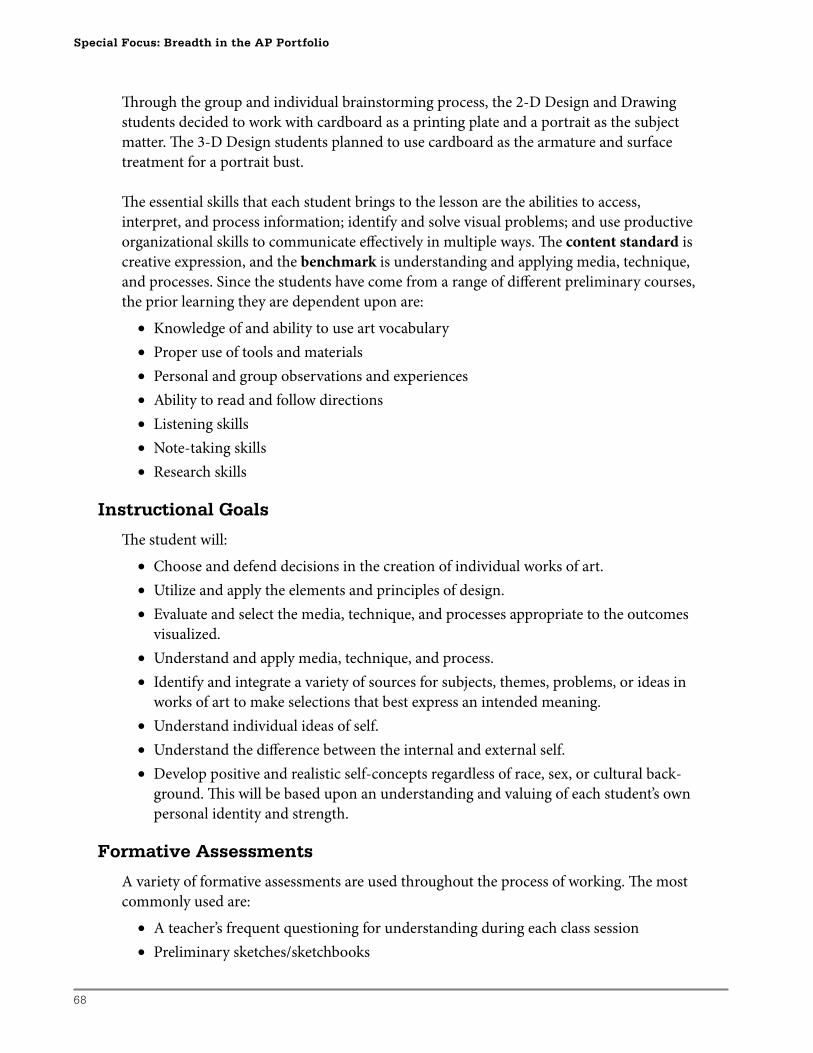
68
Special Focus: Breadth in the AP Portfolio
Th rough the group and individual brainstorming process, the 2-D Design and Drawing
students decided to work with cardboard as a printing plate and a portrait as the subject
matter. Th e 3-D Design students planned to use cardboard as the armature and surface
treatment for a portrait bust.
Th e essential skills that each student brings to the lesson are the abilities to access,
interpret, and process information; identify and solve visual problems; and use productive
organizational skills to communicate eff ectively in multiple ways. Th e content standard is
creative expression, and the benchmark is understanding and applying media, technique,
and processes. Since the students have come from a range of diff erent preliminary courses,
the prior learning they are dependent upon are:
• Knowledge of and ability to use art vocabulary
• Proper use of tools and materials
• Personal and group observations and experiences
• Ability to read and follow directions
• Listening skills
• Note-taking skills
• Research skills
Instructional Goals
Th e student will:
• Choose and defend decisions in the creation of individual works of art.
• Utilize and apply the elements and principles of design.
• Evaluate and select the media, technique, and processes appropriate to the outcomes
visualized.
• Understand and apply media, technique, and process.
• Identify and integrate a variety of sources for subjects, themes, problems, or ideas in
works of art to make selections that best express an intended meaning.
• Understand individual ideas of self.
• Understand the diff erence between the internal and external self.
• Develop positive and realistic self-concepts regardless of race, sex, or cultural back-
ground. Th is will be based upon an understanding and valuing of each student’s own
personal identity and strength.
Formative Assessments
A variety of formative assessments are used throughout the process of working. Th e most
commonly used are:
• A teacher’s frequent questioning for understanding during each class session
• Preliminary sketches/sketchbooks
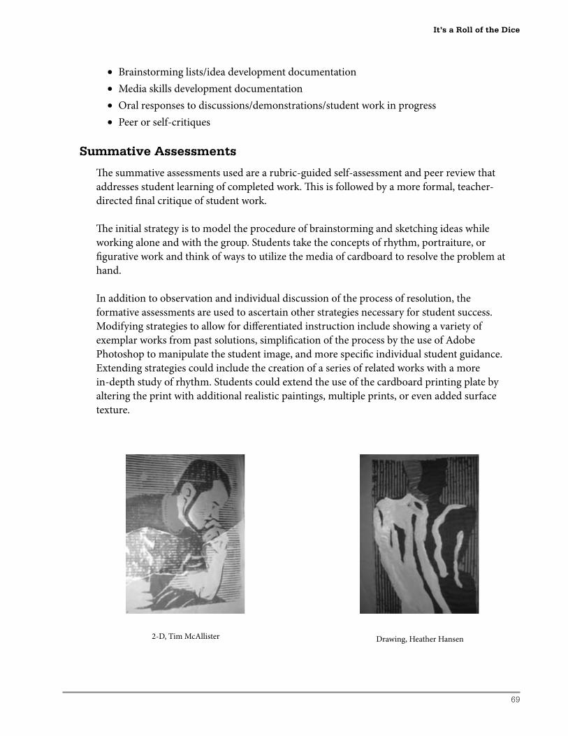
69
• Brainstorming lists/idea development documentation
• Media skills development documentation
• Oral responses to discussions/demonstrations/student work in progress
• Peer or self-critiques
Summative Assessments
Th e summative assessments used are a rubric-guided self-assessment and peer review that
addresses student learning of completed work. Th is is followed by a more formal, teacher-
directed fi nal critique of student work.
Th e initial strategy is to model the procedure of brainstorming and sketching ideas while
working alone and with the group. Students take the concepts of rhythm, portraiture, or
fi gurative work and think of ways to utilize the media of cardboard to resolve the problem at
hand.
In addition to observation and individual discussion of the process of resolution, the
formative assessments are used to ascertain other strategies necessary for student success.
Modifying strategies to allow for diff erentiated instruction include showing a variety of
exemplar works from past solutions, simplifi cation of the process by the use of Adobe
Photoshop to manipulate the student image, and more specifi c individual student guidance.
Extending strategies could include the creation of a series of related works with a more
in-depth study of rhythm. Students could extend the use of the cardboard printing plate by
altering the print with additional realistic paintings, multiple prints, or even added surface
texture.
It’s a Roll of the Dice
2-D, Tim McAllister Drawing, Heather Hansen
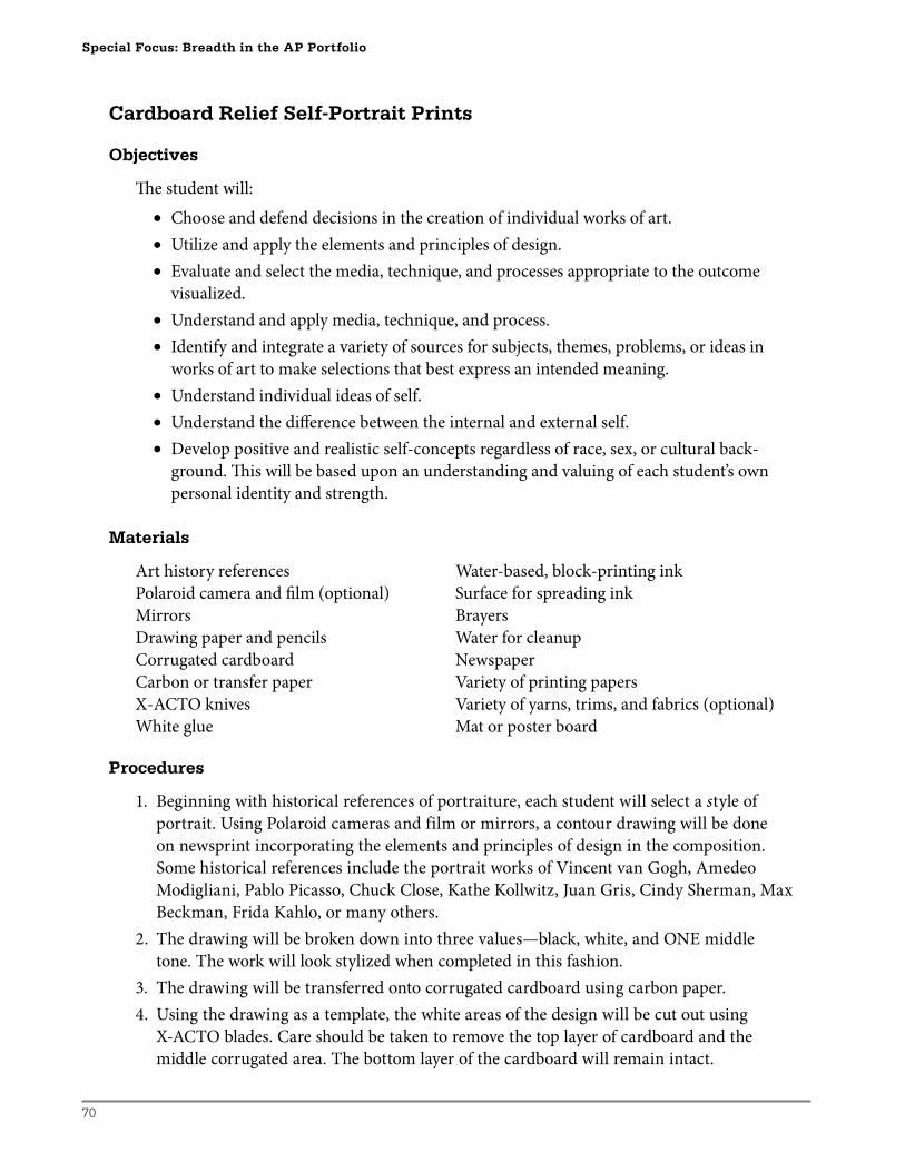
70
Special Focus: Breadth in the AP Portfolio
Cardboard Relief Self-Portrait Prints
Objectives
Th e student will:
• Choose and defend decisions in the creation of individual works of art.
• Utilize and apply the elements and principles of design.
• Evaluate and select the media, technique, and processes appropriate to the outcome
visualized.
• Understand and apply media, technique, and process.
• Identify and integrate a variety of sources for subjects, themes, problems, or ideas in
works of art to make selections that best express an intended meaning.
• Understand individual ideas of self.
• Understand the diff erence between the internal and external self.
• Develop positive and realistic self-concepts regardless of race, sex, or cultural back-
ground. Th is will be based upon an understanding and valuing of each student’s own
personal identity and strength.
Materials
Art history references Water-based, block-printing ink
Polaroid camera and fi lm (optional) Surface for spreading ink
Mirrors Brayers
Drawing paper and pencils Water for cleanup
Corrugated cardboard Newspaper
Carbon or transfer paper Variety of printing papers
X-ACTO knives Variety of yarns, trims, and fabrics (optional)
White glue Mat or poster board
Procedures
1. Beginning with historical references of portraiture, each student will select a style of
portrait. Using Polaroid cameras and film or mirrors, a contour drawing will be done
on newsprint incorporating the elements and principles of design in the composition.
Some historical references include the portrait works of Vincent van Gogh, Amedeo
Modigliani, Pablo Picasso, Chuck Close, Kathe Kollwitz, Juan Gris, Cindy Sherman, Max
Beckman, Frida Kahlo, or many others.
2. The drawing will be broken down into three values—black, white, and ONE middle
tone. The work will look stylized when completed in this fashion.
3. The drawing will be transferred onto corrugated cardboard using carbon paper.
4. Using the drawing as a template, the white areas of the design will be cut out using
X-ACTO blades. Care should be taken to remove the top layer of cardboard and the
middle corrugated area. The bottom layer of the cardboard will remain intact.
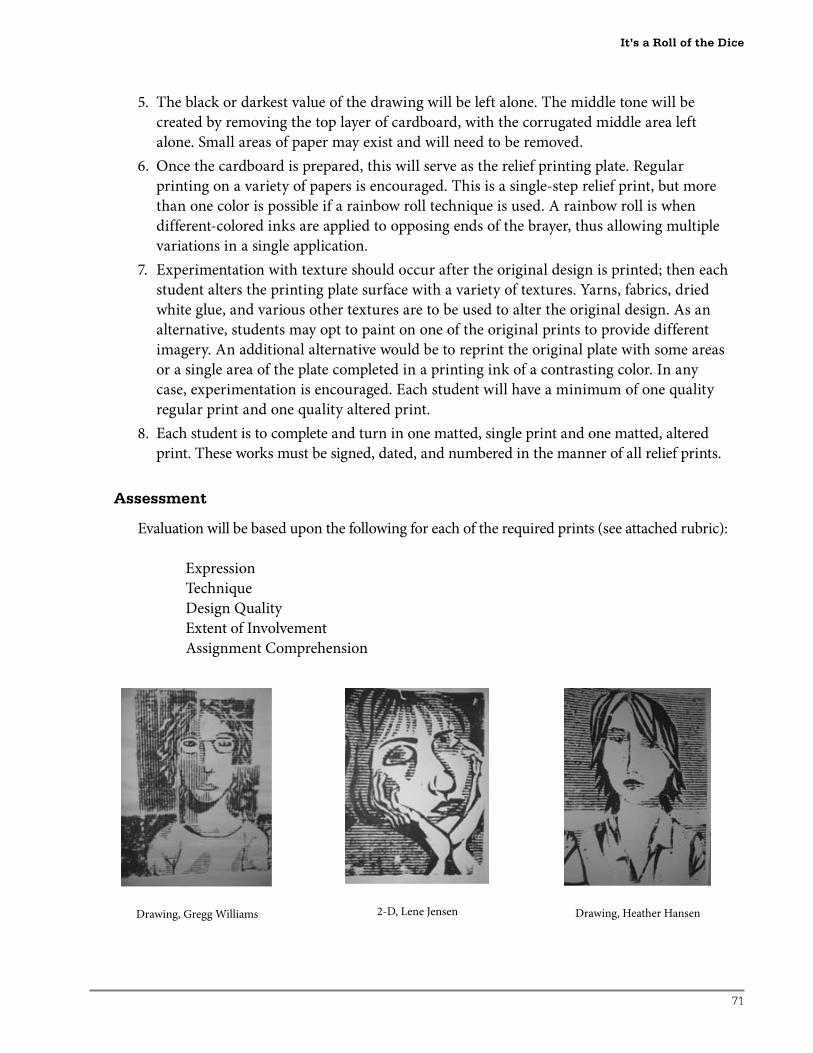
71
5. The black or darkest value of the drawing will be left alone. The middle tone will be
created by removing the top layer of cardboard, with the corrugated middle area left
alone. Small areas of paper may exist and will need to be removed.
6. Once the cardboard is prepared, this will serve as the relief printing plate. Regular
printing on a variety of papers is encouraged. This is a single-step relief print, but more
than one color is possible if a rainbow roll technique is used. A rainbow roll is when
different-colored inks are applied to opposing ends of the brayer, thus allowing multiple
variations in a single application.
7. Experimentation with texture should occur after the original design is printed; then each
student alters the printing plate surface with a variety of textures. Yarns, fabrics, dried
white glue, and various other textures are to be used to alter the original design. As an
alternative, students may opt to paint on one of the original prints to provide different
imagery. An additional alternative would be to reprint the original plate with some areas
or a single area of the plate completed in a printing ink of a contrasting color. In any
case, experimentation is encouraged. Each student will have a minimum of one quality
regular print and one quality altered print.
8. Each student is to complete and turn in one matted, single print and one matted, altered
print. These works must be signed, dated, and numbered in the manner of all relief prints.
Assessment
Evaluation will be based upon the following for each of the required prints (see attached rubric):
Expression
Technique
Design Quality
Extent of Involvement
Assignment Comprehension
It’s a Roll of the Dice
Drawing, Gregg Williams 2-D, Lene Jensen Drawing, Heather Hansen
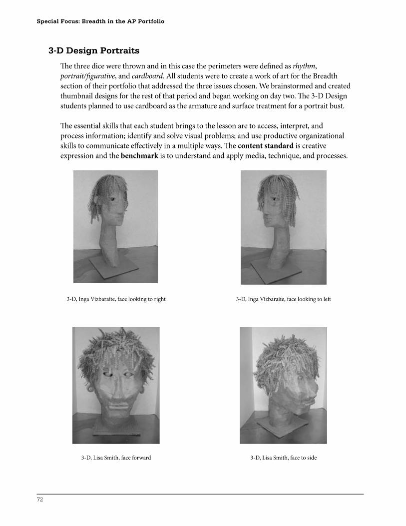
72
Special Focus: Breadth in the AP Portfolio
3-D, Inga Vizbaraite, face looking to right 3-D, Inga Vizbaraite, face looking to left
3-D Design Portraits
Th e three dice were thrown and in this case the perimeters were defi ned as rhythm,
portrait/fi gurative, and cardboard. All students were to create a work of art for the Breadth
section of their portfolio that addressed the three issues chosen. We brainstormed and created
thumbnail designs for the rest of that period and began working on day two. Th e 3-D Design
students planned to use cardboard as the armature and surface treatment for a portrait bust.
Th e essential skills that each student brings to the lesson are to access, interpret, and
process information; identify and solve visual problems; and use productive organizational
skills to communicate eff ectively in a multiple ways. Th e content standard is creative
expression and the benchmark is to understand and apply media, technique, and processes.
3-D, Lisa Smith, face forward 3-D, Lisa Smith, face to side
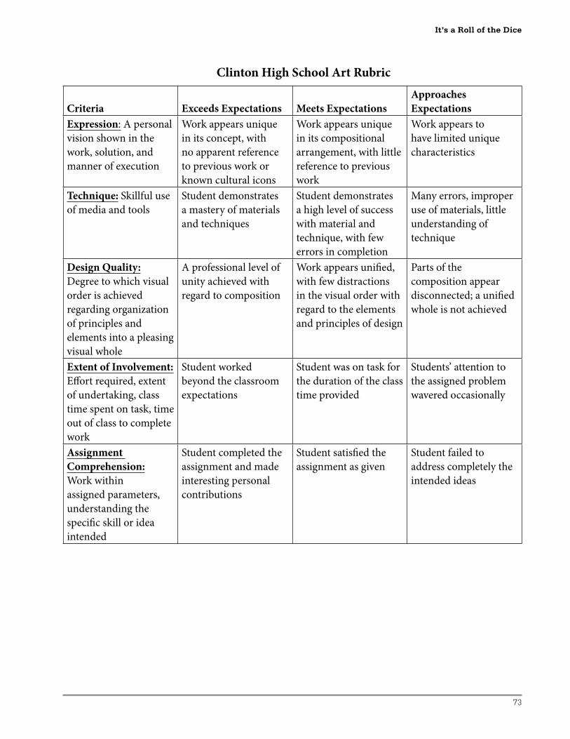
73
Clinton High School Art Rubric
Criteria Exceeds Expectations Meets Expectations
Approaches
Expectations
Expression: A personal
vision shown in the
work, solution, and
manner of execution
Work appears unique
in its concept, with
no apparent reference
to previous work or
known cultural icons
Work appears unique
in its compositional
arrangement, with little
reference to previous
work
Work appears to
have limited unique
characteristics
Technique: Skillful use
of media and tools
Student demonstrates
a mastery of materials
and techniques
Student demonstrates
a high level of success
with material and
technique, with few
errors in completion
Many errors, improper
use of materials, little
understanding of
technique
Design Quality:
Degree to which visual
order is achieved
regarding organization
of principles and
elements into a pleasing
visual whole
A professional level of
unity achieved with
regard to composition
Work appears unifi ed,
with few distractions
in the visual order with
regard to the elements
and principles of design
Parts of the
composition appear
disconnected; a unifi ed
whole is not achieved
Extent of Involvement:
Eff ort required, extent
of undertaking, class
time spent on task, time
out of class to complete
work
Student worked
beyond the classroom
expectations
Student was on task for
the duration of the class
time provided
Students’ attention to
the assigned problem
wavered occasionally
Assignment
Comprehension:
Work within
assigned parameters,
understanding the
specifi c skill or idea
intended
Student completed the
assignment and made
interesting personal
contributions
Student satisfi ed the
assignment as given
Student failed to
address completely the
intended ideas
It’s a Roll of the Dice
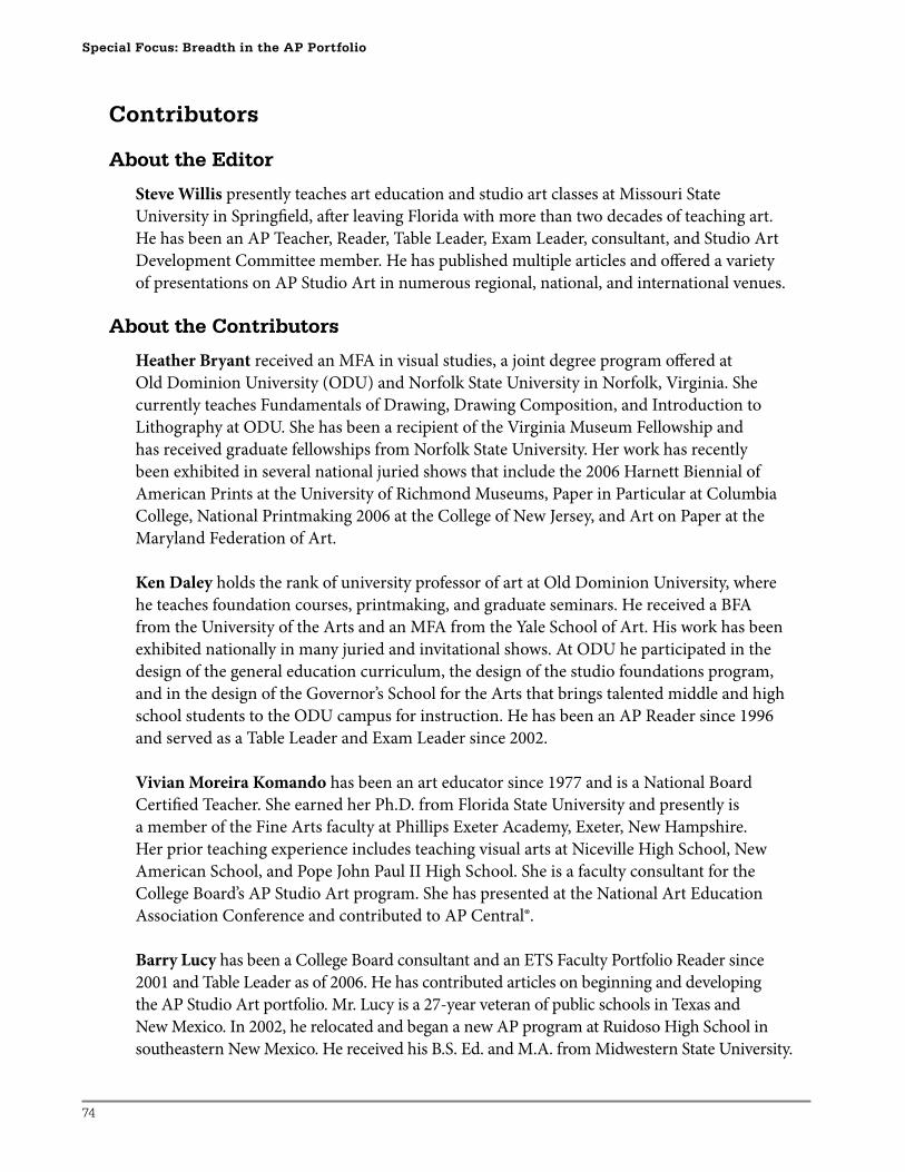
74
Special Focus: Breadth in the AP Portfolio
Contributors
About the Editor
Steve Willis presently teaches art education and studio art classes at Missouri State
University in Springfi eld, aft er leaving Florida with more than two decades of teaching art.
He has been an AP Teacher, Reader, Table Leader, Exam Leader, consultant, and Studio Art
Development Committee member. He has published multiple articles and off ered a variety
of presentations on AP Studio Art in numerous regional, national, and international venues.
About the Contributors
Heather Bryant received an MFA in visual studies, a joint degree program off ered at
Old Dominion University (ODU) and Norfolk State University in Norfolk, Virginia. She
currently teaches Fundamentals of Drawing, Drawing Composition, and Introduction to
Lithography at ODU. She has been a recipient of the Virginia Museum Fellowship and
has received graduate fellowships from Norfolk State University. Her work has recently
been exhibited in several national juried shows that include the 2006 Harnett Biennial of
American Prints at the University of Richmond Museums, Paper in Particular at Columbia
College, National Printmaking 2006 at the College of New Jersey, and Art on Paper at the
Maryland Federation of Art.
Ken Daley holds the rank of university professor of art at Old Dominion University, where
he teaches foundation courses, printmaking, and graduate seminars. He received a BFA
from the University of the Arts and an MFA from the Yale School of Art. His work has been
exhibited nationally in many juried and invitational shows. At ODU he participated in the
design of the general education curriculum, the design of the studio foundations program,
and in the design of the Governor’s School for the Arts that brings talented middle and high
school students to the ODU campus for instruction. He has been an AP Reader since 1996
and served as a Table Leader and Exam Leader since 2002.
Vivian Moreira Komando has been an art educator since 1977 and is a National Board
Certifi ed Teacher. She earned her Ph.D. from Florida State University and presently is
a member of the Fine Arts faculty at Phillips Exeter Academy, Exeter, New Hampshire.
Her prior teaching experience includes teaching visual arts at Niceville High School, New
American School, and Pope John Paul II High School. She is a faculty consultant for the
College Board’s AP Studio Art program. She has presented at the National Art Education
Association Conference and contributed to AP Central®.
Barry Lucy has been a College Board consultant and an ETS Faculty Portfolio Reader since
2001 and Table Leader as of 2006. He has contributed articles on beginning and developing
the AP Studio Art portfolio. Mr. Lucy is a 27-year veteran of public schools in Texas and
New Mexico. In 2002, he relocated and began a new AP program at Ruidoso High School in
southeastern New Mexico. He received his B.S. Ed. and M.A. from Midwestern State University.

75
Barbara Sunday began her teaching career in Jamaica, West Indies. She has taught AP
Studio Art at Sentinel Secondary School in West Vancouver, Canada, for 19 years, has served
as a District Art Coordinator, and has lectured on art education at both the University of
British Columbia and Simon Fraser University. She has been an AP Studio Art Reader for
eight years and presented at numerous AP® and Pre-AP workshops across Canada and in the
Western Region. She has presented AP Institutes in Detroit, Michigan; San Diego, California;
Bellevue, California; Hawaii; Victoria, British Columbia; Chicago, Illinois; and Toronto,
Ontario.
Joann Winkler, an art teacher since 1979, is a native of Illinois. She graduated from
Northern Illinois University (B.S. in Education), and Northeast Missouri State University
(M.A.), with continued studies at Carleton College, Colorado Institute of Art, Drake
University, Maryland Institute of Art, Rhode Island School of Design, Salzburg College, and
the School of the Art Institute of Chicago. Her honors include being listed in Who’s Who in
America, and being a Master Mentor Teacher and Gold Key winner. She teaches AP Studio
Art at Clinton High School in Clinton, Iowa. She has been an AP Studio Art Reader for fi ve
years during which she also served as a Table Leader. She contributed to AP Central and Th e
AP Vertical Teams Guide for Studio Art. Joann has presented at a variety of workshops on AP
Studio Art and AP Summer Institutes throughout the country, the AP Annual Conference,
and the National Art Education Association convention.
Contributors

F07SASF180