application gui design - notes from a toolkit developer
TRANSCRIPT

Application GUI Design – Notes From a Toolkit Developer
Tom HacohenSamsung Electronics Open Source Group
@TomHacohen
FOSDEM 2015
Designing an Application | Identify the Application
What does it do?
I Essential features
I Nice to have features
I Niche features (<1% of the users)
I Remove all the non-essential features

Designing an Application | Identify the Application
What does it do?
I Essential features
I Nice to have features
I Niche features (<1% of the users)
I Remove all the non-essential features

Designing an Application | Identify the Application
What does it do?
I Essential features
I Nice to have features
I Niche features (<1% of the users)
I Remove all the non-essential features

Designing an Application | Identify the Application
What does it do?
I Essential features
I Nice to have features
I Niche features (<1% of the users)
I Remove all the non-essential features

Designing an Application | Identify the Application
Who is it for?
I CLI power users? Designers?
I Target environment
I Common demographics
I Application specific classifications
I Userbase 6= you

Designing an Application | Identify the Application
Who is it for?
I CLI power users? Designers?
I Target environment
I Common demographics
I Application specific classifications
I Userbase 6= you

Designing an Application | Identify the Application
Who is it for?
I CLI power users? Designers?
I Target environment
I Common demographics
I Application specific classifications
I Userbase 6= you

Designing an Application | Identify the Application
Who is it for?
I CLI power users? Designers?
I Target environment
I Common demographics
I Application specific classifications
I Userbase 6= you

Designing an Application | Identify the Application
Who is it for?
I CLI power users? Designers?
I Target environment
I Common demographics
I Application specific classifications
I Userbase 6= you

Designing an Application | Identify the Application
KISS
I Adapt feature list according to your audience
I Keep focus on the more important features
I Avoid creating complex UIs
I Keep option lists (combo box) short, simple and ifthere’s no choice, split to categories

Designing an Application | Identify the Application
KISS
I Adapt feature list according to your audience
I Keep focus on the more important features
I Avoid creating complex UIs
I Keep option lists (combo box) short, simple and ifthere’s no choice, split to categories

Designing an Application | Identify the Application
KISS
I Adapt feature list according to your audience
I Keep focus on the more important features
I Avoid creating complex UIs
I Keep option lists (combo box) short, simple and ifthere’s no choice, split to categories

Designing an Application | Identify the Application
KISS
I Adapt feature list according to your audience
I Keep focus on the more important features
I Avoid creating complex UIs
I Keep option lists (combo box) short, simple and ifthere’s no choice, split to categories

Designing an Application | Beginning of the UI
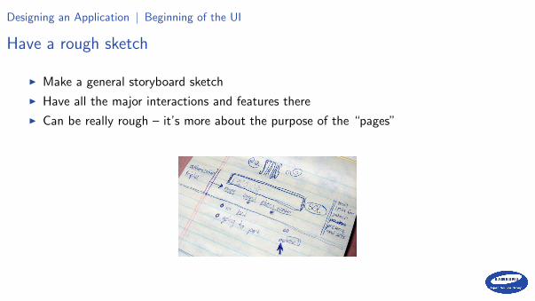
Have a rough sketch
I Make a general storyboard sketch
I Have all the major interactions and features there
I Can be really rough – it’s more about the purpose of the “pages”

Designing an Application | Beginning of the UI
Have a rough sketch
I Make a general storyboard sketch
I Have all the major interactions and features there
I Can be really rough – it’s more about the purpose of the “pages”

Designing an Application | Beginning of the UI
Have a rough sketch
I Make a general storyboard sketch
I Have all the major interactions and features there
I Can be really rough – it’s more about the purpose of the “pages”

Designing an Application | Beginning of the UI
Have a rough sketch
I Make a general storyboard sketch
I Have all the major interactions and features there
I Can be really rough – it’s more about the purpose of the “pages”
Designing an Application | Beginning of the UI
Have a rough sketch
I Make a general storyboard sketch
I Have all the major interactions and features there
I Can be really rough – it’s more about the purpose of the “pages”

Designing an Application | Beginning of the UI
Stick to the basics
I Don’t bother with colour – harder and will be added later
I Do not customise available widgets/patterns unless there really is no other way
I Develop it around the content – content is king

Designing an Application | Beginning of the UI
Stick to the basics
I Don’t bother with colour – harder and will be added later
I Do not customise available widgets/patterns unless there really is no other way
I Develop it around the content – content is king

Designing an Application | Beginning of the UI
Stick to the basics
I Don’t bother with colour – harder and will be added later
I Do not customise available widgets/patterns unless there really is no other way
I Develop it around the content – content is king

Designing an Application | Beginning of the UI
I meant it! KISS. . .
I Be purposefully simple
I Skeuomorphs are almost always bad
I Be consistent (easier when simple)
I Make it simple for your users – don’t create newusage patterns, and adhere to common ones
I Common (all?) usage patterns should be easilyavailable
I Rest should be revealed as needed
I Make self-documenting applications

Designing an Application | Beginning of the UI
I meant it! KISS. . .
I Be purposefully simple
I Skeuomorphs are almost always bad
I Be consistent (easier when simple)
I Make it simple for your users – don’t create newusage patterns, and adhere to common ones
I Common (all?) usage patterns should be easilyavailableI Rest should be revealed as needed
I Make self-documenting applications

Designing an Application | Layout
Spacing
I Choose a baseline unit size (e.g. 8px)
I Align everything to that baseline size
I Use a small set of spacing alternatives (e.g. 2, 3and 6 units)
I Make sure touch-targets are spaced enough
I Be generous, but don’t overdo it (don’t waste myscreen estate)

Designing an Application | Layout
Spacing
I Choose a baseline unit size (e.g. 8px)
I Align everything to that baseline size
I Use a small set of spacing alternatives (e.g. 2, 3and 6 units)
I Make sure touch-targets are spaced enough
I Be generous, but don’t overdo it (don’t waste myscreen estate)

Designing an Application | Layout
Spacing
I Choose a baseline unit size (e.g. 8px)
I Align everything to that baseline size
I Use a small set of spacing alternatives (e.g. 2, 3and 6 units)
I Make sure touch-targets are spaced enough
I Be generous, but don’t overdo it (don’t waste myscreen estate)

Designing an Application | Layout
Spacing
I Choose a baseline unit size (e.g. 8px)
I Align everything to that baseline size
I Use a small set of spacing alternatives (e.g. 2, 3and 6 units)
I Make sure touch-targets are spaced enough
I Be generous, but don’t overdo it (don’t waste myscreen estate)

Designing an Application | Layout
Spacing
I Choose a baseline unit size (e.g. 8px)
I Align everything to that baseline size
I Use a small set of spacing alternatives (e.g. 2, 3and 6 units)
I Make sure touch-targets are spaced enough
I Be generous, but don’t overdo it (don’t waste myscreen estate)

Designing an Application | Layout
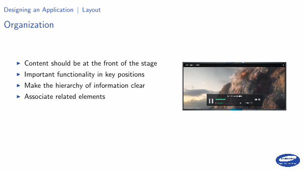
Organization
I Content should be at the front of the stage
I Important functionality in key positions
I Make the hierarchy of information clear
I Associate related elements
I Help directing the user’s focus

Designing an Application | Layout
Organization
I Content should be at the front of the stage
I Important functionality in key positions
I Make the hierarchy of information clear
I Associate related elements
I Help directing the user’s focus

Designing an Application | Layout
Organization
I Content should be at the front of the stage
I Important functionality in key positions
I Make the hierarchy of information clear
I Associate related elements
I Help directing the user’s focus
Designing an Application | Layout
Organization
I Content should be at the front of the stage
I Important functionality in key positions
I Make the hierarchy of information clear
I Associate related elements
I Help directing the user’s focus

Designing an Application | Layout
Organization
I Content should be at the front of the stage
I Important functionality in key positions
I Make the hierarchy of information clear
I Associate related elements
I Help directing the user’s focus

Designing an Application | Visuals
Icons and images
I Use known icons on buttons
I Don’t use a known icon for something other thanintended
I Use rich graphics when appropriate (cover-art,mood graphics, etc.)
I Don’t overshadow content
I Don’t use ugly graphics
I Have consistent sizing

Designing an Application | Visuals
Icons and images
I Use known icons on buttons
I Don’t use a known icon for something other thanintended
I Use rich graphics when appropriate (cover-art,mood graphics, etc.)
I Don’t overshadow content
I Don’t use ugly graphics
I Have consistent sizing

Designing an Application | Visuals
Icons and images
I Use known icons on buttons
I Don’t use a known icon for something other thanintended
I Use rich graphics when appropriate (cover-art,mood graphics, etc.)
I Don’t overshadow content
I Don’t use ugly graphics
I Have consistent sizing

Designing an Application | Visuals
Icons and images
I Use known icons on buttons
I Don’t use a known icon for something other thanintended
I Use rich graphics when appropriate (cover-art,mood graphics, etc.)
I Don’t overshadow content
I Don’t use ugly graphics
I Have consistent sizing

Designing an Application | Visuals
Icons and images
I Use known icons on buttons
I Don’t use a known icon for something other thanintended
I Use rich graphics when appropriate (cover-art,mood graphics, etc.)
I Don’t overshadow content
I Don’t use ugly graphics
I Have consistent sizing

Designing an Application | Visuals
Icons and images
I Use known icons on buttons
I Don’t use a known icon for something other thanintended
I Use rich graphics when appropriate (cover-art,mood graphics, etc.)
I Don’t overshadow content
I Don’t use ugly graphics
I Have consistent sizing

Designing an Application | Visuals
Typography
I Use a readable font size
I Space up your text
I Use text attributes (e.g. bold and size) to maketext more or less prominent
I Use a small set of fonts (probably one)
Text should be big and readable for everyone

Designing an Application | Visuals
Typography
I Use a readable font size
I Space up your text
I Use text attributes (e.g. bold and size) to maketext more or less prominent
I Use a small set of fonts (probably one)

Designing an Application | Visuals
Typography
I Use a readable font size
I Space up your text
I Use text attributes (e.g. bold and size) to maketext more or less prominent
I Use a small set of fonts (probably one)

Designing an Application | Visuals
Typography
I Use a readable font size
I Space up your text
I Use text attributes (e.g. bold and size) to maketext more or less prominent
I Use a small set of fonts (probably one)

Designing an Application | Visuals
Overlaying text on images
I Just put it on (bad)
I Black/colour/white-wash the whole image tomake text readable
I Add translucent background to the text
I Add a translucent gradient (i.e. partialblack/white-wash) so your text area is handled
I Use a big font with a shadow and on outline

Designing an Application | Visuals
Colour
I Option 1 (easier): keep the interface b&w anduse colour to direct focus
I Option 2: Choose a palette of 2 different huesand use different shades
I I almost always tint my greys (and not use black)
I Find a good palette online
I Use HSV rather RGB when choosing colours

Designing an Application | Visuals
Mimic what works
I Compare to other applications you/users like better using what we’ve covered
I Mimic what’s good there (e.g. do you need more spacing?)
I It’s usually easier to mimic than to design from scratch
I Don’t mimic the bad things (i.e. use them as excuse)
I Don’t copy, learn. . .

Designing an Application | Usability
User experience tips
I Consistent behaviour (with the platform and within the application)
I Start instantly and lazy load in the background
I Everything should take a small amount of clicks
I Discoverable UI (easy to figure out how to do things)

Designing an Application | Usability
User experience tips
I Consistent behaviour (with the platform and within the application)
I Start instantly and lazy load in the background
I Everything should take a small amount of clicks
I Discoverable UI (easy to figure out how to do things)

Designing an Application | Usability
User experience tips
I Consistent behaviour (with the platform and within the application)
I Start instantly and lazy load in the background
I Everything should take a small amount of clicks
I Discoverable UI (easy to figure out how to do things)

Designing an Application | Usability
User experience tips
I Consistent behaviour (with the platform and within the application)
I Start instantly and lazy load in the background
I Everything should take a small amount of clicks
I Discoverable UI (easy to figure out how to do things)

Designing an Application | Usability
More user experience tips
I Make it harder to make mistakes
I Avoid interruptions
I Sort long lists in a predictable, sensible order
I If your users do something and expect somethingto happen, it probably should happen

Designing an Application | Usability
More user experience tips
I Make it harder to make mistakes
I Avoid interruptions
I Sort long lists in a predictable, sensible order
I If your users do something and expect somethingto happen, it probably should happen

Designing an Application | Usability
More user experience tips
I Make it harder to make mistakes
I Avoid interruptions
I Sort long lists in a predictable, sensible order
I If your users do something and expect somethingto happen, it probably should happen

Designing an Application | Usability
More user experience tips
I Make it harder to make mistakes
I Avoid interruptions
I Sort long lists in a predictable, sensible order
I If your users do something and expect somethingto happen, it probably should happen

Current Design Landscape | Usability
Open-source GUI toolkits
I Opted for a consistent theme-able system, not individually styled apps
I Usually look very similar (for better or worse)
I Mostly similar in their widget offering and can be styled to look similar

Current Design Landscape | Usability
Open-source GUI toolkits
I Opted for a consistent theme-able system, not individually styled apps
I Usually look very similar (for better or worse)
I Mostly similar in their widget offering and can be styled to look similar
Current Design Landscape | Usability
Open-source GUI toolkits
I Opted for a consistent theme-able system, not individually styled apps
I Usually look very similar (for better or worse)
I Mostly similar in their widget offering and can be styled to look similar

Current Design Landscape | Usability
Material design (Google)
I Highly talked about cross device design guidelines
I A fairly good Android adoption rate
I I personally don’t like animations that slow usersdown
I Concepts are good, it’s implementations that arenot always good
I It doesn’t feel like they care about low-end andpower consumption

Current Design Landscape | Usability
iOS guidelines
I Old style: horrible skeuomorphism
I New style: very simple and clean, sometimes confusing
I Flat and easy to theme
I Good general guidelines
I Usually not very discoverable
Current Design Landscape | Usability
iOS guidelines
I Old style: horrible skeuomorphism
I New style: very simple and clean, sometimes confusing
I Flat and easy to theme
I Good general guidelines
I Usually not very discoverable

Current Design Landscape | Usability
iOS guidelines
I Old style: horrible skeuomorphism
I New style: very simple and clean, sometimes confusing
I Flat and easy to theme
I Good general guidelines
I Usually not very discoverable

Current Design Landscape | Usability
iOS guidelines
I Old style: horrible skeuomorphism
I New style: very simple and clean, sometimes confusing
I Flat and easy to theme
I Good general guidelines
I Usually not very discoverable

Current Design Landscape | Usability
iOS guidelines
I Old style: horrible skeuomorphism
I New style: very simple and clean, sometimes confusing
I Flat and easy to theme
I Good general guidelines
I Usually not very discoverable

Current Design Landscape | Usability
EFL
I Proportional layout (hard to create non-scalablelayouts)
I We make it harder to not use the system theme
I We are mostly flat, use 3d when helps usability(similar to Material)

Current Design Landscape | Usability
EFL
I Proportional layout (hard to create non-scalablelayouts)
I We make it harder to not use the system theme
I We are mostly flat, use 3d when helps usability(similar to Material)

Current Design Landscape | Usability
EFL
I Proportional layout (hard to create non-scalablelayouts)
I We make it harder to not use the system theme
I We are mostly flat, use 3d when helps usability(similar to Material)

Toolkit Specific | Usability
Know your toolkit
I Trying to pixel match a design across toolkits is stupid
I Know what takes a performance hit on your toolkit
I Check out the toolkit’s common patterns, those are usually best for performance andusers

Toolkit Specific | Usability
Know your toolkit
I Trying to pixel match a design across toolkits is stupid
I Know what takes a performance hit on your toolkit
I Check out the toolkit’s common patterns, those are usually best for performance andusers

Toolkit Specific | Usability
Know your toolkit
I Trying to pixel match a design across toolkits is stupid
I Know what takes a performance hit on your toolkit
I Check out the toolkit’s common patterns, those are usually best for performance andusers

Easy Tips (TL;DR) | Usability
Easy takeaways
I It’s like API design, it should be simple, self-documenting, consistent and have afamiliar feeling
I Start with black and white, don’t colour unless you need it
I Saturate your greys and don’t use black
I Add spacing and make your text bigger
I Use common patterns (and take inspiration from the best)
I Pay the design some thought (from the start)
Example of a Poor Design | Usability
Less obvious example
I The hell that is going to the cinema in London. . .

Questions?
http://stosb.com
@TomHacohen

Resources Attributions | Usability
I Page 11, flight-deck.jpg
I Page 15, twitter-sketch.jpg
I Page 23, purposefully-simple.png
I Page ??, skeuomorph.jpg
I Page ??, self-documenting.png
I Page ??, layout-baseline-align.png
I Page ??, layout-spacing-alternatives.png
I Page 55, direct-attention.png

Resources Attributions | Usability
I Page ??, imagery-mood.png
I Page ??, bad-blurry.png
I Page ??, multiple-fonts.png
I Page 50, text-overlay-bad.jpg
I Page ??, two-colours.png
I Page ??, palette.png
I Page 69, repo-delete-confirmation.png
I Page ??, interrupt-programmer.jpg
I Page 76, material.png