art 365 (typography) - uncw randall library library quiet zone.pdf · form of posters, stickers and...
TRANSCRIPT
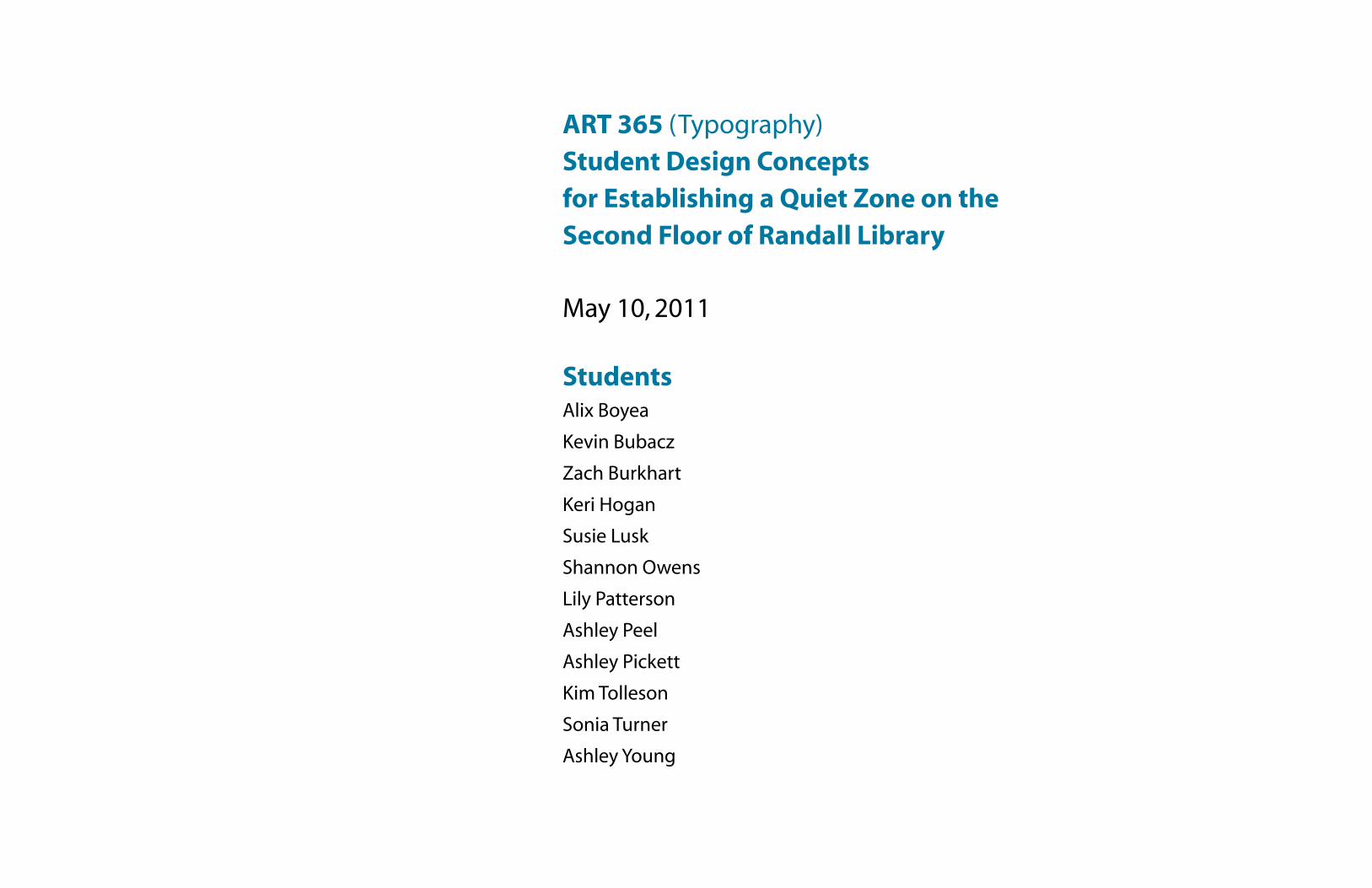
May 10, 2011
StudentsAlix Boyea
Kevin Bubacz
Zach Burkhart
Keri Hogan
Susie Lusk
Shannon Owens
Lily Patterson
Ashley Peel
Ashley Pickett
Kim Tolleson
Sonia Turner
Ashley Young
ART 365 (Typography) Student Design Conceptsfor Establishing a Quiet Zone on the Second Floor of Randall Library
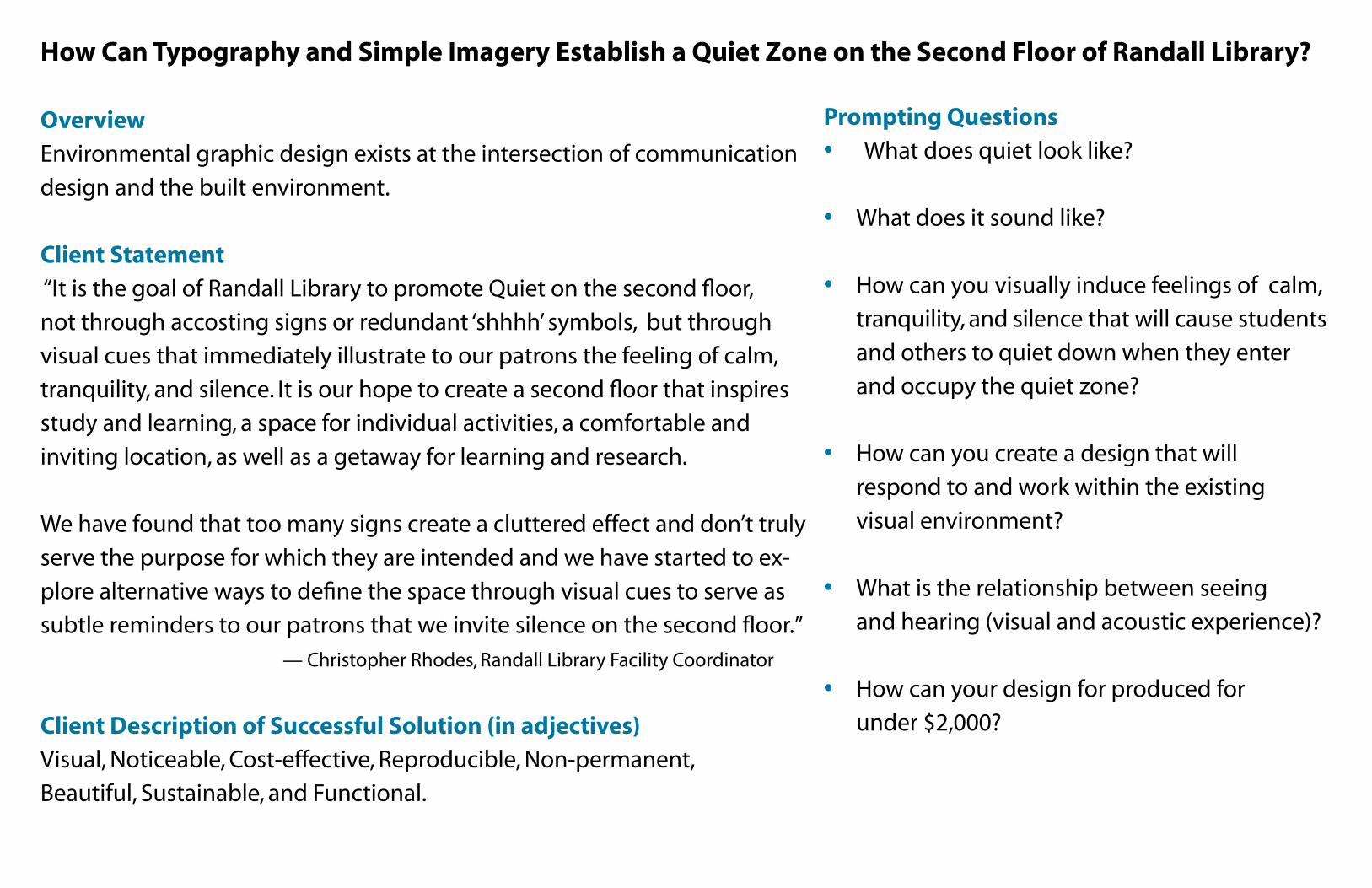
How Can Typography and Simple Imagery Establish a Quiet Zone on the Second Floor of Randall Library?
OverviewEnvironmental graphic design exists at the intersection of communication
design and the built environment.
Client Statement
“It is the goal of Randall Library to promote Quiet on the second floor,
not through accosting signs or redundant ‘shhhh’ symbols, but through
visual cues that immediately illustrate to our patrons the feeling of calm,
tranquility, and silence. It is our hope to create a second floor that inspires
study and learning, a space for individual activities, a comfortable and
inviting location, as well as a getaway for learning and research.
We have found that too many signs create a cluttered effect and don’t truly
serve the purpose for which they are intended and we have started to ex-
plore alternative ways to define the space through visual cues to serve as
subtle reminders to our patrons that we invite silence on the second floor.”
— Christopher Rhodes, Randall Library Facility Coordinator
Client Description of Successful Solution (in adjectives)Visual, Noticeable, Cost-effective, Reproducible, Non-permanent,
Beautiful, Sustainable, and Functional.
Prompting Questions• What does quiet look like?
• What does it sound like?
• How can you visually induce feelings of calm,
tranquility, and silence that will cause students
and others to quiet down when they enter
and occupy the quiet zone?
• How can you create a design that will
respond to and work within the existing
visual environment?
• What is the relationship between seeing
and hearing (visual and acoustic experience)?
• How can your design for produced for
under $2,000?
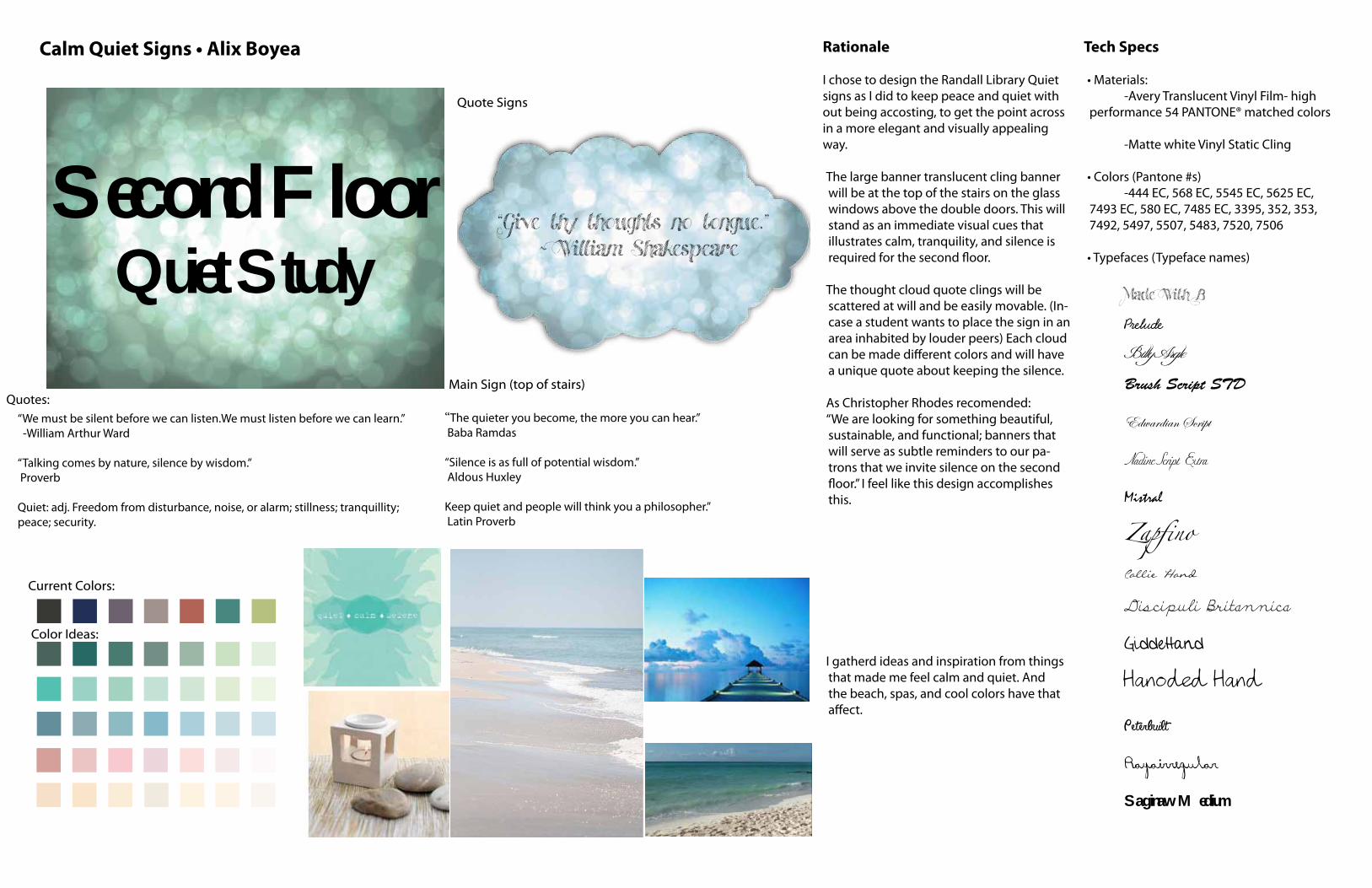
Calm Quiet Signs • Alix Boyea Tech Specs
• Materials: -Avery Translucent Vinyl Film- high performance 54 PANTONE® matched colors -Matte white Vinyl Static Cling
• Colors (Pantone #s) -444 EC, 568 EC, 5545 EC, 5625 EC, 7493 EC, 580 EC, 7485 EC, 3395, 352, 353, 7492, 5497, 5507, 5483, 7520, 7506
• Typefaces (Typeface names) Made With B
Prelude
Billy Argle
Brush Script STD
Edwardian Script
Nadine Script Extra
Mistral
Zapfino Callie Hand
Discipuli Britannica
GiddeHand
Hanoded Hand
Peterbuilt
Rayairregular
Saginaw Medium
Current Colors:
Color Options:
Main Sign (top of stairs)
Quote Signs
Rationale
I chose to design the Randall Library Quiet signs as I did to keep peace and quiet with out being accosting, to get the point across in a more elegant and visually appealing way.
The large banner translucent cling banner will be at the top of the stairs on the glass windows above the double doors. This will stand as an immediate visual cues that illustrates calm, tranquility, and silence is required for the second floor.
The thought cloud quote clings will be scattered at will and be easily movable. (In-case a student wants to place the sign in an area inhabited by louder peers) Each cloud can be made different colors and will have a unique quote about keeping the silence.
As Christopher Rhodes recomended:“We are looking for something beautiful, sustainable, and functional; banners that will serve as subtle reminders to our pa-trons that we invite silence on the second floor.” I feel like this design accomplishes this.
I gatherd ideas and inspiration from things that made me feel calm and quiet. And the beach, spas, and cool colors have that affect.
“Give thy thoughts no tongue.” ~ William Shakespeare
Second Floor Quiet Study
Current Colors:
Color Ideas:
“We must be silent before we can listen.We must listen before we can learn.” -William Arthur Ward
“Talking comes by nature, silence by wisdom.” Proverb
Quiet: adj. Freedom from disturbance, noise, or alarm; stillness; tranquillity; peace; security.
“The quieter you become, the more you can hear.” Baba Ramdas
“Silence is as full of potential wisdom.” Aldous Huxley
Keep quiet and people will think you a philosopher.” Latin Proverb
Quotes:
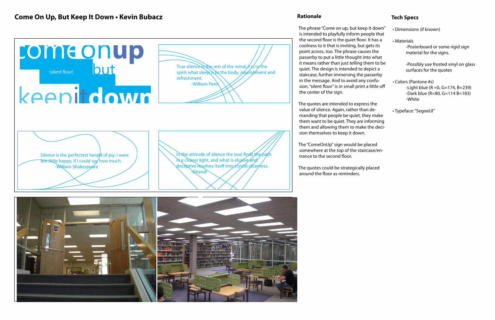
Come On Up, But Keep It Down • Kevin Bubacz Rationale
The phrase “Come on up, but keep it down” is intended to playfully inform people that the second floor is the quiet floor. It has a coolness to it that is inviting, but gets its point across, too. The phrase causes the passerby to put a little thought into what it means rather than just telling them to be quiet. The design is intended to depict a staircase, further immersing the passerby in the message. And to avoid any confu-sion, “silent floor” is in small print a little off the center of the sign.
The quotes are intended to express the value of silence. Again, rather than de-manding that people be quiet, they make them want to be quiet. They are informing them and allowing them to make the deci-sion themselves to keep it down.
The “ComeOnUp” sign would be placed somewhere at the top of the staircase/en-trance to the second floor.
The quotes could be strategically placed around the floor as reminders.
Tech Specs
• Dimensions (if known)
• Materials -Posterboard or some rigid sign material for the signs.
-Possibly use frosted vinyl on glass surfaces for the quotes
• Colors (Pantone #s) -Light blue (R =0, G=174, B=239) -Dark blue (R=80, G=114 B=183) -White
• Typeface: “SegoeUI”
Inspiration or Solution text or images
In the attitude of silence the soul �nds the path in a clearer light, and what is elusive and deceptive resolves itself into crystal clearness. -Ghandi
Silence is the perfectest herald of joy: I were but little happy, if I could say how much. -William Shakespeare
True silence is the rest of the mind; it is to the spirit what sleep is to the body, nourishment and refreshment. -William Penn
comeonup
keepitdownbut(silent �oor)
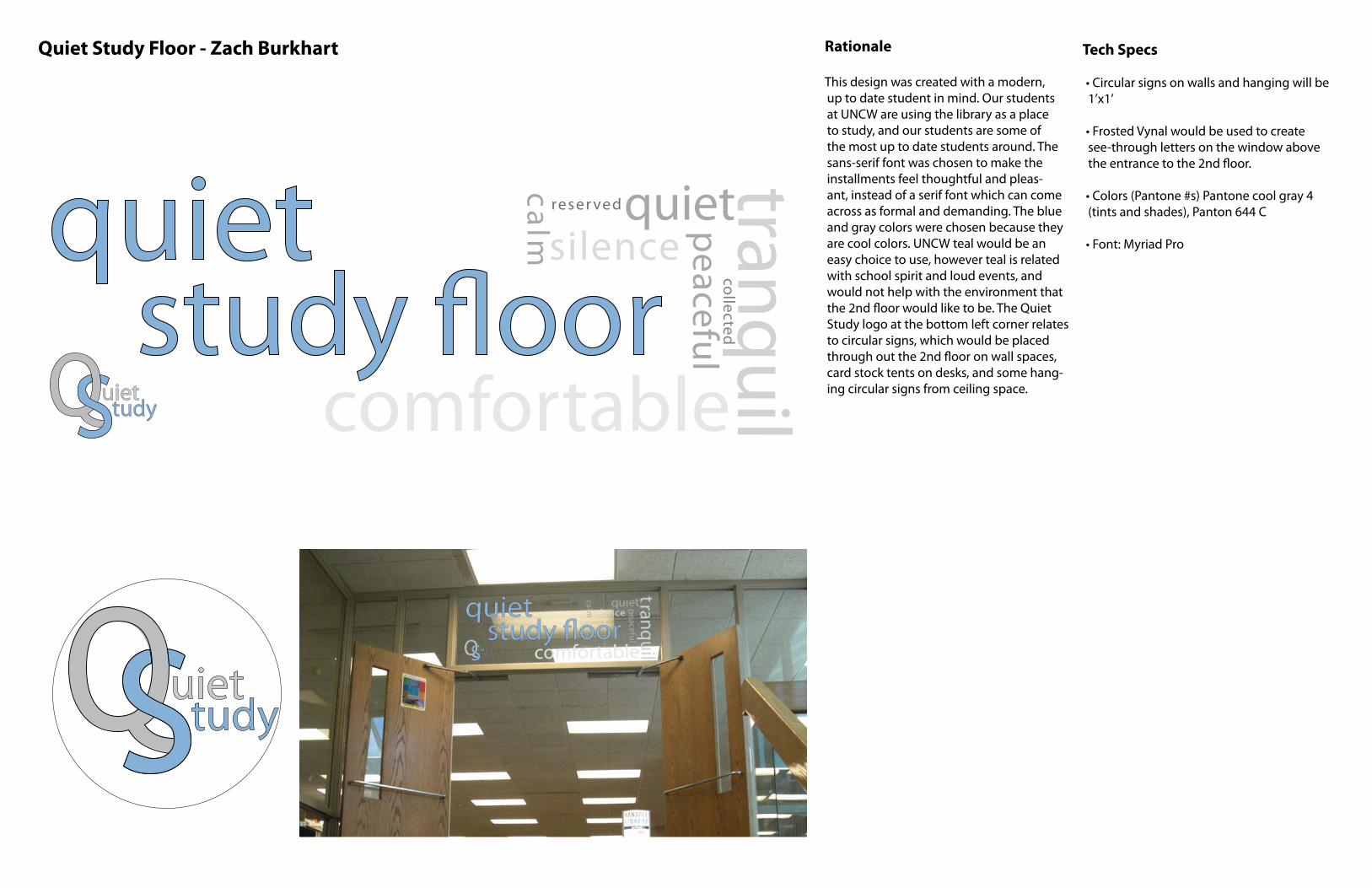
Quiet Study Floor - Zach Burkhart Rationale
This design was created with a modern, up to date student in mind. Our students at UNCW are using the library as a place to study, and our students are some of the most up to date students around. The sans-serif font was chosen to make the installments feel thoughtful and pleas-ant, instead of a serif font which can come across as formal and demanding. The blue and gray colors were chosen because they are cool colors. UNCW teal would be an easy choice to use, however teal is related with school spirit and loud events, and would not help with the environment that the 2nd floor would like to be. The Quiet Study logo at the bottom left corner relates to circular signs, which would be placed through out the 2nd floor on wall spaces, card stock tents on desks, and some hang-ing circular signs from ceiling space.
Tech Specs
• Circular signs on walls and hanging will be 1’x1’
• Frosted Vynal would be used to create see-through letters on the window above the entrance to the 2nd floor.
• Colors (Pantone #s) Pantone cool gray 4 (tints and shades), Panton 644 C
• Font: Myriad Pro
SuiettudyQ
SuiettudyQstudy �oor
quiet tranquil
silencequietcalm
reser ved
comfortable
peacefulcollected
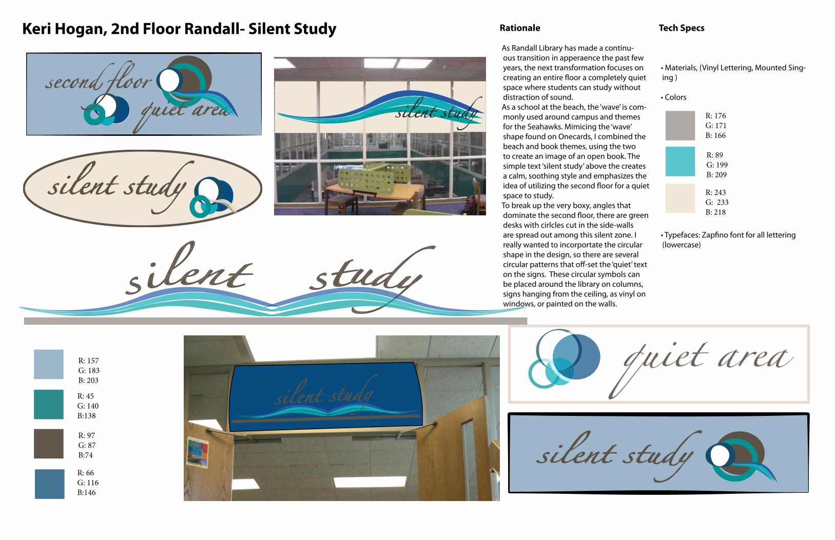
Keri Hogan, 2nd Floor Randall- Silent Study Rationale
As Randall Library has made a continu-ous transition in apperaence the past few years, the next transformation focuses on
space where students can study without distraction of sound. As a school at the beach, the ‘wave’ is com-monly used around campus and themes for the Seahawks. Mimicing the ‘wave’ shape found on Onecards, I combined the beach and book themes, using the two to create an image of an open book. The simple text ‘silent study’ above the creates a calm, soothing style and emphasizes the
space to study. To break up the very boxy, angles that
desks with cirlcles cut in the side-walls are spread out among this silent zone. I really wanted to incorportate the circular shape in the design, so there are several
on the signs. These circular symbols can be placed around the library on columns, signs hanging from the ceiling, as vinyl on windows, or painted on the walls.
Tech Specs
• Materials, (Vinyl Lettering, Mounted Sing-ing )
• Colors
(lowercase)
R: 157 G: 183B: 203
R: 45 G: 140 B:138
R: 66 G: 116 B:146
R: 97 G: 87 B:74
R: 176 G: 171B: 166
R: 243 G: 233 B: 218
R: 89 G: 199B: 209
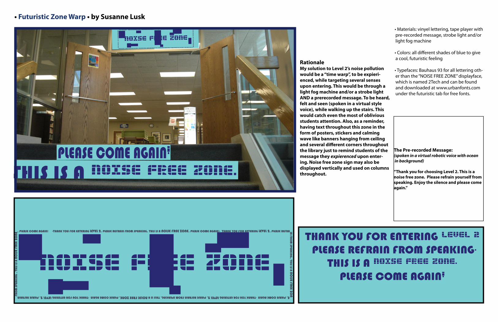
• Futuristic Zone Warp • by Susanne Lusk
RationaleMy solution to Level 2’s noise pollution would be a “time warp”, to be expieri-enced, while targeting several senses upon entering. This would be through a light fog machine and/or a strobe light AND a prerecorded message. To be heard, felt and seen (spoken in a virtual style voice), while walking up the stairs. This would catch even the most of oblivious students attention. Also, as a reminder, having text throughout this zone in the form of posters, stickers and calming wave like banners hanging from ceiling and several different corners throughout the library just to remind students of the message they expierenced upon enter-ing. Noise free zone sign may also be displayed vertically and used on columns throughout.
• Materials: vinyel lettering, tape player with pre-recorded message, strobe light and/or light fog machine
• Colors: all different shades of blue to give a cool, futuristic feeling
• Typefaces: Bauhaus 93 for all lettering oth-er than the “NOISE FREE ZONE” displayface, which is named 2Tech and can be found and downloaded at www.urbanfonts.com under the futuristic tab for free fonts.
-THANK YOU FOR ENTERING LEVEL 2. PLEASE REFRAIN FROM SPEAKING. THIS IS A NOISE FREE ZONE. PLEASE COME AGAIN!- THANK YOU FOR ENTERING LEVEL 2. PLEASE REFRAIN FR
OM
SPEAK
ING
. THIS IS A
NO
ISE FREE ZO
NE. PLEASE COME AGAIN -THANK YOU FOR ENTERING LEVEL 2. PLEASE REFRAIN FROM SPEAKING. THIS IS A NOISE FREE ZONE. PLEASE COME AGAIN -THANK YOU FOR ENTERING LEVEL 2. PLEASE REFRAIN FR
OM
SPE
AK
ING
. T
HIS
IS
A N
OIS
E FR
EE Z
ON
E . PLEASE COME AGAIN!
THANK YOU FOR ENTERING LEVEL 2 PLEASE REFRAIN FROM SPEAKING.
THIS IS A NOISE FREE ZONE. PLEASE COME AGAIN!
NOISE FREE ZONE
The Pre-recorded Message:(spoken in a virtual robotic voice with ocean in background)
“Thank you for choosing Level 2. This is a noise free zone. Please refrain yourself from speaking. Enjoy the silence and please comeagain.”
-THANK YOU FOR ENTERING LEVEL 2. PLEASE REFRAIN FROM SPEAKING. THIS IS A NOISE FREE ZONE. PLEASE COME AGAIN!- THANK YOU FOR ENTERING LEVEL 2. PLEASE REFRAIN FR
OM
SPEAK
ING
. THIS IS A
NO
ISE FREE ZO
NE. PLEASE COME AGAIN -THANK YOU FOR ENTERING LEVEL 2. PLEASE REFRAIN FROM SPEAKING. THIS IS A NOISE FREE ZONE. PLEASE COME AGAIN -THANK YOU FOR ENTERING LEVEL 2. PLEASE REFRAIN FR
OM
SPE
AK
ING
. T
HIS
IS
A N
OIS
E FR
EE Z
ON
E. PLEASE COME AGAIN!
THANK YOU FOR ENTERING LEVEL 2
PLEASE REFRAIN FROM SPEAKING.
THIS IS A NOISE FREE ZONE.
PLEASE COME AGAIN!
NOISE FREE ZONE
-THANK YOU FOR ENTERING LEVEL 2. PLEASE REFRAIN FROM SPEAKING. THIS IS A NOISE FREE ZONE. PLEASE COME AGAIN!- THANK YOU FOR ENTERING LEVEL 2. PLEASE REFRAIN F
RO
M SP
EA
KIN
G. T
HIS IS A
NO
ISE F
REE Z
ONE. PLEASE COME AGAIN -THANK YOU FOR ENTERING LEVEL 2. PLEASE REFRAIN FROM SPEAKING. THIS IS A NOISE FREE ZONE. PLEASE COME AGAIN -THANK YOU FOR ENTERING LEVEL 2. PLEASE REFRAIN F
RO
M S
PEA
KIN
G .
TH
IS I
S A
NO
ISE F
REE Z
ON
E . PLEASE COME AGAIN!
THANK YOU FOR ENTERING LEVEL 2 PLEASE REFRAIN FROM SPEAKING.
THIS IS A NOISE FREE ZONE. PLEASE COME AGAIN!
NOISE FREE ZONE-THANK YOU FOR ENTERING LEVEL 2. PLEASE REFRAIN FROM SPEAKING. THIS IS A NOISE FREE ZONE. PLEASE COME AGAIN!- THANK YOU FOR ENTERING LEVEL 2. PLEASE REFRAIN
FRO
M SPEA
KIN
G. TH
IS IS A N
OISE FR
EE ZONE. PLEASE COME AGAIN -THANK YOU FOR ENTERING LEVEL 2. PLEASE REFRAIN FROM SPEAKING. THIS IS A NOISE FREE ZONE. PLEASE COME AGAIN -THANK YOU FOR ENTERING LEVEL 2. PLEASE REFRAIN F
RO
M S
PEA
KIN
G .
TH
IS I
S A
NO
ISE
FREE
ZO
NE . PLEASE COME AGAIN!
THANK YOU FOR ENTERING LEVEL 2 PLEASE REFRAIN FROM SPEAKING.
THIS IS A NOISE FREE ZONE. PLEASE COME AGAIN!
NOISE FREE ZONE-THANK YOU FOR ENTERING LEVEL 2. PLEASE REFRAIN FROM SPEAKING. THIS IS A NOISE FREE ZONE. PLEASE COME AGAIN!- THANK YOU FOR ENTERING LEVEL 2. PLEASE REFRAIN FR
OM
SPEAKING
. THIS IS A NO
ISE FREE ZO
NE. PLEASE COME AGAIN -THANK YOU FOR ENTERING LEVEL 2. PLEASE REFRAIN FROM SPEAKING. THIS IS A NOISE FREE ZONE. PLEASE COME AGAIN -THANK YOU FOR ENTERING LEVEL 2. PLEASE REFRAIN FR
OM
SPE
AKIN
G .
TH
IS IS
A N
OIS
E FR
EE Z
ONE
. PLEASE COME AGAIN!
THANK YOU FOR ENTERING LEVEL 2 PLEASE REFRAIN FROM SPEAKING.
THIS IS A NOISE FREE ZONE. PLEASE COME AGAIN!
NOISE FREE ZONE
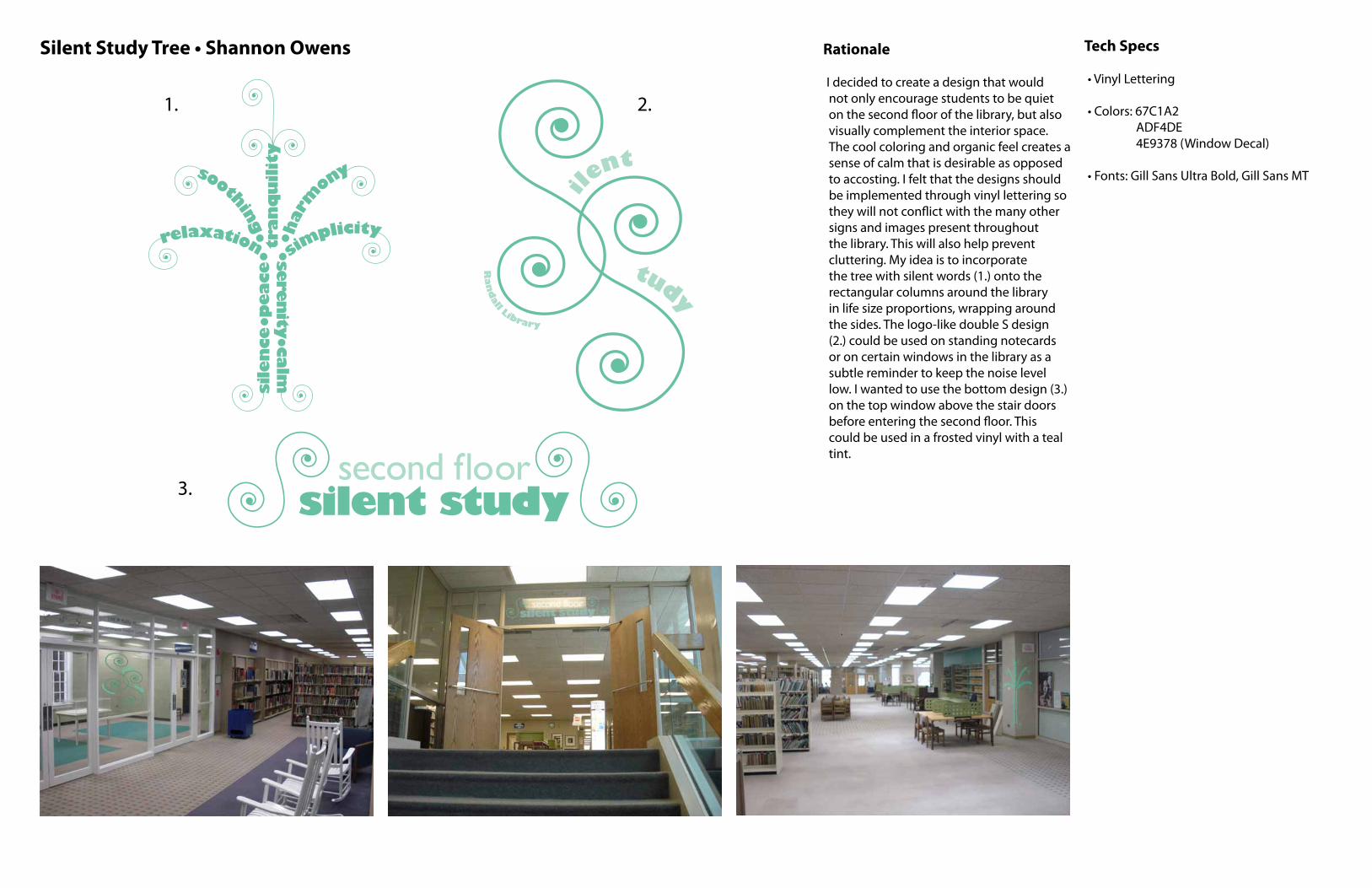
Silent Study Tree • Shannon Owens Rationale
I decided to create a design that would not only encourage students to be quiet on the second floor of the library, but also visually complement the interior space. The cool coloring and organic feel creates a sense of calm that is desirable as opposed to accosting. I felt that the designs should be implemented through vinyl lettering so they will not conflict with the many other signs and images present throughout the library. This will also help prevent cluttering. My idea is to incorporate the tree with silent words (1.) onto the rectangular columns around the library in life size proportions, wrapping around the sides. The logo-like double S design (2.) could be used on standing notecards or on certain windows in the library as a subtle reminder to keep the noise level low. I wanted to use the bottom design (3.) on the top window above the stair doors before entering the second floor. This could be used in a frosted vinyl with a teal tint.
Tech Specs
• Vinyl Lettering
• Colors: 67C1A2 ADF4DE 4E9378 (Window Decal)
• Fonts: Gill Sans Ultra Bold, Gill Sans MT
1. 2.
3.
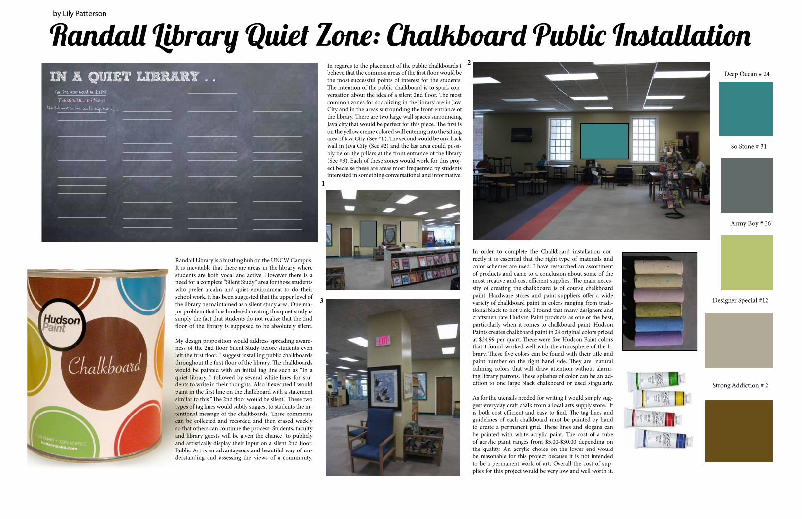
Randall Library Quiet Zone: Chalkboard Public Installation
Randall Library is a bustling hub on the UNCW Campus. It is inevitable that there are areas in the library where students are both vocal and active. However there is a need for a complete “Silent Study” area for those students who prefer a calm and quiet environment to do their school work. It has been suggested that the upper level of the library be maintained as a silent study area. One ma-jor problem that has hindered creating this quiet study is simply the fact that students do not realize that the 2nd floor of the library is supposed to be absolutely silent.
My design proposition would address spreading aware-ness of the 2nd floor Silent Study before students even left the first floor. I suggest installing public chalkboards throughout the first floor of the library. The chalkboards would be painted with an initial tag line such as “In a quiet library...” followed by several white lines for stu-dents to write in their thoughts. Also if executed I would paint in the first line on the chalkboard with a statement similar to this “The 2nd floor would be silent.” These two types of tag lines would subtly suggest to students the in-tentional message of the chalkboards. These comments can be collected and recorded and then erased weekly so that others can continue the process. Students, faculty and library guests will be given the chance to publicly and artistically display their input on a silent 2nd floor. Public Art is an advantageous and beautiful way of un-derstanding and assessing the views of a community.
IN A QUIET LIBRARY . .
THERE WOULD BE PEACE The kid next to me would stop texting ...
The 2nd floor would be SILENT.
In regards to the placement of the public chalkboards I believe that the common areas of the first floor would be the most successful points of interest for the students. The intention of the public chalkboard is to spark con-versation about the idea of a silent 2nd floor. The most common zones for socializing in the library are in Java City and in the areas surrounding the front entrance of the library. There are two large wall spaces surrounding Java city that would be perfect for this piece. The first is on the yellow creme colored wall entering into the sitting area of Java City (See #1 ). The second would be on a back wall in Java City (See #2) and the last area could possi-bly be on the pillars at the front entrance of the library (See #3). Each of these zones would work for this proj-ect because these are areas most frequented by students interested in something conversational and informative.
Deep Ocean # 24
Designer Special #12
So Stone # 31
Army Boy # 36
Strong Addiction # 2
In order to complete the Chalkboard installation cor-rectly it is essential that the right type of materials and color schemes are used. I have researched an assortment of products and came to a conclusion about some of the most creative and cost efficient supplies. The main neces-sity of creating the chalkboard is of course chalkboard paint. Hardware stores and paint suppliers offer a wide variety of chalkboard paint in colors ranging from tradi-tional black to hot pink. I found that many designers and craftsmen rate Hudson Paint products as one of the best, particularly when it comes to chalkboard paint. Hudson Paints creates chalkboard paint in 24 original colors priced at $24.99 per quart. There were five Hudson Paint colors that I found worked well with the atmosphere of the li-brary. These five colors can be found with their title and paint number on the right hand side. They are natural calming colors that will draw attention without alarm-ing library patrons. These splashes of color can be an ad-dition to one large black chalkboard or used singularly.
As for the utensils needed for writing I would simply sug-gest everyday craft chalk from a local arts supply store. It is both cost efficient and easy to find. The tag lines and guidelines of each chalkboard must be painted by hand to create a permanent grid. These lines and slogans can be painted with white acrylic paint. The cost of a tube of acrylic paint ranges from $5.00-$30.00 depending on the quality. An acrylic choice on the lower end would be reasonable for this project because it is not intended to be a permanent work of art. Overall the cost of sup-plies for this project would be very low and well worth it.
1
2
3
by Lily Patterson
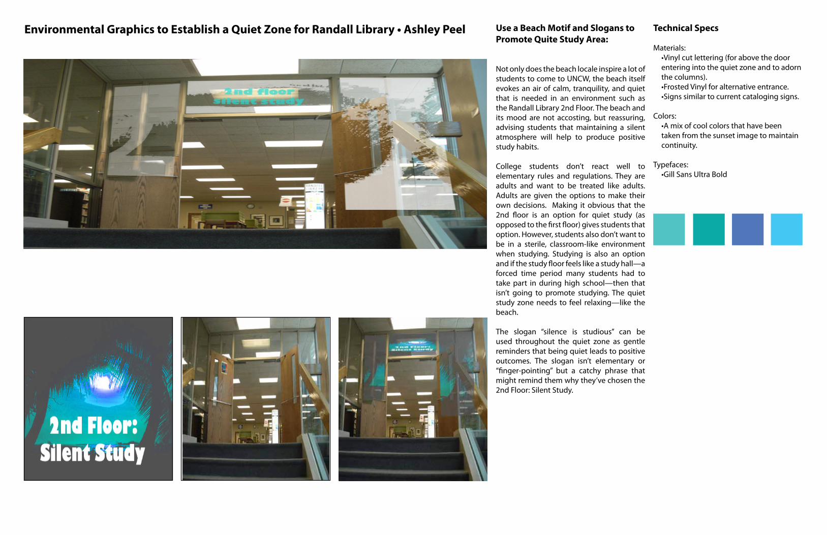
“Environmental Graphics to Establish a Quiet Zone for Randall Library” Use a Beach Motif and Slogans to Promote Quite Study Area:
Not only does the beach locale inspire a lot of students to come to UNCW, the beach itself evokes an air of calm, tranquility, and quiet that is needed in an environment such as the Randall Library 2nd Floor. The beach and its mood are not accosting, but reassuring, advising students that maintaining a silent atmosphere will help to produce positive study habits.
College students don’t react well to elementary rules and regulations. They are adults and want to be treated like adults. Adults are given the options to make their own decisions. Making it obvious that the 2nd floor is an option for quiet study (as opposed to the first floor) gives students that option. However, students also don’t want to be in a sterile, classroom-like environment when studying. Studying is also an option and if the study floor feels like a study hall—a forced time period many students had to take part in during high school—then that isn’t going to promote studying. The quiet study zone needs to feel relaxing—like the beach.
The slogan “silence is studious” can be used throughout the quiet zone as gentle reminders that being quiet leads to positive outcomes. The slogan isn’t elementary or “finger-pointing” but a catchy phrase that might remind them why they’ve chosen the 2nd Floor: Silent Study.
Technical Specs
Materials: •Vinyl cut lettering (for above the door entering into the quiet zone and to adorn the columns). •Frosted Vinyl for alternative entrance. •Signs similar to current cataloging signs.
Colors: •A mix of cool colors that have been taken from the sunset image to maintain continuity.
Typefaces: •Gill Sans Ultra Bold
Environmental Graphics to Establish a Quiet Zone for Randall Library • Ashley Peel

lii m silence
is studious
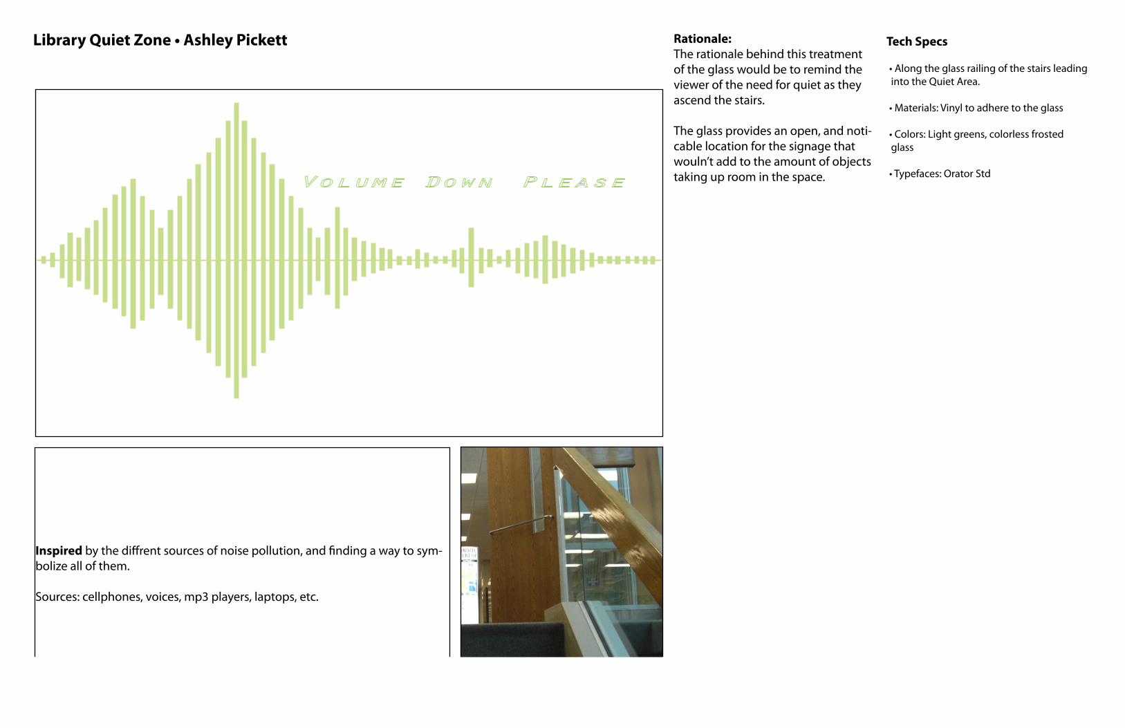
Library quiet zone Rationale:The rationale behind this treatment of the glass would be to remind the viewer of the need for quiet as they ascend the stairs.
The glass provides an open, and noti-cable location for the signage that wouln’t add to the amount of objects taking up room in the space.
Tech Specs
• Along the glass railing of the stairs leading into the Quiet Area.
• Materials: Vinyl to adhere to the glass
• Colors: Light greens, colorless frosted glass
• Typefaces: Orator Std
Inspired by the diffrent sources of noise pollution, and finding a way to sym-bolize all of them.
Sources: cellphones, voices, mp3 players, laptops, etc.
Library Quiet Zone • Ashley Pickett
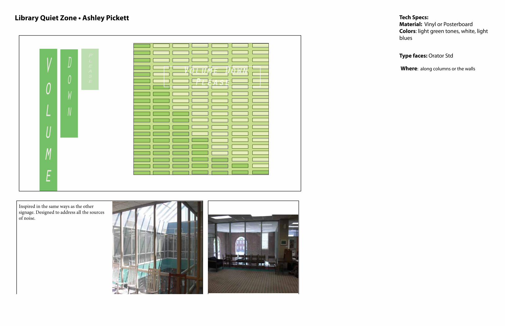
Library quiet zone signs Tech Specs:Material: Vinyl or PosterboardColors: light green tones, white, light blues
Type faces: Orator Std
Where: along columns or the walls Volume
Down
Please
Inspired in the same ways as the other signage. Designed to address all the sources of noise.
Volume Down Please
Library Quiet Zone • Ashley Pickett
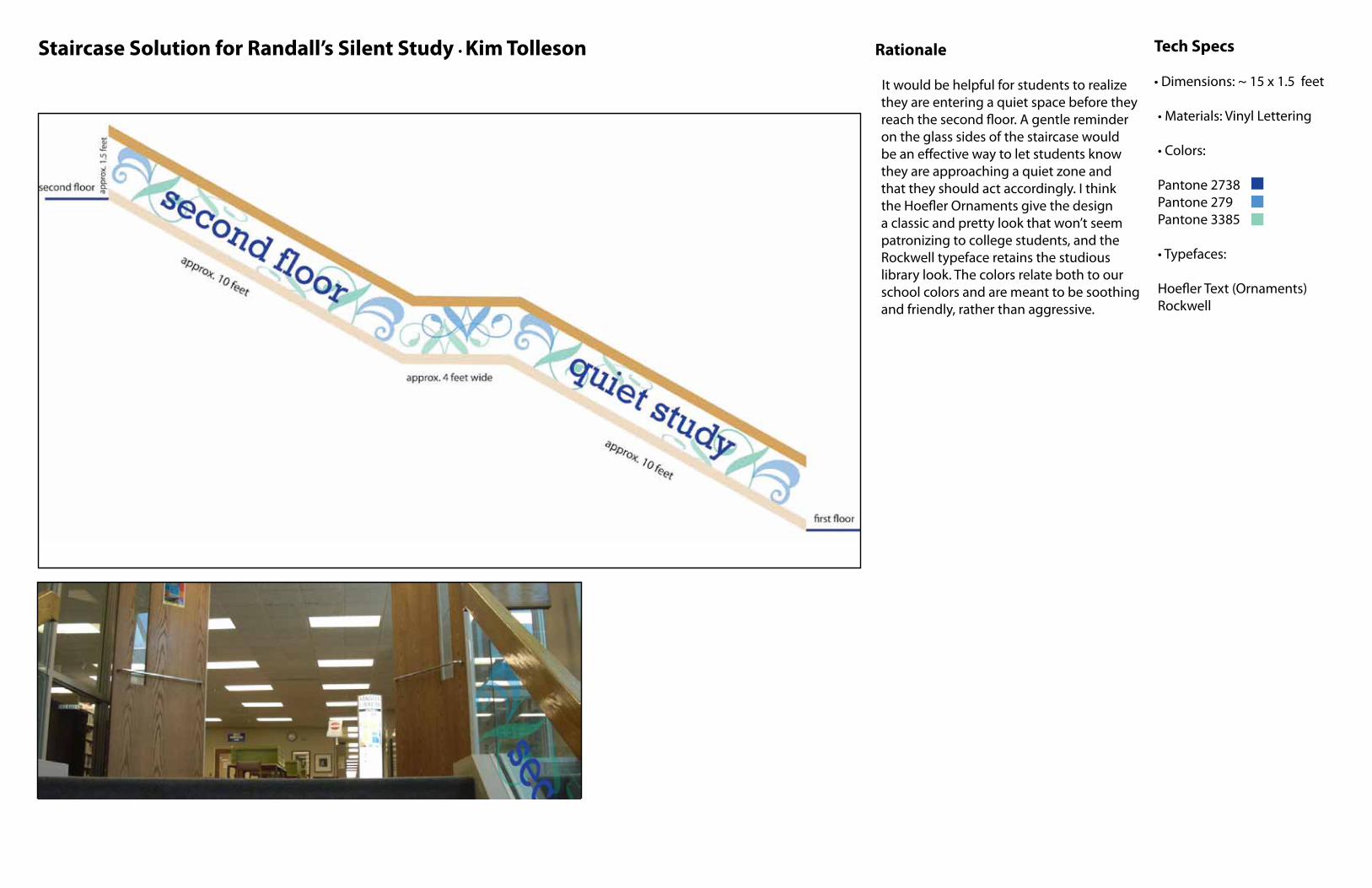
Staircase Solution for Randall’s Silent Study • Kim Tolleson Rationale
It would be helpful for students to realize they are entering a quiet space before they reach the second floor. A gentle reminder on the glass sides of the staircase would be an effective way to let students know they are approaching a quiet zone and that they should act accordingly. I think the Hoefler Ornaments give the design a classic and pretty look that won’t seem patronizing to college students, and the Rockwell typeface retains the studious library look. The colors relate both to our school colors and are meant to be soothing and friendly, rather than aggressive.
Tech Specs
• Dimensions: ~ 15 x 1.5 feet
• Materials: Vinyl Lettering
• Colors:
Pantone 2738Pantone 279 Pantone 3385
• Typefaces:
Hoefler Text (Ornaments)Rockwell
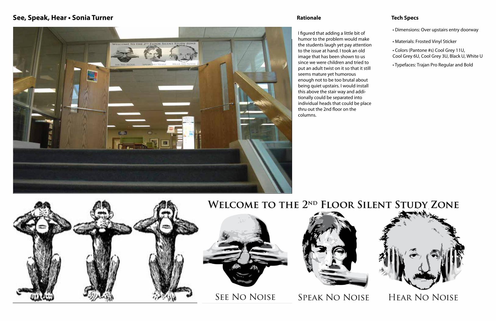
See,Speak,Hear • Sonia Turner Rationale
Tech Specs
• Dimensions: Over upstairs entry doorway
• Materials: Frosted Vinyl Sticker
• Colors (Pantone #s) Cool Grey 11U, Cool Grey 6U, Cool Grey 3U, Black U, White U
• Typefaces: Trajan Pro Regular and Bold
Solution
Inspiration or Solution text or images
I figured that adding a little bit of humor to the problem would make the students laugh yet pay attention to the issue at hand. I took an old image that has been shown to us since we were children and tried to put an adult twist on it so that it still seems mature yet humorous enough not to be too brutal about being quiet upstairs. I would install this above the stair way and addi-tionally could be separated into individual heads that could be place thru out the 2nd floor on the columns.
See, Speak, Hear • Sonia Turner
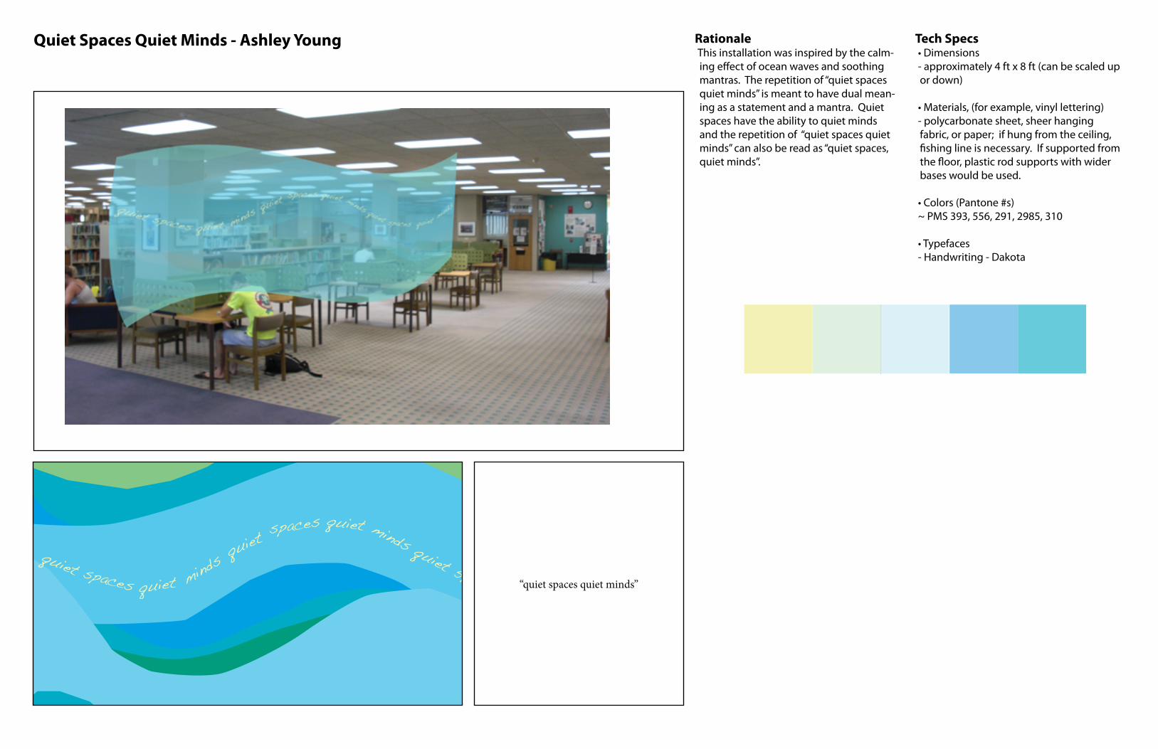
Quiet Spaces Quiet Minds - Ashley Young RationaleThis installation was inspired by the calm-ing effect of ocean waves and soothing mantras. The repetition of “quiet spaces quiet minds” is meant to have dual mean-ing as a statement and a mantra. Quiet spaces have the ability to quiet minds and the repetition of “quiet spaces quiet minds” can also be read as “quiet spaces, quiet minds”.
Tech Specs• Dimensions- approximately 4 ft x 8 ft (can be scaled up or down)
• Materials, (for example, vinyl lettering)- polycarbonate sheet, sheer hanging fabric, or paper; if hung from the ceiling, fishing line is necessary. If supported from the floor, plastic rod supports with wider bases would be used.
• Colors (Pantone #s)~ PMS 393, 556, 291, 2985, 310
• Typefaces - Handwriting - Dakota
Solution
“quiet spaces quiet minds”