as media studies evaluation presentation
TRANSCRIPT

AS Media Studies: Coursework Evaluation
Harriet Hagen


In what ways does your media product use, develop or challenge
forms and conventions of real media products?
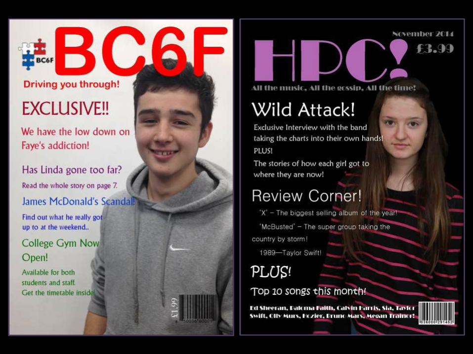
Magazine Codes and Conventions!
• Barcode• Price • Issue date • Sell lines – alliteration and puns• Masthead• Strap line • Main image (mid-shot)(minimum 4 of your own)• Advertisements • House style – colours, fonts, size of text• Interview – Question/Answer - columns• Page numbers• Direct address (gaze, editor’s note, ‘you’)• Exclusive

Masthead.Bold, bright, recognisable. Main Image.
Mid-shot, person of main article, goes over masthead, direct gaze.
Sell Lines. Different sizes, different colours, biggest sell line for the main story.
Barcode, Price, Date and Issue Number.
Strap Line.Catchy and short.
Plugs.‘Exclusive’, ‘Inside’, ‘Rare Photos’.
Skyline.What’s included.
Research into magazine codes and conventions!

Masthead.
Barcode.
Sell lines.
Plugs.
Main Image.
Date and Price.
Strap Line.
Including banner
How I used magazine codes and conventions!
How I used existing conventions in my magazine!
Masthead. I used a
masthead that is big, bold and clear so it will
attract the viewer of the magazine stand. I used the acronym of ‘HPC’ as it is catchy and short; It is staccato which makes
it more memorable. Main Image. I used a mid-
shot image of a girl who is the lead singer of the featured
band. The image has a direct gaze and looks like she is
coming out of the magazine as her head is positioned over part
of the masthead.
Sell Lines. I used sell lines on
my cover that stand out against the background of my
magazine and used exclamation marks at the end
of each one to attract my target audience.
Hooks. One of my sell
lines uses a plug which draws the viewer’s eyes to it as it makes them think
there is something exciting in the magazine.
Strap Line. I used a strap
line under my masthead that is short and catchy. It would be used on every issue and would be one of the things
the magazine is recognisable by.
House style. The house style for the magazine is bold and simple. I tested
the usual conventions slightly as black isn’t usually used for the
background colour of a pop magazine as it is too
dark and has connotations of a different music genre. However I used it as I like the contrast of the dark
and light colours because it makes it stand out more.

House Style.Continued through the magazine.
Features.The first thing read on the page.
Regulars.At the bottom of the page, less urgent to be read. Review Section
Separate from the rest of the contents,
Main Image.Relates to the main story.
Page Numbers.
Research into magazine codes and conventions!

House Style.
Features.
Images.
Regulars.
Editors Note. Page Numbers.
How I used magazine codes and conventions!

House Style. I continued
the house style throughout the magazine to make it have a continuous feel.
Images. The images on the
contents page are all connected to the main article in the magazine. They are all original images taken by me.
Features and Regulars.
The features and regular articles are separate from
each other to make the organisation easier.
Editors Note.
The editors note is written by the editor that
explains what is in the
issue.
How I used existing conventions in my magazine!
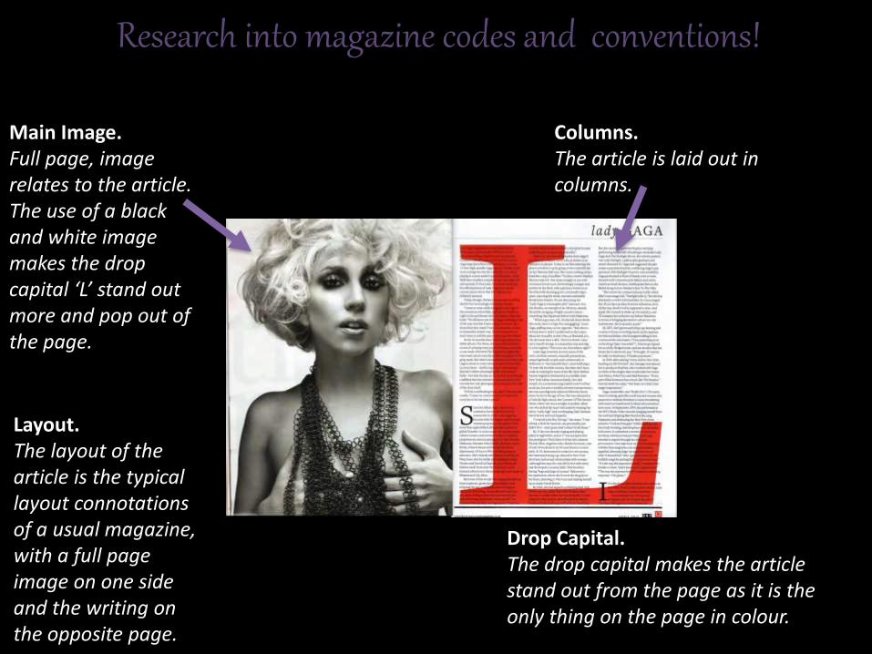
Main Image.Full page, image relates to the article.The use of a black and white image makes the drop capital ‘L’ stand out more and pop out of the page.
Columns.The article is laid out in columns.
Research into magazine codes and conventions!
Drop Capital.The drop capital makes the article stand out from the page as it is the only thing on the page in colour.
Layout.The layout of the article is the typical layout connotations of a usual magazine, with a full page image on one side and the writing on the opposite page.

House style continued.
Columns.
Question & Answer form.
Main Image.
Inset.
Caption.
How I used magazine codes and conventions!
Layout.

House Style. I continued the house style throughout the magazine
to make it have a continuous feel.
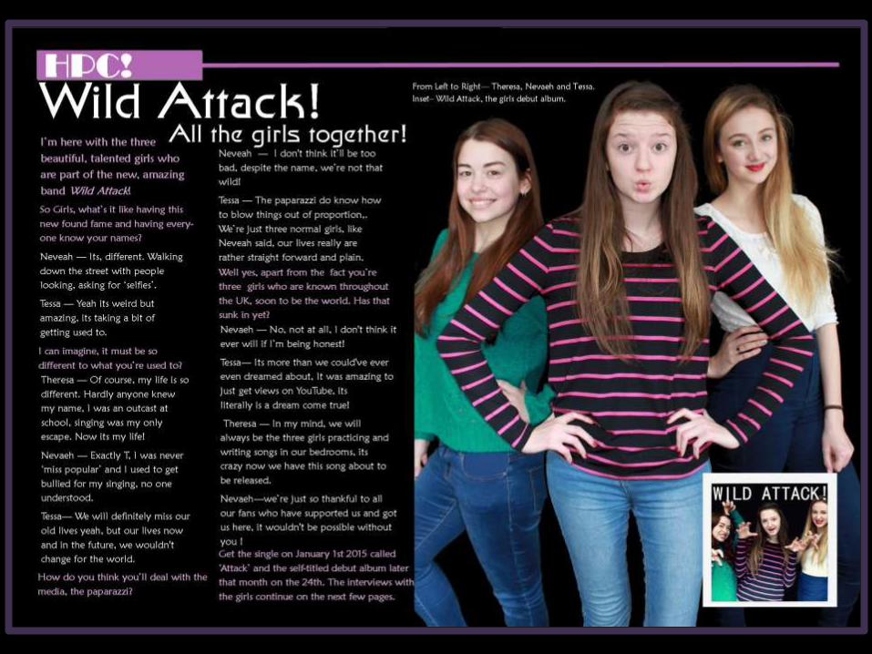
Interview. I made my
double page spread an interview which includes
direct address as the question & answer format makes the reader feel like
they are asking the questions and the
interviewees are actually talking to them.
Main Image. For the
image on my double page spread I used a long shot with all three girls in it. I also had an inset of the
album cover which is mentioned in the interview.
There is also a captionabout the images which tell
the reader what they are and which girl is which.
How I used existing conventions in my magazine!
Layout. I continued the house style throughout the magazine
to make it have a continuous feel.

Who would be the audience for your media product?

My target audience for my magazine would be teenage girls in the age range of 14-18. I decided
to choose this age group because the result from my questionnaire told me that the main
listeners to the pop genre of music were this age group. Ages
14 15 16 17

I used typical stereotypes of 14-18 year old girls to make my magazine appeal to them, for example the
colour scheme and the type of stories featured in the magazine. I put pop acts that are stereotypically
listened to by teenage girls, like Ed Sheeran and Taylor Swift. My main story was about a female pop group that I imagined to be like the girl group Little
Mix as they are a group of young girls who’s fan base is teenage girls.

How does your media product represent particular social groups?

My magazine has the typical stereotypes of a group of teenage girls, aged 14-18 as this is who my magazine is aimed at. I decided on this age
group because of the results from my questionnaire told me that the majority of
people who listen to the pop genre are teenage girls.
Ages
14 15 16 17
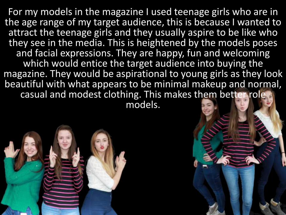
For my models in the magazine I used teenage girls who are in the age range of my target audience, this is because I wanted to attract the teenage girls and they usually aspire to be like who they see in the media. This is heightened by the models poses
and facial expressions. They are happy, fun and welcoming which would entice the target audience into buying the
magazine. They would be aspirational to young girls as they look beautiful with what appears to be minimal makeup and normal,
casual and modest clothing. This makes them better role models.
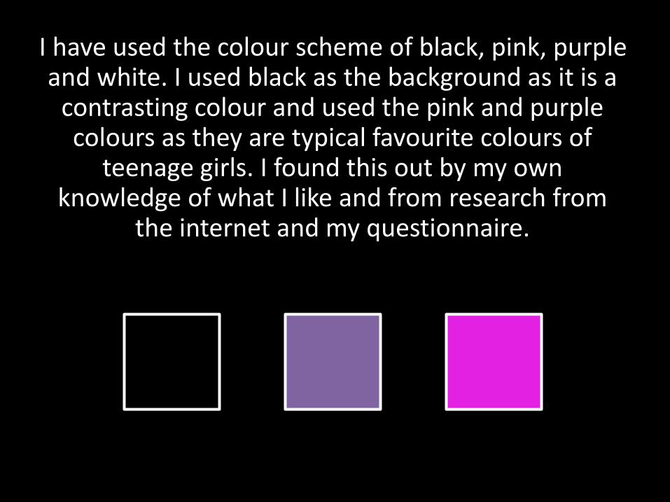
I have used the colour scheme of black, pink, purple and white. I used black as the background as it is a
contrasting colour and used the pink and purple colours as they are typical favourite colours of
teenage girls. I found this out by my own knowledge of what I like and from research from
the internet and my questionnaire.

I used exclamation marks on my magazine as they make the magazine seem light hearted and exciting.
They also link to direct address which makes the magazine appeal to the reader directly.
I made my magazine look simple and not cluttered and filled it with information that wasn’t too
educational so my magazine applied the Hypodermic Needle theory, so my readers could
just read the magazine without engaging their brain too much.

How did you attract/address your audience?

In my magazine I used direct address to attract the audience. My main image is a teenage girl looking directly into the camera which makes
her seem to be looking straight at you. I did this deliberately to draw the viewer of the magazine
in as when someone is looking at you, you automatically want to know more.

I also attracted them with the colour scheme of bright purples and pinks, which are typically
teenage girl colours, and by using the contrasting black as it makes the colours pop out of the magazine and makes them more vibrant.
What kind of media institution might distribute your media product and
why?
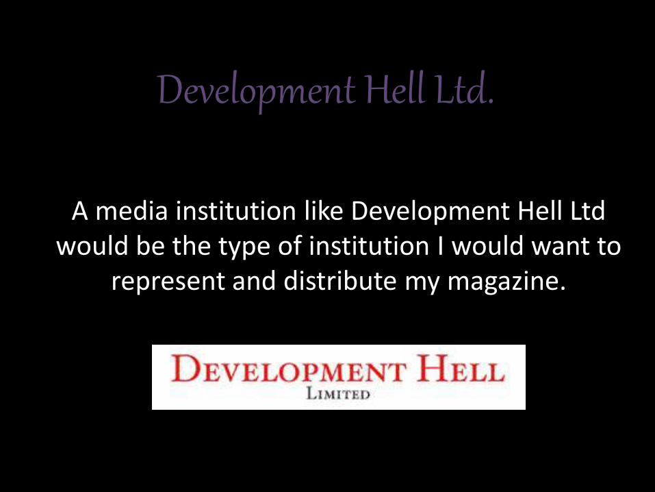
Development Hell Ltd.
A media institution like Development Hell Ltd would be the type of institution I would want to
represent and distribute my magazine.

They represent magazines that are about music and entertainment and this is the genre of my
magazine.
The owners of Development Hell Ltd used to be the executives of the institution Emap which means they have a lot of precious experience
with distributing magazines.
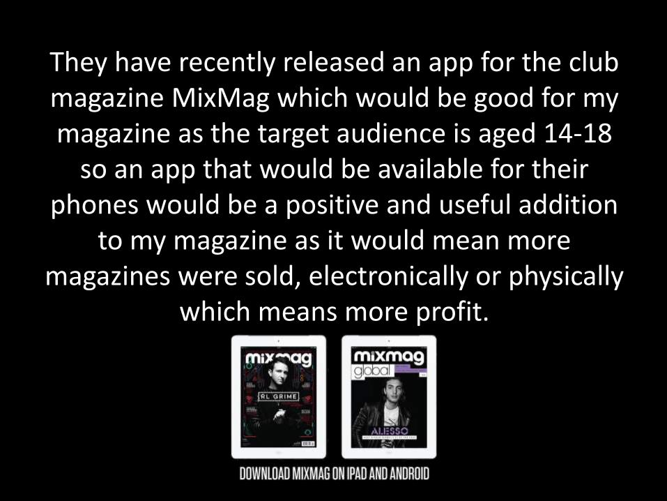
They have recently released an app for the club magazine MixMag which would be good for my magazine as the target audience is aged 14-18
so an app that would be available for their phones would be a positive and useful addition
to my magazine as it would mean more magazines were sold, electronically or physically
which means more profit.
What have you learnt about technologies from the process of
constructing this product?
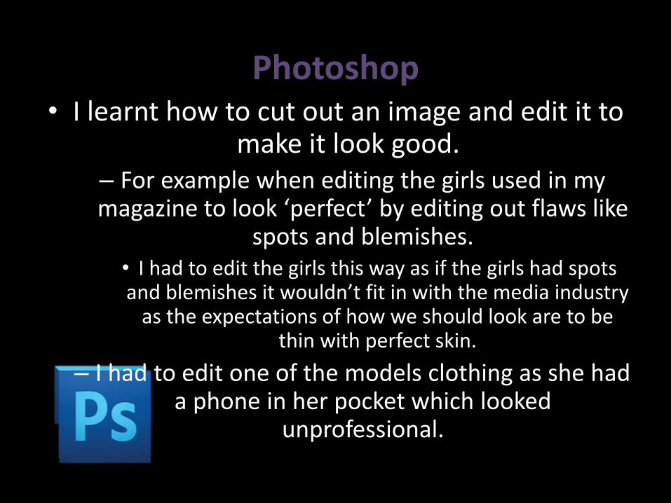
Photoshop• I learnt how to cut out an image and edit it to
make it look good. – For example when editing the girls used in my magazine to look ‘perfect’ by editing out flaws like
spots and blemishes. • I had to edit the girls this way as if the girls had spots and blemishes it wouldn’t fit in with the media industry
as the expectations of how we should look are to be thin with perfect skin.
– I had to edit one of the models clothing as she had a phone in her pocket which looked
unprofessional.


Blogger• I learnt how to embed a Slide-Share into a
blog post.
– I didn’t know how to do this before but with multiple tries and failures, I finally worked out
how to do it.
• Now I know how to do it, it’s really simple to do.
Looking back at your preliminary task, what do you feel you have learnt in the progression from it to the full
product?

• From my preliminary task, I feel that I have learnt how to make a more professional looking magazine by using different publishing software like Publisher and InDesign.
• My preliminary task magazine looked quite empty with a bland colour scheme. My contents page for my preliminary task was only a single page with a column of page numbers and a column of pictures; however now I feel like my standard has been raised as I have more of a varied layout which isn’t just in simple columns all the time.
• I feel like my skills on publishing programs have improved a lot since I first started this course, which I feel is visible in my coursework.