assignment 2/unit 6: creating and testing digital graphic...
TRANSCRIPT

Assignment 2/unit 6: creating and testing digital graphic products Sheldon Chester 21/10/2015
P4/m3
Assets list
These are my two final designs created using pixlr
Here are the list of assets used
1. this was made in PowerPoint and used on the male blue design
21/10/2015 no link provided

Assignment 2/unit 6: creating and testing digital graphic products Sheldon Chester 21/10/2015
2. this image was used from google
images in my female design 21/10/2015
https://barcode1.co.uk/sample-barcode-images/
3. This design was also used made in
PowerPoint for the female template design. /10/2015
4. The logo was created in pixlr as well as the 2 final designs.
5. this barcode was used and created inmicrosoft powerpoint

Assignment 2/unit 6: creating and testing digital graphic products Sheldon Chester 21/10/2015
6. Used this smartphone net box template design provided to me in
the sapsed 2 folders.
The
next images are assets that I considered using but didn’t
1. http://www.thewonderforest.com/2012/01/14-days-of-love-heart-favor-box-diy.html
21/10/2015 09:56 the reasons and purpose I did not use this phone box template is that
it’s not suitable for use and wouldn’t attract the audience’s attention as I would like it to
as the item needs to be appealing.

Assignment 2/unit 6: creating and testing digital graphic products Sheldon Chester 21/10/2015
2. http://deliciousbydesign.co.uk/delicious-and-inventive/
21/10/2015 10:05 I considered using this be I have a constraint and implication with
copy right as this is someone else’s design plus I don’t think the design is really relevant
as it’s for a mobile device product.
3. http://www.bhphotovideo.com/c/product/1029415-
REG/blu_l240a_blk_32gb_life_pure_smartphone.html
21/10/2015 10:13 the reason I did use this image of a smartphone is because this would
be plagiarism and copy right as this is a
company’s product.
4. This is part of the refinement process as my assets list wasn’t very clear nor very good
beforehand here is the before and after.
Before
After
Assignment 2/unit 6: creating and testing digital graphic products Sheldon Chester 21/10/2015
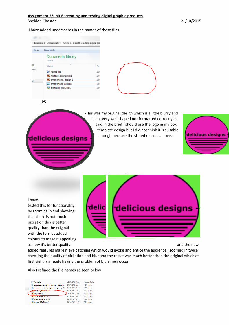
I have added underscores in the names of these files.
P5
-This was my original design which is a little blurry and
is not very well shaped nor formatted correctly as
said in the brief I should use the logo in my box
template design but I did not think it is suitable
enough because the stated reasons above.
I have
tested this for functionality
by zooming in and showing
that there is not much
pixilation this is better
quality than the original
with the format added
colours to make it appealing
as now it’s better quality and the new
added features make it eye catching which would evoke and entice the audience I zoomed in twice
checking the quality of pixilation and blur and the result was much better than the original which at
first sight is already having the problem of blurriness occur.
Also I refined the file names as seen below

Assignment 2/unit 6: creating and testing digital graphic products Sheldon Chester 21/10/2015
Before
After
Also I have done the same for the barcodes one with number and one without the numbers.
Example 1 example 2
And I have done the exact improvements on the phone designs changing little features
Example 1 example 2
High quality assets
Thes iamges are high quality as they are high res and they also are very clear and visble on both my
products.
Assignment 2/unit 6: creating and testing digital graphic products Sheldon Chester 21/10/2015
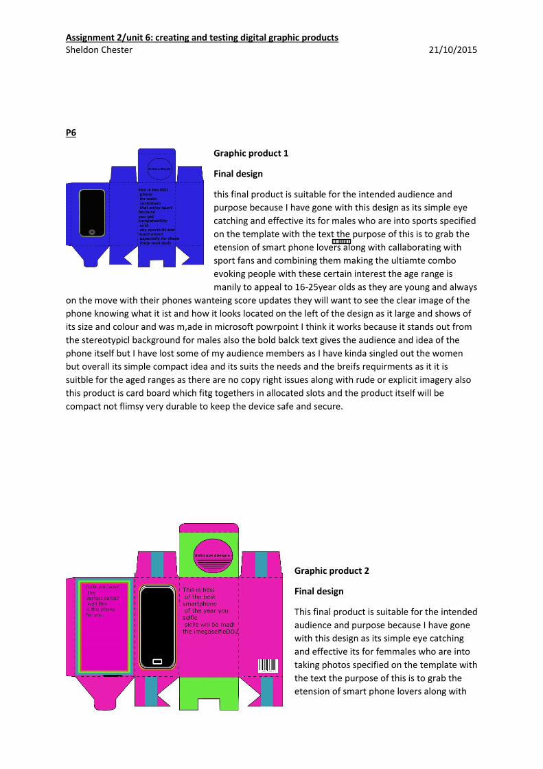
P6
Graphic product 1
Final design
this final product is suitable for the intended audience and
purpose because I have gone with this design as its simple eye
catching and effective its for males who are into sports specified
on the template with the text the purpose of this is to grab the
etension of smart phone lovers along with callaborating with
sport fans and combining them making the ultiamte combo
evoking people with these certain interest the age range is
manily to appeal to 16-25year olds as they are young and always
on the move with their phones wanteing score updates they will want to see the clear image of the
phone knowing what it ist and how it looks located on the left of the design as it large and shows of
its size and colour and was m,ade in microsoft powrpoint I think it works because it stands out from
the stereotypicl background for males also the bold balck text gives the audience and idea of the
phone itself but I have lost some of my audience members as I have kinda singled out the women
but overall its simple compact idea and its suits the needs and the breifs requirments as it it is
suitble for the aged ranges as there are no copy right issues along with rude or explicit imagery also
this product is card board which fitg togethers in allocated slots and the product itself will be
compact not flimsy very durable to keep the device safe and secure.
Graphic product 2
Final design
This final product is suitable for the intended
audience and purpose because I have gone
with this design as its simple eye catching
and effective its for femmales who are into
taking photos specified on the template with
the text the purpose of this is to grab the
etension of smart phone lovers along with

Assignment 2/unit 6: creating and testing digital graphic products Sheldon Chester 21/10/2015
selfie fanatics also a cool combo I have tried to impliment stereotypical girl colours as that is what
will grab their etension towards the design people with these certain interest the age range is manily
to appeal to 16-25year olds as they are young and always wanting memories and upadated profile
pictures on social media the have bright intense colours which will appeal and catch the entension of
young girls as the logo and phone design is large and clear as long as the text all of the items used in
this design stand out from the background of the bright box template but I have lost some of my
audience members as I have kinda singled out the men from purchasing this phone but overall its
suits the needs and the breifs requirments as it it is suitble for the aged ranges as there are no copy
right issues along with rude or explicit imagery this product is card board which fitg togethers in
allocated slots and the product itself will be compact not flimsy very durable to keep the device safe
and secure.
M4/M5
I have asked 5 people in total to gather feedback on the quality of my products and the results were
mostly positive as 60% like my two product designs the other 40% disagreed and gave me feedback
on how I should make improvements.
Feedback client 1 positive: both of your products have good intension to detail and some aspects
like colour and font size for example as they are clear and visible the compensate each other.
Feedback client 2 positive: your two designs both include specifications of the smartphone products
which a very clear and well positioned on the box template as the colours are simple but effective as
it’s the first thing that I notice.
Feedback client 3 positive: you have nicely included features such a barcode and a logo which is
effective because it makes it look realistic and very simple which I like as it doesn’t over complicate
the design idea.
Feedback client 4 negative: you should add more colour into you blue male colour design and should
add simple features like a recycle logo and QR code logo as well.
Feedback client 5 negative: to be honest the lay out I would prefer the phone to at centre of
intension as that’s what your trying to sell also you have made it specific to gender so you have lost
some of your target audience members.
I have taken into consideration about the
feedback I have received and have decided
to add in the follow a QR code for people to
scan the box with and a recycle emblem to
show this case can be recycled as it is made
from card and can be easily disposed of.

Assignment 2/unit 6: creating and testing digital graphic products Sheldon Chester 21/10/2015
They have been circled in red.
D4
Using pixlr can edit the background colour to white which is still effective as it makes all the
items like the phone and the black bold text stand out also by doing this it eliminates the constraint
of having gender phones as now anyone can buy it as it doesn’t single out a curtain gender anymore
which is a positive as now you will have a bigger target audience to sell the product to.

Assignment 2/unit 6: creating and testing digital graphic products Sheldon Chester 21/10/2015
This is my final design with feedback improvements added and recommendations
from peers I am very pleased with my final outcome as now it has improved my design idea as well
as my target audiences availability also by doing this it eliminates the constraint of having gender
phones as now anyone can buy it as it doesn’t single out a curtain gender this makes me feel better
about my graphic design skills as I have learned new skills how refine and enhance created product
with recommendations I think I could improve on this by adding a contact us link to a website along
with a phone number as well so clients can contact us in various ways.
D3
I have made further refinements to my assets as I have now added more icons in my design idea to
make it more realistic and appealing to the audience.
https://en.wikipedia.org/wiki/Recycling_symbol
15:00 21/10/2015
http://keremerkan.net/qr-code-and-2d-code-generator/
15:00 21/10/2015

Assignment 2/unit 6: creating and testing digital graphic products Sheldon Chester 21/10/2015
screenshot of new added features as well as refining them
as highlighted in red.