b uild a data dashboard with angularjs · accessibility is important, so in the html i will create...
TRANSCRIPT

PROJECTSJavaScript
98 december 2015
As soon as I began playing around with AngularJS, it struck me that its ability to grab
data and use it directly in markup could offer great possibilities for data visualisation. This approach could present a really quick and simple way to create data visualisations from scratch, rather than having to rely on a separate library.
In this tutorial we will start to build a data dashboard for a web app – in this case a RunKeeper clone called ‘JogTracker’. We will progress from using Angular values in HTML style, to inline SVG, before utilising the conic-gradient() polyfill.
For me, the most appealing part of this technique is that you can start building data visualisations with even the most limited JavaScript knowledge. We will be largely using our script file to hold data,
so if you can write JavaScript objects, you will be well on your way.
APP SETUPFor this prototype I am going to let Bootstrap do the heavy lifting when it comes to style and layout, so we can focus on the Angular-specific code. I will assume you have included the Angular library in your HTML, and have set up and linked your Angular app (see the example code at netm.ag/angularcode-274 for details on how to do this, if needed).
We are now going to create the data structure for our JogTracker application. We’ll keep this really simple, with each ‘jog’ stored as an object with a time , distance and date property. We’ll store these objects in an array called $scope.data – $scope
BUILD A DATA DASHBOARD WITH ANGULARJSNick Moreton shows you how using AngularJSshows you how using AngularJSshows you how using Angular values directly in your HTML can make building data visualisations fast and fun
JAVASCRIPT
V IDEO Nick Moreton has created an exclusive screencast to go with this tutorial. Watch along at netm.ag/angularvid-274
ABOU T T HE AU THOR
NICK MORE TON w: codepen.io/nickmoreton t: @ngmoretonjob: Lecturer, Birmingham City Universityareas of expertise: HTML, CSS, JavaScript, AngularJS, WordPress q: what gadget would you have trouble parting with? a: I have a four-track tape recorder that hasn’t been used in over 15 years. I just can’t bear to throw it away!
View source files here!
All the files you need for this tutorial can be found at
netm.ag/angularcode-274
NET274.tut_angular.indd 98 9/30/15 2:45 PM
december 2015 99
JavaScript
allows us to access this data directly from inside our controller in the HTML.
$scope.data = [{ distance: 3.24, time: 34, date: new Date("May 01, 2015"), }, // And so on... ]
In order to create my visualisations I also need to know the maximum values for time and distance. This can be done for each with a short piece of JavaScript:
$scope.maxDistance = Math.max.apply(Math, $scope.data.map(function(jog) { return jog.distance; }))
I can then do the same to find the maximum time. Now I have all my data stored and accessible from my HTML, that’s it for JavaScript!
BAR CHARTThe main visualisation I am going to create is a bar chart showing the last 10 jogs from my data, with a bar for both distance and time. Accessibility is important, so in the HTML I will create a table that contains the data, and use CSS to convert this visually to a bar chart.
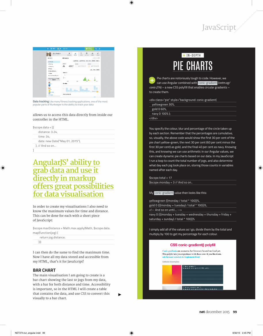
Pie charts are notoriously tough to code. However, we can use Angular combined with conic-gradient (netm.ag/
conic-274) – a new CSS polyfill that enables circular gradients – to create them.
<div class="pie" style="background: conic-gradient( yellowgreen 30%, gold 0 60%, navy 0 100% );</div>
You specify the colour, blur and percentage of the circle taken up by each section. Remember that the percentages are cumulative, so, visually, the above code would show the first 30 per cent of the pie chart yellow-green, the next 30 per cent (60 per cent minus the first 30 per cent) as gold, and the final 40 per cent as navy. Knowing this, and knowing we can use arithmetic in our Angular values, we can create dynamic pie charts based on our data. In my JavaScript I run a loop to count the total number of jogs, and also determine what day each jog took place on, storing those counts in variables named after each day.
$scope.total = 17$scope.monday = 3 // And so on..
My conic-gradient value then looks like this:
yellowgreen {{monday / total * 100}}%,gold 0 {{(monday + tuesday) / total * 100}}%, <!-- And so on until... -->navy 0 {{(monday + tuesday + wednesday + thursday + friday + saturday + sunday) / total * 100}}%
I simply add all of the values as I go, divide them by the total and multiply by 100 to get my percentage for each colour.
PIE CHARTS IN-DEPTH
Data tracking Like many fitness tracking applications, one of the most popular parts of Runkeeper is the ability to track your data
AngularJS’ ability tograb data and use itdirectly in markupoff ers great possibilitiesfor data visualisation
NET274.tut_angular.indd 99 9/30/15 2:45 PM

PROJECTSJavaScript
100 december 2015
To begin, I will leverage the ng-repeat functionality of Angular to loop through my $scope.data array and spit the data out into a table.
<table class="bar-chart"> <tr ng-repeat="jog in data | limitTo:-10"> <td> {{jog.date | date}} </td> <td> {{jog.time | number}} Minutes </td> <td> {{jog.distance | number}} Miles </td> </tr></table>
This will create a table row for each entry in the data. I declare the individual name for each entry as jog . This enables me to access the properties of that object, such as jog.distance .
I have also utilised some Angular filters using | . In the ng-repeat attribute, the limitTo filter allows you to limit the number of entries shown. A value of 10 will show the first 10 entries, however I want to show the last 10. For this I set the limitTo to -10 .
We now have an accessible table showing our data. Let’s turn it into a bar chart. Firstly, we need to set up some CSS to override the appearance of our table.
.bar-chart { display: block; height: 300px; position: relative; border-left: 1px solid #668284; border-bottom: 1px solid #668284;}.bar-chart td { position: absolute; width: 20px; bottom: 0;}
This turns both the table and the cell into block elements, adds a border to show an X and Y axis, and sets up positioning and width on the cells that will become our bars. We set absolute positioning as we are going to use some Angular magic to space the bars out along our chart using the left property.
I also set up some classes for each bar, in order to give them a background colour and offset their position. The .legend cell will show the date below the bars, so has been positioned as such. .time will sit next to the .distance bar, so has been nudged along with some margin.
.bar-chart .legend { bottom: -40px;}
SVG LINE GRAPH
We can use Angular values anywhere in our HTML markup, and this includes inline SVG. An example of this in our app
would be creating a line graph showing the progression of a user’s distance over time.
I give my <svg> a height of 200px in my CSS, and add a stroke width and colour to the <line> element. Now, in my markup, I use ng-repeat to output a <line> for every entry:
<svg> <line ng-repeat="jog in data" x1="{{($index – 1) / data.length * 100}}%" x2="{{$index / data.length * 100}}%" y1="{{data[$index – 1].distance / maxDistance * 200}}" y2="{{jog.distance / maxDistance * 200}}"> </line></svg>
Each <line> has a start ( x1 and y1 ) and end point ( x2 and y2 ) for both axes. For my X axis I want to position the lines using a percentage of the width. I again use $index , but this time I need two values, so I remove one from the $index value for my start point, and use the original $index value for my end point. This means each line starts where the previous line ends.
For my Y axis I need to do a similar thing, but with my distance value from each object. I can access previous values in my $scope. data array the same way I would in JavaScript – data[$index] is the current entry in our ng-repeat loop, data[$index-1] is the previous entry. I then divide this value by the maximum and times by the height, just like in the bar chart, to position the lines vertically.
FOCUS ON
NET274.tut_angular.indd 100 9/30/15 2:45 PM

december 2015 101
JavaScript
.bar-chart .distance { background: #B9D7D9;}
.bar-chart .time { background: #668284; margin-left: 30px;}
There are plenty of extra stylistic touches, such as rotating text along the bars, so please see the example project for full code. OK, now to dig into the Angular magic in our HTML!
<td ng-style="{ left:$index * 10 +'%' }" class="legend" >{{jog | date}}</td><td ng-style="{ left:$index * 10 +'%', height: (jog.time / maxTime) * 300 + 'px' }" class="time"> <span>{{jog.time | number}} Minutes</span></td><td ng-style="{ left:$index * 10 +'%', height: (jog.distance / maxDistance) * 300 + 'px' }" class="distance" ng-class="{ 'highlight' : jog.distance === maxDistance }"> <span>{{jog.distance}} Miles</span></td>
The key part of creating the chart is the ng-style attribute that applies styling using Angular data values. Styling in ng-style is written like an object with key value pairs. You can also pass arithmetic and mix numbers and strings here.
First let’s look at the left value, which is the same on all the cells. I want to arrange my 10 bars out evenly across the width of my chart, so will space them out in 10 per cent increments.
left:$index * 10 +'%'
To do this I utilise the $index value that Angular assigns to all the entries in the ng-repeat , going up from zero in increments of one, just like in a JavaScript array. So if we run the maths, my first cell will have a left value of: 0% – $index (0) x 10 (0)
+ ‘%’ (the unit as a string). My second cell in this column will have a left value of 10 per cent, the next 20 per cent, and so on. I can also use maths to vary the heights of my bars.
height: (jog.distance / maxDistance) * 300 + 'px'
Here I am taking the distance of my individual jog and dividing it by the maximum distance in the array. I then multiply this by 300 (the height of my chart in px) and then add my unit of px as a string.
If we consider what would happen with the longest distance entry, the result of jog.distance / maxDistance would be one (as they are the same number), which would give a result of 300px. This means our largest bar will always be the full height of the chart, and the other bars will have heights relative to this.
Ideally, most of this logic would be moved to our JavaScript, perhaps as a custom Angular filter, making the HTML cleaner. However for ease of understanding, at this stage we’ll use it directly in the HTML.
The final piece of Angular data-vis magic is to use the ng-class attribute to apply a class, based on whether a condition is met. In this case, I want to add a class of highlight to the longest jog, so I add ng-class="{highlight:jog.distance === maxDistance}" to my <td> element.
CONCLUSIONOur first Angular data visualisation is complete! It isn’t only in style attributes that Angular values can be used. We can use them inside inline SVG and even utilise them inside polyfills such as Lea Verou’s conic-gradient() to create more complex visualisations.
The key part of creatingthe chart is the ng-styleattribute that appliesstyling using Angulardata values
Access issues As the bar chart is a HTML table, we can add table headers just for screen readers for accessibility
NET274.tut_angular.indd 101 9/30/15 2:45 PM