basics of interaction design & strategy - 4/11/15
TRANSCRIPT

Basics of Interaction Design and Strategy
School of Visual Arts | April 12, 2015 Robert Stribley

Today’s presentation will be available on
SlideShare following the workshop:
www.slideshare.net/stribs

Robert Stribley
@stribs
Introduction
My clients have included:
• Bank of America, PNC, Wachovia
• Citibank, JPMorgan, Morgan Stanley, Oppenheimer Funds,
Prudential, Smith Barney, T. Rowe Price
• Boston Scientific, Nasonex
• Choice Hotels, RCI, Sotheby’s International Realty
• Computer Associates, EMC
• Ford, Lincoln
• FreshDirect
• AT&T, Nextel
• Day One, Red Cross, Smithsonian National Air & Space
Museum
• Pearson, Travel Channel, Women’s Wear Daily


About You
• What’s your name?
• What do you do for work?
• What do you do for fun?
• If you could see one museum exhibit, what would it
be?
Introduction

Goals of this workshop• Learn about particular user experience
principles in detail
• Learn about principles for responsive design
in detail
• Learn about the value of creating user
journeys and create a detailed user journey
as a team
• Brainstorm and design a responsive home
page as a team
• Brainstorm and design a mobile app
experience as a team
Introduction
Agenda

Morning• UX Principles
• Grids
• Project
• User Journeys
• Lunch
Agenda

Afternoon• Site Map
• Responsive Design
• Team Exercise: Responsive Home Page
• Team Exercise: Mobile App
• Review & Feedback
• Good Design
• Q&A
Agenda

UX Principles

Scent of information
Progressive disclosure
Information clustering & hierarchy
Remove paths not taken
Tyranny of consistency
There is no fold
Death of the homepage
Know your audience
UX Principles
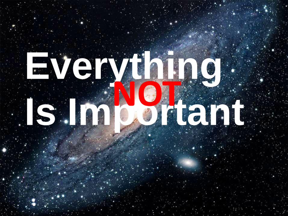
Everything
Is ImportantNOT


Scent of Information
1

3 Clicks? A myth
Designing for scent
is more successful
than designing for
navigation.– Jared Spool, UIE
If there is a scientific
basis to the Three-
Click Rule, we
couldn't find it in our
data.- User Interface
Engineering, April 2003


3 Clicks? A myth
Self Study
“Designing for the scent of information” - Jared M. Spool, Christine Perfetti & David Brittan, User Interface Engineering

Progressive Disclosure
2

Tease users.
Then draw them to the
details.

“Progressive disclosure
defers advanced or rarely
used features to a
secondary screen, making
applications easier to learn
and less error-prone.”-Jakob Nielsen
Self Study
“Progressive Disclosure” - Jakob Nielsen, December 4, 2006

Self Study
“Progressive Disclosure” – Jennifer Tildwell
Progressive disclosure with menus and form design


Information Clustering
& Hierarchy
Lustmord Table by Jenny Holzer, 1994
3

“Designers can create
normalcy out of chaos; they
can clearly communicate
ideas through the organizing
and manipulating of words
and pictures.”—Jeffery Veen, The Art and Science of Web
Design

When information is
clustered appropriately on a
screen, users can scan and
quickly come to terms with
the intent of the content.

1. Group features
and content by
type

1. Group features
and content by
type
2. Position them
according to an
intuitive hierarchy

1. Group features
and content by
type
2. Position them
according to an
intuitive hierarchy
3. Drop or demote
the less important
content

Example
Screenshot

Remove Paths
Not Taken
4

Reduce the field of view
Once users commit to a
path, remove irrelevant
navigation

Example
Screenshot


The Tyranny of
Consistency
5
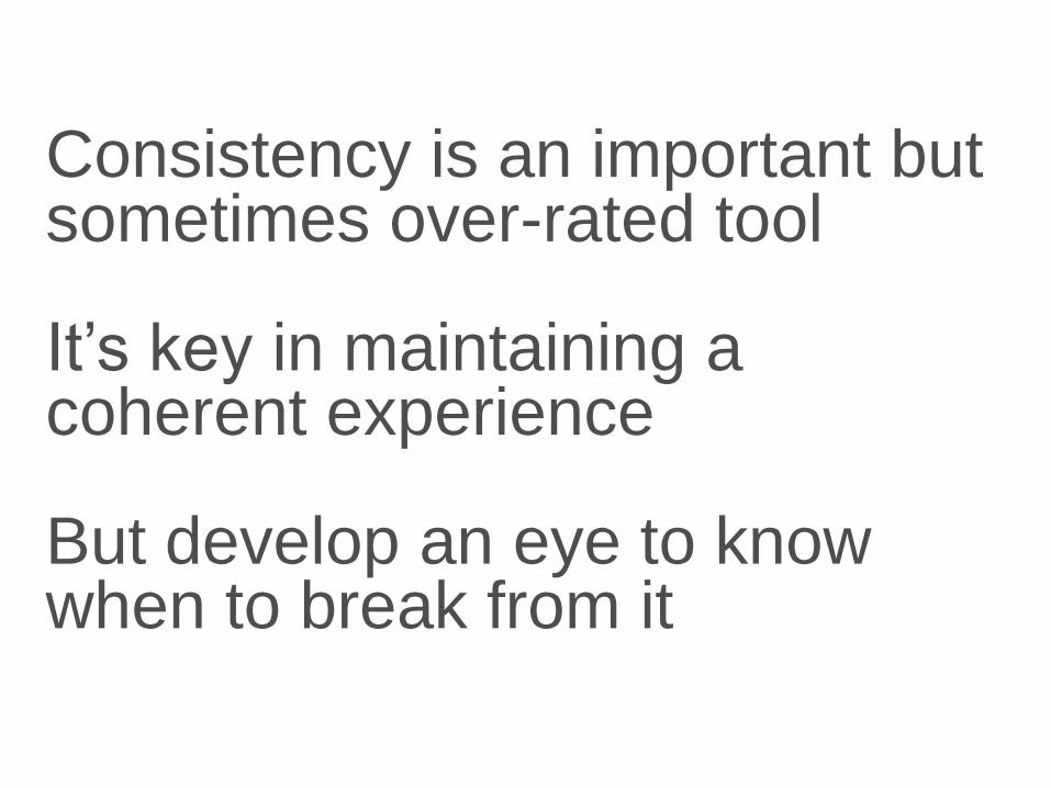
Consistency is an important but sometimes over-rated tool
It’s key in maintaining a coherent experience
But develop an eye to know when to break from it

Design pages so they're scalable
Suppress modules or sections of the page until they're needed
Don’t labor to create content just to ensure every page is "consistently" populated

Death of the Home
Page
6

People may come to your homepage
But more and more likely not
They’re more likely coming from Google or social
media
Many sites report only 20% of visitors landing on
their homepages
Some as few as 10 or 5%• 88% of traffic coming to The Atlantic not hitting home page
• More than 50% of visitors to the NYT not arriving at the
home page
Have you ever bought a book on Amazon.com
because you saw it on the homepage?

More Important?
• SEO*
• Taxonomy
• Meta data
• Tagging
*search engine optimization

Example
Screenshot

There is no fold
7
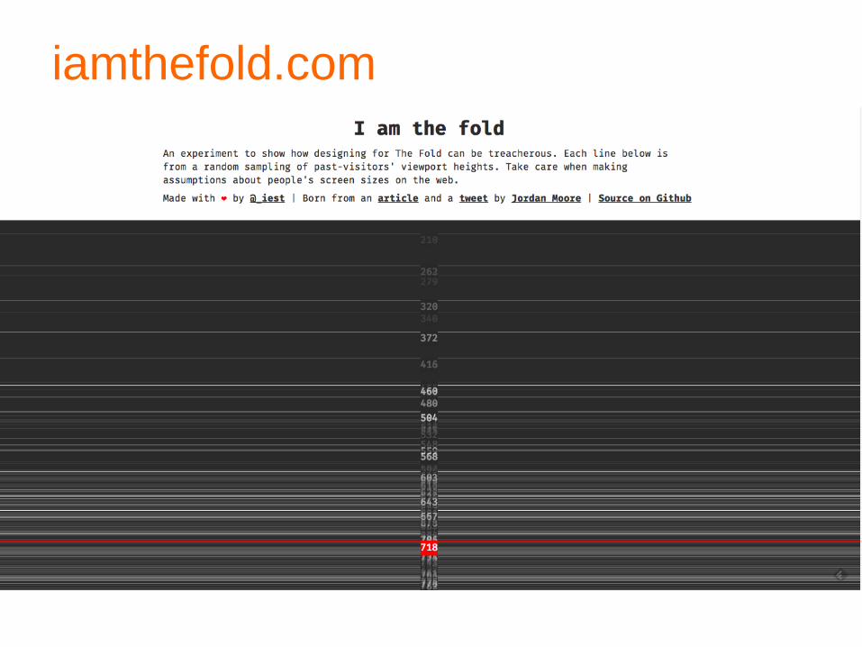
iamthefold.com

“Web users spend 80% of their
time looking at information above
the page fold. Although users do
scroll, they allocate only 20% of
their attention below the fold.”
- Jakob Nielsen, “Scrolling and Attention,” March 22, 2010

“People will look very far down a page if (a) the layout encourages
scanning, and (b) the initially viewable information makes them believe
that it will be worth their time to scroll.
Finally, while placing the most important stuff on top, don't forget to put a
nice morsel at the very bottom.”
- Jakob Nielsen, “Scrolling and Attention,” March 22, 2010

Know Your Audience
8
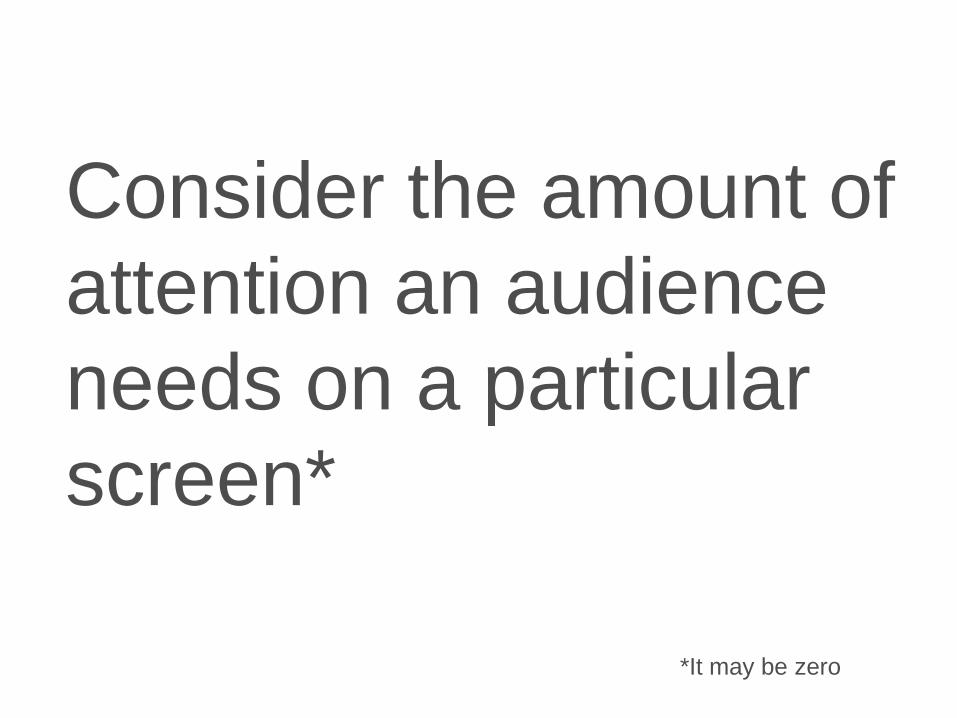
Consider the amount of
attention an audience
needs on a particular
screen*
*It may be zero

Recapping:
•Scent of Information
•Progressive Disclosure
•Information Clustering & Hierarchy
•Remove Paths Not Taken
•The Tyranny of Consistency
•Death of the Home Page
•There Is No Fold
•Know Your Audience

Grids

“To me, using grids is very
much like alphabetizing
things… sooner or later,
you realize that the
alphabet is an incredibly
useful organizing
principle.”– Khoi Vinh, former design Director, NYTimes.com
Grids

“The true benefit of using a grid is that
as you learn how to use a grid, you start
to think systemically about the solutions
you design. You start to try and see how
various details can echo one another,
how different regions of the canvas can
be reused or used for similar things,
how like elements can be grouped
together.”– Khoi Vinh
Grids


More about designing with grids:
960 Grid System
960.gs
Design by Grid
www.designbygrid.com
Hashgrid
www.hashgrid.com
Grids

Our Project

Develop a museum experience for MOMA
which utilizes both a responsive desktop
design and a mobile app experience, so users
can engage with it both at home on their
desktop computer in preparation for their trip
and during their visit via mobile app.
Our Project

Guidelines
• Since the responsive website will display on
a mobile phone, the app must not simply
repeat the website content
• Thought should be given specifically to how
the app can help visitors during their onsite
visit, but provide some value to users before
and after their trip, too
• Visitors will have comprehensive access to
Wi-Fi throughout the entire museum space
Our Project

Personas
Our Project

Competitive Review


Key Findings• Ability to highlight multiple exhibits
• Access to collections
• Display of upcoming events
• Focus on membership
• Visitor information
• Learning and education information
• Ability to view different locations
• Anything else?
• Any key differentiators?
Competitive Review

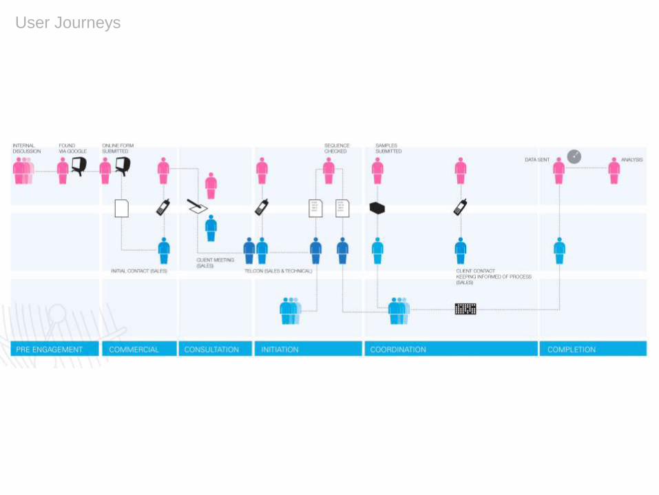
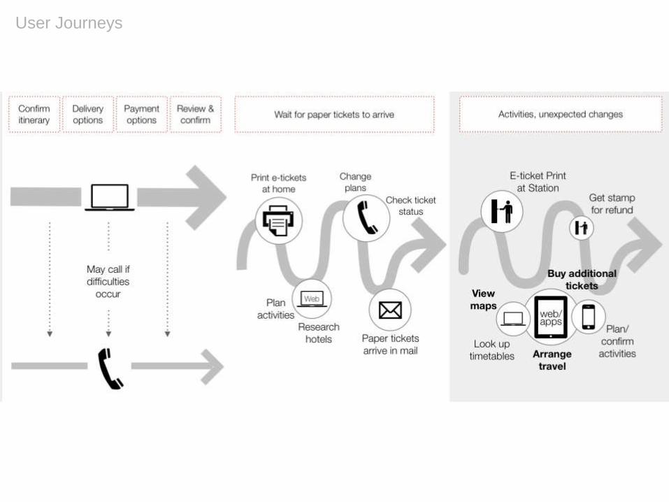
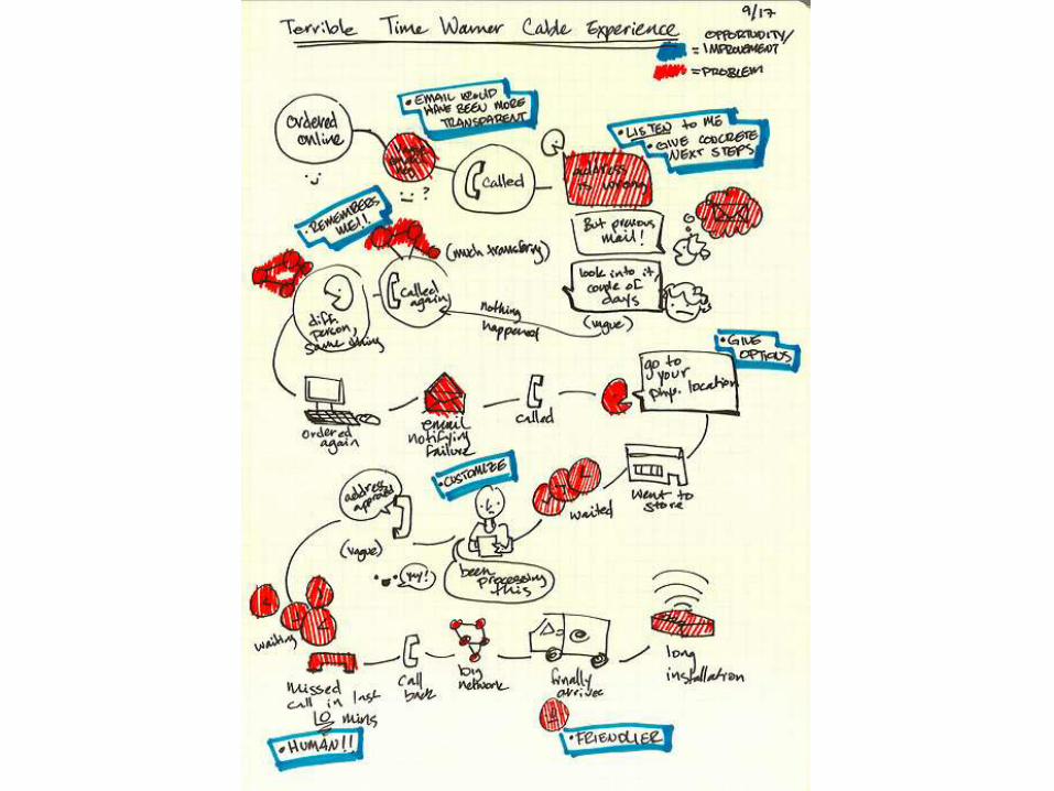
User Journeys

User Journeys
“Design is all about
entrances and
exits.”- Rem Koolhaas
User Journeys
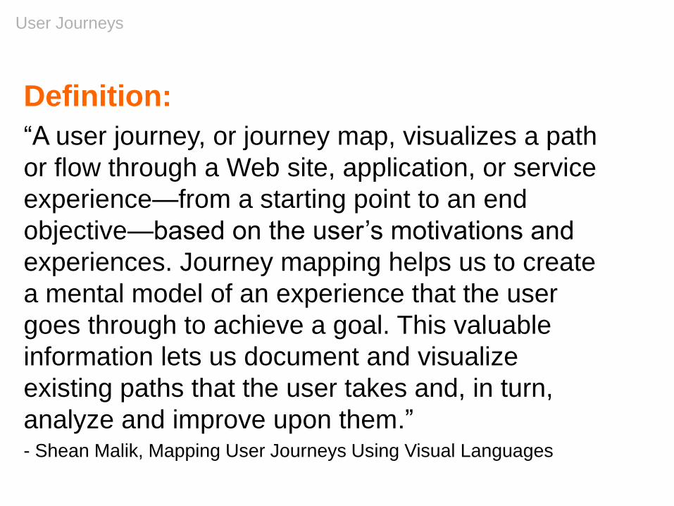
Definition:
“A user journey, or journey map, visualizes a path
or flow through a Web site, application, or service
experience—from a starting point to an end
objective—based on the user’s motivations and
experiences. Journey mapping helps us to create
a mental model of an experience that the user
goes through to achieve a goal. This valuable
information lets us document and visualize
existing paths that the user takes and, in turn,
analyze and improve upon them.”- Shean Malik, Mapping User Journeys Using Visual Languages

User Journeys
Methodology:• Keep developed personas in mind
• Determine users’ primary needs
• Consider their pain points as well
• Brainstorm different ways to help their needs and address
their pain points
• Develop a journey according to a time-based progression
• Consider how various moments in their, which can be
handled digitally
• Create relevant hooks and calls to action (CTAs)
• Strike a balance between freedom of movement and an
ideal path
Self Study
“An introduction to user journeys” - Jason Hobbs, September 6, 2005, Boxes & Arrows
User Journeys

User Journeys

Class Exercise:Develop a user journey.
• Divide into teams.
• Discuss what you expect a typical user to do …– At home
– At the museum
– With a specific exhibit
– Back home
• Develop a high-level diagram, which depicts a single
journey
• Incorporate features applicable to all 3 personas
User Journeys 20min
s

Features Identified
Let’s discuss some of the features your team
identified.
User Journeys

Lunch Break

Afternoon• Site Map
• Responsive Design
• Team Exercise: Responsive Home Page
• Team Exercise: MoMA app Design
• Team Presentations
• Good Design
• Q&A
Agenda

Create a Site Map

Simple site map
illustration
Site Map

Class Exercise:
Develop 2 high-level site maps based on the
features you discovered in your user journey,
plus any additional content needed to flesh out
the experience.
• One for the MoMA web site
• One for the MoMA mobile app
Site Map 20min
s
Review Site Maps
Let’s review your site maps
Site Map

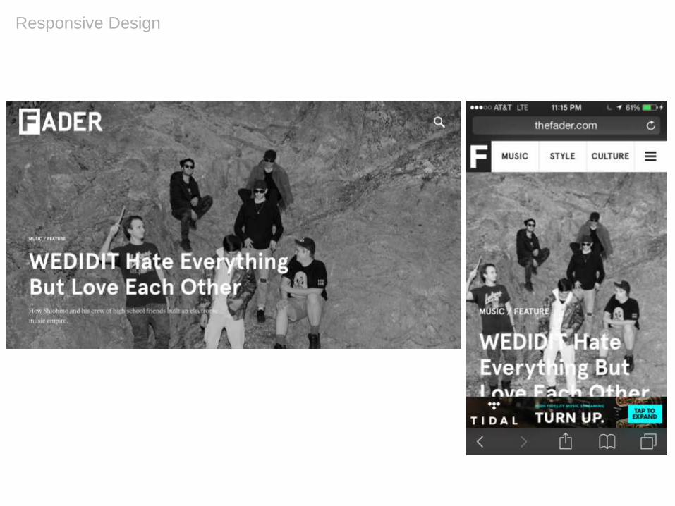
Responsive Design

Responsive Web Design
“Rather than tailoring disconnected designs to each of an ever-
increasing number of web devices, we can treat them as
facets of the same experience. We can design for an optimal
viewing experience, but embed standards-based technologies
into our designs to make them not only more flexible, but more
adaptive to the media that renders them. In short, we need to
practice responsive web design.”
– Ethan Marcotte, Responsive Web Design, A List Apart
Self Study
Ethan Marcotte: Responsive Web Design
Responsive Design

Responsive Design Characteristics
• Mobile first
• Break points
• Grids
• Handling navigation
• Handling tables
• Maintain content and features
• Maintain hierarchies
• Images
• Text
• Dropping content or features
Responsive Design

Mobile First
• Design for “mobile first” – the smallest device first, then work
up from there
• Smallest device may no longer be a mobile phone
• Mobile first may encourage simple design, but it need not be
simplistic
Responsive Design

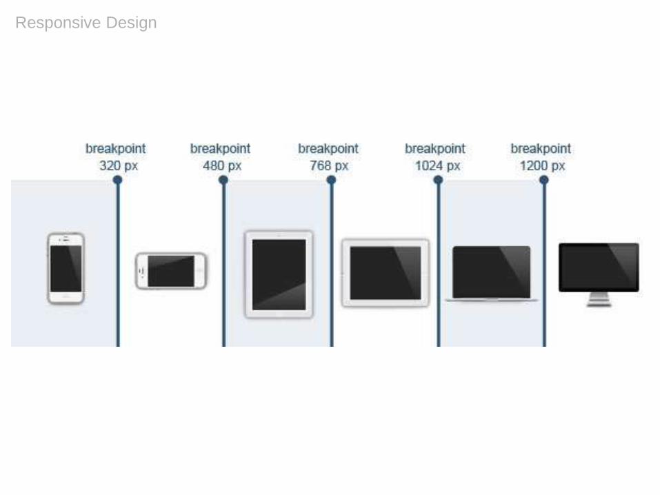
Break Points
• Responsive designs adjust at different “break points”
corresponding to the dimensions of various devices, typically
desktop, tablet and mobile
• However, they’re intended to be content, not device-specific
• Typically at least two:
– e.g. 320px for mobile, 768px for tablet (portrait), desktop
– e.g. 320px for mobile, 768px for tablet (portrait), 1280px for desktop
• May also add “minor breakpoints” to address specific issues
at various dimensions
Responsive Design
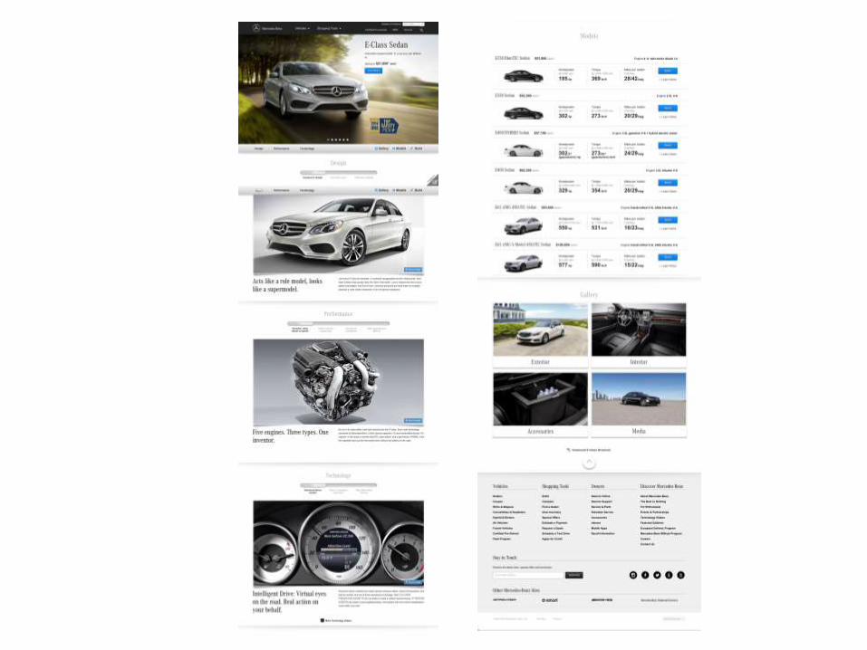
Responsive Design

Grids
• Grids are fluid within a responsive design – they change
according to screen dimensions
• For example, a desktop design might utilize a 12-column
grid, tablet a 9-column grid, and mobile a 4-column grid
• Depending on the screen, modules may shift both in size and
in placement
Responsive Design

Responsive Design

Responsive Design

Responsive Design

Handling Navigation
• Navigation may be repositioned
• Often at tablet, especially mobile
• In desktop, elements of the navigation can be activated via
hover instead of click, since users are utilizing a cursor;
whereas in tablet and mobile, these main nav elements must
be activated via touch
• Design navigation to be touch friendly – e.g. large, tactile
targets
• Beware of the “hamburger menu”
Responsive Design

Responsive Design

Responsive Design

Responsive Design
Heavy mobile direction

Handling Navigation – Tabs
• Tabs may just reduced in size
• They can also be replaced with
– Accordions
– Dropdowns
– Carousel slides
• Consider the content to determine, which of these solutions
works best
Responsive Design

Responsive Design

Handling Tables
• Simplest solution for handling tables with multiples columns
is to reduce the number of columns (to one if necessary) and
stack them in mobile.
• You can also allow horizontal scrolling
• Or turn columns into individual slides users can swipe
through
Responsive Design

Responsive Design

Responsive Design
Desktop
Mobile - Scrolling
Mobile -
Stacked
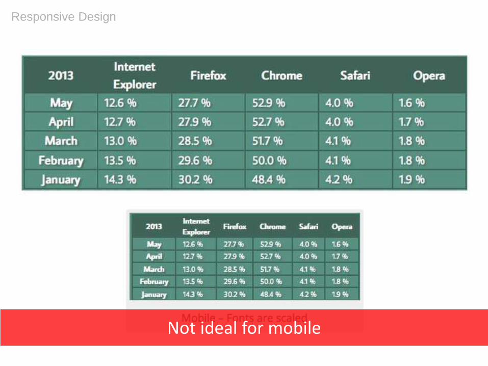
Responsive Design
Not ideal for mobile

Maintain Content & Features
• The goal: Wherever possible, maintain content and features
across devices
• Must have a strong rationale for dropping any content or
features at the mobile level
Responsive Design

Responsive Design

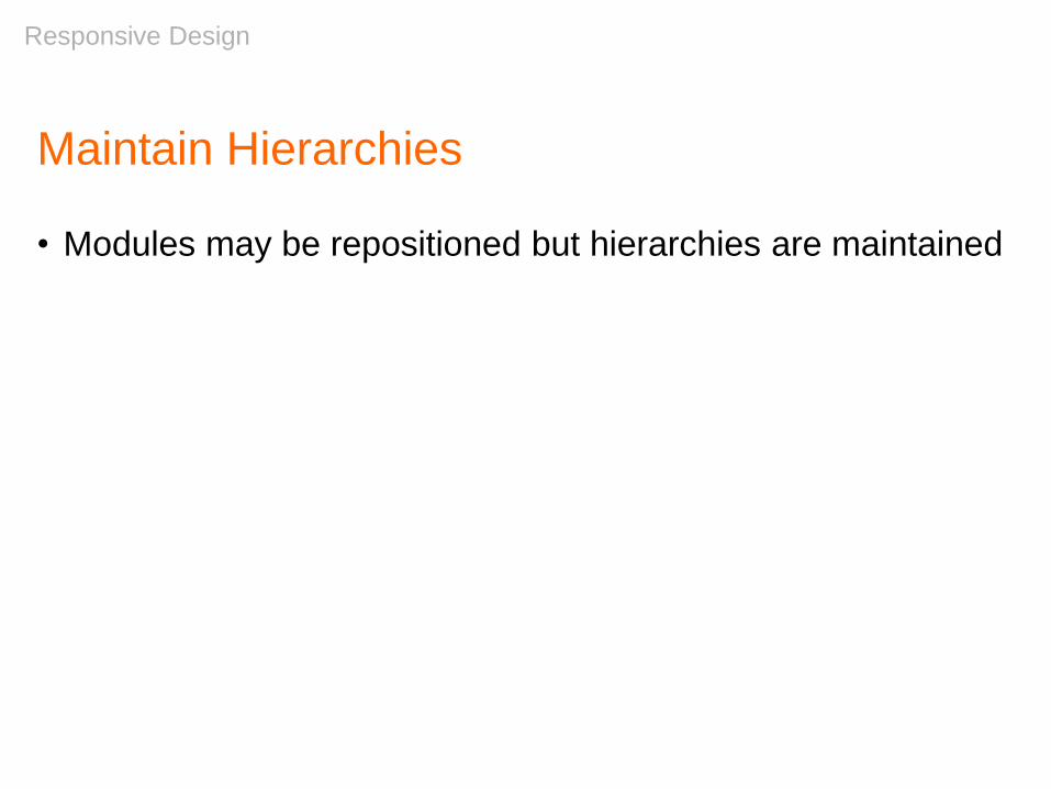
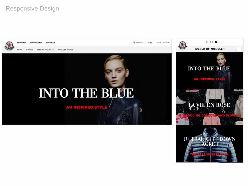
Maintain Hierarchies
• Modules may be repositioned but hierarchies are maintained
Responsive Design

Responsive Design

Responsive Design


Images
• Generally, images should be “fluid”
• They will scale down in size as the screen resolution
changes
• Additionally, they may maintain their size, but be cropped
if they’re primarily decorative
• In this case, images must be selected carefully so that
important elements of them aren’t automatically cropped
out
• In some cases, if the image isn’t needed, it may be
dropped entirely for mobile devices
Responsive Design
Responsive Design
Responsive Design

Text
• Text size is maintained where possible, though headings and
headlines may be reduced in size
• Text blocks will change in width from desktop to mobile
• However, keep lines of text to a maximum of 70 or 80
characters
• Do not automatically hyphenate text
Responsive Design

Responsive Design
Dropping Content or Features
• Whenever possible, avoid dropping content or features
• Occasionally, content or features can be dropped to save
screen real estate or if they’re not device appropriate
• Establish a clear rationale and principles for making such
changes
Responsive Design

Responsive Design
Avoid just shrinking content

Responsive Design
Responsive Web Design
by Ethan Marcotte

Team Exercise:
Design a
Responsive Home
Page
Design a Responsive Home PageIn your teams, design a responsive home page for MoMA’s
web site
1) Discuss features needed for a homepage
2) Sketch your ideas for a homepage individually
3) Share your sketches with your team mates
4) Collaborate on a single home page wireframe –
for both mobile and desktop
Team Exercise

1) Discuss features needed for a homepage
Team Exercise 20min
s

2) Sketch your ideas for a homepage individually
Team Exercise 10min
s

3) Share your sketches with your team mates
Team Exercise 10min
s

4) Collaborate on a single home page wireframe –
for both mobile and desktop
Team Exercise 20min
s

Team Exercise:
Design a Mobile App

Design a Mobile AppIn your teams, design a mobile app for MoMA
1) Discuss features needed for the app and
determine the 3 key screens you want to develop
2) Collaborate to design 3 keys screens
3) Review your work as a team to determine what
changes should be made
4) Make any necessary revisions
Team Exercise

1) Discuss features needed for the app and
determine the 3 key screens you want to develop
No sketching yet!
Team Exercise 30min
s

2) Collaborate to design 3 keys screens
Team Exercise 30min
s

Gather Your Materials
If you’re finished, start collecting your app and
responsive homepage wires so you can
present them to the class as a team
Team Exercise
Team Exercise:
Review & Feedback

Good Design

Good design is…Good design is innovative.
Good design makes a product useful.
Good design is aesthetic.
Good design makes a product understandable.
Good design is unobtrusive.
Good design is honest.
Good design is long-lasting.
Good design is thorough down to the last detail.
Good design is environmentally friendly.
Good design is as little design as possible.
Dieter Rams: 10 Principles of Good Design
© Dieter Rams, amended March 2003 and October 2009
Good Design

Q&A

Additional Resources
Books:
• Information Architecture for the World Wide Web –
Louis Rosenfeld, Peter Morville
• Information Architecture: Blueprints for the Web –
Christina Wodtke, Austin Govella
• The Elements of User Experience – Jesse James
Garrett
• Designing Web Navigation: Optimizing the User
Experience – James Kalbach, Aaron Gustafson
• Design of Everyday Things – Donald Norman
• Responsive Web Design – Ethan Marcotte
Local Events:
• IA Meetup
• Brooklyn UX
• Content Strategy Meetup
Web Sites:
• Alertbox
• A List Apart
• Boxes & Arrows
• wireframes.tumblr.com
Organizations:
• Human Computer Interactions (HCI)
• Interaction Designers Association (IxDA)
• Usability Professionals Association (UPA)
Further Studies:
• School of Visual Arts
• Continuing Ed classes
• MFA in Interaction Design
• Pratt – Course in Information Design
• Rosenfeld Media
• General Assembly
• Skillshare
• Adaptive Path
• The Information Architecture Institute
• The IA Summit
• Nielsen Norman Group
• User Interface Engineering
Video:
The Right Way to Wireframe by Russ Unger (YouTube)

Slideshare address:
http://www.slideshare.net/stribs
My article on how to find an IA job:http://blog.onwardsearch.com/2012/08/information-architecture-a-guerilla-guide-to-breaking-in/
@stribs