basics of sca scroll making - wordpress.com · basics of sca scroll making; ... • blot’s iron...
TRANSCRIPT
Basics of SCA Scroll Making; 2008 edition THLady Esperanza de Navarra
1
Basics of SCA Scroll MakingBasics of SCA Scroll MakingBasics of SCA Scroll MakingBasics of SCA Scroll Making By THLady Esperanza de Navarra
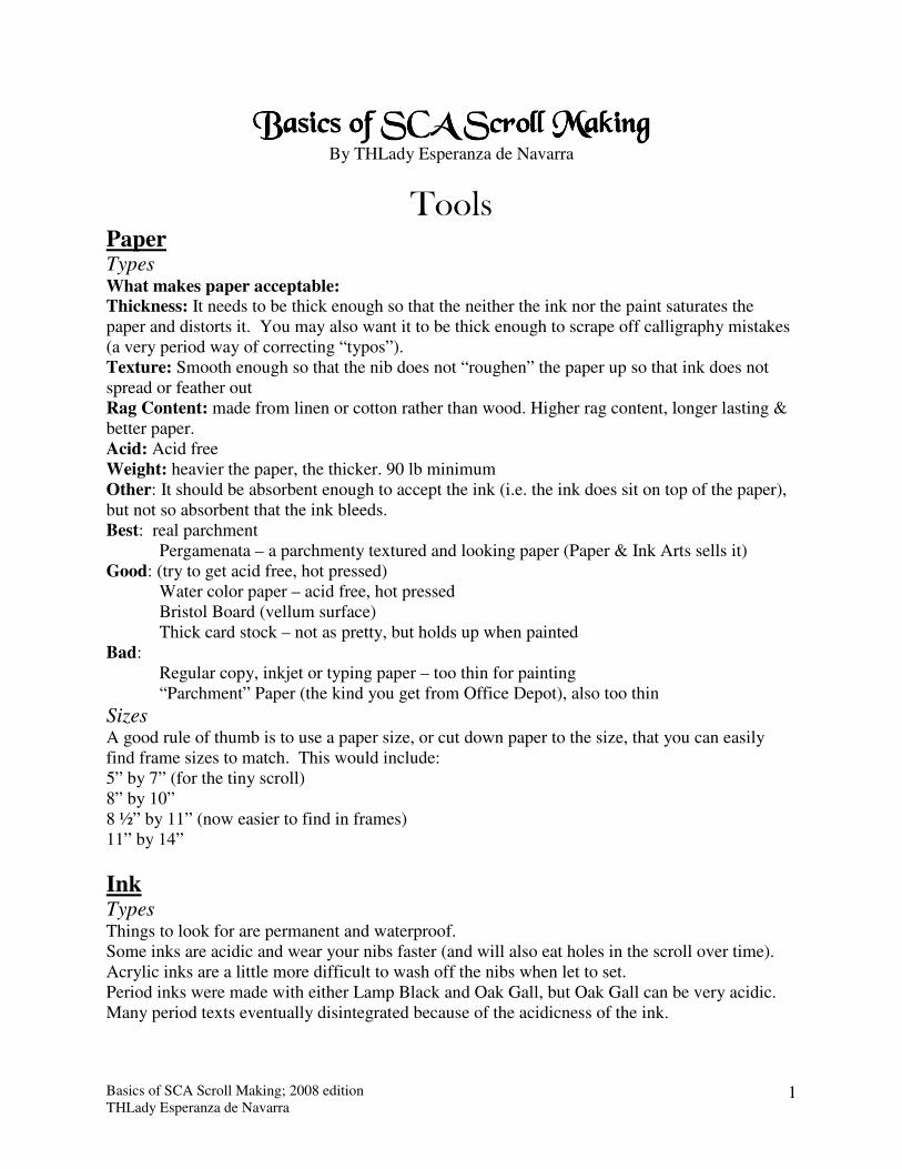
Tools Paper Types What makes paper acceptable: Thickness: It needs to be thick enough so that the neither the ink nor the paint saturates the paper and distorts it. You may also want it to be thick enough to scrape off calligraphy mistakes (a very period way of correcting “typos”). Texture: Smooth enough so that the nib does not “roughen” the paper up so that ink does not spread or feather out Rag Content: made from linen or cotton rather than wood. Higher rag content, longer lasting & better paper. Acid: Acid free Weight: heavier the paper, the thicker. 90 lb minimum Other: It should be absorbent enough to accept the ink (i.e. the ink does sit on top of the paper), but not so absorbent that the ink bleeds. Best: real parchment
Pergamenata – a parchmenty textured and looking paper (Paper & Ink Arts sells it) Good: (try to get acid free, hot pressed)
Water color paper – acid free, hot pressed Bristol Board (vellum surface) Thick card stock – not as pretty, but holds up when painted
Bad: Regular copy, inkjet or typing paper – too thin for painting “Parchment” Paper (the kind you get from Office Depot), also too thin
Sizes A good rule of thumb is to use a paper size, or cut down paper to the size, that you can easily find frame sizes to match. This would include: 5” by 7” (for the tiny scroll) 8” by 10” 8 ½” by 11” (now easier to find in frames) 11” by 14”
Ink Types Things to look for are permanent and waterproof. Some inks are acidic and wear your nibs faster (and will also eat holes in the scroll over time). Acrylic inks are a little more difficult to wash off the nibs when let to set. Period inks were made with either Lamp Black and Oak Gall, but Oak Gall can be very acidic. Many period texts eventually disintegrated because of the acidicness of the ink.
Basics of SCA Scroll Making; 2008 edition THLady Esperanza de Navarra
2
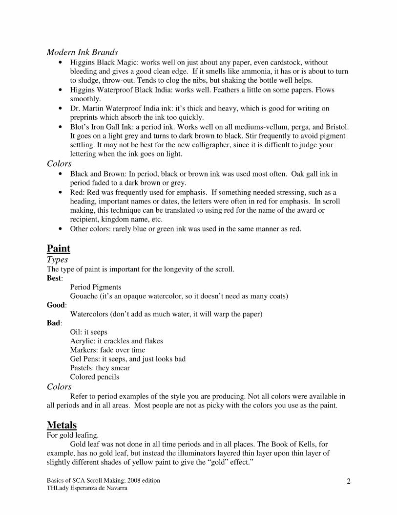
Modern Ink Brands • Higgins Black Magic: works well on just about any paper, even cardstock, without
bleeding and gives a good clean edge. If it smells like ammonia, it has or is about to turn to sludge, throw-out. Tends to clog the nibs, but shaking the bottle well helps.
• Higgins Waterproof Black India: works well. Feathers a little on some papers. Flows smoothly.
• Dr. Martin Waterproof India ink: it’s thick and heavy, which is good for writing on preprints which absorb the ink too quickly.
• Blot’s Iron Gall Ink: a period ink. Works well on all mediums-vellum, perga, and Bristol. It goes on a light grey and turns to dark brown to black. Stir frequently to avoid pigment settling. It may not be best for the new calligrapher, since it is difficult to judge your lettering when the ink goes on light.
Colors • Black and Brown: In period, black or brown ink was used most often. Oak gall ink in
period faded to a dark brown or grey.
• Red: Red was frequently used for emphasis. If something needed stressing, such as a heading, important names or dates, the letters were often in red for emphasis. In scroll making, this technique can be translated to using red for the name of the award or recipient, kingdom name, etc.
• Other colors: rarely blue or green ink was used in the same manner as red.
Paint Types The type of paint is important for the longevity of the scroll. Best:
Period Pigments Gouache (it’s an opaque watercolor, so it doesn’t need as many coats)
Good: Watercolors (don’t add as much water, it will warp the paper) Bad: Oil: it seeps Acrylic: it crackles and flakes Markers: fade over time Gel Pens: it seeps, and just looks bad Pastels: they smear Colored pencils
Colors Refer to period examples of the style you are producing. Not all colors were available in all periods and in all areas. Most people are not as picky with the colors you use as the paint.
Metals For gold leafing. Gold leaf was not done in all time periods and in all places. The Book of Kells, for example, has no gold leaf, but instead the illuminators layered thin layer upon thin layer of slightly different shades of yellow paint to give the “gold” effect.”
Basics of SCA Scroll Making; 2008 edition THLady Esperanza de Navarra
3
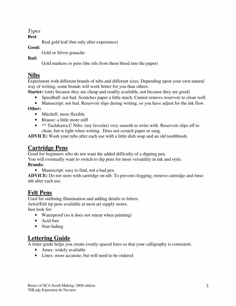
Types Best: Real gold leaf (but only after experience) Good: Gold or Silver gouache Bad: Gold markers or pens (the oils from them bleed into the paper)
Nibs Experiment with different brands of nibs and different sizes. Depending upon your own natural way of writing, some brands will work better for you than others. Starter: (only because they are cheap and readily available, not because they are good)
• Speedball: not bad. Scratches paper a little much. Cannot remove reservoir to clean well.
• Manuscript: not bad. Reservoir slips during writing, so you have adjust for the ink flow. Other:
• Mitchell: more flexible
• Brause: a little more stiff
• ** Tachikawa C Nibs: (my favorite) very smooth to write with. Reservoir slips off to clean, but is tight when writing. Does not scratch paper or snag.
ADVICE: Wash your nibs after each use with a little dish soap and an old toothbrush.
Cartridge Pens Good for beginners who do not want the added difficulty of a dipping pen. You will eventually want to switch to dip pens for more versatility in ink and style. Brands:
• Manuscript: easy to find, not a bad pen ADVICE: Do not store with cartridge on nib. To prevent clogging, remove cartridge and rinse nib after each use.
Felt Pens
Used for outlining illumination and adding details to letters. Artist/Felt tip pens available at most art supply stores. Just look for:
• Waterproof (so it does not smear when painting)
• Acid free
• Non-fading
Lettering Guide A letter guide helps you create evenly spaced lines so that your calligraphy is consistent.
• Ames: widely available
• Linex: more accurate, but will need to be ordered

Basics of SCA Scroll Making; 2008 edition THLady Esperanza de Navarra
4
Design Layout Margins:
• Smaller pages: ½” to ¾” margin
• Larger pages: 1 to 1 ½” margin Basic Layout: Try for symmetry with the non-text elements. Look at the way the Medieval scribes arranged their pages. Some basic variations of lay-outs.
Basics of SCA Scroll Making; 2008 edition THLady Esperanza de Navarra
5
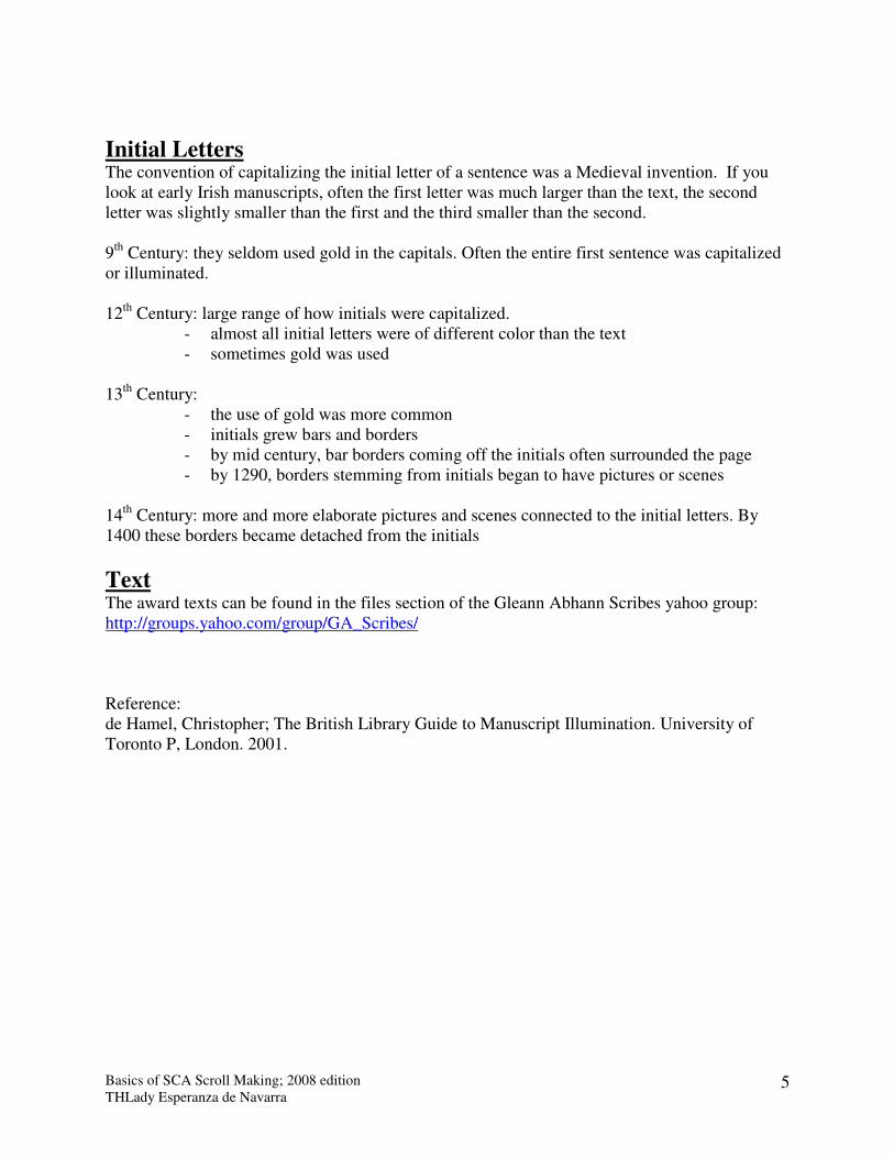
Initial Letters The convention of capitalizing the initial letter of a sentence was a Medieval invention. If you look at early Irish manuscripts, often the first letter was much larger than the text, the second letter was slightly smaller than the first and the third smaller than the second. 9th Century: they seldom used gold in the capitals. Often the entire first sentence was capitalized or illuminated. 12th Century: large range of how initials were capitalized.
- almost all initial letters were of different color than the text - sometimes gold was used
13th Century:
- the use of gold was more common - initials grew bars and borders - by mid century, bar borders coming off the initials often surrounded the page - by 1290, borders stemming from initials began to have pictures or scenes
14th Century: more and more elaborate pictures and scenes connected to the initial letters. By 1400 these borders became detached from the initials
Text The award texts can be found in the files section of the Gleann Abhann Scribes yahoo group: http://groups.yahoo.com/group/GA_Scribes/ Reference: de Hamel, Christopher; The British Library Guide to Manuscript Illumination. University of Toronto P, London. 2001.
Basics of SCA Scroll Making; 2008 edition THLady Esperanza de Navarra
6
Beginners Shopping List Or How to Walk into Hobby Lobby or Michael’s and Walk Out
with Everything You Need to Get Started for under $40 If you want more selection and a bit better quality, shop Paper & Ink Arts, online http://www.paperinkarts.com/ or request a catalog.
• Paper: Packet of Bristol, hot pressed, thick 90 lb or heavier
• Cartridge Pen set with refill cartridges
• Lettering Guide: Ames
• Ruler, solid & clear
• Pencils, any type
• Artist Eraser
• Gouache or Water Color paints, basic colors
• Paint brushes, mostly small sizes
• Felt tip pen: ultra fine, small and medium tips
• Optional: Gold gouache or water based gold paint (no oil based)
Book List (Before buying any books, check out to see if your library has them. Some books may be more useful to you than others, especially if you like a specific style or period.) Medieval Calligraphy, Its History and Technique, Marc Drogin. Dover Publications, Inc., 1980. ISBN: 0-486-26142-5 ($10.27 at Amazon.com) see above for notes. The Calligrapher's Handbook, Heather Child. Taplinger Publishing Company, 1986. ISBN: 0800811984. Not in print, but used copies can be found on-line. Isn’t a how to write book, but more of a detailed explanation on everything from making nibs with feathers to ink and parchment.
Links • Middle Kingdom Scribal Handbook http://www.midrealm.org/signet/
• Auntie Elspeth reviews calligraphy and illumination books http://www.therotunda.net/elspeth/ci-books.html
• The Virtual Known World Scriptorium http://members.aol.com/whyteboar/scriptor.htm
• On-Line Illuminated Manuscripts o http://www.bl.uk/onlinegallery/ttp/ttpbooks.html (British Library-Turn the Page) o http://hmml.org/ (Hill Museum and Manuscript Library) o http://toisondor.byu.edu/dscriptorium/ (Digital Scriptorium-BYU) o http://image.ox.ac.uk/list?collection=all (Early Medieval Manuscripts at Oxford) o http://www.bodley.ox.ac.uk/dept/scwmss/wmss/medieval/browse.htm (Bodleian
Library's collection-Oxford) o http://special.lib.gla.ac.uk/exhibns/psalter/psalterindex.html (Hunterian Psalter-
Glasgow Univ)
Basics of SCA Scroll Making; 2008 edition THLady Esperanza de Navarra
7
Styles
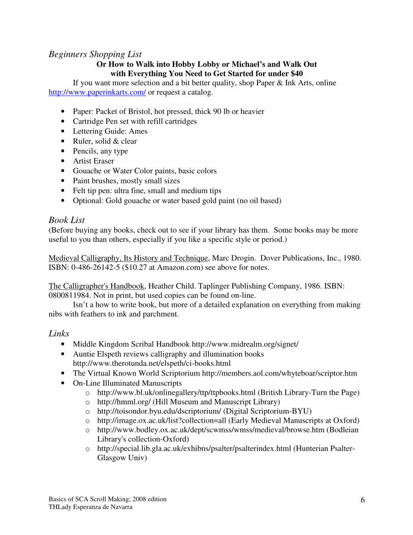
Early period Script: Uncial: 6th to 10th centuries
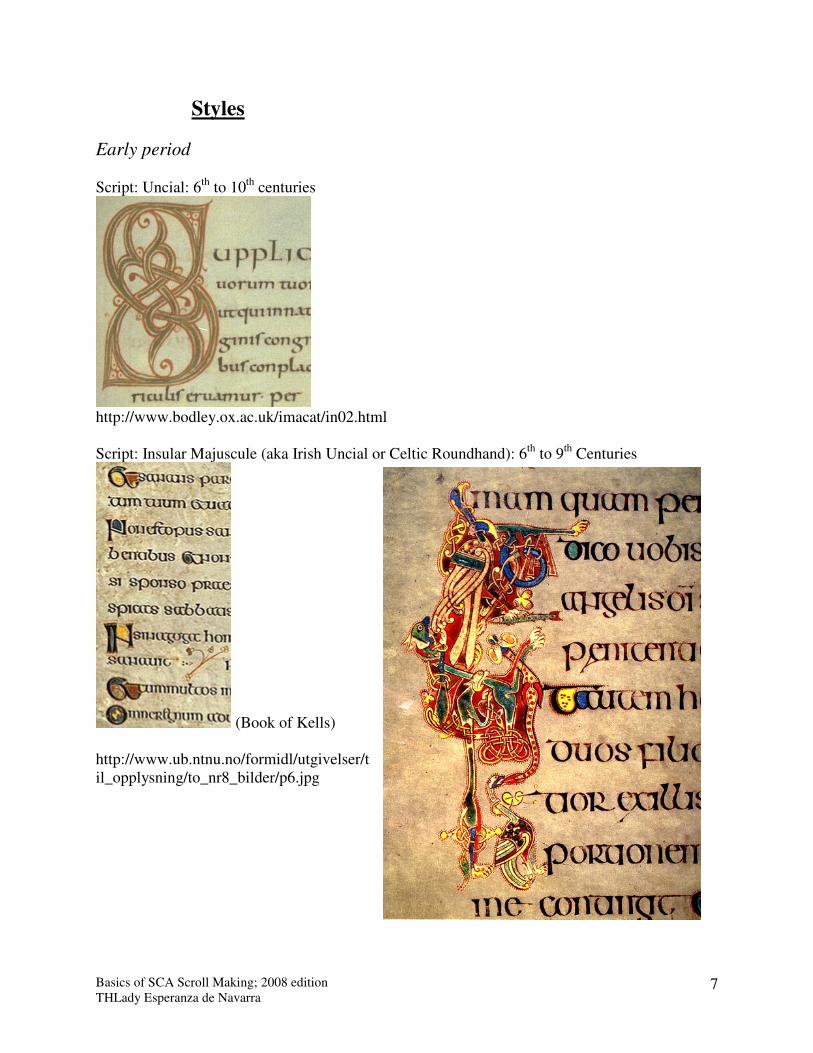
http://www.bodley.ox.ac.uk/imacat/in02.html Script: Insular Majuscule (aka Irish Uncial or Celtic Roundhand): 6th to 9th Centuries
(Book of Kells) http://www.ub.ntnu.no/formidl/utgivelser/til_opplysning/to_nr8_bilder/p6.jpg
Basics of SCA Scroll Making; 2008 edition THLady Esperanza de Navarra
8
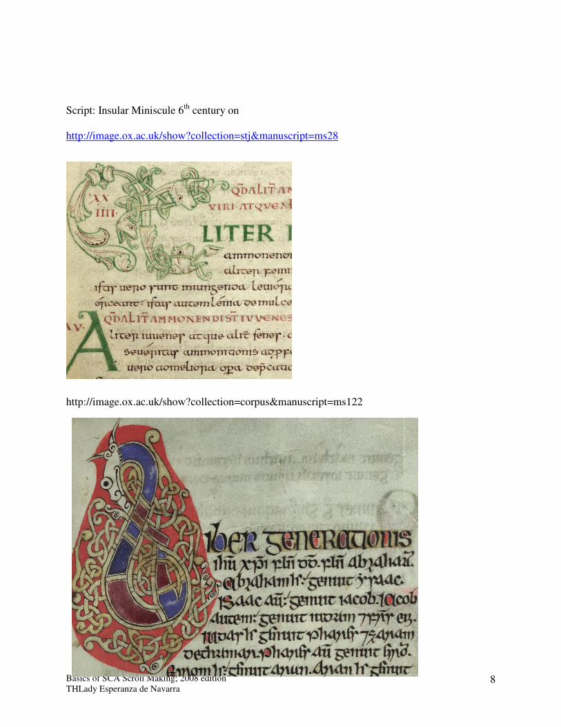
Script: Insular Miniscule 6th century on http://image.ox.ac.uk/show?collection=stj&manuscript=ms28
http://image.ox.ac.uk/show?collection=corpus&manuscript=ms122
Basics of SCA Scroll Making; 2008 edition THLady Esperanza de Navarra
9
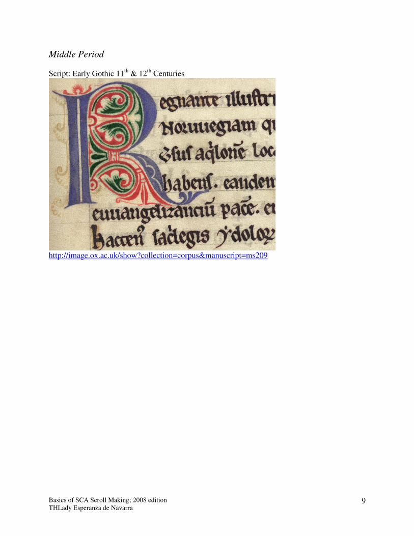
Middle Period Script: Early Gothic 11th & 12th Centuries
http://image.ox.ac.uk/show?collection=corpus&manuscript=ms209
Basics of SCA Scroll Making; 2008 edition THLady Esperanza de Navarra
10
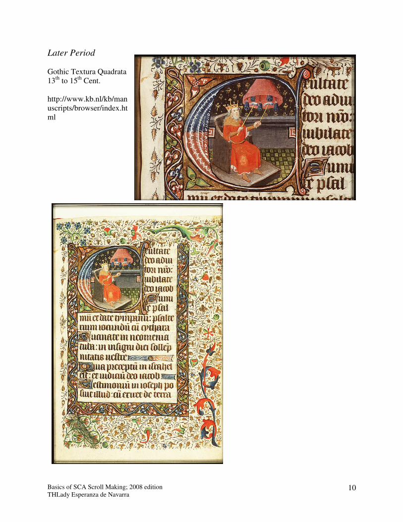
Later Period Gothic Textura Quadrata 13th to 15th Cent. http://www.kb.nl/kb/manuscripts/browser/index.html
Basics of SCA Scroll Making; 2008 edition THLady Esperanza de Navarra
11
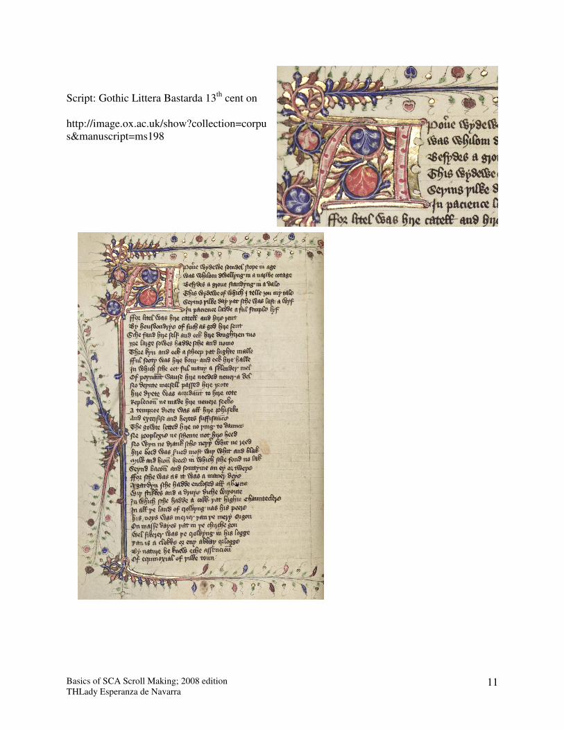
Script: Gothic Littera Bastarda 13th cent on http://image.ox.ac.uk/show?collection=corpus&manuscript=ms198