bill moggridge - lynn dombrowski | assistant professor at...
TRANSCRIPT

Designing Interactions Bill Moggridge
The MIT Press Cambridge, Massachusetts London, England
Foreword
What Is Interaction Design? by Gillian Crampton Smith

Gillian Crampton Smith
viii I Foreword
Gillian Crampton Smith, the director of Interaction Design Institute Ivrea, is the foremost academic in the emerging discipline of interaction design. She studied philosophy and art history at Cambridge University, graduating in 1968. She spent the next decade as a designer, first in book publishing, and then on the Sunday Times and Times Literary Supplement.
In 1981, at the leading edge of desktop publishing, she designed and implemented a page layout program to help her with magazine design. This experience convinced her that designers have an important role to play in creating information technologies. In 1983 she joined the faculty of London's St Martin's School of Art and established a graduate program in graphic design and computers for practicing designers. In 1989 she moved to the Royal College of Art, Britain's only purely graduate school of art and design, and set up the Computer Related Design Department with advice from Bill Moggridge, the external assessor for the program. Now called the Interaction Design Department, this was the first program in the world where graduate designers could learn to apply their skills to interactive products and systems. Under her guidance, the CRD Research
Studio achieved an international reputation as a leading center for interaction design. In 2001 she moved to Ivrea-the Italian town in the foothills of the Alps famous as the home of Olivetti-to establish Interaction Design Institute Ivrea/ which offers the world's first post-experience interaction design program.
What Is Interaction Design? j ix
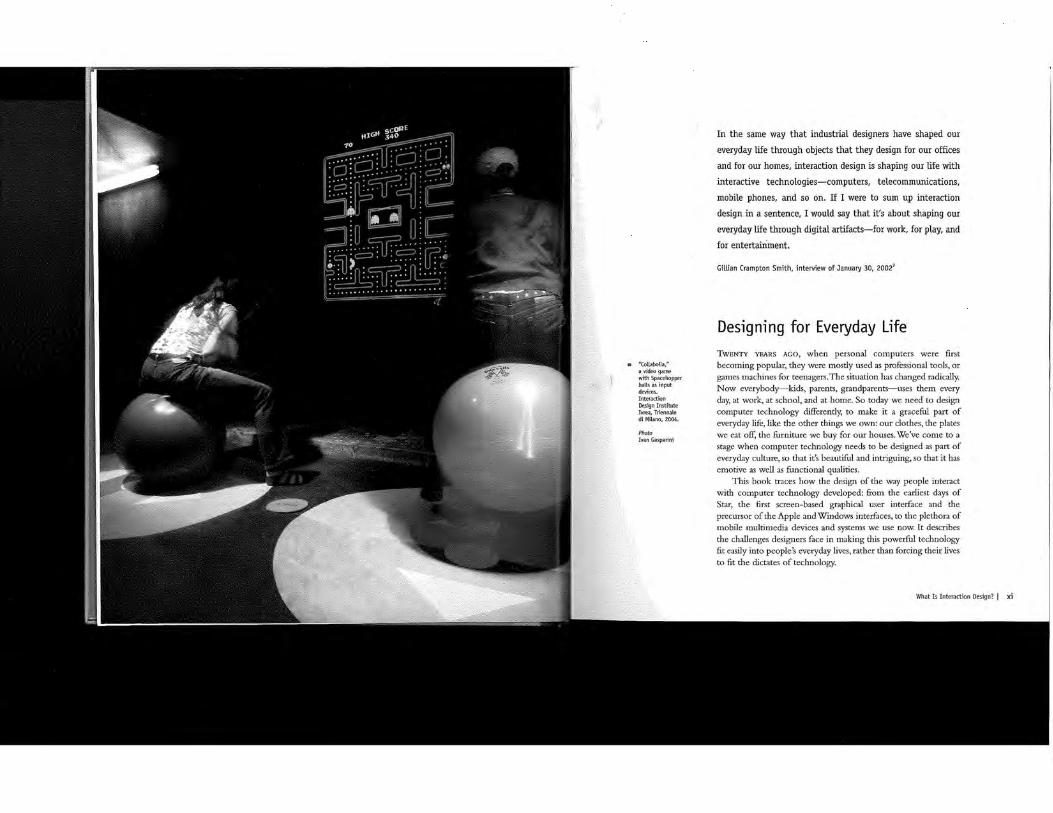
a "Collabolla," a video game withSpacehopper balls as input devices, Interaction Design Institute Ivrea, Triennale di Milano, 2004.
Photo Ivan Gasparini
In the same way that industrial designers have shaped our everyday life through objects that they design for our offices and for our homes, interaction design is shaping our life with interactive technologies-computers, telecommunications, mobile phones, and so on. If I were to sum up interaction design in a sentence, I would say that it's about shaping our everyday life through digital artifacts-for work, for play, and for entertainment.
Gillian Crampton Smith, interview of January 30, 2002''
Designing for Everyday Life TwENTY YEARS AGO, when personal computers were first becoming popular, they were mostly used as professional tools, or games machines for teenagers. The situation has changed radically. Now everybody-kids, parents, grandparents-uses them every day, at work, at school, and at home. So today we need to design computer technology differently, to make it a graceful part of everyday life, like the other things we own: our clothes, the plates we eat off, the furniture we buy for our houses. We've come to a stage when computer technology needs to be designed as part of everyday culture, so that it's beautiful and intriguing, so that it has emotive as well as functional qualities.
This book traces how the design of the way people interact with computer technology developed: from the earliest days of Star, the first screen-based graphical user interface and the precursor of the Apple and Windows interfaces, to the plethora of mobile multimedia devices and systems we use now. It describes the challenges designers face in making this powerful technology fit easily into people's everyday lives, rather than forcing their lives to fit the dictates of technology.
What Is Interaction Design? I xi
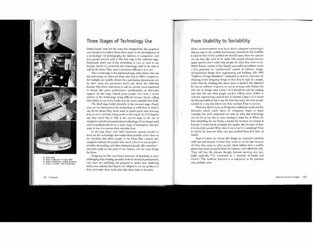
a David Liddle m Stage 1: enthusiast-EE Lab at IDEO 111 Stage2: professional-medical equipment fill Stage3:consumer-iPod at Apple Store
xii I Foreword
Three Stages of Technology Use DAVID LmmE,3 WHO led the team that designed the Star graphical user interface, has talked about three stages in the development of a technology-of photography, for instance, or cmnputers-and how people interact with it. The first stage is the enthusiast stage. Enthusiasts don't care if the technology is easy or hard to use because they're so excited hy the technology itself or by what it will do for them. They want it, however difficult it is to use.
The second stage is the professional stage, when those who use the technology are often not those who buy it. Office computers, for example, are usually chosen by a purchasing department, not hy their users; the purchasers don't care about the difficulty because they don't experience it, and are anyway more interested in factors like price, performance specifications, or after-sales support. At this stage, indeed, smne people even have a vested interest in the technology being difficult because they're selling their ability to use it; the harder it is, the more valuable their skills.
The third stage Liddle identifies is the consumer stage. People now are less interested in the technology in itself than in what it can do for them. They don't want to spend much time learning how to use it and hate being made to feel stupid. So if it's hard to use, they won't buy it. This is the current stage in the use of computer and telecomn1unications technology: it's no longer used only by professionals hut hy a wide range of nonexperts, who just want to use it to pursue their everyday lives.
In the past, those who built interactive systems tended to focus on the technology that makes them possible rather than on the interfaces that allow people to use the1n. But a systen1 isn't complete without the people who use it. Like it or not, people--irritable, demanding, and often distracted people like ourselves-and their goals are the point of om· systems, and we n1ust design for them.
Designing for this new broad spectrum of hun1anity ,,is 1nore challenging than devising specialist tools for technical professionals. Our users are, justifiably, not prepared to spend time nustering tricky new systems. And they're not obliged to use our products: if they can't make them work, they take them hack to the store.
From Usability to Sociability MANY ADVERTISEMENTS NOW boast about computer technologies that are easy to use: usability has become a buzzword. But usability is ouly the first of the qualities we should expect from the systems we use; they also need to be useful. This sounds obvious, hut too many systems don't really help people do what they want to do. Mitch Kapor, creator of the hugely successful spreadsheet Lotus 1-2-3, proposed an "architectural" model of software design, distinguishing design fi·om engineering and building. His 1990 "Software Design Manifesto"4 reminded us that we must start by thinking about designing things so that they're right for people, rather than hy thinking first about how to build it. He admitted he was no software engineer, no ace at writing code. Rather, his role was to design what Lotus 1-2-3 should be and do, making sure that this was what people needed. Others more skilled in software engineering ensured that it worked. Lotus 1-2-3 wasn't the first spreadsheet, hut it was the first that really did what people needed in a way that fitted how they worked. Thus its success.
That said, there's n1ore to living than utilitarian needs and the functions which satisfY them. As computers begin to shape everyday life, we're interested not only in what tills technology can do for us, but also in what owning it means for us. When we buy something for our home, a toaster for instance, we choose it because it toasts bread, certainly, but maybe also because of how it looks, feels, sounds. What does it say to us? Is it satisfYing? Does it enrich, by however little, our just-crawled-from-bed state of mind?
And of course we choose the things we surround ourselves with not just because of what they n1ean to us, but also because of what they mean to other people. Most Italians have a mobile phone but many young SiciEans, for instance, can't afford the calls. They still buy the phones, though, because sporting one says, fairly explicitly, ''I'm connected to a network of family and friends." The symbolic function is as important as the practical one, perhaps n1ore.
What Is Interaction Design? I xiii
xiv I Foreword
The interactive systems we design have implicit as well as explicit meanings. A design rnay communicate its purpo_se early, so that it's obvious what it is and what we should do wtth rt. But its qualities, its aesthetic qualities particularly, speak to people in a different way. Consciously or not, people read mean1ngs 1nto artifacts. A chapel speaks a different architectural language than a supermarket, and everybody can read the difference. In a drugstore we can usually distinguish a medicine bottle from a perfume botde even if we can't read the label. Artrsts and desrgners are trained to use the language of implicit meanings to add a nch communicative element over and above direct functional communication. If we only design the function of something, not what it also communicates, we risk our design being misinterpreted. Worse, we waste an opportunity to enhance everyday life.
To designing for usability, utility, satisfaction, and communicative qualities, we should add a fifth imperative: desiguing for sociability. When IT systems fail to support tire social aspect of work and leisure, when they dehumanize and de-crvilize our relationship with each other, they impoverish the nch soc1al web in which we.live and operate, essential for botir well-being and efficiency.
The technologies we design can erode or enhance this social web, so we must design for tiris explicidy, because technologically driven social changes can be creative. When young people are out socializing tbey are reluctant to make appointments. They say"Oh yeah, I'm around tomorrow. Don't know when. Give me a call, I'll see where I am."
The mobile phone has brought to hanging out-indeed, to time itself-an altogether more fluid and relaxed approach.
Good Interaction Design AN ELECTROMECHANICAL OBJECT, a radio say, Jinks its physical mechanical components to its electronic elements in a fairly direct way. When we turn the dial, our fingertips and muscles can alrnost "feel" the stations being scanned. With computers, however, the distance between, on one hand, keystrokes and screen image, and, on the other, what's happening inside the computer, is usually much less direct. Our physical world and the computer's virtual world seem miles apart.
In this (historically unprecedented) situation we need a clear mental model of what we're interacting with. HyperCard,' for instance, an early scripting system on the Apple, had a very clear mental model, a stack of cards: a precise analogy of what and how the program worked. It was obvious to its users that in effect they were flipping through a stack of cards: everything about the design reinforced this metaphor. Sadly, the same can't be said of many other applications.
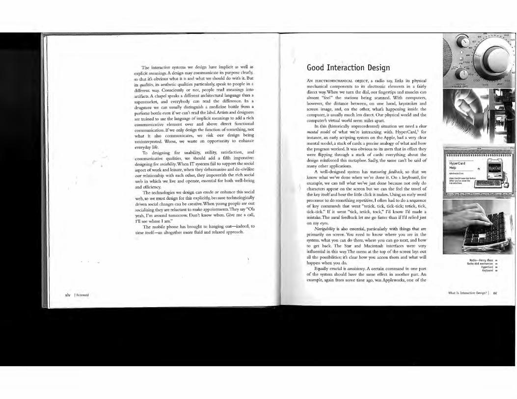
A well-designed system has reassuring feedback, so that we know what we've done when we've done it. On a keyboard, for example, we can tell what we've just done because not only do characters appear on the screen but we can the feel the travel of the key itself and hear the litde click it makes. Using an early word processor to do something repetitive, I often had to do a sequence of key commands that went "tetick, tick, tick-tick; tetick, tick, tick-tick." If it went "tick, tetick, tack," I'd know I'd made a mistake. The aural feedback let me go faster than if I'd relied just on my eyes.
Navigability is also essential, particularly with things that are primarily on screen. You need to know where you are in the system, what you can do there, where you can go next, and how to get back. The Star and Macintosh interfaces were very influential in this way. The menu at the top of the screen lays out all the possibilities; it's clear how you access them and what will happen when you do.
Equally crucial is consistency. A certain cmnmand in one part of the system should have tire same effect in another part. An example, again from some time ago, was Appleworks, one of the
Radio-Henry Kloss till
Radio dial mechanism l!il
HyperCard fill
Keyboard a
What Is Interaction Design? I XV

n Xerox Star interface m: Apple Macintosh menus m Driving
xvi I Foreword
first integrated office programs on the Apple II. Those were the days of green "ransom-note" characters on a black screen, and very limited functionality. But Appleworks was beautifully, satisfyingly, consistent. You knew exactly what to do. A command in the database did exactly the same in the word processor; wherever you were, the escape key took you back up a level. You never got lost and rarely made a mistake. Compare that with modern "integrated" applications. Consistency, like all forms of satisfying simplicity, is very difficult to achieve.
When we interact with everyday artifacts, like a car, we don't spend too n1uch time thinking about the interaction: we think about where we're heading and what we want to do. Intuitive interaction minin1izes the burden of conscious thought needed to operate the system, leaving us to concentrate on our goals. A good example was Quark Express, which let you almost unconsciously zoom in on your image by holding down two keys and clicking on what you wanted to see better. It was like shifting your gaze: you didn't have to march off somewhere to find the right tool. But too many systems still keep demanding too much attention, like incon1petent bosses, distracting us from getting on with the job.
When we design a computer-based system or device, we're designing not just what it looks like but how it behaves. We're designing the quality of how we and it interact. This is the skill of the interaction designer. It's partly responsiveness: when you n1ove your mouse, for instance, does it feel sluggish, or nippy and sprightly? When you manipulate your iPod dial, the combination of sound and feel, as well as telling you what you're doing, is subtle and satisfying. We can design those qualities of interaction, relating what we see to what we hear or feel with the same refinement with which typographers adjust the spacing of type, or product designers the radius of a curve.
But the qualities of interaction must be appropriate to the context. An adventure game need<; an interaction offering subtlety of atmosphere and intriguingly challenging navigation; central-heating control systems offering these qualities, however, would be as welcmne as a fire alarm with a snooze button.
Languages of Interaction Design WHEN NEW TECHNOLOGIES are born, we tend to think of the new in terms of the fan1i1iar. When cinenu started, people thought of it as pointing a camera at a theater stage, and divided silent films with "chapter headings" as if they were books. New "languages" eventually emerged that were true to, and fully exploited, the unique qualities of cinema itself-Eisenstein's language of montage, for instance. But the old analogies never lose their validity: films continue to use the conventions of the theater and the novel. They are just augmented by the new languages.
I believe that interaction design is still in the equivalent of the early stages of cinema. As yet, we have no fully developed language unique to interactive technology. So we are still drawing on the language of previous creative modes. It may help to categorize these languages according to their "dimensions": 1-D, 2-D, 3-D, and 4-D.
1-D includes words and poetry. Are the words in a menu the most accurate encapsulations of the action they denote? Are they used consistently? And the "tone of voice" of the dialog boxes in your system: Are they too abrupt and imperious, or too cloyingly conversational?
The 2-D languages that interaction design can borrow from include painting, typography, diagrams, and icons. When we look at a painting, even if it's not representational, it's difficult not to interpret it as a perspectival space; we can use such compositional tropes to layer the screen in apparent depth or to foreground its currently most important element. We can use the fanuliar hierarchical conventions of typography to structure the screen, and our shared sensitivity to minute differences in letter form.:; to add distinctions of tone and meaning. We can also use the language of diagrams and information graphics to communicate a con1plexity which can't be intelligibly rendered in standard text, particularly on a small screen. Another specialist 2-D language, much used in
Dialog box m Painting 111.
Icons e
What Is Interaction Design? I xvii
1111 Animation
xviii I Foreword
cmnputer interfaces, is of course that of icons: tiny simpEfied images that stand for a larger idea or a thing.
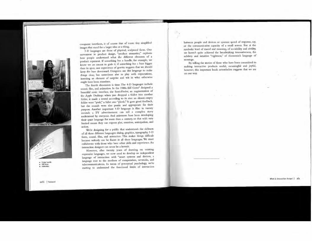
3-D languages are those of physical, sculptural form. One tnovement in product design, "product setnantics," explores how people understand what the different elements of a product represent. If something has a handle, for example, we know we are meant to grab it; if something has a base bigger than its apex, our experience of gravity suggests that we should keep the base downward. Designers use this language to make things clear, hut sometimes also to play with expectations, inserting an element of surprise and wit in what otherwise might have been mundane.
The fourth dimension is time. The 4-D languages include sound, film, and animation. In the 1980s Bill Gaver6 designed a beautiful sonic interface, the SonicFinder, an augmentation of the Apple Desktop: when you dropped a folder into another folder, it made a sound according to its size: an almost-empty folder went "pink;' a fuller one "plank." It gave good feedback, hut the sounds were also poetic and appropriate for their purpose. Another important 4-D language is film: in twenty seconds a •·· TV advertisement can tell a complex story understood by everyone. And animators have been developing their spare language for more than a century, so that with very Emited means they can express plot, emotion, anticipation, and action.
We're designing for a public that understands the richness of all these different languages: dialog, graphics, typography, 3-D form, sound, film, and animation. This makes things difficult because nobody can he fluent in all these languages. We must collaborate with those who have other skills and experience. An interaction designer can never be a hermit.
However, after twenty years of drawing on existing expressive languages, we now need to develop an independent language of interaction with "smart systems and device'S, a language true to the medium of cmnputation, networks, and telecon1lllunications. In terms of perceptual psychology, we're starting to understand the functional limits of interaction
between people and devices or systems: speed of response, say, or the communicative capacity of a small screen. But at the symbolic level of mood and meaning, of sociability and civility, we haven't quite achieved the breathtaking innovativeness, the subtlety and intuitive "rightness," of Eisenstein's language of n1ontage.
By telling the stories of those who have been committed to making interactive products useful, meaningful and joyful, however, this important book nevertheless suggests that we are on our way.
What Is Interaction Design? I xix

38 I Chapter 1
At first meeting, Stu Card seems to be a serious person. He looks at you intensely from behind his glasses and speaks in bursts, often veering off on a new tangent of connected thought. You have to concentrate hard to keep pace with him, but when you do, the reward is immediate, as he has thought everything through and arrived at a beautifully balanced view of the whole picture. Occasionally his face breaks into an impish grin, and you see that there is a rich sense of humor under the seriousness. He joined Xerox PARC in 1974, with probably the first-ever degree in human-computer interaction. As a freshman in high school, Stu built his own telescope, grinding the mirror himself. His ambition to be an astronomer led him to study physics, but he was always very interested in computers. In the eighth grade he read navy circuit manuals about how to build flip-flops out of vacuum tubes. His first evening course in computing was to aim the college telescope in the direction defined by a computer program that he wrote. At graduate school at Carnegie Mellon University he had designed his own program, studying computer science, artificial intelligence, and cognitive psychology. After graduation he was offered
three jobs; PARC was the most interesting, had the highest salary, and was in California, so it was an easy decision. Doug Engelhart and Bill English had brought the mouse to PARC from SRI, and Stu was assigned to help with the experiments that allowed them to understand the underlying science of the performance of input devices.
The Mouse and the Desktop I 39

Stu Card
A Supporting Science WHEN Sru JOINED PARC in 1974, he set out to invent a supporting science for the design of hu1nan-cmnputer interactions. This made his position somewhat different from the other researchers, There had been several attempts to develop sinillar sciences, for exa1nple human factors, but that focused too 1nuch on the evaluative side, waiting until the structure of the design was already complete and then measuring the result. Stu was more interested in contributing to the design process at the beginning, when the significant choices were still in flux and the science would be able to influence the outcome before much work was com.plete:
Newell, who was a consultant at PARC at the time, wanted to try to do a kind of applied psychology. The idea was that computer science is a very asymmetrical discipline. If you take things Like time-shared operating systems or programming languages, there is obviously a computer part to them, like how you parse them and do the compiling. There is also obviously a human part; what kind of languages can people program most easily, and what kind of errors do
The Mouse and the Desktop ! 41
42 I Chapter 1
they make, and how can you make them more efficient? All of the work that had been done in computer science was on the computer side and none on the applied psychology side. Information processing psychology showed real promise as a theory, but there were problems with psychology; it tends to be faddish and impractical and hard to build on.
The idea was that any science worth its salt should have practical applications, allowing you to test the theory in a more pragmatic context than a journal article. It would really have to work, as you were not immune to the hostile reactions of the people that you were trying to do this for. It would be difficult to do this in a university, because universities, especially psychology departments, would not tolerate applied work. In order to do basic research, you had to do it in a place like PARC.
"Design is where all of the action is!" was one of our slogans. If this was going to work at all, you had to have something that
could be used as you were designing. This did not mean that you could do all of design from science. You could have the equivalent
engineering in relation to architecture. You technical discipline that would support the design
we had a particularly concrete notion of what kind nf '"'nnmHnn science this would be; task analysis, approximation,
The idea was that you would be able to look at a make zero parameter computations about it, and then say
about what would happen in that situation without running full experiments to see, rather with just occasional experiments to spot check. The idea was that this would give you Lots of insight that it would otherwise be hard to have gotten.
"Don't bug us for ten years," we said, "and at the end we'll deliver this to you."
The wonderful thing about PARC was that they said, "Sure." We had to make arguments up front, but once they were made, we got ten years to do this. I've always appreciated the freedom that I got to do this at PARC.
To think that design is where all the action is was forward-looking at that tin'le, when innovation was thought to come from genius or pure scientific research. skills of design are synthesis, understanding people, and prototyping. Even now, the idea that these skills are innovation is not very widely accepted, but you wi11 see
of their significance again and again throughout this book. The unique contribution that Stu Card nude was to create a supporting sc1ence, connecting the theoretical underpinnings of research to the pragtnatic synthesis of design.
Bill English was Stu's first boss at PARC. Bill and Doug Englehart had coinvented the mouse when they were at SRI, with Doug providing the idea and Bill the engineering development and proto typing. A large part of English's group had come over to PARC from SRI. They wanted to do more experiments on the n1ouse to determine whether it or smne other device was really the better one. There were devices like rate-controlled isometric joysticks, ahnost identical to the one in the IBM ThinkPad keyboard today; there were various kinds of trackballs; and there were n1any versions of buttons and keys. Stu ren1embers the experiments:
English was pretty busy, so I agreed to help him do the experiments. He set up the usual kind of A-versus-B experiments between devices, but the problem with them was that he did not really know why one was better than the other, as the results varied when you changed the context. Since we were trying to do the science of this stuff, I modeled each one of the devices so that I had the empirical
between them, and I was trying to figure out how """""""" .. , to account for why those differences occurred. The most
model was the model of the mouse. law says that the time to point goes up as the log of the
the distance and the size of the target. What's about this Law is that the slope of that curve is about ten
second, which is about what had been measured for just the hand alone without a device. What's interesting about that the limitation of the device is not then in the device
in the eye-hand coordination system of the human. What was that the device was nearly optimaL The hand was
the machine instead of operating the machine at a so if you were to introduce this onto the market, nobody likely to come up with another device to beat you. We could
once we had this one empirical fact.
down to El Segundo to m_cet the Xerox engineers to invent a pointing device for the office syste1n
The Mouse and the Desktop I 43
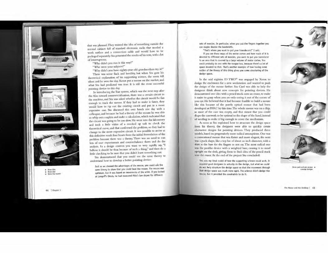
111 Xerox Alto a XeroxStar w. Xerox Star mouse
44 I Chapter 1
that was planned. They resisted the idea of something outside the normal cabinet full of standard electronic racks that needed a work surface and a connection cable and would have to be packaged separately. Stu presented the results ofhis tests, with a lot of interruptions.
"Why didn't you run it this way?" "Who were your subjects?" "Why didn't you have eighty-year-old grandmothers try it?" There was some flack and hostility, but when Stu gave his
theoretical explanation of his supporting science, the romn fell silent and he won the day. Xerox put a mouse on the market, and what Stu had predicted was true. It is still the most successful pointing device to this day.
In introducing the Star system_, which was the next step after the Alto toward cormnercialization, there was a certain circuit in the machine, and Stu was asked whether the circuit would be fast enough to track the mouse. If they had to make it faster, they would have to rip out the existing circuit and put in a more expensive one. Stu discussed this over lunch one day with a colleague, and because he had a theory of the mouse he was able to whip out a napkin and make a calculation, which indicated that the circuit was going to be too slow. He went into the laboratory and took a little video of a mocked up task to check the theoretical curve, and that confirmed the problem, so they had to change to the more expensive circuit. It was possible to arrive at this definitive result four hours fron1 the initial fonnulation of the problem_ because there was a theory. There was no need to run lots of user experiments and counterbalance then1 and do the analysis. In a design context you want to very rapidly say, "I believe it should he thus because of such a thing;' and then do a litde checking to be sure that you didn't leave something out.
Stu demonstrated that you could use the same theory to understand how to develop a better pointing device:
Just as we showed the advantages of the mouse, you could uS'e the same theory to show that you could beat the mouse. The mouse was optimum, but it was based on movements of the wrist. If you at Langoff's thesis, he had measured Fitts's law slopes for different
sets of muscles. In particular, when you put the fingers together you can maybe double the bandwidth.
"That's where you want to put your transducers!" I said. If you see these maps of the motor cortex and how much of it is
devoted to different sets of muscles, you want to put you transducer in an area that is covered by a large volume of motor cortex. You could probably do one with the tongue too, because there's a lot of space devoted to that. That's another example of how having some notion of the theory of this thing gives you some structuring of the design space.
In the mid eighties ID TW012 was engaged by Xerox to design the enclosures for a new workstation and wanted to push the design of the mouse farther. Stu Card was able to help the designers think about new concepts for pointing devices. He de1nonstrated one idea with a pencil stuck onto an eraser, to 111ake it easier to grasp when you are only seeing it out of the corner of you eye. He believed that it had become feasible to build a mouse
this because of the purely optical mouse that had been
my ideal model of how the supporting science could work. It good designers to actually do the design, but what we could
structure the design space so that the movement through space was much more rapid. The science didn't design the
provided the constraints to do it.
Xerox puck and pen mouse m concept designs
The Mouse and the Desktop l 45

46 I Chapter 1
Tim Mott created the concept of "guided fantasies" to learn about user needs, and was one of the very first people to apply rigorous user testing to the design of user interfaces. He studied computer science at Manchester University in England in the sixties and found a job with a publishing company called Ginn, near Boston, that was owned by Xerox. This led him to work with the researchers at Xerox PARC, and he collaborated with Larry Tesler to design a publishing system that included a new desktop metaphor; together they invented a user -centered design process. In the late seventies he became more interested in designing processes for management and business and honed his management skills working for Versatec, another Xerox subsidiary that manufactured electrostatic printers and plotters. In 1982 he cofounded Electronic Arts (EA) and set about building a set of processes to enable the creation and production of really rich interactive entertainment experiences-as soon as the supporting hardware was available. From the very beginning, they built the company with people who were just crazy about games. Once EA was successful, Tim went on to run a small company called Macromind,
whose founders had invented a user interface design tool called Director, leading the company to expand into multimedia and become Macromedia. He was a founding investor in Audible, setting the precedent for the MP3 players that came later, and moving from "Books on tape" to the spoken word Web site that supports public radio. He is a pilot, flying jets as well as the single-engine back-country plane that he loves to fly over wild mountain scenery.
The Mouse and the Desktop I 47

• Tim Mott in 1974
48 I Chapter 1
Tim Mott Tim put the editors in front of a display with a keyboard and a mouse. Nothing was on the display and no programs were running, but he asked them if they could walk him through the process, imagining what it would be like to use that hardware to edit. This was 1974, before word processors, so
they were using typewriters, pencils, and erasers.
Guided Fantasy GINN WAS ONE of several companies in the publishing industry that Xerox acquired around 1970.They were based in Lexington, Massachusetts, in one of the first buildings equipped with office systems furniture from Herman Miller. When the Ginn management team fo,und out how their contribution to Xerox corporate finance was being spent, they put in a request:
We're taxed for your research center; every division of Xerox has to pay money to support Xerox PARC research, and we want something back! What are you going to do for us?
This challenge eventually reached Bill English, who assigned the task of developing a publishing system for them to Larry Tesler. Larry started working with Ginn and writing specifications for their system and suggested that they hire somebody; they could send the new person to PARC for a year or so to work on the design of the new product. As it moved from design to implementation, he could write son1.e of the code and then return to Ginn to provide support. They found Tim Mott at College, where he was working on the help desk for a noairofr;unr,. Larry remembers interviewing Tim:
When we talked to him, we realized that this was the perfect guy; he writes good code, he's really fast, he understands about usability because he helps customers all the time, he loves doing support and he loves programming, and he thinks it's an interesting problem. We hired Tim Matt, and we got ten times more than we bargained for.
Tim spent a little time at Ginn , observed how they worked, started thinking about how to make it easier for the publishing tearu to get their job done, and then flew out to PARC. He remembers his first encounter with POLOS (PARC On Line Office System):
When I got out there, what I found was that, in my judgment at any rate, the system was completely unusable by anyone other than the people who built it. Their background was in building editing systems and design systems for themselves and for other computer professionals, and at least in my judgment it just wasn't going to be usable by editors and graphic designers who worked in a publishing company, so a month after getting to Palo Alto, I wrote a letter of resignation to the executive editor back in Boston, saying, "This is not a project that you should be doing." That letter found its way to Bob Taylor, who was running the computer science lab at the time. I spent some time with Bob, and he said, "Why don't you figure out what it is that we should be doing then?"
That was a challenge that Tim couldn't resist, so he teamed up Larry Tesler, and together they set about discovering what
who worked at Ginn really needed. Tim went back to and put the editors in front of a display with a
and a mouse. Nothing was on the display and no were running, but he asked them if they could walk him
the process, imagining what it would be like to use that to edit. This was 1974, before word processors, so they
typewriters, pencils, and erasers. He used the "gnided · that Larry had told him about, explaining that
be used to position a pointer on the screen and would be on the screen. The editors described the
used at that time with paper and pencil. Together typing in the text and creating a manuscript, and
The Mouse and the Desktop I 49

50 I Chapter 1
then editing that manuscript using the mouse and keyboard in the same way that they would use a pencil.
The Alto and the POLOS in 1974 both had mice on them based on the Engelhart mouse developed at SRI, and the Alto display was already a bitmap display, but the design of editing program_s was still based on the prior generation of character displays; no one had really thought about how to use the characteristics of the bitm.ap display to create a 1nore flexible editing environm_ent.
None of the text editors that had been designed for computers up to that point had a space between characters. They were based on character matrix displays that didn't allow for an editing mark to be placed between the character cells. If you wanted to mark an insertion point in the text, you either selected the character before where you wanted to add the new text, and said append, or you selected the character afterwards and said insert. Tim explains the difficulty that this caused:
That was one of the first things that I got from working with these editors. One of the concepts that they worked with was the space between characters, or the space between words.
"I want to use the mouse and put this insertion point or this caret between these two characters, and then I just want to type in the new text," they said.
When it came to deleting text, they talked about wanting to strike through it, just like they would with a pencil. They wanted to use the mouse to draw through the text. Up until that point, the way that a span of text had been selected was to mark the beginning point, and mark the end point and say "select." No one had actually used a mouse to draw through text.
These techniques that we see in all the word processing programs today came directly from working with people who spent their entire Lives editing text and asking them, "How do you want to do that?" Once Larry and I hit on this idea of having people talk about how they would want to do the work, the design itself became pretty simple. There was a new design methodology that came out of "'it. We talked about the design process as one that began with building a conceptual model that the user had today.
The Alto didn't have a user interface; rather, it came with a toolbox. Yim could build any kind of program you wanted, based on this very flexible architecture, and people started building applications on it. The Smalltalk system incorporated menus and editing techniques. There was a graphics program that William Newman built called Markup and a paint program that Bob Flegal created-applications started springing up.
Tim and Larry took the code base from Bravo,13 a text editor that already existed at PARC, and put a completely different user interface on top of it. They called their design "Gypsy"; the implementation progranl was straightforward, but they worked hard. They shared one Alto between them, working fourteen-hour shifts so that they would overlap by an hour at both ends and could tell each other what they had done. In this way they could work on the same code around the clock and could protect their access to the cmnputer, as there were only four Altos at PARC when they started.
Using "drag-through" selection for text was not the only innovation that came out of the work on Gypsy. The origin of the cut-and-paste 1netaphor is described by Larry in his interview, as
Tim's idea for double-clicking the mouse. There was also the dialog box; this was a little bar with a place for typing
such as Find. It was 1nore like a noniconic toolbar of as in Apple's Safari browser.
Gypsy had a file directory system with versions and drafts, not a list of files. You could have versions of the document and
of the version; it remembered them all and organized them much like
today. You could select something by dragging through it the two ends, and do the equivalent of Control b for changed the name of the control key to look with a so you said look b for bold.
had come up with the "guided fantasy" technique in he and Tim developed other user-centered methods
usability testing in the fall of 197 4 and the spring caught the imagination of the people in
cmmnunity. In the spring of 1975 Tim took the text-
The Mouse and the Desktop I 51

P)ZiN (, hLf I l)i£-1_£-f"£ f/IA I{_
,J!i!_ ,:w-e L\.L -twC\_>
editing program back to Lexington to try it out with the people at Ginn. For the first test he picked the most senior editor, figuring that, since she was the most entrenched both in her work habits and the company, if he could win her over, it would be smooth sailing from then on. After the first day she said, "You know, I think the quality of my work will be better going forward, because it's just so much easier to edit with this than it is with a typewriter and a pencil!"The approach had proved itself]
The Desktop (Office) Metaphor IN PARALLEL WITH completing the text editor, Tim and Larry were pretty far along in designing a page layout system for graphic designers. They were still struggling with the issue of how to think about the user interface for documents and files, and the actions that take place on an entire document, rather than on the pages or text within a document. Tim describes his moment of inspiration:
I was in a bar late one afternoon waiting for a friend, doodling on a bar napkin and thinking about this problem. I was just obsessed with this design at the time; I was just consumed by it. I was thinking about what happens in an office. Someone's got a document and they want to file it, so they walk over to the file cabinet and put it in the file cabinet; or if they want to make a copy of it, they walk over to the copier and they make a copy of it; or they want to throw it away, so they reach under their desk and throw it in the trash can.
I'm sitting there thinking about this and I'm doodling. What ended up on the bar napkin was what Larry and I called the "Office Schematic." It was a set of icons for a file cabinet, and a copier, or a printer in this case, and a trash can. The metaphor was that entire documents could be grabbed by the mouse and moved around on the screen. We didn't think about it as a desktop, we thought about it as moving these documents around an office. They could be dropped into a file cabinet, or they could be dropped onto a printer, or they could be dropped into a trashcan.
The Mouse and the Desktop I 53

54 I Chapter 1
The desktop was part of the design, and on it there were those things that you might normally find on a desktop like a calendar, a clock, and baskets for incoming and outgoing mail; the notion was that we would be able to use that as the controlling mechanism for electronic mail.
When Larry heard about the idea and saw the bar napkin, he showed Tim the illustrations fi-om "Pygmalion;'14 Dave Canfield Smith's thesis. He said that people had tried to implement similar designs before, hut they had always attempted to do very complex, three dimensional, true-to-Efe simulations, as opposed to just a sin'lple two-dimensional iconic representation. The simplicity of the representation was the breakthrough! Somewhere in one ofTin1's notebooks in Xerox there is a bar napkin covered in the doodle of his office metaphor, complete with a desktop and trash can.