book of vaadin
TRANSCRIPT

Book of Vaadin4th Edition

Book of Vaadin: 4th EditionVaadin LtdMarko Grönroos
4th Edition 1st Revision EditionVaadin Framework 6.7.0
Published: 2012-05-17Copyright © 2000-2012 Vaadin Ltd
Abstract
Vaadin is a server-side AJAX web application development framework that enables developers to buildhigh-quality user interfaces with Java. It provides a library of ready-to-use user interface components anda clean framework for creating your own components.The focus is on ease-of-use, re-usability, extensibility,and meeting the requirements of large enterprise applications. Vaadin has been used in production since2001 and it has proven to be suitable for building demanding business applications.All rights reserved. This work is licensed under the Creative Commons CC-BY-ND License Version 2.0[http://creativecommons.org/licenses/by-nd/2.0/legalcode].

Table of ContentsPreface ........................................................................................................................... xvI. Vaadin Core Framework .................................................................................................. 1
1. Introduction ......................................................................................................... 31.1. Overview .................................................................................................... 31.2. Example Application Walkthrough ................................................................ 51.3. Support for the Eclipse IDE ......................................................................... 61.4. Goals and Philosophy ................................................................................. 61.5. Background ................................................................................................ 7
2. Getting Started with Vaadin ................................................................................. 92.1. Setting up the Development Environment ..................................................... 9
2.1.1. Installing Java SDK ........................................................................ 102.1.2. Installing Eclipse IDE ...................................................................... 112.1.3. Installing Apache Tomcat ................................................................ 122.1.4. Firefox and Firebug ........................................................................ 12
2.2. Installing Vaadin ........................................................................................ 132.2.1. Vaadin Plugin for Eclipse ................................................................ 132.2.2. Installing the JAR Package ............................................................. 16
2.3. Your First Project with Vaadin ..................................................................... 162.3.1. Creating the Project ....................................................................... 162.3.2. Exploring the Project ...................................................................... 212.3.3. Setting Up and Starting the Web Server .......................................... 222.3.4. Running and Debugging ................................................................. 24
2.4. Creating a Project with NetBeans ............................................................... 252.4.1. Regular Web Application Project ..................................................... 252.4.2. Maven Project from Vaadin Archetype ............................................. 26
2.5. Creating a Project with Maven ................................................................... 27
3. Architecture ....................................................................................................... 313.1. Overview .................................................................................................. 313.2. Technological Background ......................................................................... 34
3.2.1. AJAX ............................................................................................. 343.2.2. Google Web Toolkit ........................................................................ 343.2.3. JSON ............................................................................................ 35
3.3. Applications as Java Servlet Sessions ........................................................ 353.4. Client-Side Engine .................................................................................... 353.5. Events and Listeners ................................................................................. 37
4. Writing a Web Application .................................................................................. 394.1. Overview .................................................................................................. 394.2. Managing the Main Window ....................................................................... 424.3. Sub-Windows ........................................................................................... 43
4.3.1. Opening and Closing a Sub-Window ............................................... 434.3.2. Window Positioning ........................................................................ 454.3.3. Scrolling Sub-Window Content ........................................................ 454.3.4. Modal Windows .............................................................................. 46
4.4. Handling Events with Listeners .................................................................. 464.5. Referencing Resources ............................................................................. 49
4.5.1. Resource Interfaces and Classes .................................................... 494.5.2. File Resources ............................................................................... 504.5.3. Class Loader Resources ................................................................ 504.5.4. Theme Resources .......................................................................... 50
iiiBook of Vaadin

4.5.5. Stream Resources ......................................................................... 514.6. Shutting Down an Application .................................................................... 53
4.6.1. Closing an Application .................................................................... 534.6.2. Handling the Closing of a Window ................................................... 53
4.7. Handling Errors ......................................................................................... 544.7.1. Error Indicator and message ........................................................... 544.7.2. Notifications ................................................................................... 544.7.3. Customizing System Messages ...................................................... 574.7.4. Handling Uncaught Exceptions ...................................................... 58
4.8. Setting Up the Application Environment ...................................................... 594.8.1. Creating Deployable WAR in Eclipse ............................................... 594.8.2. Web Application Contents ............................................................... 594.8.3. Deployment Descriptor web.xml .................................................... 60
5. User Interface Components ............................................................................... 635.1. Overview .................................................................................................. 645.2. Interfaces and Abstractions ....................................................................... 65
5.2.1. Component Interface ..................................................................... 665.2.2. AbstractComponent ..................................................................... 675.2.3. Field Components (Field and AbstractField) .................................. 67
5.3. Common Component Features .................................................................. 705.3.1. Caption ......................................................................................... 705.3.2. Description and Tooltips .................................................................. 715.3.3. Enabled ......................................................................................... 725.3.4. Icon ............................................................................................... 735.3.5. Locale ........................................................................................... 735.3.6. Read-Only ..................................................................................... 765.3.7. Style Name .................................................................................... 775.3.8. Visible ........................................................................................... 775.3.9. Sizing Components ........................................................................ 785.3.10. Managing Input Focus .................................................................. 80
5.4. Label ....................................................................................................... 805.4.1. Content Mode ................................................................................ 815.4.2. Making Use of the XHTML Mode ..................................................... 835.4.3. Spacing with a Label ...................................................................... 845.4.4. CSS Style Rules ............................................................................ 84
5.5. Link ......................................................................................................... 845.6. TextField ................................................................................................. 86
5.6.1. Data Binding .................................................................................. 875.6.2. String Length ................................................................................. 885.6.3. Handling Null Values ...................................................................... 885.6.4. Text Change Events ....................................................................... 895.6.5. CSS Style Rules ............................................................................ 90
5.7. TextArea .................................................................................................. 915.8. PasswordField ........................................................................................ 925.9. RichTextArea .......................................................................................... 925.10. Date and Time Input with DateField ......................................................... 94
5.10.1. PopupDateField .......................................................................... 955.10.2. InlineDateField ........................................................................... 975.10.3. Time Resolution ........................................................................... 985.10.4. DateField Locale .......................................................................... 99
5.11. Button ................................................................................................... 995.12. CheckBox ............................................................................................ 1005.13. Selecting Items ..................................................................................... 100
iv
Book of Vaadin

5.13.1. Binding Selection Components to Data ........................................ 1015.13.2. Basic Select Component ............................................................ 1055.13.3. ListSelect ................................................................................. 1075.13.4. Native Selection Component NativeSelect .................................. 1075.13.5. Radio Button and Check Box Groups with OptionGroup .............. 1085.13.6. Twin Column Selection with TwinColSelect ................................. 1105.13.7. Allowing Adding New Items ......................................................... 1115.13.8. Multiple Selection Mode .............................................................. 1125.13.9. Other Common Features ............................................................ 113
5.14. Table .................................................................................................... 1135.14.1. Selecting Items in a Table ........................................................... 1155.14.2. Table Features ........................................................................... 1165.14.3. Editing the Values in a Table ........................................................ 1195.14.4. Column Headers and Footers ...................................................... 1225.14.5. Generated Table Columns ........................................................... 1245.14.6. Formatting Table Columns ........................................................... 1275.14.7. CSS Style Rules ......................................................................... 128
5.15. Tree ..................................................................................................... 1315.16. MenuBar .............................................................................................. 1325.17. Embedded ........................................................................................... 134
5.17.1. Embedded Objects ..................................................................... 1345.17.2. Embedded Images ..................................................................... 1355.17.3. Browser Frames ......................................................................... 136
5.18. Upload ................................................................................................. 1365.19. Form .................................................................................................... 138
5.19.1. Form as a User Interface Component .......................................... 1385.19.2. Binding Form to Data .................................................................. 1405.19.3. Validating Form Input .................................................................. 1435.19.4. Buffering Form Data ................................................................... 145
5.20. ProgressIndicator ............................................................................... 1465.20.1. Doing Heavy Computation .......................................................... 146
5.21. Slider ................................................................................................... 1475.22. LoginForm ........................................................................................... 149
5.22.1. Customizing LoginForm ............................................................ 1505.23. Component Composition with CustomComponent ................................. 152
6. Managing Layout ............................................................................................. 1556.1. Overview ................................................................................................ 1566.2. Window and Panel Root Layout ................................................................ 1586.3. VerticalLayout and HorizontalLayout ..................................................... 158
6.3.1. Sizing Contained Components ...................................................... 1596.4. GridLayout ............................................................................................ 163
6.4.1. Sizing Grid Cells .......................................................................... 1646.5. FormLayout ........................................................................................... 1666.6. Panel ..................................................................................................... 168
6.6.1. Scrolling the Panel Content ........................................................... 1706.7. HorizontalSplitPanel and VerticalSplitPanel .......................................... 1726.8. TabSheet ............................................................................................... 1746.9. Accordion ............................................................................................. 1776.10. AbsoluteLayout ................................................................................... 1786.11. CssLayout ........................................................................................... 1806.12. Layout Formatting ................................................................................. 183
6.12.1. Layout Size ................................................................................ 1836.12.2. Layout Cell Alignment ................................................................. 184
v
Book of Vaadin

6.12.3. Layout Cell Spacing .................................................................... 1866.12.4. Layout Margins ........................................................................... 188
6.13. Custom Layouts .................................................................................... 190
7. Visual User Interface Design with Eclipse ........................................................ 1937.1. Overview ................................................................................................ 1937.2. Creating a New Composite ...................................................................... 1947.3. Using The Visual Designer ....................................................................... 196
7.3.1. Adding New Components ............................................................. 1977.3.2. Setting Component Properties ...................................................... 1987.3.3. Editing an AbsoluteLayout .......................................................... 200
7.4. Structure of a Visually Editable Component .............................................. 2027.4.1. Sub-Component References ......................................................... 2027.4.2. Sub-Component Builders .............................................................. 2037.4.3. The Constructor ........................................................................... 203
8. Themes ............................................................................................................ 2058.1. Overview ................................................................................................ 2058.2. Introduction to Cascading Style Sheets .................................................... 207
8.2.1. Basic CSS Rules .......................................................................... 2078.2.2. Matching by Element Class ........................................................... 2088.2.3. Matching by Descendant Relationship ........................................... 2098.2.4. Notes on Compatibility .................................................................. 211
8.3. Creating and Using Themes .................................................................... 2128.3.1. Styling Standard Components ....................................................... 2128.3.2. Built-in Themes ............................................................................ 2148.3.3. Using Themes .............................................................................. 2158.3.4. Theme Inheritance ....................................................................... 215
8.4. Creating a Theme in Eclipse .................................................................... 216
9. Binding Components to Data ........................................................................... 2199.1. Overview ................................................................................................ 2199.2. Properties .............................................................................................. 221
9.2.1. Property Viewers and Editors ........................................................ 2229.2.2. ObjectProperty Implementation ................................................... 2239.2.3. Implementing the Property Interface ............................................. 223
9.3. Holding properties in Items ...................................................................... 2249.3.1. The PropertysetItem Implementation ........................................... 2259.3.2. Wrapping a Bean in a BeanItem ................................................... 225
9.4. Collecting Items in Containers .................................................................. 2279.4.1. BeanContainer ........................................................................... 2289.4.2. BeanItemContainer .................................................................... 2309.4.3. Iterating Over a Container ............................................................. 2319.4.4. Filterable Containers ................................................................... 232
10. Vaadin SQLContainer ..................................................................................... 23510.1. Architecture .......................................................................................... 23610.2. Getting Started with SQLContainer ........................................................ 236
10.2.1. Creating a connection pool .......................................................... 23610.2.2. Creating the TableQuery Query Delegate .................................... 23710.2.3. Creating the Container ................................................................ 237
10.3. Filtering and Sorting .............................................................................. 23710.3.1. Filtering ..................................................................................... 23710.3.2. Sorting ...................................................................................... 238
10.4. Editing .................................................................................................. 238
vi
Book of Vaadin

10.4.1. Adding items .............................................................................. 23810.4.2. Fetching generated row keys ....................................................... 23810.4.3. Version column requirement ........................................................ 23910.4.4. Auto-commit mode ..................................................................... 23910.4.5. Modified state ............................................................................ 239
10.5. Caching, Paging and Refreshing ............................................................ 24010.5.1. Container Size ........................................................................... 24010.5.2. Page Length and Cache Size ...................................................... 24010.5.3. Refreshing the Container ............................................................ 24010.5.4. Cache Flush Notification Mechanism ........................................... 241
10.6. Referencing Another SQLContainer ...................................................... 24110.7. Using FreeformQuery and FreeformStatementDelegate ....................... 24210.8. Non-implemented methods of Vaadin container interfaces ....................... 24310.9. Known Issues and Limitations ................................................................ 244
11. Developing New Components ........................................................................ 24711.1. Overview .............................................................................................. 24811.2. Doing It the Simple Way in Eclipse ......................................................... 249
11.2.1. Creating a Widget ....................................................................... 24911.2.2. Recompiling the Widget Set ........................................................ 25211.2.3. Plugin Related Project Settings ................................................... 252
11.3. Google Web Toolkit Widgets ................................................................... 25411.3.1. Extending a Vaadin Widget ......................................................... 25511.3.2. Example: A Color Picker GWT Widget ......................................... 25511.3.3. Styling GWT Widgets .................................................................. 257
11.4. Integrating a GWT Widget ...................................................................... 25811.4.1. Deserialization of Component State from Server .......................... 25911.4.2. Serialization of Component State to Server .................................. 26011.4.3. Example: Integrating the Color Picker Widget ............................... 262
11.5. Defining a Widget Set ............................................................................ 26311.6. Server-Side Components ....................................................................... 264
11.6.1. Binding to the Client-Side Widget ................................................ 26411.6.2. Server-Client Serialization ........................................................... 26511.6.3. Client-Server Deserialization ....................................................... 26511.6.4. Example: Color Picker Server-Side Component ............................ 266
11.7. Using a Custom Component .................................................................. 26711.7.1. Example: Color Picker Application ............................................... 26711.7.2. Web Application Deployment ....................................................... 268
11.8. GWT Widget Development ..................................................................... 26911.8.1. Creating a Widget Project ........................................................... 26911.8.2. Importing GWT Installation Package ............................................ 27011.8.3. Writing the Code ........................................................................ 27011.8.4. Compiling GWT Widget Sets ....................................................... 27111.8.5. Ready to Run ............................................................................. 27411.8.6. GWT Development Mode ............................................................ 27511.8.7. Packaging a Widget Set .............................................................. 28111.8.8. Troubleshooting .......................................................................... 281
12. Advanced Web Application Topics ................................................................. 28312.1. Special Characteristics of AJAX Applications .......................................... 28412.2. Application-Level Windows .................................................................... 284
12.2.1. Creating New Application-Level Windows ..................................... 28512.2.2. Creation of Windows When Requested ........................................ 28712.2.3. Dynamic Multi-Window Applications ............................................ 288
vii
Book of Vaadin

12.2.4. Closing Windows ........................................................................ 29012.2.5. Caveats in Using Multiple Windows ............................................. 290
12.3. Embedding Applications in Web Pages ................................................... 29212.3.1. Embedding Inside a div Element ................................................ 29212.3.2. Embedding Inside an iframe Element ........................................ 29512.3.3. Cross-Site Embedding with the Vaadin XS Add-on ....................... 296
12.4. Debug and Production Mode .................................................................. 29712.4.1. Debug Mode .............................................................................. 29712.4.2. Analyzing Layouts ...................................................................... 29812.4.3. Custom Layouts ......................................................................... 29912.4.4. Debug Functions for Component Developers ................................ 299
12.5. Resources ............................................................................................ 29912.5.1. URI Handlers ............................................................................. 30012.5.2. Parameter Handlers .................................................................... 300
12.6. Shortcut Keys ....................................................................................... 30212.6.1. Click Shortcuts for Default Buttons ............................................... 30212.6.2. Field Focus Shortcuts ................................................................. 30312.6.3. Generic Shortcut Actions ............................................................ 30312.6.4. Supported Key Codes and Modifier Keys ..................................... 305
12.7. Printing ................................................................................................. 30612.8. Google App Engine Integration .............................................................. 30712.9. Common Security Issues ....................................................................... 308
12.9.1. Sanitizing User Input to Prevent Cross-Site Scripting .................... 30812.10. URI Fragment and History Management with UriFragmentUtility .......... 30812.11. Capturing HTTP Requests ................................................................... 310
12.11.1. Using Request and Response Objects ....................................... 31112.11.2. Managing Cookies .................................................................... 311
12.12. Drag and Drop .................................................................................... 31312.12.1. Handling Drops ........................................................................ 31312.12.2. Dropping Items On a Tree ......................................................... 31412.12.3. Dropping Items On a Table ....................................................... 31612.12.4. Accepting Drops ....................................................................... 31612.12.5. Dragging Components .............................................................. 31912.12.6. Dropping on a Component ........................................................ 32012.12.7. Dragging Files from Outside the Browser ................................... 321
12.13. Logging .............................................................................................. 32112.14. Accessing Session-Global Data ........................................................... 322
12.14.1. Passing References Around ...................................................... 32412.14.2. Overriding attach() ............................................................... 32412.14.3. ThreadLocal Pattern ................................................................. 325
13. Portal Integration ........................................................................................... 32913.1. Deploying to a Portal ............................................................................. 33013.2. Creating a Portal Application Project in Eclipse ....................................... 33013.3. Portlet Deployment Descriptors .............................................................. 33213.4. Portlet Hello World ................................................................................ 33713.5. Installing Vaadin in Liferay ...................................................................... 33713.6. Handling Portlet Requests ..................................................................... 33913.7. Handling Portlet Mode Changes ............................................................. 34013.8. Non-Vaadin Portlet Modes ..................................................................... 34213.9. Vaadin Control Panel for Liferay .............................................................. 344
13.9.1. Installing .................................................................................... 34513.9.2. Using the Control Panel .............................................................. 345
13.10. Vaadin IPC for Liferay .......................................................................... 346
viii
Book of Vaadin

13.10.1. Installing the Add-on ................................................................. 34813.10.2. Basic Communication ............................................................... 34913.10.3. Considerations ......................................................................... 34913.10.4. Communication Through Session Attributes ............................... 35013.10.5. Serializing and Encoding Data ................................................... 35113.10.6. Communicating with Non-Vaadin Portlets ................................... 352
13.11. Remote Portlets with WSRP ................................................................. 35313.11.1. Installing the Add-on ................................................................. 35313.11.2. Configuring a Remote Portlet .................................................... 35413.11.3. Producer Configuration ............................................................. 35413.11.4. Consumer Configuration ........................................................... 35513.11.5. Advanced Configuration ............................................................ 356
14. Rapid Development Using Vaadin and Roo .................................................... 35714.1. Overview .............................................................................................. 35814.2. Setting Up the Environment ................................................................... 358
14.2.1. Installing Spring Roo .................................................................. 35914.2.2. Creating the Project .................................................................... 35914.2.3. Installing Vaadin Plugin for Spring Roo ......................................... 35914.2.4. Setting up the Roo Data Layer .................................................... 360
14.3. Creating the Domain Model ................................................................... 36014.3.1. Domain Model Design ................................................................ 36014.3.2. Creating the Model in Roo .......................................................... 361
14.4. Creating Vaadin Application and CRUD Views ......................................... 36114.4.1. Creating the Application Skeleton ................................................ 36214.4.2. Generating CRUD Views ............................................................. 36214.4.3. Deploying to Development Server ................................................ 362
14.5. Using Vaadin Add-ons in a Roo project ................................................... 36214.5.1. Installing Add-ons ....................................................................... 36314.5.2. Compiling the Widget Set ............................................................ 36314.5.3. Configuring the Deployment Assembly ......................................... 364
14.6. Customizing Views ................................................................................ 36414.6.1. Modifying Roo generated entity form ........................................... 36414.6.2. Creating a Calendar View for Filling Work Entries ......................... 36514.6.3. Creating a Custom View for Reporting ......................................... 366
14.7. Authentication and Authorization ............................................................ 36614.7.1. Implementing Authentication and Authorization ............................ 366
14.8. Internationalization ................................................................................ 36814.9. Testing the Application ........................................................................... 370
14.9.1. Overview of Testing .................................................................... 37014.9.2. Running the Test Server .............................................................. 37114.9.3. Installing TestBench with Maven .................................................. 37214.9.4. Generating JUnit Tests ................................................................ 37214.9.5. Configuring System Properties .................................................... 37214.9.6. Notes ........................................................................................ 373
14.10. Exception Handling ............................................................................. 37314.10.1. Preventing Stacktraces in the UI ................................................ 37314.10.2. Where to Catch Exceptions ....................................................... 374
14.11. Deploying to Cloud Foundry ................................................................. 37514.11.1. Installing the Cloud Foundry Plug-in in STS ................................ 37514.11.2. Deploying the Application .......................................................... 37514.11.3. Binding to the MySQL Service ................................................... 376
II. Vaadin Add-ons ......................................................................................................... 379
ix
Book of Vaadin

15. Using Vaadin Add-ons .................................................................................... 38115.1. Overview .............................................................................................. 38115.2. Downloading Add-ons from Vaadin Directory ........................................... 38115.3. Compiling Add-on Widget Sets ............................................................... 382
15.3.1. Compiling Widget Sets in Eclipse ................................................ 38215.3.2. Compiling Widget Sets with an Ant Script ..................................... 38315.3.3. Troubleshooting .......................................................................... 383
15.4. Removing Add-ons ................................................................................ 38415.5. Using Add-ons in a Maven Project .......................................................... 384
15.5.1. Adding a Dependency ................................................................ 38415.5.2. Enabling Widget Set Compilation ................................................. 38515.5.3. Updating and Compiling the Project Widget Set ............................ 387
16. Vaadin Calendar ............................................................................................. 38916.1. Overview .............................................................................................. 38916.2. Installing Calendar ................................................................................ 39216.3. Basic Use ............................................................................................. 392
16.3.1. Setting the Date Range ............................................................... 39216.3.2. Adding and Managing Events ...................................................... 39316.3.3. Getting Events from a Container .................................................. 393
16.4. Implementing an Event Provider ............................................................. 39516.4.1. Custom Events ........................................................................... 39516.4.2. Implementing the Event Provider ................................................. 397
16.5. Configuring the Appearance .................................................................. 39716.5.1. Sizing ........................................................................................ 39716.5.2. Styling ....................................................................................... 39716.5.3. Visible Hours and Days ............................................................... 399
16.6. Drag and Drop ...................................................................................... 39916.7. Using the Context Menu ........................................................................ 40016.8. Localization and Formatting ................................................................... 401
16.8.1. Setting the Locale and Time Zone ............................................... 40116.8.2. Time and Date Caption Format .................................................... 401
16.9. Customizing the Calendar ...................................................................... 40116.9.1. Overview of Handlers ................................................................. 40116.9.2. Creating a Calendar ................................................................... 40216.9.3. Backward and Forward Navigation ............................................... 40216.9.4. Date Click Handling .................................................................... 40316.9.5. Handling Week Clicks ................................................................. 40316.9.6. Handling Event Clicks ................................................................. 40416.9.7. Event Dragging .......................................................................... 40416.9.8. Handling Drag Selection ............................................................. 40516.9.9. Resizing Events ......................................................................... 406
17. Vaadin Timeline .............................................................................................. 40717.1. Overview .............................................................................................. 40717.2. Using Timeline ...................................................................................... 411
17.2.1. Data Source Requirements ......................................................... 41117.2.2. Events and Listeners .................................................................. 41317.2.3. Configurability ............................................................................ 41317.2.4. Localization ................................................................................ 414
17.3. Code example ....................................................................................... 41417.3.1. Prerequisites .............................................................................. 41417.3.2. Create the data sources .............................................................. 41617.3.3. Create the Vaadin Timeline ......................................................... 419
x
Book of Vaadin

17.3.4. Final Touches ............................................................................. 420
18. Vaadin JPAContainer ...................................................................................... 42318.1. Overview .............................................................................................. 42318.2. Installing ............................................................................................... 425
18.2.1. Downloading the Package ........................................................... 42618.2.2. Installation Package Content ....................................................... 42618.2.3. Downloading with Maven ............................................................ 42718.2.4. Including Libraries in Your Project ................................................ 42718.2.5. Persistence Configuration ........................................................... 42818.2.6. Troubleshooting .......................................................................... 430
18.3. Defining a Domain Model ....................................................................... 43018.3.1. Persistence Metadata ................................................................. 431
18.4. Basic Use of JPAContainer .................................................................... 43318.4.1. Creating JPAContainer with JPAContainerFactory ..................... 43318.4.2. Creating and Accessing Entities .................................................. 43518.4.3. Nested Properties ...................................................................... 43618.4.4. Hierarchical Container ................................................................ 437
18.5. Entity Providers ..................................................................................... 43818.5.1. Built-In Entity Providers ............................................................... 43818.5.2. Using JNDI Entity Providers in JEE6 Environment ........................ 44018.5.3. Entity Providers as Enterprise Beans ........................................... 440
18.6. Filtering JPAContainer .......................................................................... 44118.7. Querying with the Criteria API ................................................................ 441
18.7.1. Filtering the Query ...................................................................... 44218.7.2. Compatibility .............................................................................. 442
18.8. Automatic Form Generation ................................................................... 44318.8.1. Configuring the Field Factory ...................................................... 44318.8.2. Using the Field Factory ............................................................... 44318.8.3. Master-Detail Editor .................................................................... 445
18.9. Using JPAContainer with Hibernate ........................................................ 44518.9.1. Lazy loading .............................................................................. 44518.9.2. The EntityManager-Per-Request pattern ...................................... 44618.9.3. Joins in Hibernate vs EclipseLink ................................................ 446
19. Mobile Applications with TouchKit ................................................................. 44719.1. Overview .............................................................................................. 44719.2. Considerations Regarding Mobile Browsing ............................................ 448
19.2.1. Mobile Human Interface .............................................................. 44819.2.2. Bandwidth .................................................................................. 44819.2.3. Mobile Features ......................................................................... 44919.2.4. Compatibility .............................................................................. 449
19.3. Creating a Project Targeting Multiple Devices .......................................... 44919.3.1. Using TouchKit Add-on in a Project .............................................. 44919.3.2. Application ................................................................................. 450
19.4. Mobile User Interface Components ......................................................... 45019.4.1. NavigationView ......................................................................... 45019.4.2. Toolbar ..................................................................................... 45219.4.3. NavigationManager .................................................................. 45219.4.4. NavigationButton ..................................................................... 45419.4.5. Popover .................................................................................... 45419.4.6. Switch ...................................................................................... 45619.4.7. ComponentGroup ..................................................................... 45619.4.8. EmailField ................................................................................ 456
xi
Book of Vaadin

19.4.9. NumberField ............................................................................. 45719.5. Mobile Features .................................................................................... 457
19.5.1. Geolocation ............................................................................... 45719.6. Testing and Debugging on Mobile Devices .............................................. 457
19.6.1. Debugging ................................................................................. 457
20. Vaadin TestBench ........................................................................................... 45920.1. Overview .............................................................................................. 45920.2. TestBench Components ......................................................................... 46020.3. Requirements ....................................................................................... 46120.4. Installing Vaadin TestBench .................................................................... 462
20.4.1. Test Development Installation ...................................................... 46320.4.2. A Distributed Test Environment .................................................... 46320.4.3. Downloading and Unpacking the Installation Package ................... 46320.4.4. Installing the Recorder ................................................................ 46420.4.5. Quick Setup for Playback on a Workstation .................................. 465
20.5. Setting Up the Grid Hub ......................................................................... 46620.5.1. Configuring the Hub ................................................................... 46620.5.2. Predefined Target Environments .................................................. 46720.5.3. Browser Identifiers ...................................................................... 46720.5.4. Starting the Hub ......................................................................... 468
20.6. Setting Up Grid Nodes ........................................................................... 46920.6.1. Configuring a Remote Control ..................................................... 46920.6.2. Configuring the Run Script .......................................................... 47020.6.3. Starting the Remote Control ........................................................ 47020.6.4. Running Tests Without a Grid Hub ............................................... 47020.6.5. Browser settings ......................................................................... 47120.6.6. Operating system settings ........................................................... 47120.6.7. Settings for Screenshots ............................................................. 471
20.7. Using Vaadin TestBench Recorder .......................................................... 47220.7.1. Starting the Recorder ................................................................. 47220.7.2. Recording .................................................................................. 47320.7.3. Playing Back Tests ...................................................................... 47420.7.4. Editing Tests .............................................................................. 47420.7.5. Saving Tests ............................................................................... 47520.7.6. Invalid Tests ............................................................................... 476
20.8. Test Script Commands ........................................................................... 47620.8.1. Taking Screen Captures: screenCapture ..................................... 47620.8.2. Recording Tooltips: showTooltip ................................................. 47720.8.3. Recording Text Assertion: assertText .......................................... 47720.8.4. Asserting CSS Class: assertCSSClass ....................................... 47720.8.5. Asserting CSS Class: assertNotCSSClass ................................. 47720.8.6. Connecting Tests Together: includeTest ...................................... 47720.8.7. Handling a Confirmation Box: expectDialog ................................ 47720.8.8. Uploading Files: uploadFile ........................................................ 47720.8.9. Shortcut Keys: keyPressSpecial ................................................. 478
20.9. Compiling and Executing JUnit Tests ...................................................... 47820.9.1. Configuring the Ant Script ........................................................... 47920.9.2. Converting HTML Tests ............................................................... 48120.9.3. Compiling JUnit tests .................................................................. 48320.9.4. Executing JUnit Tests .................................................................. 48320.9.5. Comparing Screenshots ............................................................. 485
A. User Interface Definition Language (UIDL) .............................................................. 489
xii
Book of Vaadin

A.1. API for Painting Components ........................................................................... 490A.2. JSON Rendering ............................................................................................ 491
B. Songs of Vaadin ...................................................................................................... 495Index ............................................................................................................................ 499
xiii
Book of Vaadin

xiv

PrefaceThis book provides an overview of the Vaadin Framework and covers the most important topicsthat you might encounter while developing applications with it. A more detailed documentationof the individual classes, interfaces, and methods is given in the Vaadin API Reference.
Writing this manual is ongoing work and it is rarely completely up-to-date with the quick-evolvingproduct. This revision represents a snapshot in time while working towards Vaadin 6.8. After theoriginal 4th Edition, the book has been reorganized in two parts so that the Part I documents thecore framework and the Part II the official add-on components.
You can browse an online version of this book at the Vaadin website athttp://vaadin.com/book. You can also find PDF and EPUB versions of the book there. Ifyou install the Vaadin Plugin for Eclipse, you can browse the book in Eclipse Help.You may findthe HTML or the Eclipse Help plugin version more easily searchable than this printed book orthe PDF version, but the content is the same.
This edition includes an index, which is not yet complete. Many sections are under work and willbe expanded in future.
Who is This Book For?
This book is intended for software developers who use, or are considering to use, Vaadin to de-velop web applications.
The book assumes that you have some experience with programming in Java, but if not, it is atleast as easy to begin learning Java with Vaadin as with any other UI framework. No knowledgeof AJAX is needed as it is well hidden from the developer.
You may have used some desktop-oriented user interface frameworks for Java, such as AWT,Swing, or SWT. Or a library such as Qt for C++. Such knowledge is useful for understanding thescope of Vaadin, the event-driven programming model, and other common concepts of UIframeworks, but not necessary.
If you do not have a web graphics designer at hand, knowing the basics of HTML and CSS canhelp so that you can develop presentation themes for your application. A brief introduction toCSS is provided. Knowledge of Google Web Toolkit (GWT) may be useful if you develop or integ-rate new client-side components.
Organization of This Book
The Book of Vaadin gives an introduction to what Vaadin is and how you use it to develop webapplications.
Part I: Vaadin Core Framework
Chapter 1, Introduction The chapter gives introduction to the application archi-tecture supported by Vaadin, the core design ideasbehind the framework, and some historical background.
Chapter 2, Getting Started withVaadin
This chapter gives practical instructions for installingVaadin and the reference toolchain, including theVaadin Plugin for Eclipse, how to run and debug the
xvBook of Vaadin

demos, and how to create your own application projectin the Eclipse IDE.
Chapter 3, Architecture This chapter gives an introduction to the architectureof Vaadin and its major technologies, including AJAX,Google Web Toolkit, JSON, and event-driven program-ming.
Chapter 4, Writing a Web Applic-ation
This chapter gives all the practical knowledge requiredfor creating applications with Vaadin, such as windowmanagement, application lifecycle, deployment in aservlet container, and handling events, errors, and re-sources.
Chapter 5, User Interface Com-ponents
This chapter essentially gives the reference document-ation for all the core user interface components inVaadin and their most significant features. The textgives examples for using each of the components.
Chapter 6, Managing Layout This chapter describes the layout components, whichare used for managing the layout of the user interface,just like in any desktop application frameworks.
Chapter 7, Visual User InterfaceDesign with Eclipse
This chapter gives instructions for using the visual editorfor Eclipse, which is included in the Vaadin Plugin forthe Eclipse IDE.
Chapter 8, Themes This chapter gives an introduction to Cascading StyleSheets (CSS) and explains how you can use them tobuild custom visual themes for your application.
Chapter 9, Binding Componentsto Data
This chapter gives an overview of the built-in datamodel of Vaadin, consisting of properties, items, andcontainers.
Chapter 10, Vaadin SQLContain-er
This chapter gives documentation for the SQLContain-er, which allows binding Vaadin components to SQLqueries.
Chapter 11, Developing NewComponents
This chapter describes the process of creating newclient-side widgets with Google Web Toolkit (GWT) andintegrating them with server-side counterparts. Thechapter also gives practical instructions for creatingwidget projects in Eclipse, and using the GWT Devel-opment Mode to debug widgets.
Chapter 12, Advanced Web Ap-plication Topics
This chapter provides many special topics that arecommonly needed in applications, such as openingnew browser windows, embedding applications in reg-ular web pages, low-level management of resources,shortcut keys, debugging, etc.
Chapter 13, Portal Integration This chapter is describes the development of Vaadinapplications as portlets which you can deploy to anyportal supporting Java Portlet API 2.0 (JSR-286). The
Organization of This Bookxvi
Preface
chapter also describes the special support for Liferayand the Control Panel, IPC, and WSRP add-ons.
Chapter 14, Rapid DevelopmentUsing Vaadin and Roo
This chapter is a tutorial for rapid development ofVaadin applications with Spring Roo and the VaadinPlugin for Eclipse. The tutorial includes aspects suchas internationalization, testing, and database bindingwith the JPAContainer add-on.
Part II: Vaadin Add-ons
Chapter 15, Using Vaadin Add-ons
This chapter gives a instructions for downloading andinstalling add-on components from the Vaadin Directory.
Chapter 16, Vaadin Calendar This chapter gives developer documentation for theCalendar add-on component.
Chapter 17, Vaadin Timeline This chapter gives an introduction to the Timeline add-on component. The full documentation is included inthe product manual.
Chapter 18, Vaadin JPAContainer This chapter gives documentation for the JPAContaineradd-on, which allows binding Vaadin components dir-ectly to relational and other databases using JavaPersistence API (JPA).
Chapter 19, Mobile Applicationswith TouchKit
This chapter gives examples and reference document-ation for using the Vaadin TouchKit add-on for develop-ing mobile applications.
Chapter 20, Vaadin TestBench This chapter gives the complete documentation for us-ing the Vaadin TestBench tool for recording and execut-ing user interface regression tests for Vaadin applica-tions.
Appendix A, User InterfaceDefinition Language (UIDL)
This appendix gives an outline of the low-level UIDLmessaging language, normally hidden from the de-veloper. The chapter includes the description of theserialization API needed for synchronizing the compon-ent state between the client-side and server-side com-ponents.
Appendix B, Songs of Vaadin Mythological background of the name Vaadin.
Supplementary Material
The Vaadin websites offer plenty of material that can help you understand what Vaadin is, whatyou can do with it, and how you can do it.
Demo Applications The most important demo application for Vaadin is theSampler, which demonstrates the use of all basic compon-ents and features.You can run it on-line at http://demo.vaad-in.com/ or download it as a WAR from the Vaadin downloadpage [http://vaadin.com/download/].
xviiSupplementary Material
Preface

Most of the code examples in this book and many otherscan be found online at http://demo.vaadin.com/book-ex-amples/book/.
Cheat Sheet The two-page cheat sheet illustrates the basic relationshiphierarchy of the user interface and data binding classesand interfaces. You can download it at http://dev.vaad-in.com/browser/doc/trunk/cheatsheet/vaadin-cheatsheet-duplex.pdf.
Refcard The six-page DZone Refcard gives an overview to applica-tion development with Vaadin. It includes a diagram of theuser interface and data binding classes and interfaces.Youcan find more information about it at https://vaadin.com/re-fcard.
Address Book Tutorial The Address Book is a sample application accompaniedwith a tutorial that gives detailed step-by-step instructionsfor creating a real-life web application with Vaadin.You canfind the tutorial from the product website.
Developer's Website Vaadin Developer's Site at http://dev.vaadin.com/ providesvarious online resources, such as the ticket system, a de-velopment wiki, source repositories, activity timeline, devel-opment milestones, and so on.
The wiki provides instructions for developers, especially forthose who wish to check-out and compile Vaadin itself fromthe source repository.The technical articles deal with integ-ration of Vaadin applications with various systems, such asJSP, Maven, Spring, Hibernate, and portals. The wiki alsoprovides answers to Frequently Asked Questions.
Online Documentation You can read this book online at http://vaadin.com/book.Lots of additional material, including technical HOWTOs,answers to Frequently Asked Questions and other docu-mentation is also available on Vaadin web-site[http://dev.vaadin.com/].
Support
Stuck with a problem? No need to lose your hair over it, the Vaadin Framework developer com-munity and the Vaadin company offer support for all of your needs.
Community Support Forum You can find the user and developer community forumfor Vaadin at http://vaadin.com/forum. Please use theforum to discuss any problems you might encounter,wishes for features, and so on. The answer for yourproblems may already lie in the forum archives, sosearching the discussions is always the best way to be-gin.
Report Bugs If you have found a possible bug in Vaadin, the demoapplications, or the documentation, please report it byfiling a ticket at the Vaadin developer's site at ht-
Supportxviii
Preface

tp://dev.vaadin.com/.You may want to check the existingtickets before filing a new one. You can make a ticket tomake a request for a new feature as well, or to suggestmodifications to an existing feature.
Commercial Support Vaadin offers full commercial support and training ser-vices for the Vaadin Framework and related products.Read more about the commercial products at http://vaad-in.com/pro for details.
About the Author
Marko Grönroos is a professional writer and software developer working at Vaadin Ltd in Turku,Finland. He has been involved in web application development since 1994 and has worked onseveral application development frameworks in C, C++, and Java. He has been active in manyopen source software projects and holds an M.Sc. degree in Computer Science from the Universityof Turku.
Acknowledgements
Much of the book is the result of close work within the development team at Vaadin Ltd. JoonasLehtinen, CEO of Vaadin Ltd, wrote the first outline of the book, which became the basis for thefirst two chapters. Since then, Marko Grönroos has become the primary author and editor. Thedevelopment team has contributed several passages, answered numerous technical questions,reviewed the manual, and made many corrections.
The contributors are (in rough chronological order):
Joonas LehtinenJani LaaksoMarko GrönroosJouni KoivuviitaMatti TahvonenArtur SignellMarc EnglundHenri SaraJonatan KronqvistMikael Grankvist (TestBench)Teppo Kurki (SQLContainer)Tomi Virtanen (Calendar)Risto Yrjänä (Calendar)John Ahlroos (Timeline)Petter Holmström (JPAContainer)
About Vaadin Ltd
Vaadin Ltd is a Finnish software company specializing in the design and development of RichInternet Applications. The company offers planning, implementation, and support services forthe software projects of its customers, as well as sub-contract software development. VaadinFramework, previously known as IT Mill Toolkit, is the flagship open source product of the com-pany, for which it provides commercial development and support services.
xixAbout the Author
Preface

xx

Part I. Vaadin Core Framework


Chapter 1
Introduction
1.1. Overview .................................................................................................... 31.2. Example Application Walkthrough ............................................................. 51.3. Support for the Eclipse IDE ....................................................................... 61.4. Goals and Philosophy ................................................................................ 61.5. Background ................................................................................................ 7
This chapter gives a brief introduction to software development with Vaadin. We also try to givesome insight about the design philosophy behind Vaadin and its history.
1.1. Overview
The core piece of the Vaadin Framework is the Java library that is designed to make creationand maintenance of high quality web-based user interfaces easy. The key idea in the server-driven programming model of Vaadin is that it lets you forget the web and program user interfacesmuch like you would program any Java desktop application with conventional toolkits such asAWT, Swing, or SWT. But easier.
While traditional web programming is a fun way to spend your time learning new web technologies,you probably want to be productive and concentrate on the application logic. With the server-driven programming model, Vaadin takes care of managing the user interface in the browser andAJAX communications between the browser and the server. With the Vaadin approach, you donot need to learn and debug browser technologies, such as HTML or JavaScript.
3Book of Vaadin

Figure 1.1. General Architecture of Vaadin
Figure 1.1, “General Architecture of Vaadin” illustrates the basic architecture of web applicationsmade with Vaadin. Vaadin consists of the server-side framework and a client-side engine thatruns in the browser as a JavaScript program, rendering the user interface and delivering userinteraction to the server. The application runs as a Java Servlet session in a Java applicationserver.
Because HTML, JavaScript, and other browser technologies are essentially invisible to the ap-plication logic, you can think of the web browser as only a thin client platform. A thin client displaysthe user interface and communicates user events to the server at a low level. The control logicof the user interface runs on a Java-based web server, together with your business logic. Bycontrast, a normal client-server architecture with a dedicated client application would include alot of application specific communications between the client and the server. Essentially removingthe user interface tier from the application architecture makes our approach a very effective one.
As the Client-Side Engine is executed as JavaScript in the browser, no browser plugins areneeded for using applications made with Vaadin. This gives it a sharp edge over frameworksbased on Flash, Java Applets, or other plugins. Vaadin relies on the support of GWT for a widerange of browsers, so that the developer doesn't need to worry about browser support.
Behind the server-driven development model, Vaadin makes the best use of AJAX (AsynchronousJavaScript and XML) techniques that make it possible to create Rich Internet Applications (RIA)that are as responsive and interactive as desktop applications. If you're a newcomer to AJAX,see Section 3.2.1, “AJAX” to find out what it is and how AJAX applications differ from traditionalweb applications.
Hidden well under the hood, Vaadin uses GWT, the Google Web Toolkit, for rendering the userinterface in the browser. GWT programs are written in Java, but compiled into JavaScript, thusfreeing the developer from learning JavaScript and other browser technologies. GWT is ideal forimplementing advanced user interface components (or widgets in GWT terminology) and interactionlogic in the browser, while Vaadin handles the actual application logic in the server. Vaadin isdesigned to be extensible, and you can indeed use any 3rd-party GWT components easily, inaddition to the component repertoire offered in Vaadin. The use of GWT also means that all thecode you need to write is pure Java.
Overview4
Introduction
Vaadin Framework defines a clear separation between userinterface presentation and logic and allows you to developthem separately. Our approach to this is themes, which dictatethe visual appearance of applications. Themes control the ap-pearance of the user interfaces using CSS and (optional) HTMLpage templates. As Vaadin provides excellent default themes,you do not usually need to make much customization, but youcan if you need to. For more about themes, see Chapter 8,Themes.
We hope that this is enough about the basic architecture andfeatures of Vaadin for now. You can read more about it laterin Chapter 3, Architecture, or jump straight to more practicalthings in Chapter 4, Writing a Web Application.
1.2. Example Application Walkthrough
Let us follow the long tradition of first saying "Hello World!" when learning a new programmingenvironment.
Example 1.1. HelloWorld.java
import com.vaadin.ui.*;
public class HelloWorld extends com.vaadin.Application {
public void init() { Window main = new Window("Hello window"); setMainWindow(main); main.addComponent(new Label("Hello World!")); }}
The first thing to note is that every Vaadin application extends the com.vaadin.Applicationclass. Instances of the Application are essentially user sessions, and one is created for eachuser who uses the application. In the context of our HelloWorld application, it is sufficient to knowthat the application object is created when the user first accesses it and at that time init()method is invoked.
Initialization of the application first creates a new window object and sets "Hello window" as itscaption. The "window" refers to the browser window or tab, although window objects are alsoused when embedding Vaadin applications to HTML pages.The window is set as the main windowof the application; an application can actually have many windows (or tabs or embeddings). Thismeans that when a user opens the application in a browser, the contents of the "main window"are shown to the user in the web page.The caption is shown as the title of the (browser) window.
The example creates a new Label user interface component, which can show simple text, andsets the text to "Hello World!". Finally, the label is added to the main window. So, when the ap-plication is opened in a browser, the page shows the text "Hello World!".
The result of the Hello World application is shown in Figure 1.2, “Hello World Application”.
5Example Application Walkthrough
Introduction

Figure 1.2. Hello World Application
Note that this example source code is complete and does not need any additional declarativelydefined template files to be run.To run the program, you can just package it as a web applicationand deploy it to a server, as explained in Section 4.8, “Setting Up the Application Environment”.
1.3. Support for the Eclipse IDE
While Vaadin is not bound to any specific IDE, and you can in fact easily use it without any IDEaltogether, we provide special support for the Eclipse IDE, which has become the most usedenvironment for Java development. The support is provided in the Vaadin Plugin for Eclipse,which allows you to:
• Create new Vaadin projects
• Create custom themes
• Create custom widgets
• Create composite components with a visual designer
• Easily upgrade to a newer version of the Vaadin library
The Vaadin Plugin for Eclipse is our recommended way of installing Vaadin for development.Using just the JAR or loading Vaadin from a Maven repository is also possible.
Installing and updating the Eclipse plugin is covered in Section 2.2.1, “Vaadin Plugin for Eclipse”and the creation of a new Vaadin project using the plugin in Section 2.3.1, “Creating the Project”.See Section 8.4, “Creating a Theme in Eclipse”, Section 11.2, “Doing It the Simple Way in Eclipse”,and Chapter 7, Visual User Interface Design with Eclipse for instructions on using the differentfeatures of the plugin.
1.4. Goals and Philosophy
Simply put, Vaadin's ambition is to be the best possible tool when it comes to creating web userinterfaces for business applications. It is easy to adopt, as it is designed to support both entry-level and advanced programmers, as well as usability experts and graphical designers.
When designing Vaadin, we have followed the philosophy inscribed in the following rules.
Support for the Eclipse IDE6
Introduction

Right tool for the right purpose
Because our goals are high, the focus must be clear. This toolkit is designed for creating webapplications. It is not designed for creating websites or advertisements demos. For such purposes,you might find (for instance) JSP/JSF or Flash more suitable.
Simplicity and maintainability
We have chosen to emphasize robustness, simplicity, and maintainability. This involves followingthe well-established best practices in user interface frameworks and ensuring that our implement-ation represents an ideal solution for its purpose without clutter or bloat.
XML is not designed for programming
The Web is inherently document-centered and very much bound to the declarative presentationof user interfaces. The Vaadin framework frees the programmer from these limitations. It is farmore natural to create user interfaces by programming them than by defining them in declarativetemplates, which are not flexible enough for complex and dynamic user interaction.
Tools should not limit your work
There should not be any limits on what you can do with the framework: if for some reason theuser interface components do not support what you need to achieve, it must be easy to add newones to your application. When you need to create new components, the role of the frameworkis critical: it makes it easy to create re-usable components that are easy to maintain.
1.5. Background
The Vaadin Framework was not written overnight. After working with web user interfaces sincethe beginning of the Web, a group of developers got together in 2000 to form IT Mill. The teamhad a desire to develop a new programming paradigm that would support the creation of realuser interfaces for real applications using a real programming language.
The library was originally called Millstone Library.The first version was used in a large productionapplication that IT Mill designed and implemented for an international pharmaceutical company.IT Mill made the application already in the year 2001 and it is still in use. Since then, the companyhas produced dozens of large business applications with the library and it has proven its abilityto solve hard problems easily.
The next generation of the library, IT Mill Toolkit Release 4, was released in 2006. It introducedan entirely new AJAX-based presentation engine. This allowed the development of AJAX applic-ations without the need to worry about communications between the client and the server.
Release 5 Into the Open
IT Mill Toolkit 5, released initially at the end of 2007, took a significant step further into AJAX.The client-side rendering of the user interface was completely rewritten using GWT, the GoogleWeb Toolkit.
IT Mill Toolkit 5 introduced many significant improvements both in the server-side API and in thefunctionality. Rewriting the Client-Side Engine with GWT allowed the use of Java both on theclient and the server-side. The transition from JavaScript to GWT made the development andintegration of custom components and customization of existing components much easier than
7Right tool for the right purpose
Introduction

before, and it also allows easy integration of existing GWT components. The adoption of GWTon the client-side did not, by itself, cause any changes in the server-side API, because GWT isa browser technology that is hidden well behind the API. Also themeing was completely revisedin IT Mill Toolkit 5.
The Release 5 was published under the Apache License 2, an unrestrictive open source license,to create faster expansion of the user base and make the formation of a developer communitypossible.
Birth of Vaadin Release 6
IT Mill Toolkit was renamed as Vaadin Framework, or Vaadin in short, in spring 2009. Later ITMill, the company, was also renamed as Vaadin Ltd.Vaadin means an adult female semi-domest-icated mountain reindeer in Finnish.
Together with the Vaadin 6 was released the Vaadin Plugin for Eclipse. The initially experimentalversion of the visual editor, which was included with the plugin, has since then grown into tostable development tool.
With Vaadin 6, the number of developers using the framework really exploded. The introductionof Vaadin Directory in early 2010 gave it a further boost, as the number of available componentsmultiplied almost overnight. Many of the originally experimental components have since thenmatured and are now used by thousands of developers. In 2012, we are seeing tremendousgrowth in the ecosystem around Vaadin. The size of the user community, at least if measuredby forum activity, has already gone past the competing server-side frameworks and even GWT.Whether Vaadin is already past the tipping point can be seen soon.
More technical details about the history of Vaadin can be found from the Release Notes of eachversion.
Birth of Vaadin Release 68
Introduction

Chapter 2
Getting Startedwith Vaadin
2.1. Setting up the Development Environment ................................................. 92.2. Installing Vaadin ....................................................................................... 132.3. Your First Project with Vaadin .................................................................. 162.4. Creating a Project with NetBeans ............................................................ 252.5. Creating a Project with Maven ................................................................. 27
This chapter gives practical instructions for installing the recommended toolchain and either theVaadin Plugin for Eclipse or, if you use another IDE or no IDE at all, the Vaadin JAR.
2.1. Setting up the Development Environment
This section gives a step-by-step guide for setting up a development environment.Vaadin supportsa wide variety of tools, so you can use any IDE for writing the code, most web browsers forviewing the results, any operating system or processor supported by the Java 1.5 platform, andalmost any Java web server for deploying the application.
In this example, we use the following toolchain:
• Windows XP [http://www.microsoft.com/windowsxp/], Linux, or Mac OS X
• Sun Java 2 Standard Edition 6.0 [http://java.sun.com/javase/downloads/index.jsp] (Java1.5 or newer is required)
9Book of Vaadin

• Eclipse IDE for Java EE Developers [http://www.eclipse.org/downloads/]
• Apache Tomcat 7.0 (Core) or newer [http://tomcat.apache.org/]
• Mozilla Firefox [http://www.getfirefox.com/] browser
• Firebug [http://www.getfirebug.com/] debug tool (optional)
• Vaadin Framework [http://vaadin.com/download/]
The above reference toolchain is a good choice of tools, but you can use almost any tools youare comfortable with.
Figure 2.1. Development Toolchain and Process
Figure 2.1, “Development Toolchain and Process” illustrates the development environment andprocess.You develop your application as an Eclipse project.The project must include, in additionto your source code, the Vaadin Library. It can also include project-specific themes.
You must compile and deploy a project to a web container before you can use use it. You candeploy a project through the Web Tools Platform for Eclipse, which allows automatic deploymentof web applications from Eclipse. You can deploy a project also manually, by creating a webapplication archive (WAR) and deploying it through the web container's interface.
2.1.1. Installing Java SDK
Java SDK is required by Vaadin and also by the Eclipse IDE. Vaadin is compatible with Java 1.5and later editions.
Installing Java SDK10
Getting Started with Vaadin

Windows
1. Download Sun Java 2 Standard Edition 6.0 from http://java.sun.com/javase/downloads/in-dex.jsp [http://java.sun.com/javase/downloads/index.jsp]
2. Install the Java SDK by running the installer. The default options are fine.
Linux / UNIX
1. Download Sun Java 2 Standard Edition 6.0 from http://java.sun.com/javase/downloads/in-dex.jsp [http://java.sun.com/javase/downloads/index.jsp]
2. Decompress it under a suitable base directory, such as /opt. For example, for JavaSDK, enter (either as root or with sudo in Linux):
# cd /opt# sh (path-to-installation-package)/jdk-6u1-linux-i586.bin
and follow the instructions in the installer.
2.1.2. Installing Eclipse IDE
Windows
Eclipse is now installed in C:\dev\eclipse and can be started from there (by double clickingeclipse.exe).
1. Download Eclipse IDE for Java EE Developers (Ganymede version) from http://www.ec-lipse.org/downloads/ [http://www.eclipse.org/downloads/]
2. Decompress the Eclipse IDE package to a suitable directory.You are free to select anydirectory and to use any ZIP decompressor, but in this example we decompress theZIP file by just double-clicking it and selecting "Extract all files" task from Windowscompressed folder task. In our installation example, we use C:\dev as the target dir-ectory.
Linux / UNIX
You have two basic options for installing Eclipse in Linux and UNIX: you can either install it usingthe package manager of your operating system or by downloading and installing the packagesmanually. The manual installation method is recommended, because the latest versions of thepackages available in a Linux package repository may be incompatible with Eclipse plugins thatare not installed using the package manager.
1. Download Download Eclipse IDE for Java EE Developers (Ganymede version) fromhttp://www.eclipse.org/downloads/ [http://www.eclipse.org/downloads/]
2. Decompress the Eclipse package into a suitable base directory. It is important to makesure that there is no old Eclipse installation in the target directory. Installing a new versionon top of an old one probably renders Eclipse unusable.
3. Eclipse should normally be installed as a regular user, as this makes installation ofplugins easier. Eclipse also stores some user settings in the installation directory. Toinstall the package, enter:
$ tar zxf (path-to-installation-package)/eclipse-jee-ganymede-SR2-linux-gtk.tar.gz
11Installing Eclipse IDE
Getting Started with Vaadin

This will extract the package to a subdirectory with the name eclipse.
4. You may wish to add the Eclipse installation directory and the bin subdirectory in theinstallation directory of Java SDK to your system or user PATH.
An alternative to the above procedure is to use the package management system of your operatingsystem. For example, in Ubuntu Linux, which includes Sun Java SDK and Eclipse in its APT re-pository, you can install the programs from a package manager GUI or from command-line witha command such as:
$ sudo apt-get install sun-java6-jdk eclipse
This is, however, not recommended, because the Eclipse package may not include all the neces-sary Java EE tools, most importantly the Web Standard Tools, and it may cause incompatibilitieswith some components that are not installed with the package management system of your op-erating system.
2.1.3. Installing Apache Tomcat
Apache Tomcat is a lightweight Java web server suitable for both development and production.There are many ways to install it, but here we simply decompress the installation package.
Apache Tomcat should be installed with user permissions. During development, you will be runningEclipse or some other IDE with user permissions, but deploying web applications to a Tomcatserver that is installed system-wide requires administrator or root permissions.
1. Download the installation package:
Apache Tomcat 7.0 (Core Binary Distribution) from http://tomcat.apache.org/
2. Decompress Apache Tomcat package to a suitable target directory, such as C:\dev(Windows) or /opt (Linux or Mac OS X). The Apache Tomcat home directory will beC:\dev\apache-tomcat-7.0.x or /opt/apache-tomcat-7.0.x, respectively.
2.1.4. Firefox and Firebug
Vaadin supports many web browsers and you can use any of them for development. If you planto create a custom theme, customized layouts, or create new components, we recommend thatyou use Firefox together with Firebug.
If you do not have Firefox installed already, go to www.getfirefox.com [http://www.getfirefox.com/]and download and run the installer. In Linux, you can install it also with a package manager.
Optional. After installing Firefox, use it to open http://www.getfirebug.com/[http://www.getfirebug.com/]. Follow the instructions on the site to install the latest stable versionof Firebug available for the browser. You might need to tell Firefox to allow the installation byclicking the yellow warning bar at the top of the browser-window.
When Firebug is installed, it can be enabled at any time from the bottom right corner of the Firefoxwindow. Figure 2.2, “Firebug Debugger for Firefox” shows an example of what Firebug looks like.
Installing Apache Tomcat12
Getting Started with Vaadin

Figure 2.2. Firebug Debugger for Firefox
Now that you have installed the development environment, you can proceed to creating your firstapplication.
2.2. Installing Vaadin
This section gives instructions for installing Vaadin in your development environment. You havetwo basic options for installing:
1. If you use Eclipse, we recommend that you can install the Vaadin Plugin for Eclipse, asdescribed in Section 2.2.1, “Vaadin Plugin for Eclipse”
2. Otherwise, download and install the JAR package, as described in Section 2.2.2, “In-stalling the JAR Package”.
These options are explained in detail in the following sections.
2.2.1. Vaadin Plugin for Eclipse
If you are using the Eclipse IDE, using the Vaadin plugin should help greatly.The plugin includes:
• An integration plugin with wizards for creating new Vaadin-based projects, themes, andclient-side widgets and widget sets.
• A visual editor for editing custom composite user interface components in a WYSIWYGfashion. With full round-trip support from source code to visual model and back, the ed-itor integrates seamlessly with your development process.
13Installing Vaadin
Getting Started with Vaadin

• A version of Book of Vaadin that you can browse in the Eclipse Help system.
You can install the plugin as follows:
1. Start Eclipse.
2. Select Help Software Updates....
3. Select the Available Software tab.
4. Add the Vaadin plugin update site by clicking Add Site....
Enter the URL of the Vaadin Update Site: http://vaadin.com/eclipse and click OK. TheVaadin site should now appear in the Software Updates window.
5. Select all the Vaadin plugins in the tree.
Finally, click Install.
Detailed and up-to-date installation instructions for the Eclipse plugin can be found at http://vaad-in.com/eclipse.
Updating the Vaadin Plugin
If you have automatic updates enabled in Eclipse (see Window Preferences Install/Update Automatic Updates), the Vaadin plugin will be updated automatically along with other plugins.Otherwise, you can update the Vaadin plugin (there are actually multiple plugins) manually asfollows:
1. Select Help Software Updates..., the Software Updates and Add-ons window willopen.
2. Select the Installed Software tab.
Vaadin Plugin for Eclipse14
Getting Started with Vaadin

3. If you want to update only the Vaadin plugins, select them in the list by clicking the pluginsand holding the Ctrl key pressed for all but the first.
4. Click Update.
Notice that updating the Vaadin plugin updates only the plugin and not the Vaadin library, whichis project specific. See below for instructions for updating the library.
Updating the Vaadin Library
Updating the Vaadin plugin does not update Vaadin library. The library is project specific, as adifferent version might be required for different projects, so you have to update it separately foreach project. To change the library to a newer (or some other) version, do as follows:
1. Select the project in the Project Explorer and select Project Preferences or pressAlt+Enter.
2. In the project preferences window that opens, select Vaadin Vaadin Version.
3. If the version that you want to use is not included in the Vaadin version drop-down list,click Download to open the download window.
15Vaadin Plugin for Eclipse
Getting Started with Vaadin

If you want to use a development version, select Show pre-release versions andnightly builds. Select the version that you want to download and click OK.
4. Select the version that you want to use from the Vaadin version down-down list andclick Apply.
You can observe that the new library appears in the WebContent/WEB-INF/lib folder.
2.2.2. Installing the JAR Package
You can install the Vaadin JAR package in a few simple steps:
1. Download the newest Vaadin JAR package from the download page at http://vaad-in.com/download/.
2. Put the JAR in the WEB-APP/lib web library folder in the project.
The location of the WEB-APP/lib folder depends on the project organization.
• In Eclipse projects: WebContent/WEB-INF/lib.
• In Maven projects: src/main/webapp/WEB-INF/lib.
2.3.Your First Project with Vaadin
This section gives instructions for creating a new Eclipse project using the Vaadin Plugin. Thetask will include the following steps:
1. Create a new project
2. Write the source code
3. Configure and start Tomcat (or some other web server)
4. Open a web browser to use the web application
We also show how you can debug the application in the debug mode in Eclipse.
This walkthrough assumes that you have already installed the Vaadin Plugin and set up yourdevelopment environment, as instructed in Section 2.2.2, “Installing the JAR Package” andSection 2.1, “Setting up the Development Environment”.
2.3.1. Creating the Project
Let us create the first application project with the tools installed in the previous section. First,launch Eclipse and follow the following steps:
1. Start creating a new project by selecting from the menu File New Project....
Installing the JAR Package16
Getting Started with Vaadin

2. In the New Project window that opens, select Web Vaadin Project and click Next.
3. In the Vaadin Project step, you need to set the basic web project settings. You needto give at least the project name and the runtime; the default values should be good forthe other settings.
Project name Give the project a name. The name should be avalid identifier usable cross-platform as a filenameand inside a URL, so using only lower-case alphanu-merics, underscore, and minus sign is recommen-ded.
Use default Defines the directory under which the project is cre-ated. You should normally leave it as it is. You mayneed to set the directory, for example, if you arecreating an Eclipse project on top of a version-con-trolled source tree.
17Creating the Project
Getting Started with Vaadin

Target runtime Defines the application server to use for deployingthe application. The server that you have installed,for example Apache Tomcat, should be selectedautomatically. If not, click New to configure a newserver under Eclipse.
Configuration Select the configuration to use; you should normallyuse the default configuration for the applicationserver. If you need to modify the project facets, clickModify.
Deployment configuration This setting defines the environment to which theapplication will be deployed, to generate the appro-priate project directory layout and configuration files.The choises are:
• Servlet (default)
• Google App Engine Servlet
• Generic Portlet (Portlet 2.0)
• Old Portlet (Portlet 1.0)
The further steps in the New Project Wizard dependon the selected deployment configuration; the stepslisted in this section are for the default servlet config-uration. See Section 12.8, “Google App Engine In-tegration” and Chapter 13, Portal Integration for in-structions regarding the use of Vaadin in the altern-ative environments.
Vaadin version Select the Vaadin version to use.The drop-down listshows, by default, the latest available version ofVaadin. If you want to use another version, clickDownload. The dialog that opens lists all official re-leases of Vaadin.
If you want to use a pre-release version or a nightlydevelopment build, select Show pre-release ver-
Creating the Project18
Getting Started with Vaadin

sions and nightly builds. Select a version and clickOk to download it. It will appear as a choise in thedrop-down list.
If you want to change the project to use anotherversion of Vaadin, for example to upgrade to anewer one, you can go to project settings anddownload and select the other version.
You can click Finish here to use the defaults for the rest of the settings, or click Next.
4. The settings in the Web Module step define the basic servlet-related settings and thestructure of the web application project. All the settings are pre-filled, and you shouldnormally accept them as they are.
Context Root The context root (of the application) identifies theapplication in the URL used for accessing it. For ex-ample, if the server runs in the apps context and theapplication has myproject context, the URL wouldbe http://example.com/app/url. The wizardwill suggest myproject for the context name.
Content Directory The directory containing all the content to be includedin the servlet and served by the web server. Thedirectory is relative to the root directory of the project.
Java Source Directory The default source directory containing the applica-tion sources.The src directory is suggested; anoth-er convention common in web applications is to useWebContent/WEB-INF/src, in which case thesources are included in the servlet (but not servedin HTTP requests).
Generate deploymentdescriptor
Should the wizard generate the web.xml deploy-ment descriptor required for running the servlet inthe WebContent/WEB-INF directory. Strongly re-commended. See Section 4.8.3, “DeploymentDescriptor web.xml” for more details.
19Creating the Project
Getting Started with Vaadin

T h i s w i l l b e t h e s u b - p a t h i n t h e U R L , fo r ex a m p l ehttp://localhost:8080/myproject. The default for the application root will be /(root).
You can just accept the defaults and click Next.
5. The Vaadin project step page has various Vaadin-specific application settings. If youare trying Vaadin out for the first time, you should not need to change anything. Youcan set most of the settings afterwards, except the creation of the portlet configuration.
Create project template Make the wizard create an application class stub.
Application Name The name of the application appears in the browserwindow title.
Base package name The name of the Java package under which the ap-plication class is to be placed.
Application class name Name of the Vaadin application class.
Create portlet configuration When this option is selected, the wizard will createthe files needed for running the application in aportal. See Chapter 13, Portal Integration for moreinformation on portlets.
Finally, click Finish to create the project.
6. Eclipse may ask to switch to J2EE perspective. A Dynamic Web Project uses an externalweb server and the J2EE perspective provides tools to control the server and manageapplication deployment. Click Yes.
Creating the Project20
Getting Started with Vaadin

2.3.2. Exploring the Project
After the New Project wizard exists, it has done all the work for us: Vaadin libraries are installedin the WebContent/WEB-INF/lib directory, an application class skeleton has been written tosrc directory, and WebContent/WEB-INF/web.xml already contains a deployment descriptor.
Figure 2.3. A New Dynamic Web Project
The application class created by the plugin contains the following code:
package com.example.myproject;
import com.vaadin.Application;import com.vaadin.ui.*;public class MyprojectApplication extends Application{ @Override public void init() { Window mainWindow = new Window("Myproject Application"); Label label = new Label("Hello Vaadin user"); mainWindow.addComponent(label); setMainWindow(mainWindow); }}
Let us add a button to the application to make it a bit more interesting. The resulting init()method could look something like:
public void init() { final Window mainWindow = new Window("Myproject Application");
Label label = new Label("Hello Vaadin user"); mainWindow.addComponent(label);
mainWindow.addComponent(
21Exploring the Project
Getting Started with Vaadin

new Button("What is the time?", new Button.ClickListener() { public void buttonClick(ClickEvent event) { mainWindow.showNotification( "The time is " + new Date()); } }));
setMainWindow(mainWindow);}
The deployment descriptor WebContent/WEB-INF/web.xml defines Vaadin framework servlet,the application class, and servlet mapping:
Example 2.1. Web.xml Deployment Descriptor for our project
<?xml version="1.0" encoding="UTF-8"?><web-app xmlns:xsi="http://www.w3.org/2001/XMLSchema-instance" xmlns="http://java.sun.com/xml/ns/javaee" xmlns:web="http://java.sun.com/xml/ns/javaee/web-app_2_5.xsd" id="WebApp_ID" version="2.5">
<display-name>myproject</display-name>
<context-param> <description>Vaadin production mode</description> <param-name>productionMode</param-name> <param-value>false</param-value> </context-param>
<servlet> <servlet-name>Myproject Application</servlet-name> <servlet-class> com.vaadin.terminal.gwt.server.ApplicationServlet </servlet-class> <init-param> <description>Vaadin application class to start</description> <param-name>application</param-name> <param-value> com.example.myproject.MyprojectApplication </param-value> </init-param> </servlet>
<servlet-mapping> <servlet-name>Myproject Application</servlet-name> <url-pattern>/*</url-pattern> </servlet-mapping></web-app>
For a more detailed treatment of the web.xml file, see Section 4.8.3, “Deployment Descriptorweb.xml”.
2.3.3. Setting Up and Starting the Web Server
Eclipse IDE for Java EE Developers has the Web Standard Tools package installed, which sup-ports control of various web servers and automatic deployment of web content to the server whenchanges are made to a project.
Make sure that Tomcat was installed with user permissions. Configuration of the web server inEclipse will fail if the user does not have write permissions to the configuration and deploymentdirectories under the Tomcat installation directory.
Setting Up and Starting the Web Server22
Getting Started with Vaadin

Follow the following steps.
1. Switch to the Servers tab in the lower panel in Eclipse. List of servers should be emptyafter Eclipse is installed. Right-click on the empty area in the panel and select New Server.
2. Select Apache Tomcat v7.0 Server and set Server's host name as localhost,which should be the default. If you have only one Tomcat installed, Server runtime hasonly one choice. Click Next.
3. Add your project to the server by selecting it on the left and clicking Add to add it to theconfigured projects on the right. Click Finish.
4. The server and the project are now installed in Eclipse and are shown in the Serverstab. To start the server, right-click on the server and select Debug. To start the serverin non-debug mode, select Start.
23Setting Up and Starting the Web Server
Getting Started with Vaadin

5. The server starts and the WebContent directory of the project is published to the serveron http://localhost:8080/myproject/.
2.3.4. Running and Debugging
Starting your application is as easy as selecting myproject from the Project Explorer and thenRun Debug As Debug on Server. Eclipse then opens the application in built-in web browser.
Figure 2.4. Running a Vaadin Application
You can insert break points in the Java code by double-clicking on the left margin bar of thesource code window. For example, if you insert a breakpoint in the buttonClick() methodand click the What is the time? button, Eclipse will ask to switch to the Debug perspective. Debugperspective will show where the execution stopped at the breakpoint. You can examine andchange the state of the application. To continue execution, select Resume from Run menu.
Running and Debugging24
Getting Started with Vaadin

Figure 2.5. Debugging a Vaadin Application
The procedure described above allows debugging the server-side application. For more inform-ation on debugging client-side widgets, see Section 11.8.6, “GWT Development Mode”.
Restarting Application Session
When you open the URL for the application, it creates a new user session. Thesession is preserved even if you reload the page. Moreover, as Eclipse likes to dohot deployment to Tomcat, and Tomcat likes to persist sessions on server shutdown,you may experience a problem that the application doesn't return to its initial stateafter modifying code or even restarting the server.
Adding the ?restartApplication parameter in the URL tells the Vaadin servletto create a new Application instance when reloading the page.
2.4. Creating a Project with NetBeans
Vaadin has no official plugin for NetBeans at the moment, so the tasks have to be done moremanually than with Eclipse.
You have two choices to create a Vaadin project in NetBeans: as a regular web application projector as a Maven project. We cover these both ways in the following sections.
2.4.1. Regular Web Application Project
This section describes the basic way of creating a Vaadin application project in NetBeans. Thisapproach is useful if you do not wish to use Maven, but requires more manual work.
1. Open File New Project.
2. Select Java Web Web Application and click Next.
25Creating a Project with NetBeans
Getting Started with Vaadin

3. Give a project name, such as myproject. As the project name is by default also usedas the context path, it should contain only alphanumerics, underscore and minus sign.Click Next.
4. Select a server.The reference toolchain recommends Apache Tomcat, as many instruc-tions in this book are given specifically for Tomcat, but any other server should workjust as fine. Click Next.
5. Click Finish.
The project is created. However, it is a simple skeleton for a JSP-based web application project.To make it a proper Vaadin project, you need to include the Vaadin library, create the applicationclass, and define the web.xml deployment descriptor.
2.4.2. Maven Project from Vaadin Archetype
Creating a Maven project with the Vaadin archetype is simpler than as a normal web applicationproject in NetBeans. It creates an application skeleton, defines the web.xml deploymentdescriptor, and also retrieves the latest Vaadin library automatically.
1. Select File New Project.
2. Select Maven Project from Archetype and click Next.
3. Select an archetype from a repository:
• If you have used Vaadin with Maven before, you might already have the archetypein local repository - select Archetypes from Local Repository.
• Add a new archetype by clicking Add. For Group Id, given com.vaadin. For ArtifactId, give vaadin-archetype-clean for a normal project,vaadin-archetype-widget for a custom GWT widget project, orvaadin-archetype-sample for a more advanced application skeleton. For Version,give LATEST or a specific version number. Then, click OK.
Figure 2.6. Adding a New Maven Archetype in NetBeans
Then select the Custom archetype - vaadin-archetype-clean (LATEST) from theselection tree.
Click Next.
4. In the Name and Location step, enter Project Name, which is recommended to beonly lower-case alphabetics, as it is used also as a suggestion for the Java packagename of the project. Modify the other parameters for your project and click Finish.
Maven Project from Vaadin Archetype26
Getting Started with Vaadin

Figure 2.7. Adding a New Maven Project in NetBeans
Creating the project can take a while as Maven loads all the needed dependencies. Once created,you can run it by right-clicking on the project in the Projects view and selecting Run. In the Selectdeployment server window that opens, select Apache Tomcat and click OK. If all goes well,NetBeans starts the server and launches the default browser to display the web application.
2.5. Creating a Project with Maven
The Vaadin core library and all Vaadin add-ons are available through a Maven repository andcan thereby be easily used with Apache Maven. You can use a Maven with a front-end fromEclipse or NetBeans, or by using the command-line as described in this section.
You can create a new Maven project with the following command:
$ mvn archetype:generate -DarchetypeGroupId=com.vaadin -DarchetypeArtifactId=vaadin-archetype-clean -DarchetypeVersion=LATEST -DgroupId=your.company -DartifactId=project-name -Dversion=1.0 -Dpackaging=war
The parameters are as follows:
archetypeGroupId The group ID of the archetype is com.vaadin for Vaadin ar-chetypes.
archetypeArtifactId The archetype ID. Vaadin currently supports the following ar-chetypes:
• vaadin-archetype-clean is a new project with a bare-bone skeleton for a regular Vaadin application. Thepom.xml includes out-commented definitions for additionalwidgets.
• vaadin-archetype-widget is a skeleton for a projectwith custom widgets.
27Creating a Project with Maven
Getting Started with Vaadin

• vaadin-archetype-sample is also for project with cus-tom widgets, but the skeleton includes the Color Picker ex-ample used in Chapter 11, Developing New Components.
• vaadin-archetype-addon is for Vaadin add-on projects.It packages the add-on so that it can be published in VaadinDirectory. The archetype is for server-side add-ons anddoes not include definitions needed for building a widgetset. If your add-on includes or requires other than the wid-gets in the Vaadin core library, you need to copy the requireddefinitions from a POM of a vaadin-archetype-cleanproject.
• vaadin-archetype-touchkit is for projects usingVaadin TouchKit, described in Chapter 19, Mobile Applica-tions with TouchKit. Notice that this archetype uses theAGPL-licensed version of TouchKit, which requires that yourproject must also be licensed under the AGPL license.
archetypeVersion Version of the archetype to use. This should normally beLATEST.
groupId A Maven group ID for your project. It is used for the Javapackage name and should normally be your domain namereversed, such as com.example.myproject.The group IDis used also for the Java source package name of your project,so it should be Java compatible - only alphanumerics and anunderscore.
artifactId Identifier of the artifact, that is, your project.The identifier maycontain alphanumerics, minus, and underscore.
version Initial version number of your application. The number mustobey the Maven version numbering format.
packaging How will the project be packaged. It is normally war.
Creating a project can take a while as Maven fetches all the dependencies. The created projectstructure is shown in Figure 2.8, “A New Vaadin Project with vaadin-archetype-clean”.
Figure 2.8. A New Vaadin Project with vaadin-archetype-clean
Creating a Project with Maven28
Getting Started with Vaadin

Compiling and Running the Application
Before the application can be deployed, it must be compiled and packaged as a WAR package.You can do this with the package goal as follows:
$ mvn package
The location of the resulting WAR package should be displayed in the command output.You canthen deploy it to your favorite application server.
The easiest way to run Vaadin applications with Maven is to use the light-weight Jetty webserver. After compiling the package, all you need to do is type:
$ mvn jetty:run
The special goal starts the Jetty server in port 8080 and deploys the application. You can thenopen it in a web browser at http://localhost:8080/project-name.
Using Add-ons and Custom Widget Sets
If you use Vaadin add-ons that include a widget set or make your custom widgets, you need toenable widget set compilation in the POM.The required configuration is described in Section 15.5,“Using Add-ons in a Maven Project”.
29Compiling and Running the Application
Getting Started with Vaadin

30

Chapter 3
Architecture
3.1. Overview .................................................................................................. 313.2. Technological Background ....................................................................... 343.3. Applications as Java Servlet Sessions .................................................... 353.4. Client-Side Engine ................................................................................... 353.5. Events and Listeners ............................................................................... 37
This chapter provides an introduction to the architecture of Vaadin at somewhat technical level.
3.1. Overview
In Chapter 1, Introduction, we gave a short introduction to the general architecture of Vaadin. Letus now look deeper into it. Figure 3.1, “Vaadin Architecture” gives a basic illustration of the archi-tecture.
Vaadin consists of a web application API, a horde of user interface components, themes forcontrolling the appearance, and a data model that allows binding the user interface componentsdirectly to data. Behind the curtains it also employs a terminal adapter to receive requests fromweb browsers and make responses by rendering the pages.
An application that uses Vaadin runs as a servlet in a Java web server, serving HTTP requests.The terminal adapter receives client requests through the web server's Java Servlet API, andinteprets them to user events for a particular session. Sessions are tracked using cookies. Eventsare associated with UI components and delivered to the application, which handles them withlisteners. If the application logic makes changes to the server-side UI components, the terminaladapter renders them in the web browser by generating a response.The client-side engine runningin the browser receives the responses and uses them to make any necessary changes to thepage in the browser.
31Book of Vaadin
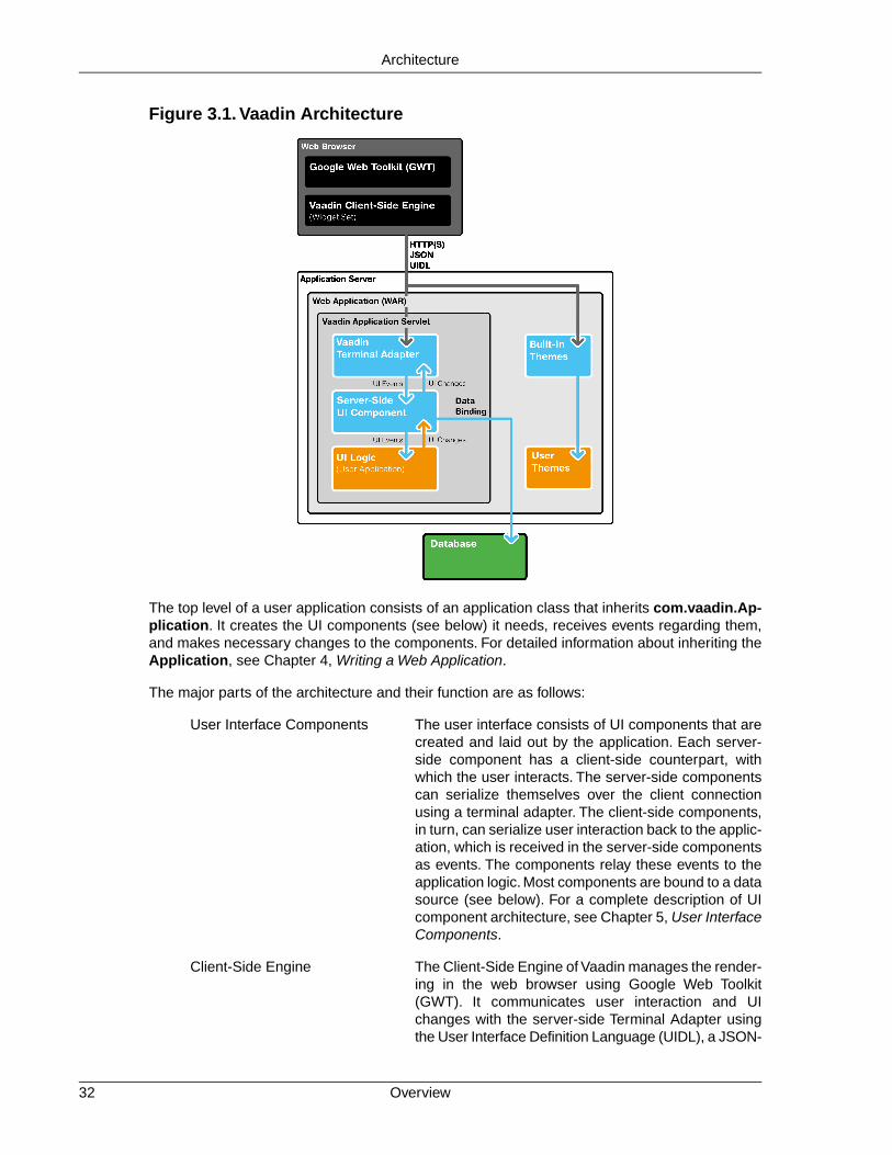
Figure 3.1. Vaadin Architecture
The top level of a user application consists of an application class that inherits com.vaadin.Ap-plication. It creates the UI components (see below) it needs, receives events regarding them,and makes necessary changes to the components. For detailed information about inheriting theApplication, see Chapter 4, Writing a Web Application.
The major parts of the architecture and their function are as follows:
User Interface Components The user interface consists of UI components that arecreated and laid out by the application. Each server-side component has a client-side counterpart, withwhich the user interacts. The server-side componentscan serialize themselves over the client connectionusing a terminal adapter. The client-side components,in turn, can serialize user interaction back to the applic-ation, which is received in the server-side componentsas events. The components relay these events to theapplication logic. Most components are bound to a datasource (see below). For a complete description of UIcomponent architecture, see Chapter 5, User InterfaceComponents.
Client-Side Engine The Client-Side Engine of Vaadin manages the render-ing in the web browser using Google Web Toolkit(GWT). It communicates user interaction and UIchanges with the server-side Terminal Adapter usingthe User Interface Definition Language (UIDL), a JSON-
Overview32
Architecture

based language. The communications are made usingasynchronous HTTP or HTTPS requests. See Sec-tion 3.4, “Client-Side Engine”.
Terminal Adapter The UI components do not render themselves directlyas a web page, but use a Terminal Adapter. This ab-straction layer allows users to use Vaadin applicationswith practically any web browser. Releases 3 and 4 ofIT Mill Toolkit supported HTML and simple AJAX basedrendering, while Vaadin Release 5 supports advancedAJAX-based rendering using Google Web Toolkit(GWT). You could imagine some other browser tech-nology, not even based on HTML, and you - or we forthat matter - could make it work just by writing a newadapter.Your application would still just see the VaadinAPI.To allow for this sort of abstraction, UI componentscommunicate their changes to the Terminal Adapter,which renders them for the user's browser. When theuser does something in the web page, the events arecommunicated to the terminal adapter (through the webserver) as asynchronous AJAX requests. The terminaladapter delivers the user events to the UI components,which deliver them to the application's UI logic.
Themes The user interface separates between presentation andlogic. While the UI logic is handled as Java code, thepresentation is defined in themes as CSS. Vaadinprovides a default themes. User themes can, in additionto style sheets, include HTML templates that definecustom layouts and other resources, such as images.Themes are discussed in detail in Chapter 8, Themes.
UIDL The Terminal Adapter draws the user interface to theweb page and any changes to it using a special UserInterface Definition Language (UIDL). The UIDL com-munications are done using JSON (JavaScript ObjectNotation), which is a lightweight data interchange formatthat is especially efficient for interfacing with JavaScript-based AJAX code in the browser. See Section 3.2.3,“JSON” and Appendix A, User Interface DefinitionLanguage (UIDL) for details.
Events User interaction with UI components creates events,which are first processed on the client-side withJavaScript and then passed all the way through theHTTP server, terminal adapter, and user componentlayers to the application. See Section 3.5, “Events andListeners”.
Data Model In addition to the user interface model, Vaadin providesa data model for interfacing data presented in UI com-ponents. Using the data model, the user interfacecomponents can update the application data directly,without the need for any control code. All the UI com-
33Overview
Architecture

ponents use this data model internally, but they can bebound to a separate data source as well. For example,you can bind a table component to an SQL query re-sponse. For a complete overview of the Vaadin DataModel, please refer to Chapter 9, Binding Componentsto Data.
3.2.Technological Background
This section provides an introduction to the various technologies and designs on which Vaadinis based: AJAX-based web applications in general, Google Web Toolkit, and JSON data inter-change format.This knowledge is not necessary for using Vaadin, but provides some backgroundif you need to make low-level extensions to Vaadin.
3.2.1. AJAX
AJAX (Asynchronous JavaScript and XML) is a technique for developing web applications withresponsive user interaction, similar to traditional desktop applications. While conventionalJavaScript-enabled HTML pages can receive new content only with page updates, AJAX-enabledpages send user interaction to the server using an asynchronous request and receive updatedcontent in the response. This way, only small parts of the page data can be loaded. This goalis archieved by the use of a certain set of technologies: XHTML, CSS, DOM, JavaScript, XMLHt-tpRequest, and XML.
AJAX, with all the fuss and pomp it receives, is essentially made possible by a simple API, namelythe XMLHttpRequest class in JavaScript. The API is available in all major browsers and, as of2006, the API is under way to become a W3C standard.
Communications between the browser and the server usually require some sort of serialization(or marshalling) of data objects. AJAX suggests the use of XML for data representation in com-munications between the browser and the server. While Vaadin Release 4 used XML for datainterchange, Release 5 uses the more efficient JSON. For more information about JSON and itsuse in Vaadin, see Section 3.2.3, “JSON”.
If you're a newcomer to Ajax, Section 12.1, “Special Characteristics of AJAX Applications” dis-cusses the history and motivations for AJAX-based web applications, as well as some specialcharacteristics that differ from both traditional web applications and desktop applications.
3.2.2. Google Web Toolkit
Google Web Toolkit is a software development kit for developing client-side web applicationseasily, without having to use JavaScript or other browser technologies directly. Applications usingGWT are developed with Java and compiled into JavaScript with the GWT Compiler.
GWT is essentially a client-side technology, normally used to develop user interface logic in theweb browser. GWT applications still need to communicate with a server using RPC calls and byserializing any data. Vaadin effectively hides all client-server communications, allows handlinguser interaction logic in a server application, and allows software development in a single server-side application. This makes the architecture of an AJAX-based web application much simpler.
Vaadin uses GWT to render user interfaces in the web browser and handle the low-level tasksof user interaction in the browser. Use of GWT is largely invisible in Vaadin for applications thatdo not need any custom GWT components.
Technological Background34
Architecture

See Section 3.4, “Client-Side Engine” for a description of how GWT is used in the Client-SideEngine of Vaadin. Chapter 11, Developing New Components provides information about the in-tegration of GWT-based user interface components with Vaadin.
3.2.3. JSON
JSON is a lightweight data-interchange format that is easy and fast to generate and parse. JSONmessages are said to be possibly a hundred times faster to parse than XML with current browsertechnology.The format is a subset of the JavaScript language, which makes it possible to evaluateJSON messages directly as JavaScript expressions. This makes JSON very easy to use inJavaScript applications and therefore also for AJAX applications.
The Client-Side Engine of Vaadin uses JSON through Google Web Toolkit, which supports JSONcommunications in the com.google.gwt.json.client package. Together with advanced updateoptimization and caching, Vaadin is able to update changes in the user interface to the browserin an extremely efficient way.
The use of JSON is completely invisible to a developer using Vaadin. Implementation of client-server serialization in custom widgets uses abstract interfaces that may be implemented as anylow-level interchange format, such as XML or JSON. Details on JSON communications are givenin Section A.2, “JSON Rendering”.
3.3. Applications as Java Servlet Sessions
Vaadin framework does basically everything it does on top of the Java Servlet API, which lieshidden deep under the hood, with the terminal adapter being the lowest level layer for handlingrequests from the web container.
When the web container gets the first request for a URL registered for an application, it createsan instance of the ApplicationServlet class in Vaadin framework that inherits the HttpServletclass defined in Java Servlet API. It follows sessions by using HttpSession interface and asso-ciates an Application instance with each session. During the lifetime of a session, the frameworkrelays user actions to the proper application instance, and further to a user interface component.
3.4. Client-Side Engine
This section gives an overview of the client-side architecture of Vaadin. Knowledge of the client-side technologies is generally not needed unless you develop or use custom GWT components.The client-side engine is based on Google Web Toolkit (GWT), which allows the developmentof the engine and client-side components solely with Java.
Chapter 11, Developing New Components provides information about the integration of GWT-based user interface components with Vaadin.
35JSON
Architecture

Figure 3.2. Architecture of Vaadin Client-Side Engine
Figure 3.2, “Architecture of Vaadin Client-Side Engine” illustrates the architecture of the client-side engine using a button component as an example. The user interface is managed by theApplicationConnection class, which handles AJAX requests to the server and renders the userinterface according to responses. Communications are done over HTTP(S) using the JSON datainterchange format and the User Interface Definition Language (UIDL). In the server-side applic-ation, the button is used with the Button class of Vaadin. On the client-side, the user interfaceconsists of various GWT components that inherit Widget class. In the figure above, the GWTclass Button is used to render the button in the browser (the inheritance of Button is simplifiedin the figure). Vaadin provides an VButton class, which implements the Paintable interfaceneeded for rendering the component with GWT.
Client-Side Engine36
Architecture

The actual initial web page that is loaded in the browser is an empty page that loads the JavaScriptcode of the Vaadin Client-Side Engine. After it is loaded and started, it handles the AJAX requeststo the server. All server communications are done through the ApplicationConnection class.
The communication with the server is done as UIDL (User Interface Definition Language) mes-sages using the JSON message interchange format over a HTTP(S) connection. UIDL is describedin Appendix A, User Interface Definition Language (UIDL) and JSON in Section 3.2.3, “JSON”and Section A.2, “JSON Rendering”.
3.5. Events and Listeners
Vaadin offers an event-driven programming model for handling user interaction. When a userdoes something in the user interface, such as clicks a button or selects an item, the applicationneeds to know about it. Many Java-based user interface frameworks follow the Event-Listenerpattern (also known as the Observer design pattern) to communicate user input to the applicationlogic. So does Vaadin.The design pattern involves two kinds of elements: an object that generates("fires" or "emits") events and a number of listeners that listen for the events.When such an eventoccurs, the object sends a notification about it to all the listeners. In a typical case, there is onlyone listener.
Events can serve many kinds of purposes. In Vaadin, the usual purpose of events is handlinguser interaction in a user interface. Session management can require special events, such asfor time-out, in which case the event would actually be the lack of user interaction. Time-out is aspecial case of timed or scheduled events, where an event occurs at a specific date and time orwhen a set time has passed. Database and other asynchronous communications can causeevents as well.
To receive events of a particular type, an application must register a listener object with the eventsource. The listeners are registered in the components with the addListener() method. Themethod has a generic version defined at the level of AbstractComponent, the base class of allcomponents.
Most components that have related events define their own event class and correspondinglistener classes. For example, the Button has Button.ClickEvent events, which can be listenedto through the Button.ClickListener interface.
In the following, we handle button clicks with a listener implemented as an anonymous class:
final Button button = new Button("Push it!");
button.addListener(new Button.ClickListener() { public void buttonClick(ClickEvent event) { button.setCaption("You pushed it!"); }});
Figure 3.3, “Class Diagram of a Button Click Listener” illustrates the case where an application-specific class inherits the Button.ClickListener interface to be able to listen for button clickevents. The application must instantiate the listener class and register it with addListener().When an event occurs, an event object is instantiated, in this case a ClickEvent.The event objectknows the related UI component, in this case the Button.
37Events and Listeners
Architecture

Figure 3.3. Class Diagram of a Button Click Listener
In the ancient times of C programming, callback functions filled largely the same need as listenersdo now. In object-oriented languages, we have only classes and methods, not functions, so theapplication has to give a class interface instead of a callback function pointer to the framework.However, Vaadin supports defining a method as a listener as well, using the MethodListenerwrapper.
Notice that many listener interfaces inherit the java.util.EventListener superinterface, but it isnot generally necessary to inherit it.
Section 4.4, “Handling Events with Listeners” goes into details of handling events in practice.
Events and Listeners38
Architecture

Chapter 4
Writing a WebApplication
4.1. Overview .................................................................................................. 394.2. Managing the Main Window .................................................................... 424.3. Sub-Windows .......................................................................................... 434.4. Handling Events with Listeners ................................................................ 464.5. Referencing Resources ........................................................................... 494.6. Shutting Down an Application .................................................................. 534.7. Handling Errors ........................................................................................ 544.8. Setting Up the Application Environment .................................................. 59
This chapter provides the fundamentals of web application development with Vaadin, concentratingon the basic elements of an application from a practical point-of-view.
If you are a newcomer to AJAX development, you may benefit from Section 12.1, “SpecialCharacteristics of AJAX Applications”. It explains the role of pages in AJAX web applications,and provides some basic design patterns for applications.
4.1. Overview
An application made with Vaadin runs as a Java Servlet in a Servlet container. The entry-pointis the application class, which needs to create and manage all necessary user interface compon-ents, including windows. User interaction is handled with event listeners, simplified by bindinguser interface components directly to data.Visual appearance is defined in themes as CSS files.
39Book of Vaadin

Icons, other images, and downloadable files are handled as resources, which can be external orserved by the application server or the application itself.
Figure 4.1. Application Architecture
Figure 4.1, “Application Architecture” above gives the basic architecture of an application madewith the Vaadin framework, with all the major elements, which are introduced below and discussedin detail in this chapter.
First of all, an application that uses Vaadin must define an application class that inherits the ab-stract com.vaadin.Application class.The application class must implement the init() method.
public class MyApp extends com.vaadin.Application {
public void init() { ... initialization code goes here ... }}
Besides acting as the entry-point in the servlet, the Application class provides facilities for windowaccess, execution control, and theme selection. The application API may seem similar to JavaServlet API, but that is only superficial. Vaadin framework associates requests with sessions sothat an application class instance is really a session object. Because of this, you can developweb applications much like you would develop desktop applications.
Overview40
Writing a Web Application

Restarting Application Session
When you open the URL for the application, it creates a new user session. Thesession is preserved even if you reload the page. However, if you use Eclipse, itlikes to do hot deployment to Tomcat and you may experience a problem that theapplication does not return to its initial state after you modify code. As Tomcat likesto persist sessions on server shutdown, the application state can remain even if yourestart the server.
Adding the ?restartApplication parameter in the URL tells the Vaadin servletto create a new Application instance on loading the page. If you also include a URIfragment, the parameter should be given before the fragment.
The most important thing in the initialization is the creation of the main window (see below), whichany application has. This, and the deployment of the application as a Java Servlet in the Servletcontainer, as described in Section 4.8, “Setting Up the Application Environment”, are the minimalrequirements for an application.
Below is a short overview of the basic elements of an application:
Windows An application always has a main window, as describedin Section 4.2, “Managing the Main Window”. An applic-ation can actually have a number of such application-level windows, all bound to the same application ses-sion, as described in Section 12.2, “Application-LevelWindows”. Application-level windows can contain non-native sub-windows, which are essentially floating lay-out components handled inside the browser.
User Interface Components The user interface consists of UI components that arecreated and laid out by the application. User interactionwith the components causes events (see below) relatedto the component, which the application must handle.Most components are bound to some data using theData Model (see below). You can make your own UIcomponents through either inheritance or composition.For a thorough reference of UI components, seeChapter 5, User Interface Components, for layoutcomponents, see Chapter 6, Managing Layout, and forcomposing components, see Section 5.23, “ComponentComposition with CustomComponent”.
Events and Listeners Events, and listeners that handle events, are the basisof handling user interaction in an application. Sec-tion 3.5, “Events and Listeners” gave an introductionto events and listeners from an architectural point-of-view, while Section 4.4, “Handling Events with Listen-ers” later in this chapter takes a more practical view.
Resources A user interface can display images or have links toweb pages or downloadable documents. These areresources, which can be external or provided by theweb server or the application itself. Section 4.5, “Refer-
41Overview
Writing a Web Application
encing Resources” gives a practical overview of thedifferent types of resources.
Themes The presentation and logic of the user interface areseparated. While the UI logic is handled as Java code,the presentation is defined in themes as CSS. Vaadinprovides a default theme. User-defined themes can, inaddition to style sheets, include HTML templates thatdefine custom layouts and other theme resources, suchas images.Themes are discussed in detail in Chapter 8,Themes, custom layouts in Section 6.13, “CustomLayouts”, and theme resources in Section 4.5.4,“Theme Resources”.
Data Binding Field components are essentially views to data, repres-ented in a data model. Using the data model, the com-ponents can update the application data directly, withoutthe need for any control code. A field component modelis always bound to a property, an item, or a container,depending on the field type. While all the componentshave a default data model, they can be bound to a user-defined data source. For example, you can bind a tablecomponent to an SQL query response. For a completeoverview of data binding in Vaadin, please refer toChapter 9, Binding Components to Data.
4.2. Managing the Main Window
As explained in Section 12.1, “Special Characteristics of AJAX Applications”, an AJAX web ap-plication usually runs in a single "web page" in a browser window. The page is generally not re-loaded after it is opened initially, but it communicates user interaction with the server throughAJAX communications. A window in an AJAX application is therefore more like a window in adesktop application and less like a web page.
A Window is the top-level container of a user interface displayed in a browser window. As anAJAX application typically runs on a single "page" (URL), there is usually just one window -- themain window. The main window can be accessed using the URL of the application. You set themain window with the setMainWindow() method of the Application class.
import com.vaadin.ui.*;
public class HelloWorld extends com.vaadin.Application { public void init() { Window main = new Window("The Main Window"); setMainWindow(main);
... fill the main window with components ... }}
You can add components to the main window, or to any other window, with the addComponent()method, which actually adds the given component to the root layout component bound to thewindow. If you wish to use other than the default root layout, you can set it with setContent(),as explained in Section 6.2, “Window and Panel Root Layout”.
Managing the Main Window42
Writing a Web Application

Vaadin has two basic kinds of windows: application-level windows, such as the main window,and sub-windows inside the application-level windows. The sub-windows are explained in thenext section, while application-level windows are covered in Section 12.2, “Application-LevelWindows”.
4.3. Sub-Windows
An application-level window can have a number of floating child or sub-windows. They aremanaged by the client-side JavaScript runtime of Vaadin using HTML features. Vaadin allowsopening and closing sub-windows, refreshing one window from another, resizing windows, andscrolling the window content. Sub-windows are typically used for Dialog Windows and MultipleDocument Interface applications. Sub-windows are by default not modal; you can set themmodal as described in Section 4.3.4, “Modal Windows”.
As with all user interface components, the appearance of a window and its contents is definedwith themes.
User control of a sub-window is limited to moving, resizing, and closing the window. Maximizingor minimizing are not yet supported.
4.3.1. Opening and Closing a Sub-Window
You can open a new window by creating a new Window object and adding it to the main windowwith addWindow() method of the Application class.
mywindow = new Window("My Window");mainwindow.addWindow(mywindow);
You close the window in a similar fashion, by calling the removeWindow() of the Applicationclass:
myapplication.removeWindow (mywindow);
The user can, by default, close a sub-window by clicking the close button in the upper-right cornerof the window. You can disable the button by setting the window as read-only withsetReadOnly(true). Notice that you could disable the button also by making it invisible inCSS with a "display: none" formatting. The problem with such a cosmetic disabling is that amalicious user might re-enable the button and close the window, which might cause problemsand possibly be a security hole. Setting the window as read-only not only disables the closebutton on the client side, but also prevents processing the close event on the server side.
The following example demonstrates the use of a sub-window in an application. The examplemanages the window using a custom component that contains a button for opening and closingthe window.
/** Component contains a button that allows opening a window. */public class WindowOpener extends CustomComponent implements Window.CloseListener { Window mainwindow; // Reference to main window Window mywindow; // The window to be opened Button openbutton; // Button for opening the window Button closebutton; // A button in the window Label explanation; // A descriptive text
public WindowOpener(String label, Window main) { mainwindow = main;
// The component contains a button that opens the window.
43Sub-Windows
Writing a Web Application

final VerticalLayout layout = new VerticalLayout();
openbutton = new Button("Open Window", this, "openButtonClick"); explanation = new Label("Explanation"); layout.addComponent(openbutton); layout.addComponent(explanation);
setCompositionRoot(layout); }
/** Handle the clicks for the two buttons. */ public void openButtonClick(Button.ClickEvent event) { /* Create a new window. */ mywindow = new Window("My Dialog"); mywindow.setPositionX(200); mywindow.setPositionY(100);
/* Add the window inside the main window. */ mainwindow.addWindow(mywindow);
/* Listen for close events for the window. */ mywindow.addListener(this);
/* Add components in the window. */ mywindow.addComponent( new Label("A text label in the window.")); closebutton = new Button("Close", this, "closeButtonClick"); mywindow.addComponent(closebutton);
/* Allow opening only one window at a time. */ openbutton.setEnabled(false);
explanation.setValue("Window opened"); }
/** Handle Close button click and close the window. */ public void closeButtonClick(Button.ClickEvent event) { /* Windows are managed by the application object. */ mainwindow.removeWindow(mywindow);
/* Return to initial state. */ openbutton.setEnabled(true);
explanation.setValue("Closed with button"); }
/** In case the window is closed otherwise. */ public void windowClose(CloseEvent e) { /* Return to initial state. */ openbutton.setEnabled(true);
explanation.setValue("Closed with window controls"); }}
The example implements a custom component that inherits the CustomComponent class. Itconsists of a Button that it uses to open a window and a Label to describe the state of the window.When the window is open, the button is disabled.When the window is closed, the button is enabledagain.
You can use the above custom component in the application class with:
public void init() { Window main = new Window("The Main Window"); setMainWindow(main);
Opening and Closing a Sub-Window44
Writing a Web Application

main.addComponent(new WindowOpener("Window Opener", main));}
When added to an application, the screen will look as illustrated in the following screenshot:
Figure 4.2. Opening a Sub-Window
4.3.2. Window Positioning
When created, a window will have a default size and position.You can specify the size of a windowwith setHeight() and setWidth() methods. You can set the position of the window withsetPositionX() and setPositionY() methods.
/* Create a new window. */mywindow = new Window("My Dialog");
/* Set window size. */mywindow.setHeight("200px");mywindow.setWidth("400px");
/* Set window position. */mywindow.setPositionX(200);mywindow.setPositionY(50);
Notice that the size of the main window is unknown and the getHeight and getWidth methodswill return -1.
4.3.3. Scrolling Sub-Window Content
If a sub-window has a fixed or percentual size and its content becomes too big to fit in the contentarea, a scroll bar will appear for the particular direction. On the other hand, if the sub-windowhas undefined size in the direction, it will fit the size of the content and never get a scroll bar.Scroll bars in sub-windows are handled with regular HTML features, namely overflow: autoproperty in CSS.
45Window Positioning
Writing a Web Application

As Window extends Panel, windows are also Scrollable. Note that the interface definesprogrammatic scrolling, not scrolling by the user. Please see Section 6.6, “Panel”.
4.3.4. Modal Windows
A modal window is a child window that has to be closed by the user before the use of the parentwindow can continue. Dialog windows are typically modal. The advantage of modal windows isthe simplification of user interaction, which may contribute to the clarity of the user interface.Modal windows are also easy to use from a development perspective, because as user interactionis isolated to them, changes in application state are more limited while the modal window is open.The disadvantage of modal windows is that they can restrict workflow too much.
Figure 4.3. Screenshot of the Modal Window Demo Application
Depending on theme settings, the parent window may be grayed while the modal window is open.
The demo application of Vaadin includes an example of using modal windows. Figure 4.3,“Screenshot of the Modal Window Demo Application” above is from the demo application. Theexample includes the source code.
Security Warning
Modality of child windows is purely a client-side feature and can be circumventedwith client-side attack code. You should not trust in the modality of child windows insecurity-critical situations such as login windows.
4.4. Handling Events with Listeners
Let us put into practice what we learned of event handling in Section 3.5, “Events and Listeners”.You can handle events in three basic ways, as shown below.
Modal Windows46
Writing a Web Application

The following example follows a typical pattern where you have a Button component and alistener that handles user interaction (clicks) communicated to the application as events. Herewe define a class that listens click events.
public class TheButton implements Button.ClickListener { Button thebutton;
/** Creates button into given container. */ public TheButton(AbstractComponentContainer container) { thebutton = new Button ("Do not push this button"); thebutton.addListener(this); container.addComponent(thebutton); }
/** Handle button click events from the button. */ public void buttonClick (Button.ClickEvent event) { thebutton.setCaption ("Do not push this button again"); }}
As an application often receives events for several components of the same class, such as multiplebuttons, it has to be able to distinguish between the individual components. There are severaltechniques to do this, but probably the easiest is to use the property of the received event, whichis set to the object sending the event. This requires keeping at hand a reference to every objectthat emits events.
public class TheButtons implements Button.ClickListener { Button thebutton; Button secondbutton;
/** Creates two buttons in given container. */ public TheButtons(AbstractComponentContainer container) { thebutton = new Button ("Do not push this button"); thebutton.addListener(this); container.addComponent(thebutton);
secondbutton = new Button ("I am a button too"); secondbutton.addListener(this); container.addComponent (secondbutton); }
/** Handle button click events from the two buttons. */ public void buttonClick (Button.ClickEvent event) { if (event.getButton() == thebutton) thebutton.setCaption("Do not push this button again"); else if (event.getButton() == secondbutton) secondbutton.setCaption("I am not a number"); }}
Another solution to handling multiple events of the same class involves attaching an event sourceto a listener method instead of the class. An event can be attached to a method using anotherversion of the addListener() method, which takes the event handler method as a parameter.The method can be passed either by the name of the method or as a Method object. In the ex-ample below, we use the name of the method, as a string (which is not checked at compile time).
public class TheButtons2 { Button thebutton; Button secondbutton;
/** Creates two buttons in given container. */ public TheButtons2(AbstractComponentContainer container) { thebutton = new Button ("Do not push this button"); thebutton.addListener(Button.ClickEvent.class, this,
47Handling Events with Listeners
Writing a Web Application

"theButtonClick"); container.addComponent(thebutton);
secondbutton = new Button ("I am a button too"); secondbutton.addListener(Button.ClickEvent.class, this, "secondButtonClick"); container.addComponent (secondbutton); }
public void theButtonClick (Button.ClickEvent event) { thebutton.setCaption ("Do not push this button again"); }
public void secondButtonClick (Button.ClickEvent event) { secondbutton.setCaption ("I am not a number!"); }}
Adding a listener method with addListener() is really just a wrapper that creates acom.vaadin.event.ListenerMethod listener object, which is an adapter from a listener class toa method. It implements the java.util.EventListener interface and can therefore work for anyevent source using the interface. Notice that not all listener classes necessarily inherit theEventListener interface.
The third way, which uses anonymous local class definitions, is often the easiest as it does notrequire cumbering the managing class with new interfaces or methods. The following exampledefines an anonymous class that inherits the Button.ClickListener interface and implementsthe buttonClick() method.
public class TheButtons3 { Button thebutton; Button secondbutton;
/** Creates two buttons in given container. */ public TheButtons3(AbstractComponentContainer container) { thebutton = new Button ("Do not push this button");
/* Define a listener in an anonymous class. */ thebutton.addListener(new Button.ClickListener() { /* Handle the click. */ public void buttonClick(ClickEvent event) { thebutton.setCaption ( "Do not push this button again"); } }); container.addComponent(thebutton);
secondbutton = new Button ("I am a button too"); secondbutton.addListener(new Button.ClickListener() { public void buttonClick(ClickEvent event) { secondbutton.setCaption ("I am not a number!"); } }); container.addComponent (secondbutton); }}
Other techniques for separating between different sources also exist. They include using objectproperties, names, or captions to separate between them. Using captions or any other visibletext is generally discouraged, as it may create problems for internationalization. Using othersymbolic strings can also be dangerous, because the syntax of such strings is checked onlyruntime.
Handling Events with Listeners48
Writing a Web Application

Events are usually emitted by the framework, but applications may need to emit them too in somesituations, such as when updating some part of the UI is required. Events can be emitted usingthe fireEvent(Component.Event) method of AbstractComponent.The event is then relayedto all the listeners of the particular event class for the object. Some components have a defaultevent type, for example, a Button has a nested Button.ClickEvent class and a correspondingButton.ClickListener interface.These events can be triggered with fireComponentEvent().
4.5. Referencing Resources
Web applications work over the web and have various resources, such as images or downloadablefiles, that the web browser has to get from the server. These resources are typically used inEmbedded (images) or Link (downloadable files) user interface components.Various components,such as TabSheet, can also include icons, which are also handled as resources.
A web server can handle many of such requests for static resources without having to ask themfrom the application, or the Application object can provide them. For dynamic resources, theuser application must be able to create them dynamically. Vaadin provides resource request in-terfaces for applications so that they can return various kinds of resources, such as files or dy-namically created resources. These include the StreamResource class and URI and parameterhandlers described in Section 12.5.1, “URI Handlers” and Section 12.5.2, “Parameter Handlers”,respectively.
Vaadin provides also low-level facilities for retrieving the URI and other parameters of a HTTPrequest. We will first look into how applications can provide various kinds of resources and thenlook into low-level interfaces for handling URIs and parameters to provide resources and func-tionalities.
Notice that using URI or parameter handlers to create "pages" is not meaningful in Vaadin or inAJAX applications generally. Please see Section 12.1, “Special Characteristics of AJAX Applica-tions” for a detailed explanation.
4.5.1. Resource Interfaces and Classes
Vaadin has two interfaces for resources: a generic Resource interface and a more specific Ap-plicationResource interface for resources provided by the application.
Figure 4.4. Resource Interface and Class Diagram
ApplicationResource resources are managed by the Application class.When you create sucha resource, you give the application object to the constructor. The constructor registers the re-source in the application using the addResource method.
Application manages requests for the resources and allows accessing resources using a URI.The URI consists of the base name of the application and a relative name of the resource. The
49Referencing Resources
Writing a Web Application

relative name is "APP/"+resourceid+"/"+filename, for example "APP/1/myimage.png".The resourceid is a generated numeric identifier to make resources unique, and filenameis the file name of the resource given in the constructor of its class. However, the applicationusing a resource does not usually need to consider its URI. It only needs to give the resource toan appropriate Embedded or Link or some other user interface component, which manages therendering of the URI.
4.5.2. File Resources
File resources are files stored anywhere in the file system. The use of file resources generallyfalls into two main categories: downloadable files and embedded images.
A file object that can be accessed as a file resource is defined with the standard java.io.Fileclass. You can create the file either with an absolute or relative path, but the base path of therelative path depends on the installation of the web server. For example, in Apache Tomcat, thedefault current directory is the installation path of Tomcat.
4.5.3. Class Loader Resources
The ClassResource allows resources to be loaded from the deployed package of the applicationusing Java Class Loader. The one-line example below loads an image resource from the applic-ation package and displays it in an Embedded component.
mainwindow.addComponent(new Embedded ("", new ClassResource("smiley.jpg", mainwindow.getApplication())));
4.5.4.Theme Resources
Theme resources of ThemeResource class are files, typically images, included in a theme. Atheme is located with path VAADIN/themes/themename in a web application. Name of a themeresource is given as the parameter for the constructor, with a path relative to the theme folder.
// A theme resource in the current theme ("book-examples")// Located in: VAADIN/themes/book-examples/img/themeimage.pngThemeResource resource = new ThemeResource("img/themeimage.png");
// Use the resourceEmbedded image = new Embedded("My Theme Image", resource);
The result is shown in Figure 4.5, “Theme Resources”, illustrating also the folder structure forthe theme resource file in an Eclipse project.
File Resources50
Writing a Web Application

Figure 4.5.Theme Resources
To use theme resources, you must set the theme for the application. See Chapter 8, Themes formore information regarding themes.
4.5.5. Stream Resources
Stream resources are application resources that allow creating dynamic resource content. Chartsare typical examples of dynamic images. To define a stream resource, you need to implementthe StreamResource.StreamSource interface and its getStream method. The method needsto return an InputStream from which the stream can be read.
The following example demonstrates the creation of a simple image in PNG image format.
import java.awt.image.*;
public class MyImageSource implements StreamResource.StreamSource { ByteArrayOutputStream imagebuffer = null; int reloads = 0;
/* We need to implement this method that returns * the resource as a stream. */ public InputStream getStream () { /* Create an image and draw something on it. */ BufferedImage image = new BufferedImage (200, 200, BufferedImage.TYPE_INT_RGB); Graphics drawable = image.getGraphics(); drawable.setColor(Color.lightGray); drawable.fillRect(0,0,200,200); drawable.setColor(Color.yellow); drawable.fillOval(25,25,150,150); drawable.setColor(Color.blue); drawable.drawRect(0,0,199,199); drawable.setColor(Color.black); drawable.drawString("Reloads="+reloads, 75, 100); reloads++;
try { /* Write the image to a buffer. */ imagebuffer = new ByteArrayOutputStream(); ImageIO.write(image, "png", imagebuffer);
/* Return a stream from the buffer. */ return new ByteArrayInputStream(
51Stream Resources
Writing a Web Application

imagebuffer.toByteArray()); } catch (IOException e) { return null; } }}
The content of the generated image is dynamic, as it updates the reloads counter with every call.The ImageIO.write() method writes the image to an output stream, while we had to return aninput stream, so we stored the image contents to a temporary buffer.
You can use resources in various ways. Some user interface components, such as Link andEmbedded, take their parameters as a resource.
Below we display the image with the Embedded component. The StreamResource constructorgets a reference to the application and registers itself in the application's resources. Assume thatmain is a reference to the main window and this is the application object.
// Create an instance of our stream source.StreamResource.StreamSource imagesource = new MyImageSource ();
// Create a resource that uses the stream source and give it a name.// The constructor will automatically register the resource in// the application.StreamResource imageresource = new StreamResource(imagesource, "myimage.png", this);
// Create an embedded component that gets its contents// from the resource.main.addComponent(new Embedded("Image title", imageresource));
The image will look as follows:
Figure 4.6. Screenshot of the stream resource example with an embeddedimage
We named the resource as myimage.png. The application adds a resource key to the file nameof the resource to make i t un ique. The fu l l URI wi l l be l ikehttp://localhost:8080/testbench/APP/1/myimage.png. The endAPP/1/myimage.png is the relative part of the URI.You can get the relative part of a resource'sURI from the application with Application.getRelativeLocation().
Another solution for creating dynamic content is an URI handler, possibly together with a para-meter handler. See Section 12.5.1, “URI Handlers” and Section 12.5.2, “Parameter Handlers”.
Stream Resources52
Writing a Web Application
4.6. Shutting Down an Application
A user can log out or close the web page or browser, so a session and the associated applicationinstance can end. Ending an application can be initiated by the application logic. Otherwise, itwill be ended automatically when the Servlet session times out.
4.6.1. Closing an Application
If the user quits the application through the user interface, an event handler should call theclose() method in the Application class to shutdown the session.
In the following example, we have a Logout button, which ends the user session.
Button closeButton = new Button("Logout");
closeButton.addListener(new Button.ClickListener() { @Override public void buttonClick(ClickEvent event) { getMainWindow().getApplication().close(); } });
main.addComponent(closeButton);
You will soon notice that closing the application simply reloads the application with a new Applic-ation instance. You can set the window to redirect to a different URL (that does not reload theapplication) with setLogoutURL. In your application class, write:
setLogoutURL("/logout.html");
4.6.2. Handling the Closing of a Window
Closing the main window (or all application-level windows) does not close session and the applic-ation instance will be left hanging. You need to program such behaviour by handling the closeevents of the windows.
If the user closes a browser window, such as the main window or any other application-levelwindow, the window will send a final AJAX request to the server, which will fire a Win-dow.CloseEvent for the closed window.You can handle the event with a Window.CloseListener.In case the user closes the browser, the event is fired for every open window.
// Close the application if the main window is closed.main.addListener(new Window.CloseListener(){ @Override public void windowClose(CloseEvent e) { System.out.println("Closing the application"); getMainWindow().getApplication().close(); } });
Notice that refreshing a window means closing and reopening it. Therefore, if you have a closehandler as above, the user loses the possibility to refresh the browser window.
In the likely case that the browser crashes, no close event is communicated to the server. As theserver has no way of knowing about the problem, and the session will be left hanging until thesession timeout expires. During this time, the user can restart the browser, open the applicationURL, and the main window will be rendered where the user left off.This can be desired behaviourin many cases, but sometimes it is not and can create a security problem.
53Shutting Down an Application
Writing a Web Application

4.7. Handling Errors
4.7.1. Error Indicator and message
All components have a built-in error indicator that can be set explicitly withsetComponentError() or can be turned on implicitly if validating the component fails. As withcomponent caption, the placement of the indicator is managed by the layout in which the com-ponent is contained. Usually, the error indicator is placed right of the caption text. Hovering themouse pointer over the field displays the error message.
The following example shows how you can set the component error explicitly. The example es-sentially validates field value without using an actual validator.
// Create a field.final TextField textfield = new TextField("Enter code");main.addComponent(textfield);
// Let the component error be initially clear.textfield.setComponentError(null); // (actually the default)
// Have a button right of the field (and align it properly).final Button button = new Button("Ok!");main.addComponent(button);((VerticalLayout)main.getLayout()) .setComponentAlignment(button, Alignment.BOTTOM_LEFT);
// Handle button clicksbutton.addListener(new Button.ClickListener() { public void buttonClick(ClickEvent event) { // If the field value is bad, set its error. // (Allow only alphanumeric characters.) if (! ((String) textfield.getValue()).matches("^\\w*$")) { // Put the component in error state and // set the error message. textfield.setComponentError( new UserError("Must be letters and numbers")); } else { // Otherwise clear it. textfield.setComponentError(null); } }});
Figure 4.7. Error indicator active
The Form component handles and displays also the errors of its contained fields so that it displaysboth the error indicator and the message in a special error indicator area. See Section 5.19,“Form” and Section 5.19.3, “Validating Form Input” for details on the Form component and val-idation of form input.
4.7.2. Notifications
Notifications are error or information boxes that appear typically at the center of the screen. Anotification box has a caption and optional description and icon. The box stays on the screen
Handling Errors54
Writing a Web Application

either for a defined time or until the user clicks it.The notification type defines the default appear-ance and behaviour of a notification.
Notifications are always associated with a window object, which can be a child window (the pos-itioning is always relative to the entire browser view). The Window class provides ashowNotification() method for displaying notifications. The method takes the caption andan optional description and notification type as parameters.The method also accepts a notificationobject of type Window.Notification, as described further below.
mainwindow.showNotification("This is the caption", "This is the description");
Figure 4.8. Notification
The caption and description are, by default, written on the same line. If you want to have a linebreak between them, use the XHTML line break markup "<br/>". You can use any XHTMLmarkup in the caption and description of a notification. If it is possible to get the notification contentfrom user input, you should sanitize the content carefully, as noted in Section 12.9.1, “SanitizingUser Input to Prevent Cross-Site Scripting”.
main.showNotification("This is a warning", "<br/>This is the <i>last</i> warning", Window.Notification.TYPE_WARNING_MESSAGE);
Figure 4.9. Notification with Formatting
The notification type defines the overall default style and behaviour of a notification. If no notific-ation type is given, the "humanized" type is used as the default. The notification types, listedbelow, are defined in the Window.Notification class.
TYPE_HUMANIZED_MESSAGE A user-friendly message that does not annoy too much:it does not require confirmation by clicking and disap-pears quickly. It is centered and has a neutral graycolor.
TYPE_WARNING_MESSAGE Warnings are messages of medium importance. Theyare displayed with colors that are neither neutral nortoo distractive. A warning is displayed for 1.5 seconds,but the user can click the message box to dismiss it.The user can continue to interact with the applicationwhile the warning is displayed.
55Notifications
Writing a Web Application

TYPE_ERROR_MESSAGE Error messages are notifications that require the highestuser attention, with alert colors and by requiring theuser to click the message to dismiss it. The error mes-sage box does not itself include an instruction to clickthe message, although the close box in the upper rightcorner indicates it visually. Unlike with other notifica-tions, the user can not interact with the application whilethe error message is displayed.
TYPE_TRAY_NOTIFICATION Tray notifications are displayed in the "system tray"area, that is, in the lower-right corner of the browserview. As they do not usually obsure any user interface,they are displayed longer than humanized or warningmessages, 3 seconds by default.The user can continueto interact with the application normally while the traynotification is displayed.
All of the features of specific notification types can be controlled with the attributes of Window.No-tification. You can pass an explicitly created notification object to the showNotification()method.
// Create a notification with default settings for a warning.Window.Notification notif = new Window.Notification( "Be warned!", "This message lurks in the top-left corner!", Window.Notification.TYPE_WARNING_MESSAGE);
// Set the position.notif.setPosition(Window.Notification.POSITION_TOP_LEFT);
// Let it stay there until the user clicks itnotif.setDelayMsec(-1);
// Show it in the main window.main.showNotification(notif);
The setPosition() method allows setting the positioning of the notification.The method takesas its parameter any of the constants:
Window.Notification.POSITION_CENTERED
Window.Notification.POSITION_CENTERED_TOP
Window.Notification.POSITION_CENTERED_BOTTOM
Window.Notification.POSITION_TOP_LEFT
Window.Notification.POSITION_TOP_RIGHT
Window.Notification.POSITION_BOTTOM_LEFT
Window.Notification.POSITION_BOTTOM_RIGHT
The setDelayMSec() allows you to set the time in milliseconds for how long the notification isdisplayed. Parameter value -1 means that the message is displayed until the user clicks themessage box. It also prevents interaction with other parts of the application window, as is defaultbehaviour for error messages. It does not, however, add a close box that the error notificationhas.
Notifications56
Writing a Web Application

4.7.3. Customizing System Messages
System messages are notifications that indicate a major invalid state in an application that usuallyrequires restarting the application. Session timeout is perhaps the most typical such state.
System messages are strings managed in SystemMessages class.
sessionExpired Application servlet session expired. A session expires if noserver requests are made during the session timeout period.The session timeout can be configured with thesession-timeout parameter in web.xml, as describedin Section 4.8.3, “Deployment Descriptor web.xml”.
communicationErrorURL An unspecified communication problem between theVaadin Client-Side Engine and the application server. Theserver may be unavailable or there is some other problem.
authenticationError This error occurs if 401 (Unauthorized) response to a re-quest is received from the server.
internalError A serious internal problem, possibly indicating a bug inVaadin Client-Side Engine or in some custom client-sidecode.
outOfSync The client-side state is invalid with respect to server-sidestate.
cookiesDisabled Informs the user that cookies are disabled in the browserand the application does not work without them.
Each message has four properties: a short caption, the actual message, a URL to which to redirectafter displaying the message, and property indicating whether the notification is enabled.
Additional details may be written (in English) to the debug console window described in Sec-tion 12.4, “Debug and Production Mode”.
You can override the default system messages by implementing the getSystemMessages()method in the application class. The method should return a Application.SystemMessagesobject. The easiest way to customize the messages is to use a CustomizedSystemMessagesobject as follows:
// Override the default implementationpublic static SystemMessages getSystemMessages() { CustomizedSystemMessages messages = new CustomizedSystemMessages(); messages.setSessionExpiredCaption("Ohno, session expired!"); messages.setSessionExpiredMessage("Don't idle!"); messages.setSessionExpiredNotificationEnabled(true); messages.setSessionExpiredURL("http://vaadin.com/"); return messages;}
Notice that the special getSystemMessages() method is not defined in an interface nor doesit exist in the Application superclass.
57Customizing System Messages
Writing a Web Application

4.7.4. Handling Uncaught Exceptions
Application development with Vaadin follows the event-driven programming model. Mouse andkeyboard events in the client cause (usually higher-level) events on the server-side, which canbe handled with listeners, and that is how most of the application logic works. Handling the eventscan result in exceptions either in the application logic or in the framework itself, but some of themmay not be caught properly.
For example, in the following code excerpt, we throw an error in an event listener but do not catchit, so it falls to the framework.
final Button button = new Button ("Fail Me");
button.addListener(new Button.ClickListener() { public void buttonClick(ClickEvent event) { // Throw some exception. throw new RuntimeException("You can't catch this."); }});
Any such exceptions that occur in the call chain, but are not caught at any other level, are even-tually caught by the terminal adapter in ApplicationServlet, the lowest-level component thatreceives client requests. The terminal adapter passes all such caught exceptions as events tothe error listener of the Application instance through the Terminal.ErrorListener interface.TheApplication class does not, by default, throw such exceptions forward.
The reason for this error-handling logic lies in the logic that handles component state synchron-ization between the client and the server. We want to handle all the serialized variable changesin the client request, because otherwise the client-side and server-side component states wouldbecome unsynchronized very easily, which could put the entire application in an invalid state.
The default implementation of the Terminal.ErrorListener interface in the Application classsimply prints the error to console. It also tries to find out a component related to the error. If theexception occurred in a listener attached to a component, that component is considered as thecomponent related to the exception. If a related component is found, the error handler sets thecomponent error for it, the same attribute which you can set with setComponentError().
In UI, the component error is shown with a small red "!" -sign (in the default theme). If you hoverthe mouse pointer over it, you will see the entire backtrace of the exception in a large tooltip box,as illustrated in Figure 4.10, “Uncaught Exception in Component Error Indicator” for the abovecode example.
Figure 4.10. Uncaught Exception in Component Error Indicator
Handling Uncaught Exceptions58
Writing a Web Application

You can change the logic of handling the terminal errors easily by overriding theterminalError() method in your application class (the one that inherits Application) or bysetting a custom error listener with the setErrorHandler method. You can safely discard thedefault handling or extend its usage with your custom error handling or logging system. In theexample code below, the exceptions are also reported as notifications in the main window.
@Overridepublic void terminalError(Terminal.ErrorEvent event) { // Call the default implementation. super.terminalError(event);
// Some custom behaviour. if (getMainWindow() != null) { getMainWindow().showNotification( "An unchecked exception occured!", event.getThrowable().toString(), Notification.TYPE_ERROR_MESSAGE); }}
Handling other exceptions works in the usual way for Java Servlets. Uncaught exceptions arefinally caught and handled by the application server.
4.8. Setting Up the Application Environment
Vaadin applications are deployed as Java web applications. A Java "web application" can containa number of servlets, each of which can be a Vaadin application or some other servlet, andstatic resources such as HTML files. Such a web application is normally packaged as WAR (Webapplication ARchive) file, which can be deployed to a Java application server (or a servlet con-tainer to be exact).
For a detailed tutorial on how web applications are packaged, please refer to any Java book thatdiscusses Java Servlets. Sun has an excellent reference online at http://java.sun.com/j2ee/tutori-al/1_3-fcs/doc/WCC3.html [http://java.sun.com/j2ee/tutorial/1_3-fcs/doc/WCC3.html].
Remember that, in the Java Servlet parlance, "web application" means a collection of Java servletsor portlets, JSP and static HTML pages, and various other resources that form an application.Such a Java web application is typically packaged as a WAR package for deployment. Vaadinapplications, on the other hand, run as servlets within such a Java web application. There existsalso other kinds of web applications.To avoid confusion with the general meaning of "web applic-ation", we often refer to Java web application as "WAR" in this book.
4.8.1. Creating Deployable WAR in Eclipse
To deploy an application to a web server, you need to create a WAR package. Here we give theinstructions for Eclipse.
1. Select File Export and then Web WAR File. Or, right-click the project in the ProjectExplorer and select Web WAR File.
2. Select the Web project to export. Enter Destination file name (.war).
3. Make any other settings in the dialog, and click Finish.
4.8.2. Web Application Contents
The following files are required in a web application in order to run it.
59Setting Up the Application Environment
Writing a Web Application

Web application organization
WEB-INF/web.xml This is the standard web application descriptor thatdefines how the application is organized.You can referto any Java book about the contents of this file. Alsosee an example in Example 4.1, “web.xml”.
WEB-INF/lib/vaadin-6.x.x.jar This is the Vaadin library. It is included in the productpackage in lib directory.
Your application classes You must include your application classes either in aJAR file in WEB-INF/lib or as classes inWEB-INF/classes
Your own theme files (OPTION-AL)
If your application uses a special theme (look and feel),you must include it in VAADIN/themes/themenamedirectory.
Widget sets (OPTIONAL) If your application uses a project-specific widget set, itmust be compiled in the VAADIN/widgetset/ direct-ory.
4.8.3. Deployment Descriptor web.xml
The deployment descriptor is an XML file with the name web.xml in the WEB-INF directory ofa web application. It is a standard component in Java EE describing how a web application shouldbe deployed. The structure of the deployment descriptor is illustrated by the following example.You simply deploy applications as servlets implemented by the specialcom.vaadin.terminal.gwt.server.ApplicationServlet wrapper class. The class ofthe actual application is specified by giving the application parameter with the name of thespecific application class to the servlet. The servlet is then connected to a URL in a standardway for Java Servlets.
Example 4.1. web.xml
<?xml version="1.0" encoding="UTF-8"?><web-app id="WebApp_ID" version="2.4" xmlns="http://java.sun.com/xml/ns/j2ee" xmlns:xsi="http://www.w3.org/2001/XMLSchema-instance" xsi:schemaLocation="http://java.sun.com/xml/ns/j2ee http://java.sun.com/xml/ns/j2ee/web-app_2_4.xsd">
<servlet> <servlet-name>myservlet</servlet-name> <servlet-class> com.vaadin.terminal.gwt.server.ApplicationServlet </servlet-class> <init-param> <param-name>application</param-name> <param-value>MyApplicationClass</param-value> </init-param> </servlet>
<servlet-mapping> <servlet-name>myservlet</servlet-name> <url-pattern>/*</url-pattern> </servlet-mapping></web-app>
Deployment Descriptor web.xml60
Writing a Web Application

The descriptor defines a servlet with name myservlet. The servlet class, com.vaadin.termin-al.gwt.server.ApplicationServlet, is provided by Vaadin framework and it should be the samefor all Vaadin projects. The servlet takes the class name Calc of the user application class as aparameter, including the full package path to the class. If the class is in the default package thepackage path is obviously not used.
The url-pattern is defined above as /*. This matches to any URL under the project context.We defined above the project context as myproject so the application URL will behttp://localhost:8080/myproject/. If the project were to have multiple applications orservlets, they would have to be given different names to distinguish them. For example,url-pattern /myapp/* w o u l d m a t c h a U R L s u c h a shttp://localhost:8080/myproject/myapp/. Notice that the slash and the asterisk mustbe included at the end of the pattern.
Notice also that if the URL pattern is other than root /* (such as /myapp/*), you will also needto make a servlet mapping to /VAADIN/* (unless you are serving it statically as noted below).For example:
... <servlet-mapping> <servlet-name>myservlet</servlet-name> <url-pattern>/myurl/*</url-pattern> </servlet-mapping>
<servlet-mapping> <servlet-name>myservlet</servlet-name> <url-pattern>/VAADIN/*</url-pattern> </servlet-mapping>
If you have multiple servlets, you should specify only one /VAADIN/* mapping . It doesn't matterwhich servlet you map the pattern to, as long as it is a Vaadin servlet.
You do not have to provide the above /VAADIN/* mapping if you serve both the widget setsand (custom and default) themes statically in the WebContent/VAADIN/ directory.The mappingsimply allows serving them dynamically from the Vaadin JAR. Serving them statically is recom-mended for production environments as it is faster. If you serve the content from within the sameweb application, you may not have the root pattern /* for the Vaadin servlet, as then all the re-quests would be mapped to the servlet.
Deployment Descriptor Parameters
Deployment descriptor can have many parameters and options that control the execution of aservlet. You can find a complete documentation of the deployment descriptor in Java ServletSpecification at http://java.sun.com/products/servlet/.
By default, Vaadin applications run in debug mode, which should be used during development.This enables various debugging features. For production use, you should have put in yourweb.xml the following parameter:
<context-param> <param-name>productionMode</param-name> <param-value>true</param-value> <description>Vaadin production mode</description></context-param>
The parameter and the debug and production modes are described in detail in Section 12.4,“Debug and Production Mode”.
61Deployment Descriptor web.xml
Writing a Web Application

One often needed option is the session timeout. Different servlet containers use varying defaultsfor timeouts, such as 30 minutes for Apache Tomcat.You can set the timeout with:
<session-config> <session-timeout>30</session-timeout></session-config>
After the timeout expires, the close() method of the Application class will be called.You shouldimplement it if you wish to handle timeout situations.
Deployment Descriptor web.xml62
Writing a Web Application

Chapter 5
User InterfaceComponents
5.1. Overview .................................................................................................. 645.2. Interfaces and Abstractions ..................................................................... 655.3. Common Component Features ............................................................... 705.4. Label ....................................................................................................... 805.5. Link ......................................................................................................... 845.6. TextField ................................................................................................. 865.7. TextArea ................................................................................................. 915.8. PasswordField ........................................................................................ 925.9. RichTextArea .......................................................................................... 925.10. Date and Time Input with DateField ...................................................... 945.11. Button ................................................................................................... 995.12. CheckBox ........................................................................................... 1005.13. Selecting Items .................................................................................... 1005.14. Table .................................................................................................... 1135.15. Tree ..................................................................................................... 1315.16. MenuBar ............................................................................................. 1325.17. Embedded .......................................................................................... 1345.18. Upload ................................................................................................ 1365.19. Form .................................................................................................... 1385.20. ProgressIndicator .............................................................................. 146
63Book of Vaadin

5.21. Slider ................................................................................................... 1475.22. LoginForm .......................................................................................... 1495.23. Component Composition with CustomComponent ........................... 152
This chapter provides an overview and a detailed description of all non-layout components inVaadin.
5.1. Overview
Vaadin provides a comprehensive set of user interface components and allows you to definecustom components. Figure 5.1, “UI Component Inheritance Diagram” illustrates the inheritancehierarchy of the UI component classes and interfaces. Interfaces are displayed in gray, abstractclasses in orange, and regular classes in blue. An annotated version of the diagram is featuredin the Vaadin Cheat Sheet.
Figure 5.1. UI Component Inheritance Diagram
At the top of the interface hierarchy, we have the Component interface. At the top of the classhierarchy, we have the AbstractComponent class. It is inherited by two other abstract classes:AbstractField, inherited further by field components, and AbstractComponentContainer, inher-
Overview64
User Interface Components

ited by various container and layout components. Components that are not bound to a contentdata model, such as labels and links, inherit AbstractComponent directly.
The layout of the various components in a window is controlled, logically, by layout components,just like in conventional Java UI toolkits for desktop applications. In addition, with the Custom-Layout component, you can write a custom layout as an XHTML template that includes the loc-ations of any contained components. Looking at the inheritance diagram, we can see that layoutcomponents inherit the AbstractComponentContainer and the Layout interface. Layout com-ponents are described in detail in Chapter 6, Managing Layout.
Looking at it from the perspective of an object hierarchy, we would have a Window object, whichcontains a hierachy of layout components, which again contain other layout components, fieldcomponents, and other visible components.
You can browse the built-in UI components of Vaadin library in the Sampler application of theVaadin Demo. The Sampler shows a description, JavaDoc documentation, and a code samplesfor each of the components.
In addition to the built-in components, many components are available as add-ons, either fromthe Vaadin Directory or from independent sources. Both commercial and free components exist.The installation of add-ons is described in Chapter 15, Using Vaadin Add-ons.
Vaadin Cheat Sheet and Refcard
Figure 5.1, “UI Component Inheritance Diagram” is included in the Vaadin CheatSheet that illustrates the basic relationship hierarchy of the user interface componentsand data binding classes and interfaces. You can download it at http://dev.vaad-in.com/browser/doc/trunk/cheatsheet/vaadin-cheatsheet-duplex.pdf.
The diagram is also included in the six-page DZone Refcard, which you can find athttps://vaadin.com/refcard.
5.2. Interfaces and Abstractions
Vaadin user interface components are built on a skeleton of interfaces and abstract classes thatdefine and implement the features common to all components and the basic logic how the com-ponent states are serialized between the server and the client.
This section gives details on the basic component interfaces and abstractions. The layout andother component container abstractions are described in Chapter 6, Managing Layout.The inter-faces that define the Vaadin data model are described in Chapter 9, Binding Components toData.
65Interfaces and Abstractions
User Interface Components

Figure 5.2. Component Interfaces and Abstractions
All components also implement the Paintable interface, which is used for serializing ("painting")the components to the client, and the reverse VariableOwner interface, which is needed fordeserializing component state or user interaction from the client.
In addition to the interfaces defined within the Vaadin framework, all components implement thejava.io.Serializable interface to allow serialization. Serialization is needed in many clusteringand cloud computing solutions.
5.2.1. Component Interface
The Component interface is paired with the AbstractComponent class, which implements allthe methods defined in the interface.
Component Tree Management
Components are laid out in the user interface hierarchically. The layout is managed by layoutcomponents, or more generally components that implement the ComponentContainer interface.Such a container is the parent of the contained components.
The getParent() method allows retrieving the parent component of a component. While thereis a setParent(), you rarely need it as you usually add components with the addComponent()method of the ComponentContainer interface, which automatically sets the parent.
A component does not know its parent when the component is created, so you can not refer tothe parent in the constructor with getParent(). Also, it is not possible to fetch a reference tothe application object with getApplication() before having a parent. For example, the followingis invalid:
public class AttachExample extends CustomComponent { public AttachExample() { // ERROR: We can't access the application object yet. ClassResource r = new ClassResource("smiley.jpg",
Component Interface66
User Interface Components

getApplication()); Embedded image = new Embedded("Image:", r); setCompositionRoot(image); }}
Adding a component to an application triggers calling the attach() method for the component.Correspondingly, removing a component from a container triggers calling the detach() method.If the parent of an added component is already connected to the application, the attach() iscalled immediately from setParent().
public class AttachExample extends CustomComponent { public AttachExample() { }
@Override public void attach() { super.attach(); // Must call.
// Now we know who ultimately owns us. ClassResource r = new ClassResource("smiley.jpg", getApplication()); Embedded image = new Embedded("Image:", r); setCompositionRoot(image); }}
The attachment logic is implemented in AbstractComponent, as described in Section 5.2.2,“AbstractComponent”.
5.2.2. AbstractComponent
AbstractComponent is the base class for all user interface components. It is the (only) imple-mentation of the Component interface, implementing all the methods defined in the interface.
AbstractComponent has a single abstract method, getTag(), which returns the serializationidentifier of a particular component class. It needs to be implemented when (and only when)creating entirely new components. AbstractComponent manages much of the serialization ofcomponent states between the client and the server. Creation of new components and serializationis described in Chapter 11, Developing New Components, and the server-side serialization APIin Appendix A, User Interface Definition Language (UIDL).
5.2.3. Field Components (Field and AbstractField)
Fields are components that have a value that the user can change through the user interface.Figure 5.3, “Field Components” illustrates the inheritance relationships and the important interfacesand base classes.
67AbstractComponent
User Interface Components

Figure 5.3. Field Components
Field components are built upon the framework defined in the Field interface and the Abstract-Field base class.
Fields are strongly coupled with the Vaadin data model.The field value is handled as a Propertyof the field component. Selection fields allow management of the selectable items through theContainer interface.
The description of the field interfaces and base classes is broken down in the following sections.
Field Interface
The Field interface inherits the Component superinterface and also the Property interface tohave a value for the field. AbstractField is the only class implementing the Field interface directly.The relationships are illustrated in Figure 5.4, “Field Interface Inheritance Diagram”.
Field Components (Field and AbstractField)68
User Interface Components

Figure 5.4. Field Interface Inheritance Diagram
You can set the field value with the setValue() and read with the getValue() method definedin the Property interface. The actual value type depends on the component.
The Field interface defines a number of attributes, which you can retrieve or manipulate with thecorresponding setters and getters.
description All fields have a description. Notice that while this attribute is definedin the Field component, it is implemented in AbstractField, whichdoes not directly implement Field, but only through the AbstractFieldclass.
required When enabled, a required indicator (usually the asterisk * character)is displayed on the left, above, or right the field, depending on thecontaining layout and whether the field has a caption. If such fieldsare validated but are empty and the requiredError property (seebelow) is set, an error indicator is shown and the component error isset to the text defined with the error property. Without validation, therequired indicator is merely a visual guide.
requiredError Defines the error message to show when a value is required, but noneis entered. The error message is set as the component error for thefield and is usually displayed in a tooltip when the mouse pointer hoversover the error indicator. The Form component can display the errormessage in a special error indicator area.
Handling Field Value Changes
Field inherits Property.ValueChangeListener to allow listening for field value changes andProperty.Editor to allow editing values.
When the value of a field changes, a Property.ValueChangeEvent is triggered for the field.Youshould not implement the valueChange() method in a class inheriting AbstractField, as it isalready implemented in AbstractField. You should instead implement the method explicitly byadding the implementing object as a listener.
69Field Components (Field and AbstractField)
User Interface Components

AbstractField Base Class
AbstractField is the base class for all field components. In addition to the component featuresinherited from AbstractComponent, it implements a number of features defined in Property,Buffered, Validatable, and Component.Focusable interfaces.
5.3. Common Component Features
The component base classes and interfaces provide a large number of features. Let us look atsome of the most commonly needed features. Features not documented here can be found fromthe Java API Reference.
The interface defines a number of properties, which you can retrieve or manipulate with the cor-responding setters and getters.
5.3.1. Caption
A caption is an explanatory textual label accompanying a user interface component, usuallyshown above, left of, or inside the component.The contents of a caption are automatically quoted,so no raw XHTML can be rendered in a caption.
The caption text can usually be given as the first parameter of a constructor of a component orwith setCaption().
// New text field with caption "Name"TextField name = new TextField("Name");layout.addComponent(name);
The caption of a component is, by default, managed and displayed by the layout component orcomponent container inside which the component is placed. For example, the VerticalLayoutcomponent shows the captions left-aligned above the contained components, while the Form-Layout component shows the captions on the left side of the vertically laid components, with thecaptions and their associated components left-aligned in their own columns. The CustomCom-ponent does not manage the caption of its composition root, so if the root component has acaption, it will not be rendered.
Figure 5.5. Caption Management by VerticalLayout and FormLayoutcomponents.
Some components, such as Button and Panel, manage the caption themselves and display itinside the component.
Icon (see Section 5.3.4, “Icon”) is closely related to caption and is usually displayed horizontallybefore or after it, depending on the component and the containing layout. Also the required indic-ator in field components is usually shown before or after the caption.
Common Component Features70
User Interface Components

An alternative way to implement a caption is to use another component as the caption, typicallya Label, a TextField, or a Panel. A Label, for example, allows highlighting a shortcut key withXHTML markup or to bind the caption to a data source. The Panel provides an easy way to addboth a caption and a border around a component.
CSS Style Rules
.v-caption {} .v-captiontext {} .v-caption-clearelem {} .v-required-field-indicator {}
A caption is be rendered inside an HTML element that has the v-caption CSS style class.Thecontaining layout may enclose a caption inside other caption-related elements.
Some layouts put the caption text in a v-captiontext element. A v-caption-clearelemis used in some layouts to clear a CSS float property in captions. An optional required indicatorin field components is contained in a separate element with v-required-field-indicatorstyle.
5.3.2. Description and Tooltips
All components (that inherit AbstractComponent) have a description separate from their caption.The description is usually shown as a tooltip that appears when the mouse pointer hovers overthe component for a short time.
You can set the description with setDescription() and retrieve with getDescription().
Button button = new Button("A Button");button.setDescription("This is the tooltip");
The tooltip is shown in Figure 5.6, “Component Description as a Tooltip”.
Figure 5.6. Component Description as a Tooltip
A description is rendered as a tooltip in most components. Form shows it as text in the top areaof the component, as described in Section 5.19.1, “Form as a User Interface Component”.
When a component error has been set with setComponentError(), the error is usually alsodisplayed in the tooltip, below the description (Form displays it in the bottom area of the form).Components that are in error state will also display the error indicator. See Section 4.7.1, “ErrorIndicator and message”.
The description is actually not plain text, but you can use XHTML tags to format it. Such a richtext description can contain any HTML elements, including images.
button.setDescription( "<h2><img src=\"../VAADIN/themes/sampler/icons/comment_yellow.gif\"/>"+ "A richtext tooltip</h2>"+ "<ul>"+ " <li>Use rich formatting with XHTML</li>"+ " <li>Include images from themes</li>"+ " <li>etc.</li>"+ "</ul>");
71Description and Tooltips
User Interface Components

The result is shown in Figure 5.7, “A Rich Text Tooltip”.
Figure 5.7. A Rich Text Tooltip
Notice that the setter and getter are defined for all fields in the Field interface, not for all compon-ents in the Component interface.
5.3.3. Enabled
The enabled property controls whether the user can actually use the component. A disabledcomponent is visible, but grayed to indicate the disabled state.
Components are always enabled by default. You can disable a component withsetEnabled(false).
Button enabled = new Button("Enabled");enabled.setEnabled(true); // The defaultlayout.addComponent(enabled);
Button disabled = new Button("Disabled");disabled.setEnabled(false);layout.addComponent(disabled);
Figure 5.8, “An Enabled and Disabled Button” shows the enabled and disabled buttons.
Figure 5.8. An Enabled and Disabled Button
A disabled component is automatically put in read-only state. No client interaction with such acomponent is sent to the server and, as an important security feature, the server-side componentsdo not receive state updates from the client in the read-only state. This feature exists in all built-in components in Vaadin and is automatically handled for all Field components for the fieldproperty value. For custom widgets, you need to make sure that the read-only state is checkedon the server-side for all safety-critical variables.
CSS Style Rules
Disabled components have the v-disabled CSS style in addition to the component-specificstyle. To match a component with both the styles, you have to join the style class names with adot as done in the example below.
.v-textfield.v-disabled { border: dotted;}
This would make the border of all disabled text fields dotted.
TextField disabled = new TextField("Disabled");disabled.setValue("Read-only value");
Enabled72
User Interface Components
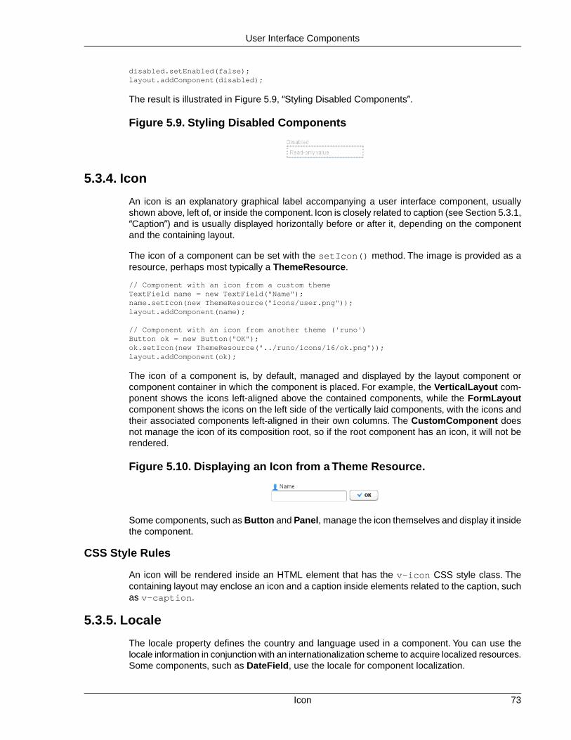
disabled.setEnabled(false);layout.addComponent(disabled);
The result is illustrated in Figure 5.9, “Styling Disabled Components”.
Figure 5.9. Styling Disabled Components
5.3.4. Icon
An icon is an explanatory graphical label accompanying a user interface component, usuallyshown above, left of, or inside the component. Icon is closely related to caption (see Section 5.3.1,“Caption”) and is usually displayed horizontally before or after it, depending on the componentand the containing layout.
The icon of a component can be set with the setIcon() method. The image is provided as aresource, perhaps most typically a ThemeResource.
// Component with an icon from a custom themeTextField name = new TextField("Name");name.setIcon(new ThemeResource("icons/user.png"));layout.addComponent(name);
// Component with an icon from another theme ('runo')Button ok = new Button("OK");ok.setIcon(new ThemeResource("../runo/icons/16/ok.png"));layout.addComponent(ok);
The icon of a component is, by default, managed and displayed by the layout component orcomponent container in which the component is placed. For example, the VerticalLayout com-ponent shows the icons left-aligned above the contained components, while the FormLayoutcomponent shows the icons on the left side of the vertically laid components, with the icons andtheir associated components left-aligned in their own columns. The CustomComponent doesnot manage the icon of its composition root, so if the root component has an icon, it will not berendered.
Figure 5.10. Displaying an Icon from a Theme Resource.
Some components, such as Button and Panel, manage the icon themselves and display it insidethe component.
CSS Style Rules
An icon will be rendered inside an HTML element that has the v-icon CSS style class. Thecontaining layout may enclose an icon and a caption inside elements related to the caption, suchas v-caption.
5.3.5. Locale
The locale property defines the country and language used in a component. You can use thelocale information in conjunction with an internationalization scheme to acquire localized resources.Some components, such as DateField, use the locale for component localization.
73Icon
User Interface Components

You can set the locale of a component (or the application) with setLocale().
// Component for which the locale is meaningfulInlineDateField date = new InlineDateField("Datum");
// German language specified with ISO 639-1 language// code and ISO 3166-1 alpha-2 country code. date.setLocale(new Locale("de", "DE"));
date.setResolution(DateField.RESOLUTION_DAY);layout.addComponent(date);
The resulting date field is shown in Figure 5.11, “Set Locale for InlineDateField”.
Figure 5.11. Set Locale for InlineDateField
You can get the locale of a component with getLocale(). If the locale is undefined for a com-ponent, that is, not explicitly set, the locale of the parent component is used. If none of the parentcomponents have a locale set, the locale of the application is used, and if that is not set, the defaultsystem locale is set, as given by Locale.getDefault().
Because of the requirement that the component must be attached to the application, it is awkwardto use getLocale() for internationalization.You can not use it in the constructor, so you wouldhave to get the locale in attach() as shown in the following example:
Button cancel = new Button() { @Override public void attach() { ResourceBundle bundle = ResourceBundle.getBundle( MyAppCaptions.class.getName(), getLocale()); setCaption(bundle.getString("CancelKey")); }};layout.addComponent(cancel);
It is normally a better practice to get the locale from an application-global parameter and use itto get the localized resource right when the component is created.
// Captions are stored in MyAppCaptions resource bundle// and the application object is known in this context.ResourceBundle bundle = ResourceBundle.getBundle(MyAppCaptions.class.getName(), getApplication().getLocale());
// Get a localized resource from the bundleButton cancel = new Button(bundle.getString("CancelKey"));layout.addComponent(cancel);
Selecting a Locale
A common task in many applications is selecting a locale. This is done in the following examplewith a Select component.
Locale74
User Interface Components

// The locale in which we want to have the language// selection listLocale displayLocale = Locale.ENGLISH;
// All known localesfinal Locale[] locales = Locale.getAvailableLocales();
// Allow selecting a language. We are in a constructor of a// CustomComponent, so preselecting the current// language of the application can not be done before// this (and the selection) component are attached to// the application.final Select select = new Select("Select a language") { @Override public void attach() { setValue(getLocale()); }};for (int i=0; i<locales.length; i++) { select.addItem(locales[i]); select.setItemCaption(locales[i], locales[i].getDisplayName(displayLocale));
// Automatically select the current locale if (locales[i].equals(getLocale())) select.setValue(locales[i]);}layout.addComponent(select);
// Locale code of the selected localefinal Label localeCode = new Label("");layout.addComponent(localeCode);
// A date field which language the selection will changefinal InlineDateField date = new InlineDateField("Calendar in the selected language");date.setResolution(DateField.RESOLUTION_DAY);layout.addComponent(date);
// Handle language selectionselect.addListener(new Property.ValueChangeListener() { public void valueChange(ValueChangeEvent event) { Locale locale = (Locale) select.getValue(); date.setLocale(locale); localeCode.setValue("Locale code: " + locale.getLanguage() + "_" + locale.getCountry()); }});select.setImmediate(true);
The user interface is shown in Figure 5.12, “Selecting a Locale”.
75Locale
User Interface Components

Figure 5.12. Selecting a Locale
5.3.6. Read-Only
The property defines whether the value of a component can be changed. The property is mainlyapplicable to Field components, as they have a value that can be edited by the user.
TextField readwrite = new TextField("Read-Write");readwrite.setValue("You can change this");readwrite.setReadOnly(false); // The defaultlayout.addComponent(readwrite);
TextField readonly = new TextField("Read-Only");readonly.setValue("You can't touch this!");readonly.setReadOnly(true);layout.addComponent(readonly);
The resulting read-only text field is shown in Figure 5.13, “A Read-Only Component.”.
Figure 5.13. A Read-Only Component.
Setting a layout or some other component container as read-only does not usually make thecontained components read-only recursively. This is different from, for example, the disabledstate, which is usually applied recursively. The Form component is an exception, as it appliesthe read-only state to the form fields.
Notice that the value of a selection component is the selection, not its items. A read-only selectioncomponent doesn't therefore allow its selection to be changed, but other changes are possible.For example, if you have a read-only Table in editable mode, its contained fields and the under-lying data model can still be edited, and the user could sort it or reorder the columns.
Client-side state modifications will not be communicated to the server-side and, more importantly,server-side field components will not accept changes to the value of a read-only Field component.The latter is an important security feature, because a malicious user can not fabricate statechanges in a read-only field. This is handled at the level of AbstractField in setValue(), soyou can not change the value programmatically either. Calling setValue() on a read-only fieldresults in Property.ReadOnlyException.
Also notice that while the read-only status applies automatically to the property value of a field,it does not apply to other component variables. A read-only component can accept some othervariable changes from the client-side and some of such changes could be acceptable, such aschange in the scroll bar position of a Table. Custom widgets should check the read-only statefor variables bound to business data.
Read-Only76
User Interface Components

CSS Style Rules
Setting a normally editable component to read-only state can change its appearance to disallowediting the value. In addition to CSS styling, also the HTML structure can change. For example,TextField loses the edit box and appears much like a Label.
A read-only component will have the v-readonly style. The following CSS rule would makethe text in all read-only TextField components appear in italic.
.v-textfield.v-readonly { font-style: italic;}
5.3.7. Style Name
The style name property defines one or more custom CSS style class names for the component.The getStyleName() returns the current style names as a space-separated list. ThesetStyleName() replaces all the styles with the given style name or a space-separated list ofstyle names. You can also add and remove individual style names with addStylename() andremoveStyleName(). A style name must be a valid CSS style name.
Label label = new Label("This text has a lot of style");label.addStyleName("mystyle");layout.addComponent(label);
The style name will appear in the component's HTML element in two forms: literally as given andprefixed with the component class specific style name. For example, if you add a style namemystyle to a Button, the component would get both mystyle and v-button-mystyle styles.Neither form may conflict with built-in style names of Vaadin or GWT. For example, focus stylewould conflict with a built-in style of the same name, and an option style for a Select componentwould conflict with the built-in v-select-option style.
The following CSS rule would apply the style to any component that has the mystyle style.
.mystyle { font-family: fantasy; font-style: italic; font-size: 25px; font-weight: bolder; line-height: 30px;}
The resulting styled component is shown in Figure 5.14, “Component with a Custom Style”
Figure 5.14. Component with a Custom Style
5.3.8. Visible
Components can be hidden by setting the visible property to false. Also the caption, icon andany other component features are made hidden. Hidden components are not just invisible, buttheir content is not communicated to the browser at all. That is, they are not made invisible cos-metically with only CSS rules. This feature is important for security if you have components thatcontain security-critical information that must only be shown in specific application states.
TextField readonly = new TextField("Read-Only");readonly.setValue("You can't see this!");
77Style Name
User Interface Components
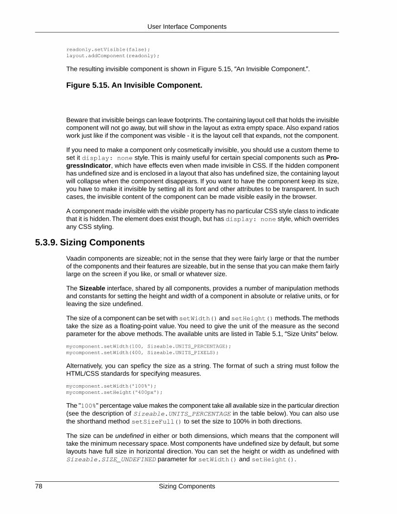
readonly.setVisible(false);layout.addComponent(readonly);
The resulting invisible component is shown in Figure 5.15, “An Invisible Component.”.
Figure 5.15. An Invisible Component.
Beware that invisible beings can leave footprints.The containing layout cell that holds the invisiblecomponent will not go away, but will show in the layout as extra empty space. Also expand ratioswork just like if the component was visible - it is the layout cell that expands, not the component.
If you need to make a component only cosmetically invisible, you should use a custom theme toset it display: none style. This is mainly useful for certain special components such as Pro-gressIndicator, which have effects even when made invisible in CSS. If the hidden componenthas undefined size and is enclosed in a layout that also has undefined size, the containing layoutwill collapse when the component disappears. If you want to have the component keep its size,you have to make it invisible by setting all its font and other attributes to be transparent. In suchcases, the invisible content of the component can be made visible easily in the browser.
A component made invisible with the visible property has no particular CSS style class to indicatethat it is hidden.The element does exist though, but has display: none style, which overridesany CSS styling.
5.3.9. Sizing Components
Vaadin components are sizeable; not in the sense that they were fairly large or that the numberof the components and their features are sizeable, but in the sense that you can make them fairlylarge on the screen if you like, or small or whatever size.
The Sizeable interface, shared by all components, provides a number of manipulation methodsand constants for setting the height and width of a component in absolute or relative units, or forleaving the size undefined.
The size of a component can be set with setWidth() and setHeight() methods.The methodstake the size as a floating-point value. You need to give the unit of the measure as the secondparameter for the above methods. The available units are listed in Table 5.1, “Size Units” below.
mycomponent.setWidth(100, Sizeable.UNITS_PERCENTAGE);mycomponent.setWidth(400, Sizeable.UNITS_PIXELS);
Alternatively, you can speficy the size as a string. The format of such a string must follow theHTML/CSS standards for specifying measures.
mycomponent.setWidth("100%");mycomponent.setHeight("400px");
The "100%" percentage value makes the component take all available size in the particular direction(see the description of Sizeable.UNITS_PERCENTAGE in the table below). You can also usethe shorthand method setSizeFull() to set the size to 100% in both directions.
The size can be undefined in either or both dimensions, which means that the component willtake the minimum necessary space. Most components have undefined size by default, but somelayouts have full size in horizontal direction. You can set the height or width as undefined withSizeable.SIZE_UNDEFINED parameter for setWidth() and setHeight().
Sizing Components78
User Interface Components

You always need to keep in mind that a layout with undefined size may not contain componentswith defined relative size, such as "full size". See Section 6.12.1, “Layout Size” for details.
The Table 5.1, “Size Units” lists the available units and their codes defined in the Sizeable inter-face.
Table 5.1. Size Units
The pixel is the basic hardware-specific measure of one physic-al display pixel.
pxUNITS_PIXELS
The point is a typographicalunit, which is usually defined as
ptUNITS_POINTS
1/72 inches or about 0.35 mm.However, on displays the sizecan vary significantly dependingon display metrics.
The pica is a typographical unit,defined as 12 points, or 1/7
pcUNITS_PICAS
inches or about 4.233 mm. Ondisplays, the size can vary de-pending on display metrics.
A unit relative to the used font,the width of the upper-case "M"letter.
emUNITS_EM
A unit relative to the used font,the height of the lower-case "x"letter.
exUNITS_EX
A physical length unit, milli-meters on the surface of a dis-
mmUNITS_MM
play device. However, the actu-al size depends on the display,its metrics in the operating sys-tem, and the browser.
A physical length unit, centi-meters on the surface of a dis-
cmUNITS_CM
play device. However, the actu-al size depends on the display,its metrics in the operating sys-tem, and the browser.
A physical length unit, incheson the surface of a display
inUNITS_INCH
device. However, the actualsize depends on the display, itsmetrics in the operating system,and the browser.
A relative percentage of theavailable size. For example, for
%UNITS_PERCENTAGE
the top-level layout 100% wouldbe the full width or height of thebrowser window. The percent-
79Sizing Components
User Interface Components

age value must be between 0and 100.
If a component inside HorizontalLayout or VerticalLayout has full size in the namesake directionof the layout, the component will expand to take all available space not needed by the othercomponents. See Section 6.12.1, “Layout Size” for details.
5.3.10. Managing Input Focus
When the user clicks on a component, the component gets the input focus, which is indicated byhighlighting according to style definitions. If the component allows inputting text, the focus andinsertion point are indicated by a cursor. Pressing the Tab key moves the focus to the componentnext in the focus order.
Focusing is supported by all Field components and also by Form and Upload.
The focus order or tab index of a component is defined as a positive integer value, which youcan set with setTabIndex() and get with getTabIndex(). The tab index is managed in thecontext of the application-level Window in which the components are contained.The focus ordercan therefore jump between two any lower-level component containers, such as sub-windowsor panels.
The default focus order is determined by the natural hierarchical order of components in the orderin which they were added under their parents. The default tab index is 0 (zero).
Giving a negative integer as the tab index removes the component from the focus order entirely.
CSS Style Rules
The component having the focus will have an additional style class with the -focus suffix. Forexample, a TextField, which normally has the v-textfield style, would additionally have thev-textfield-focus style.
For example, the following would make a text field blue when it has focus.
.v-textfield-focus { background: lightblue;}
5.4. Label
Label is a text component that displays non-editable text. In addition to regular text, you can alsodisplay preformatted text and HTML, depending on the content mode of the label.
// A container that is 100% wide by defaultVerticalLayout layout = new VerticalLayout();
Label label = new Label("Labeling can be dangerous");layout.addComponent(label);
The text will wrap around and continue on the next line if it exceeds the width of the Label. Thedefault width is 100%, so the containing layout must also have a defined width. Some layoutcomponents have undefined width by default, such as HorizontalLayout, so you need to payspecial care with them.
// A container with a defined width. The default content layout// of Panel is VerticalLayout, which has 100% default width.
Managing Input Focus80
User Interface Components

Panel panel = new Panel("Panel Containing a Label");panel.setWidth("300px");
panel.addComponent( new Label("This is a Label inside a Panel. There is " + "enough text in the label to make the text " + "wrap when it exceeds the width of the panel."));
As the size of the Panel in the above example is fixed and the width of Label is the default 100%,the text in the Label will wrap to fit the panel, as shown in Figure 5.16, “The Label Component”.
Figure 5.16.The Label Component
Setting Label to undefined width will cause it to not wrap at the end of the line, as the width ofthe content defines the width. If placed inside a layout with defined width, the Label will overflowthe layout horizontally and, normally, be truncated.
Even though Label is text and often used as a caption, it also has a caption, just like any othercomponent. As with other components, the caption is managed by the containing layout.
5.4.1. Content Mode
The contents of a label are formatted depending on the content mode. By default, the text is as-sumed to be plain text and any contained XML-specific characters will be quoted appropriatelyto allow rendering the contents of a label in XHTML in a web browser. The content mode can beset in the constructor or with setContentMode(), and can have the following values:
CONTENT_DEFAULT The default content mode is CONTENT_TEXT (see below).
CONTENT_PREFORMATTED Content mode, where the label contains preformatted text.It will be, by default, rendered with a fixed-width typewriterfont. Preformatted text can contain line breaks, written inJava with the \n escape sequence for a newline character(ASCII 0x0a), or tabulator characters written with \t (ASCII0x08).
CONTENT_RAW Content mode where the label contains raw text. Output isnot required to be valid XML. It can be, for example, HTML,which can be unbalanced or otherwise invalid XML. The ex-ample below uses the <br> tag in HTML. While XHTMLshould be preferred in most cases, this can be useful forsome specific purposes where you may need to displayloosely formatted HTML content. The raw mode also pre-serves character entities, some of which might otherwise beinterpreted incorrectly.
81Content Mode
User Interface Components

Please note the security and validity warnings regarding thecontent mode later in this section.
CONTENT_TEXT Content mode, where the label contains only plain text. Allcharacters are allowed, including the special <, >, and &characters in XML or HTML, which are quoted properly inXHTML while rendering the component. This is the defaultmode.
CONTENT_XHTML Content mode where the label contains XHTML.The contentwill be enclosed in a DIV element having the namespace"http://www.w3.org/TR/xhtml1/DTD/xhtml1-strict.dtd".
Please note the security and validity warnings regarding thecontent mode later in this section.
CONTENT_XML Content mode, where the label contains well-formed andwell-balanced XML. Each of the root elements must havetheir default namespace specified.
Please note the security and validity warnings regarding thecontent mode later in this section.
CONTENT_UIDL Formatted content mode, where the contents are XML thatis restricted to UIDL 1.0, the internal language of Vaadin forAJAX communications between the server and the browser.Obsolete since IT Mill Toolkit 5.0.
Cross-Site Scripting Warning
Having Label in RAW, XHTML, or XML content modes allows pure HTML content. Ifthe content comes from user input, you should always carefully sanitize it to preventcross-site scripting (XSS) attacks. Please see Section 12.9.1, “Sanitizing User Inputto Prevent Cross-Site Scripting”.
Also, the validity of the XML content is not checked when rendering the componentand any errors can result in an error in the browser. If the content comes from anuncertain source, you should always validate it before displaying it in the component.
The following example demonstrates the use of Label in different modes.
GridLayout labelgrid = new GridLayout (2,1);
labelgrid.addComponent (new Label ("CONTENT_DEFAULT"));labelgrid.addComponent ( new Label ("This is a label in default mode: <plain text>", Label.CONTENT_DEFAULT));
labelgrid.addComponent (new Label ("CONTENT_PREFORMATTED"));labelgrid.addComponent ( new Label ("This is a preformatted label.\n"+ "The newline character \\n breaks the line.", Label.CONTENT_PREFORMATTED));
labelgrid.addComponent (new Label ("CONTENT_RAW"));labelgrid.addComponent ( new Label ("This is a label in raw mode.<br>It can contain, "+ "for example, unbalanced markup.", Label.CONTENT_RAW));
Content Mode82
User Interface Components

labelgrid.addComponent (new Label ("CONTENT_TEXT"));labelgrid.addComponent ( new Label ("This is a label in (plain) text mode", Label.CONTENT_TEXT));
labelgrid.addComponent (new Label ("CONTENT_XHTML"));labelgrid.addComponent ( new Label ("<i>This</i> is an <b>XHTML</b> formatted label", Label.CONTENT_XHTML));
labelgrid.addComponent (new Label ("CONTENT_XML"));labelgrid.addComponent ( new Label ("This is an <myelement>XML</myelement> "+ "formatted label", Label.CONTENT_XML));
main.addComponent(labelgrid);
The rendering will look as follows:
Figure 5.17. Label Modes Rendered on Screen
5.4.2. Making Use of the XHTML Mode
Using the XHTML, XML, or raw modes allow inclusion of, for example, images within the textflow, which is not possible with any regular layout components. The following example includesan image within the text flow, with the image coming from a class loader resource.
ClassResource labelimage = new ClassResource ("labelimage.jpg", this);main.addComponent(new Label("Here we have an image <img src=\"" + this.getRelativeLocation(labelimage) + "\"/> within text.", Label.CONTENT_XHTML));
When you use a class loader resource, the image has to be included in the JAR of the web ap-plication. In this case, the labelimage.jpg needs to be in the default package.When renderedin a web browser, the output will look as follows:
Figure 5.18. Referencing An Image Resource in Label
Another solution would be to use the CustomLayout component, where you can write the com-ponent content as an XHTML fragment in a theme, but such a solution may be too heavy formost cases.
83Making Use of the XHTML Mode
User Interface Components

Notice that the rendering of XHTML depends on the assumption that the client software and theterminal adapter are XHTML based. It is possible to write a terminal adapter for a custom thinclient application, which may not be able to render XHTML at all. There are also differencesbetween web browsers in their support of XHTML.
5.4.3. Spacing with a Label
You can use a Label to create vertical or horizontal space in a layout. If you need a empty "line"in a vertical layout, having just a label with empty text is not enough, as it will collapse to zeroheight. The same goes for a label with only whitespace as the label text.You need to use a non-breaking space character, either or  :
layout.addComponent(new Label(" ", Label.CONTENT_XHTML));
Using the Label.CONTENT_PREFORMATTED mode has the same effect; preformatted spacesdo not collapse in a vertical layout. In a HorizontalLayout, the width of a space character maybe unpredictable if the label font is proportional, so you can use the preformatted mode to addem-width wide spaces.
If you want a gap that has adjustable width or height, you can use an empty label if you specifya height or width for it. For example, to create vertical space in a VerticalLayout:
Label gap = new Label();gap.setHeight("1em");verticalLayout.addComponent(gap);
You can make a flexible expanding spacer by having a relatively sized empty label with 100%height or width and setting the label as expanding in the layout.
// A wide component barHorizontalLayout horizontal = new HorizontalLayout();horizontal.setWidth("100%");
// Have a component before the gap (a collapsing cell)Button button1 = new Button("I'm on the left");horizontal.addComponent(button1);
// An expanding gap spacerLabel expandingGap = new Label();expandingGap.setWidth("100%");horizontal.addComponent(expandingGap);horizontal.setExpandRatio(expandingGap, 1.0f);
// A component after the gap (a collapsing cell)Button button2 = new Button("I'm on the right");horizontal.addComponent(button2);
5.4.4. CSS Style Rules
The Label component has a v-label overall style.
The Reindeer theme includes a number of predefined styles for typical formatting cases. Theseinclude "h1" (Reindeer.LABEL_H1) and "h2" (Reindeer.LABEL_H2) heading styles and"light" (Reindeer.LABEL_SMALL) style.
5.5. Link
The Link component allows making hyperlinks. References to locations are represented as re-source objects, explained in Section 4.5, “Referencing Resources”. The Link is a regular HTML
Spacing with a Label84
User Interface Components

hyperlink, that is, an <a href> anchor element that is handled natively by the browser. Unlikewhen clicking a Button, clicking a Link does not cause an event on the server-side.
Links to an arbitrary URL can be made by using an ExternalResource as follows:
// Textual linkLink link = new Link("Click Me!", new ExternalResource("http://vaadin.com/"));
You can use setIcon() to make image links as follows:
// Image linkLink iconic = new Link(null, new ExternalResource("http://vaadin.com/"));iconic.setIcon(new ThemeResource("img/nicubunu_Chain.png"));
// Image + captionLink combo = new Link("To appease both literal and visual", new ExternalResource("http://vaadin.com/"));combo.setIcon(new ThemeResource("img/nicubunu_Chain.png"));
The resulting links are shown in Figure 5.19, “Link Example”. You could add a "display:block" style for the icon element to place the caption below it.
Figure 5.19. Link Example
With the simple constructor used in the above example, the resource is opened in the currentwindow. Using the constructor that takes the target window as a parameter, or by setting thetarget window with setTargetName(), you can open the resource in another window, such asa native popup window. As the target name is an HTML target string managed by the browser,the target can be any window, including windows not managed by the application itself.You canuse the special underscored target names, such as _blank to open the link to a new browserwindow or tab.
// Hyperlink to a given URLLink link = new Link("Take me a away to a faraway land", new ExternalResource("http://vaadin.com/"));
// Open the URL in a new window/tablink.setTargetName("_blank");
// Indicate visually that it opens in a new window/tablink.setIcon(new ThemeResource("icons/external-link.png"));link.addStyleName("icon-after-caption");
Normally, the link icon is before the caption.You can have it right of the caption by reversing thetext direction in the containing element.
/* Position icon right of the link caption. */.icon-after-caption { direction: rtl;}/* Add some padding around the icon. */
85Link
User Interface Components

.icon-after-caption .v-icon { padding: 0 3px;}
The resulting link is shown in Figure 5.20, “Link That Opens a New Window”.
Figure 5.20. Link That Opens a New Window
With the _blank target, a normal new browser window is opened. If you wish to open it in apopup window, you need to give a size for the window with setTargetWidth() andsetTargetHeight(). You can control the window border style with setTargetBorder(),which takes any of the defined border styles TARGET_BORDER_DEFAULT,TARGET_BORDER_MINIMAL, and TARGET_BORDER_NONE. The exact result depends on thebrowser.
// Open the URL in a popuplink.setTargetName("_blank");link.setTargetBorder(Link.TARGET_BORDER_NONE);link.setTargetHeight(300);link.setTargetWidth(400);
In addition to the Link component, Vaadin allows alternative ways to make hyperlinks.The Buttoncomponent has a Reindeer.BUTTON_LINK style name that makes it look like a hyperlink, whilehandling clicks in a server-side click listener instead of in the browser. Also, you can make hyper-links (or any other HTML) in a Label in XHTML content mode.
CSS Style Rules.v-link { } a { } .v-icon {} span {}
The overall style for the Link component is v-link. The root element contains the <a href>hyperlink anchor. Inside the anchor are the icon, with v-icon style, and the caption in a textspan.
Hyperlink anchors have a number of pseudo-classes that are active at different times. An unvisitedlink has a:link class and a visited link a:visited. When the mouse pointer hovers over thelink, it will have a:hover, and when the mouse button is being pressed over the link, thea:active class.When combining the pseudo-classes in a selector, please notice that a:hovermust come after an a:link and a:visited, and a:active after the a:hover.
5.6. TextField
TextField is one of the most commonly used user interface components. It is a Field componentthat allows entering textual values using keyboard.
The following example creates a simple text field:
// Create a text fieldTextField tf = new TextField("A Field");
// Put some initial content in ittf.setValue("Stuff in the field");
CSS Style Rules86
User Interface Components

See the result in Figure 5.21, “TextField Example”.
Figure 5.21. TextField Example
Value changes are handled with a Property.ValueChangeListener, as in most other fields. Thevalue can be acquired with getValue() directly from the text field, as is done in the examplebelow, or from the property reference of the event.
// Handle changes in the valuetf.addListener(new Property.ValueChangeListener() { public void valueChange(ValueChangeEvent event) { // Assuming that the value type is a String String value = (String) tf.getValue();
// Do something with the value getWindow().showNotification("Value is:", value); }});
// Fire value changes immediately when the field loses focustf.setImmediate(true);
Much of the API of TextField is defined in AbstractTextField, which allows different kinds oftext input fields, such as rich text editors, which do not share all the features of the single-linetext fields.
Figure 5.22.Text Field Class Relationships
5.6.1. Data Binding
You can bind a TextField to any property type that allows conversion of the value to and fromString with the getValue() and setValue() methods.
// Have an initial data model. As Double is unmodificable and// doesn't support assignment from String, the object is// reconstructed in the wrapper when the value is changed.Double trouble = 42.0;
// Wrap it in a property data sourcefinal ObjectProperty<Double> property = new ObjectProperty<Double>(trouble);
87Data Binding
User Interface Components

// Create a text field bound to itTextField tf = new TextField("The Answer", property);tf.setImmediate(true);
// Show that the value is really written back to the// data source when edited by user.Label feedback = new Label(property);feedback.setCaption("The Value");
When you put values in a Form or Table, the DefaultFieldFactory creates a TextField for almostevery property type by default. However, you often need to make a custom factory that sets thetext field description, immediateness, validation, formatting, and so on.
See Chapter 9, Binding Components to Data for more details on data binding, field factories forTable in Section 5.14.3, “Editing the Values in a Table”, and for Form in the section called“Generating Proper Fields with a FormFieldFactory”.
5.6.2. String Length
The setMaxLength() method sets the maximum length of the input string so that the browserprevents the user from entering a longer one. As a security feature, the input value is automaticallytruncated on the server-side, as the maximum length setting could be bypassed on the client-side. The maximum length property is defined at AbstractTextField level.
Notice that the maximum length setting does not affect the width of the field. You can set thewidth with setWidth(), as with other components. Using em widths is recommended to betterapproximate the proper width in relation to the size of the used font. There is no standard wayin HTML for setting the width exactly to a number of letters (in a monospaced font).You can trickyour way around this restriction by putting the text field in an undefined-width VerticalLayouttogether with an undefined-width Label that contains a sample text, and setting the width of thetext field as 100%. The layout will get its width from the label, and the text field will use that.
5.6.3. Handling Null Values
As with any field, the value of a TextField can be set as null.This occurs most commonly whenyou create a new field without setting a value for it or bind the field value to a data source thatallows null values. In such case, you might want to show a special value that stands for the nullvalue.You can set the null representation with the setNullRepresentation() method. Mosttypically, you use an empty string for the null representation, unless you want to differentiate froma string that is explicitly empty.The default null representation is "null", which essentially warnsthat you may have forgotten to initialize your data objects properly.
The setNullSettingAllowed() controls whether the user can actually input a null value byusing the null value representation. If the setting is false, which is the default, inputting the nullvalue representation string sets the value as the literal value of the string, not null. This defaultassumption is a safeguard for data sources that may not allow null values.
// Create a text field without setting its valueTextField tf = new TextField("Field Energy (J)");tf.setNullRepresentation("-- null-point energy --");
// The null value is actually the defaulttf.setValue(null);
// Allow user to input the null value by// its representationtf.setNullSettingAllowed(true);
String Length88
User Interface Components

// Feedback to see the valueLabel value = new Label(tf);value.setCaption("Current Value:");
The Label, which is bound to the value of the TextField, displays a null value as empty. Theresulting user interface is shown in Figure 5.23, “Null Value Representation”.
Figure 5.23. Null Value Representation
5.6.4.Text Change Events
Often you want to receive a change event immediately when the text field value changes. Theimmediate mode is not literally immediate, as the changes are transmitted only after the fieldloses focus. In the other extreme, using keyboard events for every keypress would make typingunbearably slow and also processing the keypresses is too complicated for most purposes. Textchange events are transmitted asynchronously soon after typing and do not block typing whilean event is being processed.
Text change events are received with a TextChangeListener, as is done in the following examplethat demonstrates how to create a text length counter:
// Text field with maximum lengthfinal TextField tf = new TextField("My Eventful Field");tf.setValue("Initial content");tf.setMaxLength(20);
// Counter for input lengthfinal Label counter = new Label();counter.setValue(tf.toString().length() + " of " + tf.getMaxLength());
// Display the current length interactively in the countertf.addListener(new TextChangeListener() { public void textChange(TextChangeEvent event) { int len = event.getText().length(); counter.setValue(len + " of " + tf.getMaxLength()); }});
// This is actually the defaulttf.setTextChangeEventMode(TextChangeEventMode.LAZY);
The result is shown in Figure 5.24, “Text Change Events”.
Figure 5.24.Text Change Events
The text change event mode defines how quickly the changes are transmitted to the server andcause a server-side event. Lazier change events allow sending larger changes in one event ifthe user is typing fast, thereby reducing server requests.
89Text Change Events
User Interface Components

You can set the text change event mode of a TextField with setTextChangeEventMode().The allowed modes are defined in TextChangeEventMode class and are the following:
TextChangeEventMode.LAZY(default)
An event is triggered when there is a pause in editingthe text. The length of the pause can be modified withsetInputEventTimeout(). As with the TIMEOUTmode, a text change event is forced before a possibleValueChangeEvent, even if the user did not keep apause while entering the text.
This is the default mode.
TextChangeEventMode.TIMEOUT A text change in the user interface causes the event tobe communicated to the application after a timeoutperiod. If more changes are made during this period,the event sent to the server-side includes the changesmade up to the last change. The length of the timeoutcan be set with setInputEventTimeout().
If a ValueChangeEvent would occur before the timeoutperiod, a TextChangeEvent is triggered before it, onthe condition that the text content has changed sincethe previous TextChangeEvent.
TextChangeEventMode.EAGER An event is triggered immediately for every change inthe text content, typically caused by a key press. Therequests are separate and are processed sequentiallyone after another. Change events are neverthelesscommunicated asynchronously to the server, so furtherinput can be typed while event requests are being pro-cessed.
5.6.5. CSS Style Rules.v-textfield { }
The HTML structure of TextField is extremely simple, consisting only of an element withv-textfield style.
For example, the following custom style uses dashed border:
.v-textfield-dashing { border: thin dashed; background: white; /* Has shading image by default */}
The result is shown in Figure 5.25, “Styling TextField with CSS”.
Figure 5.25. Styling TextField with CSS
The style name for TextField is also used in several components that contain a text input field,even if the text input is not an actual TextField. This ensures that the style of different text inputboxes is similar.
CSS Style Rules90
User Interface Components

5.7. TextArea
TextArea is a multi-line version of the TextField component described in Section 5.6, “TextField”.
The following example creates a simple text area:
// Create the areaTextArea area = new TextArea("Big Area");
// Put some content in itarea.setValue("A row\n"+ "Another row\n"+ "Yet another row");
The result is shown in Figure 5.26, “TextArea Example”.
Figure 5.26. TextArea Example
You can set the number of visible rows with setRows() or use the regular setHeight() todefine the height in other units. If the actual number of rows exceeds the number, a verticalscrollbar will appear. Setting the height with setRows() leaves space for a horizontal scrollbar,so the actual number of visible rows may be one higher if the scrollbar is not visible.
You can set the width with the regular setWidth() method. Setting the size with the em unit,which is relative to the used font size, is recommended.
Word Wrap
The setWordwrap() sets whether long lines are wrapped (true - default) when the line lengthreaches the width of the writing area. If the word wrap is disabled (false), a vertical scrollbarwill appear instead.The word wrap is only a visual feature and wrapping a long line does not insertline break characters in the field value; shortening a wrapped line will undo the wrapping.
TextArea area1 = new TextArea("Wrapping");area1.setWordwrap(true); // The defaultarea1.setValue("A quick brown fox jumps over the lazy dog");
TextArea area2 = new TextArea("Nonwrapping");area2.setWordwrap(false);area2.setValue("Victor jagt zwölf Boxkämpfer quer "+ "über den Sylter Deich");
The result is shown in Figure 5.27, “Word Wrap in TextArea”.
91TextArea
User Interface Components

Figure 5.27. Word Wrap in TextArea
CSS Style Rules.v-textarea { }
The HTML structure of TextArea is extremely simple, consisting only of an element withv-textarea style.
5.8. PasswordField
The PasswordField is a variant of TextField that hides the typed input from visual inspection.
PasswordField tf = new PasswordField("Keep it secret");
The result is shown in Figure 5.28, “PasswordField”.
Figure 5.28. PasswordField
You should note that the PasswordField hides the input only from "over the shoulder" visualobservation. Unless the server connection is encrypted with a secure connection, such as HTTPS,the input is transmitted in clear text and may be intercepted by anyone with low-level access tothe network. Also phishing attacks that intercept the input in the browser may be possible byexploiting JavaScript execution security holes in the browser.
CSS Style Rules.v-textfield { }
The PasswordField does not have its own CSS style name but uses the same v-textfieldstyle as the regular TextField. See Section 5.6.5, “CSS Style Rules” for information on stylingit.
5.9. RichTextArea
The RichTextArea field allows entering or editing formatted text. The toolbar provides all basicediting functionalities. The text content of RichTextArea is represented in HTML format. Rich-TextArea inherits TextField and does not add any API functionality over it. You can add newfunctionality by extending the client-side components VRichTextArea and VRichTextToolbar.
CSS Style Rules92
User Interface Components

As with TextField, the textual content of the rich text area is the Property of the field and canbe set with setValue() and read with getValue().
// Create a rich text areafinal RichTextArea rtarea = new RichTextArea();rtarea.setCaption("My Rich Text Area");
// Set initial content as HTMLrtarea.setValue("<h1>Hello</h1>\n" + "<p>This rich text area contains some text.</p>");
Figure 5.29. Rich Text Area Component
Above, we used context-specific tags such as <h1> in the initial HTML content. The rich textarea component does not allow creating such tags, only formatting tags, but it does preservethem unless the user edits them away. Any non-visible whitespace such as the new line character(\n) are removed from the content. For example, the value set above will be as follows whenread from the field with getValue():
<h1>Hello</h1> <p>This rich text area contains some text.</p>
The rich text area is one of the few components in Vaadin that contain textual labels.The selectionboxes in the toolbar are in English and currently can not be localized in any other way than byinheriting or reimplementing the client-side VRichTextToolbar widget.The buttons can be localizedsimply with CSS by downloading a copy of the toolbar background image, editing it, and replacingthe default toolbar. The toolbar is a single image file from which the individual button icons arepicked, so the order of the icons is different from the rendered. The image file depends on theclient-side implementation of the toolbar.
.v-richtextarea-richtextexample .gwt-ToggleButton
.gwt-Image { background-image: url(img/richtextarea-toolbar-fi.png) !important;}
Figure 5.30. Regular English and a Localized Rich Text Area Toolbar
93RichTextArea
User Interface Components

Cross-Site Scripting with RichTextArea
The user input from a RichTextArea is transmitted as XHTML from the browser to server-sideand is not sanitized. As the entire purpose of the RichTextArea component is to allow input offormatted text, you can not sanitize it just by removing all HTML tags. Also many attributes, suchas style, should pass through the sanitization.
See Section 12.9.1, “Sanitizing User Input to Prevent Cross-Site Scripting” for more details onCross-Site scripting vulnerabilities and sanitization of user input.
CSS Style Rules.v-richtextarea { }.v-richtextarea .gwt-RichTextToolbar { }.v-richtextarea .gwt-RichTextArea { }
The rich text area consists of two main parts: the toolbar with overall style.gwt-RichTextToolbar and the editor area with style .gwt-RichTextArea.The editor areaobviously contains all the elements and their styles that the HTML content contains. The toolbarcontains buttons and drop-down list boxes with the following respective style names:
.gwt-ToggleButton { }
.gwt-ListBox { }
5.10. Date and Time Input with DateField
The DateField component provides the means to display and input date and time. The fieldcomes in two variations: PopupDateField, with a numeric input box and a popup calendar view,and InlineDateField, with the calendar view always visible. The DateField base class defaultsto the popup variation.
The example below illustrates the use of the DateField baseclass, which is equivalent to thePopupDateField. We set the initial time of the date field to current time by using the defaultconstructor of the java.util.Date class.
// Create a DateField with the default styleDateField date = new DateField();
// Set the date and time to presentdate.setValue(new Date());
The result is shown in Figure 5.31, “DateField (PopupDateField) for Selecting Date and Time”.
Figure 5.31. DateField (PopupDateField) for Selecting Date and Time
Cross-Site Scripting with RichTextArea94
User Interface Components

5.10.1. PopupDateField
The PopupDateField provides date input using a text box for the date and time. As the DateFielddefaults to this component, the use is exactly the same as described earlier. Clicking the handleright of the date opens a popup view for selecting the year, month, and day, as well as time. Alsothe Down key opens the popup. Once opened, the user can navigate the calendar using thecursor keys.
The date and time selected from the popup are displayed in the text box according to the defaultdate and time format of the current locale, or as specified with setDateFormat(). The sameformat definitions are used for parsing user input.
Date and Time Format
The date and time are normally displayed according to the default format for the current locale(see Section 5.3.5, “Locale”).You can specify a custom format with setDateFormat(). It takesa format string that follows the format of the SimpleDateFormat in Java.
// Display only year, month, and day in ISO formatdate.setDateFormat("yyyy-MM-dd");
The result is shown in Figure 5.32, “Custom Date Format for PopupDateField”.
Figure 5.32. Custom Date Format for PopupDateField
The same format specification is also used for parsing user-input date and time, as describedlater.
Handling Malformed User Input
A user can easily input a malformed or otherwise invalid date or time. DateField has two validationlayers: first on the client-side and then on the server-side.
The validity of the entered date is first validated on the client-side, immediately when the inputbox loses focus. If the date format is invalid, the v-datefield-parseerror style is set.Whether this causes a visible indication of a problem depends on the theme.The built-in reindeertheme does not shown any indication by default, making server-side handling of the problemmore convenient.
.mydate.v-datefield-parseerror .v-textfield { background: pink;}
The setLenient(true) setting enables relaxed interpretation of dates, so that invalid dates,such as February 30th or March 0th, are wrapped to the next or previous month, for example.
The server-side validation phase occurs when the date value is sent to the server. If the datefield is set in immediate state, it occurs immediately after the field loses focus. Once this is doneand if the status is still invalid, an error indicator is displayed beside the component. Hoveringthe mouse pointer over the indicator shows the error message.
95PopupDateField
User Interface Components
You can handle the errors by overriding the handleUnparsableDateString() method. Themethod gets the user input as a string parameter and can provide a custom parsing mechanism,as shown in the following example.
// Create a date field with a custom parsing and a// custom error message for invalid formatPopupDateField date = new PopupDateField("My Date") { @Override protected Date handleUnparsableDateString(String dateString) throws Property.ConversionException { // Try custom parsing String fields[] = dateString.split("/"); if (fields.length >= 3) { try { int year = Integer.parseInt(fields[0]); int month = Integer.parseInt(fields[1])-1; int day = Integer.parseInt(fields[2]); GregorianCalendar c = new GregorianCalendar(year, month, day); return c.getTime(); } catch (NumberFormatException e) { throw new Property. ConversionException("Not a number"); } }
// Bad date throw new Property. ConversionException("Your date needs two slashes"); }};
// Display only year, month, and day in slash-delimited formatdate.setDateFormat("yyyy/MM/dd");
// Don't be too tight about the validity of dates// on the client-sidedate.setLenient(true);
The handler method must either return a parsed Date object or throw a ConversionException.Returning null will set the field value to null and clear the input box.
Customizing the Error Message
In addition to customized parsing, overriding the handler method for unparseable input is usefulfor internationalization and other customization of the error message. You can also use it foranother way for reporting the errors, as is done in the example below:
// Create a date field with a custom error message for invalid formatPopupDateField date = new PopupDateField("My Date") { @Override protected Date handleUnparsableDateString(String dateString) throws Property.ConversionException { // Have a notification for the error getWindow().showNotification( "Your date needs two slashes", Notification.TYPE_WARNING_MESSAGE);
// A failure must always also throw an exception throw new Property.ConversionException("Bad date"); }};
PopupDateField96
User Interface Components

If the input is invalid, you should always throw the exception; returning a null value would makethe input field empty, which is probably undesired.
Input Prompt
Like other fields that have a text box, PopupDateField allows an input prompt that is visible untilthe user has input a value.You can set the prompt with setInputPrompt.
PopupDateField date = new PopupDateField();
// Set the promptdate.setInputPrompt("Select a date");
// Set width explicitly to accommodate the promptdate.setWidth("10em");
The date field doesn't automatically scale to accommodate the prompt, so you need to set it ex-plicitly with setWidth().
The input prompt is not available in the DateField superclass.
CSS Style Rules
.v-datefield, v-datefield-popupcalendar {} .v-textfield, v-datefield-textfield {} .v-datefield-button {}
The top-level element of DateField and all its variants have v-datefield style.The base classand the PopupDateField also have the v-datefield-popupcalendar style.
In addition, the top-level element has a style that indicates the resolution, with v-datefield-basename and an extension, which is one of full, day, month, or year. The -full style isenabled when the resolution is smaller than a day. These styles are used mainly for controllingthe appearance of the popup calendar.
The text box has v-textfield and v-datefield-textfield styles, and the calendar buttonv-datefield-button.
Once opened, the calendar popup has the following styles at the top level:
.v-datefield-popup {} .v-popupcontent {} .v-datefield-calendarpanel {}
The top-level element of the floating popup calendar has .v-datefield-popup style. Observethat the popup frame is outside the HTML structure of the component, hence it is not enclosedin the v-datefield element and does not include any custom styles. The content in thev-datefield-calendarpanel is the same as in InlineDateField, as described in Sec-tion 5.10.2, “InlineDateField”.
5.10.2. InlineDateField
The InlineDateField provides a date picker component with a month view.The user can navigatemonths and years by clicking the appropriate arrows. Unlike with the popup variant, the monthview is always visible in the inline field.
// Create a DateField with the default styleInlineDateField date = new InlineDateField();
97InlineDateField
User Interface Components

// Set the date and time to presentdate.setValue(new java.util.Date());
The result is shown in Figure 5.33, “Example of the InlineDateField”.
Figure 5.33. Example of the InlineDateField
The user can also navigate the calendar using the cursor keys.
CSS Style Rules
.v-datefield {} .v-datefield-calendarpanel {} .v-datefield-calendarpanel-header {} .v-datefield-calendarpanel-prevyear {} .v-datefield-calendarpanel-prevmonth {} .v-datefield-calendarpanel-month {} .v-datefield-calendarpanel-nextmonth {} .v-datefield-calendarpanel-nextyear {} .v-datefield-calendarpanel-body {} .v-datefield-calendarpanel-weekdays, .v-datefield-calendarpanel-weeknumbers {} .v-first {} .v-last {} .v-datefield-calendarpanel-weeknumber {} .v-datefield-calendarpanel-day {} .v-datefield-calendarpanel-time {} .v-datefield-time {} .v-select {} .v-label {}
The top-level element has the v-datefield style. In addition, the top-level element has a stylename that indicates the resolution of the calendar, with v-datefield- basename and an exten-sion, which is one of full, day, month, or year.The -full style is enabled when the resolutionis smaller than a day.
The v-datefield-calendarpanel-weeknumbers andv-datefield-calendarpanel-weeknumber styles are enabled when the week numbersare enabled.The former controls the appearance of the weekday header and the latter the actualweek numbers.
The other style names should be self-explanatory. For weekdays, the v-first and v-laststyles allow making rounded endings for the weekday bar.
5.10.3.Time Resolution
You probably will not need milliseconds in most applications, and might not even need the time,but just the date, or month or year. The visibility of the input components is controlled by time
Time Resolution98
User Interface Components

resolution, which can be set with setResolution() method.The method takes as its parametersthe lowest visible component, typically RESOLUTION_DAY for just dates and RESOLUTION_MINfor dates with time in hours and minutes. Please see the API Reference for a complete list ofresolution parameters.
5.10.4. DateField Locale
The date and time are displayed according to the locale of the user, as reported by the browser.You can set a custom locale with the setLocale() method of AbstractComponent, as describedin Section 5.3.5, “Locale”. Only Gregorian calendar is supported.
5.11. Button
The Button is a user interface component that is normally used for finalizing input and initiatingsome action. When the user clicks a button, a Button.ClickEvent is emitted. A listener that in-herits the Button.ClickListener interface can handle clicks with the buttonClick() method.
public class TheButton extends CustomComponent implements Button.ClickListener { Button thebutton;
public TheButton() { // Create a Button with the given caption. thebutton = new Button ("Do not push this button");
// Listen for ClickEvents. thebutton.addListener(this);
setCompositionRoot(thebutton); }
/** Handle click events for the button. */ public void buttonClick (Button.ClickEvent event) { thebutton.setCaption ("Do not push this button again"); }}
Figure 5.34. An Example of a Button
As a user interface often has several buttons, you can differentiate between them either bycomparing the Button object reference returned by the getButton() method of Button.Click-Event to a kept reference or by using a separate listener method for each button. The listeningobject and method can be given to the constructor. For a detailed description of these patternstogether with some examples, please see Section 3.5, “Events and Listeners”.
CSS Style Rules.v-button { }
The exact CSS style name can be different if a Button has the switchMode attribute enabled.See the alternative CSS styles below.
Adding the "small" style name enables a smaller style for the Button. You can also use theBUTTON_SMALL constant in Runo and Reindeer theme classes as well. The BaseTheme class
99DateField Locale
User Interface Components

also has a BUTTON_LINK style, with "link" style name, which makes the button look like a hy-perlink.
5.12. CheckBox
CheckBox is a two-state selection component that can be either checked or unchecked. Thecaption of the check box will be placed right of the actual check box. Vaadin provides two waysto create check boxes: individual check boxes with the CheckBox component described in thissection and check box groups with the OptionGroup component in multiple selection mode, asdescribed in Section 5.13.5, “Radio Button and Check Box Groups with OptionGroup”.
Clicking on a check box will change its state. The state is the Boolean property of the Button,and can be set with setValue() and obtained with getValue() method of the Property inter-face. Changing the value of a check box will cause a ValueChangeEvent, which can be handledby a ValueChangeListener.
// A check box with default state (not checked, false).final CheckBox checkbox1 = new CheckBox("My CheckBox");main.addComponent(checkbox1);
// Another check box with explicitly set checked state.final CheckBox checkbox2 = new CheckBox("Checked CheckBox");checkbox2.setValue(true);main.addComponent(checkbox2);
// Make some application logic. We use anonymous listener// classes here. The above references were defined as final// to allow accessing them from inside anonymous classes.checkbox1.addListener(new ValueChangeListener() { public void valueChange(ValueChangeEvent event) { // Copy the value to the other checkbox. checkbox2.setValue(checkbox1.getValue()); }});checkbox2.addListener(new ValueChangeListener() { public void valueChange(ValueChangeEvent event) { // Copy the value to the other checkbox. checkbox1.setValue(checkbox2.getValue()); }});
Figure 5.35. An Example of a Check Box
For an example on the use of check boxes in a table, see Section 5.14, “Table”.
CSS Style Rules.v-checkbox { }
5.13. Selecting Items
Vaadin gives many alternatives for selecting one or more items from a list, using drop-down andregular lists, radio button and check box groups, tables, trees, and so on.
CheckBox100
User Interface Components

The core library includes the following selection components, all based on the AbstractSelectclass:
Select In single selection mode, a drop-down list with a text input area, whichthe user can use to filter the displayed items. In multiselect mode, alist box equivalent to ListSelect.
ComboBox A drop-down list for single selection. Otherwise as Select, but the usercan also enter new items. The component also provides an inputprompt.
ListSelect A vertical list box for selecting items in either single or multiple selectionmode.
NativeSelect Provides selection using the native selection component of the browser,typically a drop-down list for single selection and a multi-line list inmultiselect mode. This uses the <select> element in HTML.
OptionGroup Shows the items as a vertically arranged group of radio buttons in thesingle selection mode and of check boxes in multiple selection mode.
TwinColSelect Shows two list boxes side by side where the user can select itemsfrom a list of available items and move them to a list of selected itemsusing control buttons.
In addition, the Tree and Table components allow special forms of selection. They also inheritthe AbstractSelect.
5.13.1. Binding Selection Components to Data
The selection components are strongly coupled with the Vaadin Data Model.The selectable itemsin all selection components are objects that implement the Item interface and are contained ina Container. The current selection is bound to the Property interface.
Even though the data model is used, the selection components allow simple use in the mostcommon cases. Each selection component is bound to a default container type, which supportsmanagement of items without need to implement a container.
See Chapter 9, Binding Components to Data for a detailed description of the data model, its in-terfaces, and built-in implementations.
Adding New Items
New items are added with the addItem() method defined in the Container interface.
// Create a selection componentSelect select = new Select ("Select something here");
// Add some items and give each an item IDselect.addItem("Mercury");select.addItem("Venus");select.addItem("Earth");
The addItem() method creates an empty Item, which is identified by its item identifier (IID)object, given as the parameter. This item ID is by default used also as the caption of the item,as explained in the next section. The identifier is typically a String. The item is of a type specific
101Binding Selection Components to Data
User Interface Components

to the container and has itself little relevance for most selection components, as the propertiesof an item may not be used in any way (except in Table), only the item ID.
The item identifier can be of any object type. We could as well have given integers for the itemidentifiers and set the captions explicitly with setItemCaption(). You could also add an itemwith the parameterless addItem(), which returns an automatically generated item ID.
// Create a selection componentSelect select = new Select("My Select");
// Add an item with a generated IDObject itemId = select.addItem();select.setItemCaption(itemId, "The Sun");
// Select the itemselect.setValue(itemId);
Some container types may support passing the actual data object to the add method. For example,you can add items to a BeanItemContainer with addBean(). Such implementations can use aseparate item ID object, or the data object itself as the item ID, as is done in addBean(). In thelatter case you can not depend on the default way of acquiring the item caption; see the descriptionof the different caption modes later.
The following section describes the different options for determining the item captions.
Item Captions
The displayed captions of items in a selection component can be set explicitly withsetItemCaption() or determined from the item IDs or item properties. This behaviour isdefined with the caption mode, which you can set with setItemCaptionMode(). The defaultmode is ITEM_CAPTION_MODE_EXPLICIT_DEFAULTS_ID, which uses the item identifiers forthe captions, unless given explicitly.
In addition to a caption, an item can have an icon. The icon is set with setItemIcon().
Caption Modes for Selection Components
ITEM_CAPTION_MODE_EXPLICIT_DEFAULTS_ID This is the default caption mode and its flexibility allowsusing it in most cases. By default, the item identifier willbe used as the caption. The identifier object does notnecessarily have to be a string; the caption is retrievedwith toString() method. If the caption is specifiedexplicitly with setItemCaption(), it overrides theitem identifier.
Select select = new Select("Moons of Mars");
// Use the item ID also as the caption of this itemselect.addItem(new Integer(1));
// Set item caption for this item explicitlyselect.addItem(2); // same as "new Integer(2)"select.setItemCaption(2, "Deimos");
ITEM_CAPTION_MODE_EXPLICIT Captions must be explicitly specified withsetItemCaption(). If they are not, the caption willbe empty. Such items with empty captions will never-
Binding Selection Components to Data102
User Interface Components

theless be displayed in the Select component as emptyitems. If they have an icon, they will be visible.
ITEM_CAPTION_MODE_ICON_ONLY Only icons are shown, captions are hidden.
ITEM_CAPTION_MODE_ID String representation of the item identifier object is usedas caption.This is useful when the identifier is a string,and also when the identifier is an complex object thathas a string representation. For example:
Select select = new Select("Inner Planets");select.setItemCaptionMode(Select.ITEM_CAPTION_MODE_ID);
// A class that implements toString()class PlanetId extends Object implements Serializable { String planetName; PlanetId (String name) { planetName = name; } public String toString () { return "The Planet " + planetName; }}
// Use such objects as item identifiersString planets[] = {"Mercury", "Venus", "Earth", "Mars"};for (int i=0; i<planets.length; i++) select.addItem(new PlanetId(planets[i]));
ITEM_CAPTION_MODE_INDEX Index number of item is used as caption. This captionmode is applicable only to data sources that implementthe Container.Indexed interface. If the interface is notavailable, the component will throw a ClassCastExcep-tion. The Select component itself does not implementthis interface, so the mode is not usable without aseparate data source. An IndexedContainer, for ex-ample, would work.
ITEM_CAPTION_MODE_ITEM String representation of item, acquired withtoString(), is used as the caption.This is applicablemainly when using a custom Item class, which alsorequires using a custom Container that is used as adata source for the Select component.
ITEM_CAPTION_MODE_PROPERTY Item captions are read from the String representationof the property with the identifier specified withsetItemCaptionPropertyId(). This is useful, forexample, when you have a container that you use asthe data source for a Select, and you want to use aspecific property for caption.
In the example below, we bind a selection componentto a bean container and use a property of the bean asthe caption.
103Binding Selection Components to Data
User Interface Components

/* A bean with a "name" property. */public class Planet implements Serializable { String name;
public Planet(String name) { this.name = name; }
public void setName(String name) { this.name = name; }
public String getName() { return name; }}
void propertyModeExample() { VerticalLayout layout = new VerticalLayout();
// Have a bean container to put the beans in BeanItemContainer<Planet> container = new BeanItemContainer<Planet>(Planet.class);
// Put some example data in it container.addItem(new Planet("Mercury")); container.addItem(new Planet("Venus")); container.addItem(new Planet("Earth")); container.addItem(new Planet("Mars"));
// Create a selection component bound to the container Select select = new Select("Planets", container);
// Set the caption mode to read the caption directly // from the 'name' property of the bean select.setItemCaptionMode( Select.ITEM_CAPTION_MODE_PROPERTY); select.setItemCaptionPropertyId("name");
layout.addComponent(select);
Getting and Setting Selection
A selection component provides the current selection as the property of the component (with theProperty interface). The property value is an item identifier object that identifies the selecteditem.You can get the identifier with getValue() of the Property interface.
You can select an item with the corresponding setValue() method. In multiselect mode, theproperty will be an unmodifiable set of item identifiers. If no item is selected, the property will benull in single selection mode or an empty collection in multiselect mode.
The Select and NativeSelect components will show "-" selection when no actual item is selected.This is the null selection item identifier. You can set an alternative ID withsetNullSelectionItemId(). Setting the alternative null ID is merely a visual text; thegetValue() will still return null value if no item is selected, or an empty set in multiselectmode.
Binding Selection Components to Data104
User Interface Components

The item identifier of the currently selected item will be set as the property of the Select object.You can access it with the getValue() method of the Property interface of the component.Also, when handling changes in a Select component with the Property.ValueChangeListenerinterface, the Property.ValueChangeEvent will have the selected item as the property of theevent, accessible with the getProperty() method.
Figure 5.36. Selected Item
5.13.2. Basic Select Component
The Select component allows, in single selection mode, selecting an item from a drop-down list.The component also has a text field area, which allows entering search text by which the itemsshown in the drop-down list are filtered.
In multiple selection mode, the component shows the items in a vertical list box, identical toListSelect.
Figure 5.37.The Select Component
Filtered Selection
The Select component allows filtering the items available for selection. The component showsas an input box for entering text.The text entered in the input box is used for filtering the availableitems shown in a drop-down list. Pressing Enter will complete the item in the input box. PressingUp- and Down-arrows can be used for selecting an item from the drop-down list. The drop-downlist is paged and clicking on the scroll buttons will change to the next or previous page. The listselection can also be done with the arrow keys on the keyboard. The shown items are loadedfrom the server as needed, so the number of items held in the component can be quite large.
Vaadin provides two filtering modes:FILTERINGMODE_CONTAINS matches any item that containsthe string given in the text field part of the component and FILTERINGMODE_STARTSWITH
105Basic Select Component
User Interface Components

matches only items that begin with the given string. The filtering mode is set withsetFilteringMode(). Setting the filtering mode to the default value FILTERINGMODE_OFFdisables filtering.
Select select = new Select("Enter containing substring");
select.setFilteringMode(AbstractSelect.Filtering.FILTERINGMODE_CONTAINS);
/* Fill the component with some items. */final String[] planets = new String[] { "Mercury", "Venus", "Earth", "Mars", "Jupiter", "Saturn", "Uranus", "Neptune" };
for (int i = 0; i < planets.length; i++) for (int j = 0; j < planets.length; j++) { select.addItem(planets[j] + " to " + planets[i]);
The above example uses the containment filter that matches to all items containing the inputstring. As shown in Figure 5.38, “Filtered Selection” below, when we type some text in the inputarea, the drop-down list will show all the matching items.
Figure 5.38. Filtered Selection
CSS Style Rules
.v-filterselect { }
.v-filterselect-input { }
.v-filterselect-button { }
.v-filterselect-suggestpopup { }
.v-filterselect-prefpage-off { }
.v-filterselect-suggestmenu { }
.v-filterselect-status { }
.v-select { }
.v-select-select { }
In its default state, only the input field of the Select component is visible. The entire componentis enclosed in v-filterselect style, the input field has v-filterselect-input style andthe button in the right end that opens and closes the drop-down result list hasv-filterselect-button style.
The drop-down result list has an overall v-filterselect-suggestpopup style. It containsthe list of suggestions with v-filterselect-suggestmenu style and a status bar in the bottom
Basic Select Component106
User Interface Components

with v-filterselect-status style. The list of suggestions is padded with an area withv-filterselect-prefpage-off style above and below the list.
In multiselect-mode, the styles of the component aere identical to ListSelect component, withv-select overall style and v-select-select for the native selection element.
5.13.3. ListSelect
The ListSelect component is list box that shows the selectable items in a vertical list. If thenumber of items exceeds the height of the component, a scrollbar is shown.The component allowsboth single and multiple selection modes, which you can set with setMultiSelect(). It isvisually identical in both modes.
// Create the selection componentListSelect select = new ListSelect("My Selection");
// Add some itemsselect.addItem("Mercury");select.addItem("Venus");select.addItem("Earth");...
select.setNullSelectionAllowed(false);
// Show 5 items and a scrollbar if there are moreselect.setRows(5);
The number of visible items is set with setRows().
Figure 5.39.The ListSelect Component
CSS Style Rules
.v-select {}
.v-select-select {}
The component has a v-select overall style. The native select element hasv-select-select style.
5.13.4. Native Selection Component NativeSelect
NativeSelect offers the native selection component of web browsers, using the HTML <select>element. The component is shown as a drop-down list.
// Create the selection componentfinal NativeSelect select = new NativeSelect("Native Selection");
// Add some itemsselect.addItem("Mercury");select.addItem("Venus");...
107ListSelect
User Interface Components
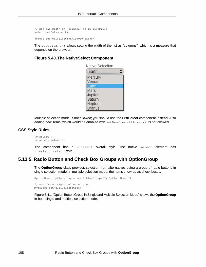
// Set the width in "columns" as in TextFieldselect.setColumns(10);
select.setNullSelectionAllowed(false);
The setColumns() allows setting the width of the list as "columns", which is a measure thatdepends on the browser.
Figure 5.40.The NativeSelect Component
Multiple selection mode is not allowed; you should use the ListSelect component instead. Alsoadding new items, which would be enabled with setNewItemsAllowed(), is not allowed.
CSS Style Rules
.v-select {}
.v-select-select {}
The component has a v-select overall style. The native select element hasv-select-select style.
5.13.5. Radio Button and Check Box Groups with OptionGroup
The OptionGroup class provides selection from alternatives using a group of radio buttons insingle selection mode. In multiple selection mode, the items show up as check boxes.
OptionGroup optiongroup = new OptionGroup("My Option Group");
// Use the multiple selection mode.myselect.setMultiSelect(true);
Figure 5.41, “Option Button Group in Single and Multiple Selection Mode” shows the OptionGroupin both single and multiple selection mode.
Radio Button and Check Box Groups with OptionGroup108
User Interface Components

Figure 5.41. Option Button Group in Single and Multiple Selection Mode
You can create check boxes individually using the CheckBox class, as described in Section 5.12,“CheckBox”. The advantages of the OptionGroup component are that as it maintains the indi-vidual check box objects, you can get an array of the currently selected items easily, and thatyou can easily change the appearance of a single component.
Disabling Items
You can disable individual items in an OptionGroup with setItemEnabled(). The user cannot select or deselect disabled items in multi-select mode, but in single-select mode the use canchange the selection from a disabled to an enabled item. The selections can be changed pro-grammatically regardless of whether an item is enabled or disabled. You can find out whetheran item is enabled with isItemEnabled().
The setItemEnabled() identifies the item to be disabled by its item ID.
// Have an option groupOptionGroup group = new OptionGroup("My Disabled Group");group.addItem("One");group.addItem("Two");group.addItem("Three");
// Disable one itemgroup.setItemEnabled("Two", false);
The item IDs are also used for the captions in this example. The result is shown in Figure 5.42,“OptionGroup with a Disabled Item”.
Figure 5.42. OptionGroup with a Disabled Item
Setting an item as disabled turns on the v-disabled style for it.
CSS Style Rules
.v-select-optiongroup {}
.v-select-option.v-checkbox {}
.v-select-option.v-radiobutton {}
The v-select-optiongroup is the overall style for the component. Each check box will havethe v-checkbox style, borrowed from the CheckBox component, and each radio button the
109Radio Button and Check Box Groups with OptionGroup
User Interface Components

v-radiobutton style. Both the radio buttons and check boxes will also have thev-select-option style that allows styling regardless of the option type. Disabled items haveadditionally the v-disabled style.
The options are normally laid out vertically. You can use horizontal layout by setting display:inline-block for the options. The nowrap setting for the overall element prevents wrappingif there is not enough horizontal space in the layout, or if the horizontal width is undefined.
/* Lay the options horizontally */.v-select-optiongroup-horizontal .v-select-option { display: inline-block;}
/* Avoid wrapping if the layout is too tight */.v-select-optiongroup-horizontal { white-space: nowrap;}
/* Some extra spacing is needed */.v-select-optiongroup-horizontal .v-select-option.v-radiobutton { padding-right: 10px;}
Use of the above rules requires setting a custom horizontal style name for the component.The result is shown in Figure 5.43, “Horizontal OptionGroup”.
Figure 5.43. Horizontal OptionGroup
5.13.6.Twin Column Selection with TwinColSelect
The TwinColSelect field provides a multiple selection component that shows two lists side byside, with the left column containing unselected items and the right column the selected items.The user can select items from the list on the left and click on the ">>" button to move them tothe list on the right. Items can be deselected by selecting them in the right list and clicking on the"<<" button.
TwinColSelect is always in multi-select mode, so its property value is always a collection of theitem IDs of the selected items, that is, the items in the right column.
The selection columns can have their own captions, separate from the overall component caption,which is managed by the containing layout. You can set the column captions withsetLeftColumnCaption() and setRightColumnCaption().
final TwinColSelect select = new TwinColSelect("Select Targets to Destroy");
// Set the column captions (optional)select.setLeftColumnCaption("These are left");select.setRightColumnCaption("These are done for");
// Put some data in the selectString planets[] = {"Mercury", "Venus", "Earth", "Mars", "Jupiter", "Saturn", "Uranus", "Neptune"};for (int pl=0; pl<planets.length; pl++) select.addItem(planets[pl]);
Twin Column Selection with TwinColSelect110
User Interface Components

// Set the number of visible itemsselect.setRows(planets.length);
The resulting component is shown in Figure 5.44, “Twin Column Selection”.
Figure 5.44.Twin Column Selection
The setRows() method sets the height of the component by the number of visible items in theselection boxes. Setting the height with setHeight() to a defined value overrides the rowssetting.
CSS Style Rules
.v-select-twincol {} .v-select-twincol-options-caption {} .v-select-twincol-selections-caption {} .v-select-twincol-options {} .v-select-twincol-buttons {} .v-button {} .v-button-wrap {} .v-button-caption {} .v-select-twincol-deco {} .v-select-twincol-selections {}
The TwinColSelect component has an overall v-select-twincol style. If set, the left andright column captions have v-select-twincol-options-caption andv-select-twincol-options-caption style names, respectively.The left box, which displaysthe unselected items, has v-select-twincol-options-caption style and the right box,which displays the selected items, has v-select-twincol-options-selections style.Between them is the button area, which has overall v-select-twincol-buttons style; theactual buttons reuse the styles for the Button component. Between the buttons is a divider elementwith v-select-twincol-deco style.
5.13.7. Allowing Adding New Items
The selection components allow the user to add new items, with a user interface similar to comboboxes in desktop user interfaces. You need to enable the newItemsAllowed mode with thesetNewItemsAllowed() method.
myselect.setNewItemsAllowed(true);
The user interface for adding new items depends on the selection component and the selectionmode. The regular Select component in single selection mode, which appears as a combo box,allows you to simply type the new item in the combo box and hit Enter to add it. In most otherselection components, as well as in the multiple selection mode of the regular Select component,a text field that allows entering new items is shown below the selection list, and clicking the +button will add the item in the list, as illustrated in Figure 5.45, “Select Component with AddingNew Items Allowed”.
111Allowing Adding New Items
User Interface Components

Figure 5.45. Select Component with Adding New Items Allowed
The identifier of an item added by the user will be a String object identical to the caption of theitem.You should consider this if the item identifier of automatically filled items is some other typeor otherwise not identical to the caption.
Adding new items is possible in both single and multiple selection modes and in all styles. Addingnew items may not be possible if the Select is bound to an external Container that does not allowadding new items.
5.13.8. Multiple Selection Mode
Setting the Select, NativeSelect, or OptionGroup components to multiple selection mode withthe setMultiSelect() method changes their appearance to allow selecting multiple items.
Select and NativeSelect These components appear as a native HTML selectionlist, as shown in Figure 5.45, “Select Component withAdding New Items Allowed”. By holding the Ctrl or Shiftkey pressed, the user can select multiple items.
OptionGroup The option group, which is a radio button group in singleselection mode, will show as a check box group in mul-tiple selection mode. See Section 5.13.5, “Radio Buttonand Check Box Groups with OptionGroup”.
The TwinColSelect, described in Section 5.13.6, “Twin Column Selection with TwinColSelect”,is a special multiple selection mode that is not meaningful for single selection.
myselect.setMultiSelect(true);
As in single selection mode, the selected items are set as the property of the Select object. Inmultiple selection mode, the property is a Collection of currently selected items. You can getand set the property with the getValue() and setValue() methods as usual.
A change in the selection will trigger a ValueChangeEvent, which you can handle with aPropery.ValueChangeListener. As usual, you should use setImmediate(true) to triggerthe event immediately when the user changes the selection. The following example shows howto handle selection changes with a listener.
public class SelectExample extends CustomComponent implements Property.ValueChangeListener { // Create a Select object with a caption. Select select = new Select("This is a Select component");
Multiple Selection Mode112
User Interface Components

VerticalLayout layout = new VerticalLayout(); Label status = new Label("-");
SelectExample () { setCompositionRoot (layout); layout.addComponent(select);
// Fill the component with some items. final String[] planets = new String[] { "Mercury", "Venus", "Earth", "Mars", "Jupiter", "Saturn", "Uranus", "Neptune"}; for (int i=0; i<planets.length; i++) select.addItem(planets[i]);
// By default, the change event is not triggered // immediately when the selection changes. // This enables the immediate events. select.setImmediate(true);
// Listen for changes in the selection. select.addListener(this);
layout.addComponent(status); }
/* Respond to change in the selection. */ public void valueChange(Property.ValueChangeEvent event) { // The event.getProperty() returns the Item ID (IID) // of the currently selected item in the component. status.setValue("Currently selected item ID: " + event.getProperty()); }}
5.13.9. Other Common Features
Item Icons
You can set an icon for each item with setItemIcon(), or define an item property that providesthe icon resource with setItemIconPropertyId(), in a fashion similar to captions. Notice,however, that icons are not supported in NativeSelect, TwinColSelect, and some other selectioncomponents and modes.This is because HTML does not support images inside the native selectelements. Icons are also not really visually applicable.
5.14. Table
The Table component is intended for presenting tabular data organized in rows and columns.The Table is one of the most versatile components in Vaadin. Table cells can include text or ar-bitrary UI components. You can easily implement editing of the table data, for example clickingon a cell could change it to a text field for editing.
The data contained in a Table is managed using the Data Model of Vaadin (see Chapter 9,Binding Components to Data), through the Container interface of the Table.This makes it possibleto bind a table directly to a data source, such as a database query. Only the visible part of thetable is loaded into the browser and moving the visible window with the scrollbar loads contentfrom the server. While the data is being loaded, a tooltip will be displayed that shows the currentrange and total number of items in the table. The rows of the table are items in the container andthe columns are properties. Each table row (item) is identified with an item identifier (IID), andeach column (property) with a property identifier (PID).
113Other Common Features
User Interface Components

When creating a table, you first need to define columns with addContainerProperty(). Thismethod comes in two flavors. The simpler one takes the property ID of the column and uses italso as the caption of the column. The more complex one allows differing PID and header for thecolumn. This may make, for example, internationalization of table headers easier, because if aPID is internationalized, the internationalization has to be used everywhere where the PID isused.The complex form of the method also allows defining an icon for the column from a resource.The "default value" parameter is used when new properties (columns) are added to the table, tofill in the missing values. (This default has no meaning in the usual case, such as below, wherewe add items after defining the properties.)
/* Create the table with a caption. */Table table = new Table("This is my Table");
/* Define the names and data types of columns. * The "default value" parameter is meaningless here. */table.addContainerProperty("First Name", String.class, null);table.addContainerProperty("Last Name", String.class, null);table.addContainerProperty("Year", Integer.class, null);
/* Add a few items in the table. */table.addItem(new Object[] { "Nicolaus","Copernicus",new Integer(1473)}, new Integer(1));table.addItem(new Object[] { "Tycho", "Brahe", new Integer(1546)}, new Integer(2));table.addItem(new Object[] { "Giordano","Bruno", new Integer(1548)}, new Integer(3));table.addItem(new Object[] { "Galileo", "Galilei", new Integer(1564)}, new Integer(4));table.addItem(new Object[] { "Johannes","Kepler", new Integer(1571)}, new Integer(5));table.addItem(new Object[] { "Isaac", "Newton", new Integer(1643)}, new Integer(6));
In this example, we used an increasing Integer object as the Item Identifier, given as the secondparameter to addItem(). The actual rows are given simply as object arrays, in the same orderin which the properties were added. The objects must be of the correct class, as defined in theaddContainerProperty() calls.
Figure 5.46. Basic Table Example
Scalability of the Table is largely dictated by the container. The default IndexedContainer isrelatively heavy and can cause scalability problems, for example, when updating the values. Useof an optimized application-specific container is recommended. Table does not have a limit forthe number of items and is just as fast with hundreds of thousands of items as with just a few.With the current implementation of scrolling, there is a limit of around 500 000 rows, dependingon the browser and the pixel height of rows.
Table114
User Interface Components

5.14.1. Selecting Items in a Table
The Table allows selecting one or more items by clicking them with the mouse. When the userselects an item, the IID of the item will be set as the property of the table and a ValueChangeEventis triggered. To enable selection, you need to set the table selectable. You will also need to setit as immediate in most cases, as we do below, because without it, the change in the propertywill not be communicated immediately to the server.
The following example shows how to enable the selection of items in a Table and how to handleValueChangeEvent events that are caused by changes in selection. You need to handle theevent with the valueChange() method of the Property.ValueChangeListener interface.
// Allow selecting items from the table.table.setSelectable(true);
// Send changes in selection immediately to server.table.setImmediate(true);
// Shows feedback from selection.final Label current = new Label("Selected: -");
// Handle selection change.table.addListener(new Property.ValueChangeListener() { public void valueChange(ValueChangeEvent event) { current.setValue("Selected: " + table.getValue()); }});
Figure 5.47.Table Selection Example
If the user clicks on an already selected item, the selection will deselected and the table propertywill have null value. You can disable this behaviour by settingsetNullSelectionAllowed(false) for the table.
The selection is the value of the table's property, so you can get it with getValue(). You canget it also from a reference to the table itself. In single selection mode, the value is the itemidentifier of the selected item or null if no item is selected. In multiple selection mode (see below),the value is a Set of item identifiers. Notice that the set is unmodifiable, so you can not simplychange it to change the selection.
Multiple Selection Mode
A table can also be in multiselect mode, where a user can select multiple items by clicking themwith left mouse button while holding the Ctrl key (or Meta key) pressed. If Ctrl is not held, clickingan item will select it and other selected items are deselected. The user can select a range byselecting an item, holding the Shift key pressed, and clicking another item, in which case all theitems between the two are also selected. Multiple ranges can be selected by first selecting a
115Selecting Items in a Table
User Interface Components

range, then selecting an item while holding Ctrl, and then selecting another item with both Ctrland Shift pressed.
The multiselect mode is enabled with the setMultiSelect() method of the Select interfaceof Table. Setting table in multiselect mode does not implicitly set it as selectable, so it must beset separately.
The setMultiSelectMode() property affects the control of multiple selection:MultiSelectMode.DEFAULT is the default behaviour, which requires holding the Ctrl (or Meta)key pressed while selecting items, while in MultiSelectMode.SIMPLE holding the Ctrl key isnot needed. In the simple mode, items can only be deselected by clicking them.
5.14.2.Table Features
Page Length and Scrollbar
The default style for Table provides a table with a scrollbar. The scrollbar is located at the rightside of the table and becomes visible when the number of items in the table exceeds the pagelength, that is, the number of visible items.You can set the page length with setPageLength().
Setting the page length to zero makes all the rows in a table visible, no matter how many rowsthere are. Notice that this also effectively disables buffering, as all the entire table is loaded tothe browser at once. Using such tables to generate reports does not scale up very well, as thereis some inevitable overhead in rendering a table with Ajax. For very large reports, generatingHTML directly is a more scalable solution.
Resizing Columns
You can set the width of a column programmatically from the server-side withsetColumnWidth().The column is identified by the property ID and the width is given in pixels.
The user can resize table columns by dragging the resize handle between two columns. Resizinga table column causes a ColumnResizeEvent, which you can handle with a Table.ColumnRes-izeListener. The table must be set in immediate mode if you want to receive the resize eventsimmediately, which is typical.
table.addListener(new Table.ColumnResizeListener() { public void columnResize(ColumnResizeEvent event) { // Get the new width of the resized column int width = event.getCurrentWidth();
// Get the property ID of the resized column String column = (String) event.getPropertyId();
// Do something with the information table.setColumnFooter(column, String.valueOf(width) + "px"); }});
// Must be immediate to send the resize events immediatelytable.setImmediate(true);
See Figure 5.48, “Resizing Columns” for a result after the columns of a table has been resized.
Table Features116
User Interface Components

Figure 5.48. Resizing Columns
Reordering Columns
If setColumnReorderingAllowed(true) is set, the user can reorder table columns bydragging them with the mouse from the column header,
Collapsing Columns
When setColumnCollapsingAllowed(true) is set, the right side of the table header showsa drop-down list that allows selecting which columns are shown. Collapsing columns is differentthan hiding columns with setVisibleColumns(), which hides the columns completely so thatthey can not be made visible (uncollapsed) from the user interface.
You can collapse columns programmatically with setColumnCollapsed(). Collapsing mustbe enabled before collapsing columns with the method or it will throw an IllegalAccessException.
// Allow the user to collapse and uncollapse columnstable.setColumnCollapsingAllowed(true);
// Collapse this column programmaticallytry { table.setColumnCollapsed("born", true);} catch (IllegalAccessException e) { // Can't occur - collapsing was allowed above System.err.println("Something horrible occurred");}
// Give enough width for the table to accommodate the// initially collapsed column latertable.setWidth("250px");
See Figure 5.49, “Collapsing Columns”.
Figure 5.49. Collapsing Columns
If the table has undefined width, it minimizes its width to fit the width of the visible columns. Ifsome columns are initially collapsed, the width of the table may not be enough to accomodatethem later, which will result in an ugly horizontal scrollbar. You should consider giving the tableenough width to accomodate columns uncollapsed by the user.
117Table Features
User Interface Components

Components Inside a Table
The cells of a Table can contain any user interface components, not just strings. If the rows arehigher than the row height defined in the default theme, you have to define the proper row heightin a custom theme.
When handling events for components inside a Table, such as for the Button in the examplebelow, you usually need to know the item the component belongs to. Components do not them-selves know about the table or the specific item in which a component is contained. Therefore,the handling method must use some other means for finding out the Item ID of the item. Thereare a few possibilities. Usually the easiest way is to use the setData() method to attach anarbitrary object to a component.You can subclass the component and include the identity inform-ation there.You can also simply search the entire table for the item with the component, althoughthat solution may not be so scalable.
The example below includes table rows with a Label in XHTML formatting mode, a multilineTextField, a CheckBox, and a Button that shows as a link.
// Create a table and add a style to allow setting the row height in theme.final Table table = new Table();table.addStyleName("components-inside");
/* Define the names and data types of columns. * The "default value" parameter is meaningless here. */table.addContainerProperty("Sum", Label.class, null);table.addContainerProperty("Is Transferred", CheckBox.class, null);table.addContainerProperty("Comments", TextField.class, null);table.addContainerProperty("Details", Button.class, null);
/* Add a few items in the table. */for (int i=0; i<100; i++) { // Create the fields for the current table row Label sumField = new Label(String.format( "Sum is <b>$%04.2f</b><br/><i>(VAT incl.)</i>", new Object[] {new Double(Math.random()*1000)}), Label.CONTENT_XHTML); CheckBox transferredField = new CheckBox("is transferred");
// Multiline text field. This required modifying the // height of the table row. TextField commentsField = new TextField(); commentsField.setRows(3);
// The Table item identifier for the row. Integer itemId = new Integer(i);
// Create a button and handle its click. A Button does not // know the item it is contained in, so we have to store the // item ID as user-defined data. Button detailsField = new Button("show details"); detailsField.setData(itemId); detailsField.addListener(new Button.ClickListener() { public void buttonClick(ClickEvent event) { // Get the item identifier from the user-defined data. Integer itemId = (Integer)event.getButton().getData(); getWindow().showNotification("Link "+ itemId.intValue()+" clicked."); } }); detailsField.addStyleName("link");
// Create the table row. table.addItem(new Object[] {sumField, transferredField,
Table Features118
User Interface Components

commentsField, detailsField}, itemId);}
// Show just three rows because they are so high.table.setPageLength(3);
The row height has to be set higher than the default with a style rule such as the following:
/* Table rows contain three-row TextField components. */.v-table-components-inside .v-table-cell-content { height: 54px;}
The table will look as shown in Figure 5.50, “Components in a Table”.
Figure 5.50. Components in a Table
Iterating Over a Table
As the items in a Table are not indexed, iterating over the items has to be done using an iterator.The getItemIds() method of the Container interface of Table returns a Collection of itemidentifiers over which you can iterate using an Iterator. For an example about iterating over aTable, please see Section 9.4, “Collecting Items in Containers”. Notice that you may not modifythe Table during iteration, that is, add or remove items. Changing the data is allowed.
Filtering Table Contents
A table can be filtered if its container data source implements the Filterable interface, as thedefault IndexedContainer does. See Section 9.4.4, “Filterable Containers”.
5.14.3. Editing the Values in a Table
Normally, a Table simply displays the items and their fields as text. If you want to allow the userto edit the values, you can either put them inside components as we did above, or you can simplycall setEditable(true) and the cells are automatically turned into editable fields.
Let us begin with a regular table with a some columns with usual Java types, namely a Date,Boolean, and a String.
// Create a table. It is by default not editable.final Table table = new Table();
// Define the names and data types of columns.table.addContainerProperty("Date", Date.class, null);
119Editing the Values in a Table
User Interface Components

table.addContainerProperty("Work", Boolean.class, null);table.addContainerProperty("Comments", String.class, null);
// Add a few items in the table.for (int i=0; i<100; i++) { Calendar calendar = new GregorianCalendar(2008,0,1); calendar.add(Calendar.DAY_OF_YEAR, i);
// Create the table row. table.addItem(new Object[] {calendar.getTime(), new Boolean(false), ""}, new Integer(i)); // Item identifier}
table.setPageLength(8);layout.addComponent(table);
You could put the table in editable mode right away if you need to. We'll continue the exampleby adding a mechanism to switch the Table from and to the editable mode.
final CheckBox switchEditable = new CheckBox("Editable");switchEditable.addListener(new Property.ValueChangeListener() { public void valueChange(ValueChangeEvent event) { table.setEditable(((Boolean)event.getProperty() .getValue()).booleanValue()); }});switchEditable.setImmediate(true);layout.addComponent(switchEditable);
Now, when you check to checkbox, the components in the table turn into editable fields, as shownin Figure 5.51, “A Table in Normal and Editable Mode”.
Figure 5.51. A Table in Normal and Editable Mode
Field Factories
The field components that allow editing the values of particular types in a table are defined in afield factory that implements the TableFieldFactory interface. The default implementation isDefaultFieldFactory, which offers the following crude mappings:
Table 5.2.Type to Field Mappings in DefaultFieldFactory
Mapped to Field ClassProperty Type
A DateField.Date
A CheckBox.Boolean
Editing the Values in a Table120
User Interface Components
Mapped to Field ClassProperty Type
A Form.The fields of the form are automaticallycreated from the item's properties using a
Item
FormFieldFactory. The normal use for thisproperty type is inside a Form and is less usefulinside a Table.
A TextField.The text field manages conversionsfrom the basic types, if possible.
other
Field factories are covered with more detail in Section 5.19.2, “Binding Form to Data”.You couldjust implement the TableFieldFactory interface, but we recommend that you extend the Default-FieldFactory according to your needs. In the default implementation, the mappings are definedin the createFieldByPropertyType() method (you might want to look at the source code)both for tables and forms.
Navigation in Editable Mode
In the editable mode, the editor fields can have focus. Pressing Tab moves the focus to nextcolumn or, at the last column, to the first column of the next item. Respectively, pressing Shift+Tabmoves the focus backward. If the focus is in the last column of the last visible item, the pressingTab moves the focus outside the table. Moving backward from the first column of the first itemmoves the focus to the table itself. Some updates to the table, such as changing the headers orfooters or regenerating a column, can move the focus from an editor component to the table itself.
The default behaviour may be undesirable in many cases. For example, the focus also goesthrough any read-only editor fields and can move out of the table inappropriately.You can providebetter navigation is to use event handler for shortcut keys such as Tab, Arrow Up, Arrow Down,and Enter.
// Keyboard navigationclass KbdHandler implements Handler { Action tab_next = new ShortcutAction("Tab", ShortcutAction.KeyCode.TAB, null); Action tab_prev = new ShortcutAction("Shift+Tab", ShortcutAction.KeyCode.TAB, new int[] {ShortcutAction.ModifierKey.SHIFT}); Action cur_down = new ShortcutAction("Down", ShortcutAction.KeyCode.ARROW_DOWN, null); Action cur_up = new ShortcutAction("Up", ShortcutAction.KeyCode.ARROW_UP, null); Action enter = new ShortcutAction("Enter", ShortcutAction.KeyCode.ENTER, null); public Action[] getActions(Object target, Object sender) { return new Action[] {tab_next, tab_prev, cur_down, cur_up, enter}; }
public void handleAction(Action action, Object sender, Object target) { if (target instanceof TextField) { // Move according to keypress int itemid = (Integer) ((TextField) target).getData(); if (action == tab_next || action == cur_down) itemid++; else if (action == tab_prev || action == cur_up) itemid--; // On enter, just stay where you were. If we did // not catch the enter action, the focus would be // moved to wrong place.
121Editing the Values in a Table
User Interface Components

if (itemid >= 0 && itemid < table.size()) { TextField newTF = valueFields.get(itemid); if (newTF != null) newTF.focus(); } } }}
// Panel that handles keyboard navigationPanel navigator = new Panel();navigator.addStyleName(Reindeer.PANEL_LIGHT);navigator.addComponent(table);navigator.addActionHandler(new KbdHandler());
The main issue in implementing keyboard navigation in an editable table is that the editor fieldsdo not know the table they are in.To find the parent table, you can either look up in the componentcontainer hierarchy or simply store a reference to the table with setData() in the field component.The other issue is that you can not acquire a reference to an editor field from the Table component.One solution is to use some external collection, such as a HashMap, to map item IDs to the ed-itor fields.
// Can't access the editable components from the table so// must store the informationfinal HashMap<Integer,TextField> valueFields = new HashMap<Integer,TextField>();
The map has to be filled in a TableFieldFactory, such as in the following. You also need to setthe reference to the table there and you can also set the initial focus there.
table.setTableFieldFactory(new TableFieldFactory () { public Field createField(Container container, Object itemId, Object propertyId, Component uiContext) { TextField field = new TextField((String) propertyId);
// User can only edit the numeric column if ("Source of Fear".equals(propertyId)) field.setReadOnly(true); else { // The numeric column // The field needs to know the item it is in field.setData(itemId);
// Remember the field valueFields.put((Integer) itemId, field);
// Focus the first editable value if (((Integer)itemId) == 0) field.focus(); } return field; }});
The issues are complicated by the fact that the editor fields are not generated for the entire table,but only for a cache window that includes the visible items and some items above and below it.For example, if the beginning of a big scrollable table is visible, the editor component for the lastitem does not exist. This issue is relevant mostly if you want to have wrap-around navigation thatjumps from the last to first item and vice versa.
5.14.4. Column Headers and Footers
Table supports both column headers and footers; the headers are enabled by default.
Column Headers and Footers122
User Interface Components

Headers
The table header displays the column headers at the top of the table. You can use the columnheaders to reorder or resize the columns, as described earlier. By default, the header of a columnis the property ID of the column, unless given explicitly with setColumnHeader().
// Define the propertiestable.addContainerProperty("lastname", String.class, null);table.addContainerProperty("born", Integer.class, null);table.addContainerProperty("died", Integer.class, null);
// Set nicer header namestable.setColumnHeader("lastname", "Name");table.setColumnHeader("born", "Born");table.setColumnHeader("died", "Died");
The text of the column headers and the visibility of the header depends on the column headermode. The header is visible by default, but you can disable it withsetColumnHeaderMode(Table.COLUMN_HEADER_MODE_HIDDEN).
Footers
The table footer can be useful for displaying sums or averages of values in a column, and so on.The footer is not visible by default; you can enable it with setFooterVisible(true). Unlikein the header, the column headers are empty by default. You can set their value withsetColumnFooter(). The columns are identified by their property ID.
The following example shows how to calculate average of the values in a column:
// Have a table with a numeric columnTable table = new Table("Custom Table Footer");table.addContainerProperty("Name", String.class, null);table.addContainerProperty("Died At Age", Integer.class, null);
// Insert some dataObject people[][] = {{"Galileo", 77}, {"Monnier", 83}, {"Vaisala", 79}, {"Oterma", 86}};for (int i=0; i<people.length; i++) table.addItem(people[i], new Integer(i));
// Calculate the average of the numeric columndouble avgAge = 0;for (int i=0; i<people.length; i++) avgAge += (Integer) people[i][1];avgAge /= people.length;
// Set the footerstable.setFooterVisible(true);table.setColumnFooter("Name", "Average");table.setColumnFooter("Died At Age", String.valueOf(avgAge));
// Adjust the table height a bittable.setPageLength(table.size());
The resulting table is shown in Figure 5.52, “A Table with a Footer”.
123Column Headers and Footers
User Interface Components

Figure 5.52. A Table with a Footer
Handling Mouse Clicks on Headers and Footers
Normally, when the user clicks a column header, the table will be sorted by the column, assumingthat the data source is Sortable and sorting is not disabled. In some cases, you might want someother functionality when the user clicks the column header, such as selecting the column in someway.
Clicks in the header cause a HeaderClickEvent, which you can handle with a Table.Header-ClickListener. Click events on the table header (and footer) are, like button clicks, sent immedi-ately to server, so there is no need to set setImmediate().
// Handle the header clickstable.addListener(new Table.HeaderClickListener() { public void headerClick(HeaderClickEvent event) { String column = (String) event.getPropertyId(); getWindow().showNotification("Clicked " + column + "with " + event.getButtonName()); }});
// Disable the default sorting behaviortable.setSortDisabled(true);
Setting a click handler does not automatically disable the sorting behavior of the header; youneed to disable it explicitly with setSortDisabled(true). Header click events are not sentwhen the user clicks the column resize handlers to drag them.
The HeaderClickEvent object provides the identity of the clicked column with getPropertyId().The getButton() reports the mouse button with which the click was made: BUTTON_LEFT,BUTTON_RIGHT, or BUTTON_MIDDLE.The getButtonName() a human-readable button namein English: "left", "right", or "middle". The isShiftKey(), isCtrlKey(), etc., methodsindicate if the Shift, Ctrl, Alt or other modifier keys were pressed during the click.
Clicks in the footer cause a FooterClickEvent, which you can handle with a Table.FooterClick-Listener. Footers do not have any default click behavior, like the sorting in the header. Otherwise,handling clicks in the footer is equivalent to handling clicks in the header.
5.14.5. Generated Table Columns
You might want to have a column that has values calculated from other columns. Or you mightwant to format table columns in some way, for example if you have columns that display currencies.The ColumnGenerator interface allows defining custom generators for such columns.
You add new generated columns to a Table with addGeneratedColumn(). It takes the columnidentifier as its parameters. Usually you want to have a more user-friendly and possibly interna-
Generated Table Columns124
User Interface Components

tionalized column header. You can set the header and a possible icon by callingaddContainerProperty() before adding the generated column.
// Define table columns. table.addContainerProperty( "date", Date.class, null, "Date", null, null);table.addContainerProperty( "quantity", Double.class, null, "Quantity (l)", null, null);table.addContainerProperty( "price", Double.class, null, "Price (e/l)", null, null);table.addContainerProperty( "total", Double.class, null, "Total (e)", null, null);
// Define the generated columns and their generators.table.addGeneratedColumn("date", new DateColumnGenerator());table.addGeneratedColumn("quantity", new ValueColumnGenerator("%.2f l"));table.addGeneratedColumn("price", new PriceColumnGenerator());table.addGeneratedColumn("total", new ValueColumnGenerator("%.2f e"));
Notice that the addGeneratedColumn() always places the generated columns as the lastcolumn, even if you defined some other order previously. You will have to set the proper orderwith setVisibleColumns().
table.setVisibleColumns(new Object[] {"date", "quantity", "price", "total"});
The generators are objects that implement the Table.ColumnGenerator interface and itsgenerateCell() method.The method gets the identity of the item and column as its parameters,in addition to the table object. It has to return a component object.
The following example defines a generator for formatting Double valued fields according to aformat string (as in java.util.Formatter).
/** Formats the value in a column containing Double objects. */class ValueColumnGenerator implements Table.ColumnGenerator { String format; /* Format string for the Double values. */
/** * Creates double value column formatter with the given * format string. */ public ValueColumnGenerator(String format) { this.format = format; }
/** * Generates the cell containing the Double value. * The column is irrelevant in this use case. */ public Component generateCell(Table source, Object itemId, Object columnId) { // Get the object stored in the cell as a property Property prop = source.getItem(itemId).getItemProperty(columnId); if (prop.getType().equals(Double.class)) { Label label = new Label(String.format(format, new Object[] { (Double) prop.getValue() }));
// Set styles for the column: one indicating that it's // a value and a more specific one with the column // name in it. This assumes that the column name // is proper for CSS.
125Generated Table Columns
User Interface Components

label.addStyleName("column-type-value"); label.addStyleName("column-" + (String) columnId); return label; } return null; }}
The generator is called for all the visible (or more accurately cached) items in a table. If the userscrolls the table to another position in the table, the columns of the new visible rows are generateddynamically. The columns in the visible (cached) rows are also generated always when an itemhas a value change. It is therefore usually safe to calculate the value of generated cells from thevalues of different rows (items).
When you set a table as editable, regular fields will change to editing fields. When the userchanges the values in the fields, the generated columns will be updated automatically. Putting atable with generated columns in editable mode has a few quirks. The editable mode of Tabledoes not affect generated columns. You have two alternatives: either you generate the editingfields in the generator or, in case of formatter generators, remove the generator in the editablemode. The example below uses the latter approach.
// Have a check box that allows the user// to make the quantity and total columns editable.final CheckBox editable = new CheckBox( "Edit the input values - calculated columns are regenerated");
editable.setImmediate(true);editable.addListener(new ClickListener() { public void buttonClick(ClickEvent event) { table.setEditable(editable.booleanValue());
// The columns may not be generated when we want to // have them editable. if (editable.booleanValue()) { table.removeGeneratedColumn("quantity"); table.removeGeneratedColumn("total"); } else { // Not editable // Show the formatted values. table.addGeneratedColumn("quantity", new ValueColumnGenerator("%.2f l")); table.addGeneratedColumn("total", new ValueColumnGenerator("%.2f e")); } // The visible columns are affected by removal // and addition of generated columns so we have // to redefine them. table.setVisibleColumns(new Object[] {"date", "quantity", "price", "total", "consumption", "dailycost"}); }});
You will also have to set the editing fields in immediate mode to have the update occur imme-diately when an edit field loses the focus. You can set the fields in immediate mode with the acustom TableFieldFactory, such as the one given below, that just extends the default implement-ation to set the mode:
public class ImmediateFieldFactory extends DefaultFieldFactory { public Field createField(Container container, Object itemId, Object propertyId, Component uiContext) { // Let the DefaultFieldFactory create the fields... Field field = super.createField(container, itemId,
Generated Table Columns126
User Interface Components

propertyId, uiContext);
// ...and just set them as immediate. ((AbstractField)field).setImmediate(true);
return field; }}...table.setTableFieldFactory(new ImmediateFieldFactory());
If you generate the editing fields with the column generator, you avoid having to use such a fieldfactory, but of course have to generate the fields for both normal and editable modes.
Figure 5.53, “Table with Generated Columns in Normal and Editable Mode” shows a table withcolumns calculated (blue) and simply formatted (black) with column generators.
Figure 5.53.Table with Generated Columns in Normal and Editable Mode
5.14.6. Formatting Table Columns
The displayed values of properties shown in a table are normally formatted using the toString()method of each property. Customizing the format of a column can be done in several ways:
• Using ColumnGenerator to generate a second column that is formatted. The originalcolumn needs to be set invisible. See Section 5.14.5, “Generated Table Columns”.
• Using a PropertyFormatter as a proxy between the table and the data property. Thisalso normally requires using an mediate container in the table.
• Overriding the default formatPropertyValue() in Table.
127Formatting Table Columns
User Interface Components
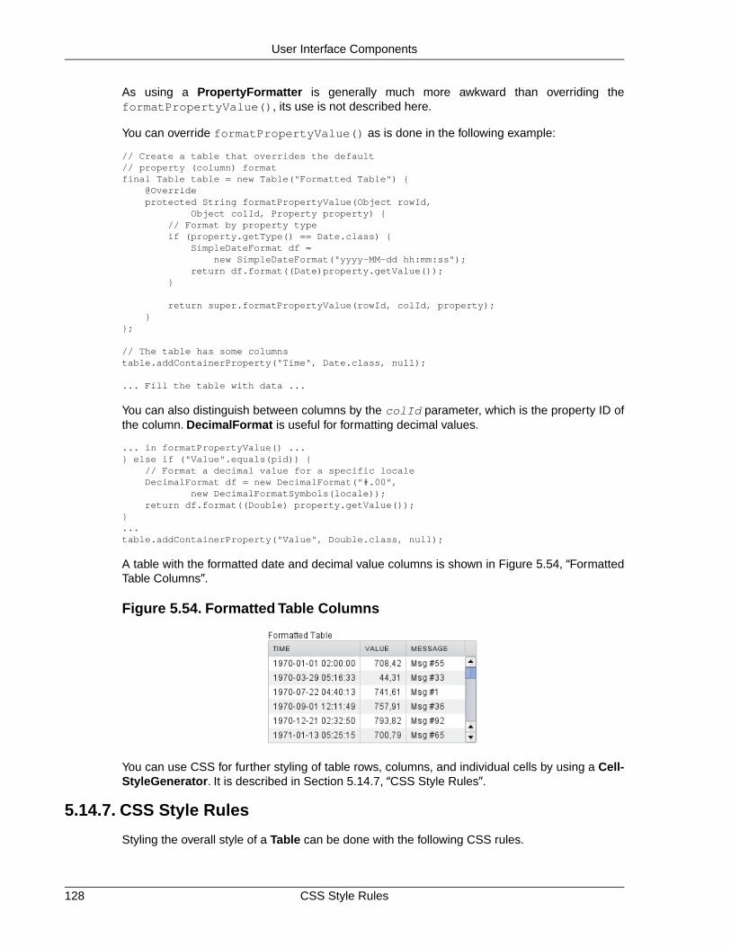
As using a PropertyFormatter is generally much more awkward than overriding theformatPropertyValue(), its use is not described here.
You can override formatPropertyValue() as is done in the following example:
// Create a table that overrides the default// property (column) formatfinal Table table = new Table("Formatted Table") { @Override protected String formatPropertyValue(Object rowId, Object colId, Property property) { // Format by property type if (property.getType() == Date.class) { SimpleDateFormat df = new SimpleDateFormat("yyyy-MM-dd hh:mm:ss"); return df.format((Date)property.getValue()); }
return super.formatPropertyValue(rowId, colId, property); }};
// The table has some columnstable.addContainerProperty("Time", Date.class, null);
... Fill the table with data ...
You can also distinguish between columns by the colId parameter, which is the property ID ofthe column. DecimalFormat is useful for formatting decimal values.
... in formatPropertyValue() ...} else if ("Value".equals(pid)) { // Format a decimal value for a specific locale DecimalFormat df = new DecimalFormat("#.00", new DecimalFormatSymbols(locale)); return df.format((Double) property.getValue());}...table.addContainerProperty("Value", Double.class, null);
A table with the formatted date and decimal value columns is shown in Figure 5.54, “FormattedTable Columns”.
Figure 5.54. Formatted Table Columns
You can use CSS for further styling of table rows, columns, and individual cells by using a Cell-StyleGenerator. It is described in Section 5.14.7, “CSS Style Rules”.
5.14.7. CSS Style Rules
Styling the overall style of a Table can be done with the following CSS rules.
CSS Style Rules128
User Interface Components

.v-table {} .v-table-header-wrap {} .v-table-header {} .v-table-header-cell {} .v-table-resizer {} /* Column resizer handle. */ .v-table-caption-container {} .v-table-body {} .v-table-row-spacer {} .v-table-table {} .v-table-row {} .v-table-cell-content {}
Notice that some of the widths and heights in a table are calculated dynamically and can not beset in CSS.
Setting Individual Cell Styles
The Table.CellStyleGenerator interface allows you to set the CSS style for each individual cellin a table. You need to implement the getStyle(), which gets the row (item) and column(property) identifiers as parameters and can return a style name for the cell. The returned stylename will be concatenated to prefix "v-table-cell-content-".
The getStyle() is called also for each row, so that the propertyId parameter is null. Thisallows setting a row style.
Alternatively, you can use a Table.ColumnGenerator (see Section 5.14.5, “Generated TableColumns”) to generate the actual UI components of the cells and add style names to them.
Table table = new Table("Table with Cell Styles");table.addStyleName("checkerboard");
// Add some columns in the table. In this example, the property// IDs of the container are integers so we can determine the// column number easily.table.addContainerProperty("0", String.class, null, "", null, null);for (int i=0; i<8; i++) table.addContainerProperty(""+(i+1), String.class, null, String.valueOf((char) (65+i)), null, null);
// Add some items in the table.table.addItem(new Object[]{ "1", "R", "N", "B", "Q", "K", "B", "N", "R"}, new Integer(0));table.addItem(new Object[]{ "2", "P", "P", "P", "P", "P", "P", "P", "P"}, new Integer(1));for (int i=2; i<6; i++) table.addItem(new Object[]{String.valueOf(i+1), "", "", "", "", "", "", "", ""}, new Integer(i));table.addItem(new Object[]{ "7", "P", "P", "P", "P", "P", "P", "P", "P"}, new Integer(6));table.addItem(new Object[]{ "8", "R", "N", "B", "Q", "K", "B", "N", "R"}, new Integer(7));table.setPageLength(8);
// Set cell style generatortable.setCellStyleGenerator(new Table.CellStyleGenerator() { public String getStyle(Object itemId, Object propertyId) { // Row style setting, not relevant in this example. if (propertyId == null) return "green"; // Will not actually be visible
int row = ((Integer)itemId).intValue(); int col = Integer.parseInt((String)propertyId);
// The first column.
129CSS Style Rules
User Interface Components

if (col == 0) return "rowheader";
// Other cells. if ((row+col)%2 == 0) return "black"; else return "white"; }});
You can then style the cells, for example, as follows:
/* Center the text in header. */.v-table-header-cell { text-align: center;}
/* Basic style for all cells. */.v-table-checkerboard .v-table-cell-content { text-align: center; vertical-align: middle; padding-top: 12px; width: 20px; height: 28px;}
/* Style specifically for the row header cells. */.v-table-cell-content-rowheader { background: #E7EDF3 url(../default/table/img/header-bg.png) repeat-x scroll 0 0;}
/* Style specifically for the "white" cells. */.v-table-cell-content-white { background: white; color: black;}
/* Style specifically for the "black" cells. */.v-table-cell-content-black { background: black; color: white;}
The table will look as shown in Figure 5.55, “Cell Style Generator for a Table”.
CSS Style Rules130
User Interface Components

Figure 5.55. Cell Style Generator for a Table
5.15. Tree
The Tree component allows a natural way to represent data that has hierarchical relationships,such as filesystems or message threads. The Tree component in Vaadin works much like thetree components of most modern desktop user interface toolkits, for example in directorybrowsing.
The typical use of the Tree component is for displaying a hierachical menu, like a menu on theleft side of the screen, as in Figure 5.56, “A Tree Component as a Menu”, or for displayingfilesystems or other hierarchical datasets. The menu style makes the appearance of the treemore suitable for this purpose.
final Object[][] planets = new Object[][]{ new Object[]{"Mercury"}, new Object[]{"Venus"}, new Object[]{"Earth", "The Moon"}, new Object[]{"Mars", "Phobos", "Deimos"}, new Object[]{"Jupiter", "Io", "Europa", "Ganymedes", "Callisto"}, new Object[]{"Saturn", "Titan", "Tethys", "Dione", "Rhea", "Iapetus"}, new Object[]{"Uranus", "Miranda", "Ariel", "Umbriel", "Titania", "Oberon"}, new Object[]{"Neptune", "Triton", "Proteus", "Nereid", "Larissa"}};
Tree tree = new Tree("The Planets and Major Moons");
/* Add planets as root items in the tree. */for (int i=0; i<planets.length; i++) { String planet = (String) (planets[i][0]); tree.addItem(planet);
if (planets[i].length == 1) { // The planet has no moons so make it a leaf. tree.setChildrenAllowed(planet, false); } else { // Add children (moons) under the planets. for (int j=1; j<planets[i].length; j++) { String moon = (String) planets[i][j];
// Add the item as a regular item.
131Tree
User Interface Components

tree.addItem(moon);
// Set it to be a child. tree.setParent(moon, planet);
// Make the moons look like leaves. tree.setChildrenAllowed(moon, false); }
// Expand the subtree. tree.expandItemsRecursively(planet); }}
main.addComponent(tree);
Figure 5.56, “A Tree Component as a Menu” below shows the tree from the code example in apractical situation.
You can read or set the currently selected item by the value property of the Tree component,that is, with getValue() and setValue(). When the user clicks an item on a tree, the tree willreceive an ValueChangeEvent, which you can catch with a ValueChangeListener. To receivethe event immediately after the click, you need to set the tree as setImmediate(true).
The Tree component uses Container data sources much like the Table component, with theaddition that it also utilizes hierarchy information maintained by a HierarchicalContainer. Thecontained items can be of any item type supported by the container. The default container andits addItem() assume that the items are strings and the string value is used as the item ID.
5.16. MenuBar
The MenuBar component allows creating horizontal dropdown menus, much like the main menuin desktop applications.
// Create a menu barfinal MenuBar menubar = new MenuBar();main.addComponent(menubar);
You insert the top-level menu items to a MenuBar object with the addItem() method. It takesa string label, an icon resource, and a command as its parameters. The icon and command arenot required and can be null.
MenuBar.MenuItem beverages = menubar.addItem("Beverages", null, null);
The command is called when the user clicks the item. A menu command is a class that implementsthe MenuBar.Command interface.
// A feedback componentfinal Label selection = new Label("-");main.addComponent(selection);
// Define a common menu command for all the menu items.MenuBar.Command mycommand = new MenuBar.Command() { public void menuSelected(MenuItem selectedItem) { selection.setValue("Ordered a " + selectedItem.getText() + " from menu."); } };
MenuBar132
User Interface Components

Figure 5.56. A Tree Component as a Menu
The addItem() method returns a MenuBar.MenuItem object, which you can use to add sub-menu items. The MenuItem has an identical addItem() method.
// Put some items in the menu hierarchicallyMenuBar.MenuItem beverages = menubar.addItem("Beverages", null, null);MenuBar.MenuItem hot_beverages = beverages.addItem("Hot", null, null);hot_beverages.addItem("Tea", null, mycommand);hot_beverages.addItem("Coffee", null, mycommand);MenuBar.MenuItem cold_beverages = beverages.addItem("Cold", null, null);cold_beverages.addItem("Milk", null, mycommand);
// Another top-level itemMenuBar.MenuItem snacks = menubar.addItem("Snacks", null, null);snacks.addItem("Weisswurst", null, mycommand);snacks.addItem("Salami", null, mycommand);
// Yet another top-level itemMenuBar.MenuItem services = menubar.addItem("Services", null, null);services.addItem("Car Service", null, mycommand);
The menu will look as follows:
Figure 5.57. Menu Bar
CSS Style Rules.v-menubar { }.gwt-MenuItem {}.gwt-MenuItem-selected {}
133CSS Style Rules
User Interface Components

The menu bar has the overall style name .v-menubar. Each menu item has .gwt-MenuItemstyle normally and .gwt-MenuItem-selected when the item is selected.
5.17. Embedded
The Embedded component allows displaying embedded media objects, such as images, anim-ations, or any embeddable media type supported by the browser.The contents of an Embeddedcomponent are managed as resources. For documentation on resources, see Section 4.5, “Ref-erencing Resources”.
The following example displays an image from the same Java package as the class itself usingthe class loader.
Embedded image = new Embedded("Yes, logo:", new ClassResource("vaadin-logo.png", this));main.addComponent(image);
Figure 5.58. Embedded Image
The Embedded component supports several different content types, which are rendered differentlyin HTML. You can set the content type with setType(), although for images, as in the aboveexample, the type is determined automatically.
Embedded.TYPE_OBJECT The default embedded type, allows embedding certain filetypes inside HTML <object> and <embed> elements.
Embedded.TYPE_IMAGE Embeds an image inside a HTML <img> element.
Embedded.TYPE_BROWSER Embeds a browser frame inside a HTML <iframe> ele-ment.
5.17.1. Embedded Objects
The Embedded.TYPE_OBJECT is the default and most generic embedded type, which allowsembedding media objects inside HTML <object> and <embed> elements.You need define theMIME type for the object type.
Currently, only Shockwave Flash animations are supported (MIME typeapplication/x-shockwave-flash).
// Create a Shockware Flash resourcefinal ClassResource flashResource = new ClassResource("itmill_spin.swf", getApplication());
// Display the resource in a Embedded compoantfinal Embedded embedded =
Embedded134
User Interface Components

new Embedded("Embedded Caption", flashResource);
// This is the default type, but we set it anyway.embedded.setType(Embedded.TYPE_OBJECT);
// This is recorgnized automatically, but set it anyway.embedded.setMimeType("application/x-shockwave-flash");
You can set object parameters with setParameter(), which takes a parameter's name andvalue as strings. The object parameters are included in the HTML as <param> elements.
5.17.2. Embedded Images
Images are embedded with the type Embedded.TYPE_IMAGE, although you do not normallyneed to set the type explicitly, as it is recognized automatically from the MIME type of the resource,as in the example above.
Embedded component has by default undefined size in both directions, so it will automaticallyfit the size of the embedded image. If you want scrolling with scroll bars, you can put the Embed-ded inside a Panel that has a defined size to enable scrolling, as described in Section 6.6.1,“Scrolling the Panel Content”.You can also give it a defined size and set the overflow: autoCSS property for it in a theme.
You can find another example of displaying an image from FileResource in Section 5.18, “Up-load”. Another example, in Section 4.5.5, “Stream Resources”, shows how you can generate thecontent of an Embedded component dynamically using a StreamResource.
If you have a dynamically generated image, for example with a StreamResource, and the datachanges, you need to reload the image in the browser. Because of how caching is handled insome browsers, you are best off by renaming the filename of the resource with a unique name,such as one including a timestamp. You should set cache time to zero with setCacheTime()for the resource object when you create it.
// Create the stream resource with some initial filename.StreamResource imageResource = new StreamResource(imageSource, "initial-filename.png", getApplication());
// Instruct browser not to cache the image.imageResource.setCacheTime(0);
// Display the image in an Embedded component.Embedded embedded = new Embedded("", imageResource);
When refreshing, you also need to call requestRepaint() for the Embedded object.
// This needs to be done, but is not sufficient.embedded.requestRepaint();
// Generate a filename with a timestamp.SimpleDateFormat df = new SimpleDateFormat("yyyyMMddHHmmssSSS");String filename = "myfilename-" + df.format(new Date()) + ".png";
// Replace the filename in the resource.imageResource.setFilename(makeImageFilename());
You can find more detailed information about the StreamResource in Section 4.5.5, “StreamResources”.
135Embedded Images
User Interface Components

5.17.3. Browser Frames
The browser frame type allows you to embed external content inside an HTML <iframe> element.You can refer to a URL with an ExternalResource object. URLs are given with the standardJava URL class.
URL url = new URL("http://dev.vaadin.com/");Embedded browser = new Embedded("", new ExternalResource(url));browser.setType(Embedded.TYPE_BROWSER);main.addComponent(browser);
5.18. Upload
The Upload component allows a user to upload files to the server. It displays a file name entrybox, a file selection button, and an upload submit button. The user can either write the filenamein the text area or click the Browse button to select a file. After the file is selected, the user sendsthe file by pressing the upload submit button.
// Create the Upload component.Upload upload = new Upload("Upload the file here", this);
Figure 5.59. Upload Component
You can set the text of the upload button with setButtonCaption(), as in the example above,but it is difficult to change the look of the Browse button.This is a security feature of web browsers.The language of the Browse button is determined by the browser, so if you wish to have thelanguage of the Upload component consistent, you will have to use the same language in yourapplication.
upload.setButtonCaption("Upload Now");
The uploaded files are typically stored as files in a file system, in a database, or as temporaryobjects in memory.The upload component writes the received data to an java.io.OutputStreamso you have plenty of freedom in how you can process the upload content.
To use the Upload component, you need to define a class that implements the Upload.Receiverinterface. The receiveUpload() method is called when the user clicks the submit button. Themethod must return an OutputStream. To do this, it typically creates a File or a memory bufferwhere the stream is written.The method gets the file name and MIME type of the file, as reportedby the browser.
When an upload is finished, successfully or unsuccessfully, the Upload component will emit theUpload.FinishedEvent event.To receive it, you need to implement the Upload.FinishedListenerinterface, and register the listening object in the Upload component. The event object will alsoinclude the file name, MIME type, and length of the file. Notice that the more specific Upload.Faile-dEvent and Upload.SucceededEvent events will be called in the cases where the upload failedor succeeded, respectively.
The following example allows uploading images to /tmp/uploads directory in (UNIX) filesystem(the directory must exist or the upload fails). The component displays the last uploaded imagein an Embedded component.
import java.io.File;import java.io.FileOutputStream;
Browser Frames136
User Interface Components

import java.io.OutputStream;import com.vaadin.terminal.FileResource;import com.vaadin.ui.*;
public class MyUploader extends CustomComponent implements Upload.SucceededListener, Upload.FailedListener, Upload.Receiver {
Panel root; // Root element for contained components. Panel imagePanel; // Panel that contains the uploaded image. File file; // File to write to.
MyUploader() { root = new Panel("My Upload Component"); setCompositionRoot(root);
// Create the Upload component. final Upload upload = new Upload("Upload the file here", this);
// Use a custom button caption instead of plain "Upload". upload.setButtonCaption("Upload Now");
// Listen for events regarding the success of upload. upload.addListener((Upload.SucceededListener) this); upload.addListener((Upload.FailedListener) this);
root.addComponent(upload); root.addComponent(new Label("Click 'Browse' to "+ "select a file and then click 'Upload'."));
// Create a panel for displaying the uploaded image. imagePanel = new Panel("Uploaded image"); imagePanel.addComponent( new Label("No image uploaded yet")); root.addComponent(imagePanel); }
// Callback method to begin receiving the upload. public OutputStream receiveUpload(String filename, String MIMEType) { FileOutputStream fos = null; // Output stream to write to file = new File("/tmp/uploads/" + filename); try { // Open the file for writing. fos = new FileOutputStream(file); } catch (final java.io.FileNotFoundException e) { // Error while opening the file. Not reported here. e.printStackTrace(); return null; }
return fos; // Return the output stream to write to }
// This is called if the upload is finished. public void uploadSucceeded(Upload.SucceededEvent event) { // Log the upload on screen. root.addComponent(new Label("File " + event.getFilename() + " of type '" + event.getMIMEType() + "' uploaded."));
// Display the uploaded file in the image panel. final FileResource imageResource = new FileResource(file, getApplication()); imagePanel.removeAllComponents();
137Upload
User Interface Components

imagePanel.addComponent(new Embedded("", imageResource)); }
// This is called if the upload fails. public void uploadFailed(Upload.FailedEvent event) { // Log the failure on screen. root.addComponent(new Label("Uploading " + event.getFilename() + " of type '" + event.getMIMEType() + "' failed.")); }}
The example does not check the type of the uploaded files in any way, which will cause an errorif the content is anything else but an image. The program also assumes that the MIME type ofthe file is resolved correctly based on the file name extension. After uploading an image, thecomponent will look as show in Figure 5.60, “Image Upload Example” below.The browser showsthe Browse button localized.
Figure 5.60. Image Upload Example
5.19. Form
Most web applications need forms. The Form component in Vaadin offers an easy way to createforms where the fields can be automatically generated from a data source that is bound to theform. The BeanItem adapter allows the data sources to be just JavaBeans or Plain Old JavaObjects (POJOs) with just the setter and getter methods. Form manages buffering so that theform contents can be committed to the data source only when filling the form is complete, andbefore that, the user can discard any changes.
The Form component is also a layout, with a bounding box, a caption, a description field, and aspecial error indicator. As such, it can also be used within logical forms to group input fields.
5.19.1. Form as a User Interface Component
To begin with the Form, it is a UI component with a layout suitable for its purpose. A Form hasa caption, a description, a layout that contains the fields, an error indicator, and a footer, as illus-trated in Figure 5.61, “Layout of the Form Component” below. Unlike with other components, thecaption is shown within the border. (See the details below on how to enable the border with CSS,as it may not be enabled in the default style.)
Form138
User Interface Components

Figure 5.61. Layout of the Form Component
Unlike most components, Form does not accept the caption in the constructor, as forms are oftencaptionless, but you can give the caption with the setCaption(). While the description text,which you can set with setDescription(), is shown as a tooltip in most other components, a Formdisplays it in top of the form box as shown in the figure above.
Form form = new Form();form.setCaption("Form Caption");form.setDescription("This is a description of the Form that is " + "displayed in the upper part of the form. You normally " + "enter some descriptive text about the form and its " + "use here.");
Form has FormLayout as its default layout, but you can set any other layout with setLayout().See Section 6.5, “FormLayout” for more information. Note that the Form itself handles layoutfor the description, the footer and other common elements of the form. The user-set layout onlymanages the contained fields and their captions.
The Form is most of all a container for fields so it offers many kinds of automation for creatingand managing fields.You can, of course, create fields directly in the layout, but it is usually moredesirable to bind the fields to the connected data source.
// Add a field directly to the layout. This field will// not be bound to the data source Item of the form.form.getLayout().addComponent(new TextField("A Field"));
// Add a field and bind it to an named item property.form.addField("another", new TextField("Another Field"));
Binding forms and their fields to data objects is described further in Section 5.19.2, “Binding Formto Data” below.
The Form has a special error indicator inside the form. The indicator can show the followingtypes of error messages:
• Errors set with the setComponentError() method of the form. For example:
form.setComponentError(new UserError("This is the error indicator of the Form."));
• Errors caused by a validator attached to the Form with addValidator().
139Form as a User Interface Component
User Interface Components

• Errors caused by validators attached to the fields inside forms, ifsetValidationVisible(true) is set for the form.This type of validation is explainedfuther in Section 5.19.3, “Validating Form Input” below.
• Errors from automatic validation of fields set as required with setRequired(true) ifan error message has also been set with setRequiredError().
Only a single error is displayed in the error indicator at a time.
Finally, Form has a footer area.The footer is a HorizontalLayout by default, but you can changeit with setFooter().
// Set the footer layout.form.setFooter(new VerticalLayout());
form.getFooter().addComponent( new Label("This is the footer area of the Form. "+ "You can use any layout here. "+ "This is nice for buttons."));
// Have a button bar in the footer.HorizontalLayout okbar = new HorizontalLayout();okbar.setHeight("25px");form.getFooter().addComponent(okbar);
// Add an Ok (commit), Reset (discard), and Cancel buttons// for the form.Button okbutton = new Button("OK", form, "commit");okbar.addComponent(okbutton);okbar.setComponentAlignment(okbutton, Alignment.TOP_RIGHT);okbar.addComponent(new Button("Reset", form, "discard"));okbar.addComponent(new Button("Cancel"));
CSS Style Rules
.v-form {}
.v-form legend
.v-form fieldset {}
.v-form-error {}
.v-form-errormessage {}
.v-form-description {}
The top-level style name of a Form component is v-form. It is important to notice that the formis implemented as a HTML <fieldset>, which allows placing the caption (or "legend") insidethe border. It would not be so meaningful to set a border for the top-level form element. The fol-lowing example sets a border around the form, as is done in Figure 5.61, “Layout of the FormComponent” above.
.v-form fieldset { border: thin solid;}
The top-level element of the form has the style name v-form-error if a component error hasbeen set for the form.
5.19.2. Binding Form to Data
The main purpose of the Form component is that you can bind it to a data source and let theForm generate and manage fields automatically. The data source can be any class that imple-ments the Item interface, which is part of the Vaadin Data Model, as described in Chapter 9,Binding Components to Data. You can either implement the Item interface yourself, which can
Binding Form to Data140
User Interface Components

be overly complicated, or use the ready BeanItem adapter to bind the form to any JavaBeanobject.You can also use PropertysetItem to bind the form to an ad hoc set of Property objects,resembling a Map.
Let us consider the following simple JavaBean with proper setter and getter methods for themember variables.
/** A simple JavaBean. */public class PersonBean { String name; String city;
public void setName(String name) { this.name = name; }
public String getName() { return name; }
public void setCity(String city) { this.city = city; }
public String getCity() { return city; }}
We can now bind this bean to a Form using the BeanItem adapter as follows.
// Create a form and use FormLayout as its layout.final Form form = new Form();
// Set form caption and description textsform.setCaption("Contact Information");form.setDescription("Please specify name of the person and the city where the person lives in.");
// Create the custom bean.PersonBean bean = new PersonBean();
// Create a bean item that is bound to the bean.BeanItem item = new BeanItem(bean);
// Bind the bean item as the data source for the form.form.setItemDataSource(item);
The Form uses FormLayout layout by default and automatically generates the fields for eachof the bean properties, as shown in Figure 5.62, “Form Automatically Generated from a Bean”below.
Figure 5.62. Form Automatically Generated from a Bean
141Binding Form to Data
User Interface Components

The automatically determined order of the fields can be undesirable. To set the order properly,you can use the setVisibleItemProperties() method of the Form, which takes an orderedcollection as its parameter. Fields that are not listed in the collection are not included in the form.
// Set the order of the items in the form.Vector order = new Vector();order.add("city");order.add("name");form.setVisibleItemProperties(order);
The form uses the property identifiers as the captions of the fields by default. If you want to havemore proper captions for the fields, which is often the case, you need to use a FieldFactory tocreate the fields, as is shown in the section below.
Generating Proper Fields with a FormFieldFactory
The form generates the fields automatically using very coarse logic. A String, int, or double willresult in a TextField alike, regardless of the meaning of the field. You might want to have a cityname to be input with a combo box, for example. You can create such custom fields by imple-menting the createField() method in the FormFieldFactory interface.
The default implementation, DefaultFieldFactory is shared with the Table component: it alsoimplements the TableFieldFactory interface. This allows the DefaultFieldFactory to create thefields for both purposes with the same logic. It is usually simplest to just extend the default imple-mentation instead of implementing the interfaces from scratch. You should consult the sourcecode of DefaultFieldFactory to see how it works; you may want to reimplementcreateFieldByPropertyType(), which actually creates the fields by type, instead of thecreateField().
Below is an example of implementing the FormFieldFactory interface for a specific form, usingthe names of the fields of the form to create the editable field components.
class MyFieldFactory implements FormFieldFactory { public Field createField(Item item, Object propertyId, Component uiContext) { // Identify the fields by their Property ID. String pid = (String) propertyId; if ("name".equals(pid)) { return new TextField("Name"); } else if ("city".equals(pid)) { Select select = new Select("City"); select.addItem("Berlin"); select.addItem("Helsinki"); select.addItem("London"); select.addItem("New York"); select.addItem("Turku"); select.setNewItemsAllowed(true); return select; }
return null; // Invalid field (property) name. }}
You set a Form to use a custom field factory with setFormFieldFactory():
form.setFormFieldFactory(new MyFieldFactory());
The earlier example will now look as shown in Figure 5.63, “Form Fields Generated with aFormFieldFactory”.
Binding Form to Data142
User Interface Components

Figure 5.63. Form Fields Generated with a FormFieldFactory
5.19.3. Validating Form Input
Validation of the form input is one of the most important tasks in handling forms. The fields inVaadin can be bound to validators. The validation provides feedback about bad input and theforms can also manage validation results and accept the input only if all validations are successful.Fields can also be set as required, which is a special built-in validator. The validators work onthe server-side.
Using Validators in Forms
Validators check the validity of input and, if the input is invalid, can provide an error messagethrough an exception.Validators are classes that implement the Validator interface.The interfacehas two methods that you must implement: isValid() that returns the success or failure as atruth value, and validate(), which reports a failure with an exception. The exception can beassociated with an error message describing the details of the error.
Simple validators that only need to produce a single error message in case the validation failscan inherit from AbstractValidator or AbstractStringValidator. The Vaadin also provides anumber of standard validators, including IntegerValidator and DoubleValidator for validatingnumerical input, StringLengthValidator, EmailValidator and the more general RegexpValidatorfor checking that a string matches a Java regular expression:
// Postal code that must be 5 digits (10000-99999).TextField field = new TextField("Postal Code");field.setColumns(5);
// Create the validatorValidator postalCodeValidator = new RegexpValidator( "[1-9][0-9]{4}", "Postal code must be a number 10000-99999.");field.addValidator(postalCodeValidator);
If you are using a custom FieldFactory to generate the fields, you may want to set the validatorsfor fields there. It is useful to have the form in immediate mode:
// Set the form to act immediately on user input. This is// necessary for the validation of the fields to occur immediately// when the input focus changes and not just on commit.form.setImmediate(true);
143Validating Form Input
User Interface Components

Validation is done always when you call the commit() method of the Form.
// The Commit button calls form.commit().Button commit = new Button("Commit", form, "commit");
If any of the validators in the form fail, the commit will fail and a validation exception message isdisplayed in the error indicator of the form. If the commit is successful, the input data is writtento the data source. Notice that commit() also implicitly sets setValidationVisible(true)(if setValidationVisibleOnCommit() is true, as is the default). This makes the error in-dicators visible even if they were previously not visible.
Figure 5.64. Form Validation in Action
For cases in which more complex error handling is required, the validator can also implementthe Validator interface directly:
// Create the validatorValidator postalCodeValidator = new Validator() {
// The isValid() method returns simply a boolean value, so // it can not return an error message. public boolean isValid(Object value) { if (value == null || !(value instanceof String)) { return false; }
return ((String) value).matches("[1-9][0-9]{4}"); }
// Upon failure, the validate() method throws an exception // with an error message. public void validate(Object value) throws InvalidValueException { if (!isValid(value)) { if (value != null && value.toString().startsWith("0")) { throw new InvalidValueException( "Postal code must not start with a zero."); } else { throw new InvalidValueException( "Postal code must be a number 10000-99999."); } } }};
Required Fields in Forms
Setting a field as required outside a form is usually just a visual clue to the user. Leaving arequired field empty does not display any error indicator in the empty field as a failed validationdoes. However, if you set a form field as required with setRequired(true) and give an error
Validating Form Input144
User Interface Components

message with setRequiredError() and the user leaves the required field empty, the formwill display the error message in its error indicator.
form.getField("name").setRequired(true);form.getField("name").setRequiredError("Name is missing");form.getField("address").setRequired(true); // No error message
To have the validation done immediately when the fields lose focus, you should set the form asimmediate, as was done in the section above.
Figure 5.65. Empty Required Field After Clicking Commit
Note
It is important that you provide the user with feedback from failed validation of requiredfields either by setting an error message or by providing the feedback by other means.
Otherwise, when a user clicks the Ok button (commits the form), the button does notappear to work and the form does not indicate any reason. As an alternative to settingthe error message, you can handle the validation error and provide the feedbackabout the problem with a different mechanism.
5.19.4. Buffering Form Data
Buffering means keeping the edited data in a buffer and writing it to the data source only whenthe commit() method is called for the component. If the user has made changes to a buffer,calling discard() restores the buffer from the data source. Buffering is actually a feature of allField components and Form is a Field. Form manages the buffering of its contained fields sothat if commit() or discard() is called for the Form, it calls the respective method for all ofits managed fields.
final Form form = new Form();...add components...
// Enable buffering.form.setWriteThrough(false);
// The Ok button calls form.commit().Button commit = new Button("Ok", form, "commit");
// The Restore button calls form.discard().Button restore = new Button("Restore", form, "discard");
The Form example in the Feature Browser of Vaadin demonstrates buffering in forms.The Widgetcaching demo in Additional demos demonstrates buffering in other Field components, its sourcecode is available in BufferedComponents.java.
145Buffering Form Data
User Interface Components

5.20. ProgressIndicator
The ProgressIndicator component allows displaying the progress of a task graphically. Theprogress is given as a floating-point value between 0.0 and 1.0.
Figure 5.66.The Progress Indicator Component
The progress indicator polls the server for updates for its value. If the value has changed, theprogress is updated. Notice that the user application does not have to handle any polling event,but updating the component is done automatically.
Creating a progress indicator is just like with any other component.You can give the initial progressvalue as a parameter for the constructor. The default polling frequency is 1000 milliseconds (onesecond), but you can set some other interval with the setPollingInterval() method.
// Create the indicatorfinal ProgressIndicator indicator = new ProgressIndicator(new Float(0.0));main.addComponent(indicator);
// Set polling frequency to 0.5 seconds.indicator.setPollingInterval(500);
CSS Style Rules/* Base element. */.v-progressindicator {}
/* Progress indication element on top of the base. */.v-progressindicator div {}
The default style for the progress indicator uses an animated GIF image (img/base.gif) asthe base background for the component.The progress is a <div> element inside the base.Whenthe progress element grows, it covers more and more of the base background. By default, thegraphic of the progress element is defined in img/progress.png under the default style directory.S e ecom.vaadin.terminal.gwt/public/default/progressindicator/progressindicator.css.
5.20.1. Doing Heavy Computation
The progress indicator is often used to display the progress of a heavy server-side computationtask. In the following example, we create a thread in the server to do some "heavy work". All thethread needs to do is to set the value of the progress indicator with setValue() and the currentprogress is displayed automatically when the browser polls the server.
// Create an indicator that makes you look busyfinal ProgressIndicator indicator = new ProgressIndicator(new Float(0.0));main.addComponent(indicator);
// Set polling frequency to 0.5 seconds.indicator.setPollingInterval(500);
// Add a button to start workingfinal Button button = new Button("Click to start");main.addComponent(button);
ProgressIndicator146
User Interface Components

// Another thread to do some workclass WorkThread extends Thread { public void run () { double current = 0.0; while (true) { // Do some "heavy work" try { sleep(50); // Sleep for 50 milliseconds } catch (InterruptedException) {}
// Show that you have made some progress: // grow the progress value until it reaches 1.0. current += 0.01; if (current>1.0) indicator.setValue(new Float(1.0)); else indicator.setValue(new Float(current));
// After all the "work" has been done for a while, // take a break. if (current > 1.2) { // Restore the state to initial. indicator.setValue(new Float(0.0)); button.setVisible(true); break; } } }}
// Clicking the button creates and runs a work threadbutton.addListener(new Button.ClickListener() { public void buttonClick(ClickEvent event) { final WorkThread thread = new WorkThread(); thread.start();
// The button hides until the work is done. button.setVisible(false); }});
Figure 5.67. Starting Heavy Work
5.21. Slider
The Slider is a vertical or horizontal bar that allows setting a numeric value within a defined rangeby dragging a bar handle with the mouse. The value is shown when dragging the handle.
Slider has a number of different constructors that take a combination of the caption, minimumand maximum value, resolution, and the orientation of the slider.
// Create a vertical sliderfinal Slider vertslider = new Slider(1, 100);vertslider.setOrientation(Slider.ORIENTATION_VERTICAL);
Slider Properties
min Minimum value of the slider range. The default is 0.0.
147Slider
User Interface Components

max Maximum value of the slider range. The default is 100.0.
resolution The number of digits after the decimal point. The default is 0.
orientation T h e o r i e n t a t i o n c a n b e e i t h e r h o r i z o n t a l(Slider.ORIENTATION_HORIZONTAL) or vertical(Slider.ORIENTATION_VERTICAL). The default is horizontal.
As the Slider is a field component, you can handle value changes with a ValueChangeListener.The value of the Slider field is a Double object.
// Shows the value of the vertical sliderfinal Label vertvalue = new Label();vertvalue.setSizeUndefined();
// Handle changes in slider value.vertslider.addListener(new Property.ValueChangeListener() { public void valueChange(ValueChangeEvent event) { double value = (Double) vertslider.getValue();
// Use the value box.setHeight((float) value, Sizeable.UNITS_PERCENTAGE); vertvalue.setValue(String.valueOf(value)); }});
// The slider has to be immediate to send the changes// immediately after the user drags the handle.vertslider.setImmediate(true);
You can set the value with the setValue() method defined in Slider that takes the value as anative double value. The setter can throw a ValueOutOfBoundsException, which you musthandle.
// Set the initial value. This has to be set after the// listener is added if we want the listener to handle// also this value change.try { vertslider.setValue(50.0);} catch (ValueOutOfBoundsException e) {}
Alternatively, you can use the regular setValue(Object), which does not do bounds checking.
Figure 5.68, “The Slider Component” shows both vertical (from the code examples) and horizontalsliders that control the size of a box. The slider values are displayed also in separate labels.
Slider148
User Interface Components

Figure 5.68.The Slider Component
CSS Style Rules.v-slider {}.v-slider-base {}.v-slider-handle {}
The enclosing style for the Slider is v-slider. The slider bar has style v-slider-base. Eventhough the handle is higher (for horizontal slider) or wider (for vertical slider) than the bar, thehandle element is nevertheless contained within the slider bar element. The appearance of thehandle comes from a background image defined in the background CSS property.
5.22. LoginForm
The LoginForm component is a login form that allows a password manager in the web browserto remember and later automatically fill in the username and password. This commonly usedfunctionality does not work with regular Vaadin components and is a common problem with Ajaxapplications.
// A wrapper with a caption for the login formPanel loginPanel = new Panel("Login");loginPanel.setWidth("250px");
LoginForm login = new LoginForm();loginPanel.addComponent(login);
The resulting form is shown in Figure 5.69, “The LoginForm Component”.
149CSS Style Rules
User Interface Components

Figure 5.69.The LoginForm Component
The LoginForm uses static HTML inside an iframe element to enable the functionality. Thecomponent provides a default implementation of the static HTML; if you want to change the layout,you need to reimplement the getLoginHtml() method.
The login form has by default 100%x100% relative size, taking all the space given by the containinglayout. You may set the size to fixed values, but not undefined in either direction, because thecontained iframe element takes all of this size (it also has 100%x100% size). How the actualform uses this space depends on the static HTML. Giving too little space for the form results inscroll bars.
5.22.1. Customizing LoginForm
Customization of the login form is necessary, for example, if you need to change the layout orinternationalize the form. Customization is done by overriding the getLoginHtml() method,which returns the static HTML of the form. The customization layer is very "unvaadin"-like, andat best hack-ish, but dictated by the form management in browsers.
Let us look at a custom login form that lets the user of the form to give the field captions:
class MyLoginForm extends LoginForm { String usernameCaption; String passwordCaption; String submitCaption;
public MyLoginForm(String usernameCaption, String passwordCaption, String submitCaption) { this.usernameCaption = usernameCaption; this.passwordCaption = passwordCaption; this.submitCaption = submitCaption; }
Then we override the method that generates the static HTML for the form:
@Overrideprotected byte[] getLoginHTML() { // Application URI needed for submitting form String appUri = getApplication().getURL().toString() + getWindow().getName() + "/";
String x, h, b; // XML header, HTML head and body
The XML header is needed for the validity of the XHTML page:
Customizing LoginForm150
User Interface Components

x = "<!DOCTYPE html PUBLIC \"-//W3C//DTD " + "XHTML 1.0 Transitional//EN\" " + "\"http://www.w3.org/TR/xhtml1/" + "DTD/xhtml1-transitional.dtd\">\n";
Notice that it is important to have a newline (\n) at the end of the XML header line.
The HTML header part contains JavaScript definitions that handle submitting the form data. Italso copies the style sheet references from the parent window.
h = "<head><script type='text/javascript'>" + "var setTarget = function() {" + " var uri = '" + appUri + "loginHandler';" + " var f = document.getElementById('loginf');" + " document.forms[0].action = uri;" + " document.forms[0].username.focus();" + "};" + "" + "var styles = window.parent.document.styleSheets;" + "for(var j = 0; j < styles.length; j++) {\n" + " if(styles[j].href) {" + " var stylesheet = document.createElement('link');\n" + " stylesheet.setAttribute('rel', 'stylesheet');\n" + " stylesheet.setAttribute('type', 'text/css');\n" + " stylesheet.setAttribute('href', styles[j].href);\n" + " document.getElementsByTagName('head')[0]" + " .appendChild(stylesheet);\n" + " }" + "}\n" + "function submitOnEnter(e) {" + " var keycode = e.keyCode || e.which;" + " if (keycode == 13) {document.forms[0].submit();}" + "}\n" + "</script>" + "</head>";
The HTML body element contains the actual form. Notice that it is contained within an inneriframe. The form and the button must have JavaScript calls to submit the form content.
b = "<body onload='setTarget();'" + " style='margin:0;padding:0; background:transparent;'" + " class='" + ApplicationConnection.GENERATED_BODY_CLASSNAME + "'>" + "<div class='v-app v-app-loginpage'" + " style='background:transparent;'>" + "<iframe name='logintarget' style='width:0;height:0;" + "border:0;margin:0;padding:0;'></iframe>" + "<form id='loginf' target='logintarget'" + " onkeypress='submitOnEnter(event)'" + " method='post'>" + "<table>" + "<tr><td>" + usernameCaption + "</td>" + "<td><input class='v-textfield' style='display:block;'" + " type='text' name='username'></td></tr>" + "<tr><td>" + passwordCaption + "</td>" + " <td><input class='v-textfield'" + " style='display:block;' type='password'" + " name='password'></td></tr>" + "</table>" + "<div>" + "<div onclick='document.forms[0].submit();'" + " tabindex='0' class='v-button' role='button'>" + "<span class='v-button-wrap'>" + "<span class='v-button-caption'>" + submitCaption + "</span>" + "</span></div></div></form></div></body>";
151Customizing LoginForm
User Interface Components

Then combine and return the page as a byte array.
return (x + "<html>" + h + b + "</html>").getBytes();}
We can use the custom login form as follows:
MyLoginForm loginForm = new MyLoginForm("Name of the User", "A passing word", "Login Me Now");
The customized LoginForm is shown in Figure 5.70, “Customizing the LoginForm”.
Figure 5.70. Customizing the LoginForm
Styling with CSS.v-customcomponent {}.v-customcomponent .v-embedded {}.v-app-loginpage {}.v-app-loginpage .v-textfield {}.v-app-loginpage .v-button {}
The LoginForm component is a purely server-side component that extends CustomComponentand therefore has a v-customcomponent base style. If you wish to do any styling for the com-ponent, you should give it a custom style name to distinguish it from the regular CustomCom-ponent.
The component contains an iframe in an element with v-embedded style.The other styles aredefined in the static HTML code returned by the getLoginHTML() method. The default imple-mentation reuses the styles of the TextField and Button components for the input fields and thebutton, that is, v-textfield and v-button. The root element has the same v-app style asa regular Vaadin application would have, and an additional v-app-loginpage style.
...+ "<div class='v-app v-app-loginpage' style=\"background:transparent;\">"...+ "<input class='v-textfield' ......+ "<div><input class='v-textfield' ......<div ... class='v-button' role='button'>
5.23. Component Composition with CustomComponent
The ease of making new user interface components is one of the core features of Vaadin.Typically,you simply combine existing built-in components to produce composite components. In manyapplications, such composite components make up the majority of the user interface.
To create a composite component, you need to inherit the CustomComponent and call thesetCompositionRoot() in the constructor to set the composition root component. The rootcomponent is typically a layout component that contains multiple components.
Styling with CSS152
User Interface Components

For example:
class MyComposite extends CustomComponent { public MyComposite(String message) { // A layout structure used for composition Panel panel = new Panel("My Custom Component"); panel.setContent(new VerticalLayout());
// Compose from multiple components Label label = new Label(message); label.setSizeUndefined(); // Shrink panel.addComponent(label); panel.addComponent(new Button("Ok"));
// Set the size as undefined at all levels panel.getContent().setSizeUndefined(); panel.setSizeUndefined(); setSizeUndefined();
// The composition root MUST be set setCompositionRoot(panel); }}
Take note of the sizing when trying to make a customcomponent that shrinks to fit the containedcomponents. You have to set the size as undefined at all levels; the sizing of the compositecomponent and the composition root are separate.
You can use the component as follows:
MyComposite mycomposite = new MyComposite("Hello");
The rendered component is shown in Figure 5.71, “A Custom Composite Component”.
Figure 5.71. A Custom Composite Component
You can also inherit any other components, such as layouts, to attain similar composition. Evenfurther, you can create entirely new low-level components, by integrating custom Google WebToolkit components or by extending the client-side functionality of built-in components. Develop-ment of custom GWT components is covered in Chapter 11, Developing New Components.
153Component Composition with CustomComponent
User Interface Components

154

Chapter 6
Managing Layout
6.1. Overview ................................................................................................ 1566.2. Window and Panel Root Layout ............................................................. 1586.3. VerticalLayout and HorizontalLayout ................................................. 1586.4. GridLayout ............................................................................................ 1636.5. FormLayout .......................................................................................... 1666.6. Panel ..................................................................................................... 1686.7. HorizontalSplitPanel and VerticalSplitPanel ...................................... 1726.8. TabSheet ............................................................................................... 1746.9. Accordion ............................................................................................. 1776.10. AbsoluteLayout .................................................................................. 1786.11. CssLayout .......................................................................................... 1806.12. Layout Formatting ................................................................................ 1836.13. Custom Layouts ................................................................................... 190
Ever since the ancient xeroxians invented graphical user interfaces, programmers have wantedto make GUI programming ever easier for themselves. Solutions started simple. When GUIsappeared on PC desktops, practically all screens were of the VGA type and fixed into 640x480size. Mac or X Window System on UNIX were not much different. Everyone was so happy withsuch awesome graphics resolutions that they never thought that an application would have towork on a radically different screen size. At worst, screens could only grow, they thought, givingmore space for more windows. In the 80s, the idea of having a computer screen in your pocketwas simply not realistic. Hence, the GUI APIs allowed placing UI components using screen co-ordinates. Visual Basic and some other systems provided an easy way for the designer to dragand drop components on a fixed-sized window. One would have thought that at least translatorswould have complained about the awkwardness of such a solution, but apparently they were not,
155Book of Vaadin

as non-engineers, heard or at least cared about. At best, engineers could throw at them a resourceeditor that would allow them to resize the UI components by hand. Such was the spirit back then.
After the web was born, layout design was doomed to change for ever. At first, layout didn'tmatter much, as everyone was happy with plain headings, paragraphs, and a few hyperlinks hereand there. Designers of HTML wanted the pages to run on any screen size. The screen size wasactually not pixels but rows and columns of characters, as the baby web was really just hypertext,not graphics.That was soon to be changed.The first GUI-based browser, NCSA Mosaic, launcheda revolution that culminated in Netscape Navigator. Suddenly, people who had previously beendoing advertisement brochures started writing HTML. This meant that layout design had to beeasy not just for programmers, but also allow the graphics designer to do his or her job withouthaving to know a thing about programming.The W3C committee designing web standards cameup with the CSS (Cascading Style Sheet) specification, which allowed trivial separation of appear-ance from content. Later versions of HTML followed, XHTML appeared, as did countless otherstandards.
Page description and markup languages are a wonderful solution for static presentations, suchas books and most web pages. Real applications, however, need to have more control. Theyneed to be able to change the state of user interface components and even their layout on therun. This creates a need to separate the presentation from content on exactly the right level.
Thanks to the attack of graphics designers, desktop applications were, when it comes to appear-ance, far behind web design. Sun Microsystems had come in 1995 with a new programminglanguage, Java, for writing cross-platform desktop applications. Java's original graphical userinterface toolkit, AWT (Abstract Windowing Toolkit), was designed to work on multiple operatingsystems as well as embedded in web browsers. One of the special aspects of AWT was thelayout manager, which allowed user interface components to be flexible, growing and shrinkingas needed. This made it possible for the user to resize the windows of an application flexibly andalso served the needs of localization, as text strings were not limited to some fixed size in pixels.It became even possible to resize the pixel size of fonts, and the rest of the layout adapted to thenew size.
Layout management of Vaadin is a direct successor of the web-based concept for separation ofcontent and appearance and of the Java AWT solution for binding the layout and user interfacecomponents into objects in programs. Vaadin layout components allow you to position your UIcomponents on the screen in a hierarchical fashion, much like in conventional Java UI toolkitssuch as AWT, Swing, or SWT. In addition, you can approach the layout from the direction of theweb with the CustomLayout component, which you can use to write your layout as a templatein XHTML that provides locations of any contained components.
The moral of the story is that, because Vaadin is intended for web applications, appearance isof high importance. The solutions have to be the best of both worlds and satisfy artists of bothkind: code and graphics. On the API side, the layout is controlled by UI components, particularlythe layout components. On the visual side, it is controlled by themes. Themes can contain anyHTML, CSS, and JavaScript that you or your web artists create to make people feel good aboutyour software.
6.1. Overview
The user interface components in Vaadin can roughly be divided in two groups: components thatthe user can interact with and layout components for placing the other components to specificplaces in the user interface. The layout components are identical in their purpose to layoutmanagers in regular desktop frameworks for Java and you can use plain Java to accomplishsophisticated component layouting.
Overview156
Managing Layout

You start by creating a root layout for the main window, unless you use the default, and then addthe other layout components hierarchically, and finally the interaction components as the leavesof the component tree.
// Create the main window.Window main = new Window("My Application");setMainWindow(main);
// Set the root layout (VerticalLayout is actually the default).VerticalLayout root = new VerticalLayout();main.setContent(root);
// Add the topmost component.root.addComponent(new Label("The Ultimate Cat Finder"));
// Add a horizontal layout for the bottom part.HorizontalLayout bottom = new HorizontalLayout();root.addComponent(bottom);
bottom.addComponent(new Tree("Major Planets and Their Moons"));bottom.addComponent(new Panel());...
You will usually need to tune the layout components a bit by setting sizes, expansion ratios,alignments, spacings, and so on. The general settings are described in Section 6.12, “LayoutFormatting”, while the layout component specific settings are described in connection with thecomponent.
Layouts are coupled with themes that specify various layout features, such as backgrounds,borders, text alignment, and so on. Definition and use of themes is described in Chapter 8,Themes
You can see the finished version of the above example in Figure 6.1, “Layout Example”.
Figure 6.1. Layout Example
The alternative for using layout components is to use the special CustomLayout that allowsusing HTML templates. This way, you can let the web page designers take responsibility ofcomponent layouting using their own set of tools.What you lose is the ability to manage the layoutdynamically.
157Overview
Managing Layout

The Visual Editor
While you can always program the layout by hand, the Vaadin plugin for the EclipseIDE includes a visual (WYSIWYG) editor that you can use to create user interfacesvisually. The editor generates the code that creates the user interface and is usefulfor rapid application development and prototyping. It is especially helpful when youare still learning the framework, as the generated code, which is designed to be asreusable as possible, also works as an example of how you create user interfaceswith Vaadin. You can find more about the editor in Chapter 7, Visual User InterfaceDesign with Eclipse.
6.2. Window and Panel Root Layout
The Window and its superclass Panel have a single root layout component. The component isusually a Layout, but any ComponentContainer is allowed. When you create the components,they create a default root layout, usually VerticalLayout, but you can change it with the setCon-tent() method.
Window main = new Window("My Application");setMainWindow(main);
// Set another root layout for the main window.TabSheet tabsheet = new TabSheet();main.setContent(tabsheet);
The size of the root layout is the default size of the particular layout component, for example, aVerticalLayout has 100% width and undefined height by default. In many applications, you wantto use the full area of the browser view. Setting the components contained inside the root layoutto full size is not enough, and would actually lead to an invalid state if the height of the root layoutis undefined.
// This is actually the default.main.setContent(new VerticalLayout());
// Set the size of the root layout to full width and height.main.getContent().setSizeFull();
// Add a title area on top of the screen. This takes just the// vertical space it needs.main.addComponent(new Label("My Application"));
// Add a menu-view area that takes rest of the vertical space.HorizontalLayout menuview = new HorizontalLayout();menuview.setSizeFull();main.addComponent(menuview);
See Section 6.12.1, “Layout Size” for more information about setting layout sizes.
6.3. VerticalLayout and HorizontalLayout
VerticalLayout and HorizontalLayout are containers for laying components out either verticallyor horizontally, respectively. These are the two most important layout components in Vaadin andsome components, such as Window and Panel, have a VerticalLayout as the root layout, whichyou can set with setContent().
Typical use of the layouts goes as follows:
VerticalLayout vertical = new VerticalLayout ();vertical.addComponent(new TextField("Name"));
Window and Panel Root Layout158
Managing Layout

vertical.addComponent(new TextField("Street address"));vertical.addComponent(new TextField("Postal code"));main.addComponent(vertical);
In these layouts, component captions are placed above the component. The layout will look onscreen as follows:
Using HorizontalLayout gives the following layout:
The layouts can have spacing between the horizontal or vertical cells, defined withsetSpacing(), as described in Section 6.12.3, “Layout Cell Spacing”.The contained componentscan be aligned within their cells with setComponentAlignment(), as described in Sec-tion 6.12.2, “Layout Cell Alignment”.
6.3.1. Sizing Contained Components
The components contained within an ordered layout can be laid out in a number of different waysdepending on how you specify their height or width in the primary direction of the layout component.
Figure 6.2. Component Widths in HorizontalLayout
Figure 6.2, “Component Widths in HorizontalLayout” above gives a summary of the sizing optionsfor a HorizontalLayout. The figure is broken down in the following subsections.
Layout with Undefined Size
If a VerticalLayout has undefined height or HorizontalLayout undefined width, the layout willshrink to fit the contained components so that there is no extra space between them.
HorizontalLayout fittingLayout = new HorizontalLayout();fittingLayout.setWidth(Sizeable.SIZE_UNDEFINED, 0); // DefaultfittingLayout.addComponent(new Button("Small"));fittingLayout.addComponent(new Button("Medium-sized"));
159Sizing Contained Components
Managing Layout

fittingLayout.addComponent(new Button("Quite a big component"));parentLayout.addComponent(fittingLayout);
The both layouts actually have undefined height by default and HorizontalLayout has also un-defined width, while VerticalLayout has 100% relative width.
If such a vertical layout with undefined height continues below the bottom of a window (a Windowobject), the window will pop up a vertical scroll bar on the right side of the window area.This way,you get a "web page". The same applies to Panel.
A layout that contains components with percentual size must have a definedsize!
If a layout has undefined size and a contained component has, say, 100% size, thecomponent would fill the space given by the layout, while the layout would shrink tofit the space taken by the component, which would be a paradox. This requirementholds for height and width separately.The debug mode allows detecting such invalidcases; see Section 12.4.1, “Debug Mode”.
An exception to the above rule is a case where you have a layout with undefined size that containsa component with a fixed or undefined size together with one or more components with relativesize. In this case, the contained component with fixed (or undefined) size in a sense defines thesize of the containing layout, removing the paradox.That size is then used for the relatively sizedcomponents.
The technique can be used to define the width of a VerticalLayout or the height of a Horizont-alLayout.
// Vertical layout would normally have 100% widthVerticalLayout vertical = new VerticalLayout();
// Shrink to fit the width of contained componentsvertical.setWidth(Sizeable.SIZE_UNDEFINED, 0);
// Label has normally 100% width, but we set it as// undefined so that it will take only the needed spaceLabel label = new Label("\u2190 The VerticalLayout shrinks to fit "+ "the width of this Label \u2192");label.setWidth(Sizeable.SIZE_UNDEFINED, 0);vertical.addComponent(label);
// Button has undefined width by defaultButton butt = new Button("\u2190 This Button takes 100% "+ "of the width \u2192");butt.setWidth("100%");vertical.addComponent(butt);
Figure 6.3. Defining the Size with a Component
Sizing Contained Components160
Managing Layout

Layout with Defined Size
If you set a HorizontalLayout to a defined size horizontally or a VerticalLayout vertically, andthere is space left over from the contained components, the extra space is distributed equallybetween the component cells. The components are aligned within these cells according to theiralignment setting, top left by default, as in the example below.
fixedLayout.setWidth("400px");
Using percentual sizes for components contained in a layout requires answering the question,"Percentage of what?" There is no sensible default answer for this question in the current imple-mentation of the layouts, so in practice, you may not define "100%" size alone.
Expanding Components
Often, you want to have one component that takes all the available space left over from othercomponents.You need to set its size as 100% and set it as expanding with setExpandRatio().The second parameter for the method is an expansion ratio, which is relevant if there are morethan one expanding component, but its value is irrelevant for a single expanding component.
HorizontalLayout layout = new HorizontalLayout();layout.setWidth("400px");
// These buttons take the minimum size.layout.addComponent(new Button("Small"));layout.addComponent(new Button("Medium-sized"));
// This button will expand.Button expandButton = new Button("Expanding component");
// Use 100% of the expansion cell's width.expandButton.setWidth("100%");
// The component must be added to layout before setting the ratio.layout.addComponent(expandButton);
// Set the component's cell to expand.layout.setExpandRatio(expandButton, 1.0f);
parentLayout.addComponent(layout);
Notice that you must call setExpandRatio() after addComponent(), because the layout cannot operate on an component that it doesn't (yet) include.
Expand Ratios
If you specify an expand ratio for multiple components, they will all try to use the available spaceaccording to the ratio.
HorizontalLayout layout = new HorizontalLayout();layout.setWidth("400px");
// Create three equally expanding components.String[] captions = { "Small", "Medium-sized", "Quite a big component" };for (int i = 1; i <= 3; i++) {
161Sizing Contained Components
Managing Layout

Button button = new Button(captions[i-1]); button.setWidth("100%"); layout.addComponent(button);
// Have uniform 1:1:1 expand ratio. layout.setExpandRatio(button, 1.0f);}
As the example used the same ratio for all components, the ones with more content may havethe content cut. Below, we use differing ratios:
// Expand ratios for the components are 1:2:3.layout.setExpandRatio(button, i * 1.0f);
If the size of the expanding components is defined as a percentage (typically "100%"), the ratiois calculated from the overall space available for the relatively sized components. For example,if you have a 100 pixels wide layout with two cells with 1.0 and 4.0 respective expansion ratios,and both the components in the layout are set as setWidth("100%"), the cells will have re-spective widths of 20 and 80 pixels, regardless of the minimum size of the components.
However, if the size of the contained components is undefined or fixed, the expansion ratio is ofthe excess available space. In this case, it is the excess space that expands, not the components.
for (int i = 1; i <= 3; i++) { // Button with undefined size. Button button = new Button(captions[i - 1]);
layout4.addComponent(button);
// Expand ratios are 1:2:3. layout4.setExpandRatio(button, i * 1.0f);}
It is not meaningful to combine expanding components with percentually defined size and com-ponents with fixed or undefined size. Such combination can lead to a very unexpected size forthe percentually sized components.
Percentage of Cells
A percentual size of a component defines the size of the component within its cell. Usually, youuse "100%", but a smaller percentage or a fixed size (smaller than the cell size) will leave anempty space in the cell and align the component within the cell according to its alignment setting,top left by default.
HorizontalLayout layout50 = new HorizontalLayout();layout50.setWidth("400px");
String[] captions1 = { "Small 50%", "Medium 50%", "Quite a big 50%" };for (int i = 1; i <= 3; i++) { Button button = new Button(captions1[i-1]); button.setWidth("50%"); layout50.addComponent(button);
Sizing Contained Components162
Managing Layout

// Expand ratios for the components are 1:2:3. layout50.setExpandRatio(button, i * 1.0f);}parentLayout.addComponent(layout50);
6.4. GridLayout
GridLayout container lays components out on a grid, defined by the number of columns androws. The columns and rows of the grid serve as coordinates that are used for laying out com-ponents on the grid. Each component can use multiple cells from the grid, defined as an area(x1,y1,x2,y2), although they typically take up only a single grid cell.
The grid layout maintains a cursor for adding components in left-to-right, top-to-bottom order. Ifthe cursor goes past the bottom-right corner, it will automatically extend the grid downwards byadding a new row.
The following example demonstrates the use of GridLayout. The addComponent takes a com-ponent and optional coordinates. The coordinates can be given for a single cell or for an area inx,y (column,row) order. The coordinate values have a base value of 0. If coordinates are notgiven, the cursor will be used.
// Create a 4 by 4 grid layout.GridLayout grid = new GridLayout(4, 4);grid.addStyleName("example-gridlayout");
// Fill out the first row using the cursor.grid.addComponent(new Button("R/C 1"));for (int i = 0; i < 3; i++) { grid.addComponent(new Button("Col " + (grid.getCursorX() + 1)));}
// Fill out the first column using coordinates.for (int i = 1; i < 4; i++) { grid.addComponent(new Button("Row " + i), 0, i);}
// Add some components of various shapes.grid.addComponent(new Button("3x1 button"), 1, 1, 3, 1);grid.addComponent(new Label("1x2 cell"), 1, 2, 1, 3);InlineDateField date = new InlineDateField("A 2x2 date field");date.setResolution(DateField.RESOLUTION_DAY);grid.addComponent(date, 2, 2, 3, 3);
The resulting layout will look as follows. The borders have been made visible to illustrate thelayout cells.
163GridLayout
Managing Layout

Figure 6.4.The Grid Layout Component
A component to be placed on the grid must not overlap with existing components. A conflictcauses throwing a GridLayout.OverlapsException.
6.4.1. Sizing Grid Cells
You can define the size of both a grid layout and its components in either fixed or percentualunits, or leave the size undefined altogether, as described in Section 5.3.9, “Sizing Components”.Section 6.12.1, “Layout Size” gives an introduction to sizing of layouts.
The size of the GridLayout component is undefined by default, so it will shrink to fit the size ofthe components placed inside it. In most cases, especially if you set a defined size for the layoutbut do not set the contained components to full size, there will be some unused space. The pos-ition of the non-full components within the grid cells will be determined by their alignment. SeeSection 6.12.2, “Layout Cell Alignment” for details on how to align the components inside thecells.
The components contained within a GridLayout layout can be laid out in a number of differentways depending on how you specify their height or width. The layout options are similar to Hori-zontalLayout and VerticalLayout, as described in Section 6.3, “VerticalLayout and Horizont-alLayout”.
A layout that contains components with percentual size must have a definedsize!
If a layout has undefined size and a contained component has, say, 100% size, thecomponent would fill the space given by the layout, while the layout would shrink tofit the space taken by the component, which is a paradox. This requirement holdsfor height and width separately.The debug mode allows detecting such invalid cases;see Section 12.4.1, “Debug Mode”.
Often, you want to have one or more rows or columns that take all the available space left overfrom non-expanding rows or columns. You need to set the rows or columns as expanding withsetRowExpandRatio() and setColumnExpandRatio(). The first parameter for thesemethods is the index of the row or column to set as expanding. The second parameter for themethods is an expansion ratio, which is relevant if there are more than one expanding row orcolumn, but its value is irrelevant if there is only one. With multiple expanding rows or columns,
Sizing Grid Cells164
Managing Layout

the ratio parameter sets the relative portion how much a specific row/column will take in relationwith the other expanding rows/columns.
GridLayout grid = new GridLayout(3,2);
// Layout containing relatively sized components must have// a defined size, here is fixed size.grid.setWidth("600px");grid.setHeight("200px");
// Add some contentString labels [] = { "Shrinking column<br/>Shrinking row", "Expanding column (1:)<br/>Shrinking row", "Expanding column (5:)<br/>Shrinking row", "Shrinking column<br/>Expanding row", "Expanding column (1:)<br/>Expanding row", "Expanding column (5:)<br/>Expanding row"};for (int i=0; i<labels.length; i++) { Label label = new Label(labels[i], Label.CONTENT_XHTML); label.setWidth(null); // Set width as undefined grid.addComponent(label);}
// Set different expansion ratios for the two columnsgrid.setColumnExpandRatio(1, 1);grid.setColumnExpandRatio(2, 5);
// Set the bottom row to expandgrid.setRowExpandRatio(1, 1);
// Align and size the labels.for (int col=0; col<grid.getColumns(); col++) { for (int row=0; row<grid.getRows(); row++) { Component c = grid.getComponent(col, row); grid.setComponentAlignment(c, Alignment.TOP_CENTER);
// Make the labels high to illustrate the empty // horizontal space. if (col != 0 || row != 0) c.setHeight("100%"); }}
Figure 6.5. Expanding Rows and Columns in GridLayout
If the size of the contained components is undefined or fixed, the expansion ratio is of the excessspace, as in Figure 6.5, “Expanding Rows and Columns in GridLayout” (excess horizontal spaceis shown in white). However, if the size of the all the contained components in the expandingrows or columns is defined as a percentage, the ratio is calculated from the overall space available
165Sizing Grid Cells
Managing Layout

for the percentually sized components. For example, if we had a 100 pixels wide grid layout withtwo columns with 1.0 and 4.0 respective expansion ratios, and all the components in the gridwere set as setWidth("100%"), the columns would have respective widths of 20 and 80 pixels,regardless of the minimum size of their contained components.
CSS Style Rules.v-gridlayout {}.v-gridlayout-margin {}
The v-gridlayout is the root element of the GridLayout component. The v-gridlayout-margin is asimple element inside it that allows setting a padding between the outer element and the cells.
For styling the individual grid cells, you should style the components inserted in the cells. Theimplementation structure of the grid can change, so depending on it, as is done in the examplebelow, is not generally recommended. Normally, if you want to have, for example, a differentcolor for a certain cell, just make set the component inside it setSizeFull(), and add a stylename for it. Sometimes you may need to use a layout component between a cell and its actualcomponent just for styling.
The following example shows how to make the grid borders visible, as in Figure 6.5, “ExpandingRows and Columns in GridLayout”.
.v-gridlayout-gridexpandratio { background: blue; /* Creates a "border" around the grid. */ margin: 10px; /* Empty space around the layout. */}
/* Add padding through which the background color shows. */.v-gridlayout-gridexpandratio .v-gridlayout-margin { padding: 2px; }
/* Add cell borders and make the cell backgrounds white. * Warning: This depends heavily on the HTML structure. */.v-gridlayout-gridexpandratio > div > div > div { padding: 2px; /* Layout background will show through. */ background: white; /* The cells will be colored white. */}
/* Components inside the layout are a safe way to style cells. */.v-gridlayout-gridexpandratio .v-label { text-align: left; background: #ffffc0; /* Pale yellow */}
You should beware of margin, padding, and border settings in CSS as they can mess up thelayout. The dimensions of layouts are calculated in the Client-Side Engine of Vaadin and somesettings can interfere with these calculations. For more information, on margins and spacing, seeSection 6.12.3, “Layout Cell Spacing” and Section 6.12.4, “Layout Margins”
6.5. FormLayout
FormLayout is the default layout of a Form component. It lays the form fields and their captionsout in two columns, with optional indicators for required fields and errors that can be shown foreach field.
CSS Style Rules166
Managing Layout

A Form handles additional layout elements itself, including a caption, a form description, a formerror indicator, a footer that is often used for buttons and a border. For more information on these,see Section 5.19, “Form”.
The field captions can have an icon in addition to the text.
// A FormLayout used outside the context of a FormFormLayout fl = new FormLayout();
// Make the FormLayout shrink to its contents fl.setSizeUndefined();
TextField tf = new TextField("A Field");fl.addComponent(tf);
// Mark the first field as requiredtf.setRequired(true);tf.setRequiredError("The Field may not be empty.");
TextField tf2 = new TextField("Another Field");fl.addComponent(tf2);
// Set the second field straing to error state with a message.tf2.setComponentError( new UserError("This is the error indicator of a Field."));
The resulting layout will look as follows. The error message shows in a tooptip when you hoverthe mouse pointer over the error indicator.
Figure 6.6. A FormLayout Layout for Forms
CSS Style Rules.v-formlayout {}.v-formlayout .v-caption {}
/* Columns in a field row. */.v-formlayout-contentcell {} /* Field content. */.v-formlayout-captioncell {} /* Field caption. */.v-formlayout-errorcell {} /* Field error indicator. */
/* Overall style of field rows. */.v-formlayout-row {}.v-formlayout-firstrow {}.v-formlayout-lastrow {}
/* Required field indicator. */.v-formlayout .v-required-field-indicator {}.v-formlayout-captioncell .v-caption .v-required-field-indicator {}
/* Error indicator. */
167CSS Style Rules
Managing Layout
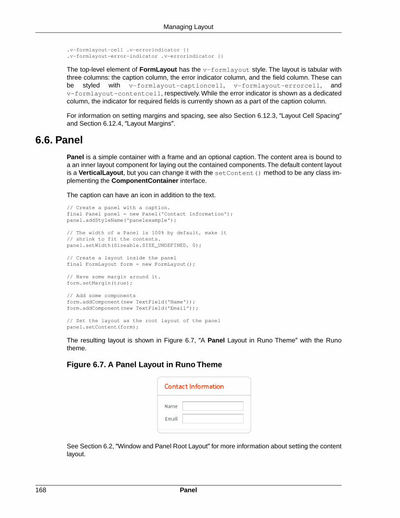
.v-formlayout-cell .v-errorindicator {}
.v-formlayout-error-indicator .v-errorindicator {}
The top-level element of FormLayout has the v-formlayout style. The layout is tabular withthree columns: the caption column, the error indicator column, and the field column. These canbe styled with v-formlayout-captioncell, v-formlayout-errorcell, andv-formlayout-contentcell, respectively. While the error indicator is shown as a dedicatedcolumn, the indicator for required fields is currently shown as a part of the caption column.
For information on setting margins and spacing, see also Section 6.12.3, “Layout Cell Spacing”and Section 6.12.4, “Layout Margins”.
6.6. Panel
Panel is a simple container with a frame and an optional caption. The content area is bound toa an inner layout component for laying out the contained components. The default content layoutis a VerticalLayout, but you can change it with the setContent() method to be any class im-plementing the ComponentContainer interface.
The caption can have an icon in addition to the text.
// Create a panel with a caption.final Panel panel = new Panel("Contact Information");panel.addStyleName("panelexample");
// The width of a Panel is 100% by default, make it// shrink to fit the contents.panel.setWidth(Sizeable.SIZE_UNDEFINED, 0);
// Create a layout inside the panelfinal FormLayout form = new FormLayout();
// Have some margin around it.form.setMargin(true);
// Add some componentsform.addComponent(new TextField("Name"));form.addComponent(new TextField("Email"));
// Set the layout as the root layout of the panelpanel.setContent(form);
The resulting layout is shown in Figure 6.7, “A Panel Layout in Runo Theme” with the Runotheme.
Figure 6.7. A Panel Layout in Runo Theme
See Section 6.2, “Window and Panel Root Layout” for more information about setting the contentlayout.
Panel168
Managing Layout

Panel has 100% width and undefined width by default. This corresponds with the default sizingof VerticalLayout, the default root layout of Panel. If you set undefined width for a panel, alsothe root layout must have undefined width to avoid a paradox.
CSS Style Rules.v-panel {}.v-panel-caption {}.v-panel-nocaption {}.v-panel-content {}.v-panel-deco {}
The entire panel has v-panel style. A panel consists of three parts: the caption, content, andbottom decorations (shadow).These can be styled with v-panel-caption, v-panel-content,and v-panel-deco, respectively. If the panel has no caption, the caption element will have thestyle v-panel-nocaption.
The built-in light style has no borders or border decorations for the Panel. You enable it simplyby adding the light style name for the panel, as is done in the example below. You can alsouse the PANEL_LIGHT constant defined in BaseTheme class; it is usable in all subthemes.
// Have a window with a SplitPanel.final Window window = new Window("Window with a Light Panel");window.setWidth("400px");window.setHeight("200px");final HorizontalSplitPanel splitter = new HorizontalSplitPanel();window.setContent(splitter);
// Create a panel with a caption.final Panel light = new Panel("Light Panel");light.setSizeFull();
// The "light" style is a predefined style without borderslight.addStyleName(Runo.PANEL_LIGHT);
light.addComponent(new Label("The light Panel has no borders."));light.getLayout().setMargin(true);
// The Panel will act as a "caption" of the left panel// in the SplitPanel.splitter.addComponent(light);splitter.setSplitPosition(250, Sizeable.UNITS_PIXELS);
main.addWindow(window);
Figure 6.8, “A Panel with Light Style” shows the rendered Panel in the Runo theme.
169CSS Style Rules
Managing Layout

Figure 6.8. A Panel with Light Style
The light style is typical when using a Panel as the root layout of a window or some similar layout,as in the example above.
6.6.1. Scrolling the Panel Content
Normally, if a panel has undefined size in a direction, as it has by default vertically, it will fit thesize of the content and grow as the content grows. However, if it has a fixed or percentual sizeand its content becomes too big to fit in the content area, a scroll bar will appear for the particulardirection. Scroll bars in a Panel are handled natively by the browser with the overflow: autoproperty in CSS.
In the following example, the Embedded component has undefined size in both dimensions bydefault, but we also have to set undefined size for the root layout of the panel as the defaultVerticalLayout only has undefined height by default.
// Serve the image from the themeResource rsrc = new ThemeResource("img/embedded-journalist.jpg");
// Display the image without captionEmbedded image = new Embedded(null, rsrc);image.setSizeUndefined(); // Actually the default
// The panel will give it scrollbars. The root layout// (VerticalLayout) must have undefined width to make the// horizontal scroll bar appear.Panel panel = new Panel("Embedding");panel.setWidth("400px");panel.setHeight("300px");panel.getContent().setSizeUndefined();panel.addComponent(image);
layout.addComponent(panel);
The result is shown in Figure 6.9, “Panel with Scroll Bars”.
Scrolling the Panel Content170
Managing Layout

Figure 6.9. Panel with Scroll Bars
Programmatic Scrolling with Scrollable
Panel implements the Scrollable interface to allow programmatic scrolling. You first need toenable programmatic scrolling with setScrollable(true), after which you can set the scrollposition in pixels with setScrollTop() and setScrollLeft().
Consider the following example:
final Panel panel = new Panel("Scrolling Panel");panel.setHeight("300px");panel.setWidth("400px");panel.getContent().setHeight("1000px");panel.setScrollable(true);
layout.addComponent(panel);
HorizontalLayout scrollButtons = new HorizontalLayout();layout.addComponent(scrollButtons);
Button scrollUp = new Button("Scroll Up");scrollUp.addListener(new Button.ClickListener() { public void buttonClick(ClickEvent event) { int scrollPos = panel.getScrollTop() - 250; if (scrollPos < 0) scrollPos = 0; panel.setScrollTop(scrollPos); }});scrollButtons.addComponent(scrollUp);
Button scrollDown = new Button("Scroll Down");scrollDown.addListener(new Button.ClickListener() { public void buttonClick(ClickEvent event) { int scrollPos = panel.getScrollTop(); if (scrollPos > 1000) scrollPos = 1000; panel.setScrollTop(scrollPos + 250); }});scrollButtons.addComponent(scrollDown);
171Scrolling the Panel Content
Managing Layout

6.7. HorizontalSplitPanel and VerticalSplitPanel
HorizontalSplitPanel and VerticalSplitPanel are a two-component containers that divide theavailable space into two areas to accomodate the two components. HorizontalSplitPanel makesthe split horizontally with a vertical splitter bar, and VerticalSplitPanel vertically with a horizontalsplitter bar. The user can drag the bar to adjust its position.
You can set the two components with the setFirstComponent() andsetSecondComponent() methods, or with the regular addComponent() method.
// Have a panel to put stuff inPanel panel = new Panel("Split Panels Inside This Panel");
// Have a horizontal split panel as its root layoutHorizontalSplitPanel hsplit = new HorizontalSplitPanel();panel.setContent(hsplit);
// Put a component in the left panelTree tree = new Tree("Menu", TreeExample.createTreeContent());hsplit.setFirstComponent(tree);
// Put a vertical split panel in the right panelVerticalSplitPanel vsplit = new VerticalSplitPanel();hsplit.setSecondComponent(vsplit);
// Put other components in the right panelvsplit.addComponent(new Label("Here's the upper panel"));vsplit.addComponent(new Label("Here's the lower panel"));
The result is shown in Figure 6.10, “HorizontalSplitPanel and VerticalSplitPanel”. Observethat the tree is cut horizontally as it can not fit in the layout. If its height exceeds the height of thepanel, a vertical scroll bar will appear automatically. If horizontal scroll bar is necessary, youcould put the content in a Panel, which can have scroll bars in both directions.
Figure 6.10. HorizontalSplitPanel and VerticalSplitPanel
You can set the split position with setSplitPosition(). It accepts any units defined in theSizeable interface, with percentual size relative to the size of the component.
// Have a horizontal split panelHorizontalSplitPanel hsplit = new HorizontalSplitPanel();hsplit.setFirstComponent(new Label("75% wide panel"));hsplit.setSecondComponent(new Label("25% wide panel"));
HorizontalSplitPanel and VerticalSplitPanel172
Managing Layout

// Set the position of the splitter as percentagehsplit.setSplitPosition(75, Sizeable.UNITS_PERCENTAGE);
Another version of the setSplitPosition() method allows leaving out the unit, using thesame unit as previously.The method also has versions take take a boolean parameter, reverse,which allows defining the size of the right or bottom panel instead of the left or top panel.
The split bar allows the user to adjust the split position by dragging the bar with mouse. To lockthe split bar, use setLocked(true). When locked, the move handle in the middle of the bar isdisabled.
// Lock the splitterhsplit.setLocked(true);
Setting the split position programmatically and locking the split bar is illustrated in Figure 6.11,“A Layout With Nested SplitPanels”.
Figure 6.11. A Layout With Nested SplitPanels
Notice that the size of a split panel must not be undefined in the split direction.
CSS Style Rules/* For a horizontal SplitPanel. */.v-splitpanel-horizontal {}.v-splitpanel-hsplitter {}.v-splitpanel-hsplitter-locked {}
/* For a vertical SplitPanel. */.v-splitpanel-vertical {}.v-splitpanel-vsplitter {}.v-splitpanel-vsplitter-locked {}
/* The two container panels. */.v-splitpanel-first-container {} /* Top or left panel. */.v-splitpanel-second-container {} /* Bottom or right panel. */
The entire split panel has the style v-splitpanel-horizontal or v-splitpanel-vertical,depending on the panel direction. The split bar or splitter between the two content panels haseither the ...-splitter or ...-splitter-locked style, depending on whether its positionis locked or not.
173CSS Style Rules
Managing Layout

6.8. TabSheet
The TabSheet is a multicomponent container that allows switching between the componentswith "tabs". The tabs are organized as a tab bar at the top of the tab sheet. Clicking on a tabopens its contained component in the main display area of the layout.
You add new tabs to a tab sheet with the addTab() method. The simple version of the methodtakes as its parameter the root component of the tab.You can use the root component to retrieveits corresponding Tab object. Typically, you put a layout component as the root component.
// Create an empty tab sheet.TabSheet tabsheet = new TabSheet();
// Create a component to put in a tab and put// some content in it.VerticalLayout myTabRoot = new VerticalLayout();myTabRoot.addComponent(new Label("Hello, I am a Tab!"));
// Add the component to the tab sheet as a new tab.tabsheet.addTab(myTabRoot);
// Get the Tab holding the component and set its caption.tabsheet.getTab(myTabRoot).setCaption("My Tab");
Each tab in a tab sheet is represented as a Tab object, which manages the tab caption, icon,and attributes such as hidden and visible.You can set the caption with setCaption() and theicon with setIcon(). If the component added with addTab() has a caption or icon, it is usedas the default for the Tab object. However, changing the attributes of the root component laterdoes not affect the tab, but you must make the setting through the Tab object. The addTab()returns the new Tab object, so you can easily set an attribute using the reference.
// Set an attribute using the returned referencetabsheet.addTab(myTab).setCaption("My Tab");
You can also give the caption and the icon as parameters for the addTab() method.The followingexample demonstrates the creation of a simple tab sheet, where each tab shows a different Labelcomponent. The tabs have an icon, which are (in this example) loaded as Java class loader re-sources from the application.
TabSheet tabsheet = new TabSheet();
// Make the tabsheet shrink to fit the contents.tabsheet.setSizeUndefined();
tabsheet.addTab(new Label("Contents of the first tab"), "First Tab", new ClassResource("images/Mercury_small.png", this));tabsheet.addTab(new Label("Contents of the second tab"), "Second Tab", new ClassResource("images/Venus_small.png", this));tabsheet.addTab(new Label("Contents of the third tab"), "Third tab", new ClassResource("images/Earth_small.png", this));
Figure 6.12. A Simple TabSheet Layout
TabSheet174
Managing Layout

The hideTabs() method allows hiding the tab bar entirely.This can be useful in tabbed documentinterfaces (TDI) when there is only one tab. An individual tab can be made invisible by settingsetVisible(false) for the Tab object. A tab can be disabled by setting setEnabled(false).
Clicking on a tab selects it. This fires a TabSheet.SelectedTabChangeEvent, which you canhandle by implementing the TabSheet.SelectedTabChangeListener interface. The sourcecomponent of the event, which you can retrieve with getSource() method of the event, will bethe TabSheet component. You can find the currently selected tab with getSelectedTab()and select (open) a particular tab programmatically with setSelectedTab(). Notice that alsoadding the first tab fires the SelectedTabChangeEvent, which may cause problems in yourhandler if you assume that everything is initialized before the first change event.
The example below demonstrates handling TabSheet related events and enabling and disablingtabs. The sort of logic used in the example is useful in sequential user interfaces, often calledwizards, where the user goes through the tabs one by one, but can return back if needed.
import com.vaadin.ui.*;import com.vaadin.ui.Button.ClickEvent;import com.vaadin.ui.TabSheet.SelectedTabChangeEvent;
public class TabSheetExample extends CustomComponent implements Button.ClickListener, TabSheet.SelectedTabChangeListener { TabSheet tabsheet = new TabSheet(); Button tab1 = new Button("Push this button"); Label tab2 = new Label("Contents of Second Tab"); Label tab3 = new Label("Contents of Third Tab");
TabSheetExample() { setCompositionRoot(tabsheet);
// Listen for changes in tab selection. tabsheet.addListener(this);
// First tab contains a button, for which we // listen button click events. tab1.addListener(this);
// This will cause a selectedTabChange() call. tabsheet.addTab(tab1, "First Tab", null);
// A tab that is initially invisible. tabsheet.addTab(tab2, "Second Tab", null); tabsheet.getTab(tab2).setVisible(false);
// A tab that is initially disabled. tabsheet.addTab(tab3, "Third tab", null); tabsheet.getTab(tab3).setEnabled(false); }
public void buttonClick(ClickEvent event) { // Enable the invisible and disabled tabs. tabsheet.getTab(tab2).setVisible(true); tabsheet.getTab(tab3).setEnabled(true);
// Change selection automatically to second tab. tabsheet.setSelectedTab(tab2); }
public void selectedTabChange(SelectedTabChangeEvent event) { // Cast to a TabSheet. This isn't really necessary in // this example, as we have only one TabSheet component, // but would be useful if there were multiple TabSheets. final TabSheet source = (TabSheet) event.getSource();
175TabSheet
Managing Layout

if (source == tabsheet) { // If the first tab was selected. if (source.getSelectedTab() == tab1) { // The 2. and 3. tabs may not have been set yet. if (tabsheet.getTab(tab2) != null && tabsheet.getTab(tab3) != null) { tabsheet.getTab(tab2).setVisible(false); tabsheet.getTab(tab3).setEnabled(false); } } } }}
Figure 6.13. A TabSheet with Hidden and Disabled Tabs
CSS Style Rules.v-tabsheet {}.v-tabsheet-tabs {}.v-tabsheet-content {}.v-tabsheet-deco {}.v-tabsheet-tabcontainer {}.v-tabsheet-tabsheetpanel {}.v-tabsheet-hidetabs {}
.v-tabsheet-scroller {}
.v-tabsheet-scrollerPrev {}
.v-tabsheet-scrollerNext {}
.v-tabsheet-scrollerPrev-disabled{}
.v-tabsheet-scrollerNext-disabled{}
.v-tabsheet-tabitem {}
.v-tabsheet-tabitem-selected {}
.v-tabsheet-tabitemcell {}
.v-tabsheet-tabitemcell-first {}
.v-tabsheet-tabs td {}
.v-tabsheet-spacertd {}
The entire tabsheet has the v-tabsheet style. A tabsheet consists of three main parts: the tabson the top, the main content pane, and decorations around the tabsheet.
The tabs area at the top can be styled with v-tabsheet-tabs, v-tabsheet-tabcontainerand v-tabsheet-tabitem*.
The style v-tabsheet-spacertd is used for any empty space after the tabs. If the tabsheethas too little space to show all tabs, scroller buttons enable browsing the full tab list. These usethe styles v-tabsheet-scroller*.
The content area where the tab contents are shown can be styled with v-tabsheet-content,and the surrounding decoration with v-tabsheet-deco.
CSS Style Rules176
Managing Layout

6.9. Accordion
Accordion is a multicomponent container similar to TabSheet, except that the "tabs" are arrangedvertically. Clicking on a tab opens its contained component in the space between the tab and thenext one. You can use an Accordion identically to a TabSheet, which it actually inherits. SeeSection 6.8, “TabSheet” for more information.
The following example shows how you can create a simple accordion. As the Accordion is rathernaked alone, we put it inside a Panel that acts as its caption and provides it a border.
// Create the Accordion.Accordion accordion = new Accordion();
// Have it take all space available in the layout.accordion.setSizeFull();
// Some components to put in the Accordion.Label l1 = new Label("There are no previously saved actions.");Label l2 = new Label("There are no saved notes.");Label l3 = new Label("There are currently no issues.");
// Add the components as tabs in the Accordion.accordion.addTab(l1, "Saved actions", null);accordion.addTab(l2, "Notes", null);accordion.addTab(l3, "Issues", null);
// A container for the Accordion.Panel panel = new Panel("Tasks");panel.setWidth("300px");panel.setHeight("300px");panel.addComponent(accordion);
// Trim its layout to allow the Accordion take all space.panel.getLayout().setSizeFull();panel.getLayout().setMargin(false);
Figure 6.14, “An Accordion” shows what the example would look like with the default theme.
Figure 6.14. An Accordion
177Accordion
Managing Layout

CSS Style Rules.v-accordion {}.v-accordion-item {}.v-accordion-item-open {}.v-accordion-item-first {}.v-accordion-item-caption {}.v-accordion-item-caption .v-caption {}.v-accordion-item-content {}
The top-level element of Accordion has the v-accordion style. An Accordion consists of asequence of item elements, each of which has a caption element (the tab) and a content areaelement.
The selected item (tab) has also the v-accordion-open style. The content area is not shownfor the closed items.
6.10. AbsoluteLayout
AbsoluteLayout allows placing components in arbitrary positions in the layout area.The positionsare specified in the addComponent() method with horizontal and vertical coordinates relativeto an edge of the layout area. The positions can include a third depth dimension, the z-index,which specifies which components are displayed in front and which behind other components.
The positions are specified by a CSS absolute position string, using the left, right, top,bottom, and z-index properties known from CSS. In the following example, we have a 300 by150 pixels large layout and position a text field 50 pixels from both the left and the top edge:
// A 400x250 pixels size layoutAbsoluteLayout layout = new AbsoluteLayout();layout.setWidth("400px");layout.setHeight("250px");
// A component with coordinates for its top-left cornerTextField text = new TextField("Somewhere someplace");layout.addComponent(text, "left: 50px; top: 50px;");
The left and top specify the distance from the left and top edge, respectively. The right andbottom specify the distances from the right and top edge.
// At the top-left cornerButton button = new Button( "left: 0px; top: 0px;");layout.addComponent(button, "left: 0px; top: 0px;");
// At the bottom-right cornerButton buttCorner = new Button( "right: 0px; bottom: 0px;");layout.addComponent(buttCorner, "right: 0px; bottom: 0px;");
// Relative to the bottom-right cornerButton buttBrRelative = new Button( "right: 50px; bottom: 50px;");layout.addComponent(buttBrRelative, "right: 50px; bottom: 50px;");
// On the bottom, relative to the left sideButton buttBottom = new Button( "left: 50px; bottom: 0px;");layout.addComponent(buttBottom, "left: 50px; bottom: 0px;");
// On the right side, up from the bottomButton buttRight = new Button( "right: 0px; bottom: 100px;");layout.addComponent(buttRight, "right: 0px; bottom: 100px;");
CSS Style Rules178
Managing Layout

The result of the above code examples is shown in Figure 6.15, “Components Positioned Relativeto Various Edges”.
Figure 6.15. Components Positioned Relative to Various Edges
In the above examples, we had components of undefined size and specified the positions ofcomponents by a single pair of coordinates. The other possibility is to specify an area and let thecomponent fill the area by specifying a proportinal size for the component, such as "100%". Nor-mally, you use setSizeFull() to take the entire area given by the layout.
// Specify an area that a component should fillPanel panel = new Panel("A Panel filling an area");panel.setSizeFull(); // Fill the entire given arealayout.addComponent(panel, "left: 25px; right: 50px; "+ "top: 100px; bottom: 50px;");
The result is shown in Figure 6.16, “Component Filling an Area Specified by Coordinates”
Figure 6.16. Component Filling an Area Specified by Coordinates
You can also use proportional coordinates to specify the coordinates:
// A panel that takes 30% to 90% horizontally and// 20% to 80% verticallyPanel panel = new Panel("A Panel");panel.setSizeFull(); // Fill the specified arealayout.addComponent(panel, "left: 30%; right: 10%;" + "top: 20%; bottom: 20%;");
179AbsoluteLayout
Managing Layout

The result is shown in Figure 6.17, “Specifying an Area by Proportional Coordinates”
Figure 6.17. Specifying an Area by Proportional Coordinates
Drag and drop is very useful for moving the components contained in an AbsoluteLayout. Checkout the example in Section 12.12.6, “Dropping on a Component”.
Styling with CSS.v-absolutelayout {}.v-absolutelayout-wrapper {}
The AbsoluteLayout component has v-absolutelayout root style. Each component in thelayout is contained within an element that has the v-absolutelayout-wrapper.The componentcaptions are outside the wrapper elements, in a separate element with the usual v-captionstyle.
6.11. CssLayout
CssLayout allows strong control over styling of the components contained inside the layout.Thecomponents are contained in a simple DOM structure consisting of <div> elements. By default,the contained components are laid out horizontally and wrap naturally when they reach the widthof the layout, but you can control this and most other behaviour with CSS. You can also injectcustom CSS for each contained component. As CssLayout has a very simple DOM structureand no dynamic rendering logic, relying purely on the built-in rendering logic of the browsers, itis the fastest of the layout components.
The basic use of CssLayout is just like with any other layout component:
CssLayout layout = new CssLayout();
// Component with a layout-managed caption and iconTextField tf = new TextField("A TextField");tf.setIcon(new ThemeResource("icons/user.png"));layout.addComponent(tf);
// Labels are 100% wide by default so must unset widthLabel label = new Label("A Label");label.setWidth(Sizeable.SIZE_UNDEFINED, 0);layout.addComponent(label);
Styling with CSS180
Managing Layout

layout.addComponent(new Button("A Button"));
The result is shown in Figure 6.18, “Basic Use of CssLayout”. Notice that the default spacingand alignment of the layout is quite crude and CSS styling is nearly always needed.
Figure 6.18. Basic Use of CssLayout
The display attribute of CssLayout is inline-block by default, so the components are laidout horizontally following another. CssLayout has 100% width by default. If the componentsreach the width of the layout, they are wrapped to the next "line" just as text would be. If you adda component with 100% width, it will take an entire line by wrapping before and after the compon-ent.
Overriding the getCss() method allows injecting custom CSS for each component. The CSSreturned by the method is inserted in the style attribute of the <div> element of the component,so it will override any style definitions made in CSS files.
CssLayout layout = new CssLayout() { @Override protected String getCss(Component c) { if (c instanceof Label) { // Color the boxes with random colors int rgb = (int) (Math.random()*(1<<24)); return "background: #" + Integer.toHexString(rgb); } return null; }};layout.setWidth("400px"); // Causes to wrap the contents
// Add boxes of various sizesfor (int i=0; i<40; i++) { Label box = new Label(" ", Label.CONTENT_XHTML); box.addStyleName("flowbox"); box.setWidth((float) Math.random()*50, Sizeable.UNITS_PIXELS); box.setHeight((float) Math.random()*50, Sizeable.UNITS_PIXELS); layout.addComponent(box);}
The style name added to the components allows making common styling in a CSS file:
.v-label-flowbox { border: thin black solid;}
Figure 6.19, “Use of getCss() and line wrap” shows the rendered result.
181CssLayout
Managing Layout

Figure 6.19. Use of getCss() and line wrap
The stregth of the CssLayout is also its weakness. Much of the logic behind the other layoutcomponents is there to give nice default behaviour and to handle the differences in differentbrowsers. Some browsers, no need to say which, are notoriously incompatible with the CSSstandards, so they require a lot of custom CSS.You may need to make use of the browser-spe-cific style classes in the root element of the application. Some features in the other layouts arenot even solvable in pure CSS, at least in all browsers.
Styling with CSS.v-csslayout {}.v-csslayout-margin {}.v-csslayout-container {}
The CssLayout component has v-csslayout root style. The margin element withv-csslayout-margin style is always enabled. The components are contained in an elementwith v-csslayout-container style.
For example, we could style the basic CssLayout example shown earlier as follows:
/* Have the caption right of the text box, bottom-aligned */.csslayoutexample .mylayout .v-csslayout-container { direction: rtl; line-height: 24px; vertical-align: bottom;}
/* Have some space before and after the caption */.csslayoutexample .mylayout .v-csslayout-container .v-caption { padding-left: 3px; padding-right: 10px;}
The example would now be rendered as shown in Figure 6.20, “Styling CssLayout”.
Figure 6.20. Styling CssLayout
Captions and icons that are managed by the layout are contained in an element with v-captionstyle. These caption elements are contained flat at the same level as the actual component ele-ments.This may cause problems with wrapping in inline-block mode, as wrapping can occurbetween the caption and its corresponding component element just as well as between compon-ents. Such use case is therefore not feasible.
Styling with CSS182
Managing Layout

6.12. Layout Formatting
While the formatting of layouts is mainly done with style sheets, just as with other components,style sheets are not ideal or even possible to use in some situations. For example, CSS doesnot allow defining the spacing of table cells, which is done with the cellspacing attribute inHTML.
Moreover, as many layout sizes are calculated dynamically in the Client-Side Engine of Vaadin,some CSS settings can fail altogether.
6.12.1. Layout Size
The size of a layout component can be specified with the setWidth() and setHeight()methods defined in the Sizeable interface, just like for any component. It can also be undefined,in which case the layout shrinks to fit the component(s) inside it. Section 5.3.9, “Sizing Compon-ents” gives details on the interface.
Figure 6.21. HorizontalLayout with Undefined vs Defined size
Many layout components take 100% width by default, while they have the height undefined.
The sizes of components inside a layout can also be defined as a percentage of the spaceavailable in the layout, for example with setWidth("100%"); or with the (most commonly usedmethod) setFullSize() that sets 100% size in both directions. If you use a percentage in aHorizontalLayout, VerticalLayout, or GridLayout, you will also have to set the component asexpanding, as noted below.
Warning
A layout that contains components with percentual size must have a defined size!
If a layout has undefined size and a contained component has, say, 100% size, thecomponent will try to fill the space given by the layout, while the layout will shrink tofit the space taken by the component, which is a paradox. This requirement holdsfor height and width separately.The debug mode allows detecting such invalid cases;see Section 12.4.1, “Debug Mode”.
For example:
// This takes 100% width but has undefined height.VerticalLayout layout = new VerticalLayout();
// A button that takes all the space available in the layout.Button button = new Button("100%x100% button");button.setSizeFull();layout.addComponent(button);
// We must set the layout to a defined height vertically, in// this case 100% of its parent layout, which also must// not have undefined size.layout.setHeight("100%");
183Layout Formatting
Managing Layout

The default layout of Window and Panel is VerticalLayout with undefined height. If you insertenough components in such a layout, it will grow outside the bottom of the view area and scrollbarswill appear in the browser. If you want your application to use all the browser view, nothing moreor less, you should use setFullSize() for the root layout.
// Create the main window.Window main = new Window("Main Window");setMainWindow(main);
// Use full size.main.getLayout().setSizeFull();
Expanding Components
If you set a HorizontalLayout to a defined size horizontally or a VerticalLayout vertically, andthere is space left over from the contained components, the extra space is distributed equallybetween the component cells. The components are aligned within these cells, according to theiralignment setting, top left by default, as in the example below.
Often, you don't want such empty space, but want one or more components to take all the leftoverspace. You need to set such a component to 100% size and use setExpandRatio(). If thereis just one such expanding component in the layout, the ratio parameter is irrelevant.
If you set multiple components as expanding, the expand ratio dictates how large proportion ofthe available space (overall or excess depending on whether the components are sized as apercentage or not) each component takes. In the example below, the buttons have 1:2:3 ratiofor the expansion.
GridLayout has corresponding method for both of its directions, setRowExpandRatio() andsetColumnExpandRatio().
Expansion is dealt in detail in the documentation of the layout components that support it. SeeSection 6.3, “VerticalLayout and HorizontalLayout” and Section 6.4, “GridLayout” for detailson components with relative sizes.
6.12.2. Layout Cell Alignment
You can set the alignment of the component inside a specific layout cell with thesetComponentAlignment() method. The method takes as its parameters the componentcontained in the cell to be formatted, and the horizontal and vertical alignment.
Figure 6.22, “Cell Alignments” illustrates the alignment of components within a GridLayout.
Layout Cell Alignment184
Managing Layout

Figure 6.22. Cell Alignments
The easiest way to set alignments is to use the constants defined in the Alignment class. Letus look how the buttons in the top row of the above GridLayout are aligned with constants:
// Create a grid layoutfinal GridLayout grid = new GridLayout(3, 3);
grid.setWidth(400, Sizeable.UNITS_PIXELS);grid.setHeight(200, Sizeable.UNITS_PIXELS);
Button topleft = new Button("Top Left");grid.addComponent(topleft, 0, 0);grid.setComponentAlignment(topleft, Alignment.TOP_LEFT);
Button topcenter = new Button("Top Center");grid.addComponent(topcenter, 1, 0);grid.setComponentAlignment(topcenter, Alignment.TOP_CENTER);
Button topright = new Button("Top Right");grid.addComponent(topright, 2, 0);grid.setComponentAlignment(topright, Alignment.TOP_RIGHT);...
The following table lists all the Alignment constants by their respective locations:
Table 6.1. Alignment Constants
TOP_RIGHTTOP_CENTERTOP_LEFT
MIDDLE_RIGHTMIDDLE_CENTERMIDDLE_LEFT
BOTTOM_RIGHTBOTTOM_CENTERBOTTOM_LEFT
Another way to specify the alignments is to create an Alignment object and specify the horizontaland vertical alignment with separate constants.You can specify either of the directions, in whichcase the other alignment direction is not modified, or both with a bitmask operation between thetwo directions.
Button middleleft = new Button("Middle Left");grid.addComponent(middleleft, 0, 1);grid.setComponentAlignment(middleleft, new Alignment(Bits.ALIGNMENT_VERTICAL_CENTER | Bits.ALIGNMENT_LEFT));
Button middlecenter = new Button("Middle Center");grid.addComponent(middlecenter, 1, 1);grid.setComponentAlignment(middlecenter, new Alignment(Bits.ALIGNMENT_VERTICAL_CENTER | Bits.ALIGNMENT_HORIZONTAL_CENTER));
Button middleright = new Button("Middle Right");grid.addComponent(middleright, 2, 1);
185Layout Cell Alignment
Managing Layout
grid.setComponentAlignment(middleright, new Alignment(Bits.ALIGNMENT_VERTICAL_CENTER | Bits.ALIGNMENT_RIGHT));
Obviously, you may combine only one vertical bitmask with one horizontal bitmask, though youmay leave either one out. The following table lists the available alignment bitmask constants:
Table 6.2. Alignment Bitmasks
Bits.ALIGNMENT_LEFTHorizontal
Bits.ALIGNMENT_HORIZONTAL_CENTER
Bits.ALIGNMENT_RIGHT
Bits.ALIGNMENT_TOPVertical
Bits.ALIGNMENT_VERTICAL_CENTER
Bits.ALIGNMENT_BOTTOM
You can determine the current alignment of a component with getComponentAlignment(),which returns an Alignment object.The class provides a number of getter methods for decodingthe alignment, which you can also get as a bitmask value.
Size of Aligned Components
You can only align a component that is smaller than its containing cell in the direction of alignment.If a component has 100% width, as many components have by default, horizontal alignment doesnot have any effect. For example, Label is 100% wide by default and can not therefore be hori-zontally aligned as such. The problem can be hard to notice, as the text inside a Label is left-aligned.
You usually need to set either a fixed size, undefined size, or less than a 100% relative size forthe component to be aligned - a size that is smaller than the containing layout has.
For example, assuming that a Label has short content that is less wide than the containing Ver-ticalLayout, you could center it as follows:
VerticalLayout layout = new VerticalLayout(); // 100% default widthLabel label = new Label("Hello"); // 100% default widthlabel.setSizeUndefined();layout.addComponent(label);layout.setComponentAlignment(label, Alignment.MIDDLE_CENTER);
If you set the size as undefined and the component itself contains components, make sure thatthe contained components also have either undefined or fixed size. For example, if you set thesize of a Form as undefined, its containing layout FormLayout has 100% default width, whichyou also need to set as undefined. But then, any components inside the FormLayout must haveeither undefined or fixed size.
6.12.3. Layout Cell Spacing
The VerticalLayout, HorizontalLayout, and GridLayout layouts offer a setSpacing() methodfor enabling space between the cells in the layout. Enabling the spacing adds a spacing style forall cells except the first so that, by setting the left or top padding, you can specify the amount ofspacing.
To enable spacing, simply call setSpacing(true) for the layout as follows:
Layout Cell Spacing186
Managing Layout

HorizontalLayout layout2 = new HorizontalLayout();layout2.addStyleName("spacingexample");layout2.setSpacing(true);layout2.addComponent(new Button("Component 1"));layout2.addComponent(new Button("Component 2"));layout2.addComponent(new Button("Component 3"));
VerticalLayout layout4 = new VerticalLayout();layout4.addStyleName("spacingexample");layout4.setSpacing(true);layout4.addComponent(new Button("Component 1"));layout4.addComponent(new Button("Component 2"));layout4.addComponent(new Button("Component 3"));
In practise, the setSpacing() method toggles between the"v-COMPONENTCLASSNAME-spacing-on" and "-off" CSS class names in the cell elements.Elements having those class names can be used to define the spacing metrics in a theme.
The layouts have a spacing style name to define spacing also when spacing is off. This allowsyou to define a small default spacing between components by default and a larger one when thespacing is actually enabled.
Spacing can be horizontal (for HorizontalLayout), vertical (for VerticalLayout), or both (forGridLayout).The name of the spacing style for horizontal and vertical spacing is the base nameof the component style name plus the "-spacing-on" suffix, as shown in the following table:
Table 6.3. Spacing Style Names
v-verticallayout-spacing-onVerticalLayout
v-horizontallayout-spacing-onHorizontalLayout
v-gridlayout-spacing-onGridLayout
In the CSS example below, we specify the exact amount of spacing for the code example givenabove, for the layouts with the custom "spacingexample" style:
/* Set the amount of horizontal cell spacing in a * specific element with the "-spacingexample" style. */.v-horizontallayout-spacingexample .v-horizontallayout-spacing-on { padding-left: 30px;}
/* Set the amount of vertical cell spacing in a * specific element with the "-spacingexample" style. */.v-verticallayout-spacingexample .v-verticallayout-spacing-on { padding-top: 30px;}
/* Set the amount of both vertical and horizontal cell spacing * in a specific element with the "-spacingexample" style. */.v-gridlayout-spacingexample .v-gridlayout-spacing-on { padding-top: 30px; padding-left: 50px;}
The resulting layouts will look as shown in Figure 6.23, “Layout Spacings”, which also shows thelayouts with no spacing.
187Layout Cell Spacing
Managing Layout

Figure 6.23. Layout Spacings
Note
Spacing is unrelated to "cell spacing" in HTML tables.While many layout componentsare implemented with HTML tables in the browser, this implementation is not guar-anteed to stay the same and at least Vertical-/HorizontalLayout could be implemen-ted with <div> elements as well. In fact, as GWT compiles widgets separately fordifferent browsers, the implementation could even vary between browsers.
Also note that HTML elements with spacing classnames don't necessarily exist in acomponent after rendering, because the Client-Side Engine of Vaadin processesthem.
6.12.4. Layout Margins
By default, layout components do not have any margin around them. You can add margin withCSS directly to the layout component. Below we set margins for a specific layout component(here a horizontallayout):
layout1.addStyleName("marginexample1");
.v-horizontallayout-marginexample1 .v-horizontallayout-margin { padding-left: 200px; padding-right: 100px; padding-top: 50px; padding-bottom: 25px;}
Similar settings exist for other layouts such as verticallayout.
The layout size calculations require the margins to be defined as CSS padding rather than asCSS margin.
As an alternative to the pure CSS method, you can set up a margin around the layout that canbe enabled with setMargin(true). The margin element has some default margin widths, butyou can adjust the widths in CSS if you need to.
Let us consider the following example, where we enable the margin on all sides of the layout:
// Create a layoutHorizontalLayout layout2 = new HorizontalLayout();containinglayout.addComponent( new Label("Layout with margin on all sides:"));containinglayout.addComponent(layout2);
// Set style name for the layout to allow styling itlayout2.addStyleName("marginexample");
Layout Margins188
Managing Layout

// Have margin on all sides around the layoutlayout2.setMargin(true);
// Put something inside the layoutlayout2.addComponent(new Label("Cell 1"));layout2.addComponent(new Label("Cell 2"));layout2.addComponent(new Label("Cell 3"));
You can enable the margins only for specific sides. The margins are specified for thesetMargin() method in clockwise order for top, right, bottom, and left margin. The followingwould enable the top and left margins:
layout2.setMargin(true, false, false, true);
You can specify the actual margin widths in the CSS if you are not satisfied with the default widths(in this example for a HorizontalLayout):
.v-horizontallayout-marginexample .v-horizontallayout-margin-left {padding-left: 200px;}.v-horizontallayout-marginexample .v-horizontallayout-margin-right {padding-right: 100px;}.v-horizontallayout-marginexample .v-horizontallayout-margin-top {padding-top: 50px; }.v-horizontallayout-marginexample .v-horizontallayout-margin-bottom {padding-bottom: 25px; }
The resulting margins are shown in Figure 6.24, “Layout Margins” below. The two ways produceidentical margins.
Figure 6.24. Layout Margins
CSS Style Rules
The CSS style names for the margin widths for setMargin() consist of the specific layout nameplus -margin-left and so on. The CSS style names for CSS-only margins consist of thespecific layout name plus -margin. Below, the style rules are given for VerticalLayout:
/* Alternative 1: CSS only style */.v-verticallayout-margin { padding-left: ___px; padding-right: ___px; padding-top: ___px; padding-bottom: ___px;}
189Layout Margins
Managing Layout

/* Alternative 2: CSS rules to be enabled in code */.v-verticallayout-margin-left {padding-left: ___px;}.v-verticallayout-margin-right {padding-right: ___px;}.v-verticallayout-margin-top {padding-top: ___px;}.v-verticallayout-margin-bottom {padding-bottom: ___px;}
6.13. Custom Layouts
While it is possible to create almost any typical layout with the standard layout components, it issometimes best to separate the layout completely from code.With the CustomLayout component,you can write your layout as a template in XHTML that provides locations of any containedcomponents. The layout template is included in a theme. This separation allows the layout to bedesigned separately from code, for example using WYSIWYG web designer tools such as AdobeDreamweaver.
A template is a HTML file located under layouts folder under a theme folder under theWebContent/VAADIN/themes/ f o l d e r , f o r e x a m p l e ,WebContent/VAADIN/themes/themename/layouts/mylayout.html. (Notice that theroot path WebContent/VAADIN/themes/ for themes is fixed.) A template can also be provideddynamically from an InputStream, as explained below. A template includes <div> elementswith a location attribute that defines the location identifier. All custom layout HTML-files mustbe saved using UTF-8 character encoding.
<table width="100%" height="100%"> <tr height="100%"> <td> <table align="center"> <tr> <td align="right">User name:</td> <td><div location="username"></div></td> </tr> <tr> <td align="right">Password:</td> <td><div location="password"></div></td> </tr> </table> </td> </tr> <tr> <td align="right" colspan="2">
<div location="okbutton"></div> </td> </tr></table>
The client-side engine of Vaadin will replace contents of the location elements with the compon-ents. The components are bound to the location elements by the location identifier given toaddComponent(), as shown in the example below.
// Have a Panel where to put the custom layout.Panel panel = new Panel("Login");panel.setSizeUndefined();main.addComponent(panel);
// Create custom layout from "layoutname.html" template.CustomLayout custom = new CustomLayout("layoutname");custom.addStyleName("customlayoutexample");
// Use it as the layout of the Panel.panel.setContent(custom);
// Create a few components and bind them to the location tags
Custom Layouts190
Managing Layout

// in the custom layout.TextField username = new TextField();custom.addComponent(username, "username");
TextField password = new TextField();custom.addComponent(password, "password");
Button ok = new Button("Login");custom.addComponent(ok, "okbutton");
The resulting layout is shown below in Figure 6.25, “Example of a Custom Layout Component”.
Figure 6.25. Example of a Custom Layout Component
You can use addComponent() also to replace an existing component in the location given inthe second parameter.
In addition to a static template file, you can provide a template dynamically with the CustomLayoutconstructor that accepts an InputStream as the template source. For example:
new CustomLayout(new ByteArrayInputStream("<b>Template</b>".getBytes()));
or
new CustomLayout(new FileInputStream(file));
191Custom Layouts
Managing Layout

192

Chapter 7
Visual UserInterface Design
with Eclipse
7.1. Overview ................................................................................................ 1937.2. Creating a New Composite .................................................................... 1947.3. Using The Visual Designer .................................................................... 1967.4. Structure of a Visually Editable Component .......................................... 202
This chapter provides instructions for developing the graphical user interface of Vaadin componentswith the Vaadin Plugin for the Eclipse IDE.
7.1. Overview
The visual designer feature in the Vaadin Plugin for Eclipse allows you to design the user interfaceof an entire application or of specific composite components. The plugin generates the actualJava code, which is designed to be reusable, so you can design the basic layout of the user in-terface with the visual designer and build the user interaction logic on top of the generated code.You can use inheritance and composition to modify the components further.
The designer works with classes that extend the CustomComponent class, which is the basictechnique in Vaadin for creating composite components. Component composition is described
193Book of Vaadin

in Section 5.23, “Component Composition with CustomComponent”. Any CustomComponentwill not do for the visual designer; you need to create a new one as instructed below.
For instructions on installing the Eclipse plugin, see Section 2.2.1, “Vaadin Plugin for Eclipse”.
Using a Composite Component
You can use a composite component as you would use any Vaadin component. Just rememberthat the component as well as its root layout, which is an AbsoluteLayout, are 100% wide andhigh by default. A component with full size (expand-to-fit container) may not be inside a layoutwith undefined size (shrink-to-fit content).The default root layout for Window is a VerticalLayout,which by default has undefined height, so you have to set it explicitly to a defined size, usuallyto full (100%) height.
public class MyApplication extends Application { public void init() { Window mainWindow = new Window("My Application"); setMainWindow(mainWindow);
// Needed because composites are full size mainWindow.getContent().setSizeFull();
MyComposite myComposite = new MyComposite(); mainWindow.addComponent(myComposite); }}
You could also set the size of the root layout of the composite to a fixed height (in componentproperties in the visual editor). An AbsoluteLayout may not have undefined size.
7.2. Creating a New Composite
If the Vaadin Plugin is installed in Eclipse, you can create a new composite component as follows.
1. Select File New Other... in the main menu or right-click the Project Explorer andselect New Other... to open the New window.
2. In the first, Select a wizard step, select Vaadin Vaadin Composite and click Next.
Using a Composite Component194
Visual User Interface Design with Eclipse

3. The Source folder is the root source directory where the new component will be created.This is by default the default source directory of your project.
Enter the Java Package under which the new component class should be created orselect it by clicking the Browse button. Also enter the class Name of the new component.
195Creating a New Composite
Visual User Interface Design with Eclipse

Finally, click Finish to create the component.
A newly created composite component is opened in the Design window, as shown in Figure 7.1,“New Composite Component”.
Figure 7.1. New Composite Component
You can observe that a component that you can edit with the visual designer has two tabs at thebottom of the view: Source and Design. These tabs allow switching between the source viewand the visual design view.
If you later open the source file for editing, the Source and Design tabs should appear belowthe source editor. If they do not, right-click the file in the Project Explorer and select Open With.
7.3. Using The Visual Designer
The visual editor view consists of, on the left side, an editing area that displays the current layoutand, on the right side, a control panel that contains a component list for selecting new componentsto add, the current component tree, and a component property panel.
Using The Visual Designer196
Visual User Interface Design with Eclipse
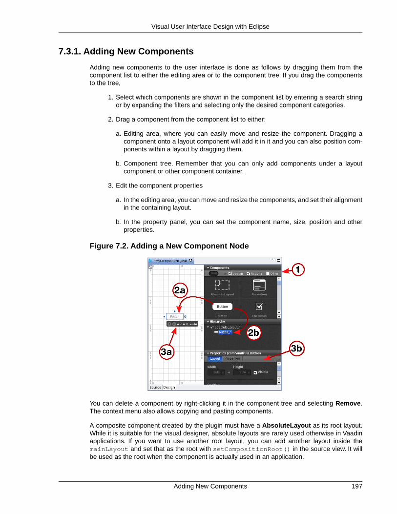
7.3.1. Adding New Components
Adding new components to the user interface is done as follows by dragging them from thecomponent list to either the editing area or to the component tree. If you drag the componentsto the tree,
1. Select which components are shown in the component list by entering a search stringor by expanding the filters and selecting only the desired component categories.
2. Drag a component from the component list to either:
a. Editing area, where you can easily move and resize the component. Dragging acomponent onto a layout component will add it in it and you can also position com-ponents within a layout by dragging them.
b. Component tree. Remember that you can only add components under a layoutcomponent or other component container.
3. Edit the component properties
a. In the editing area, you can move and resize the components, and set their alignmentin the containing layout.
b. In the property panel, you can set the component name, size, position and otherproperties.
Figure 7.2. Adding a New Component Node
You can delete a component by right-clicking it in the component tree and selecting Remove.The context menu also allows copying and pasting components.
A composite component created by the plugin must have a AbsoluteLayout as its root layout.While it is suitable for the visual designer, absolute layouts are rarely used otherwise in Vaadinapplications. If you want to use another root layout, you can add another layout inside themainLayout and set that as the root with setCompositionRoot() in the source view. It willbe used as the root when the component is actually used in an application.
197Adding New Components
Visual User Interface Design with Eclipse

7.3.2. Setting Component Properties
The property setting sub-panel of the control panel allows setting component properties. Thepanel has two tabs: Layout and Properties, where the latter defines the various basic properties.
Basic Properties
The top section of the property panel, shown in Figure 7.3, “Basic Component Properties”, allowssetting basic component properties. The panel also includes properties such as field propertiesfor field components.
Figure 7.3. Basic Component Properties
The properties are as follows:
Name The name of the component, which is used for the referenceto the component, so it must obey Java notation for variablenames.
Style Name A space-separated list of CSS style class names for thecomponent. See Chapter 8, Themes for information oncomponent styles in themes.
Caption The caption of a component is usually displayed above thecomponent. Some components, such as Button, displaythe caption inside the component. For Label text, youshould set the value of the label instead of the caption,which should be left empty.
Setting Component Properties198
Visual User Interface Design with Eclipse

Description (tooltip) The description is usually displayed as a tooltip when themouse pointer hovers over the component for a while. Somecomponents, such as Form have their own way of display-ing the description.
Icon The icon of a component is usually displayed above thecomponent, left of the caption. Some components, such asButton, display the icon inside the component.
Formatting type Some components allow different formatting types, suchas Label, which allow formatting either as Text, XHTML,Preformatted, and Raw.
Value The component value. The value type and how it is dis-played by the component varies between different compon-ent types and each value type has its own editor.The editoropens by clicking on the ... button.
Most of the basic component properties are defined in the Component interface; see Section 5.2.1,“Component Interface” for further details.
Layout Properties
The size of a component is determined by its width and height, which you can give in the twoedit boxes in the control panel. You can use any unit specifiers for components, as described inSection 5.3.9, “Sizing Components”. Emptying a size box will make the size "automatic", whichmeans setting the size as undefined. In the generated code, the undefined value will be expressedas "-1px".
Setting width of "100px" and auto (undefined or empty) height would result in the following gen-erated settings for a button:
// myButtonmyButton = new Button();...myButton.setHeight("-1px");myButton.setWidth("100px");...
Figure 7.4, “Layout Properties” shows the control panel area for the size and position.
199Setting Component Properties
Visual User Interface Design with Eclipse

Figure 7.4. Layout Properties
The generated code for the example would be:
// myButtonmyButton = new Button();myButton.setWidth("-1px");myButton.setHeight("-1px");myButton.setImmediate(true);myButton.setCaption("My Button");mainLayout.addComponent(myButton, "top:243.0px;left:152.0px;");
The position is given as a CSS position in the second parameter for addComponent(). Thevalues "-1px" for width and height will make the button to be sized automatically to the minimumsize required by the caption.
When editing the position of a component inside an AbsoluteLayout, the editor will display ver-tical and horizontal guides, which you can use to set the position of the component. See Sec-tion 7.3.3, “Editing an AbsoluteLayout” for more information about editing absolute layouts.
The ZIndex setting controls the "Z coordinate" of the components, that is, which component willoverlay which when they overlap. Value -1 means automatic, in which case the componentsadded to the layout later will be on top.
7.3.3. Editing an AbsoluteLayout
The visual editor has interactive support for the AbsoluteLayout component that allows positioningcomponents exactly at specified coordinates.You can position the components using guides thatcontrol the position attributes, shown in the control panel on the right. The position values aremeasured in pixels from the corresponding edge; the vertical and horizontal rulers show the dis-tances from the top and left edge.
Figure 7.5, “Positioning with AbsoluteLayout” shows three components, a Label, a Table, anda Button, inside an AbsoluteLayout.
Editing an AbsoluteLayout200
Visual User Interface Design with Eclipse

Figure 7.5. Positioning with AbsoluteLayout
Position attributes that are empty are automatic and can be either zero (at the edge) or dynamicto make it shrink to fit the size of the component, depending on the component. Guides are shownalso for the automatic position attributes and move automatically; in Figure 7.5, “Positioning withAbsoluteLayout” the right and bottom edges of the Button are automatic.
Moving an automatic guide manually makes the guide and the corresponding the position attributenon-automatic. To make a manually set attribute automatic, empty it in the control panel. Fig-ure 7.6, “Manually positioned Label” shows a Label component with all the four edges setmanually. Notice that if an automatic position is 0, the guide is at the edge of the ruler.
Figure 7.6. Manually positioned Label
201Editing an AbsoluteLayout
Visual User Interface Design with Eclipse

7.4. Structure of a Visually Editable Component
A component created by the wizard and later managed by the visual editor has a very specificstructure that allows you to insert your user interface logic in the component while keeping aminimal amount of code off-limits.You need to know what you can edit yourself and what exactlyis managed by the editor. The managed member variables and methods are marked with theAutoGenerated annotation, as you can see later.
A visually editable component consists of:
• Member variables containing sub-component references
• Sub-component builder methods
• The constructor
The structure of a composite component is hierarchical, a nested hierarchy of layout componentscontaining other layout components as well as regular components. The root layout of the com-ponent tree, or the composition root of the CustomComponent, is named mainLayout. SeeSection 5.23, “Component Composition with CustomComponent” for a detailed description ofthe structure of custom (composite) components.
7.4.1. Sub-Component References
The CustomComponent class will include a reference to each contained component as amember variable. The most important of these is the mainLayout reference to the compositionroot layout. Such automatically generated member variables are marked with the@AutoGenerated annotation. They are managed by the editor, so you should not edit themmanually, unless you know what you are doing.
A composite component with an AbsoluteLayout as the composition root, containing a Buttonand a Table would have the references as follows:
public class MyComponent extends CustomComponent {
@AutoGenerated private AbsoluteLayout mainLayout; @AutoGenerated private Button myButton; @AutoGenerated private Table myTable; ...
The names of the member variables are defined in the component properties panel of the visualeditor, in the Component name field, as described in the section called “Basic Properties”.Whileyou can change the name of any other components, the name of the root layout is alwaysmainLayout. It is fixed because the editor does not make changes to the constructor, as notedin Section 7.4.3, “The Constructor”.You can, however, change the type of the root layout, whichis an AbsoluteLayout by default.
Certain typically static components, such as the Label label component, will not have a referenceas a member variable. See the description of the builder methods below for details.
Structure of a Visually Editable Component202
Visual User Interface Design with Eclipse

7.4.2. Sub-Component Builders
Every managed layout component will have a builder method that creates the layout and all itscontained components. The builder puts references to the created components in their corres-ponding member variables, and it also returns a reference to the created layout component.
Below is an example of an initial main layout:
@AutoGeneratedprivate AbsoluteLayout buildMainLayout() { // common part: create layout mainLayout = new AbsoluteLayout();
// top-level component properties setHeight("100.0%"); setWidth("100.0%");
return mainLayout;}
Notice that while the builder methods return a reference to the created component, they alsowrite the reference directly to the member variable. The returned reference might not be usedby the generated code at all (in the constructor or in the builder methods), but you can use it foryour purposes.
The builder of the main layout is called in the constructor, as explained in Section 7.4.3, “TheConstructor”.When you have a layout with nested layout components, the builders of each layoutwill call the appropriate builder methods of their contained layouts to create their contents.
7.4.3.The Constructor
When you create a new composite component using the wizard, it will create a constructor forthe component and fill its basic content.
public MyComponent() { buildMainLayout(); setCompositionRoot(mainLayout);
// TODO add user code here }
The most important thing to do in the constructor is to set the composition root of the Custom-Component with the setCompositionRoot() (see Section 5.23, “Component Compositionwith CustomComponent” for more details on the composition root). The generated constructorfirst builds the root layout of the composite component with buildMainLayout() and then usesthe mainLayout reference.
The editor will not change the constructor afterwards, so you can safely change it as you want.The editor does not allow changing the member variable holding a reference to the root layout,so it is always named mainLayout.
203Sub-Component Builders
Visual User Interface Design with Eclipse

204

Chapter 8
Themes
8.1. Overview ................................................................................................ 2058.2. Introduction to Cascading Style Sheets ................................................. 2078.3. Creating and Using Themes .................................................................. 2128.4. Creating a Theme in Eclipse .................................................................. 216
This chapter provides details about using and creating themes that control the visual look of webapplications. Themes consist of Cascading Style Sheets (CSS) and other theme resources suchas images. We provide an introduction to CSS, especially concerning the styling of HTML byelement classes.
8.1. Overview
Vaadin separates the appearance of the user interface from its logic using themes. Themes caninclude CSS style sheets, custom HTML layouts, and any necessary graphics.Theme resourcescan also be accessed from an application as ThemeResource objects.
Custom themes are placed under the WebContent/VAADIN/themes/ folder of the web applic-ation. This location is fixed -- the VAADIN folder specifies that these are static resources specificto Vaadin. The folder should normally contain also the built-in themes, although you can let thembe loaded dynamically from the Vaadin JAR (even though that is somewhat inefficient). Figure 8.1,“Contents of a Theme” illustrates the contents of a theme.
205Book of Vaadin

Figure 8.1. Contents of a Theme
The name of a theme folder defines the name of the theme.The name is used in the setTheme()call. A theme must contain the styles.css stylesheet, but other contents have free naming.We suggest a convention for naming the folders as img for images, layouts for custom layouts,and css for additional stylesheets.
Custom themes that use an existing complete theme need to inherit the theme. See Section 8.3.2,“Built-in Themes” and Section 8.3.4, “Theme Inheritance” for details on inheriting a theme.Copying and modifying a complete theme is also possible, but it may need more work to maintainif the modifications are small.
You use a theme with a simple setTheme() method call for the Application object as follows:
public class MyApplication extends com.vaadin.Application { public void init() { setTheme("demo"); ... }}
An application can use different themes for different users and switch between themes duringexecution. For smaller changes, a theme can contain alternate styles for user interface compon-ents, which can be changed as needed.
In addition to style sheets, a theme can contain HTML templates for custom layouts used withCustomLayout. See Section 6.13, “Custom Layouts” for details.
Resources provided in a theme can also be accessed using the ThemeResource class, as de-scribed in Section 4.5.4, “Theme Resources”.This allows using theme resources, such as images,for example in Embedded objects and other objects that allow inclusion of images using resources.
Overview206
Themes

8.2. Introduction to Cascading Style Sheets
Cascading Style Sheets or CSS is a technique to separate the appearance of a web page fromthe content represented in HTML or XHTML. Let us give a short introduction to Cascading StyleSheets and look how they are relevant to software development with Vaadin.
8.2.1. Basic CSS Rules
A style sheet is a file that contains a set of rules. Each rule consists of one or more selectors,separated with commas, and a declaration block enclosed in curly braces. A declaration blockcontains a list of property statements. Each property has a label and a value, separated with acolon. A property statement ends with a semicolon.
Let us look at an example:
p, td { color: blue;}
td { background: yellow; font-weight: bold;}
In the example above, p and td are element type selectors that match with <p> and <td> ele-ments in HTML, respectively.The first rule matches with both elements, while the second matchesonly with <td> elements. Let us assume that you have saved the above style sheet with thename mystylesheet.css and consider the following HTML file located in the same folder.
<html> <head> <link rel="stylesheet" type="text/css" href="mystylesheet.css"/> </head> <body>
<p>This is a paragraph</p><p>This is another paragraph</p>
<table> <tr>
<td>This is a table cell</td><td>This is another table cell</td>
</tr> </table> </body></html>
The <link> element defines the style sheet to use. The HTML elements that match the aboverules are emphasized. When the page is displayed in the browser, it will look as shown in thefigure below.
Figure 8.2. Simple Styling by Element Type
207Introduction to Cascading Style Sheets
Themes

CSS has an inheritance mechanism where contained elements inherit the properties of theirparent elements. For example, let us change the above example and define it instead as follows:
table { color: blue; background: yellow;}
All elements contained in the <table> element would have the same properties. For example,the text in the contained <td> elements would be in blue color.
Each HTML element type accepts a certain set of properties. The <div> elements are genericelements that can be used to create almost any layout and formatting that can be created witha specific HTML element type. Vaadin uses <div> elements extensively, especially for layouts.
Matching elements by their type is, however, rarely if ever used in style sheets for Vaadin com-ponents or Google Web Toolkit widgets.
8.2.2. Matching by Element Class
Matching HTML elements by the class attribute of the elements is the most relevant form ofmatching with Vaadin. It is also possible to match with the identifier of a HTML element.
The class of an HTML element is defined with the class attribute as follows:
<html> <body>
<p class="normal">This is the first paragraph</p>
<p class="another">This is the second paragraph</p>
<table> <tr>
<td class="normal">This is a table cell</td><td class="another">This is another table cell</td>
</tr> </table> </body></html>
The class attributes of HTML elements can be matched in CSS rules with a selector notationwhere the class name is written after a period following the element name. This gives us fullcontrol of matching elements by their type and class.
p.normal {color: red;}p.another {color: blue;}td.normal {background: pink;}td.another {background: yellow;}
The page would look as shown below:
Figure 8.3. Matching HTML Element Type and Class
Matching by Element Class208
Themes

We can also match solely by the class by using the universal selector * for the element name,for example *.normal. The universal selector can also be left out altogether so that we use justthe class name following the period, for example .normal.
.normal { color: red;}
.another { blackground: yellow;}
In this case, the rule will match with all elements of the same class regardless of the elementtype. The result is shown in Figure 8.4, “Matching Only HTML Element Class”. This example il-lustrates a technique to make style sheets compatible regardless of the exact HTML elementused in drawing a component.
Figure 8.4. Matching Only HTML Element Class
To assure compatibility, we recommend that you use only matching based on the element classesand do not match for specific HTML element types in CSS rules, because either Vaadin or GWTmay use different HTML elements to render some components in the future. For example, IT MillToolkit Release 4 used <div> elements extensively for layout components. However, IT MillToolkit Release 5 and Vaadin use GWT to render the components, and GWT uses the <table>element to implement most layouts. Similarly, IT Mill Toolkit Release 4 used <div> element alsofor buttons, but in Release 5, GWT uses the <button> element. Vaadin has little control overhow GWT renders its components, so we can not guarantee compatibility in different versionsof GWT. However, both <div> and <table> as well as <tr> and <td> elements accept mostof the same properties, so matching only the class hierarchy of the elements should be compatiblein most cases.
8.2.3. Matching by Descendant Relationship
CSS allows matching HTML by their containment relationship. For example, consider the followingHTML fragment:
<body> <p class="mytext">Here is some text inside a paragraph element</p> <table class="mytable"> <tr> <td class="mytext">Here is text inside a table and inside a td element.</td> </tr> </table></body>
Matching by the class name .mytext alone would match both the <p> and <td> elements. Ifwe want to match only the table cell, we could use the following selector:
.mytable .mytext {color: blue;}
209Matching by Descendant Relationship
Themes

To match, a class listed in a rule does not have to be an immediate descendant of the previousclass, but just a descendant. For example, the selector ".v-panel .v-button" would matchall elements with class .v-button somewhere inside an element with class .v-panel.
Let us give an example with a real case. Consider the following Vaadin component.
public class LoginBox extends CustomComponent { Panel panel = new Panel("Log In");
public LoginBox () { setCompositionRoot(panel);
panel.addComponent(new TextField("Username:")); panel.addComponent(new TextField("Password:")); panel.addComponent(new Button("Login")); }}
The component will look by default as shown in the following figure.
Figure 8.5.Themeing Login Box Example with 'runo' theme.
Now, let us look at the HTML structure of the component. The following listing assumes that theapplication contains only the above component in the main window of the application.
<body> <div id="v-app"> <div> <div class="v-orderedlayout"> <div> <div class="v-panel"> <div class="v-panel-caption">Log In</div> <div class="v-panel-content"> <div class="v-orderedlayout"> <div> <div> <div class="v-caption"> <span>Username:</span> </div> </div> <input type="text" class="v-textfield"/> </div> <div> <div> <div class="v-caption"> <span>Password:</span> </div> </div> <input type="password" class="v-textfield"/> </div> <div>
Matching by Descendant Relationship210
Themes

<button type="button" class="v-button">Login</button> </div> </div> </div> <div class="v-panel-deco"/> </div> </div> </div> </div> </div></body>
Now, consider the following theme where we set the backgrounds of various elements.
.v-panel .v-panel-caption { background: #80ff80; /* pale green */}
.v-panel .v-panel-content { background: yellow;}
.v-panel .v-textfield { background: #e0e0ff; /* pale blue */}
.v-panel .v-button { background: pink;}
The coloring has changed as shown in the following figure.
Figure 8.6.Themeing Login Box Example with Custom Theme
An element can have multiple classes separated with a space. With multiple classes, a CSS rulematches an element if any of the classes match.This feature is used in many Vaadin componentsto allow matching based on the state of the component. For example, when the mouse is overa Link component, over class is added to the component. Most of such styling is a feature ofGoogle Web Toolkit.
8.2.4. Notes on Compatibility
CSS was first proposed in 1994. The specification of CSS is maintained by the CSS WorkingGroup of World Wide Web Consortium (W3C). Its versions are specified as levels that build uponthe earlier version. CSS Level 1 was published in 1996, Level 2 in 1998. Development of CSSLevel 3 was started in 1998 and is still under way.
211Notes on Compatibility
Themes

While the support for CSS has been universal in all graphical web browsers since at least 1995,the support has been very incomplete at times and there still exists an unfortunate number ofincompatibilities between browsers.While we have tried to take these incompatibilities into accountin the built-in themes in Vaadin, you need to consider them while developing custom themes.
Compatibility issues are detailed in various CSS handbooks.
8.3. Creating and Using Themes
Custom themes are placed in VAADIN/themes folder of the web application (in the WebContentdirectory) as illustrated in Figure 8.1, “Contents of a Theme”. This location is fixed. You need tohave a theme folder for each theme you use in your application, although applications rarelyneed more than a single theme. For example, if you want to define a theme with the namemytheme, you will place it in folder VAADIN/themes/mytheme.
A custom theme must also inherit a built-in theme, as shown in the example below:
@import "../reindeer/styles.css";
.v-app { background: yellow;}
Vaadin 6.0 includes two built-in themes: reindeer and runo.The latter is a compatibility themefor IT Mill Toolkit 5; there is no longer a "default" theme. See Section 8.3.2, “Built-in Themes”and Section 8.3.4, “Theme Inheritance” below for details on inheriting themes.
8.3.1. Styling Standard Components
Each user interface component in Vaadin has a CSS style class that you can use to control theappearance of the component. Some components have additional sub-elements that also allowstyling.
Table 8.1, “Default CSS Style Names of Vaadin Components” lists the style classes of all Vaadincomponents, together with their client-side widgets. Notice that a single server-side componentcan have multiple client-side implementations. For example, a Button can be rendered on theclient side either as a regular button or a check box, depending on the switchMode attribute ofthe button. For details regarding the mapping to client-side components, see Section 11.5, “De-fining a Widget Set”. Each client-side component type has its own style class and a number ofadditional classes that depend on the client-side state of the component. For example, a textfield will have v-textfield-focus class when mouse pointer hovers over the component.This state is purely on the client-side and is not passed to the server.
Table 8.1. Default CSS Style Names of Vaadin Components
CSS Class NameClient-Side WidgetServer-Side Component
v-absolutelayoutVAbsoluteLayoutAbsoluteLayout
v-accordionVAccordionAccordion
v-buttonVButtonButton
v-checkboxVCheckBoxCheckBox
v-csslayoutVCssLayoutCssLayout
v-customcomponentVCustomComponentCustomComponent
Creating and Using Themes212
Themes

CSS Class NameClient-Side WidgetServer-Side Component
v-customlayoutVCustomLayoutCustomLayout
v-datefieldVDateFieldDateField
v-datefield-entrycalendarVCalendar
v-datefield-calendarVDateFieldCalendar
v-datefield-calendarVPopupCalendar
VTextualDate
-VEmbeddedEmbedded
v-formVFormForm
-VFormLayoutFormLayout
-VGridLayoutGridLayout
v-labelVLabelLabel
v-linkVLinkLink
v-select-optiongroupVOptionGroupOptionGroup
v-horizontallayoutVHorizontalLayoutHorizontalLayout
v-verticallayoutVVerticalLayoutVerticalLayout
v-panelVPanelPanel
Select
v-listselectVListSelect
v-filterselectVFilterSelect
v-sliderVSliderSlider
-VSplitPanelSplitPanel
-VSplitPanelHorizontal
-VSplitPanelVertical
v-tableVScrollTableTable
v-tableVTablePaging
v-tabsheetVTabSheetTabSheet
v-textfieldVTextFieldTextField
VTextArea
VPasswordField
v-treeVTreeTree
v-select-twincolVTwinColSelectTwinColSelect
-VUploadUpload
v-windowVWindowWindow
-CalendarEntry-
v-datefield-calendarpanelCalendarPanel-
v-contextmenuContextMenu-
vaadin-unknownVUnknownComponent-
-VView-
213Styling Standard Components
Themes

CSS Class NameClient-Side WidgetServer-Side Component
gwt-MenuBarMenubar-
gwt-MenuItemMenuItem-
v-datefield-timeTime-
Please see the documentation of the particular components for a listing of possible sub-componentstyles.
Some client-side components can be shared by different server-side components. There is alsothe VUnknownComponent, which is a component that indicates an internal error in a situationwhere the server asked to render a component which is not available on the client-side.
8.3.2. Built-in Themes
Vaadin currently includes two built-in themes: reindeer and runo. The latter is the defaulttheme for IT Mill Toolkit 5 (where its name is "default"); the default theme in Vaadin 6.0 isreindeer.
The built-in themes are provided in the respective VAADIN/themes/reindeer/styles.cssand VAADIN/themes/runo/styles.css stylesheets in the Vaadin library JAR. Thesestylesheets are compilations of the separate stylesheets for each component in the correspondingsubdirectory. The stylesheets are compiled to a single file for efficiency: the browser needs toload just a single file.
Various constants related to the built-in themes are defined in the theme classes in com.vaad-in.ui.themes package. These are mostly special style names for specific components.
setTheme("runo");
Panel panel = new Panel("Regular Panel in the Runo Theme");panel.addComponent(new Button("Regular Runo Button"));
// A button with the "small" styleButton smallButton = new Button("Small Runo Button");smallButton.addStyleName(Runo.BUTTON_SMALL);
Panel lightPanel = new Panel("Light Panel");lightPanel.addStyleName(Runo.PANEL_LIGHT);lightPanel.addComponent(new Label("With addStyleName(\"light\")"));
The example with the Runo theme is shown in Figure 8.7, “Runo Theme”.
Figure 8.7. Runo Theme
Built-in Themes214
Themes

Serving Built-In Themes Statically
The built-in themes included in the Vaadin library JAR are served dynamically fromthe JAR by the servlet. Serving themes and widget sets statically by the web serveris more efficient.You only need to extract the VAADIN/ directory from the JAR underyour WebContent directory. Just make sure to update it if you upgrade to a newerversion of Vaadin.
Creation of a default theme for custom GWT widgets is described in Section 11.3.3, “Styling GWTWidgets”.
8.3.3. Using Themes
Using a theme is simple, you only need to set the theme with setTheme() in the applicationobject. The Eclipse wizard for creating custom Vaadin themes automatically adds such call inthe init() method of the application class, as explained in Section 8.4, “Creating a Theme inEclipse”.
Defining the appearance of a user interface component is fairly simple. First, you create a com-ponent and add a custom style name for it with addStyleName(). Then you write the CSSelement that defines the formatting for the component.
8.3.4.Theme Inheritance
When you define your own theme, you will need to inherit a built-in theme (unless you just copythe built-in theme).
Inheritance in CSS is done with the @import statement. In the typical case, when you defineyour own theme, you inherit a built-in theme as follows:
@import "../reindeer/styles.css";
.v-app { background: yellow;}
You can even create a deep hierarchy of themes by inheritance. Such a solution is often usefulif you have some overall theme for your application and a slightly modified theme for differentuser classes.You can even make it possible for each user to have his or her own theme.
For example, let us assume that we have the base theme of an application with the name myappand a specific myapp-student theme for users with the student role. The stylesheet of the basetheme would be located in themes/myapp/styles.css. We can then "inherit" it inthemes/myapp-student/styles.css with a simple @import statement:
@import "../myapp/styles.css";
.v-app { background: green;}
This would make the page look just as with the base theme, except for the green background.You could use the theme inheritance as follows:
public class MyApplication extends com.vaadin.Application {
public void init() { setTheme("myapp");
215Using Themes
Themes

... }
public void login(User user) { if (user.role == User.ROLE_STUDENT) setTheme("myapp-student"); ... }
public void logout() { setTheme("myapp"); ... }}
In the above example, the User class is an imaginary class assumed to hold user information.
8.4. Creating a Theme in Eclipse
The Eclipse plugin provides a wizard for creating custom themes. Do the following steps to createa new theme.
1. Select File New Other... in the main menu or right-click the Project Explorer andselect New Other.... A window will open.
2. In the Select a wizard step, select the Vaadin Vaadin Theme wizard.
Click Next to proceed to the next step.
3. In the Create a new Vaadin theme step, you have the following settings:
Project (mandatory) The project in which the theme should be created.
Theme name (mandatory) The theme name is used as the name of the themefolder and in a CSS tag (prefixed with "v-theme-"),so it must be a proper identifier. Only latin alphanu-merics, underscore, and minus sign are allowed.
Modify application classes touse theme (optional)
The setting allows the wizard to write a code state-ment that enables the theme in the constructor ofthe selected application class(es). If you need tocontrol the theme with dynamic logic, you can leavethe setting unchecked or change the generated linelater.
Creating a Theme in Eclipse216
Themes

Click Finish to create the theme.
The wizard creates the theme folder under the WebContent/VAADIN/themes folder and theactual style sheet as styles.css, as illustrated in Figure 8.8, “Newly Created Theme”.
Figure 8.8. Newly Created Theme
The created theme inherits a built-in base theme with an @import statement. See the explanationof theme inheritance in Section 8.3, “Creating and Using Themes”. Notice that the reindeertheme is not located in the widgetsets folder, but in the Vaadin JAR. See Section 8.3.2, “Built-in Themes” for information for serving the built-in themes.
If you selected an application class or classes in the Modify application classes to use themein the theme wizard, the wizard will add the following line at the end of the init() method ofthe application class(es):
setTheme("myprojecttheme");
Notice that renaming a theme by changing the name of the folder will not change the setTheme()calls in the application classes or vise versa. You need to change such references to themenames in the calls manually.
217Creating a Theme in Eclipse
Themes

218

Chapter 9
BindingComponents to
Data
9.1. Overview ................................................................................................ 2199.2. Properties .............................................................................................. 2219.3. Holding properties in Items .................................................................... 2249.4. Collecting Items in Containers ............................................................... 227
This chapter describes the Vaadin Data Model and shows how you can use it to bind componentsdirectly to data sources, such as database queries.
9.1. Overview
The Vaadin Data Model is one of the core concepts of the library.To allow the view (user interfacecomponents) to access the data model of an application directly, we have introduced a standarddata interface.
The model allows binding user interface components directly to the data that they display andpossibly allow to edit. There are three nested levels of hierarchy in the data model: property,item, and container. Using a spreadsheet application as an analogy, these would correspond toa cell, a row, and a table, respectively.
219Book of Vaadin

Figure 9.1. Vaadin Data Model
The Data Model is realized as a set of interfaces in the com.vaadin.data package. The packagecontains the Property, Item, and Container interfaces, along with a number of more specializedinterfaces and classes.
Notice that the Data Model does not define data representation, but only interfaces. This leavesthe representation fully to the implementation of the containers.The representation can be almostanything, such as a plain old Java object (POJO) structure, a filesystem, or a database query.
The Data Model is used heavily in the core user interface components of Vaadin, especially thefield components, that is, components that implement the Field interface or more typically extendAbstractField, which defines many common features. A key feature of all the built-in field com-ponents is that they can either maintain their data by themselves or be bound to an external datasource. The value of a field is always available through the Property interface. As more thanone component can be bound to the same data source, it is easy to implement various viewer-editor patterns.
The relationships of the various interfaces are shown in Figure 9.2, “Interface Relationships inVaadin Data Model”; the value change event and listener interfaces are shown only for theProperty interface, while the notifier interfaces are omitted altogether.
Overview220
Binding Components to Data

Figure 9.2. Interface Relationships in Vaadin Data Model
The Data Model has many important and useful features, such as support for change notification.Especially containers have many helper interfaces, including ones that allow indexing, ordering,sorting, and filtering the data. Also Field components provide a number of features involving thedata model, such as buffering, validation, and lazy loading.
Vaadin provides a number of built-in implementations of the data model interfaces. The built-inimplementations are used as the default data models in many field components.
In addition to the built-in implementations, many data model implementations, such as containers,are available as add-ons, either from the Vaadin Directory or from independent sources. Bothcommercial and free implementations exist. The JPAContainer, described in Chapter 18, VaadinJPAContainer, is the most often used conmmercial container add-on. The installation of add-onsis described in Chapter 15, Using Vaadin Add-ons. Notice that unlike with most regular add-oncomponents, you do not need to compile a widget set for add-ons that include just data modelimplementations.
9.2. Properties
The Property interface is the base of the Vaadin Data Model. It provides a standardized API fora single data object that can be read (get) and written (set). A property is always typed, but canoptionally support data type conversions.The type of a property can be any Java class. Optionally,properties can provide value change events for following their changes.
The value of a property is written with setValue() and read with getValue(). The returnvalue is a generic Object reference, so you need to cast it to the proper type. The type can beacquired with getType().
final TextField tf = new TextField("Name");
// Set the value
221Properties
Binding Components to Data

tf.setValue("The text field value");
// When the field value is edited by the usertf.addListener(new Property.ValueChangeListener() { public void valueChange(ValueChangeEvent event) { // Get the value and cast it to proper type String value = (String) tf.getValue();
// Do something with it layout.addComponent(new Label(value)); }});
Changes in the property value usually emit a ValueChangeEvent, which can be handled with aValueChangeListener.The event object provides reference to the property with getProperty().
Properties are in themselves unnamed.They are collected in items, which associate the propertieswith names: the Property Identifiers or PIDs. Items can be further contained in containers andare identified with Item Identifiers or IIDs. In the spreadsheet analogy, Property Identifiers wouldcorrespond to column names and Item Identifiers to row names. The identifiers can be arbitraryobjects, but must implement the equals(Object) and hashCode() methods so that they canbe used in any standard Java Collection.
The Property interface can be utilized either by implementing the interface or by using some ofthe built-in property implementations. Vaadin includes a Property interface implementation forarbitrary function pairs and bean properties, with the MethodProperty class, and for simple objectproperties, with the ObjectProperty class, as described later.
In addition to the simple components, many selection components such as Select, Table, andTree provide their current selection through the Property property. In single selection mode, theproperty is a single item identifier, while in multiple selection mode it is a set of item identifiers.Please see the documentation of the selection components for further details.
Components that can be bound to a property have an internal default data source object, typicallya ObjectProperty, which is described later. As all such components are viewers or editors, alsodescribed later, so you can rebind a component to any data source withsetPropertyDataSource().
9.2.1. Property Viewers and Editors
The most important function of the Property as well as of the other data model interfaces is toconnect classes implementing the interface directly to editor and viewer classes. This meansconnecting a data source (model) to a user interface component (views) to allow editing orviewing the data model.
A property can be bound to a component implementing the Viewer interface withsetPropertyDataSource().
// Have a data modelObjectProperty property = new ObjectProperty("Hello", String.class);
// Have a component that implements ViewerLabel viewer = new Label();
// Bind it to the dataviewer.setPropertyDataSource(property);
Property Viewers and Editors222
Binding Components to Data

You can use the same method in the Editor interface to bind a component that allows editing aparticular property type to a property.
// Have a data modelObjectProperty property = new ObjectProperty("Hello", String.class);
// Have a component that implements ViewerTextField editor = new TextField("Edit Greeting");
// Bind it to the dataeditor.setPropertyDataSource(property);
As all field components implement the Property interface, you can bind any component imple-menting the Viewer interface to any field, assuming that the viewer is able the view the objecttype of the field. Continuing from the above example, we can bind a Label to the TextField value:
Label viewer = new Label();viewer.setPropertyDataSource(editor);
// The value shown in the viewer is updated immediately// after editing the value in the editor (once it// loses the focus)editor.setImmediate(true);
9.2.2. ObjectProperty Implementation
The ObjectProperty class is a simple implementation of the Property interface that allowsstoring an arbitrary Java object.
// Have a component that implements Viewer interfacefinal TextField tf = new TextField("Name");
// Have a data model with some dataString myObject = "Hello";
// Wrap it in an ObjectPropertyObjectProperty property = new ObjectProperty(myObject, String.class);
// Bind the property to the componenttf.setPropertyDataSource(property);
9.2.3. Implementing the Property Interface
Implementation of the Property interface requires defining setters and getters for the value andthe read-only mode. Only a getter is needed for the property type, as the type is often fixed inproperty implementations.
The following example shows a simple implementation of the Property interface:
class MyProperty implements Property { Integer data = 0; boolean readOnly = false;
// Return the data type of the model public Class<?> getType() { return Integer.class; }
public Object getValue() { return data; }
223ObjectProperty Implementation
Binding Components to Data

// Override the default implementation in Object @Override public String toString() { return Integer.toHexString(data); }
public boolean isReadOnly() { return readOnly; }
public void setReadOnly(boolean newStatus) { readOnly = newStatus; }
public void setValue(Object newValue) throws ReadOnlyException, ConversionException { if (readOnly) throw new ReadOnlyException();
// Already the same type as the internal representation if (newValue instanceof Integer) data = (Integer) newValue;
// Conversion from a string is required else if (newValue instanceof String) try { data = Integer.parseInt((String) newValue, 16); } catch (NumberFormatException e) { throw new ConversionException(); } else // Don't know how to convert any other types throw new ConversionException();
// Reverse decode the hexadecimal value }}
// Instantiate the property and set its dataMyProperty property = new MyProperty();property.setValue(42);
// Bind it to a componentfinal TextField tf = new TextField("Name", property);
The components get the displayed value by the toString() method, so it is necessary tooverride it. To allow editing the value, value returned in the toString() must be in a formatthat is accepted by the setValue() method, unless the property is read-only.The toString()can perform any type conversion necessary to make the internal type a string, and thesetValue() must be able to make a reverse conversion.
The implementation example does not notify about changes in the property value or in the read-only mode. You should normally also implement at least the Property.ValueChangeNotifierand Property.ReadOnlyStatusChangeNotifier. See the ObjectProperty class for an exampleof the implementation.
9.3. Holding properties in Items
The Item interface provides access to a set of named properties. Each property is identified bya property identifier (PID) and a reference to such a property can be queried from an Item withgetItemProperty() using the identifier.
Holding properties in Items224
Binding Components to Data

Examples on the use of items include rows in a Table, with the properties corresponding to tablecolumns, nodes in a Tree, and the the data bound to a Form, with item's properties bound to in-dividual form fields.
Items are generally equivalent to objects in the object-oriented model, but with the exception thatthey are configurable and provide an event handling mechanism.The simplest way to utilize Iteminterface is to use existing implementations. Provided utility classes include a configurableproperty set (PropertysetItem) and a bean-to-item adapter (BeanItem). Also, a Form implementsthe interface and can therefore be used directly as an item.
In addition to being used indirectly by many user interface components, items provide the basicdata model underlying the Form component. In simple cases, forms can even be generatedautomatically from items. The properties of the item correspond to the fields of the form.
The Item interface defines inner interfaces for maintaining the item property set and listeningchanges made to it. PropertySetChangeEvent events can be emitted by a class implementingthe PropertySetChangeNotifier interface. They can be received through the Proper-tySetChangeListener interface.
9.3.1.The PropertysetItem Implementation
The PropertysetItem is a generic implementation of the Item interface that allows storing prop-erties. The properties are added with addItemProperty(), which takes a name and theproperty as parameters.
The following example demonstrates a typical case of collecting ObjectProperty properties inan item:
PropertysetItem item = new PropertysetItem();item.addItemProperty("name", new ObjectProperty("Zaphod"));item.addItemProperty("age", new ObjectProperty(42));
// Bind it to a componentForm form = new Form();form.setItemDataSource(item);
9.3.2. Wrapping a Bean in a BeanItem
The BeanItem implementation of the Item interface is a wrapper for Java Bean objects. In fact,only the setters and getters are required while serialization and other bean features are not, soyou can wrap almost any POJOs with minimal requirements.
// Here is a bean (or more exactly a POJO)class Person { String name; int age;
public String getName() { return name; }
public void setName(String name) { this.name = name; }
public Integer getAge() { return age; }
public void setAge(Integer age) {
225The PropertysetItem Implementation
Binding Components to Data

this.age = age.intValue(); }}
// Create an instance of the beanPerson bean = new Person();
// Wrap it in a BeanItemBeanItem<Person> item = new BeanItem<Person>(bean);
// Bind it to a componentForm form = new Form();form.setItemDataSource(item);
You can use the getBean() method to get a reference to the underlying bean.
Nested Beans
You may often have composite classes where one class "has a" another class. For example,consider the following Planet class which "has a" discoverer:
// Here is a bean with two nested beanspublic class Planet implements Serializable { String name; Person discoverer;
public Planet(String name, Person discoverer) { this.name = name; this.discoverer = discoverer; }
... getters and setters ...}
...// Create an instance of the beanPlanet planet = new Planet("Uranus", new Person("William Herschel", 1738));
When shown in a Form, for example, you would want to list the properties of the nested beanalong the properties of the composite bean. You can do that by binding the properties of thenested bean individually with a MethodProperty or NestedMethodProperty.You should usuallyhide the nested bean from binding as a property by listing only the bound properties in the con-structor.
// Wrap it in a BeanItem and hide the nested bean propertyBeanItem<Planet> item = new BeanItem<Planet>(planet, new String[]{"name"});
// Bind the nested properties.// Use NestedMethodProperty to bind using dot notation.item.addItemProperty("discoverername", new NestedMethodProperty(planet, "discoverer.name"));
// The other way is to use regular MethodProperty.item.addItemProperty("discovererborn", new MethodProperty<Person>(planet.getDiscoverer(), "born"));
The difference is that NestedMethodProperty does not access the nested bean immediatelybut only when accessing the property values, while when using MethodProperty the nestedbean is accessed when creating the method property. The difference is only significant if thenested bean can be null or be changed later.
Wrapping a Bean in a BeanItem226
Binding Components to Data

You can use such a bean item for example in a Form as follows:
// Bind it to a componentForm form = new Form();form.setItemDataSource(item);
// Nicer captionsform.getField("discoverername").setCaption("Discoverer");form.getField("discovererborn").setCaption("Born");
Figure 9.3. A Form with Nested Bean Properties
The BeanContainer and BeanItemContainer allow easy definition of nested bean propertieswith addNestedContainerProperty(), as described in the section called “Nested Properties”.
9.4. Collecting Items in Containers
Container is the highest-level of the data model interfaces supported by Vaadin. It provides avery flexible way of managing a set of items that share common properties. Contained items areidentified by an item identifier or IID.
Items can be added to a container with the addItem() method. Notice that the actual item isnot passed as a parameter to the method, only the item ID, as the interface assumes that thecontainer implementation knows how to create the item. The parameterless version of themethod uses an automatically generated item ID. Implementations can provide methods to addexternally created items, or they can assume that the item ID is also the item itself.
Properties can be requested from container by first requesting an item with getItem() and thengetting the properties from the item with getItemProperty(). You can also get a propertydirectly by the item and property ids with getContainerProperty().
The Container interface was designed with flexibility and efficiency in mind. It contains inner in-terfaces that containers can optionally implement for ordering the items sequentially, indexingthe items, and accessing them hierarchically. Such ordering models provide the basis for theTable, Tree, and Select components. As with other data model interfaces, the Container supportsevents for notifying about changes made to their contents.
As containers can be unordered, ordered, indexed, or hierarchical, they can interface practicallyany kind of data representation.Vaadin includes data connectors for some common data sources,such as the simple tabular data, with IndexedContainer, and the filesystem, with Filesystem-Container.
In addition to generic container implementations, also many user interface components arecontainers as themselves, in addition to being properties. This is especially true for selectioncomponents, that is, those that implement Select, because they are containers that contain se-lectable items. Their property is the currently selected item. This is useful as it allows bindingcomponents to view and updating each others' data directly, and makes it easy to reuse alreadyconstructed data models, for example, a form could edit a row (item) of a table directly, and the
227Collecting Items in Containers
Binding Components to Data

table could use a database container as its underlying container. The fields of the form wouldcorrespond to the properties of the item, that is, the cells of the table row.
The library contains a set of utilities for converting between different container implementationsby adding external ordering or hierarchy into existing containers. In-memory containers imple-menting indexed and hierarchical models provide easy-to-use tools for setting up in-memory datastorages. Such default container implementations include IndexedContainer, which can bethought of as a generalization of a two-dimensional data table, and BeanItemContainer, whichmaps standard Java objects (beans) to items of an indexed container. In addition, the built-incontainers include a hierarchical container for direct file system browsing.
9.4.1. BeanContainer
The BeanContainer is an in-memory container for JavaBean objects. Each contained bean iswrapped inside a BeanItem wrapper. The item properties are determined automatically by in-specting the getter and setter methods of the class. This requires that the bean class has publicvisibility, local classes for example are not allowed. Only beans of the same type can be addedto the container.
The generic has two parameters: a bean type and an item identifier type.The item identifiers canbe obtained by defining a custom resolver, using a specific item property for the IDs, or by givingitem IDs explicitly. As such, it is more general than the BeanItemContainer, which uses the beanobject itself as the item identifier, making the use usually simpler. Managing the item IDs makesBeanContainer more complex to use, but it is necessary in some cases where the equals()or hashCode() methods have been reimplemented in the bean.
// Here is a JavaBeanpublic class Bean implements Serializable { String name; double energy; // Energy content in kJ/100g
public Bean(String name, double energy) { this.name = name; this.energy = energy; }
public String getName() { return name; }
public void setName(String name) { this.name = name; }
public double getEnergy() { return energy; }
public void setEnergy(double energy) { this.energy = energy; }}
void basic(VerticalLayout layout) { // Create a container for such beans with // strings as item IDs. BeanContainer<String, Bean> beans = new BeanContainer<String, Bean>(Bean.class);
// Use the name property as the item ID of the bean beans.setBeanIdProperty("name");
BeanContainer228
Binding Components to Data

// Add some beans to it beans.addBean(new Bean("Mung bean", 1452.0)); beans.addBean(new Bean("Chickpea", 686.0)); beans.addBean(new Bean("Lentil", 1477.0)); beans.addBean(new Bean("Common bean", 129.0)); beans.addBean(new Bean("Soybean", 1866.0));
// Bind a table to it Table table = new Table("Beans of All Sorts", beans); layout.addComponent(table);}
To use explicit item IDs, use the methods addItem(Object, Object),addItemAfter(Object, Object, Object), and addItemAt(int, Object, Object).
It is not possible to add additional properties to the container, except properties in a nested bean.
Nested Properties
If you have a nested bean with a 1:1 relationship inside a bean type contained in a BeanContaineror BeanItemContainer, you can add its properties to the container by specifying them withaddNestedContainerProperty(). The feature is defined at the level of AbstractBeanCon-tainer.
As with a top-level bean in a bean container, also a nested bean must have public visibility orotherwise an access exception is thrown. Intermediary getters returning a nested bean must alwaysreturn a non-null value.
For example, assume that we have the following two beans with the first one nested inside thesecond one.
/** Bean to be nested */public class EqCoord implements Serializable { double rightAscension; /* In angle hours */ double declination; /* In degrees */
... constructor and setters and getters for the properties ...}
/** Bean containing a nested bean */public class Star implements Serializable { String name; EqCoord equatorial; /* Nested bean */
... constructor and setters and getters for the properties ...}
After creating the container, you can declare the nested properties by specifying their propertyidentifiers with the addNestedContainerProperty() in dot notation.
// Create a container for beansfinal BeanItemContainer<Star> stars = new BeanItemContainer<Star>(Star.class);
// Declare the nested properties to be used in the containerstars.addNestedContainerProperty("equatorial.rightAscension");stars.addNestedContainerProperty("equatorial.declination");
// Add some itemsstars.addBean(new Star("Sirius", new EqCoord(6.75, 16.71611)));stars.addBean(new Star("Polaris", new EqCoord(2.52, 89.26417)));
229BeanContainer
Binding Components to Data

If you bind such a container to a Table, you probably also need to set the column headers. Noticethat the entire nested bean itself is still a property in the container and would be displayed in itsown column. The toString() method is used for obtaining the displayed value, which is bydefault an object reference. You normally do not want this, so you can hide the column withsetVisibleColumns().
// Put them in a tableTable table = new Table("Stars", stars);table.setColumnHeader("equatorial.rightAscension", "RA");table.setColumnHeader("equatorial.declination", "Decl");table.setPageLength(table.size());
// Have to set explicitly to hide the "equatorial" propertytable.setVisibleColumns(new Object[]{"name", "equatorial.rightAscension", "equatorial.declination"});
The resulting table is shown in Figure 9.4, “Table Bound to a BeanContainer with NestedProperties”.
Figure 9.4. Table Bound to a BeanContainer with Nested Properties
The bean binding in AbstractBeanContainer normally uses the MethodProperty implementationof the Property interface to access the bean properties using the setter and getter methods. Fornested properties, the NestedMethodProperty implementation is used.
Defining a Bean ID Resolver
If a bean ID resolver is set using setBeanIdResolver() or setBeanIdProperty(), themethods addBean(), addBeanAfter(), addBeanAt() and addAll() can be used to additems to the container. If one of these methods is called, the resolver is used to generate anidentifier for the item (must not return null).
Note that explicit item identifiers can also be used when a resolver has been set by calling theaddItem*() methods - the resolver is only used when adding beans using the addBean*()or addAll(Collection) methods.
9.4.2. BeanItemContainer
BeanItemContainer is a container for JavaBean objects where each bean is wrapped inside aBeanItem wrapper. The item properties are determined automatically by inspecting the getterand setter methods of the class.This requires that the bean class has public visibility, local classesfor example are not allowed. Only beans of the same type can be added to the container.
BeanItemContainer is a specialized version of the BeanContainer described in Section 9.4.1,“BeanContainer”. It uses the bean itself as the item identifier, which makes it a bit easier to usethan BeanContainer in many cases.The latter is, however, needed if the bean has reimplementedthe equals() or hashCode() methods.
Let us revisit the example given in Section 9.4.1, “BeanContainer” using the BeanItemContainer.
BeanItemContainer230
Binding Components to Data

// Create a container for the beansBeanItemContainer<Bean> beans = new BeanItemContainer<Bean>(Bean.class);
// Add some beans to itbeans.addBean(new Bean("Mung bean", 1452.0));beans.addBean(new Bean("Chickpea", 686.0));beans.addBean(new Bean("Lentil", 1477.0));beans.addBean(new Bean("Common bean", 129.0));beans.addBean(new Bean("Soybean", 1866.0));
// Bind a table to itTable table = new Table("Beans of All Sorts", beans);
It is not possible to add additional properties to a BeanItemContainer, except properties in anested bean, as described in Section 9.4.1, “BeanContainer”.
9.4.3. Iterating Over a Container
As the items in a Container are not necessarily indexed, iterating over the items has to be doneusing an Iterator.The getItemIds() method of Container returns a Collection of item identi-fiers over which you can iterate. The following example demonstrates a typical case where youiterate over the values of check boxes in a column of a Table component. The context of theexample is the example used in Section 5.14, “Table”.
// Collect the results of the iteration into this string.String items = "";
// Iterate over the item identifiers of the table.for (Iterator i = table.getItemIds().iterator(); i.hasNext();) { // Get the current item identifier, which is an integer. int iid = (Integer) i.next();
// Now get the actual item from the table. Item item = table.getItem(iid);
// And now we can get to the actual checkbox object. Button button = (Button) (item.getItemProperty("ismember").getValue());
// If the checkbox is selected. if ((Boolean)button.getValue() == true) { // Do something with the selected item; collect the // first names in a string. items += item.getItemProperty("First Name") .getValue() + " "; }}
// Do something with the results; display the selected items.layout.addComponent (new Label("Selected items: " + items));
Notice that the getItemIds() returns an unmodifiable collection, so the Container may not bemodified during iteration. You can not, for example, remove items from the Container during it-eration. The modification includes modification in another thread. If the Container is modifiedduring iteration, a ConcurrentModificationException is thrown and the iterator may be left inan undefined state.
231Iterating Over a Container
Binding Components to Data

9.4.4. Filterable Containers
Containers that implement the Container.Filterable interface can be filtered. For example, thebuilt-in IndexedContainer and the bean item containers implement it. Filtering is typically usedfor filtering the content of a Table.
Filters implement the Filter interface and you add them to a filterable container with theaddContainerFilter() method. Container items that pass the filter condition are kept andshown in the filterable component.
Filter filter = new SimpleStringFilter("name", "Douglas", true, false);table.addContainerFilter(filter);
If multiple filters are added to a container, they are evaluated using the logical AND operator sothat only items that are passed by all the filters are kept.
Atomic and Composite Filters
Filters can be classified as atomic and composite. Atomic filters, such as SimpleStringFilter,define a single condition, usually for a specific container property. Composite filters make filteringdecisions based on the result of one or more other filters.The built-in composite filters implementthe logical operators AND, OR, or NOT.
For example, the following composite filter would filter out items where the name property containsthe name "Douglas" somewhere and where the age property has value less than 42. The prop-erties must have String and Integer types, respectively.
filter = new Or(new SimpleStringFilter("name", "Douglas", true, false), new Compare.Less("age", 42));
Built-In Filter Types
The built-in filter types are the following:
SimpleStringFilter Passes items where the specified property, that mustbe of String type, contains the given filterStringas a substring. If ignoreCase is true, the search iscase insensitive. If the onlyMatchPrefix is true,the substring may only be in the beginning of the string,otherwise it may be elsewhere as well.
IsNull Passes items where the specified property has nullvalue. For in-memory filtering, a simple == check isperformed. For other containers, the comparison imple-mentation is container dependent, but should corres-pond to the in-memory null check.
Equal, Greater, Less, Great-erOrEqual, and LessOrEqual
The comparison filter implementations compare thespecified property value to the given constant and passitems for which the comparison result is true. Thecomparison operators are included in the abstractCompare class.
Filterable Containers232
Binding Components to Data

For the Equal filter, the equals() method for theproperty is used in built-in in-memory containers. Inother types of containers, the comparison is containerdependent and may use, for example, database com-parison operations.
For the other filters, the property value type must imple-ment the Comparable interface to work with the built-in in-memory containers. Again for the other types ofcontainers, the comparison is container dependent.
And and Or These logical operator filters are composite filters thatcombine multiple other filters.
Not The logical unary operator filter negates which itemsare passed by the filter given as the parameter.
Implementing Custom Filters
A custom filter needs to implement the Container.Filter interface.
A filter can use a single or multiple properties for the filtering logic. The properties used by thefilter must be returned with the appliesToProperty() method. If the filter applies to a user-defined property or properties, it is customary to give the properties as the first argument for theconstructor of the filter.
class MyCustomFilter implements Container.Filter { protected String propertyId; protected String regex;
public MyCustomFilter(String propertyId, String regex) { this.propertyId = propertyId; this.regex = regex; }
/** Tells if this filter works on the given property. */ @Override public boolean appliesToProperty(Object propertyId) { return propertyId != null && propertyId.equals(this.propertyId); }
The actual filtering logic is done in the passesFilter() method, which simply returns true ifthe item should pass the filter and false if it should be filtered out.
/** Apply the filter on an item to check if it passes. */ @Override public boolean passesFilter(Object itemId, Item item) throws UnsupportedOperationException { // Acquire the relevant property from the item object Property p = item.getItemProperty(propertyId);
// Should always check validity if (p == null || !p.getType().equals(String.class)) return false; String value = (String) p.getValue();
// The actual filter logic return value.matches(regex); }}
233Filterable Containers
Binding Components to Data

You can use such a custom filter just like any other:
c.addContainerFilter( new MyCustomFilter("Name", (String) tf.getValue()));
Filterable Containers234
Binding Components to Data

Chapter 10
VaadinSQLContainer
10.1. Architecture ......................................................................................... 23610.2. Getting Started with SQLContainer ..................................................... 23610.3. Filtering and Sorting ............................................................................ 23710.4. Editing .................................................................................................. 23810.5. Caching, Paging and Refreshing ......................................................... 24010.6. Referencing Another SQLContainer ................................................... 24110.7. Using FreeformQuery and FreeformStatementDelegate ................. 24210.8. Non-implemented methods of Vaadin container interfaces ................. 24310.9. Known Issues and Limitations ............................................................. 244
Vaadin SQLContainer is a container implementation that allows easy and customizable accessto data stored in various SQL-speaking databases.
SQLContainer supports two types of database access. Using TableQuery, the pre-made querygenerators will enable fetching, updating, and inserting data directly from the container into adatabase table - automatically, whereas FreeformQuery allows the developer to use their own,probably more complex query for fetching data and their own optional implementations for writing,filtering and sorting support - item and property handling as well as lazy loading will still be handledautomatically.
In addition to the customizable database connection options, SQLContainer also extends theVaadin Container interface to implement more advanced and more database-oriented filtering
235Book of Vaadin

rules. Finally, the add-on also offers connection pool implementations for JDBC connectionpooling and JEE connection pooling, as well as integrated transaction support; auto-commit modeis also provided.
The purpose of this section is to briefly explain the architecture and some of the inner workingsof SQLContainer. It will also give the readers some examples on how to use SQLContainer intheir own applications. The requirements, limitations and further development ideas are alsodiscussed.
SQLContainer is available from the Vaadin Directory under the same unrestrictive Apache License2.0 as the Vaadin Framework itself.
10.1. Architecture
The architecture of SQLContainer is relatively simple. SQLContainer is the class implementingthe Vaadin Container interfaces and providing access to most of the functionality of this add-on.The standard Vaadin Property and Item interfaces have been implementd as the ColumnPropertyand RowItem classes. Item IDs are represented by RowId and TemporaryRowId classes. TheRowId class is built based on the primary key columns of the connected database table or queryresult.
In the connection package, the JDBCConnectionPool interface defines the requirements for aconnection pool implementation. Two implementations of this interface are provided: SimpleJD-BCConnectionPool provides a simple yet very usable implementation to pool and access JDBCconnections. J2EEConnectionPool provides means to access J2EE DataSources.
The query package contains the QueryDelegate interface, which defines everything the SQL-Container needs to enable reading and writing data to and from a database. As discussed earlier,two implementations of this interface are provided: TableQuery for automatic read-write supportfor a database table, and FreeformQuery for customizing the query, sorting, filtering and writing;this is done by implementing relevant methods of the FreeformStatementDelegate interface.
The query package also contains Filter and OrderBy classes which have been written to providean alternative to the standard Vaadin container filtering and make sorting non-String propertiesa bit more user friendly.
Finally, the generator package contains a SQLGenerator interface, which defines the kind ofqueries that are required by the TableQuery class.The provided implementations include supportfor HSQLDB, MySQL, PostgreSQL (DefaultSQLGenerator), Oracle (OracleGenerator) andMicrosoft SQL Server (MSSQLGenerator). A new or modified implementations may be providedto gain compatibility with older versions or other database servers.
For further details, please refer to the SQLContainer API documentation.
10.2. Getting Started with SQLContainer
Getting development going with the SQLContainer is easy and quite straight-forward.The purposeof this section is to describe how to create the required resources and how to fetch data fromand write data to a database table attached to the container.
10.2.1. Creating a connection pool
First, we need to create a connection pool to allow the SQLContainer to connect to a database.Here we will use the SimpleJDBCConnectionPool, which is a basic implementation of connection
Architecture236
Vaadin SQLContainer

pooling with JDBC data sources. In the following code, we create a connection pool that usesthe HSQLDB driver together with an in-memory database. The initial amount of connections is2 and the maximum amount is set at 5. Note that the database driver, connection url, username,and password parameters will vary depending on the database you are using.
JDBCConnectionPool pool = new SimpleJDBCConnectionPool( "org.hsqldb.jdbc.JDBCDriver", "jdbc:hsqldb:mem:sqlcontainer", "SA", "", 2, 5);
10.2.2. Creating the TableQuery Query Delegate
After the connection pool is created, we'll need a query delegate for the SQLContainer. Thesimplest way to create one is by using the built-in TableQuery class. The TableQuery delegateprovides access to a defined database table and supports reading and writing data out-of-the-box.The primary key(s) of the table may be anything that the database engine supports, and arefound automatically by querying the database when a new TableQuery is instantiated.We createthe TableQuery with the following statement:
TableQuery tq = new TableQuery("tablename", connectionPool);
In order to allow writes from several user sessions concurrently, we must set a version columnto the TableQuery as well. The version column is an integer- or timestamp-typed column whichwill either be incremented or set to the current time on each modification of the row. TableQueryassumes that the database will take care of updating the version column; it just makes sure thecolumn value is correct before updating a row. If another user has changed the row and theversion number in the database does not match the version number in memory, an Optimist-icLockException is thrown and you can recover by refreshing the container and allow the userto merge the data. The following code will set the version column:
tq.setVersionColumn("OPTLOCK");
10.2.3. Creating the Container
Finally, we may create the container itself. This is as simple as stating:
SQLContainer container = new SQLContainer(tq);
After this statement, the SQLContainer is connected to the table tablename and is ready to usefor example as a data source for a Vaadin Table or a Vaadin Form.
10.3. Filtering and Sorting
Filtering and sorting the items contained in an SQLContainer is, by design, always performed inthe database. In practice this means that whenever the filtering or sorting rules are modified, atleast some amount of database communication will take place (the minimum is to fetch the updatedrow count using the new filtering/sorting rules).
10.3.1. Filtering
Filtering is performed using the filtering API in Vaadin, which allows for very complex filtering tobe easily applied. More information about the filtering API can be found in .
In addition to the filters provided by Vaadin, SQLContainer also implements the Like filter as wellas the Between filter. Both of these map to the equally named WHERE-operators in SQL. Thefilters can also be applied on items that reside in memory, for example, new items that have notyet been stored in the database or rows that have been loaded and updated, but not yet stored.
237Creating the TableQuery Query Delegate
Vaadin SQLContainer

The following is an example of the types of complex filtering that are possible with the new filteringAPI. We want to find all people named Paul Johnson that are either younger than 18 years orolder than 65 years and all Johnsons whose first name starts with the letter "A":
mySQLContainer.addContainerFilter( new Or(new And(new Equal("NAME", "Paul"), new Or(new Less("AGE", 18), new Greater("AGE", 65))), new Like("NAME", "A%")));mySQLContainer.addContainerFilter( new Equal("LASTNAME", "Johnson"));
This will produce the following WHERE clause:
WHERE (("NAME" = "Paul" AND ("AGE" < 18 OR "AGE" > 65)) OR "NAME" LIKE "A%") AND "LASTNAME" = "Johnson"
10.3.2. Sorting
Sorting can be performed using standard Vaadin, that is, using the sort method from the Contain-er.Sortable interface. The propertyId parameter refers to column names.
public void sort(Object[] propertyId, boolean[] ascending)
In addition to the standard method, it is also possible to directly add an OrderBy to the containervia the addOrderBy() method. This enables the developer to insert sorters one by one withoutproviding the whole array of them at once.
All sorting rules can be cleared by calling the sort method with null or an empty array as the firstargument.
10.4. Editing
Editing the items (RowItems) of SQLContainer can be done similarly to editing the items of anyVaadin container. ColumnProperties of a RowItem will automatically notify SQLContainer tomake sure that changes to the items are recorded and will be applied to the database immediatelyor on commit, depending on the state of the auto-commit mode.
10.4.1. Adding items
Adding items to an SQLContainer object can only be done via the addItem() method. Thismethod will create a new Item based on the connected database table column properties. Thenew item will either be buffered by the container or committed to the database through the querydelegate depending on whether the auto commit mode (see the next section) has been enabled.
When an item is added to the container it is impossible to precisely know what the primary keysof the row will be, or will the row insertion succeed at all.This is why the SQLContainer will assignan instance of TemporaryRowId as a RowId for the new item. We will later describe how tofetch the actual key after the row insertion has succeeded.
If auto-commit mode is enabled in the SQLContainer, the addItem() methot will return the finalRowId of the new item.
10.4.2. Fetching generated row keys
Since it is a common need to fetch the generated key of a row right after insertion, a listener/no-tifier has been added into the QueryDelegate interface. Currently only the TableQuery class
Sorting238
Vaadin SQLContainer

implements the RowIdChangeNotifier interface, and thus can notify interested objects of changedrow IDs.The events fill be fired after commit() in TableQuery has finished; this method is calledby SQLContainer when necessary.
To receive updates on the row IDs, you might use the following code (assuming container is aninstance of SQLContainer). Note that these events are not fired if auto commit mode is enabled.
app.getDbHelp().getCityContainer().addListener( new QueryDelegate.RowIdChangeListener() { public void rowIdChange(RowIdChangeEvent event) { System.err.println("Old ID: " + event.getOldRowId()); System.err.println("New ID: " + event.getNewRowId()); } });
10.4.3. Version column requirement
If you are using the TableQuery class as the query delegate to the SQLContainer and need toenable write support, there is an enforced requirement of specifying a version column name tothe TableQuery instance. The column name can be set to the TableQuery using the followingstatement:
tq.setVersionColumn("OPTLOCK");
The version column is preferrably an integer or timestamp typed column in the table that is attachedto the TableQuery. This column will be used for optimistic locking; before a row modification theTableQuery will check before that the version column value is the same as it was when the datawas read into the container. This should ensure that no one has modified the row inbetween thecurrent user's reads and writes.
Note! TableQuery assumes that the database will take care of updating the version column byeither using an actual VERSION column (if supported by the database in question) or by a triggeror a similar mechanism.
If you are certain that you do not need optimistic locking, but do want to enable write support,you may point the version column to, for example, a primary key column of the table.
10.4.4. Auto-commit mode
SQLContainer is by default in transaction mode, which means that actions that edit, add or removeitems are recorded internally by the container. These actions can be either committed to thedatabase by calling commit() or discarded by calling rollback().
The container can also be set to auto-commit mode. When this mode is enabled, all changes willbe committed to the database immediately. To enable or disable the auto-commit mode, call thefollowing method:
public void setAutoCommit(boolean autoCommitEnabled)
It is recommended to leave the auto-commit mode disabled, as it ensures that the changes canbe rolled back if any problems are noticed within the container items. Using the auto-commitmode will also lead to failure in item addition if the database table contains non-nullable columns.
10.4.5. Modified state
When used in the transaction mode it may be useful to determine whether the contents of theSQLContainer have been modified or not. For this purpose the container provides an
239Version column requirement
Vaadin SQLContainer

isModified() method, which will tell the state of the container to the developer. This methodwill return true if any items have been added to or removed from the container, as well as if anyvalue of an existing item has been modified.
Additionally, each RowItem and each ColumnProperty have isModified() methods to allowfor a more detailed view over the modification status. Do note that the modification statuses ofRowItem and ColumnProperty objects only depend on whether or not the actual Propertyvalues have been modified. That is, they do not reflect situations where the whole RowItem hasbeen marked for removal or has just been added to the container.
10.5. Caching, Paging and Refreshing
To decrease the amount of queries made to the database, SQLContainer uses internal cachingfor database contents.The caching is implemented with a size-limited LinkedHashMap containinga mapping from RowIds to RowItems.Typically developers do not need to modify caching options,although some fine-tuning can be done if required.
10.5.1. Container Size
The SQLContainer keeps continuously checking the amount of rows in the connected databasetable in order to detect external addition or removal of rows. By default, the table row count isassumed to remain valid for 10 seconds. This value can be altered from code; withsetSizeValidMilliSeconds() in SQLContainer.
If the size validity time has expired, the row count will be automatically updated on:
• A call to getItemIds() method
• A call to size() method
• Some calls to indexOfId(Object itemId) method
• A call to firstItemId() method
• When the container is fetching a set of rows to the item cache (lazy loading)
10.5.2. Page Length and Cache Size
The page length of the SQLContainer dictates the amount of rows fetched from the databasein one query. The default value is 100, and it can be modified with the setPageLength()method. To avoid constant queries it is recommended to set the page length value to at least 5times the amount of rows displayed in a Vaadin Table; obviously, this is also dependent on thecache ratio set for the Table component.
The size of the internal item cache of the SQLContainer is calculated by multiplying the pagelenght with the cache ratio set for the container. The cache ratio can only be set from the code,and the default value for it is 2. Hence with the default page length of 100 the internal cache sizebecomes 200 items. This should be enough even for larger Tables while ensuring that no hugeamounts of memory will be used on the cache.
10.5.3. Refreshing the Container
Normally, the SQLContainer will handle refreshing automatically when required. However, theremay be situations where an implicit refresh is needed, for example, to make sure that the version
Caching, Paging and Refreshing240
Vaadin SQLContainer

column is up-to-date prior to opening the item for editing in a form. For this purpose a refresh()method is provided. This method simply clears all caches, resets the current item fetching offsetand sets the container size dirty. Any item-related call after this will inevitably result into row countand item cache update.
Note that a call to the refresh method will not affect or reset the following properties of the con-tainer:
• The QueryDelegate of the container
• Auto-commit mode
• Page length
• Filters
• Sorting
10.5.4. Cache Flush Notification Mechanism
Cache usage with databases in multiuser applications always results in some kind of a compromisebetween the amount of queries we want to execute on the database and the amount of memorywe want to use on caching the data; and most importantly, risking the cached data becomingstale.
SQLContainer provides an experimental remedy to this problem by implementing a simple cacheflush notification mechanism. Due to its nature these notifications are disabled by default but canbe easily enabled for a container instance by calling enableCacheFlushNotifications()at any time during the lifetime of the container.
The notification mechanism functions by storing a weak reference to all registered containers ina static list structure. To minimize the risk of memory leaks and to avoid unlimited growing of thereference list, dead weak references are collected to a reference queue and removed from thelist every time a SQLContainer is added to the notification reference list or a container calls thenotification method.
When a SQLContainer has its cache notifications set enabled, it will call the staticnotifyOfCacheFlush() method giving itself as a parameter. This method will compare thenotifier-container to all the others present in the reference list. To fire a cache flush event, thetarget container must have the same type of QueryDelegate (either TableQuery or Freeform-Query) and the table name or query string must match with the container that fired the notification.If a match is found the refresh() method of the matching container is called, resulting in cacheflushing in the target container.
Note: Standard Vaadin issues apply; even if the SQLContainer is refreshed on the server side,the changes will not be reflected to the UI until a server round-trip is performed, or unless a pushmechanism is used.
10.6. Referencing Another SQLContainer
When developing a database-connected application, there is usually a need to retrieve data relatedto one table from one or more other tables. In most cases, this relation is achieved with a foreignkey reference, where a column of the first table contains a primary key or candidate key of a rowin another table.
241Cache Flush Notification Mechanism
Vaadin SQLContainer

SQLContainer offers limited support for this kind of referencing relation, although all referencingis currently done on the Java side so no constraints need to be made in the database. A newreference can be created by calling the following method:
public void addReference(SQLContainer refdCont, String refingCol, String refdCol);
This method should be called on the source container of the reference. The target containershould be given as the first parameter. The refingCol is the name of the 'foreign key' columnin the source container, and the refdCol is the name of the referenced key column in the targetcontainer.
Note: For any SQLContainer, all the referenced target containers must be different.You can notreference the same container from the same source twice.
Handling the referenced item can be done through the three provided set/get methods, and thereference can be completely removed with the removeReference() method. Signatures ofthese methods are listed below:
public boolean setReferencedItem(Object itemId, Object refdItemId, SQLContainer refdCont)public Object getReferencedItemId(Object itemId, SQLContainer refdCont)public Item getReferencedItem(Object itemId, SQLContainer refdCont)public boolean removeReference(SQLContainer refdCont)
The setter method should be given three parameters: itemId is the ID of the referencing item(from the source container), refdItemId is the referenced itemID (from the target container)and refdCont is a reference to the target container that identifies the reference. This methodreturns true if the setting of the referenced item was successful. After setting the referenced itemyou must normally call commit() on the source container to persist the changes to the database.
The getReferencedItemId() method will return the item ID of the referenced item. As para-meters this method needs the item ID of the referencing item and a reference to the target con-tainer as an identifier. SQLContainer also provides a convenience methodgetReferencedItem(), which directly returns the referenced item from the target container.
Finally, the referencing can be removed from the source container by calling theremoveReference() method with the target container as parameter. Note that this does notactually change anything in the database; it merely removes the logical relation that exists onlyon the Java-side.
10.7. Using FreeformQuery and FreeformStatementDelegate
In most cases, the provided TableQuery will be enough to allow a developer to gain effortlessaccess to an SQL data source. However there may arise situations when a more complex querywith, for example, join expressions is needed. Or perhaps you need to redefine how the writingor filtering should be done.The FreeformQuery query delegate is provided for this exact purpose.Out of the box the FreeformQuery supports read-only access to a database, but it can be exten-ded to allow writing also.
Getting started
Getting started with the FreeformQuery may be done as shown in the following.The connectionpool initialization is similar to the TableQuery example so it is omitted here. Note that the name(s)
Using FreeformQuery and FreeformStatementDelegate242
Vaadin SQLContainer

of the primary key column(s) must be provided to the FreeformQuery manually. This is requiredbecause depending on the query the result set may or may not contain data about primary keycolumns. In this example, there is one primary key column with a name 'ID'.
FreeformQuery query = new FreeformQuery( "SELECT * FROM SAMPLE", pool, "ID");SQLContainer container = new SQLContainer(query);
Limitations
While this looks just as easy as with the TableQuery, do note that there are some importantcaveats here. Using FreeformQuery like this (without providing FreeformQueryDelegate orFreeformStatementDelegate implementation) it can only be used as a read-only window to theresultset of the query. Additionally filtering, sorting and lazy loading features will not be supported,and the row count will be fetched in quite an inefficient manner. Bearing these limitations in mind,it becomes quite obvious that the developer is in reality meant to implement the FreeformQuery-Delegate or FreeformStatementDelegate interface.
The FreeformStatementDelegate interface is an extension of the FreeformQueryDelegate in-terface, which returns StatementHelper objects instead of pure query Strings. This enables thedeveloper to use prepared statetemens instead of regular statements. It is highly recommendedto use the FreeformStatementDelegate in all implementations. From this chapter onwards, wewill only refer to the FreeformStatementDelegate in cases where FreeformQueryDelegatecould also be applied.
Creating your own FreeformStatementDelegate
To create your own delegate for FreeformQuery you must implement some or all of the methodsfrom the FreeformStatementDelegate interface, depending on which ones your use case requires.The interface contains eight methods which are shown below. For more detailed requirements,see the JavaDoc documentation of the interface.
// Read-only queriespublic StatementHelper getCountStatement()public StatementHelper getQueryStatement(int offset, int limit)public StatementHelper getContainsRowQueryStatement(Object... keys)
// Filtering and sortingpublic void setFilters(List<Filter> filters)public void setFilters(List<Filter> filters, FilteringMode filteringMode)public void setOrderBy(List<OrderBy> orderBys)
// Write supportpublic int storeRow(Connection conn, RowItem row)public boolean removeRow(Connection conn, RowItem row)
A simple demo implementation of this interface can be found in the SQLContainer package, morespecifically in the class com.vaadin.addon.sqlcontainer.demo.DemoFreeformQueryDelegate.
10.8. Non-implemented methods of Vaadin container interfaces
Due to the database connection inherent to the SQLContainer, some of the methods from thecontainer interfaces of Vaadin can not (or would not make sense to) be implemented. Thesemethods are listed below, and they will throw an UnsupportedOperationException on invocation.
public boolean addContainerProperty(Object propertyId, Class<?> type,
243Limitations
Vaadin SQLContainer

Object defaultValue)public boolean removeContainerProperty(Object propertyId)public Item addItem(Object itemId)public Object addItemAt(int index)public Item addItemAt(int index, Object newItemId)public Object addItemAfter(Object previousItemId)public Item addItemAfter(Object previousItemId, Object newItemId)
Additionally, the following methods of the Item interface are not supported in the RowItem class:
public boolean addItemProperty(Object id, Property property)public boolean removeItemProperty(Object id)
About the getItemIds() method
To properly implement the Vaadin Container interface, a getItemIds() method has been im-plented in the SQLContainer. By definition, this method returns a collection of all the item IDspresent in the container. What this means in the SQLContainer case is that the container hasto query the database for the primary key columns of all the rows present in the connecteddatabase table.
It is obvious that this could potentially lead to fetching tens or even hundreds of thousands ofrows in an effort to satisfy the method caller. This will effectively kill the lazy loading propertiesof SQLContainer and therefore the following warning is expressed here:
Warning
It is highly recommended not to call the getitemIds() method, unless it is knownthat in the use case in question the item ID set will always be of reasonable size.
10.9. Known Issues and Limitations
At this point, there are still some known issues and limitations affecting the use of SQLContainerin certain situations. The known issues and brief explanations are listed below:
• Some SQL data types do not have write support when using TableQuery:
• All binary types
• All custom types
• CLOB (if not converted automatically to a String by the JDBC driver in use)
• See com.vaadin.addon.sqlcontainer.query.generator.StatementHelper for details.
• When using Oracle or MS SQL database, the column name "rownum" can not be usedas a column name in a table connected to SQLContainer.
This limitation exists because the databases in question do not support limit/offset clausesrequired for paging. Instead, a generated column named 'rownum' is used to implementpaging support.
The permanent limitations are listed below. These can not or most probably will not be fixed infuture versions of SQLContainer.
• The getItemIds() method is very inefficient - avoid calling it unless absolutely required!
About the getItemIds() method244
Vaadin SQLContainer

• When using FreeformQuery without providing a FreeformStatementDelegate, the rowcount query is very inefficient - avoid using FreeformQuery without implementing atleast the count query properly.
• When using FreeformQuery without providing a FreeformStatementDelegate, writing,sorting and filtering will not be supported.
• When using Oracle database most or all of the numeric types are converted tojava.math.BigDecimal by the Oracle JDBC Driver.
This is a feature of how Oracle DB and the Oracle JDBC Driver handles data types.
245Known Issues and Limitations
Vaadin SQLContainer

246

Chapter 11
Developing NewComponents
11.1. Overview .............................................................................................. 24811.2. Doing It the Simple Way in Eclipse ...................................................... 24911.3. Google Web Toolkit Widgets ................................................................ 25411.4. Integrating a GWT Widget ................................................................... 25811.5. Defining a Widget Set .......................................................................... 26311.6. Server-Side Components .................................................................... 26411.7. Using a Custom Component ............................................................... 26711.8. GWT Widget Development .................................................................. 269
This chapter describes how you can create custom client-side components as Google Web Toolkit(GWT) widgets and how you integrate them with Vaadin. The client-side implementations of allstandard user interface components in Vaadin use the same client-side interfaces and patterns.
Google Web Toolkit is intended for developing browser-based user interfaces using the Javalanguage, which is compiled into JavaScript that is executed in the browser. Knowledge of suchclient-side technologies is usually not needed with Vaadin, as its built-in repertoire of user interfacecomponents should be sufficient for most applications. The easiest way to create custom com-ponents in Vaadin is to make composite components with the CustomComponent class, asdescribed in Section 5.23, “Component Composition with CustomComponent”. In some cases,however, you may need to make modifications to existing components, integrate existing GWTwidgets with your application, or create entirely new ones.
247Book of Vaadin

Creation of new widgets involves a number of rather intricate tasks.The Vaadin Plugin for Eclipsemakes many of the tasks much easier, so if you are using Eclipse and the plugin, you should findSection 11.2, “Doing It the Simple Way in Eclipse” helpful.
If you need more background on the architecture, Section 3.4, “Client-Side Engine” gives an in-troduction to the architecture of the Vaadin Client-Side Engine. If you are new to Google WebToolkit, Section 3.2.2, “Google Web Toolkit” gives an introduction to GWT and its role in the ar-chitecture of Vaadin.
On Terminology
Google Web Toolkit uses the term widget for user interface components. In this book,we use the term widget to refer to client-side components made with Google WebToolkit, while using the term component in a general sense and also in the specialsense for server-side components.
11.1. Overview
The Client-Side Engine of Vaadin runs in the web browser as a JavaScript program and rendersthe user interface components according to state data received from the server. For each server-side component, there is a client-side widget, which renders the content of the particular componenttype. The client-side engine and all the built-in client-side widgets of Vaadin have been pro-grammed in Java with GWT, and compiled into JavaScript with the GWT Compiler. Developingcustom Vaadin components and integrating existing GWT widgets is easy, requiring only Javaprogramming.
You can start with any existing GWT widget or design a new one. To integrate it with Vaadin,you have to implement the Paintable interface of the client-side engine that provides the AJAXcommunications with the server-side application.You can find the interface in the com.vaadin.ter-minal.gwt.client package. You can also choose to extend an existing Vaadin client-side widgetin the com.vaadin.terminal.gwt.client.ui package. You can find the source code for the built-inwidgets in the Vaadin JAR.
To use custom widgets, you need to define a widget set that inherits the DefaultWidgetSet,which contains the standard widgets, or some other widget set.You can also define stylesheetsfor custom widgets. A widget set is defined in a GWT Module Descriptor.
For the server-side API, you need a server-side component that can serialize and deserialize itsattributes to and from the client-side counterpart. A server-side component usually inherits theAbstractComponent or AbstractField class and implements either the paintContent() orthe more generic paint() method to serialize its data to the client. These methods "paint" thecomponent in the browser by generating a UIDL element that is sent to the client. The UIDLelement contains all the relevant information about the component, and you can easily add yourown attributes to it. Upon reception of UIDL messages, the client-side engine creates or updatesuser interface widgets as needed.
To summarize, you need to do the following:
• Implement the Paintable interface of Vaadin in a GWT widget
• Define a widget set that extends an existing widget set with the new widget
• Create a default CSS style sheet for the widget set (optional)
Overview248
Developing New Components

• Create a GWT Module Descriptor (.gwt.xml) that defines the widget set and the op-tional style sheet
• Create a server-side counterpart for the client-side widget
Figure 11.1, “Color Picker Package” illustrates the folder hierarchy of the Color Picker exampleused in this chapter.
Figure 11.1. Color Picker Package
The ColorPickerApplication.java application provides an example of using the customColorPicker component. The source code for the server-side implementation of the componentis located in the same folder.
The GWT Compiler takes the root folder of the client-side source code as its argument andcompiles all the Java source files into JavaScript. A client-side widget set must therefore becontained within a single package, which in the Color Picker example is thecom.vaadin.demo.colorpicker.gwt.client package. The inherited widget set and anoptional style sheet are specified in a .gwt.xml descriptor for the GWT Compiler. In the example,the client-side widget is split in two classes: GwtColorPicker, a pure GWT widget, and VCol-orPicker that provides the integration with Vaadin. The default style sheet for the widget set isdefined in the descriptor and located in the gwt/public/colorpicker/styles.css subfolder.
11.2. Doing It the Simple Way in Eclipse
While you can develop new widgets with any IDE or even without, you may find Eclipse and theVaadin Plugin for it useful, as it automates all the basic routines of widget development, mostimportantly the creation of new widgets.
11.2.1. Creating a Widget
You can create a new widget as follows:
249Doing It the Simple Way in Eclipse
Developing New Components

1. Select File New Other... in the main menu or right-click the Project Explorer andselect New Other... or press Ctrl+N to open the New dialog.
2. In the first, Select a wizard step, select Vaadin Vaadin Widget and click Next.
3. In the New Component wizard step, fill out the target folder, package, and class inform-ation.
Source folder The root folder of the entire source tree. The defaultvalue is the default source tree of your project, and youshould normally leave it unchanged unless you have adifferent project structure.
Package The parent package under which the new server-sidecomponent should be created. If it does not alreadyexist, the .gwt.xml descriptor that defines the widgetset will be created under the widgetset subpackage
Creating a Widget250
Developing New Components

under this package, and the actual new widget underthe widgetset.client.ui subpackage.
Name The class name of the new server-side component.The name of the client-side widget stub (if you have itscreation enabled) will be the same but with "V-" prefix,for example, VMycomponent. You can rename theclasses afterwards.
Superclass The superclass of the server-side component. It is Ab-stractComponent by default, but com.vaadin.ui.Ab-stractField or com.vaadin.ui.AbstractSelect areother commonly used superclasses. If you are extend-ing an existing component, you should select it as thesuperclass.You can easily change the superclass later.
Build client-side stub When this option is selected (strongly recommended),the wizard will build a stub for the client-side widget.
Finally, click Finish to create the new component.
The wizard will:
• Create a server-side component stub in the base package
• Create a GWT module descriptor file (.gwt.xml) in the widgetset package underthe base package
• Create a client-side widget stub in the widgetset.client.ui package under thebase package
• Modify the web.xml deployment descriptor to specify the widget set class name para-meter for the application.
The structure of the server-side component and the client-side widget, and the serialization ofcomponent state between them, is explained in the subsequent sections of this chapter.
To compile the widget set, click the Compile widget set button in the Eclipse toolbar. See Sec-tion 11.2.2, “Recompiling the Widget Set” for details. After the compilation finishes, you shouldbe able to run your application as before, but using the new widget set. The compilation result iswritten under the WebContent/VAADIN/widgetsets folder. When you need to recompile thewidget set in Eclipse, see Section 11.2.2, “Recompiling the Widget Set”. For detailed informationon compiling widget sets, see Section 11.8.4, “Compiling GWT Widget Sets”.
The following setting is inserted in the web.xml deployment descriptor to enable the widget set:
<init-param> <description>Application widgetset</description> <param-name>widgetset</param-name>
<param-value>com.example.myproject.widgetset.MyprojectApplicationWidgetset</param-value></init-param>
You can refactor the package structure if you find need for it, but GWT compiler requires that theclient-side code must always be stored under a package named "client".
251Creating a Widget
Developing New Components

11.2.2. Recompiling the Widget Set
After you edit a widget, you need to recompile the widget set. Vaadin automatically suggests tocompile the widget set every time you save a client-side source file. If this gets annoying, youcan disable the automatic recompilation from the Vaadin category in project settings, by selectingthe Suspend automatic widgetset builds option.
You can recompile the widget set manually by clicking the Compile widgetset button in the Eclipsetoolbar, shown in Figure 11.2, “The Compile Widgetset Button in Eclipse Toolbar” while theproject is open and selected.
Figure 11.2.The Compile Widgetset Button in Eclipse Toolbar
The compilation progress is shown in the Console panel in Eclipse, as illustrated in Figure 11.3,“Recompiling a Widget Set”.
The compilation output is written under the WebContent/VAADIN/widgetsets folder, in awidget set specific folder.
You can speed up the compilation significantly by compiling the widget set only for your browserduring development. The generated .gwt.xml descriptor stub includes a disabled element thatspecifies the target browser. See Section 11.5, “Defining a Widget Set” for more details on settingthe user-agent property.
For detailed information on compiling widget sets, see Section 11.8.4, “Compiling GWT WidgetSets”. Should you compile a widget set outside Eclipse, you need to refresh the project by selectingit in Project Explorer and pressing F5.
11.2.3. Plugin Related Project Settings
When you have the Eclipse Plugin installed, the project settings will have a Vaadin section, whereyou can select the Vaadin version and make settings to widget set building. The settings windowis shown in Figure 11.4, “Plugin Related Project Settings”.
Recompiling the Widget Set252
Developing New Components

Figure 11.3. Recompiling a Widget Set
Figure 11.4. Plugin Related Project Settings
Suspend automatic widgetsetbuilds
Normally, when this option is unselected, Eclipse willsuggest to rebuild the widget set automatically everytime you save a widget source file. If this gets annoying,you can suspend the automatic building by enablingthis option. You then have to click the widget set buildbutton in the Eclipse toolbar.
JavaScript style Normally, GWT outputs obfuscated JavaScript to makethe code less readable. The main purpose is to protectthe intellectual property, but the obfuscated code is alsomore compact, reducing the time required to load andparse the files. The Obfuscated mode is the default.The other output types are Pretty, which makes theJavaScript more readable to a human, and Detailed,which is more detailed than the pretty option with, forexample, more descriptive variable names.
253Plugin Related Project Settings
Developing New Components

Compiler threads You can set the GWT Compiler to use a specific num-ber of threads to use the available processor cores.
Create development modelaunch
Clicking this button generates a launch configurationfor starting the application in GWT Development Mode.You can use the launch configuration to debug client-side code. See Section 11.8.6, “GWT DevelopmentMode” for detailed information on the GWT DevelpmentMode launch configuration.
The plugin will automatically download the GWT version compatible with the selected Vaadinpackage.
11.3. Google Web Toolkit Widgets
Let us take a look into how you create custom GWT widgets.The authoritative sources for devel-oping with GWT are the Google Web Toolkit Developer Guide and Google Web Toolkit ClassReference, both available from the GWT website.
Google Web Toolkit offers a variety of ways for creating custom widgets. The easiest way is tocreate composite widgets by grouping existing basic widgets and adding some interaction logicto them.You can also develop widgets using the lower-level Java interfaces used by the standardGWT widgets or the really low-level JavaScript interfaces.
A custom GWT widget needs to find its place in the GWT class hierarchy. Figure 11.5, “GWTWidget Base Class Hierarchy” illustrates the abstract base classes for GWT widgets.
Figure 11.5. GWT Widget Base Class Hierarchy
Each of the base classes offers various services for different types of widgets. Many customwidgets, such as the Color Picker example below, extend the Composite class to compose thewidget from existing GWT widgets.The other base classes offer various features useful for differentkinds of widgets. You can also choose to extend an existing GWT widget, as we have done formost of the standard user interface components of Vaadin, or to extend a Vaadin widget.
Google Web Toolkit Widgets254
Developing New Components

11.3.1. Extending a Vaadin Widget
Extending an existing Vaadin widget is an easy way to add features, such as advanced client-side validation, to existing standard components. Just extend both the server-side componentand the client-side widget, and add the needed properties and other functionality.
A few guidelines apply for extending existing components:
• Do not redefine the client or id member variables in the subclass.They should alwaysbe defined as protected and set by the base class where they are defined inupdateFromUIDL().
• Call super() as the first thing in the constructor.
• In updateFromUIDL():
• Do not call client.updateComponent() as it is already called in the superclass.If the superclass calls it in an undesired way, you have to reimplement the entirefunctionality and not call super.updateFromUIDL() at all.
• Call super.updateFromUIDL(uidl, client), unless you specifically want tochange the behaviour of the superclass implementation of the method. In such case,you have to set the client and id yourself.
• Be careful about overloading superclass handlers, etc.
11.3.2. Example: A Color Picker GWT Widget
In the following example, we present a custom widget composited from the HorizontalPanel,Grid, Button, and Label GWT widgets. This widget does not include any Vaadin integration withthe server-side code, which will be added in a separate integration widget later in this chapter.
package com.vaadin.demo.colorpicker.gwt.client.ui;
import com.google.gwt.event.dom.client.*;import com.google.gwt.user.client.*;import com.google.gwt.user.client.ui.*;
/** * A regular GWT component without integration with Vaadin. */public class GwtColorPicker extends Composite implements ClickHandler {
// The currently selected color name to give client-side // feedback to the user. protected Label currentcolor = new Label();
public GwtColorPicker() { // Create a 4x4 grid of buttons with names for 16 colors final Grid grid = new Grid(4, 4); final String[] colors = new String[] { "aqua", "black", "blue", "fuchsia", "gray", "green", "lime", "maroon", "navy", "olive", "purple", "red", "silver", "teal", "white", "yellow" }; int colornum = 0; for (int i = 0; i < 4; i++) { for (int j = 0; j < 4; j++, colornum++) { // Create a button for each color Button button = new Button(colors[colornum]);
255Extending a Vaadin Widget
Developing New Components

button.addClickHandler(this);
// Put the button in the Grid layout grid.setWidget(i, j, button);
// Set the button background colors. DOM.setStyleAttribute(button.getElement(), "background", colors[colornum]);
// For dark colors, the button label must be // in white. if ("black navy maroon blue purple" .indexOf(colors[colornum]) != -1) { DOM.setStyleAttribute(button.getElement(), "color", "white"); } } }
// Create a panel with the color grid and currently // selected color indicator. final HorizontalPanel panel = new HorizontalPanel(); panel.add(grid); panel.add(currentcolor);
// Set the class of the color selection feedback box // to allow CSS styling. We need to obtain the DOM // element for the current color label. This assumes // that the <td> element of the HorizontalPanel is // the parent of the label element. Notice that the // element has no parent before the widget has been // added to the horizontal panel. final Element panelcell = DOM.getParent(currentcolor.getElement()); DOM.setElementProperty(panelcell, "className", "colorpicker-currentcolorbox");
// Set initial color. This will be overridden with the // value read from server. setColor("white");
// Composite GWT widgets must call initWidget(). initWidget(panel); }
/** Handles click on a color button. */ @Override public void onClick(ClickEvent event) { // Use the button label as the color name to set setColor(((Button) event.getSource()).getText()); }
/** Sets the currently selected color. */ public void setColor(String newcolor) { // Give client-side feedback by changing the color // name in the label. currentcolor.setText(newcolor);
// Obtain the DOM elements. This assumes that the <td> // element of the HorizontalPanel is the parent of the // caption element. final Element caption = currentcolor.getElement(); final Element cell = DOM.getParent(caption);
// Give feedback by changing the background color DOM.setStyleAttribute(cell, "background", newcolor);
Example: A Color Picker GWT Widget256
Developing New Components

DOM.setStyleAttribute(caption, "background", newcolor); if ("black navy maroon blue purple" .indexOf(newcolor) != -1) DOM.setStyleAttribute(caption, "color", "white"); else DOM.setStyleAttribute(caption, "color", "black"); }}
This example demonstrates one reason for making a custom widget: it provides client-sidefeedback to the user in a way that would not be possible or at least practical from server-sidecode. Server-side code can only select a static CSS style or a theme, while on the client-side wecan manipulate styles of HTML elements flexibly. Notice that manipulation of the DOM tree de-pends somewhat on the browser. In this example, the manipulation should be rather compatible,but in some cases there could be problems.Thd standard GWT and Vaadin widgets handle manyof such compatibility issues, but when doing low-level operations such as DOM manipulation,you may need to consider browser compatibility.
The structure of the DOM tree depends on how GWT renders its widgets in a specific browser.It is also not guaranteed that the rendering does not change in future releases of GWT. Youshould therefore make as few assumptions regarding the DOM structure as possible. Unfortunately,GWT does not provide a way to set the style of, for example, cells of layout elements. The aboveexample therefore assumes that the Grid is a table and the <button> elements are inside <td>elements of the table. See Section 11.3.3, “Styling GWT Widgets” below for more details oncompatibility.
The widget will look as shown in Figure 11.6, “Color Picker Widget Without Styling”.
Figure 11.6. Color Picker Widget Without Styling
As you may notice, the widget will look rather uninviting without CSS styling. We will next lookhow to define a default style for a GWT widget.
11.3.3. Styling GWT Widgets
GWT renders its widgets in the DOM tree of the web browser as HTML elements.Therefore, youcan define their style with Cascading Style Sheets (CSS), just as in HTML. The GWT Compilersupports packaging style sheets from the source package tree. The style sheet is defined in the.gwt.xml GWT module descriptor file (see Section 11.5, “Defining a Widget Set” for details).
<!-- Default theme for the widget set. --><stylesheet src="colorpicker/styles.css"/>
The style sheet path is relative to the public folder under the folder containing the .gwt.xmlfile. In Eclipse, you can add the folders as regular folders instead of Java packages.
Let us define the colorpicker/styles.css as follows.
/* Set style for the color picker table. * This assumes that the Grid layout is rendered
257Styling GWT Widgets
Developing New Components

* as a HTML <table>. */table.example-colorpicker { border-collapse: collapse; border: 0px;}
/* Set color picker button style. * This does not make assumptions about the HTML * element tree as it only uses the class attributes * of the elements. */.example-colorpicker .gwt-Button { height: 60px; width: 60px; border: none; padding: 0px;}
/* Set style for the right-hand box that shows the * currently selected color. While this may work for * other implementations of the HorizontalPanel as well, * it somewhat assumes that the layout is rendered * as a table where cells are <td> elements. */.colorpicker-currentcolorbox { width: 240px; text-align: center; /* Must be !important to override GWT styling: */ vertical-align: middle !important;}
The stylesheet above makes some assumptions regarding the HTML element structure. First, itassumes that the Grid layout is a table. Second, the custom class name,colorpicker-currentcolorbox, of the right-hand HorizontalPanel cell was inserted in theDOM representation of the widget in the GwtColorPicker implementation. Styling a button makesless assumptions. Using only class names instead of specific element names may make astylesheet more compatible if the HTML representation is different in different browsers or changesin the future.
Figure 11.7. Color Picker Widget With Styling
11.4. Integrating a GWT Widget
Integration of GWT widgets with Vaadin can be done in two basic ways: by modifying the originalwidget or by extending it and adding the integration code in the subclass.The latter way is actually
Integrating a GWT Widget258
Developing New Components

the way the standard client-side components in Vaadin are done: they simply inherit the corres-ponding standard GWT widgets. For example, VButton inherits GWT Button.
The client-side integration code has the following tasks:
• Receive component state from server
• Send state changes caused by user interaction to server
• Manage CSS style class
The integration is broken down in the following sections into server-client deserialization done inupdateFromUIDL() and client-server serialization done with updateVariable().The completeexample of the integration of the Color Picker widget is given at the end of this section.
If you are using the Eclipse IDE, the Vaadin Plugin for Eclipse allows easy creation of a stub fora new widget, alongside its server-side component. It also manages the widget set for youautomatically. See Section 11.2.1, “Creating a Widget” for detailed instructions.
Naming Conventions
While the use of Vaadin does not require the use of any particular naming conventionsfor GWT widgets, some notes regarding naming may be necessary. Even thoughJava package names make it possible to use identical class names in the samecontext, it may be useful to try to make them more distinctive to avoid any inconveni-ence. GWT uses plain names for its standard widgets, such as Button.The standardcomponents of Vaadin use identical or similar names, but that does not cause anyinconvenience, because the GWT widgets and server-side components of Vaadinare never used in the same context. For the client-side components of Vaadin, weuse the "V" prefix, for example VButton. In the Color Picker example, we useGwtColorPicker for the GWT widget, VColorPicker for the integration implementa-tion, and ColorPicker for the server-side component.You may wish to follow similarconventions.
Notice that the naming convention changed when IT Mill Toolkit was renamed asVaadin.The prefix for client-side widgets in IT Mill Toolkit was I, which was changedto V in Vaadin. Similarly, CSS style name prefixes were changed from i- to v-.
11.4.1. Deserialization of Component State from Server
To receive data from the server, a widget must implement the Paintable interface and itsupdateFromUIDL() method.The idea is that the method "paints" the user interface descriptionby manipulating the HTML tree on the browser.Typically, when using composite GWT components,most of the DOM tree manipulation is done by standard GWT widgets.
An implementation of the updateFromUIDL() method must include some routine tasks:
• Call updateComponent() and return if it succeeds
• Manage the component identifier
• Manage a reference to the ApplicationConnection object. The widget needs to knowit to be able to initiate a server request when a browser event occurs.
259Deserialization of Component State from Server
Developing New Components

The latter two of these tasks are not needed if the widget does not handle any user input thatneeds to be sent to server.
The following excerpt provides a skeleton for the updateFromUIDL() method and shows howthe component identifier and connection object reference are managed by a widget.
String uidlId; ApplicationConnection client;
...
public void updateFromUIDL(UIDL uidl, ApplicationConnection client) { if (client.updateComponent(this, uidl, true)) return;
this.client = client; uidlId = uidl.getId();
... }
The updateComponent() call has several functions important for different kinds of components.It updates various default attributes, such as disabled, readonly, invisible, and (CSS)style attributes. If the manageCaption argument is true, the call will also update the captionof the component. By default, the caption is managed by the parent layout of the component.Components, such as a Button, that manage the caption themselves, do not need managementof the caption.
The updateComponent() is also part of the transmutation mechanism that allows a singleserver-side component to have alternative client-side implementations, based on its parameters.For example, the Button server-side component can manifest either as a clickable VButton oras a switchable VCheckBox widget on the client-side. If the parameters are changed, the client-side widget can be replaced with another dynamically. Determination of the correct implementationis done in a WidgetSet. If updateComponent() returns true, the client-side engine can attemptto replace the implementation. For more details on the transmutation mechanism, see Section 11.5,“Defining a Widget Set”.
The component identifier is used when the component needs to serialize its updated state toserver.The reference to the application connection manager is needed to make the server request.If a component does not have any state changes that need to be sent to the server, managementof the variables is not needed. See Section 11.4.2, “Serialization of Component State to Server”below for further details.
The design of the client-side framework of Vaadin, because the Paintable is an interface andcan not store any references. Having an API layer between GWT and custom widgets would bea much more complicated solution.
11.4.2. Serialization of Component State to Server
User input is handled in GWT widgets with events.
User input is passed to the server using the updateVariable() method. If the immediateparameter is false, the value is simply added to a queue to be sent to the server at next AJAXrequest. If the argument is true, the AJAX request is made immediately, and will include allqueued updates to variables. The immediate argument is described in more detail below.
Serialization of Component State to Server260
Developing New Components

if (uidl_id == null || client == null) return;
client.updateVariable(uidl_id, "myvariable", newvalue, immediate);
The client of the above example is a reference to the ApplicationConnection object thatmanages server requests. The uidl_id argument is the UIDL identifier obtained during aupdateFromUIDL() call with uidl.getId() method.
The updateVariable() method has several varieties to send variables of different types.
Table 11.1. UIDL Variable Types
UIDL TypeDescriptionType
sString object.String
iNative integer value.int
lNative long integer value.long
fNative single-precision floating-point value.
float
dNative double-precision float-ing-point value.
double
bNative boolean value.boolean
aArray of object data. ThetoString() method is used
Object[]
to serialize each of the objects.The content strings are es-caped with escapeString(),to allow characters such asquotes.
This serialization mechanism is intended to be as simple as possible in most cases, when theuser input is typically just one state variable, while also allowing the serialization of more complexdata, if necessary.
Immediateness
Server-side components that inherit AbstractComponent have an immediate attribute, setwith setImmediate(). This attribute dictates whether a component makes a server requestimmediately when its state changes, or only afterwards. For example, there is no need to sendthe contents of a "Username" TextField before the "Login" button has been clicked. On the otherhand, the server can set the TextField as immediate to receive changes for example when thecomponent loses focus.
Most widgets should support immediateness by receiving the immediate attribute from the UIDLmessage that renders the widget.The following example is extracted from the VTextField imple-mentation.
// Store the immediate attribute in a member variableprivate boolean immediate = false;...
public void updateFromUIDL(UIDL uidl, ApplicationConnection client) {
261Serialization of Component State to Server
Developing New Components

if(client.updateComponent(this, uidl, true)) return;
// Receive and store the immediate attribute immediate = uidl.getBooleanAttribute("immediate"); ...}
public void onChange(Widget sender) { if(client != null && id != null) { // Use the stored immediate attribute to say // whether or not make the server request // immediately. client.updateVariable(id, "text", getText(), immediate); }}
In some widgets, the immediate attribute would have little meaning, and in fact an accidentalfalse value would cause undesired behaviour. For example, a button is always expected tosend a request to the server when it is clicked. Such widgets can simply use true for theimmediate argument in updateVariable(). For example, VButton does as follows:
public void onClick(Widget sender) { if (id == null || client == null) return; client.updateVariable(id, "state", true, /* always immediate */ true);}
11.4.3. Example: Integrating the Color Picker Widget
Below is a complete example of an integration component for the Color Picker example. Itdemonstrates all the basic tasks needed for the integration of a GWT widget with its server-sidecounterpart component.
import com.vaadin.terminal.gwt.client.ApplicationConnection;import com.vaadin.terminal.gwt.client.Paintable;import com.vaadin.terminal.gwt.client.UIDL;
public class VColorPicker extends GwtColorPicker implements Paintable {
/** Set the CSS class name to allow styling. */ public static final String CLASSNAME = "example-colorpicker";
/** Component identifier in UIDL communications. */ String uidlId;
/** Reference to the server connection object. */ ApplicationConnection client;
/** * The constructor should first call super() to initialize * the component and then handle any initialization relevant * to Vaadin. */ public VColorPicker() { // The superclass has a lot of relevant initialization super();
// This method call of the Paintable interface sets // the component style name in DOM tree setStyleName(CLASSNAME); }
Example: Integrating the Color Picker Widget262
Developing New Components
/** * This method must be implemented to update the client-side * component from UIDL data received from server. * * This method is called when the page is loaded for the * first time, and every time UI changes in the component * are received from the server. */ public void updateFromUIDL(UIDL uidl, ApplicationConnection client) { // This call should be made first. Ensure correct // implementation, and let the containing layout // manage the caption, etc. if (client.updateComponent(this, uidl, true)) return;
// Save reference to server connection object to be // able to send user interaction later this.client = client;
// Save the UIDL identifier for the component uidlId = uidl.getId();
// Get value received from server and actualize it // in the GWT component setColor(uidl.getStringVariable("colorname")); }
/** * Override the method to communicate the new value * to server. **/ public void setColor(String newcolor) { // Ignore if no change if (newcolor.equals(currentcolor.getText())) return;
// Let the original implementation to do // whatever it needs to do super.setColor(newcolor);
// Updating the state to the server can not be done // before the server connection is known, i.e., before // updateFromUIDL() has been called. if (uidlId == null || client == null) return;
// Communicate the user interaction parameters to server. // This call will initiate an AJAX request to the server. client.updateVariable(uidlId, "colorname", newcolor, true); }}
11.5. Defining a Widget Set
The client-side components, or in GWT terminology, widgets, must be made usable in the client-side GWT application by defining a widget set. A widget set is actually a GWT application andneeds to be defined in the GWT module descriptor as the entry point of the client-side engine.A GWT module descriptor is an XML file with extension .gwt.xml.
If you are using the Eclipse IDE, the New Vaadin Widget wizard will automatically create theGWT module descriptor. See Section 11.2.1, “Creating a Widget” for detailed instructions.
263Defining a Widget Set
Developing New Components

The following example of ColorPickerWidgetSet.gwt.xml shows the GWT module descriptorof the Color Picker application. We also define the default stylesheet for the color picker widget,as described above in Section 11.3.3, “Styling GWT Widgets”.
<module> <!-- Inherit the default widget set --> <inherits name="com.vaadin.terminal.gwt.DefaultWidgetSet" />
<!-- The default theme of this widget set --> <stylesheet src="colorpicker/styles.css"/></module>
Compiling widget sets takes considerable time.You can reduce the compilation time significantlyby compiling the widget sets only for your browser, which is useful during development.You cando this by setting the user.agent property in the .gwt.xml GWT module descriptor.
<set-property name="user.agent" value="gecko1_8"/>
The value attribute should match your browser. The browsers supported by GWT depend onthe GWT version, below is a list of browser identifiers supported by GWT 2.0.
Table 11.2. GWT User Agents
NameIdentifier
Mozilla Firefox 1.5 and latergecko1_8
Mozilla Firefox 1.0 (obsolete)gecko
Internet Explorer 6ie6
Internet Explorer 8ie8
Apple Safari and other Webkit-based browsersincluding Google Chrome
safari
Operaopera
For more information about the GWT Module XML Format, please see Google Web Toolkit De-veloper Guide.
11.6. Server-Side Components
Server-side components provide the API for user applications to build their user interface. Manyapplications do not ever need to bother with the client-side implementation of the standard com-ponents, but those that use their own GWT widgets need to have corresponding server-sidecomponents.
If you are using the Vaadin Plugin for Eclipse, the wizard for creating new widgets will also createa stub of the server-side component for you. See Section 11.2.1, “Creating a Widget” for detailedinstructions.
A server-side component has two basic tasks: it has to be able to serialize its state variables tothe corresponding client-side component, and deserialize any user input received from the client.Many of these tasks are taken care of by the component framework.
11.6.1. Binding to the Client-Side Widget
A server-side component needs to be bound to a specific client-side widget. This is done with aspecial annotation. For example, for the ColorPicker server-side component, we define:
Server-Side Components264
Developing New Components

import com.vaadin.demo.colorpicker.widgetset.client.ui.VColorPicker;
@ClientWidget(VColorPicker.class)public class ColorPicker extends AbstractField { ...
The annotation is read during the compilation of the widget with the GWT Compiler.The compilerinvokes a WidgetMapGenerator that reads the annotations from the compiled server-sidecomponent classes. It is therefore necessary that the server-side components are compiled beforethe client-side compilation, as noted in Section 11.8.4, “Compiling GWT Widget Sets”.
The serialization is broken down into server-client serialization and client-server deserializationin the following sections.We will also present the complete example of the server-side implement-ation of the Color Picker component below.
11.6.2. Server-Client Serialization
The server-side implementation of a component must be able to serialize its data into a UIDLmessage that is sent to the client.You need to override the paintContent() method, definedin AbstractComponent.You should call the superclass to allow it to paint its data as well.
The data is serialized with the variants of the addAttribute() and addVariable() methodsfor different basic data types.
The UIDL API offered in PaintTarget is covered in Section A.1, “API for Painting Components”.
11.6.3. Client-Server Deserialization
The server-side component must be able to receive state changes from the client-side widget.This is done by overriding the changeVariables() method, defined in AbstractComponent.A component should always call the superclass implementation in the beginning to allow it handleits variables.
The variables are given as objects in the variables map, with the same key with which theywere serialized on the client-side. The object type is likewise the same as given for the particularvariable in updateVariable() in the client-side.
@Overridepublic void changeVariables(Object source, Map variables) { // Let superclass read any common variables. super.changeVariables(source, variables);
// Sets the currently selected color if (variables.containsKey("colorname") && !isReadOnly()) { final String newValue = (String)variables.get("colorname");
// Changing the property of the component will // trigger a ValueChangeEvent setValue(newValue, true); }}
The above example handles variable changes for a field component inheriting AbstractField.Fields have their value as the value property of the object. Setting the value with setValue(),as above, will trigger a ValueChangeEvent, which the user of the component can catch with aValueChangeListener.
Contained components, such as components inside a layout, are deserialized by referencingthem by their paintable identifier or PID.
265Server-Client Serialization
Developing New Components

11.6.4. Example: Color Picker Server-Side Component
The following example provides the complete server-side ColorPicker component for the ColorPicker example. It has only one state variable: the currently selected color, which is stored asthe property of the component. Implementation of the Property interface is provided in the Ab-stractField superclass of the component.The UIDL tag name for the component is colorpickerand the state is communicated through the colorname variable.
package com.vaadin.demo.colorpicker;
import com.vaadin.demo.colorpicker.widgetset.client.ui.VColorPicker;...
/** * Color picker for selecting a color from a palette. * * @author magi */@ClientWidget(VColorPicker.class)public class ColorPicker extends AbstractField { public ColorPicker() { super(); setValue(new String("white")); }
/** The property value of the field is a String. */ @Override public Class<?> getType() { return String.class; }
/** Set the currently selected color. */ public void setColor(String newcolor) { // Sets the color name as the property of the component. // Setting the property will automatically cause // repainting of the component with paintContent(). setValue(newcolor); }
/** Retrieve the currently selected color. */ public String getColor() { return (String) getValue(); }
/** Paint (serialize) the component for the client. */ @Override public void paintContent(PaintTarget target) throws PaintException { // Superclass writes any common attributes in the // paint target. super.paintContent(target);
// Add the currently selected color as a variable in // the paint target. target.addVariable(this, "colorname", getColor()); }
/** Deserialize changes received from the client. */ @Override public void changeVariables(Object source, Map variables) { // Sets the currently selected color if (variables.containsKey("colorname") && !isReadOnly()) { // Changing the property of the component will // trigger a ValueChangeEvent
Example: Color Picker Server-Side Component266
Developing New Components

setValue((String) variables.get("colorname"), true); } }}
11.7. Using a Custom Component
A custom component is used like any other Vaadin component. You will, however, need tocompile the client-side widget set with the GWT Compiler. See Section 11.8.4, “Compiling GWTWidget Sets” for instructions on how to compile widget sets.
11.7.1. Example: Color Picker Application
The following server-side example application shows how to use the Color Picker custom widget.The example includes also server-side feedback of the user input and changing the color selectionto show that the communication of the component state works in both directions.
package com.vaadin.demo.colorpicker;
import com.vaadin.data.Property.ValueChangeEvent;import com.vaadin.data.Property.ValueChangeListener;import com.vaadin.ui.*;import com.vaadin.ui.Button.ClickEvent;
/** * Demonstration application that shows how to use a simple * custom client-side GWT component, the ColorPicker. */public class ColorPickerApplication extends com.vaadin.Application { Window main = new Window("Color Picker Demo");
/* The custom component. */ ColorPicker colorselector = new ColorPicker();
/* Another component. */ Label colorname;
public void init() { setMainWindow(main); setTheme("demo");
// Listen for value change events in the custom // component, triggered when user clicks a button // to select another color. colorselector.addListener(new ValueChangeListener() { public void valueChange(ValueChangeEvent event) { // Provide some server-side feedback colorname.setValue("Selected color: " + colorselector.getColor()); } }); main.addComponent(colorselector);
// Add another component to give feedback from // server-side code colorname = new Label("Selected color: " + colorselector.getColor()); main.addComponent(colorname);
// Server-side manipulation of the component state Button button = new Button("Set to white"); button.addListener(new Button.ClickListener() { public void buttonClick(ClickEvent event) {
267Using a Custom Component
Developing New Components

colorselector.setColor("white"); } }); main.addComponent(button); }}
11.7.2. Web Application Deployment
Deployment of web applications that include custom components is almost identical to the normalcase where you use only the default widget set of Vaadin. The default case is documented inSection 4.8.3, “Deployment Descriptor web.xml”. You only need to specify the widget set forthe application in the WebContent/WEB-INF/web.xml deployment descriptor.
If you use the Vaadin Plugin for Eclipse to create a new widget in your project, the plugin willmodify the deployment descriptor to use the custom widget set.
The following deployment descriptor specifies the Color Picker Application detailed in the previoussection.
<?xml version="1.0" encoding="UTF-8"?><web-app id="WebApp_ID" version="2.4" xmlns="http://java.sun.com/xml/ns/j2ee" xmlns:xsi="http://www.w3.org/2001/XMLSchema-instance" xsi:schemaLocation="http://java.sun.com/xml/ns/j2ee http://java.sun.com/xml/ns/j2ee/web-app_2_4.xsd">
<display-name>myproject</display-name>
<servlet> <servlet-name>ColorPickerServlet</servlet-name> <servlet-class> com.vaadin.terminal.gwt.server.ApplicationServlet </servlet-class> <init-param> <param-name>application</param-name> <param-value>
com.vaadin.demo.colorpicker.ColorPickerApplication </param-value> </init-param> <init-param> <param-name>widgetset</param-name> <param-value>
com.vaadin.demo.colorpicker.widgetset.ColorPickerWidgetSet </param-value> </init-param> </servlet>
<servlet-mapping> <servlet-name>ColorPickerServlet</servlet-name> <url-pattern>/*</url-pattern> </servlet-mapping></web-app>
The project specific parameters are emphasized. Notice that the widget set name is not a filename, but the base name for the ColorPickerWidgetSet.gwt.xml module descriptor.
The Eclipse Plugin will automatically generate the init-param parameter in the web.xml fileof your project when you create a new widget.
Web Application Deployment268
Developing New Components

As the project context root in the above example is myproject and the <url-pattern> is /*,the URL for the application will be /myproject/. If you are using an URL pattern such as/myapp/*, you need to make an additional mapping to map requests to /VAADIN/* context tothe same servlet. Otherwise the default widget set and built-in themes in Vaadin will be missing.
<servlet-mapping> <servlet-name>Book of Vaadin Examples</servlet-name> <url-pattern>/VAADIN/*</url-pattern> </servlet-mapping>
11.8. GWT Widget Development
Development of new GWT widgets includes widget set definition (GWT Module Descriptor),compiling the widgets and the Vaadin Client-Side Engine to JavaScript with the GWT Compiler,and debugging the application in the GWT Development Mode.
You can use any IDE for developing GWT components for Vaadin. The examples given in thisbook are for the Eclipse IDE. It allows easy launching of the GWT Development Mode, debugging,and running an external compiler for GWT widget sets.
11.8.1. Creating a Widget Project
Creation of a Vaadin project that uses the default widget set was covered in Section 2.3, “YourFirst Project with Vaadin”. Developing custom widgets creates a number of additional requirementsfor a project.
Let us review the steps required for creating an application that contains custom widgets. Detailsfor each step are given in the subsequent sections.
1. Create a new Vaadin project (for Eclipse, see Section 2.3.1)
2. Copy or import the GWT JARs to the project and add them to the class path (Sec-tion 11.8.2)
3. Write the source code for the client-side widgets, their server-side counterparts, andthe application (Section 11.8.3)
4. Write the web.xml Deployment Descriptor for the web application
• Define the widget set used in the application (Section 11.7.2)
5. Compile the widget set to JavaScript runtime with GWT Compiler (Section 11.8.4)
6. Deploy the project to an application server (for Eclipse and Tomcat see Section 2.3.3)
7. Either:
a. Open a web browser to use the web application.
b. Open a web browser in GWT Development Mode to debug the client-side widgetcode. (Section 11.8.6)
The contents of a ready widget development project are described in Section 11.8.5, “Ready toRun”.
269GWT Widget Development
Developing New Components

The Vaadin Plugin for Eclipse makes the creation of application custom widgets as well as theapplication projects easy by taking care of all the above steps (except deployment), so if you useit, please see Section 11.2, “Doing It the Simple Way in Eclipse” for detailed instructions.
11.8.2. Importing GWT Installation Package
You will need to include the Google Web Toolkit in your project to develop custom widgets. Youcan download it from the GWT website - just make sure the version is compatible with the versionof Vaadin that you use. The package includes precompiled libraries and applications for thespecific platform of the installation.To use the libraries, you need to configure them in the classpathof your project as described below.
You can copy or import either the entire GWT directory or just the GWT JARs to your project.
If you use Eclipse and copy the GWT directory or the libraries to the project with system tools,remember to select your project folder and press F5 to refresh the project. You can also importthe directory as follows (importing the JARs is similar):
1. Right-click on the project folder in Project Explorer and select Import Import....
2. From the Import dialog, select General File System and click Next.
3. Click Browse button of the "From directory" field and browse to the parent directoryof the GWT installation directory. Click Ok in the file selection dialog.
4. Select the gwt entry in the list box for importing.
5. In the "Into folder" field, enter myproject/gwt. (If you do not set this, all the contentsof the gwt directory will be imported directly below the root directory of the project whichis undesirable.)
6. Click Finish.
You must include the GWT libraries in the classpath of the project. If using Eclipse, right-click onthe project folder in the Project Explorer in Eclipse and select Properties. Select Java BuildPath Libraries.
11.8.3. Writing the Code
Guidelines for the Project Structure
The project structure is otherwise free, but if you use the build script described in Section 11.8.4,“Compiling GWT Widget Sets” or configure the GWT Development Mode, as described in Sec-tion 11.8.6, “GWT Development Mode”, the examples assume that source files are located underthe WebContent/WEB-INF/src folder.
We recommend that the name for the package containing the widget set is widgetset, but thisis not required. GWT does, however, require that the client-side code is written under a clientpackage and any stylesheets are located under a public directory (not necessarily a package)under the package containing the .gwt.xml descriptor.
See Section 11.8.5, “Ready to Run” for an example project structure.
Importing GWT Installation Package270
Developing New Components

Importing the ColorPicker Demo
If you want to use the Color Picker application as an application skeleton, you need to import itunder the source folder.
1. Right-click on the source folder and select Import.
2. In the Import dialog, select General File System and click Next.
3. Browse to WebContent/WEB-INF/src/com/vaadin/demo/colorpicker/ andclick Ok button in the Import from directory dialog.
4. I n t h e I n t o f o l d e r f i e l d , e n t e rmyproject/WebContent/WEB-INF/src/com/vaadin/demo/colorpicker.
5. Check the colorpicker entry in the list box.
6. Click Finish.
This will import the directory as com.vaadin.demo.colorpicker package. If you want to use it asa skeleton for your own project, you should refactor it to some other name. Notice that you willneed to refactor the package and application name manually in the web.xml and .gwt.xmldescriptor files.
11.8.4. Compiling GWT Widget Sets
You need to compile the Vaadin Client-Side Engine and your custom widget set to JavaScriptwith the GWT Compiler. The easiest way is to use the Vaadin Plugin for Eclipse, it has a toolbarbutton that allows you to compile the widget set. See Section 11.2.2, “Recompiling the WidgetSet” for instructions.
If you need to use Ant for compiling a widget set, you can find a script template at the URL ht-tps://vaadin.com/download/misc/build-widgetset.xml.You can copy the build script to your projectand, once configured, enter:
$ ant -f build-widgetset.xml
To configure the build script, you need to set the paths in the "configure" target and the widgetset class name in the "compile-widgetset" target to suit your project.
You can launch the build script from Eclipse, by right-clicking the script in Package Explorer andselecting Run As Ant Build. Progress of the compilation is shown in the Console window.
After compilation, refresh the project by selecting it and pressing F5. This makes Eclipse scannew content in the file system and become aware of the output of the compilation in theWebContent/VAADIN/widgetsets/ directory. If the project is not refreshed, the JavaScriptruntime is not included in the web application and running the application will result in an errormessage such as the following:
Requested resource [VAADIN/widgetsets/com.vaadin.demo.colorpicker.gwt.ColorPickerWidgetSet/com.vaadin.demo.colorpicker.gwt.ColorPickerWidgetSet.nocache.js] not found from filesystem or through class loader. Add widgetset and/or theme JAR to your classpath or add files to WebContent/VAADIN folder.
Compilation with GWT is required also initially when using the GWT Development Mode, whichis described in Section 11.8.6, “GWT Development Mode”.The compilation with the GWT Compilermust be done at least once, as it provides files that are used also by the GWT Development
271Compiling GWT Widget Sets
Developing New Components

Mode, even though the browser runs the GWT application in Java Virtual Machine instead ofJavaScript.
Warning
Because GWT supports a slightly reduced version of Java, GWT compilation canproduce errors that do not occur with the Java compiler integrated in the Eclipse IDE.
Also notice that client-side compilation loads the server-side classes (to find the @ClientWidgetannotations) and, as a side effect, executes any static code blocks in the classes, even in anynon-component classes such as the application class. This could cause unexpected behaviourduring the compilation.
Compiling a Custom Widget Set
If you wish to use the build script to compile your own widget sets, open it in an editor. The buildscript contains some instructions in the beginning of the file.
First, you need to make some basic configuration in the configure target:
<target name="configure"> <!-- Path from this file to the project root --> <property name="base" value="../../../" />
<!-- Location of GWT distribution --> <property name="gwt-location" value="${base}gwt" />
<!-- Location of Vaadin JAR --> <property name="vaadin-jar-location" value="${base}WebContent/WEB-INF/lib/vaadin-6.3.3.jar"/>
<!-- Location of project source code --> <property name="src-location" value="${base}WebContent/WEB-INF/src" />
<!-- Target where to compile server-side classes --> <property name="server-side-destination" value="${base}WebContent/WEB-INF/classes"/>
<!-- Target where to compile the widget set --> <property name="client-side-destination" value="${base}WebContent/VAADIN/widgetsets" /></target>
You also need to define the widget set in the configure-widgetset target:
<!-- NOTE: Modify this example to compile your own widgetset --><target name="configure-widgetset">
<!-- Name of the widget set --> <property name="widgetset" value="com.vaadin.demo.colorpicker.gwt.ColorPickerWidgetSet"/>
The widget set class name must match the package and the file name of the .gwt.xml descriptor,without the extension.
You can use the compile-widgetset target as it is, or as a template for your own configuration:
<!-- Build the widget set. --><target name="compile-widgetset"
Compiling GWT Widget Sets272
Developing New Components

depends="compile-server-side, generate-widgetset"> <echo>Compiling ${widgetset}...</echo>
<java classname="com.google.gwt.dev.Compiler" failonerror="yes" fork="yes" maxmemory="256m"> <arg value="-war" /> <arg value="${client-side-destination}" /> <arg value="${widgetset}" /> <jvmarg value="-Xss1024k"/> <jvmarg value="-Djava.awt.headless=true"/> <classpath> <path refid="compile.classpath"/> </classpath> </java></target>
Notice that the server-side must be compiled before the client-side and the compiled server-sideclasses must be included in the class path for the GWT Compiler. The reason is that the annota-tions that define the component-to-widget mappings are read from the class files during the GWTcompilation.
Google Web Toolkit Version
You must use a version of GWT that is compatible with the version of Vaadin youare using. If you use the Vaadin Plugin for Eclipse, it automatically downloads a GWTversion that matches the currently used Vaadin version.
Java Stack Overflow Problems
The -Xss parameter for the Java process may be necessary if you experience stackoverflow errors with the default stack size. They occur especially with GWT 1.6,which uses large amount of stack space.
Notice further that the Windows version of Sun JRE 1.5 has a bug that makes thestack size setting ineffective. The Windows version also has a smaller default stacksize than the other platforms. If you experience the problem, we advice that youeither use JRE 1.6 on the Windows platform or use a wrapper that circumvents theproblem. To use the wrapper, use class com.vaadin.launcher.WidgetsetCompilerin the build script instead of the regular compiler.
The -Djava.awt.headless=true parameter is necessary in Linux/UNIX platforms to avoidsome X11 warnings.
You can now compile the widget set with the following command:
$ ant -f build-widgetset.xml
Generating Widget Set Definition
If you use libraries containing other widget sets, you may want to automatically generate the.gwt.xml GWT Module Descriptor that defines the widget set that combines the Vaadin defaultwidget set, widget sets included in any libraries, and any widget sets defined in your project.
If you use the build-widgetset.xml Ant build script as a template, you need to define thesettings required for generating a widget set in the configure-widgetset target.
<target name="configure-widgetset"> <property name="widgetset" value="com.vaadin.demo.generated.GeneratedWidgetSet"/>
273Compiling GWT Widget Sets
Developing New Components
<property name="generate.widgetset" value="1"/> <property name="widgetset-path" value="com/vaadin/demo/widgetset"/></target>
Define the name of the widget set definition file, without the .gwt.xml suffix, in the widgetsetproperty. The generate-widgetset target is executed only if the generate.widgetsetproperty is defined. You also need to give a file path to the widget set directory, relative to the$src-location directory..
The generate-widgetset target is defined as follows:
<target name="generate-widgetset" depends="compile-server-side, configure-widgetset" if="generate.widgetset">
<!-- Create the directory if it does not already exist. --> <mkdir dir="${src-location}/${widgetset-path}"/>
<java classname="com.vaadin.terminal.gwt.widgetsetutils.WidgetSetBuilder" failonerror="yes" fork="yes" maxmemory="256m"> <arg value="${widgetset}"/> <jvmarg value="-Xss1024k"/> <jvmarg value="-Djava.awt.headless=true"/> <classpath> <path refid="compile.classpath"/> </classpath> </java></target>
The widget set builder assumes that the root of the source directory is the first item in the classpath, here defined with the src-location property. The location must point to the root of theentire source tree, not the path of the widget set under it. Also the location of compiled server-side classes must be included, here defined with the server-side-destination property.In the example script, the class path is defined in the init target as follows:
<path id="compile.classpath"> <pathelement path="${src-location}" /> <pathelement path="${server-side-destination}" /> <pathelement path="${toolkit-jar-location}" /> <pathelement path="${gwt-location}/gwt-user.jar" /> <pathelement path="${gwt-location}/gwt-dev-${gwt-platform}.jar" /> <pathelement path="${gwt-location}/validation-api-1.0.0.GA.jar" /> <pathelement path="${gwt-location}/validation-api-1.0.0.GA-sources.jar" /> <fileset dir="${base}WebContent/WEB-INF/lib/"> <include name="*.jar"/> </fileset></path>
11.8.5. Ready to Run
Figure 11.8, “Annotated Project Contents” shows the contents of a ready project.
Ready to Run274
Developing New Components

Figure 11.8. Annotated Project Contents
Notice that the Package Explorer does not correspond with the file system contents. Eclipsedisplays the items marked with asterisk (*) in a logical location, instead of the physical locationin the file system.
You can either run the application in web mode, as introduced in Section 2.3.4, or debug it in theGWT Development Mode, as detailed in the next section.
11.8.6. GWT Development Mode
The GWT Development Mode allows debugging client-side GWT applications in a Java IDE suchas Eclipse, as if the applications ran as Java in the browser, even though they actually areJavaScript.This is made possible by the Google Web Toolkit Developer Plugin, which is availablefor major browsers, such as Mozilla Firefox, Google Chrome, Safari, and Internet Explorer.
275GWT Development Mode
Developing New Components

Figure 11.9. GWT Development Mode
Figure 11.9, “GWT Development Mode” shows the GWT Development Mode in action. On theleft, you have the GWT Development Mode window. It displays compilation information andpossible errors that occur during compilation. You can open the application in a new browserwindow by clicking Launch Default Browser.
The browser window has a Compile/Browse button, which runs the GWT Compiler to producethe runtime code and opens a regular web browser to run the application. Notice that even thoughit is possible to recompile the program with the button, GWT Compiler must be run at least oncebefore launching the GWT Development Mode, as described in Section 11.8.4, “Compiling GWTWidget Sets”, as the compiler creates some required files.
Because GWT supports a slightly reduced version of Java, GWT compilation can produce errorsthat do not occur with the Java compiler integrated in the Eclipse IDE. Such errors will show upin the GWT Development Mode window.
Creating a GWT Development Mode Launch Configuration
If you use the Vaadin Plugin for Eclipse, you can create a launch configuration for the GWT De-velopment Mode in the project properties. The Vaadin project properties are described in Sec-tion 11.2.3, “Plugin Related Project Settings”. Open the project properties and the Vaadin section,click Create development mode launch and OK.You should see the launch configuration appearin the project.
You can run a launch configuration in a few different ways. For example, select it, open menuRun Debug As..., and select the launch configuration. The GWT Development Mode windowshould open.
Creating a Launch Configuration Manually
This section describes how to create a launch configuration for the GWT Development Modemanually in the Eclipse IDE, without using the Vaadin Plugin for Eclipse.
GWT Development Mode276
Developing New Components

1. Select from menu Run Debug... and the Debug configuration window will open. Noticethat it is not purposeful to run the GWT Development Mode in the "Run" mode, becauseits entire purpose is to allow debugging.
2. Select the Java Application folder and click on the New button to create a new launchconfiguration.
Figure 11.10. Creating New Launch Configuration
3. Click on the created launch configuration to open it on the right-side panel. In the Maintab, give the launch configuration a name. Define the Main class ascom.google.gwt.dev.DevMode.
277GWT Development Mode
Developing New Components

Figure 11.11. Naming Launch Configuration
4. Switch to the Arguments tab and enter arguments for the application.
a. In the Program arguments field, enter:
-noserver -war WebContent/VAADIN/widgetsetscom.example.myproject.widgetset.MyProjectWidgetSet-startupUrl http://localhost:8080/myproject
The browser application, DevMode, takes as its arguments the following parameters:
-noserver Prevents an embedded web server from starting, therebyallowing to use an already running server.
-whitelist Adds a regular expression to the list of allowed URL pat-terns for the web browser. Modify the port number from the8080 given above as necessary.
-war Output directory for compiling widgets with GWT Compiler.T h e d i r e c t o r y m u s t b eWebContent/VAADIN/widgetsets. You can compilethe widgets either from the GWT Development Mode win-dow or externally as explained later in this chapter.
-startupUrl <URL> The URL to connect to. This must be the same as thewhitelist entry given above. The port number must corres-pond to the port of the running web server. The Jetty webserver included in Vaadin will run in port 8888 by default.In contrast, Apache Tomcat installed under Eclipse will runin port 8080 by default.
GWT Development Mode278
Developing New Components
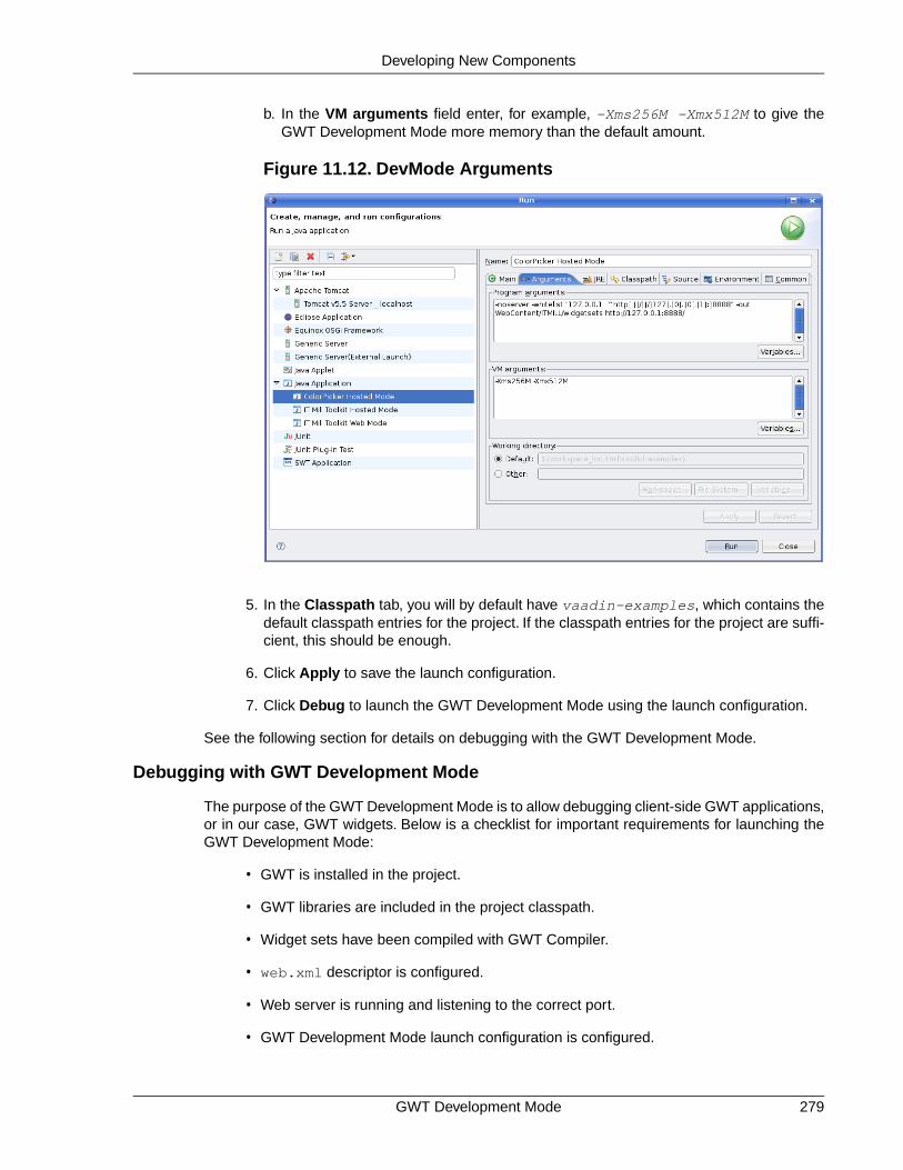
b. In the VM arguments field enter, for example, -Xms256M -Xmx512M to give theGWT Development Mode more memory than the default amount.
Figure 11.12. DevMode Arguments
5. In the Classpath tab, you will by default have vaadin-examples, which contains thedefault classpath entries for the project. If the classpath entries for the project are suffi-cient, this should be enough.
6. Click Apply to save the launch configuration.
7. Click Debug to launch the GWT Development Mode using the launch configuration.
See the following section for details on debugging with the GWT Development Mode.
Debugging with GWT Development Mode
The purpose of the GWT Development Mode is to allow debugging client-side GWT applications,or in our case, GWT widgets. Below is a checklist for important requirements for launching theGWT Development Mode:
• GWT is installed in the project.
• GWT libraries are included in the project classpath.
• Widget sets have been compiled with GWT Compiler.
• web.xml descriptor is configured.
• Web server is running and listening to the correct port.
• GWT Development Mode launch configuration is configured.
279GWT Development Mode
Developing New Components

Once everything is ready to start debugging, just open a source file, for example, thecom.vaadin.demo.colorpicker.gwt.client.ui.GwtColorPicker class. Find the onClick()method. At the line containing the setColor() call, right-click on the leftmost bar in the editorand select Toggle Breakpoint from the popup menu. A small magnifying glass will appear inthe bar to indicate the breakpoint.
Figure 11.13. Setting a Breakpoint
Select from menu Run Debug... and the Debug configuration window will open. Notice that itis not purposeful to run the GWT Development Mode in the "Run" mode, because its entire pur-pose is to allow debugging.
Figure 11.14. Debugging with GWT Development Mode
Starting applications under the GWT Development Mode can take considerable time!Compiling widgets can take 10-60 seconds, depending on the hardware. During this time, theweb browser is unresponsive, does not update its window, and appears "stuck".
Please refer to Eclipse IDE documentation for further instructions on using the debugger.
GWT Development Mode280
Developing New Components

11.8.7. Packaging a Widget Set
Packaging and reusing custom components is almost as easy as with any Java code, but witha small difference. You can package the source code of a widget set as a JAR. A user can dropthe JAR in the project and add it to the class path. If using widgets from multiple widget sets, theuser has to inherit the widget set in a combining widget set (which can be generated automatically).The user then has to compile the widget set(s) as described in Section 11.8.4, “Compiling GWTWidget Sets”.
While you could, in theory, package precompiled widget sets in the JAR as well, it would createa serious danger for incompatibility between the client-side and server-side versions of Vaadin.The user would anyhow have to recompile the widget set if he uses multiple widget sets packagedin different JARs, or has developed project-specific widgets.
The widget set build script template, which you can find at the URL https://vaadin.com/down-load/misc/build-widgetset.xml, includes an example package-jar target for building a JAR.You can use the example as it is or modify it as you need.
You need to make the JAR packaging specific configuration in the configure-jar target.Change to property values to reflect your widget set.
<target name="configure-jar"> <!-- The compiled JAR name --> <property name="jar-destination" value="${base}colorpicker.jar"/>
<!-- Title of the widget set (for JAR) --> <property name="widgetset-title" value="ColorPicker"/>
<!-- Version of the widget set (for JAR) --> <property name="widgetset-version" value="1.0"/>
<!-- Vendor of the widget set (for JAR) --> <property name="widgetset-vendor" value="IT Mill Oy"/></target>
You may want to check also the package-jar target if you want to use other license informationor otherwise customize the package content.
Assuming that you have otherwise configured the build script for your project as described inSection 11.8.4, “Compiling GWT Widget Sets”, you can build the JAR package with the followingcommand:
$ ant -f build-widgetset.xml package-jar
Notice that the package-jar target does not depend on the compile-widgetset target, asthe compiled widget set is not included in the package. If you really wish to do so, add the de-pendency and include the compiled files as a fileset for the package.
11.8.8.Troubleshooting
Below are some typical cases that may cause you trouble.
Deferred binding fails The widget set compilation in GWT Development Modeconsole produces the following error, which is shownin the Eclipse console:
281Packaging a Widget Set
Developing New Components

Deferred binding failed for 'com.vaadin.csvalidation.widgetset.client.ui.VJavaScriptEditor' (did you forget to inherit a required module?)
This problem occurs if the creation of an instance of awidget fails, usually due to an exception in the construct-or. The GWT Development Mode console displays amore detailed exception log.
Widgets are missing from thewidget set
The widget set compilation displays the list of widgetsincluded in the widget set. If the list includes only theinherited widgets (built-in Vaadin widgets), but yourcustom widgets are missing, there is a problem.
The typical reason is that the server-side classes arenot yet compiled or are missing from the classpath.Check that the server-side compilation output folder(such as build/classes) is included in the classpathof GWT Compiler and that you compile the server-sidecomponents before the client-side, so that they areavailable in the classpath. The reason for this is thatGWT Compiler (or more precisely a Vaadin widget setgenerator) reads the annotations that define themappping from server-side components to client-sidewidgets from compiled class files.
The correct widget set is notloaded
The widget set must be specified inWebContent/WEB-INF/web.xml descriptor, as aninitialization parameter for the servlet.
<init-param> <description>Application widgetset</description> <param-name>widgetset</param-name>
<param-value>com.example.mylibrary.widgetset.MyWidgetset</param-value></init-param>
A generated widget set inheritsitself
The widget set builder can create a .gwt.xmldescriptor that inherits the same widget set.This usuallyoccurs when the class path for the source files is setto something different than the root of the entire sourcetree, so that the package name of the widget set to bedefined with the descriptor would be invalid.
Troubleshooting282
Developing New Components

Chapter 12
Advanced WebApplication Topics
12.1. Special Characteristics of AJAX Applications ...................................... 28412.2. Application-Level Windows .................................................................. 28412.3. Embedding Applications in Web Pages ............................................... 29212.4. Debug and Production Mode ............................................................... 29712.5. Resources ........................................................................................... 29912.6. Shortcut Keys ...................................................................................... 30212.7. Printing ................................................................................................ 30612.8. Google App Engine Integration ........................................................... 30712.9. Common Security Issues ..................................................................... 30812.10. URI Fragment and History Management with UriFragmentUtil-ity ................................................................................................................. 30812.11. Capturing HTTP Requests ................................................................ 31012.12. Drag and Drop ................................................................................... 31312.13. Logging .............................................................................................. 32112.14. Accessing Session-Global Data ........................................................ 322
This chapter covers various features and topics often needed in applications. While other topicscould be considered as "advanced", the first section gives a brief introduction to AJAX developmentfor beginners.
283Book of Vaadin

12.1. Special Characteristics of AJAX Applications
New to AJAX? This section is intended for people familiar with the development of either tradi-tional web applications or desktop applications, who are entering AJAX-enabled web applicationdevelopment. AJAX application development has a few special characteristics with respect toother types of applications. Possibly the most important one is how the display is managed inthe web browser.
The web was originally not built for applications, but for hypertext pages that you can view witha browser. The purpose of web pages is to provide content for the user. Application software hasa somewhat different purpose; usually to allow you to work on some data or content, much ofwhich is not ever intended to be accessible through a web browser as web pages. As the webis inherently page-based, conventional web applications had to work with page requests andoutput HTML as response. JavaScript and AJAX have made it possible to let go of the pages.
Pages are largely an unknown concept to conventional desktop applications. At most, desktopapplications can open multiple windows, but usually they work with a single main window, withan occasional dialog window here and there. Same goes usually for web applications developedwith Vaadin: an application typically runs on a single page, changing the layout as needed andpopping up dialog boxes.
Not having to load pages and use hyperlinks to communicate all user interaction is a relief forapplication development. However, they are an important feature that ordinary desktop applicationslack. They allow referencing different functionalities of an application or resources managed bythe application. They are also important for integration with external applications.
Certain resources can be identified through a URI or Universal Resource Identifier. A URI caneasily be passed around or stored as a bookmark. We will see in Section 12.5.1, “URI Handlers”how you can retrieve the URI of a page request. Similarly, a page request can have query para-meters, which can be handled as detailed in Section 12.5.2, “Parameter Handlers”.
Using URIs or request parameters to access functionalities or content is not as straight-forwardas in conventional page-based web applications. Vaadin, just as any other AJAX framework,uses browser cookies not just for tracking users but also for tracking the application state.Cookies are unique in a browser, so any two windows share the same cookies and thereforealso the state. The advantage is that you can close your browser and open it again and the ap-plication will be in the state where you left off (except for components such as text fields whichdid not have the immediate attribute enabled). The disadvantage is that there is no good way todistinguish between the windows, so there can usually be only a single application window. Evenif there were several, you would have trouble with synchronization of application data betweenwindows. Many conventional page-based web applications simply ignore out-of-sync situations,but such situations are risky for application platforms that are intended to be stable. Therefore itis safer to work with a single browser window. If you wish to have multiple windows in your ap-plication, you can create them inside the main window as Window objects. A URI can be usedto fetch resources that have no particular state or to provide an entry point to the application.
12.2. Application-Level Windows
Vaadin supports two types of windows: application-level windows and sub-windows. The applic-ation-level windows are native browser windows or tabs. The main window is the special initialapplication-level window created when the user first started the application session by openingthe URL in the browser. Sub-windows are freely floating HTML windows inside a browser window,as described in Section 4.3, “Sub-Windows”.
Special Characteristics of AJAX Applications284
Advanced Web Application Topics

Application-level windows of the same application use the same Application object and thereforeshare the same session. Each window is identified with a URL that is used to access it. Thismakes it possible to bookmark application-level windows. Such windows can even be createddynamically based on the URLs.
Application-level windows allow several common use cases for browser-based applications.
• Native popup windows. An application can open popup windows for sub-tasks.
• Page-based browsing. The application can allow the user to open certain content todifferent windows. For example, in a messaging application, it can be useful to opendifferent messages to different windows so that the user can browse through them whilewriting a new message.
• Bookmarking. Bookmarks in the web browser can provide an entry-point to some contentprovided by an application.
• Embedding windows.Windows can be embedded in web pages, thus making it possibleto provide different views to an application from different pages or even from the samepage, while keeping the same session. See Section 12.3, “Embedding Applications inWeb Pages”.
Because of the special nature of AJAX applications, these uses require some caveats. We willgo through them later in Section 12.2.5, “Caveats in Using Multiple Windows”.
12.2.1. Creating New Application-Level Windows
Creating a new application-level window is much like creating a child window (see Section 4.3,“Sub-Windows”), except that the window is added with addWindow() to the application objectinstead of the main window.
public class WindowTestApplication extends Application { public void init() { // First create the main window. final Window main = new Window ("My Test Application"); setMainWindow(main);
// Create another application-level window. final Window mywindow = new Window("Second Window");
// Manually set the name of the window. mywindow.setName("mywindow");
// Add some content to the window. mywindow.addComponent(new Label("Has content."));
// Add the window to the application. addWindow(mywindow); }}
This creates the window object that a user can view by opening a URL in a browser. Creatingan application-level window object does not open a new browser window automatically to viewthe object, but if you wish to open one, you have to do it explicitly as shown below. An application-level window has a unique URL, which is based on the application URL and the name of thewindow given with the setName() method. For example, if the application URL ishttp://localhost:8080/myapp/ and the window name is mywindow, the URL for the windowwill be http://localhost:8080/myapp/mywindow/. If the name of a window is not explicitly
285Creating New Application-Level Windows
Advanced Web Application Topics

set with setName(), an automatically generated name will be used. The name can be retrievedwith the getName() method and the entire URL with getURL().
There are three typical ways to open a new window: using the open() method of Window class,a Link, or referencing it from HTML or JavaScript code written inside a Label component.
The Window open() method takes as parameters a resource to open and the target name.Youcan use ExternalResource to open a specific URL, which you get from the window to be openedwith the getURL() method.
/* Create a button to open a new window. */main.addComponent(new Button("Click to open new window", new Button.ClickListener() { public void buttonClick(ClickEvent event) { // Open the window. main.open(new ExternalResource(mywindow.getURL()), "_new"); } }));
The target name is one of the default HTML target names (_new, _blank, _top, etc.) or a customtarget name. How the window is exactly opened depends on the browser. Browsers that supporttabbed browsing can open the window in another tab, depending on the browser settings.
Another typical way to open windows is to use a Link component with the window URL as anExternalResource.
/* Add a link to the second window. */Link link = new Link("Click to open second window", new ExternalResource(mywindow.getURL()));link.setTargetName("second");link.setTargetHeight(300);link.setTargetWidth(300);link.setTargetBorder(Link.TARGET_BORDER_DEFAULT);main.addComponent(link);
Using a Link allows you to specify parameters for the window that opens by clicking on the link.Above, we set the dimensions of the window and specify what window controls the window shouldcontain.The Link.TARGET_BORDER_DEFAULT specifies to use the default, which includes mostof the usual window controls, such as the menu, the toolbar, and the status bar.
Another way to allow the user to open a window is to insert the URL in HTML code inside a Label.This allows even more flexibility in specifying how the window should be opened.
// Add the link manually inside a Label.main.addComponent( new Label("Second window: <a href='" + mywindow.getURL() + "' target='second'>click to open</a>", Label.CONTENT_XHTML));main.addComponent( new Label("The second window can be accessed through URL: " + mywindow.getURL()));
When an application-level window is closed in the browser the close() method is normallycalled just like for a child window and the Window object is purged from the application. However,there are situations where close() might not be called. See Section 12.2.4, “Closing Windows”for more information.
Creating New Application-Level Windows286
Advanced Web Application Topics

12.2.2. Creation of Windows When Requested
You can create a window object dynamically by its URL sub-path when it is first requested byoverriding the getWindow() method of the Application class.The method gets a window nameas its parameter and must return the corresponding Window object.The window name is determ-ined from the first URL path element after the application URL (the name may not contain slashes).See the notes below for setting the actual name of the dynamically created windows below.
The following example allows opening windows with a window name that begins with "planet-"prefix. Since the method is called for every browser request for the application, we filter only therequests where a window with the given name does not yet exist.
public class WindowTestApplication extends Application { ...
@Override public Window getWindow(String name) { // If a dynamically created window is requested, but // it does not exist yet, create it. if (name.startsWith("planet-") && super.getWindow(name) == null) { String planetName = name.substring("planet-".length());
// Create the window object. Window newWindow = new Window("Window about " + planetName);
// DANGEROUS: Set the name explicitly. Otherwise, // an automatically generated name is used, which // is usually safer. newWindow.setName(name);
// Put some content in it. newWindow.addComponent( new Label("This window contains details about " + planetName + "."));
// Add it to the application as a regular // application-level window. addWindow(newWindow);
return newWindow; }
// Otherwise the Application object manages existing // windows by their name. return super.getWindow(name); }
The window name must be a unique indentifier for each Window object instance. If you usesetName() to set the window name explicitly, as we did above, any browser window that hasthe same URL (within the same browser) would open the same window object.This is dangerousand generally not recommended, because the browser windows would share the same windowobject. Opening two windows with the same static name would immediately lead to a synchron-ization error, as is shown in Figure 12.1, “Synchronization Error Between Windows with the SameName” below. (While also the window captions are same, they are irrelevant for this problem.)
287Creation of Windows When Requested
Advanced Web Application Topics

Figure 12.1. Synchronization Error Between Windows with the Same Name
There are some cases where setting the name explicitly is useful. The launch application belowis one example, as it always opens the other windows in a window target that is specific to thewindow name, thereby never creating two windows with the same URL. Similarly, if you hadembedded the application in a browser frame and the link would open the window in a frame,you would not have problems. Having a single window instance for a URL is also useful if thebrowser crashes and the user opens the window again, as it will have kept its previous (server-side) state.
12.2.3. Dynamic Multi-Window Applications
Having multiple browser windows or tabs open in the same website and even the same page isone of the basic use cases of web browsing. The creation of Window objects described in theprevious section allows opening multiple special-purpose windows with different URLs, but howto open multiple windows with the same URL? The solution is based on the fact that Vaadindoesn't identify windows only by their URL subpath, but also by an invisible window name.
Leaving the window name to be automatically generated allows opening multiple windows withthe same URL, while each of the windows will have a separate state. The URL in the locationbar stays unchanged and the generated window name is used only for the Ajax communicationsto identify the window object. A generated name is a string representation of a unique randomnumber, such as "1928676448". You should be aware of the generated window names whenoverriding the getWindow() method (and not unintentionally create a new window instancedynamically for each such request). The condition in the above example would also filter out therequests for an already existing window with a generated name.
Figure 12.2, “A Dynamically Created Window” shows a dynamically created application-levelwindow with the URL shown in the address bar. The URL for the application is herehttp://localhost:8080/book-examples/windowexample/, including the applicationcontext, application path. The dynamically created window's name is planet-mars.
Dynamic Multi-Window Applications288
Advanced Web Application Topics

Figure 12.2. A Dynamically Created Window
The application knows the windows it already has and can return them after the creation. Theapplication also handles closing and destruction of application-level window objects, as discussedin Section 12.2.4, “Closing Windows”.
Such dynamic windows could be opened as in the following example:
public void init() { final Window main = new Window("Window Test"); setMainWindow(main);
// Have some IDs for the dynamically creatable windows. final String[] items = new String[] { "mercury", "venus", "earth", "mars", "jupiter", "saturn", "uranus", "neptune" };
// Create a list of links to each of the available window. for (int i = 0; i < items.length; i++) { // Create a URL for the window. String windowUrl = getURL() + "planet-" + items[i];
// Create a link to the window URL. Using the // item ID for the target also opens it in a new // browser window (or tab) unique to the window name. main.addComponent( new Link("Open window about " + items[i], new ExternalResource(windowUrl), items[i], -1, -1, Window.BORDER_DEFAULT)); }}
289Dynamic Multi-Window Applications
Advanced Web Application Topics

Figure 12.3. Opening Windows
12.2.4. Closing Windows
When the user closes an application-level window, the Client-Side Engine running in the browserwill report the event to the server before the page is actually removed. You can catch the eventwith a Window.CloseListener, as is done in the example below.
newWindow.addListener(new Window.CloseListener() { @Override public void windowClose(CloseEvent e) { // Do something. System.out.println(e.getWindow().getName() + " was closed");
// Add a text to the main window about closing. // (This does not update the main window.) getMainWindow().addComponent( new Label("Window '" + e.getWindow().getName() + "' was closed.")); }});
Notice that the change to the server-side state of the main window (or another application-levelwindow) does not refresh the window in the browser, so the change will be unseen until user in-teraction or polling refreshes the window. This problem and its dangers are discussed in Sec-tion 12.2.5, “Caveats in Using Multiple Windows” below.
The close event does not occur if the browser crashes or the connection is otherwise severedviolently. In such a situation, the window object will be left hanging, which could become a resourceproblem if you allow the users to open many such application-level windows. The positive sideis that the user can reconnect to the window using the window URL.
12.2.5. Caveats in Using Multiple Windows
Communication Between Windows
For cases where you need communication between windows, we recommend using floating childwindows. In Vaadin Release 5, an application window can not update the data in other windows.The contents of a window can only be updated when the particular window makes a request tothe server. The request can be caused by user input or through polling.
Closing Windows290
Advanced Web Application Topics

Changing the server-side state of a window while processing a user event from another windowcan potentially cause serious problems. Changing the client-side state of a window does not alwaysimmediately communicate the changes to the server. The server-side state can therefore be outof sync with the client-side state.
Figure 12.4. Communication Between Two Application-Level Windows
The following example creates a second window that changes the contents of the main window,as illustrated in the figure above. In this simple case, changing the main window contents is safe.
// Create a table in the main window to hold items added// in the second windowfinal Table table = new Table();table.setPageLength(5);table.getSize().setWidth(100, Size.UNITS_PERCENTAGE);table.addContainerProperty("Name", String.class, "");main.addComponent(table);
// Create the second windowfinal Window adderWindow = new Window("Add Items");adderWindow.setName("win-adder");main.getApplication().addWindow(adderWindow);
// Create selection component to add items to the tablefinal NativeSelect select = new NativeSelect("Select item to add");select.setImmediate(true);adderWindow.addComponent(select);
// Add some items to the selectionString items[] = new String[]{"-- Select --", "Mercury", "Venus", "Earth", "Mars", "Jupiter", "Saturn", "Uranus", "Neptune"};for (int i=0; i<items.length; i++) select.addItem(items[i]);select.setNullSelectionItemId(items[0]);
// When an item is selected in the second window, add// table in the main windowselect.addListener(new ValueChangeListener() { public void valueChange(ValueChangeEvent event) { // If the selected value is something else // but a null selection item. if (select.getValue() != null) { // Add the selected item to the table // in the main window table.addItem(new Object[]{select.getValue()}, new Integer(table.size())); } }});
291Caveats in Using Multiple Windows
Advanced Web Application Topics

// Link to open the selection windowLink link = new Link("Click to open second window", new ExternalResource(adderWindow.getURL()), "_new", 50, 200, Link.TARGET_BORDER_DEFAULT);main.addComponent(link);
// Enable polling to update the main windowProgressIndicator poller = new ProgressIndicator();poller.addStyleName("invisible");main.addComponent(poller);
The example uses an invisible ProgressIndicator to implement polling.This is sort of a trick anda more proper API for polling is under design. Making the progress indicator invisible requiresthe following CSS style definition:
.v-progressindicator-invisible { display: none;}
12.3. Embedding Applications in Web Pages
Many web sites are not all Ajax, but Ajax is used only for specific functionalities. In practice, manyweb applications are a mixture of dynamic web pages and Ajax applications embedded in suchpages.
Embedding Vaadin applications is easy and there are several different ways to embed them.One is to have a <div> placeholder for the web application and load the Vaadin Client-SideEngine with a simple JavaScript code. Another method is even easier, which is to simply use the<iframe> element. Both of these methods have advantages and disadvantages. The <div>method can only embed one application in a page, while the <iframe> method can embed asmany as needed. One disadvantage of the <iframe> method is that the size of the <iframe>element is not flexible according to the content while the <div> method allows such flexibility.The following sections look closer into these two embedding methods. Additionally, the VaadinXS add-on allows embedding Vaadin applications in websites running in another server.
12.3.1. Embedding Inside a div Element
You can embed a Vaadin application inside a web page with a method that is equivalent toloading the initial page content from the application servlet in a non-embedded application. Nor-mally, the ApplicationServlet servlet generates an initial page that contains the correct parametersfor the specific application. You can easily configure it to load multiple Vaadin applications onthe same page, assuming that they use the same widget set.
You can view the initial page for your application easily simply by opening the application in aweb browser and viewing the HTML source code.You could just copy and paste the embeddingcode from the default initial page. It has, however, some extra functionality that is not normallyneeded: it generates some of the script content with document.write() calls, which is usefulonly when you are running the application as a portlet in a portal. The method outlined below ismuch simpler.
Embedding requires four elements inside the HTML document:
1. In the <head> element, you need to define the application URI and parameters andload the Vaadin Client-Side Engine. The vaadin variable is an associative map thatcan contain various runtime data used by the Client-Side Engine of Vaadin. The
Embedding Applications in Web Pages292
Advanced Web Application Topics

vaadinConfigurations item is itself an associate map that contains parameters foreach of the applications embedded in the page. The map must contain the followingitems:
appUri The application URI consists of the context and the applic-ation path. If the context is /mycontext and the applicationpath is myapp, the appUri would be /mycontext/myapp.
pathInfo The PATHINFO parameter for the Servlet.
themeUri (optional) URI of the application theme.The URI must include applic-ation context and the path to the theme directory. Themesare, by default, stored under the /VAADIN/themes/ path.
versionInfo This item is itself an associative map that contains twoparameters:vaadinVersion contains the version numberof the Vaadin version used by the application. TheapplicationVersion parameter contains the version ofthe particular application. The contained parameters areoptional, but the versionInfo parameter itself is not.
The following example defines two applications to run in the same window: the Calcu-lator and Hello World examples. In the example, the application context is /mycontext.
<script type="text/javascript"> var vaadin = { vaadinConfigurations: { 'calc': { appUri:'/mycontext/Calc', pathInfo: '/', themeUri: '/mycontext/VAADIN/themes/example', versionInfo : { vaadinVersion: "6.7.6", applicationVersion: "NONVERSIONED" } }, 'hello': { appUri:'/mycontext/HelloWorld', pathInfo: '/', themeUri: '/mycontext/VAADIN/themes/example', versionInfo : {} } }};</script>
2. Loading the Vaadin Client-Side Engine, that is, the widget set, is done with the followingkind of line in the <head> element:
<script language='javascript' src='/mycontext/VAADIN/widgetsets/com.vaadin.terminal.gwt.DefaultWidgetSet/com.vaadin.terminal.gwt.DefaultWidgetSet.nocache.js'></script>
The engine URI consists of the context of the web application, mycontext above, fol-lowed by the path to the JavaScript (.js) file of the widget set, relative to the web ap-plication root (the WebContent directory in Eclipse). The line above assumes the useof the default widget set in Vaadin. If you have made custom widgets that are definedin a custom widget set, you need to use the path to the compiled widget set file. Widgetsets must be compiled under the WebContent/VAADIN/widgetsets directory.
293Embedding Inside a div Element
Advanced Web Application Topics

3. In the <html> element, you need to do a routine inclusion of GWT history iframeelement as follows:
<iframe id="__gwt_historyFrame" style="width:0;height:0;border:0"></iframe>
4. The location of the Vaadin application is defined with a div placeholder element havingid="calc", where the identifier is the same as in the vaadinConfigurationsparameter, as follows:
<div id="calc"></div>
The embedding element should not be self-closing.
Below is a complete example of embedding an application.
<?xml version="1.0" encoding="UTF-8" ?><!DOCTYPE html PUBLIC "-//W3C//DTD XHTML 1.0 Strict//EN" "http://www.w3.org/TR/xhtml1/DTD/xhtml1-strict.dtd"><html xmlns="http://www.w3.org/1999/xhtml"><head> <meta http-equiv="Content-Type" content="text/html; charset=UTF-8" />
<title>Embedding a Vaadin Application in HTML Page</title>
<!-- Define the application configuration --> <script type="text/javascript"> var vaadin = { vaadinConfigurations: { helloworld: { appUri:'/book-examples/helloworld', pathInfo: '/', themeUri:'/book-examples/VAADIN/themes/book-examples', versionInfo : {}} }}; </script>
<!-- Load the widget set, that is, the Client-Side Engine --> <script language='javascript' src='/book-examples/VAADIN/widgetsets/com.vaadin.book.widgetset.BookExamplesWidgetSet/com.vaadin.book.widgetset.BookExamplesWidgetSet.nocache.js'></script>
<!-- Load the style sheet --> <link rel="stylesheet" type="text/css" href="/book-examples/VAADIN/themes/book-examples/styles.css"/></head>
<body> <!-- GWT requires an invisible history frame is needed for --> <!-- page/fragment history in the browser --> <iframe tabIndex="-1" id="__gwt_historyFrame" style="position:absolute;width:0;height:0;border:0;overflow:hidden;" src="javascript:false"></iframe>
<h1>Embedding a Vaadin Application</h1>
<p>This is a static web page that contains an embedded Vaadin application. It's here:</p>
<!-- So here comes the div element in which the Vaadin --> <!-- application is embedded. --> <div id="helloworld" style="border: 2px solid green;"></div>
Embedding Inside a div Element294
Advanced Web Application Topics

<p>Please view the page source to see how embedding works.</p>
<noscript>You have to enable javascript in your browser to use an application built with Vaadin.</noscript></body></html>
You can style the embedded application with themes, as described in Chapter 8, Themes. TheClient-Side Engine loads the theme required by the application. In addition, you can do stylingwith CSS in the embedding page. In the above example, we added some styling directly to theelement.
12.3.2. Embedding Inside an iframe Element
Embedding a Vaadin application inside an <iframe> element is even easier than the methoddescribed above, as it does not require definition of any Vaadin specific definitions. The use of<iframe> makes it possible to embed multiple web applications or two different views to thesame application on the same page.
You can embed an application with an element such as the following:
<iframe src="/vaadin-examples/Calc"></iframe>
The problem with <iframe> elements is that their size of is not flexible depending on the contentof the frame, but the content must be flexible to accommodate in the frame.You can set the sizeof an <iframe> element with height and width attributes.
Below is a complete example of using the <iframe> to embed two applications in a web page.
<!DOCTYPE html PUBLIC "-//W3C//DTD XHTML 1.0 Transitional//EN" "http://www.w3.org/TR/xhtml1/DTD/xhtml1-transitional.dtd"><html xmlns="http://www.w3.org/1999/xhtml" > <head> <title>Embedding in IFrame</title> </head>
<body style="background: #d0ffd0;"> <h1>This is a HTML page</h1> <p>Below are two Vaadin applications embedded inside a table:</p>
<table align="center" border="3"> <tr> <th>The Calculator</th> <th>The Color Picker</th> </tr> <tr valign="top"> <td> <iframe src="/vaadin-examples/Calc" height="200" width="150" frameborder="0"></iframe> </td> <td> <iframe src="/vaadin-examples/colorpicker" height="330" width="400" frameborder="0"></iframe> </td> </tr> </table> </body></html>
295Embedding Inside an iframe Element
Advanced Web Application Topics

The page will look as shown in Figure 12.5, “Vaadin Applications Embedded Inside IFrames”below.
Figure 12.5. Vaadin Applications Embedded Inside IFrames
You can embed almost anything in an iframe, which essentially acts as a browser window.However, this creates various problems. The iframe must have a fixed size, inheritance of CSSfrom the embedding page is not possible, and neither is interaction with JavaScript, which makesmashups impossible, and so on. Even bookmarking with URI fragments will not work.
Note also that websites can forbid iframe embedding by specifying an X-Frame-Options:SAMEORIGIN header in the HTTP response.
12.3.3. Cross-Site Embedding with the Vaadin XS Add-on
In the previous sections, we described the two basic methods for embedding Vaadin applications:in a <div> element and in an <iframe>. One problem with div embedding is that it does notwork between different Internet domains, which is a problem if you want to have your websiterunning in one server and your Vaadin application in another. The security model in browserseffectively prevents such cross-site embedding of Ajax applications by enforcing the same originpolicy for XmlHttpRequest calls, even if the server is running in the same domain but differentport. While iframe is more permissive, allowing embedding almost anything in anywhere, it hasmany disadvantanges, as described earlier.
The Vaadin XS (Cross-Site) add-on works around the limitation in div embedding by using JSONP-style communication instead of the standard XmlHttpRequests.
Embedding is done simply with:
Cross-Site Embedding with the Vaadin XS Add-on296
Advanced Web Application Topics

<script src="http://demo.vaadin.com/xsembed/getEmbedJs" type="text/javascript"></script>
This includes an automatically generated embedding script in the page, thereby making embeddingeffortless.
This assumes that the main layout of the application has undefined height. If the height is 100%,you have to wrap it inside an element with a defined height. For example:
<div style="height: 500px;"> <script src="http://demo.vaadin.com/xsembed/getEmbedJs" type="text/javascript"></script></div>
It is possible to restrict where the application can be embedded by using a whitelist. The add-onalso encrypts the client-server communication, which is more important for embedded applicationsthan usual.
You can get the Vaadin XS add-on from Vaadin Directory. It is provided as a Zip package.Download and extract the installation package to a local folder. Instructions for installation andfurther information is given in the README.html file in the package.
Some restrictions apply. You can have only one embedded application in one page. Also, somethird-party libraries may interfere with the communication. Other notes are given in the README.
12.4. Debug and Production Mode
Vaadin applications can be run in two modes: debug mode and production mode. The debugmode, which is on by default, enables a number of built-in debug features for the developers.The features include:
• Debug Window for accessing debug functionalities
• Display debug information in the Debug Window and server console.
• Analyze layouting button that analyzes the layout for possible problems.
All applications are run in the debug mode by default (since IT Mill Toolkit version 5.3.0). Theproduction mode can be enabled, and debug mode thereby disabled, by adding aproductionMode=true parameter to the servlet context in the web.xml deployment descriptor:
<context-param> <description>Vaadin production mode</description> <param-name>productionMode</param-name> <param-value>true</param-value></context-param>
Enabling the production mode disables the debug features, thereby preventing users from easilyinspecting the inner workings of the application from the browser.
12.4.1. Debug Mode
Running an application in the debug mode enables the client-side Debug Window in the browser.You can open the Debug Window by adding "?debug" to the application URL, for example,http://localhost:8080/myapp/?debug.The Debug Window, shown in Figure 12.6, “DebugWindow”, consists of buttons controlling the debugging features and a scrollable log of debugmessages.
297Debug and Production Mode
Advanced Web Application Topics

Figure 12.6. Debug Window
Clear console Clears the log in the Debug Window.
Restart app Restarts the application.
Force layout Causes all currently visible layouts to recalculate their appearance.Layout components calculate the space required by all child com-ponents, so the layout appearance must be recalculated wheneverthe size of a child component is changed. In normal applications,this is done automatically, but when you do themeing or alter theCSS with Firebug, you may need to force all layouts to recalculatethemselves, taking into account the recently made changes.
Analyze layouts This is described in the following section.
If you use the Firebug plugin in Mozilla Firefox, the log messages will also be printed to theFirebug console. In such a case, you may want to enable client-side debugging without showingthe Debug Window with "?debug=quiet" in the URL. In the quiet debug mode, log messageswill only be printed to the Firebug console.
12.4.2. Analyzing Layouts
The Analyze layouts button analyzes the currently visible layouts and makes a report of possiblelayout related problems. All detected layout problems are displayed in the log and also printedto the console.
The most common layout problem is caused by placing a component that has a relative size insidea container (layout) that has undefined size, for example, adding a 100% wide Panel inside aHorizontalLayout with no width specification. In such a case, the error will look as shown below:
Vaadin DEBUG- Window/1a8bd74 "My window" (width: MAIN WINDOW) - HorizontalLayout/1cf243b (width: UNDEFINED) - Panel/12e43f1 "My panel" (width: RELATIVE, 100.0 %)Layout problem detected: Component with relative width inside a HorizontalLayout with no width definedRelative sizes were replaced by undefined sizes, components may not render as expected.
This particular error tells that the Panel "My panel" is 100% wide while the width of the containingHorizontalLayout is undefined. The components will be rendered as if the the width of the con-tained Panel was undefined, which might not be what the developer wanted. There are twopossible fixes for this case: if the Panel should fill the main window horizontally, set a width for
Analyzing Layouts298
Advanced Web Application Topics

the HorizontalLayout (for example 100% wide), or set the width of the Panel to "undefined" torender the it as it is currently rendered but avoiding the warning message.
The same error is shown in the Debug Window in a slightly different form and with an additionalfeature (see Figure 12.7, “Debug Window Showing the Result of Analyze layouts.”). Checkingthe Emphasize component in UI box will turn red the background of the component that causeda warning, making it easy for the developer to figure out which component each warning relatesto.The messages will also be displayed hierarchically, as a warning from a containing componentoften causes more warnings from its child components. A good rule of thumb is to work on theupper-level problems first and only after that worry about the warnings from the children.
Figure 12.7. Debug Window Showing the Result of Analyze layouts.
12.4.3. Custom Layouts
CustomLayout components can not be analyzed in the same way as other layouts. For customlayouts, the Analyze layouts button analyzes all contained relative-sized components and checksif any relative dimension is calculated to zero so that the component will be invisible. The errorlog will display a warning for each of these invisible components. It would not be meaningful toemphasize the component itself as it is not visible, so when you select such an error, the parentlayout of the component is emphasized if possible.
12.4.4. Debug Functions for Component Developers
You can take advantage of the debug mode when developing client-side components. The staticfunction ApplicationConnection.getConsole() will return a reference to a Console objectwhich contains logging methods such as log(String msg) and error(String msg).Thesefunctions will print messages to the Debug Window and Firebug console in the same way asother debugging functionalities of Vaadin do. No messages will be printed if the Debug Windowis not open or if the application is running in production mode.
12.5. Resources
In addition to high-level resource classes described in Section 4.5, “Referencing Resources”,Vaadin provides low-level facilities for retrieving the URI and other parameters of HTTP requests.In the following, we will look into low-level interfaces for handling URIs and parameters to provideresources and functionalities.
Notice that using URI or parameter handlers to create "pages" is not meaningful in Vaadin or inAJAX applications generally. See Section 12.1, “Special Characteristics of AJAX Applications”for reasons.
299Custom Layouts
Advanced Web Application Topics

12.5.1. URI Handlers
The URI parameter for the application is useful mainly for two purposes: for providing somespecial functionality according to the URI or for providing dynamic content. Dynamic content canalso be provided with StreamResource.
You can retrieve the URI for the HTTP request made for your application by implementing thecom.vaadin.terminal.URIHandler interface. The handler class needs to be registered in themain window object of your application with the addURIHandler() method. You then get theURI by implementing the handleURI() method. The method gets two parameters: a contextand a URI relative to the context. The context is the base URI for your application.
public void init() { final Window main = new Window("Hello window"); setMainWindow(main);
URIHandler uriHandler = new URIHandler() { public DownloadStream handleURI(URL context, String relativeUri) { // Do something here System.out.println("handleURI=" + relativeUri);
// Should be null unless providing dynamic data. return null; } }; main.addURIHandler(uriHandler);
}
If you have multiple URI handlers attached to a window, they are executed after one another.The URI handlers should return null, unless you wish to provide dynamic content with the call.Other URI handlers attached to the window will not be executed after some handler returns non-null data.The combined parameter and URI handler example below shows how to create dynamiccontent with a URI handler.
Notice that if you do provide dynamic content with a URI handler, the dynamic content is returnedin the HTTP response. If the handler makes any changes to the UI state of the application, thesechanges are not rendered in the browser, as they are usually returned in the HTTP responsemade by the Application object and now the custom URI handler overrides the default behaviour.If your client-side code makes a server call that does update the UI state, the client-side mustinitiate an update from the server. For example, if you have an integration situation where youmake a JavaScript call to the server, handle the request with a URI handler, and the server statechanges as a side-effect, you can use the vaadin.forceSync() method to force the update.
12.5.2. Parameter Handlers
You can retrieve the parameters passed to your application by implementing the com.vaadin.ter-minal.ParameterHandler interface.The handler class needs to be registered in the main windowobject of your application with the addParameterHandler() method. You then get the para-meters in the handleParameters() method.The parameters are passes as a map from stringkey to a vector of string values.
class MyParameterHandler implements ParameterHandler { public void handleParameters(Map parameters) { // Print out the parameters to standard output for (Iterator it = parameters.keySet().iterator(); it.hasNext();) { String key = (String) it.next();
URI Handlers300
Advanced Web Application Topics

String value = ((String[]) parameters.get(key))[0]; System.out.println("Key: "+key+", value: "+value); } }}
The parameter handler is not called if there are no parameters. Parameter handler is called beforethe URI handler, so if you handle both, you might typically want to just store the URI parametersin the parameter handler and do actual processing in URI handler. This allows you, for example,to create dynamic resources based on the URI parameters.
import java.awt.*;import java.awt.image.BufferedImage;import java.io.*;import java.net.URL;import java.util.Map;import javax.imageio.ImageIO;import com.vaadin.terminal.*;
/** * Demonstrates handling URI parameters and the URI itself to * create a dynamic resource. */public class MyDynamicResource implements URIHandler, ParameterHandler { String textToDisplay = "- no text given -";
/** * Handle the URL parameters and store them for the URI * handler to use. */ public void handleParameters(Map parameters) { // Get and store the passed HTTP parameter. if (parameters.containsKey("text")) textToDisplay = ((String[])parameters.get("text"))[0]; }
/** * Provides the dynamic resource if the URI matches the * resource URI. The matching URI is "/myresource" under * the application URI context. * * Returns null if the URI does not match. Otherwise * returns a download stream that contains the response * from the server. */ public DownloadStream handleURI(URL context, String relativeUri) { // Catch the given URI that identifies the resource, // otherwise let other URI handlers or the Application // to handle the response. if (!relativeUri.startsWith("myresource")) return null;
// Create an image and draw some background on it. BufferedImage image = new BufferedImage (200, 200, BufferedImage.TYPE_INT_RGB); Graphics drawable = image.getGraphics(); drawable.setColor(Color.lightGray); drawable.fillRect(0,0,200,200); drawable.setColor(Color.yellow); drawable.fillOval(25,25,150,150); drawable.setColor(Color.blue); drawable.drawRect(0,0,199,199);
301Parameter Handlers
Advanced Web Application Topics

// Use the parameter to create dynamic content. drawable.setColor(Color.black); drawable.drawString("Text: "+textToDisplay, 75, 100);
try { // Write the image to a buffer. ByteArrayOutputStream imagebuffer = new ByteArrayOutputStream(); ImageIO.write(image, "png", imagebuffer);
// Return a stream from the buffer. ByteArrayInputStream istream = new ByteArrayInputStream( imagebuffer.toByteArray()); return new DownloadStream (istream,null,null); } catch (IOException e) { return null; } }}
When you use the dynamic resource class in your application, you obviously need to provide thesame instance of the class as both types of handler:
MyDynamicResource myresource = new MyDynamicResource();mainWindow.addParameterHandler(myresource);mainWindow.addURIHandler(myresource);
Figure 12.8. Dynamic Resource with URI Parameters
12.6. Shortcut Keys
Vaadin provides simple ways for defining shortcut keys for field components and a default button,and a lower-level generic shortcut key binding API based on actions.
12.6.1. Click Shortcuts for Default Buttons
You can add or set a click shortcut to a button to set it as "default" button; pressing the definedkey, typically Enter, in any component in the window causes a click event for the button.
You can define a click shortcut with the setClickShortcut() shorthand method:
// Have an OK button and set it as the default buttonButton ok = new Button("OK");ok.setClickShortcut(KeyCode.ENTER);ok.addStyleName("primary");
Shortcut Keys302
Advanced Web Application Topics

The primary style name highlights a button to show the default button status; usually with abolder font than usual, depending on the theme. The result can be seen in Figure 12.9, “DefaultButton with Click Shortcut”.
Figure 12.9. Default Button with Click Shortcut
12.6.2. Field Focus Shortcuts
You can define a shortcut key that sets the focus to a field component (any component that in-herits AbstractField) by adding a FocusShortcut as a shortcut listener to the field.
// A field with Alt+N bound to itTextField name = new TextField("Name (Alt+N)");name.addShortcutListener( new AbstractField.FocusShortcut(name, KeyCode.N, ModifierKey.ALT));layout.addComponent(name);
// A field with Alt+A bound to itTextField address = new TextField("Address (Alt+A)");address.addShortcutListener( new AbstractField.FocusShortcut(address, KeyCode.A, ModifierKey.ALT));layout.addComponent(address);
The constructor of the FocusShortcut takes the field component as its first parameter, followedby the key code, and an optional list of modifier keys, as listed in Section 12.6.4, “Supported KeyCodes and Modifier Keys”.
12.6.3. Generic Shortcut Actions
Shortcut keys can be defined as actions using the ShortcutAction class. ShortcutAction extendsthe generic Action class that is used for example in Tree and Table for context menus. Currently,the only classes that accept ShortcutActions are Window and Panel.
To handle key presses, you need to define an action handler by implementing the Handler inter-face. The interface has two methods that you need to implement: getActions() andhandleAction().
The getActions() method must return an array of Action objects for the component, specifiedwith the second parameter for the method, the sender of an action. For a keyboard shortcut,you use a ShortcutAction. The implementation of the method could be following:
// Have the unmodified Enter key cause an eventAction action_ok = new ShortcutAction("Default key", ShortcutAction.KeyCode.ENTER, null);
// Have the C key modified with Alt cause an eventAction action_cancel = new ShortcutAction("Alt+C", ShortcutAction.KeyCode.C, new int[] { ShortcutAction.ModifierKey.ALT });
Action[] actions = new Action[] {action_cancel, action_ok};
public Action[] getActions(Object target, Object sender) { if (sender == myPanel)
303Field Focus Shortcuts
Advanced Web Application Topics

return actions;
return null;}
The returned Action array may be static or you can create it dynamically for different sendersaccording to your needs.
The constructor of ShortcutAction takes a symbolic caption for the action; this is largely irrelevantfor shortcut actions in their current implementation, but might be used later if implementors usethem both in menus and as shortcut actions.The second parameter is the key code and the thirda list of modifier keys, which are listed in Section 12.6.4, “Supported Key Codes and ModifierKeys”.
The following example demonstrates the definition of a default button for a user interface, as wellas a normal shortcut key, Alt+C for clicking the Cancel button.
public class DefaultButtonExample extends CustomComponent implements Handler { // Define and create user interface components Panel panel = new Panel("Login"); FormLayout formlayout = new FormLayout(); TextField username = new TextField("Username"); TextField password = new TextField("Password"); HorizontalLayout buttons = new HorizontalLayout();
// Create buttons and define their listener methods. Button ok = new Button("OK", this, "okHandler"); Button cancel = new Button("Cancel", this, "cancelHandler");
// Have the unmodified Enter key cause an event Action action_ok = new ShortcutAction("Default key", ShortcutAction.KeyCode.ENTER, null);
// Have the C key modified with Alt cause an event Action action_cancel = new ShortcutAction("Alt+C", ShortcutAction.KeyCode.C, new int[] { ShortcutAction.ModifierKey.ALT });
public DefaultButtonExample() { // Set up the user interface setCompositionRoot(panel); panel.addComponent(formlayout); formlayout.addComponent(username); formlayout.addComponent(password); formlayout.addComponent(buttons); buttons.addComponent(ok); buttons.addComponent(cancel);
// Set focus to username username.focus();
// Set this object as the action handler System.out.println("adding ah"); panel.addActionHandler(this);
System.out.println("start done."); }
/** * Retrieve actions for a specific component. This method * will be called for each object that has a handler; in * this example just for login panel. The returned action * list might as well be static list. */
Generic Shortcut Actions304
Advanced Web Application Topics
public Action[] getActions(Object target, Object sender) { System.out.println("getActions()"); return new Action[] { action_ok, action_cancel }; }
/** * Handle actions received from keyboard. This simply directs * the actions to the same listener methods that are called * with ButtonClick events. */ public void handleAction(Action action, Object sender, Object target) { if (action == action_ok) { okHandler(); } if (action == action_cancel) { cancelHandler(); } }
public void okHandler() { // Do something: report the click formlayout.addComponent(new Label("OK clicked. " + "User=" + username.getValue() + ", password=" + password.getValue())); }
public void cancelHandler() { // Do something: report the click formlayout.addComponent(new Label("Cancel clicked. User=" + username.getValue() + ", password=" + password.getValue())); }}
Notice that the keyboard actions can currently be attached only to Panels and Windows. Thiscan cause problems if you have components that require a certain key. For example, multi-lineTextField requires the Enter key.There is currently no way to filter the shortcut actions out whilethe focus is inside some specific component, so you need to avoid such conflicts.
12.6.4. Supported Key Codes and Modifier Keys
The shortcut key definitions require a key code to identify the pressed key and modifier keys,such as Shift, Alt, or Ctrl, to specify a key combination.
The key codes are defined in the ShortcutAction.KeyCode interface and are:
Keys A to Z Normal letter keys
F1 to F12 Function keys
BACKSPACE, DELETE, ENTER,ESCAPE, INSERT, TAB
Control keys
NUM0 to NUM9 Number pad keys
ARROW_DOWN, ARROW_UP,ARROW_LEFT, ARROW_RIGHT
Arrow keys
HOME, END, PAGE_UP,PAGE_DOWN
Other movement keys
305Supported Key Codes and Modifier Keys
Advanced Web Application Topics

Modifier keys are defined in ShortcutAction.ModifierKey and are:
ModifierKey.ALT Alt key
ModifierKey.CTRL Ctrl key
ModifierKey.SHIFT Shift key
All constructors and methods accepting modifier keys take them as a variable argument list fol-lowing the key code, separated with commas. For example, the following defines a Ctrl+Shift+Nkey combination for a shortcut.
TextField name = new TextField("Name (Ctrl+Shift+N)");name.addShortcutListener( new AbstractField.FocusShortcut(name, KeyCode.N, ModifierKey.CTRL, ModifierKey.SHIFT));
Supported Key Combinations
The actual possible key combinations vary greatly between browsers, as most browsers have anumber of built-in shortcut keys, which can not be used in web applications. For example, MozillaFirefox allows binding almost any key combination, while Opera does not even allow binding Altshortcuts. Other browsers are generally in between these two. Also, the operating system canreserve some key combinations and some computer manufacturers define their own system keycombinations.
12.7. Printing
Vaadin does not currently have any special support for printing. Printing on the server-side is, inany case, largely independent from the web UI of an application.You just have to take care thatthe printing does not block server requests, possibly by running printing in another thread.
For client-side printing, most browsers support printing the web page. Vaadin does not explicitlysupport launching the printing in browser, but you can easily use the JavaScript print()method that opens the print window of the browser.
final Button print = new Button("Print This Page");print.addListener(new ClickListener() { public void buttonClick(ClickEvent event) { print.getWindow().executeJavaScript("print();"); }});
This button would print the current page, including the button itself. Often, you want to be ableto print a report or receipt and it should not have any visible UI components. In such a case, youcould offer it as a PDF resource, or you could open a new window, as is done below, and auto-matically launch printing.
// A button to open the printer-friendly page.Button print = new Button("Click to Print");
print.addListener(new Button.ClickListener() { public void buttonClick(ClickEvent event) { // Create a window that contains what you want to print Window window = new Window("Window to Print");
// Have some content to print window.addComponent(new Label( "<h1>Here's some dynamic content</h1>\n" +
Printing306
Advanced Web Application Topics

"<p>This is to be printed to the printer.</p>", Label.CONTENT_XHTML));
// Add the printing window as a new application-level // window getApplication().addWindow(window);
// Open it as a popup window with no decorations getWindow().open(new ExternalResource(window.getURL()), "_blank", 500, 200, // Width and height Window.BORDER_NONE); // No decorations
// Print automatically when the window opens. // This call will block until the print dialog exits! window.executeJavaScript("print();");
// Close the window automatically after printing window.executeJavaScript("self.close();"); }});
How the browser opens the window, as an actual (popup) window or just a tab, depends on thebrowser. Notice that calling the print() method in the window will block the entire applicationuntil the print dialog exits. After printing, we automatically close the window with anotherJavaScript call, as there is no close() method in Window.
Printing as PDF would not require creating a Window object, but you would need to provide thecontent as a static or a dynamic resource for the open() method. Printing a PDF file would ob-viously require a PDF viewer cabability (such as Adobe Reader) in the browser.
12.8. Google App Engine Integration
Vaadin includes support to run Vaadin applications in the Google App Engine (GAE). The mostessential requirement for GAE is the ability to serialize the application state. Vaadin applicationsare serializable through the java.io.Serializable interface.
To run as a GAE application, an application must use GAEApplicationServlet instead of Applic-ationServlet in web.xml, and of course implement the java.io.Serializable interface for allpersistent classes.You also need to enable session support in appengine-web.xml with:
<sessions-enabled>true</sessions-enabled>
The Vaadin Project wizard can create the configuration files needed for GAE deployment. SeeSection 2.3.1, “Creating the Project”. When the Google App Engine deployment configuration isselected, the wizard will create the project structure following the GAE Servlet convention insteadof the regular Servlet convention. The main differences are:
• Source directory: src/main/java
• Output directory: war/WEB-INF/classes
• Content directory: war
Rules and Limitations
Running Vaadin applications in Google App Engine has the following rules and limitations:
• Avoid using the session for storage, usual App Engine limitations apply (no synchroniz-ation, that is, it is unreliable).
307Google App Engine Integration
Advanced Web Application Topics

• Vaadin uses memcache for mutex, the key is of the form _vmutex<sessionid>.
• The Vaadin WebApplicationContext class is serialized separately into memcache anddatastore; the memcache key is _vac<sessionid> and the datastore entity kind is_vac with identifiers of the type _vac<sessionid>.
• Do not update the application state when serving an ApplicationResource (such asClassResource.getStream()).
• Avoid (or be very careful when) updating application state in a TransactionListener -it is called even when the application is not locked and won't be serialized (such as withApplicationResource), and changes can therefore be lost (it should be safe to updatethings that can be safely discarded later, that is, valid only for the current request).
• The application remains locked during uploads - a progress bar is not possible.
12.9. Common Security Issues
12.9.1. Sanitizing User Input to Prevent Cross-Site Scripting
You can put raw XHTML content in many components, such as the Label and CustomLayout,as well as in tooltips and notifications. In such cases, you should make sure that if the contenthas any possibility to come from user input, the input is well sanitized before displaying it. Other-wise, a malicious user can easily make a cross-site scripting attack by injecting offensiveJavaScript code in such components.
Offensive code can easily be injected with <script> markup or in tag attributes as events, suchas onLoad. Cross-site scripting vulnerabilities are browser dependent, depending on the situationsin which different browsers execute scripting markup.
There is no generic way to sanitize user input as different applications can allow different kindsof input. Pruning (X)HTML tags out is somewhat simple, but some applications may need to allow(X)HTML. It is therefore the responsibility of the application to sanitize the input.
Character encoding can make sanitization more difficult, as offensive tags can be encoded sothat they are not recognized by a sanitizer. This can be done, for example, with HTML characterentities and with variable-width encodings such as UTF-8 or various CJK encodings, by abusingmultiple representations of a character. Most trivially, you could input < and > with < and>, respectively.The input could also be malformed and the sanitizer must be able to interpretit exactly as the browser would, and different browsers can interpret malformed HTML and variable-width character encodings differently.
Notice that the problem applies also to user input from a RichTextArea is transmitted as XHTMLfrom the browser to server-side and is not sanitized. As the entire purpose of the RichTextAreacomponent is to allow input of formatted text, you can not just remove all HTML tags. Also manyattributes, such as style, should pass through the sanitization.
12.10. URI Fragment and History Management with UriFragmen-tUtility
A major issue in AJAX applications is that as they run in a single web page, bookmarking theapplication URL (or more generally the URI) can only bookmark the application, not an applicationstate. This is a problem for many applications such as product catalogs and forums, in which it
Common Security Issues308
Advanced Web Application Topics

would be good to provide links to specific products or messages. Consequently, as browsersremember the browsing history by URI, the history and the Back button do not normally work.The solution is to use the fragment part of the URI, which is separated from the primary part(address + path + optional query parameters) of the URI with the hash (#) character. For example:
http://example.com/path#myfragment
The exact syntax of the fragment part is defined in RFC 3986 (Internet standard STD 66) thatdefines the URI syntax. A fragment may only contain the regular URI path characters (see thestandard) and additionally the slash and the question mark.
The UriFragmentUtility is a special-purpose component that manages the URI fragment; it allowssetting the fragment and to handle user-made changes to it. As it is a regular component, thoughinvisible, you must add it to a layout in an application window with the addComponent(), asusual.
public void init() { Window main = new Window("URI Fragment Example"); setMainWindow(main);
// Create the URI fragment utility final UriFragmentUtility urifu = new UriFragmentUtility(); main.addComponent(urifu);
Notice that the utility component can work only when it is attached to the window, so in practiceit must be added in the init() method of the application and must afterwards always remainin the application's user interface.
You can set the URI fragment with the setFragment() method of the UriFragmentUtility object.The method takes the fragment as a string parameter. In the following example, we have a menu,from which the user can select the URI fragment.
// Application state menufinal ListSelect menu = new ListSelect("Select a URI Fragment");menu.addItem("mercury");menu.addItem("venus");menu.addItem("earth");menu.addItem("mars");menu.setImmediate(true);main.addComponent(menu);
// Set the URI Fragment when menu selection changesmenu.addListener(new Property.ValueChangeListener() { public void valueChange(ValueChangeEvent event) { String itemid = (String) event.getProperty().getValue(); urifu.setFragment(itemid); }});
The URI fragment and any changes to it are passed to an application as Frag-mentChangedEvents, which you can handle with a FragmentChangedListener. You can getthe new fragment value with the getFragment() method from the URI fragment utility component.
// When the URI fragment is given, use it to set menu selection urifu.addListener(new FragmentChangedListener() { public void fragmentChanged(FragmentChangedEvent source) { String fragment = source.getUriFragmentUtility().getFragment(); if (fragment != null) menu.setValue(fragment); }});
309URI Fragment and History Management with UriFragmentUtility
Advanced Web Application Topics

Figure 12.10, “Application State Management with URI Fragment Utility” shows an applicationthat allows specifying the menu selection with a URI fragment and correspondingly sets thefragment when the user selects a menu item, as done in the code examples above.
Figure 12.10. Application State Management with URI Fragment Utility
12.11. Capturing HTTP Requests
Behind the event-driven processing model of Vaadin lies the Java Servlet API, which is basedon processing HTTP requests. These requests are normally hidden from Vaadin applications,but can be caught using the HttpServletRequestListener interface. You must implement theinterface in your application class.The two methods defined in the interface, onRequestStart()and onRequestEnd(), allow processing the request before and after other processing.
import javax.servlet.http.HttpServletRequest;import javax.servlet.http.HttpServletResponse;
import com.vaadin.Application;import com.vaadin.terminal.gwt.server.HttpServletRequestListener;import com.vaadin.ui.*;
public class HttpServletRequestApplication extends Application implements HttpServletRequestListener {
@Override public void init() { System.out.println(" Application.init() called.");
Window main = new Window("URI Fragment Example"); setMainWindow(main); setTheme("book-examples");
// Does nothing but causes a request Button button = new Button ("Make a request"); main.addComponent(button); }
public void onRequestStart(HttpServletRequest request, HttpServletResponse response) { System.out.println("[Start of request"); System.out.println(" Query string: " + request.getQueryString()); System.out.println(" Path: " + request.getPathInfo()); }
public void onRequestEnd(HttpServletRequest request, HttpServletResponse response) { System.out.println(" End of request]");
Capturing HTTP Requests310
Advanced Web Application Topics

}}
The onRequestStart() is called for the first time when the application class is loaded but theinit() is not yet called. This can be seen in the output of the above code example:
[Start of request Query string: null Path: null Application.init() called. End of request][Start of request Query string: repaintAll=1&sh=1050&sw=1680&cw=500&ch=300&vw=500 Path: /UIDL/ End of request][Start of request Query string: windowName=1071684214 Path: /UIDL/ End of request]
The first call is a regular HTML page load, so the URL path is simply the application path. Thesubsequent calls are AJAX calls made using the UIDL protocol, so the request path includes the/UIDL/ part. This is important to know when using cookies, as explained later.
12.11.1. Using Request and Response Objects
The HttpServletRequest object provides access to the request data, such as request headers,path info, and query string, as well as to some higher-level information such as cookies.
The HttpServletResponse object is somewhat different, as most write operations write datadirectly to the output stream of the server request. It is therefore possible to add new headersand cookies in the onRequestStart(), and make other settings, but not later on, especiallynot in the onRequestEnd(), as all the UIDL response data has already been written to theoutput stream. The framework writes the UIDL response to the output stream of the responsebefore calling onRequestEnd().You therefore have to be careful when writing to the responseobject.You can usually write to it when handling component events in listeners, as is done in thecookie example later.
While it is theoretically possible to redirect the output stream of the response object to writecustom data to the response, you should never need to do that, as it would break the UIDLcommunication protocol.
The servlet request and response objects are defined in the Java Servlet API. Please refer to itsdocumentation for more detailed information.
12.11.2. Managing Cookies
Setting and reading cookies is one of the typical uses of HttpServletRequestListener. The ap-plication gets the HttpServletRequest object containing the cookies in the onRequestStart()method.
Setting a Cookie
You normally set a cookie in an event listener. As the request object is a transient object thatexists only for the duration of the request, it is not accessible from the Application object. Theonly way to access it is to store it in onRequestStart(), as done in the following example.
311Using Request and Response Objects
Advanced Web Application Topics

public class CookieExampleApplication extends Application implements HttpServletRequestListener { HttpServletResponse response;
public void onRequestStart(HttpServletRequest request, HttpServletResponse response) { // Store the reference to the response object for // using it in event listeners this.response = response; ... } ...
We can then use the reference to set or delete cookies in event listeners. Notice that the cookiepath property is automatically set to the application path (such as /book-examples/cookies)on the first request, but contains the UIDL subpath on subsequent calls (such as/book-examples/cookies/UIDL). As the cookies are matched against this path, you mayneed to set the path explicitly with setPath().
newuser = new TextField ("Give a user name");login = new Button("Login");login.addListener(new Button.ClickListener() { public void buttonClick(ClickEvent event) { Object value = newuser.getValue(); if (value != null && ! "".equals((String)value)) { username = (String) value;
Cookie cookie = new Cookie("username", username); // Use a fixed path cookie.setPath("/book-examples"); cookie.setMaxAge(3600); // One hour response.addCookie(cookie); System.out.println("Set cookie.");
newuser.setEnabled(false); login.setEnabled(false); restart.setEnabled(true); logout.setEnabled(true); } }});loginrow.addComponent(newuser);loginrow.addComponent(login);
Removing cookie can be set in similar way by setting the maxAge property to zero.
// Delete the cookieCookie cookie = new Cookie("username", username);cookie.setPath("/book-examples");cookie.setMaxAge(0); // Deleteresponse.addCookie(cookie);
Reading a Cookie
Reading a cookie can be done in the onRequestStart() event. As this method is called alsoon the first client request before the application is initialized, it is possible to read user identificationcookies and such on the first request.
public class CookieExampleApplication extends Application implements HttpServletRequestListener { String username;
Managing Cookies312
Advanced Web Application Topics

public void onRequestStart(HttpServletRequest request, HttpServletResponse response) { if (username == null) { Cookie[] cookies = request.getCookies(); for (int i=0; i<cookies.length; i++) { if ("username".equals(cookies[i].getName())) // Log the user in automatically username = cookies[i].getValue(); } } } ...
Notice that the request path is the application path (such as /book-examples/cookies) onthe first request, but contains the UIDL subpath on subsequent AJAX calls (such as/book-examples/cookies/UIDL). So, if you have set the cookie in an AJAX request withoutsetting the cookie path explicitly to such that does not contain the UIDL subpath, the cookie willbe filtered out on the initial onRequestStart() call.
12.12. Drag and Drop
Dragging an object from one location to another by grabbing it with mouse, holding the mousebutton pressed, and then releasing the button to "drop" it to the other location is a common wayto move, copy, or associate objects. For example, most operating systems allow dragging anddropping files between folders or dragging a document on a program to open it. In Vaadin, it ispossible to drag and drop components and parts of certain components.
Dragged objects, or transferables, are essentially data objects. You can drag and drop rows inTable and nodes in Tree components, either within or between the components. You can alsodrag entire components by wrapping them inside DragAndDropWrapper.
Dragging starts from a drag source, which defines the transferable. Transferables implement theTransferable interfaces. For trees and tables, which are bound to Container data sources, anode or row transferable is a reference to an Item in the Vaadin Data Model. Dragged componentsare referenced with a WrapperTransferable. Starting dragging does not require any client-server communication, you only need to enable dragging. All drag and drop logic occurs in twooperations: determining (accepting) where dropping is allowed and actually dropping. Drops canbe done on a drop target, which implements the DropTarget interface.Three components imple-ment the interface: Tree, Table, and DragAndDropWrapper. These accept and drop operationsneed to be provided in a drop handler. Essentially all you need to do to enable drag and drop isto enable dragging in the drag source and implement the getAcceptCriterion() and drop()methods in the DropHandler interface.
The client-server architecture of Vaadin causes special requirements for the drag and dropfunctionality.The logic for determining where a dragged object can be dropped, that is, acceptinga drop, should normally be done on the client-side, in the browser. Server communications aretoo slow to have much of such logic on the server-side.The drag and drop feature therefore offersa number of ways to avoid the server communications to ensure a good user experience.
12.12.1. Handling Drops
Most of the user-defined drag and drop logic occurs in a drop handler, which is provided by im-plementing the drop() method in the DropHandler interface. A closely related definition is thedrop accept criterion, which is defined in the getAcceptCriterion() method in the same in-terface. It is described in Section 12.12.4, “Accepting Drops” later.
313Drag and Drop
Advanced Web Application Topics

The drop() method gets a DragAndDropEvent as its parameters. The event object providesreferences to two important object: Transferable and TargetDetails.
A Transferable contains a reference to the object (component or data item) that is being dragged.A tree or table item is represented as a TreeTransferable or TableTransferable object, whichcarries the item identifier of the dragged tree or table item. These special transferables, whichare bound to some data in a container, are DataBoundTransferable. Dragged components arerepresented as WrapperTransferable objects, as the components are wrapped in a DragAnd-DropWrapper.
The TargetDetails object provides details regarding the exact location where the transferableobject is being dropped. If the target is a tree or a table, the TreeTargetDetails and TableTar-getDetails objects provide the tree or table item on which the drop is being made. For entirecomponents, the information is provided in a WrapperDropDetails object. In addition to the targetitem or component, the details objects provide a drop location. For selection components, thelocation can be obtained with the getDropLocation() and for wrapped components withverticalDropLocation() and horizontalDropLocation(). The locations are specifiedas either VerticalDropLocation or HorizontalDropLocation objects. The drop location objectsspecify whether the transferable is being dropped above, below, or directly on (at the middle of)a component or item.
Dropping on a Tree, Table, and a wrapped component is explained further in the following sections.
12.12.2. Dropping Items On a Tree
You can drag items from, to, or within a Tree. Making tree a drag source requires simply settingthe drag mode with setDragMode(). Tree currently supports only one drag mode,TreeDragMode.NODE, which allows dragging single tree nodes. While dragging, the draggednode is referenced with a TreeTransferable object, which is a DataBoundTransferable. Thetree node is identified by the item ID of the container item.
When a transferable is dropped on a tree, the drop location is stored in a TreeTargetDetailsobject, which identifies the target location by item ID of the tree node on which the drop is made.You can get the item ID with getItemIdOver() method in AbstractSelectTargetDetails, whichthe TreeTargetDetails inherits. A drop can occur directly on or above or below a node; the exactlocation is a VerticalDropLocation, which you can get with the getDropLocation() method.
In the example below, we have a Tree and we allow reordering the tree items by drag and drop.
final Tree tree = new Tree("Inventory");tree.setContainerDataSource(TreeExample.createTreeContent());layout.addComponent(tree);
// Expand all itemsfor (Iterator<?> it = tree.rootItemIds().iterator(); it.hasNext();) tree.expandItemsRecursively(it.next());
// Set the tree in drag source modetree.setDragMode(TreeDragMode.NODE);
// Allow the tree to receive drag drops and handle themtree.setDropHandler(new DropHandler() { public AcceptCriterion getAcceptCriterion() { return AcceptAll.get(); }
public void drop(DragAndDropEvent event) { // Wrapper for the object that is dragged
Dropping Items On a Tree314
Advanced Web Application Topics

Transferable t = event.getTransferable();
// Make sure the drag source is the same tree if (t.getSourceComponent() != tree) return;
TreeTargetDetails target = (TreeTargetDetails) event.getTargetDetails();
// Get ids of the dragged item and the target item Object sourceItemId = t.getData("itemId"); Object targetItemId = target.getItemIdOver();
// On which side of the target the item was dropped VerticalDropLocation location = target.getDropLocation();
HierarchicalContainer container = (HierarchicalContainer) tree.getContainerDataSource();
// Drop right on an item -> make it a child if (location == VerticalDropLocation.MIDDLE) tree.setParent(sourceItemId, targetItemId);
// Drop at the top of a subtree -> make it previous else if (location == VerticalDropLocation.TOP) { Object parentId = container.getParent(targetItemId); container.setParent(sourceItemId, parentId); container.moveAfterSibling(sourceItemId, targetItemId); container.moveAfterSibling(targetItemId, sourceItemId); }
// Drop below another item -> make it next else if (location == VerticalDropLocation.BOTTOM) { Object parentId = container.getParent(targetItemId); container.setParent(sourceItemId, parentId); container.moveAfterSibling(sourceItemId, targetItemId); } }});
Accept Criteria for Trees
Tree defines some specialized accept criteria for trees.
TargetInSubtree (client-side) Accepts if the target item is in the specified sub-tree.The sub-tree is specified by the item ID of the root ofthe sub-tree in the constructor.The second constructorincludes a depth parameter, which specifies how deepfrom the given root node are drops accepted.Value -1means infinite, that is, the entire sub-tree, and istherefore the same as the simpler constructor.
TargetItemAllowsChildren (cli-ent-side)
A c c e p t s a d r o p i f t h e t r e e h a ssetChildrenAllowed() enabled for the target item.The criterion does not require parameters, so the classis a singleton and can be acquired withTree.TargetItemAllowsChildren.get(). Forexample, the following composite criterion acceptsdrops only on nodes that allow children, but betweenall nodes:
315Dropping Items On a Tree
Advanced Web Application Topics

return new Or (Tree.TargetItemAllowsChildren.get(), new Not(VerticalLocationIs.MIDDLE));
TreeDropCriterion (server-side) Accepts drops on only some items, which as specifiedby a set of item IDs.You must extend the abstract classand implement the getAllowedItemIds() to returnthe set. While the criterion is server-side, it is lazy-loading, so that the list of accepted target nodes isloaded only once from the server for each drag opera-tion. See Section 12.12.4, “Accepting Drops” for anexample.
In addition, the accept criteria defined in AbstractSelect are available for a Tree, as listed inSection 12.12.4, “Accepting Drops”.
12.12.3. Dropping Items On a Table
You can drag items from, to, or within a Table. Making table a drag source requires simply settingthe drag mode with setDragMode(). Table supports dragging both single rows, withTableDragMode.ROW, and multiple rows, with TableDragMode.MULTIROW. While dragging,the dragged node or nodes are referenced with a TreeTransferable object, which is aDataBoundTransferable. Tree nodes are identified by the item IDs of the container items.
When a transferable is dropped on a table, the drop location is stored in a AbstractSelectTar-getDetails object, which identifies the target row by its item ID. You can get the item ID withgetItemIdOver() method. A drop can occur directly on or above or below a row; the exactlocation is a VerticalDropLocation, which you can get with the getDropLocation() methodfrom the details object.
Accept Criteria for Tables
Table defines one specialized accept criterion for tables.
TableDropCriterion (server-side) Accepts drops only on (or above or below) items thatare specified by a set of item IDs.You must extend theabstract c lass and implement thegetAllowedItemIds() to return the set. While thecriterion is server-side, it is lazy-loading, so that the listof accepted target items is loaded only once from theserver for each drag operation.
12.12.4. Accepting Drops
You can not drop the objects you are dragging around just anywhere. Before a drop is possible,the specific drop location on which the mouse hovers must be accepted. Hovering a draggedobject over an accepted location displays an accept indicator, which allows the user to positionthe drop properly. As such checks have to be done all the time when the mouse pointer movesaround the drop targets, it is not feasible to send the accept requests to the server-side, so dropson a target are normally accepted by a client-side accept criterion.
A drop handler must define the criterion on the objects which it accepts to be dropped on thetarget.The criterion needs to be provided in the getAcceptCriterion() method of the DropHandlerinterface. A criterion is represented in an AcceptCriterion object, which can be a composite ofmultiple criteria that are evaluated using logical operations. There are two basic types of criteria:
Dropping Items On a Table316
Advanced Web Application Topics

client-side and server-side criteria. The various built-in criteria allow accepting drops based onthe identity of the source and target components, and on the data flavor of the dragged objects.
To allow dropping any transferable objects, you can return a universal accept criterion, whichyou can get with AcceptAll.get().
tree.setDropHandler(new DropHandler() { public AcceptCriterion getAcceptCriterion() { return AcceptAll.get(); } ...
Client-Side Criteria
The client-side criteria, which inherit the ClientSideCriterion, are verified on the client-side, soserver requests are not needed for verifying whether each component on which the mousepointer hovers would accept a certain object.
The following client-side criteria are define in com.vaadin.event.dd.acceptcriterion:
AcceptAll Accepts all transferables and targets.
And Logical AND operation on two client-side criterion; acceptsthe transferable if all the defined sub-criteria accept it.
ContainsDataFlavour The transferable must contain the defined data flavour.
Not Logical NOT operation on two client-side criterion; acceptsthe transferable if and only if the sub-criterion does not acceptit.
Or Logical OR operation on two client-side criterion; accepts thetransferable if any of the defined sub-criteria accept it.
SourceIs Accepts all transferables from any of the given source com-ponents
SourceIsTarget Accepts the transferable only if the source component is thesame as the target. This criterion is useful for ensuring thatitems are dragged only within a tree or a table, and not fromoutside it.
TargetDetailIs Accepts any transferable if the target detail, such as the itemof a tree node or table row, is of the given data flavor and hasthe given value.
In addition, target components such as Tree and Table define some component-specific client-side accept criteria. See Section 12.12.2, “Dropping Items On a Tree” for more details.
AbstractSelect defines the following criteria for all selection components, including Tree andTable.
AcceptItem Accepts only specific items from a specific selectioncomponent. The selection component, which must in-herit AbstractSelect, is given as the first parameter forthe constructor. It is followed by a list of allowed itemidentifiers in the drag source.
317Accepting Drops
Advanced Web Application Topics

AcceptItem.ALL Accepts all transferables as long as they are items.
TargetItemIs Accepts all drops on the specified target items. Theconstructor requires the target component (AbstractSe-lect) followed by a list of allowed item identifiers.
VerticalLocationIs.MIDDLE,TOP, and BOTTOM
The three static criteria accepts drops on, above, orbelow an item. For example, you could accept dropsonly in between items with the following:
public AcceptCriterion getAcceptCriterion() { return new Not(VerticalLocationIs.MIDDLE);}
Server-Side Criteria
The server-side criteria are verified on the server-side with the accept() method of theServerSideCriterion class. This allows fully programmable logic for accepting drops, but thenegative side is that it causes a very large amount of server requests. A request is made forevery target position on which the pointer hovers. This problem is eased in many cases by thecomponent-specific lazy loading criteria TableDropCriterion and TreeDropCriterion. They dothe server visit once for each drag and drop operation and return all accepted rows or nodes forcurrent Transferable at once.
The accept() method gets the drag event as a parameter so it can perform its logic much likein drop().
public AcceptCriterion getAcceptCriterion() { // Server-side accept criterion that allows drops on any other // location except on nodes that may not have children ServerSideCriterion criterion = new ServerSideCriterion() { public boolean accept(DragAndDropEvent dragEvent) { TreeTargetDetails target = (TreeTargetDetails) dragEvent.getTargetDetails();
// The tree item on which the load hovers Object targetItemId = target.getItemIdOver();
// On which side of the target the item is hovered VerticalDropLocation location = target.getDropLocation(); if (location == VerticalDropLocation.MIDDLE) if (! tree.areChildrenAllowed(targetItemId)) return false; // Not accepted
return true; // Accept everything else } }; return criterion;}
The server-side criteria base class ServerSideCriterion provides a generic accept() method.The more specific TableDropCriterion and TreeDropCriterion are conveniency extensions thatallow definiting allowed drop targets as a set of items. They also provide some optimization bylazy loading, which reduces server communications significantly.
public AcceptCriterion getAcceptCriterion() { // Server-side accept criterion that allows drops on any // other tree node except on node that may not have children TreeDropCriterion criterion = new TreeDropCriterion() { @Override protected Set<Object> getAllowedItemIds(
Accepting Drops318
Advanced Web Application Topics

DragAndDropEvent dragEvent, Tree tree) { HashSet<Object> allowed = new HashSet<Object>(); for (Iterator<Object> i = tree.getItemIds().iterator(); i.hasNext();) { Object itemId = i.next(); if (tree.hasChildren(itemId)) allowed.add(itemId); } return allowed; } }; return criterion;}
Accept Indicators
When a dragged object hovers on a drop target, an accept indicator is displayed to showwhether or not the location is accepted. For MIDDLE location, the indicator is a box around thetarget (tree node, table row, or component). For vertical drop locations, the accepted locationsare shown as horizontal lines, and for horizontal drop locations as vertical lines.
For DragAndDropWrapper drop targets, you can disable the accept indicators or drag hints withthe no-vertical-drag-hints, no-horizontal-drag-hints, and no-box-drag-hintsstyles.You need to add the styles to the layout that contains the wrapper, not to the wrapper itself.
// Have a wrapperDragAndDropWrapper wrapper = new DragAndDropWrapper(c);layout.addComponent(wrapper);
// Disable the hintslayout.addStyleName("no-vertical-drag-hints");layout.addStyleName("no-horizontal-drag-hints");layout.addStyleName("no-box-drag-hints");
12.12.5. Dragging Components
Dragging a component requires wrapping the source component within a DragAndDropWrapper.You can then allow dragging by putting the wrapper (and the component) in drag mode withsetDragStartMode(). The method supports two drag modes: DragStartMode.WRAPPERand DragStartMode.COMPONENT, which defines whether the entire wrapper is shown as thedrag image while dragging or just the wrapped component.
// Have a component to dragfinal Button button = new Button("An Absolute Button");
// Put the component in a D&D wrapper and allow dragging itfinal DragAndDropWrapper buttonWrap = new DragAndDropWrapper(button);buttonWrap.setDragStartMode(DragStartMode.COMPONENT);
// Set the wrapper to wrap tightly around the componentbuttonWrap.setSizeUndefined();
// Add the wrapper, not the component, to the layoutlayout.addComponent(buttonWrap, "left: 50px; top: 50px;");
The default height of DragAndDropWrapper is undefined, but the default width is 100%. If youwant to ensure that the wrapper fits tightly around the wrapped component, you should callsetSizeUndefined() for the wrapper. Doing so, you should make sure that the wrappedcomponent does not have a relative size, which would cause a paradox.
319Dragging Components
Advanced Web Application Topics

Dragged components are referenced in the WrapperTransferable. You can get the referenceto the dragged component with getDraggedComponent(). The method will return null if thetransferable is not a component. Also HTML 5 drags (see later) are held in wrapper transferables.
12.12.6. Dropping on a Component
Drops on a component are enabled by wrapping the component in a DragAndDropWrapper.The wrapper is an ordinary component; the constructor takes the wrapped component as aparameter.You just need to define the DropHandler for the wrapper with setDropHandler().
In the following example, we allow moving components in an absolute layout. Details on the drophandler are given later.
// A layout that allows moving its contained components// by dragging and dropping themfinal AbsoluteLayout absLayout = new AbsoluteLayout();absLayout.setWidth("100%");absLayout.setHeight("400px");
... put some (wrapped) components in the layout ...
// Wrap the layout to allow handling dropsDragAndDropWrapper layoutWrapper = new DragAndDropWrapper(absLayout);
// Handle moving components within the AbsoluteLayoutlayoutWrapper.setDropHandler(new DropHandler() { public AcceptCriterion getAcceptCriterion() { return AcceptAll.get(); }
public void drop(DragAndDropEvent event) { ... }});
Target Details for Wrapped Components
The drop handler receives the drop target details in a WrapperTargetDetails object, which im-plements the TargetDetails interface.
public void drop(DragAndDropEvent event) { WrapperTransferable t = (WrapperTransferable) event.getTransferable(); WrapperTargetDetails details = (WrapperTargetDetails) event.getTargetDetails();
The wrapper target details include a MouseEventDetails object, which you can get withgetMouseEvent(). You can use it to get the mouse coordinates for the position where themouse button was released and the drag ended. Similarly, you can find out the drag start positionfrom the transferable object (if it is a WrapperTransferable) with getMouseDownEvent().
// Calculate the drag coordinate differenceint xChange = details.getMouseEvent().getClientX() - t.getMouseDownEvent().getClientX();int yChange = details.getMouseEvent().getClientY() - t.getMouseDownEvent().getClientY();
// Move the component in the absolute layoutComponentPosition pos = absLayout.getPosition(t.getSourceComponent());
Dropping on a Component320
Advanced Web Application Topics

pos.setLeftValue(pos.getLeftValue() + xChange);pos.setTopValue(pos.getTopValue() + yChange);
You can get the absolute x and y coordinates of the target wrapper with getAbsoluteLeft()and getAbsoluteTop(), which allows you to translate the absolute mouse coordinates to co-ordinates relative to the wrapper. Notice that the coordinates are really the position of the wrapper,not the wrapped component; the wrapper reserves some space for the accept indicators.
The verticalDropLocation() and horizontalDropLocation() return the more detaileddrop location in the target.
12.12.7. Dragging Files from Outside the Browser
The DragAndDropWrapper allows dragging files from outside the browser and dropping themon a component wrapped in the wrapper. Dropped files are automatically uploaded to the applic-ation and can be acquired from the wrapper with getFiles(). The files are represented asHtml5File objects as defined in the inner class. You can define an upload Receiver to receivethe content of a file to an OutputStream.
Dragging and dropping files to browser is supported in HTML 5 and requires a compatible browser,such as Mozilla Firefox 3.6 or newer.
12.13. Logging
You can do logging in Vaadin application using the standard java.util.logging facilities. Configuringlogging is as easy as putting a file named logging.properties in the default package of yourVaadin application (src in an Eclipse project or src/main/java or src/main/resources ina Maven project). This file is read by the Logger class when a new instance of it is initialize.
Logging in Apache Tomcat
For logging Vaadin applications deployed in Apache Tomcat, you do not need to do anythingspecial to log to the same place as Tomcat itself. If you need to write the Vaadin application relatedmessages elsewhere, just add a custom logging.properties file to the default package ofyour Vaadin application.
If you would like to pipe the log messages through another logging solution, see the section called“Piping to Log4j using SLF4J” below.
Logging in Liferay
Liferay mutes logging through java.util.logging by default. In order to enable logging, you needto add a logging.properties file of your own to the default package of your Vaadin application.This file should define at least one destination where to save the log messages.
You can also log through SLF4J, which is used in and bundled with Liferay. Follow the instructionsin the section called “Piping to Log4j using SLF4J”.
Piping to Log4j using SLF4J
Piping output from java.util.logging to Log4j is easy with SLF4J (http://slf4j.org/). The basic wayto go about this is to add the SLF4J JAR file as well as the jul-to-slf4j.jar file, which im-plements the bridge from java.util.logging, to SLF4J. You will also need to add a third logging
321Dragging Files from Outside the Browser
Advanced Web Application Topics

implementation JAR file, that is, slf4j-log4j12-x.x.x.jar, to log the actual messages usingLog4j. For more info on this, please visit the SLF4J site.
In order to get the java.util.logging to SLF4J bridge installed, you need to add the followingsnippet of code to your Application class at the very top:
static { SLF4JBridgeHandler.install(); }
This will make sure that the bridge handler is installed and working before Vaadin starts to processany logging calls.
Please note!
This can seriously impact on the cost of disabled logging statements (60-fold increase)and a measurable impact on enabled log statements (20% overall increase). However,Vaadin doesn't log very much, so the effect on performance will be negligible.
Using Logger
You can do logging with a simple pattern where you register a static logger instance in each classthat needs logging, and use this logger wherever logging is needed in the class. For example:
public class MyClass { private final static Logger logger = Logger.getLogger(MyClass.class.getName());
public void myMethod() { try { // do something that might fail } catch (Exception e) { logger.log(Level.SEVERE, "FAILED CATASTROPHICALLY!", e); } }}
Having a static logger instance for each class needing logging saves a bit of memory and timecompared to having a logger for every logging class instance. However, it could cause the applic-ation to leak PermGen memory with some application servers when redeploying the application.The problem is that the Logger may maintain hard references to its instances. As the Loggerclass is loaded with a classloader shared between different web applications, references toclasses loaded with a per-application classloader would prevent garbage-collecting the classesafter redeploying, hence leaking memory. As the size of the PermGen memory where class objectare stored is fixed, the leakage will lead to a server crash after many redeployments. The issuedepends on the way how the server manages classloaders, on the hardness of the back-refer-ences, and may also be different between Java 6 and 7. So, if you experience PermGen issues,or want to play it on the safe side, you should consider using non-static Logger instances.
12.14. Accessing Session-Global Data
Applications typically need to access some objects from practically all user interface code, suchas a user object, a business data model, or a database connection.This data is typically initializedand managed in the application class. Some such data is built-in into the Application class, suchas the locale.
Using Logger322
Advanced Web Application Topics

You can access the application object from any user interface component using thegetApplication() method. For example:
class MyApplication extends Application { UserData userData;
public void init() { userData = new UserData(); }
public UserData getUserData() { return userData; }}
...data = ((MyApplication)component.getApplication()).getUserData();
The Problem
The basic problem in accessing session-global data is that the getApplication() methodworks only after the component has been attached to the application. Before that, it returns null.This is the case in constructors of components, such as a CustomComponent:
class MyComponent extends CustomComponent { public MyComponent() { // This fails with NullPointerException Label label = new Label("Country: " + getApplication().getLocale().getCountry());
setCompositionRoot(label); }}
Using a static variable or a singleton implemented with such to give a global access to usersession data is not possible, because static variables are global in the entire web application,not just the user session. This can be handy for communicating data between the concurrentsessions, but creates a problem within a session.
For example, the following would not work:
class MyApplication extends Application { static UserData userData;
public void init() { userData = new UserData(); }
public static UserData getUserData() { return userData; }}
The data would be shared by all users and be reinitialized every time a new user opens the ap-plication.
Overview of Solutions
To get the application object or any other global data, you have the following solutions:
• Pass a reference to the global data as a parameter.
323The Problem
Advanced Web Application Topics

• Initialize components in attach() method.
• Store a reference to global data using the ThreadLocal Pattern.
Each solution is described in the following sections.
12.14.1. Passing References Around
You can pass references to objects as parameters. This is the normal way in object-orientedprogramming.
class MyApplication extends Application { UserData userData;
public void init() { Window mainWindow = new Window("My Window"); setMainWindow(mainWindow);
userData = new UserData();
mainWindow.addComponent(new MyComponent(this)); }
public UserData getUserData() { return userData; }}
class MyComponent extends CustomComponent { public MyComponent(MyApplication app) { Label label = new Label("Name: " + app.getUserData().getName());
setCompositionRoot(label); }}
If you need the reference in other methods, you either have to pass it again as a parameter orstore it in a member variable.
The problem with this solution is that practically all constructors in the application need to get areference to the application object, and passing it further around in the classes is another hardtask.
12.14.2. Overriding attach()
The attach() method is called when the component is attached to the application componentthrough containment hierarchy. The getApplication() method always works.
class MyComponent extends CustomComponent { public MyComponent() { // Must set a dummy root in constructor setCompositionRoot(new Label("")); }
@Override public void attach() { Label label = new Label("Name: " + ((MyApplication)component.getApplication()) .getUserData().getName());
setCompositionRoot(label);
Passing References Around324
Advanced Web Application Topics

}}
While this solution works, it is slightly messy. You may need to do some initialization in the con-structor, but any construction requiring the global data must be done in the attach() method.Especially, CustomComponent requires that the setCompositionRoot() method is calledin the constructor. If you can't create the actual composition root component in the constructor,you need to use a temporary dummy root, as is done in the example above.
Using getApplication() also needs casting if you want to use methods defined in your ap-plication class.
12.14.3.ThreadLocal Pattern
The ThreadLocal pattern gives a solution to the global access problem by solving two sub-prob-lems.
As the first problem, the servlet container processes requests for many users (sessions) sequen-tially, so if a static variable is set in a request belonging one user, it could be read or re-set bythe next incoming request belonging to another user. This can be solved by setting the globalreference at the beginning of each HTTP request to point to data of the current user, as illustratedin Figure 12.11.
Figure 12.11. Switching a static (or ThreadLocal) reference during sequentialprocessing of requests
You can implement such switching either with the TransactionListener or HttpServletRequest-Listener interface by setting the reference in transactionStart() or onRequestStart(),respectively.We use the former interface in the example code in this section, as the latter interfacehas to be implemented in the application class.
The second problem is that servlet containers typically do thread pooling with multiple workerthreads that process requests.Therefore, setting a static reference would change it in all threadsrunning concurrently, possibly just when another thread is processing a request for another user.The solution is to store the reference in a thread-local variable instead of a static.You can do soby using the ThreadLocal class in Java for the switch reference.
325ThreadLocal Pattern
Advanced Web Application Topics

Figure 12.12. Switching ThreadLocal references during concurrentprocessing of requests
Notice that if you use a TransactionListener, the listeners are attached to the web applicationcontext (in practice a user session), not the application instance.The problem is that an applicationcontext can have multiple different Vaadin applications that share the same user session. If twoof these applications add a transaction listener to the context to listen for requests, both are calledand without any checks they would both set the reference to themselves.Therefore, the applicationdata object needs to know which application it belongs to and check that when the transactionbegins and ends. Using the HttpServletRequestListener frees you from these checks.
While you may not absolutely need to clear the reference in transactionEnd(), you areprobably on the safer side if you do. Setting such unneeded references to null can help avoidmemory leaks and it could also be a good security precaution not to leave a reference to sessiondata so that it could be seen by another user session in the next request.
We end up with the following code. As we put the application data to a class separate from theapplication class, we have to make it a TransactionListener.
/** Holds data for one user session. */public class AppData implements TransactionListener, Serializable { private ResourceBundle bundle; private Locale locale; // Current locale private String userData; // Trivial data model for the user
private Application app; // For distinguishing between apps
private static ThreadLocal<AppData> instance = new ThreadLocal<AppData>();
public AppData(Application app) { this.app = app;
// It's usable from now on in the current request instance.set(this); }
@Override
ThreadLocal Pattern326
Advanced Web Application Topics

public void transactionStart(Application application, Object transactionData) { // Set this data instance of this application // as the one active in the current thread. if (this.app == application) instance.set(this); }
@Override public void transactionEnd(Application application, Object transactionData) { // Clear the reference to avoid potential problems if (this.app == application) instance.set(null); }
public static void initLocale(Locale locale, String bundleName) { instance.get().locale = locale; instance.get().bundle = ResourceBundle.getBundle(bundleName, locale); }
public static Locale getLocale() { return instance.get().locale; }
public static String getMessage(String msgId) { return instance.get().bundle.getString(msgId); }
public static String getUserData() { return instance.get().userData; }
public static void setUserData(String userData) { instance.get().userData = userData; }}
We can then use it in the application as follows. Observe that we do not have a reference to theapplication object in the constructor of the MyComponent class.
/** * We can now nicely access the session-global data * in the constuctor of this class. */class MyComponent extends CustomComponent { public MyComponent() { VerticalLayout layout = new VerticalLayout();
// Get stuff from the application data object layout.addComponent(new Label("Hello, " + AppData.getUserData()));
layout.addComponent(new Label("Your locale is " + AppData.getLocale().getDisplayLanguage()));
layout.addComponent(new Button( AppData.getMessage(MyAppCaptions.CancelKey)));
setCompositionRoot(layout); }}
/** The application class. */public class ThreadLocalApplication extends Application {
327ThreadLocal Pattern
Advanced Web Application Topics

public void init() { Window main = new Window("Hello window"); setMainWindow(main);
// Create the application data instance AppData sessionData = new AppData(this);
// Register it as a listener in the application context getContext().addTransactionListener(sessionData);
// Initialize the session-global data AppData.initLocale(getLocale(), MyAppCaptions.class.getName());
// Also set the user data model AppData.setUserData("Billy");
// Now, we do not pass this application object // in the constructor, so it couldn't access the // app data otherwise. main.addComponent(new MyComponent()); }}
ThreadLocal Pattern328
Advanced Web Application Topics

Chapter 13
Portal Integration
13.1. Deploying to a Portal ........................................................................... 33013.2. Creating a Portal Application Project in Eclipse .................................. 33013.3. Portlet Deployment Descriptors ........................................................... 33213.4. Portlet Hello World ............................................................................... 33713.5. Installing Vaadin in Liferay ................................................................... 33713.6. Handling Portlet Requests ................................................................... 33913.7. Handling Portlet Mode Changes .......................................................... 34013.8. Non-Vaadin Portlet Modes ................................................................... 34213.9. Vaadin Control Panel for Liferay ........................................................... 34413.10. Vaadin IPC for Liferay ........................................................................ 34613.11. Remote Portlets with WSRP .............................................................. 353
Vaadin supports running applications as portlets, as defined in the JSR-168 (Java Portlet API)and JSR-286 (Java Portlet API 2.0) standards. While providing generic support for all portalsimplementing the standards, Vaadin especially supports the Liferay portal and the needed portal-specific configuration is given below for Liferay.
You can deploy the Vaadin demo package WAR (available from the download site) directly to aportal such as Liferay. It contains all the necessary portlet configuration files. For optimal perform-ance with Liferay, you can install the Vaadin library and other needed resources in Liferay asdescribed later in this section.
You can find more documentation and examples from the Vaadin Developer's Site athttp://dev.vaadin.com/.
329Book of Vaadin
13.1. Deploying to a Portal
Deploying a Vaadin application as a portlet is essentially just as easy as deploying a regular ap-plication to an application server.You do not need to make any changes to the application itself,but only the following:
• Application packaged as a WAR• WEB-INF/portlet.xml descriptor• WEB-INF/web.xml descriptor for Portlet 1.0 portlets• WEB-INF/liferay-portlet.xml descriptor for Liferay• WEB-INF/liferay-display.xml descriptor for Liferay• WEB-INF/liferay-plugin-package.properties for Liferay
• Widget set installed to portal (optional)• Themes installed to portal (optional)• Vaadin library installed to portal (optional)• Portal configuration settings (optional)
Installing the widget set and themes to the portal is required for running two or more Vaadinportlets simultaneously in a single portal page. As this situation occurs quite easily, we recommendinstalling them in any case.
In addition to the Vaadin library, you will need to copy the portlet.jar to your project. Noticethat you must not put the portlet.jar in the same WebContent/WEB-INF/lib directory asthe Vaadin JAR or otherwise include it in the WAR to be deployed, because it would create aconflict with the internal portlet library of the portal. The conflict would cause errors such as"ClassCastException: ...ApplicationPortlet2 cannot be cast tojavax.portlet.Portlet".
How you actually deploy a WAR package depends on the portal. In Liferay, you simply drop it tothe deploy subdirectory under the Liferay installation directory. The deployment depends onthe application server under which Liferay runs; for example, if you use Liferay bundled withTomcat, you will find the extracted package in the webapps directory under the Tomcat installationdirectory included in Liferay.
13.2. Creating a Portal Application Project in Eclipse
While you can create the needed deployment descriptors manually for any existing Vaadin ap-plication, as described in subsequent sections, the Vaadin Plugin for Eclipse provides a wizardfor easy creation of portal application projects.
Creation of a portal application project is almost identical to the creation of a regular applicationproject. For a full treatment of the New Project Wizard and the possible options, please seeSection 2.3.1, “Creating the Project”.
1. Start creating a new project by selecting from the menu File New Project....
Deploying to a Portal330
Portal Integration

2. In the New Project window that opens, select Web Vaadin Project and click Next.
3. In the Vaadin Project step, you need to set the basic web project settings. You needto give at least the project name, the runtime, and select Generic Portlet for the deploy-ment configuration; the default values should be good for the other settings.
You can click Finish here to use the defaults for the rest of the settings, or click Next.
4. The settings in the Web Module step define the basic servlet-related settings and thestructure of the web application project. All the settings are pre-filled, and you shouldnormally accept them as they are and click Next.
5. The Vaadin project step page has various Vaadin-specific application settings. Theseare largely the same as for regular applications.You should not need to change anythingas you can change the application titles and other details afterwards.The Create portlettemplate option should be automatically selected. You can give another portlet title ofyou want.You can change most of the settings afterward.
331Creating a Portal Application Project in Eclipse
Portal Integration

Create project template Creates an application class and all the needed portletdeployment descriptors.
Application name The application name is used in the title of the mainwindow (which is usually invisible in portlets) and asan identifier, either as is or with a suffix, in variousdeployment descriptors.
Base package name Java package for the application class.
Application class name Name of the application class. The default is derivedfrom the project name.
Portlet version Same as in the project settings.
Portlet title The portlet title, defined in portlet.xml, can beused as the display name of the portlet (at least inLiferay). The default value is the project name. Thetitle is also used as a short description inliferay-plugin-package.properties.
Vaadin version Same as in the project settings.
Finally, click Finish to create the project.
6. Eclipse may ask you to switch to J2EE perspective. A Dynamic Web Project uses anexternal web server and the J2EE perspective provides tools to control the server andmanage application deployment. Click Yes.
13.3. Portlet Deployment Descriptors
To deploy a portlet WAR in a portal, you need to provide the basic portlet.xml descriptorspecified in the Java Portlet standard. In addition, you may need to include possible portal vendorspecific deployment descriptors. The ones required by Liferay are described below.
Portlet 2.0 Deployment Descriptor
The por tlet WAR must include a por tlet descr iptor located atWebContent/WEB-INF/portlet.xml. A portlet definition includes the portlet name, mappingto a servlet in web.xml, modes supported by the portlet, and other configuration. Below is anexample of a simple portlet definition in portlet.xml descriptor.
<?xml version="1.0" encoding="UTF-8" standalone="no"?><portlet-app xmlns="http://java.sun.com/xml/ns/portlet/portlet-app_2_0.xsd" xmlns:xsi="http://www.w3.org/2001/XMLSchema-instance" version="2.0" xsi:schemaLocation= "http://java.sun.com/xml/ns/portlet/portlet-app_2_0.xsd http://java.sun.com/xml/ns/portlet/portlet-app_2_0.xsd">
<portlet> <portlet-name>Portlet Example portlet</portlet-name> <display-name>Vaadin Portlet Example</display-name>
<!-- Map portlet to a servlet. --> <portlet-class> com.vaadin.terminal.gwt.server.ApplicationPortlet2
Portlet Deployment Descriptors332
Portal Integration

</portlet-class> <init-param> <name>application</name>
<!-- The application class with package name. --> <value>com.example.myportlet.MyportletApplication</value> </init-param>
<!-- Supported portlet modes and content types. --> <supports> <mime-type>text/html</mime-type> <portlet-mode>view</portlet-mode> <portlet-mode>edit</portlet-mode> <portlet-mode>help</portlet-mode> </supports>
<!-- Not always required but Liferay requires these. --> <portlet-info> <title>Vaadin Portlet Example</title> <short-title>Portlet Example</short-title> </portlet-info> </portlet></portlet-app>
Listing supported portlet modes in portlet.xml enables the corresponding portlet controls inthe portal user interface that allow changing the mode, as described later.
Portlet 1.0 Deployment Descriptor
The portlet deployment descriptor for Portlet 1.0 API is largely the same as for Portlet 2.0. Themain differences are:
1. XML namespace and schema names
2. Portlet-class: ApplicationPortlet vs ApplicationPortlet2
3. The application parameter is a name of the servlet (defined in web.xml in Portlet1.0, but name of the application class in Portlet 2.0. There is no longer a separateweb.xml file in Servlet 2.0.
4. The portlet-name must not be same as the servlet name in Portlet 1.0; in Portlet 2.0this does not matter.
Below is an example of a complete deployment descriptor for Portlet 1.0:
<?xml version="1.0" encoding="UTF-8"?><portlet-app version="1.0" xmlns="http://java.sun.com/xml/ns/portlet/portlet-app_1_0.xsd" xmlns:xsi="http://www.w3.org/2001/XMLSchema-instance" xsi:schemaLocation= "http://java.sun.com/xml/ns/portlet/portlet-app_1_0.xsd http://java.sun.com/xml/ns/portlet/portlet-app_1_0.xsd">
<portlet> <!-- Must not be the same as servlet name. --> <portlet-name>Portlet Example portlet</portlet-name> <display-name>Vaadin Portlet Example</display-name>
<!-- Map portlet to a servlet. --> <portlet-class> com.vaadin.terminal.gwt.server.ApplicationPortlet </portlet-class>
333Portlet 1.0 Deployment Descriptor
Portal Integration

<init-param> <name>application</name>
<!-- Must match the servlet URL mapping in web.xml. --> <value>portletexample</value> </init-param>
<!-- Supported portlet modes and content types. --> <supports> <mime-type>text/html</mime-type> <portlet-mode>view</portlet-mode> <portlet-mode>edit</portlet-mode> <portlet-mode>help</portlet-mode> </supports>
<!-- Not always required but Liferay requires these. --> <portlet-info> <title>Vaadin Portlet Example</title> <short-title>Portlet Example</short-title> </portlet-info> </portlet></portlet-app>
The value of the application parameter must match the context in the <url-pattern> elementin the <servlet-mapping> in the web.xml deployment descriptor, without the path qualifiersin the pattern. The above example would match the following servlet mapping in web.xml:
<servlet-mapping> <servlet-name>Portlet Example</servlet-name> <url-pattern>/portletexample/*</url-pattern> </servlet-mapping>
In fact, it would also match the /* mapping.
Using a Single Widget Set
If you have just one Vaadin application that you ever need to run in your portal, you can just deploythe WAR as described above and that's it. However, if you have multiple applications, especiallyones that use different custom widget sets, you run into problems, because a portal window canload only a single Vaadin widget set at a time. You can solve this problem by combining all thedifferent widget sets in your different applications into a single widget set using inheritance orcomposition.
For example, the portal demos defined in the portlet.xml in the demo WAR have the followingsetting for all portlets so that they will all use the same widget set:
<portlet> ... <!-- Use the portal default widget set for all portal demos. --> <init-param> <name>widgetset</name> <value>com.vaadin.portal.gwt.PortalDefaultWidgetSet</value> </init-param> ...
The PortalDefaultWidgetSet extends SamplerWidgetSet, which extends the DefaultWidgetSet.The DefaultWidgetSet is therefore essentially a subset of PortalDefaultWidgetSet, whichcontains also the widgets required by the Sampler demo. Other applications that would otherwiserequire only the regular DefaultWidgetSet, and do not define their own widgets, can just as welluse the larger set, making them compatible with the demos. The PortalDefaultWidgetSet willalso be the default Vaadin widgetset bundled in Liferay 5.3 and later.
Using a Single Widget Set334
Portal Integration

If your portlets are contained in multiple WARs, which can happen quite typically, you need toinstall the widget set and theme portal-wide so that all the portlets can use them. See Section 13.5,“Installing Vaadin in Liferay” on configuring the widget sets in the portal itself.
Liferay Portlet Descriptor
Liferay requires a special liferay-portlet.xml descriptor file that defines Liferay-specificparameters. Especially, Vaadin portlets must be defined as "instanceable", but not "ajaxable".
Below is an example descriptor for the earlier portlet example:
<?xml version="1.0" encoding="UTF-8"?><!DOCTYPE liferay-portlet-app PUBLIC "-//Liferay//DTD Portlet Application 4.3.0//EN" "http://www.liferay.com/dtd/liferay-portlet-app_4_3_0.dtd">
<liferay-portlet-app> <portlet> <!-- Matches definition in portlet.xml. --> <!-- Note: Must not be the same as servlet name. --> <portlet-name>Portlet Example portlet</portlet-name>
<instanceable>true</instanceable> <ajaxable>false</ajaxable> </portlet></liferay-portlet-app>
See Liferay documentation for further details on the liferay-portlet.xml deploymentdescriptor.
Liferay Display Descriptor
The WEB-INF/liferay-display.xml file defines the portlet category under which portletsare located in the Add Application window in Liferay. Without this definition, portlets will be or-ganized under the "Undefined" category.
The following display configuration, which is included in the demo WAR, puts the Vaadin portletsunder the "Vaadin" category, as shown in Figure 13.1, “Portlet Categories in Add ApplicationWindow”.
<?xml version="1.0"?><!DOCTYPE display PUBLIC "-//Liferay//DTD Display 4.0.0//EN" "http://www.liferay.com/dtd/liferay-display_4_0_0.dtd">
<display> <category name="Vaadin"> <portlet id="Portlet Example portlet" /> </category></display>
335Liferay Portlet Descriptor
Portal Integration

Figure 13.1. Portlet Categories in Add Application Window
See Liferay documentation for further details on how to configure the categories in theliferay-display.xml deployment descriptor.
Liferay Plugin Package Properties
The liferay-plugin-package.properties file defines a number of settings for the portlet,most importantly the Vaadin JAR to be used.
name=Portlet Example portletshort-description=myportletmodule-group-id=Vaadinmodule-incremental-version=1#change-log=#page-uri=#author=license=Proprietaryportal-dependency-jars=\
vaadin.jar
name The plugin name must match the portlet name.
short-description A short description of the plugin. This is by default theproject name.
module-group-id The application group, same as the category id definedin liferay-display.xml.
license The plugin license type; "proprietary" by default.
portal-dependency-jars The JAR libraries on which this portlet depends. Thisshould have value vaadin.jar, unless you need to usea specific version.The JAR must be installed in the portal,
Liferay Plugin Package Properties336
Portal Integration

for example, in Liferay bundled with Tomcat totomcat-x.x.x/webapps/ROOT/WEB-INF/lib/vaadin.jar.
13.4. Portlet Hello World
The Hello World program that runs as a portlet is no different from a regular Vaadin application,as long as it doesn't need to handle portlet actions, mode changes, and so on.
import com.vaadin.Application;import com.vaadin.ui.*;
public class PortletExample extends Application { @Override public void init() { Window mainWindow = new Window("Portlet Example");
Label label = new Label("Hello Vaadin user"); mainWindow.addComponent(label); setMainWindow(mainWindow); }}
In addition to the application class, you need the descriptor files, libraries, and other files as de-scribed earlier. Figure 13.2, “Portlet Project Structure in Eclipse” shows the complete projectstructure under Eclipse.
Installed as a portlet in Liferay from the Add Application menu, the application will show as illus-trated in Figure 13.3, “Hello World Portlet”.
Figure 13.3. Hello World Portlet
13.5. Installing Vaadin in Liferay
Loading widget sets, themes, and the Vaadin JAR from a portlet is possible as long as you havea single portlet, but causes a problem if you have multiple portlets. To solve this, Vaadin portletsneed to use a globally installed widget set, themes, and Vaadin JAR. They, and all the requiredconfiguration, are bundled with Liferay 5.3 and later, but if you are using an earlier version ofLiferay or use a custom widget set, custom themes, or a later version of Vaadin, you need to installthem in Liferay.
The easiest way to install or upgrade Vaadin or compile the widget set in Liferay is to use theVaadin Control Panel for Liferay, as described in Section 13.9, “Vaadin Control Panel for Liferay”.If you need to make the installation or compilation manually, read ahead.
337Portlet Hello World
Portal Integration

Figure 13.2. Portlet Project Structure in Eclipse
In these instructions, we assume that you use Liferay bundled with Apache Tomcat, althoughyou can use almost any other application server with Liferay just as well. The Tomcat installationis included in the Liferay installation package, under the tomcat-x.x.x directory.
The Vaadin JAR should be put in tomcat-x.x.x/webapps/ROOT/WEB-INF/lib/vaadin.jar.The Vaadin version number should normally be left out from the JAR.
The widget set needs to be located at /html/VAADIN/widgetsets/ and themes at/html/VAADIN/themes/ path under the portal context.You simply need to copy the contentsf r o m u n d e r yo u r WebContent/VAADIN d i r e c t o r y t o t h etomcat-x.x.x/webapps/ROOT/html/VAADIN directory under the Liferay installation directory.If you use a built-in widget set or theme included in the Vaadin JAR, such as the PortalDefaultWid-getSet, you should extract it from the JAR, from under VAADIN/widgetsets.The default themesare located under VAADIN/themes in the JAR.
You need to define the widget set, the theme, and the JAR in the portal-ext.propertiesconfiguration file for Liferay, as described earlier.The file should normally be placed in the Liferayinstallation directory. See Liferay documentation for details on the configuration file.
Below is an example of a portal-ext.properties file:
# Path under which the VAADIN directory is located.# (/html is the default so it is not needed.)# vaadin.resources.path=/html
# Portal-wide widget setvaadin.widgetset=com.vaadin.portal.gwt.PortalDefaultWidgetSet
Installing Vaadin in Liferay338
Portal Integration

# Theme to usevaadin.theme=reindeer
The allowed parameters are:
vaadin.resources.path Specifies the resource root path under the portal context.This is /html by default. Its actual location depends on theportal and the application server; in Liferay with Tomcat itwould be located at webapps/ROOT/html under theTomcat installation directory.
vaadin.widgetset The widget set class to use. Give the full path to the classname in the dot notation. If the parameter is not given, thedefault widget set is used.
vaadin.theme Name of the theme to use. If the parameter is not given,the default theme is used, which is reindeer in Vaadin 6.
You will need to restart Liferay after creating or modifying the portal-ext.properties file.
13.6. Handling Portlet Requests
Portals such as Liferay are not AJAX applications but reload the page every time a user interactionrequires data from the server.They consider a Vaadin application to be a regular web applicationthat works by HTTP requests. All the AJAX communications required by the Vaadin applicationare done by the Vaadin Client-Side Engine (the widget set) past the portal, so that the portal isunaware of the communications.
The only way a portal can interact with an application is to load it with a HTTP request; reloadingdoes not reset the application.The Portlet 2.0 API supports four types of requests: render, action,resource, and event requests.The old Portlet 1.0 API supports only the render and action requests.Requests can be caused by user interaction with the portal controls or by clicking action URLsdisplayed by the portlet. You can handle portlet requests by implementing the PortletListenerinterface and the handler methods for each of the request types.You can use the request objectpassed to the handler to access certain portal data, such as user information, the portlet mode,etc.
The PortletListener interface is defined in the PortletApplicationContext2 for Portlet 2.0 APIand com.vaadin.terminal.gwt.server.PortletApplicationContext class for the old Portlet 1.0API. You can get the portlet application context with getContext() method of the applicationclass.
You need to have the portlet.jar in your class path during development. However, you mustnot deploy the portlet.jar with the portlet, because it would create a conflict with the internalportlet library of the portal. You should put it in a directory that is not deployed with the portlet,for example, if you are using Eclipse, under the lib directory under the project root, not underWebContent/WEB-INF/lib, for example.
You can also define portal actions that you can handle in the handleActionRequest()method of the interface.
You add your portlet request listener to the application context of your application, which is aPortletApplicationContext when (and only when) the application is being run as a portlet.
339Handling Portlet Requests
Portal Integration

// Check that we are running as a portlet.if (getContext() instanceof PortletApplicationContext2) { PortletApplicationContext2 ctx = (PortletApplicationContext2) getContext();
// Add a custom listener to handle action and // render requests. ctx.addPortletListener(this, new MyPortletListener());} else { getMainWindow().showNotification( "Not initialized via Portal!", Notification.TYPE_ERROR_MESSAGE);}
The handler methods receive references to request and response objects, which are defined inthe Java Servlet API. Please refer to the Servlet API documentation for further details.
The PortletDemo application included in the demo WAR package includes examples of processingmode and portlet window state changes in a portlet request listener.
13.7. Handling Portlet Mode Changes
Portals support three portlet modes defined in the Portlet API: view, edit, and help modes. Theview mode is the default and the portal can have buttons to switch the portlet to the other modes.In addition to the three predefined modes, the Portlet API standards allow custom portlet modes,although portals may support custom modes to a varying degree.
You need to define which portlet modes are enabled in the portlet.xml deployment descriptoras follows.
<!-- Supported portlet modes and content types. --><supports> <mime-type>text/html</mime-type> <portlet-mode>view</portlet-mode> <portlet-mode>edit</portlet-mode> <portlet-mode>help</portlet-mode></supports>
Changes in the portlet mode are received as resource requests, which you can handle with ahandleResourceRequest(), defined in the PortletListener interface. The current portletmode can be acquired with getPortletMode() from the request object.
The following complete example (for Portlet 2.0) shows how to handle the three built-modes ina portlet application.
// Use Portlet 2.0 APIimport com.vaadin.terminal.gwt.server.PortletApplicationContext2;import com.vaadin.terminal.gwt.server.PortletApplicationContext2.PortletListener;
public class PortletModeExample extends Application implements PortletListener { Window mainWindow; ObjectProperty data; // Data to view and edit VerticalLayout viewContent = new VerticalLayout(); VerticalLayout editContent = new VerticalLayout(); VerticalLayout helpContent = new VerticalLayout();
@Override public void init() { mainWindow = new Window("Myportlet Application"); setMainWindow(mainWindow);
Handling Portlet Mode Changes340
Portal Integration

// Data model data = new ObjectProperty("<h1>Heading</h1>"+ "<p>Some example content</p>");
// Prepare views for the three modes (view, edit, help) // Prepare View mode content Label viewText = new Label(data, Label.CONTENT_XHTML); viewContent.addComponent(viewText);
// Prepare Edit mode content RichTextArea editText = new RichTextArea(); editText.setCaption("Edit the value:"); editText.setPropertyDataSource(data); editContent.addComponent(editText);
// Prepare Help mode content Label helpText = new Label("<h1>Help</h1>" + "<p>This helps you!</p>", Label.CONTENT_XHTML); helpContent.addComponent(helpText);
// Start in the view mode mainWindow.setContent(viewContent);
// Check that we are running as a portlet. if (getContext() instanceof PortletApplicationContext2) { PortletApplicationContext2 ctx = (PortletApplicationContext2) getContext();
// Add a custom listener to handle action and // render requests. ctx.addPortletListener(this, this); } else { mainWindow.showNotification("Not running in portal", Notification.TYPE_ERROR_MESSAGE); } }
// Dummy implementations for the irrelevant request types public void handleActionRequest(ActionRequest request, ActionResponse response, Window window) { } public void handleRenderRequest(RenderRequest request, RenderResponse response, Window window) { } public void handleEventRequest(EventRequest request, EventResponse response, Window window) { }
public void handleResourceRequest(ResourceRequest request, ResourceResponse response, Window window) { // Switch the view according to the portlet mode if (request.getPortletMode() == PortletMode.EDIT) window.setContent(editContent); else if (request.getPortletMode() == PortletMode.VIEW) window.setContent(viewContent); else if (request.getPortletMode() == PortletMode.HELP) window.setContent(helpContent); }}
341Handling Portlet Mode Changes
Portal Integration

Figure 13.4, “Portlet Modes in Action” shows the resulting portlet in the three modes: view, edit,and help. In Liferay, the edit mode is shown in the popup menu as a Preferences item.
Figure 13.4. Portlet Modes in Action
13.8. Non-Vaadin Portlet Modes
In some cases, it can be useful to implement certain modes of a portlet as pure HTML or JSPpages instead of running the full Vaadin application user interface in them. Common reasons forthis are static pages (for example, a simple help mode), integrating legacy content to a portlet(for example, a JSP configuration interface), and providing an ultra-lightweight initial view for aportlet (for users behind slow connections).
Fully static modes that do not require the Vaadin server side application to be running can beimplemented by subclassing the portlet class ApplicationPortlet2 (Portlet 2.0). The subclasscan either create the HTML content directly or dispatch the request to, for example, a HTML orJSP page via the portal. When using this approach, any Vaadin portlet and portlet requestlisteners are not called.
Customizing the content for the standard modes (view, edit, and help) can be performed byoverriding the methods doView, doEdit and doHelp, respectively. Custom modes can be
Non-Vaadin Portlet Modes342
Portal Integration

handled by implementing similar methods with the @javax.portlet.RenderMode(name = "my-mode") annotation.
You need to define which portlet modes are enabled in the portlet.xml deployment descriptoras described in Section 13.7, “Handling Portlet Mode Changes”. Also, the portlet class inportlet.xml should point to the customized subclass of ApplicationPortlet2.
The following example (for Portlet 2.0) shows how to create a static help page for the portlet.
portlet.xml:
<!-- Supported portlet modes and content types. --><supports> <mime-type>text/html</mime-type> <portlet-mode>view</portlet-mode> <portlet-mode>help</portlet-mode></supports>
HtmlHelpPortlet.java::
// Use Portlet 2.0 APIimport com.vaadin.terminal.gwt.server.ApplicationPortlet2;
public class HtmlHelpPortlet extends ApplicationPortlet2 { // Override the help mode, let the Vaadin // application handle the view mode @Override protected void doHelp(RenderRequest request, RenderResponse response) throws PortletException, IOException { // Bypass the Vaadin application entirely response.setContentType("text/html"); response.getWriter().println( "This is the help text as plain HTML.");
// Alternatively, you could use the dispatcher for, // for example, JSP help pages as follows: // PortletRequestDispatcher dispatcher = getPortletContext() // .getRequestDispatcher("/html/myhelp.jsp"); // dispatcher.include(request, response); }}
To produce pure HTML portlet content from a running Vaadin application instead of staticallyoutside an application, the ApplicationPortlet2 method writeAjaxPage should be overridden.This approach allows using the application state in HTML content generation, and all relevantVaadin portlet request and portlet listeners are called around the portlet content generation.However, the client side engine (widgetset) is not loaded by the browser, which can shorten theinitial page display time.
<portlet-class>com.vaadin.demo.portlet.HtmlModePortlet</portlet-class><supports> <mime-type>text/html</mime-type> <portlet-mode>view</portlet-mode> <portlet-mode>help</portlet-mode></supports>
public class CountApplication extends Application { private int count = 0;
public void init() { Window w = new Window("Portlet mode example"); w.addComponent(new Label("This is the Vaadin app.")); w.addComponent(new Label("Try opening the help mode."));
343Non-Vaadin Portlet Modes
Portal Integration

setMainWindow(w); }
public int incrementCount() { return ++count; }}
// Use Portlet 2.0 APIpublic class HtmlModePortlet extends AbstractApplicationPortlet {
@Override protected void writeAjaxPage(RenderRequest request, RenderResponse response, Window window, Application app) throws PortletException, IOException { if (PortletMode.HELP.equals(request.getPortletMode())) { CountApplication capp = (CountApplication) app; response.setContentType("text/html"); response.getWriter().println( "This is the HTML help, shown " + capp.incrementCount() + " times so far."); } else { super.writeAjaxPage(request, response, window, app); } }
@Override protected Class<? extends Application> getApplicationClass(){ return CountApplication.class; }}
The user can freely move between Vaadin and non-Vaadin portlet modes with the user interfaceprovided by the portal (for standard modes) or the portlet (for example, action links). Once theserver side application has been started, it continues to run as long as the session is alive. Ifnecessary, specific portlet mode transitions can be disallowed in portlet.xml.
In the case of Portlet 1.0, both a portlet and a servlet are involved. A render request is receivedby ApplicationPortlet when the portlet mode is changed, and serving pure HTML in some modescan be achieved by overriding the method render and handling the modes of interest separatelywhile calling super.render() for other modes. As always, when extending the portlet, thereference to the portlet class in portlet.xml needs to be updated.
To serve HTML-only content in the Portlet 1.0 case after starting the server side application andcalling the relevant listeners, the servlet class ApplicationServlet should be subclassed insteadof the portlet.The method writeAjaxPage can be overridden to produce custom HTML contentfor certain modes. However, it should be noted that some HTML content (for example, loadingthe portal-wide Vaadin theme) is created by the portlet and not the servlet.
13.9. Vaadin Control Panel for Liferay
Vaadin portlets, just as all Vaadin applications, use a widget set to render the user interface inthe browser and to handle the Ajax communication with the server-side application.While regularVaadin applications use a widget set for each application, in portals the widget set is shared byall Vaadin portlets running in the portal. Liferay actually comes preinstalled with a precompiledversion of the default portal widget set. However, many add-on components come with their ownwidget set, which needs to be compiled into the portal widget set. The Vaadin Control Panel forLiferay automates this compilation.You can also use it to just install a new version of the Vaadinlibrary.
Vaadin Control Panel for Liferay344
Portal Integration

13.9.1. Installing
Vaadin Control Panel for Liferay is available for download from Vaadin Directory. It is a WARpackage, which you need to simply drop into Liferay's deploy folder. Once the deployment isdone, the Vaadin Control Panel should show up in the Liferay Control Panel.
13.9.2. Using the Control Panel
Open the Vaadin section in the Liferay Control Panel. The initial state with is illustrated in Fig-ure 13.5, “Initial State of Vaadin Control Panel for Liferay”.
Figure 13.5. Initial State of Vaadin Control Panel for Liferay
Upgrading Vaadin
Liferay comes with Vaadin preinstalled.To upgrade the preinstalled version to a newer one, followthe following steps. Notice that the Vaadin library is upgraded for all Vaadin portlets, so they mustall be compatible with the new version.
1. Click Upgrade in the Vaadin Jar Version.
2. In the warning dialog that appears, read the message and if you want to go on with theupgrade, click Change version to proceed.
3. Recompile the widget set as instructed below.
4. Redeploy all Vaadin portlets in Liferay, that is, copy the WARs to the deploy folder inLiferay.
The Google Web Toolkit (GWT) libraries required for the widget set compilation are also upgradedautomatically.
345Installing
Portal Integration

Compiling Widget Set
When you need to compile the widget set, follow the following steps:
1. Place any add-on Jars containing widget sets, such as add-on Jars, in the WEB-INF/libfolder of Liferay. Its exact location depends on the used server; for example in Tomcatit is under the webapps/ROOT folder.
2. Click re-scan in the Add-on Directory to detect any new add-on libraries.
3. Select the add-ons which you wish to compile into the widget set.
4. Click Manage Additional Dependencies if the libraries require any special librariesand add them.
5. Click Compile Widget Set to compile the widget set. The compilation can take severalminutes.
The compiled widget set is copied automatically to the proper folder and taken into use.
13.10. Vaadin IPC for Liferay
Portlets rarely live alone. A page can contain multiple portlets and when the user interacts withone portlet, you may need to have the other portlets react to the change immediately. This is notnormally possible with Vaadin portlets, as Vaadin applications need to get an Ajax request fromthe client-side to change their user interface. On the other hand, the regular inter-portlet commu-nication (IPC) mechanism in Portlet 2.0 Specification requires a complete page reload, but thatis not appropriate with Vaadin or in general Ajax applications, which do not require a page reload.One solution is to communicate between the portlets on the server-side and then use a server-push mechanism to update the client-side.
The Vaadin IPC for Liferay Add-on takes another approach by communicating between theportlets through the client-side. Events (messages) are sent through the LiferayIPC componentand the client-side widget relays them to the other portlets, as illustrated in Figure 13.6, “VaadinIPC for Liferay Architecture”.
Vaadin IPC for Liferay346
Portal Integration

Figure 13.6. Vaadin IPC for Liferay Architecture
Vaadin IPC for Liferay uses the Liferay JavaScript event API for client-side inter-portlet commu-nication, so you can communicate just as easily with other Liferay portlets.
Notice that you can use this communication only between portlets on the same page.
Figure 13.7, “Vaadin IPC Add-on Demo with Two Portlets” shows Vaadin IPC for Liferay in action.Entering a new item in one portlet is updated interactively in the other.
347Vaadin IPC for Liferay
Portal Integration

Figure 13.7. Vaadin IPC Add-on Demo with Two Portlets
13.10.1. Installing the Add-on
The Vaadin IPC for Liferay add-on is available from the Vaadin Directory as well as from a Mavenrepository, as described in Chapter 15, Using Vaadin Add-ons.
The contents of the installation package are as follows:
vaadin-ipc-for-liferay-x.x.x.jar The add-on JAR in the installation package must beinstalled in the WEB-INF/lib directory under the rootcontext. The location depends on the server - for ex-ample in Liferay running in Tomcat it is located underthe webapps/ROOT folder of the server.
doc The documentation folder includes a README.TXT filethat describes the contents of the installation packagebr ief ly, and licensing.txt andlicense-asl-2.0.txt, which describe the licensingunder the Apache License 2.0. Under the doc/apifolder is included the complete JavaDoc API document-ation for the add-on.
vaadin-ipc-for-liferay-x.x.x-demo.war A WAR containing demo portlets. After installing theadd-on library and compiling the widget set, as de-scribed below, you can deploy the WAR to Liferay andadd the two demo portlets to a page, as shown in Fig-ure 13.7, “Vaadin IPC Add-on Demo with Two Portlets”.The source of the demo is available at dev.vaad-i n . c o m / s v n / a d d o n s / I P C f o r L i f e r a y / t r u n k /[http://dev.vaadin.com/svn/addons/IPCforLiferay/trunk/demo/src/com/vaadin/addon/ipcforliferay/demo/].
Installing the Add-on348
Portal Integration

Compiling the Widget Set
The add-on contains a widget set, which you must compile into the Vaadin widget set installedin the portal. The easiest way you can do this is to use the Vaadin Control Panel for Liferay[http://vaadin.com/directory#addon/vaadin-control-panel-for-liferay] add-on (also available fromVaadin Directory) to compile the portal widget set, as described in Section 13.9, “Vaadin ControlPanel for Liferay”.
13.10.2. Basic Communication
LiferayIPC is an invisible user interface component that can be used to send messages betweentwo or more Vaadin portlets. You add it to an application layout as you would any regular userinterface component.
LiferayIPC liferayipc = new LiferayIPC();layout.addComponent(liferayipc);
You should be careful not to remove the invisible component from the portlet later if you modifythe layout of the portlet.
The component can be used both for sending and receiving messages, as described next.
Sending Events
You can send an event (a message) with the sendEvent() method, which takes an event IDand the message data as parameters. The event is broadcast to all listening portlets. The eventID is a string that can be used to identify the recipient of an event or the event type.
liferayipc.sendEvent("hello", "This is Data");
If you need to send more complex data, you need to format or serialize it to a string representationas described in Section 13.10.5, “Serializing and Encoding Data”.
Receiving Events
A portlet wishing to receive events (messages) from other portlets needs to register a listener inthe component with addListener().The listener receives the messages in a LiferayIPCEventobject. Filtering events by the ID is built in into the listener handler, you give the listened eventID as the first parameter for the addListener(). The actual message data is held in the dataproperty, which you can read with getData().
liferayipc.addListener("hello", new LiferayIPCEventListener() { public void eventReceived(LiferayIPCEvent event) { // Do something with the message data String data = event.getData(); getWindow().showNotification( "Received hello: " + data); }});
A listener added to a LiferayIPC can be removed with removeListener().
13.10.3. Considerations
Both security and efficiency should be considered with inter-portlet communications when usingthe Vaadin IPC for Liferay.
349Basic Communication
Portal Integration

Browser Security
As the message data is passed through the client-side (browser), any code running in the browserhas access to the data. You should be careful not to expose any security-critical data in client-side messaging. Also, malicious code running in the browser could alter or fake messages.Sanitization can help with the latter problem and encryption to solve the both issues. You canalso share the sensitive data through session attributes or a database and use the client-sideIPC only to notify that the data is available.
Efficiency
Sending data through the browser requires loading and sending it in HTTP requests. The datais held in the memory space of the browser, and handling large data in the client-side JavaScriptcode can take time. Noticeably large message data can therefore reduce the responsiveness ofthe application and could, in extreme cases, go over browser limits for memory consumption orJavaScript execution time.
13.10.4. Communication Through Session Attributes
In many cases, such as when considering security or efficiency, it is better to pass the bulk dataon the server-side and use the client-side IPC only for notifying the other portlet(s) that the datais available. Session attributes are a conveninent way of sharing data on the server-side. Youcan also share objects through them, not just strings.
The session variables have a scope, which should be APPLICATION_SCOPE. The "application"refers to the scope of the Java web application (WAR) that contains the portlets.
If the communicating portlets are in the same Java web application (WAR), no special configurationis needed. You can also communicate between portlets in different WARs, in which case youneed to disable the private-session-attributes parameter in liferay-portlet.xmlby setting it to false. Please see Liferay documentation for more information regarding theconfiguration.
You can also share Java objects between the portlets in the same WAR, not just strings. If theportlets are in different WARs, they normally have different class loaders, which could cause in-compatibilities, so you can only communicate with strings and any object data needs to be seri-alized.
Session attributes are accessible through the PortletSession object, which you can accessthrough the portlet context from the Vaadin Application class.
Person person = new Person(firstname, lastname, age);...
PortletSession session = ((PortletApplicationContext2)getContext()). getPortletSession();
// Share the objectString key = "IPCDEMO_person";session.setAttribute(key, person, PortletSession.APPLICATION_SCOPE);
// Notify that it's availableliferayipc.sendEvent("ipc_demodata_available", key);
You can then receive the attribute in a LiferayIPCEventListener as follows:
Communication Through Session Attributes350
Portal Integration

public void eventReceived(LiferayIPCEvent event) { String key = event.getData();
PortletSession session = ((PortletApplicationContext2)getContext()). getPortletSession();
// Get the object reference Person person = (Person) session.getAttribute(key);
// We can now use the object in our application BeanItem<Person> item = new BeanItem<Person> (person); form.setItemDataSource(item);}
Notice that changes to a shared object bound to a user interface component are not updatedautomatically if it is changed in another portlet. The issue is the same as with double-binding ingeneral.
13.10.5. Serializing and Encoding Data
The IPC events support transmitting only plain strings, so if you have object or other non-stringdata, you need to format or serialize it to a string representation. For example, the demo applic-ation formats the trivial data model as a semicolon-separated list as follows:
private void sendPersonViaClient(String firstName, String lastName, int age) { liferayIPC_1.sendEvent("newPerson", firstName + ";" + lastName + ";" + age);}
You can use standard Java serialization for any classes that implement the Serializable in-terface.The transmitted data may not include any control characters, so you also need to encodethe string, for example by using Base64 encoding.
// Some serializable objectMyBean mybean = new MyBean();...
// SerializeByteArrayOutputStream baostr = new ByteArrayOutputStream();ObjectOutputStream oostr;try { oostr = new ObjectOutputStream(baostr); oostr.writeObject(mybean); // Serialize the object oostr.close();} catch (IOException e) { getWindow().showNotification("IO PAN!"); // Complain}
// EncodeBASE64Encoder encoder = new BASE64Encoder();String encoded = encoder.encode(baostr.toByteArray());
// Send the IPC event to other portlet(s)liferayipc.sendEvent("mybeanforyou", encoded);
You can then deserialize such a message at the receiving end as follows:
public void eventReceived(LiferayIPCEvent event) { String encoded = event.getData();
// Decode and deserialize it BASE64Decoder decoder = new BASE64Decoder();
351Serializing and Encoding Data
Portal Integration

try { byte[] data = decoder.decodeBuffer(encoded); ObjectInputStream ois = new ObjectInputStream( new ByteArrayInputStream(data));
// The deserialized bean MyBean deserialized = (MyBean) ois.readObject(); ois.close();
... do something with the bean ...
} catch (IOException e) { e.printStackTrace(); // Handle somehow } catch (ClassNotFoundException e) { e.printStackTrace(); // Handle somehow }}
13.10.6. Communicating with Non-Vaadin Portlets
You can use the Vaadin IPC for Liferay to communicate also between a Vaadin application andother portlets, such as JSP portlets. The add-on passes the events as regular Liferay JavaScriptevents. The demo WAR includes two JSP portlets that demonstrate the communication.
When sending events from non-Vaadin portlet, fire the event using the JavaScriptLiferay.fire() method with an event ID and message. For example, in JSP you could have:
<%@ taglib uri="http://java.sun.com/portlet_2_0" prefix="portlet" %><portlet:defineObjects />
<script>function send_message() { Liferay.fire('hello', "Hello, I'm here!");}</script>
<input type="button" value="Send message" onclick="send_message()" />
You can receive events using a Liferay JavaScript event handler. You define the handler withthe on() method in the Liferay object. It takes the event ID and a callback function as its para-meters. Again in JSP you could have:
<%@ taglib uri="http://java.sun.com/portlet_2_0" prefix="portlet" %><portlet:defineObjects />
<script>Liferay.on('hello', function(event, data) { alert("Hello: " + data);});</script>
Communicating with Non-Vaadin Portlets352
Portal Integration

13.11. Remote Portlets with WSRP
Web Services for Remote Portlets (WSRP) is a way to deploy a portlet in one portal, a producer,and use it in another, a consumer. This is done using a special WSRP portlet that relays the userinput from a consumer to an actual portlet running in a producer.The Vaadin WSRP add-on givesyou the ability to run Vaadin portlets as remote WSRP portlets. The basic WSRP architecture isillustrated in Figure 13.8, “WSRP Architecture”.
Figure 13.8. WSRP Architecture
In this documentation, we give the instructions for Liferay, but the Vaadin WSRP add-on shouldwork in any other portal or non-portal server that supports WSRP. If you use other portal software,please refer to its documentation for the relevant parts of WSRP configuration.
The add-on is licensed under the same Apache License 2.0 as the Vaadin Framework itself.
13.11.1. Installing the Add-on
The Vaadin WSRP add-on is available as a JAR from the Vaadin Directory as well as from aMaven repository, as described in Chapter 15, Using Vaadin Add-ons. Vaadin 6.6.0 or later isrequired.
You need to install the Vaadin WSRP JAR at least in the producer portals. A consumer onlyneeds the widget set, but no JARs related to your Vaadin portlet, not even the Vaadin JAR.
You should put the Vaadin WSRP JAR in the WEB-INF/lib folder under the root context in theproducer portal server. The location of the root context depends on the server, for example inTomcat it is in webapps/ROOT.
Compiling the Widget Set
The Vaadin WSRP add-on contains a widget set, which you must compile into the Vaadin widgetset installed in the portal. The widget set is needed in both the producer and consumer portals,but you do not need the WSRP JAR (or any other Vaadin JARs) in the consumer portal.You canavoid compiling the widget set by copying it (and the Vaadin themes) from the producer.
353Remote Portlets with WSRP
Portal Integration

If you use Liferay, the easiest way to compile the widget set is to use the Vaadin Control Panelfor Liferay [http://vaadin.com/directory#addon/vaadin-control-panel-for-liferay] add-on (alsoavailable from Vaadin Directory). Its use is described in detail in Section 13.9, “Vaadin ControlPanel for Liferay”.You can use the Control Panel to upgrade Vaadin, if you need, then select theVaadin WSRP add-on, and compile the widget set. Once compiled in the producer, you can copythe ROOT/html/VAADIN folder to the corresponding folder in a consumer, or do the samecompilation in the consumer separately.
For other portals than Liferay, a simple manual way to compile the widget set is to create aVaadin project in Eclipse, add the WSRP JAR and any other required JARs to theWebContent/WEB-INF/lib folder, and click the Compile Vaadin widgets button. You needthe Vaadin Plugin for Eclipse to do this.
13.11.2. Configuring a Remote Portlet
A portlet needs some configuration to be used as a remote portlet.
Portlet Configuration
You need to replace the regular Vaadin application portlet in your project to a WSRP portlet. Editthe WEB-INF/portlet.xml file and change the line:
<portlet-class>com.vaadin.terminal.gwt.server.ApplicationPortlet2</portlet-class>
to the following:
<portlet-class>com.vaadin.addon.wsrp.WSRPApplicationPortlet</portlet-class>
Other Portlet Configuration
WSRP support may need to be enabled in the portal-specific configuration. For example, to enableWSRP in Liferay, you need to enable the remoteable property in theWEB-INF/liferay-portlet.xml file for a portlet:
<remoteable>true</remoteable>
13.11.3. Producer Configuration
Once you have installed and Vaadin WSRP JAR in the producer portal, compiled the widget set,and deployed your portlet, you can configure it as a producer.
In Liferay, you can configure a WSRP portlet in the Control Panel as follows.
1. Open the Control Panel as an administrator and select WSRP.
2. Open the Producers tab and click Add Producer to create a new producer.
Configuring a Remote Portlet354
Portal Integration

Figure 13.9. WSRP Producer Configuration
3. Select your portlet from the Available portlets and click the left-arrow to select it ascurrent.
4. Give the producer a Name and click Save.
The producer portlet is shown in the list.You need to copy the URL shown in the list when creatinga consumer portlet in the consumer portal.
In other portals than Liferay, follow the instructions for the portal software to set up a portlet asa producer.
13.11.4. Consumer Configuration
Once you have configured a portlet as a producer in the producer portal, you can add it as aconsumer portlet in a consumer portal.The consumer portlet is not a Vaadin portlet but a specialWSRP portlet that relays the user input to the producer portlet in the other portal.
This requires that you have copied or compiled the widget set (and themes) in the consumer, asdescribed earlier.
In Liferay, you first need to configure a WSRP consumer in the Control Panel as follows:
1. Open the Control Panel as an administrator and open the WSRP section.
2. Select the Consumers tab and click Add Consumer to create a new consumer. Theconfiguration window is shown in Figure 13.10, “WSRP Consumer Configuration”.
355Consumer Configuration
Portal Integration

Figure 13.10. WSRP Consumer Configuration
3. Copy and paste the URL for the producer portlet from the producer portal configuration.
4. Give the consumer a Name and click Save.
5. In the consumer list, click Actions Manage Portlets for the new consumer.
6. In the Manage Portlets view, click New Portlet.
7. Give the consumer portlet a Name, select the Remote Portlet, and click Save.
8. Go back to Liferay from the Control Panel by clicking Back to Liferay.
9. In the page where you want to add the portlet, click Add More... WSRP.
10. Your remote portlet should show up in the list. Click Add to add it to the page.You needto reload the page for the portlet to show up.
In other portals than Liferay, follow the instructions for the portal software to set up the portlet asa producer.
13.11.5. Advanced Configuration
Alternative Path for Vaadin Resources
The Vaadin WSRP implementation assumes that the widget set is located in /html/VAADINURL. If you need to change this default to serve the VAADIN resource directory from some otherURL, you have to extend the WSRPApplicationPortlet class and override thegetStaticFilesLocation() method, which normally returns "/html". It should return thepath under which the VAADIN directory is found.
If you extend the portlet class, you need to use your custom class in portlet.xml.
Advanced Configuration356
Portal Integration

Chapter 14
RapidDevelopment
Using Vaadin andRoo
14.1. Overview .............................................................................................. 35814.2. Setting Up the Environment ................................................................. 35814.3. Creating the Domain Model ................................................................. 36014.4. Creating Vaadin Application and CRUD Views .................................... 36114.5. Using Vaadin Add-ons in a Roo project ............................................... 36214.6. Customizing Views .............................................................................. 36414.7. Authentication and Authorization ......................................................... 36614.8. Internationalization .............................................................................. 36814.9. Testing the Application ......................................................................... 37014.10. Exception Handling ............................................................................ 37314.11. Deploying to Cloud Foundry .............................................................. 375
357Book of Vaadin

This chapter presents a tutorial for developing a basic application using rapid application devel-opment tools: Spring Roo and Vaadin Plugin for Eclipse. The application includes databasebinding with JPAContainer, internationalization, and testing with Vaadin TestBench.
14.1. Overview
In this tutorial, we develop a simple application while demonstrating also the basic tasks ofmaking a typical business application:
• Creating a business data model using Roo
• Database binding using Java Persistence API (JPA) and the JPAContainer add-on
• Creating CRUD views using the Vaadin Plugin for Spring Roo
• Customizing views using Vaadin Plugin for Eclipse
• Using the Vaadin Calendar add-on
• User login with authentication and authorization
• Internationalization
• Using the Vaadin TestBench for regression testing
• Deploying the application to Cloud Foundry
Spring Roo is a rapid development tool for Java applications. It generates code that uses theSpring Framework, Java Persistence API, and Apache Maven. It also allows extending its func-tionality using add-ons, such as the Vaadin Plugin for Spring Roo. The Vaadin add-on can gen-erate user interface views based on the data model definitions given to Roo. These views canthen be customized and combined with views made with the visual editor of the Vaadin Pluginfor Eclipse.
Vaadin JPAContainer is a Container that communicates with a JPA implementation of yourchoice, which in turn usually communicates with virtually any SQL database you choose. Thenby binding the JPAContainer to a component such as a Table (in editable mode), you get a no-brainer CRUD component. As the edited table data is updated to the JPAContainer, which islinked to the JPA implementation, everything you do in the UI can immediately be reflected backto the database. JPAContainer is dual-licensed with the open source AGPL for free projects andCVAL for commercial applications.
Demo Application
For the purpose of this tutorial, we develop a simple business application.The work hour reportingapplication allows an employee to report work done for different projects.
For authentication, the application will have a login screen, where the user can also select thelanguage. Business tasks are done in the main view, which will have a typical layout with a menubar.
14.2. Setting Up the Environment
Let us begin with setting up the environment and creating the project.The tutorial requires install-ation of:
Overview358
Rapid Development Using Vaadin and Roo

• Spring Roo (bundled with the SpringSource Tool Suite)
• Vaadin Plugin for Eclipse
• Vaadin Plugin for Spring Roo
• Vaadin Calendar Add-on
• Vaadin TestBench Add-on
The installation of Vaadin add-ons is covered later in Section 14.5, “Using Vaadin Add-ons in aRoo project” and Vaadin TestBench in Section 14.9, “Testing the Application”.
14.2.1. Installing Spring Roo
The easiest way to get Spring Roo is to install the SpringSource Tool Suite (STS), which is adistribution of the Eclipse IDE packaged with Roo integration, among other things.You can alsoinstall Spring Roo as a command-line tool.
You can download the SpringSource Tool Suite from http://www.springsource.com/developer/sts.Please follow the installation instructions at the website. After installing, you can start STS byrunning the STS executable in the installation folder.
You need to install the Vaadin Plugin for Eclipse in STS. Please follow the instructions given inSection 2.2.1, “Vaadin Plugin for Eclipse”.
14.2.2. Creating the Project
You can create a new Spring Roo project as follows:
1. Select File New Spring Roo Project.
2. Give the project a Project name. The name must be a proper identifier, that is, nospaces, etc.
3. Give the project a Top-level package name, such as com.example.rapid.
4. Make any other necessary project settings. None are required in this tutorial example.Finally, click Next and Finish to create the project. Creating a project can take a fewseconds.
A Roo Shell is automatically opened for a new Roo project. If closed, you can open a new RooShell by selecting Window Show View Roo Shell.
14.2.3. Installing Vaadin Plugin for Spring Roo
Installing the Vaadin Plugin for Spring Roo is done in the Roo Shell. While the plugin installationis not project specific and it will work in all projects once installed, a Roo Shell can only be openedfor an existing project.
1. If the Roo Shell is not already open, right-click the project folder in the Package Explorerand select Spring Tools Open Roo Shell.
2. In the Roo Shell view enter:
359Installing Spring Roo
Rapid Development Using Vaadin and Roo

roo> pgp trust --keyId 0xBF0451C0roo> download accept terms of useroo> addon install bundle --bundleSymbolicName com.vaadin.spring.roo.addon
14.2.4. Setting up the Roo Data Layer
Binding application data model to a database with Java Persistence API (JPA) is amazingly easywith Roo.You simply need to set up persistence as follows:
roo> persistence setup --provider ECLIPSELINK--database HYPERSONIC_IN_MEMORY
The above example sets up persistence using the EclipseLink JPA layer and an in-memoryHSQLDB database. Hitting Ctrl+Space completion shows the possible values for the --providerand --database parameters.
When using a real database, you need to configure the database connection insrc/main/resources/META-INF/spring/database.properties.
14.3. Creating the Domain Model
Spring Roo automates the creation of a domain model. Using simple commands, it creates theentity classes and their property fields. As we enabled persistence for the project earlier, creatingthe entities also creates the JPA mappings between the domain objects and their underlyingdatabase representation.
14.3.1. Domain Model Design
The domain model of the work hour reporting system consists of three entities, illustrated in Fig-ure 14.1, “Entity Diagram of the Domain Model”. Employees working on projects, who are alsothe users of the system, are represented as RapidUser entities. Authorization is managed simplywith an admin flag.
An employee uses the system to enter work entries, represented with the WorkEntry class. Eachentry has starts and ends at a specific date and time and has a comment. A work entry is alwaysassociated with a project, represented in the Project class. A project has a name and endedprojects can be disabled so that they can no longer be selected.
Figure 14.1. Entity Diagram of the Domain Model
Setting up the Roo Data Layer360
Rapid Development Using Vaadin and Roo

14.3.2. Creating the Model in Roo
Roo Shell helps you in creating your model objects. The entity command creates a new entityclass, specified with the --class parameter.Tilde (~) can be used to refer to the project package.The --testAutomatically option creates integration tests for the entity. As always with RooShell, hitting CTRL-SPACE can hint or autocomplete your commands.
roo> entity --class ~.domain.RapidUser --testAutomatically
The field command in Roo creates class properties. The first parameter for the command is thefield type, such as string, boolean, or date. The name of the field is specified with the--fieldName parameter. The --notNull specifies that the field value may not be null. Thestring type as additional options, such as minimum (--sizeMin) and maximum (--sizeMax)length.
roo> field string --fieldName username --notNull --sizeMin 2
To create the domain model described earlier, the following commands need to be issued in all(including the ones explained above):
entity --class ~.domain.RapidUser --testAutomaticallyfield string --fieldName username --notNull --sizeMin 2field string --fieldName password --notNull --sizeMin 4field boolean --fieldName admin --primitive
entity --class ~.domain.Project --testAutomaticallyfield string --fieldName name --notNull --sizeMin 2 --sizeMax 255field boolean --fieldName enabled --primitive
entity --class ~.domain.WorkEntry --testAutomaticallyfield string --fieldName comment --sizeMax 255field reference --fieldName project --type ~.domain.Project --notNullfield reference --fieldName employee --type ~.domain.RapidUser --notNullfield date --fieldName startTime --type java.util.Date --notNullfield date --fieldName endTime --type java.util.Date --notNull
The reference field type is used for references to other entities. The entity type is given withthe --type option.
As we gave the --testAutomatically parameter when we created domain objects, Rooshould have generated some tests automatically.To validate the domain model, type the followingcommand in the Roo Shell:
roo> perform tests
14.4. Creating Vaadin Application and CRUD Views
Spring Roo is essentially a code generator. As already seen in the data model part of this tutorial,it will write a whole bunch of boiler plate code for JPA entities.You get an even greater advantageof Roo when you want a simple user interface around the domain models.
By default, Spring Roo uses JSP pages (Spring MVC to be more specific) to create basic CRUD(Create, Remove, Update, Delete) views. This is covered in Roo's own tutorials. We choose abit different route and use the Vaadin plugin for Roo to create an advanced Vaadin-based server-side RIA user interface for our backend.
361Creating the Model in Roo
Rapid Development Using Vaadin and Roo

14.4.1. Creating the Application Skeleton
First, we use the vaadin setup command to create the basic application skeleton, on which welater build the user interface. Issue the following command in the Roo shell:
vaadin setup --applicationPackage ~.web --baseName RapidWorkHours --themeName rapid --useJpaContainer true
The command creates everything that you need or might need later during development:
1. a "web" package where all your Vaadin related code will be added
2. an Application class
3. a web.xml file to configure Vaadin application for servlet containers
4. a theme
With --useJpaContainer true, we instruct the application to use JPAContainer later whenwe create the CRUD views. As JPAContainer is lazy-loading, this will save some memory in ourapplication server in case the database grows a lot.
14.4.2. Generating CRUD Views
Next, we create the actual CRUD views. Issue the following command in the Roo Shell:
vaadin generate all --package ~.web.ui --visuallyComposable true
The command creates CRUD views for all the domain objects into web.ui package. The--visuallyComposable parameter instructs the Roo plugin to build views in such a way thatwe can later modify them with Vaadin Visual Designer. Without this parameter, the views areconstructed in bit different manner, which may be bit more maintainable for advanced Vaadinusers.
In case you add new domain objects later, you may issue this command again to create viewsfor new domain objects.
14.4.3. Deploying to Development Server
At this point, we have a working Vaadin application ready, so we naturally want to see it in action.In the STS IDE, you can simply select the project and use Run Run as Run on Server. Youcan use the VMware vFabric server bundled with STS, but any other servlet container (such asthe Jetty-based JEE Preview) should work fine as well.
In case you feel more comfortable in the Maven world, the project can also be deployed fortesting with, for example, the jetty:run target. The Jetty plugin is automatically installed forthe generated project.
14.5. Using Vaadin Add-ons in a Roo project
Complex Vaadin application often need to use some add-ons in addition to the core Vaadin. Inour example project, we need the Vaadin Calendar and JPAContainer add-ons.The JPAContaineradd-on is installed automatically by the Roo plugin, but the Calendar add-on needs to be installedmanually.
We will next:
Creating the Application Skeleton362
Rapid Development Using Vaadin and Roo

1. Install the Vaadin Calendar add-on
2. Compile the widget set
3. Configure the Deployment Assembly
The Vaadin Plugin for Roo supports installing add-ons from the Vaadin Directory and compilingthe included widget sets.
14.5.1. Installing Add-ons
Open or select a Roo Shell and enter:
roo> vaadin addon install --artifactId vaadin-calendar
You can type the beginning of the command up to the --artifactId, followed by a space, andthen hit Ctrl+Space for completion. It lists all the available add-ons in the Directory. If you enterthe beginning of an add-on name, such as vaadin-, before the completion, it shows just thoseadd-ons, as shown in Figure 14.2, “Getting List of Add-ons in Directory”.
Figure 14.2. Getting List of Add-ons in Directory
14.5.2. Compiling the Widget Set
Add-ons that include custom widgets, in this case the Vaadin Calendar component, requirecompilation of a widget set, as described in detail in Chapter 15, Using Vaadin Add-ons. Roomakes the compilation simple, you only have to enter the following command in the Roo Shell:
roo> vaadin widgetset create
Executing the command can take considerable time, as it downloads all the necessary Mavendependencies on the first run. The actual widget set compilation takes usually between 20 to 60seconds, depending on the hardware.
This creates a combining widget set that includes all the widget sets from different add-ons andalso the default widget set of the Vaadin core library. The compiled widget set should appear int h etarget/rapid-0.1.0-SNAPSHOT/VAADIN/widgetsets/com.vaadin.rapid.web.RapidWidgetsetfolder and be referenced in the web.xml deployment descriptor of the application.
363Installing Add-ons
Rapid Development Using Vaadin and Roo

Generally, only add-ons that introduce entirely new user interface components include a widgetset that needs to be compiled. These are the majority of Vaadin add-ons. Add-ons providing atheme or container implementation do not include a widget set.
If you later add other add-ons, you need to issue the vaadin widgetset update command,which updates the combining widget set definition file. The vaadin widgetset compilecommand simply recompiles the widget set without updating the combining widget set definitionfile.
14.5.3. Configuring the Deployment Assembly
The widget set is compiled under the target/rapid-0.1.0.BUILD-SNAPSHOT folder, whichis not included in the deployment path by default.
1. Open the project properties for the project
2. Select Deployment Assembly
3. Click Add
4. Select Folder
5. Select target/rapid-0.1.0.BUILD-SNAPSHOT
6. Click Finish and OK to save the settings
If you are using Maven to debug your application, you will face the same issue. As a workaround,use the jetty-run or jetty:run-exploded targets that use the target directory as the basedirectory for the web app. Another option is to modify the gwt-maven-plugin to compile thewidget set to src/main/webapp with its inplace mode.
14.6. Customizing Views
For basic use, the entity views created by Roo work just fine. However in some cases, modifyingthe form or changing visible properties in the table component may be needed to satisfy criticalend users. In this section, we discuss some methods how you can modify the application skeletongenerated by Roo.
14.6.1. Modifying Roo generated entity form
As discussed in Section 14.4.1, “Creating the Application Skeleton”, entity forms generated byRoo can be made compatible with the visual editor of the Eclipse plugin. If you gave the--visuallyComposable true parameter for Roo when creating the views, you can open forexample the WorkEntryForm.java file with the Visual Designer. For example, right-click onthe the file in the Project Explorer view. Then, choosing the Design view from the bottom of thescreen opens the form generated by Roo in a graphical editor. Use the editor to organize theview according to your preferences. Also, add a Label component to the view and name it ashoursLabel.
When you switch back to the source view, you can immediately see the changes made by thevisual mode. To fill proper value for the newly created hoursLabel, modify thesetItemDataSource() method to call an updateDuration() method that you create tocalculate the duration between start and the end times. The resulting value should be shown in
Configuring the Deployment Assembly364
Rapid Development Using Vaadin and Roo

the label. You might also call this method from a value change listener hooked to start and endtime fields.
At any time you may switch between the source code editor and the visual editor without losingchanges done on the other side. Just make sure not to modify parts of the code (methods andfield declarations) that are marked with @AutoGenerated annotation.
14.6.2. Creating a Calendar View for Filling Work Entries
In this section, we build an alternative view for WorkEntry entities built around the Vaadin Cal-endar add-on.The Calendar displays filled entries for the end user in a nice graphical presentation.User can get a quick overview of what he has done during the week and it is also easy to spot ifthere is some missing entries. The user can also select and modify time ranges visually with thecalendar, which speeds up the daily tasks.
Start by sketching the view with the Visual Designer.
1. Choose File New Vaadin Composite
2. Fill in the proper package and class name (such as ~web.ui and CalendarView). TheVaadin Plugin for Eclipse creates a class that extends CustomComponent.
3. Switch to the Design tab using the tab selector below the source code and the visualeditor opens.
For our view we need three components: two ComboBoxes to select the project and employee,and a Calendar from the add-on that we installed previously. Filtering may help you in findingthem from the component list. Drag them to the the composite and sketch the view according toyour preferences. Also use the Properties tab to give components more meaningful names andpossibly fill in a suitable caption. When you return to the source code view, you can see thegenerated code.
Customizing Generated Code
The constructor has a comment to indicate the place where you should add your custom code.To make our view display some data, we need to connect the combo boxes to the data sourcesand provide events to the Calendar component via its CalendarEventProvider interface. Forthe project and employee selectors, the easiest option is to use the JPAContainer.
When implementing the CalendarEventProvider, you need to extend the data model with amethod that lists WorkEntry objects within a specific time ranges and also implement a light-weight wrapper for WorkEntry to make them compatible with the Calendar component.
Using Custom Views
Once you have some data sources connected, you most probably want to check out how yournew view looks in the application. The Vaadin application skeleton generated by Roo uses theNavigator add-on and a generated RapidEntityManagerView (where Rapid is the applicationbase name) class as the view controller. For complex applications, you might want to build yourown navigation system, but for this application we can just modify the RapidEntityManagerViewto include our custom views.
Let the composite implement the org.vaadin.navigator.Navigator.View interface and modifyaddEntityViewsToList() method in RapidEntityManagerView to include your custom viewto the navigation. After that, deploy the application and verify the view is shown. You may add
365Creating a Calendar View for Filling Work Entries
Rapid Development Using Vaadin and Roo

some test data in the WorkEntry views generated by Roo and check that it is shown in the Cal-endarView.
Adding New Entries
To allow users to add new entries via Calendar, implement a RangeSelectHandler and registerit to the Calendar. In the handler, you can create an new instance of WorkEntry. Fill in the timerange from the provided event object and default values for the project and employee fields thatyou can find through the combo boxes that we created earlier.
The new WorkEntry object now contains the most essential information, but it still has the defaultcomment field.The user might also want to review the new entry. Here we can use the previouslyfine-tuned WorkEntry form that was originally automatically created by the Roo. Wrap theWorkEntry object in a BeanItem and pass it to a WorkEntryForm instance. As our Calendarcomponent consumes quite a lot of space on the screen, it is best to show the editor form in amodal Window. Again, use your existing Java know-how and extract the recyclable parts tohelper methods (such as showEditorPopup(WorkEntry)).
To fine-tune the usability of the view, you may add more hooks in the Calendar:
• EventClickHandler to open editor for existing event
• EventMoveHandler to adjust the time range
• EventResizeHandler to adjust the time range
14.6.3. Creating a Custom View for Reporting
Our example project also has a report view for easy listing of work entries. The query can befiltered by project, employee and the time range. Most of the process is similar to creating thecalendar view, but in the ReportView one can survive with just standard Vaadin components.The table component at the bottom of the view lists entries matching the criteria defined by thecontrols above it.
When you have sketched the view connect selects to the data sources. Also hook a JPAContainerto the Table. Add ChangeListener to all fields and update filters in the JPAContainer instancehooked to the result table.
14.7. Authentication and Authorization
The goals of authentication and authorization are preventing unauthorized viewing and editingof data. In the case of our tutorial application, only administrators should be allowed to view andedit hours and projects entered by users other than themselves.
14.7.1. Implementing Authentication and Authorization
Since the requirements of the example project are very simple, all authentication is handled witha simple Authenticator class that checks if a certain user with a certain password exists in thedatabase.The Authenticator could just as easily be implemented using Spring Security or someother security framework. The authenticator has two responsibilities:
1. Authenticate users based on a username / password pair
2. Keep track of views that require administrator privileges to access and answer the simplequestion: "Is this view accessible in the current session?"
Creating a Custom View for Reporting366
Rapid Development Using Vaadin and Roo

This approach is too simplistic for a real project, but the basics should be fairly similar when in-tegrating a framework such as Spring Security with Vaadin.
To authenticate users, the system needs to show a login view before letting users view anypossibly sensitive data. For the example project, the Vaadin composite LoginView was createdusing Vaadin Visual Designer. By default the Visual Designer creates a AbsoluteLayout as theroot layout. This was changed into a VerticalLayout and a LoginForm was placed inside of it.The login form was then aligned to the middle center, making it appear in the middle of the browserwindow when the login view is the only visible layout in the main window.
In order to display the login view before anything else, the main window, which is defined by theRapidWindow class has to be edited. Instead of setting the content of the window to a newRapidEntityManagerView, the content is set to the login view, unless a user is already loggedin, and a LoginListener is registered to the login view. The login listener is called when the"Login" button is clicked, and passed the values of the text fields in the login form. By default, ausername and a password is passed in and these are passed off to the authenticator for authen-tication. If the authentication succeeds, the content of the RapidWindow is replaced with a newRapidEntityManagerView, just as before introducing the login view.
public class RapidWindow extends Window implements LoginListener {
public RapidWindow() { if (RapidApplication.get().getUser() == null) { setContent(new LoginView(this)); } else { showMainUI(); }
// select window theme setTheme("rapid"); }
public void showMainUI() { // entity manager setContent(new RapidEntityManagerView()); }
@Override public void onLogin(LoginEvent event) { String username = event.getLoginParameter("username"); String password = event.getLoginParameter("password"); if (Authenticator.login(username, password)) { showMainUI(); } }}
The check whether a user is already logged in is important, because of the multi-window supportthat is automatically enabled in all Vaadin projects created with Spring Roo. Without the check,a user could first log in as one user and then open a new window and log in as another user,causing both windows to be logged in as the latter user. This is because all windows open to thesame application in the same browser share the same session, and only the last user to be loggedin is stored in the session.
Authorization is handled in the addEntityViewsToList() method in RapidEntityManagerViewclass. Before the view is added to the list, the authenticator is asked whether the user is allowedaccess the view and only adds the view if the answer is true.
if (Authenticator.isViewAccessible(viewClass) && Navigator.View.class.isAssignableFrom(viewClass)) {
367Implementing Authentication and Authorization
Rapid Development Using Vaadin and Roo

navigator.addView(key, viewClass); ...}
14.8. Internationalization
We want to have the user interface to be available in different languages. Details such as theformatting of dates has to change depending on the selected language.
The login view has a drop-down select that allows the user to choose the language. The applic-ation attempts to detect the preferred language reported by the browser, and defaults to Englishif the preferred language is not available. The preferred language is detected and the locale setin the application class, as follows:
public void init() { ... // Use the locale from the request as default. // Login uses this setting later. setLocale(((WebApplicationContext)getContext()) .getBrowser().getLocale()); ...}
Now that we know the preferred language of the user, we can start internationalizing the applic-ation. Vaadin does not have a preferred way of doing internationalization, so you are free tochoose whichever method you prefer. Quite often, the common Java practice of using Resource-Bundles and .properties files is sufficient, and this suits our application perfectly. Pleaserefer to Java documentation for more details regarding internationalization in Java.
The Externalize Strings feature in the Eclipse IDE (and STS) will handle most of the boilerplategeneration. In the Package Explorer, select the package that holds the UI classes (com.vaad-in.rapid.web) and select Source Externalize Strings.The dialog shows a list of files that containsstrings that are yet to be translated - you need to open one at a time and externalize the strings.In the externalize dialog, first make sure the location of the messages.properties is suitable(and stays the same for all files you go trough), in our case we want it in the com.vaadin.rapid.webpackage. The IDE will generate the messages.properties and a Messages class the firsttime you run it. In the String to externalize list, make sure that strings that do not need to betranslated have an X mark and that strings that should be translated have a check mark. Also,change all keys for translated strings to something descriptive.
Internationalization368
Rapid Development Using Vaadin and Roo

Figure 14.3.The Externalize Strings Dialog
Externalize Strings marks strings that should not be translated using a special comment in thecode, so that the next time you run the function, it will only show the new strings or strings youhave forgotten.
Note that if you externalize strings from a visually editable component, the Visual Editor can nolonger open the component, because the generated code has been changed. This will probablybe fixed in a future release of the Visual Editor, but for now you can go ahead and move the coderows that contain translations to the constructor.
Next, we will translate the names of the Views. We'll do this dynamically in the RapidEntityMan-agerView by prefixing the translation key with "View." and appending the view name (withspaces removed).
final String viewCaption = Messages.getString("View." + viewName);
In this application we do not want to translate the URI fragment that is shown in the browser, sowe make some small changes to keep the viewName and the translated viewCaption separatethroughout the code. Whether or not one wants to translate depends on the application - if youtranslate the fragment, it will be more descriptive in the users own language, but users with dif-ferent language settings will not be able to share deep links.
To translate the column headers of the various tables, we add some code to the end of therefresh() in AbstractEntityView. This will allow us to translate the headers after the contenthas been set:
protected void refresh() { ... // Translate column headers
369Internationalization
Rapid Development Using Vaadin and Roo

Object[] columns = getTableColumns(); String[] headers = new String[columns.length]; for (int i = 0; i < headers.length; i++) headers[i] = Messages.getString(getClass().getSimpleName() + "." + columns[i].toString()); table.setColumnHeaders(headers); ...}
To translate boolean values and localize dates in the various tables, we modify thecreateTable() in AbstractEntityView so that it returns our own RapidTable, which overridesformatPropertyValue():
protected String formatPropertyValue(Object rowId, Object colId, Property property) { Object value = property.getValue(); if (value instanceof Boolean) { // Translate boolean values return Messages.getString("Boolean." + ((Boolean) value).toString()); } else if (value instanceof Date) { // Localize date/time return DateFormat.getDateTimeInstance(DateFormat.SHORT, DateFormat.SHORT, RapidApplication.get().getLocale()) .format((Date) value); } return super.formatPropertyValue(rowId, colId, property);}
There is one more translation task to do: BeansValidation (JSR 303) is used for validating valuesaccording to annotations on the entities. This process produces some messages that originatefrom the BeansValidation, and need to be translated separately. BeansValidation also usesproperty files, namely ValidationMessages.properties, that should be placed in thesrc/main/resources folder. To tell BeansValidation which locale to use we currently needsome boilerplate - this will hopefully be fixed soon. In each Form class (ProjectForm, Rapid-UserForm, WorkEntryForm) we need to call a helper that goes trough our validators and setsthe locale:
public void setItemDataSource(Item item) { ... for (Object propertyId : getBeanPropertyIds()) ValidatorMessageUtil.updateValidators( getField(propertyId)); ...}
The helper method in ValidatorMessageUtil iterates trough the validators for the field, updatingthe locale.
14.9.Testing the Application
In the data model section, we already discussed briefly about automatic integration tests thatRoo generates for the domain objects. They are a good start, but only ensure that simple CRUDmethods work from domain model to the persistency layer. In serious application development,you should write tests for any additional business logic, as well for the UI layers.
14.9.1. Overview of Testing
Writing unit tests for the user interface layer of an application can be a time consuming task.Yet,they do not necessary ensure that the UI works properly. Deployment problems, timing issues,
Testing the Application370
Rapid Development Using Vaadin and Roo

and the browser layer may still cause issues that break the UI. In this step of the tutorial, we willuse the Vaadin TestBench to test the user interface layer. TestBench executes tests with realbrowsers, by simulating user actions in the browser. This way, we do not just test the UI layer,but the entire stack from JavaScripts running in the browser down to the database.
Vaadin TestBench tests are normally recorded with a browser plugin. Advanced users may finetune the tests by hand and, for example, configure tests with parameters. Tests scripts are thenconverted into JUnit test cases, which can be integrated into an existing testing environment.Roo projects are based on the Maven build system, so we will configure the pom.xml of theproject so that TestBench tests are run automatically.The TestBench setup and usage is discussedbriefly. Please refer to Chapter 20, Vaadin TestBench in case you face problems.
To help the integration tests, we use the Maven Failsafe plugin. It is a testing plugin that automat-ically runs all tests named, for example, *ITCase.java in the test sources with the verifygoal.The Failsafe plugin also provides necessary hooks where we can configure how our applic-ation server is started and stopped. If you want to test on a separate server, you can do just deployand un-deploy at these phases. The necessary Maven snippet can be found from the Failsafeproject page.
14.9.2. Running the Test Server
The Jetty plugin should be already installed in your pom.xml, but we will configure Jetty to startautomatically before the integration test phase and close cleanly when the tests have been run.Add the following XML snippet inside the definition of your Jetty plugin:
<executions> <!-- start and stop jetty (running our app) when running integration tests --> <execution> <id>start-jetty</id> <phase>pre-integration-test</phase> <goals> <goal>run-exploded</goal> </goals> <configuration> <scanIntervalSeconds>0</scanIntervalSeconds> <daemon>true</daemon> <stopKey>STOP</stopKey> <stopPort>8866</stopPort> </configuration> </execution> <execution> <id>stop-jetty</id> <phase>post-integration-test</phase> <goals> <goal>stop</goal> </goals> <configuration> <stopPort>8866</stopPort> <stopKey>STOP</stopKey> </configuration> </execution></executions>
To verify that the integration test system works, you can create a simple smoke test. Create aJUnit test case and name it as SmokeTestITCase.java and create a test method that connectsto the test server. Verify that a proper kickstart page is returned. This verifies that the applicationis properly deployed for more advanced tests. Run your integration test with mvn verify. If thisbasic integration test passes fine, you are ready to continue setting up the TestBench.
371Running the Test Server
Rapid Development Using Vaadin and Roo

14.9.3. Installing TestBench with Maven
TestBench is not available in any public Maven repository. Unless you have TestBench alreadyinstalled, download it from vaadin.com/directory. Install the JAR to your local repository (or Mavenproxy) by executing the following command in the install directory of TestBench:
mvn install::install-file -Dfile=vaadin-testbench-2.2.2.jar-DgroupId=com.vaadin -DartifactId=testbench -Dversion=2.2.2-Dpackaging=jar -DgeneratePom=true
You also need to specify the dependency pom.xml file of the project. Use the test scope asthe JAR file is not needed in the actual application execution. We will need it when compiling testscripts from HTML to JUnit test cases, and also when executing the actual JUnit tests.
Notice that Vaadin TestBench is licensed with the Commercial Vaadin Add-on License. You candownload the product for a 30-day free trial period with Maven, after which you need a licensewhich you can buy from the Vaadin Directory.
14.9.4. Generating JUnit Tests
The test cases for Vaadin TestBench are recorded as HTML files and need to be compiled asJUnit tests, as described in Section 20.9, “Compiling and Executing JUnit Tests”. This needs tobe automated.
Native scripts are kept in source repository as they are more maintainable than the compiledJUnit tests. The conversion is done by com.vaadin.testbenc.DirectoryTestConverter tool.Youcan use it most conveniently through the Maven Exec plugin. Configure it to be run at, for example,generate-test-sources and add generated java files to test sources. The Exec plugin hasan option to do this, but you may need to use build-helper-maven-plugin instead.
14.9.5. Configuring System Properties
The test setup is now almost ready. As the last step, we need to provide some system propertiesto be defined for the JUnit tests generated by TestBench. Add the following configuration snippetto the configuration of the Failsafe plugin:
<configuration> <!-- Define some necessary system properties for --> <!-- TestBench JUnit tests. --> <systemPropertyVariables> <com.vaadin.testbench.tester.host> ${testbench.hubhost} </com.vaadin.testbench.tester.host> <com.vaadin.testbench.deployment.url> ${testbench.appurl} </com.vaadin.testbench.deployment.url> <com.vaadin.testbench.screenshot.directory> ${project.build.directory}/testbench-generated </com.vaadin.testbench.screenshot.directory> </systemPropertyVariables> <encoding>UTF-8</encoding></configuration>
The parameters are described in Section 20.9.1, “Configuring the Ant Script”. Define the usedparameters and you are ready to go. The localhost andhttp://localhost:8080/${project.name} will work fine for local testing. Save your scriptsunder src/test/resources/ with the filenames ending with ITCase.html, and they will be
Installing TestBench with Maven372
Rapid Development Using Vaadin and Roo

automatically executed when you issue mvn verify.Your first test can simply login as the adminuser and then assert some text to verify that the initial screen gets rendered.
14.9.6. Notes
Notice that we did not configure the TestBench hub (nor a remote control) to start and stop fromMaven. Instead, we just defined the host where the hub is running. So, before actually executingthe integration tests, make sure that the TestBench is up and running, as described in Chapter 20,Vaadin TestBench. Commonly, TestBench is used so that the hub and its slaves are running ina separate cluster, rather than on developer's workstations. If you have access to this kind ofexternal hub, you can give its address as com.vaadin.testbench.tester.host. Thelocalhost does not work as the deployment URL in this case, but you should use an URLwhich the test machines can access. If no separate test cluster is used, you might want to cus-tomize your Maven build to start and stop TestBench in a way similar to Jetty.
Your more advanced tests can then use the login test as a base and test various features. Recordtests for at least basic CRUD actions for all entity types. To verify authorization code to work,you can also create a non-admin user in one test and verify with the new user that admin onlyfeatures are not visible. Most actions can be recorded with the TestBench Recorder automatically,but there are some limitations. For example, selecting a time range in the Calendar view needsto be manually built using Selenium methods. (The TestBench version 2.2.0 also has a regressionthat adds an excess selectWindow command when logging in with LoginForm, so remove thatcommand manually in case your test seems to fail in the very beginning.)
When building tests, notice that integration tests use the same database by default, so the datafilled in the previous test will be visible during the next test. Tests are run in alphabetical order,so you may use a naming convention to control the test execution order.
14.10. Exception Handling
When something goes wrong in a Vaadin application, a small error indicator icon is shown onthe control that was interacted with. When hovering over the icon, a tooltip containing the entirestacktrace of the exception is shown. No normal person (that is, other than a software developer)understands what this means and knows what to do.
In this section, we will remove the stack traces and replace them with error messages in termsthat a normal user would understand.
14.10.1. Preventing Stacktraces in the UI
The autogenerated code lets the exceptions fall all the way through to the user interface. Thiscan easily be changed by overriding the terminalError() method in the Application subclass.
@Overridepublic void terminalError(Terminal.ErrorEvent event) { Window errorWindow = findWindowForError(event); // Shows an error notification if (errorWindow != null) { errorWindow.showNotification( "An internal error has occurred, please " + "contact the administrator!", Notification.TYPE_ERROR_MESSAGE); }
// print the error logger.log(Level.SEVERE, "An uncaught exception occurred: ",
373Notes
Rapid Development Using Vaadin and Roo
event.getThrowable());}
14.10.2. Where to Catch Exceptions
The most likely places for errors to occur in the example application are when interacting withthe database. Validation errors are already handled in the generated code, but errors due toconstraint violations on the database level and communication failures need to be caught andhandled correctly.
Almost all saving and deleting of entities is handled through the AbstractEntityView, which isthe super type of all but one view. CalendarView is the custom view that does not extend Ab-stractEntityView, and thus needs to catch the exceptions separately. Almost all exceptions canbe handled in a good way by handling them in AbstractEntityView and CalendarView. Whenan exception occurs, an error notification should be displayed to the user.
Handling Exceptions in AbstractEntityView
The Vaadin plug-in for Spring Roo generates the AbstractEntityView class for handling CRUDfor all different entities in the application. This means that the methods that handle saving anddeleting of entities can be changed to include customized exception handling. Roo generates anaspect, AbstractEntityView_Roo_AbstractEntityView containing the doCommit() anddoDelete() methods. These methods can be changed by moving them to the Ab-stractEntityView, which will cause Roo to stop autogenerating the methods in the Ab-stractEntityView_Roo_AbstractEntityView aspect.
Move the methods to AbstractEntityView and surround the method contents with a try...catchblock, catching all Exceptions and showing a notification about which operation failed.
@Transactionalpublic void doDelete() { try { Object id = getIdForEntity(getEntityForItem( getForm().getItemDataSource())); if (id != null) { getTable().removeItem(id); } } catch (Exception e) { logger.log(Level.SEVERE, "Could not delete entity", e); getWindow().showNotification( "Deletion of the item failed.", Notification.TYPE_ERROR_MESSAGE); }}
Handling Exceptions in CalendarView
Since CalendarView is a custom view which doesn't extend AbstractEntityView, it also needsto handle exceptions. The calendar view does the same things as the other entity views, but witha different layout and logic.
Exception handling needs to be added to all code that persists or deletes data from the database.The CalendarView does this in several locations: When creating a new entry, when editing anentry, when moving an entry and when resizing an entry. E.g. the range select handler, whichpersists a work entry when it is first created should be changed to wrap the call toworkEntry.persist() in a try...catch block.
@Overridepublic void rangeSelect(RangeSelectEvent event) {
Where to Catch Exceptions374
Rapid Development Using Vaadin and Roo

... // Build a work entry ...
try { workEntry.persist(); showEditorPopup(workEntry, true); } catch (Exception e) { logger.log(Level.SEVERE, "Could not store entity", e); getWindow().showNotification("Could not create a new " + work entry due to an internal error.", Notification.TYPE_ERROR_MESSAGE); }}
In the rest of the code, all calls to persist(), merge() or delete() are wrapped intry...catch blocks and a notification with a suitable message for each of the cases is displayed.
14.11. Deploying to Cloud Foundry
Cloud Foundry (http://cloudfoundry.com/) is a new platform-as-a-service solution fromSpringSource. Cloud Foundry makes it extremely easy to deploy applications created with SpringRoo and Vaadin to the cloud.
Before you can deploy to Cloud Foundry, you must register an account athttp://cloudfoundry.com/. The activation might take some time, so you should do the re-gistration several days before you need the account.
14.11.1. Installing the Cloud Foundry Plug-in in STS
Installing the Cloud Foundry plug-in is easy. Open the STS Dashboard and select the Extensionstab in the lower-left corner of the dashboard view. Scroll down to the Server and Clouds sectionand choose the Cloud Foundry integration plug-in from there. Click Install and follow the on-screen instructions.
14.11.2. Deploying the Application
Deploying the application is also very simple.
1. Open the Servers view, right-click somewhere in it, and create a New Server.
2. In the New Server window, choose VMWare Cloud Foundry and click Next.
3. Fill in the account information that you received by email from cloudfoundry.com andchoose VMware Cloud Foundry - http://api.cloudfoundry.com from the URL drop-down.
4. You can click 'Validate Account' to make sure that you filled in your password correctly.
5. Click 'Finish' to finish the installation of the Cloud Foundry server.
Once the new server is installed, you can add your project to it, just like you would add yourproject to any other server using the Servers view. Once added, right-click on the project andchoose Start. This will ask for a name that identifies your project in the cloud as well as the URLto deploy to. After giving this information, the project will be uploaded and started in the cloud.
375Deploying to Cloud Foundry
Rapid Development Using Vaadin and Roo

After a few seconds, you should be able to visit the URL you provided and see your project inaction.
14.11.3. Binding to the MySQL Service
The final part of our demonstration is to bind the application deployed in the Cloud Foundry to areal DBMS. In the following, we describe how you can bind the application to a MySQL database.
1. Bind a MySQL database to the application in Eclipse. In the Cloud Foundry view:
a. Double-click the application deployed in Cloud Foundry
b. Select Services and click Add in the upper-right corner
c. Give the connection a name and choose a MySQL database
d. Drag the created service from the Services panel to the Services table in the applic-ation
2. Remove the dependency to the HSQLDB that we used at first from pom.xml
3. Add the MySQL connector dependency as follows:
<dependency> <groupId>mysql</groupId> <artifactId>mysql-connector-java</artifactId> <version>5.1.15</version></dependency>
4. Add the Cloud Foundry runtime dependency as follows:
<dependency> <groupId>org.cloudfoundry</groupId> <artifactId>cloudfoundry-runtime</artifactId> <version>0.6.1</version></dependency>
5. Edit the persistence.xml file and change the org.eclipse.persistence.platform.data-base.HSQLPlatform class name to org.eclipse.persistence.platform.database.MySQL-Platform.
6. Edit the applicationContext.xml file and change the following line:
<beans xmlns="http://www.springframework.org/schema/beans" xmlns:aop= ...
to the following:
<beans xmlns="http://www.springframework.org/schema/beans" xmlns:aop="http://www.springframework.org/schema/aop" xmlns:context="http://www.springframework.org/schema/context" xmlns:jee="http://www.springframework.org/schema/jee" xmlns:tx="http://www.springframework.org/schema/tx" xmlns:xsi="http://www.w3.org/2001/XMLSchema-instance" xmlns:cloud="http://schema.cloudfoundry.org/spring" xsi:schemaLocation="http://www.springframework.org/schema/aop http://www.springframework.org/schema/aop/spring-aop-3.0.xsd http://www.springframework.org/schema/beans http://www.springframework.org/schema/beans/spring-beans-3.0.xsd http://www.springframework.org/schema/context http://www.springframework.org/schema/context/spring-context-3.0.xsd
Binding to the MySQL Service376
Rapid Development Using Vaadin and Roo

http://www.springframework.org/schema/jee http://www.springframework.org/schema/jee/spring-jee-3.0.xsd http://www.springframework.org/schema/tx http://www.springframework.org/schema/tx/spring-tx-3.0.xsd http://schema.cloudfoundry.org/spring http://schema.cloudfoundry.org/spring/cloudfoundry-spring.xsd">
7. Also in the applicationContext.xml replace the following:
<bean class="org.apache.commons.dbcp.BasicDataSource" destroy-method="close" id="dataSource"> <property name="driverClassName" value="${database.driverClassName}"/> <property name="url" value="${database.url}"/> <property name="username" value="${database.username}"/> <property name="password" value="${database.password}"/></bean>
with the following:
<cloud:data-source id="dataSource" />
377Binding to the MySQL Service
Rapid Development Using Vaadin and Roo

378

Part II. Vaadin Add-onsThe Vaadin core library is just the beginning. Vaadin is designed to be highly extendable with third-partycomponents, themes, data binding implementations, and tools. The add-ons are an important part of theVaadin ecosystem, supporting also different business models for different needs.


Chapter 15
Using VaadinAdd-ons
15.1. Overview .............................................................................................. 38115.2. Downloading Add-ons from Vaadin Directory ...................................... 38115.3. Compiling Add-on Widget Sets ............................................................ 38215.4. Removing Add-ons .............................................................................. 38415.5. Using Add-ons in a Maven Project ...................................................... 384
This chapter describes the installation of add-on components, themes, containers, and othertools from the Vaadin Directory and the use of commercial add-ons offered by Vaadin.
15.1. Overview
In addition to the components, layouts, themes, and data sources built in into the core Vaadinlibrary, many others are available as add-ons, either from the Vaadin Directory or from independentsources. Both commercial and free components exist under various licenses.
Installation of themes, data sources, and components built with server-side component compos-ition is simple, just dropping a JAR package in a project and, usually, compiling the includedwidget set (the client-side implementation).
15.2. Downloading Add-ons from Vaadin Directory
Vaadin Directory at http://vaadin.com/directory/ provides a rich collection of add-onsfor Vaadin.You can download Directory add-on packages from the details page of an add-on.
381Book of Vaadin

1. Select the version; some add-ons have several versions available. The latest is shownby default, but you can choose another the version to download from the dropdownmenu in the header of the details page.
2. Click Download Now and save the JAR or Zip file on your computer.
3. If the add-on is packaged in a Zip package, unzip the package and follow any instructionsprovided inside the package. Typically, you just need to copy a JAR file to your webproject under the WEB-INF/lib directory.
4. Update and recompile your project. In Eclipse, select the project and press F5.
5. You need to compile the client-side implementations of the add-on components, thatis, a widget set. This is the case for majority of add-ons, except for pure server-side,theme, or data binding add-ons. You must recompile the widget set if you install a newversion of the add-on or the Vaadin library. See the subsequent sections for detailedinstructions for compiling widget sets.
6. Update the project in web server and possibly restart the server.
After trying out an add-on, you can give some feedback to the author of the add-on by rating theadd-on with one to five stars and optionally leaving a comment.
Please note the add-on license. While most commercial add-ons can be downloaded directly,you should note their license and other terms and conditions. Many are offered under a dual li-censing agreement so that they can be used in open source projects for free, and many have atrial period for closed-source development.
15.3. Compiling Add-on Widget Sets
15.3.1. Compiling Widget Sets in Eclipse
To be able to compile widget sets in Eclipse, you need to have the Vaadin Plugin for Eclipse in-stalled, as instructed in Section 2.2.1, “Vaadin Plugin for Eclipse”.
An application can only have one widget set, so if you use multiple add-ons and possibly yourown custom widgets, they need to be combined to a single widget set that inherits them. Youcan create the combining widget set manually and the Eclipse plugin simply update it when youadd new add-ons. Otherwise, the Eclipse plugin automatically creates a project-specific widgetset under the project root source folder.
The Eclipse plugin compiles widget sets automatically by default. They do not normally need tobe recompiled after changes to server-side classes, so if the automatic recompilation get annoying,disable it from the project settings.
To compile the widget set(s) manually, click the Compile Vaadin widgets button in Eclipsetoolbar or press Ctrl+6. You must recompile the widget set(s) always when you install a newversion of the add-on or of the Vaadin library.
Figure 15.1.The Compile Vaadin widgets Button in Eclipse Toolbar
Compiling Add-on Widget Sets382
Using Vaadin Add-ons

Further information on defining and compiling widget sets is given in Section 11.2.2, “Recompilingthe Widget Set”, Section 11.5, “Defining a Widget Set”, and Section 11.8.4, “Compiling GWTWidget Sets”.
15.3.2. Compiling Widget Sets with an Ant Script
If you need to compile the widget set with an Ant script, you can find a script template at the URLhttps://vaadin.com/download/misc/build-widgetset.xml. You can copy the build script to yourproject and, once configured, use it by entering:
$ ant -f build-widgetset.xml
See Section 11.8.4, “Compiling GWT Widget Sets” for details on configuring the build script andthe available build targets, and Section 11.5, “Defining a Widget Set” for information regardingthe widget set definition file.
If you are using an IDE such as Eclipse, always remember to refresh the project to synchronizeit with the filesystem after compiling the widget set outside Eclipse.
15.3.3.Troubleshooting
If you experience problems, do the following:
• Check the .gwt.xml widget set definition file under the widget set folder in the projectroot package. For example, if the project root package is com.example.myproject,t h e w i d g e t s e t d e f i n i t i o n f i l e w o u l d b ecom.example.myproject.widgetset.MyprojectWidgetset.gwt.xml. SeeSection 11.5, “Defining a Widget Set” for details on the contents of the widget setdefinition file.
• Check the WEB-INF/web.xml deployment descriptor and see that the servlet for yourapplication has a widget set parameter, such as the following:
<init-param> <description>Application widgetset</description> <param-name>widgetset</param-name> <param-value>com.example.myproject.widgetset.MyprojectWidgetset</param-value></init-param>
• See the VAADIN/widgetsets directory and check that the widget set appears there.You can remove it and recompile to see that compilation works properly.
• Use the Net tab in Firebug to see that the widget set (and theme) is loaded properly.
• Use the ?debug parameter for the application to see if there is any version conflictbetween the widget set and the Vaadin library, or the themes. See Section 12.4.1, “DebugMode” for details.
• Refresh and recompile the project. In Eclipse, select the project and press F5, stop theserver, clean the server temporary directories, and restart it.
• Check the Error Log view in Eclipse (or the IDE you use).
For more specific problems related to widget sets definition and compilation, see Section 11.8.8,“Troubleshooting”.
383Compiling Widget Sets with an Ant Script
Using Vaadin Add-ons

15.4. Removing Add-ons
Version mismatch problems with custom widget sets are a common source of grief for manybeginners in Vaadin. If you need add-ons or your own custom components that include widgetsets, you of course need to compile them, but otherwise it is unnecessary.
If you do not use any such add-ons or your own custom components, do the following:
1. If you are using the Eclipse plugin, disable automatic widget set compilation from projectpreferences, in the Vaadin category, by selecting Suspend automatic widgetsetbuilds. This prevents accidental compilation of the unnecessary widget sets. You maywant to do this anyhow as the automatic builds can be annoying. You can still alwaysbuild the widget set with the button in the toolbar.
2. Remove all widget set folders from under the VAADIN/widgetsets folder.
3. Edit the WEB-INF/web.xml file and remove the widgetset init parameter from theservlet. It looks as follows:
<init-param> <description>Application widgetset</description> <param-name>widgetset</param-name>
<param-value>com.vaadin.demo.colorpicker.widgetset.ColorPickerWidgetSet</param-value></init-param>
4. Refresh the project. In Eclipse, select the project and press F5, stop the server, cleanthe server temporary directories, and restart it.
At least in development environments, if you have extracted Vaadin themes to theVAADIN/themes folder, you should remove them and let them be loaded dynamically from theVaadin JAR.
15.5. Using Add-ons in a Maven Project
To use add-ons in a project that uses Maven, you simply have to add them as dependencies inthe POM. If the add-ons includes widget sets, as at least most component add-ons do, you alsoneed to define and compile a project widget set.
Creating, compiling, and packaging a Vaadin project using Maven was described in Section 2.5,“Creating a Project with Maven”.
15.5.1. Adding a Dependency
Vaadin Directory provides a Maven repository for all the add-ons in the Directory. You can viewneeded Maven dependency definitions by clicking the Maven POM button at the right side of theadd-on view, as illustrated in Figure 15.2, “Maven POM Definitions in Vaadin Directory”.
Removing Add-ons384
Using Vaadin Add-ons

Figure 15.2. Maven POM Definitions in Vaadin Directory
You need to copy the dependency declaration to the pom.xml file in your project, under the/project/dependencies element.
... <dependencies> <dependency> <groupId>com.vaadin</groupId> <artifactId>vaadin</artifactId> <version>${vaadin.version}</version> </dependency> <dependency> <groupId>org.vaadin.addons</groupId> <artifactId>vaadin-sqlcontainer</artifactId> <version>1.1.0</version> </dependency> ...
You can use the exact version number, as is done in the example above, or LATEST to alwaysuse the latest version of the add-on.
The POM excerpt given in Directory includes also a repository definition, but if you have usedthe vaadin-archetype-clean archetype when creating your project, it should already includethe definition.
15.5.2. Enabling Widget Set Compilation
Most add-on components in Vaadin Directory include a widget set which must be compiled beforeusing the add-on. Some add-ons, such as data binding add-ons or themes, do not include awidget set.
Configuring the POM
The configuration needed for compiling widget sets is included in the pom.xml created with thevaadin-archetype-clean archetype, but the elements are commented out. You just needto enable the configuration.
<!-- Compile custom GWT components or widget dependencies with the GWT compiler --><!--<plugin> <groupId>org.codehaus.mojo</groupId> ...
385Enabling Widget Set Compilation
Using Vaadin Add-ons

</plugin>-->
...
<!--<pluginRepositories></pluginRepositories>-->
...
<dependencies>...<!--
<dependency> ... </dependency>-->
</dependencies>
Creating a Widget Set Definition File
Your project needs a widget set that combines the default widget set in the Vaadin core librarywith any widget sets from add-ons. This requires creating an empty widget set definition file (ormodule file in GWT terminology). The actual content of the file is generated automatically bysearching the class path for widget sets (with the vaadin:update-widgetset as explainedlater), but you need to create an empty file.
Create a widget set directory in your project source directory.
$ mkdir project-name/src/main/java/your/company/gwt
Then create a ProjectNameWidgetSet.gwt.xml file in the directory with an empty <module>element as follows:
<module></module>
Enabling the Widget Set in the Application
The project widget set needs to be enabled in the web.xml deployment descriptor in the applic-ation. Edit the src/main/webapp/WEB-INF/web.xml file and add or modify the widgetsetparameter for the servlet as follows.
<servlet> ... <init-param> <description>Widget Set to Use</description> <param-name>widgetset</param-name> <param-value>your.company.gwt.ProjectNameWidgetSet</param-value> </init-param></servlet>
The parameter is the class name of the widget set, that is, without the .gwt.xml extension andwith the Java dot notation for class names that include the package name.
This should complete the task of enabling a widget set compilation and use in your project. Next,you need to update the project widget set, as described in the next section.
Enabling Widget Set Compilation386
Using Vaadin Add-ons

15.5.3. Updating and Compiling the Project Widget Set
If you have enabled widget set compilation as described earlier and created the project widgetset, you need to update the widget set to include the default widget set and any widget sets in-cluded in add-ons.You can do this simply by running the vaadin:update-widgetset goal inthe project directory.
$ mvn vaadin:update-widgetset...[INFO] auto discovered modules [your.company.gwt.ProjectNameWidgetSet][INFO] Updating widgetset your.company.gwt.ProjectNameWidgetSet[ERROR] 27.10.2011 19:22:34 com.vaadin.terminal.gwt.widgetsetutils.ClassPathExplorer getAvailableWidgetSets[ERROR] INFO: Widgetsets found from classpath:[ERROR] your.company.gwt.ProjectNameWidgetSet in file:/home/magi/itmill/maventest/project-name/src/main/java[ERROR] com.vaadin.terminal.gwt.DefaultWidgetSet in jar:file:/home/magi/.m2/repository/com/vaadin/vaadin/6.7.1/vaadin-6.7.1.jar!/[ERROR] [ERROR] 27.10.2011 19:22:34 com.vaadin.terminal.gwt.widgetsetutils.ClassPathExplorer getAvailableWidgetSets[ERROR] INFO: Search took 8ms...
Do not mind the "ERROR" labels, they are just an issue with the Vaadin Plugin for Maven.
If you later add other add-ons in the project, or remove some, you need to run the widget setupdate again.
The project widget set also needs to be compiled using the GWT Compiler. We enabled theMaven add-ons for GWT compilation in the previous section. You can compile the widget setwith the gwt:compile goal as follows:
$ mvn gwt:compile
You need to recompile the widget set if you upgrade to a new version of Vaadin or any of theincluded widget sets. It is not done automatically by the package goal. If you have added or re-moved add-ons, you also need to run the vaadin:update-widgetset goal before the compil-ation.
This concludes the compilation of add-on widget sets.You still need to compile and package theactual application with the package goal, as described in Section 2.5, “Creating a Project withMaven”.
387Updating and Compiling the Project Widget Set
Using Vaadin Add-ons

388

Chapter 16
Vaadin Calendar
16.1. Overview .............................................................................................. 38916.2. Installing Calendar ............................................................................... 39216.3. Basic Use ............................................................................................ 39216.4. Implementing an Event Provider .......................................................... 39516.5. Configuring the Appearance ................................................................ 39716.6. Drag and Drop ..................................................................................... 39916.7. Using the Context Menu ...................................................................... 40016.8. Localization and Formatting ................................................................ 40116.9. Customizing the Calendar ................................................................... 401
The Vaadin Calendar is a commercial add-on component for organizing and displaying calendarevents. It can be used to view and manage events in monthly, weekly, and daily views.
16.1. Overview
The main features of the Vaadin Calendar include:
• Monthly, weekly, and daily views
• Two types of events: all-day events and events with a time range
• Add events directly, from a Container, or with an event provider
• Control the range of the visible dates
• Selecting and editing date or time range by dragging
• Drag and drop events to calendar
389Book of Vaadin

• Support for localization and timezones
The data source of the calendar can be practically anything, as its events are queried dynamicallyby the component.You can bind the calendar to a Vaadin container, or to any other data sourceby implementing an event provider.
Monthly and Weekly Views
The Vaadin Calendar has two types of views that are shown depending on the date range of thecalendar. The weekly view displays a week by default. It can show anything between one toseven days a week, and is also used as a single-day view. The view mode is determined fromthe date range of the calendar, defined by a start and an end date. Calendar will be shown in amonthly view when the date range is over than one week (seven days) long. The date range isalways calculated in an accuracy of one millisecond.
The monthly view, shown in Figure 16.1, “Monthly view with All-Day and Normal Events”, caneasily be used to control all types of events, but it is best suited for events that last for one ormore days. You can drag the events to move them. In the figure, you can see two longer eventsthat are highlighted with a blue and green background color. Other markings are shorter dayevents that last less than a 24 hours. These events can not be moved by dragging in the monthlyview.
In Figure 16.2, “Weekly View”, you can see four normal day events and also all-day events atthe top of the time line grid.
Calendar Events
All occurrences in a calendar are represented as events. You have three ways to manage thecalendar events: add them to the calendar and manage them by its API, from a VaadinContainer, or with an event provider.
Events are handled though the CalendarEvent interface. The concrete class of the event de-pends on the specific CalendarEventProvider used in the calendar. By default, Calendar usesa BasicEventProvider to provide events, which uses BasicEvent instances.
Vaadin Calendar does not depend on any particular data source implementation. Events arequeried by the Calendar from the provider that just has to implement theCalendarEventProvider interface. It is up to the event provider that Calendar gets the correctevents.
You can bind any Vaadin Container to a calendar, in which case a ContainerEventProvider isused transparently. The container must be ordered by start date and time of the events. SeeSection 9.4, “Collecting Items in Containers” for basic information about containers.
A calendar event requires a start time and an end time.These are the only mandatory properties.In addition, an event can also be set as an all-day event by setting the all-day property of theevent.You can also set the description of an event, which is displayed as a tooltip in the userinterface.
If the all-day field of the event is true, then the event is always rendered as an all-day event.In the monthly view, this means that no start time is displayed in the user interface and the eventhas an colored background. In the weekly view, all-day events are displayed in the upper part ofthe screen, and rendered similarly to the monthly view. In addition, when the time range of anevent is 24 hours or longer, it is rendered as an all-day event in the monthly view.
Monthly and Weekly Views390
Vaadin Calendar

Figure 16.1. Monthly view with All-Day and Normal Events
Figure 16.2. Weekly View
When the time range of an event is equal or less than 24 hours, with the accuracy of one milli-second, the event is considered as a normal day event. Normal event has a start and end timesthat may be on different days.
391Calendar Events
Vaadin Calendar

Interaction
The date and week captions, as well as events, are clickable and the clicks can be listened forby the server. Also date/time range selections, event dragging, and event resizing can be listenedby the server. Using the API, you have full control over the events caused by user interaction.
The weekly view has navigation buttons to navigate forward and backward in time.These actionsare also listened by the server. Custom navigation can be implemented using event handlers,as described in Section 16.9, “Customizing the Calendar”.
16.2. Installing Calendar
Vaadin Calendar is available for download from Vaadin Directory and from a Maven repository.Installing the add-on is the same as with Vaadin add-ons in general, so please refer to Chapter 15,Using Vaadin Add-ons. Vaadin Calendar includes a widget set, which you need to compile toyour project widget set.
Licensing
When downloading the Vaadin Calendar add-on from Vaadin Directory, you need to choose thelicense.
Vaadin Calendar is a commercial product licensed under a dual-licensing scheme. The AGPL(GNU Affero General Public License) allows open-source development, while the CVAL (Com-mercial Vaadin Add-On License) needs to be purchased for closed-source use, including webdeployments and internal use. With the CVAL license, you have a free 30-day trial period forevaluating the product.
Commercial licenses can be purchased from the Vaadin Directory, where you can also find thelicense details and download the Vaadin Calendar.
16.3. Basic Use
Use of Calendar requires two tasks after creating a Calendar instance: setting a time range forit and providing the calendar events. The time range controls its view mode; whether it is a daily,weekly, or monthly view.
16.3.1. Setting the Date Range
The view mode is controlled by the date range of the calendar. The weekly view is the defaultview mode.You can change the range by setting start and end dates for the calendar. The rangemust be between one and 60 days.
In the following, we set the calendar to show only one day, which is the current day.
cal.setStartDate(new Date());cal.setEndDate(new Date());
Notice that although the range we set above is actually zero time long, the calendar still rendersthe time from 00:00 to 23:59. This is normal, as the Vaadin Calendar is guaranteed to render atleast the date range provided, but may expand it. This behaviour is important to notice when weimplement our own event providers.
Interaction392
Vaadin Calendar

16.3.2. Adding and Managing Events
The first thing the you will probably notice about the Calendar is that it is rather empty at first.The Calendar allows three different ways to add events:
• Add events directly to the Calendar object using the addEvent()
• Use a Container as a data source
• Use the event provider mechanism
The easiest way to add and manage events in a calendar is to use the basic event managementAPI in the Calendar. You can add events with addEvent() and remove them with theremoveEvent().These methods will use the underlying event provider to write the modificationsto the data source.
For example, the following adds a two-hour event starting from the current time. The standardJava GregorianCalendar provides various ways to manipulate date and time.
// Add a short eventGregorianCalendar start = new GregorianCalendar();GregorianCalendar end = new GregorianCalendar();end.add(java.util.Calendar.HOUR, 2);calendar.addEvent(new BasicEvent("Calendar study", "Learning how to use Vaadin Calendar", start.getTime(), end.getTime()));
Calendar uses by default a BasicEventProvider, which keeps the events in memory in an internalreprensetation.
This adds a new event that lasts for 3 hours. As the BasicEventProvider and BasicEvent implementsome optional event interfaces provided by the calendar package, there is no need to refreshthe calendar. Just create events, set their properties and add them to the Event Provider.
16.3.3. Getting Events from a Container
You can use any Vaadin Container that implements the Indexed interface as the data sourcefor calendar events.The Calendar will listen to change events from the container as well as writechanges to the container. You can attach a container to a Calendar withsetContainerDataSource().
In the following example, we bind a BeanItemContainer that contains built-in BasicEvent eventsto a calendar.
// Create the calendarCalendar calendar = new Calendar("Bound Calendar");
// Use a container of built-in BasicEventsfinal BeanItemContainer<BasicEvent> container = new BeanItemContainer<BasicEvent>(BasicEvent.class);
// Create a meeting in the containercontainer.addBean(new BasicEvent("The Event", "Single Event", new GregorianCalendar(2012,1,14,12,00).getTime(), new GregorianCalendar(2012,1,14,14,00).getTime()));
// The container must be ordered by the start time. You// have to sort the BIC every time after you have added// or modified events.container.sort(new Object[]{"start"}, new boolean[]{true});
393Adding and Managing Events
Vaadin Calendar

calendar.setContainerDataSource(container, "caption", "description", "start", "end", "styleName");
The container must either use the default property IDs for event data, as defined in theCalendarEvent interface, or provide them as parameters for the setContainerDataSource()method, as we did in the example above.
Keeping the Container Ordered
The events in the container must be kept ordered by their start date/time. Failing to do so mayand will result in the events not showing in the calendar properly.
Ordering depends on the container. With some containers, such as BeanItemContainer, youhave to sort the container explicitly every time after you have added or modified events, usuallywith the sort() method, as we did in the example above. Some container, such as JPACon-tainer, keep the in container automatically order if you provide a sorting rule.
For example, you could order a JPAContainer by the following rule, assuming that the startdate/time is held in the startDate property:
// The container must be ordered by start date. For JPAContainer// we can just set up sorting once and it will stay ordered.container.sort(new String[]{"startDate"}, new boolean[]{true});
Delegation of Event Management
Setting a container as the calendar data source with setContainerDataSource() automaticallyswitches to ContainerEventProvider. You can manipulate the event data through the API inCalendar and the user can move and resize event through the user interface.The event providerdelegates all such calendar operations to the container.
If you add events through the Calendar API, notice that you may be unable to create events ofthe type held in the container or adding them requires some container-specific operations. Insuch case, you may need to customize the addEvent() method.
For example, JPAContainer requires adding new items with addEntity().You could first addthe entity to the container or entity manager directly and then pass it to the addEvent(). Thatdoes not, however, work if the entity class does not implement CalendarEvent. This is actuallythe case always if the property names differ from the ones defined in the interface. You couldhandle creating the underlying entity objects in the addEvent() as follows:
// Create a JPAContainerfinal JPAContainer<MyCalendarEvent> container = JPAContainerFactory.make(MyCalendarEvent.class, "book-examples");
// Customize the event provider for adding events// as entitiesContainerEventProvider cep = new ContainerEventProvider(container) { @Override public void addEvent(CalendarEvent event) { MyCalendarEvent entity = new MyCalendarEvent( event.getCaption(), event.getDescription(), event.getStart(), event.getEnd(), event.getStyleName()); container.addEntity(entity); }}
Getting Events from a Container394
Vaadin Calendar

// Set the container as the data sourcecalendar.setEventProvider(cep);
// Now we can add events to the database through the calendarBasicEvent event = new BasicEvent("The Event", "Single Event", new GregorianCalendar(2012,1,15,12,00).getTime(), new GregorianCalendar(2012,1,15,14,00).getTime());calendar.addEvent(event);
16.4. Implementing an Event Provider
If the two simple ways of storing and managing events for a calendar are not enough, you mayneed to implement a custom event provider. It is the most flexible way of providing events. Youneed to attach the event provider to the Calendar using the setEventProvider() method.
Event queries are done by asking the event provider for all the events between two given dates.The range of these dates is guaranteed to be at least as long as the start and end dates set forthe component.The component can, however, ask for a longer range to ensure correct rendering.In particular, all start dates are expanded to the start of the day, and all end dates are expandedto the end of the day.
16.4.1. Custom Events
An event provider could use the built-in BasicEvent, but it is usually more proper to define acustom event type that is bound directly to the data source. Custom events may be useful forsome other purposes as well, such as when you need to add extra information to an event orcustomize how it is acquired.
Custom events must implement the CalendarEvent interface or extend an existing event class.The built-in BasicEvent class should serve as a good example of implementing simple events.It keeps the data in member variables.
public class BasicEvent implements CalendarEventEditor, EventChangeNotifier { ...
public String getCaption() { return caption; }
public String getDescription() { return description; }
public Date getEnd() { return end; }
public Date getStart() { return start; }
public String getStyleName() { return styleName; }
public boolean isAllDay() { return isAllDay; }
395Implementing an Event Provider
Vaadin Calendar

public void setCaption(String caption) { this.caption = caption; fireEventChange(); }
public void setDescription(String description) { this.description = description; fireEventChange(); }
public void setEnd(Date end) { this.end = end; fireEventChange(); }
public void setStart(Date start) { this.start = start; fireEventChange(); }
public void setStyleName(String styleName) { this.styleName = styleName; fireEventChange(); }
public void setAllDay(boolean isAllDay) { this.isAllDay = isAllDay; fireEventChange(); }
public void addListener(EventChangeListener listener) { ... }
public void removeListener(EventChangeListener listener) { ... }
protected void fireEventChange() {...}}
You may have noticed that there was some additional code in the BasicEvent that was not inthe CalendarEvent interface. Namely BasicEvent also implements two additional interfaces:
CalendarEditor This interface defines setters for all the fields, and is requiredfor some of the default handlers to work.
EventChangeNotifier This interface adds the possibility to listen for changes in theevent, and enables the Calendar to render the changes imme-diately.
The start time and end time are mandatory, but caption, description, and style name are not.Thestyle name is used as a part of the CSS class name for the HTML DOM element of the event.
In addition to the basic event interfaces, you can enhance the functionality of your event andevent provider classes by using the EventChange and EventSetChange events. They let theCalendar component to know about changes in events and update itself accordingly. The Ba-sicEvent and BasicEventProvider examples given earlier include a simple implementation ofthese interfaces.
Custom Events396
Vaadin Calendar

16.4.2. Implementing the Event Provider
An event provider needs to implement the CalendarEventProvider interface. It has only onemethod to be implemented. Whenever the calendar is painted, getEvents(Date, Date)method is called and it must return a list of events between the given start and end time.
The following example implementation returns only one example event. The event starts fromthe current time and is five hours long.
public class MyEventProvider implements CalendarEventProvider{ public List<Event> getEvents(Date startDate, Date endDate){ List<Event> events = new ArrayList<Event>(); GregorianCalendar cal = new GregorianCalendar(); cal.setTime(new Date());
Date start = cal.getTime(); cal.add(GregorianCalendar.HOUR, 5); Date end = cal.getTime(); BasicEvent event = new BasicEvent(); event.setCaption("My Event"); event.setDescription("My Event Description"); event.setStart(start); event.setEnd(end); events.add(event);
return events; }}
It is important to notice that the Calendar may query for dates beyond the range defined by startdate and end date. Particularly, it may expand the date range to make sure the user interface isrendered correctly.
16.5. Configuring the Appearance
Configuring the appearance of the Vaadin Calendar component is one of the basic tasks. At theleast, you need to consider its sizing in your user interface. You also quite probably want to usesome color or colors for events.
16.5.1. Sizing
The Vaadin Calendar supports the dynamic size system of Vaadin, with both defined and undefinedsizes. When using defined sizes, the Calendar calculates the correct height for the cells so thatit fits to the size given.
When using an undefined size for the calendar, all the sizes come from CSS. In addition, whenthe height is undefined, a scrollbar is displayed in the weekly view to better fit the cells to theuser interface. See the section called “Style for Undefined Size” for information about customizingthe undefined sizes.
16.5.2. Styling
The Calendar has a default theme defined in the widget set. You may choose to overwrite thestyle names from the default theme file calendar.css. The file is located in a folder namedpublic under the src folder in the JAR file. Vaadin will find the CSS from inside the JARpackage.
397Implementing the Event Provider
Vaadin Calendar

Style for Undefined Size
Usually, you do not need to overwrite any of the default styles, but a Calendar with undefinedsize is a exception. Below is a list of style names that define the size of a Calendar with undefinedsize (these are the defaults from calendar.css):
.v-calendar-month-sizedheight .v-calendar-month-day { height: 100px;}
.v-calendar-month-sizedwidth .v-calendar-month-day { width: 100px;}
.v-calendar-header-month-Hsized .v-calendar-header-day { width: 101px;}
/* for IE */.v-ie6 .v-calendar-header-month-Hsized .v-calendar-header-day { width: 104px;}
/* for others */.v-calendar-header-month-Hsized td:first-child { padding-left: 21px;}
.v-calendar-header-day-Hsized { width: 200px;}
.v-calendar-week-numbers-Vsized .v-calendar-week-number { height: 100px; line-height: 100px;}
.v-calendar-week-wrapper-Vsized { height: 400px; overflow-x: hidden !important;}
.v-calendar-times-Vsized .v-calendar-time { height: 38px;}
.v-calendar-times-Hsized .v-calendar-time { width: 42px;}
.v-calendar-day-times-Vsized .v-slot,.v-calendar-day-times-Vsized .v-slot-even { height: 18px;}
.v-calendar-day-times-Hsized, .v-calendar-day-times-Hsized
.v-slot,.v-calendar-day-times-Hsized .v-slot-even { width: 200px;}
Event Style
Events can be styled with CSS by setting them a style name suffix. The suffix is retrieved withthe getStyleName() method in CalendarEvent. If you use BasicEvent events, you can setthe suffix with setStyleName().
Styling398
Vaadin Calendar

BasicEvent event = new BasicEvent("Wednesday Wonder", ... );event.setStyleName("mycolor");calendar.addEvent(event);
Suffix mycolor would create v-calendar-event-mycolor class for regular events andv-calendar-event-mycolor-add-day for all-day events. You could style the events withthe following rules:
.v-calendar .v-calendar-event-mycolor {}
.v-calendar .v-calendar-event-mycolor-all-day {}
.v-calendar .v-calendar-event-mycolor .v-calendar-event-caption {}
.v-calendar .v-calendar-event-mycolor .v-calendar-event-content {}
16.5.3. Visible Hours and Days
As we saw in Section 16.3.1, “Setting the Date Range”, you can set the range of dates that areshown by the Calendar. But what if you wanted to show the entire month but hide the weekends?Or show only hours from 8 to 16 in the weekly view? The setVisibleDays() andsetVisibleHours() methods allow you to do that.
calendar.setVisibleDays(1,5); // Monday to Fridaycalendar.setVisibleHours(0,15); // Midnight until 4 pm
After the above settings, only weekdays from Monday to Friday would be shown. And when thecalendar is in the weekly view, only the time range from 00:00 to 16:00 would be shown.
Note that the excluded times are never shown so you should take care when setting the daterange. If the date range contains only dates / times that are excluded, nothing will be displayed.Also note that even if a date is not rendered because these settings, the event provider may stillbe queried for events for that date.
16.6. Drag and Drop
Vaadin Calendar can act as a drop target for drag and drop, described in Section 12.12, “Dragand Drop”. With the functionality, the user could drag events, for example, from a table to a cal-endar.
To support dropping, a Calendar must have a drop handler. When the drop handler is set, thedays in the monthly view and the time slots in the weekly view can receive drops. Other locations,such as day names in the weekly view, can not currently receive drops.
Calendar uses its own implementation of TargetDetails: CalendarTargetdetails. It holds in-formation about the the drop location, which in the context of Calendar means the date and time.The drop target location can be retrieved via the getDropTime() method. If the drop is donein the monthly view, the returned date does not have exact time information. If the drop happenedin the weekly view, the returned date also contains the start time of the slot.
Below is a short example of creating a drop handler and using the drop information to create anew event:
private Calendar createDDCalendar() { Calendar calendar = new Calendar(); calendar.setDropHandler(new DropHandler() { public void drop(DragAndDropEvent event) { CalendarTargetDetails details = (CalendarTargetDetails) event.getTargetDetails();
TableTransferable transferable = (TableTransferable) event.getTransferable();
399Visible Hours and Days
Vaadin Calendar

createEvent(details, transferable); removeTableRow(transferable); }
public AcceptCriterion getAcceptCriterion() { return AcceptAll.get(); }
});
return calendar;}
protected void createEvent(CalendarTargetDetails details, TableTransferable transferable) { Date dropTime = details.getDropTime(); java.util.Calendar timeCalendar = details.getTargetCalendar() .getInternalCalendar(); timeCalendar.setTime(dropTime); timeCalendar.add(java.util.Calendar.MINUTE, 120); Date endTime = timeCalendar.getTime();
Item draggedItem = transferable.getSourceComponent(). getItem(transferable.getItemId());
String eventType = (String)draggedItem. getItemProperty("type").getValue();
String eventDescription = "Attending: " + getParticipantString( (String[]) draggedItem. getItemProperty("participants").getValue());
BasicEvent newEvent = new BasicEvent(); newEvent.setAllDay(!details.hasDropTime()); newEvent.setCaption(eventType); newEvent.setDescription(eventDescription); newEvent.setStart(dropTime); newEvent.setEnd(endTime);
BasicEventProvider ep = (BasicEventProvider) details .getTargetCalendar().getEventProvider(); ep.addEvent(newEvent);}
16.7. Using the Context Menu
Vaadin Calendar allows the use of context menu (mouse right-click) to manage events. As inother context menus in Vaadin, the menu items are handled in Vaadin as actions by an actionhandler. To enable a context menu, you have to implement a Vaadin Action.Handler andadd it to the calendar with addActionHandler().
An action handler must implement two methods: getActions() and handleAction(). ThegetActions() is called for each day displayed in the calendar view. It should return a list ofallowed actions for that day, that is, the items of the context menu. The target parameter is thecontext of the click - a CalendarDateRange that spans over the day.The sender is the Calendarobject.
The handleActions() receives the target context in the target. If the context menu wasopened on an event, the target is the Event object, otherwise it is a CalendarDateRange.
Using the Context Menu400
Vaadin Calendar

16.8. Localization and Formatting
16.8.1. Setting the Locale and Time Zone
Month and weekday names are shown in the language of the locale setting of the Calendar.Thetranslations are acquired from the standard Java locale data. By default, Calendar uses thesystem default locale for its internal calendar, but you can change it with setLocale(Localelocale). Setting the locale will update also other location specific date and time settings, suchas the first day of the week, time zone, and time format. However, time zone and time format canbe overridden by settings in the Calendar.
For example, the following would set the language to US English:
cal.setLocale(Locale.US);
The locale defines the default time zone. You can change it with the setTimeZone() method,which takes a java.util.TimeZone object as its parameter. Setting timezone to null will resettimezone to the locale default.
For example, the following would set the Finnish time zone, which is EET
cal.setTimeZone(TimeZone.getTimeZone("Europe/Helsinki"));
16.8.2.Time and Date Caption Format
The time may be shown either in 24 or 12 hour format.The default format is defined by the locale,but you can change it with the setTimeFormat() method. Giving a null setting will reset thetime format to the locale default.
cal.setTimeFormat(TimeFormat.Format12H);
You can change the format of the date captions in the week view with thesetWeeklyCaptionFormat(String dateFormatPattern) method.The date format patternshould follow the format of the standard Java java.text.SimpleDateFormat class.
For example:
cal.setWeeklyCaptionFormat("dd-MM-yyyy");
16.9. Customizing the Calendar
In this section, we give a tutorial for how to make various basic customizations of the VaadinCalendar. The event provider and styling was described earlier, so now we concentrate on otherfeatures of the Calendar API.
We use example code to demonstrate the customizations. You can find the source code of theexample application on-line with the name CustomizedCalendarDemo athttp://dev.vaadin.com/svn/addons/Calendar. Some of the less important code for thisdocument has been left out to make the code more readable and shorter.
16.9.1. Overview of Handlers
Most of the handlers related to calendar events have sensible default handlers. These are foundin the com.vaadin.ui.handler package.The default handlers and their functionalities are describedbelow.
401Localization and Formatting
Vaadin Calendar

• BasicBackwardHandler. Handles clicking the back-button of the weekly view so thatthe viewed month is changed to the previous one.
• BasicForwardHandler. Handles clicking the forward-button of the weekly view so thatthe viewed month is changed to the next one.
• BasicWeekClickHandler. Handles clicking the week numbers int the monthly view sothat the viewable date range is changed to the clicked week.
• BasicDateClickHandler. Handles clicking the dates on both the monthly view and theweekly view. Changes the viewable date range so that only the clicked day is visible.
• BasicEventMoveHandler. Handles moving the events in both monthly view and theweekly view. Events can be moved and their start and end dates are changed correctly,but only if the event implements CalendarEventEditor (implemented by BasicEvent).
• BasicEventResizeHandler. Handles resizing the events in the weekly view. Events canbe resized and their start and end dates are changed correctly, but only if the event im-plements CalendarEventEditor (implemented by the BasicEvent).
All of these handlers are automatically set when creating a new Calendar. If you wish to disablesome of the default functionality, you can simply set the corresponding handler to null. This willprevent the functionality from ever appearing on the user interface. For example, if you set theEventMoveHandler to null, the user will be unable to move events in the browser.
16.9.2. Creating a Calendar
Let us first create a new Calendar instance. Here we use our own event provider, the MyEvent-Provider described in Section 16.4.2, “Implementing the Event Provider”.
Calendar cal = new Calendar(new MyEventProvider());
This initializes the Calendar. To customize the viewable date range, we must set a start and enddate to it.
There is only one visible event in the timeline, starting from the current time. That is what ourevent provider passes to the client.
It would be nice to also be able to control the navigation forward and backward. The defaultnavigation is provided by the default handlers, but perhaps we want to restrict the users so theycan only navigate dates in the current year. Maybe we also want to pose some other restrictionsto the clicking week numbers and dates.
These restrictions and other custom logic can be defined with custom handlers.You can find thehandlers in the com.vaadin.addon.calendar.ui.handler package and they can be easily extended.Note that if you don not want to extend the default handlers, you are free to implement your own.The interfaces are described in CalendarComponentEvents.
16.9.3. Backward and Forward Navigation
Vaadin Calendar has only limited built-in navigation support. The weekly view has navigationbuttons in the top left and top right corners.
You can handle backward and forward navigation with a BackwardListener andForwardListener.
Creating a Calendar402
Vaadin Calendar

cal.setHandler(new BasicBackwardHandler() { protected void setDates(BackwardEvent event, Date start, Date end) {
java.util.Calendar calendar = event.getComponent() .getInternalCalendar(); if (isThisYear(calendar, end) && isThisYear(calendar, start)) { super.setDates(event, start, end); } }});
The forward navigation handler can be implemented in the same way. The example handler re-stricts the dates to the current year.
16.9.4. Date Click Handling
By default, clicking a date either in month or week view switches single-day view. The date clickevent is handled by a DateClickHandler.
The following example handles click events so that when the user clicks the date header in theweekly view, it will switch to single-day view, and in the single-day view switch back to the weeklyview.
cal.setHandler(new BasicDateClickHandler() { public void dateClick(DateClickEvent event) { Calendar cal = event.getComponent(); long currentCalDateRange = cal.getEndDate().getTime() - cal.getStartDate().getTime();
if (currentCalDateRange < VCalendar.DAYINMILLIS) { // Change the date range to the current week cal.setStartDate(cal.getFirstDateForWeek(event.getDate())); cal.setEndDate(cal.getLastDateForWeek(event.getDate()));
} else { // Default behaviour, change date range to one day super.dateClick(event); } }});
16.9.5. Handling Week Clicks
The monthly view displays week numbers for each week row on the left side of the date grid.Theweek number are clickable and you can handle the click events by setting a WeekClickHandlerfor the Calendar object. The default handler changes the date range to be the clicked week.
In the following example, we add a week click handler that changes the date range of the calendarto one week only if the start and end dates of the week are in the current month.
cal.setHandler(new BasicWeekClickHandler() { protected void setDates(WeekClick event, Date start, Date end) { java.util.Calendar calendar = event.getComponent() .getInternalCalendar(); if (isThisMonth(calendar, start) && isThisMonth(calendar, end)) { super.setDates(event, start, end); } }});
403Date Click Handling
Vaadin Calendar

16.9.6. Handling Event Clicks
The calendar events in all views are are clickable. There is no default handler. Just like the dateand week click handlers, event click handling is enabled by setting an EventClickHandlerfor the Calendar object.
You can get hold of the clicked event by the getCalendarEvent() method in the EventClickobject passed to the handler, as shown in the following example.
cal.addListener(new EventClickListener() { public void eventClick(EventClick event) { BasicEvent e = (BasicEvent) event.getCalendarEvent(); getMainWindow().showNotification( "Event clicked: " + e.getCaption(), e.getDescription()); }});
16.9.7. Event Dragging
The user can drag an event to change its position in time. The default handler sets the start andend time of the event accordingly. You can do many things with a custom move handler, suchas restrict moving events.
In the following example, we add a EventMoveHandler to a Calendar. The event handler up-dates the new position to the datasource, but only if the new dates are in the current month. Thisrequires making some changes to the event provider class.
cal.setHandler(new BasicEventMoveHandler() { private java.util.Calendar javaCalendar;
public void eventMove(MoveEvent event) { javaCalendar = event.getComponent().getInternalCalendar(); super.eventMove(event); }
protected void setDates(CalendarEventEditor event, Date start, Date end) { if (isThisMonth(javaCalendar, start) && isThisMonth(javaCalendar, end)) { super.setDates(event, start, end); } }});
For the above example to work, the example event provider presented earlier needs to be changedslightly so that it doesn't always create a new event when getEvents() is called.
public static class MyEventProvider implements CalendarEventProvider { private List<CalendarEvent> events = new ArrayList<CalendarEvent>();
public MyEventProvider() { events = new ArrayList<CalendarEvent>(); GregorianCalendar cal = new GregorianCalendar(); cal.setTime(new Date());
Date start = cal.getTime(); cal.add(GregorianCalendar.HOUR, 5); Date end = cal.getTime(); BasicEvent event = new BasicEvent();
Handling Event Clicks404
Vaadin Calendar

event.setCaption("My Event"); event.setDescription("My Event Description"); event.setStart(start); event.setEnd(end); events.add(event); }
public void addEvent(CalendarEvent BasicEvent) { events.add(BasicEvent); }
public List<CalendarEvent> getEvents(Date startDate, Date endDate) { return events; }}
After these changes, the user can move events around as earlier, but dropping an event, thestart and end dates are checked by the server. Note that as the server-side must move the eventin order for it to render to the place it was dropped.The server can also reject moves by not doinganything when the event is received.
16.9.8. Handling Drag Selection
Drag selection works both in the monthly and weekly views. To listen for drag selection, you canadd a RangeSelectListener to the Calendar. There is no default handler for range select.
In the code example below, we create an new event when any date range is selected. Drag se-lection opens a window where the user is asked for a caption for the new event. After confirming,the new event is be passed to the event provider and calendar is updated. Note that as our ex-ample event provider and event classes do not implement the event change interface, we mustrefresh the Calendar manually after changing the events.
cal.setHandler(new RangeSelectHandler() { public void rangeSelect(RangeSelectEvent event) { BasicEvent calendarEvent = new BasicEvent(); calendarEvent.setStart(event.getStart()); calendarEvent.setEnd(event.getEnd());
// Create popup window and add a form in it. VerticalLayout layout = new VerticalLayout(); layout.setMargin(true); layout.setSpacing(true);
final Window w = new Window(null, layout); ...
// Wrap the calendar event to a BeanItem // and pass it to the form final BeanItem<CalendarEvent> item = new BeanItem<CalendarEvent>(myEvent);
final Form form = new Form(); form.setItemDataSource(item); ...
layout.addComponent(form);
HorizontalLayout buttons = new HorizontalLayout(); buttons.setSpacing(true); buttons.addComponent(new Button("OK", new ClickListener() {
public void buttonClick(ClickEvent event) {
405Handling Drag Selection
Vaadin Calendar

form.commit(); // Update event provider's data source provider.addEvent(item.getBean()); // Calendar needs to be repainted cal.requestRepaint(); getMainWindow().removeWindow(w); } }));
... }});
16.9.9. Resizing Events
The user can resize an event by dragging from both ends to change its start or end time. Thisoffers a convenient way to change event times without the need to type anything. The defaultresize handler sets the start and end time of the event according to the resize.
In the example below, we set a custom handler for resize events.The handler prevents any eventto be resized over 12 hours in length. Note that this does not prevent the user from resizing anevent over 12 hours in the client. The resize will just be corrected by the server.
cal.setHandler(new BasicEventResizeHandler() { private static final long twelveHoursInMs = 12*60*60*1000;
protected void setDates(CalendarEventEditor event, Date start, Date end) { long eventLength = end.getTime() - start.getTime(); if (eventLength <= twelveHoursInMs) { super.setDates(event, start, end); } }});
Resizing Events406
Vaadin Calendar
Chapter 17
Vaadin Timeline
17.1. Overview .............................................................................................. 40717.2. Using Timeline ..................................................................................... 41117.3. Code example ...................................................................................... 414
17.1. Overview
Vaadin Timeline is an add-on component that gives the user an intuitive understanding of eventsand trends. A timeline consists of a time-axis depicting a desired time range and some eventsor values mapped to the time range.
407Book of Vaadin

Figure 17.1. Vaadin Timeline Add-On Component
A timeline allows representing time-related data visually as graphs instead of numerical values.They are used commonly in almost all fields of business, science, and technology, such as inproject management to map out milestones and goals, in geology to map out historical events,and perhaps most prominently in the stock market.
With Vaadin Timeline, you can represent almost any time-related statistical data that has a time-value mapping. Even several data sources can be used for comparison between data.This allowsthe user to better grasp of changes in the data and antipate forthcoming trends and problems.
Vaadin Timeline can be easily included in a Vaadin application and is highly customizable to suitalmost any purpose. Timeline supports multiple graph types as well as events and markers. Theuser interaction with the Timeline is straight-forward and simple.
Book of Vaadin currently includes only an introduction to Vaadin Timeline. Please refer to theproduct documentation included in the installation package for further details.
Licensing
Vaadin Timeline is a commercial product licensed under a dual-licensing scheme. The AGPL(GNU Affero General Public License) allows open-source development. CVAL (CommercialVaadin Add-On License) needs to be purchased for closed-source use, including web deploymentsas well as intranet use.
Commercial licenses can be purchased from the Vaadin Directory, where you can also find thelicense details and download the Vaadin Timeline.
Licensing408
Vaadin Timeline

Graph types
The Vaadin Timeline supports three graph types:
Line graphs Useful for representing continuous data, such as temperature changesor changes in stock price.
Bar graphs Useful for representing discrete or discontinuous data, such as marketshare or forum posts.
Scatter graphs Useful for representing discrete or discontinuous data.
If you have several graphs in the timeline, you can also stack them on top of each other insteadof drawing them on top of each other by setting setGraphStacking() in Timeline to true.
Interaction Elements
The user can interact with the Vaadin Timeline in several ways.
On the bottom of the timeline there is a scrollbar area where you can move the time forward orbackward in time by dragging the time range box or by clicking the left and right arrow buttons.You can change the time range by resizing the range box in the scrollbar area. You can alsozoom with the mouse wheel when the pointer is inside the component.
Figure 17.2. Scrollbar Area
The middle area of the timeline is the main area where the selected time range is displayed.Timescale is shown below the main area. The time scale used depends on the zoom level and canbe a time unit from hours to years. Value scale is displayed on the right side of the main area.The scale can be either a static value range or a range calculated from the displayed data set.The user can move in time by dragging the main area with the mouse left and right and zoom inand out by using the mouse wheel.
409Graph types
Vaadin Timeline

Figure 17.3. Main Area
You can select a preset zoom level with the buttons on the top the Timeline. This will change thedisplayed time range to match the zoom level. The zoom levels are fully customizable to suit thetime range in the API.
Figure 17.4. Preset Zoom Buttons
The current time range is shown at the top-right corner of the component. Clicking the datesmakes them editable, so that you can manually change them. Graph legend is shown below thetime range. The legend explains what is represented by each bar on the graph and displays thecurrent value when the user moves the mouse cursor over the graph.
Figure 17.5. Current Time Range and Graph Legend
Finally, the available chart modes are shown below the preset zoom levels options.The availablegraph modes can be set from the API.
Figure 17.6. Chart Mode
You can use or hide any of the features above can be shown or hidden depending on your needs.For example, if you only need to display a graph without any controls, you can hide all them fromthe API.
Interaction Elements410
Vaadin Timeline

Event Markers
In addition to graphs, the timeline can have events. An event can be, for example, the time of apublished advertisement in a graph that displays website hits. Combining the event data with thegraphs enables the user to observe the relevance of the advertisement to the website hits visually.
Vaadin Timeline provides two types of event markers, as illustrated in Figure 17.7, “TimelineEvent Markers”.
Figure 17.7.Timeline Event Markers
(On left) Marker with a customizable marker sign, for example, letter 'E'. The marker displays acaption which appears when the user hovers the pointer over the event.
(On right) Marker with button-like appearance with a marker sign and a caption.
Efficiency
Vaadin Timeline reduces the traffic between the server and the client by using two methods.
First of all, all the data that is presented in the component is dynamically fetched from the serveras needed.This means that when the user scrolls the timeline view, the component continuouslyfetches data from the server. Also, only data that is visible to the user is transferred to the client.For example, if the timeline has data that has been measured once a second for an entire year,not all the data will be sent to the client. Only the data which can be rendered on the screenwithout overlapping is sent. This ensures that, even for large data sets, the loading time is smalland only the necessary data is actually transferred over the network.
Second, Vaadin Timeline caches the data received from the server in the browser, so that thedata is transferred over the network only once, if possible. This speeds up the time-rangebrowsing when data can be fetched from the cache instead of reloading it over the network.
17.2. Using Timeline
17.2.1. Data Source Requirements
Vaadin Timeline uses Vaadin containers as data sources for both the graphs and the events.There are, however, some requirements for the containers to make them compatible with theVaadin Timeline.
The containers have to implement Container.Indexed for the Vaadin Timeline to be able touse them. This is because the Vaadin Timeline dynamically fetches the data from the serverwhen needed. This way large data sets can be used without having to load all data to the client-side at once and it brings a huge performance increase.
411Event Markers
Vaadin Timeline

Another requirement is that the container has one property of type java.util.Date (or a class thatcan be cast to it), which contains the timestamp when a data point or event occurred.This propertyhas to be set by using the setGraphTimestampPropertyId() in Timeline. The defaultproperty ID timeline.PropertyId.TIMESTAMP is used if no timestamp-property ID has beenset.
A graph container also needs to have a value property that defines the value of the data point.This value can be any numerical value. The value property can be set withsetGraphValuePropertyId() in Timeline. The default property IDTimeline.PropertyId.VALUE is used if no value property is given.
Below is an example of how a graph container could be constructed:
// Construct a container which implements Container.Indexed IndexedContainer container = new IndexedContainer();
// Add the Timestamp property to the containerObject timestampProperty = "Our timestamp property";container.addContainerProperty(timestampProperty, java.util.Date.class, null);
// Add the value propertyObject valueProperty = "Our value property";container.addContainerProperty(valueProperty, Float.class, null);
// Our timelineTimeline timeline = new Timeline();
// Add the container as a graph containertimeline.addGraphDataSource(container, timestampProperty, valueProperty);
The event and marker containers are similar. They both need the timestamp property whichshould be of type java.util.Date and the caption property which should be a string.The markercontainer additionally needs a value property which is displayed in the marker popup.
Below is an example on how a marker or event container can be constructed:
// Create the containerIndexedContainer container = new IndexedContainer();
// Add the timestamp propertycontainer.addContainerProperty(Timeline.PropertyId.TIMESTAMP, Date.class, null);
// Add the caption propertycontainer.addContainerProperty(Timeline.PropertyId.CAPTION, String.class, "");
// Add the marker specific value property.// Not needed for a event containers.container.addContainerProperty(Timeline.PropertyId.VALUE, String.class, "");
// Create the timeline with the container as both the marker// and event data sourceTimeline timeline = new Timeline();timeline.setMarkerDataSource(container, Timeline.PropertyId.TIMESTAMP, Timeline.PropertyId.CAPTION, Timeline.PropertyId.VALUE);
timeline.setEventDataSource(container,
Data Source Requirements412
Vaadin Timeline

Timeline.PropertyId.TIMESTAMP, Timeline.PropertyId.CAPTION);
The above example uses the default property IDs.You can change them to suit your needs.
The Timeline listens for changes in the containers and updates the graph accordingly. When itupdates the graph and items are added or removed from the container, the currently selecteddate range will remain selected.The selection bar in the browser area moves to keep the currentselection selected. If you want the selection to change when the contents of the container changesand keep the selection area stationary, you can disable the selection lock by settingsetBrowserSelectionLock() to false.
17.2.2. Events and Listeners
Two types of events are available when using the Vaadin Timeline.
When the user modifies the selected date range by moving the date range selector, dragging thetimeline, or by manually entering new dates, an event will be sent to the server with the informationof what the current displayed date range is. To listen to these events you can attach a DateRan-geListener which will receive the start and end dates of the current selection.
If you are using events in your graph then you can attach an EventClickListener to listen forclicks on the events. The listener will receive a list of itemIds from the event data source whichare related to the click event. Since the events can be gathered into a single event icon if spaceis not sufficient for displaying them all, many item ids can be returned.
17.2.3. Configurability
The Vaadin Timeline is highly customizable and its outlook can be easily changed to suit yourneeds. The default view of the Timeline contains all the controls available but often all of themare not needed and can be hidden.
The following list contains the components that can be shown or hidden at your preference:
• Chart modes
• Textual date select
• Browser area (bottom part of the Timeline)
• Legend
• Zoom levels
• Caption
The outlook of the graphs themselves can also be changed for both the browser area and themain view. The following settings are available through the API:
• Graph outline color
• Graph outline width
• Graph caps (in line graphs only)
• Graph fill color
413Events and Listeners
Vaadin Timeline

• Graph visibility
• Graph shadows
Other changes to the outlook of the component can easily be done by CSS.
Zoom levels are also fully customizable. Zoom levels are defined as milliseconds and can beadded by calling the addZoomLevel() method. A zoom level always has a caption, which isthe visible part in the zoom panel, and a millisecond amount.
By default the grid divides the graph into five equally spaced parts with a gray color. However,you can fully customize how the grid is drawn by using setGridColor() andsetVerticalGridLines().
17.2.4. Localization
By default the Vaadin Timeline uses English as its primary language for the captions and thedefault locale for the application to display the dates in the timeline.
You can change the different captions in the Timeline by using their corresponding setters:
• setZoomLevelsCaption() -- The caption appearing before the zoom levels
• setChartModesCaption() -- The caption appearing before the chart modes
Furthermore, you can also change the locale in which the Timeline shows the dates in the hori-zontal scale by specifying a valid locale using the setLocale() method of the timeline.
You can also configure in what format the dates appear in the horizontal scale or in the date selectin the top-right corner by using the getDateFormats()-method which will return a DateForm-atInfo object. By using its setters you can set specific formats for each date range in the scale.Please note that if you are using long date formats they might get clipped if the scale does notfit the whole formatted date.
17.3. Code example
17.3.1. Prerequisites
To get started using the Vaadin Timeline component you should first download the Vaadin eclipseplugin and install it. More information on getting it can be found at http://vaadin.com/eclipse.
Once you got the plugin installed create an example project by selecting File New Other andselect Vaadin Project. Lets call it MyTimelineDemo.
Localization414
Vaadin Timeline

Figure 17.8. New Timeline Project
When the project is created you should add the Vaadin Timeline library to your project. This canbe done by copying the timeline-*.jar to the projects WebContent/WEB-INF/lib directory.When you copy the library into the folder you might get the message shown in Figure 17.9,“Widget set compilation”.
Figure 17.9. Widget set compilation
You should answer Yes and let the widgetset get compiled. If you do not get the above messageor you answer No then you have to compile the widgetset manually by selecting the icon. It mighttake a while until the widgetset gets compiled depending of how much resources your computerhave.
Once the compilation is done the project file structure should look something as shown in Fig-ure 17.10, “Timeline Example Project”.
415Prerequisites
Vaadin Timeline

Figure 17.10.Timeline Example Project
Now you are ready to start developing with the Vaadin Timeline!
17.3.2. Create the data sources
To use the Vaadin Timeline you need to create some data sources for it. The Vaadin Timelineuses Container.Indexed containers as data sources for both the graphs and the markers andevents. So lets start by creating a datasource which represents the graph we want to draw in thetimeline.
For the Vaadin Timeline to understand how the data is constructed in the container we need touse specific property ids which describe what kind of data each property represents. For theVaadin Timeline to work properly we will need to add two property ids, one for when the valuewas acquired and one for the value itself. The Vaadin Timeline has these both properties pre-defined as Timeline.PropertyId.TIMESTAMP and Timeline.PropertyId.VALUE. Youcan use the predefined ones or create your own if you wish.
So, lets create a container which meets the above stated specification. Open the main applicationclass which was automatically created when we created the project (in our caseMytimelinedemoApplication.java) and add the following method.
/** * Creates a graph container with a month of random data */public Container.Indexed createGraphDataSource(){
// Create the container Container.Indexed container = new IndexedContainer();
// Add the required property ids (use the default ones here) container.addContainerProperty(Timeline.PropertyId.TIMESTAMP, Date.class, null);
Create the data sources416
Vaadin Timeline
container.addContainerProperty(Timeline.PropertyId.VALUE, Float.class, 0f);
// Add some random data to the container Calendar cal = Calendar.getInstance(); cal.add(Calendar.MONTH, -1); Date today = new Date(); Random generator = new Random();
while(cal.getTime().before(today)){ // Create a point in time Item item = container.addItem(cal.getTime());
// Set the timestamp property item.getItemProperty(Timeline.PropertyId.TIMESTAMP) .setValue(cal.getTime());
// Set the value property item.getItemProperty(Timeline.PropertyId.VALUE) .setValue(generator.nextFloat());
cal.add(Calendar.DAY_OF_MONTH, 1); }
return container; }
This method will create an indexed container with some random points. As you can see we areusing an IndexedContainer and define two properties to it which was discussed earlier. Thenwe just generate some random data in the container. Here we are using the default property idsfor the timestamp and value but you could use your own if you wished. We'll see later how youwould tell the Timeline which property ids to use if you used your own.
Next, lets add some markers to our graph. Markers are arrow like shapes in the bottom of thetimeline with which you can mark some occurrence that happened at that time.To create markersyou again have to create a data source for them. I'll first show you how the code to create themand then explain what it all means. Add the following method to the main Application class:
/** * Creates a marker container with a marker for each seven days */public Container.Indexed createMarkerDataSource(){
// Create the container Container.Indexed container = new IndexedContainer();
// Add the required property IDs (use the default ones here) container.addContainerProperty(Timeline.PropertyId.TIMESTAMP, Date.class, null); container.addContainerProperty(Timeline.PropertyId.CAPTION, String.class, "Our marker symbol"); container.addContainerProperty(Timeline.PropertyId.VALUE, String.class, "Our description");
// Add a marker for every seven days Calendar cal = Calendar.getInstance(); cal.add(Calendar.MONTH, -1); Date today = new Date(); SimpleDateFormat formatter = new SimpleDateFormat("EEE, MMM d, ''yy"); while(cal.getTime().before(today)){ // Create a point in time Item item = container.addItem(cal.getTime());
// Set the timestamp property
417Create the data sources
Vaadin Timeline

item.getItemProperty(Timeline.PropertyId.TIMESTAMP) .setValue(cal.getTime());
// Set the caption property item.getItemProperty(Timeline.PropertyId.CAPTION) .setValue("M");
// Set the value property item.getItemProperty(Timeline.PropertyId.VALUE). setValue("Today is "+formatter.format(cal.getTime()));
cal.add(Calendar.DAY_OF_MONTH, 7); }
return container; }
Here we start the same as in the example with the graph container by creating an indexed con-tainer. Remember, all containers must be indexed containers when using the graph component.
We then add the timestamp property, caption property and value property.
The timestamp property is the same as in the graph container but the caption and value propertydiffer. The caption property describes what kind of marker it is. The caption is displayed on topof the arrow shape in the Timeline so it should be a short symbol, preferably only one characterlong. The class of the caption property must be String.
The value property should also be a string and is displayed when the user hovers the mouseover the marker. This string can be arbitrarily long and normally should represent some kind ofdescription of the marker.
The third kind of data sources are the event data sources. The events are displayed on top ofthe timeline and supports grouping and are clickable. They are represented as button like iconsin the Timeline.
The event data sources are almost identical the to marker data sources except the value propertyis missing. Lets create an event data source and add events for each Sunday in out graph:
/** * Creates a event container with a marker for each sunday */public Container.Indexed createEventDataSource(){
// Create the container Container.Indexed container = new IndexedContainer();
// Add the required property IDs (use the default ones here) container.addContainerProperty(Timeline.PropertyId.TIMESTAMP, Date.class, null); container.addContainerProperty(Timeline.PropertyId.CAPTION, String.class, "Our marker symbol");
// Add a marker for every seven days Calendar cal = Calendar.getInstance(); cal.add(Calendar.MONTH, -1); Date today = new Date(); while(cal.getTime().before(today)){ if(cal.get(Calendar.DAY_OF_WEEK) == Calendar.SUNDAY){ // Create a point in time Item item = container.addItem(cal.getTime());
// Set the timestamp property item.getItemProperty(Timeline.PropertyId.TIMESTAMP)
Create the data sources418
Vaadin Timeline

.setValue(cal.getTime());
// Set the caption property item.getItemProperty(Timeline.PropertyId.CAPTION) .setValue("Sunday"); } cal.add(Calendar.DAY_OF_MONTH, 1); }
return container; }
As you can see the event container does not differ a whole lot from the marker containers. In usehowever they differ since they are groupable they can be closely put together and still be usableand you can add click listeners to them so you can catch user events. More on the click listenerslater.
So now we have our three data sources ready to be displayed in our application. In the nextchapter we will use them with our Timeline and see how they integrate with it.
17.3.3. Create the Vaadin Timeline
Okay, now that we have out data sources lets look at the init-method in our Vaadin Application.Lets start by creating our timeline, so add the following line to the end of the init-method in My-timelinedemoApplication:
Timeline timeline = new Timeline("Our timeline");timeline.setWidth("100%");
This will create the timeline we want with a 100 percent width. Now lets add our data sources tothe timeline:
timeline.addGraphDataSource(createGraphDataSource(), Timeline.PropertyId.TIMESTAMP, Timeline.PropertyId.VALUE);
timeline.setMarkerDataSource(createMarkerDataSource(), Timeline.PropertyId.TIMESTAMP, Timeline.PropertyId.CAPTION, Timeline.PropertyId.VALUE);
timeline.setEventDataSource(createEventDataSource(), Timeline.PropertyId.TIMESTAMP, Timeline.PropertyId.CAPTION);
And finally add the timeline to the window. Here is the complete init-method:
@Overridepublic void init() { Window mainWindow = new Window("Mytimelinedemo Application"); Label label = new Label("Hello Vaadin user"); mainWindow.addComponent(label); setMainWindow(mainWindow);
// Create the timeline Timeline timeline = new Timeline("Our timeline");
// Create the data sources Container.Indexed graphDS = createGraphDataSource(); Container.Indexed markerDS = createMarkerDataSource(); Container.Indexed eventDS = createEventDataSource();
// Add our data sources timeline.addGraphDataSource(graphDS,
419Create the Vaadin Timeline
Vaadin Timeline

Timeline.PropertyId.TIMESTAMP, Timeline.PropertyId.VALUE); timeline.setMarkerDataSource(markerDS, Timeline.PropertyId.TIMESTAMP, Timeline.PropertyId.CAPTION, Timeline.PropertyId.VALUE); timeline.setEventDataSource(eventDS, Timeline.PropertyId.TIMESTAMP, Timeline.PropertyId.CAPTION);
mainWindow.addComponent(timeline); }
Now you should be able to start the application and browse the timeline. The result is shown inFigure 17.11, “Timeline Example Application”.
Figure 17.11.Timeline Example Application
17.3.4. Final Touches
Now that we have our timeline we would probably like to customize it a bit.There are many thingsyou can do but lets start by giving our graph some style properties and a caption in the legend.This can be done as follows:
// Set the caption of the graphtimeline.setGraphLegend(graphDataSource, "Our cool graph");
// Set the color of the graphtimeline.setGraphOutlineColor(graphDataSource, Color.RED);
// Set the fill color of the graphtimeline.setGraphFillColor(graphDataSource, new Color(255,0,0,128));
// Set the width of the graphtimeline.setGraphOutlineThickness(2.0);
Final Touches420
Vaadin Timeline

Lets do the same to the browser areas graph:
// Set the color of the browser graphtimeline.setBrowserOutlineColor(graphDataSource, Color.BLACK);
// Set the fill color of the graphtimeline.setBrowserFillColor(graphDataSource, new Color(0,0,0,128));
And the result looks like this:
Figure 17.12. Styling Timeline
Okay, now that looks different. But there is still something missing. If you look in the upper leftcorner you will not see any zoom levels. No zoom levels are predefined so we will have to makeour own. Since we are dealing with a month of data lets make a zoom level for a day, a weekand a month. Zoom levels are given in milliseconds so we will have to calculate how many milli-seconds each of the zoom levels are. So lets add them by adding the following lines:
// Add some zoom levelstimeline.addZoomLevel("Day", 86400000L);timeline.addZoomLevel("Week", 7 * 86400000L);timeline.addZoomLevel("Month", 2629743830L);
Remember the events we added? You can now see them in the graph but their functionality isstill a bit incomplete. We can add an event listener to the graph which will send an event eachtime the user clicks on one of the event buttons. To demonstrate this feature lets add an eventlistener which notifies the user what date the Sunday-button represents. Here is the code for that:
// Listen to click events from eventstimeline.addListener(new Timeline.EventClickListener() { @Override public void eventClick(EventButtonClickEvent event) { Item item = eventDataSource.getItem(event.getItemIds() .iterator().next());
421Final Touches
Vaadin Timeline

Date sunday = (Date) item.getItemProperty( Timeline.PropertyId.TIMESTAMP).getValue(); SimpleDateFormat formatter = new SimpleDateFormat("EEE, MMM d, ''yy");
MyTimelineDemo.this.getMainWindow() .showNotification(formatter.format(sunday)); } });
Now try clicking on the events and see what happens!
And here is the final demo application, yours will probably look a bit different since we are usingrandom data.
Figure 17.13. Final Example
Now we hope you have a basic understanding of how the Vaadin Timeline works and how it canbe customized. There are still a few features we left out of this tutorial like hiding unnecessarycomponents from the timeline and adding multiple graphs to the timeline, but these are prettyself explanatory features and you probably can look them up in the JavaDoc.
We hope you enjoy the Vaadin Timeline and find it useful in your projects!
Final Touches422
Vaadin Timeline

Chapter 18
VaadinJPAContainer
18.1. Overview .............................................................................................. 42318.2. Installing .............................................................................................. 42518.3. Defining a Domain Model .................................................................... 43018.4. Basic Use of JPAContainer .................................................................. 43318.5. Entity Providers ................................................................................... 43818.6. Filtering JPAContainer ....................................................................... 44118.7. Querying with the Criteria API ............................................................. 44118.8. Automatic Form Generation ................................................................. 44318.9. Using JPAContainer with Hibernate ..................................................... 445
This chapter describes the use of the Vaadin JPAContainer add-on.
18.1. Overview
Vaadin JPAContainer add-on makes it possible to bind user interface components to a databaseeasily using the Java Persistence API (JPA). It is an implementation of the Container interfacedescribed in Section 9.4, “Collecting Items in Containers”. It supports a typical three-layer applic-ation architecture with an intermediate domain model between the user interface and the dataaccess layer.
423Book of Vaadin

Figure 18.1.Three-Layer Architecture Using JPAContainer And JPA
The role of Java Persistence API is to handle persisting the domain model in the database. Thedatabase is typically a relational database. Vaadin JPAContainer binds the user interface com-ponents to the domain model and handles database access with JPA transparently.
JPA is really just an API definition and has many alternative implementations. Vaadin JPACon-tainer supports especially EclipseLink, which is the reference implementation of JPA, and Hibern-ate. Any other compliant implementation should work just as well. The architecture of an applic-ation using JPAContainer is shown in Figure 18.2, “JPAContainer Architecture”.
Figure 18.2. JPAContainer Architecture
Vaadin JPAContainer also plays together with the Vaadin Bean Validation add-on, which bringsJava Bean Validation (JSR 303) to Vaadin applications.
Java Persistence API
Java Persistence API (JPA) is an API for object-relational mapping (ORM) of Java objects to arelational database. In JPA and entity-relationship modeling in general, a Java class is consideredan entity. Class (or entity) instances correspond with a row in a database table and membervariables of a class with columns. Entities can also have relationships with other entities.
The object-relational mapping is illustrated in Figure 18.3, “Object-Relational Mapping” with twoentities with a one-to-many relationship.
Java Persistence API424
Vaadin JPAContainer

Figure 18.3. Object-Relational Mapping
The entity relationships are declared with metadata. With Vaadin JPAContainer, you provide themetadata with annotations in the entity classes. The JPA implementation uses reflection to readthe annotations and defines a database model automatically from the class definitions. Definitionof the domain model and the annotations are described in Section 18.3.1, “Persistence Metadata”.
The main interface in JPA is the EntityManager, which allows making different kinds of querieseither with the Java Persistence Query Language (JPQL), native SQL, or the Criteria API in JPA2.0.You can always use the interface directly as well, using Vaadin JPAContainer only for bindingthe data to the user interface.
Vaadin JPAContainer supports JPA 2.0 (JSR 317).
JPAContainer Concepts
The JPAContainer is an implementation of the Vaadin Container interface that you can bindto user interface components such as Table, Select, etc.
The data access to the persistent entities is handled with a entity provider, as defined in theEntityProvider interface. JPAContainer provides a number of different entity providers fordifferent use cases and optimizations.The built-in providers are described in Section 18.5, “EntityProviders”.
Documentation and Support
In addition to this chapter in the book, the installation package includes the following document-ation about JPAContainer:
• API Documentation
• JPAContainer Tutorial
• JPAContainer AddressBook Demo
• JPAContainer Demo
18.2. Installing
Vaadin JPAContainer can be installed either as an installation package, downloaded from theVaadin Directory, or as a Maven dependency.You can also create a new JPAContainer-enabledVaadin project using a Maven archetype.
425JPAContainer Concepts
Vaadin JPAContainer

18.2.1. Downloading the Package
Vaadin JPAContainer is available for download from the Vaadin Directory[http://vaadin.com/directory]. Please see Section 15.2, “Downloading Add-ons from Vaadin Dir-ectory” for basic instructions for downloading from Directory. The download page also gives thedependency declaration needed for retrieving the library with Maven.
JPAContainer is a purely server-side component, so it does not include a widget set that youwould need to compile.
Choosing the License
Vaadin JPAContainer is available under two licenses: Affero General Public License (AGPL) andCommercial Vaadin Add-on License (CVAL). If your project is compatible with the open-sourceAGPL, you can use the add-on for free. Otherwise you must acquire a sufficient number of CVALlicenses before the 30-day trial period ends. Vaadin JPAContainer is distributed as a separateinstallation package for each license.
Use of Vaadin JPAContainer with the CVAL license is included in the Vaadin PRO subscription.
18.2.2. Installation Package Content
Once extracted to a local folder, the contents of the installation directory are as follows:
README A readme file describing the package contents.
licensing.txt General information about licensing of JPAContainer.
license-xxxx-y.y.txt The full license text for the library.
vaadin-jpacontainer-xxxx-y.y-z.z.z.jar The actual Vaadin JPAContainer library. The xxxx isthe license name and y.y its version number. The finalz.z.z is the version number of the Vaadin JPAContainer.
vaadin-jpacontainer-xxxx-y.y-z.z.z-javadoc.jar JavaDoc documentation JAR for the library. You canuse it for example in Eclipse by associating the JavaDocJAR with the JPAContainer JAR in the build path set-tings of your project.
apidocs A folder containing the JavaDoc API documentation inplain HTML.
jpacontainer-tutorial.pdf The tutorial in PDF format.
jpacontainer-tutorial The tutorial in HTML format. The online version of thetutorial is always available at vaadin.com/download/jpa-c o n t a i n e r - t u t o r i a l /[http://vaadin.com/download/jpacontainer-tutorial/].
jpacontainer-addressbook-demo The JPAContainer AddressBook Demo project coveredin this tutorial.You can compile and package the applic-ation as a WAR with "mvn package" or launch it in theJetty web browser with "mvn jetty:run". You canalso import the demo project in Eclipse as describedin the tutorial.
Downloading the Package426
Vaadin JPAContainer

jpacontainer-demo-z.z.z.war The basic JPAContainer demo. It is somewhat moreextensive than the AddressBook Demo.
18.2.3. Downloading with Maven
The download page in Vaadin Directory [http://vaadin.com/directory] gives the dependency de-claration needed for retrieving the Vaadin JPAContainer library with Maven. A separate depend-ency declaration is given for both available licenses for Vaadin JPAContainer.
For the CVAL License:
<dependency> <groupId>com.vaadin.addon</groupId> <artifactId>jpacontainer-addon-cval-2.0</artifactId> <version>2.0.0</version></dependency>
For the AGPL License:
<dependency> <groupId>com.vaadin.addon</groupId> <artifactId>jpacontainer-addon-agpl-3.0</artifactId> <version>2.0.0</version></dependency>
Use the LATEST version tag to automatically download the latest stable release or use a specificversion number as done above.
See Section 15.5, “Using Add-ons in a Maven Project” for detailed instructions for using aVaadin add-on with Maven.
Using the Maven Archetype
If you wish to create a new JPAContainer-enabled Vaadin project with Maven, you can use thevaadin-archetype-jpacontainer archetype. Please see Section 2.5, “Creating a Projectwith Maven” for details on creating a Vaadin project with a Maven archetype.
18.2.4. Including Libraries in Your Project
The Vaadin JPAContainer JAR must be included in the library folder of the web application. It islocated in WEB-INF/lib path in a web application. In a normal Eclipse web projects the path isWebContent/WEB-INF/lib. In Maven projects the JARs are automatically included in thefolder, as long as the dependencies are defined correctly.
You will need the following JARs:
• Vaadin Framework Library
• Vaadin JPAContainer
• Java Persistence API 2.0 (javax.persistence package)
• JPA implementation (EclipseLink, Hibernate, ...)
• Database driver or embedded engine (H2, HSQLDB, MySQL, PostgreSQL, ...)
If you use Eclipse, the Vaadin Framework library is automatically downloaded and updated bythe Vaadin Plugin for Eclipse.
427Downloading with Maven
Vaadin JPAContainer

Optionally, you may need to also install the Vaadin BeanValidation add-on. If you do so, you alsoneed an implementation of the Bean Validation, such as Hibernate Validator.
18.2.5. Persistence Configuration
Persistence configuration is done in a persistence.xml file. In a regular Eclipse project, itshould be located in WebContent/WEB-INF/classes/META-INF. In a Maven project, it shouldbe in src/main/resources/META-INF. The configuration includes the following:
• The persistence unit
• The persistence provider
• The database driver and connection
• Logging
The persistence.xml file is packaged as WEB-INF/classes/META-INF/persistence.xmlin the WAR. This is done automatically in a Maven build at the package phase.
Persistence XML Schema
The beginning of a persistence.xml file defines the used schema and namespaces:
<?xml version="1.0" encoding="UTF-8"?><persistence xmlns="http://java.sun.com/xml/ns/persistence" xmlns:xsi="http://www.w3.org/2001/XMLSchema-instance" xsi:schemaLocation=" http://java.sun.com/xml/ns/persistence http://java.sun.com/xml/ns/persistence/persistence_2_0.xsd" version="2.0">
Defining the Persistence Unit
The root element of the persistence definition is persistence-unit. The name of the persistenceunit is needed for creating JPAContainer instances from a JPAContainerFactory, as describedin Section 18.4.1, “Creating JPAContainer with JPAContainerFactory” or when creating a JPAentity manager.
<persistence-unit name="addressbook">
Persistence provider is the JPA provider implementation used. For example, the JPAContainerAddressBook demo uses the EclipseLink JPA, which is defined as follows:
<provider> org.eclipse.persistence.jpa.PersistenceProvider</provider>
The persistent classes need to be listed with a <class> element. Alternatively, you can allowincluding unlisted classes for persistence by overriding the exclude-unlisted-classes defaultas follows:
<exclude-unlisted-classes>false</exclude-unlisted-classes>
Persistence Configuration428
Vaadin JPAContainer
JPA provider specific parameters are given under the properties element.
<properties> ...
In the following section we give parameters for the EclipseLink JPA and H2 database used inthe JPAContainer AddressBook Demo. Please refer to the documentation of the JPA provideryou use for a complete reference of parameters.
Database Connection
EclipseLink allows using JDBC for database connection. For example, if we use the the H2database, we define its driver here as follows:
<property name="eclipselink.jdbc.platform" value="org.eclipse.persistence.platform.database.H2Platform"/><property name="eclipselink.jdbc.driver" value="org.h2.Driver" />
Database connection is specified with a URL. For example, using an embedded H2 databasestored in the home directory it would be as follows:
<property name="eclipselink.jdbc.url" value="jdbc:h2:~/my-app-h2db"/>
A hint: when using an embedded H2 database while developing a Vaadin application in Eclipse,you may want to add ;FILE_LOCK=NO to the URL to avoid locking issues when redeploying.
We can just use the default user name and password for the H2 database:
<property name="eclipselink.jdbc.user" value="sa"/><property name="eclipselink.jdbc.password" value="sa"/>
Logging Configuration
JPA implementations as well as database engines like to produce logs and they should be con-figured in the persistence configuration. For example, if using EclipseLink JPA, you can get logthat includes all SQL statements with the FINE logging level:
<property name="eclipselink.logging.level" value="FINE" />
Other Settings
The rest is some Data Definition Language settings for EclipseLink. During development, whenwe use generated example data, we want EclipseLink to drop tables before trying to create them.In production environments, you should use create-tables.
<property name="eclipselink.ddl-generation" value="drop-and-create-tables" />
And there is no need to generate SQL files, just execute them directly to the database.
<property name="eclipselink.ddl-generation.output-mode" value="database"/> </properties> </persistence-unit></persistence>
429Persistence Configuration
Vaadin JPAContainer

18.2.6.Troubleshooting
Below are some typical errors that you might get when using JPA. These are not specific toJPAContainer.
javax.persistence.Persist-enceException: No Persistenceprovider for EntityManager
The most typical cases for this error are that the persist-ence unit name is wrong in the source code or in thepersistence.xml file, or that the persistence.xmlis at a wrong place or has some other problem. Makesure that the persistence unit name matches and thep e r s i s t e n c e . x m l i s i nWEB-INF/classes/META-INF folder in the deploy-ment.
java.lang.IllegalArgumentExcep-tion: The class is not an entity
The class is missing from the set of persistent entities.If the persistence.xml does not haveexclude-unlisted-classes defined as false,the persistent entity classes should be listed with<class> elements.
18.3. Defining a Domain Model
Developing a persistent application begins with defining a domain model. A domain model consistsof a number of entities (classes) and relationships between them.
Figure 18.4, “A Domain Model” illustrates a simple domain model as a UML class diagram. It hastwo entities: Country and Person. They have a "country has persons" relationship. This is aone-to-many relationship with one country having many persons, each of which belongs to justone country.
Figure 18.4. A Domain Model
Realized in Java, the classes are as follows:
public class Country { private Long id; private String name; private Set<Person> persons;
... setters and getters ...}
public class Person { private Long id; private String name; private Integer age; private Country country;
... setters and getters ...}
You should make the classes proper beans by defining a default constructor and implementingthe Serializable interface. A default constructor is required by the JPA entity manager for
Troubleshooting430
Vaadin JPAContainer

instantiating entities. Having the classes serializable is not required but often useful for otherreasons.
After you have a basic domain model, you need to define the entity relationship metadata byannotating the classes.
18.3.1. Persistence Metadata
The entity relationships are defined with metadata. The metadata can be defined in an XMLmetadata file or with Java annotations defined in the javax.persistence package. With VaadinJPAContainer, you need to provide the metadata as annotations.
For example, if we look at the Person class in the JPAContainer AddressBook Demo, we definevarious database-related metadata for the member variables of a class:
@Entitypublic class Person { @Id @GeneratedValue(strategy = GenerationType.AUTO) private Long id;
private String name; private Integer age;
@ManyToOne private Country country;
The JPA implementation uses reflection to read the annotations and defines a database modelautomatically from the class definitions.
Let us look at some of the basic JPA metadata annotations. The annotations are defined in thejavax.persistence package. Please refer to JPA reference documentation for the complete list ofpossible annotations.
Annotation: @Entity
Each class that is enabled as a persistent entity must have the @Entity annotation.
@Entitypublic class Country {
Annotation: @Id
Entities must have an identifier that is used as the primary key for the table. It is used for variouspurposes in database queries, most commonly for joining tables.
@Id@GeneratedValue(strategy = GenerationType.AUTO)private Long id;
The identifier is generated automatically in the database.The strategy for generating the identifieris defined with the @GeneratedValue annotation. Any generation type should work.
Annotation: @OneToOne
The @OneToOne annotation describes a one-to-one relationship where each entity of one typeis associated with exactly one entity of another type. For example, the postal address of a personcould be given as such.
431Persistence Metadata
Vaadin JPAContainer

@OneToOneprivate Address address;
When using the JPAContainer FieldFactory to automatically create fields for a form, the@OneToOne relationship generates a nested Form to edit the data. See Section 18.8, “AutomaticForm Generation” for more details.
Annotation: @Embedded
Just as with the @OneToOne annotation, @Embedded describes a one-to-one relationship, butsays that the referenced entity should be stored as columns in the same table as the referencingentity.
@Embeddedprivate Address address;
The referenced entity class must have @Embeddable annotation.
The JPAContainer FieldFactory generates a nested Form for @Embedded, just as with@OneToOne.
Annotation: @OneToMany
The Country entity in the domain model has a one-to-many relationship with the Person entity("country has persons"). This relationship is represented with the @OneToMany annotation. ThemappedBy parameter names the corresponding back-reference in the Person entity.
@OneToMany(mappedBy = "country")private Set<Person> persons;
When using the JPAContainer FieldFactory to automatically create fields for a form, the@OneToMany relationship generates a MasterDetailEditor for editing the items. See Section 18.8,“Automatic Form Generation” for more details.
Annotation: @ElementCollection
The @ElementCollection annotation can be used for one-to-many relationships to a collectionof basic values such as String or Integer, or to entities annotated as @Embeddable. The refer-enced entities are stored in a separate table defined with a @CollectionTable annotation.
@ElementCollection@CollectionTable( name="OLDPEOPLE", joinColumns=@JoinColumn(name="COUNTRY_ID"))private Set<Person> persons;
JPAContainer FieldFactory generates a MasterDetailEditor for the @ElementCollectionrelationship, just as with @OneToMany.
Annotation: @ManyToOne
Many people can live in the same country. This would be represented with the @ManyToOneannotation in the Person class.
@ManyToOneprivate Country country;
JPAContainer FieldFactory generates a NativeSelect for selecting an item from the collection.You can do so yourself as well in a custom field factory. Doing so you need to pay notice not to
Persistence Metadata432
Vaadin JPAContainer

confuse the container between the referenced entity and its ID, which could even result in insertionof false entities in the database in some cases.You can translate between an entity and the entityID using the SingleSelectTranslator as follows:
@Overridepublic Field createField(Item item, Object propertyId, Component uiContext) { if (propertyId.equals("station")) { ComboBox box = new ComboBox("Station");
// Translate between referenced entity and its ID box.setPropertyDataSource( new SingleSelectTranslator(box));
box.setContainerDataSource(stationContainer); ...
The JPAContainer FieldFactory uses the translator internally, so using it also avoids the problem.
Annotation: @Transient
JPA assumes that all entity properties are persisted. Properties that should not be persistedshould be marked as transient with the @Transient annotation.
@Transientprivate Boolean superDepartment;...@Transientpublic String getHierarchicalName() {...
18.4. Basic Use of JPAContainer
Vaadin JPAContainer offers a highly flexible API that makes things easy in simple cases whileallowing extensive flexibility in demanding cases. To begin with, it is a Container, as describedin Section 9.4, “Collecting Items in Containers”.
In this section, we look how to create and use JPAContainer instances. We assume that youhave defined a domain model with JPA annotations, as described in the previous section.
18.4.1. Creating JPAContainer with JPAContainerFactory
The JPAContainerFactory is the easy way to create JPAContainers. It provides a set of make...()factory methods for most cases that you will likely meet. Each factory method uses a differenttype of entity provider, which are described in Section 18.5, “Entity Providers”.
The factory methods take the class type of the entity class as the first parameter. The secondparameter is either a persistence unit name (persistence context) or an EntityManager instance.
// Create a persistent person containerJPAContainer<Person> persons = JPAContainerFactory.make(Person.class, "book-examples");
// You can add entities to the container as wellpersons.addEntity(new Person("Marie-Louise Meilleur", 117));
// Set up sorting if the natural order is not appropriatepersons.sort(new String[]{"age", "name"}, new boolean[]{false, false});
// Bind it to a component
433Basic Use of JPAContainer
Vaadin JPAContainer

Table personTable = new Table("The Persistent People", persons);personTable.setVisibleColumns(new String[]{"id","name","age"});layout.addComponent(personTable);
It's that easy. In fact, if you run the above code multiple times, you'll be annoyed by getting a newset of persons for each run - that's how persistent the container is. The basic make() uses aCachedMutableLocalEntityProvider, which allows modifying the container and its entities, aswe do above by adding new entities.
When using just the persistence unit name, the factory creates an instance of EntityManager-Factory for the persistence unit and uses it to build entity managers. You can also create theentity managers yourself, as described later.
The entity providers associated with the different factory methods are as follows:
Table 18.1. JPAContainerFactory Methods
CachingMutableLocalEntityProvidermake()
CachingLocalEntityProvidermakeReadOnly()
BatchableLocalEntityProvidermakeBatchable()
MutableLocalEntityProvidermakeNonCached()
LocalEntityProvidermakeNonCachedReadOnly()
JPAContainerFactory holds a cache of entity manager factories for the different persistenceunits, making sure that any entity manager factory is created only once, as it is a heavy operation.You can access the cache to get a new entity manager with thecreateEntityManagerForPersistenceUnit() method.
// Get an entity managerEntityManager em = JPAContainerFactory. createEntityManagerForPersistenceUnit("book-examples");
// Do a queryem.getTransaction().begin();em.createQuery("DELETE FROM Person p").executeUpdate();em.persist(new Person("Jeanne Calment", 122));em.persist(new Person("Sarah Knauss", 119));em.persist(new Person("Lucy Hannah", 117));em.getTransaction().commit();
...
Notice that if you use update the persistent data with an entity manager outside a JPAContainerbound to the data, you need to refresh the container as described in Section 18.4.2, “Creatingand Accessing Entities”.
Creating JPAContainer Manually
While it is normally easiest to use a JPAContainerFactory to create JPAContainer instances,you may need to create them manually. It is necessary, for example, when you need to use acustom entity provider or extend JPAContainer.
First, we need to create an entity manager and then the entity provider, which we bind to aJPAContainer.
// We need a factory to create entity managerEntityManagerFactory emf =
Creating JPAContainer with JPAContainerFactory434
Vaadin JPAContainer

Persistence.createEntityManagerFactory("book-examples");
// We need an entity manager to create entity providerEntityManager em = emf.createEntityManager();
// We need an entity provider to create a container CachingMutableLocalEntityProvider<Person> entityProvider = new CachingMutableLocalEntityProvider<Person>(Person.class, em);
// And there we have itJPAContainer<Person> persons = new JPAContainer<Person> (Person.class);persons.setEntityProvider(entityProvider);
You could save the first step by asking the entity manager from the JPAContainerFactory.
18.4.2. Creating and Accessing Entities
JPAContainer integrates with the JPA entity manager, which you would normally use to createand access entities with JPA. You can use the entity manager for any purposes you may have,and then JPAContainer to bind entities to user interface components such as Table, Tree, anyselection components, or a Form.
You can add new entities to a JPAContainer with the addEntity() method. It returns the itemID of the new entity.
Country france = new Country("France");Object itemId = countries.addEntity(france);
The item ID used by JPAContainer is the value of the ID property (column) defined with the @Idannotation. In our Country entity, it would have Long type. It is generated by the entity managerwhen the entity is persisted and set with the setter for the ID proeprty.
Notice that the addEntity() method does not attach the entity instance given as the parameter.Instead, it creates a new instance. If you need to use the entity for some purpose, you need toget the actual managed entity from the container. You can get it with the item ID returned byaddEntity().
// Create a new entity and add it to a containerCountry france = new Country("France");Object itemId = countries.addEntity(france);
// Get the managed entityfrance = countries.getItem(itemId).getEntity();
// Use the managed entity in entity referencespersons.addEntity(new Person("Jeanne Calment", 122, france));
Entity Items
The getItem() method is defined in the normal Vaadin Container interface. It returns anEntityItem, which is a wrapper over the actual entity object. You can get the entity object withgetEntity().
An EntityItem can have a number of states: persistent, modified, dirty, and deleted. The dirtyand deleted states are meaningful when using container buffering, while the modified state ismeaningful when using item buffering. Both levels of buffering can be used together - user inputis first written to the item buffer, then to the entity instance, and finally to the database.
435Creating and Accessing Entities
Vaadin JPAContainer

The isPersistent() method tells if the item is actually persistent, that is, fetched from a per-sistent storage, or if it is just a transient entity created and buffered by the container.
The isModified() method checks whether the EntityItem has changes that are not yet com-mitted to the entity instance. It is only relevant if the item buffering is enabled withsetWriteThrough(false) for the item.
The isDirty() method checks whether the entity object has been modified after it was fetchedfrom the entity provider.The dirty state is possible only when buffering is enabled for the container.
The isDeleted() method checks whether the item has been marked for deletion withremoveItem() in a buffered container.
Refreshing JPAContainer
In cases where you change JPAContainer items outside the container, for example by throughan EntityManager, or when they change in the database, you need to refresh the container.
The EntityContainer interface implemented by JPAContainer provides two methods to refresha container. The refresh() discards all container caches and buffers and refreshes all loadeditems in the container. All changes made to items provided by the container are discarded. TherefreshItem() refreshes a single item.
18.4.3. Nested Properties
If you have a one-to-one or many-to-one relationship, you can define the properties of the refer-enced entity as nested in a JPAContainer. This way, you can access the properties directlythrough the container of the first entity type as if they were its properties. The interface is thesame as with BeanContainer described in Section 9.4.1, “BeanContainer”. You just need toadd each nested property with addNestedContainerProperty() using dot-separated pathto the property.
// Have a persistent containerJPAContainer<Person> persons = JPAContainerFactory.make(Person.class, "book-examples");
// Add a nested property to a many-to-one propertypersons.addNestedContainerProperty("country.name");
// Show the persons in a table, except the "country" column,// which is an object - show the nested property insteadTable personTable = new Table("The Persistent People", persons);personTable.setVisibleColumns(new String[]{"name","age", "country.name"});
// Have a nicer caption for the country.name columnpersonTable.setColumnHeader("country.name", "Nationality");
The result is shown in Figure 18.5, “Nested Properties”. Notice that the country property in thecontainer remains after adding the nested property, so we had to make that column invisible.Alternatively, we could have redefined the toString() method in the country object to showthe name instead of an object reference.
Nested Properties436
Vaadin JPAContainer

Figure 18.5. Nested Properties
You can use the * wildcard to add all properties in a nested item, for example, "country.*".
18.4.4. Hierarchical Container
JPAContainer implements the Container.Hierarchical interface and can be bound tohierarchical components such as a Tree or TreeTable. The feature requires that the hierarchyis represented with a parent property that refers to the parent item. At database level, this wouldbe a column with IDs.
The representation would be as follows:
@Entitypublic class CelestialBody implements Serializable { @Id @GeneratedValue(strategy = GenerationType.IDENTITY) private Long id;
private String name;
@ManyToOne private CelestialBody parent; ...} ...
// Create some entitiesCelestialBody sun = new CelestialBody("The Sun", null);CelestialBody mercury = new CelestialBody("Mercury", sun);CelestialBody venus = new CelestialBody("Venus", sun); CelestialBody earth = new CelestialBody("Earth", sun);CelestialBody moon = new CelestialBody("The Moon", earth);CelestialBody mars = new CelestialBody("Mars", sun);...
You set up a JPAContainer to have hierarchy by calling setParentProperty() with the nameof the property that refers to the parent. Coincidentally, it is named "parent" in the example:
// Create the containerJPAContainer<CelestialBody> bodies = JPAContainerFactory.make(CelestialBody.class, "my-unit");
// Set it up for hierarchical representationbodies.setParentProperty("parent");
// Bind it to a hierarhical componentTree tree = new Tree("Celestial Bodies", bodies);tree.setItemCaptionMode(Tree.ITEM_CAPTION_MODE_PROPERTY);tree.setItemCaptionPropertyId("name");
You can use the rootItemIds() to acquire the item IDs of the root elements with no parent.
437Hierarchical Container
Vaadin JPAContainer

// Expand the treefor (Object rootId: bodies.rootItemIds()) tree.expandItemsRecursively(rootId);
Unsupported Hierarchical Features
Using setParent() in the container to define parenthood is not supported.
Also, the current implementation does not support setChildrenAllowed(), which controls whetherthe user can expand a node by clicking a toggle. The toggle is by default visible for all nodes,even if they have no children. The method is not supported because it would require storing theinformation outside the entities. You can override areChildrenAllowed() to implement thefunctionality using a custom logic.
// Customize JPAContainer to define the logic for// displaying the node expansion indicatorJPAContainer<CelestialBody> bodies = new JPAContainer<CelestialBody>(CelestialBody.class) { @Override public boolean areChildrenAllowed(Object itemId) { // Some simple logic return getChildren(itemId).size() > 0; }};bodies.setEntityProvider( new CachingLocalEntityProvider<CelestialBody>( CelestialBody.class, em));
18.5. Entity Providers
Entity providers provide access to entities persisted in a data store.They are essentially wrappersover a JPA entity manager with optimizations and other features important when binding persistentdata to a user interface.
The choise and use of entity providers is largely invisible if you create your JPAContainer in-stances with the JPAContainerFactory, which hides such details.
JPAContainer entity providers can be customized, which is necessary for some purposes. Entityproviders can be Enterprise JavaBeans (EJBs), which is useful when you use them in a Java EEapplication server.
18.5.1. Built-In Entity Providers
JPAContainer includes various kinds of built-in entity providers: caching and non-caching, read-write and read-only, and batchable.
Caching is useful for performance, but takes some memory for the cache and makes the providerstateful. Batching, that is, running updates in larger batches, can also enhance performance andbe used together with caching. It is stateless, but doing updates is a bit more complex than oth-erwise.
Using a read-only container is preferable if read-write capability is not needed.
All built-in providers as local in the sense that they provide access to entities using a local JPAentity manager.
The CachingMutableLocalEntityProvider is usually recommended as the first choise for read-write access and CachingLocalEntityProvider for read-only access.
Entity Providers438
Vaadin JPAContainer
LocalEntityProvider
A read-only, lazy loading entity provider that does not perform caching and reads its data directlyfrom an entity manager.
You can create the provider with makeNonCachedReadOnly() method in JPAContainerFactory.
MutableLocalEntityProvider
Extends LocalEntityProvider with write support. All changes are directly sent to the entitymanager.
Transactions can be handled either internally by the provider, which is the default, or by thecontainer. In the latter case, you can extend the class and annotate it, for example, as describedin Section 18.5.1, “Built-In Entity Providers”.
The provider can notify about updates to entities through the EntityProviderChangeNotifierinterface.
BatchableLocalEntityProvider
A simple non-caching implementation of the BatchableEntityProvider interface. It extendsMutableLocalEntityProvider and simply passes itself to the batchUpdate() callback method.This will work properly if the entities do not contain any references to other entities that aremanaged by the same container.
CachingLocalEntityProvider
A read-only, lazy loading entity provider that caches both entities and query results for differentfilter/sortBy combinations.When the cache gets full, the oldest entries in the cache are removed.The maximum number of entities and entity IDs to cache for each filter/sortBy combination canbe configured in the provider. The cache can also be manually flushed. When the cache growsfull, the oldest items are removed.
You can create the provider with makeReadOnly() method in JPAContainerFactory.
CachingMutableLocalEntityProvider
Just like CachingLocalEntityProvider, but with read-write access. For read access, cachingworks just like in the read-only provider.When an entity is added or updated, the cache is flushedin order to make sure the added or updated entity shows up correctly when using filters and/orsorting. When an entity is removed, only the filter/sortBy-caches that actually contain the itemare flushed.
This is perhaps the most commonly entity provider that you should consider using for most tasks.You can create it with the make() method in JPAContainerFactory.
CachingBatchableLocalEntityProvider
This provider supports making updates in batches. You need to implement aBatchUpdateCallback that does all the updates and execute the batch by callingbatchUpdate() on the provider.
439Built-In Entity Providers
Vaadin JPAContainer

The provider is an extension of the CachingMutableLocalEntityProvider that implements theBatchableEntityProvider interface.This will work properly if the entities do not contain anyreferences to other entities that are managed by the same container.
You can create the provider with makeBatchable() method in JPAContainerFactory.
18.5.2. Using JNDI Entity Providers in JEE6 Environment
JPAContainer 2.0 introduced a new set of entity providers specifically for working in a JEE6 en-vironment. In a JEE environment, you should use an entity manager provided by the applicationserver and, usually, JTA transactions instead of transactions provided by JPA. Entity providersin com.vaadin.addon.jpacontainer.provider.jndijta package work mostly the same way as thenormal providers discussed earlier, but use JNDI lookups to get reference to an EntityManagerand to a JTA transaction.
The JNDI providers work with almost no special configuration at all. The JPAContainerFactoryhas factory methods for creating various JNDI provider types. The only thing that you commonlyneed to do is to expose the EntityManager to a JNDI address. By default, the JNDI providerslook for the EntityManager from "java:comp/env/persistence/em". This can be donewith the following snippet in web.xml or with similar configuration with annotations.
<persistence-context-ref> <persistence-context-ref-name> persistence/em </persistence-context-ref-name> <persistence-unit-name>MYPU</persistence-unit-name></persistence-context-ref>
The "MYPU" is the identifier of your persistence unit defined in your persistence.xml file.
If you choose to annotate your servlets (instead of using the web.xml file as described above),you can simply add the following annotation to your servlet.
@PersistenceContext(name="persistence/em",unitName="MYPU")
If you wish to use another address for the persistence context, you can define them with thesetJndiAddresses() method.You can also define the location for the JTA UserTransaction,but that should be always accessible from "java:comp/UserTransaction" by the JEE6specification.
18.5.3. Entity Providers as Enterprise Beans
Entity providers can be Enterprise JavaBeans (EJB).This may be useful if you use JPAContainerin a Java EE application server. In such case, you need to implement a custom entity providerthat allows the server to inject the entity manager.
For example, if you need to use Java Transaction API (JTA) for JPA transactions, you can imple-ment such entity provider as follows. Just extend a built-in entity provider of your choise and an-notate the entity manager member as @PersistenceContext. Entity providers can be eitherstateless or stateful session beans. If you extend a caching entity provider, it has to be stateful.
@Stateless@TransactionManagementpublic class MyEntityProviderBean extends MutableLocalEntityProvider<MyEntity> {
@PersistenceContext private EntityManager em;
Using JNDI Entity Providers in JEE6 Environment440
Vaadin JPAContainer

protected LocalEntityProviderBean() { super(MyEntity.class); setTransactionsHandledByProvider(false); }
@Override @TransactionAttribute(TransactionAttributeType.REQUIRED) protected void runInTransaction(Runnable operation) { super.runInTransaction(operation); }
@PostConstruct public void init() { setEntityManager(em); /* * The entity manager is transaction-scoped, which means * that the entities will be automatically detached when * the transaction is closed. Therefore, we do not need * to explicitly detach them. */ setEntitiesDetached(false); }}
If you have more than one EJB provider, you might want to create an abstract super class of theabove and only define the entity type in implementations. You can implement an entity provideras a managed bean in Spring Framefork the same way.
18.6. Filtering JPAContainer
Normally, a JPAContainer contains all instances of a particular entity type in the persistencecontext. Hence, it is equivalent to a database table or query. Just like with database queries, youoften want to narrow the results down. JPAContainer implements the Filterable interface inVaadin containers, described in Section 9.4.4, “Filterable Containers”. All filtering is done at thedatabase level with queries, not in the container.
For example, let us filter all the people older than 117:
Filter filter = new Compare.Greater("age", 117);persons.addContainerFilter(filter);
This would create a JPQL query somewhat as follows:
SELECT id FROM Person WHERE (AGE > 117)
The filtering implementation uses the JPA 2.0 Criteria API transparently. As the filtering is doneat the database-level, custom filters that use the Filterable API do not work.
When using Hibernate, note that it does not support implicit joins. See Section 18.9.3, “Joins inHibernate vs EclipseLink” for more details.
18.7. Querying with the Criteria API
When the Filterable API is not enough and you need to have more control, you can makequeries directly with the JPA Criteria API. You may also need to customize sorting or joins, orotherwise modify the query in some way. To do so, you need to implement aQueryModifierDelegate that the JPAContainer entity provider calls when making a query.The easiest way to do this is to extend DefaultQueryModifierDelegate, which has empty imple-mentations of all the methods so that you can only override the ones you need.
441Filtering JPAContainer
Vaadin JPAContainer

The entity provider calls specific QueryModifierDelegate methods at different stages whilemaking a query. The stages are:
1. Start building a query
2. Add "ORDER BY" expression
3. Add "WHERE" expression (filter)
4. Finish building a query
Methods where you can modify the query are called before and after each stage as listed in thefollowing table:
Table 18.2. QueryModifierDelegate Methods
queryWillBeBuilt()
orderByWillBeAdded()
orderByWasAdded()
filtersWillBeAdded()
filtersWereAdded()
queryHasBeenBuilt()
All the methods get two parameters. The CriteriaBuilder is a builder that you can use tobuild queries. The CriteriaQuery is the query being built.
You can use the getRoots().iterator().next() in CriteriaQuery to get the "root" thatis queried, for example, the PERSON table, etc.
18.7.1. Filtering the Query
Let us consider a case where we modify the query for a Person container so that it includes onlypeople over 116. This trivial example is identical to the one given earlier using the Filterable in-terface.
persons.getEntityProvider().setQueryModifierDelegate( new DefaultQueryModifierDelegate () { @Override public void filtersWillBeAdded( CriteriaBuilder criteriaBuilder, CriteriaQuery<?> query, List<Predicate> predicates) { Root<?> fromPerson = query.getRoots().iterator().next();
// Add a "WHERE age > 116" expression Path<Integer> age = fromPerson.<Integer>get("age"); predicates.add(criteriaBuilder.gt(age, 116)); }});
18.7.2. Compatibility
When building queries, you should consider the capabilities of the different JPA implementations.Regarding Hibernate, see Section 18.9.3, “Joins in Hibernate vs EclipseLink”.
Filtering the Query442
Vaadin JPAContainer

18.8. Automatic Form Generation
The JPAContainer FieldFactory is an implementation of the FormFieldFactory andTableFieldFactory interfaces that can generate fields based on JPA annotations in a POJO.It goes further than the DefaultFieldFactory, which only creates simple fields for the basic datatypes. This way, you can easily create forms to input entities or enable editing in tables.
The result is bit similar to what you can achieve with Spring Roo, as described in Section 14.4,“Creating Vaadin Application and CRUD Views”. However, the form views are generated dynam-ically at run-time, whereas Roo generates static form views.
The generated defaults are as follows:
Class MappingAnnotation
NativeSelect@ManyToOne
Nested Form@OneToOne, @Embedded
MasterDetailEditor (see below)@OneToMany, @ElementCollection
Selectable Table@ManyToMany
The field factory is recusive, so that you can edit a complex object tree with one form.
18.8.1. Configuring the Field Factory
The FieldFactory is highly configurable with various configuration settings and by extending.You need to make the configuration before
The setMultiSelectType() and setSingleSelectType() allow you to specify a selectioncomponent that is used instead of the default for a field with @ManyToMany and @ManyToOneannotation, respectively. The first parameter is the class type of the field, and the second para-meter is the class type of a selection component. It must be a sub-class of AbstractSelect.
The setVisibleProperties() controls which properties (fields) are visible in generatedforms, subforms, and tables. The first paramater is the class type for which the setting should bemade, followed by the IDs of the visible properties.
The configuration should be done before binding the form to a data source as that is when thefield generation is done.
Further configuration must be done by extending the many protected methods. Please see theAPI documentation for the complete list.
18.8.2. Using the Field Factory
The most basic use case for the JPAContainer FieldFactory is with a Form bound to a containeritem:
// Have a persistent containerfinal JPAContainer<Country> countries = JPAContainerFactory.make(Country.class, "book-examples");
// For selecting an item to editfinal Select countrySelect = new Select("Select a Country", countries);countrySelect.setItemCaptionMode(Select.ITEM_CAPTION_MODE_PROPERTY);
443Automatic Form Generation
Vaadin JPAContainer

countrySelect.setItemCaptionPropertyId("name");
// Country Editorfinal Form countryForm = new Form();countryForm.setCaption("Country Editor");countryForm.addStyleName("bordered"); // Custom stylecountryForm.setWidth("420px");countryForm.setWriteThrough(false); // Enable bufferingcountryForm.setEnabled(false);
// When an item is selected from the list...countrySelect.addListener(new ValueChangeListener() { @Override public void valueChange(ValueChangeEvent event) { // Get the item to edit in the form Item countryItem = countries.getItem(event.getProperty().getValue());
// Use a JPAContainer field factory // - no configuration is needed here final FieldFactory fieldFactory = new FieldFactory(); countryForm.setFormFieldFactory(fieldFactory);
// Edit the item in the form countryForm.setItemDataSource(countryItem); countryForm.setEnabled(true);
// Handle saves on the form final Button save = new Button("Save"); countryForm.getFooter().removeAllComponents(); countryForm.getFooter().addComponent(save); save.addListener(new ClickListener() { @Override public void buttonClick(ClickEvent event) { try { countryForm.commit(); countryForm.setEnabled(false); } catch (InvalidValueException e) { } } }); }});countrySelect.setImmediate(true);countrySelect.setNullSelectionAllowed(false);
This would create a form shown in Figure 18.6, “Using FieldFactory with One-to-Many Relation-ship”.
Using the Field Factory444
Vaadin JPAContainer

Figure 18.6. Using FieldFactory with One-to-Many Relationship
If you use Hibernate, you also need to pass an EntityManagerPerRequestHelper, either for theconstructor or with setEntityManagerPerRequestHelper(), as described in Section 18.9.2,“The EntityManager-Per-Request pattern”.
18.8.3. Master-Detail Editor
The MasterDetailEditor is a field component that allows editing an item property that has one-to-many relationship.The item can be a row in a table or bound to a form. It displays the referencedcollection as an editable Table and allows adding and removing items in it.
You can use the MasterDetailEditor manually, or perhaps more commonly use a JPAContainerFieldFactory to create it automatically. As shown in the example in Figure 18.6, “Using FieldFact-ory with One-to-Many Relationship”, the factory creates a MasterDetailEditor for all propertieswith a @OneToMany or an @ElementCollection annotation.
18.9. Using JPAContainer with Hibernate
Hibernate needs special handling in some cases.
18.9.1. Lazy loading
In order for lazy loading to work automatically, an entity must be attached to an entity manager.Unfortunately, Hibernate can not keep entity managers for long without problems.To work aroundthe problem, you need to use a special lazy loading delegate for Hibernate.
JPAContainer entity providers handle lazy loading in delegates defined by theLazyLoadingDelegate interface. The default implementation for Hibernate is defined in Hi-bernateLazyLoadingDelegate. You can instantiate one and use it in an entity provider withsetLazyLoadingDelegate().
445Master-Detail Editor
Vaadin JPAContainer

The default implementation works so that whenever a lazy property is accessed through theVaadin Property interface, the value is retrieved with a separate (JPA Criteria API) query usingthe currently active entity manager. The value is then manually attached to the entity instance,which is detached from the entity manager. If this default implementation is not good enough,you may need to make your own implementation.
18.9.2.The EntityManager-Per-Request pattern
One issue with Hibernate is that it is designed for short-lived sessions. The lifetime of an entitymanager is roughly that of a session. However, if an error occurs in a session or entity manager,the manager becomes unuseable. This causes big problems with long-lived sessions that wouldwork fine with EclipseLink.
The recommended solution is to the EntityManager-per-Request pattern. It is highly recommendedalways when using Hibernate.
An entity manager can only be open during the request-response cycle of the Vaadin applicationservlet, so that one is created at the beginning of the request and closed at the end.
You can use the EntityManagerPerRequestHelper as follows:
1. Create a new instance in the constructor or init() method of your Vaadin applicationclass.
2. Override onRequestStart() in the application class and call requestStart() inthe helper instance.
3. Override onRequestEnd() in the application class and call requestEnd() in thehelper.
4. Whenever a new JPAContainer instance is created in the application, register it in thehelper by calling addContainer() with the container.
5. If you use the JPAContainer FieldFactory, as described in Section 18.8, “AutomaticForm Generation”, you need to set the helper for the factory either by passing it in theconstructor (new FieldFactory(myEMPRH)) or withsetEntityManagerPerRequestHelper().The FieldFactory creates JPAContainersinternally and these instances need to be updated with the entity manager instanceswhen they change between requests.
18.9.3. Joins in Hibernate vs EclipseLink
EclipseLink supports implicit joins, while Hibernate requires explicit joins. In SQL terms, an explicitjoin is a "FROM a INNER JOIN b ON a.bid = b.id" expression, while an implicit join isdone in a WHERE clause, such as: "FROM a,b WHERE a.bid = b.id".
In a JPAContainer filter with EclipseLink, an implicit join would have form:
new Equal("skills.skill", s)
In Hibernate you would need to use JoinFilter for the explicit join:
new JoinFilter("skills", new Equal("skill", s))
The EntityManager-Per-Request pattern446
Vaadin JPAContainer

Chapter 19
MobileApplications with
TouchKit
19.1. Overview .............................................................................................. 44719.2. Considerations Regarding Mobile Browsing ........................................ 44819.3. Creating a Project Targeting Multiple Devices ..................................... 44919.4. Mobile User Interface Components ..................................................... 45019.5. Mobile Features ................................................................................... 45719.6. Testing and Debugging on Mobile Devices .......................................... 457
This chapter describes how to write mobile applications using the Vaadin TouchKit.
19.1. Overview
Web browsing is becoming ever increasingly mobile and web applications need to satisfy userswith both desktop computers and mobile devices, such as phones and tablets. While the mobilebrowsers can show the pages just like in regular browsers, the screen size, finger accuracy, andmobile browser features need to be considered to make the experience more pleasant. VaadinTouchKit gives the power of Vaadin for creating mobile user interfaces that complement theregular web user interfaces of your applications. Just like the purpose of the Vaadin Framework
447Book of Vaadin

is to make desktop-like web applications, the purpose of TouchKit is to allow creation of webapplications that give the look and feel akin to native mobile applications.
In this chapter, we first look into the special considerations of mobile browsing. Then, we lookhow to create a project that uses TouchKit. TouchKit offers a number of specialized mobilecomponents, which are described in a dedicated section. We treat phone and tablet applicationsseparately, and discuss testing briefly. Finally, we discuss the limitations of TouchKit briefly. Inthe chapter, we use a Mobile Mail application as an example for creating a web application thatlooks very much like a native mobile application.
Vaadin TouchKit is a commercial product licensed under a dual-licensing scheme. The AGPL li-cense allows open-source development, while the CVAL license needs to be purchased forclosed-source use, including web deployments and internal use. Commercial licenses can bepurchased from the Vaadin Directory, where you can also find the license details and downloadVaadin TouchKit.
19.2. Considerations Regarding Mobile Browsing
When developing applications that support mobile browsing, you need to consider various issuesthat are different from non-mobile use.
19.2.1. Mobile Human Interface
Mobile devices use very different human interfaces than regular computers. Perhaps the mostevident feature is that the user can easily change the orientation of the display to switch betweenportrait and landscape views. This may change not just the dimensions of the display, but alsothe most useful layout.
There is often no physical but a virtual keyboard.You need to ensure that, when the virtual key-board pops up, it does not hide the input field to which the user is trying to enter data.This shouldbe handled by the browser, but you should in any case check that it does.This is largely a testingissue.
There is no "right-finger-button" and double-tap is not normally used in mobile user interfacesunlike the double-click with mouse. Instead, a "long tap" usually has the same meaning as thedouble click. Finger gestures also play a large role, such as using a vertical swipe gesture forscrolling instead of a scroll bar.
TouchKit helps with many of these special requirements for mobile applications.
19.2.2. Bandwidth
Mobile Internet connections are often significantly slower than with fixed lines. With a common384 kbps connection, just loading the Vaadin client-side engine can take several seconds. Thiscan be helped by compiling a widget set that includes only the used components.
Even with mobile broadband, the latency can be significant factor, especially with highly interactiverich applications. The latency is usually almost unnoticeable in fixed lines, typically less than 100ms, while mobile Edge connections typically have latency around 500 ms, and sometimes muchhigher during hiccups.You may need to limit the use of the immediate mode, text change events,and polling.
Considerations Regarding Mobile Browsing448
Mobile Applications with TouchKit

19.2.3. Mobile Features
Phones and tablets have many integrated features that are often available in the browser interfaceas well. Location-awareness is one of the most recent features. And of course, you can alsomake phone calls.
19.2.4. Compatibility
The mobile browsing field is currently evolving at fast pace and the special conventions that areintroduced by leading manufacturers may, in the next few years, stabilize as new web standards.The browser support in TouchKit concentrates on WebKit, which appears to be emerging as theleading mobile browser core. In addition to Apple's products, also the default browser in Androiduses WebKit as the layout engine.Yet there are differences, as the Android's JavaScript engine,which is highly relevant for Vaadin, is the Google Chrome's V8 engine.
TouchKit aims to follow the quickly evolving APIs of these major platforms, with the assumptionthat other browsers will follow their lead in standardization. Other platforms will be supported ifthey rise in popularity.
Back Button
Some mobile devices, especially Android devices, have a dedicated back button, while iOSdevices particularly do not. TouchKit does not provide any particular support for the button, butas it is a regular browser back button, you can handle it with URI fragments, as described inSection 12.10, “URI Fragment and History Management with UriFragmentUtility”. For iOS, thebrowser back button is hidden if the user adds the application to the home screen, in which caseyou need to implement application-specific logic for the back-navigation.
19.3. Creating a Project Targeting Multiple Devices
19.3.1. Using TouchKit Add-on in a Project
You can install TouchKit as a Vaadin add-on or use it with Maven with the vaadin-touchkitdependency.
Deployment Descriptor
You need to use the special TouchKitApplicationServlet class instead of the regular Applica-tionServlet in the web.xml deployment descriptor.
As TouchKit comes with a custom widget set, you need to define a combining widget set for yourproject. The combining widget set descriptor is automatically generated by the Vaadin Plugin forEclipse and in Maven when you install or define the TouchKit add-on.
<servlet> <servlet-name>Vaadin Application Servlet</servlet-name>
<servlet-class>com.vaadin.addon.touchkit.server.TouchKitApplicationServlet</servlet-class>
<init-param> <description>Vaadin application class to start</description> <param-name>application</param-name> <param-value>com.vaadin.demo.mobilemail.MobileMailApplication</param-value> </init-param> <init-param> <param-name>widgetset</param-name>
449Mobile Features
Mobile Applications with TouchKit

<param-value>com.vaadin.demo.mobilemail.gwt.MobileMailWidgetSet</param-value> </init-param></servlet>
19.3.2. Application
Mobile applications must extend the TouchKitApplication instead of the regular Applicationclass. Because much of the browser information is not yet available when the init() methodis called, you should only set basic things like the main window and theme there.The main windowmust be set and must be a TouchKitWindow, not a Window as in regular Vaadin applications.
public class MobileMailApplication extends TouchKitApplication { @Override public void init() { setMainWindow(new TouchKitWindow());
// Using mobile mail theme setTheme("mobilemail"); }
Most initialization has to be be done in onBrowserDetailsReady(), including the decision touse a regular or a mobile browser interface. The decision is usually made using the user-agentinformation available in the WebBrowser class and the width and height of the main window.
public void onBrowserDetailsReady() { WebBrowser browser = getBrowser(); float viewPortWidth = getMainWindow().getWidth();
if (viewPortWidth < 600) { getMainWindow().setContent(new SmartphoneMainView()); } else { getMainWindow().setContent(new TabletMainView()); }}
The demo application does not actually support regular browsers, just notifies about the situation.The special mobile components in TouchKit are not guaranteed to work at all in regular browsers.It does give separate user interfaces for phones and tablets, as described in detail later.
19.4. Mobile User Interface Components
TouchKit introduces a number of components special to mobile device user interfaces.
19.4.1. NavigationView
The NavigationView is a layout component that consists of a navigation bar and a content area.The content area is scrollable, so there is no need to use an inner panel component. In addition,there can be an optional toolbar component at the bottom of the view. NavigationView is oftenused inside a NavigationManager to get view change animations.
Application450
Mobile Applications with TouchKit
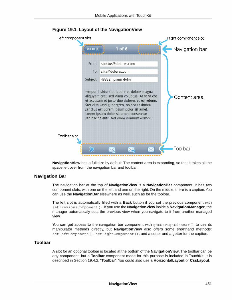
Figure 19.1. Layout of the NavigationView
NavigationView has a full size by default. The content area is expanding, so that it takes all thespace left over from the navigation bar and toolbar.
Navigation Bar
The navigation bar at the top of NavigationView is a NavigationBar component. It has twocomponent slots, with one on the left and one on the right. On the middle, there is a caption.Youcan use the NavigationBar elsewhere as well, such as for the toolbar.
The left slot is automatically filled with a Back button if you set the previous component withsetPreviousComponent(). If you use the NavigationView inside a NavigationManager, themanager automaticaly sets the previous view when you navigate to it from another managedview.
You can get access to the navigation bar component with getNavigationBar() to use itsmanipulator methods directly, but NavigationView also offers some shorthand methods:setLeftComponent(), setRightComponent(), and a setter and a getter for the caption.
Toolbar
A slot for an optional toolbar is located at the bottom of the NavigationView. The toolbar can beany component, but a Toolbar component made for this purpose is included in TouchKit. It isdescribed in Section 19.4.2, “Toolbar”.You could also use a HorizontalLayout or CssLayout.
451NavigationView
Mobile Applications with TouchKit

You usually fill the tool bar with Button components with an icon and no textual caption.You setthe toolbar with setToolbar().
Styling with CSS
.v-touchkit-navview { } .v-touchkit-navview-wrapper {} .v-touchkit-navview-toolbar {}.v-touchkit-navview .v-touchkit-navview-notoolbar {}
The root element has the v-touchkit-navview class. The content area is wrapped inside av-touchkit-navview-wrapper element. If the view has a toolbar, the toolbar slot has thev-touchkit-navview-toolbar style, but if not, the top-level element has thev-touchkit-navview-notoolbar style.
19.4.2. Toolbar
The Toolbar is a layout component that extends CssLayout, usually containing Button compon-ents. The toolbar has by default 100% horizontal width and a fixed height. The components arespread evenly in the horizontal direction. Toolbar is typically used in a NavigationView, as de-scribed in Section 19.4.1.
For a description of the inherited features, please refer to Section 6.3, “VerticalLayout and Ho-rizontalLayout”.
Styling with CSS
.v-touchkit-toolbar { }
The component has an overall v-touchkit-toolbar style in addition to the v-csslayoutstyle of the superclass. Other style names are as for CssLayout.
19.4.3. NavigationManager
The NavigationManager is a visual effect component that gives sliding animation when switchingbetween views. You can register three components: the currently displayed component, theprevious one on the left, and the next component on the right. You can set these componentswith setCurrentComponent(), setPreviousComponent(), and setNextComponent(),respectively.
The NavigationManager component is illustrated in Figure 19.2, “NavigationManager withThree NavigationViews”.
Toolbar452
Mobile Applications with TouchKit

Figure 19.2. NavigationManager with Three NavigationViews
The navigation manager is important for responsiveness, because the previous and next com-ponents are cached and the slide animation started before server is contacted to load the newnext or previous views.
Switching between the views is done programmatically according to user interaction; swipegestures are not supported at the moment.
Handling View Changes
While you can put any components in the manager, some special features are enabled whenusing the NavigationView.When a view becomes visible, the onBecomingVisible() methodin the view is called.You can override it, just remember to call the superclass method.
@Overrideprotected void onBecomingVisible() { super.onBecomingVisible();
...}
Tracking Breadcrumbs
NavigationManager also handles breadcrumb tracking.The navigateTo() pushes the currentview on the top of the breadcrumb stack and navigateBack() can be called to return to theprevious breadcrumb level.
Notice that calling navigateTo() with the "previous" component is equivalent to callingnavigateBack().
453NavigationManager
Mobile Applications with TouchKit

19.4.4. NavigationButton
The NavigationButton is a special version of the regular Button designed for navigation insidea NavigationManager, as described in Section 19.4.3. Clicking the button will automaticallynavigate to the defined target view. The view change animation does not need to make a serverrequest first, but starts immediately after clicking the button. If you leave the target view empty,an empty placeholder view is shown in the animation. The view is filled after it gets the contentfrom the server.
You can give the target view either in the constructor or with setTargetView().
NavigationView view = new NavigationView("A View");...NavigationButton button = new NavigationButton("Click");button.setTargetView(view);...
Notice that the automatic navigation will only work if the button is inside a NavigationManager(in a view inside it). If you just want to use the button as a visual element, you can use it like aregular Button and handle the click events with a ClickListener.
Styling with CSS
.v-touchkit-navbutton { } .v-touchkit-navbutton-desc { }
The component has an overall v-touchkit-navbutton style. If the component description isset with setDescription(), it is shown in a separate <span> element with thev-touchkit-navbutton-desc style.
19.4.5. Popover
Popover is much like a regular Vaadin sub-window, useful for quickly displaying some optionsor a small form related to an action. Unlike regular sub-windows, it does not support dragging orresizing by the user. It can have a caption, but usually does not. As sub-windows usually requirea rather large screen size, the Popover is mainly applicable to tablet devices, but can be usedalso in phones with full size with setSizeFull().
In the following, we extend Popover to use it. It is modal by default. Notice that the screen sizeis not available in the constructor, so we have to postpone using it to the attach() method.
public class ComposeView extends Popover { ... public ComposeView(boolean smartphone) { setClosable(false);
...
// In phones use all space, in tablets just vertically if (smartphone) { setSizeFull(); } else { setHeight("100%"); center(); } }
@Override public void attach() {
NavigationButton454
Mobile Applications with TouchKit

super.attach();
// If tablet is wide, leave some space horizontally if (!smartphone) { if (getParent().getWidth() > 800) { setWidth("80%"); } else { setWidth("100%"); } } } ...}
You add popover windows to an application-level Window object with addWindow(), just likesub-windows in a regular Vaadin application.
if (event.getButton() == emailButton) { ComposeView composeView = new ComposeView(smartphone); getWindow().addWindow(composeView); return;}
The resulting user interface in a tablet device is shown in Figure 19.3, “Popover in a TabletDevice”.
Figure 19.3. Popover in a Tablet Device
Alternatively, you can call the showRelativeTo(), which displays the sub-window relative toan existing component in the user interface.
Popover popover = new Popover();popover.setContent(mailboxHierarchyView);popover.setClosable(true);popover.showRelativeTo(showMailboxHierarchyButton);popover.setHeight(getParent().getHeight() - 100, UNITS_PIXELS);
In this case, you should not call addWindow() explicitly.
Styling with CSS
.v-touchkit-popover .v-touchkit-fullscreen { } .v-touchkit-popover .v-touchkit-relative { } .v-touchkit-popover .v-touchkit-plain { }
455Popover
Mobile Applications with TouchKit

The component has an overall v-touchkit-popover style. If full-screen, it also has thev-touchkit-fullscreen style, if positioned relatively it has v-touchkit-relative, andif not, the v-touchkit-plain style.
19.4.6. Switch
The Switch component is a CheckBox that looks like the switch button in Apple iOS.
Switch switch = new Switch();switch.setCaption("Do I look like iOS?");layout.addComponent(switch);
Styling with CSS
.v-touchkit-switch { } .v-touchkit-switch-slider { }
The component has an overall v-touchkit-switch style. The slider element hasv-touchkit-switch-slider style.
19.4.7. ComponentGroup
The ComponentGroup is a layout component for grouping components. It uses margins, back-ground color, and rounded corners to visualize the grouping. It extends CssLayout and behavesotherwise as such, except in having 100% default width. There is a vertical and a horizontalversion of the component.
VerticalComponentGroup componentGroup = new VerticalComponentGroup();
// Name fieldComponent textField = new TextField("Name");textField.setWidth("100%");componentGroup.addComponent(textField);
// Email fieldEmailField emailField = new EmailField("Email");emailField.setWidth("100%");componentGroup.addComponent(emailField);
// Number fieldNumberField numberField = new NumberField("Age");numberField.setWidth("100%");componentGroup.addComponent(numberField);
Styling with CSS
.v-touchkit-componentgroup { }
.v-touchkit-componentgroup-h { }
The component has an overall v-touchkit-componentgroup style if vertical andv-touchkit-componentgroup-h if horizontal. If the component has a caption, thev-touchkit-has-caption style is added.
19.4.8. EmailField
The EmailField is just like the regular TextField, except that it has automatic capitalization andcorrection turned off. Mobile devices also recognize the field as an email field and can offer avirtual keyboard for the purpose, so that it includes the at (@) and period (.) characters, andpossibly a shorthand for .com.
Switch456
Mobile Applications with TouchKit

19.4.9. NumberField
The NumberField is just like the regular TextField, except that it is marked as a numeric inputfield for mobile devices, so that they will show a numeric virtual keyboard rather than the defaultalphanumeric.
19.5. Mobile Features
19.5.1. Geolocation
The geolocation feature in TouchKit allows receiving the geographical location from the mobiledevice. The browser will ask the user to confirm that the web site is allowed to get the locationinformation. Tapping Share Location gives the permission. The browser will give the positionacquired by GPS, cellular positioning, or Wi-Fi positioning, as enabled in the device.
Geolocation is requested by calling detectCurrentPosition() in the TouchKitWindowmain window of the application. You need to give a PositionCallback handler that receives thelocation in onSuccess() if acquired from the device successfully. The position is given in aPosition object.
mainWindow.detectCurrentPosition(new PositionCallback() { public void onSuccess(Position position) { double latitude = position.getLatitude(); double longitude = position.getLongitude(); double accuracy = position.getAccuracy();
... }
public void onFailure(int errorCode) { ... }});
The position is given as degrees with fractions. The longitude is positive to East and negative toWest of the Prime Meridian passing through Greenwich, following the convention for coordinatesystems. The accuracy is given in meters.
The onFailure() is called if the positioning fails for some reason. The errorCode explainsthe reason. Error 1 is returned if the permission was denied, 2 if the position is unavailable, 3 onpositioning timeout, and 0 on an unknown error.
Notice that geolocation can take significant time, depending on the location method used by thedevice. With Wi-Fi and cellular positioning, the time is usually less than 30 seconds. With GPS,it can reach minutes or longer, especially if the reception is bad.
19.6.Testing and Debugging on Mobile Devices
Testing places special challenges for mobile devices. The mobile browsers may not have muchdebugging features and you may not be able to install third-party debugging add-ons, such asFirebug.
19.6.1. Debugging
The debug mode, as described in Section 12.4, “Debug and Production Mode”, works on mobilebrowsers as well, even if it is a bit harder to use.
457NumberField
Mobile Applications with TouchKit

The lack of FireBug and similar tools can be helped with simple client-side coding. For example,you can dump the HTML content of the page with the innerHTML property in the HTML DOM.
TouchKit supports especially WebKit-based browsers, which are used in iOS and Android devices.You can therefore reach a good compatibility by using a desktop browser based on WebKit.Features such as geolocation are also supported by desktop browsers. If you make yourphone/tablet-detection and orientation detection using screen size, you can easily emulate themodes by resizing the browser.
Debugging458
Mobile Applications with TouchKit

Chapter 20
Vaadin TestBench
20.1. Overview .............................................................................................. 45920.2. TestBench Components ....................................................................... 46020.3. Requirements ...................................................................................... 46120.4. Installing Vaadin TestBench ................................................................. 46220.5. Setting Up the Grid Hub ...................................................................... 46620.6. Setting Up Grid Nodes ......................................................................... 46920.7. Using Vaadin TestBench Recorder ...................................................... 47220.8. Test Script Commands ......................................................................... 47620.9. Compiling and Executing JUnit Tests ................................................... 478
This chapter describes the installation and use of the commercial Vaadin TestBench product.
20.1. Overview
Quality assurance is one of the cornerstones of modern software development. Extendingthroughout the entire development process, quality assurance is the thread that binds the endproduct to the requirements. In iterative development processes, with ever shorter release cyclesand continuous integration, the role of regression testing is central. The special nature of webapplications creates many unique requirements for regression testing.
Vaadin TestBench makes it possible to automate the regression testing of web applications thatuse Vaadin. You record test cases by interacting with your application. After recording, you cancompile the tests as JUnit tests and run them for as many times as you want, on multiple platformsand browsers. The test results can be collected for later analysis and quality assurance.
459Book of Vaadin

Figure 20.1.TestBench Workflow
The main features of Vaadin TestBench are:
• Recording and playing back test cases using a recorder in browser
• Validating UI state by assertion points and screen capture comparison
• Screen capture comparison with difference highlighting
• Execution of tests through JUnit
• Distributed test grid for running tests
• Integration with unit testing
Execution of tests can be distributed over a grid of test nodes, which speeds up testing. The gridnodes can run different operating systems and have different browsers installed. In a minimalsetup, such as for recording the tests, you can use Vaadin TestBench on just a single computer.
Vaadin TestBench is based on the Selenium testing framework and Selenium Grid for distributedtesting. Selenium is augmented with Vaadin-specific extensions, such as the screen capturefeature.
Licensing and Trial Period
Vaadin TestBench is a commercial product sold under the Commercial Vaadin Add-On License(CVAL).You can purchase and download TestBench from the Vaadin Directory.
You may try out the product for a free 30-day trial period, after which you are required to acquirethe needed licenses.
20.2.TestBench Components
The main components of Vaadin TestBench are:
• Vaadin TestBench Recorder
• Vaadin TestBench Library
• Vaadin TestBench Grid Hub
• Vaadin TestBench Grid Remote Control
The components and a basic setup are illustrated in Figure 20.2, “Vaadin TestBench Architecture”.
Licensing and Trial Period460
Vaadin TestBench

Figure 20.2. Vaadin TestBench Architecture
Recording test cases requires Vaadin TestBench Recorder, which is a Mozilla Firefox extensionthat you install in your browser. It provides a control panel to record test cases and play themback.You can play test cases right in the recorder and later automatically by the Grid Node RemoteControl, which opens a browser and starts the recorder in playback mode.
The test suite and results from test runs are stored on a test server. A test suite includes recordedtest cases and possible reference images for similarity tests.
Vaadin TestBench Library provides the central control logic for:
• Converting tests from recordings to JUnit tests
• Comparing screen captures with reference images
• Controlling the execution of tests on the VaadinTestBench Grid Hub
Vaadin TestBench Grid Hub is a service that distributes testing tasks to nodes on the test grid.It contacts a Grid Node Controller on a node and asks it to open a browser to run the current teston. The Grid Hub runs on a server which can be dedicated, one of the grid nodes, or the testserver itself.
Vaadin TestBench Grid Node Controller is a service that runs on each grid node. It is able toopen any of the browsers installed in a node and run commands for tests on the browsers. It re-ceives requests to execute test commands from the Grid Hub and reports the results back.
A basic Vaadin TestBench environment consists of:
• A workstation with Firefox and the TestBench Recorder for recording tests
• A build/test server used to build, launch, and test the web application
• A server running the Grid Hub
• One or more servers running Grid Remote Controls
The workstation and servers can be separate computers or one computer can work in multipleroles.
20.3. Requirements
Requirements for Vaadin TestBench Recorder
For recording and playback with Vaadin TestBench Recorder:
461Requirements
Vaadin TestBench

• Mozilla Firefox 3.x or newer
Requirements for Automated Testing
For running tests:
• Java JDK 1.5 or newer
• Browsers installed on test nodes
• Apache Ant or some other way to run Ant scripts (recommended)
Continuous Integration Compatibility
Vaadin TestBench works with continuous integration systems that support JUnit testing. It istested to work on the TeamCity build management and continuous integration server.
Known Compatibility Problems
Firebug should be disabled In some cases, Firebug injects a <divid="_firebugConsole"> element under the <body>element (the element is invisible in the Firebug's HTMLstructure browser). This can disturb recording of testcases, especially when closing notifications. Firebug1.6 should fix this issue, but we still encourage Test-Bench users to disable Firebug when recording orplaying test cases.
Screenshots when running Inter-net Explorer 9 in CompatibilityMode
Internet Explorer prior to version 9 adds a two-pixelborder around the content area. Version 9 no longerdoes this and as a result screenshots taken using Inter-net Explorer 9 running in compatibility mode (IE7/IE8)will include the two pixel border, contrary to what theolder versions of Internet Explorer do.
20.4. Installing Vaadin TestBench
Installation of Vaadin TestBench covers the following tasks:
• Download and unpack the Vaadin TestBench installation package
• Install Vaadin TestBench Recorder
• Install Vaadin TestBench Library and launch scripts
• Install Vaadin TestBench Grid Hub
• Install Vaadin TestBench Grid Remote Controls
At first, you only need to install the Recorder. It allows you to record and play back tests in thebrowser.The rest of the installation tasks are for running automated tests from a test server usinga grid.
Two basic installation types are covered in these instructions:
Requirements for Automated Testing462
Vaadin TestBench

• Test development installation on a workstation
• Distributed grid installation
20.4.1.Test Development Installation
In a typical small test development setup, you will install all the components on a single workstation.See Section 20.4.5, “Quick Setup for Playback on a Workstation” for a quick test developmentsetup.
The default values in the example/test.xml Ant script in the installation package assumesthat the hub is installed on the localhost where the script is executed. With the base setup thehub and remote control are launched on the localhost.
20.4.2. A Distributed Test Environment
A Vaadin TestBench grid consists of two categories of components:
• Vaadin TestBench Grid Hub service
• Grid nodes running Vaadin TestBench Grid Remote Control
The hub is a service that handles communication between the JUnit test runner and the nodecontrollers. The node controllers are services that can launch a browser and perform the actualexecution of test commands in the browser.
The hub requires very little resources, so you would typically run it either in the test server or onone of the nodes.
In a fully distributed setup, you install the Vaadin TestBench components on separate hosts.
20.4.3. Downloading and Unpacking the Installation Package
First, download the installation package vaadin-testbench-2.x.x.zip and extract the in-stallation package where you can find it.
Windows
In Windows, use the default ZIP decompression feature to extract the package into your chosendirectory, for example, C:\dev.
Warning
The default decompression program in Windows XP and Vista as well as some ver-sions of WinRAR cannot unpack the installation package properly in certain cases.Decompression can result in an error such as: "The system cannot find the file spe-cified." This can happen because the default decompression program is unable tohandle long file paths where the total length exceeds 256 characters. This occurs,for example, if you try to unpack the package under Desktop. You should unpackthe package directly into C:\dev or some other short path or use another decom-pression program.
463Test Development Installation
Vaadin TestBench

Linux, MacOS X, and other UNIX
In Linux, Mac OS X, and other UNIX-like systems, use Info-ZIP or other ZIP software with thecommand:
$ unzip vaadin-testbench-2.x.x.zip
The contents of the installation package will be extracted under the vaadin-testbench install-ation directory in the chosen directory.
20.4.4. Installing the Recorder
You need the Vaadin TestBench Recorder in a test development environment for recording testcases and to play them back.
After extracting the files from the installation package, do the following:
1. Change to the vaadin-testbench-recorder directory under the installation directory.
2. Open Mozilla Firefox
3. Either drag and drop the vaadin-testbench-recorder-2.x.x.xpi to an openFirefox window or open it from the File menu.
4. Firefox will ask if you want to install the TestBench Recorder extension. Click InstallNow.
Figure 20.3. Installing Vaadin TestBench Recorder
5. After the installation of the add-on is finished, Firefox offers to restart. Click RestartNow.
Installation of a new version of Vaadin TestBench Recorder will overwrite an existing previousversion.
After Firefox has restarted, navigate to a Vaadin application for which you want to record testcases, such as http://demo.vaadin.com/colorpicker.
Installing the Recorder464
Vaadin TestBench

20.4.5. Quick Setup for Playback on a Workstation
You can run the grid hub and a remote control on your workstation when developing tests. Theconfiguration uses the localhost as default, so you do not need to edit the configuration files atthis point.
Windows
1. Navigate to grid/hub/ in the installation directory and run hub.bat to start the hubon port 4444.
2. Navigate to grid/remote-control/ in the installation directory and run rc.bat tostart the remote control on the local machine and have it connect to the hub.
Linux, Mac OS X, and other UNIX
1. Open a terminal window and change to grid/hub/ under the installation directory
2. Edit hub configuration file grid_configuration.yml and check that it includes yourenvironment, as described in Section 20.5.2, “Predefined Target Environments”. Espe-cially in Linux, if using Firefox, edit the path to the firefox-bin executable.
3. Run hub.sh to start the hub on port 4444.
$ cd vaadin-testbench-2.x.x/grid/hub$ sh hub.sh
4. Open a second terminal window and change to grid/node-controller/ under theinstallation directory
5. Edit the remote configuration file rc_configuration.xml, disable the Windows targetsand enable the targets for your environment, as described in Section 20.6.1, “Configuringa Remote Control”.
6. Run rc.bat to start the node controller on the local machine and have it connect tothe hub.
$ cd vaadin-testbench-2.x.x/grid/remote-control$ sh rc.sh
Check that the remote control registers correctly by opening http://localhost:4444/console in aweb browser.
Next, change to the example/ directory.
$ cd vaadin-testbench-2.x.x/example
Open the test.xml file in an editor and edit the list of browsers (target environment names) tomatch your system and the installed browsers.
<property name="browsers" value="winxp-ie8,winxp-firefox3" />
The value must be a comma-separated list of target names. A complete list of predefined browsers(target environments) is given in Section 20.5.2, “Predefined Target Environments”. If your envir-onment is not included in the predefined entries, you need to edit the hub and remote control
465Quick Setup for Playback on a Workstation
Vaadin TestBench

configurations before starting them. Notice that the target name is merely an alias for a browseridentifier, and you could use "winxp-firefox3" in Linux or Mac OS X as well, assuming thatFirefox is installed on the host.
When you feel that the configuration is OK, run the script:
$ ant -f test.xml
The script will convert, compile, run the recorded test and give a brief output on the success orfailure of the test.
20.5. Setting Up the Grid Hub
The grid hub can be installed in the same server where the tests are run, in one of the grid nodes,or on a dedicated server. In a test development installation, you can install it on the same work-station or server with all the other components.
You can find the grid hub from the full installation package and from the separatevaadin-testbench-grid package.
20.5.1. Configuring the Hub
The hub is configured in the grid_configuration.yml file. You need to edit this file if thepredefined list of targets does not cover all the wanted targets, that is, the operating system +browser combinations that you wish to test.
The first line contains the "hub" tag, after which should come the port definition. A hub uses theport 4444 by default. After the "environments:" tag comes a list of name-browser pairs thateach define a target.
DescriptionParameter
Corresponds to the Target value in a remotecontrol in a node. The name can be defined as
name
anything, but may not contain commas, whichact as separator characters in the environmentvariable of the remote control configuration.
Identifies a browser run by this target. Thebrowser identifiers are prefixed with an asterisk
browser
and can be appended with an exact path to thebrowser executable. A list of allowed browseridentifiers and a description of the executablepaths is given in Section 20.5.3, “BrowserIdentifiers”.
For example:
hub: port: 4444 remoteControlPollingIntervalInSeconds: 120 sessionMaxIdleTimeInSeconds: 90 newSessionMaxWaitTimeInSeconds: 5 environments: - name: "winxp-ie7" browser: "*iexplore" - name: "winxp-firefox3" browser: "*firefox"
Setting Up the Grid Hub466
Vaadin TestBench

- name: "winxp-googlechrome4" browser: "*googlechrome"
- name: "linux-firefox3" browser: "*firefox /usr/lib/firefox/firefox-bin"
- name: "osx-firefox35" browser: "*firefox" - name: "osx-safari4" browser: "*safari"
A list of the predefined target environments is given in the next section.
20.5.2. Predefined Target Environments
The predefined targets are system-browser combinations mapped to a browser identifier. Theyare as follows:
BrowserTarget Name
*iexplorewinxp-ie6
*iexplorewinxp-ie7
*iexplorewinxp-ie8
*firefoxwinxp-firefox3
*firefoxwinxp-firefox36
*safariwinxp-safari4
*safariproxywinxp-safari5
*operawinxp-opera10
*googlechromewinxp-googlechrome6
*firefoxlinux-firefox3
*firefoxlinux-firefox36
*operalinux-opera10
*firefoxosx-firefox35
*safariosx-safari4
*operaosx-opera10
20.5.3. Browser Identifiers
Vaadin TestBench supports the following browser identifiers:
BrowserBrowser Identifier
Mozilla Firefox 2 or 3 (prefers 2)*firefox
Mozilla Firefox 2.x*firefox2
Mozilla Firefox 3.x*firefox3
Mozilla Firefox*firefoxchrome
Mozilla Firefox (not Google Chrome!)*chromec
Internet Explorer*iexplore
Apple Safari and other WebKit based browsers*safari
467Predefined Target Environments
Vaadin TestBench

BrowserBrowser Identifier
Apple Safari 5 requires this identifier*safariproxy
Opera*opera
Google Chrome*googlechrome
The above list does not include incompatible or otherwise irrelevant browsers.
Notice that the target *firefox3 is defined so that, if both Firefox 2 and 3 are installed on thesystem, preference is given to the version 2. This may cause an unexpected mix-up, as onewould expect Firefox 3 to be launched.
In cases where
• multiple browsers with the same name are installed, or
• the remote controller can not find the browser because it is not installed to the defaultlocation,
the browser identifier can be appended with the absolute path to the browser executable, separatedby a space from the identifier. For example, "*firefox /opt/firefox3.6/firefox-bin".
If you specify the absolute path to the browser, it must be same on all grid nodes (remote controls)that support the target environment. If such a browser is installed in a different location on differentnodes, you need to have a separate target environment specified for each.
In Linux, using the absolute path for Firefox is necessary, because the "firefox" program is justa script that launches the actual executable. Stopping the launch script does not close the browser,so the Firefox window will not close after the tests are done. If your Firefox installation directoryis /opt/firefox, for example, you need to use "*firefox /opt/firefox/firefox-bin"in the configuration to start Firefox.
The exact installation directory of Firefox depends on the system and used installation method(package management or manual installation). Typical locations include the following paths:
• /opt/firefox/firefox-bin
• /usr/lib/firefox/firefox-bin
• /usr/local/firefox/firefox-bin
• /usr/local/lib/firefox/firefox-bin
The binary itself can also be named something else that firefox-bin.
20.5.4. Starting the Hub
The grid hub is a service bound to a port, 4444 by default.
On Windows:
1. Navigate to grid/hub/ folder in the installation folder, and
2. Run hub.bat to start the hub on port 4444.
Closing the console window will stop the service.
Starting the Hub468
Vaadin TestBench

On Linux, Mac OS X, and other UNIX:
1. Open a terminal window and change to grid/hub/
2. Run hub.sh to start the hub on port 4444.
$ cd vaadin-testbench-2.x.x/grid/hub$ sh hub.sh
The hub service starts attached to the terminal and writes its log to standard output. Press Ctrl+Cto stop the service.You can also daemonize the service.
20.6. Setting Up Grid Nodes
A grid node is a server, a desktop computer, or a virtual machine running a windowed operatingsystem. It needs to have:
• Java 1.5 JRE (or newer) installed
• One or more web browsers installed
• Vaadin TestBench Remote Control installed and configured
A remote control is a service running on a grid node. It acts as a "remote control" for controllingthe web browsers installed on the node: it can launch and stop browser applications and executetest commands in them. A remote control is itself "remote controlled" by the grid hub, which del-egates the tests to the available remote controls.
The installation of web browsers is not covered in this manual.
20.6.1. Configuring a Remote Control
A remote control should be configured before starting it. The configuration is done by editing therc_configuration.xml file. Values given in the XML configuration file override the defaultvalues defined in the run script.
DescriptionParameter
The port this remote control listens to for com-mands from the hub. Default port is 5555.
port
The address of the hub as a URL. Local hostby default.
hubURL
An environment target (system-browser combin-ation) that this remote control supports. The
environment
target must match one of the target namesdefined in the hub configuration.You can definemultiple environments. See 2.5.1: Configuringthe Hub for more information about the targetsand a list of predefined targets.
The host name or IP address of this node con-troller. If the host name is not defined, the hubtries to determine it from the registration request.
host
469Setting Up Grid Nodes
Vaadin TestBench

If the hub is running on the same host as the remote control, only the environment targets needto be defined.
20.6.2. Configuring the Run Script
A remote control can also be configured in the run scripts (rc.sh or rc.bat) by defining:
DescriptionEnvironment Variable
Environment targets (system-browser combina-tions) supported by this remote control. The
ENVIRONMENT
targets in the comma-separated list must matchone of the target names defined in the hubconfiguration.
Where user-extensions.js is located.USEREXTENSIONS
In this case, you will also need to add the following parameters after theSelfRegisteringRemoteControlLauncher.
DescriptionParameter
Address of the hub.hubUrl
The port that this node controller should listento.
port
On a Windows machine, you can put an -ensureCleanSession option in the rc.bat to havethe remote control close all running iexplore.exe processes.
20.6.3. Starting the Remote Control
A remote control is a service bound to a port, 5555 by default.
On Windows, navigate to grid/remote-control/ folder under the installation folder and runrc.bat to start the remote control. Closing the console window will stop the service.
On Linux, Mac OS X, or other UNIX:
1. Open a terminal window and change to grid/remote-control/
2. Run rc.sh to start the remote control.
$ cd vaadin-testbench-2.x.x/grid/remote-control$ sh rc.sh
The remote control service starts attached to the terminal and writes its log to standard output.Press Ctrl+C to stop the service.You can make the service run in the background by daemonizingit.
20.6.4. Running Tests Without a Grid Hub
You can run tests on a single testing node also without a grid hub, with just a remote control in-stalled.The used remote control needs to be a clean Selenium remote control that is started withthe command:
$ java -jar selenium-server.jar -userExtensions user-extensions.js
Configuring the Run Script470
Vaadin TestBench

The user-extensions.js file can be found in the grid/remote-control/ folder.
When running the tests through JUnit, as described in Section 20.9, “Compiling and ExecutingJUnit Tests”, you need to:
1. Set the com.vaadin.testbench.tester.host property to point to the server onwhich the remote control runs instead of a hub host.
2. You need to list the browsers installed in the RC host in the browsers property, eitherin the Ant script or in command-line. See the list of allowed browser identifiers in Sec-tion 20.5.1, “Configuring the Hub”.
<property name="browsers" value="*firefox"/>
You can also specify the browser executable path here, as described in Section 20.5.1,“Configuring the Hub”.
<property name="browsers" value="*firefox /opt/firefox/firefox-bin"/>
20.6.5. Browser settings
Turn off pop-up blockers for all browsers.
Internet Explorer Make the settings in Tools Pop-up Blocker Turn Off Pop-upBlocker
Safari Make the settings in Edit Block Pop-up Windows
Also turn off default browser checks for all browsers.
20.6.6. Operating system settings
Make any operating system settings that might interfere with the browser and how it is openedor closed. Typical problems include crash handler dialogs.
On Windows, disable error reporting in case a browser crashes as follows:
1. Open control panel System
2. Select Advanced tab
3. Select Error reporting
4. Check that Disable error reporting is selected
5. Check that But notify me when critical errors occur is not selected
20.6.7. Settings for Screenshots
The screenshot comparison feature requires that the user interface of the browser stays constant.The exact features that interfere with testing depend on the browser and the operating system.
In general:
• Disable the auto-hide function for the toolbar
471Browser settings
Vaadin TestBench
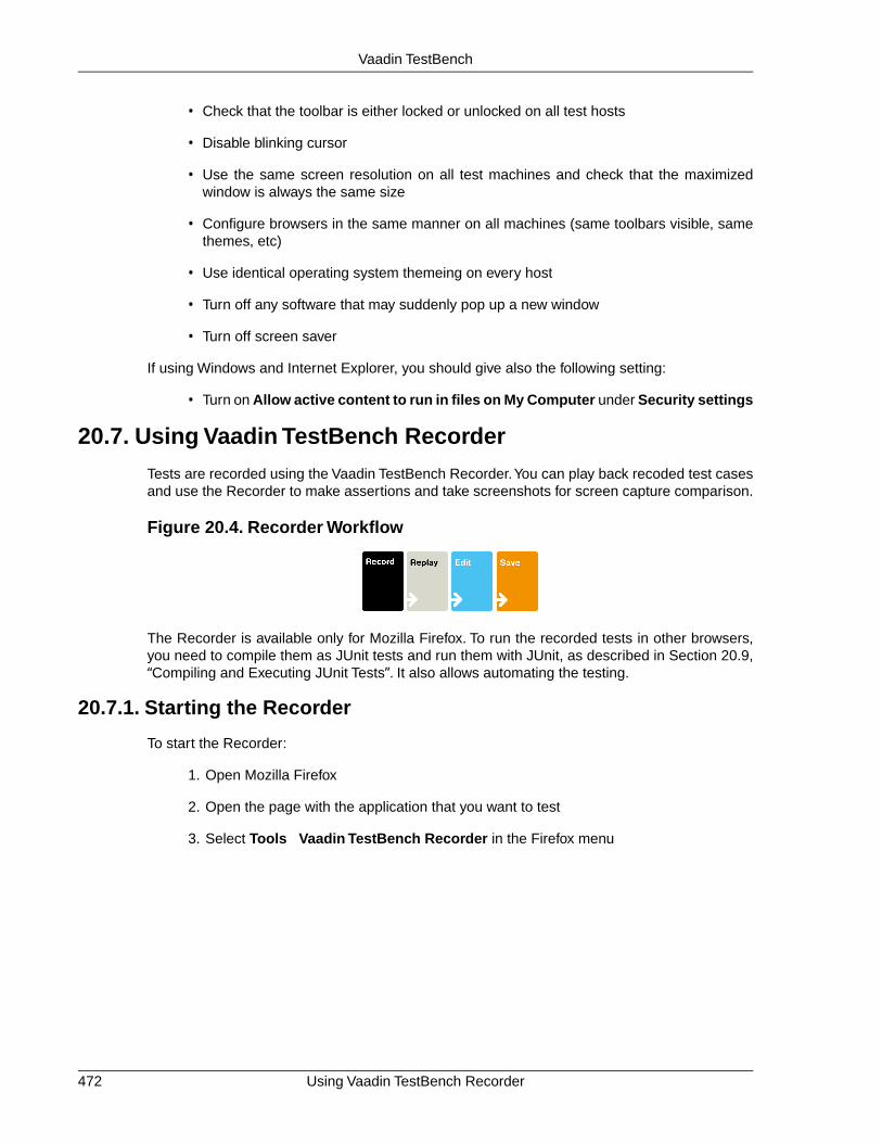
• Check that the toolbar is either locked or unlocked on all test hosts
• Disable blinking cursor
• Use the same screen resolution on all test machines and check that the maximizedwindow is always the same size
• Configure browsers in the same manner on all machines (same toolbars visible, samethemes, etc)
• Use identical operating system themeing on every host
• Turn off any software that may suddenly pop up a new window
• Turn off screen saver
If using Windows and Internet Explorer, you should give also the following setting:
• Turn on Allow active content to run in files on My Computer under Security settings
20.7. Using Vaadin TestBench Recorder
Tests are recorded using the Vaadin TestBench Recorder.You can play back recoded test casesand use the Recorder to make assertions and take screenshots for screen capture comparison.
Figure 20.4. Recorder Workflow
The Recorder is available only for Mozilla Firefox. To run the recorded tests in other browsers,you need to compile them as JUnit tests and run them with JUnit, as described in Section 20.9,“Compiling and Executing JUnit Tests”. It also allows automating the testing.
20.7.1. Starting the Recorder
To start the Recorder:
1. Open Mozilla Firefox
2. Open the page with the application that you want to test
3. Select Tools Vaadin TestBench Recorder in the Firefox menu
Using Vaadin TestBench Recorder472
Vaadin TestBench

Figure 20.5. Starting Vaadin TestBench Recorder
The Vaadin TestBench Recorder window will open, as shown in Figure 4.
Figure 20.6. Vaadin TestBench Recorder running with the Calc demo
Recording is automatically enabled when the Recorder starts. This is indicated by the pressedRecord button.
20.7.2. Recording
While recording, you can interact with the application in (almost) any way you like. The Recorderrecords the interaction as commands in a test script, which is shown in tabular format in the Tabletab and as HTML source code in the Source tab.
473Recording
Vaadin TestBench

Figure 20.7. User interaction recorded as commands
Please note the following:
• Changing browser tabs or opening a new browser window is not recommended, as anyclicks and other actions will be recorded
• Passwords are considered to be normal text input and are stored in plain text
While recording, you can insert various commands such as assertions or take a screenshot byselecting the command from the Command list.
When you are finished, click the Record button to stop recording.
20.7.3. Playing Back Tests
After you have stopped recording, reset the application to the initial state and press Playcurrent test to run the test again. You can use the &restartApplication parameter for anapplication in the URL to restart it.
You can also play back saved tests by opening a target test in the Recorder with File Open.
You can use the slider to control the playback speed, click Pause to interrupt theexecution and Resume to continue. While paused, you can click Step to execute the script step-by-step.
Check that the test works as intended and no unintended or invalid commands are found; a testshould run without errors.
20.7.4. Editing Tests
You can insert various commands, such as assertions or taking a screenshot, in the test scriptduring or after recording,
You insert a command by selecting an insertion point in the test script and right-clicking an elementin the browser. A context menu opens and shows a selection of Recorder commands at thebottom. Selecting Show All Available Commands shows more commands. Commands insertedfrom the sub-menu are automatically added to the top-level context menu.
Figure 20.8, “Inserting commands in a test script” shows adding an assertion after calculating"6*7=" with the Calc demo.
Playing Back Tests474
Vaadin TestBench

Figure 20.8. Inserting commands in a test script
Inserting a command from the context menu automatically selects the command in the Commandfield and fills in the target and value parameters.
You can also select the command manually from the Command list. The new command orcomment will be added at the selected location, moving the selected location down. If the commandrequires a target element, click Select and then click an element in your application. A referenceto the element is shown in the Target field and you can highlight the element by clicking Find.If the command expects some value, such as for comparing the element value, give it in theValue field.
Commands in a test script can be changed by selecting a command and changing the command,target, or value.
The commands specific to Vaadin TestBench are documented in Section 20.8, “Test ScriptCommands”.
20.7.5. Saving Tests
Saving Individual Tests
You can save a test by selecting File Save Test. If you are just learning to use the Recorder,give the example/testscripts/ folder below the Vaadin TestBench installation folder as thetarget folder.
Vaadin TestBench stores the tests and test suites as HTML files. This makes it easy to reviewsaved test scripts with a web browser and edit them manually.
Saving Test Suites
You can save multiple tests as a test suite with File Save Test Suite. If you are just learning touse the Recorder, give example/testscripts/ folder below the Vaadin TestBench installationfolder as the target folder.
An entire test suite is executed as a single JUnit test. However, the success or failure is reportedfor the entire suite, which may be undesired. It is usually more useful to get the result for eachtest separately.
Test suites are nevertheless useful for composing larger tests from separate test phases. Forexample, you could have all your tests as test suites, and each would have a "login test" as thefirst phase, followed by some test case specific phases. You can also use the includeTestcommand for the same purpose
475Saving Tests
Vaadin TestBench

20.7.6. Invalid Tests
Tests can become invalid due to intentional changes to the application. Normally, it involveschanges in elements so that the Vaadin TestBench element locator can't find the correct element.
If the problem is that an element can not be found, press to play back the test. Find the problemposition and check with the Find button that the element can not be found (for example, it is aproblem with timing so that the element just is not available yet). You can re-select the elementeasily with the Select button that will update the target.
20.8.Test Script Commands
Vaadin TestBench Recorder is based on the Selenium IDE, so the Selenium documentationprovides a complete reference of all the commands available in the Selenium IDE and thereforein the Recorder.
Vaadin TestBench Recorder has the following special commands:
• screenCapture
• showTooltip
• assertText
• assertCSSClass
• includeTest
• expectDialog
• uploadFile
These special commands are described next.
20.8.1.Taking Screen Captures: screenCapture
The screenCapture command orders the Remote Control to take a screen capture of the browserview and compare the result against a reference image, if one is available. If a reference imageis not available, the command will save the screen capture and fail the test. You can then latercopy the captured image as the reference image.
Observe that the screenshots are not taken by the Recorder, for example when you are playingback a test case in the Recorder. They are taken by the Remote Control only afterward, whenyou run the tests from the test server that controls the Remote Control (through the hub).
The Value field can be used to define an identifier string for the screenshot. If the value is empty,a running number starting from 1 will be used as the identifier. Using a given identifier is morereliable than the numbers if the test is changed and screenshots are added or removed.
The naming convention for screenshot file names is automated and has the following format:
TestName_OS_BrowserName_BrowserMajorNumber_ID.png
Comparison and storage of screenshots is described in Section 20.9.5, “Comparing Screenshots”.
Invalid Tests476
Vaadin TestBench

20.8.2. Recording Tooltips: showTooltip
Clicking switches Recorder to a tooltip mode that allows making a tooltip appear. Recordingis done by hovering over the target element until a tooltip appears and then moving the mouseaway from the element. This will insert a showTooltip command and disable the tooltip button.
After this command causes a tooltip to appear, its content can be asserted with other commands.
20.8.3. Recording Text Assertion: assertText
Clicking allows recording an assertText command on elements where the context menu does
not work for some reason. When the button is active, the Recorder will record an assertTextcommand for the next mouse click, with the clicked element as the target.
20.8.4. Asserting CSS Class: assertCSSClass
Making an assertion on the CSS class of an element can be useful, for example, for determiningif a row in a table is selected, and in other cases where the use of a normal assertion would beinconvenient. The assertCSSClass needs to be manually added and the target selected.
Note that when selecting the target with the Select button, the selected target may be a child tothe wanted element. In this case the target needs to be edited or re-selected so that it points tothe correct element.
20.8.5. Asserting CSS Class: assertNotCSSClass
The assertNotCSSClass has the reverse function to assertCSSClass. This one is useful fordetecting cases where a class should have been removed from an element, but is not.
20.8.6. Connecting Tests Together: includeTest
Vaadin TestBench allows connecting tests together. This is done by inserting the includeTestcommand, where Value is the path to the test to be inserted. The path can be relative to the dir-ectory from which TestConverter is executed or an absolute path. Target test will be added infull at the position with includeTest. Inclusion only works when converting to JUnit tests withTestConverter.
20.8.7. Handling a Confirmation Box: expectDialog
The commands expectDialog + assertCommand are needed when a click event opens up aConfirmation dialog.
20.8.8. Uploading Files: uploadFile
Vaadin TestBench supports uploading of files for the Firefox browser. File uploads are recordedautomatically in the recorder and can be replayed as such. The uploadFile command differsfrom default behavior in Selenium in the way that there is no need to deploy the file to a URL thatis accessible from all remote controls, but the file is passed along to the remote controls, whichthen use the local copy when running the test. The file can be placed in the same location asyour test scripts (see Section 20.7.5, “Saving Tests”) as long as the name is not changed. Thisfile is sent to the remote controls if found, otherwise the file is read from the absolute path givenin the Value property of the command.
477Recording Tooltips: showTooltip
Vaadin TestBench

Vaadin TestBench is not aware of when the upload has been completed, so you need to add acommand such as waitForElementVisible if there is a component that is added after the upload.For example, the application might have a Label showing "Upload Finished". Otherwise, VaadinTestBench will continue with the next command before the upload has finished, which may causeproblems if it has not been taken into account.
Note
Playback of the uploadFile command in the TestBench Recorder will currently notsucceed if using Vaadin locators in Firefox 3.x due to security restrictions in thebrowser. This is a restriction in Recorder only and uploadFile in TestBench RemoteControl works correctly also when using a Vaadin locator. In order for replay to workin Recorder in Firefox 3.x, the Target should be changed to a standard XPath selectorstring by choosing one from the Target drop down menu. This problem has beenfixed in Firefox 4.
20.8.9. Shortcut Keys: keyPressSpecial
For testing shortcut keys (Ctrl, Alt, Shift + key) the command keyPressSpecial can be used.Combinations using arrow keys will be automatically recorded.
The value for keyPressSpecial should be a string with a space-separated list of modifier keys,and finalle the target key. For example, "ctrl a" or "alt shift a".
Note that the alphabetical key names are case-dependent and that Vaadin ShortcutAction.Key-Code responds to uppercase letters.
20.9. Compiling and Executing JUnit Tests
JUnit allows running tests remotely on a variety of different web browsers installed in grid nodes.The test scripts need to be first compiled from the HTML scripts saved with Recorder to Javaclasses. Vaadin TestBench Library includes a converter from the HTML format to Java sourcefiles, which you can then compile with a Java compiler.
Figure 20.9. JUnit Workflow
The recommended way to compile and run JUnit tests is to use an Ant script, as described inSection 20.9.1, “Configuring the Ant Script”.The subsequent sections give more details regardingthe tasks and their configuration options and describe how to use the tools from command-line.
A complete testing process involves the following tasks:
1. Start Vaadin TestBench Grid Hub
2. Start Vaadin TestBench Remote Control on each test node
3. Build the application to be tested
4. Convert and compile the tests
Shortcut Keys: keyPressSpecial478
Vaadin TestBench

5. Deploy the application to be tested (start the server)
6. Remove old error screens for screenshot directory
7. Run the compiled JUnit tests
8. Collect test results
9. Clean up temporary files (source and compiled java files)
10. Undeploy the application (stop the server)
11. Analyze test results
The exact order of the tasks may vary, especially for the conversion and compilation of tests,which can be done also before the step 1 or somewhere between the steps 3 and 5. Also deploy-ment and the collection of test results varies.
Building the application and how it is deployed is out of the context of this chapter. Java applica-tions are typically built with build systems such as Ant or Maven. Such a build system can be in-tegrated with a continuous integration system that not only builds the application, but also runstests and collects test results. Support for JUnit tests in Vaadin TestBench allows integration withany continuous integration system that supports JUnit tests.
20.9.1. Configuring the Ant Script
The recommended way to compile and run JUnit tests is to use an Ant script. An example scriptis given in the examples directory in the installation package. It will convert, compile, and run thetests.
You can make the settings either by editing the Ant script or by giving the settings as propertydefinitions from the command-line, for example:
$ ant -Dcom.vaadin.testbench.tester.host=localhost ...
Mandatory Settings
Define required system property values to the java virtual machine:
com.vaadin.testbench.tester.host Host name or IP address of the Vaadin TestBench GridHub. For example, "localhost. The port numbershould not be given in this parameter. If you have justa single test node and do not need the hub, you cangive the address of the node.
com.vaadin.testbench.deployment.url Base URL of the Vaadin application to be tested, forexample, "http://demo.vaadin.com/sampler/".
com.vaadin.testbench.screenshot.directory Base folder for screenshot reference and error images.The reference images are expected to be stored underthe reference subfolder. Error images are stored byJUnit under the error subfolder. On the first run, thereare no reference images; you should copy "accepted"screenshots from the error directory to thereference directory.
479Configuring the Ant Script
Vaadin TestBench

browsers A comma-separated list of target environments onwhich the tests should be run. The list entries mustmatch targets defined in the configuration of remotecontrols in the grid nodes. They must also be listed inthe configuration of the hub. The predefined browsernames are system-browser pairs.
The default settings in the example test script are:
<!-- Host name or IP address of the host running --><!-- TestBench RemoteControl or TestBench Hub. --><property name="com.vaadin.testbench.tester.host" value="127.0.0.1" />
<!-- Base URL where the testable application is --><!-- deployed --><property name="com.vaadin.testbench.deployment.url" value="http://demo.vaadin.com/" />
<!-- Browsers to use for testing --><property name="browsers" value="winxp-ie8,winxp-firefox35" />
<!-- Base directory for screenshots. --><property name="com.vaadin.testbench.screenshot.directory" value="screenshots" />
Optional Settings
Optional property values that can be used:
com.vaadin.testbench.screenshot.softfail If "true", a test is allowed to continue even if ascreenshot comparison fails.
If "false", the test is interrupted and testing will contin-ue with the next test.
com.vaadin.testbench.screenshot.onfail If "true" (default), a screenshot is automatically takenwhen a test fails. If "false", no screenshot is taken.
com.vaadin.testbench.screenshot.cursor If "true", makes checks whether a comparison erroroccurs because of a cursor. A blinking cursor can causeunintentional differences in screenshots and this helpswith the problem.
com.vaadin.testbench.screenshot.block.error Sets the amount of difference that causes a screenshotcomparison to fail. Comparison is done by 16x16 pixelblocks.The difference limit is given as a fraction (0<x 1)of how much a block can differ from the reference block.Default is 0.025, which means 2.5% difference.
com.vaadin.testbench.screenshot.reference.debug If "true", writes extra output for debugging purposes.
com.vaadin.testbench.screenshot.max.retries Defines how many times a screenshot should be takenagain if it contains differences from the reference image.This setting tries to eliminate unnecessary differencesthat are often caused by too slow rendering, so that thescreenshot may be taken from an unfinished renderingstate. The default is 2 retries.
Configuring the Ant Script480
Vaadin TestBench

com.vaadin.testbench.screenshot.resolution(recommended)
Specifies the resolution of screenshots as<width>x<height> pixels. For example, "1024x768".The browser window will be resized so that the viewarea has the given size.This setting does not work withOpera, which requires a custom profile file"profile-opera.txt" in the Remote Controllerfolder.
If tests give faulty croppings and sizes on screenshots,check that the browser canvas fits into the desktop.
20.9.2. Converting HTML Tests
The tests are stored in HTML format and need to be converted to Java source files before theycan be compiled as executable JUnit tests.
Converting tests is done by using the TestConverter in the Vaadin TestBench Library.
Using the TestConverter
The TestConverter is a utility class included in the Vaadin TestBench Library. You can use itfrom the command line or with the create-tests target in the example Ant script.
To use the converter, you need to add the Vaadin TestBench Library into your build path:
• vaadin-testbench-2.x.x.jar
The library is located in the root directory of the Vaadin TestBench installation package.
Command-Line Interface
You can use the test converter from command-line as follows:
$ java com.vaadin.testbench.util.TestConverter <OutputDir> <Browsers> <HTMLTestFiles>...
You also need to add the vaadin-testbench-2.x.x.jar in the class path, either with the-cp command-line parameter or with the CLASSPATH environment variable.
The parameters are:
DescriptionParameter
Output directory where the generated Javasource files should be written. The source files
OutputDir
are organized in Java packages by test nameand target environment name.
A comma-separated list of target environments.The target names must match the entries in thehub and remote control configurations.
Browsers
A space-separated list of test files in HTMLformat.
HTMLTestFiles
For example, assuming that you have recorded and saved a test by name mytests/CalcTest.html,as described in Section 20.7.5, “Saving Tests”, you could give the following command in the in-stallation folder:
481Converting HTML Tests
Vaadin TestBench

$ java -cp vaadin-testbench-2.0.0.jarcom.vaadin.testbench.util.TestConverterjava/ linux-firefox36 mytests/CalcTest.html
Using output directory: srcGenerating test CalcTest for linux-firefox36 in CalcTest.linux_firefox36Creating src/CalcTest/linux_firefox36/CalcTest.java for CalcTest
Here, we assumed that we have a remote control capable of executing tests for thelinux-firefox36 target. The command would create the Java source filesrc/CalcTest/linux_firefox36/CalcTest.java.
The Java package name is determined from the test name and the target environment.
Ant Script
The example Ant script located in the example/ folder in the installation package includes acreate-tests target, which runs the test converter for each HTML test file.
The target is called automatically by the default target in the script, but you can run it separatelyas well. For example:
$ cd example$ ant -f test.xml create-testsBuildfile: test.xml
create-tests: [echo] Using test scripts: '/opt/vaadin-testbench-2.0.0/example/testscripts/demo.vaadin.com.html' [java] Using output directory: temp-dir/src [java] Generating test demo_vaadin_com for winxp-ie8 in demo_vaadin_com.winxp_ie8 [java] Creating temp-dir/src/demo_vaadin_com/winxp_ie8/demo_vaadin_com.java for demo_vaadin_com [java] Generating test demo_vaadin_com for winxp-firefox35 in demo_vaadin_com.winxp_firefox35 [java] Creating temp-dir/src/demo_vaadin_com/winxp_firefox35/demo_vaadin_com.java for demo_vaadin_com
BUILD SUCCESSFULTotal time: 1 second
The example script writes the Java source files under temp-dir/src folder, as defined withthe temp-dir property in the script.
Optional conversion settings
com.vaadin.testbench.converter.parameterFile Defines a .properties file to be used for paramet-rising TestBench test Values.
On command-line, the parameter should be given asa s y s t e m p r o p e r t y(-Dcom.vaadin....parameterFile=VALUE. In anAnt script it should be given as <syspropertykey="com.vaadin...parameterFile"value="VALUE" />.
Converting HTML Tests482
Vaadin TestBench

20.9.3. Compiling JUnit tests
The Java source files for the JUnit tests need to be compiled. You need to include the VaadinTestBench Library vaadin-testbench-2.x.x.jar in your class path. The library is neededalso later when running the tests.
Command-Line Compilation
You can compile the tests with a Java compiler from the command-line, for example as follows:
$ javac -cp vaadin-testbench-2.0.0.jar -d classes src/CalcTest/linux_firefox36/CalcTest.java
In the above example, we assume that the source file is located in the src/ directory, where itwas written in the example in Section 20.9.2, “Converting HTML Tests” earlier. The compiledclass files are written to classes/.
Ant Build Script
The example Ant script located in the example/ folder in the installation package includes acompile-tests target, which compiles all the JUnit test Java sources.
For example:
$ ant -f test.xml compile-testsBuildfile: test.xml
create-tests: [echo] Using test scripts: '/opt/vaadin-testbench-2.0.0/example/testscripts/demo.vaadin.com.html' [java] Using output directory: temp-dir/src [java] Generating test demo_vaadin_com for winxp-ie8 in demo_vaadin_com.winxp_ie8 [java] Creating temp-dir/src/demo_vaadin_com/winxp_ie8/demo_vaadin_com.java for demo_vaadin_com [java] Generating test demo_vaadin_com for winxp-firefox35 in demo_vaadin_com.winxp_firefox35 [java] Creating temp-dir/src/demo_vaadin_com/winxp_firefox35/demo_vaadin_com.java for demo_vaadin_com
compile-tests: [mkdir] Created dir: /opt/vaadin-testbench-2.0.0/example/temp-dir/classes [javac] Compiling 2 source files to /opt/vaadin-testbench-2.0.0/example/temp-dir/classes
BUILD SUCCESSFULTotal time: 2 seconds
The example script writes the compiled classes under temp-dir/classes folder, as definedwith the temp-dir property in the script.
20.9.4. Executing JUnit Tests
Execution of JUnit tests requires:
• All tests have been compiled as Java classes (Section 20.9.3)
• Vaadin TestBench Grid Hub is running (Section 20.5)
• One or more Vaadin TestBench Remote Controls is running (Section 20.6)
483Compiling JUnit tests
Vaadin TestBench

• The Vaadin TestBench Library
JUnit and Selenium Remote Control Java Client are included in the Vaadin TestBench Library,vaadin-testbench-2.x.x.jar.
Test Execution Parameters
The following parameters must be defined:
com.vaadin.testbench.tester.host Host name or IP address of the Vaadin TestBench Hub.For example, "localhost", as you would have in atest development setup. The address can also be theaddress of a Remote Control in a single test node in-stallation, as described in Section 20.6.4, “RunningTests Without a Grid Hub”.
com.vaadin.testbench.deployment.url The URL address of the Vaadin application to be tested.For example, "http://demo.vaadin.com/sampler/".
com.vaadin.testbench.screenshot.directory Directory path where the screenshots will be stored,assuming that any are taken. The path may be relativeto the directory where JUnit is executed, or absolute.
Executing JUnit from Command-Line
Execution of JUnit requires the JUnit libraries, which are included in the Vaadin TestBench Library,and the compiled tests.
In the following example, we assume that we have already converted and compiled a test casefor the Calc application and that we have a remote control running and capable of testing thelinux-firefox36 target.
$ java -cp vaadin-testbench-2.0.0.jar:classes-Dcom.vaadin.testbench.tester.host=localhost-Dcom.vaadin.testbench.deployment.url=http://demo.vaadin.com/Calc/org.junit.runner.JUnitCoreCalcTest.linux_firefox36.CalcTest
JUnit version 4.5Time: 17.964There was 1 failure:1) testlinux_firefox36(CalcTest.linux_firefox36.CalcTest)junit.framework.AssertionFailedError: Test was missing reference images.at junit.framework.Assert.fail(Assert.java:47)...FAILURES!!!Tests run: 1, Failures: 1
In this example, the test failed because we did not have the reference images installed. SeeSection 20.9.5, “Comparing Screenshots” for instructions on copying the reference images afterthe first run.
Executing JUnit from an Ant Script
Apache Ant has an optional <junit> task, which makes it easier to run JUnit tests from Ant.
You need to:
• Include Vaadin TestBench Library and the compiled tests in the class path
Executing JUnit Tests484
Vaadin TestBench

• Define the required parameters with <jvmarg> elements
• List the source files of the tests in a <batchtest> element
See the run-tests target in example/test.xml for an example of using the task.
<junit fork="yes"> <classpath> <fileset dir=".." includes="vaadin-testbench-*.jar" /> <pathelement path="${temp-dir}/classes" /> </classpath>
<!-- Optional --> <formatter type="brief" usefile="false" />
<!-- The required parameters --> <jvmarg value="-Dcom.vaadin.testbench.tester.host=${com.vaadin.testbench.tester.host}" /> <jvmarg value="-Dcom.vaadin.testbench.deployment.url=${com.vaadin.testbench.deployment.url}" /> <jvmarg value="-Dcom.vaadin.testbench.screenshot.directory=${com.vaadin.testbench.screenshot.directory}" />
<batchtest> <fileset dir="${temp-dir}/src"> <include name="**/**.java" /> </fileset> </batchtest></junit>
JUnit Output
The output of JUnit depends on how it was executed. When executed from command-line, itwrites output to standard output. Ant provides possibilities to format the output and to write it toa file. Certain other build systems and continuous integration systems integrate with JUnit andsupport collecting the results.
Screenshots with errors are written to the errors/ subdirectory under the screenshot directorygiven as a parameter. See Section 20.9.5, “Comparing Screenshots” for more details.
20.9.5. Comparing Screenshots
Vaadin TestBench allows taking screenshots of the web browser window with the screenCapturecommand, as described in Section 20.8.1, “Taking Screen Captures: screenCapture”.
When the tests are executed with JUnit, the captured images are compared to reference images.If the images differ more than the allowed amount, as defined by the block error parameter (seethe optional settings in Section 20.9.1, “Configuring the Ant Script”), the test produces an Asser-tionFailedError exception. The comparison results in the same error also when the referenceimage is missing altogether.
Screenshot Comparison Error Images
Screenshots with errors are written to the errors/ subfolder under the screenshot folder thatgiven as a parameter to JUnit.
For example, the error caused by a missing reference image in the example in Section 20.9.4,“ E x e c u t i n g J U n i t T e s t s ” i s w r i t t e n t o
485Comparing Screenshots
Vaadin TestBench

screenshot/errors/CalcTest_Linux_Firefox_3_CalcPicture.png. The image isshown in Figure 20.10, “A screenshot taken by a test run”.
Figure 20.10. A screenshot taken by a test run
When taking screenshots, the browser is maximized to full screen. Only the page view area inthe browser is captured.
Reference Images
Reference images are expected to be found in the reference/ subfolder under the screenshotfolder given as a parameter for JUnit. To create a reference image, just copy a screenshot fromthe errors/ directory to the reference/ directory.
For example:
$ cp screenshot/errors/CalcTest_Linux_Firefox_3_CalcPicture.png screenshot/reference/
Now, when the proper reference image exists, rerunning the test that was run the first time inSection 20.9.4, “Executing JUnit Tests”, outputs success:
$ java ...JUnit version 4.5.Time: 18.222
OK (1 test)
You can also supply multiple versions of the reference images by appending an underscore andan index to the filenames. For example:
CalcTest_Linux_Firefox_3_CalcPicture.pngCalcTest_Linux_Firefox_3_CalcPicture_1.pngCalcTest_Linux_Firefox_3_CalcPicture_2.png
This can be useful in certain situations when there actually are more than one "correct" reference.
Visualization of Differences in Screenshots with Highlighting
Vaadin TestBench supports advanced difference visualization between a captured screenshotand the reference image. A difference report is written to a HTML file that has the same nameas the failed screenshot, but with .html suffix. The reports are written to the same errors/folder as the screenshots from the failed tests.
Comparing Screenshots486
Vaadin TestBench

The differences in the images are highlighted with blue squares. Moving the mouse pointer overa square shows the difference area as it appears in the reference image. Clicking the imageswitches the entire view to the reference image and back. Text "Image for this run" is displayedin the top-left corner to identify the currently displayed screenshot.
Figure 20.11, “A highlighed error image and the reference image” shows a difference report withthree differences. Date fields are a typical cause of differences in screenshots.
Figure 20.11. A highlighed error image and the reference image
Practices for Handling Screenshots
Access to the screenshot reference image directory should be arranged so that a developer whocan view the results can copy the valid images to the reference directory. One possibility is tostore the reference images in a version control system and check-out them to the reference/directory.
A build system or a continuous integration system can be configured to automatically collect andstore the screenshots as build artifacts.
487Comparing Screenshots
Vaadin TestBench

488

Appendix A
User InterfaceDefinition
Language (UIDL)
User Interface Definition Language (UIDL) is a language for serializing user interface contentsand changes in responses from web server to a browser. The idea is that the server-side com-ponents "paint" themselves to the screen (a web page) with the language. The UIDL messagesare parsed in the browser and translated to GWT widgets.
The UIDL is used through both server-side and client-side APIs. The server-side API consists ofthe PaintTarget interface, described in Section A.1, “API for Painting Components”. The client-side interface depends on the implementation of the client-side engine. In Vaadin Release 5, theclient-side engine uses the Google Web Toolkit framework. Painting the user interface with aGWT widget is described in Section 11.3, “Google Web Toolkit Widgets”.
UIDL supports painting either the entire user interface or just fragments of it.When the applicationis started by opening the page in a web browser, the entire user interface is painted. If a userinterface component changes, only the changes are painted.
Since Vaadin Release 5, the UIDL communications are currently done using JSON (JavaScriptObject Notation), which is a lightweight data interchange format that is especially efficient for in-terfacing with JavaScript-based AJAX code in the browser. The use of JSON as the interchangeformat is largely transparent; IT Mill Toolkit version 4 (predecessor of Vaadin released in 2006)
489Book of Vaadin

the older versions used an XML-based UIDL representation with the same API. Nevertheless,the UIDL API uses XML concepts such as attributes and elements. Below, we show examplesof a Button component in both XML and JSON notation.
With XML notation:
<button id="PID2" immediate="true" caption="My Button" focusid="1"> <boolean id="v1" name="state" value="false"></boolean></button>
With JSON notation:
["button", {"id": "PID2", "immediate":true, "caption": "My Button", "focusid":1, "v":{"state":false} }]
Components are identified with a PID or paintable identifier in the id attribute. Each componentinstance has its individual PID, which is usually an automatically generated string, but can be setmanually with setDebugId() method.
Section A.2, “JSON Rendering” gives further details on JSON. For more information abouthandling UIDL messages in the client-side components, see Chapter 11, Developing NewComponents.
You can track and debug UIDL communications easily with the Firebug extension for MozillaFirefox, as illustrated in Section A.2, “JSON Rendering” below.
A.1. API for Painting Components
Serialization or "painting" of user interface components from server to the client-side enginerunning in the browser is done through the PaintTarget interface. In Vaadin Release 5, the onlyimplementation of the interface is the JsonPaintTarget, detailed in Section A.2, “JSON Rendering”below.
The abstract AbstractComponent class allows easy painting of user interface components bymanaging many basic tasks, such as attributes common for all components. Components thatinherit the class need to implement the abstract getTag() method that returns the UIDL tag ofthe component. For example, the implementation for the Button component is as follows:
public String getTag() { return "button";}
AbstractComponent implements the paint() method of the Paintable interface to handlebasic tasks in painting, and provides paintContent() method for components to paint theirspecial contents.The method gets the PaintTarget interface as its parameter.The method shouldcall the default implementation to paint any common attributes.
/* Paint (serialize) the component for the client. */public void paintContent(PaintTarget target) throws PaintException { // Superclass writes any common attributes in // the paint target.
API for Painting Components490
User Interface Definition Language (UIDL)

super.paintContent(target);
// Set any values as variables of the paint target. target.addVariable(this, "colorname", getColor());}
Serialized data can be attributes or variables, serialized with the addAttribute() andaddVariable() methods, respectively. You must always serialize the attributes first and thevariables only after that.
The API provides a number of variations of the methods for serializing different basic data types.The methods support the native Java data types and strings of the String class.addVariable()also supports vectors of strings.
Contained components are serialized by calling the paint() method of a sub-component, whichwill call the paintContent() for the sub-component, allowing the serialization of user interfacesrecursively. The paint() method is declared in the server-side Paintable interface and imple-mented in the abstract base classes, AbstractComponent and AbstractComponentContainer(for layouts).
Layout components have to serialize the essential attributes and variables they need, but not thecontained components. The AbstractComponentContainer and AbstractLayout baseclassesmanage the recursive painting of all the contained components in layouts.
The AbstractField provides an even higher-level base class for user interface components. Thefield components hold a value or a property, and implement the Property interface to accessthis property. For example the property of a Button is a Boolean value.
public void paintContent(PaintTarget target) throws PaintException { super.paintContent(target);
// Serialize the switchMode as an attribute if (isSwitchMode()) target.addAttribute("type", "switch");
// Get the state of the Button safely boolean state; try { state = ((Boolean) getValue()).booleanValue(); } catch (NullPointerException e) { state = false; } target.addVariable(this, "state", state);
}
A.2. JSON Rendering
Vaadin 5 uses JSON, a lightweight data-interchange format, to communicate UI rendering withthe browser, because it is very fast to parse compared to XML. JSON messages are essentiallyJavaScript statements that can be directly evaluated by the browser. The client-side engine ofVaadin parses and evaluates the UIDL messages with the JSON library that comes with theGoogle Web Toolkit.
Section 3.2.3, “JSON” gave a general introduction to JSON as part of the architecture of Vaadin.In this section, we look into the technical details of the format. The technical details of the JSONmessages are useful mainly for debugging purposes, for example using the Firebug plugin forMozilla Firefox.
491JSON Rendering
User Interface Definition Language (UIDL)

To view a UIDL message, open the Firebug panel in Firefox, select Net tab, select a "POSTUIDL" request, open the Response tab, and click Load Response.This displays the entire UIDLmessage, as shown in Figure A.1, “Debugging UIDL Messages with Firebug” below.
Figure A.1. Debugging UIDL Messages with Firebug
JSON messages are represented as nested lists and associative arrays (objects with namedproperties) in JavaScript syntax. At the top level, we can find an associative array with the followingfields:
changes Changes to the UI caused by the request.
meta Meta-information regarding the response and the application state.
resources Information about application resources.
locales Locale-specific data for locale-dependent components, such as names ofmonths and weekdays.
The "changes" field contains the actual UI changes as a list of components. Components thatcan contain other components are represented in a recursive list structure.
A component is represented as a list that first contains the UIDL tag of the component, whichidentifies its class, followed by data fields.The basic representation of component data as attributesand variables is defined in the base classes of the framework. Attributes are represented as anassociative array and variables as a separate associative array inside the special "v" attribute.For example, a Button component is communicated with a JSON representation such as thefollowing:
["button", {"id": "PID5", "immediate": true, "caption": "7", "v":{"state":false}}]
JSON Rendering492
User Interface Definition Language (UIDL)

A component can give its data also in additional fields in the list instead of the attributes or vari-ables, as is done for the Label component:
["label", {"id": "PID4", "width": "100.0%"}, "Some text here"]
The meta-information field can contain certain types of information, which are not displayed inthe UI, but used by the client-side engine. The repaintAll parameter tells that the changesinclude the entire window contents, not just partial changes. Other data includes redirection detailsfor expired sessions.
493JSON Rendering
User Interface Definition Language (UIDL)

494

Appendix B
Songs of Vaadin
Vaadin is a mythological creature in Finnish folklore, the goddess and divine ancestor of themountain reindeer. It appears frequently in the poetic mythos, often as the trustworthy steed ofeither Seppo Ilmarinen or Väinämöinen, the two divine hero figures. In many of the stories, it isreferred to as Steed of Seppo or Seponratsu in Finnish. An artifact itself, according to most ac-counts, Vaadin helped Seppo Ilmarinen in his quests to find the knowledge necessary to forgemagical artefacts, such as Sampo.
Some of the Vaadin poems were collected by Elias Lönnrot, but he left them out of Kalevala, theFinnish epic poem, as they were somewhat detached from the main theme and would have createdinconsistencies with the poems included in the epos. Lönnrot edited Kalevala heavily and it rep-resents a selection from a much larger and more diverse body of collected poems. Many of theaccounts regarding Vaadin were sung by shamans, and still are. A shamanistic tradition, centeredon the tales of Seppo and Vaadin, still lives in South-Western Finland, around the city of Turku.Some research in the folklore suggests that the origin of Vaadin is as a shamanistic animal spiritused during trance for voyaging to Tuonela, the Land of Dead, with its mechanical constructionreflecting the shamanistic tools used for guiding the trance. While the shamanistic interpretationof the origins is disputed by a majority of the research community in a maximalist sense, it isconsidered a potentially important component in the collection of traditions that preserve thefolklore.
Origin or birth poems, synnyt in Finnish, provide the most distinct accounts of mythological artefactsin the Finnish folklore, as origin poems or songs were central in the traditional magical practices.Vaadin is no exception and its origin poems are numerous. In many of the versions, Vaadin wascreated in a mill, for which Seppo had built the millstone. After many a year, grinding the sacredacorns of the Great Oak (a version of the World Tree in Finnish mythology), the millstone hadbecome saturated with the magical juices of the acorns. Seppo found that the stone could beused to make tools. He cut it in many pieces and built a toolkit suitable for fashioning spider webinto any imaginable shape. When Seppo started making Sampo, he needed a steed that would
495Book of Vaadin

help him find the precious components and the knowledge he required.The magical tools becamethe skeleton of Vaadin.
"Lost, his mind was, gone, was his understanding, ran away, were his memories, in the vast land of hills of stone. Make a steed he had to, forge bone out of stone, flesh out of moss, and skin of bark of the birch.
The length of his hammer, he put as the spine and the hip, bellows as the lungs, tongs as the legs, paired. So woke Vaadin from the first slumber, lichen did Seppo give her for eating, mead did he give her for drinking, then mounted her for the journey."
Other versions associate the creation with Väinämöinen instead of Seppo Ilmarinen, and givedifferent accounts for the materials.This ambiguity can be largely explained through the frequentcooperation between Väinämöinen and Seppo in the mythos.
The Kalevala associates a perverted Vaadin-like creature with the evil antagonist Hiisi. Thecreature, Elk of Hiisi, is chased by Lemminkäinen, the third hero in Kalevala. While this is anti-thetical to the other accounts of Vaadin, it is noteworthy in how it blurs the distinction betweenthe mountain reindeer and elk, and how it makes clear that the steed is an artificial construct.
But the boast was heard by Hiisi,And by Juutas comprehended;And an elk was formed by Hiisi,And a reindeer formed by Juutas,With a head of rotten timber,Horns composed of willow-branches,Feet of ropes the swamps which border,Shins of sticks from out the marshes;And his back was formed of fence-stakes,Sinews formed of dryest grass-stalks,Eyes of water-lily flowers,Ears of leaves of water-lily,And his hide was formed of pine-bark,And his flesh of rotten timber.(Translation by W. F. Kirby, 1907)
Nevertheless, proper names are rarely used, so the identity of the steed or steeds remains largelyimplicit in the myths and, because of the differences in the origin myths, can not be unambiquouslyassociated with a unique identity.
The theme of animal ancestor gods is common in the Finnish myth, as we can see in the wide-spread worship of Tapio, the lord of the bear and the forest. With respect to Vaadin, the identific-ation of the animal is not completely clear. The Finnish word vaadin refers specifically to an adultfemale of the semi-domesticated mountain reindeer, which lives in the Northern Finland in Laplandas well as in the Northern Sweden and Norway. On the other hand, the Finnish folklore repres-ented in Kalevala and other collections has been collected from Southern Finland, where the
496
Songs of Vaadin

mountain reindeer does not exist. Nevertheless, Southern Finnish folklore and Kalevala do includemany other elements as well that are distinctively from Lapland, such as the hunting of the Elkof Hiisi, so we may assume that the folklore reflects a record of cultural interaction.The distinctionbetween the northern mountain reindeer and the deer species of Southern Finland, the forestreindeer and the elk, is clear in the modern language, but may have been less clear in old Finnishdialects, as is reflected in the Kalevala account. Peura, reindeer, may have been a generic wordfor a wild animal, as can be seen in jalopeura, the old Finnish word for lion. Kalevala uses theporopeura in the Lemminkäinen story to distinguish the specific sub-type of reindeer. The identi-fication is further complicated by the fact that other lines of poems included in Kalevala oftenrefer to a horse in association with Seppo and Väinämöinen. To some extent, this could be dueto the use of the word for horse as a generic name for a steed. While a mountain reindeer is notsuitable for riding, animal gods are typically portrayed as uncommonly large in mythology, evento the extremes, so the identification fits quite well in the variety of magical mounts.
The mythology related to Vaadin, especially as represented in Kalevala, locates some importantcharacters and people in Pohjola, a mythical land in the north from where all evil originates, ac-cording to most accounts. For example, Louhi or Pohjolan emäntä, Queen of Pohjola, is theprimary antagonist in the Kalevala mythos. Both Seppo Ilmarinen and Väinämöinen make servicesto Louhi to earn the hand of her daughters for marriage. Vaadin is often mentioned in connectionwith these services, such as the making of Sampo. On the other hand, as Sampo can be identifiedwith the mill mentioned in creation stories of Vaadin, its identification in the stories becomes un-clear.
While beginning its life as an artifact, Vaadin is later represented as an antropomorphic divinebeing.This is in contrast with the Bride of Gold, another creation of Seppo, which failed to becomea fully living and thinking being. Finding magical ways around fundamental problems in life arecentral in Kalevala. In some areas, magical solutions are morally acceptable, while in others theyare not and the successes and failures in the mythos reflect this ethic. Research in the folkloreregarding the Bride of Gold myth has provided support for a theory that creating a wife would goagainst very fundamental social rules of courting and mating, paralleling the disapproval of"playing god" in acts involving life and death (though "cheating death" is usually considered apositive act). The main motivation of the protagonists in Kalevala is courting young daughters,which always ends in failure, usually for similar reasons. Animals, such as Vaadin, are outsidethe social context and considered to belong in the same category with tools and machines. TheVaadin myths present a noteworthy example of this categorization of animals and tools in thesame category at an archetypal level.
The Vaadin myths parallel the Sleipnir myths in the Scandinavian mythology. This connection isespecially visible for the connection of Väinämöinen with Odin, who used Sleipnir in his journeys.The use of tongs for the legs of Vaadin actually suggests eight legs, which is the distinguishingattribute of Sleipnir.While Sleipnir is almost universally depicted as a horse, the exact identificationof the steed may have changed during the transmission between the cultures.
The Bridle of Vaadin is a special artifact itself. There is no headstall, but only the rein, detachedfrom the creature, kept in the hand of the rider. The rein is a chain or set of "gadgets" used forcontrolling the creature. The rein was built of web with special tools, with Seppo wearing magni-fying goggles to work out the small details.
The significance and cultural influence of Vaadin can be seen in its identification with a constel-lation in the traditional Finnish constellation system. The famous French astronomer PierreCharles Le Monnier (1715-99), who visited Lapland, introduced the constellation to internationalstar charts with the name Tarandus vel Rangifer. The constellation was present in many starcharts of the time, perhaps most notably in the Uranographia published in 1801 by Johann ElertBode, as shown in Figure B.1, “Constellation of Tarandus vel Rangifer in Bode's Uranographia
497
Songs of Vaadin

(1801)”. It was later removed in the unification of the constellation system towards the Greekmythology.
Figure B.1. Constellation of Tarandus vel Rangifer in Bode's Uranographia(1801)
498
Songs of Vaadin

IndexAAbstractComponent, 64, 67
paintContent(), 248AbstractComponentContainer, 64AbstractField, 64
paintContent(), 248addContainerFilter(), 232addNestedContainerProperty(), 229AJAX, 7, 33, 34Alignment, 184-186And (filter), 233
Ccaption property, 70Client-Side Engine, 32, 35, 248Color Picker, 249compatibility, 211Component, 64Component interface, 66, 67
caption, 70description, 71enabled, 72icon, 73locale, 73read-only, 76style name, 77visible, 77
Container, 227-234Filterable, 119, 232-234
cookies, 311-313CSS, 33, 34, 205-217, 248
compatibility, 211introduction, 207-212
CustomComponent, 193-203
DData Model, 33DefaultWidgetSet, 248description property, 71DOM, 34Drag and Drop, 313-321
Accept Criteria, 316-319
EEclipse
widget development, 249-254enabled property, 72Equal (filter), 232events, 33
executeJavaScript(), 306
FField, 67-70Filter (in Container), 232-234
GgetLocale(), 74Google Web Toolkit, 4, 7, 32, 33, 34, 35, 153, 248, 254, 489
GWT Compiler, 248, 249GWT Module Descriptor, 248, 386importing, 270themeing, 208widgets, 247-282
Greater (filter), 232GreaterOrEqual (filter), 232GWT Module Descriptor, 248
HHorizontalSplitPanel, 172-173HTML templates, 33HTTP, 32HttpServletRequest, 311HttpServletRequestListener, 310-313HttpServletResponse, 311
Iicon property, 73IndexedContainer, 232interfaces, 65IPC add-on, 346-352IsNull (filter), 232IT Mill Toolkit, 7, 33
JJava, 35, 248JavaDoc, 65JavaScript, 4, 34, 248
executeJavaScript(), 306print(), 306-307
JPAContainer, 423-446JSON, 32, 33
Llayout, 65Layout, 65Less (filter), 232LessOrEqual (filter), 232Liferay
display descriptor, 335-336plugin properties, 336-337
499Book of Vaadin

portlet descriptor, 335liferay-display.xml, 335-336liferay-plugin-package.xml, 336-337liferay-portlet.xml, 354locale property
in Component, 73Log4j, 321
MMaven
compiling, 29creating a project, 27-29using add-ons, 29, 384-387
memory leak, 322MethodProperty, 230
Nnested bean properties, 229-230, 231NestedMethodProperty, 230Not (filter), 233Null representation, 88-89
OOr (filter), 233overflow, 45
PPaintable, 66, 248PDF, 307PermGen, 322portal integration, 329-356portlet.xml, 354print(), 306-307printing, 306-307
Rread-only property, 76remoteable, 354
SSampler, 65Scrollable, 46, 171scroll bars, 45-46, 135, 170-171Serializable, 66server-side component, 248setComponentAlignment(), 184-186setNullRepresentation(), 88setNullSettingAllowed(), 88setVisibleColumns(), 230SimpleStringFilter, 232Sizeable interface, 78SLF4J, 321
SQL, 34static, 322style name property, 77
TTable, 113-131, 232Terminal Adapter, 33Text change events, 89-90TextField, 86-90theme, 33, 205-217ThreadLocal pattern, 325-328tooltips, 71TouchKit, 447-458
UUIDL, 32, 33, 248, 489
VVaadin Data Model, 219-234Vaadin Plugin for Eclipse
visual designer, 193-203Vaadin WSRP, 353-356VariableOwner, 66VerticalSplitPanel, 172-173visible property, 77
Wwidget, definition, 248widgets, 247widget set, 248Window, 65
closing, 307WSRP, 353-356
XXHTML, 34XML, 34XMLHttpRequest, 34
500
Index