bootstrap essentials - sample chapter
TRANSCRIPT

C o m m u n i t y E x p e r i e n c e D i s t i l l e d
Use the powerful features of Bootstrap to create responsive and appealing web pages
Bootstrap Essentials
Snig B
haumik
Bootstrap Essentials
This book will familiarize you with all the features, functionalities, and architectural knowledge of the Bootstrap platform. You will begin by discovering the mobile-fi rst philosophy and what Bootstrap is. You will learn about Bootstrap's architecture and components, and how to use Bootstrap with LESS. You will create responsive layouts using Bootstrap CSS and work with the packaged components that come along with Bootstrap. You will proceed to explore the various JavaScript components and add-ons offered by Bootstrap. Finally, you will learn how to customize Bootstrap, compile and build your Bootstrap code, and extend Bootstrap with different extensions to create more advanced websites.
By the end of this book, you will be able to build, compile, and customize your own Bootstrap system to create mobile friendly websites.
Who this book is written forIf you are a web developer who designs and develops websites and pages using HTML, CSS, and JavaScript, but have very little familiarity with Bootstrap, this is the book for you. Previous experience with HTML, CSS, and JavaScript will be helpful, while knowledge of jQuery would be an extra advantage.
$ 29.99 US£ 19.99 UK
Prices do not include local sales tax or VAT where applicable
Snig Bhaumik
What you will learn from this book
Understand the internal architecture and structure of Bootstrap
Download and confi gure Bootstrap in your web project
Get to grips with the usage of Bootstrap CSS and its components
Build and compile Bootstrap from source code
Work with the JavaScript objects offered by Bootstrap and the CSS pre-processors
Customize and extend Bootstrap to suit your requirements
Bootstrap Essentials
P U B L I S H I N GP U B L I S H I N G
community experience dist i l led
Visit www.PacktPub.com for books, eBooks, code, downloads, and PacktLib.
Free Sample

In this package, you will find: The author biography
A preview chapter from the book, Chapter 1 'The Evolution of CSS
and Bootstrap'
A synopsis of the book’s content
More information on Bootstrap Essentials
About the Author
Snig Bhaumik is the technical director of InfoAxon Technologies, located in New Delhi, India, and Bracknell, UK. He also heads the open source evangelist team of InfoAxon. He is an active member of, and contributor to, various open source products, such as Alfresco, Liferay, and Pentaho.
Having more than 12 years of software development and architecture experience in various tools and technologies, his prime interests now lie in mobile development, social media implementations, digital governance, Internet of Things, and traditional practices such as knowledge management and business intelligence.
He authored a popular cookbook on the Alfresco Content Management System named Alfresco 3 Cookbook, Packt Publishing in 2011 (https://www.packtpub.com/web-development/alfresco-3-cookbook) and was also a part of the technical review team for Learning Alfresco Web Scripts, Packt Publishing (https://www.packtpub.com/web-development/learning-alfresco-web-scripts) in 2014.

PrefaceAs the number of Internet users on mobile devices is growing every moment, your websites are no longer built only for the desktop machines. The mobile-fi rst philosophy demands the sites to be fully compatible for all available and future mobile devices. Bootstrap allows and easily enables you to design and develop your websites congenial to all devices including various screen readers.
We have until now developed your websites using all those manual CSS classes and quite a number of various JavaScript libraries. Delivering the desired results and upgrading your websites has traditionally been quite a challenge. Mobile devices coming into the picture has made the task even more diffi cult. Bootstrap comes to your rescue here – providing all you need including CSS classes and JavaScript components in a single package.
This book covers all the theoretical and practical aspects of Bootstrap and makes you a profi cient web developer for the mobile world. You will be able to download, include, and confi gure Bootstrap in your web project. You will understand the internal architecture and structure of Bootstrap and get fully familiar with the usage of Bootstrap CSS and components and become apprised of the JavaScript objects offered by Bootstrap. You will also be able to build and compile Bootstrap from the source code, and fi nally customize and extend to suit your requirements.
What this book coversChapter 1, The Evolution of CSS and Bootstrap, introduces you to a brief history of CSS and the birth of CSS3. It introduces the mobile-fi rst philosophy and lays down the fundamental concepts and requirements of Bootstrap.
Chapter 2, Getting Started with Bootstrap, enables you to download and include Bootstrap in your project. You will get to know the fi les' and folders' structure of different distributions of Bootstrap. You will also start building a sample application using Bootstrap framework.
Preface
Chapter 3, Creating Responsive Layouts Using Bootstrap CSS, goes through all the major aspects of CSS classes offered by Bootstrap, including basic HTML elements, responsive classes, handling images, Bootstrap grid system, data entry forms, and so on.
Chapter 4, Packaged Components in Bootstrap, explores all the components that come in-built with the Bootstrap framework. For example, the Glyphicons, navigation bars, toolbars, panels, wells, and pagination. You will use all these components in the sample application to understand the practical usage.
Chapter 5, The JavaScript Add-ons in Bootstrap, makes you profi cient with all the important JavaScript add-ons that Bootstrap offers. You will be able to use the modal windows, tabs, pills, accordians, tooltips, dropdowns, popovers, alerts, carousels, and so on.
Chapter 6, Compiling and Building Bootstrap, introduces you to the advanced usage of Bootstrap and how to establish the development environment of Bootstrap, how to compile the Bootstrap source code, and how to build the distributable version of the framework.
Chapter 7, Customizing Bootstrap, enables you to use the development environment and customize Bootstrap's default behavior to suit your own requirements.
Chapter 8, Extending Bootstrap, introduces you to the Bootstrap community marketplace where you will fi nd different resources by which you can extend and broaden the Bootstrap default capabilities and features. For example, you will use Tree-view control and WYSIWYG editors, which are not a part of Bootstrap default offering. Finally, you will be able to create the sample application with almost all the major classes and components of Bootstrap along with the community controls.
[ 1 ]
The Evolution of CSS and Bootstrap
HTML, CSS, and JavaScript—the three most important tools for you as a web developer in today's ever-evolving and ever-demanding Web 2.0 and Web 3.0 world. As the mobile world and its needs grow every day, the websites and web pages you'll be required to develop are far more challenging. Thankfully, as the appetite increases, the industry also serves with all new engines and mechanisms to meet the demand.
The following topics are going to be covered in this chapter:
• Introducing CSS3• Understanding the mobile-first philosophy• Learning the basics of responsive design• Introducing Bootstrap as a responsive design framework

The Evolution of CSS and Bootstrap
[ 2 ]
The purpose of this book is to understand and be profi cient in using Bootstrap. Since Bootstrap is largely based on CSS3, we will spend a few minutes to see the evolution of CSS:
In late 1996, the offi cial CSS1 specifi cations were published; some of the critical aspects were color of text, backgrounds, capability of margin, border, padding, positioning, various font properties, various text properties, spacing, alignment, and so on.
The CSS2 specifi cations were published in 1998, including a number of features such as element positioning, z-index, font shadows, and bidirectional texts.
However, CSS3 was a major shift and is currently the latest version. It added a number of powerful capabilities and boosted the mobile-fi rst philosophy of the technology. Some of the very crucial inclusions are Media queries, Selectors, Cascading and Inheritance, Template layouts, Namespaces, MathML, Flexible and Grid layouts, Transformations and Transitions, and so on.
Several modules of CSS3 are still under consideration and in proposal stage; many older browsers of both mobile devices and desktop do not support CSS3 tags. Bootstrap uses them and is heavily based on CSS3 and HTML5; thus, as a developer, you must make sure that while using Bootstrap, you are building a future proof website, but at the same time, your website is not going to be compatible with older browsers, unless you are taking extra precautions in that aspect.
Chapter 1
[ 3 ]
The mobile-fi rst philosophyAs an experienced web developer, you must be aware of the mobile-fi rst philosophy until now, and if you are not, it is high time to wake up.
Let's consider the following few facts (all approximate values):
• There are more than 1 billion mobile users worldwide, and counting• More than 25 percent of web users access it on a mobile only; they rarely use
a desktop to browse the web• More than 90 percent of all people on earth have a mobile phone, and more
than 50 percent own a smartphone• More than 50 percent of mobile phone users use mobile device as their
primary Internet source, and not a desktop computer• More than 70 percent of tablet owners purchase things online from their
tablets each week• By 2015 and 2016, mobiles and tablets are predicted to overtake desktop
internet usage
So if not now, within a couple years down the line, we will develop websites not only for a desktop machine, but mostly for the mobile devices.
There comes the mobile-fi rst approach which goes side by side with terms such as Progressive Enhancement, Graceful Degradation, and Responsive Web Design.
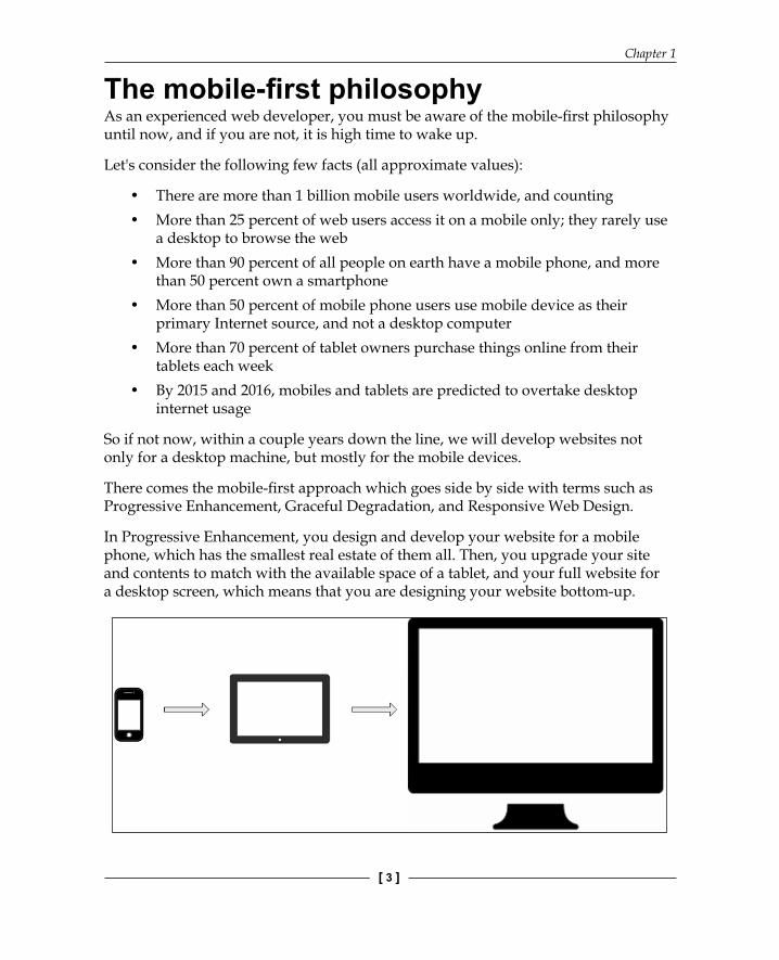
In Progressive Enhancement, you design and develop your website for a mobile phone, which has the smallest real estate of them all. Then, you upgrade your site and contents to match with the available space of a tablet, and your full website for a desktop screen, which means that you are designing your website bottom-up.
The Evolution of CSS and Bootstrap
[ 4 ]
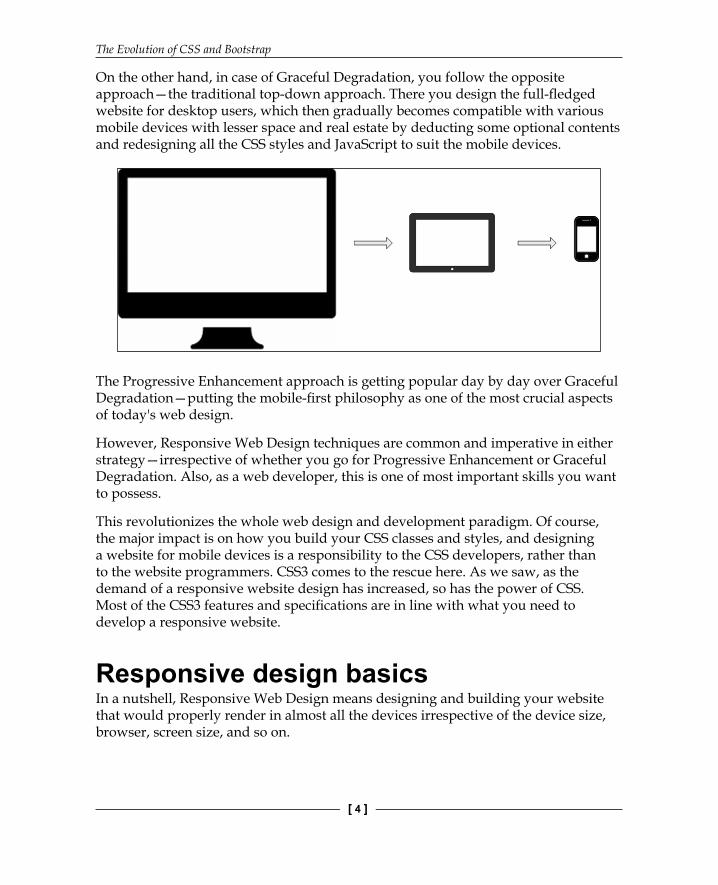
On the other hand, in case of Graceful Degradation, you follow the opposite approach—the traditional top-down approach. There you design the full-fl edged website for desktop users, which then gradually becomes compatible with various mobile devices with lesser space and real estate by deducting some optional contents and redesigning all the CSS styles and JavaScript to suit the mobile devices.
The Progressive Enhancement approach is getting popular day by day over Graceful Degradation—putting the mobile-fi rst philosophy as one of the most crucial aspects of today's web design.
However, Responsive Web Design techniques are common and imperative in either strategy—irrespective of whether you go for Progressive Enhancement or Graceful Degradation. Also, as a web developer, this is one of most important skills you want to possess.
This revolutionizes the whole web design and development paradigm. Of course, the major impact is on how you build your CSS classes and styles, and designing a website for mobile devices is a responsibility to the CSS developers, rather than to the website programmers. CSS3 comes to the rescue here. As we saw, as the demand of a responsive website design has increased, so has the power of CSS. Most of the CSS3 features and specifi cations are in line with what you need to develop a responsive website.
Responsive design basicsIn a nutshell, Responsive Web Design means designing and building your website that would properly render in almost all the devices irrespective of the device size, browser, screen size, and so on.
Chapter 1
[ 5 ]
As we discussed earlier, the best approach is to design the site for the smallest screen size fi rst, and then to move upward. There are few very basic steps to be followed in order to achieve responsiveness and a good user experience.
The below points are only to get underlying concepts clearer and make your elemental background ready. We will later on see in detail how Bootstrap can be used to build and generate a full functional responsive website.
Setting the viewportViewport is the visible area of a web page on the device or monitor the user is accessing on. The size of viewport varies with the device—for a mobile phone, it is very small; for a tablet, it is little bigger; for a desktop computer, it is bigger than that for a tablet; for a TV, it is much bigger.
Pages targeted and optimized for a variety of devices must include a meta viewport element in the head section of the document. The meta viewport element makes the browser understand how to control the page's dimensions and scaling for rendering different page elements.
For example,
<meta name="viewport" content="width=device-width, initial-scale=1">
The meta viewport value width=device-width instructs the browser to match the screen's width in device-independent pixels while rendering the page. HTML5 has introduced this meta tag to enable web developers take control over the size of the browser screen and render the web page contents as per the size. This is essentially the base of Responsive Web Design.
Sizing your content to the viewportIrrespective of the device and browser that the user is working on, nobody prefers a horizontal scroll bar. Thus, you need to make sure that all your contents and elements are adjusted within the screen real estate you have got—with only the vertical scroll bar.
While you have set the page contained within the available viewport, it is also necessary to create and structure your content so as to fi t into the space available. For example, if you put an image with fi xed width 600 px, in a screen with 320 px, you will face a horizontal scroll bar to see the full image, even if you have got the meta viewport element added into the head section.
The Evolution of CSS and Bootstrap
[ 6 ]
Thus, a proper responsive design requires that all the web page content is also automatically adaptive to screen viewport size.
Using media queries to achieve responsivenessThere is a crazy range of mobile devices available in the market. So what do you do in order to make sure that your page does render in all the devices and browsers effi ciently without compromising on any user experience? Of course, you cannot write separate code to handle separate devices and then dynamically fi nd out which code base is to be made executed.
Here come the CSS media queries—these are simple fi lters to change styles of the HTML elements, based on the characteristics and properties of the device. Consider the following example:
<link rel="stylesheet" media="print" href="print.css"><link rel="stylesheet" media="(max-width: 800px)" href="max800.css"><link rel="stylesheet" media="(max-width: 320px)" href="max320.css"><link rel="stylesheet" media="(orientation: portrait)" href="prt.css"><link rel="stylesheet" media="(orientation: landscape)" href="lnd.css">
Responsive design patternsHere are the few established and well-adopted patterns in Responsive Web Design:
• Fluid design: This is the most popular and easiest option for responsive design. In this pattern, larger screen multiple columns layout renders as a single column in a smaller screen in absolutely same sequence.
• Column drop: In this pattern also, the page gets rendered as a single column, however, the order of blocks gets altered. This means, if a content block is visible first in order in case of larger screen, the block might be rendered as second or third in case of smaller screen.
• Layout shifter: This is a complex but powerful pattern in which the whole layout of the screen contents get altered, in the case of smaller screen. This means that you need to develop different page layouts for large, medium, and small screens.

Chapter 1
[ 7 ]
Navigation patternsFollowing are some of the things you should take care while designing a responsive web page. These are essentially the major navigational elements that you would concentrate on while developing a mobile-friendly and responsive website:
• Menu bar• Navigation/app bar• Footer• Main container shell• Images• Tabs• HTML forms and elements• Alerts and popups• Embedded audios and videos and so on
You can see that there are lots of elements and aspects you need to take care of to create a fully responsive design. While all of these are achieved by using various features and technologies in CSS3, it is of course not an easy problem to solve without a framework that could help you do so. Precisely, you need a frontend framework that takes care of all the pains of technical responsive design's implementation and releases you only for your brand and application design.
Now, we introduce Bootstrap, which will help you design and develop a Responsive Web Design in a much optimized and effi cient way.
Introducing BootstrapSimply put, Bootstrap is a frontend framework for faster and easier web development in the new standard of the mobile-fi rst philosophy. It uses HTML, CSS, and JavaScript. In August 2010, Twitter released Bootstrap as open source.
There are quite a few similar frontend frameworks available in the industry, but Bootstrap is arguably by far the most popular in the lot. It is evident when we see Bootstrap is the most starred project in GitHub since 2012.
The Evolution of CSS and Bootstrap
[ 8 ]
Until now, you must be in a position to fathom why and where we need to use Bootstrap for web development; however, just to recap, here are the points in short:
• The mobile-first approach• A responsive design• Automatic browser support and handling• Easy to adapt and get going
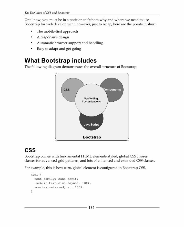
What Bootstrap includesThe following diagram demonstrates the overall structure of Bootstrap:
CSSBootstrap comes with fundamental HTML elements styled, global CSS classes, classes for advanced grid patterns, and lots of enhanced and extended CSS classes.
For example, this is how HTML global element is confi gured in Bootstrap CSS.
html { font-family: sans-serif; -webkit-text-size-adjust: 100%; -ms-text-size-adjust: 100%;}

Chapter 1
[ 9 ]
This is how a standard HR HTML element is styled:
hr { height: 0; -webkit-box-sizing: content-box; -moz-box-sizing: content-box; box-sizing: content-box;}
Here is an example of new classes introduced in Bootstrap:
.glyphicon { position: relative; top: 1px; display: inline-block; font-family: 'Glyphicons Halflings'; font-style: normal; font-weight: normal; line-height: 1; -webkit-font-smoothing: antialiased; -moz-osx-font-smoothing: grayscale;}
ComponentsBootstrap offers a rich set of reusable and built-in components such as breadcrumbs, progress bars, alerts, and navigation bars. The components are technically custom CSS classes specially crafted for the specifi c purposes.
For example, if you want to create a breadcrumb in your page, you simply add a DIV tag in your HTML using Bootstrap's breadcrumb class:
<ol class="breadcrumb"> <li><a href="#">Home</a></li> <li><a href="#">The Store</a></li> <li class="active">Offer Zone</li></ol>
In the background (stylesheet), this Bootstrap class is used to create your breadcrumb:
.breadcrumb { padding: 8px 15px; margin-bottom: 20px; list-style: none;
The Evolution of CSS and Bootstrap
[ 10 ]
background-color: #f5f5f5; border-radius: 4px;}.breadcrumb > li { display: inline-block;}.breadcrumb > li + li:before { padding: 0 5px; color: #ccc; content: "/\00a0";}.breadcrumb > .active { color: #777;}
Please note that these sets of code blocks are simply snippets; we will explore all these features and functionalities in detail in later chapters.
JavaScriptBootstrap framework comes with a number of ready-to-use JavaScript plugins. Thus, when you need to create Popup windows, Tabs, Carousels or Tooltips, and so on, you just use one of the prepackaged JavaScript plugins.
For example, if you need to create a tab control in your page, you use the following:
<div role="tabpanel"> <ul class="nav nav-tabs" role="tablist"> <li role="presentation" class="active"><a href="#recent" aria-controls="recent" role="tab" data-toggle="tab">Recent Orders</a></li> <li role="presentation"><a href="#all" aria-controls="al" role="tab" data-toggle="tab">All Orders</a></li> <li role="presentation"><a href="#redeem" aria-controls="redeem" role="tab" data-toggle="tab">Redemptions</a></li> </ul>
<div class="tab-content"> <div role="tabpanel" class="tab-pane active" id="recent"> Recent Orders</div>
Chapter 1
[ 11 ]
<div role="tabpanel" class="tab-pane" id="all">All Orders</div> <div role="tabpanel" class="tab-pane" id="redeem">Redemption History</div> </div></div>
To activate (open) a tab, you write this JS code:
$('#profileTab li:eq(1) a').tab('show');
As you may have guessed by looking at the syntax of this JavaScript line here, that the Bootstrap JS plugins are built on the top of jQuery. Thus the JS code you would write for Bootstrap are also all based on jQuery. We will explore more on this in the later chapters.
CustomizationEven though Bootstrap offers most (if not all) standard features and functionalities for Responsive Web Design, there might be several cases when you would want to customize and extend the framework. One of the very basic requirements for customization would be to deploy your own branding and color combinations (themes), instead of the Bootstrap default ones. There can be several such cases where you would want to change the default behavior of the framework.
Bootstrap offers very easy and stable ways to customize the platform. We will explore more on this in the later chapters.
When you use the Bootstrap CSS, all the global and fundamental HTML elements automatically become responsive and would properly behave as the client device on which the web page is browsed.The built-in components are also designed to be responsive, and as the developer, you shouldn't be worried about how these advanced components would behave in different devices and in different client agents.
The Evolution of CSS and Bootstrap
[ 12 ]
SummaryWe briefl y went through the history of CSS evolution. We saw how the design approach of web portals and pages has changed toward the mobile-fi rst approach and going to be further matured.
We have also covered the basics of Responsive Web Design and realized the need of a frontend framework that will help us develop responsive web pages.
In this context, we have been introduced to Bootstrap framework and have briefl y seen the elements that are the part of Bootstrap.
In the next chapter, we will dive deep into Bootstrap, understand the structure, and see how to use Bootstrap. We will also briefl y discuss some CSS preprocessor tools and languages.

Where to buy this book You can buy Bootstrap Essentials from the Packt Publishing website.
Alternatively, you can buy the book from Amazon, BN.com, Computer Manuals and most internet
book retailers.
Click here for ordering and shipping details.
www.PacktPub.com
Stay Connected:
Get more information Bootstrap Essentials