brand guidelines - amazon web services
TRANSCRIPT
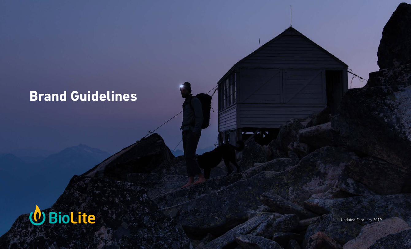
Brand Guidelines
Updated February 2019

Table Of Contents
3
5
7
8
9
11
12
14
Logo
Typography
Colors
Voice & Tone
Photography
Iconography
Layout & Composition
Assets & Support

3I. Logo | BioLite Brand Guidelines
PRIMARY LOGOS
LIMITED USE LOGOS
NOTE: Usage of logos in this section re-quires approval from the BioLite Design team. See page 14 for approval process.
FULL COLOR
This is the standard BioLite logo and will be used for most applications.
USAGE:
USAGE: USAGE:
USAGE:• Digital• Print• Environmental
• Social Media Avatars• Application Icons• Apparel & Merchandise
• Product Design• Digital Banner Ads
• Textiles• Shippers & Master Cartons• Product Design
FLAME ICON
The icon minus the wordmark should only be used when there are extreme space constraints or in lifestyle applications.
STACKED LOGO
The stacked logo may be used when the available space is in an extremely vertical orientation.
1 COLOR
A 1-color logo in black or white reverse may be used only when color is restricted by the print medium.
Download logo assets at BioLiteEnergy.com/Brand
I. LogoPRIMARY USES

4I. Logo | BioLite Brand Guidelines
LOGO CLEAR SPACE REQUIREMENT
MINIMUM LOGO SIZE
DEPRECATED & PROHIBITED USES
Always ensure that the BioLite logo has adequate space to breathe. TIP: Use the height on the BioLite “e” as a guide to the proper clearspace
To ensure proper readability, the BioLite logo should NEVER appear at heights smaller than those specified below
NEVER use in a solid color other than white or black
NEVER rotate the logo
NEVER distort or stretch the logo
DEPRECATED - logo with tagline is no longer permitted0.75 inches19 mm
35 pixels
I. LogoSIZING & RESTRICTIONS

5II. Typography | BioLite Brand Guidelines
BioLite uses two primary font families - Din Next Pro
and Open Sans.
Din Next Pro is a modern typeface that has a future-
facing feel without being a gimmick. The monoline
form and subtle rounds complement BioLite’s
industrial design aesthetic and iconography.
The primary use for Din Next Pro is in headlines and
product names. This font should not be used in long-
form copy and should only be used in one of two
weights - Bold and Light.
Open Sans, is an open-source, humanist sans-serif
typeface. Its friendly form and multiple weights
make it a desirable choice for both print and
web applications. The primary use for Open Sans
paragraph and multi-line text. The variety of weights
can also be combined with Din Next Pro to create
stylized headlines and graphic treatments.
Din Next Pro BoldABCDEFGHIJKLMNOPQRSTUVWXYZabcdefghijklmnopqrstuvwxyz0123456789
Din Next Pro LightABCDEFGHIJKLMNOPQRSTUVWXYZabcdefghijklmnopqrstuvwxyz0123456789
Open Sans BoldABCDEFGHIJKLMNOPQRSTUVWXYZabcdefghijklmnopqrstuvwxyz0123456789
Open Sans LightABCDEFGHIJKLMNOPQRSTUVWXYZabcdefghijklmnopqrstuvwxyz0123456789
MAJOR HEADLINESPRODUCT NAMESDIAGRAM LABELS
EMPHASIS IN LONG-FORM COPY
PARAGRAPH TEXT
SUBHEADLINES
Download fonts at BioLiteEnergy.com/Brand
II. TypographyFONT FAMILIES
6II. Typography | BioLite Brand Guidelines
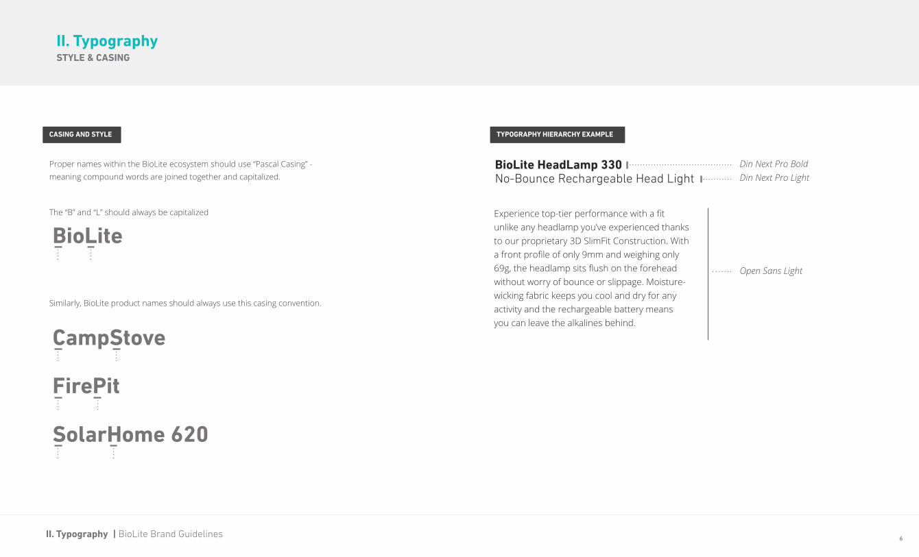
BioLite HeadLamp 330
BioLite
CampStove
FirePit
SolarHome 620
No-Bounce Rechargeable Head Light
Experience top-tier performance with a fit unlike any headlamp you’ve experienced thanks to our proprietary 3D SlimFit Construction. With a front profile of only 9mm and weighing only 69g, the headlamp sits flush on the forehead without worry of bounce or slippage. Moisture-wicking fabric keeps you cool and dry for any activity and the rechargeable battery means you can leave the alkalines behind.
TYPOGRAPHY HIERARCHY EXAMPLECASING AND STYLE
Proper names within the BioLite ecosystem should use “Pascal Casing” - meaning compound words are joined together and capitalized.
The “B” and “L” should always be capitalized
Similarly, BioLite product names should always use this casing convention.
Din Next Pro BoldDin Next Pro Light
Open Sans Light
II. TypographySTYLE & CASING

7III. Colors | BioLite Brand Guidelines
PRIMARY PALETTE SECONDARY PALETTE
Most BioLite communications will use some combination of the two colors in our primary palette. Note that screen tints or opacities are only permitted when using BioLite Charcoal.
Colors from the secondary palette should be used on a limited basis when color is helpful to distinguish between BioLite product verticals (Cooking, Charging, & Lighting) or business verticals (Outdoor Recreation & Emerging Markets).
PMS 326
R: 0 G: 178 B: 176
C: 85 M: 0 Y: 38 K: 0
Hex #00B2B0
BioLite Teal
PMS 426
R: 37 G: 39 B: 40
C: 73 M: 66 Y: 62 K: 67
Hex #252728
BioLite Charcoal
PMS 130
R: 253 G: 184 B: 19
#FDB813
C: 0 M: 30 Y: 100 K: 0
BioLite Yellow
PMS 7675 C
R: 142 G: 143 B: 180
#8E8FB4
C: 47 M: 41 Y: 13 K: 0
BioLite Purple
PMS 718 C
R: 193 G: 80 B: 39
#C15027
C: 18 M: 81 Y: 100 K: 7
BioLite Red
• Packaging background• Headline and body copy• Icons• Strokes on product illustrations
• Callouts & attention grabbers• Headlines• Background on product titles• Calls-to-action
• Charging Designation • Lighting Designation • Cooking Designation• Emerging Markets Designation
NOTE: Usage of colors in this section requires approval from the BioLite Design team. See page 14 for approval process.
III. Colors
USAGE:

8IV. Voice & Tone | BioLite Brand Guidelines
TAGLINES & SHORT SUMMARIES BRAND SUMMARY CONSUMER-FACING MISSION CONNECTION PRODUCT DESCRIPTIONS
BioLite is on a mission to bring Energy Everywhere with revolutionary products that transform the way we cook, charge, and light our lives off the grid. A team of engineers, designers, operators, and adventurers, we believe that advanced technologies paired with sustainable business practices have the power to change the world. Our business model called Parallel Innovation pairs the needs of families living in energy poverty with the passions of outdoor enthusiasts, driving solutions that push the energy boundaries of life outdoors and on-the-go. BioLite is a proudly Carbon Neutral company.
“ Impact in Every Purchase: A portion of every sale is reinvested into BioLite’s work bringing safe, clean energy access to off-grid families across sub-Saharan Africa.
“Gear to Cook, Charge, and Light Your Life Outside and Off-Grid
“
Refer to the prepared statements below as a guide for matching BioLite’s voice and tone across various communication mediums.
Download product descriptions for all BioLite products at BioLiteEnergy.com/Brand
“ BioLite HeadLamp 330No-Bounce Rechargeable Head Light
Experience top-tier performance with a fit unlike any headlamp you’ve experienced thanks to our proprietary 3D SlimFit Construction. With a front profile of only 9mm and weighing only 69g, the headlamp sits flush on the forehead without worry of bounce or slippage. Moisture-wicking fabric keeps you cool and dry for any activity and the rechargeable battery means you can leave the alkalines behind.
Below is a sample product description consisting of name, short summary, long summary, and bullet point feature list. These can be used in any combination depending on the medium and space restrictions.
Currently written as “we,” may be edited into a 3rd person perspective, but further editing is restricted.
Useful for signage or digital display graphics for a concise brand summary.
To be used when looking for a concise description of how a consumer’s purchase gives back.
IV. Voice & Tone

9V. Photography | BioLite Brand Guidelines
DO THIS
V. PhotographyTHIS NOT THAT
Warm
Color temperature of the scene should be slightly on the warm side. Style works well in scenes with fire and light.
Soft Saturation
Whether is the unexpected orange powerpack or the sun reflecting off the bright blue KettlePot, pops of vibrant color are part of the BioLite brand. Amplify these with a slight bump in saturation.
Communal & Social
Small groups (2-5) encourage laughter, happiness, and fun. Capture this by encouraging conversation and a tight group dynamic.
Authentic
The components of a scene should feel very candid. Setup products in configurations that very natural. Don’t be afraid to accessorize with complementary products but keep it under control so the scene doesn’t feel busy.
NOT THAT
Cool
Photos with a cooler temperature, less contrast or overly exposed.
HDR
While beautiful, these types of high dynamic range photos can feel staged and unnatural. Keep saturation and contrast levels in check to maintain a more natural look.
Independent, Detached
Be aspirational without being extreme. BioLite products pair performance design with practical, wide-reaching use cases.
Forced
Avoid perching products that are charging in ways that feel unnatural or including products in configurations that wouldn’t normally be used.

10V. Photography | BioLite Brand Guidelines
WEIGHTING COMPOSITION TIME OF DAY MODELS & SETTING
V. PhotographyCOMPOSITION AND STAGING
About 75% of shots should be heavily weighted to one side of the frame. This allows text to be placed over the image and keeps the photo feeling open and airy.
About 50% of shots should be a heavily orthographic, 2d composition. Products should be oriented distinctly with one side facing the camera. This is a great opportunity for overhead shots too.
Dusk and dawn. We’re looking for warm lights and cool nights - that magical golden hour when the sky is a deep blue but there’s still enough light to see glimmers of product detail. Daytime is great for arrival, hiking and setup shots.
Outfit models with gear appropriate for the setting. Choose neutral colors when possible to keep the focus on BioLite and the environment. Don’t be afraid to accessorize with complementary products but keep it under control so the scene doesn’t feel busy. Choose destinations that are aspirational and invoke wonder.
11VI. Iconography | BioLite Brand Guidelines
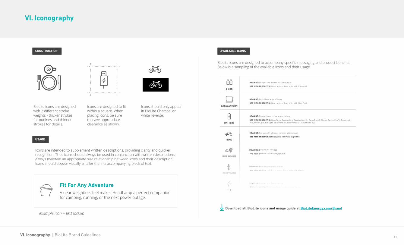
VI. Iconography
AVAILABLE ICONSCONSTRUCTION
USAGE
Download all BioLite icons and usage guide at BioLiteEnergy.com/Brand
BioLite icons are designed with 2 different stroke weights - thicker strokes for outlines and thinner strokes for details.
Icons are intended to supplement written descriptions, providing clarity and quicker recognition. Thus icons should always be used in conjunction with written descriptions. Always maintain an appropriate size relationship between icons and their description. Icons should appear visually smaller than its accompanying block of text.
BioLite icons are designed to accompany specific messaging and product benefits. Below is a sampling of the available icons and their usage.
Icons are designed to fit within a square. When placing icons, be sure to leave appropriate clearance as shown.
Icons should only appear in BioLite Charcoal or white reverse.
Fit For Any AdventureA near weightless feel makes HeadLamp a perfect companion for camping, running, or the next power outage.
example icon + text lockup

12VII. Layout & Composition | BioLite Brand Guidelines
VII. Layout & Composition
The following sections are guidelines for creating layouts that consist of various components within the BioLite brand toolkit.
LOGO POSITION
The BioLite logo should either be weighted to the bottom left or centered within the available space. Centered logo placement is ideal for vertical layouts while bottom left is preferred for horizontal layouts.
centered
lower left
GRAPHIC OVERLAYS
A majority of BioLite’s lifestyle photography is composed to allow for graphic overlays. This composition draws the eye to the scene’s subject and gives space for messaging. Use this negative space sparingly for the BioLite logo, text and icons.
PRODUCT PHOTOGRAPHY
BioLite product photography should be presented on a gray background whenever possible. Use hex value #f3f3f3 for digital environments and PMS 420 at a 4% tint for print. Photography with transparent backgrounds are available for download at BioLiteEnergy.com/brand.
BEST PRACTICES
COLOR USAGEUse BioLite Teal sparingly within layouts to draw attention to important concepts. Keep color usage within a single layout to 2 colors: BioLite Teal and BioLite Charcoal.
13VII. Layout & Composition | BioLite Brand Guidelines
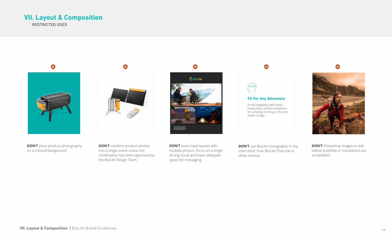
VII. Layout & CompositionRESTRICTED USES
DON’T place product photography on a colored background.
DON’T overcrowd layouts with multiple photos. Focus on a single strong visual and leave adequate space for messaging.
DON’T use BioLite iconography in any color other than BioLite Charcoal or white reverse.
Fit For Any Adventure
A near weightless feel makes HeadLamp a perfect companion for camping, running, or the next power outage.
DON’T combine product photos into a single scene unless the combination has been approved by the BioLite Design Team.
DON’T Photoshop images or edit videos (subtitles or translations are acceptable).

14VIII. Assets & Support | BioLite Brand Guidelines
VIII. Assets & Support
• Product Photos
• Lifestyle Photos
• Product Videos
• Sales Sheets
• Instruction Manuals
• Logo Files
• Fonts
• Iconography
All of the assets outlined in this document are available to download via Dropbox. Looking for something not listed below? Send an email to the BioLite Brand Team at [email protected].
Asset folders include the following:
BioLiteEnergy.com/Brand
APPROVAL PROCESSBRAND ASSETS
For treatments requiring approval or not explicitly outlined in this document, follow the steps below:
• Send an email to [email protected] with the following:• A brief contain containing the purpose and medium of the asset(s)• A mockup of the treatment• A deadline for completion
• Please allow up to 2 business days for a response.
SUPPORT
If you are a BioLite dealer and need additional support with our brand asset guidelines, please reach out to us at [email protected].
Copyright © 2019 by BioLite. All rights reserved.