brand identity guidelines - washington state university official
TRANSCRIPT


2
WASHINGTON STATE UNIVERSITY
ATHLETICS DEPARTMENT
Brand Identity Guidelines

3
INTRODUCTION
About Our Identity ............................................................................ 05
Goal .................................................................................................. 07
Concept ............................................................................................ 09
Brand Architecture ............................................................................ 10
IDENTITY
Color
Primary ....................................................................................... 13
Typography
Primary ....................................................................................... 16
Secondary ................................................................................... 18
Primary Identity
Logotype .................................................................................... 20
Secondary Identity
Wordmarks .................................................................................. 26
Primary Logotype & Wordmark .................................................... 34
Ter tiary Identity
Sport-Specific Wordmarks ........................................................... 36
RESOURCES
Identity Standards ....................................................................... 41
Use Proper Ar twork ..................................................................... 42
Using Trademarks & Registered Marks ......................................... 46
Electronic Files ............................................................................ 47

4
Introduction
5
Introduction
ABOUT OUR IDENTITY
The Washington State Athletics brand is distinguished by a simple philosophy:
To cultivate a championship athletics program that promotes excellence, quality
and accountability. This new concept creates a cohesive identity program that not
only respects the traditions of the university but also looks ahead to the promise
of a great future.
The qualities and values of Washington State Athletics are expressed in the
design of its brand identity. These guidelines allow strategic par tners to work with
the elements of the design so that their application and presentation achieves
a powerfully consistent ef fect. This manual provides simple ground rules. By
following these guidelines in our communications, we contribute to the rising
reputation for excellence across the country and around the globe.
Presenting the Washington State Athletics visual identity with consistency and
quality is crucial in maintaining our competitive edge as a leader. It is imperative
that we always use these guidelines when designing any materials for athletics.
These guidelines will not constrain creativity but will ensure the full and beneficial
impact of the athletics brand image.

6
Introduction

7
Introduction
GOAL
To promote consistency across Washington State Athletics by developing a
strong, timeless and innovative athletic identity system that ref lects the unique
characteristics of Washington State University.

8
Introduction
9
Introduction
CONCEPT
With the publication of these brand guidelines, we introduce the new
Washington State Athletics identity. Comprised of new wordmarks as well as
refined colors and typefaces, this new brand identity is being introduced to
underscore the Athletics Depar tment’s commitment to a strategic direction that
is anchored to athletic and academic excellence.
The identity has been enhanced to reinforce the core values of Washington State
Athletics. Its essence includes strength of character and exceptional performance
both in the classroom and on the field of play.
Washington State Athletics embodies the following at tributes:
Unif ication
Toughness
Passion
Loyalty
Pride

10
Introduction
BRAND ARCHITECTURE
Primary—The Statement
A consistent primary identity has been developed to accurately represent the
university and confidently position it for the future. The identity is both timeless
and strong. Reinforcement of the primary mark will build worldwide brand equity.
Secondary—The Support
The secondary identity works closely in support of the primary identity to
represent the university. It gives the identity f lexibility while staying consistent
with the primary look and feel.
Tertiary—The Connection
The ter tiary identity connects with specific programs and traditional mascots.
These marks can supply freshness to products when needed as well as
representing specific aspects of the university.

11
Introduction
STATEMENT
SUPPORT
CONNECTION

12
Identity

13
Identity
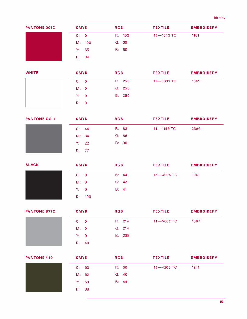
COLOR PALETTE
The colors we choose—as well as how those colors are combined with other
design elements—work together to create a unique and compelling brand
expression. The more consistently we use color, the more powerful our brand
will become.
A consistent color palet te allows for instant team identification. Refinement of
the existing color palet te includes Dark Steel Grey as well as clearly defining
Cougar Crimson.
Correct use of color will enhance the impact of the identity and dif ferentiate the
brand from competitors.

14
Identity
Color provides a strong visual link to our brand identity across a wide range of
applications. Crimson, White and Dark Steel Grey serve as the brand’s primary colors
for print, electronic and environmental applications.
A palet te of colors has been chosen as the Washington State Athletics
color scheme. Consistent use of these colors will contribute to the cohesive and
harmonious look of the Washington State brand identity across all relevant media.
NOTE
Embroidery specification at right is Madeira.
Whenever possible, use PANTONE colors for print materials. CMYK values can be used when digital printing is necessary.
Pantone 877 is Metallic Silver and should only be used as an accent and/or highlight color.
Identity
15
PANTONE 201C
C: 0 R: 152 19—1543 TC 1181
M: 100 G: 30
Y: 65 B: 50
K: 34
CMYK RGB TEXTILE EMBROIDERY
C: 0 R: 255 11—0601 TC 1005
M: 0 G: 255
Y: 0 B: 255
K: 0
WHITE CMYK RGB TEXTILE EMBROIDERY
C: 44 R: 83 14 —1159 TC 2396
M: 34 G: 86
Y: 22 B: 90
K: 77
PANTONE CG11 CMYK RGB TEXTILE EMBROIDERY
C: 0 R: 44 18 — 4005 TC 1041
M: 0 G: 42
Y: 0 B: 41
K: 100
BLACK CMYK RGB TEXTILE EMBROIDERY
C: 0 R: 214 14 —5002 TC 1087
M: 0 G: 214
Y: 0 B: 209
K: 40
PANTONE 877C CMYK RGB TEXTILE EMBROIDERY
C: 63 R: 56 19— 4205 TC 1241
M: 62 G: 46
Y: 59 B: 44
K: 88
PANTONE 440 CMYK RGB TEXTILE EMBROIDERY

Identity
16
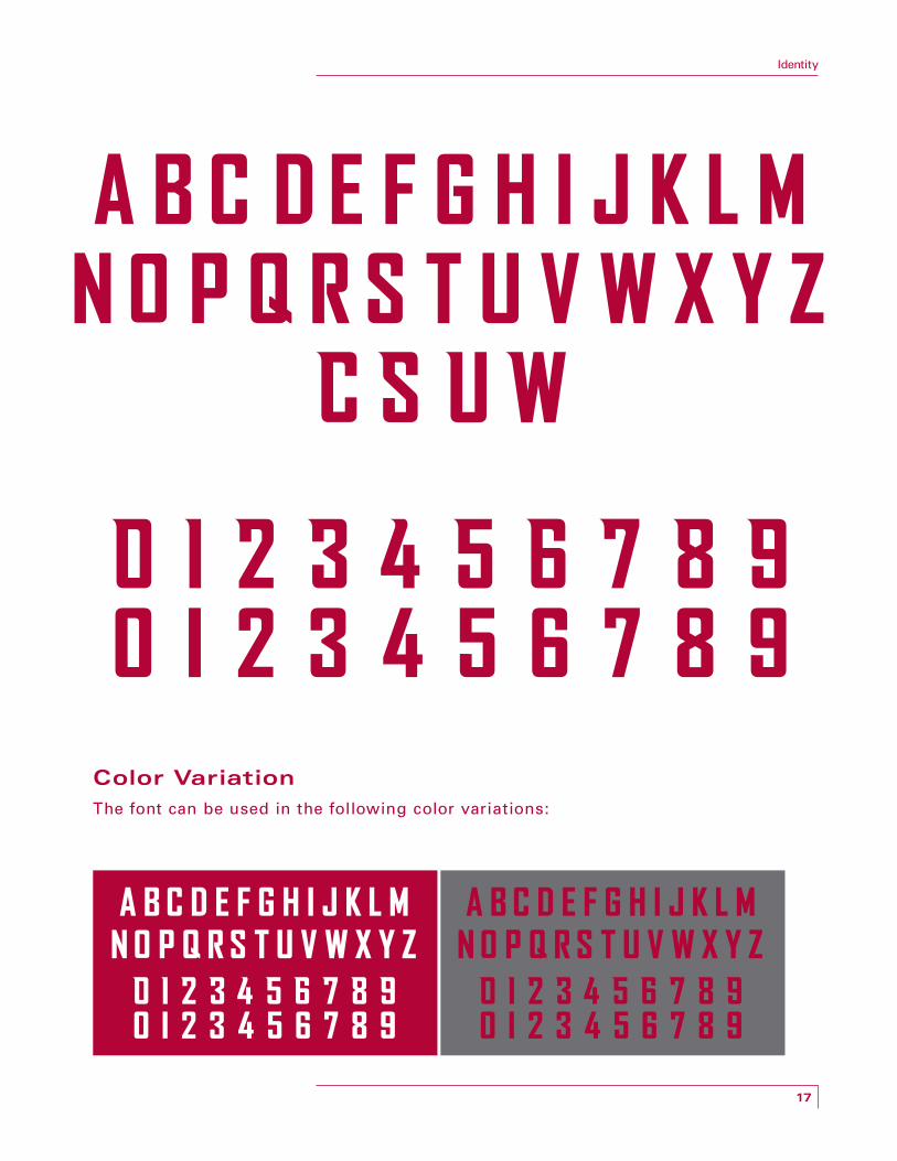
TYPOGRAPHY
Primary
Typography is a powerful tool within our identity system that unites
athletics. It plays an important role in communicating an overall tone.
Careful use of typography reinforces our personality and ensures clarity and
harmony in all athletics communications. To aid in creating a consistent look
for a wide variety of athletics-related communications, two typefaces are
included in the identity manual.
A custom typeface Cougar Bold has been designed with unique let ter
par ts that are carried throughout the alphabet. These unique characteristics
form a distinctive, readily identifiable typeface. Consistent use will enhance
the overall identity, promote consistency across athletics and build equity
in the brand.
Numerals
Custom numerals have been designed to complement the wordmarks as well
as unite athletics across multiple spor ts. The numeral system, consisting of lef t
and right numerals, has been developed to fur ther distinguish Washington State
University from the competition.
NOTE
There is no lowercase version. Do not use this font for large bodies of copy and never more than one sentence.
The exclusive typography is a custom hand-designed font. There is no lowercase version. Do not try to create a lowercase version.
17
Identity
Color Variation
The font can be used in the following color variations:
18
Identity
TYPOGRAPHY
Secondary
The secondary sans-serif typeface Univers was selected to complement the
primary typeface and directly tie back to the university identity. Univers is par t of
a family that of fers a range of weights, providing great versatility and legibility
in print and electronic applications. It may be used as headline and body copy for
athletics depar tment marketing materials and support verbiage. (i.e., specific spor t
marks, event tickets, brochures, etc.)
Univers is a neo-grotesque sans-serif typeface designed by Adrian Frutiger in 1957.
Dif ferent weights and variations within the type family are designated by the use of
numbers rather than names. Frutiger envisioned a large family with multiple widths
and weights that maintained a unified design idiom. Currently, the Univers type
family consists of 44 faces, with 16 uniquely numbered weight, width and position
combinations.
NOTE
Only variations of the font shown here may be used. Do not use outline, shadow versions, etc.
The supporting typeface is not to be used as the primary display font.

19
Identity
Univers 55 —Roman
AB C DE F G HI J K L M N OP Q RST U V W X Y Zab c de f ghi j k l m n o p q r s t u v w x y z 012 3 4 5 6 78 9
Univers 65 —Bold
A B C DE F G HI J K L M N O P Q RST U V W X Y Za b c d e f g h i j k l m n o p q r s t u v w x y z 012 3 4 5 6 7 8 9
Univers 75 —Black
ABCDEFGHIJKLMNOPQRSTUVWXYZabcdefgh i jk lmnopqrs tuvwxyz 0123456789
Univers 73 —Black Extended
ABCDEFGHIJKLMNOPQRSTUVWXYZ
abcdefghi jklmnopqrstuvwxyz
0123456789

20
Identity
PRIMARY IDENTITY Logotype
The Cougar head logotype is the primary representation of the brand and is
used as the main identifying device for athletics. The Cougar head is a unique and
recognizable symbol. Reinforcement of the primary identity will build equity in
the brand.
The logo was created by Randall Johnson in July 1936 while a student at then named
Washington State College. Employed as a college sign painter that summer, Johnson,
a fine ar ts major, was working for Fred Rounds, the college architect and head of the
Depar tment of Buildings and Grounds.
In 1958, when the university ’s name was changed to Washington State University,
Johnson tweaked the logo to ref lect the revised name. The logo has been in feature
films, placed on World War II f ighter jets and has even been in outer space when
astronaut John Fabian wore a logo pin aboard the space shut tle.

21
Identity
22
Identity
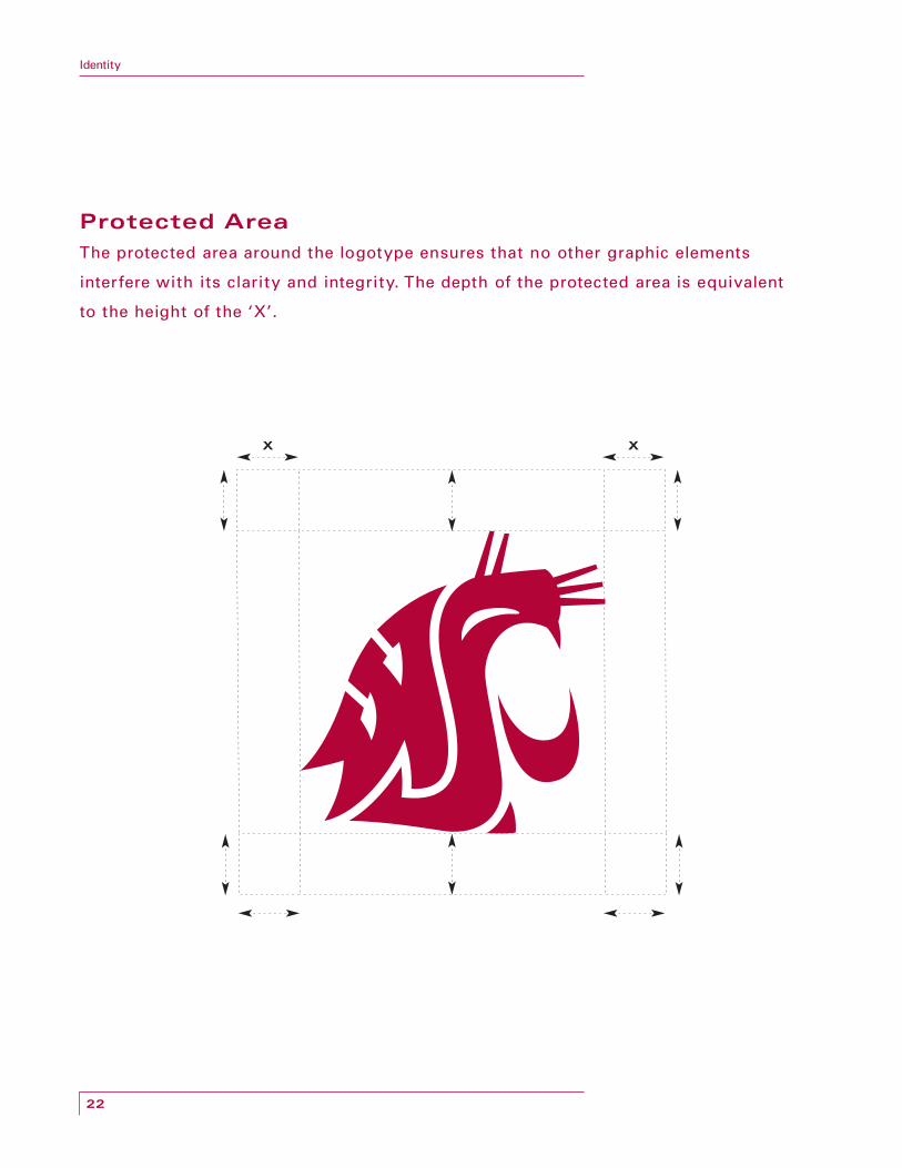
Protected Area
The protected area around the logotype ensures that no other graphic elements
interfere with its clarity and integrity. The depth of the protected area is equivalent
to the height of the ‘X’.
X X
23
Identity
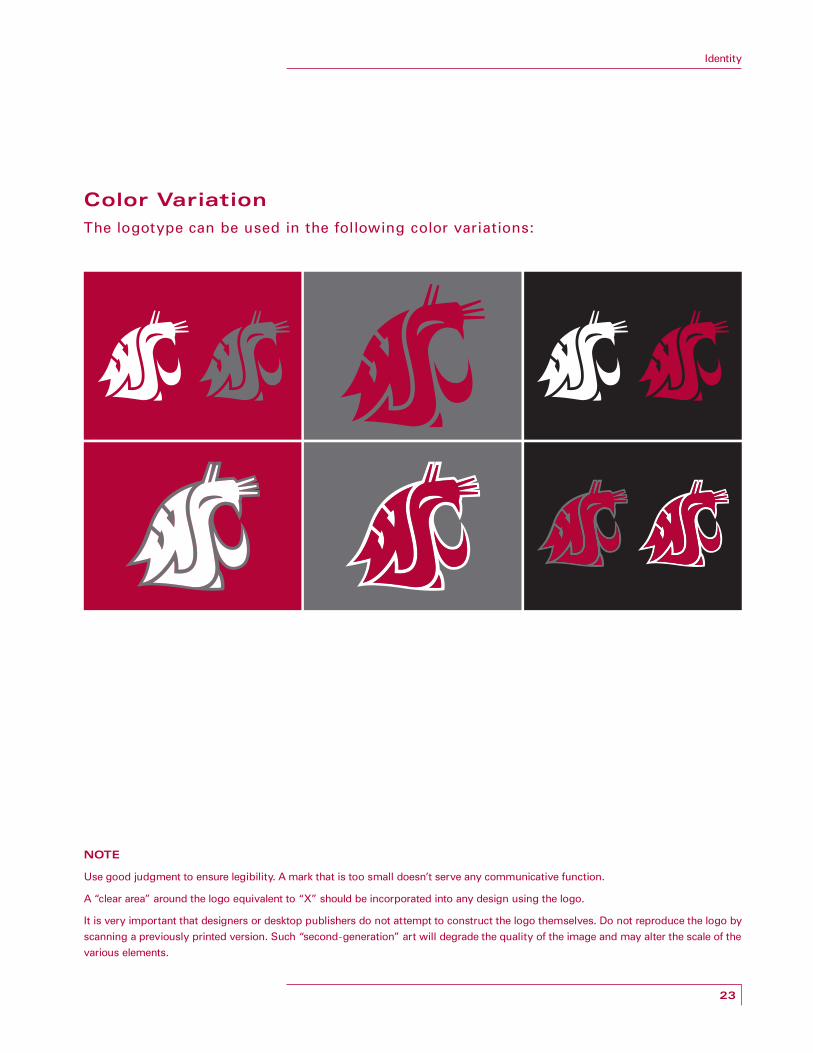
Color Variation
The logotype can be used in the following color variations:
NOTE
Use good judgment to ensure legibility. A mark that is too small doesn’t serve any communicative function.
A “clear area” around the logo equivalent to “X” should be incorporated into any design using the logo.
It is very important that designers or desktop publishers do not attempt to construct the logo themselves. Do not reproduce the logo by scanning a previously printed version. Such “second-generation” art will degrade the quality of the image and may alter the scale of the various elements.
24
Identity
Use Restrictions
The logotype can only appear as specified in these guidelines. This is important in
ensuring the desired consistency in the way the logotype is used, which promotes
ef fective recognition in the market.
The char t on the opposite page provides recommended use of the various marks
on specific applications.
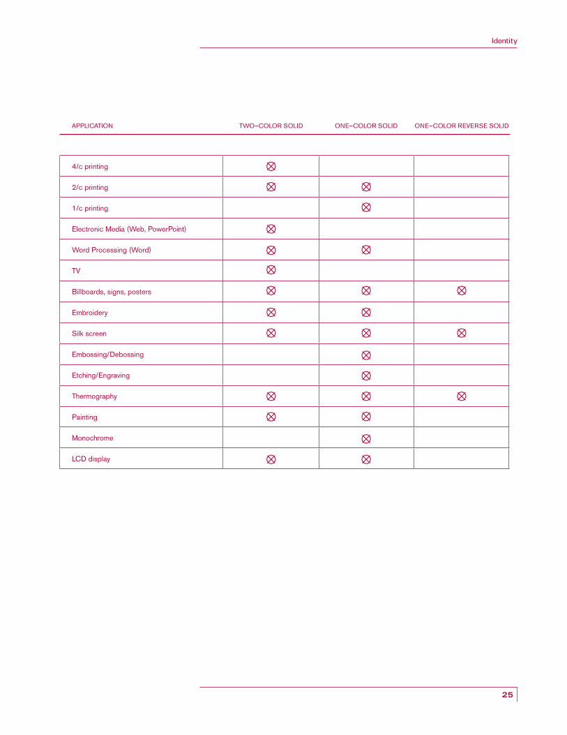
25
Identity
4/c printing
2/c printing
1/c printing
Electronic Media (Web, PowerPoint)
Word Processing (Word)
TV
Billboards, signs, posters
Embroidery
Silk screen
Embossing/Debossing
Etching/Engraving
Thermography
Painting
Monochrome
LCD display
TWO—COLOR SOLIDAPPLICATION ONE—COLOR SOLID ONE—COLOR REVERSE SOLID
26
Identity
SECONDARY IDENTITY Wordmarks
The wordmarks are bold graphic treatments creating a clear, consistent and
visually memorable identity. The representation of the words Washington State,
Cougars and WSU become visual symbols of the Washington State Athletics
organization.
They incorporate unique structural elements to create a powerful look that
distinguishes the university ’s wordmarks from other universities. The wordmarks
have been specially designed and cannot be created by typeset ting the wording.
NOTE
Use good judgment to ensure legibility. A mark that is too small doesn’t serve any communicative function.
Wordmarks (Washington State, Cougars and WSU) can be used on their own without the primary mark.

27
Identity

28
Identity
SECONDARY IDENTITY Washington State Wordmark—Protected Area
The protected area around the logotype ensures that no other graphic elements
interfere with its clarity and integrity. The depth of the protected area is equivalent
to the height of the ‘X’.
NOTE
Use good judgment to ensure legibility. A mark that is too small doesn’t serve any communicative function.
A “clear area” around the logo equivalent to “X” should be incorporated into any design using the wordmark.
It is very important that designers or desktop publishers do not attempt to construct the wordmark themselves. Do not reproduce by scanning a previously printed version. Such “second-generation” art will degrade the quality of the image and may alter the scale of the various elements.
29
Identity
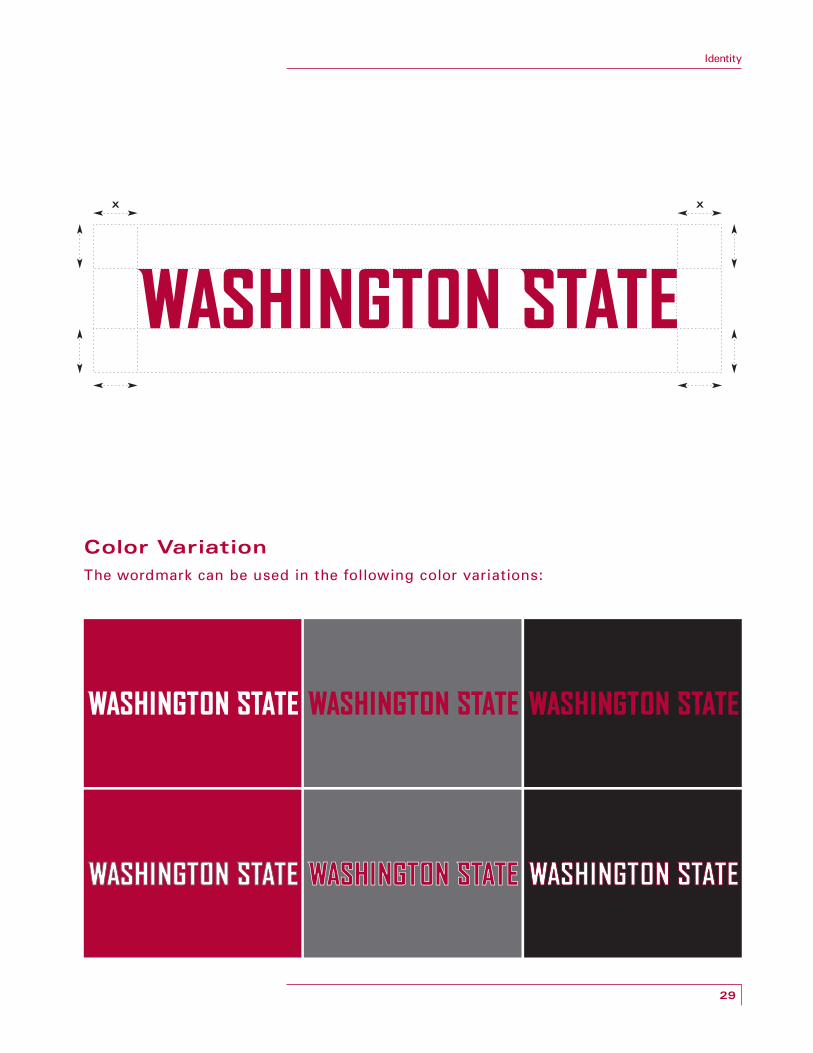
Color Variation
The wordmark can be used in the following color variations:
X X
30
Identity
SECONDARY IDENTITY Cougars Wordmark—Protected Area
The protected area around the logotype ensures that no other graphic elements
interfere with its clarity and integrity. The depth of the protected area is equivalent
to the height of the ‘X’.
NOTE
Use good judgment to ensure legibility. A mark that is too small doesn’t serve any communicative function.
A “clear area” around the logo equivalent to “X” should be incorporated into any design using the wordmark.
It is very important that designers or desktop publishers do not attempt to construct the wordmark themselves. Do not reproduce by scanning a previously printed version. Such “second-generation” art will degrade the quality of the image and may alter the scale of the various elements.

Identity
31
Color Variation
The wordmark can be used in the following color variations:
X X

32
Identity
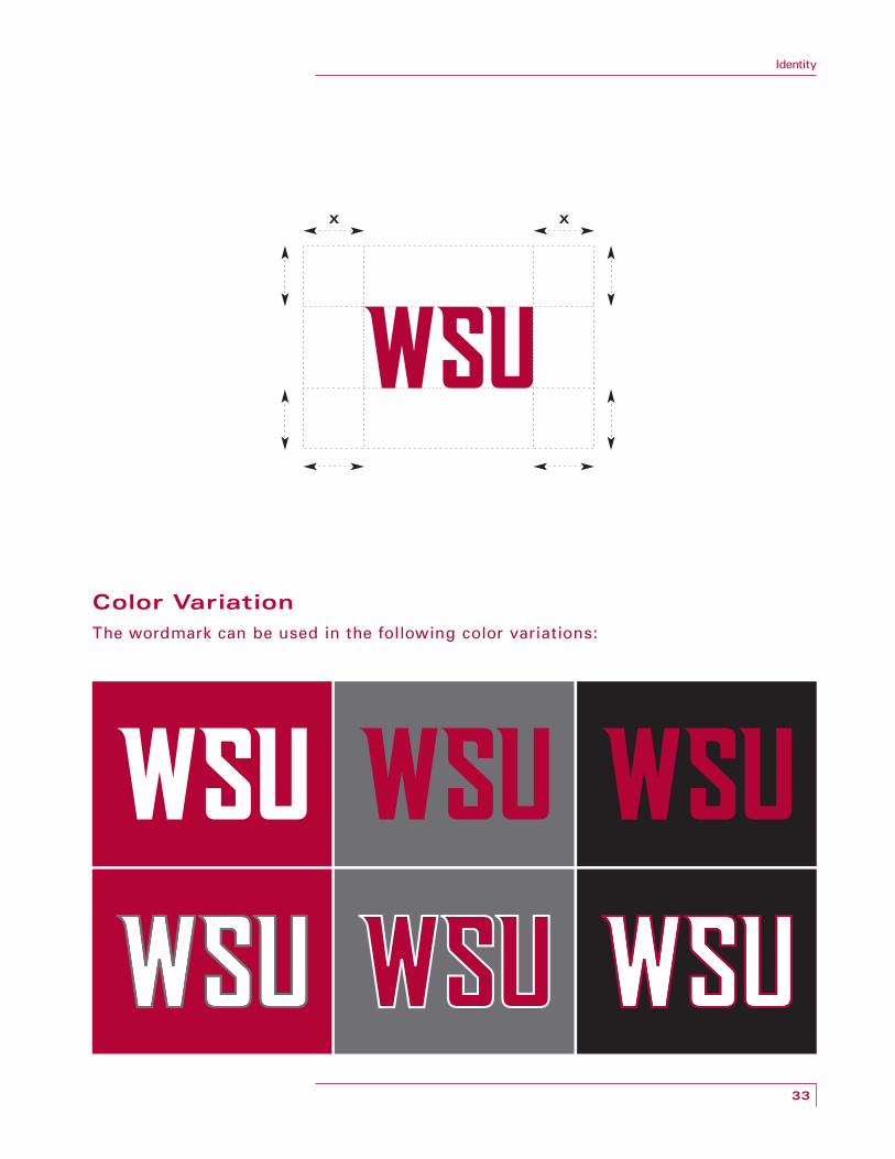
SECONDARY IDENTITY WSU Wordmark—Protected Area
The protected area around the logotype ensures that no other graphic elements
interfere with its clarity and integrity. The depth of the protected area is equivalent
to the height of the ‘X’.
NOTE
Use good judgment to ensure legibility. A mark that is too small doesn’t serve any communicative function.
A “clear area” around the logo equivalent to “X” should be incorporated into any design using the wordmark.
It is very important that designers or desktop publishers do not attempt to construct the wordmark themselves. Do not reproduce by scanning a previously printed version. Such “second-generation” art will degrade the quality of the image and may alter the scale of the various elements.
33
Identity
Color Variation
The wordmark can be used in the following color variations:
X X

34
Identity
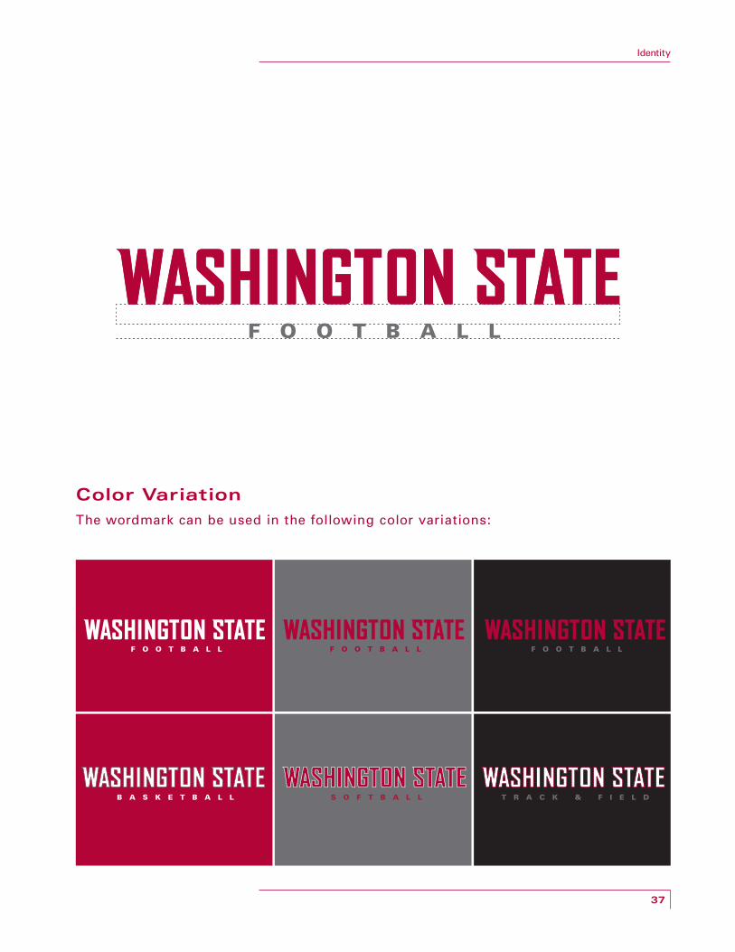
PRIMARY MARK/WORDMARK
The protected area around the logotype ensures that no other graphic elements
interfere with its clarity and integrity. The depth of the protected area is equivalent
to the height of the ‘X’.
NOTE
Use good judgment to ensure legibility. A mark that is too small doesn’t serve any communicative function.
A “clear area” around the logo equivalent to “X” should be incorporated into any design using the wordmark.
It is very important that designers or desktop publishers do not attempt to construct the logo themselves. Do not reproduce by scanning a previously printed version. Such “second-generation” art will degrade the quality of the image and may alter the scale of the various elements.

35
Identity
X X
X X

36
Identity
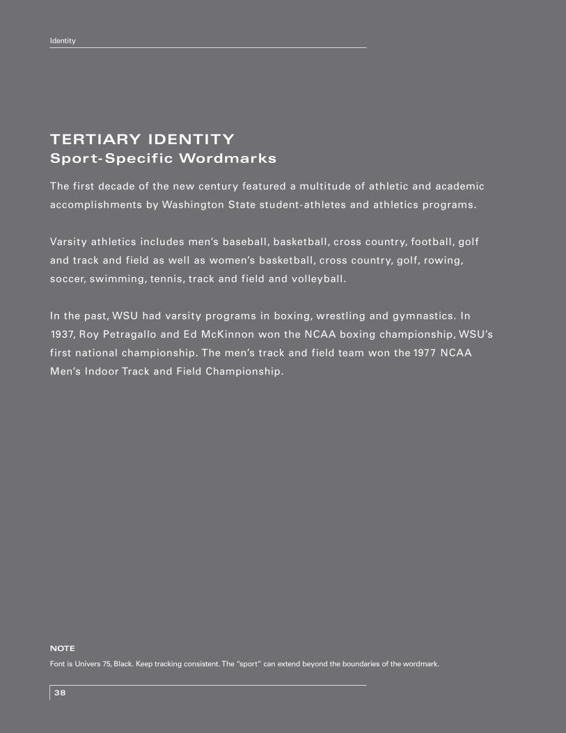
TERTIARY IDENTITY Sport-Specific Wordmarks
Sport-specific marks supply freshness and uniqueness to products when
needed, as well as represent specific athletics programs. Sport-specific wordmarks
unify athletics and promote consistency across the brand by sharing a common
visual language and hierarchy.
Each sport benefits from identification as par t of Washington State Athletics.
Fur thermore, the system communicates the diversity of the athletics program
while building the core brand.
NOTE
Font is Univers 75, Black. Keep tracking consistent. The “sport” can extend beyond the boundaries of the wordmark.
37
Identity
Color Variation
The wordmark can be used in the following color variations:
38
Identity
TERTIARY IDENTITY Sport-Specific Wordmarks
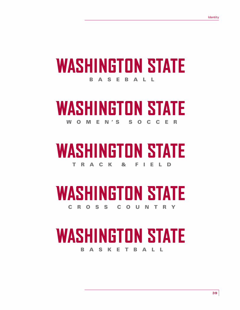
The first decade of the new century featured a multitude of athletic and academic
accomplishments by Washington State student-athletes and athletics programs.
Varsity athletics includes men’s baseball, basketball, cross country, football, golf
and track and field as well as women’s basketball, cross country, golf, rowing,
soccer, swimming, tennis, track and field and volleyball.
In the past, WSU had varsity programs in boxing, wrestling and gymnastics. In
1937, Roy Petragallo and Ed McKinnon won the NCAA boxing championship, WSU’s
first national championship. The men’s track and field team won the 1977 NCAA
Men’s Indoor Track and Field Championship.
NOTE
Font is Univers 75, Black. Keep tracking consistent. The “sport” can extend beyond the boundaries of the wordmark.
39
Identity

40
Identity
41
Resources
IDENTITY STANDARDS
Specific usage standards have been established for application of the identity,
providing a quality control system to ensure that each individual component is
used correctly. Visual parameters have been established with examples of logo
proportions and “correct” and “incorrect” usage.
These standards should be adhered to whenever possible in order to maintain
the integrity of the identity program. By following these guidelines in all our
communications, we each contribute to Washington State University ’s reputation
for excellence across the country and around the globe.

42
Resources
USE PROPER ARTWORK
For reproduction, use only the digital ar twork on the disc supplied.
The examples to the right and on the following pages illustrate some of the most
common application errors. Adhering to these guidelines will ensure proper
reproduction and application of the identity.

43
Resources
At no time should anything (other logos, type, etc.) be placed over the Primary Mark.
All elements surrounding the Primary Mark must adhere to the prescribed distance requirements.
The Primary Mark should not be used as a repeated element in closed pat terns.
All wordmarks or support type must be positioned below the Primary Mark and should adhere to the outlined proportions.
The Primary Mark should not be modified, stretched or distor ted in any way.
CORRECT
CORRECT
CORRECT
CORRECT
CORRECT
INCORRECT
INCORRECT
INCORRECT
INCORRECT
INCORRECT
X X
X X
44
Resources
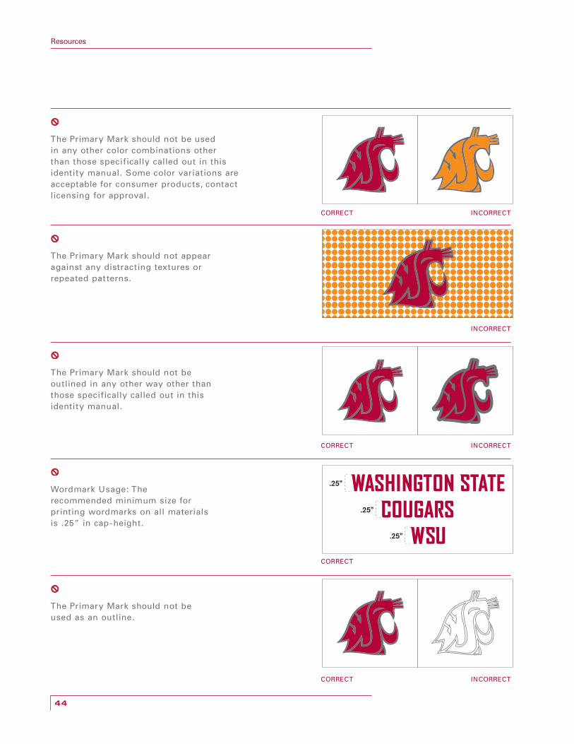
The Primary Mark should not be used in any other color combinations other than those specifically called out in this identity manual. Some color variations are acceptable for consumer products, contact licensing for approval.
The Primary Mark should not appear against any distracting textures or repeated pat terns.
The Primary Mark should not be outlined in any other way other than those specifically called out in this identity manual.
Wordmark Usage: The recommended minimum size for printing wordmarks on all materials is .25” in cap-height.
The Primary Mark should not be used as an outline.
CORRECT
CORRECT
CORRECT
CORRECT
INCORRECT
INCORRECT
INCORRECT
INCORRECT
.25”
.25”
.25”
45
Resources
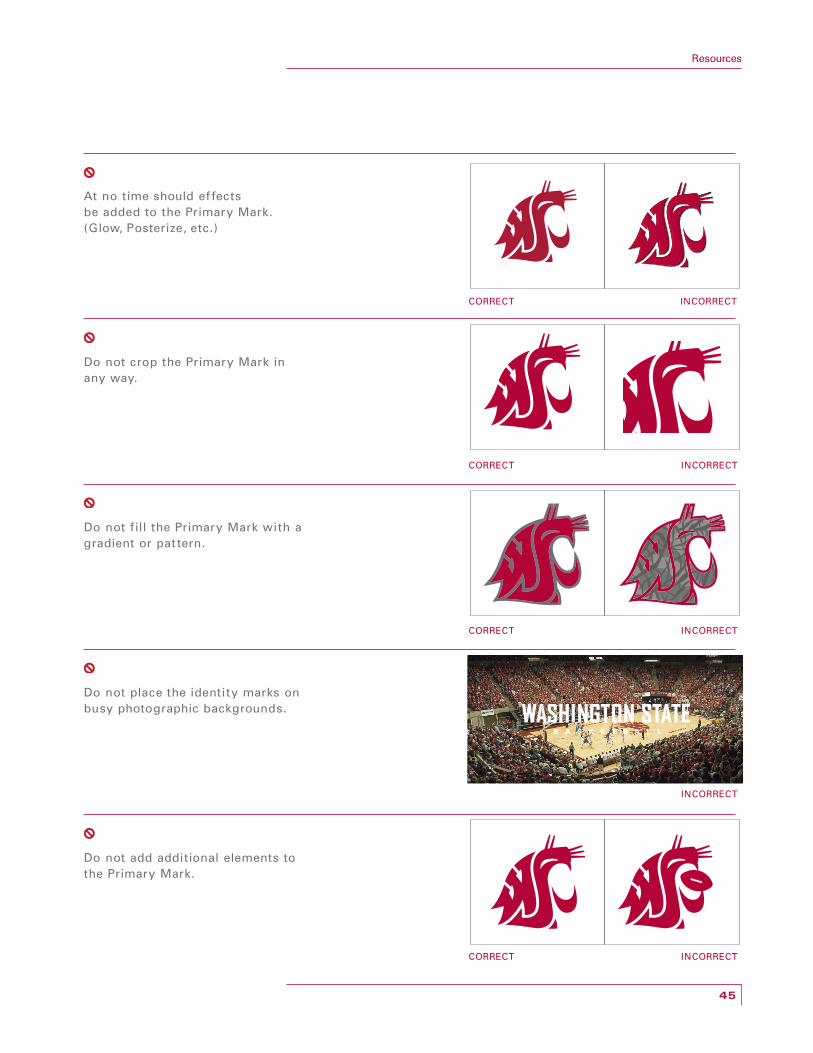
At no time should ef fects be added to the Primary Mark. (Glow, Posterize, etc.)
Do not crop the Primary Mark in any way.
Do not fill the Primary Mark with a gradient or pat tern.
Do not place the identity marks on busy photographic backgrounds.
Do not add additional elements to the Primary Mark.
CORRECT
CORRECT
CORRECT
CORRECT
INCORRECT
INCORRECT
INCORRECT
INCORRECT
INCORRECT

46
Resources
REFERENCES Using Trademarks and Registered Marks
The logos and wordmarks are registered marks of Washington State University and
must include the ® or ™ designation whenever they are used.
Washington State®
Cougars®
WSU™
Any individual, organization or company wishing to use Washington State
University ’s logos and trademarks must obtain the right to do so in writing from
the university. All uses of Washington State University ’s logos and trademarks
must be licensed and shall be regulated by the Licensing Program.
All images, logos, designs and other marks in this standards manual are
trademarks owned by Washington State University. By accessing and using any of
the images, logos, designs or marks in this standards manual, you are agreeing not
to reproduce or otherwise use any of the images, logos, designs or marks, except
in accordance with the terms of your contract with Washington State University or
as otherwise expressly permit ted by an authorized WSU representative.

47
Resources
ELECTRONIC FILES
The entire Washington State Athletics Identity Standards Manual is also included
as an interactive Adobe Acrobat PDF file on the supplied CD.
All content in this printed manual is also included on the supplied CD as master
Adobe Illustrator files as well as individually as EPS files in Pantone, CMYK and
RGB color spaces.

48
Resources
Washington State University has delegated the responsibility for this program to
the Depar tment of Intercollegiate Athletics (Trademark Licensing Program).
A formal Licensing program has been established to insure Washington State
University ’s control of its identity; facilitate the process of securing authorization
for legitimate third par ty uses; and to insure that WSU secures a legitimate royalty
from the promotional use of the marks.
Trademark Licensing Program
P.O. Box 641227
Pullman, WA 99164 -1227
Phone: (509) 335 -2202
Fax: (509) 335 -8734
Reproduction of any logos or wordmarks is prohibited without the approval of
Washington State University.