brand standards manual - · pdf filesupport organization for the advancement of the sorority...
TRANSCRIPT

2018
BRAND STANDARDS MANUAL


TABLE OF CONTENTS
Who we are 3
Our identity 5
Appropriate usage of logo 7
Logo clear space 9
Incorrect usage of logo 11
Exceptional usage of the logo 13
Extension of the NPC brand 14
Co-branded Logos 15
Primary colors 17
Design treatments 18
Color reproduction 19
Typography 23
Photography 27

WHO WE ARE
The National Panhellenic Conference (NPC), one of the largest
organizations advocating for women, is the umbrella group for
26 national and international sororities that are autonomous
social organizations. NPC sororities are located on more
than 670 campuses with more than 400,000 undergraduate
members. Alumnae are represented in more than 3,500
associations throughout the world.
3 | BRAND STANDARDS MANUAL

OUR PURPOSE:NPC was established in 1902 to assist collegiate and alumnae chapters
of the NPC member organizations in cooperating with colleges and
universities and to foster interfraternal relationships.
OUR MISSION:The National Panhellenic Conference is the premier advocacy and
support organization for the advancement of the sorority experience.
OUR VISION:
National Panhellenic Conference —
Advancing the Sorority Experience Together.
OUR VALUES: We are committed to relationships built on trust through transparency,
accountability and mutual respect. Innovation and our core values of
friendship, leadership, service, knowledge, integrity and community
guide us in fulfilling our mission.
THE VOICE FOR SORORITY ADVANCEMENT
NPCwomen.org | 4

While the logo may be the most easily identifiable thing about
the NPC brand, a visual identity requires a holistic approach. It’s
an entire graphic experience that resonates with every audience.
When done well, a strong visual identity helps convey the
mission, vision and values of NPC to everyone involved.
To maximize effectiveness, the brand must be adopted by
everyone. And used consistently. Following these guidelines
helps maintain the brand’s strength.
BRAND RECOGNITION
The more often our members and volunteers encounter a
consistent brand experience, the more they recognize who we
are and what we can accomplish together. Likewise, the more
we adopt the brand internally, the easier it is to help represent
and reflect our identity and reinforce our unity and purpose.
BRAND PERSONALITY
Bold. Empowering. Impactful. Purpose-Driven. Strong.
Diverse. Leading.
The words serve as the inspiration for the NPC brand as the
organization advocates for women and is leading and relevant,
whether at its founding, for today, or in years to come.
BRANDIDENTITY
5 | BRAND STANDARDS MANUAL

NPCwomen.org | 6

APPROPRIATE USAGE OF LOGO
The NPC logo and brand elements showcase a fresh design while
paying homage to NPC’s rich history. The logo incorporates NPC’s
Greek-influenced laurel leaf and familiar green while adding new,
contemporary accent colors. The logo design symbolizes unity, as the
lively colors represent member organizations working together.
The new NPC logo consists of two elements, the wordmark and the
logomark. The horizontal format is the primary logo, however, please
be sensitive to the space available for the logo and choose the best fit.
• The full logo should always be used as shown to the right.
• The logomark may be used on its own as a design element,
but the wordmark or lettermark also should be highly visible.
• The wordmark should never appear on its own.
It is ideal to use the full-color logo, however, a black logo and a
white (reversed out) logo is available if printing in grayscale. An
example of this would be a sponsorship logo on a T-shirt or sign.
See page 11 for incorrect use of the logo.
ADDITIONAL GUIDELINES
• Contact the NPC office for the approved NPC logo, logomark,
workmark, customized APH and CPH logos and other graphics
files.
• Always use a licensed vendor, including but not limited to the
NPC Store (npcstore.org).
7 | BRAND STANDARDS MANUAL

Wordmark
Logomark
HORIZONTAL
Logomark
STACKED
Wordmark
NPCwomen.org | 8

LOGO CLEAR SPACE
Whenever the NPC logo is used, it is surrounded by clear space to
ensure visibility and impact. No graphic elements of any kind should
be placed inside this zone. The clear space is determined by 25
percent of the height and width of the logomark.
9 | BRAND STANDARDS MANUAL

NPCwomen.org | 10

INCORRECT USAGE
To keep the consistency of the brand as well as the impact of the
logo, avoid making changes or alterations. The next page contains
visual examples of what not to do.
BACKGROUND IMAGES
Use background images or floods of color that complement the
logo. Using images that are busy or have conflicting colors causes
the logo to not stand out or be as impactful.
COLORS
Do not rearrange the brand colors used within the logo or create
the logo in other colors.
SIZE AND PROPORTIONS
Do not change the size relationship or placement between the
wordmark and logomark. Do not skew or rotate the logo. Make
sure the artwork is always large enough to read and at the
appropriate resolution so the quality is retained.
The minimum size the full horizontal logo can be scaled to is
1 1/4” wide, the full stacked logo can be scaled to a minimum of
1” wide, and the minimum size for the logomark on its own is 1/4”.
11 | BRAND STANDARDS MANUAL

1 1/2” wide 1/4” wide1” wide
NPCwomen.org | 12

EXCEPTIONAL USAGE OF LOGOWhile it’s important to keep a consistent use of the logo, there are
unique situations that may allow for an exceptional format due to size or
other constraints.
It is recommended if the logo becomes smaller than 1-1/2” wide,
the logomark be used instead. However, in a situation where the
logomark would not be recognized as the NPC logo, e.g., sponsorship
opportunities or small name badges, use the horizontal stacked version
that incorporates larger lettering so the letters are legible.
In addition, in a situation where the logo needs to be under 1-1/2” wide,
and is accompanied by other branding elements, or will be seen with a
representative from NPC, the lettermark can be used.
Lastly, in very limited circumstances, you may use the words only logo.
Similar to the logomark and the lettermark, the words only logo should
be accompanied by other branded elements and not stand alone.
HORIZONTAL STACKED LETTERMARK
WORDS ONLY
13 | BRAND STANDARDS MANUAL

BUTLER UNIVERSITY
EXTENSION OF THE NPC BRANDAs an extension of the NPC brand, College and Alumnae
Panhellenics and the NPC Foundation can use group-specific
logos. The College and Alumnae Panhellenic logos seen below
have been created to be customized with campus or city names,
while retaining the same look and feel as the NPC logo. Contact
the NPC office for files. Please note the abbreviations “CPH” and
“APH” should only be used in the logo, not in body copy.
In the same manner, the NPC Foundation logo has also been
created to match the NPC brand. Please note all guidelines
outlined in this manual for NPC also apply to the College and
Alumnae Panhellenics and the NPC Foundation logos.
INDIANAPOLIS
NPCwomen.org | 14

CO-BRANDED LOGOSFrom time to time, it may be desired to co-brand the NPC
logo with the logo of another entity, such as an NPC member
organization. To achieve an appealing design, it may be
necessary to create another approved exceptional use for the
logo in that specific instance. All requests to co-brand the NPC
logo should be approved in advance by the NPC executive
director.
Examples of co-branded logos appear below.
15 | BRAND STANDARDS MANUAL

NPCwomen.org | 16

PRIMARYCOLORS
Whether used to complement copy and photography or as a bold
stand-alone design element, the NPC color palette was chosen to
be clean and simple, while progressive and bold, resonating with
the mission and vision of NPC.
While there are four colors incorporated in the logo, please
note the primary colors of jade and plum should be the most
predominate colors used within any design. Rose and pumpkin
are used as secondary colors, with pumpkin often being used to
signify the NPC Foundation.
The CMYK, RGB, Pantone Matching System (PMS) and
Hexadecimal (HEX) values are provided for each color.
C: 85 M: 0 Y: 65 K: 0
R: 0 G: 176 B: 133
PMS: 3395 C
HEX: 00af85
JADE
C: 0 M: 96 Y: 10 K: 0
R: 237 G: 35 B: 132
PMS: 219 C
HEX: ed2384
ROSE
C: 43 M: 100 Y: 27 K: 8
R: 148 G: 33 B: 108
PMS: 7649 C
HEX: 94216b
PLUM
C: 0 M: 61 Y: 100 K: 0
R: 245 G: 128 B: 32
PMS: 158 C
HEX: f4801f
PUMPKIN
Note: Tints may be used sparingly to add depth or hierarchy. Color
reductions of 25 percent and 50 percent are shown above.
17 | BRAND STANDARDS MANUAL
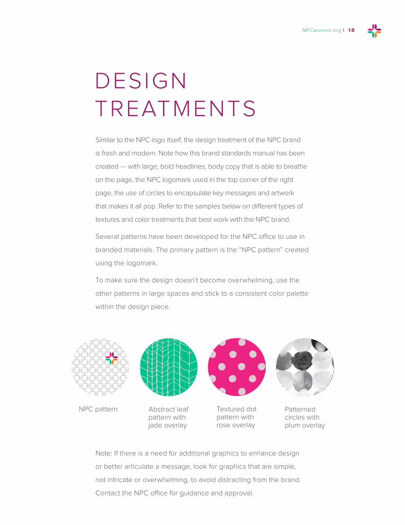
Similar to the NPC logo itself, the design treatment of the NPC brand
is fresh and modern. Note how this brand standards manual has been
created — with large, bold headlines, body copy that is able to breathe
on the page, the NPC logomark used in the top corner of the right
page, the use of circles to encapsulate key messages and artwork
that makes it all pop. Refer to the samples below on different types of
textures and color treatments that best work with the NPC brand.
Several patterns have been developed for the NPC office to use in
branded materials. The primary pattern is the “NPC pattern” created
using the logomark.
To make sure the design doesn’t become overwhelming, use the
other patterns in large spaces and stick to a consistent color palette
within the design piece.
DESIGN TREATMENTS
Note: If there is a need for additional graphics to enhance design
or better articulate a message, look for graphics that are simple,
not intricate or overwhelming, to avoid distracting from the brand.
Contact the NPC office for guidance and approval.
NPC pattern Abstract leaf pattern with jade overlay
Textured dot pattern with rose overlay
Patterned circles with plum overlay
NPCwomen.org | 18

To retain the integrity of NPC brand, the colors must remain
consistent in hue and saturation across all mediums, particularly
print and digital. Below you will find a explanation of a variety of
industry-standard color reproduction techniques. To ensure the
correct logo file format is used depending on medium, note all logo
file names have been organized according color production.
PMS = PANTONE MATCHING SYSTEM
The Pantone Matching System is a system of thousands of numbered
swatches. Most corporate colors, in a logo for example, are identified
with a number from this system. It is referred to as a PMS number.
Pantone colors are also called “spot” colors.
This is similar to picking paint at the hardware store for your walls:
you refer to swatches, choose by number and then the color is
pre-mixed before application. This is good for applications that are
predominantly one color (or two) such as a business card.
Printing a one- or two-color job is less expensive than a four-color
job because there are fewer printing plates made. This system also
creates the most accurate color match. Not all PMS colors can be
reproduced accurately in CMYK/four-color reproduction.
COLORREPRODUCTION
19 | BRAND STANDARDS MANUAL

COATED VS. UNCOATED
Pantone colors are listed by number. Colors also have a “C” or an
“U.” The “C” stands for coated paper and the “U” for uncoated paper.
Coated papers have a smooth finish, where the paper is pressed
and polished during the manufacturing process. This coating
makes the paper less absorbent and takes the ink better. Think
of it as the coat of primer you’d use before painting your walls.
Uncoated paper is just that; paper without the coated layer. It is
more absorbent than coated paper.
Since coated papers allow the ink to sit on the surface, it remains rich
and vibrant. The uncoated sheet allows more ink to be absorbed into
the paper. Minerals in the inks affect the way the color is absorbed.
As a result, coated and uncoated versions of the same PMS color will
look very different. To compensate for this, we have recommended
different PMS colors for “C” versus “U” applications.
CMYK = CYAN, MAGENTA, YELLOW, BLACK:
FOUR-COLOR OR PROCESS COLOR
CMYK refers to full-color printing. While using PMS colors is best
for something that prints in limited colors, it is not suitable for
reproducing photographic images or multicolor projects. Instead,
the CMYK or four-color process is used. Process color uses
percentages of each of the four colors (CMYK) to create a color.
NPCwomen.org | 20
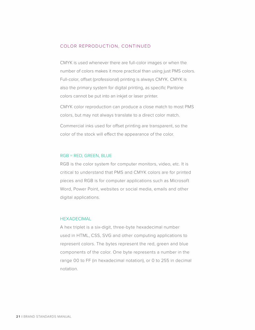
CMYK is used whenever there are full-color images or when the
number of colors makes it more practical than using just PMS colors.
Full-color, offset (professional) printing is always CMYK. CMYK is
also the primary system for digital printing, as specific Pantone
colors cannot be put into an inkjet or laser printer.
CMYK color reproduction can produce a close match to most PMS
colors, but may not always translate to a direct color match.
Commercial inks used for offset printing are transparent, so the
color of the stock will effect the appearance of the color.
RGB = RED, GREEN, BLUE
RGB is the color system for computer monitors, video, etc. It is
critical to understand that PMS and CMYK colors are for printed
pieces and RGB is for computer applications such as Microsoft
Word, Power Point, websites or social media, emails and other
digital applications.
HEXADECIMAL
A hex triplet is a six-digit, three-byte hexadecimal number
used in HTML, CSS, SVG and other computing applications to
represent colors. The bytes represent the red, green and blue
components of the color. One byte represents a number in the
range 00 to FF (in hexadecimal notation), or 0 to 255 in decimal
notation.
COLOR REPRODUCTION, CONTINUED
21 | BRAND STANDARDS MANUAL

NPCwomen.org | 22

Typography plays an important role in how people react to a
document and it language, and the consistent use of a brand’s
typefaces can aid in recognition and brand building.
The following fonts have been selected to support the NPC brand:
• Primary font: Proxima Nova.
• Secondary font: Zilla Slab
• Script font: Satisfy
FONT SUBSITUTIONS
For business correspondence, Panhellenic governing documents
and other templates, emails, web and onscreen presentations,
Arial may be substituted for Proxima Nova if not available.
PURCHASING FONTS
If a volunteer or vendor is setting up artwork, that individual or entity
is responsible for purchasing the fonts needed if the brand fonts
cannot be provided by the requestor. Additional fonts should not be
used without proper prior approval from the NPC office,
Fonts may be purchased from one of the following:
• Proxima Nova: www.adobe.com/type or www.fontspring.com
• Zilla Slab and Satisfy: fonts.google.com (free)
Purchase fonts according to the computer platform (MAC or
Windows). To download and install, follow the instructions provided
by the site where fonts were purchased.
TYPOGRAPHY
23 | BRAND STANDARDS MANUAL

Proxima Nova is the primary font for NPC and should be used for all
copy. Different weights within Proxima Nova can be used to create
hierarchy and style.
Thin Lorem ipsum dolor sit amet, consectetur adipiscing elit.
Light
Lorem ipsum dolor sit amet,
consectetur adipiscing elit.
Light Italic
Lorem ipsum dolor sit amet,
consectetur adipiscing elit.
Regular
Lorem ipsum dolor sit amet,
consectetur adipiscing elit.
Italic Lorem ipsum dolor sit amet, consectetur adipiscing elit.
Semibold
Lorem ipsum dolor sit amet,
consectetur adipiscing elit.
Bold
Lorem ipsum dolor sit amet,
consectetur adipiscing elit.
Bold Oblique
Lorem ipsum dolor sit amet,
consectetur adipiscing elit.
AaBbCcDdEeFfGgHh
LOREM IPSUM DOLOR SIT.Etiam eu nibh lacinia, rutrum lectus at, euismod urna. Morbi dapi-
bus justo ac sem commodo efficitur. Phasellus ornare pulvinar
orci, vel elementum dui sagittis ut. Mauris sed velit ac massa
vehicula fermentum ac at metus. Suspendisse potenti.
Styling Example 1: Simple header and copy
NPCwomen.org | 24

PRAESENT UT QUAM MATTISEtiam eu nibh lacinia, rutrum lectus at, euismod urna. Morbi dapi-
bus justo ac sem commodo efficitur. Phasellus ornare pulvinar
orci, vel elementum dui sagittis ut. Mauris sed velit ac massa.
LOREM IPSUM DOLOR SIT.
Styling Example 2: Complex header, sub-head and copy
Light Lorem ipsum dolor sit amet, consectetur adipiscing elit.
Light Italic Lorem ipsum dolor sit amet, consectetur adipiscing elit.
Italic Lorem ipsum dolor sit amet, consectetur adipiscing elit.
Regular Lorem ipsum dolor sit amet, consectetur adipiscing elit.
Medium Lorem ipsum dolor sit amet, consectetur adipiscing elit.
Medium Italic Lorem ipsum dolor sit amet, consectetur adipiscing elit.
Semibold Lorem ipsum dolor sit amet, consectetur adipiscing elit.
Semibold Italic Lorem ipsum dolor sit amet, consectetur adipiscing elit.
Bold Lorem ipsum dolor sit amet, consectetur adipiscing elit.
Bold Italic Lorem ipsum dolor sit amet, consectetur adipiscing elit.
AaBbCcDdEeFfGgHhIiJj
Zilla Slab is a free Google font that can also be used as a typeface
for headlines or call outs.
25 | BRAND STANDARDS MANUAL
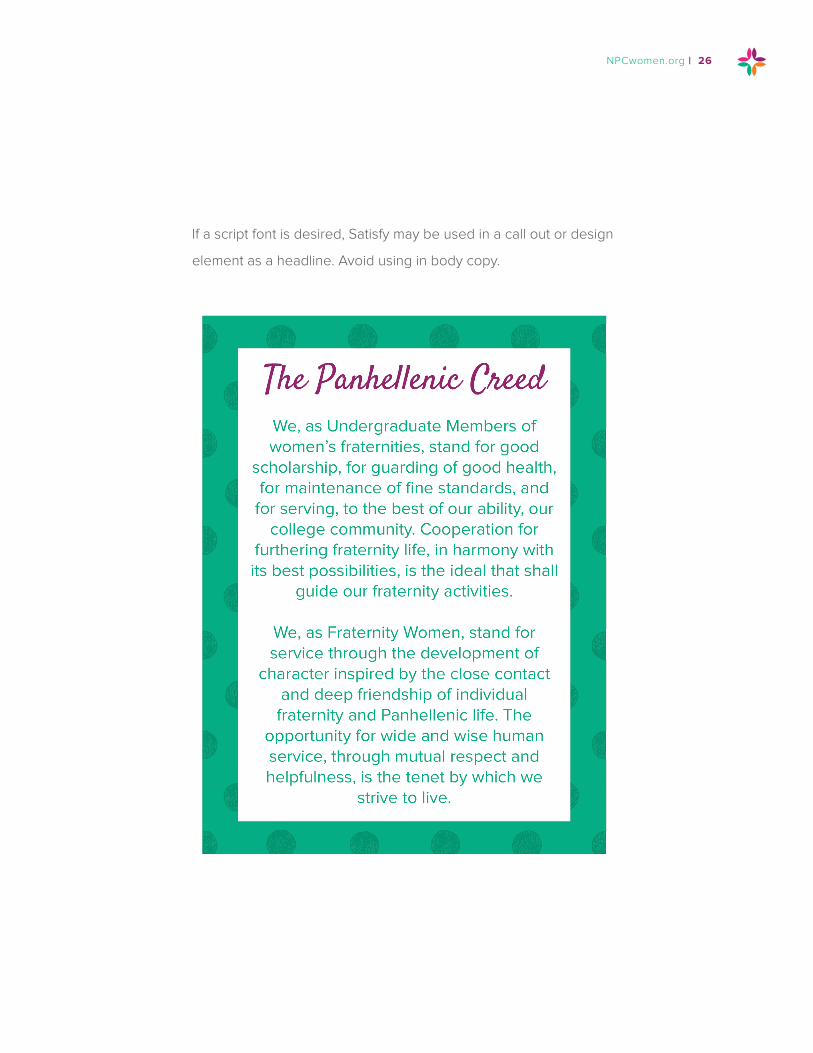
If a script font is desired, Satisfy may be used in a call out or design
element as a headline. Avoid using in body copy.
NPCwomen.org | 26

Photography is key to enhancing the NPC brand message. For
photography, we emphasize women, both collegiate and alumnae.
Women are the basis of our organization.
To the right are examples of the ideal type and style of photography.
Primarily, any photography used to speak to NPC’s member
organizations should represent them. Note how the women look
energetic, attentive and happy to be interacting with one another.
However, there may be special circumstances in which member
photography is not available or does not fit the messaging. In this
case, look for stock photography that embodies these same types
of attributes noted above.
Tip: When needing multiple photos within one piece, it is helpful
to select photos that show a variety of settings, groups, diversity
and activities.
When taking photography, especially at events, ask attendees to
remove their lanyards or name badges and stand away from materials
that show the date and event location. This will allow the photography
to be used in a variety of materials and have a longer shelf life.
PHOTOGRAPHY STYLING / TREATMENT
To help create consistency among photos from different sources,
converting the photos to black and white and adding a color filter
will help keep all photos feeling on-brand. Examples of types of
photo filters are shown to the right and on the pages that follow.
PHOTOGRAPHY
27 | BRAND STANDARDS MANUAL

NPCwomen.org | 28

29 | BRAND STANDARDS MANUAL

NPCwomen.org | 30

3901 W. 86th Street, Suite 398 Indianapolis, IN 46268 317-872-3185 | NPCwomen.org