brand style guide - norc.org
TRANSCRIPT

1
Brand Style GuideAUGUST 2021

NORC strives to send clear messages–written and visual–to both our external and internal audiences. This visual style manual was created to help NORC develop consistent brand recognition through printed and online publications and other graphic assets.
Table of Contents
1 - BRAND LOGO & TAGLINE
Logo . . . . . . . . . . . . . . . . . . . . . . . . . . . . . . . . . . . . . . . . . . . . . . . . . . . . 4
Logo Responsiveness . . . . . . . . . . . . . . . . . . . . . . . . . . . . . . . . . 5
Logo Clearspace . . . . . . . . . . . . . . . . . . . . . . . . . . . . . . . . . . . . . . 6
Logo Usage . . . . . . . . . . . . . . . . . . . . . . . . . . . . . . . . . . . . . . . . . . . . 7
Tagline . . . . . . . . . . . . . . . . . . . . . . . . . . . . . . . . . . . . . . . . . . . . . . . . 11
Tagline Usage. . . . . . . . . . . . . . . . . . . . . . . . . . . . . . . . . . . . . . . . . 12
2 - BRAND SYSTEM
Brand Messaging . . . . . . . . . . . . . . . . . . . . . . . . . . . . . . . . . . . . . 14
NORC Look & Feel . . . . . . . . . . . . . . . . . . . . . . . . . . . . . . . . . . . 1 5
Stationery . . . . . . . . . . . . . . . . . . . . . . . . . . . . . . . . . . . . . . . . . . . . . 16
Color. . . . . . . . . . . . . . . . . . . . . . . . . . . . . . . . . . . . . . . . . . . . . . . . . . . 17
d Typography . . . . . . . . . . . . . . . . . . . . . . . . . . . . . . . . . . . . . . . . . . . 19
2e Spark Usage . . . . . . . . . . . . . . . . . . . . . . . . . . . . . . . . . . . . . . . . . . 21
Icongraphy . . . . . . . . . . . . . . . . . . . . . . . . . . . . . . . . . . . . . . . . . . . . 26
Visualizations . . . . . . . . . . . . . . . . . . . . . . . . . . . . . . . . . . . . . . . . . 27
Textures & Graphics . . . . . . . . . . . . . . . . . . . . . . . . . . . . . . . . . . 28
Photography . . . . . . . . . . . . . . . . . . . . . . . . . . . . . . . . . . . . . . . . . . 29
3 - BRAND EXPRESSIONS
Publications . . . . . . . . . . . . . . . . . . . . . . . . . . . . . . . . . . . . . . . . . . 32

Brand Logo & Tagline
Brand Logo & Tagline

4
< Table of Contents
Our iconic Spark symbolizes the insights that drive the trusted research NORC is known for.
Orange is NORC’s primary color and a significant part of our brand logo and system.
A symmetric use of streamline, humanistic letter-forms and Spark aid to the pronunciation of NORC as a word rather than an acronym.
The University of Chicago descriptor is an integral part of our logo and reinforces NORC’s alignment with the institution.
Logo

5
< Table of Contents
Alternate options of the logo were created to accommodate space and scale limitations while retaining design integrity.
FULL LOGO Use 95% of the time
SHORT LOGO Use when “at the U of C” descriptor is illegible or when circumstances require it to be removed
STACKED LOGONeeds permission to use
SPARK LOGONeeds permission to use
Logo Responsiveness DOWNLOAD LOGOS & TAGLINES

6
< Table of Contents
Logo Clearspace
SHORT LOGO CLEAR SPACE IDEAL
STACKED LOGO CLEAR SPACE
1 N height
1/2 N height
1/2 N height
2 N width
1 N width
1 N width (frame)
SHORT LOGO CLEAR SPACE MINIMUM
CenteredVertically
1 N width
Logo clear space is an essential style requirement for NORC’s logo integrity and consistency across all materials.
FULL LOGO CLEAR SPACE IDEAL FULL LOGO CLEAR SPACE MINIMUM
How not to use
NORC at the University of Chicago is an objective and non-partisan research institution that delivers reliable data and
rigorous analysis to guide critical programmatic, business, and policy decisions.
Do not set logo edge-to-edge with margin or graphic artwork
Do not crowd the logo with text1 N height
2 N width
7
< Table of Contents
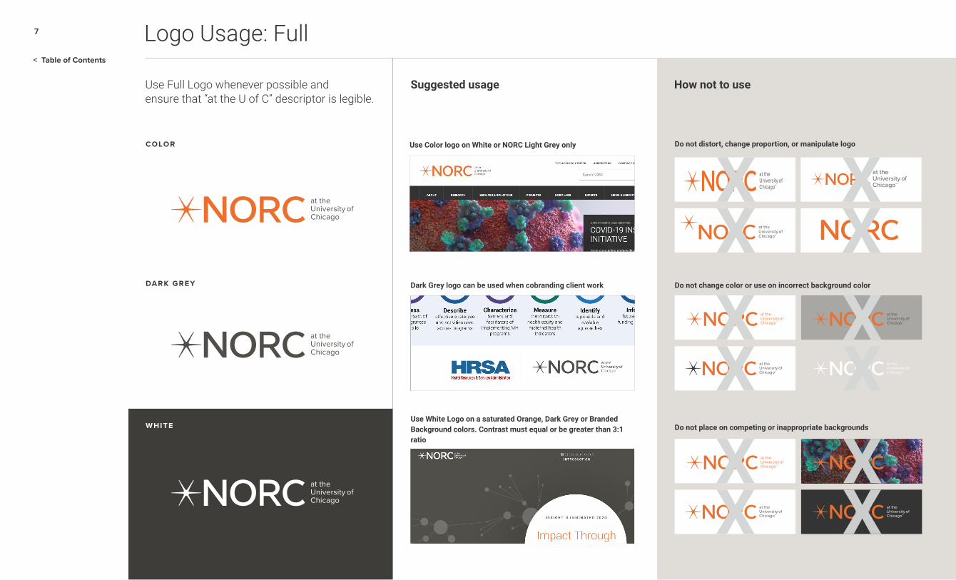
Logo Usage: Full
WHITE
Use Full Logo whenever possible and ensure that “at the U of C” descriptor is legible.
Suggested usage How not to use
COLOR Use Color logo on White or NORC Light Grey only Do not distort, change proportion, or manipulate logo
Do not change color or use on incorrect background color
Do not place on competing or inappropriate backgrounds
Dark Grey logo can be used when cobranding client work
Use White Logo on a saturated Orange, Dark Grey or Branded Background colors. Contrast must equal or be greater than 3:1 ratio
DARK GREY
WHITE

8
< Table of Contents
WHITE
Use Short Logo only when size of image area does not allow for “at the U of C” descriptor to be legible.
Suggested usage How not to use
COLOR Use Short logo on small swag and promotional items Do not use Full Logo when “at the U of C” descriptor is illegible
Do not use Short Logo when space allows for Primary Logo usage
Use Short Logo when digital interface restraints prohibit the reproduction of small type
Use Short Logo when printing techniques prohibit the reproduction of small type
DARK GREY
WHITE
?
Logo Usage: Short
9
< Table of Contents
WHITE
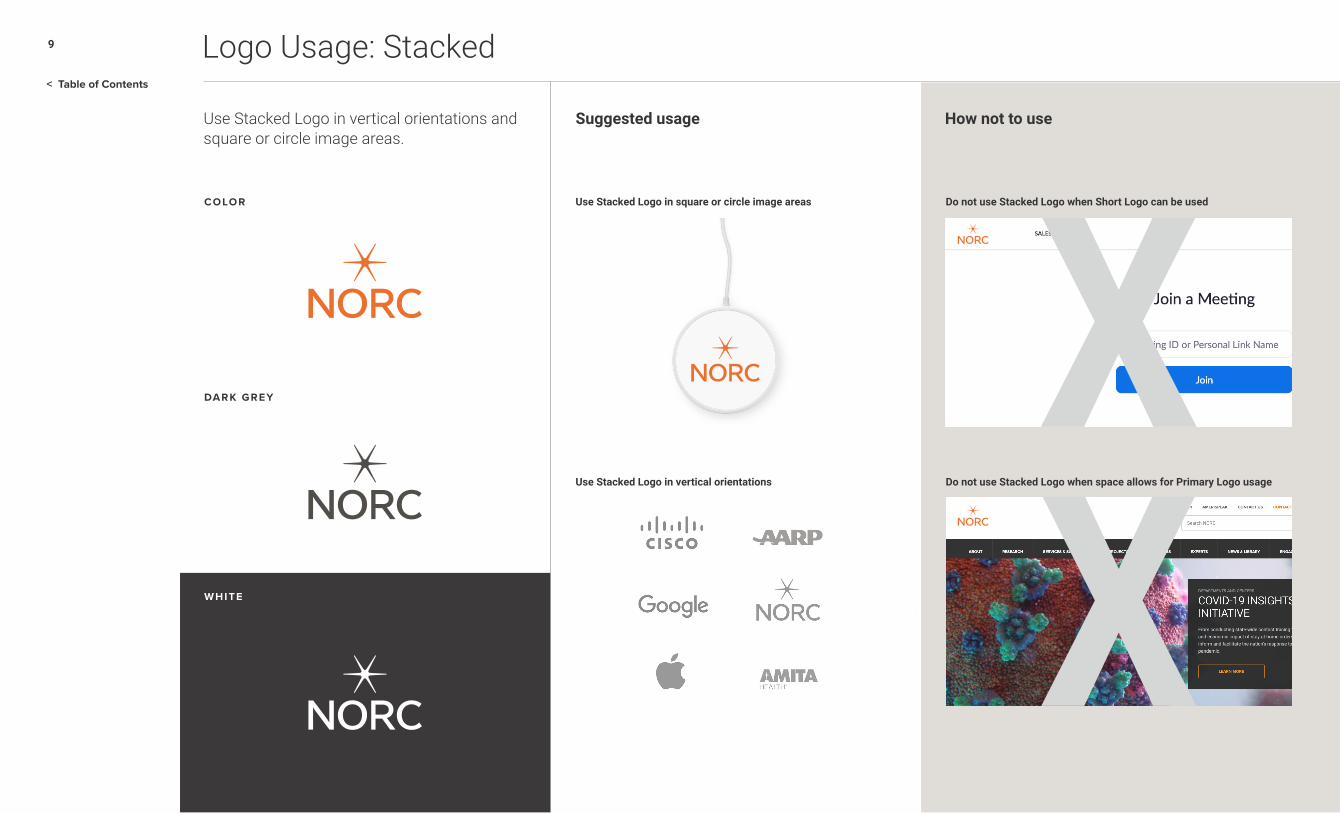
Use Stacked Logo in vertical orientations andsquare or circle image areas.
Suggested usage How not to use
COLOR Use Stacked Logo in square or circle image areas
Use Stacked Logo in vertical orientations
Do not use Stacked Logo when Short Logo can be used
Do not use Stacked Logo when space allows for Primary Logo usage
WHITE
Logo Usage: Stacked
DARK GREY

10
< Table of Contents
WHITE
Use the Spark Logo in extremely limited spaces and within proximity to “NORC at the University of Chicago” language.
Suggested use for image areas How not to use
COLOR Use Stacked Logo in square or circle image area
Use Spark as a signature on branded media and video
Use Stacked Logo in vertical orientations.
Do not use Spark Logo when space allows for Primary Logo usage
DARK GREY
WHITE
Logo Usage: Spark

11
< Table of Contents
Tagline
Our iconic Spark, symbolizing the insights that drive trusted research, carries over into our tagline.
Orange is NORC’s primary color and a significant part of our brand logo and system.
Research You Can Trust font style embodies the same humanistic letter-forms found in our logo and is set in NORC’s proprietary Dark Grey.
Research You Can Trust is always trademarked when presented as the official Tagline.

12
< Table of Contents
Tagline Usage
WHITE
Suggested usage How not to use
COLOR Used as a signature on digital communications
Used as a signature on online communications
Do not use the Tagline directly under or next to the logo
Do not crowd the Tagline by placing it directly above or below copy or graphics
DARK GREY
WHITE
Our Tagline is an integral and strategic brand component and is used sparingly, typically as a signature to print and online communications.
NORC at the University of Chicago is an objective and non-partisan research institution that delivers reliable data and
rigorous analysis to guide critical programmatic, business, and policy decisions.
DOWNLOAD LOGOS & TAGLINES

Brand System
Brand System

14
< Table of Contents
Brand Messaging
ELEVATOR SPEECH
NORC at the University of Chicago is an objective, nonpartisan research organization
that delivers insights and analysis decision-makers trust.
BOILERPLATE
NORC at the University of Chicago conducts research and analysis that decision-makers
can trust. As a nonpartisan research organization and a pioneer in measuring and
understanding the world, we have studied almost every aspect of the human experience
and every major news event for more that eight decades. Today, we partner with
government, corporate, and nonprofit clients around the world to provide the objectivity
and expertise necessary to inform the critical decisions facing society.
VIEW MESSAGING GUIDE

15
< Table of Contents
NORC Look & Feel
DATA AS ARTFRESH WHITE , GREYS & ORANGE ACCENTSBOLD ORANGE
We hope you’re doing okay, all things considered.
Have a meal on us, and get it delivered.
Your hard work and dedication have kept us moving.
Stay safe, wear a mask, and thanks for all you’re doing.
– Dan and the Executive Council –

16
< Table of Contents
Stationery
55 East Monroe Street30th Floor Chicago IL 60603
o�ce 312.759.4000 fax 312.759.4004 norc.org
(Date)
Dear (Name)
Lorem ipsum dolor sit amet, consectetur adipiscing elit, sed do eiusmod tempor incid idunt ut labore et dolore magna aliqua. Ut enim ad minim veniam, quis nostrud exerc itation ullamco laboris nisi ut aliquip ex ea commodo consequat. Duis aute irure dol in reprehenderit in voluptate velit esse cillum dolore eu fugiat nulla pariatur. Exceur sint occaecat cupidatat non proident, sunt in culpa qui officia desicia derunt mollit anidmid est laborum.
Lorem ipsum dolor sit amet, consectetur adipiscing elit, sed do eiusmod tempor incid idunt ut labore et dolore magna aliqua. Ut enim ad minim veniam, quis nostrud exerc reprehenderit in voluptate velit esse cillum dolore eu fugiat nulla pariatur. Exceur sint occaecat cupidatat non proident, sunt in culpa qui officia desicia derunt mollit anidmid est laborum.
Lorem ipsum dolor sit amet, consectetur adipiscing elit, sed do eiusmod tempor incid idunt ut labore et dolore magna aliqua. Ut enim ad minim veniam, quis nostrud exerc itation ullamco laboris nisi ut aliquip ex ea commodo consequat. Duis aute irure dol in reprehenderit in voluptate velit esse cillum dolore eu fugiat nulla pariatur. Exceur sint occaeadfcat cupidatat non proident, sunt in culpa qui officia desicia derunt mollit anidmid est laborum.
Sincerely,
NameTitle
55 East Monroe Street, 30th Floor Chicago IL 60603
Janet SmithResearch Scientist, Education & Child Development
| NORC.org
[email protected]: 312.357.6043 | m: 312.357.6043
@NORCnews /NORCatUofC /company/NORC
Line text up with “N” of logo
Logo distance from top edge: 1/2”
Tagline distance from bottom edge: 1/2”
Logo distance from top edge: 1/4”Logo and address
distance from top edge: 5/8”
Tagline distance from bottom edge: .5/8”
“N” of Logo and letter distance from right edge: 1”
LETTERHEAD, BUSINESS CARD & ENVELOPE

17
< Table of Contents
Color
Color is an important branding system component and correct use allows for maximum brand recognition and consistency across all communication vehicles.
NORC ORANGEhex: ec712epms: 152 C
r236, g113, b46c3, m69, y93, k0
NORC GREY 2hex: d5d0ca
pms: Warm Grey 1r213, g208, b202c16, m14, y17, k0
NORC GREY 1hex: e5e3df
pms: Warm Grey 1 (60%)r229, g227, b223
c9, m7, y9, k0
NORC GREY 3hex: ada39d
pms: Warm Grey 5r173, g163, b157
c34, m32, y34, k1
NORC GREY 4hex: 7d7470
pms: 60% of Black 4r125, g116, b112
c48, m46, y47, k17
NORC GREY 5hex: 615753
pms: 75% of Black 4r97, g87, b83
c55 m55, y56, k33
NORC GREY 6hex: 353435
pms: 85% Black 6r53, g52, b53
c79, m74, y71, k45
WHITEhex: ffffff
pms: Whiter255, g255, 255c0, m0, y 0, k0
NORC PRIMARY PALETTEThe Primary Palette is made up of NORC Orange in combination with white and a family of Grey’s across all communication materials. Bold=14pt+
Regular=18pt+Bold=14pt+Regular=18pt+
WHITEGREY 6 WHITEGREY 6 WHITEGREY 6
GREY 5 GREY 6GREY 4
AA COMPLIANT:
508 compliant for text on white and background color for white text.AA COMPLIANT:
508 compliant background colors for black or Grey 6 colored text.
AA COMPLIANT:
508 compliant for text on white and background color for white text.

18
< Table of Contents
Color: Research Areas
Research areas have their own signature color to help differentiate NORC’s multiple areas of expertise while building brand consistency between communication materials.
ECONOMICShex: 286f5dpms: 3295
r40, g111, b93c83, m36, y67, k20
HEALTHhex: 4c7b91pms: 7698
r76, g123, b145c74, m42, y32, k6
EDUCATIONhex: 8d1821pms: 1815
r141, g24, b33c27, m100, y92 k30
GLOBALhex: 76376bpms: 7657
r119, g55, b107c57, m90, y30 k14
SOCIETY, MEDIA, AND PUBLIC
AFFAIRS hex: c55051pms: 7619
r197, g80, b81c18, m82, y67, k4
RESEARCH AREA COLOR PALETTESResearch Area Palettes are made up of a signature area color plus NORC’s Primary Orange and family of Greys.
ECONOMICS EDUCATION GLOBAL SOCIETYHEALTH
ECONOMICS EDUCATION GLOBAL SOCIETYHEALTH
AA COMPLIANT:
508 compliant for text on white and background color for white text.

19
< Table of Contents
Typography
Typography is also an important branding system component. NORC’s typography family consists of two primary fonts– Roboto and Proxima Nova.
Headlines, Body Copy and Online
Roboto Thin abcdefghijklmnopqrstuvwxyz | abcdefghijklmnopqrstuvwxyz ABCDEFGHIJKLMNOPQRSTUVWXYZ 1234567890-!@#$%^&*()_{}:”<>?
Roboto Light abcdefghijklmnopqrstuvwxyz | abcdefghijklmnopqrstuvwxyzABCDEFGHIJKLMNOPQRSTUVWXYZ 1234567890-!@#$%^&*()_{}:”<>?
Roboto Regular abcdefghijklmnopqrstuvwxyz | abcdefghijklmnopqrstuvwxyz ABCDEFGHIJKLMNOPQRSTUVWXYZ 1234567890-!@#$%^&*()_{}:”<>?
Roboto Medium abcdefghijklmnopqrstuvwxyz | abcdefghijklmnopqrstuvwxyz ABCDEFGHIJKLMNOPQRSTUVWXYZ 1234567890-!@#$%^&*()_{}:”<>?
Roboto Bold abcdefghijklmnopqrstuvwxyz | abcdefghijklmnopqrstuvwxyz ABCDEFGHIJKLMNOPQRSTUVWXYZ 1234567890-!@#$%^&*()_{}:”<>?
Roboto Extra Bold abcdefghijklmnopqrstuvwxyz | abcdefghijklmnopqrstuvwxyz ABCDEFGHIJKLMNOPQRSTUVWXYZ 1234567890-!@#$%^&*()_{}:”<>?
Aa
Aa
Aa
Aa
Aa
Aa
Roboto
Big Title HeadlinesThinUse with type 34pt+
Primary HeadlinesLightUse with type 18pt+
Body Copy RegularUse with type 10pt
LightUse with type 11pt+
*
*
*
* Primary Roboto font styles

20
< Table of Contents
Typography
Subheads, Labels and Alternate Headlines
Proxima NovaProxima Nova Thin abcdefghijklmnopqrstuvwxyz | abcdefghijklmnopqrstuvwxyz ABCDEFGHIJKLMNOPQRSTUVWXYZ 1234567890-!@#$%^&*()_{}:”<>?
Proxima Nova Light abcdefghijklmnopqrstuvwxyz | abcdefghijklmnopqrstuvwxyz ABCDEFGHIJKLMNOPQRSTUVWXYZ 1234567890-!@#$%^&*()_{}:”<>?
Proxima Nova Regularabcdefghijklmnopqrstuvwxyz | abcdefghijklmnopqrstuvwxyz ABCDEFGHIJKLMNOPQRSTUVWXYZ 1234567890-!@#$%^&*()_{}:”<>?
Proxima Nova Medium abcdefghijklmnopqrstuvwxyz | abcdefghijklmnopqrstuvwxyz ABCDEFGHIJKLMNOPQRSTUVWXYZ 1234567890-!@#$%^&*()_{}:”<>?
Proxima Nova Semibold abcdefghijklmnopqrstuvwxyz | abcdefghijklmnopqrstuvwxyz ABCDEFGHIJKLMNOPQRSTUVWXYZ 1234567890-!@#$%^&*()_{}:”<>?
Proxima Nova Bold abcdefghijklmnopqrstuvwxyz | abcdefghijklmnopqrstuvwxyz ABCDEFGHIJKLMNOPQRSTUVWXYZ 1234567890-!@#$%^&*()_{}:”<>?
Proxima Nova Extra Bold abcdefghijklmnopqrstuvwxyz | abcdefghijklmnopqrstuvwxyz ABCDEFGHIJKLMNOPQRSTUVWXYZ 1234567890-!@#$%^&*()_{}:”<>?
Proxima Nova Black abcdefghijklmnopqrstuvwxyz | abcdefghijklmnopqrstuvwxyz ABCDEFGHIJKLMNOPQRSTUVWXYZ 1234567890-!@#$%^&*()_{}:”<>?
AaAaAaAaAaAaAaAa
*Primary Proxima Nova font styles
*
*
Alternative/Secondary HeadlinesBold all caps – spaced 100-150Use at 22pt
Special Number TreatmentsLight
LabelsRegular and Bold all caps – spaced 100-150Use 10pt
FootnotesRegular and Bold all caps – spaced 100-150Use at 8pt

21
< Table of Contents
Spark Usage
The Spark is the most recognizable aspect of our logo. Using the Spark in various formats builds brand awareness and consistency.
PRIMARY SPARK PATTERNGrey Sparks touch with select, random highlights of NORC Orange–pattern’s edge is always organic/incomplete.
NORC promotion card and envelope
Use these Greys for Sparks
55 East Monroe, 30th FloorChicago, IL 60603
We hope you’re doing okay, all things considered.
Have a meal on us, and get it delivered.
Your hard work and dedication have kept us moving.
Stay safe, wear a mask, and thanks for all you’re doing.
– Dan and the Executive Council –
SPARSE USE OF ORANGE ACCENTS
INCOMPLETE PATTERN EDGE
SPARK GREY ON WHITEhex: d9d8d6pms: 15% of Black 3r217, g216, b214c14, m11, y12, k0
DOWNLOAD SPARK PATTERNS

22
< Table of Contents
Spark Usage
HOW TO USE PRIMARY SPARK PATTERN Grey Sparks touch with select, random highlights of NORCOrange. Align tip-to-tip horizontally and on a 30° angle. When using near logo, scale larger or smaller than logo Spark.
SCALE APPROPRIATELY WHEN NEAR
OR AROUND NORC LOGO
AL IGN ON 30° ANGLE
SMALLER
LARGER
ALIGN HORIZONTALLY
How not to use
Do not tilt
Do not stackDo not align incorrectly
Use Orange sparingly
Avoid using too much pattern Do not overlap
Do not rotate
Do not scatter or outline
DOWNLOAD SPARK PATTERNS

23
< Table of Contents
Spark Usage
Use pre-designed Primary Spark templates on postcards, envelopes, invitations, zoom backgrounds and social media materials.
CORNERS
SILHOUETTESHORIZONTAL
LARGE MEDIUM SMALL
VERTICAL SQUARE
DOWNLOAD SPARK PATTERNS

24
< Table of Contents
Spark Usage
Zoom background
LinkedIn background
HALO PATTERNUse pre-designed Primary Spark template on postcards, envelopes, invitations, zoom backgrounds and social media materials.
Use these Greys for Sparks
SPARK GREY ON BACKGROUNDhex: b1aea9pms: 40% of Black 7r177, g174, b169c32, m27, y30, k0
DOWNLOAD SPARK PATTERNS
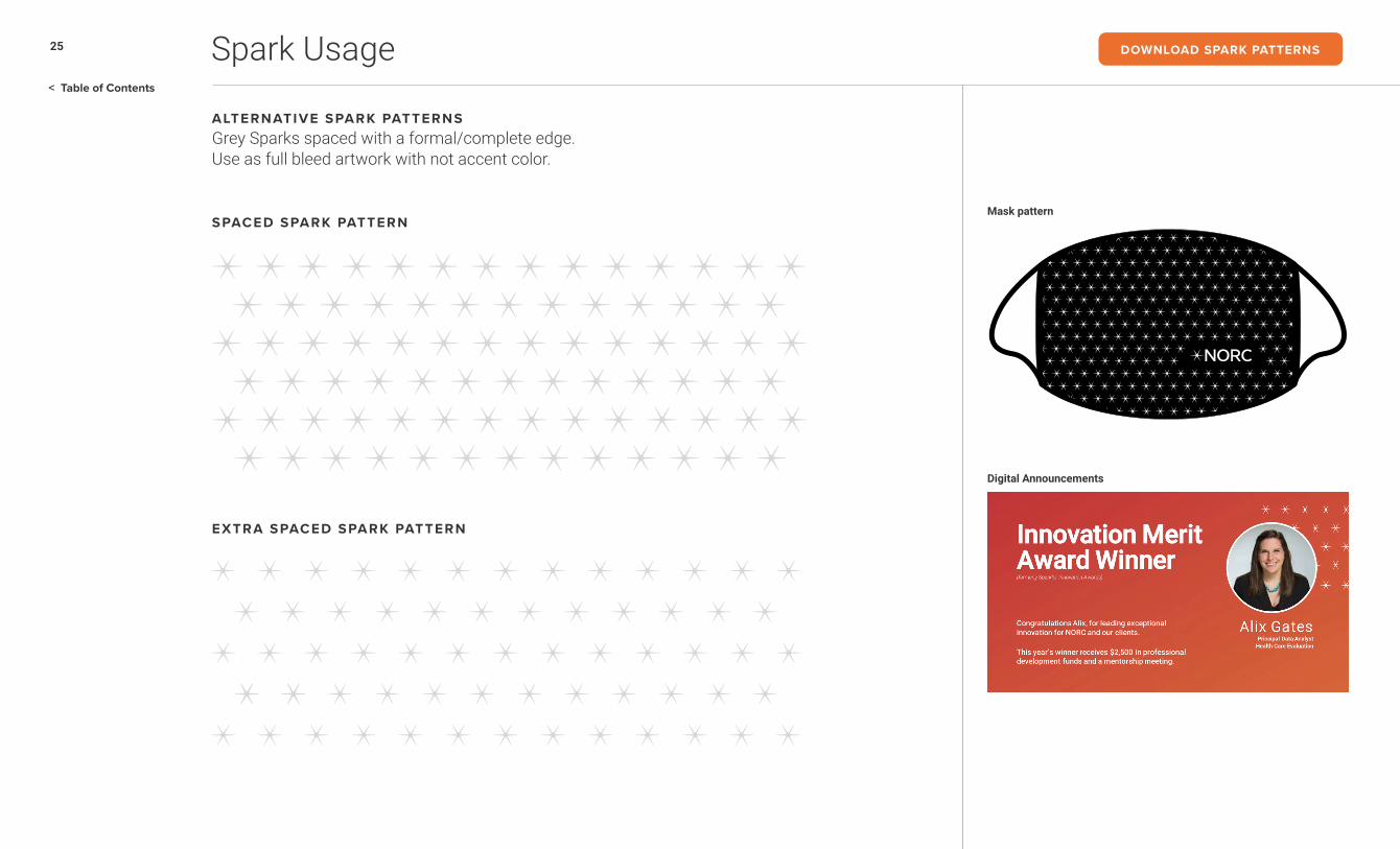
25
< Table of Contents
Spark Usage
Mask pattern
Digital Announcements
ALTERNATIVE SPARK PATTERNSGrey Sparks spaced with a formal/complete edge. Use as full bleed artwork with not accent color.
SPACED SPARK PATTERN
EXTRA SPACED SPARK PATTERN
DOWNLOAD SPARK PATTERNS

26
< Table of Contents
Iconography
Icons help communicate ideas quickly while adding visual interest to layouts.
UTITL ITY ICONSUtility icons are NORC’s preferred icon treatment. Use in various combinations of Greys and NORC Orange inside simple geometric shapes or on their own.
NORC ORANGE VARIOUS SHADES OF GREY WITH NORC ORANGE ACCENT
NORC GREY 6 AND NORC GREY 1
NORC GREY 4
STRATEGIC CONCEPT ICONSStrategic icons are made up of Greys with a NORC Orange accent and used for more conceptual storytelling.
PRIMARY PALETTE G3 G4G2G1O G5 G6 W
DOWNLOAD ICON LIBRARY

27
< Table of Contents
Visualizations
DisseminationReach your Audiences
Policy Analysis Prepare for Change
Excellence & ImpactWe conduct high quality analysis summarized with clear and concise insights to maximize your impact.
Continual Innovation
We combine academic rigor, technical expertise, forward-
thinking, and latest in research and analytical methods.
Objective & Non-PartisanWe interpret complex research and present it without bias or favor. We tell it like it is.
Strategic Partners
We understand our partners’ business needs,
adapt our methods, deliverables, and speak
their language.
AdvancedAnalyticsExtract Meaning from Data
Consumer InsightsKnow your
Data StrategyMaster your Data
EvaluationMeasure your Impact
Use a combination of NORC Orange with multiple Greys and the typeface Roboto while creating various types of visualizations.
CHARTS AND GRAPHS
PRIMARY PALETTE
PROCESS GRAPHICS
G3 G4G2G1O G5 G6 W
28
< Table of Contents
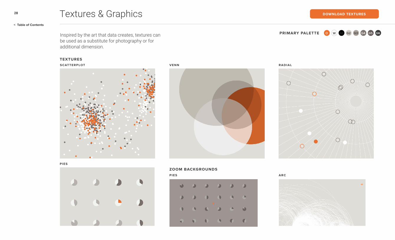
Textures & Graphics
Inspired by the art that data creates, textures can be used as a substitute for photography or for additional dimension.
TEXTURES
ZOOM BACKGROUNDS
PRIMARY PALETTE G3 G4G2G1O G5 G6 W
SCATTERPLOT
PIES ARC
PIES
VENN RADIAL
DOWNLOAD TEXTURES
29
< Table of Contents
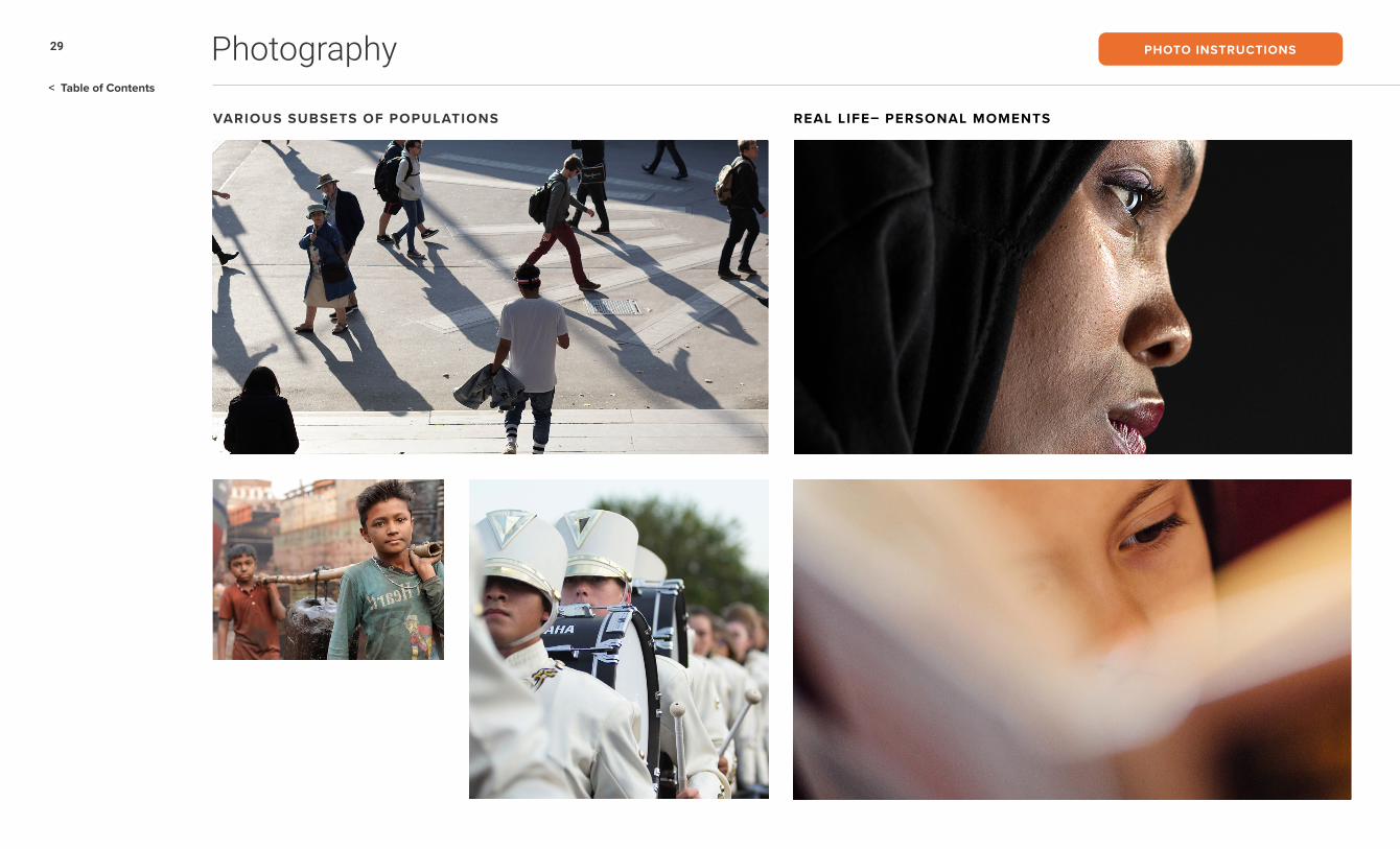
Photography
VARIOUS SUBSETS OF POPULATIONS REAL LIFE– PERSONAL MOMENTS
PHOTO INSTRUCTIONS

30
< Table of Contents
Photography
IMMERSIVE & EXPERIENTIALARTFUL PHOTOJOURNALISM
PHOTO INSTRUCTIONS

Brand Expressions
Brand Expressions

32
< Table of Contents
Publications
NORC produces research and analysis driven digital publications for multiple audiences.
NORC NOWStories of insight & impact.
NORC NUMBERS (HEADER)Data driven stories for visualization enthusiasts.