brand.berkeley berkeley positioning ... office: brand.berkeley.edu... ® ® ® of of of ® of ® ®...
TRANSCRIPT

Brand Guidelines
brand.berkeley.edu
PUBLISHED BY
Office of Communications & Public Affairs
University of California, Berkeley
publicaffairs.berkeley.edu
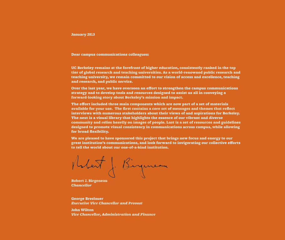
January 2013
Dear campus communications colleagues:
UC Berkeley remains at the forefront of higher education, consistently ranked in the top tier of global research and teaching universities. As a world-renowned public research and teaching university, we remain committed to our vision of access and excellence, teaching and research, and public service.
Over the last year, we have overseen an effort to strengthen the campus communications strategy and to develop tools and resources designed to assist us all in conveying a forward-looking story about Berkeley’s mission and impact.
The effort included three main components which are now part of a set of materials available for your use. The first contains a core set of messages and themes that reflect interviews with numerous stakeholders about their views of and aspirations for Berkeley. The next is a visual library that highlights the essence of our vibrant and diverse community and relies heavily on images of people. Last is a set of resources and guidelines designed to promote visual consistency in communications across campus, while allowing for broad flexibility.
We are pleased to have sponsored this project that brings new focus and energy to our great institution’s communications, and look forward to invigorating our collective efforts to tell the world about our one-of-a-kind institution.
Robert J. Birgeneau Chancellor
George Breslauer Executive Vice Chancellor and Provost
John Wilton Vice Chancellor, Administration and Finance
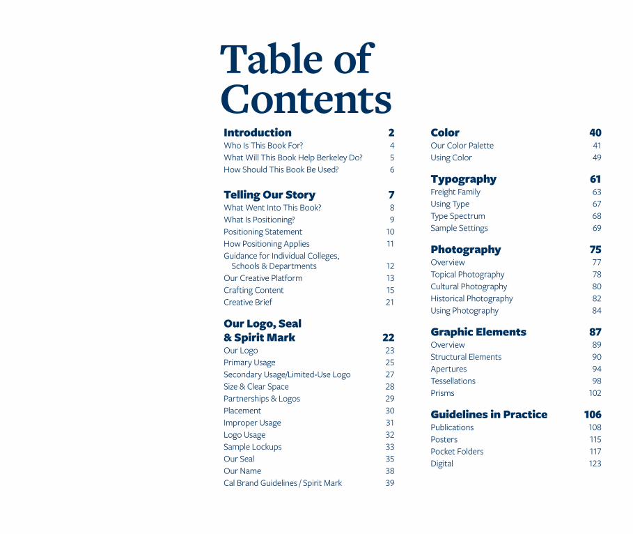
Table of ContentsIntroduction 2 Who Is This Book For? 4 What Will This Book Help Berkeley Do? 5 How Should This Book Be Used? 6
Telling Our Story 7 What Went Into This Book? 8 What Is Positioning? 9 Positioning Statement 10 How Positioning Applies 11 Guidance for Individual Colleges, Schools & Departments 12 Our Creative Platform 13 Crafting Content 15 Creative Brief 21
Our Logo, Seal & Spirit Mark 22 Our Logo 23 Primary Usage 25 Secondary Usage/Limited-Use Logo 27 Size & Clear Space 28 Partnerships & Logos 29 Placement 30 Improper Usage 31 Logo Usage 32 Sample Lockups 33 Our Seal 35 Our Name 38 Cal Brand Guidelines / Spirit Mark 39
Color 40 Our Color Palette 41 Using Color 49
Typography 61 Freight Family 63 Using Type 67 Type Spectrum 68 Sample Settings 69
Photography 75 Overview 77 Topical Photography 78 Cultural Photography 80 Historical Photography 82 Using Photography 84
Graphic Elements 87 Overview 89 Structural Elements 90 Apertures 94 Tessellations 98 Prisms 102
Guidelines in Practice 106 Publications 108 Posters 115 Pocket Folders 117 Digital 123

Introduction
INTRODUCTION 3
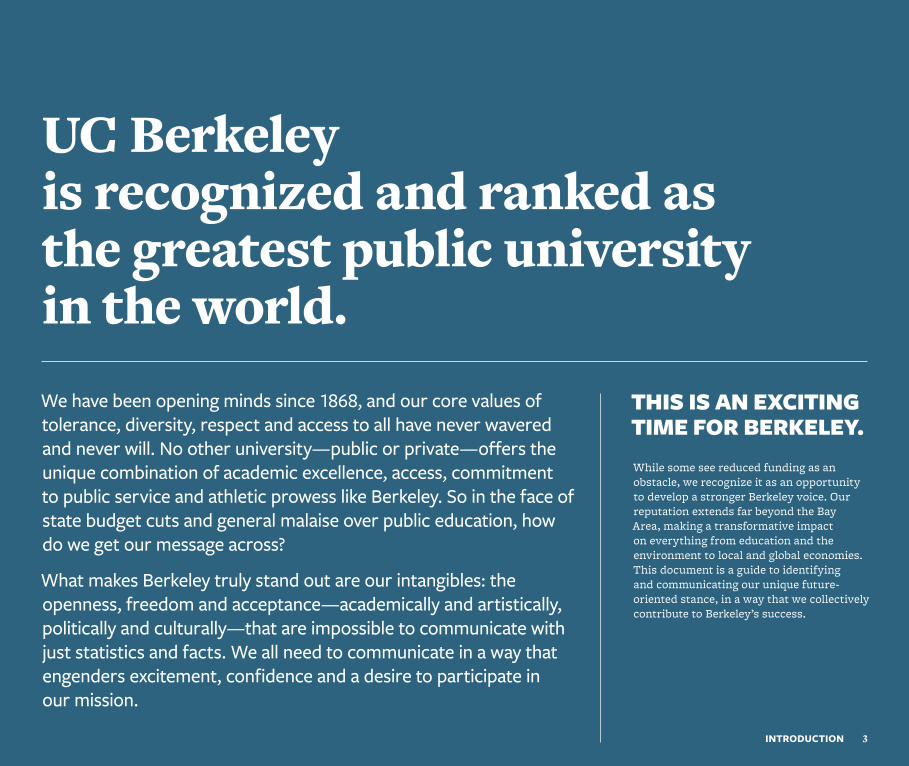
UC Berkeley is recognized and ranked as the greatest public university in the world. We have been opening minds since 1868, and our core values of tolerance, diversity, respect and access to all have never wavered and never will. No other university—public or private—offers the unique combination of academic excellence, access, commitment to public service and athletic prowess like Berkeley. So in the face of state budget cuts and general malaise over public education, how do we get our message across?
What makes Berkeley truly stand out are our intangibles: the openness, freedom and acceptance—academically and artistically, politically and culturally—that are impossible to communicate with just statistics and facts. We all need to communicate in a way that engenders excitement, confidence and a desire to participate in our mission.
THIS IS AN EXCITING TIME FOR BERKELEY.While some see reduced funding as an obstacle, we recognize it as an opportunity to develop a stronger Berkeley voice. Our reputation extends far beyond the Bay Area, making a transformative impact on everything from education and the environment to local and global economies. This document is a guide to identifying and communicating our unique future-oriented stance, in a way that we collectively contribute to Berkeley’s success.
Who is this book for?Anyone at Berkeley who communicates on the university’s behalf should find this book a helpful and inspiring resource.
Department leaders can use this guide as a platform to focus their initiatives.
Lead communicators can use it to provide examples for the creation of new, impactful stories.
Writers can use it to draw inspiration when they create stories about the achievements of their individual departments.
Designers can mine the rich veins of typography, color palettes, photography and design elements to give life to their creations.
4INTRODUCTION | Who
What will this book help Berkeley do?
We all want to tell a compelling, forward-thinking story about the Berkeley experience. While there are many different internal and external audiences, the tools in this book should inspire each of us to take part in the Berkeley story, and to collectively and individually benefit from being part of it.
5INTRODUCTION | What
6INTRODUCTION | How
How should this book be used?
To clarify Berkeley’s unique qualities, advantages and capabilities.
To ensure key themes are present in all communications.
To encourage internal and external advocates for Berkeley.

Telling Our Story
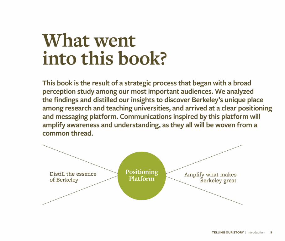
Amplify what makes Berkeley great
What went into this book?This book is the result of a strategic process that began with a broad perception study among our most important audiences. We analyzed the findings and distilled our insights to discover Berkeley’s unique place among research and teaching universities, and arrived at a clear positioning and messaging platform. Communications inspired by this platform will amplify awareness and understanding, as they all will be woven from a common thread.
TELLING OUR STORY | Introduction 8
Distill the essence of Berkeley
Positioning Platform
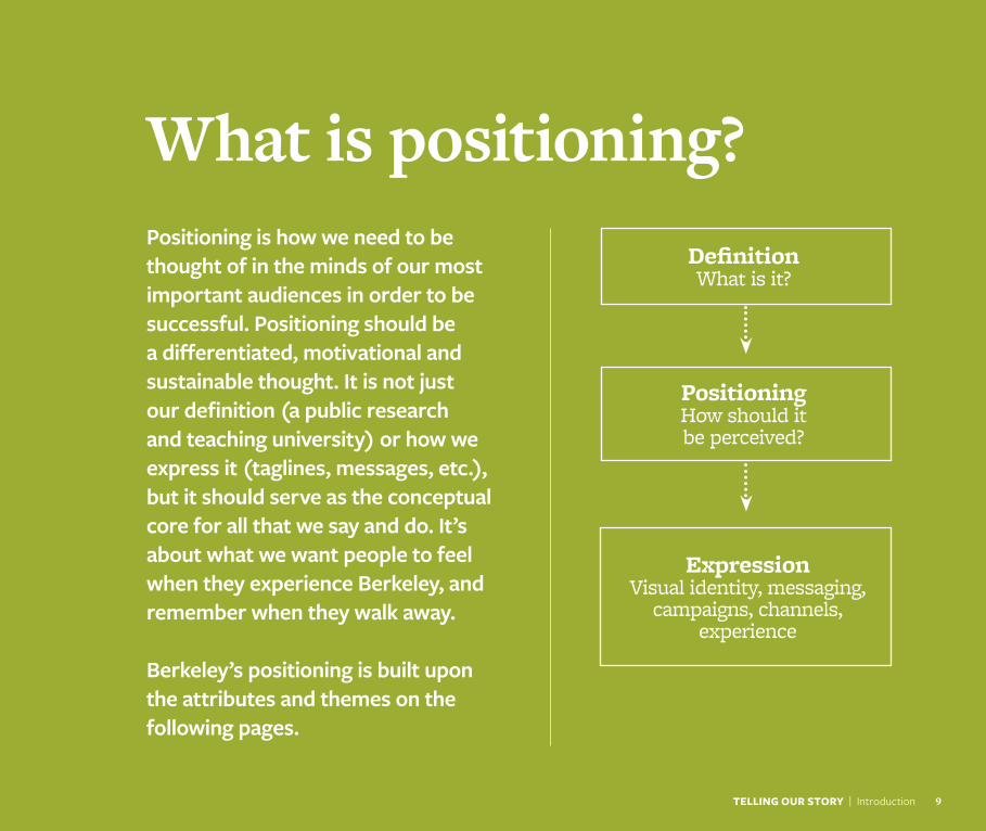
What is positioning?Positioning is how we need to be thought of in the minds of our most important audiences in order to be successful. Positioning should be a differentiated, motivational and sustainable thought. It is not just our definition (a public research and teaching university) or how we express it (taglines, messages, etc.), but it should serve as the conceptual core for all that we say and do. It’s about what we want people to feel when they experience Berkeley, and remember when they walk away.
Berkeley’s positioning is built upon the attributes and themes on the following pages.
TELLING OUR STORY | Introduction 9
Definition What is it?
Positioning How should it be perceived?
ExpressionVisual identity, messaging,
campaigns, channels, experience
10TELLING OUR STORY | Positioning
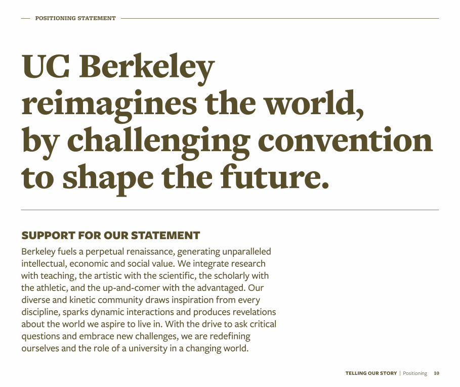
UC Berkeley reimagines the world, by challenging convention to shape the future.
POSITIONING STATEMENT
SUPPORT FOR OUR STATEMENTBerkeley fuels a perpetual renaissance, generating unparalleled intellectual, economic and social value. We integrate research with teaching, the artistic with the scientific, the scholarly with the athletic, and the up-and-comer with the advantaged. Our diverse and kinetic community draws inspiration from every discipline, sparks dynamic interactions and produces revelations about the world we aspire to live in. With the drive to ask critical questions and embrace new challenges, we are redefining ourselves and the role of a university in a changing world.
How positioning applies
TELLING OUR STORY | How 11
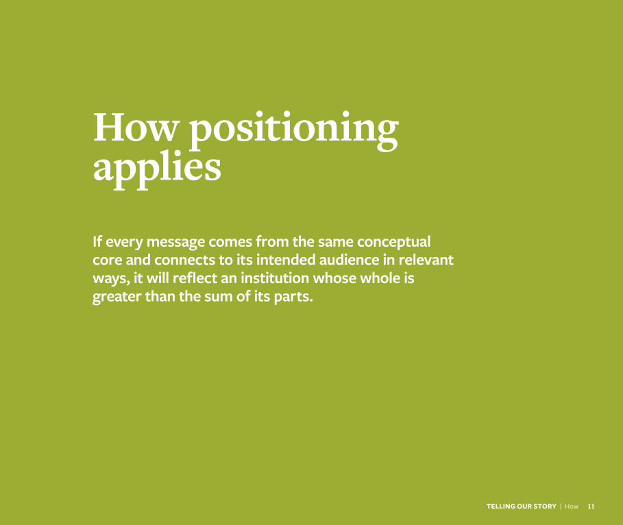
If every message comes from the same conceptual core and connects to its intended audience in relevant ways, it will reflect an institution whose whole is greater than the sum of its parts.
Guidance for individual colleges, schools and departments
TELLING OUR STORY | Guidance 12
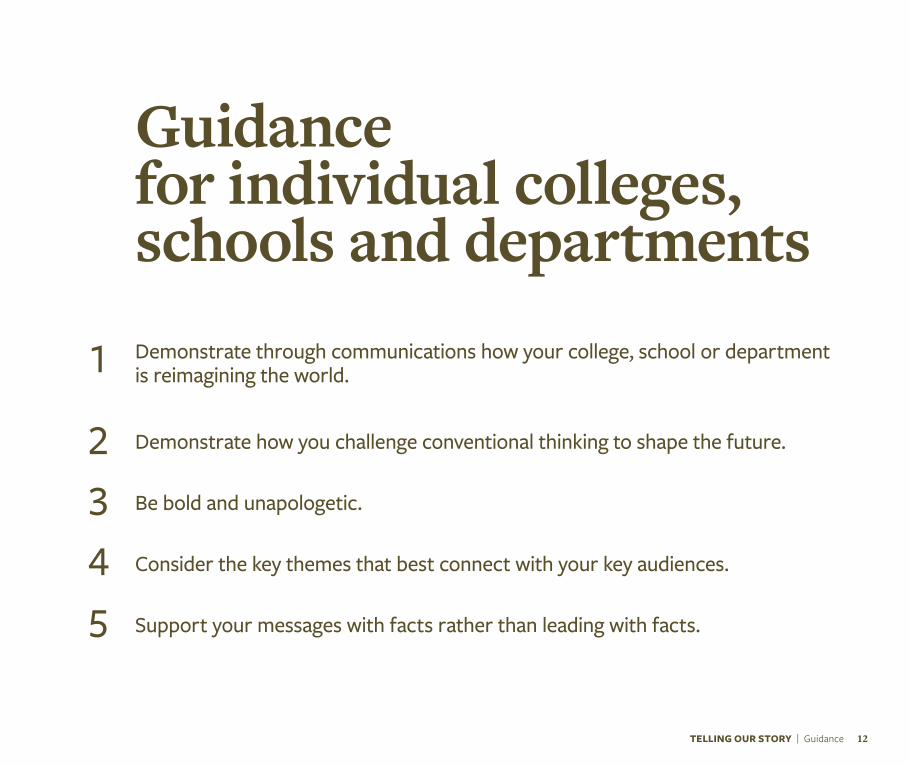
Demonstrate through communications how your college, school or department is reimagining the world.
Demonstrate how you challenge conventional thinking to shape the future.
Be bold and unapologetic.
Consider the key themes that best connect with your key audiences.
Support your messages with facts rather than leading with facts.
1
2345
Our creative platformThe creative platform is an emotional translation of the positioning — condensing all of its important points into a phrase with personality. This is not a tagline or a headline, but a starting point to inspire the look, feel and tone of communications.
13TELLING OUR STORY | Creative Platform
TELLING OUR STORY | Creative Platform 14
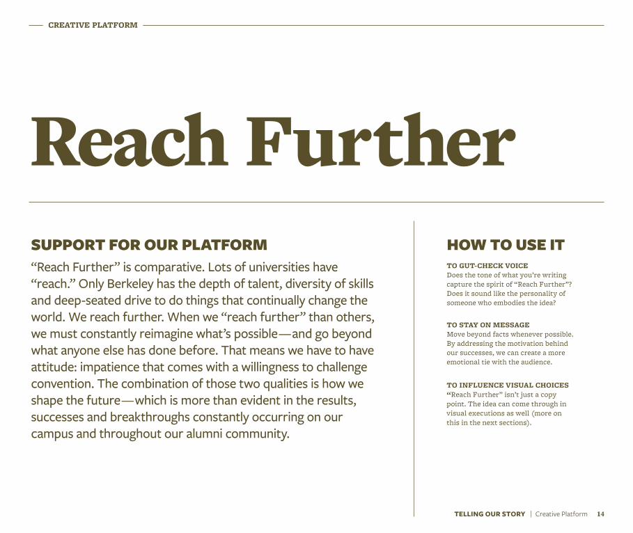
CREATIVE PLATFORM
Reach FurtherHOW TO USE ITTO GUT-CHECK VOICE Does the tone of what you’re writing capture the spirit of “Reach Further”? Does it sound like the personality of someone who embodies the idea?
TO STAY ON MESSAGE Move beyond facts whenever possible. By addressing the motivation behind our successes, we can create a more emotional tie with the audience.
TO INFLUENCE VISUAL CHOICES “Reach Further” isn’t just a copy point. The idea can come through in visual executions as well (more on this in the next sections).
SUPPORT FOR OUR PLATFORM“Reach Further” is comparative. Lots of universities have “reach.” Only Berkeley has the depth of talent, diversity of skills and deep-seated drive to do things that continually change the world. We reach further. When we “reach further” than others, we must constantly reimagine what’s possible — and go beyond what anyone else has done before. That means we have to have attitude: impatience that comes with a willingness to challenge convention. The combination of those two qualities is how we shape the future — which is more than evident in the results, successes and breakthroughs constantly occurring on our campus and throughout our alumni community.
CraftingcontentEvery brand has a personality. Voice is how that personality is conveyed verbally. Sentence structure, word choice and tone all create a distinct character that can only be Berkeley. Here’s how to do it consistently.
TELLING OUR STORY | Crafting Content 15
TELLING OUR STORY | Crafting Content 16
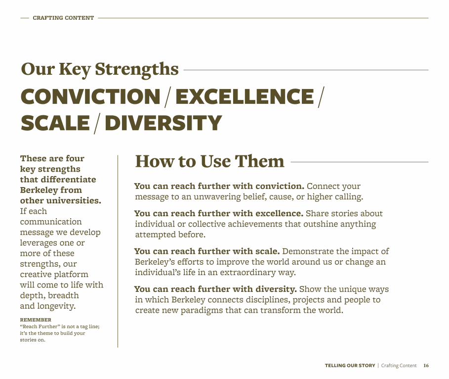
CONVICTION / EXCELLENCE /SCALE / DIVERSITY
You can reach further with conviction. Connect your message to an unwavering belief, cause, or higher calling.
You can reach further with excellence. Share stories about individual or collective achievements that outshine anything attempted before.
You can reach further with scale. Demonstrate the impact of Berkeley’s efforts to improve the world around us or change an individual’s life in an extraordinary way.
You can reach further with diversity. Show the unique ways in which Berkeley connects disciplines, projects and people to create new paradigms that can transform the world.
CRAFTING CONTENT
Our Key Strengths
How to Use ThemThese are four key strengths that differentiate Berkeley from other universities. If each communication message we develop leverages one or more of these strengths, our creative platform will come to life with depth, breadth and longevity.REMEMBER “Reach Further” is not a tag line; it’s the theme to build your stories on.
CRAFTING CONTENT
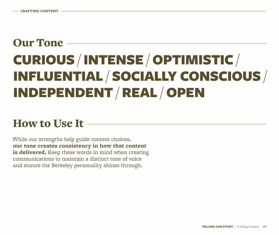
CURIOUS / INTENSE / OPTIMISTIC /INFLUENTIAL / SOCIALLY CONSCIOUS /INDEPENDENT / REAL / OPEN
Our Tone
While our strengths help guide content choices, our tone creates consistency in how that content is delivered. Keep these words in mind when creating communications to maintain a distinct tone of voice and ensure the Berkeley personality shines through.
How to Use It
TELLING OUR STORY | Crafting Content 17
CRAFTING CONTENT
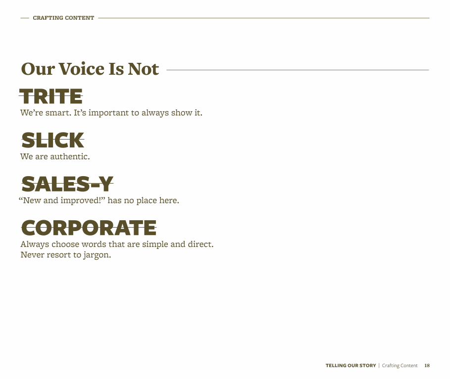
TRITE We’re smart. It’s important to always show it.
SLICK We are authentic.
SALES-Y “New and improved!” has no place here.
CORPORATE Always choose words that are simple and direct. Never resort to jargon.
Our Voice Is Not
TELLING OUR STORY | Crafting Content 18
CRAFTING CONTENT
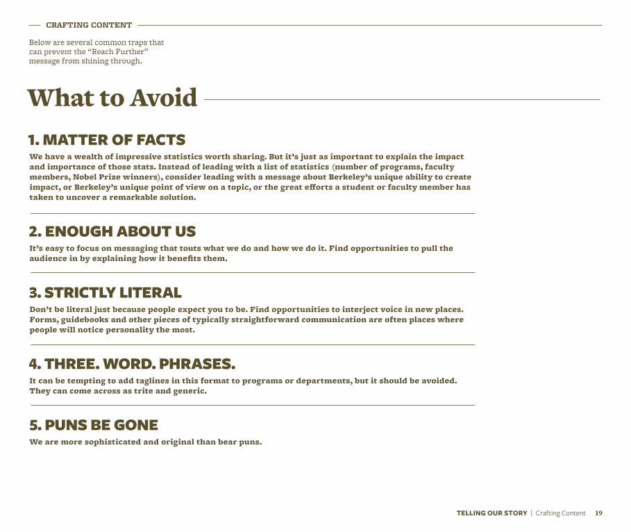
Below are several common traps that can prevent the “Reach Further” message from shining through.
1. MATTER OF FACTSWe have a wealth of impressive statistics worth sharing. But it’s just as important to explain the impact and importance of those stats. Instead of leading with a list of statistics (number of programs, faculty members, Nobel Prize winners), consider leading with a message about Berkeley’s unique ability to create impact, or Berkeley’s unique point of view on a topic, or the great efforts a student or faculty member has taken to uncover a remarkable solution.
2. ENOUGH ABOUT USIt’s easy to focus on messaging that touts what we do and how we do it. Find opportunities to pull the audience in by explaining how it benefits them.
3. STRICTLY LITERALDon’t be literal just because people expect you to be. Find opportunities to interject voice in new places. Forms, guidebooks and other pieces of typically straightforward communication are often places where people will notice personality the most.
4. THREE. WORD. PHRASES.It can be tempting to add taglines in this format to programs or departments, but it should be avoided. They can come across as trite and generic.
5. PUNS BE GONEWe are more sophisticated and original than bear puns.
TELLING OUR STORY | Crafting Content 19
What to Avoid
TELLING OUR STORY | Crafting Content 20
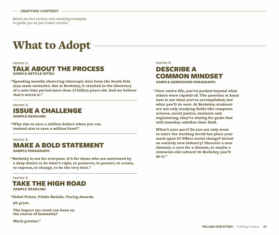
tactic 1:
TALK ABOUT THE PROCESSSAMPLE ARTICLE INTRO:
“Spending months observing telescopic data from the South Pole may seem excessive. But at Berkeley, it resulted in the discovery of a new time period more than 13 billion years old. And we believe that’s worth it.”
tactic 2:
ISSUE A CHALLENGESAMPLE HEADLINE:
“Why aim to earn a million dollars when you can instead aim to save a million lives?”
tactic 3:
MAKE A BOLD STATEMENTSAMPLE PARAGRAPH:
“Berkeley is not for everyone. It’s for those who are motivated by a deep desire to do what’s right, to preserve, to protect, to create, to express, to change, to be the very best.”
tactic 4:
TAKE THE HIGH ROADSAMPLE HEADLINE:
“Nobel Prizes. Fields Medals. Turing Awards.
All great.
The impact our work can have on the course of humanity?
Much greater.”
tactic 5: DESCRIBE A COMMON MINDSETSAMPLE ADMISSIONS PARAGRAPH:
“Your entire life, you’ve pushed beyond what others were capable of. The question at hand now is not what you’ve accomplished, but what you’ll do next. At Berkeley, students are not only studying fields like computer science, social justice, business and engineering, they’re aiming for goals that will someday redefine their field.
What’s your part? Do you not only want to enter the working world but place your mark upon it? Effect social change? Invent an entirely new industry? Discover a new element, a cure for a disease, or maybe a centuries-old culture? At Berkeley, you’ll do it.”
CRAFTING CONTENT
Below are five tactics, and resulting examples, to guide you as you create content.
What to Adopt
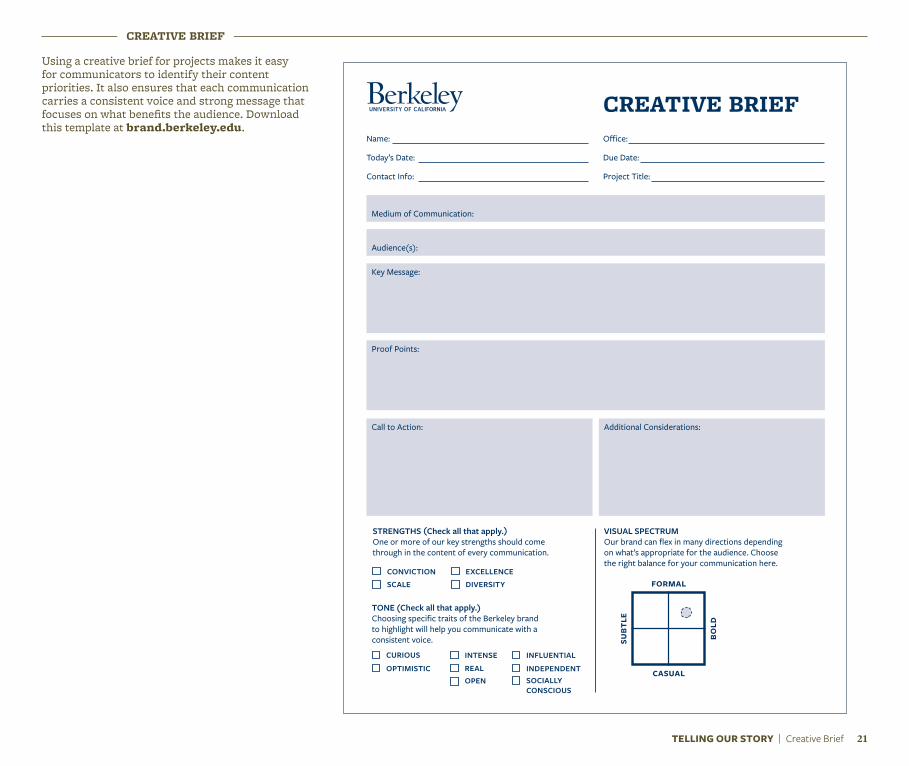
CREATIVE BRIEF
Medium of Communication:
Audience(s):
Key Message:
Proof Points:
Call to Action: Additional Considerations:
Name:
Today’s Date:
Contact Info:
Office:
Due Date:
Project Title:
CREATIVE BRIEF
STRENGTHS (Check all that apply.)One or more of our key strengths should come through in the content of every communication.
CONVICTION
CURIOUS
EXCELLENCE
INTENSE INFLUENTIAL
SCALE
OPTIMISTICOPEN SOCIALLY
CONSCIOUS
DIVERSITY
REAL INDEPENDENT
TONE (Check all that apply.)Choosing specific traits of the Berkeley brand to highlight will help you communicate with a consistent voice.
VISUAL SPECTRUMOur brand can flex in many directions depending on what’s appropriate for the audience. Choose the right balance for your communication here.
formal
casual
subt
le
bold
Using a creative brief for projects makes it easy for communicators to identify their content priorities. It also ensures that each communication carries a consistent voice and strong message that focuses on what benefits the audience. Download this template at brand.berkeley.edu.
TELLING OUR STORY | Creative Brief 21

Our Logo, Seal & Spirit Mark
Our logo
The UC Berkeley logo represents us at the very highest level and is vitally important to our brand. It acts as a signature, an identifier and a stamp of quality. It is, and should always be, the most consistent component in our communications.
In order to maintain this consistency, a few simple guidelines should be followed.
a NOTE a
The Berkeley logo should never be recreated or typeset. Only official logo files should be used in communications.
Official logo files can be downloaded from brand.berkeley.edu.
The Berkeley logo as shown here will serve as the campus’s primary logo and trademark. Other campus trademarks may appear on merchandise produced by vendors specifically licensed to reproduce these trademarks. For more information and to view lists of our trademark licensees, please visit ombo.berkeley.edu/name/promotion.
23OUR LOGO, SEAL & SPIRIT MARK | Our Logo

24OUR LOGO, SEAL & SPIRIT MARK | Our Logo
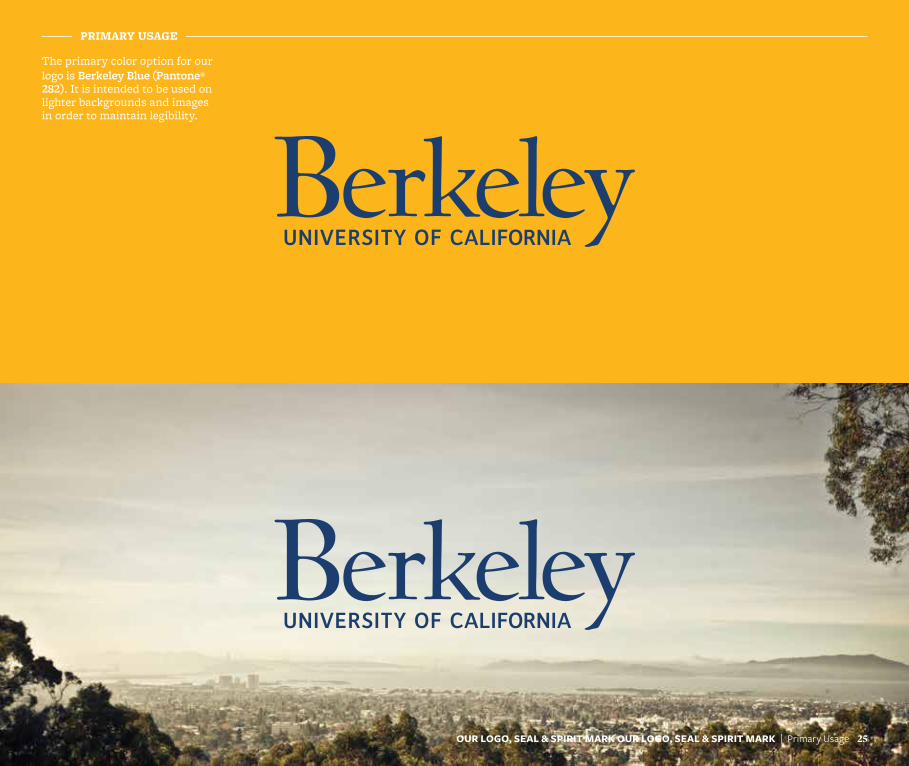
PRIMARY USAGE
The primary color option for our logo is Berkeley Blue (Pantone® 282). It is intended to be used on lighter backgrounds and images in order to maintain legibility.
25OUR LOGO, SEAL & SPIRIT MARK OUR LOGO, SEAL & SPIRIT MARK | Primary Usage

OUR LOGO, SEAL & SPIRIT MARK | Primary Usage 26
PRIMARY USAGE
Another acceptable color option is to reverse the logo out to White on darker backgrounds and images.
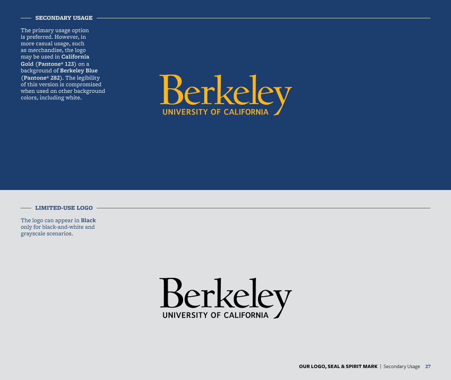
SECONDARY USAGE
LIMITED-USE LOGO
The primary usage option is preferred. However, in more casual usage, such as merchandise, the logo may be used in California Gold (Pantone® 123) on a background of Berkeley Blue (Pantone® 282). The legibility of this version is compromised when used on other background colors, including white.
The logo can appear in Black only for black-and-white and grayscale scenarios.
OUR LOGO, SEAL & SPIRIT MARK | Secondary Usage 27
OUR LOGO, SEAL & SPIRIT MARK | Size & Clear Space 28
≥1˝ or 175 px
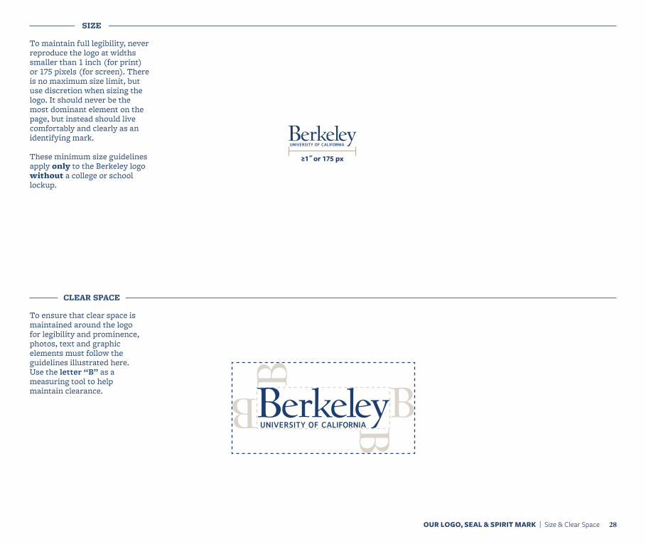
SIZE
To maintain full legibility, never reproduce the logo at widths smaller than 1 inch (for print) or 175 pixels (for screen). There is no maximum size limit, but use discretion when sizing the logo. It should never be the most dominant element on the page, but instead should live comfortably and clearly as an identifying mark.
These minimum size guidelines apply only to the Berkeley logo without a college or school lockup.
CLEAR SPACE
To ensure that clear space is maintained around the logo for legibility and prominence, photos, text and graphic elements must follow the guidelines illustrated here. Use the letter “B” as a measuring tool to help maintain clearance.
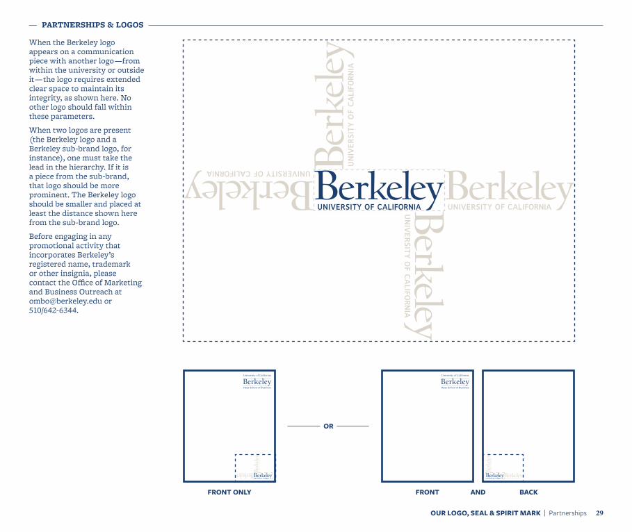
PARTNERSHIPS & LOGOS
When the Berkeley logo appears on a communication piece with another logo —from within the university or outside it — the logo requires extended clear space to maintain its integrity, as shown here. No other logo should fall within these parameters.
When two logos are present (the Berkeley logo and a Berkeley sub-brand logo, for instance), one must take the lead in the hierarchy. If it is a piece from the sub-brand, that logo should be more prominent. The Berkeley logo should be smaller and placed at least the distance shown here from the sub-brand logo.
Before engaging in any promotional activity that incorporates Berkeley’s registered name, trademark or other insignia, please contact the Office of Marketing and Business Outreach at [email protected] or 510/642-6344.
OR
FRONT ONLY FRONT AND BACK
OUR LOGO, SEAL & SPIRIT MARK | Partnerships 29
OUR LOGO, SEAL & SPIRIT MARK | Placement 30
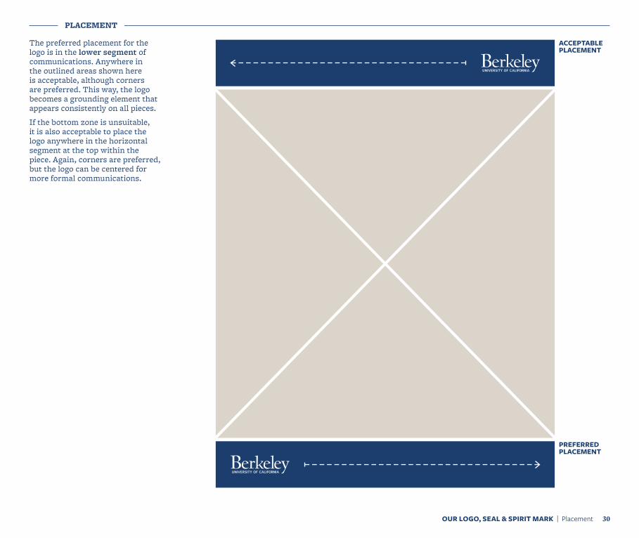
PLACEMENT
The preferred placement for the logo is in the lower segment of communications. Anywhere in the outlined areas shown here is acceptable, although corners are preferred. This way, the logo becomes a grounding element that appears consistently on all pieces.
If the bottom zone is unsuitable, it is also acceptable to place the logo anywhere in the horizontal segment at the top within the piece. Again, corners are preferred, but the logo can be centered for more formal communications.
ACCEPTABLE PLACEMENT
PREFERRED PLACEMENT
IMPROPER USAGE
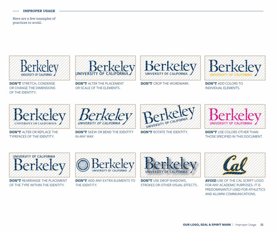
Here are a few examples of practices to avoid.
OUR LOGO, SEAL & SPIRIT MARK | Improper Usage 31
DON’T STRETCH, CONDENSE OR CHANGE THE DIMENSIONS OF THE IDENTITY.
DON’T ALTER OR REPLACE THE TYPEFACES OF THE IDENTITY.
DON’T REARRANGE THE PLACEMENT OF THE TYPE WITHIN THE IDENTITY.
DON’T ALTER THE PLACEMENT OR SCALE OF THE ELEMENTS.
DON’T SKEW OR BEND THE IDENTITY IN ANY WAY.
DON’T ADD ANY EXTRA ELEMENTS TO THE IDENTITY.
DON’T CROP THE WORDMARK.
DON’T ROTATE THE IDENTITY.
DON’T USE DROP SHADOWS, STROKES OR OTHER VISUAL EFFECTS.
DON’T ADD COLORS TO INDIVIDUAL ELEMENTS.
DON’T USE COLORS OTHER THAN THOSE SPECIFIED IN THIS DOCUMENT.
AVOID USE OF THE CAL SCRIPT LOGO FOR ANY ACADEMIC PURPOSES. IT IS PREDOMINANTLY USED FOR ATHLETICS AND ALUMNI COMMUNICATIONS.
LOGO USAGE
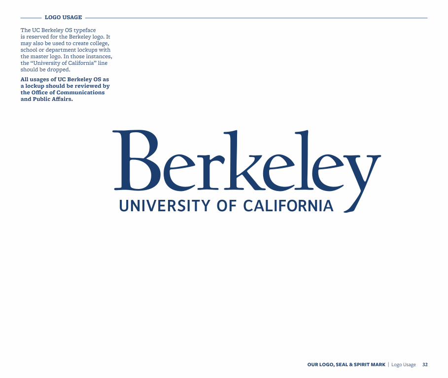
The UC Berkeley OS typeface is reserved for the Berkeley logo. It may also be used to create college, school or department lockups with the master logo. In those instances, the “University of California” line should be dropped.
All usages of UC Berkeley OS as a lockup should be reviewed by the Office of Communications and Public Affairs.
OUR LOGO, SEAL & SPIRIT MARK | Logo Usage 32
SAMPLE LOCKUPS
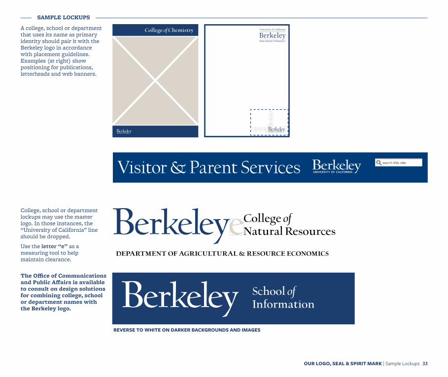
A college, school or department that uses its name as primary identity should pair it with the Berkeley logo in accordance with placement guidelines. Examples (at right) show positioning for publications, letterheads and web banners.
OUR LOGO, SEAL & SPIRIT MARK | Sample Lockups 33
College of Chemistry
department of agricultural & resource economics
College of Natural Resources
School of Information
REVERSE TO WHITE ON DARKER BACKGROUNDS AND IMAGES
College, school or department lockups may use the master logo. In those instances, the “University of California” line should be dropped.
Use the letter “e” as a measuring tool to help maintain clearance.
The Office of Communications and Public Affairs is available to consult on design solutions for combining college, school or department names with the Berkeley logo.
Visitor & Parent Services
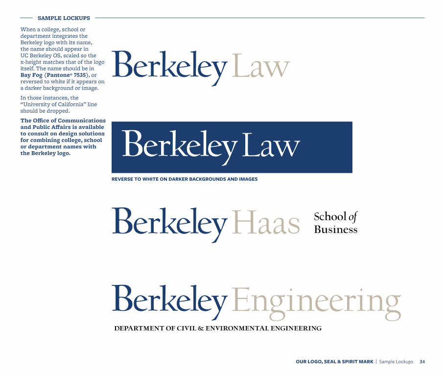
When a college, school or department integrates the Berkeley logo with its name, the name should appear in UC Berkeley OS, scaled so the x-height matches that of the logo itself. The name should be in Bay Fog (Pantone® 7535), or reversed to white if it appears on a darker background or image.
In those instances, the “University of California” line should be dropped.
The Office of Communications and Public Affairs is available to consult on design solutions for combining college, school or department names with the Berkeley logo.
Law
Haas School of Business
Engineeringdepartment of civil & environmental engineering
LawREVERSE TO WHITE ON DARKER BACKGROUNDS AND IMAGES
OUR LOGO, SEAL & SPIRIT MARK | Sample Lockups 34
SAMPLE LOCKUPS
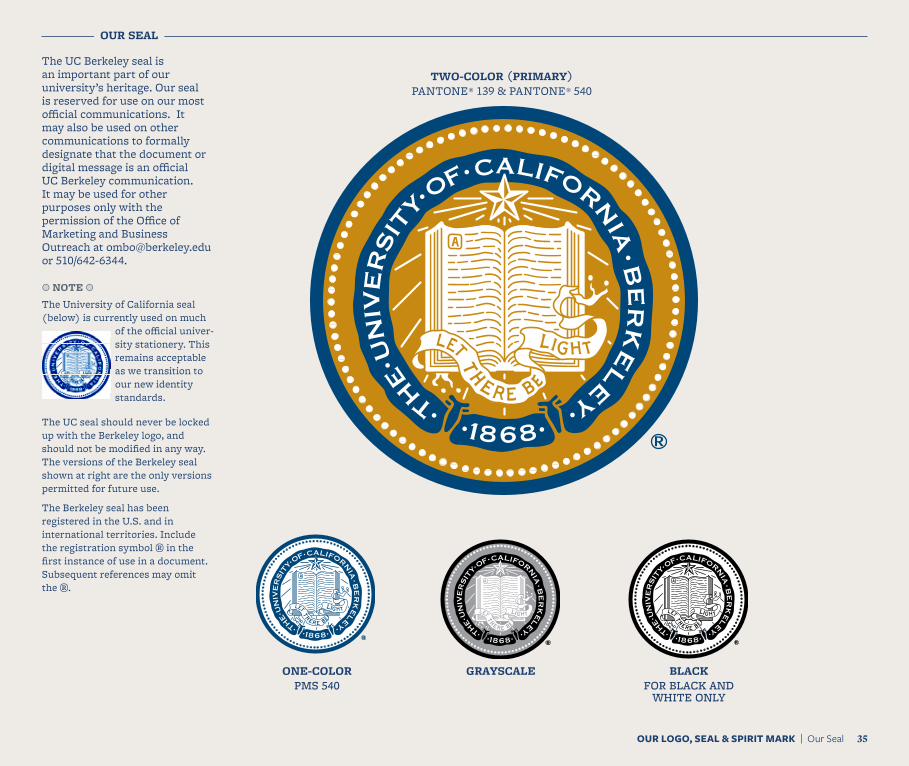
TWO-COLOR (PRIMARY)PANTONE® 139 & PANTONE® 540
OUR SEAL
The UC Berkeley seal is an important part of our university’s heritage. Our seal is reserved for use on our most official communications. It may also be used on other communications to formally designate that the document or digital message is an official UC Berkeley communication. It may be used for other purposes only with the permission of the Office of Marketing and Business Outreach at [email protected] or 510/642-6344.
a NOTE a
The University of California seal (below) is currently used on much
of the official univer-sity stationery. This remains acceptable as we transition to our new identity standards.
The UC seal should never be locked up with the Berkeley logo, and should not be modified in any way. The versions of the Berkeley seal shown at right are the only versions permitted for future use.
The Berkeley seal has been registered in the U.S. and in international territories. Include the registration symbol ® in the first instance of use in a document. Subsequent references may omit the ®.
OUR LOGO, SEAL & SPIRIT MARK | Our Seal 35
ONE-COLORPMS 540
GRAYSCALE BLACKFOR BLACK AND
WHITE ONLY
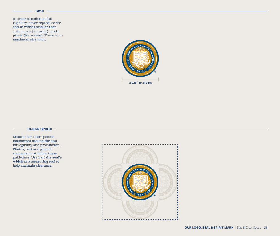
SIZE
In order to maintain full legibility, never reproduce the seal at widths smaller than 1.25 inches (for print) or 215 pixels (for screen). There is no maximum size limit.
CLEAR SPACE
Ensure that clear space is maintained around the seal for legibility and prominence. Photos, text and graphic elements must follow these guidelines. Use half the seal’s width as a measuring tool to help maintain clearance.
≥1.25˝ or 215 px
OUR LOGO, SEAL & SPIRIT MARK | Size & Clear Space 36
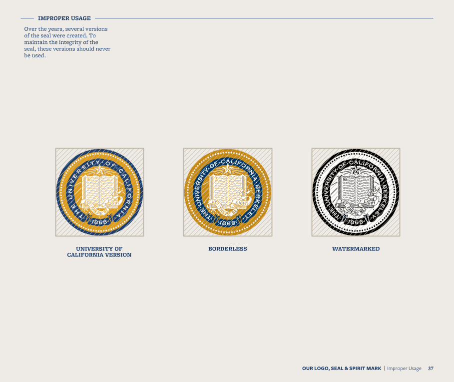
IMPROPER USAGE
Over the years, several versions of the seal were created. To maintain the integrity of the seal, these versions should never be used.
UNIVERSITY OF CALIFORNIA VERSION
BORDERLESS WATERMARKED
OUR LOGO, SEAL & SPIRIT MARK | Improper Usage 37
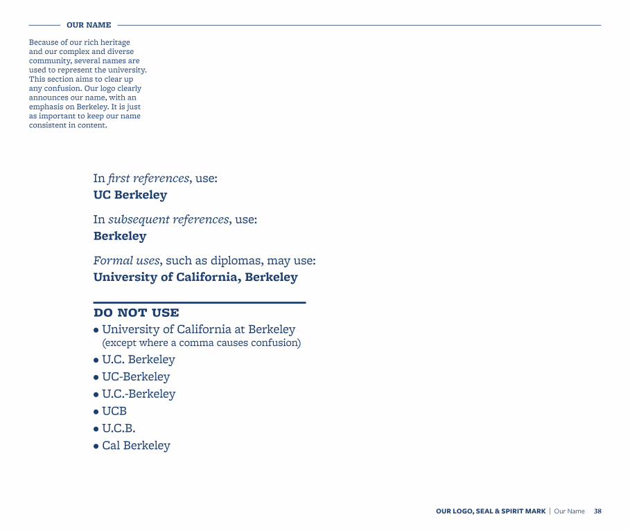
OUR NAME
Because of our rich heritage and our complex and diverse community, several names are used to represent the university. This section aims to clear up any confusion. Our logo clearly announces our name, with an emphasis on Berkeley. It is just as important to keep our name consistent in content.
In first references, use: UC Berkeley
In subsequent references, use: Berkeley
Formal uses, such as diplomas, may use: University of California, Berkeley
do not use • University of California at Berkeley
(except where a comma causes confusion)• U.C. Berkeley• UC-Berkeley • U.C.-Berkeley• UCB• U.C.B.• Cal Berkeley
OUR LOGO, SEAL & SPIRIT MARK | Our Name 38
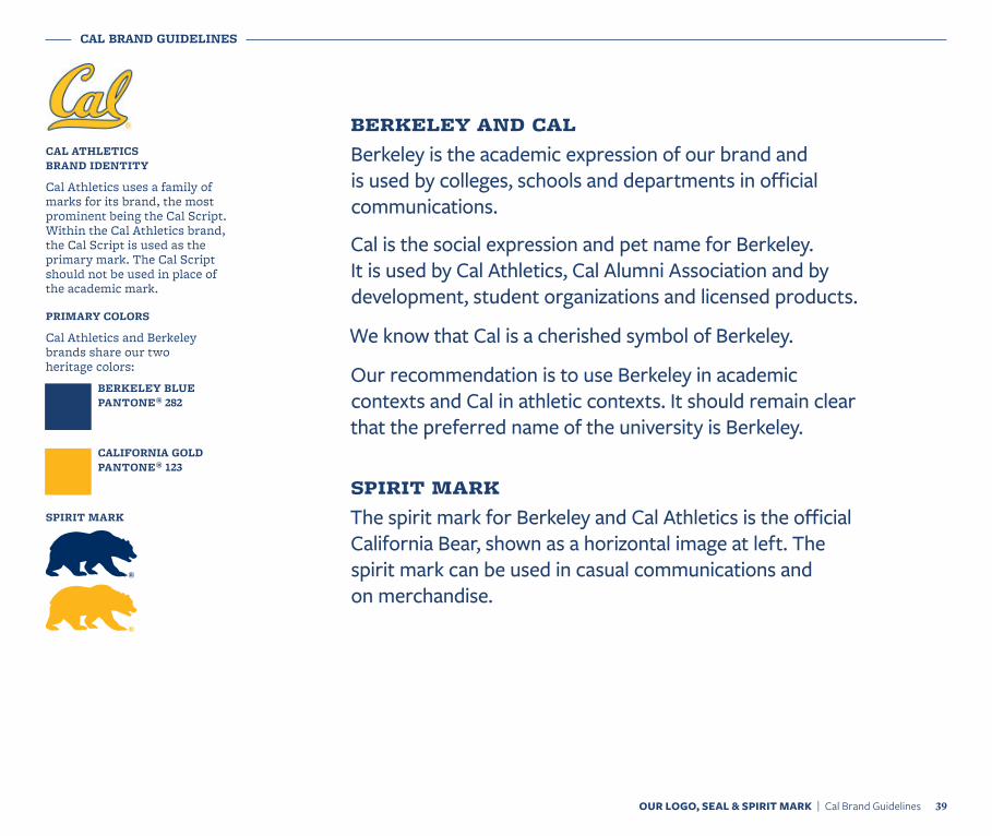
berkeley and calBerkeley is the academic expression of our brand and is used by colleges, schools and departments in official communications.
Cal is the social expression and pet name for Berkeley. It is used by Cal Athletics, Cal Alumni Association and by development, student organizations and licensed products.
We know that Cal is a cherished symbol of Berkeley.
Our recommendation is to use Berkeley in academic contexts and Cal in athletic contexts. It should remain clear that the preferred name of the university is Berkeley.
spirit markThe spirit mark for Berkeley and Cal Athletics is the official California Bear, shown as a horizontal image at left. The spirit mark can be used in casual communications and on merchandise.
OUR LOGO, SEAL & SPIRIT MARK | Cal Brand Guidelines 39
CAL BRAND GUIDELINES
PRIMARY COLORS
Cal Athletics and Berkeley brands share our two heritage colors:
BERKELEY BLUE PANTONE® 282
CALIFORNIA GOLD PANTONE® 123
SPIRIT MARK
CAL ATHLETICS BRAND IDENTITY
Cal Athletics uses a family of marks for its brand, the most prominent being the Cal Script. Within the Cal Athletics brand, the Cal Script is used as the primary mark. The Cal Script should not be used in place of the academic mark.
®
®

Color
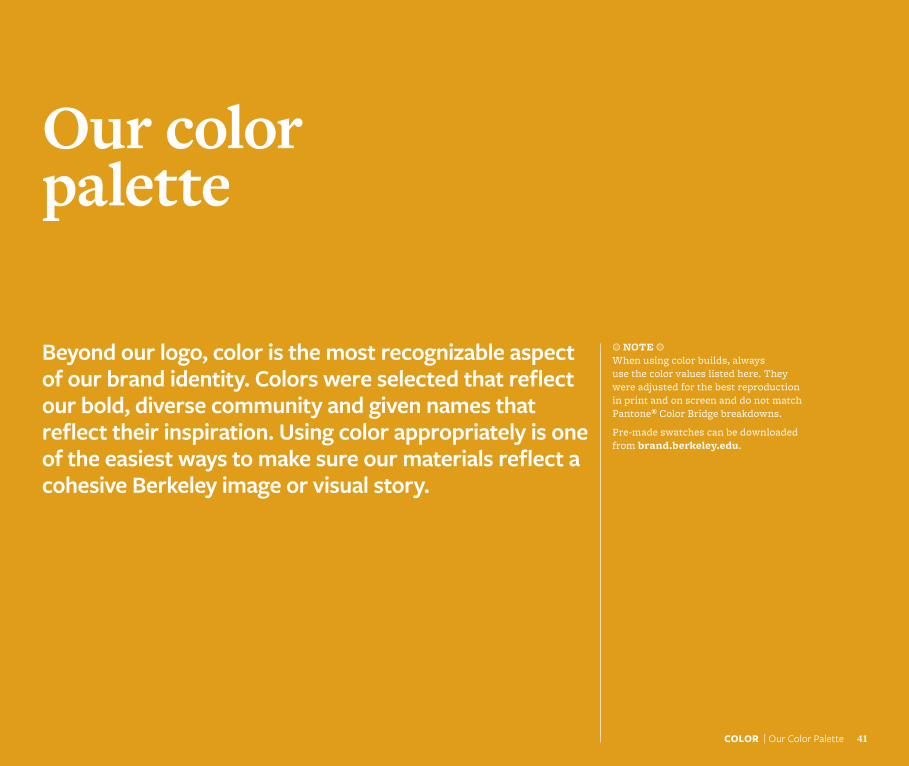
Our color palette
Beyond our logo, color is the most recognizable aspect of our brand identity. Colors were selected that reflect our bold, diverse community and given names that reflect their inspiration. Using color appropriately is one of the easiest ways to make sure our materials reflect a cohesive Berkeley image or visual story.
a NOTE a When using color builds, always use the color values listed here. They were adjusted for the best reproduction in print and on screen and do not match Pantone® Color Bridge breakdowns.
Pre-made swatches can be downloaded from brand.berkeley.edu.
COLOR | Our Color Palette 41
COLOR | Our Color Palette 42
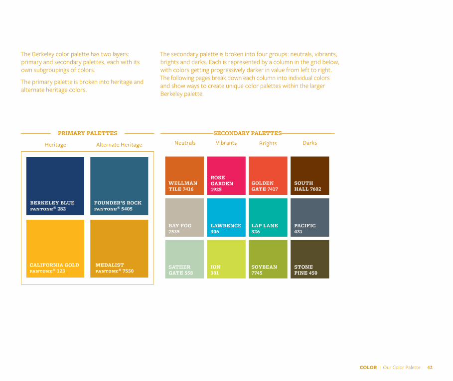
Neutrals Vibrants Darks
SECONDARY PALETTES
Heritage Alternate Heritage
PRIMARY PALETTES
The Berkeley color palette has two layers: primary and secondary palettes, each with its own subgroupings of colors.
The primary palette is broken into heritage and alternate heritage colors.
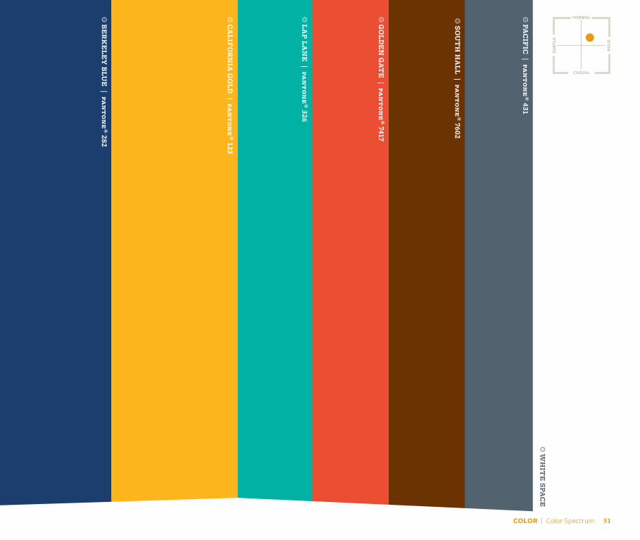
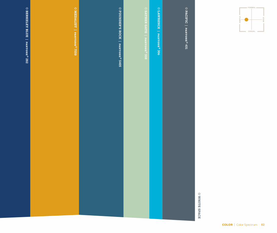
The secondary palette is broken into four groups: neutrals, vibrants, brights and darks. Each is represented by a column in the grid below, with colors getting progressively darker in value from left to right. The following pages break down each column into individual colors and show ways to create unique color palettes within the larger Berkeley palette.
Brights
BERKELEY BLUEpantone® 282
CALIFORNIA GOLD pantone® 123
FOUNDER’S ROCK pantone® 5405
MEDALISTpantone® 7550
WELLMAN TILE 7416
BAY FOG 7535
SATHER GATE 558
ROSE GARDEN 1925
LAWRENCE 306
ION 381
GOLDEN GATE 7417
LAP LANE 326
SOYBEAN 7745
SOUTH HALL 7602
PACIFIC 431
STONE PINE 450
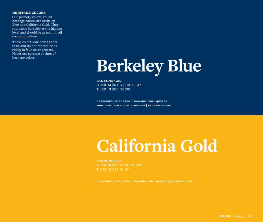
PANTONE® 282C | 100 M | 071 Y | 010 K | 047R | 000 G | 050 B | 098
Berkeley Blue
HERITAGE COLORS Our primary colors, called heritage colors, are Berkeley Blue and California Gold. They represent Berkeley at the highest level and should be present in all communications.
These colors look best as spot inks, and do not reproduce as richly in four-color process. Never use screens or tints of heritage colors.
headlines | subheads | lead-ins | pull quotes body copy | callouts | captions | reversed type
COLOR | Heritage 43
California GoldPANTONE® 123C | 000 M | 032 Y | 100 K | 000R | 253 G | 181 B | 021
headlines | subheads | lead-ins | pull quotes | reversed type
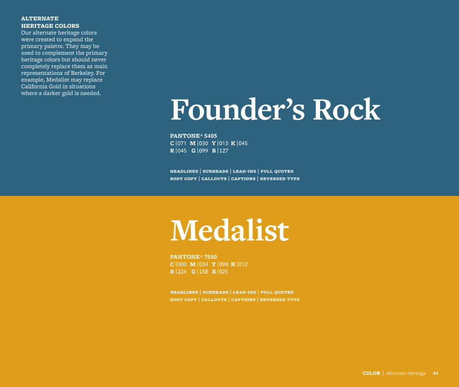
Founder’s RockPANTONE® 5405C | 071 M | 030 Y | 013 K | 045R | 045 G | 099 B | 127
ALTERNATE HERITAGE COLORSOur alternate heritage colors were created to expand the primary palette. They may be used to complement the primary heritage colors but should never completely replace them as main representations of Berkeley. For example, Medalist may replace California Gold in situations where a darker gold is needed.
headlines | subheads | lead-ins | pull quotes body copy | callouts | captions | reversed type
COLOR | Alternate Heritage 44
MedalistPANTONE® 7550C | 000 M | 034 Y | 098 K | 012R | 224 G | 158 B | 025
headlines | subheads | lead-ins | pull quotes body copy | callouts | captions | reversed type
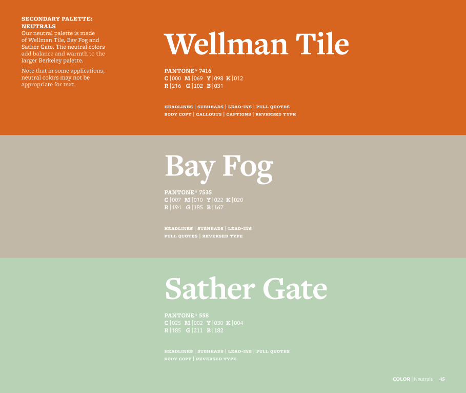
Wellman TilePANTONE® 7416C | 000 M | 069 Y | 098 K | 012R | 216 G | 102 B | 031
SECONDARY PALETTE: NEUTRALS Our neutral palette is made of Wellman Tile, Bay Fog and Sather Gate. The neutral colors add balance and warmth to the larger Berkeley palette.
Note that in some applications, neutral colors may not be appropriate for text.
headlines | subheads | lead-ins | pull quotes body copy | callouts | captions | reversed type
COLOR | Neutrals 45
Bay FogPANTONE® 7535C | 007 M | 010 Y | 022 K | 020R | 194 G | 185 B | 167
headlines | subheads | lead-ins pull quotes | reversed type
Sather GatePANTONE® 558C | 025 M | 002 Y | 030 K | 004R | 185 G | 211 B | 182
headlines | subheads | lead-ins | pull quotes body copy | reversed type
COLOR | Vibrants 4646
Rose GardenPANTONE® 1925C | 000 M | 098 Y | 046 K | 000R | 238 G | 031 B | 096
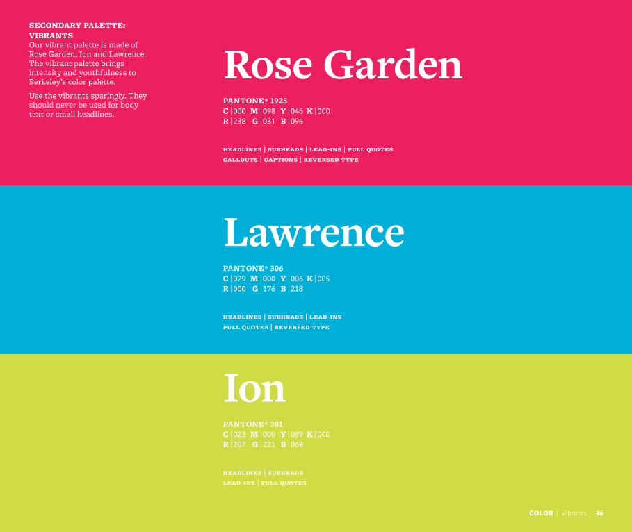
SECONDARY PALETTE: VIBRANTS Our vibrant palette is made of Rose Garden, Ion and Lawrence. The vibrant palette brings intensity and youthfulness to Berkeley’s color palette.
Use the vibrants sparingly. They should never be used for body text or small headlines.
headlines | subheads | lead-ins | pull quotes callouts | captions | reversed type
LawrencePANTONE® 306C | 079 M | 000 Y | 006 K | 005R | 000 G | 176 B | 218
headlines | subheads | lead-ins pull quotes | reversed type
IonPANTONE® 381C | 023 M | 000 Y | 089 K | 000R | 207 G | 221 B | 069
headlines | subheads lead-ins | pull quotes
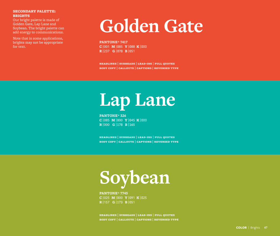
Golden GatePANTONE® 7417C | 001 M | 085 Y | 088 K | 000R | 237 G | 078 B | 051
SECONDARY PALETTE: BRIGHTS Our bright palette is made of Golden Gate, Lap Lane and Soybean. The bright palette can add energy to communications.
Note that in some applications, brights may not be appropriate for text.
headlines | subheads | lead-ins | pull quotes body copy | callouts | captions | reversed type
Lap LanePANTONE® 326C | 085 M | 000 Y | 045 K | 000R | 000 G | 178 B | 165
headlines | subheads | lead-ins | pull quotes body copy | callouts | captions | reversed type
SoybeanPANTONE® 7745C | 025 M | 000 Y | 091 K | 025R | 157 G | 173 B | 051
headlines | subheads | lead-ins | pull quotes body copy | callouts | captions | reversed type
COLOR | Brights 47
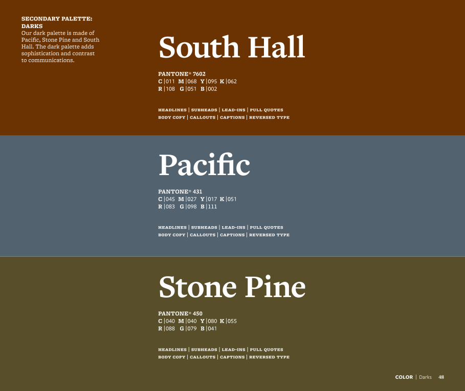
South HallPANTONE® 7602C | 011 M | 068 Y | 095 K | 062R | 108 G | 051 B | 002
COLOR | Darks 48
SECONDARY PALETTE: DARKSOur dark palette is made of Pacific, Stone Pine and South Hall. The dark palette adds sophistication and contrast to communications.
headlines | subheads | lead-ins | pull quotes body copy | callouts | captions | reversed type
PacificPANTONE® 431C | 045 M | 027 Y | 017 K | 051R | 083 G | 098 B | 111
headlines | subheads | lead-ins | pull quotes body copy | callouts | captions | reversed type
Stone PinePANTONE® 450C | 040 M | 040 Y | 080 K | 055R | 088 G | 079 B | 041
headlines | subheads | lead-ins | pull quotes body copy | callouts | captions | reversed type
Using color
It is important to maintain a sense of hierarchy, balance and harmony when using the Berkeley color palette. Our color system is extremely flexible, but exercise restraint. Unique and exciting color palettes can be created from as few as three or four colors in addition to the primary Berkeley palette.
The following pages break down the entire palette to show how color combinations can be used successfully. Each is different but still maintains the character and emotion that is Berkeley. Use the vertical banding as a guide to the ratios of each color. This isn’t meant to be a precise mathematical system but is intended to give an idea of relative use. It is also important to note that the primary palette plays a role in each sub-palette, even if it’s a minimal one.
a NOTE a Although the pages within this section are nearly fully flooded with color, white space also plays a key role in our visual brand identity. Rather than viewing white space as a blank area, see it as a pause. Don’t rush to fill white space. It can focus attention on what is there, not draw attention to what is not.
Always balance color, typography and graphic elements with generous amounts of white space.
COLOR | Using Color 49
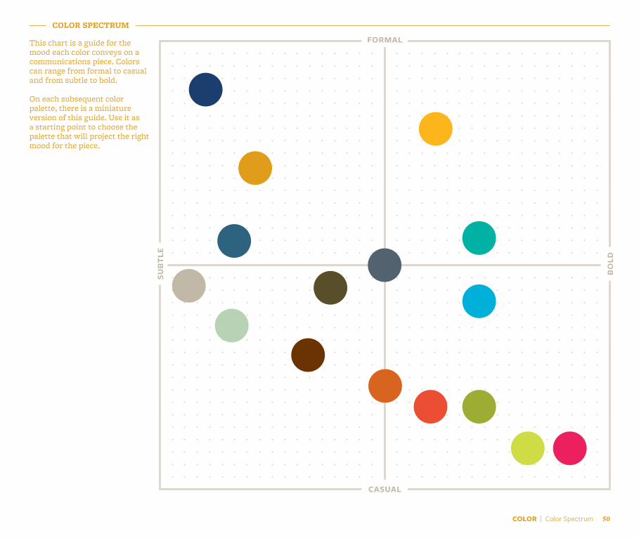
COLOR | Color Spectrum 50
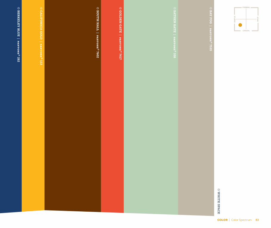
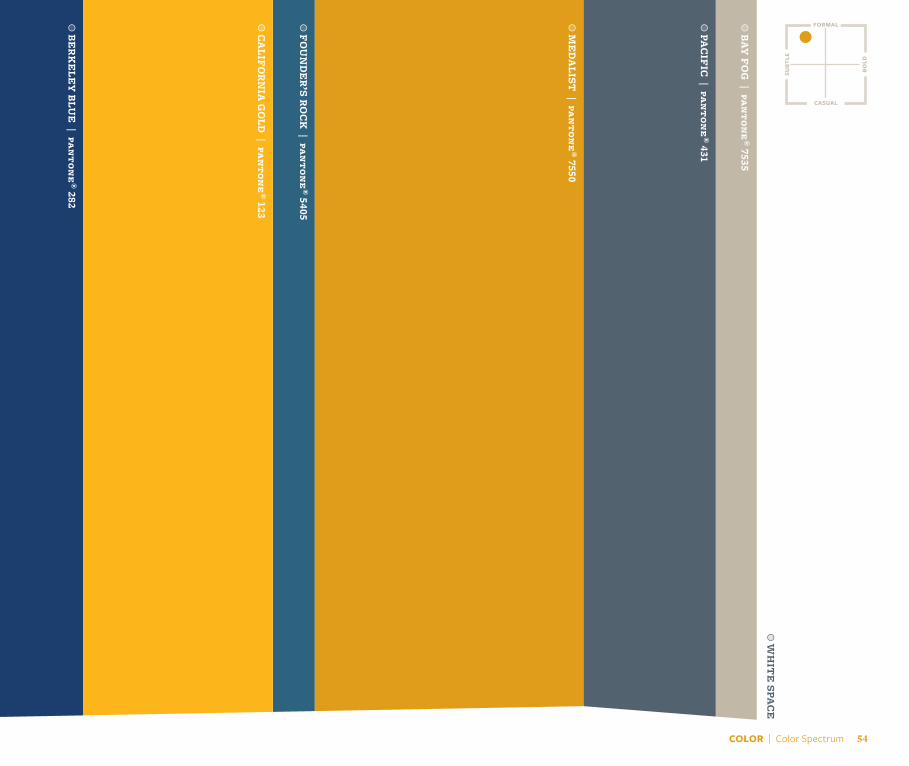
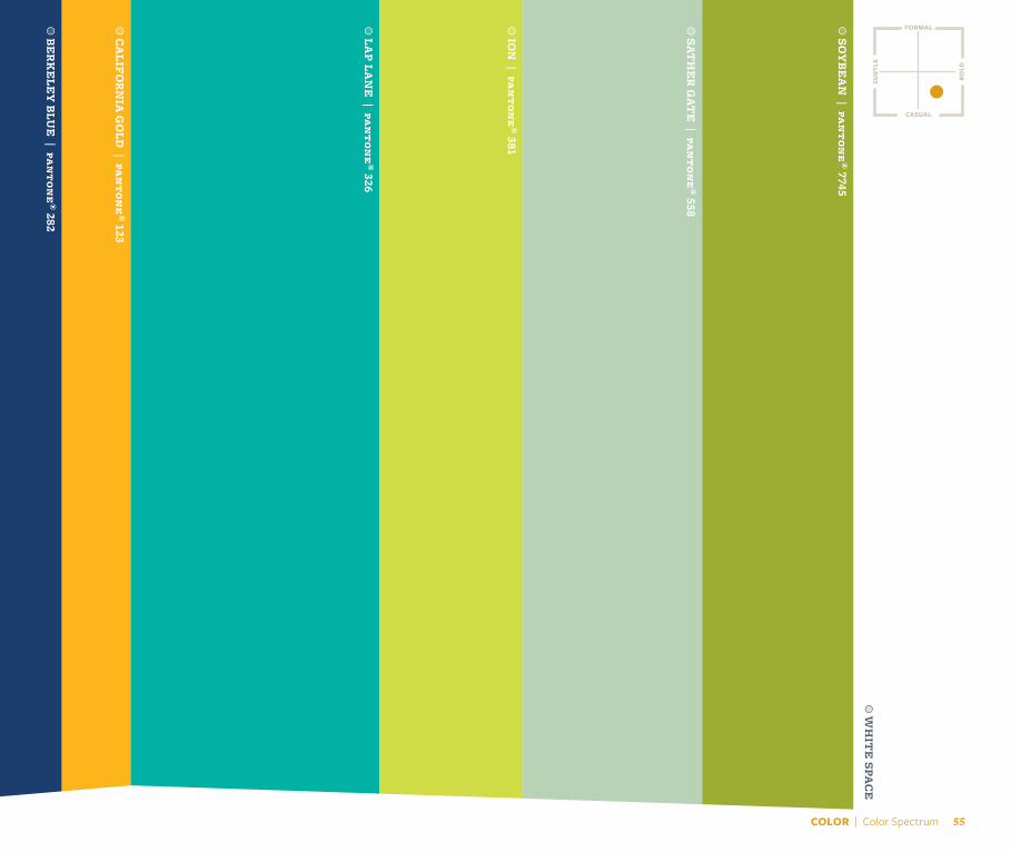
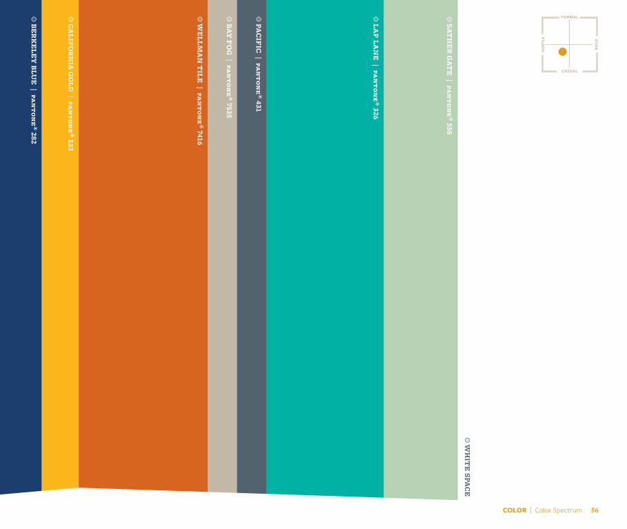
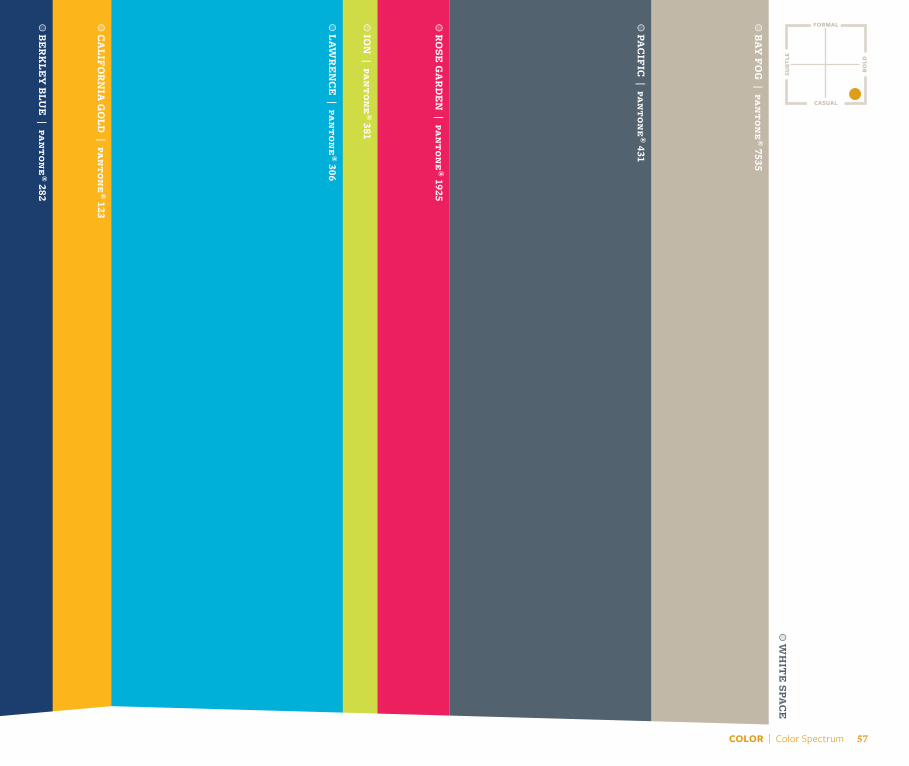
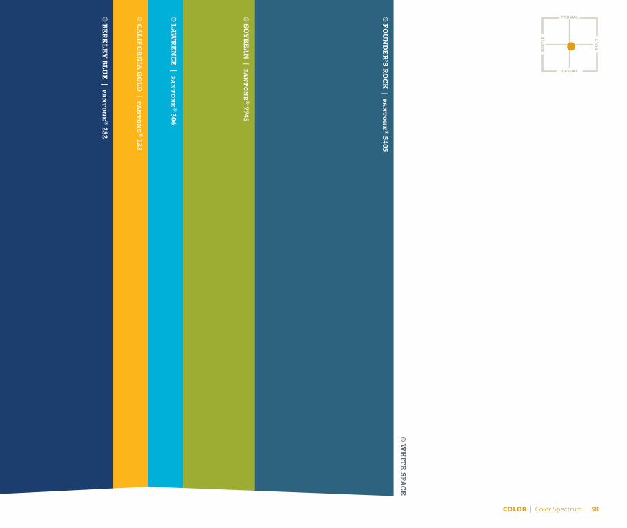
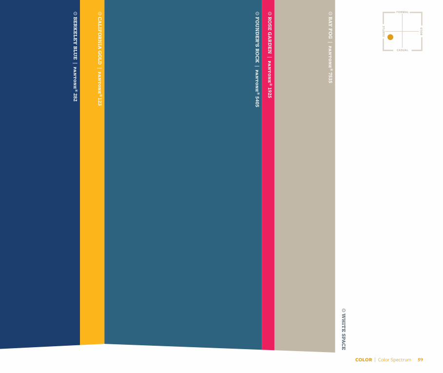
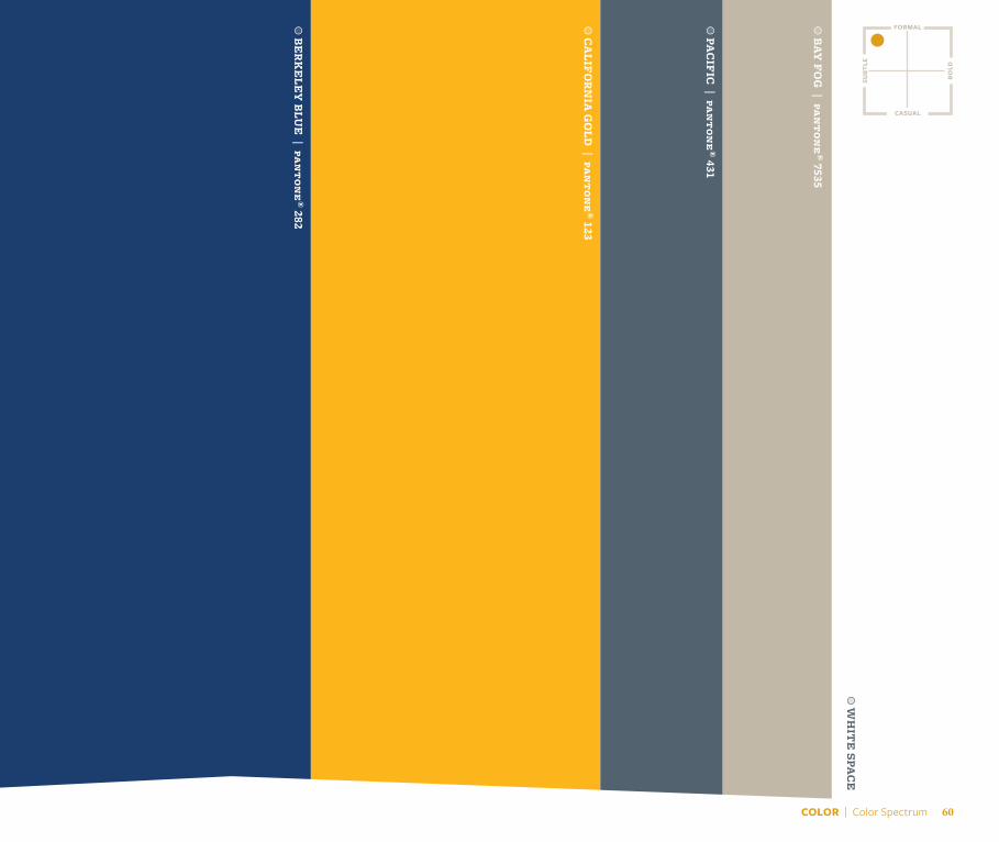
This chart is a guide for the mood each color conveys on a communications piece. Colors can range from formal to casual and from subtle to bold.
On each subsequent color palette, there is a miniature version of this guide. Use it as a starting point to choose the palette that will project the right mood for the piece.
COLOR SPECTRUM
formal
casual
subt
le
bold
a B
ER
KE
LEY
BLU
E | pa
nton
e® 282
a C
ALIF
OR
NIA
GO
LD | pa
nton
e® 123
a L
AP L
AN
E | pa
nton
e® 326
a G
OLD
EN
GAT
E | pa
nton
e® 7417
a SO
UT
H H
ALL | pa
nton
e® 7602
a PA
CIF
IC | pa
nton
e® 431
formal
casual
bold
subt
le
a W
HIT
E SPA
CE
COLOR | Color Spectrum 51
a B
ER
KE
LEY
BLU
E | pa
nton
e® 282
a M
ED
ALIST
| pan
tone
® 7550
a F
OU
ND
ER
’S RO
CK
| pan
tone
® 5405
a S
ATH
ER
GAT
E | pa
nton
e® 558
a L
AWR
EN
CE
| pan
tone
® 306
a PA
CIF
IC | pa
nton
e® 431
COLOR | Color Spectrum 52
formal
casual
bold
subt
le
a W
HIT
E SPA
CE
formal
casual
bold
subt
le
a B
ER
KE
LEY
BLU
E | pa
nton
e® 282
a C
ALIF
OR
NIA
GO
LD | pa
nton
e® 123
a SO
UT
H H
ALL | pa
nton
e® 7602
a G
OLD
EN
GAT
E | pa
nton
e® 7417
a S
ATH
ER
GAT
E | pa
nton
e® 558
a B
AY F
OG
| pan
tone
® 7535
a W
HIT
E SPA
CE
COLOR | Color Spectrum 53
formal
casual
bold
subt
le
a B
ER
KE
LEY
BLU
E | pa
nton
e® 282
a C
ALIF
OR
NIA
GO
LD | pa
nton
e® 123
a F
OU
ND
ER
’S RO
CK
| pan
tone
® 5405
a PA
CIF
IC | pa
nton
e® 431
a B
AY F
OG
| pan
tone
® 7535
a M
ED
ALIST
| pan
tone
® 7550
COLOR | Color Spectrum 54
a W
HIT
E SPA
CE
formal
casual
bold
subt
le
a B
ER
KE
LEY
BLU
E | pa
nton
e® 282
a C
ALIF
OR
NIA
GO
LD | pa
nton
e® 123
a L
AP L
AN
E | pa
nton
e® 326
a IO
N | pa
nton
e® 381
a S
ATH
ER
GAT
E | pa
nton
e® 558
a SO
YB
EA
N | pa
nton
e® 7745
a W
HIT
E SPA
CE
COLOR | Color Spectrum 55
formal
casual
bold
subt
le
a B
ER
KE
LEY
BLU
E | pa
nton
e® 282
a C
ALIF
OR
NIA
GO
LD | pa
nton
e® 123
a W
ELLM
AN
TILE
| pan
tone
® 7416
a B
AY F
OG
| pan
tone
® 7535
a PA
CIF
IC | pa
nton
e® 431
a L
AP L
AN
E | pa
nton
e® 326
a S
ATH
ER
GAT
E | pa
nton
e® 558
COLOR | Color Spectrum 56
a W
HIT
E SPA
CE
a B
ER
KLE
Y B
LUE
| pan
tone
® 282
a C
ALIF
OR
NIA
GO
LD | pa
nton
e® 123
a L
AWR
EN
CE
| pan
tone
® 306
a IO
N | pa
nton
e® 381
a R
OSE
GA
RD
EN
| pan
tone
® 1925
a PA
CIF
IC | pa
nton
e® 431
a B
AY F
OG
| pan
tone
® 7535
formal
casual
bold
subt
le
a W
HIT
E SPA
CE
COLOR | Color Spectrum 57
formal
casual
bold
subt
le
a B
ER
KLE
Y B
LUE
| pan
tone
® 282
a C
ALIF
OR
NIA
GO
LD | pa
nton
e® 123
a L
AWR
EN
CE
| pan
tone
® 306
a SO
YB
EA
N | pa
nton
e® 7745
a F
OU
ND
ER
’S RO
CK
| pan
tone
® 5405
COLOR | Color Spectrum 58
a W
HIT
E SPA
CE
formal
casual
bold
subt
le
a B
ER
KE
LEY
BLU
E | pa
nton
e® 282
a C
ALIF
OR
NIA
GO
LD | pa
nton
e®
123
a B
AY F
OG
| pan
tone
® 7535
a W
HIT
E SPA
CE
a F
OU
ND
ER
’S RO
CK
| pan
tone
® 5405
a R
OSE
GA
RD
EN
| pan
tone
® 1925
COLOR | Color Spectrum 59
formal
casual
bold
subt
le
a W
HIT
E SPA
CE
a B
ER
KE
LEY
BLU
E | pa
nton
e® 282
a C
ALIF
OR
NIA
GO
LD | pa
nton
e® 123
a PA
CIF
IC | pa
nton
e® 431
a B
AY F
OG
| pan
tone
® 7535
COLOR | Color Spectrum 60

Typography
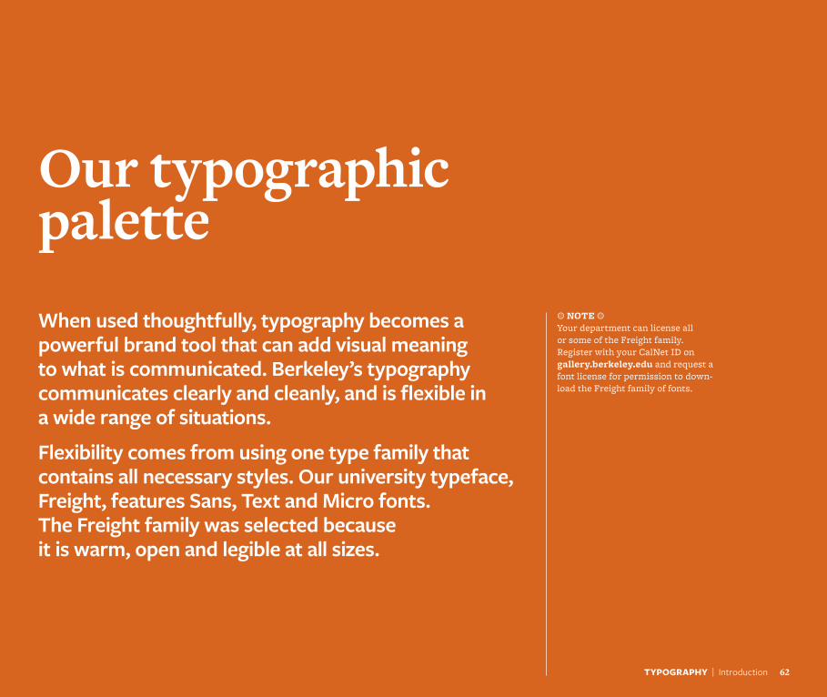
Our typographic paletteWhen used thoughtfully, typography becomes a powerful brand tool that can add visual meaning to what is communicated. Berkeley’s typography communicates clearly and cleanly, and is flexible in a wide range of situations.
Flexibility comes from using one type family that contains all necessary styles. Our university typeface, Freight, features Sans, Text and Micro fonts. The Freight family was selected because it is warm, open and legible at all sizes.
a NOTE a Your department can license all or some of the Freight family. Register with your CalNet ID on gallery.berkeley.edu and request a font license for permission to down-load the Freight family of fonts.
TYPOGRAPHY | Introduction 62
TYPOGRAPHY | Freight Family 63
CaliforniaAaAa
Light
AaAa
Book
AaAaMedium
AaAaSemibold
AaAa
Bold
AaAa
Black
FREIGHT SANS
FREIGHT TEXT
CaliforniaAaAa
Light
AaAa
Book
AaAaMedium
AaAaSemibold
AaAa
Bold
AaAa
Black
FREIGHT MICRO
CaliforniaAaAa
Light
AaAa
Book
AaAaMedium
AaAaSemibold
AaAa
Bold
AaAa
Black
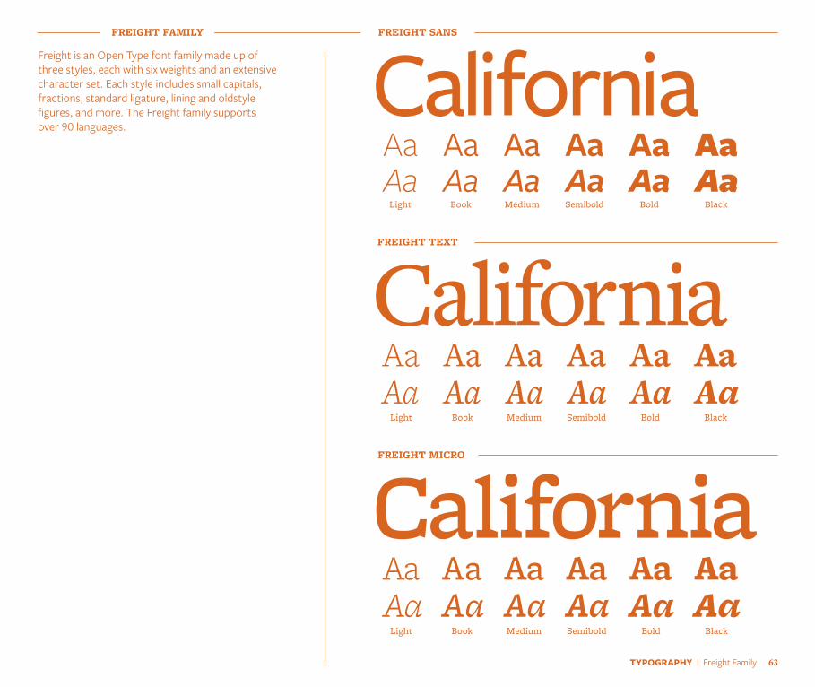
FREIGHT FAMILY
Freight is an Open Type font family made up of three styles, each with six weights and an extensive character set. Each style includes small capitals, fractions, standard ligature, lining and oldstyle figures, and more. The Freight family supports over 90 languages.
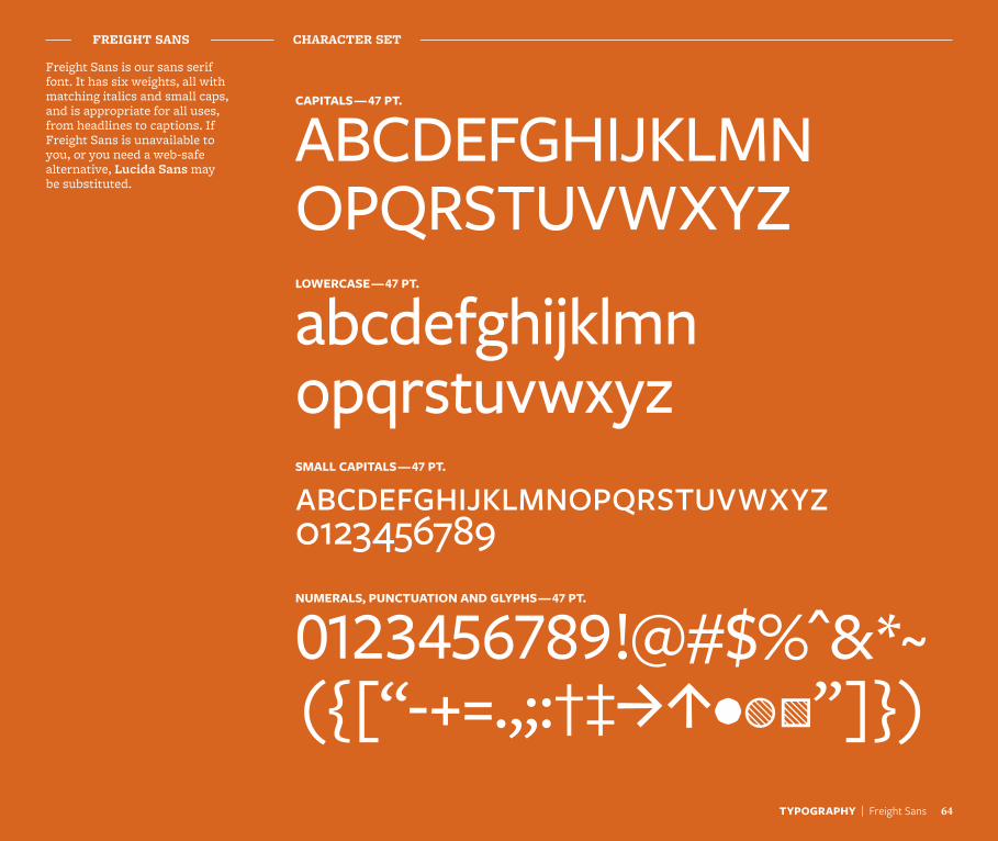
Freight Sans is our sans serif font. It has six weights, all with matching italics and small caps, and is appropriate for all uses, from headlines to captions. If Freight Sans is unavailable to you, or you need a web-safe alternative, Lucida Sans may be substituted.
ABCDEFGHIJKLMN OPQRSTUVWXYZ
abcdefghijklmn opqrstuvwxyzabcdefghijklmnopqrstuvwxyz 0123456789
0123456789!@#$%^&*~ ({[“-+=.,;:†‡JI•WO”]})
FREIGHT SANS CHARACTER SET
CAPITALS — 47 PT.
LOWERCASE — 47 PT.
SMALL CAPITALS — 47 PT.
NUMERALS, PUNCTUATION AND GLYPHS — 47 PT.
TYPOGRAPHY | Freight Sans 64
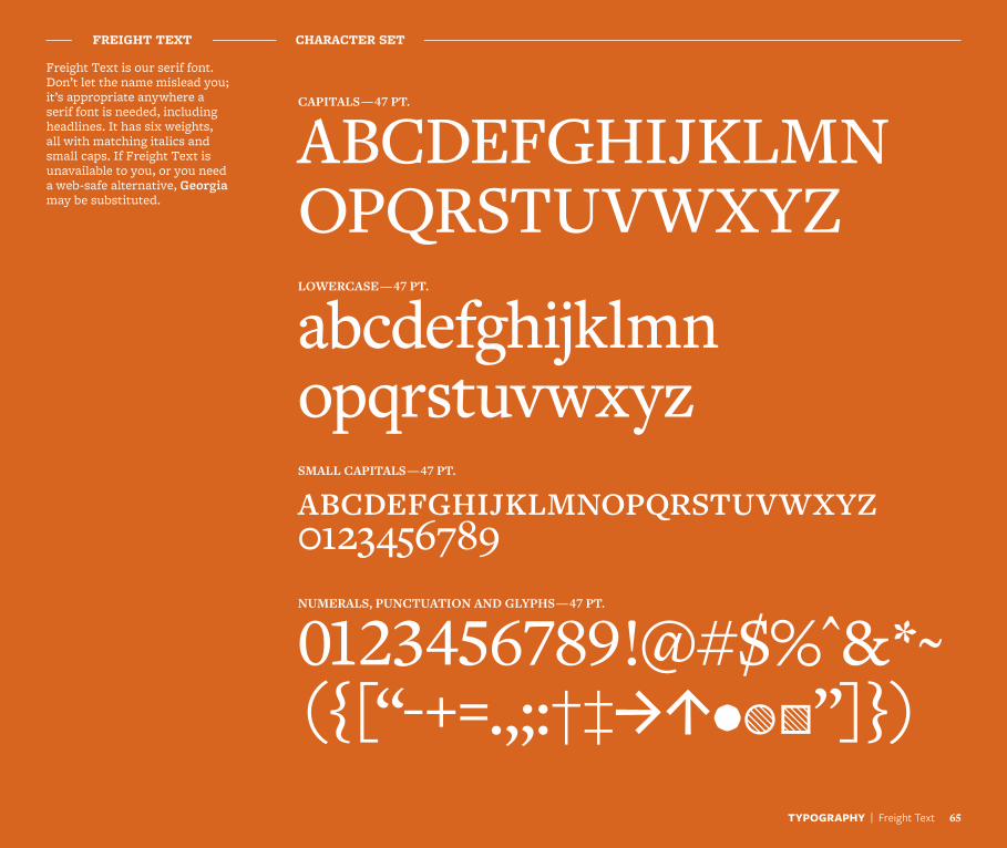
Freight Text is our serif font. Don’t let the name mislead you; it’s appropriate anywhere a serif font is needed, including headlines. It has six weights, all with matching italics and small caps. If Freight Text is unavailable to you, or you need a web-safe alternative, Georgia may be substituted.
ABCDEFGHIJKLMN OPQRSTUVWXYZ
abcdefghijklmn opqrstuvwxyzabcdefghijklmnopqrstuvwxyz 0123456789
0123456789!@#$%^&*~ ({[“-+=.,;:†‡JI•WO”]})
FREIGHT TEXT CHARACTER SET
CAPITALS — 47 PT.
LOWERCASE — 47 PT.
SMALL CAPITALS — 47 PT.
NUMERALS, PUNCTUATION AND GLYPHS — 47 PT.
TYPOGRAPHY | Freight Text 65
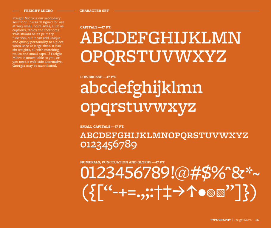
Freight Micro is our secondary serif font. It was designed for use at very small point sizes, such as captions, tables and footnotes. This should be its primary function, but it can add unique and quirky personality to a piece when used at large sizes. It has six weights, all with matching italics and small caps. If Freight Micro is unavailable to you, or you need a web-safe alternative, Georgia may be substituted.
ABCDEFGHIJKLMN OPQRSTUVWXYZ
abcdefghijklmn opqrstuvwxyzabcdefghijklmnopqrstuvwxyz 0123456789
0123456789!@#$%^&*~ ({[“-+=.,;:†‡JI•WO”]})
FREIGHT MICRO CHARACTER SET
CAPITALS — 47 PT.
LOWERCASE — 47 PT.
SMALL CAPITALS — 47 PT.
NUMERALS, PUNCTUATION AND GLYPHS — 47 PT.
TYPOGRAPHY | Freight Micro 66
TYPOGRAPHY | Using Type 67
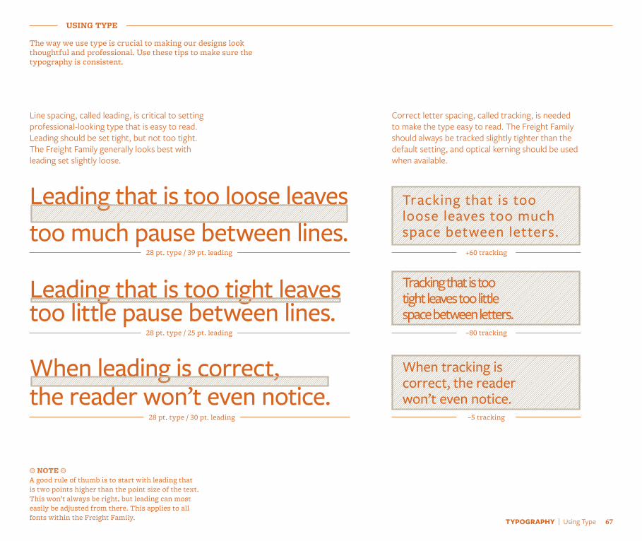
The way we use type is crucial to making our designs look thoughtful and professional. Use these tips to make sure the typography is consistent.
USING TYPE
Line spacing, called leading, is critical to setting professional-looking type that is easy to read. Leading should be set tight, but not too tight. The Freight Family generally looks best with leading set slightly loose.
Leading that is too loose leaves too much pause between lines.
28 pt. type / 39 pt. leading
Correct letter spacing, called tracking, is needed to make the type easy to read. The Freight Family should always be tracked slightly tighter than the default setting, and optical kerning should be used when available.
a NOTE a A good rule of thumb is to start with leading that is two points higher than the point size of the text. This won’t always be right, but leading can most easily be adjusted from there. This applies to all fonts within the Freight Family.
28 pt. type / 25 pt. leading
Leading that is too tight leaves too little pause between lines.
When leading is correct, the reader won’t even notice.
28 pt. type / 30 pt. leading
Tracking that is too tight leaves too little space between letters.
–80 tracking
Tracking that is too loose leaves too much space between letters.
+60 tracking
When tracking is correct, the reader won’t even notice.
–5 tracking
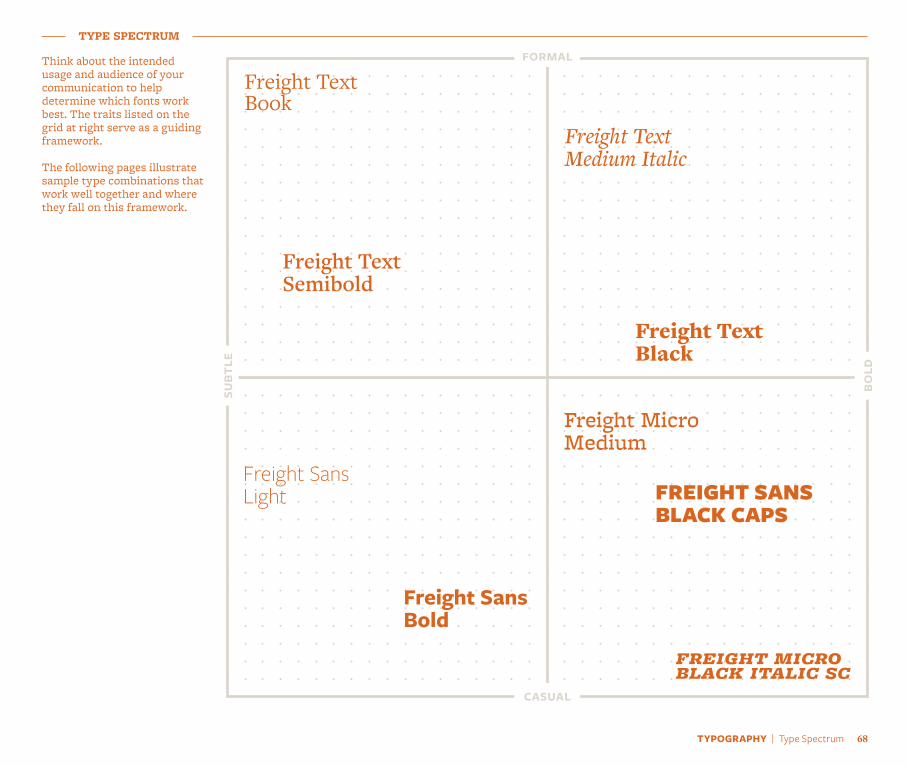
Think about the intended usage and audience of your communication to help determine which fonts work best. The traits listed on the grid at right serve as a guiding framework.
The following pages illustrate sample type combinations that work well together and where they fall on this framework.
TYPE SPECTRUM
formal
casual
subt
le
bold
Freight Text Book
freight micro black italic sc
Freight Micro Medium
Freight Text Medium Italic
Freight Text Black
Freight Text Semibold
Freight Sans Light
Freight Sans Bold
FREIGHT SANS BLACK CAPS
TYPOGRAPHY | Type Spectrum 68
TYPOGRAPHY | Sample Settings 69
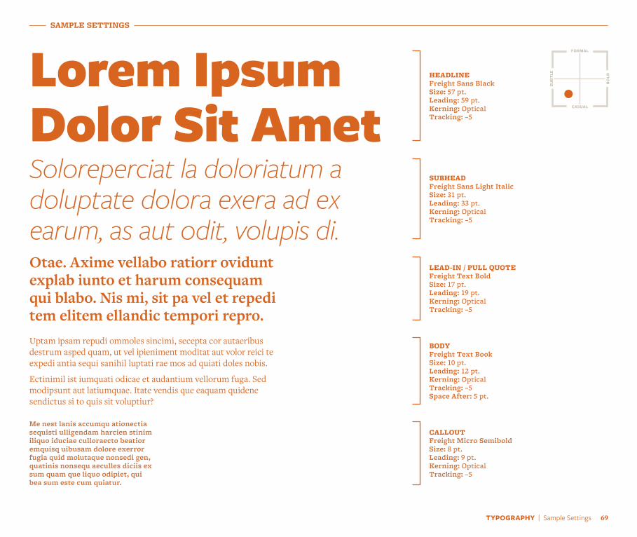
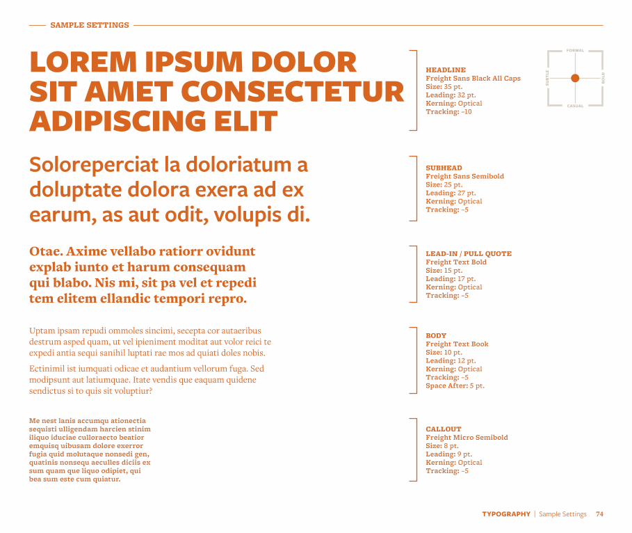
SAMPLE SETTINGS
Lorem Ipsum Dolor Sit Amet
HEADLINEFreight Sans BlackSize: 57 pt.Leading: 59 pt.Kerning: OpticalTracking: –5
Soloreperciat la doloriatum a doluptate dolora exera ad ex earum, as aut odit, volupis di.
SUBHEADFreight Sans Light ItalicSize: 31 pt.Leading: 33 pt.Kerning: OpticalTracking: –5
Otae. Axime vellabo ratiorr ovidunt explab iunto et harum consequam qui blabo. Nis mi, sit pa vel et repedi tem elitem ellandic tempori repro.
LEAD-IN / PULL QUOTEFreight Text BoldSize: 17 pt.Leading: 19 pt.Kerning: OpticalTracking: –5
Uptam ipsam repudi ommoles sincimi, secepta cor autaeribus destrum asped quam, ut vel ipieniment moditat aut volor reici te expedi antia sequi sanihil luptati rae mos ad quiati doles nobis.
Ectinimil ist iumquati odicae et audantium vellorum fuga. Sed modipsunt aut latiumquae. Itate vendis que eaquam quidene sendictus si to quis sit voluptiur?
BODYFreight Text BookSize: 10 pt.Leading: 12 pt.Kerning: OpticalTracking: –5 Space After: 5 pt.
Me nest lanis accumqu ationectia sequisti ulligendam harcien stinim iliquo iduciae culloraecto beatior emquisq uibusam dolore exerror fugia quid molutaque nonsedi gen, quatinis nonsequ aeculles diciis ex sum quam que liquo odipiet, qui bea sum este cum quiatur.
CALLOUTFreight Micro SemiboldSize: 8 pt.Leading: 9 pt.Kerning: OpticalTracking: –5
formal
casual
bold
subt
le
SAMPLE SETTINGS
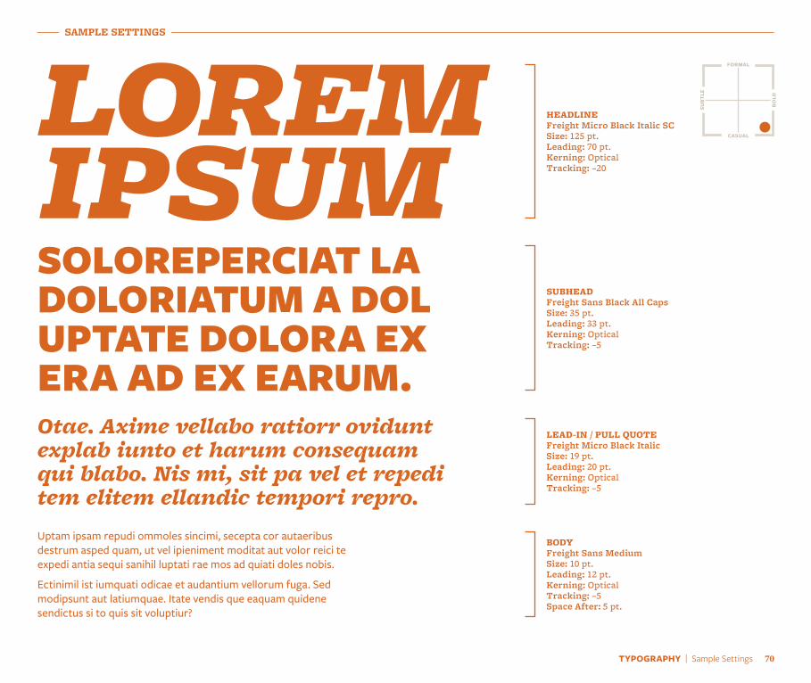
lorem ipsumHEADLINEFreight Micro Black Italic SCSize: 125 pt.Leading: 70 pt.Kerning: OpticalTracking: –20
SOLOREPERCIAT LA DOLORIATUM A DOL UPTATE DOLORA EX ERA AD EX EARUM.
SUBHEADFreight Sans Black All CapsSize: 35 pt.Leading: 33 pt.Kerning: OpticalTracking: –5
Otae. Axime vellabo ratiorr ovidunt explab iunto et harum consequam qui blabo. Nis mi, sit pa vel et repedi tem elitem ellandic tempori repro.
LEAD-IN / PULL QUOTEFreight Micro Black ItalicSize: 19 pt.Leading: 20 pt.Kerning: OpticalTracking: –5
Uptam ipsam repudi ommoles sincimi, secepta cor autaeribus destrum asped quam, ut vel ipieniment moditat aut volor reici te expedi antia sequi sanihil luptati rae mos ad quiati doles nobis.
Ectinimil ist iumquati odicae et audantium vellorum fuga. Sed modipsunt aut latiumquae. Itate vendis que eaquam quidene sendictus si to quis sit voluptiur?
BODYFreight Sans MediumSize: 10 pt.Leading: 12 pt.Kerning: OpticalTracking: –5 Space After: 5 pt.
formal
casual
bold
subt
le
TYPOGRAPHY | Sample Settings 70
TYPOGRAPHY | Sample Settings 71
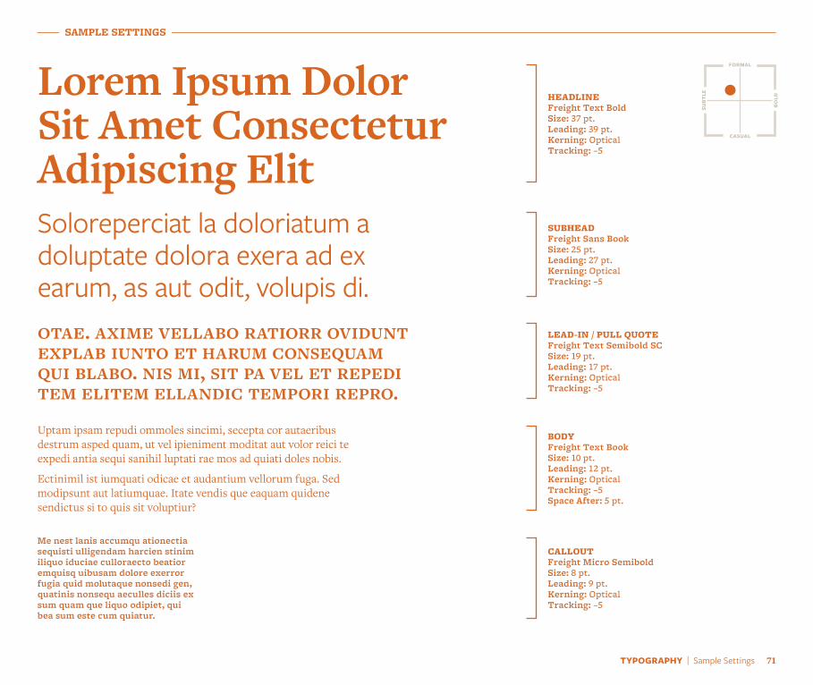
Lorem Ipsum Dolor Sit Amet Consectetur Adipiscing Elit
HEADLINEFreight Text BoldSize: 37 pt.Leading: 39 pt.Kerning: OpticalTracking: –5
Soloreperciat la doloriatum a doluptate dolora exera ad ex earum, as aut odit, volupis di.
SUBHEADFreight Sans BookSize: 25 pt.Leading: 27 pt.Kerning: OpticalTracking: –5
otae. axime vellabo ratiorr ovidunt explab iunto et harum consequam qui blabo. nis mi, sit pa vel et repedi tem elitem ellandic tempori repro.
LEAD-IN / PULL QUOTEFreight Text Semibold SCSize: 19 pt.Leading: 17 pt.Kerning: OpticalTracking: –5
Uptam ipsam repudi ommoles sincimi, secepta cor autaeribus destrum asped quam, ut vel ipieniment moditat aut volor reici te expedi antia sequi sanihil luptati rae mos ad quiati doles nobis.
Ectinimil ist iumquati odicae et audantium vellorum fuga. Sed modipsunt aut latiumquae. Itate vendis que eaquam quidene sendictus si to quis sit voluptiur?
BODYFreight Text BookSize: 10 pt.Leading: 12 pt.Kerning: OpticalTracking: –5 Space After: 5 pt.
Me nest lanis accumqu ationectia sequisti ulligendam harcien stinim iliquo iduciae culloraecto beatior emquisq uibusam dolore exerror fugia quid molutaque nonsedi gen, quatinis nonsequ aeculles diciis ex sum quam que liquo odipiet, qui bea sum este cum quiatur.
CALLOUTFreight Micro SemiboldSize: 8 pt.Leading: 9 pt.Kerning: OpticalTracking: –5
formal
casual
bold
subt
le
SAMPLE SETTINGS
SAMPLE SETTINGS
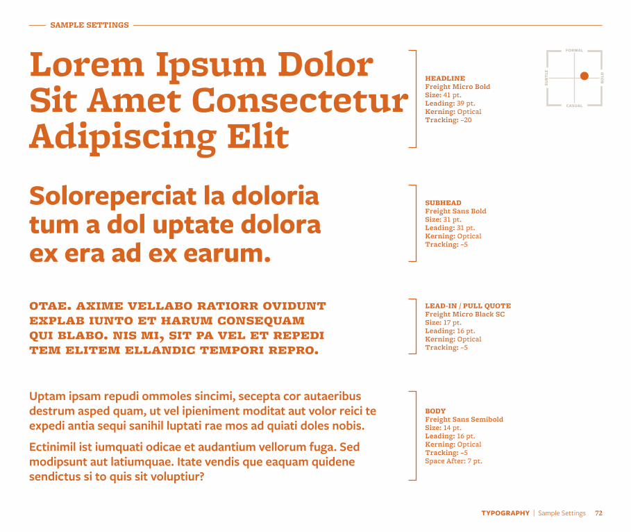
Lorem Ipsum Dolor Sit Amet Consectetur Adipiscing Elit
HEADLINEFreight Micro BoldSize: 41 pt.Leading: 39 pt.Kerning: OpticalTracking: –20
Soloreperciat la doloria tum a dol uptate dolora ex era ad ex earum.
SUBHEADFreight Sans BoldSize: 31 pt.Leading: 31 pt.Kerning: OpticalTracking: –5
otae. axime vellabo ratiorr ovidunt explab iunto et harum consequam qui blabo. nis mi, sit pa vel et repedi tem elitem ellandic tempori repro.
LEAD-IN / PULL QUOTEFreight Micro Black SCSize: 17 pt.Leading: 16 pt.Kerning: OpticalTracking: –5
Uptam ipsam repudi ommoles sincimi, secepta cor autaeribus destrum asped quam, ut vel ipieniment moditat aut volor reici te expedi antia sequi sanihil luptati rae mos ad quiati doles nobis.
Ectinimil ist iumquati odicae et audantium vellorum fuga. Sed modipsunt aut latiumquae. Itate vendis que eaquam quidene sendictus si to quis sit voluptiur?
BODYFreight Sans SemiboldSize: 14 pt.Leading: 16 pt.Kerning: OpticalTracking: –5 Space After: 7 pt.
formal
casual
bold
subt
le
TYPOGRAPHY | Sample Settings 72
TYPOGRAPHY | Sample Settings 73
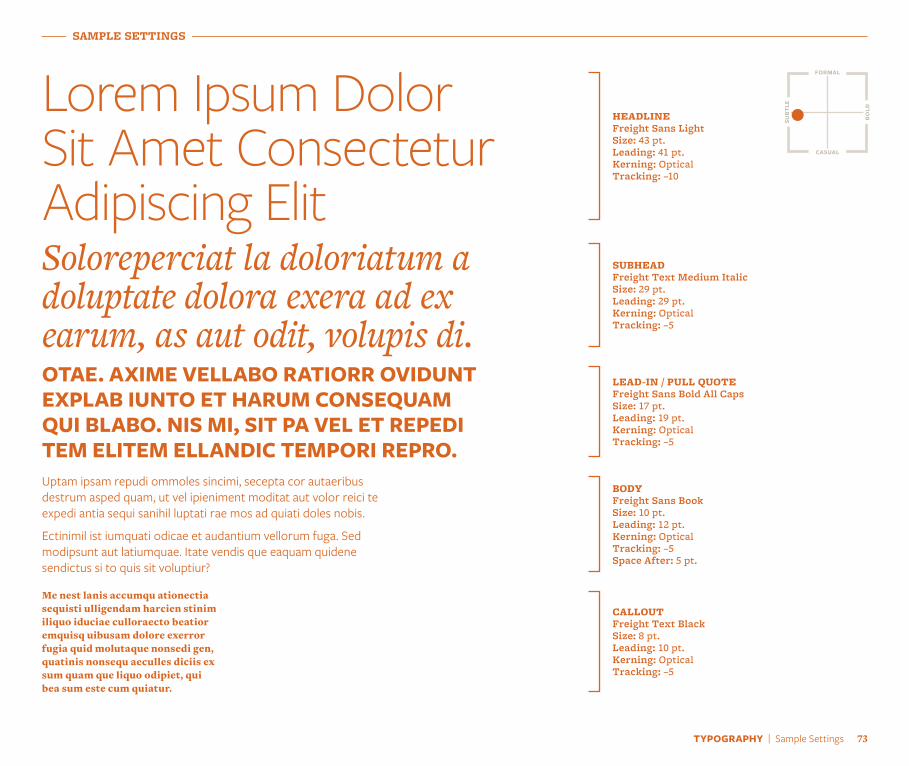
Lorem Ipsum Dolor Sit Amet Consectetur Adipiscing Elit
HEADLINEFreight Sans LightSize: 43 pt.Leading: 41 pt.Kerning: OpticalTracking: –10
Soloreperciat la doloriatum a doluptate dolora exera ad ex earum, as aut odit, volupis di.
SUBHEADFreight Text Medium ItalicSize: 29 pt.Leading: 29 pt.Kerning: OpticalTracking: –5
OTAE. AXIME VELLABO RATIORR OVIDUNT EXPLAB IUNTO ET HARUM CONSEQUAM QUI BLABO. NIS MI, SIT PA VEL ET REPEDI TEM ELITEM ELLANDIC TEMPORI REPRO.
LEAD-IN / PULL QUOTEFreight Sans Bold All CapsSize: 17 pt.Leading: 19 pt.Kerning: OpticalTracking: –5
Me nest lanis accumqu ationectia sequisti ulligendam harcien stinim iliquo iduciae culloraecto beatior emquisq uibusam dolore exerror fugia quid molutaque nonsedi gen, quatinis nonsequ aeculles diciis ex sum quam que liquo odipiet, qui bea sum este cum quiatur.
CALLOUTFreight Text BlackSize: 8 pt.Leading: 10 pt.Kerning: OpticalTracking: –5
Uptam ipsam repudi ommoles sincimi, secepta cor autaeribus destrum asped quam, ut vel ipieniment moditat aut volor reici te expedi antia sequi sanihil luptati rae mos ad quiati doles nobis.
Ectinimil ist iumquati odicae et audantium vellorum fuga. Sed modipsunt aut latiumquae. Itate vendis que eaquam quidene sendictus si to quis sit voluptiur?
BODYFreight Sans BookSize: 10 pt.Leading: 12 pt.Kerning: OpticalTracking: –5 Space After: 5 pt.
formal
casual
bold
subt
le
SAMPLE SETTINGS
SAMPLE SETTINGS
LOREM IPSUM DOLOR SIT AMET CONSECTETUR ADIPISCING ELIT
HEADLINEFreight Sans Black All CapsSize: 35 pt.Leading: 32 pt.Kerning: OpticalTracking: –10
Soloreperciat la doloriatum a doluptate dolora exera ad ex earum, as aut odit, volupis di.
SUBHEADFreight Sans SemiboldSize: 25 pt.Leading: 27 pt.Kerning: OpticalTracking: –5
Otae. Axime vellabo ratiorr ovidunt explab iunto et harum consequam qui blabo. Nis mi, sit pa vel et repedi tem elitem ellandic tempori repro.
LEAD-IN / PULL QUOTEFreight Text BoldSize: 15 pt.Leading: 17 pt.Kerning: OpticalTracking: –5
Uptam ipsam repudi ommoles sincimi, secepta cor autaeribus destrum asped quam, ut vel ipieniment moditat aut volor reici te expedi antia sequi sanihil luptati rae mos ad quiati doles nobis.
Ectinimil ist iumquati odicae et audantium vellorum fuga. Sed modipsunt aut latiumquae. Itate vendis que eaquam quidene sendictus si to quis sit voluptiur?
BODYFreight Text BookSize: 10 pt.Leading: 12 pt.Kerning: OpticalTracking: –5 Space After: 5 pt.
Me nest lanis accumqu ationectia sequisti ulligendam harcien stinim iliquo iduciae culloraecto beatior emquisq uibusam dolore exerror fugia quid molutaque nonsedi gen, quatinis nonsequ aeculles diciis ex sum quam que liquo odipiet, qui bea sum este cum quiatur.
CALLOUTFreight Micro SemiboldSize: 8 pt.Leading: 9 pt.Kerning: OpticalTracking: –5
formal
casual
bold
subt
le
TYPOGRAPHY | Sample Settings 74

Photographygallery.berkeley.edu
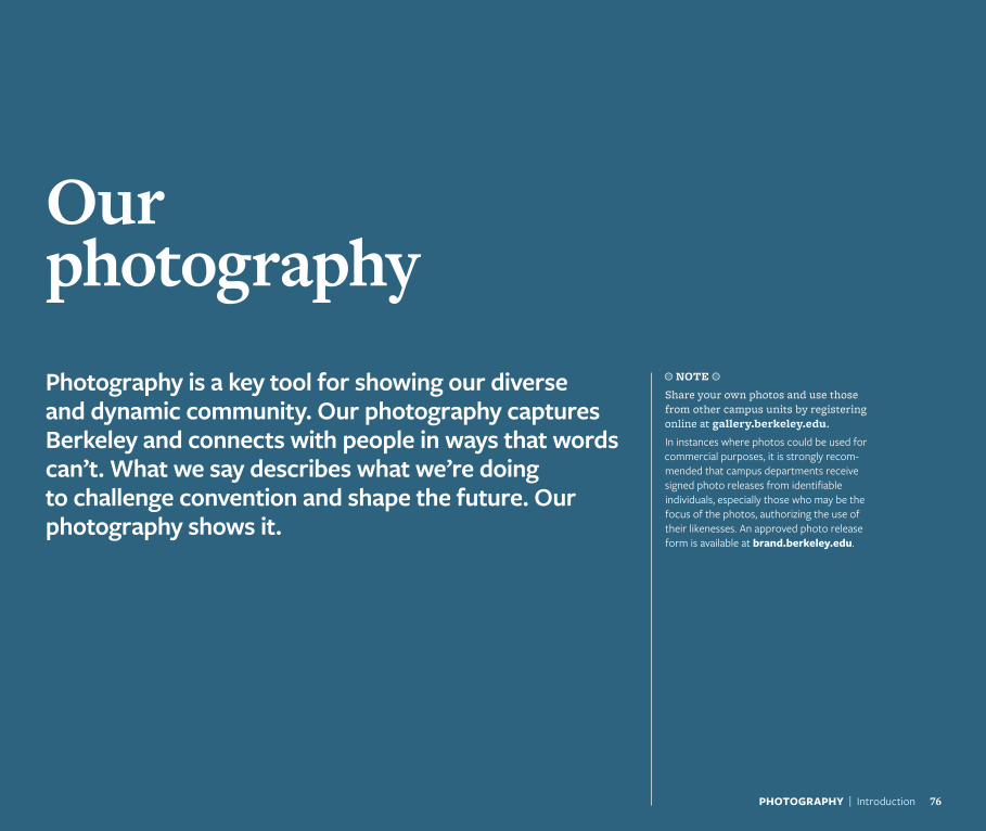
Our photographyPhotography is a key tool for showing our diverse and dynamic community. Our photography captures Berkeley and connects with people in ways that words can’t. What we say describes what we’re doing to challenge convention and shape the future. Our photography shows it.
a NOTE a
Share your own photos and use those from other campus units by registering online at gallery.berkeley.edu.
In instances where photos could be used for commercial purposes, it is strongly recom-mended that campus departments receive signed photo releases from identifiable individuals, especially those who may be the focus of the photos, authorizing the use of their likenesses. An approved photo release form is available at brand.berkeley.edu.
PHOTOGRAPHY | Introduction 76
77PHOTOGRAPHY | Overview
TOPICAL
CULTURAL
HISTORICAL
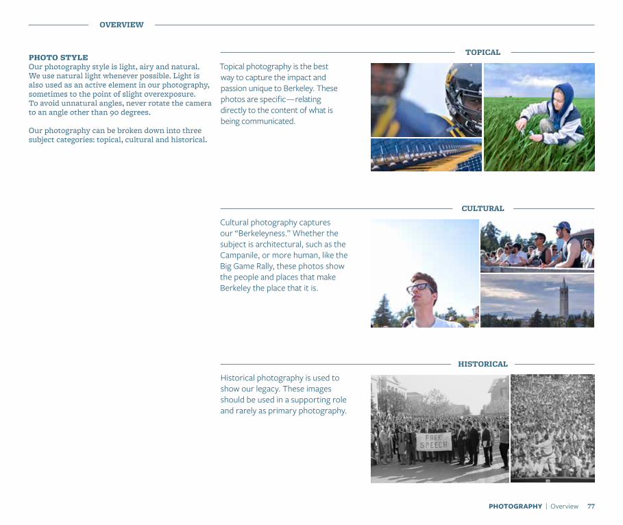
Topical photography is the best way to capture the impact and passion unique to Berkeley. These photos are specific — relating directly to the content of what is being communicated.
Historical photography is used to show our legacy. These images should be used in a supporting role and rarely as primary photography.
PHOTO STYLEOur photography style is light, airy and natural. We use natural light whenever possible. Light is also used as an active element in our photography, sometimes to the point of slight overexposure. To avoid unnatural angles, never rotate the camera to an angle other than 90 degrees.
Our photography can be broken down into three subject categories: topical, cultural and historical.
OVERVIEW
Cultural photography captures our “Berkeleyness.” Whether the subject is architectural, such as the Campanile, or more human, like the Big Game Rally, these photos show the people and places that make Berkeley the place that it is.
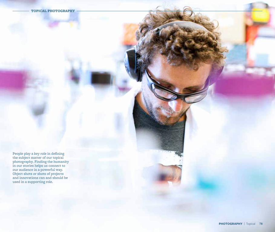
People play a key role in defining the subject matter of our topical photography. Finding the humanity in our stories helps us connect to our audience in a powerful way. Object shots or shots of projects and innovations can and should be used in a supporting role.
TOPICAL PHOTOGRAPHY
78PHOTOGRAPHY | Topical

79PHOTOGRAPHY | Topical
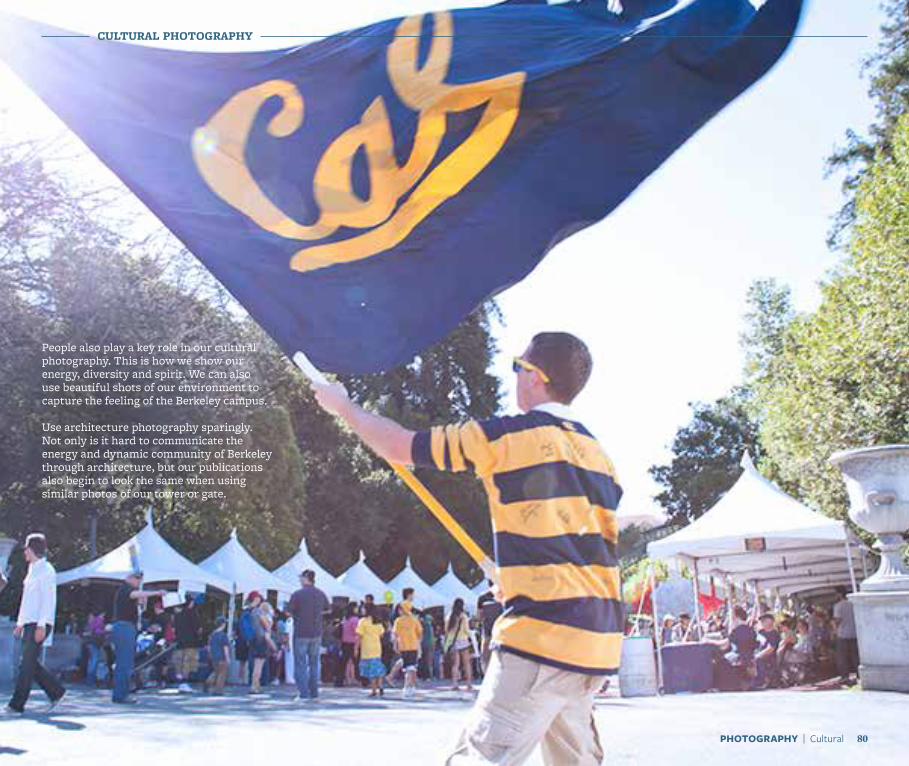
People also play a key role in our cultural photography. This is how we show our energy, diversity and spirit. We can also use beautiful shots of our environment to capture the feeling of the Berkeley campus.
Use architecture photography sparingly. Not only is it hard to communicate the energy and dynamic community of Berkeley through architecture, but our publications also begin to look the same when using similar photos of our tower or gate.
CULTURAL PHOTOGRAPHY
80PHOTOGRAPHY | Cultural

81PHOTOGRAPHY | Cultural
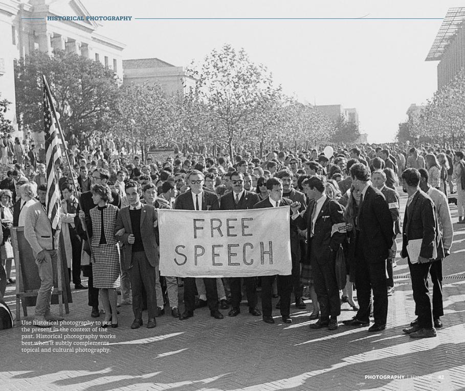
Use historical photography to put the present in the context of the past. Historical photography works best when it subtly complements topical and cultural photography.
HISTORICAL PHOTOGRAPHY
82PHOTOGRAPHY | Historical

83PHOTOGRAPHY | Historical
USING PHOTOGRAPHY
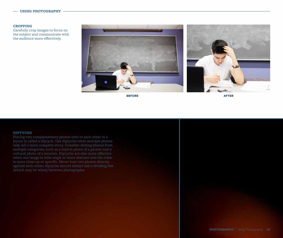
CROPPINGCarefully crop images to focus on the subject and communicate with the audience more effectively.
DIPTYCHS Placing two complementary photos next to each other in a layout is called a diptych. Use diptychs when multiple photos help tell a more complete story. Consider mixing photos from multiple categories, such as a topical photo of a person and a cultural photo of a location. Diptychs are also more effective when one image is wide-angle or more abstract and the other is more close-up or specific. Never butt two photos directly against each other; diptychs should always use a dividing line (which may be white) between photographs.
BEFORE AFTER
84PHOTOGRAPHY | Using Photography
USING PHOTOGRAPHY
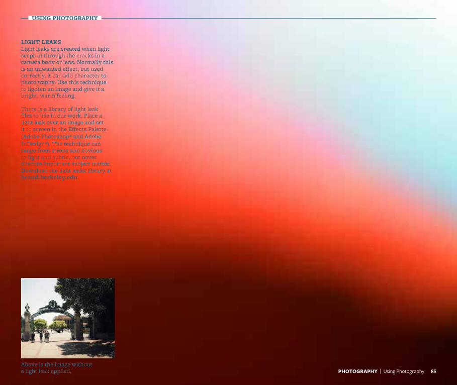
LIGHT LEAKSLight leaks are created when light seeps in through the cracks in a camera body or lens. Normally this is an unwanted effect, but used correctly, it can add character to photography. Use this technique to lighten an image and give it a bright, warm feeling.
There is a library of light leak files to use in our work. Place a light leak over an image and set it to screen in the Effects Palette (Adobe Photoshop® and Adobe InDesign®). The technique can range from strong and obvious to light and subtle, but never obscure important subject matter. Download the light leaks library at brand.berkeley.edu.
Above is the image without a light leak applied. 85PHOTOGRAPHY | Using Photography
USING PHOTOGRAPHY
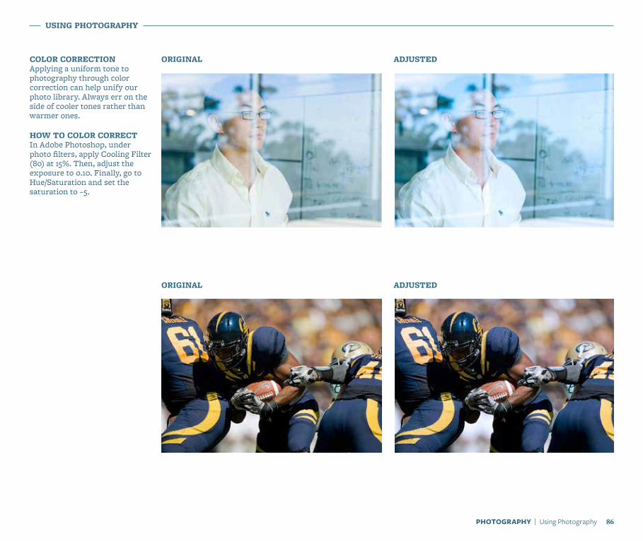
COLOR CORRECTIONApplying a uniform tone to photography through color correction can help unify our photo library. Always err on the side of cooler tones rather than warmer ones.
HOW TO COLOR CORRECT In Adobe Photoshop, under photo filters, apply Cooling Filter (80) at 15%. Then, adjust the exposure to 0.10. Finally, go to Hue/Saturation and set the saturation to –5.
ORIGINAL
ORIGINAL
ADJUSTED
ADJUSTED
86PHOTOGRAPHY | Using Photography

Graphic Elements
Our library of graphic elementsWe have provided a variety of graphic tools that create a unique look and make us recognizable. These elements shouldn’t be combined, but can be emphasized or played down individually to add visual interest and enhance our storytelling.
a NOTE a
Find digital assets for our graphic-elements library and download at brand.berkeley.edu.
88GRAPHIC ELEMENTS | Introduction
a NOTE a
Each element has a skill-level rating. Use these ratings to help determine which elements you should attempt to use in a design.
Easiest (You don’t have to be an expert to use these elements.)
Intermediate (Moderate design skills required.)
Advanced (Significant design experience necessary.)
Experts Only (Use only if you’ve had some serious design training.)
89GRAPHIC ELEMENTS | Overview
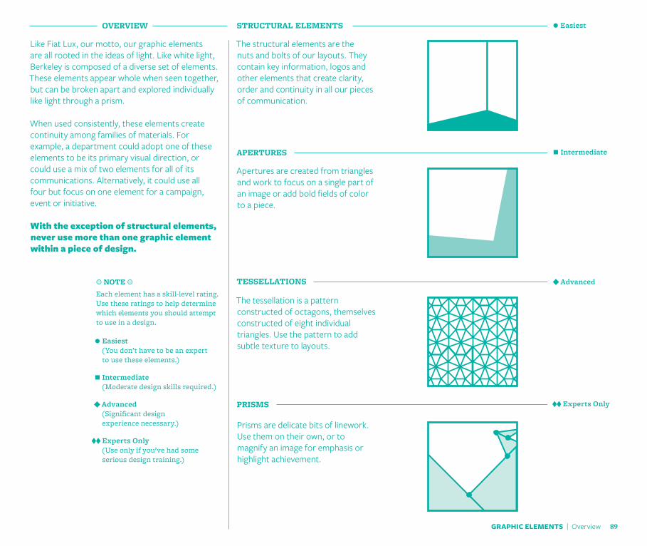
Like Fiat Lux, our motto, our graphic elements are all rooted in the ideas of light. Like white light, Berkeley is composed of a diverse set of elements. These elements appear whole when seen together, but can be broken apart and explored individually like light through a prism.
When used consistently, these elements create continuity among families of materials. For example, a department could adopt one of these elements to be its primary visual direction, or could use a mix of two elements for all of its communications. Alternatively, it could use all four but focus on one element for a campaign, event or initiative.
With the exception of structural elements, never use more than one graphic element within a piece of design.
APERTURES
Apertures are created from triangles and work to focus on a single part of an image or add bold fields of color to a piece.
Prisms are delicate bits of linework. Use them on their own, or to magnify an image for emphasis or highlight achievement.
PRISMS
The tessellation is a pattern constructed of octagons, themselves constructed of eight individual triangles. Use the pattern to add subtle texture to layouts.
TESSELLATIONS
The structural elements are the nuts and bolts of our layouts. They contain key information, logos and other elements that create clarity, order and continuity in all our pieces of communication.
STRUCTURAL ELEMENTSOVERVIEW Easiest
Intermediate
Advanced
Experts Only
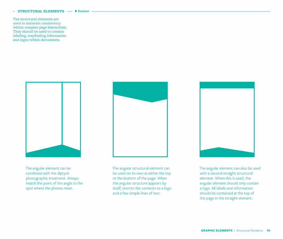
The structural elements are used to maintain consistency within complex page hierarchies. They should be used to contain labeling, wayfinding information and logos within documents.
STRUCTURAL ELEMENTS
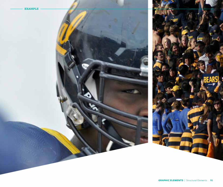
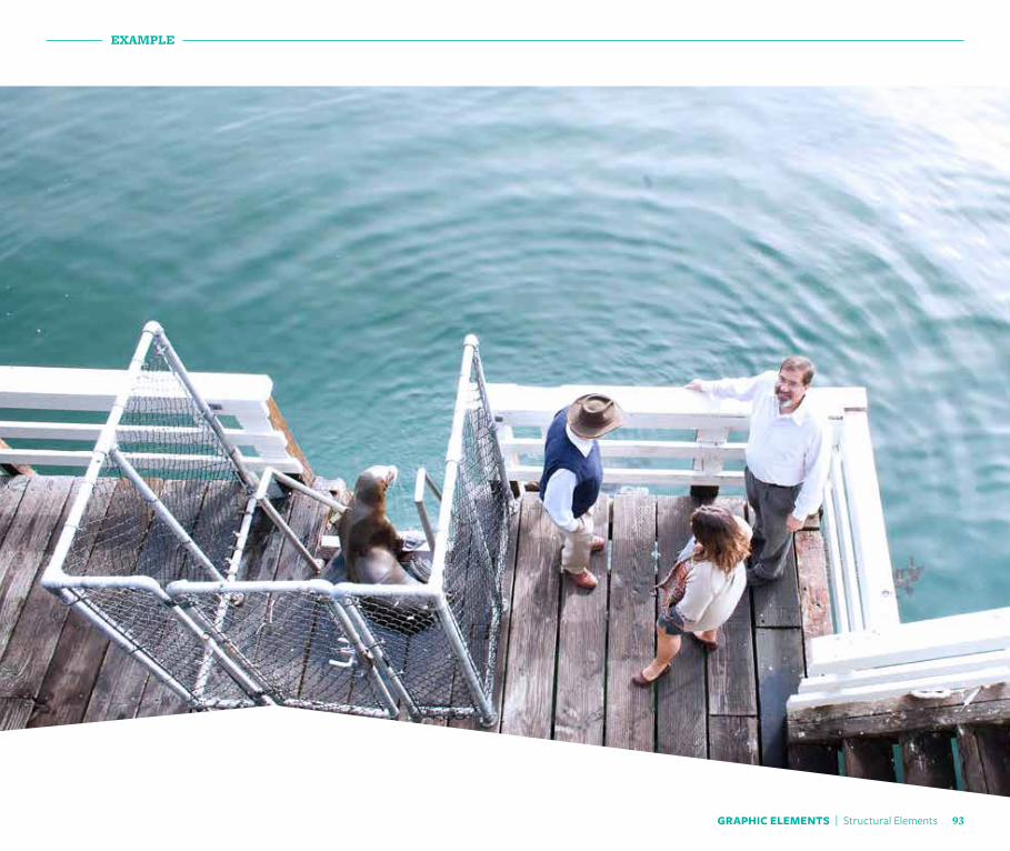
The angular structural element can be used on its own at either the top or the bottom of the page. When the angular structure appears by itself, restrict the contents to a logo and a few simple lines of text.
The angular element can also be used with a second straight structural element. When this is used, the angular element should only contain a logo. All labels and information should be contained at the top of the page in the straight element.
The angular element can be combined with the diptych photographic treatment. Always match the point of the angle to the spot where the photos meet.
Easiest
90GRAPHIC ELEMENTS | Structural Elements
GRAPHIC ELEMENTS | Structural Elements 91
EXAMPLE

EXAMPLE
GRAPHIC ELEMENTS | Structural Elements 92
EXAMPLE
GRAPHIC ELEMENTS | Structural Elements 93
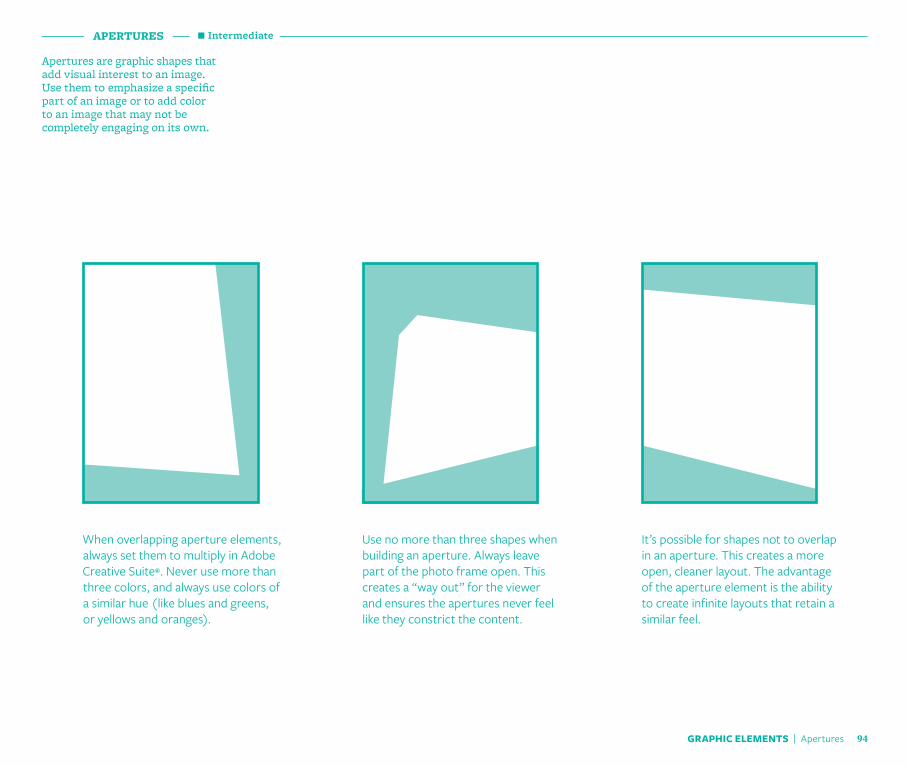
Apertures are graphic shapes that add visual interest to an image. Use them to emphasize a specific part of an image or to add color to an image that may not be completely engaging on its own.
APERTURES
Use no more than three shapes when building an aperture. Always leave part of the photo frame open. This creates a “way out” for the viewer and ensures the apertures never feel like they constrict the content.
It’s possible for shapes not to overlap in an aperture. This creates a more open, cleaner layout. The advantage of the aperture element is the ability to create infinite layouts that retain a similar feel.
When overlapping aperture elements, always set them to multiply in Adobe Creative Suite®. Never use more than three colors, and always use colors of a similar hue (like blues and greens, or yellows and oranges).
Intermediate
GRAPHIC ELEMENTS | Apertures 94

GRAPHIC ELEMENTS | Apertures 95
EXAMPLE

EXAMPLE
GRAPHIC ELEMENTS | Apertures 96

EXAMPLE
GRAPHIC ELEMENTS | Apertures 97
TESSELLATIONS
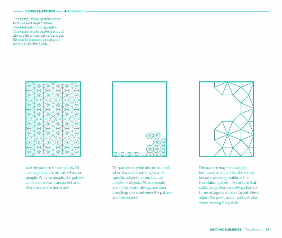
The tessellation pattern adds texture and depth when overlaid onto photography. The tessellation pattern should always be white, set to between 50 and 80 percent opacity in Adobe Creative Suite.
The pattern may be deconstructed when it’s used over images with specific subject matter, such as people or objects. When people are in the photo, always maintain breathing room between the pattern and the subject.
The pattern may be enlarged, but never so much that the shapes become unrecognizable as the tessellation pattern. Make sure that, collectively, there are always two to three octagons within a layout. Never adjust the point size or add a stroke when resizing the pattern.
Use the pattern to completely fill an image that is textural or has no people. With no people, the pattern can become less transparent and, therefore, more dominant.
Advanced
GRAPHIC ELEMENTS | Tessellations 98

99
EXAMPLE
GRAPHIC ELEMENTS | Tessellations

EXAMPLE
100GRAPHIC ELEMENTS | Tessellations

EXAMPLE
GRAPHIC ELEMENTS | Tessellations 101
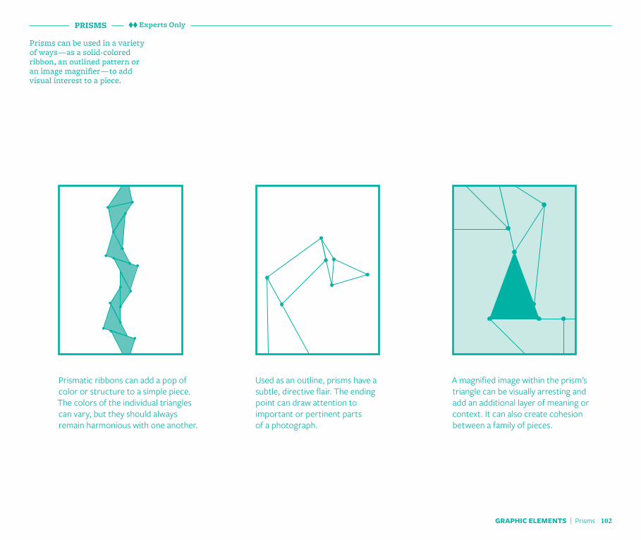
PRISMS
Prisms can be used in a variety of ways — as a solid-colored ribbon, an outlined pattern or an image magnifier — to add visual interest to a piece.
Used as an outline, prisms have a subtle, directive flair. The ending point can draw attention to important or pertinent parts of a photograph.
A magnified image within the prism’s triangle can be visually arresting and add an additional layer of meaning or context. It can also create cohesion between a family of pieces.
Prismatic ribbons can add a pop of color or structure to a simple piece. The colors of the individual triangles can vary, but they should always remain harmonious with one another.
Experts Only
GRAPHIC ELEMENTS | Prisms 102

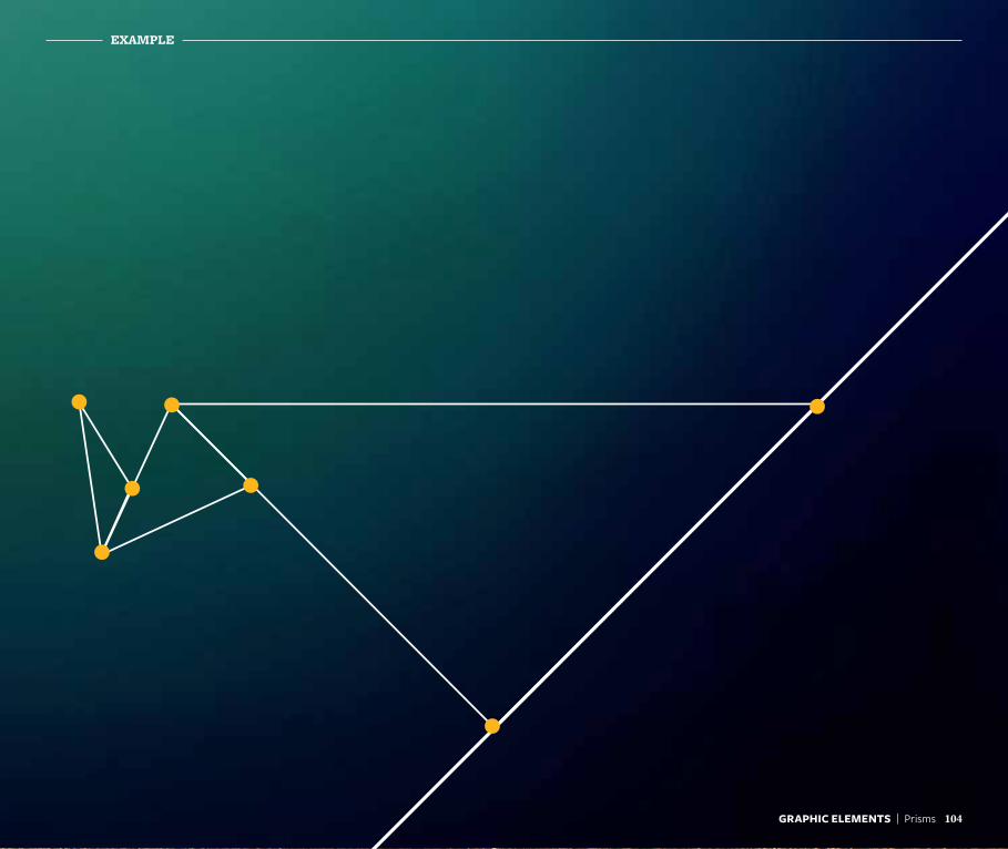
EXAMPLE
GRAPHIC ELEMENTS | Prisms 103
GRAPHIC ELEMENTS | Prisms 104
EXAMPLE
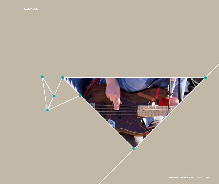
EXAMPLE
GRAPHIC ELEMENTS | Prisms 105

Guidelines in Practice
Bringing our work to lifeThe Berkeley visual look and feel is a collection of elements that create a cohesive package. Our colors, typography, photography, graphic elements and voice all combine to create a strong, unique image for Berkeley. We tailor these elements for each piece we create and, by using these tools consistently, each piece we design will combine to create a larger whole.
a NOTE a
The following examples were created to show how existing pieces can be reimagined using the new Berkeley tools. A thumbnail of the original layout provides a source of inspiration for the revised design. In addition, a short creative brief is given to provide context to the situation, as well as a list of the new elements used in the new design.
The photographs used in the following samples are for demonstration only and may not feature approved images for Berkeley.
GUIDELINES IN PRACTICE | Introduction 107
108GUIDELINES IN PRACTICE | Publications
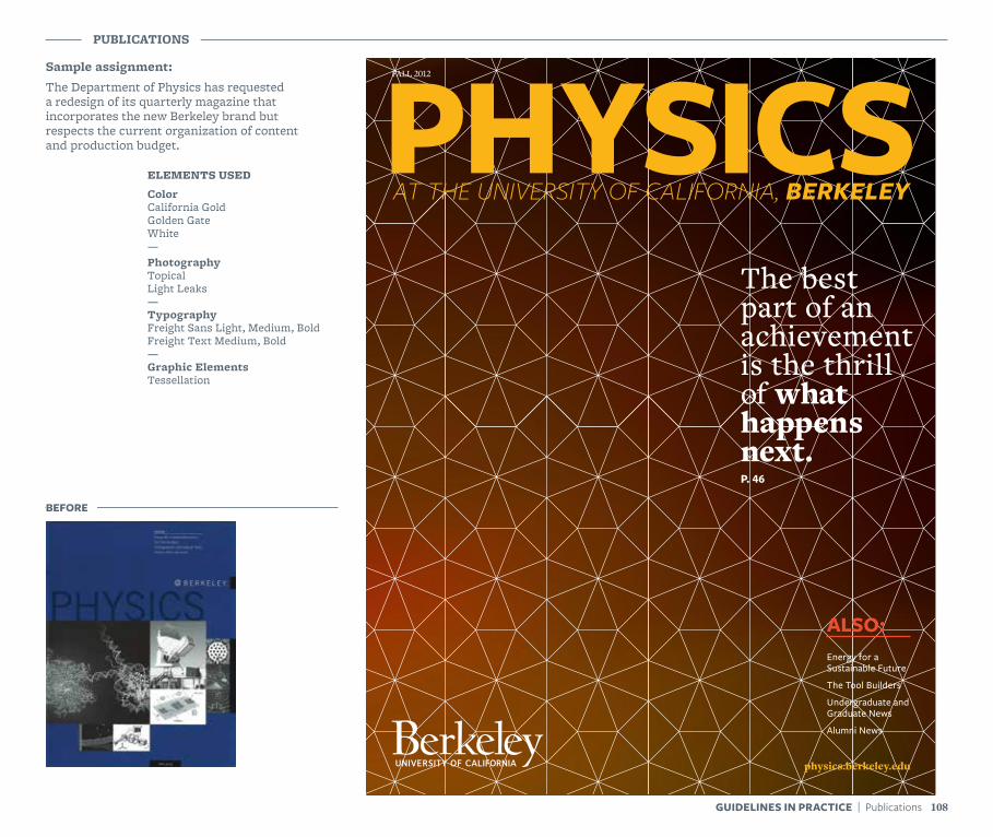
Sample assignment:The Department of Physics has requested a redesign of its quarterly magazine that incorporates the new Berkeley brand but respects the current organization of content and production budget.
PUBLICATIONS
PHYSICSThe best part of an achievement is the thrill of what happens next.P. 46
FALL 2012
physics.berkeley.edu
Energy for a Sustainable Future
The Tool Builders
Undergraduate and Graduate News
Alumni News
AT THE UNIVERSITY OF CALIFORNIA, BERKELEY
ALSO:
BEFORE
ELEMENTS USED
ColorCalifornia GoldGolden GateWhite—PhotographyTopicalLight Leaks—TypographyFreight Sans Light, Medium, BoldFreight Text Medium, Bold—Graphic ElementsTessellation
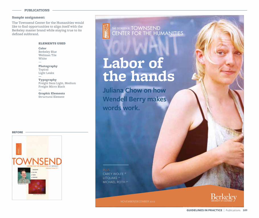
Sample assignment:The Townsend Center for the Humanities would like to find opportunities to align itself with the Berkeley master brand while staying true to its defined subbrand.
PUBLICATIONS
PLUSCAREY WOLFE 18LITQUAKE 26
MICHAEL ROTH 30
Labor of the hands
NEWSLETTER NOVEMBER/DECEMBER 2012
Juliana Chow on how Wendell Berry makes words work.
BEFORE
ELEMENTS USED
ColorBerkeley BlueWellman TileWhite—PhotographyTopicalLight Leaks—TypographyFreight Sans Light, MediumFreight Micro Black—Graphic ElementsStructural Element
109GUIDELINES IN PRACTICE | Publications
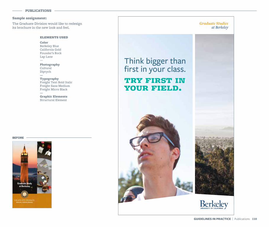
Sample assignment:The Graduate Division would like to redesign its brochure in the new look and feel.
PUBLICATIONS
110GUIDELINES IN PRACTICE | Publications
BEFORE
ELEMENTS USED
ColorBerkeley BlueCalifornia GoldFounder’s RockLap Lane—PhotographyCulturalDiptych—TypographyFreight Text Bold ItalicFreight Sans MediumFreight Micro Black—Graphic ElementsStructural Element
Think bigger than first in your class.try first in your field.
Graduate Studies at Berkeley
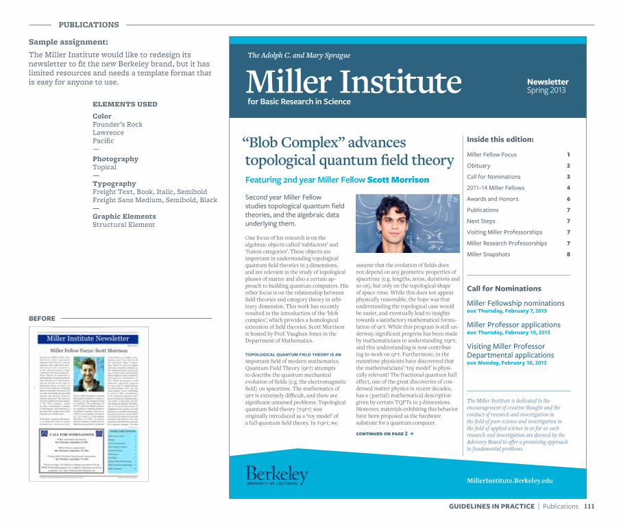
Sample assignment:The Miller Institute would like to redesign its newsletter to fit the new Berkeley brand, but it has limited resources and needs a template format that is easy for anyone to use.
PUBLICATIONS
Miller InstituteThe Adolph C. and Mary Sprague
for Basic Research in Science
NewsletterSpring 2013
“Blob Complex” advances topological quantum field theoryFeaturing 2nd year Miller Fellow Scott Morrison
Second year Miller Fellow studies topological quantum field theories, and the algebraic data underlying them.
One focus of his research is on the algebraic objects called ‘subfactors’ and ‘fusion categories’. These objects are important in understanding topological quantum field theories in 3 dimensions, and are relevant in the study of topological phases of matter and also a certain ap-proach to building quantum computers. His other focus is on the relationship between field theories and category theory in arbi-trary dimension. This work has recently resulted in the introduction of the ‘blob complex’, which provides a homological extension of field theories. Scott Morrison is hosted by Prof. Vaughan Jones in the Department of Mathematics.
topological quantum field theory is an important field of modern mathematics. Quantum Field Theory (qft) attempts to describe the quantum mechanical evolution of fields (e.g. the electromagnetic field) on spacetime. The mathematics of qft is extremely difficult, and there are significant untamed problems. Topological quantum field theory (tqft) was originally introduced as a ‘toy model’ of a full quantum field theory. In tqft, we
assume that the evolution of fields does not depend on any geometric properties of spacetime (e.g. lengths, areas, durations and so on), but only on the topological shape of space-time. While this does not appear physically reasonable, the hope was that understanding the topological case would be easier, and eventually lead to insights towards a satisfactory mathematical formu-lation of qft. While this program is still un-derway, significant progress has been made by mathematicians in understanding tqft, and this understanding is now contribut-ing to work on qft. Furthermore, in the meantime physicists have discovered that the mathematicians’ ‘toy model’ is physi-cally relevant! The fractional quantum hall effect, one of the great discoveries of con-densed matter physics in recent decades, has a (partial) mathematical description given by certain TQFTs in 3 dimensions. Moreover, materials exhibiting this behavior have been proposed as the hardware substrate for a quantum computer.
continued on page 2 J
Inside this edition:
Miller Fellow Focus 1
Obituary 2
Call for Nominations 3
2011–14 Miller Fellows 4
Awards and Honors 6
Publications 7
Next Steps 7
Visiting Miller Professorships 7
Miller Research Professorships 7
Miller Snapshots 8
Call for Nominations
Miller Fellowship nominationsdue Thursday, February 7, 2013
Miller Professor applicationsdue Thursday, February 14, 2013
Visiting Miller Professor Departmental applicationsdue Monday, February 18, 2013
The Miller Institute is dedicated to the encouragement of creative thought and the conduct of research and investigation in the field of pure science and investigation in the field of applied science in so far as such research and investigation are deemed by the Advisory Board to offer a promising approach to fundamental problems.
MillerInstitute.Berkeley.edu
BEFORE
ELEMENTS USED
ColorFounder’s RockLawrencePacific—PhotographyTopical—TypographyFreight Text, Book, Italic, SemiboldFreight Sans Medium, Semibold, Black—Graphic ElementsStructural Element
111GUIDELINES IN PRACTICE | Publications
PUBLICATIONS
112GUIDELINES IN PRACTICE | Publications
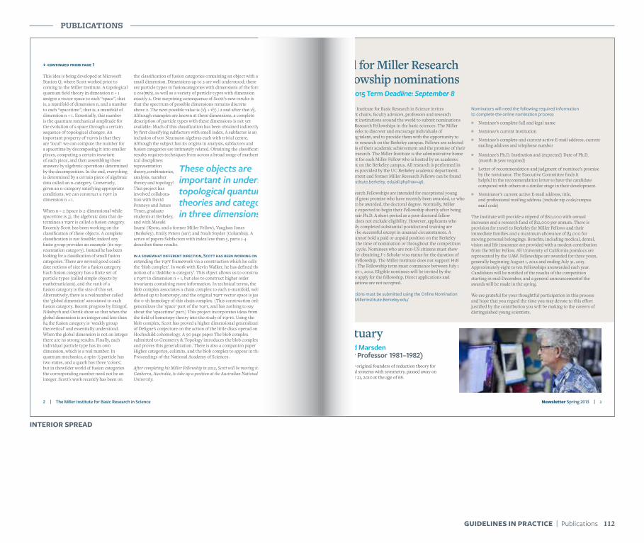
2 | The Miller Institute for Basic Research in Science Newsletter Spring 2013 | 3
K continued from page 1
This idea is being developed at Microsoft Station Q, where Scott worked prior to coming to the Miller Institute. A topological quantum field theory in dimension n + 1assigns a vector space to each “space”, that is, a manifold of dimension n, and a number to each “spacetime”, that is, a manifold of dimension n + 1. Essentially, this numberis the quantum mechanical amplitude for the evolution of a space through a certain sequence of topological changes. An important property of tqfts is that they are ‘local’: we can compute the number for a spacetime by decomposing it into smaller pieces, computing a certain invariant of each piece, and then assembling these answers by algebraic operations determined by the decomposition. In the end, everything is determined by a certain piece of algebraic data called an n-category. Conversely, given an n-category satisfying appropriate conditions, we can construct a tqft in dimension n + 1.
When n = 2 (space is 2-dimensional while spacetime is 3), the algebraic data that de-termines a tqft is called a fusion category. Recently Scott has been working on the classification of these objects. A complete classification is not feasible; indeed any finite group provides an example (its rep-resentation category). Instead he has been looking for a classification of small fusion categories. There are several good candi-date notions of size for a fusion category. Each fusion category has a finite set of particle types (called simple objects by mathematicians), and the rank of a fusion category is the size of this set. Alternatively, there is a realnumber calledthe ‘global dimension’ associated to each fusion category. Recent progress by Etingof, Nikshych and Ostrik show so that when the global dimension is an integer and less than84 the fusion category is ‘weakly group theoretical’ and essentially understood. When the global dimension is not an integer there are no strong results. Finally, each individual particle type has its own dimension, which is a real number. In quantum mechanics, a spin-½ particle has two states, and a quark has three ‘colors’, but in thewilder world of fusion categories the corresponding number need not be an integer. Scott’s work recently has been on
the classification of fusion categories containing an object with a small dimension. Dimensions up to 2 are well understood; there are particle types in fusioncategories with dimensions of the form 2 cos(π/n), as well as a variety of particle types with dimension exactly 2. One surprising consequence of Scott’s new results isthat the spectrum of possible dimensions remains discreteabove 2. The next possible value is (√3 + √7) / 2 and after that √5. Although examples are known at these dimensions, a complete description of particle types with these dimensions is not yet available. Much of this classification has been obtained indirectlyby first classifying subfactors with small index. A subfactor is an inclusion of von Neumann algebras each with trivial centre. Although the subject has its origins in analysis, subfactors and fusion categories are intimately related. Obtaining the classification results requires techniques from across a broad range of mathemat-ical disciplines: representation theory, combinatorics, analysis, number theory and topology! This project hasinvolved collabora-tion with David Penneys and JamesTener, graduate students at Berkeley, and with MasakiIzumi (Kyoto, and a former Miller Fellow), Vaughan Jones (Berkeley), Emily Peters (mit) and Noah Snyder (Columbia). A series of papers Subfactors with index less than 5, parts 1-4 describes these results.
in a somewhat different direction, Scott has been working on extending the tqft framework via a construction which he calls the ‘blob complex’. In work with Kevin Walker, he has defined the notion of a ‘disklike n-category’. This object allows us to construct a tqft in dimension n + 1, but also to construct higher order invariants containing more information. In technical terms, the blob complex associates a chain complex to each n-manifold, well defined up to homotopy, and the original tqft vector space is just the 0-th homology of this chain complex. (This construction only generalizes the ‘space’ part of the tqft, and has nothing to say about the ‘spacetime’ part.) This project incorporates ideas from the field of homotopy theory into the study of tqfts. Using the blob complex, Scott has proved a higher dimensional generalization of Deligne’s conjecture on the action of the little discs operad on Hochschild cohomology. A 90 page paper The blob complex submitted to Geometry & Topology introduces the blob complex and proves this generalization. There is also a companion paper Higher categories, colimits, and the blob complex to appear in the Proceedings of the National Academy of Sciences.
After completing his Miller Fellowship in 2012, Scott will be moving to Canberra, Australia, to take up a position at the Australian National University.
The Miller Institute for Basic Research in Science invites department chairs, faculty advisors, professors and research scientists at institutions around the world to submit nominations for Miller Research Fellowships in the basic sciences. The Miller Institute seeks to discover and encourage individuals of outstanding talent, and to provide them with the opportunity to pursue their research on the Berkeley campus. Fellows are selected on the basis of their academic achievement and the promise of their scientific research. The Miller Institute is the administrative home department for each Miller Fellow who is hosted by an academic department on the Berkeley campus. All research is performed in the facilities provided by the UC Berkeley academic department. A list of current and former Miller Research Fellows can be found at: MillerInstitute.berkeley. edu/all.php?nav=46.
Miller Research Fellowships are intended for exceptional young scientists of great promise who have recently been awarded, or who are about to be awarded, the doctoral degree. Normally, Miller Fellows are expected to begin their Fellowship shortly after being awarded their Ph.D. A short period as a post-doctoral fellow elsewhere does not exclude eligibility. However, applicants who have already completed substantial postdoctoral training are unlikely to be successful except in unusual circumstances. A nominee cannot hold a paid or unpaid position on the Berkeley campus at the time of nomination or throughout the competition and award cycle. Nominees who are non-US citizens must show eligibility for obtaining J-1 Scholar visa status for the duration of the Miller Fellowship. The Miller Institute does not support H1B visa status. The Fellowship term must commence between July 1 and October 1, 2012. Eligible nominees will be invited by the Institute to apply for the fellowship. Direct applications and self-nominations are not accepted.
All nominations must be submitted using the Online Nomination System at MillerInstitute.Berkeley.edu/
One of the original founders of reduction theory formechanical systems with symmetry, passed away onSeptember 21, 2010 at the age of 68.
Nominators will need the following required information to complete the online nomination process:
W Nominee’s complete full and legal name
W Nominee’s current Institution
W Nominee’s complete and current active E-mail address, current mailing address and telephone number
W Nominee’s Ph.D. Institution and (expected) Date of Ph.D. (month & year required)
W Letter of recommendation and judgment of nominee’s promise by the nominator. The Executive Committee finds it helpful in the recommendation letter to have the candidate compared with others at a similar stage in their development.
W Nominator’s current active E-mail address, title, and professional mailing address (include zip code/campus mail code)
The Institute will provide a stipend of $60,000 with annual increases and a research fund of $12,000 per annum. There isprovision for travel to Berkeley for Miller Fellows and their immediate families and a maximum allowance of $3,000 formoving personal belongings. Benefits, including medical, dental, vision and life insurance are provided with a modest contributionfrom the Miller Fellow. All University of California postdocs are represented by the UAW. Fellowships are awarded for three years, generally beginning August 1, 2012 and ending July 31, 2015. Approximately eight to ten Fellowships areawarded each year. Candidates will be notified of the results of the competition starting in mid-December, and a general announcementof the awards will be made in the spring.
We are grateful for your thoughtful participation in this process and hope that you regard the time you may devote to this effortjustified by the contribution you will be making to the careers of distinguished young scientists.
These objects are important in understanding topological quantum field theories and category theory in three dimensions.
Call for Miller Research Fellowship nominations2012-2015 Term Deadline: September 8
ObituaryJerrold Marsden (Miller Professor 1981–1982)
INTERIOR SPREAD
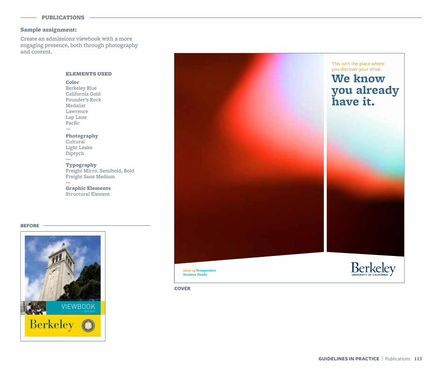
Sample assignment:Create an admissions viewbook with a more engaging presence, both through photography and content.
PUBLICATIONS
ELEMENTS USED
ColorBerkeley BlueCalifornia GoldFounder’s RockMedalist LawrenceLap LanePacfic—PhotographyCulturalLight LeaksDiptych—TypographyFreight Micro, Semibold, BoldFreight Sans Medium—Graphic ElementsStructural Element
2012–13 Prospective Student Guide
This isn’t the place where you discover your drive.
We know you already have it.
COVER
BEFORE
2010-2011VIEWBOOK Sign up at: pictureyourself.berkeley.edu
113GUIDELINES IN PRACTICE | Publications
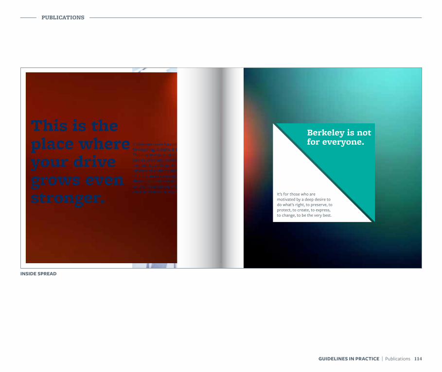
PUBLICATIONS
114GUIDELINES IN PRACTICE | Publications
It’s for those who are motivated by a deep desire to do what’s right, to preserve, to protect, to create, to express, to change, to be the very best.
Berkeley is not for everyone.
This is the place where your drive grows even stronger.
It becomes more focused. More far-reaching. It shifts. It builds. This is where your interests and talents join many more interests and talents, and together they inform and enhance each other. This is where new people, new discoveries, and new challenges build on foundations of hard work and excellent teachings.
INSIDE SPREAD
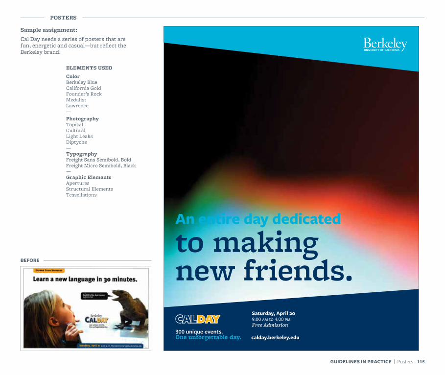
Sample assignment:Cal Day needs a series of posters that are fun, energetic and casual—but reflect the Berkeley brand.
POSTERS
An entire day dedicated
to making new friends.
Free AdmissionCALDAY
calday.berkeley.edu
Saturday, April 20
BEFORE
ELEMENTS USED
ColorBerkeley BlueCalifornia GoldFounder’s RockMedalistLawrence—PhotographyTopicalCulturalLight LeaksDiptychs—TypographyFreight Sans Semibold, BoldFreight Micro Semibold, Black—Graphic ElementsAperturesStructural ElementsTessellations
115GUIDELINES IN PRACTICE | Posters
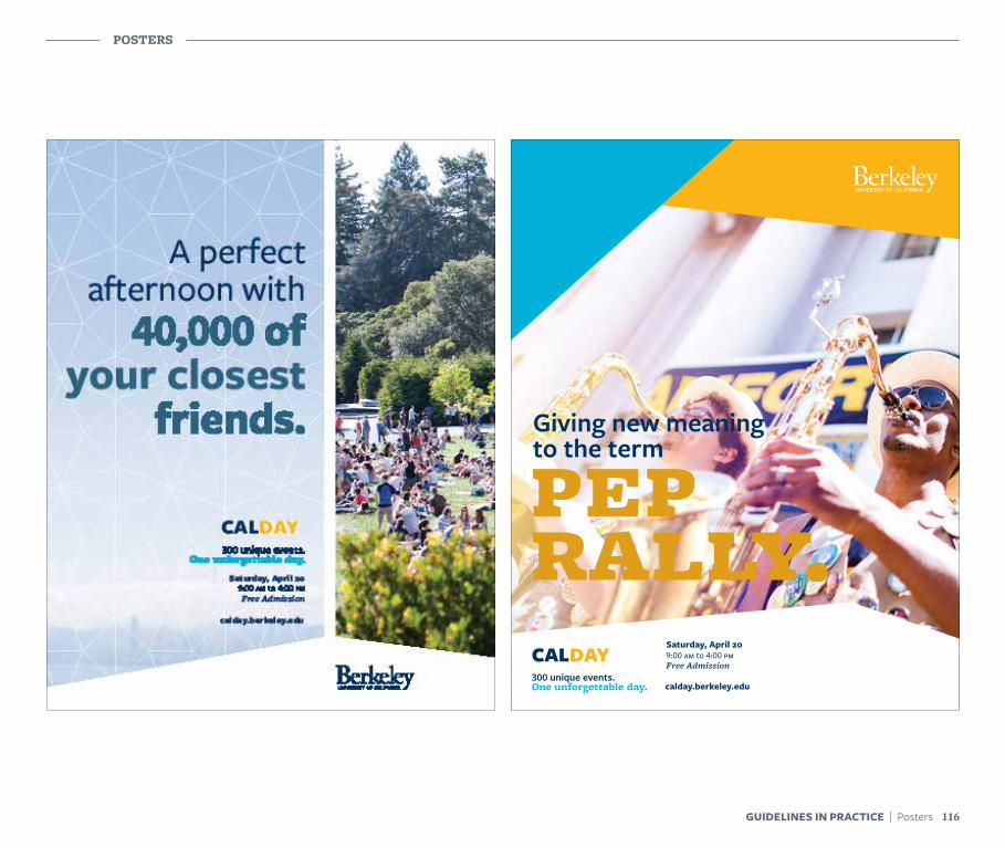
POSTERS
116GUIDELINES IN PRACTICE | Posters
CALDAYFree Admission
Giving new meaning to the term
Saturday, April 20
calday.berkeley.edu
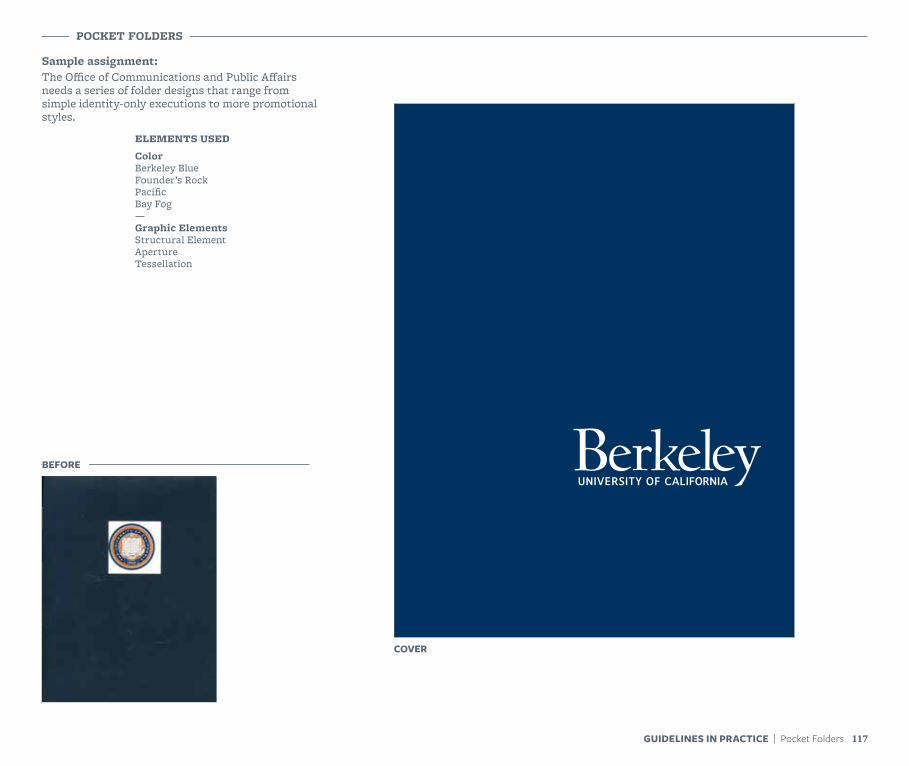
Sample assignment:The Office of Communications and Public Affairs needs a series of folder designs that range from simple identity-only executions to more promotional styles.
POCKET FOLDERS
ELEMENTS USED
ColorBerkeley BlueFounder’s RockPacificBay Fog—Graphic ElementsStructural ElementApertureTessellation
BEFORE
POCKET FOLDERS
COVER
117GUIDELINES IN PRACTICE | Pocket Folders
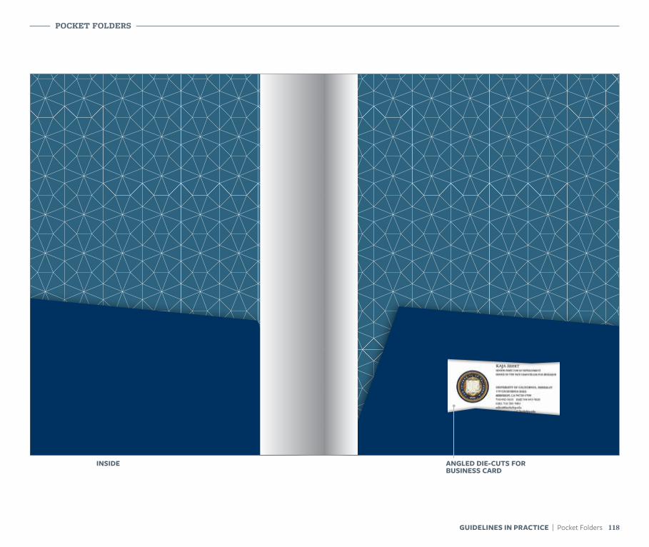
118GUIDELINES IN PRACTICE | Pocket Folders
POCKET FOLDERS
INSIDE ANGLED DIE-CUTS FOR BUSINESS CARD
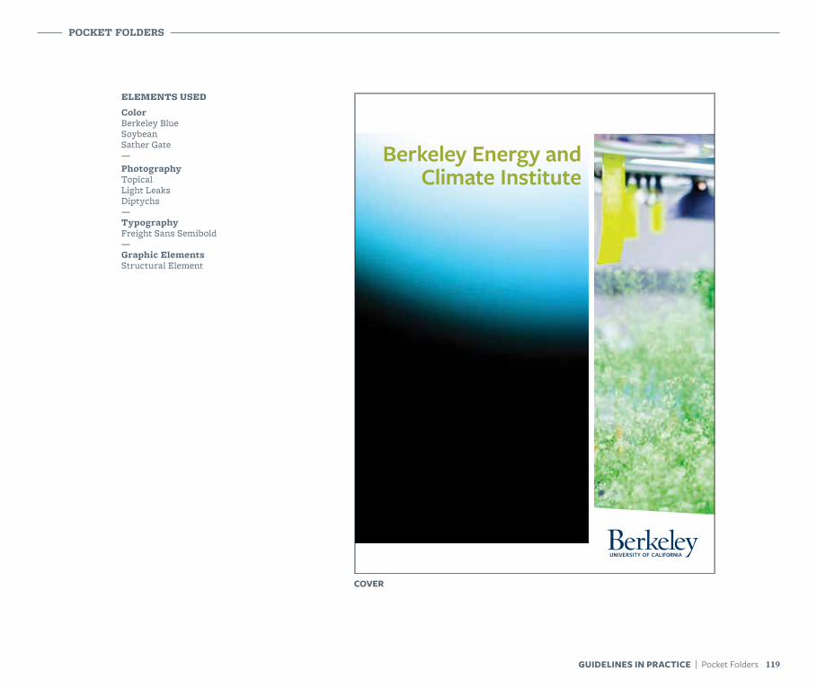
ELEMENTS USED
ColorBerkeley BlueSoybeanSather Gate—PhotographyTopicalLight LeaksDiptychs—TypographyFreight Sans Semibold—Graphic ElementsStructural Element
Berkeley Energy and Climate Institute
POCKET FOLDERS
COVER
119GUIDELINES IN PRACTICE | Pocket Folders
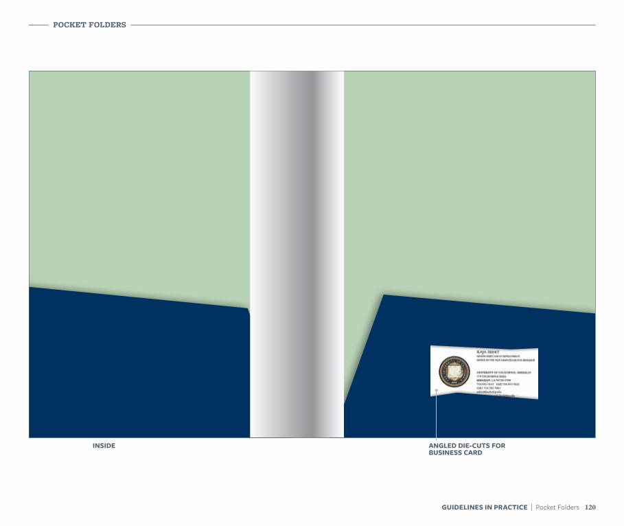
POCKET FOLDERS
120GUIDELINES IN PRACTICE | Pocket Folders
INSIDE ANGLED DIE-CUTS FOR BUSINESS CARD
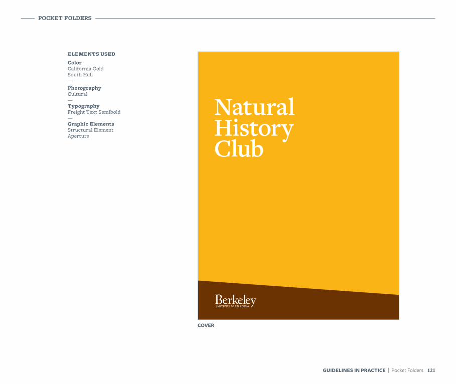
ELEMENTS USED
ColorCalifornia GoldSouth Hall—PhotographyCultural—TypographyFreight Text Semibold—Graphic ElementsStructural ElementAperture
Natural History Club
POCKET FOLDERS
COVER
121GUIDELINES IN PRACTICE | Pocket Folders
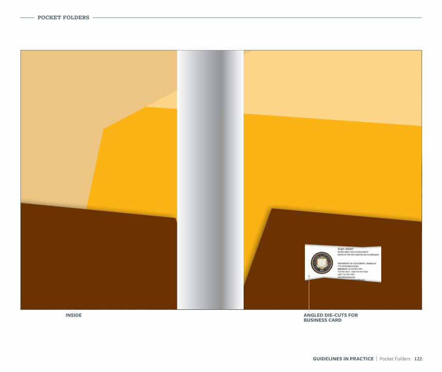
POCKET FOLDERS
122GUIDELINES IN PRACTICE | Pocket Folders
INSIDE ANGLED DIE-CUTS FOR BUSINESS CARD
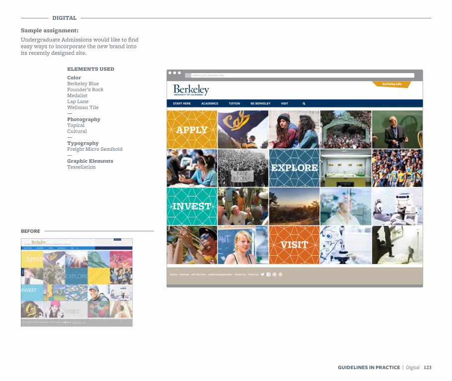
Sample assignment:Undergraduate Admissions would like to find easy ways to incorporate the new brand into its recently designed site.
DIGITAL
ELEMENTS USED
ColorBerkeley BlueFounder’s RockMedalistLap LaneWellman Tile—PhotographyTopicalCultural—TypographyFreight Micro Semibold—Graphic ElementsTessellation
BEFORE
APPLY
INVEST
EXPLORE
VISIT
START HERE ACADEMICS TUITION BE BERKELEY VISIT
Events Volunteer 24/7 Ask Oski myBerkeleyApplication Contact Us Follow Us
berkeley.edu
www.ccbrandcenter.comadmissions.berkeley.edu
123GUIDELINES IN PRACTICE | Digital
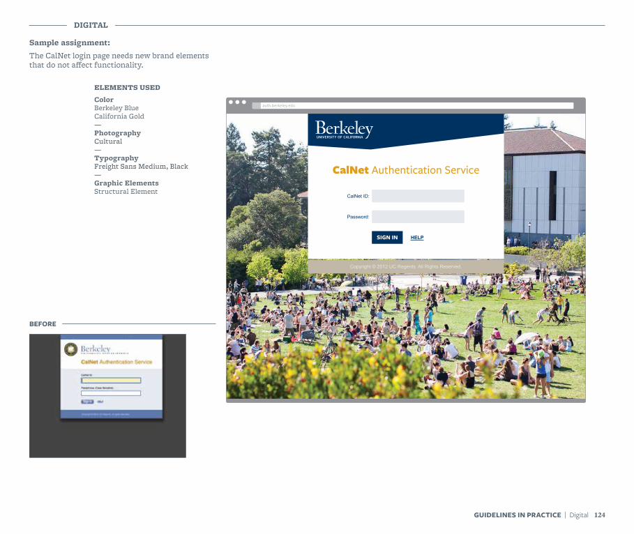
Sample assignment:The CalNet login page needs new brand elements that do not affect functionality.
DIGITAL
124GUIDELINES IN PRACTICE | Digital
ELEMENTS USED
ColorBerkeley BlueCalifornia Gold—PhotographyCultural—TypographyFreight Sans Medium, Black—Graphic ElementsStructural Element
BEFORE
CalNet Authentication Service
SIGN IN
CalNet ID:
HELP
Password:
Copyright © 2012 UC Regents. All Rights Reserved.
www.ccbrandcenter.comauth.berkeley.edu
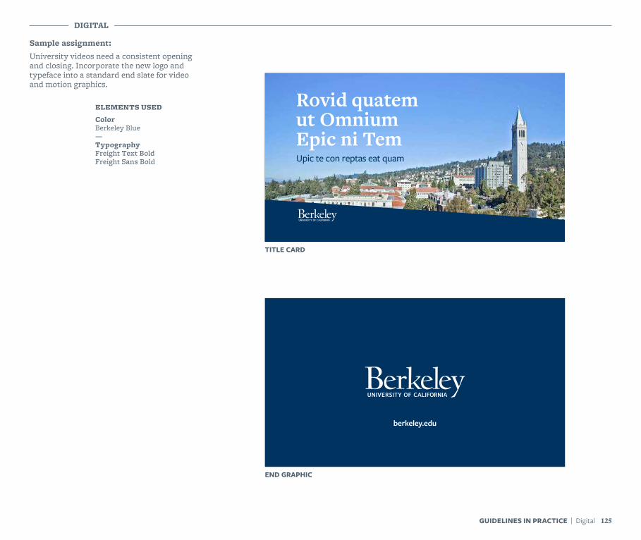
Sample assignment:University videos need a consistent opening and closing. Incorporate the new logo and typeface into a standard end slate for video and motion graphics.
DIGITAL
ELEMENTS USED
ColorBerkeley Blue—TypographyFreight Text BoldFreight Sans Bold
Rovid quatem ut Omnium Epic ni TemUpic te con reptas eat quam
TITLE CARD
END GRAPHIC
125GUIDELINES IN PRACTICE | Digital
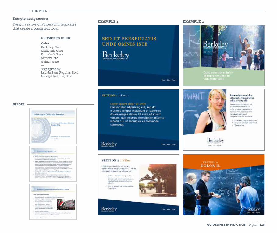
Sample assignment:Design a series of PowerPoint templates that create a consistent look.
EXAMPLE 1 EXAMPLE 2
DIGITAL
ELEMENTS USED
ColorBerkeley BlueCalifornia GoldFounder’s RockSather GateGolden Gate—TypographyLucida Sans Regular, BoldGeorgia Regular, Bold
126GUIDELINES IN PRACTICE | Digital
BEFORE

blurb.com
Beautiful print+ebooks. Made by you.
This book was produced with Blurb’s creative publishing platform and, like every book made with Blurb, it’s something special. Blurb offers tools to create bookstore-quality print books and graphically rich ebooks.
From innovative portfolios to magazines, Blurb has all the tools you need to create beautiful books, catalogues, and programs – whether you’re a first-time book maker or an experienced pro.
Here’s to creativity.Book Credits: Refueled: Issue 10 | Chris Brown, Cannes Lion Report | rawiribain, The Future of Advertising | Hyper Island, The Story of Eat Retreat | Laura Brunow Miner

To download a copy of these guidelines or other digital brand assets, visit brand.berkeley.edu.