branding exploration publication
DESCRIPTION
I chose to create a publication about branding. I wanted to look into the minds of thebranding experts and see what they had to say about the topic. I used articles writtenby Michael Bierut and Steven Heller. I wrote my own preface explaining the purpose ofthe publication and postface that spells out what I’ve learned through this exploration.The layouts are inspired by Emigre Magazine’s typographic experimentation andlimited color palettes. I chose to take an analytical approach to the publication usingcallout images and footnotes that I wrote in response to the essays I selected.TRANSCRIPT

BRANDINGEXPLORATION
J E N N L U M E T TA
A r t i c l e s b y M i c h a e l B i e r u t & S t e v e n H e l l e r e x p l o r e d b y :0

PREFACEOn October 5, 2011, Steve Jobs, the CEO and co-founder of Apple Computers, passed away. He left behind a company that does the impossible, selling millions of expensive products to consumers that normally expect everything for free. So how did Jobs manage to achieve the impossible? He used branding.
Branding is much more than just a logo. A brand is a de�nition of what it represents. In the case of Apple Computers, their brand represents exclusivity, which makes consumers want to buy their products in order to be a part of the exclusive club that is made up of Apple product owners. Apple achieves the idea of exclusivity through the look and feel of their products, advertisements, and presentations of such. When you walk into an Apple store, you walk into a gallery of sorts. Everything is white, just as in an art gallery, so your focus is solely on the products. There are no distractions, and the products are given their own space on tables that act as pedestals do in an art gallery, showing off their glory. The sleek and clean feel of Apple stores carries into the packaging and advertising of their products. The clean look that brands Apple is what makes it stand out from other computer companies that are more focused on the technology than the brand.
As a designer, I must understand branding in order to create a brand image for companies like Apple. I have taken an interest in logo and identity as a specialty and wish to continue studying the topic of branding. The rest of this publication contains two articles on branding written by the experts. Designing a mostly typographical publication using these articles will force me to spend a lot of time focusing on their words. Through this exploration, I hope to develop a deeper understanding of what it means to be a brand identity designer.
IN MOST PEOPLE'S VOCABULARIES, DESIGN MEANS
VENEER. IT'S INTERIOR DECORATING. IT'S THE FABRIC
OF THE CURTAINS AND THE SOFA. BUT TO ME, NOTHING
COULD BE FURTHER FROM THE MEANING OF DESIGN.
STEVE JOBS[2.24.1955 – 10.5.2011]
“
“1

M ICHAE L B I E RUTTHE MYSTERIOUSPOWER OF CONTEXT
IN MOST PEOPLE'S VOCABULARIES, DESIGN MEANS
VENEER. IT'S INTERIOR DECORATING. IT'S THE FABRIC
OF THE CURTAINS AND THE SOFA. BUT TO ME, NOTHING
COULD BE FURTHER FROM THE MEANING OF DESIGN.
STEVE JOBS[2.24.1955 – 10.5.2011]
4A while ago, I was designing the identity for a large, fashion-oriented organization. It was time to decide which typeface we'd use for their name. Opinions were not hard to come by: this was the kind of place where people were not unused to exercising their visual connoisseurship. But a �nal decision was elusive.
We decided to recommend a straightforward sans serif font. Predictably, this recommendation was greeted by complaints: it was too generic, too mechanical, too unstylish, too unre�ned. I had trouble responding until I added two more elements to the presentation. The �rst was a medium weight, completely bland, sans serif "C." "Does this look stylish to you?" I would ask. "Does it communicate anything about fashion or taste?" Naturally, the answer was no.
Then I would show the same letter as it usually appears as the �rst in a six-letter sequence: CHANEL. "Now what do you think?"
It worked every time. But how? The answer, of course, is context. The lettering in the Chanel logo is neutral, blank, open-ended: what we see when we look at it is eight decades' worth of accumulated associations. In the world of identity design, very few designs mean anything when they're brand new. A good logo, according to Paul Rand, provides the "pleasure of recognition and the promise of meaning." The promise, of course, is only ful�lled over time. "It is only by association with a product, a service, a business, or a corporation that a logo takes on any real meaning," Rand wrote in 1991. "It derives its meaning and usefulness from the quality of that which it symbolizes."
Everyone seems to understand this intellectually. Yet each time I unveil a new logo proposal to a client, I sense the yearning for that some enchanted evening moment: love at �rst sight, getting swept off your feet by the never-before-seen stranger across the dance �oor. Tell clients don't worry, you'll learn to love it and they react like an unwilling bride getting hustled into an unsuitable arranged marriage.1 In fact, perhaps designers should spend less time reading Paul Rand and more time reading Jane Austen: after all, it is a truth universally acknowledged that a corporation in possession of a good fortune must be in want of a logo, isn't it? Finding that one perfect logo is worth its own romantic novel.
“ IN THE WORLD OF IDENTITY DESIGN,
VERY FEW DESIGNS MEAN ANYTHING
WHEN THEY'RE BRAND NEW.
“
1. So how do you convince a client that they will learn to fall in love with a logo? In my experience, a client needs a reason to love a logo. It needs to make sense to them as a visual expression of what their company represents.

THE MYSTERIOUS POWER OF CONTEXT [CONTINUED]
M ICHAE L B I E RUTAll of this is compounded by the fact that designers themselves have very little faith in context.2 We too want the quick hit, the clever idea that will sell itself in the meeting and, even better, jump off the table in design competitions. More than anything, we want to proffer the promise of control: the control of communication, the control of meaning. To admit the truth—that so much is out of our hands— marginalizes our power to the point where it seems positively self-destructive. This is especially true in graphic design, where much of our work's functional requirements are minimal on one hand and vague on the other. "The pleasure of recognition and the promise of meaning" is a nice two line performance speci�cation, but one that's impossible to put to the test.
Yet all around us are demonstrations of how effective a blank slate can be. It's just hard to learn from them. I'd like to think, for instance, that I'd see the potential of a red dot in a red circle if I was designing a logo for a company named Target. But in truth I'd probably say, "What, that's all?" and not let it into the initial presentation. How, after all, could you guarantee that the client would invest 40 years in transforming that blank slate into a vivid three-dimensional picture?
Appreciating the power of context takes patience, humility, and, perhaps in the end, a sense of resignation. You sense it in this account of designer Carolyn Davidson's disappointing presentation for her �rst big ( $35) freelance project:
6After sifting through the stack of drawings, Knight and the other men in the room kept coming back -- albeit with something less than enthusiasm -- to the design that looked like a checkmark.
"It doesn't do anything," Johnson complained. "It's just a decoration. Adidas' stripes support the arch. Puma's stripe supports the ball of the foot. Tiger's does both. This doesn't do either."
"Oh, c'mon," Woodell said. "We've got to pick something. The three stripes are taken."
That was the trouble, thought Davidson. They were all in love with the three stripes. They didn't want a new logo; they wanted an old logo, the one that belonged to Adidas. Davidson liked [them] but found it disheartening to go out on her very �rst real job and get this kind of reception.
We all know the ending to this story: the client grudgingly accepted Carolyn Davidson's chubby checkmark, and the rest, as recounted here in Swoosh: The Unauthorized Story of Nike and the Men Who Played There is corporate identity history. The swoosh has proven durable enough to stand for the company's dedication to athletic achievement, its opponents' resistance to the forces of global capital, and a lot of things in between. Sometimes, the client is smarter than we think. Give Nike founder Phil Knight credit: he had the vision to admit, "I don't love it. But I think it'll grow on me."
Maybe he believed it. Or maybe he was just tired of trying to decide. Either way, context did the rest.
. . .SO MUCH IS OUT OF OUR HANDS...“
“
2. But design is changing and designers are changing their ways of thinking.

WHEN BAD THINGS HAPPENTO GOOD LOGOS
When bad things happen, even the best-intentioned designs will suffer. Logos are judged good or bad by the deeds or policies they represent. Although inconceivable today, during the early 20th century the swastika—or hooked cross, an ancient symbol of good fortune—was adopted as a commercial mark for such products as Good Luck Jar Rubbers, Fresh Deodorant, Swastika Fresh Fruit, Swastika Cigars, Swastika Matches and even Coca-Cola. In 1922 it was, however, adopted by Adolf Hitler's National Socialist Workers Party (the Nazis), and in 1935 was elevated to the national symbol of Nazi Germany. From that moment its symbolism went from benign to toxic. The possibility that the swastika can be cleansed of its dreadful connotations in Western culture is improbable for the foreseeable future.
ST EVE N H E L LE RThis is the most extreme case of bad things happening to good logos, but the list goes on. Take the Enron “E” designed by Paul Rand. Prior to the massive corruption scandal that brought down the energy company and wiped out billions in employee pensions, the three horizontal bars on the “E” simply represented three pipelines meeting at a central distribution repository—an elegant way to represent the company's primary asset.1 While this was not necessarily Rand's best corporate logo, it was an effective mnemonic. Until, that is, the public learned of Enron's corporate malfeasance, which eventually brought its executives to trial, jail and suicide, and the “E” became a scarlet letter, the butt of stinging satire and vitriolic condemnation.
Rand warned that logos are like “rabbits' feet,” imbued with mystical and magical properties not always rooted in the rational. He further noted, a logo is only as good as the entity it stands for. The Edsel automobile was a commercial failure, so the Edsel name and trademark became forever associated with folly. Recently, Circuit City, the big box electronics and appliance store, went belly-up, and I'd wager that red circular logos like theirs won't be repeated by other retailers in the near future lest they brand themselves a
failure. Although the recession triggered Circuit City's demise, the logo will doubtless be blamed.2 The logo is the face of a company, institution or state. It embodies the good, bad and ugly aspects of what it brands. It is either lucky or unlucky, positive or negative, depending on the context in which it exists. Context is just about everything in logoland.
Much criticism has been heaped on the Arnell Group for its bland design of the Tropicana package and logo, which, following an unpredicted popular outcry, was returned to its previous, less generic state: the orange and candy-stripe straw motif. But few remember that, before the emblematic orange, the juice package was graced with a racially offensive trade character named Tropic-Ana. She was a slightly pot-bellied topless little girl in a skimpy grass skirt, carrying a basket of oranges on her head, a variation on the Minute Maid girl and Chiquita Banana lady. Cuteness was used in the same way one might view a baby bear. Innocent given the conventions of the times, Tropic-Ana symbolized a widespread view of superiority over indigenous peoples the world over (she was apparently a native to Florida) that underscored the colonialist/manifest destiny idea that “the natives” exist only to serve the American way of life.
Could this tasteless Pronto Pups campaign have ever been considered a good idea?
7LOGOS ARE JUDGED
GOOD OR BAD BY THE
DEEDS OR POLICIES
THEY REPRESENT.
“ “
1. Was anyone besides Paul Rand and the client aware that Enron’s logo was supposed to represent three pipelines meeting at a central distribution repository? Is it important that a logo have meaning?
2. Will this trigger a trend away from all circular logos? How important is it to pay attention to these trends when designing logos?

ST EVE N H E L LE R
Many trade characters have been retired over time for their offensive depictions. Around a score of such questionable characters are collected in the new book, Ad Boy: Vintage Advertising with Character (10 Speed Press) by Warren Dotz and Masud Husain. Included among the mostly benign, silly and cute characters are the more tasteless: a sombrero/poncho-wearing hot dog for Tasty Pronto Pups; the Indian River maiden, an Indian “squaw” with the head of an orange and the va-va-voom body of a femme fatale; and of course, the Frito Bandito, the Mexican bandito (as if all Mexicans were outlaws) who is always pilfering corn chips. Analysis is not necessary because these characters speak for themselves—we know they're wrong when we see them. Racist trademarks were once copious on labels and advertisements for American products (and many foreign ones too), in part because minorities had little or no voice in mainstream society, and their otherness gave them curiosity value.3
WHEN BAD THINGS HAPPEN TO GOOD LOGOS [CONTINUED]
Some of these characterizations still exist, however, in the sports �eld. Others, including Aunt Jemima, Uncle Ben and the Cream of Wheat chef, were so positively ingrained in the public's consciousness (in the trade press they were referred to as “friendly characters” that housewives welcomed into their homes) that, rather than retire them, they were re�ned to re�ect the times. Aunt Jemima, who in the late-19th century was actually a real-life African-American pitchwoman who performed around the country, was transformed from a plantation house slave into a benign aunty. Uncle Ben, the happy house servant, has not changed much to this day (incidentally, the product was originally produced by an African-American entrepreneur, Gordon L. Harwell).
This Archdiocesan Youth Commission logo, designed by Gerry Kano in the early 1970s, is not so black and white.
A logo is designed to activate positive recognition. There's nothing worse than a logo that sparks indifference, except perhaps one that has no redeeming value at all. Failure—a product that fails to appeal—is one such valueless attribute. Designers who have created logos for failed or sluggish businesses are wise to remove such work from their portfolio.4 On some occasions, logos are more than marks of failure or malfeasance; sometimes they unintentionally illustrate the foibles or folly of a company or institution all too vividly. Take the Archdiocesan Youth Commission logo, designed three decades before the sex abuse scandal broke
out in the Catholic Church. The unfortunate pictorial relationship between the priest and the child, given our collective awareness in 2009, suggests a much too ironic interpretation. It's a challenge to see what this positive/negative image once suggested, a guardian protecting the innocent, since the benevolence of its subject matter is no longer black and white. When a good design signi�es bad deeds, the result is, well, a really unfortunate logo.
10A LOGO IS DESIGNED TO ACTIVATE
POSITIVE RECOGNITION. THERE'S
NOTHING WORSE THAN A LOGO
THAT SPARKS INDIFFERENCE...
“ “
3. This brings up the question of designing for the majority, a target market, or for the masses. Should a logo always be designed with everyone in mind since it is what de�nes the company and is what everyone sees?
4. So does a logo design ultimately fail if what it represents gets a bad reputation? Is there a difference between a good logo aesthetically and a good logo contextually? Should you really be ashamed of your design if what it represents ends up falling short?

12POSTFACEThrough this exploration, I have gained more questions rather than answers. I think this is part of the learning process. My deeper understanding allows me to ask better questions and develop a curiosity about ideas I didn’t even realize existed.
Both of these articles mentioned context as the determining factor of whether a logo is good or not. But if a logo is de�ned by what it represents, how can a designer ever know their logo is good? Is it unimportant as to what a logo looks like as long as the company it stands for is doing well? Does the designer need to be satis�ed with the mark or just the client? Does it even matter if the client likes the logo? Isn’t there a point in making an aesthetically pleasing logo?
These articles only talked about logos. Heller’s article touched on packaging briefely, but I had trouble �nding any articles written by designers about branding as a whole. Is there a disconnect between what is design and what is marketing? I know there are designers that are experts on branding, but why doesn’t there seem to be much discussion on the topic? Why is everyone so concerned with the logo and only the logo? I know it is an important part of a brand, but the brand as a whole holds the most importance.
Debbie Millman just released a book called “Brand Thinking and other Noble Pursuits”, which consists of twenty interviews with the world’s leading designers about branding. I found it at the AIGA Pivot Design Conference I went to a couple weeks ago and was so happy to �nd that someone was actually discussing branding instead of just logos. I have yet to read it but can’t wait to dive into the minds of branding experts.
Now is the time when designers will start to look at the bigger picture; how design affects the world and how the world affects design. The de�nition of design is changing. I am optimistic about where it is heading and what it will become.
THE NOTION OF THE ‘BRAND,’ LIKE ANY
CONCEPT THAT DOMINATES MARKETS
AND PUBLIC CONSCIOUSNESS, IS A
CHALLENGE TO DEFINE. IS IT A SIMPLE
DIFFERENTIATOR OF THE CEREALS IN
OUR CUPBOARDS, A MANIPULATIVE
BRAINWASHING TOOL FORCED ON US
BY CORPORATIONS, OR A CREATIVE
TRIUMPH AS CAPABLE AS ANY ART
FORM OF STIMULATING OUR EMOTIONS
AND INTELLECT?
DEBBIE MILLMAN
“
“
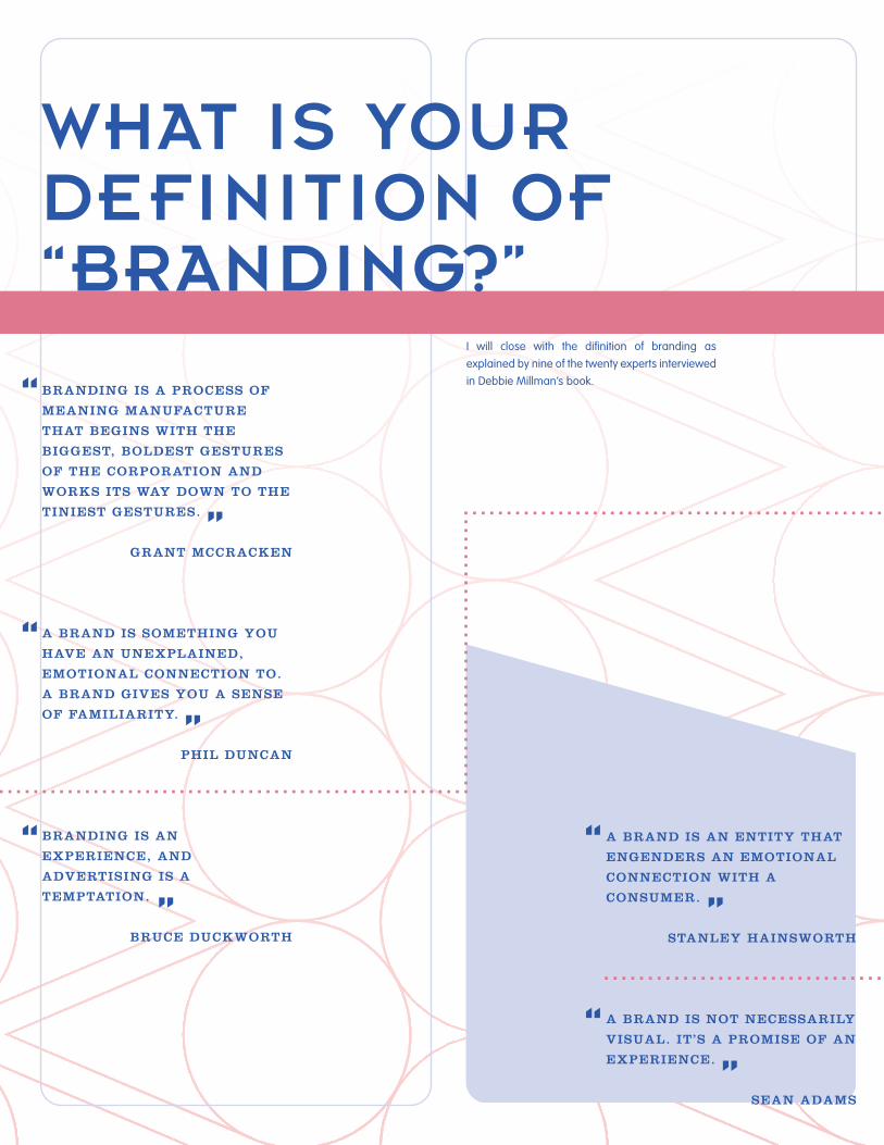
14WHAT IS YOUR DEFINITION OF “BRANDING?”
I will close with the di�nition of branding as explained by nine of the twenty experts interviewed in Debbie Millman’s book.“BRANDING IS A PROCESS OF
MEANING MANUFACTURE
THAT BEGINS WITH THE
BIGGEST, BOLDEST GESTURES
OF THE CORPORATION AND
WORKS ITS WAY DOWN TO THE
TINIEST GESTURES.
GRANT MCCRACKEN
A BRAND IS SOMETHING YOU
HAVE AN UNEXPLAINED,
EMOTIONAL CONNECTION TO.
A BRAND GIVES YOU A SENSE
OF FAMILIARITY.
PHIL DUNCAN
BRANDING IS AN
EXPERIENCE, AND
ADVERTISING IS A
TEMPTATION.
BRUCE DUCKWORTH
““
“
“ “
A BRAND IS AN ENTITY THAT
ENGENDERS AN EMOTIONAL
CONNECTION WITH A
CONSUMER.
STANLEY HAINSWORTH
A BRAND IS NOT NECESSARILY
VISUAL. IT’S A PROMISE OF AN
EXPERIENCE.
SEAN ADAMS
“ “
“ “
“ ““
“
“
“
FROM THE SENDER’S POINT OF VIEW AND FROM THE RECEIVER’S
POINT OF VIEW. I DON’T WANT TO MAKE IT OVERLY COMPLICATED,
BUT FROM THE PERSPECTIVE OF P&G OR DELL OR ANY OTHER
COMPANY, A BRAND MIGHT BE A PROMISE: A PROMISE OF WHAT
AWAITS THE CUSTOMER IF THEY BUY THAT PARTICULAR PRODUCT,
SERVICE, OR EXPERIENCE. FROM THE RECEIVER’S POINT OF VIEW, I
THINK A BRAND IS A PROMISE.
DAN PINK
BRANDING IS A PROFOUND MANIFESTATION OF THE HUMAN
CONDITION. IT IS ABOUT BELONGING: BELONGING TO A TRIBE,
TO A RELIGION, TO A FAMILY. BRANDING DEMONSTRATES THAT
SENSE OF BELONGING. IT HAS THIS FUNCTION FOR BOTH THE
PEOPLE WHO ARE PART OF THE SAME GROUP AND ALSO FOR THE
PEOPLE WHO DON’T BELONG.
WALLY OLINS
A BRAND IS A PRODUCT WITH A COMPELLING STORY—A BRAND
OFFERS “QUINTESSENTIAL QUALITIES” FOR WHICH THE
CONSUMER BELIEVES THERE IS ABSOLUTELY NO SUBSTITUTE.
BRANDS ARE TOTEMS. THEY TELL US STORIES ABOUT OUR
PLACE IN CULTURE—ABOUT WHERE WE ARE AND WHERE WE’VE
BEEN. THEY ALSO HELP US FIGURE OUT WHERE WE’RE GOING.
CHERYL SWANSON
I BELIEVE THAT “BRAND” IS A STAND-IN, A EUPHEMISM, A
SHORTCUT FOR A WHOLE BUNCH OF EXPECTATIONS, WORLDVIEW
CONNECTIONS, EXPERIENCES, AND PROMISES THAT A PRODUCT OR
SERVICE MAKES.
SETH GODIN
“
“

WWW[DOT]
[DOT] COMFURRYLANE
I am Jenni {fer Elaine} Lumetta.
15