building using powerpoint a poster
TRANSCRIPT

1: Know your story.What is the main information you want to tell? In the short time someone stands infront of your poster, what do you want them to learn? The title should reflect the storybeing told and the poster should include only what supports that story. Knowing thestory you want to tell helps you edit. If you are unsure of your story, the audience willbe too.
1 of 17
2: Know your audience.Knowing your audience helps you choose the best way to reach them, and the bestlanguage to use. Are they from your own field or the general public? Do acronyms needto be defined? If many languages are spoken, consider less text and more pictures tocommunicate your story. Remember, some images or words may be offensive to someaudiences.
3: Think about how you are going to use the poster.You are making a visual tool to convey information to an audience. Before you begindesigning this tool, consider its use.
Where will the poster be used? How close will the reader be to it?
How much space is available (or allowed) to display the poster?
Will it stand alone or will you be there to add to its content?
Does it need contact information? Website? Phone number? Email?
Will you use it in more than one situation? If so, consider changes tothe content or size to accommodate more than one use.
Did someone give you assistance with, or funding for, your research?You may want to include an acknowledgment.
This guide can be viewed on-screen (in color)or downloaded as a PDF from:
http://cis.unh.edu/idc/posters
BuildingUsing PowerPointA Guide for Using PowerPoint
a Poster
to Present Your Researchas a Large-format Poster
2 of 174: Sort everything into main categories.Before opening PowerPoint, gather everything you think you want on the poster. This isthe time to edit! Ask yourself, “Is it necessary? Does it help tell my story?” If the answeris “Not really”, don’t use it.
Sort everything into 3-5 main categories (3-5 is just a guideline, every poster is unique).Note: References and acknowledgments are not main categories.
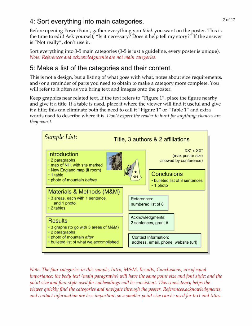
Note: The four categories in this sample, Intro, M&M, Results, Conclusions, are of equalimportance; the body text (main paragraphs) will have the same point size and font style; and thepoint size and font style used for subheadings will be consistent. This consistency helps theviewer quickly find the categories and navigate through the poster. References,acknowledgments,and contact information are less important, so a smaller point size can be used for text and titles.
5: Make a list of the categories and their content.This is not a design, but a listing of what goes with what, notes about size requirements,and/or a reminder of parts you need to obtain to make a category more complete. Youwill refer to it often as you bring text and images onto the poster.
Keep graphics near related text. If the text refers to “Figure 1”, place the figure nearbyand give it a title. If a table is used, place it where the viewer will find it useful and giveit a title; this can eliminate both the need to call it “Figure 1” or “Table 1” and extrawords used to describe where it is. Don’t expect the reader to hunt for anything; chances are,they won’t.
XX” x XX”(max poster size
allowed by conference)
Contact Information:address, email, phone, website (url)
Title, 3 authors & 2 affiliations
Materials & Methods (M&M)• 3 areas, each with 1 sentence
and 1 photo• 2 tables
Results• 3 graphs (to go with 3 areas of M&M)• 2 paragraphs• photo of mountain after• bulleted list of what we accomplished
Conclusions• bulleted list of 3 sentences• 1 photo
Acknowledgments:2 sentences, grant #
References:numbered list of 8
Introduction• 2 paragraphs• map of NH, with site marked• New England map (if room)• 1 table• photo of mountain before
NH
Sample List:

7: Begin.1) Open PowerPoint (PPT).
MAC ‘04 & ‘08 and PC ‘03:>File >New >Blank Presentation >Slide layout; choose the empty box (Blank).Go to File >Page Setup, select “Custom.”
PC ‘07:Offce Button (upper left of screen); choose New; choose Blank; click “Create” (lowerright corner of screen). Go to the “Design” tab; choose “Page Setup”(left side on ribbon).
2) Both MAC & PC, all versions:Once you have chosen “Custom” (the default is “On-screen”), type dimensions.PPT allows a maximum of 56” x 56”; however, many large format printers are 44” or36” wide (not 56”), so the largest PPT poster would be 44”(or 36”) x 56” (either verticalor horizontal format). Check with the printer to be sure the poster you create can beprinted without reducing it to fit the paper.
Close other windows (outline, layout) to give yourself the most room to work.
NOTE: When using PowerPoint for posters, know that you are making a presentationof one slide; everything on the poster is on one slide. Determine the poster size BEFOREyou begin. Changing the size after placing elements on the slide can result in a ruineddesign, distorted images, and crazy text wraps. It could take hours putting it right;avoid this by setting up the slide at the correct size from the beginning.
3 of 176: Review your list and edit more.The goal of the poster design is to make the information easy to grasp. Anything thatdoes not aid that process is distracting. Unnecessary words are like boulder fields toclimb through. Make the path easy and the viewers will read; your information willreach someone.
Avoid a poster that is all text; remember, you are making a visual tool!Photos communicate immediately; a strong image can bring people to your poster.The audience is standing (not sitting to read a journal article); they may only stand infront of your poster for a minute or two - make it easy!
Print out a sample of your text at 28-30pt to get an idea of the space it will occupy on theposter. Edit!
8: Use guides.See guides. There are two guides:PC ‘03: >View >Grid and Guides, check “Display drawing guides”.PC ‘07: Right click on the slide; in the dialogue box check “Grid and Guides”; check “Display drawing guides on screen”; leave other boxes unchecked.
MAC ‘04 & ‘08: >View; >Guides, check “Guides” (‘04 ) and Static Guides (‘08).

4 of 17
*Caution: Click on a guide at the edge of the poster or away from anything that you don’twant selected and moved or deleted by mistake. Be sure you see the numbers that appear whenclicking on a guide (they indicate location); if you don’t see them, it means you have clicked onsomething else.
8: Use guides.Get more guides.PC ’03 & ‘07: Click* on a guide, hold Ctrl, and drag another guide from it.MAC ‘04 & ‘08: Click* on a guide, hold Alt, and drag another guide from it.Note: MAC ‘08 has problems with guides; often, duplicate guides cannot be madeand/or guides disappear. Make a line using the line tool, holding Shift to keep itstraight, and place it wherever you need a guide. Be sure to delete all measuringdevices like this before printing!Note: The number of guides is finite! Don’t move them into the gray area outside theposter, they can’t always be retrieved.
Use guides to set margins. A general rule: Left, right, and top margins are thesame (1 1/2” to 2” is good for a 36”- or 44”-wide poster); the bottom is slightly largerthan the top, providing a “visual base” for the poster to rest on. Margins “frame” theposter, separating it from its surroundings, and help the reader focus on the content.
Use guides to align text boxes or shapes. Select a text box, line, or shape andbring it to a guide. What seems “close enough” on your 14” screen may not look asgood when enlarged on a wide poster! Lack of alignment can detract from thereaders’ concentration.
Use guides to set columns. Refer to your list (Step 5, page 2) as you bringeverything onto your poster. Keep the content of each category together (text, images,graphs); this will help determine column widths.Since we generally read left to right, begin with the category you wish to be read first.Place text boxes for this category along the left margin of the poster and place a guidefor what will be the the right edge of the column (you can move it any time). Pull onmiddle side handles of the text boxes to make them fitbetween the guides marking the width of the column.If more than one category can stay together and fill a column, try that. The goal is tokeep related information together. If a category has four parts, avoid placing someparts in one column and the remainder in another; the audience may read only whatis in one column and miss the rest. Don’t ask the audience to hunt for all the parts;they won’t.
Determine the width of a column. Content determines width. Related information(graphs, tables, paragraphs) will ideally stay together; try to keep categories unbroken.The columns don’t have to be the same width; but the space between columns shouldbe consistent. Allow enough space (about 2”) so that the viewer doesn’t read across toanother column before reading down. Avoid a line of text over 20” wide; the viewershould not have to walk to get the rest of a sentence!

5 of 179: Text: Bringing into PowerPoint
Enter all main text (paragraphs, not titles) and change the point size to ~26-30, to beeasily read from 5ft; this will give you an idea of the space left for graphics or images.If space allows when everything has been entered, consider increasing the point size.Captions, references, acknowledgments, and contact information can be smaller(~18-24pt).
Choose the Text Box tool; click and drag to make a text box; begin typing; it willexpand as you add text. The text box can be resized to fit any column width by pullingon the middle side handles. Select text and change font style, size, or color at any time.
With both Word and PPT open, select the text in Word; >Edit >Copy; return to PPT;create a text box; then >Edit >Paste.
The text can now be edited; size, font, and color changed. Creating a text box first isimportant, because once filled with text, it can be resized and edited easily and thetext will wrap to fit.
From Word
Directly in PPT
Make separate text boxes for titles and body text.Sizes and styles can easily be changed for all titles or all body text by selecting onlythe text boxes that you want to change. For example, all body text on the poster canbe selected and changed to 30pt Bookman, dark green. If you decide to change it to 26or 28pt, to create more white space, or change the color, it can be done quickly.
Separate text boxesfor titles.
Separate text boxesfor body text.
Separate text boxesfor subtitles.
6 of 17
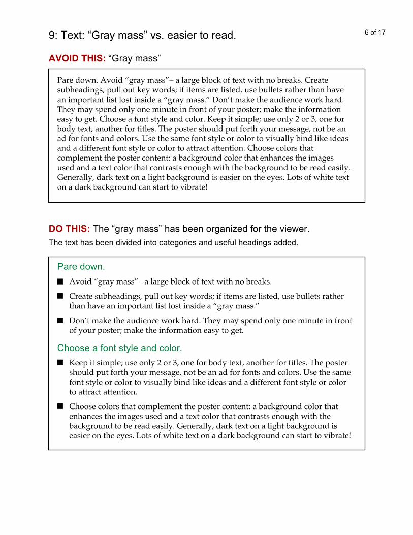
DO THIS: The “gray mass” has been organized for the viewer.
Pare down.Avoid “gray mass”– a large block of text with no breaks.
Create subheadings, pull out key words; if items are listed, use bullets ratherthan have an important list lost inside a “gray mass.”
Don’t make the audience work hard. They may spend only one minute in frontof your poster; make the information easy to get.
Choose a font style and color.Keep it simple; use only 2 or 3, one for body text, another for titles. The postershould put forth your message, not be an ad for fonts and colors. Use the samefont style or color to visually bind like ideas and a different font style or colorto attract attention.
Choose colors that complement the poster content: a background color thatenhances the images used and a text color that contrasts enough with thebackground to be read easily. Generally, dark text on a light background iseasier on the eyes. Lots of white text on a dark background can start to vibrate!
The text has been divided into categories and useful headings added.
AVOID THIS: “Gray mass”
Pare down. Avoid “gray mass”– a large block of text with no breaks. Createsubheadings, pull out key words; if items are listed, use bullets rather than havean important list lost inside a “gray mass.” Don’t make the audience work hard.They may spend only one minute in front of your poster; make the informationeasy to get. Choose a font style and color. Keep it simple; use only 2 or 3, one forbody text, another for titles. The poster should put forth your message, not be anad for fonts and colors. Use the same font style or color to visually bind like ideasand a different font style or color to attract attention. Choose colors thatcomplement the poster content: a background color that enhances the imagesused and a text color that contrasts enough with the background to be read easily.Generally, dark text on a light background is easier on the eyes. Lots of white texton a dark background can start to vibrate!
9: Text: “Gray mass” vs. easier to read.
7 of 17
Consider the references. Long references within a paragraph can interrupt a trainof thought and use valuable space. Consider listing references and numbering them.Place only the reference number within the text like this (5). Be sure the numbers arecorrect!
Check font size. A good starting point for body text (main text in paragraphs) is28-30pt on a poster ~6’ wide. Type a line at 30pt and view it @100% (View >Zoom,select 100); what is on your screen is as it will be on the final printed poster. Standback and look. Caution: Changing font styles can change size; for example, 20pt Arial islarger than 20pt Times.
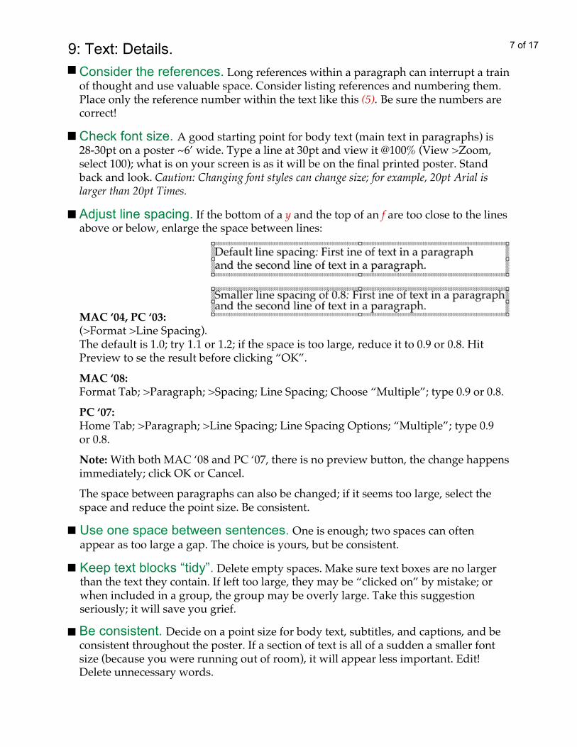
Adjust line spacing. If the bottom of a y and the top of an f are too close to the linesabove or below, enlarge the space between lines:
9: Text: Details.
Use one space between sentences. One is enough; two spaces can oftenappear as too large a gap. The choice is yours, but be consistent.
Keep text blocks “tidy”. Delete empty spaces. Make sure text boxes are no largerthan the text they contain. If left too large, they may be “clicked on” by mistake; orwhen included in a group, the group may be overly large. Take this suggestionseriously; it will save you grief.
Be consistent. Decide on a point size for body text, subtitles, and captions, and beconsistent throughout the poster. If a section of text is all of a sudden a smaller fontsize (because you were running out of room), it will appear less important. Edit!Delete unnecessary words.
MAC ‘04, PC ‘03:(>Format >Line Spacing).The default is 1.0; try 1.1 or 1.2; if the space is too large, reduce it to 0.9 or 0.8. HitPreview to se the result before clicking “OK”.
MAC ‘08:Format Tab; >Paragraph; >Spacing; Line Spacing; Choose “Multiple”; type 0.9 or 0.8.
PC ‘07:Home Tab; >Paragraph; >Line Spacing; Line Spacing Options; “Multiple”; type 0.9or 0.8.
Note: With both MAC ‘08 and PC ‘07, there is no preview button, the change happensimmediately; click OK or Cancel.
The space between paragraphs can also be changed; if it seems too large, select thespace and reduce the point size. Be consistent.

8 of 17
Beware of gimmicks like “word art”; they can be overpowering and are often hard to read. Use only what supports your story.
The toys, unless they help tell your story.9: Text: What to avoid.
POWERPOINT POSTER TITLE (tight)
POWERPOINT POSTER TITLE (with spaces)
All caps, unless more space is added between words.
are often large gaps. On a large-format poster, it canlook awkward and be hard to read.
The 2 lines above are equal justified. Some fonts are interpreted by the printer asshapes and not letters; when equal justified, spaces occur inside a word, making thesentence difficult and sometimes humorous to read. Your information is lost in theshuffle. “Comic sans” is a troublesome font and does not equal justify well:
hum orous diffi cu lt insidi e awo rd
Equal justification (distributing words evenly across a text box).Unless the spacing is quite even to start with, once justified, there
If a title must take two lines, pay attention to where you break the text. Always breakafter a colon. Beware of centering a paragraph; space around a few words can bringunwanted attention.
Breaking a line in the wrong place; you may send the wrong message.
The future holds realchallenges in feeding the
world. This is anopportunity for agriculture.
The future holds real challengesin feeding the world.This is an opportunity
for agriculture.
Better:Awkward:
Systematic Planning: ThreeWays to Accomplish the Task
Systematic Planning:Three Ways to Accomplish the Task
9 of 17
Hiding key words; they may go unread.Lorem ipsum consectetuer adipiscing. Lorem ipsum consectetuer adipiscing. Loremipsum consectetuer adipiscing. Ut wisi enim ad minim veniam, quis nostrud exercitation ullam corper suscipit lobortis nisl ut aliquip exeacommodo consequat. Duisautem vel eum iriure dolor in dolore eu feugiat nullaiusto odio dignissim quiblandit praesent luptatum zzril delenit. The purpose of this study is to determineDolore eu feugiat nullaiusto odio dignissim qui blandit praesent luptatum zzrildelenit. Nam liber tempor cum soluta nobis eleifend option congue nihil .
Give key words room to be seen and they will be read, like this:
Lorem ipsum consectetuer adipiscing. Lorem ipsum consectetuer adipng.Lorem ipsum consectetuer adipiscing. Ut wisi enim ad minim veniam, scquis nostrud exerci tation ullam corper suscipit lobortis nisl ut aliquip.
The purpose of this study is: To determine xxxxxxxxxxx.Nam liber tempor cum soluta nobis eleifend option congue nihil maxxzimimperdiet doming id quod mazim placerat facer. Luptatum zzril delenit.
9: Text: Using bullets.
Allow bullets to do their job.Be aware of what you are listing. Use a different size, style, or color bulletfor each level of information.
Put a space after the bullet and set a tab; if there is a second line of text,tab over so the bullets remain in a column by themselves.
Don’t use a bullet if there is only one item (no list), except to stay within a style.
•Preheat oven to 500°•Make dough and put to rise(or buy a BOBOLI)•Assemble toppings•anchovies•roasted red peppers•Artichokes•Roll out dough…
Bullets aren’t working: More effective use of bullets:Preheat oven to 500°Make dough and put to rise(or buy a BOBOLI)
Assemble toppings: anchovies roasted red peppers artichokes…
Roll out dough …
Two ways to make bullets:Standard
They are made within the text box. Select the line or lines of text; (MAC ‘04 & ‘08and PC ‘03) >Format >Bullet; To delete a bullet: Select the line; >Format; >Bullet;choose “None”. (PC ‘07: Home Tab; > Paragraph; > Bullet.) Choose a style, color, anda percentage of the font size. Experiment with different percentages; the default sizecan be too small and look more like a period than a bullet. Be consistent.
9: Text: What to avoid (cont’).

10 of 17
Create a shape with the Rectangle Tool or one of the Basic Shapes (hold Shift for an exactsquare); apply a colors and/or line. Select the shape and duplicate it with keys Ctrl+D[PC] or Apple+D [Mac]. Align shapes along a vertical guide (or use the align tool*) andmove them as a group, keeping a space between bullets and text. Select each bullet andmove it up or down (using the arrow keys) to line up with each line of text. (If you can’tplace it exactly, see the “wee nudge”, one of the “Tricks”, page 11.)* MAC ‘04 & ‘08: Select shapes; >Drawing Toolbar, >Align; Align Left (Right, Top…) PC ‘07: Select shapes; >Format Tab; > Arrange; Align Left (Right, Top..)Down side: Takes a bit of time.Plus side: Because the text box is on its own, problems with tabs and indents are avoided.You don’t have to play the “Tab Game”!! Your bullets are unique and custom made foryour poster. The bullets used in the “More effective” pizza list example on the previouspage are rectangles, duplicated and aligned.
Caution: Group the bullet shapes with the text box.
By HandTwo ways to make bullets (cont’):
10: Importing photos.Insert >Picture >From File:Select the image file wherever it is stored (folder, desktop, CD, USB). The imageshould be at least 100dpi, the same size it will be on the poster. Unsure of the size itwill be in the final design? Use a rectangle as a place holder and scan the picture later.Save the image as a “JPG”; PowerPoint loves JPGs!
Cropping a photo in PPT:MAC ‘04 & PC ‘03: The Picture Tool Bar will appear when a picture is selected;choose the crop tool. If the Picture tools aren’t in sight, go to “View”; >Toolbars;check “Picture”.
MAC ‘08: Select the image;> Formatting Palette; >Picture;choose the Crop Tool and crop from any side.
PC ‘07: Right click picture; >Format Tab; >Size; choose the Crop Tool.
The remaining image after cropping can be resized. The Crop tool acts like a mask;you can use the tool again to get the picture back (reverse the crop).
MAC ‘08
PC ‘07
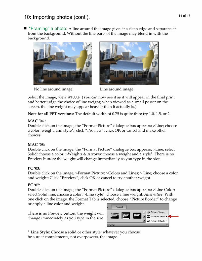
No line around image. Line around image.
11 of 17
“Framing” a photo: A line around the image gives it a clean edge and separates itfrom the background. Without the line parts of the image may blend in with thebackground.
10: Importing photos (cont’).
MAC ‘04 :Double click on the image; the “Format Picture” dialogue box appears; >Line; choosea color; weight, and style*; click “Preview”; click OK or cancel and make otherchoices.
MAC ‘08:Double click on the image; the “Format Picture” dialogue box appears; >Line; selectSolid; choose a color; >Weights & Arrows; choose a weight and a style*. There is noPreview button; the weight will change immediately as you type in the size.
PC ‘03:Double click on the image; >Format Picture; >Colors and Lines; > Line; choose a colorand weight; Click “Preview”; click OK or cancel to try another weight.
PC ‘07:Double click on the image; the “Format Picture” dialogue box appears; >Line Color;select Solid line; choose a color; >Line style*; choose a line weight. Alternative: Withone click on the image, the Format Tab is selected; choose “Picture Border” to changeor apply a line color and weight.
There is no Preview button; the weight willchange immediately as you type in the size.
* Line Style: Choose a solid or other style; whatever you choose,be sure it complements, not overpowers, the image.
Note for all PPT versions: The default width of 0.75 is quite thin; try 1.0, 1.5, or 2.
Select the image; view @100% (You can now see it as it will appear in the final printand better judge the choice of line weight; when viewed as a small poster on thescreen, the line weight may appear heavier than it actually is.)
12 of 17
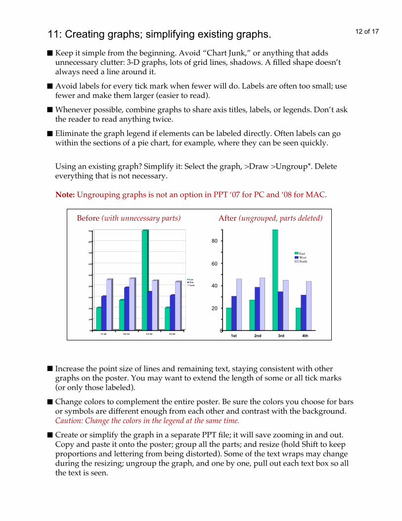
Using an existing graph? Simplify it: Select the graph, >Draw >Ungroup*. Deleteeverything that is not necessary.
Note: Ungrouping graphs is not an option in PPT ‘07 for PC and ‘08 for MAC.
11: Creating graphs; simplifying existing graphs.
Keep it simple from the beginning. Avoid “Chart Junk,” or anything that addsunnecessary clutter: 3-D graphs, lots of grid lines, shadows. A filled shape doesn’talways need a line around it.
Avoid labels for every tick mark when fewer will do. Labels are often too small; usefewer and make them larger (easier to read).
Whenever possible, combine graphs to share axis titles, labels, or legends. Don’t askthe reader to read anything twice.
Eliminate the graph legend if elements can be labeled directly. Often labels can gowithin the sections of a pie chart, for example, where they can be seen quickly.
Before (with unnecessary parts) After (ungrouped, parts deleted)
0
10
20
30
40
50
60
70
80
90
1st Qtr 2nd Qtr 3rd Qtr 4th Qtr
East
West
North
0
20
40
60
80
1st 2nd 3rd 4th
EastWestNorth
Increase the point size of lines and remaining text, staying consistent with othergraphs on the poster. You may want to extend the length of some or all tick marks(or only those labeled).
Change colors to complement the entire poster. Be sure the colors you choose for barsor symbols are different enough from each other and contrast with the background.Caution: Change the colors in the legend at the same time.
Create or simplify the graph in a separate PPT file; it will save zooming in and out.Copy and paste it onto the poster; group all the parts; and resize (hold Shift to keepproportions and lettering from being distorted). Some of the text wraps may changeduring the resizing; ungroup the graph, and one by one, pull out each text box so allthe text is seen.
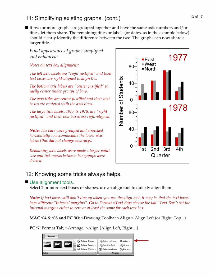
13 of 1711: Simplifying existing graphs. (cont.)If two or more graphs are grouped together and have the same axis numbers and/ortitles, let them share. The remaining titles or labels (or dates, as in the example below)should clearly identify the difference between the two. The graphs can now share alarger title.
Quarter1st 2nd 3rd 4th
EastWestNorth
0
40
80
0
40
80
Num
ber o
f Stu
dent
s
1977
1978
Final appearance of graphs simplifiedand enhanced:
Note: The bars were grouped and stretchedhorizontally to accommodate the lower axislabels (this did not change accuracy).
Remaining axis labels were made a larger pointsize and tick marks between bar groups weredeleted.
The left axis labels are “right justified” and theirtext boxes are right-aligned to align 0’s.
The bottom axis labels are “center justified” toeasily center under groups of bars.
The axis titles are center justified and their textboxes are centered with the axis lines.
The large title labels, 1977 & 1978, are “rightjustified” and their text boxes are right-aligned.
Notes on text box alignment:
12: Knowing some tricks always helps.Use alignment tools.Select 2 or more text boxes or shapes, use an align tool to quickly align them.
Note: If text boxes still don’t line up when you use the align tool, it may be that the text boxeshave different “Internal margins”. Go to Format >Text Box; choose the tab “Text Box”; set theinternal margins either to zero or at least the same for each text box.
MAC ‘04 & ‘08 and PC ‘03: >Drawing Toolbar >Align > Align Left (or Right, Top...).
PC ‘7: Format Tab; >Arrange; >Align (Align Left, Right…)

14 of 1712: Knowing some tricks always helps (cont’).
Duplicate anything.Select a text box, image, shape, or group of things; >Ctrl +D [PC] or Apple +D [MAC]to Duplicate. If it is a text box, you simply need to edit the text; the formatting is done!
Subtitle styles, such as “Conclusions” with a band of color behind the text, can bemade by building a template, duplicating it, and editing the text; this keeps the styleconsistent. Use the same style for all main categories on the poster.To make a template:
Need a wee nudge?Things attach themselves to an invisible grid and sometimes this is not where youwant them. To get just a wee nudge, hold Alt [PC] or Apple [MAC] as you click anddrag a guide, object, text box, or group and place it exactly where you want!
See your poster from a distance.View >Slide Show [F5 on a PC]; hit “Esc” key to exit. Do this often to see how theoverall design is working. Inconsistencies are often more apparent in this view.
Create a text box using the longest subtitle and the one with letters like “k,t”or “g,y”; this ensures that all titles will fit the template.
Create a rectangle or any shape; with it still selected:Give it a color and/or line; send it behind the text box.
MAC ‘04 & PC ‘03: >Draw >Order [PC] or Arrange [MAC] >Send to Back).MAC ‘08: Formatting Palette; > Size, Rotation, and Ordering; >Arrange;Send to Back.
Group the text box and colored shape; duplicate group; edit text.
Options for fills & lines are endless:
Future Happenings
Future Happenings
Past Events
Shape sent behind text box:
Shape and text box grouped:
Text edited, group stays intact:
Future Happenings

Customize your toolbox. Are there tools or commands you use often?Customizing the toolbars, having the tools in one place, can save time. Add the iconsor to any Toolbar.MAC ‘04 & ‘08 and PC ‘03: View; >Toolbars; >Customize; choose Drawing tools (tostart). Select “Commands”; choose an icon; and drag it to your toolbox. [Group,Ungroup, Bring to Front, Send to Back, Align Left (or Right, Top, and Bottom), andInsert Picture are especially useful.]
PC’07: The Quick Access Tool Bar, located over or under the ribbon along the top ofthe screen, provides a place for the tools you use often.
12: Knowing some tricks always helps (cont’).
Quick Access Tool Bar
1) Click the down arrow to access more commands.
5)The icon will appear in this listand in the Quick Access Bar.
4)Click
“Add”.
3)Select icon.
2)Select category.
6)Click OK.
Change the positionof the icons on the Barwith the up & down arrows.
To remove icons, select fromthe list on the right and clickthe “Remove” button.
Change the positionof Bar, above orbelow Ribbon.
15 of 17

13: Last but not least: The background.
MAC ‘04 & PC ‘03: Format; >Slide Background; Choose a style– Automatic (selectingone of the colors presented), More Colors (select from a variety of sources), or Filleffects (select either a Gradient, Texture, Pattern, or Picture).
MAC ‘08: Formatting Palette; >Slide Background; >Format Background; choose Solidselecting from Theme, Standard, or More Colors (choose from the Color Wheel, ApplePalette, Crayon Library, or RGB, Gray Scale, or CMYK sliders); or choose Gradient,Picture, or Texture.
PC ‘07: Design Tab; >Background; >Fill; choose Solid fill, Gradient fill, or Picture orTexture fill.
A Background Color.It should complement the poster content and images. Try different colors; you canchange them any time. Keep the contrast high between text and background so thattext is easy to read. Colors begin to tell a story as the viewer approaches your poster.(Pink may not be the best choice to tell a story about violence.) Vibrating colors mayforce an audience to walk away.
Every monitor and printer will interpret your color choices differently; check theprinter’s color charts (Hex Chart [PC] and Crayon Library & Apple Palette [MAC])to see how the printer interprets your choice. Ask for a draft print from the sameprinter and on the same paper as the final to be sure the colors are as you expect.
16 of 17
Pattern or Texture.This style can be very effective but use with caution; be sure that the text remainseasy to read (a colored shape may be needed behind text). Often the resolution of thetextures is not high enough for a quality print at large format poster sizes.
Whatever your choice of background–color, pattern ,texture, or picture–be sure that itdoes not overpower the poster content, make the images hard to see, or the text hardto read.
Consider other background styles:
Gradient.Note: Be sure the text color can be read in all areas of the gradient.
MAC ‘04 & PC ‘3: Format >Background >Fill Effects, choose Gradient; then style andcolors: one color (to darker or lighter) or two different colors.MAC ‘08: Formatting Palette; >Slide Background; >Format Background; >Gradient;>Style; begin with Linear (experiment with others).The bar shows a default colorblending to white; two “button” arrow sliders under the bar relate to the colors; movethe sliders to see the effect of the gradient; click “Add Color” to add another arrow;assign a color to the arrow in the “Color” field; click “Remove Color” to delete thearrow.
Note: Experiment with transparent color under the text so the photo will still be visible.Ask for a draft print to be sure the transparency looks OK; some transparencies appearlike millions of dots when printed, even though they look fine on screen. The dots cancompete with text and make it hard to read.
13: Last but not least: The background.
A Background Template.Like “clip art”, it can be treated like a recipe, not a prescription! Select it; >ViewMaster; select the “template”; Ungroup; and delete or alter any part that does notsupport your story.
A Photograph.It can be great, but it must be high enough resolution to look good when printed; atleast 100dpi at the final size. Ask your printer what is required. Place the photo on theslide master to avoid selecting and moving it by mistake.
Be sure text placed on top of the photo is easy to read. If light text is over a light areain the photo, you may want to put a shape with a dark fill behind the text (or light fillfor dark text on a dark photo).
17 of 17
Prepared by: S. Palmer, Instructional Development Center,CIS Academic Technology, UNH, Durham NH.
http://cis.unh.edu/idc/posters(6/ 2008) Visit our website for the latest version.
Have patience, keep it simple, save often.Remember: If it doesn’t help tell your story, don’t use it.
http://cis.unh.edu/idc/posters