case study music_magazine
TRANSCRIPT
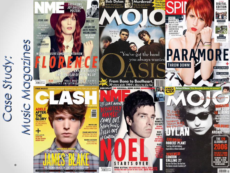
Ca
se S
tud
y:
Ca
se S
tud
y:
Mu
sic M
ag
azi
ne
sM
usic
Ma
ga
zin
es
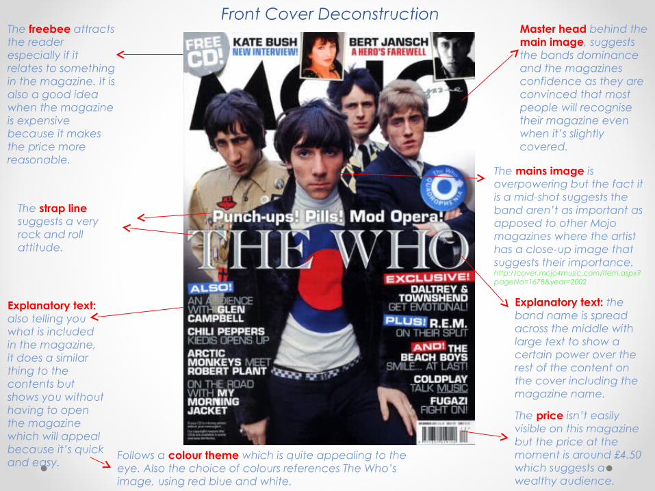
Master head behind the main image, suggests the bands dominance and the magazines confidence as they are convinced that most people will recognise their magazine even when it’s slightly covered.
Explanatory text: the band name is spread across the middle with large text to show a certain power over the rest of the content on the cover including the magazine name.
The strap line suggests a very rock and roll attitude.
The freebee attracts the reader especially if it relates to something in the magazine. It is also a good idea when the magazine is expensive because it makes the price more reasonable.
Explanatory text: also telling you what is included in the magazine, it does a similar thing to the contents but shows you without having to open the magazine which will appeal because it’s quick and easy.
Follows a colour theme which is quite appealing to the eye. Also the choice of colours references The Who’s image, using red blue and white.
The price isn’t easily visible on this magazine but the price at the moment is around £4.50 which suggests a wealthy audience.
The mains image is overpowering but the fact it is a mid-shot suggests the band aren’t as important as apposed to other Mojo magazines where the artist has a close-up image that suggests their importance.http://cover.mojo4music.com/Item.aspx?pageNo=1678&year=2002
Front Cover Deconstruction
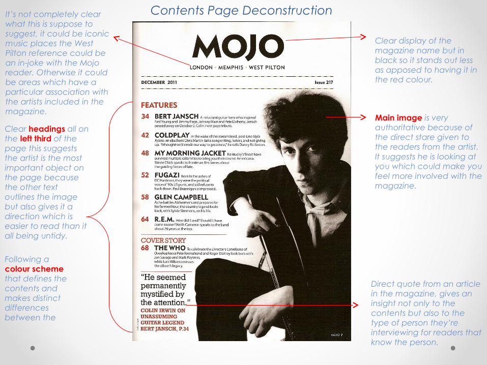
Clear headings all on the left third of the page this suggests the artist is the most important object on the page because the other text outlines the image but also gives it a direction which is easier to read than it all being untidy.
Following a colour scheme that defines the contents and makes distinct differences between the
Main image is very authoritative because of the direct stare given to the readers from the artist. It suggests he is looking at you which could make you feel more involved with the magazine.
Direct quote from an article in the magazine, gives an insight not only to the contents but also to the type of person they’re interviewing for readers that know the person.
Clear display of the magazine name but in black so it stands out less as apposed to having it in the red colour.
It’s not completely clear what this is suppose to suggest, it could be iconic music places the West Pilton reference could be an in-joke with the Mojo reader. Otherwise it could be areas which have a particular association with the artists included in the magazine.
Contents Page Deconstruction

Target Audience/Sales Target Audience/Sales FiguresFigures
Sales Figures:I think NME has larger sales figures
due to it’s popular and familiar title and it’s age. -It sold around 200,000 issues per week but I think there has been a decrease since magazines have become less popular, although the website has over 7million users per month.
Mojo doesn’t quite reach the exact readers as NME but it is also quite a regularly sold music magazine.
Target Audience:Both Mojo and NME I think
have very similar audience styles. Both appeal to quite young audience, NME possibly has more variety in age but apart from that they both include quite a large mixture of different music styles which suggests that they appeal to quite a wide range of music readers.

InstitutionsInstitutionsWho owns the magazine? Mike Williams
was named the NME editor in 2012, taking over from Krissi Murison. The website is edited by Luke Lewis.
Background information on the company:
• Was originally a music news paper published in 1952-1980’s.
• NME.COM was launched in 1996. It is now the world's biggest standalone music site, with over 7 million users per month.
• In 2002 NME started making themed copies reprinting vintage articles, interviews and reviews. They called them ‘NME Originals’.-These included artists like ‘The Beatles’, ‘Radiohead’, ‘The Rolling Stones’ etc.http://www.nme.com/originals
• NME has it’s own award ceremony-NME Award-whereby they celebrate the best music of the past year.

Colour s scheme highlights the more important sections of the article. Also makes the article more appealing to the eye of the reader.
Design/Layout AnalysisDesign/Layout AnalysisReader Interesting and controversial image of the band that appeals to the magazines younger audience.
Advertising the magazines website. Creating more beneficial profits for the company.
Reader Quick information on the band for the readers which usually engages them which makes them want to read more. -Also the format is very stylised.
Small informative side articles on other bands or music that their demographic might be interested
in.

Type of Type of Articles/FeaturesArticles/Features
Both magazines have very similar styles, therefore, their articles contents are quite similar. Their main articles are often interviewing a specific artist or band, about upcoming music events or an interesting personal opinion on something music like.
This is appealing to their audience because it is what they want to hear about when they buy the magazine, it doesn’t waste space talking about something their readers aren’t going to be interested in.
That is why these magazines are well sold because they don’t mess around with the information, they directly target their intentions of the magazine.

‘‘Tone’ of MojoTone’ of Mojo• Mojo appeals to quite a varied audience, but at
the same time it can also be quite a niche group. This is mainly dependant on the artist or band displayed on the cover of the magazine. Although if it was only to be chosen by the readers due to the ‘tone’ of the magazine I would presume that it has a large varied audience. This is because the tone is generally quite simple for a younger lower class and middle class audience as apposed to a piece of text that has intellectual language.

‘‘Tone’ of NMETone’ of NME• NME has a similar tone to ‘Mojo’ but I think it could
have slightly more intelligent language but nothing drastically different because they are generally quite alike. I do think NME has a more rocky or grungy style as apposed to some other magazines. Again it does include a young audience due to it’s youthful banter, but also appeals to some older audiences, I think, through it’s sophisticated layout and vintage resources.

AdvertsAdvertsWhat brands do we see?Mojo: The adverts we see in Mojo are often about music, they
advertise CD’s and music stores probably that they think their readers might be interested in. A particular music shop they advertise is HMV which is very varied in it’s music choices, which appeals to a wider audience, meaning they can’t really go wrong.
NME: The adverts in NME also display CD’s and music shops but because I think it’s got a slightly older audience it also advertises venues and events which is very appealing to the readers because they get additional information that benefits themselves.
WebsiteWebsiteMojo:http://www.mojo4music.com/blog/ The fact that it has to suggest what the website is
about in the link ‘4music’ implies a lack of confidence in the familiarity of the magazine. The website is quite technical and still follows the theme of the magazine so it’s regular to
their readers. But I think it does display too much text on the front page and look better appearance wise. Also it does advertise it’s own magazine quite frequently which again suggests it’s lack of assurance in itself, but that can be seen as a strength because it is advertising it’s magazine more which will get the company more publicity.
NME:http://www.nme.com/ This reveals the websites assurance in itself because it only
includes the magazine name and no following information. It’s also a lot quicker and easier for readers to get to, it’s not difficult to find on the internet.
This website is also very clearly by NME as it follows their magazine theme. I think it’s slightly better in comparison to the ‘Mojo’ website because it’s more appealing to the eye, it has less writing on the front page and more pictures which is probably what their readers want to see first as apposed to be instantly confronted with too much text. The fact that NME don’t include so much advertising gives it a slick effect because it doesn’t feel the need to do so.