chapter 1 › images › db › pdf › 0782141781... · 2020-03-15 · chapter 1 essentials of...
TRANSCRIPT

Chapter 1
Essentials of Images and Image Editing
There are really only a few things that can be done with an image, and they all revolve
around changing content. To do so, you choose tools and work with tone, color, and compo-
sition. That’s it. If your process covers color correction, composition changes, and tool selec-
tion, you are doing what you should for every image. Following a process and understanding
the possibilities gives you a solid foundation to work from. Although the process for each
image may be very different, you can use the same set of steps just about every time. The
purpose of this chapter is to outline the process for you, and get you set up as you should be.
With this foundation, we can then jump into making your images better.
The Image Editing Process
The Tools You’ll Need
Basic Concepts of Tone, Contrast, and Color
Understanding and Using Color Management
Resolution
Know Your Equipment
Know Your Images
4178c01.qxd 11/20/02 12:48 AM Page 3
COPYRIG
HTED M
ATERIAL

The Image Editing ProcessWhen you go on a vacation, it is often a good idea to make a checklist to help you remember
everything you have to do before you go and everything you want to bring along. If you are a
seasoned traveler, you can probably do most of your packing and planning without a list. If
you are visiting somewhere you’ve never been before, you might ask someone who’s been
there what to bring.
When approaching image correction, a checklist can help you ensure that you’ve covered all
the essentials. The list should cover everything you will have to do to an image, and you’ll want
to do the steps in a particular order until you develop your own preferences and methods.
The following list consists of a procedure I have developed over many years of working
with digital images, and it covers all the things you really need to do. For some images you’ll
skip a step, and for others you might spend hours indulging one step or another. During the
process of correction, you will generally want to work from global changes down to smaller
and more specific changes. The steps come in three parts:
Preparation Be sure your system and program setup are correct and that you know what
you want to do with the image.
Correction Take specific steps to achieve the goal of the image.
Purposing Finalize the image to target it to specific output.
The following sections describe the basic processes of image editing starting with a cor-
rections checklist. However, the most important information you will need cannot be provided
by any book; you must know your equipment, and know your images. The final two sections
of the chapter show you how to control your own individual circumstances to make your
image editing a success.
Image Correction ChecklistEach set of steps in the image editing process is outlined in the following checklist, and this
checklist will be the basis for discussion in the rest of the book. Consider this checklist your
plan, and consider me your tour guide.
Preparation
1. Store the original image file safely and work with a copy to do all of your image editing.
If any step goes awry, you will want to be able to return to the original image to start
over, or you may want to repurpose the original in the future.
2. Be sure that your monitor is calibrated and that you have set up your preferences and
tested your output. Doing so ensures your best chance of getting the results you intend.
(See “Calibrating Your Monitor and Building an ICC Profile,” later in this chapter.)
4 ■ C H A P T E R 1: ES S E N T I A L S O F IM A G E S A N D IM A G E ED I T I N G
4178c01.qxd 11/20/02 12:48 AM Page 4

3. Consider resolution and color. Have in mind a target range for the resolution and a color
mode for the final image. You may work at different resolutions and in different color
modes throughout, but knowing what you need from the outset can help you work
smarter, with fewer color conversions (which you generally want to try to avoid). See
“Types of Color” and “What Image Resolution to Use”, later in this chapter.
4. Evaluate the image. This analysis can include looking at color and tone, determining the
image type (high-key, low-key, high contrast), evaluating the extent of work to be done,
and considering the composition. The result of the evaluation should be a short list of
things you want to improve or change. See “Evaluating Image Tones” in Chapter 3.
Correction
5. Make general color and tonal corrections. Be sure to make a good general correction
at this point, but don’t spend a lot of time getting it exact. A good general correction
will point out some flaws that may otherwise lurk in the image until later in the process.
While it isn’t bad to double back during the process, it can take your concentration away
from progressing through. Overall, doubling back may unnecessarily increase the amount
of time you spend on images. See “ Redistributing Tone with Levels” and “ Snapping and
Fading Contrast with Curves” in Chapter 3 and “Levels Correction for Color” and
“Curves Correction for Color” in Chapter 4.
6. Make any necessary general damage corrections, such as eliminating dust from scans,
fixing cracks and holes in scanned images, and reducing digital noise. See “Do Minor
Cleanup First” in Chapter 3 and “Minor Cleanup for Color Images” in Chapter 4.
7. Make more involved color correction. This means do more intensive tonal and color
adjustments, but not spot adjustments (using selection). Those corrections will come
later. See “Snapping and Fading Contrast with Curves” in Chapter 3 and “Curves Cor-
rection for Color” in Chapter 4.
8. Crop and size the image so that you are working with only the image area you really
need. See “Cropping as a Tool for Composition” in Chapter 6.
9. Make major specific compositional changes and corrections, including replacing parts of
the image with replacement parts you have created. This is the final compositional
change. See Chapter 6 and 7.
10. Make targeted color and tonal correction to selected parts of the image. This is really
using techniques you’ve learned throughout to select and mask changes to specific areas
of an image. You’ll revisit techniques from all chapters 1 through 7 to finish this step.
Chapter 5 might hold the most to mine in this step.
T H E I M A G E E D I T I N G P R O C E S S ■ 5
4178c01.qxd 11/20/02 12:48 AM Page 5

11. Make final fine-tuning adjustments to sharpening, contrast, and brightness.
12. Save the layered RGB version of the image. Be sure to give the file a new name, so you
do not replace the original.
Purposing
13. Simplify the image as appropriate. This process may include flattening the image or
merging layers, altering the color mode, or removing extraneous image information.
14. Make final color and tonal adjustments to optimize the image for output and use. This
process can include such changes as setting white and black points and making device-
specific color changes.
15. Save the image in output file format.
16. Package the image for output and use.
This checklist may seem involved, but some things you will do naturally and others
take just a moment. Practicing correction by following the steps in the list can ensure that
nothing gets left behind in making adjustments and corrections and achieving what you
intended to do with the image. The tools to use in each of these steps are discussed in the
next section.
The Tools You’ll NeedIn each step of the image editing process, you can usually use a small subset of tools to
accomplish your goals. Having these smaller sets in mind will streamline your image process-
ing and keep you on target.
The tool sets listed in Table 1.1 are based on the steps described in the preceding section.
These tools are mostly standard ones you already have in Photoshop Elements, along with
some of the add-ins you will find on this book’s companion CD. These “Hidden Power Tools”
can simplify processes or add new functionality to Photoshop Elements.
You may occasionally reach outside these suggested tool sets for a special purpose, but
this listing offers a general guideline to simplifying the tools needed to get excellent and
consistent results. The choices are based not on which tool is easiest to use, but on which
will get the best results.
Don’t delete or merge shape layers that may be important to your output.
6 ■ C H A P T E R 1: ES S E N T I A L S O F IM A G E S A N D IM A G E ED I T I N G
4178c01.qxd 11/20/02 12:48 AM Page 6

P R O C E S S S T E P T O O L S U S E T H I S T O O L T O D O W H A T ? L O C A T I O N
1: Store the original image Save As File ➔ Save As
2: Calibrate the monitor Adobe Gamma Your computer’s ControlPanel, or the PhotoshopElements CD
New File ➔ New
Image Size Image ➔ Resize ➔Image Size
Mode Image ➔ Mode submenu
4: Evaluate the image Eyedropper Eyedropper tool in thetoolbox
Info palette Display sampled readouts. Window ➔ Info
Histograms Image ➔ Histograms
Levels Enhance ➔ Adjust Brightness/Contrast ➔Levels
Hidden Power Tools
Clone Stamp Clone Stamp tool in thetoolbox
Masking Customize selections using masking Hidden Power Tools
Copy Edit ➔ Copy
Paste Edit ➔ Paste
Hidden Power Tools
Curves Hidden Power Tools
Hue/Saturation Layer ➔ New Adjustment Layer ➔ Hue Saturation
Color Balance Hidden Power Tools
8: Crop and size the image Crop tool Crop tool in the toolbox
Polygonal Lasso tool in thetoolbox
Masking Hidden Power Tools
Copy Edit ➔ Copy
Paste Edit ➔ Paste
Continues
Paste a copied area from the clip-board into a new layer.
Copy a selected image area to theclipboard.
Customize the transparency ofreplacement parts and grayscalecontrol of selection.
Select regular and irregularly shapedimage objects.
Marquee andPolygonal Lasso
9: Make specific compo-sitional changes
Change the image size by cropping outor adding extra canvas area.
Adjust color by balancing the influenceof color opposites.
Adjust color by altering hue, increasing/decreasing saturation and effecting gen-eral lightness and darkness using slidercontrols.
Adjust tone and contrast with sophisti-cated, multi-reference point corrections.
Split color into tonal components tosimplify and target adjustments.
Separations(Luminosity/Color and RGB)
7: Make advanced colorcorrections
Paste a copied area from the clipboardinto a new layer.
Copy the selected image area to theclipboard.
Make brush-style corrections via sampling of other image areas.
6: Make general damagecorrections
Reduce color noise associated withdigital capture
Reduce ColorNoise
Adjust tonal levels using simple slidersto effect tonal dynamic range.
5: Make general color andtonal corrections
View a chart and statistics showingtonal mapping of the image.
Sample to check color and tone valuesin specific image areas.
Change the image color mode of anopen image.
Change the size and resolution of anopen image.
Set the color, size, and resolution touse for new images.
3: Specify resolution andcolor settings
Do free, easy monitor calibration andICC profile generation in one process.
Save your image with a specific nameand location.
Table 1.1
Tool Sets
T H E T O O L S Y O U’L L N E E D ■ 7
4178c01.qxd 11/20/02 12:48 AM Page 7

Continued
P R O C E S S S T E P T O O L S U S E T H I S T O O L T O D O W H A T ? L O C A T I O N
Transform Reshape a pasted object. Image ➔ Transformsubmenu
Guides Place non-printing edges for alignment. Hidden Power Tools
Add Noise Filter ➔ Noise ➔ Add Noise
Gaussian Blur Filter ➔ Blur ➔ Gaussian Blur
History Brush Hidden Power Tools
Gradient Map Layer ➔ New Adjustment Layer ➔ Gradient Map
Blend Mask Hidden Power Tools
Unsharp Masking Filter ➔ Sharpen ➔Unsharp Mask
12: Save the image Save As Save with a new filename. File ➔ Save As
13: Simplify as appropriate Merge Layers ➔ Merge Linked, Layers ➔ Merge Visible, Layers ➔ Merge Down
Flatten Layers ➔ Flatten Image
Type To Paths Hidden Power Tools
Mode Convert to final color space. Image ➔ Mode submenu
Levels Adjust tone. Enhance ➔ Adjust Brightness/Contrast ➔Levels
Blend Mask Adjust white point. Hidden Power Tools
Create separations for print ready files. Hidden Power Tools
15: Save in output file format Save As Save with a new filename. File ➔ Save As
Save For Web File ➔ Save For Web
DCS Templates Hidden Power Tools
These tools will all be explored in this book as part of the exercises in making image cor-
rections. This listing cuts out many tools, most of which provide redundant (and sometimes
inferior) means of completing tasks. If you follow the methods described here you will find
that tools other than those on this list are seldom necessary. Several other minor tools (not
specifically mentioned) may sneak in at points during the exercises, but are mostly covered
in the categories in the list.
Use custom files to allow unsupportedcolor modes (CMYK and spot color).
Save Web images with limited colorand transparency.
Separations(CMYK andDuotone)
14: Optimize the image forfinal output and use
Globalize type by converting tovector layers.
Remove extra layers and image con-tent when there are no vector layersto preserve.
Remove extra layers and image contentwhen there are vector layers to preserve.
Work with both local and fine contrast inthe image to improve edge definitionand contrast in color and tone.
11: Make final fine-tuningadjustments
Influence specific tones and colors usingtone and color measurement.
Influence specific tones and colors usinggradients.
Paint in adjustments from filtered results,such as to target Dodge and Burn.
10: Make targeted colorand tonal corrections
Smooth out tones that are unnaturallyrough.
Roughen up tones that are unnaturallysmooth.
9: Make specific compo-sitional changes
Table 1.1
Tool Sets
8 ■ C H A P T E R 1: ES S E N T I A L S O F IM A G E S A N D IM A G E ED I T I N G
4178c01.qxd 11/20/02 12:48 AM Page 8

One tool that does not fit into any category, but is very useful, is the History palette,
shown in Figure 1.1. When doing serious correction and experimentation, it should become a
good friend. When you have taken several steps that have not accomplished what you hoped,
or you want to compare before and after changes, a single click on the History palette can
step you back to an earlier point in the development of the image so you don’t have to start
all over again. It’s a real timesaver and a helpful tool.
Basic Concepts of Tone, Contrast, and ColorWithout light, there would be no images. Light is what shapes the subject of images. It strikes
an object that you are photographing, reflects back through the camera lens, and creates the
exposure for the image. It also helps shape the object, because shadows and highlights reveal
object contour. The subtle interplay of tones and contrast gives shape to objects and defines
the subject of an image.
Tonal range is the difference between the lightest and darkest image areas. The greater
the difference is between the lightest and darkest areas of an image, the greater the tonal
range. The way light and dark tones play against one another is contrast. The more stark the
difference is between light and dark image areas, the greater the contrast. If tonal range and
contrast are not balanced correctly, an image will appear too light, too dark, too flat, or too
harsh and contrasty, as illustrated in Figure 1.2.
Creating a dynamic image starts with making the most of the tonal range that exists in the
image. Contrast (or lack of contrast) between tones within that range helps further define
image character. Not every image will have high contrast and a broad tonal range. Some
images may be naturally high-key (light, usually with moderate to low contrast), low-key
(dark, usually with moderate to low contrast), or simply low contrast. The goal of correction
is to maintain the natural character of an image while adjusting tone and contrast to enhance
and improve dynamics. If there are 255 possible grays for your image, and you only use 100
of those, the image is really only 40% as dynamic as it
might be. If you adjust the tonal range, the image will
become more visually dynamic; if you adjust with care, you
won’t lose the natural quality of the image.
Both tone and contrast work in almost the same way
when dealing with color or black-and-white images: You
want to make the most of tonal range and dynamics while
maintaining image character. The difference is, when you
extend the tonal range in a black-and-white image, you get
more potential grays; when you make similar adjustments
in color images, you get more colors.
B A S I C C O N C E P T S O F T O N E, C O N T R A S T, A N D C O L O R ■ 9
Click a step to undo actions after this point.
Undone
Figure 1.1
The History palette acts
like a multiple Undo. Just
click a previous state, and
the image reverts to the
way it looked then.
4178c01.qxd 11/20/02 12:48 AM Page 9

Color as ToneColor is a pretty simple thing to manage if you’re only picking out clothes, drapes, or uphol-
stery. In those cases it is already mixed and applied for you. If you don’t have experience
with color mixing, it isn’t until the first time you actually try to correct the color of an image
that the complexity of color comes alive. If you’ve never had any training in art and color the-
ory, understanding how color works can be a little confusing. Add to that the fact that there
are different color modes (theoretical ways of defining color) and color gets still more com-
plex. However complex, you have to understand color to apply it and achieve the results you
want in your images. Because color can be split into simple grayscale components, it is
important to understand how grayscale (tone and contrast) can also define color.
For the most part, images that you will work with in color will be in RGB mode. RGB
stands for red, green, and blue. It is an additive light-based color theory, where different
Too light
Too harsh Balanced
Too dark Too flat
Figure 1.2
One image can look
many different ways,
but the best way usu-
ally uses full range and
flattering contrast.
10 ■ C H A P T E R 1: ES S E N T I A L S O F IM A G E S A N D IM A G E ED I T I N G
4178c01.qxd 11/20/02 12:48 AM Page 10

combinations and intensities of red, green, and blue lights combine to make up the set of
available colors. As the red, green, or blue lights are made brighter and applied with more
intensity, the resulting color gets brighter, and colors mix in these varying intensities to form
other colors. It is a theory that works great with projection, like on your monitor and some
projection TVs and the like. Breaking images into their component RGB colors is how your
monitor displays color.
Each color you see in an image is made up of these three colors in different combinations.
Each of the three colors has just 256 different intensities, which are stored as grayscale informa-
tion in your image files. Light coming into a camera or sensed by a scanner is actually broken
into these three components and stored so the information can be reassembled to reproduce the
RGB image on your computer. The theory and practice have been around for quite a while.
One of the earliest photographers to create color
images did it in Russia in the early 1900s. Sergei
Mikhailovich Prokudin-Gorskii (1863–1944) made
glass plates three at a time when he took pictures
with a specially designed camera, filtering for the
red, green, and blue components of light to record
the strength (tone) of each component on what was
essentially grayscale film. The plates would record
the captured light as grayscale, and then using a spe-
cial projector, Prokudin-Gorskii would project the
images simultaneously with red, green, and blue
filters to reproduce the color images on a screen.
Figure 1.3 shows one of Prokudin-Gorskii’s images;
a composited version of this image is also presented
in this book’s color section. (These plates are from
the collection at the U.S. Library of Congress, which
can be accessed at http://lcweb2.loc.gov/pp/
prokquery.html.)
Inside each of your RGB images are the primary
source colors: red, green, and blue. These source col-
ors are stored as grayscale representations and map-
pings of the intensity of red, green, and blue light in
every pixel in your image. When you work on color
images, the changes that you make affect all three of
the source colors at the same time.
B A S I C C O N C E P T S O F T O N E, C O N T R A S T, A N D C O L O R ■ 11
Red
Blue Composite
Green
Figure 1.3
This image by Prokudin-
Gorskii, titled Man in
Uniform, Seated on
Chair, Outside, was
taken around 1910 by
separating color into
grayscale RGB plates.
Scans of the glass plates
can be composited to
achieve a full-color
result (as shown in this
book’s color section).
4178c01.qxd 11/20/02 12:48 AM Page 11

Breaking down color information into separations may not always be to your advantage when
making corrections. However, the grayscale color components can be separated out of your
images, as Prokudin-Gorskii did in creating his plates, by filtering. When they are separate, they
can be adjusted one at a time. This can help when correcting color-specific defects, in simplifying
an approach to images and corrections, in developing a better understanding of what happens when
you apply a tool to color images, and in doing the most complex color alterations and corrections.
Types of ColorColor in your images can be measured in several different ways. In Photoshop Elements,
these are color modes, which are really just different ways of depicting color and tone. The
four modes you can use are Bitmap, Grayscale, Indexed Color, and RGB. Image color mode
and file type are two very different things. Knowing which color modes appear in which file
types (and which file types to use with a certain color mode) is often essential.
For the most part, people using Photoshop Elements will be working with color images in
RGB mode. This mode offers the broadest flexibility for color and tone, and will be the mode
most images will originate in (from a camera or by scanning). There are 16 million potential
colors in RGB, based on 256 possible tonal variations in each of the three primary colors (256
× 256 × 256 = 16,777,216 possible variations). That’s one big box of Crayolas! In fact, it is by
far the largest color set of any of the color modes you will be working with in Elements. A
larger number of colors allows changes that you make to images to blend more evenly.
Generally you will work in RGB for the best access to tools and the most predictable
behavior of images. When the image is complete (e.g., all changes you are going to make
have been made), then you can consider converting the RGB image to other modes as
required for your final purpose. You can save RGB files in many formats, but you will proba-
bly most often use TIFF (print), Photoshop (archive), JPEG (Web), and PDF (portability).
Indexed Color is a much more limited color mode than RGB and is almost always associ-
ated with GIF Web images. This color set has a maximum of 256 colors. The colors are cre-
ated as a table using hex values: six-character codes that represent specific colors (see the
hex code chart in the Hidden Power tables in the Appendix). The colors cannot be mixed,
and must be one or another of the colors in the table. The goal of limiting colors, especially in
the case of Web images, is to simplify files and make them smaller. In the case of Web images,
this helps transfer them more quickly.
The full version of Photoshop has a palette called Channels, which is another palette like Lay-
ers that allows you to get into colors and manipulate them separately (in RGB as well as other
color modes). This can be a great tool in making complex color corrections. Although Photo-
shop Elements doesn’t have a Channels palette, this book will show you how to access and
alter channel information easily, just as if you had a Channels palette working for you.
12 ■ C H A P T E R 1: ES S E N T I A L S O F IM A G E S A N D IM A G E ED I T I N G
4178c01.qxd 11/20/02 12:48 AM Page 12

Without any experience in converting to Indexed Color from RGB, it may be obvious that
converting all of your 16 million potential colors from RGB into a measly set of 256 colors for
Indexed Color may not always produce the best results. In converting to Indexed Color from
RGB, almost all of your original color will have to change. Of course, the results can be disas-
trous to a full-color image. However, there are color tricks (such as dithering) that can make
color sets appear larger than they really are. Because color is applied rather than mixed,
Indexed Color is a difficult color mode to work in. This color mode will almost always be a
last step conversion, and almost always will be done in converting images for display on the
Web (when JPEG is not used). They are almost always saved in GIF format.
Grayscale (Figure 1.4) is also limited, but to no color at all. This “color” mode has 256 lev-
els of gray tones that make up all you see in standard black-and-white images, or when work-
ing with individual color channels (such as those from RGB images). Generally you should
convert images to grayscale when you are printing images without color, so that you can get
the best depiction of tone (without depending on the color device to convert color for you).
Taking the color out of an image can be simple, but it can also be considered an art, because
what looks good in color may not look good at all in a straight conversion to black-and-white.
Grayscale images are most often used in black-and-white print jobs.
Bitmap images are like grayscale, but are more strictly formed in black-and-white. There
are no grays in a bitmap image: pixels are either white (off) or black (on), as illustrated in
Figure 1.5. For the most part, bitmap images are used with line art (pen-and-ink type line
drawings). This will probably be the least used color mode of those available. If used, you will
probably save in TIFF or BMP formats.
b
c
a
Figure 1.4
Grayscale gradients
showing white to black
gradients in (a) 10 steps
(10% darker in each),
(b) 25 steps (10 levels
darker in each) and
(c) 255 steps (every
level of gray).
These bitmap images are different from the color bitmaps that used in screen shots and
other images on a PC.
B A S I C C O N C E P T S O F T O N E, C O N T R A S T, A N D C O L O R ■ 13
4178c01.qxd 11/20/02 12:48 AM Page 13

CMYK color mode is not really available to Elements users. It is how color is most often
depicted in print. The theory is similar to RGB in that a limited set of colors (cyan, magenta,
yellow, and black) are used as inks to create visible color. CMYK at the same time is percep-
tually the opposite of RGB. While RGB is based on additive color (the more you add, the
brighter it gets), CMYK is subtractive (the more ink you add, the darker it gets, because the
light striking the color is absorbed). Figure 1.6 shows how two ink halftones combine for a
darker result.
Conversion from RGB to CMYK is often a disappointing one, because CMYK can actually
portray fewer colors even though there is one more color in the set. The reason for this is
probably easiest to understand by simply looking at efficiency. While light is pretty much
100% efficient when projected, the absorption of light by ink pigments is not. Because pig-
ments do not provide perfect light absorption, the color they reflect is not a perfect conver-
sion. Black was added to the CMY color set as an attempt to increase the efficiency of
absorption. As an additive, it really produces only redundant color (color that should have
been reproducible in a 100% efficient CMY pigment set).
Figure 1.5
The magnification of a
portion of the original
bitmap image reveals
the bitmap patterning.
14 ■ C H A P T E R 1: ES S E N T I A L S O F IM A G E S A N D IM A G E ED I T I N G
4178c01.qxd 11/20/02 12:48 AM Page 14

There is a supposition that you cannot work with CMYK images in Elements, but this
is not entirely true. While the program is not set up to handle CMYK directly, an indirect
approach can allow users to make custom CMYK separations and usable CMYK images which
may improve printed output. The file format used with CMYK is often TIFF, PDF, or Photo-
shop EPS. Regretfully none of these will work, directly. However, users can essentially hijack
another file format (DCS: Desktop Color Separation) that will allow saving and manipulating
files as CMYK.
Understanding and Using Color ManagementA buzz phrase in image correction is color management. If you are not familiar with this
term, or if you have heard of it and are embarrassed that you don’t know quite what it is,
this section will cover all you really need to know. While it is something you should take
seriously, it does not have to be as complex or mysterious as it tends to be. This brief dis-
cussion will help you get familiar with it, poke it with a stick, and see that it is dangerous if
completely ignored. We’ll look at your options, get you set up, and get on with the main
course of editing images as we pass color management by with a better understanding and
a knowing grin.
Some users wonder—and even worry—about using 16-bit mode for image editing. 16-bit
images offer more color detail: where 8-bit can reproduce “only” 16 million colors per pixel,
16-bit can reproduce about 281 trillion. While this difference between 16-bit and 8-bit may be
significant for archival purposes, for most cases in the real world, it should not make a notice-
able difference in your images. Most output devices can’t handle the additional image infor-
mation, and it is questionable whether technology will meet the 16-bit challenge in the near
future, or if human perception can really distinguish between the results. Elements does not
support using 16-bit color. The only real gain you would have is in temporarily extending the
usable color space for your images while you work on them.
+ =
Figure 1.6
Samples of black
(45°, left image) and
cyan (108°, middle
image) halftone dots
as grayscale. When
the halftone dots are
printed over one
another (right), colors
combine to absorb
more light.
U N D E R S T A N D I N G A N D U S I N G C O L O R M A N A G E M E N T ■ 15
4178c01.qxd 11/20/02 12:48 AM Page 15

Color management is supposed to be a means of helping you get better color consistently.
By using color management you can have a better chance of your images looking the same
from a variety of outputs (print and display). Color management uses a profile that describes
how your display handles color to help translate what you see to other devices and how they
handle color (via a common color palette and profiles of those other devices). The profile
from your monitor can be embedded (saved) with your image file to act as the color inter-
preter for other devices (monitors and printers).
Every device has its own profile, which acts as the interpreter on its end, essentially so
the devices can speak the same color language and adjust for differences. The key to full
color management is that every device has to have a profile to be able to interpret other pro-
files, so the translation will work reliably. The embedded profile will affect images behind the
scenes, both to help represent color correctly on screen and to serve as a translator to other
devices. In theory, that results in a better image. All this automatic translation sounds very
appealing, like I’m serving the chocolate cake first.
This is all nice in theory, but the sad fact is, it doesn’t necessarily work in practice. There
are a lot of points in image processing where detours or errors can occur. Your profile can
get dropped, changed, or ignored, or it can just plain be wrong. Profiling can occur where
you don’t expect it, and other profiles can be wrong, causing information in your image to be
misinterpreted. Any of these can cause unexpected results.
First, you are responsible for building yourself a color profile. You have to set up the
profile correctly, and there is no guarantee that you will (even if you follow instructions).
Second, every step between saving your image and sending it to the printer has to both
respect the color management and process it correctly. This is where the chocolate cake
turns to mud pie.
While profiling was planned to function behind the scenes and stay with your image, you
can’t be sure that the results you get are based on the choices you have made to embed your
monitor profile in the image. You also can’t be sure that you really want the process to respect
your profile (if it is not correct). Embedding a profile doesn’t work consistently because it
can’t be enforced: even if you embed a profile, some device or person along the way can drop
your settings. There are devices that don’t recognize color management settings; there are
services that don’t use them in processing. If your results depend on the color management
and the wrong color profile is embedded or the profile is missing, you are just as likely—or
more likely—to get a bad result than you are without embedding color profiles.
Your only chance for guaranteed success using embedded color profiles is to make a
study of how the profiles work, and become intimately knowledgeable about the output
types and processes you use. Reading your printer manual is not necessarily intimate knowl-
edge, it goes somewhat deeper than that.
16 ■ C H A P T E R 1: ES S E N T I A L S O F IM A G E S A N D IM A G E ED I T I N G
4178c01.qxd 11/20/02 12:48 AM Page 16

Even with this additional effort, using color management and embedding profiles requires
testing. Funny thing is, you have another choice: not embedding profiles. Not embedding pro-
files also requires testing, but it removes the potential complexity of using embedded profiles.
In the long run, if you set your system up correctly by calibrating your monitor and creating
an ICC profile (which you should do even if you are not embedding profiles in your images),
not embedding profiles can actually be more predictable. I find embedding profiles to be an
extra half-step that can just as likely trip you up as ease your progress up the stairs—depending
on how much you are paying attention. My experience is that you are more likely to trip over
that half-step and swear at it than praise it.
None of this is to say that you can’t embed profiles with success! You can, and if you do
currently, don’t change what you do. My perspective on using or not using profiles is a lot
like my perspective on images: don’t change what works, change what doesn’t. If you cur-
rently use embedded profiles and everything works fine, stay with it. If you don’t, or you
have never looked at them, or you don’t understand what they are and how to use them,
practice color management with the following fast, safe, and effective system:
1. Calibrate your monitor and create a profile (we’ll do this in a moment).
2. Don’t embed profiles.
To be reasonably successful with color management, all the Photoshop Elements user
needs to do is to calibrate, create a monitor profile (which Elements uses for image viewing),
and choose how to handle profiles by making a selection in Color Settings. We’ll discuss
these procedures in the next few sections.
What You See Should Be What You GetOne problem with trusting your visual sense is that it assumes that what you see on screen is
the right thing. Regrettably, that is not probable without calibration. All monitors are differ-
ent, and the settings for display and color will affect what you see. If you haven’t calibrated,
colors on your screen might look different from colors on someone else’s—and worse, they
might not match the color that gets printed.
If you are looking at a screen that is shifted green and you depend on the color to be accu-
rate, you will tone down the greens when looking at the screen to make the image look right.
This will cause output of any kind to be shifted toward reds. Calibration will help compensate
for shifts by flattening the response of your screen.
The goal of calibration is simple: you want to be able to trust what you see on your monitor,
within reason. If you can trust what you see, you can mostly use your visual sense to correct
your images.
I say “mostly” because even if you’ve calibrated your monitor, you have merely adjusted it
for best performance. You are going to get the most out of your monitor, but the monitor
U N D E R S T A N D I N G A N D U S I N G C O L O R M A N A G E M E N T ■ 17
4178c01.qxd 11/20/02 12:48 AM Page 17

itself may have some limitations. While you probably won’t reach perfection, calibrating your
monitor gives you a far better chance of at least coming close. With some selective checking,
you should be able to feel confident in what you’ll get as a result.
Calibrating Your Monitor and Building an ICC ProfileHere I’ll show you how to use Adobe Gamma, a utility that comes with Photoshop Elements,
to calibrate your monitor. Before you begin, you should know several things about the
response and performance of your monitor, including the manufacturer-suggested color tem-
perature, gamma, and phosphor settings. Color temperature reflects the monitor display
color for the white point, which really measures the color of white on your monitor. It is
usually 5000, 6500, 7500, or 9300 degrees on the Kelvin scale. It is a characteristic of your
display and can subtly affect the appearance of color on screen.
Gamma is a measure of tonal response, often a number with two decimal places between
1 and 3. Phosphors are a set of six numbers with x and y coordinates for red, green, and
blue; these numbers can be up to three decimal places. These settings vary between monitor
brands and models, so don’t make assumptions about them or copy someone else’s. Find the
settings in your manual or contact the manufacturer (via the website or technical support).
Your monitor should be in an area that will minimize glare, and lighting (except where
noted during the calibration) should be as you will have it when you are most frequently
using the computer and monitor. Lighting should generally be subdued and indirect if possi-
ble. Changes in lighting will require recalibrating the monitor. The monitor can be calibrated
to different light conditions, but it is easier to maintain a consistent room lighting than to add
it as a variable in color corrections. Extremely bright or overly dark rooms might cause some
problems with calibrations and monitor viewing. Optimally, room lighting should be bright
enough that you can read and view materials that are not on the screen, yet not so bright
that it causes glare or washes out the display. After creating your profile, be sure the lighting
where you work remains the same as when you calibrated the monitor.
Before you begin, you should also locate the monitor’s brightness, contrast, and color con-
trols. If your monitor has an option to reset to factory settings, do it now.
1. Turn on your monitor and system, and let the monitor warm up for at least 30 minutes.
Calibration will be slightly different in every operating system and OS version, though the
screens will be similar. For example, in Mac OS X, you should use the Display Calibration Assis-
tant. I’ll walk you through the Mac OS 9 version, and you can adapt this to your computer.
Monitor manufacturers don’t always put monitor specs for phosphors, white point, and
gamma in the manuals. When you obtain the information, write it down. I usually write the
settings right on the cover of the monitor manual for easy reference.
18 ■ C H A P T E R 1: ES S E N T I A L S O F IM A G E S A N D IM A G E ED I T I N G
4178c01.qxd 11/20/02 12:48 AM Page 18

2. If you haven’t done it yet, read the owner’s manual for
the monitor to see if it provides suggestions for
calibration.
3. Open Adobe Gamma by double-clicking the icon in the Con-
trol Panel folder. You should see the screen illustrated in Fig-
ure 1.7. If Adobe Gamma is not in the Control Panel folder,
find it on the Photoshop Elements CD.
4. Click Step By Step. This will lead you through the process of
calibrating and creating an ICC profile for your monitor. Click
the Next button.
5. In the Description field, type a name for the profile you will be creating (Figure 1.8).
You can enter a lot of information here, but it’s best to keep it short. I find it handy to
name the monitor and add the date, so the profiles are easy to identify. If you use output
white point settings (Step 12), you may also want to include this value in the name.
Click the Next button.
6. Using the monitor controls, set the contrast all the way up and then adjust brightness
until the smaller gray box in the center is dark enough that it is just barely discernable
from the larger black box surrounding it (see Figure 1.9). If you notice the white frame
beginning to darken at any point, stop darkening the screen. If necessary, adjust the
brightness lighter a bit until the frame is bright white again. As you fine-tune this adjust-
ment, it may help to squint or use your peripheral vision to get the center square as dark
as possible without losing the brightness of the white frame. When you are satisfied with
the adjustments, click the Next button.
Figure 1.9
Concentric squares help the user adjust the screen contrast by
observation while making adjustments to the physical moni-
tor settings.
Figure 1.8
Type the profile name in the Description field.
U N D E R S T A N D I N G A N D U S I N G C O L O R M A N A G E M E N T ■ 19
Figure 1.7
The initial Adobe
Gamma screen
4178c01.qxd 11/20/02 12:48 AM Page 19

7. On the screen that appears, select Custom to open the
Custom Phosphors screen shown in Figure 1.10.
8. Type the six values obtained from the manufacturer of
your monitor in the appropriate fields. You don’t really
have to know what each number means, but you do have
to place each one correctly. Click the OK button to
close the Custom Phosphors screen and accept the
changes. This returns you to the Adobe Gamma Assistant
dialog box.
9. Click the Next button. The screen that appears (Figure 1.11) allows you to adjust
gamma. Check the View Single Gamma Only check box. Using the slider, adjust the
appearance of the outer square (the alternating lines of black and white) so that it
matches the tone of the 50% black center. Adjust the appearance by squinting at the
screen (to blur the box slightly in your vision) while moving the slider. The goal is for
the entire square to seem to have a uniform tone.
10. In the Gamma field, type the Gamma value you got from the manufacturer. You will be
able to enter a two-decimal value, but Adobe Gamma will round the value off when you
save the entry.
Figure 1.12
White point is a measure of the “color” of the brightest parts of
your monitor, measured in degrees Kelvin.
Figure 1.11
Sliders help you visually adjust for the monitor gamma.
If you change monitors, you will obviously have to build a new profile. Other less-obvious
reasons to build a new profile are: monitor aging and changes in response due to use, replac-
ing your system hard drive, and changing room lighting (or computer placement).
20 ■ C H A P T E R 1: ES S E N T I A L S O F IM A G E S A N D IM A G E ED I T I N G
Figure 1.10
Phosphor values describe the moni-
tor’s response to color.
4178c01.qxd 11/20/02 12:48 AM Page 20

11. Click the Next button. The screen that appears (shown in Figure 1.12) allows adjust-
ment of the monitor’s white point. Set the monitor’s white point by choosing the value in
the drop-down list that corresponds with the number you got from the manufacturer. (If
you do not know what value to choose, see the following note.)
12. Click the Next button. The screen that appears (Figure 1.13) will allow you to select a
white point for output. This selection should be based on the color temperature of the
intended output media. If you are unsure, or you are creating images for the Web, use
the Same As Hardware setting.
13. Click the Next button. The next screen (Figure 1.14) allows you to compare calibration
before and after the adjustments you made in the previous steps. Click to toggle the
Before and After buttons several times, comparing the appearance of your screen as you
toggle back and forth. Specifically, note the grays in the dialog box and see whether the
color appears more neutral before or after adjustment. The more neutral (lacking any
color, and looking flat gray), the better the calibration.
14. If the before and after results are noticeably different, run through the process again
(Steps 3 to 13).
15. Click the Finish button to accept the changes.
Figure 1.14
Compare the Before and After settings by toggling the radio
buttons.
Figure 1.13
Output white point differs from monitor white point. This set-
ting should reflect the color temperature of your output. This
may be another monitor, paper, or a projection screen.
A second option on this screen allows you to measure the white point. To do this, dim (or
turn off) the lighting in your work area and click the Measure button. A set of three gray
squares will appear on a black background. Click the square that seems most flatly gray and
repeat until the test closes.
U N D E R S T A N D I N G A N D U S I N G C O L O R M A N A G E M E N T ■ 21
4178c01.qxd 11/20/02 12:48 AM Page 21

What you have just done is calibrated your monitor and created an ICC profile for it. The
calibration helps you to be sure the image information you see on screen is reasonably accu-
rate. The ICC profile is a description of your color space and other data that helps describe
how color appears on your system. This information can be used if you embed profiles in
your images, to help describe color in your image to other ICC-aware devices.
Although Adobe Gamma is an adequate tool for visual calibration, calibration devices (see
the example in Figure 1.15) can measure more accurately than your eye, and will probably
measure a greater number of gray levels and create more accurate profiling. The devices
take measurements directly from your screen, and create a profile based on those measure-
ments. Using such a device can ensure that your monitor is calibrated properly, and it may
actually save some time during calibrations.
Figure 1.15
A calibration device
attached to a monitor
I never calibrate one time and sit back satisfied—even when using a calibration device. I run
through the process a few times.
22 ■ C H A P T E R 1: ES S E N T I A L S O F IM A G E S A N D IM A G E ED I T I N G
4178c01.qxd 11/20/02 12:48 AM Page 22

Color PreferencesMost Preferences settings in Photoshop Elements are just a matter of personal preference,
and they can be changed at any time as you see fit. However, the one you will be required to
make a choice about is Color Settings. This is where you can define how Elements handles
images with profiles that you open, what color space you want to work in, and whether pro-
files get embedded in your images by default. The choice you make can be important to your
results, and will certainly effect how you work with images.
The Color Settings choices will make themselves known immediately when you first open
the program after installing. The dialog box pops up before you do anything. If you have
already dismissed this (or want to change preferences after reading this), you can revisit
the setting by opening the Color Settings dialog
box (Edit ➔ Color Settings), which is shown in Fig-
ure 1.16. The three choices seem straightforward
enough, but they really don’t tell you what they do,
and the Help isn’t much help.
You actually have more than the three options that appear here. If you want to experi-
ment a little, you can open an image using one Color Settings option and close it using
another. Changing Color Settings will enforce different rules and create different results.
Here are descriptions and some important background information for each choice:
No Color Management This choice ignores any existing profile in an image if one is present
when you open it. On saving, Photoshop Elements will not embed a profile with your image.
The option to embed a profile is available by choosing Save As from the File menu; to embed
a profile, you simply check the Embed Color Profile checkbox. The profile embedded will be
based on the ICC profile you created for your monitor. If you change the Color Settings while
an image is open, changing to Limited Color Management will offer the option to embed the
sRGB profile if using Save As, but will not embed a profile otherwise. Changing to Full Color
Management will save a profile fitting to the current color mode (these options are outlined
in the following description for Full Color Management).
Limited Color Management Selecting this option will convert to the current profile any pro-
file that exists in an image you are opening. The resulting profile for the image will use the
sRGB color space. On Save, no profile will be embedded. The option to embed is available
using Save As, and the sRGB profile will be embedded if you choose this option. If you
change color management settings while the image is open, changing to No Color Manage-
ment will allow you the option of saving by manually embedding the profile you created.
Changing to Full Color Management will save the image with a profile fitting to the color
mode (these options are outlined in the following description for Full Color Management).
U N D E R S T A N D I N G A N D U S I N G C O L O R M A N A G E M E N T ■ 23
Figure 1.16
Do most users
understand their
options here?
4178c01.qxd 11/20/02 12:48 AM Page 23

Full Color Management Retains a color profile if it is present in an opened image. On Save,
the original profile will be retained with the image. The option to disable embedding the pro-
file can be found in the Save As dialog box. Opening a new image (an image with no existing
profile) will cause Photoshop Elements to make a decision for the profiling to be retained
with the image based on the color mode. These choices are the same when changing Color
Settings while an image is open:
• RGB will have the Adobe RGB (1998) profile.
• Indexed Color will have the Adobe RGB (1998) profile.
• Grayscale will have a Dot Gain 20% profile.
• Bitmaps will have no profile.
Notice that if you want to ignore, convert, or retain a profile and embed your own (sRGB
or Adobe RGB), you can do that by manipulating the Color Settings before and after the
image is opened. This may be a pain, and it is something you probably won’t do very often,
but it can come in handy when you get a bad profile or an opened file does not convert dur-
ing opening the way you think it should. Attempting to open the image using different set-
tings might improve the initial result.
Color space definitions will be the relative mystery here. A color space is really just a
defined color set. Some color sets are larger than others, meaning they can encompass more
color. You can know the name of the color space, but that may not tell you a lot about what
you are working with. sRGB is a limited RGB color space that assumes some limitations of a
common RGB monitor to display all RGB colors. Because of inherent limitations in monitor
projection, a larger RGB color space may allow you to record color in your files that your
monitor can’t display. The drawback to that would be that you may be manipulating color
that you can’t actually see. All this really means is that there are fewer colors in the sRGB
color space than in a full-gamut RGB, and that the images you make in sRGB color space
are more likely to be compatible with other monitors.
Adobe RGB (1998) is a larger-gamut RGB color space than sRGB. Because it allows a
larger number of colors than sRGB, Adobe suggests that it may be a better choice for work-
ing with images that are intended for print.
Your ICC profile (you’ll see it as the Embed Color Profile choice in the Save As screen
when you are using No Color Management) is a custom profile based on the calibration and
choices you made while using Adobe Gamma.
You can choose whether to manage color and how to do it. However, the level of complex-
ity and unknowns in working with images seems to rise quite a bit if you choose to embed
profiles. Personally, I work with color management off until I get an image that seems to have
a profile embedded. In that case, I might try to open the file using different Color Settings to
24 ■ C H A P T E R 1: ES S E N T I A L S O F IM A G E S A N D IM A G E ED I T I N G
4178c01.qxd 11/20/02 12:48 AM Page 24

see if I get a better-looking conversion. Otherwise, I stick to the things I normally do because
I can depend on them to get consistent results. I never embed a profile (although I might if I
were ever to develop a closed workflow where outputs, services, processes, and personnel
remained the same).
ResolutionPut as simply as possible, resolution is a measure of potential detail in your images. High res-
olution suggests that there will be intricate detail; low resolution suggests that detail may be
compromised. It would seem, if this description holds, that you would always want high reso-
lution if you consider detail important. But that’s not always the case. What you really want
is the correct resolution, and this depends not only on what size you want the result to be
but also on what medium you will be using. Output and display can use image resolution in
different ways, so the result doesn’t depend only on what the resolution of the image is; it
depends on how much there is as well as how it is used.
In print, if you don’t have enough resolution to meet the needs of the output, images
won’t look as sharp as they could; if you have too much, file sizes are unnecessarily large and
processing will take longer than it needs to. On the Web, images without enough resolution
will be too small; those with too much will be too large. This rule also carries over into other
display-based technologies such as film recorders, which makes high-resolution images on
film from digital files. You can’t really just guess how much image information you need; you
have to know the amount you really need and work within those parameters. Understanding
what resolution is and how it is used is the only way to use it correctly.
While dpi is really an output term, it’s often used casually as a universal term for resolu-
tion (spi, ppi, dpi, and even lpi). It can be confusing if you randomly throw out acronyms
(abbreviations) when you really mean something specific, but it can also be confusing to use
the proper terms consistently. To simplify with better accuracy, use spi when speaking of
capture (scan sampling), ppi when discussing digital files, dpi when considering output reso-
lution, and lpi in the context of halftone dot size.
Spi (Samples Per Inch) Capture resolution. The number of scanning and digital capture sam-
ples per inch.
Ppi (Pixels Per Inch) Digital file resolution. The assigned number of digital pixel elements to
be used in printing or display of an image.
Dpi (Dots Per Inch) Printer resolution. The number of bitmap dot (smallest printing compo-
nent) an output can create per inch.
Lpi (Lines Per Inch) A measure of halftone dot size. Halftone dots are made of multiple
printer dots. The number of rows of halftone dots per inch.
R E S O L U T I O N ■ 25
4178c01.qxd 11/20/02 12:48 AM Page 25

How Image Resolution Is MeasuredImage resolution is usually measured in one of several ways: the number of total pixels
(image dimension in pixels), the size of the file (number of bytes, kilobytes, or megabytes),
or the amount of information per inch (ppi, or pixels per inch). One way of measuring the file
size is not necessarily better or worse than another, as long as you can consistently achieve
the desired result—without guesswork.
Measuring image resolution in total pixels or file size is not the most intuitive or useful
approach for most people working in Elements. Both of these are usually used to measure
source image size, such as with scans or images from digital cameras. While the measures tell
the quantity of image information in a file, the parameters don’t dictate how the information is
used. A 2100 × 1500 image in total pixels could be a 7 × 5 inch image at 300 ppi, or a 21 × 15
inch image at 100 ppi—and it can be used that way simultaneously. The number of pixels used
in an image measured as total pixels is essentially arbitrary. An image measured with a file size
of 12 MB might be about a third larger in RGB than CMYK. In black-and-white (grayscale), a
12 MB image would be much larger still—about four times the size of a 12 MB CMYK image.
The lack of a controlling parameter to lock in the size of the image when using total pixels or
file size keeps you from knowing exactly what you have and how the image will be applied if
you look at file size alone. File size is probably the least-used measure of resolution, and it only
really makes sense in a workflow where color mode is static (e.g., images are only either RGB
or CMYK).
Most Elements users will use ppi as a measure of image resolution because it is the most
compatible in comparing to output resolutions. This type of measure tells how much of the
image pixel information should be applied per inch. Because printer resolution is most often
a finite measure (based on the printer’s dpi: how many printer dots can be made per inch),
using ppi measurement makes it easy to determine the optimal match between digital image
information and what the printer will need to produce the best results.
What Image Resolution to UseSome people generalize and suggest using 300 ppi as a standard resolution for images going
to print. For Web images is it usually accepted that images should be 72 ppi. While these are
pretty good as general-purpose guidelines, they don’t tell the entire story. 300 ppi may be
more than is necessary for all home printers, and may actually be too little for demanding
output (such as film recorder output). Since monitor resolutions can vary, your 72 ppi image
on a 96 dpi screen would actually be about 75% of the intended size. Neither choice is very
likely to ruin your output, in most cases.
Because output differs, there is no one universal magic formula to figure out what resolu-
tion to use. Each output type has a target range (minimum and maximum), based on its
capability to process and use image information. If you know that range, you simply use that
26 ■ C H A P T E R 1: ES S E N T I A L S O F IM A G E S A N D IM A G E ED I T I N G
4178c01.qxd 11/20/02 12:48 AM Page 26
range as a target when working on an image. Know what your service company or printer
manufacturer recommends for output on the devices you use. This may require reading the
manuals, or giving a call to the service company to find out.
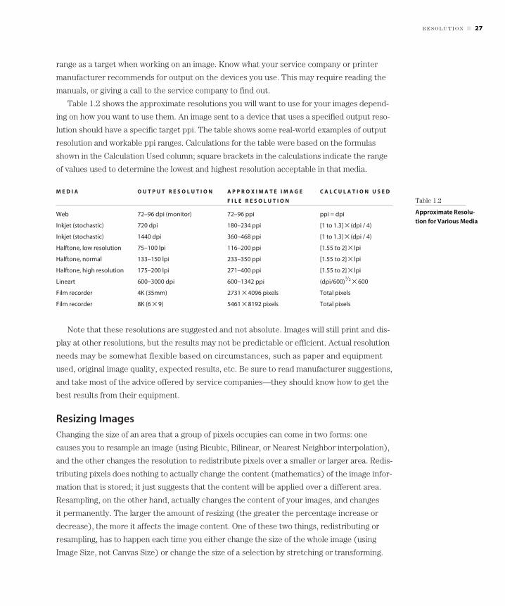
Table 1.2 shows the approximate resolutions you will want to use for your images depend-
ing on how you want to use them. An image sent to a device that uses a specified output reso-
lution should have a specific target ppi. The table shows some real-world examples of output
resolution and workable ppi ranges. Calculations for the table were based on the formulas
shown in the Calculation Used column; square brackets in the calculations indicate the range
of values used to determine the lowest and highest resolution acceptable in that media.
M E D I A O U T P U T R E S O L U T I O N A P P R O X I M A T E I M A G E C A L C U L A T I O N U S E D
F I L E R E S O L U T I O N
Web 72–96 dpi (monitor) 72–96 ppi ppi = dpi
Inkjet (stochastic) 720 dpi 180–234 ppi [1 to 1.3] × (dpi / 4)
Inkjet (stochastic) 1440 dpi 360–468 ppi [1 to 1.3] × (dpi / 4)
Halftone, low resolution 75–100 lpi 116–200 ppi [1.55 to 2] × lpi
Halftone, normal 133–150 lpi 233–350 ppi [1.55 to 2] × lpi
Halftone, high resolution 175–200 lpi 271–400 ppi [1.55 to 2] × lpi
Lineart 600–3000 dpi 600–1342 ppi (dpi/600)1⁄2 × 600
Film recorder 4K (35mm) 2731 × 4096 pixels Total pixels
Film recorder 8K (6 × 9) 5461 × 8192 pixels Total pixels
Note that these resolutions are suggested and not absolute. Images will still print and dis-
play at other resolutions, but the results may not be predictable or efficient. Actual resolution
needs may be somewhat flexible based on circumstances, such as paper and equipment
used, original image quality, expected results, etc. Be sure to read manufacturer suggestions,
and take most of the advice offered by service companies—they should know how to get the
best results from their equipment.
Resizing ImagesChanging the size of an area that a group of pixels occupies can come in two forms: one
causes you to resample an image (using Bicubic, Bilinear, or Nearest Neighbor interpolation),
and the other changes the resolution to redistribute pixels over a smaller or larger area. Redis-
tributing pixels does nothing to actually change the content (mathematics) of the image infor-
mation that is stored; it just suggests that the content will be applied over a different area.
Resampling, on the other hand, actually changes the content of your images, and changes
it permanently. The larger the amount of resizing (the greater the percentage increase or
decrease), the more it affects the image content. One of these two things, redistributing or
resampling, has to happen each time you either change the size of the whole image (using
Image Size, not Canvas Size) or change the size of a selection by stretching or transforming.
R E S O L U T I O N ■ 27
Table 1.2
Approximate Resolu-
tion for Various Media
4178c01.qxd 11/20/02 12:48 AM Page 27

When you upsample or downsample an image or image area and retain the resolution,
Photoshop Elements has to interpret and redistribute tonal and color information, either
creating (upsample) or removing (downsample) pixels. It does this through interpolation
(or decimation), which is really a fancy name for making an educated guess. Resampling an
image to make it larger will never fill in information that is not already there, no matter what
you do and which plug-in you use. That trick you’ve seen on TV, where a pixelated image
gets clearer and clearer as they zoom in, is reverse engineered. The only thing you can really
do to reclaim image detail that you don’t already have is reshoot an image or rescan (assum-
ing that the detail is present in what you are scanning). What resampling will do is estimate
and average differences between pixels to make a best guess. Details will tend to soften
(upsample) or be lost (downsample).
Photoshop Elements has three methods of interpolation—that is, of figuring out how to
insert new pixels or remove existing ones as you change an image’s size:
Nearest Neighbor Using Nearest Neighbor interpolation, when you resize, Photoshop Ele-
ments picks a representative color from the color that is already in the image according to
the surrounding color (whether upsample or downsample). There is no averaging to create
new colors or tones. It is useful, for example, for controlled upsample of screenshots without
blurring.
Bilinear Bilinear interpolation behaves much like Bicubic and is supposed to be faster, but
I’ve never clocked them. During the sampling, new tones and colors can be introduced
between existing colors that are not in the original image. This can blur sampling of hard
edges, but can provide a smooth transition for tones (Nearest Neighbor might provide a
blockier, stepped result). One thing about Bilinear upsampling is that it remains more true to
simple averaging between neighboring tones and adds less new qualities to an image than
Bicubic (sometimes a good or less good thing). It is useful when you want a straight-forward
averaging, which may be useful when downsampling images.
Bicubic The resampling process creates new image information by averaging, like Bilinear,
but goes one step further to provide what is perhaps a tiny bit of something like sharpening
to the result. This is intended to counteract the blurring result of averaging. It affects change
in a greater number of pixels with the same radius setting as Bilinear, but may generally give
a better visible result in most cases than Bilinear. It is the real workhorse for sizing images.
While making up information and decimating it sound like bad things, each has their pur-
pose. Usually you should avoid upsampling—especially if the option exists for gaining more
detail through a better-targeted source image. However, images can be upsampled with
some success, depending on the desired quality—provided the change isn’t huge. Upsam-
pling 10% or even 20% may not be noticeable if the source image is sharp. Usually you will
28 ■ C H A P T E R 1: ES S E N T I A L S O F IM A G E S A N D IM A G E ED I T I N G
4178c01.qxd 11/20/02 12:48 AM Page 28

only upsample to make up small gaps (if necessary) between the resolution you have in an
image and what you really need, or to adjust borrowed image components.
Downsampling, while certainly damaging and compromising to image content, should be
less noticeable in your results. Image information indeed gets averaged or eliminated, but if
downsizing is being done for the right reason, any details you lose would have been lost on
output or display anyway. Detail loss is inherent in the process of downsizing or outputting
images at a smaller size: even if the equipment used could reproduce detail at a smaller size,
eventually details will pass the limit of the human eye’s ability to discern them.
Multipurpose ImagesMaking images that you’ll use with more than one purpose (e.g., print and Web) can cause a
little problem. Optimally, you’d like to work with images so that you target the result. Doing
so will ensure that you retain all of the actual image detail rather than relying on interpolation
or decimation and your choice for sampling type to produce the right results. It is a simple
fact that an image going to print on a high-resolution printer should have more information
than one at the same size used on the Web, or you will not optimize detail. Your only solutions
in working with dual-purpose images are:
• To create two images with specific purpose, or
• To create one image and resize.
Either of these choices poses a trade-off. In creating two images, you sacrifice valuable
time by simply trying to achieve similar results in two images using the best process. In cre-
ating one image and resizing, you have to allow either interpolation of new image information
or decimation, which may not be the optimal process.
You can’t work on small images and resize up, because detail will not be present. It is
often self-defeating to work on two images to produce the same results (even using a
detailed script) because the difference in size and volume of information in the image will
produce different results with the same application of tools.
The best way to go about working with multipurpose images is usually to work with them
at the highest resolution, and resize them smaller. Working at the higher of two or more reso-
lutions retains the details for the higher-resolution presentations, and decimates detail that
will not be reproducible at lower resolutions.
Your Images and EquipmentThere are some miscellaneous aspects of working with digital images that may fall into a gray
area. Part of working with images on your computer is learning the nuances of systems and
software, and having some idea what you expect to do with an image. You are responsible for
knowing your equipment and the purpose of your images.
Y O U R I M A G E S A N D E Q U I P M E N T ■ 29
4178c01.qxd 11/20/02 12:48 AM Page 29
Know Your EquipmentBecause all computers and systems are not alike, it is impossible to cover every nuance of
every system in every situation in one book. There are innumerable digital cameras on the
market, a plethora of ways to get the images off the cameras, and hundreds of home printers
to print the result to. Software configurations and utilities can cause problems while solving
others, and compatabilities can be an issue with both hardware and software.
If you have trouble getting the images off your camera, or have trouble with your printer
or computer, the place to find answers is in the user manual for these devices and through
technical support from manufacturers.
The following is a short checklist of maintenance items you should recognize and under-
stand for your computer, peripherals, and software.
Scanners (and analog film)
• Calibrate your scanner per manufacturer suggestions.
• Maintain a regimen for cleaning the scanner and scanned objects.
• Be sure to use proper connections and connection settings.
• Consider having important images scanned by scanning services, which may have better
equipment and resolution than you may have at home (e.g., scan negatives and slides to
a Kodak PhotoCD rather than on a home flatbed scanner).
Digital cameras
• Choose appropriate settings per manufacturer recommendations, and don’t change set-
tings if you don’t know what they do.
• Learn about special features and settings by reading the manual.
• Understand image control and exposure.
• Understand how to format camera storage.
• Know how to properly connect a camera to your computer and download images from
the camera.
Printers
• Use appropriate paper and inks as suggested by the manufacturer.
• Read maintenance and cleaning suggestions and follow these practices rigorously.
• Don’t expect RGB results from a CMYK printer. CMYK is a smaller color space, meaning
there are simply fewer colors available.
30 ■ C H A P T E R 1: ES S E N T I A L S O F IM A G E S A N D IM A G E ED I T I N G
4178c01.qxd 11/20/02 12:48 AM Page 30

Computer software and hardware
• Maintain a firewall if using an open Internet connection.
• Use virus protection software to minimize problems with infected digital files, especially
if you trade a lot of files. Never open a file from an outside source (even a known
source) if it has not been scanned for viruses.
• Maintain a schedule of maintenance for data backup, disk error scanning, and associated
digital maintenance (such as defragmenting).
• Check manufacturer websites regularly for software updates, bug fixes, and compatibil-
ity notices.
• Keep a log of program installations to help locate software conflicts.
• Don’t jump to conclusions. Note multiple problems in the operation of your system. If
you have problems with more than one program or device, there may be a common link
to the real cause.
• Simplify your system whenever possible by detaching chronically unused peripherals
and uninstalling unnecessary software.
Know Your ImageSome matters involved in repairing and compositing images are not really judgment calls,
and some are. One thing no book or manual can tell you is exactly what you want to do with
an image. While I can suggest proven ways of getting good results, learning to evaluate an
image’s composition and deciding what to do to improve it will be a judgment call.
Don’t ever say it is good enough if it isn’t good enough. Give up on an image only when it
is not worth the effort to improve it. There is almost nothing you can’t do with an image if
you have the desire. You can also correct the same image from now until doomsday, improv-
ing it in increments all the time. Sometimes putting an image aside for a day or two can give
you a new perspective: when you come back to it, you may see solutions you hadn’t previ-
ously considered. Solutions won’t always jump out at you, and sometimes you’ll have to man-
ufacture them. In trying to stretch your limitations, no matter what you are attempting to do
to an image, chances are you will learn from each solution you attempt.
The more you work with images, the easier and quicker the manipulations will become.
Y O U R I M A G E S A N D E Q U I P M E N T ■ 31
4178c01.qxd 11/20/02 12:48 AM Page 31

4178c01.qxd 11/20/02 12:48 AM Page 32