chapter 161 scatter plots - ncsschapter 161 scatter plots introduction the x-y scatter plot is one...
TRANSCRIPT

NCSS Statistical Software NCSS.com
161-1 © NCSS, LLC. All Rights Reserved.
Chapter 161
Scatter Plots Introduction The x-y scatter plot is one of the most powerful tools for analyzing data. NCSS includes a host of features to enhance the basic scatter plot. Some of these features are trend lines (least squares) and confidence limits, polynomials, splines, loess curves, border box plots, and sunflower plots. Following are examples of scatter plots that you can create with this procedure. Instructions on how to create each are given later.

NCSS Statistical Software NCSS.com Scatter Plots
161-2 © NCSS, LLC. All Rights Reserved.
Data Structure A scatter plot is constructed from two variables. A third variable may be used to divide the first two variables into groups (e.g., age group or gender). No other constraints are made on the input data. Note that rows with missing values in one of the selected variables are ignored.

NCSS Statistical Software NCSS.com Scatter Plots
161-3 © NCSS, LLC. All Rights Reserved.
Procedure Options This section describes the options available in the Scatter Plot procedure.
Variables Tab This panel specifies which variables are in the scatter plot.
Variables
Vertical Variable(s) Enter one or more vertical variables. If more than one variable is entered, the number of plots is determined by the Overlay option.
Horizontal Variable(s) Enter one or more horizontal variables. If more than one variable is entered, the number of plots is determined by the Overlay option.
Grouping (Symbol) Variable This variable may be used to separate the observations into groups. For example, you might want to use different plotting symbols to distinguish observations from different groups. You designate the grouping variable here. Each unique value of this column is plotted with a different symbol. The symbols are selected by clicking on the plot format button and then clicking on the symbol format button.
Data Label Variable A data label is text that is displayed beside each point. A column containing the data labels is specified here. The values may be text or numeric. The data labels will not be shown unless you activate them by clicking the plot format button and checking “Labels.”
Plot Overlay This option is used when multiple vertical and/or horizontal variables are entered to specify whether to overlay specified plots onto a single plot. Possible choices are:
• None No plots are overlaid. Each combination of horizontal and vertical plots produces its own separate plot.
• Multiple Vertical All vertical variables are combined onto one plot. A separate plot is drawn for each horizontal variable.
• Multiple Horizontal All horizontal variables are combined onto one plot. A separate plot is drawn for each vertical variable.
• Series of Paired Each sequential pair of horizontal and vertical variables is combined onto one plot.
• Series: No Overlay A series of plots are drawn using each vertical and horizontal variable in sequence. The first vertical variable is matched with the first horizontal variable, the second vertical with the second horizontal, and so on.

NCSS Statistical Software NCSS.com Scatter Plots
161-4 © NCSS, LLC. All Rights Reserved.
Format Options
Variable Names This option selects whether to display only variable’s name, label, or both.
Value Labels This option selects whether to display only values, value labels, or both. Use this option if you want the group variable to automatically attach labels to the values (like 1=Yes, 2=No, etc.).
Scatter Plot Format
Format Click the format button to change the plot settings (see Scatter Plot Window Options below).
Edit During Run Checking this option will cause the Scatter Plot Format window to appear when the procedure is run. This allows you to modify the format of the graph with the actual data.
Symbol Size Options
Symbol Size Variable This optional variable can be used to specify a proportional size for the data points.
Scatter Plot Window Options This section describes the specific options available on the Scatter Plot window, which is displayed when the Scatter Plot button is clicked. Common options, such as axes, labels, legends, and titles are documented in the Graphics Components chapter.
Scatter Plot Tab
Symbols Section You can modify the shape, color, and size of the plot symbols. To change them, click the Symbol Format button to display the Symbol Format window. Here are some of the graphics effects that can easily be achieved.

NCSS Statistical Software NCSS.com Scatter Plots
161-5 © NCSS, LLC. All Rights Reserved.
Linear Regression Section You can add regression lines, residuals, confidence limits, confidence bands, prediction limits, and probability ellipses to the plot using the options available in this section. The technical details of how these items are calculated are presented in the Linear Regression and Correlation chapter.
Estimation Section With these options, you can set the resolution of any curved lines (such as confidence limits and polynomial fits). You can also force the regression line to pass through the origin.

NCSS Statistical Software NCSS.com Scatter Plots
161-6 © NCSS, LLC. All Rights Reserved.
Data Point Labels Section You can display data labels next to the symbols.
More Lines Tab
Alternative Linear Regression Lines Section You can add other types of regression lines to the plot using the options available in this section. A popular alternative to linear regression is curvi-linear regression. Other possible lines are orthogonal (principal components) regression, robust regression through the medians, and robust regression through the quartiles.
Smooth Lines Section You can add loess smooth and median smooth lines using the options available in this section.
The loess smooth line is documented in the Linear Regression and Correlation chapter.
The median smooth is analogous to the moving average. It is computed using running medians instead of running means.

NCSS Statistical Software NCSS.com Scatter Plots
161-7 © NCSS, LLC. All Rights Reserved.
Connect Data Points Section You can connect the symbols with a line. Along with setting the format of the connecting line, this section also lets you specify the order in which the points are connected. The connection can be done with a straight line or a curved spline.
45º Line You can connect the symbols with a line. Along with setting the format of the connecting line, this section also lets you specify the order in which the points are connected. The connection can be done with a straight line or a curved spline.
Points-to-Axis Tab
Tick Marks for each Data Point Section You can display a tick mark along each axis for each point.
Lines from each Data Point Section You can display a line between the data point and an axis.

NCSS Statistical Software NCSS.com Scatter Plots
161-8 © NCSS, LLC. All Rights Reserved.
Bars from each Data Point Section You can display bars between data points and an axis.
Mean Extension Lines Section You can display horizontal and vertical lines at the group means.
Border Plots Tab
X and Y Axis Sections You can display box plots, density plots, dot plots, and histograms in the border of each axis.

NCSS Statistical Software NCSS.com Scatter Plots
161-9 © NCSS, LLC. All Rights Reserved.
Sunflower Tab
Sunflower Density Section You can display a sunflower grid over the points on the plot. This technique was developed for when you have many, many overlapping points on the plot. Instead of showing the points, flowers are shown in which the number of petals is proportional to the number of points falling in the grid cell.
Titles, Legend, X Axis, Y Axis, Grid Lines, and Background Tabs Details on setting the options in these tabs are given in the Graphics Components chapter.
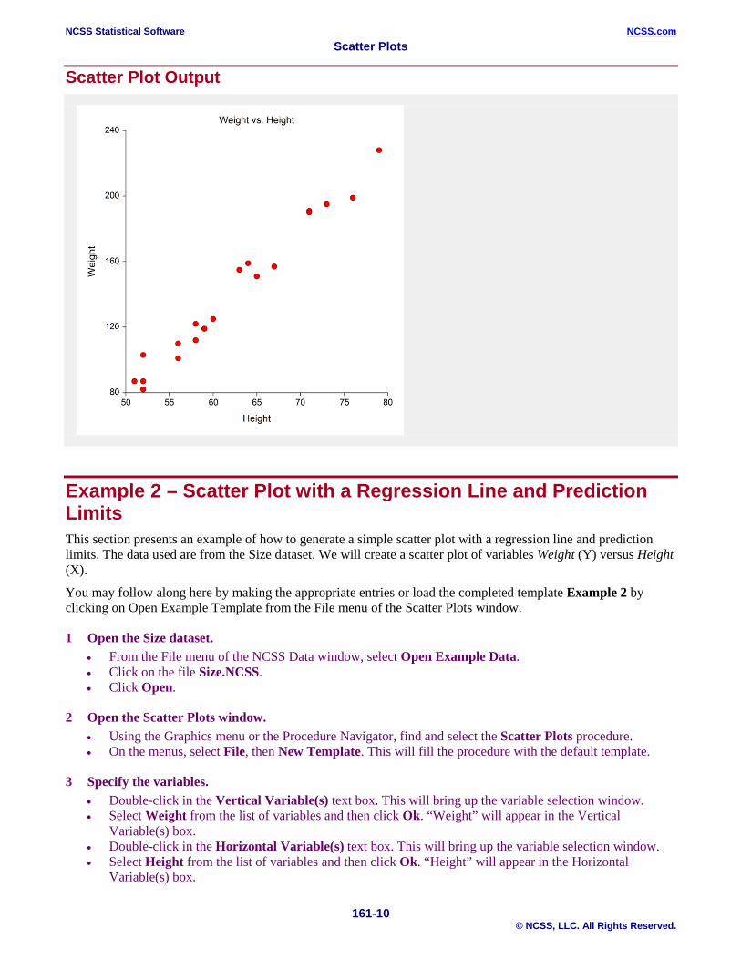
Example 1 – Creating a Scatter Plot This section presents an example of how to generate a simple scatter plot. The data used are from the Size dataset. We will create a scatter plot of variables Weight versus Height.
You may follow along here by making the appropriate entries or load the completed template Example 1 by clicking on Open Example Template from the File menu of the Scatter Plots window.
1 Open the Size dataset. • From the File menu of the NCSS Data window, select Open Example Data. • Click on the file Size.NCSS. • Click Open.
2 Open the Scatter Plots window. • Using the Graphics menu or the Procedure Navigator, find and select the Scatter Plots procedure. • On the menus, select File, then New Template. This will fill the procedure with the default template.
3 Specify the variables. • Double-click in the Vertical Variable(s) text box. This will bring up the variable selection window. • Select Weight from the list of variables and then click Ok. “Weight” will appear in the Vertical
Variable(s) box. • Double-click in the Horizontal Variable(s) text box. This will bring up the variable selection window. • Select Height from the list of variables and then click Ok. “Height” will appear in the Horizontal
Variable(s) box.
4 Run the procedure. • From the Run menu, select Run Procedure. Alternatively, just click the green Run button.
NCSS Statistical Software NCSS.com Scatter Plots
161-10 © NCSS, LLC. All Rights Reserved.
Scatter Plot Output
Example 2 – Scatter Plot with a Regression Line and Prediction Limits This section presents an example of how to generate a simple scatter plot with a regression line and prediction limits. The data used are from the Size dataset. We will create a scatter plot of variables Weight (Y) versus Height (X).
You may follow along here by making the appropriate entries or load the completed template Example 2 by clicking on Open Example Template from the File menu of the Scatter Plots window.
1 Open the Size dataset. • From the File menu of the NCSS Data window, select Open Example Data. • Click on the file Size.NCSS. • Click Open.
2 Open the Scatter Plots window. • Using the Graphics menu or the Procedure Navigator, find and select the Scatter Plots procedure. • On the menus, select File, then New Template. This will fill the procedure with the default template.
3 Specify the variables. • Double-click in the Vertical Variable(s) text box. This will bring up the variable selection window. • Select Weight from the list of variables and then click Ok. “Weight” will appear in the Vertical
Variable(s) box. • Double-click in the Horizontal Variable(s) text box. This will bring up the variable selection window. • Select Height from the list of variables and then click Ok. “Height” will appear in the Horizontal
Variable(s) box.

NCSS Statistical Software NCSS.com Scatter Plots
161-11 © NCSS, LLC. All Rights Reserved.
4 Turn On the Regression Line and Prediction Limits • Click the Scatter Plot Format button. This will bring up the scatter plot format window. • Check the Regression Line box to turn on the display of the regression line. • Check the Prediction Limits – Fill box to turn on the display of the prediction limits shaded region. • Click the OK button to save the updated settings and close the Scatter Plot Format window.
5 Run the procedure. • From the Run menu, select Run Procedure. Alternatively, just click the green Run button.
Scatter Plot Output with Regression Line and Predicition Limits

NCSS Statistical Software NCSS.com Scatter Plots
161-12 © NCSS, LLC. All Rights Reserved.
Example 3 – Scatter Plot with a Regression Line, Prediction Limits, and Border Plots This section presents an example of how to generate a simple scatter plot with a regression line, prediction limit, and border plots (box plots and dot plots). The data used are from the Size dataset. We will create a scatter plot of variables Weight (Y) versus Height (X).
You may follow along here by making the appropriate entries or load the completed template Example 3 by clicking on Open Example Template from the File menu of the Scatter Plots window.
1 Open the Size dataset. • From the File menu of the NCSS Data window, select Open Example Data. • Click on the file Size.NCSS. • Click Open.
2 Open the Scatter Plots window. • Using the Graphics menu or the Procedure Navigator, find and select the Scatter Plots procedure. • On the menus, select File, then New Template. This will fill the procedure with the default template.
3 Specify the variables. • Double-click in the Vertical Variable(s) text box. This will bring up the variable selection window. • Select Weight from the list of variables and then click Ok. “Weight” will appear in the Vertical
Variable(s) box. • Double-click in the Horizontal Variable(s) text box. This will bring up the variable selection window. • Select Height from the list of variables and then click Ok. “Height” will appear in the Horizontal
Variable(s) box.
4 Turn On the Regression Line and Prediction Limits • Click the Scatter Plot Format button. This will bring up the scatter plot format window. • Check the Regression Line box to turn on the display of the regression line. • Check the Prediction Limits – Fill box to turn on the display of the prediction limits shaded region.
5 Turn On the Border Plots • Click the Border Plots tab button. This will bring up the border plots window. • Check the X Axis – Box Plot box to turn on the display of the horizontal box plot. • Check the X Axis – Density Plot box to turn on the display of the horizontal density plot. • Check the X Axis – Dot Plot box to turn on the display of the horizontal dot plot. • Check the Y Axis – Box Plot box to turn on the display of the vertical box plot. • Check the Y Axis – Density Plot box to turn on the display of the vertical density plot. • Check the Y Axis – Dot Plot box to turn on the display of the vertical dot plot. • Click the OK button to save the updated settings and close the Scatter Plot Format window.
6 Run the procedure. • From the Run menu, select Run Procedure. Alternatively, just click the green Run button.

NCSS Statistical Software NCSS.com Scatter Plots
161-13 © NCSS, LLC. All Rights Reserved.
Scatter Plot Output with Regression Line, Predicition Limits, and Border Plots
Example 4 – Scatter Plot with a Loess Line This section presents an example of how to generate a simple scatter plot with a Loess line. The data used are from the Size dataset. We will create a scatter plot of variables Weight (Y) versus Height (X).
You may follow along here by making the appropriate entries or load the completed template Example 4 by clicking on Open Example Template from the File menu of the Scatter Plots window.
1 Open the Size dataset. • From the File menu of the NCSS Data window, select Open Example Data. • Click on the file Size.NCSS. • Click Open.
2 Open the Scatter Plots window. • Using the Graphics menu or the Procedure Navigator, find and select the Scatter Plots procedure. • On the menus, select File, then New Template. This will fill the procedure with the default template.
3 Specify the variables. • Double-click in the Vertical Variable(s) text box. This will bring up the variable selection window. • Select Weight from the list of variables and then click Ok. “Weight” will appear in the Vertical
Variable(s) box. • Double-click in the Horizontal Variable(s) text box. This will bring up the variable selection window. • Select Height from the list of variables and then click Ok. “Height” will appear in the Horizontal
Variable(s) box.

NCSS Statistical Software NCSS.com Scatter Plots
161-14 © NCSS, LLC. All Rights Reserved.
4 Turn On the Loess Line • Click the Scatter Plot Format button. This will bring up the scatter plot format window. • Click the More Lines tab to bring up the More Lines options. • Check the Loess box to turn on the display of the Loess line. • Click the OK button to save the updated settings and close the Scatter Plot Format window.
5 Run the procedure. • From the Run menu, select Run Procedure. Alternatively, just click the green Run button.
Scatter Plot Output with Loess Line

NCSS Statistical Software NCSS.com Scatter Plots
161-15 © NCSS, LLC. All Rights Reserved.
Example 5 – Scatter Plot with 3D Symbols of Varying Sizes and Gradient Interior This section presents an example of how to generate a scatter plot with 3D symbols of varying sizes and a gradient-filled interior background. The data used are from the FISHER dataset. We will create a scatter plot of variables SepalLength (Y) versus SepalWidth (X) by Iris (G).
You may follow along here by making the appropriate entries or load the completed template Example 5 by clicking on Open Example Template from the File menu of the Scatter Plots window.
1 Open the Fisher dataset. • From the File menu of the NCSS Data window, select Open Example Data. • Click on the file Fisher.NCSS. • Click Open.
2 Open the Scatter Plots window. • Using the Graphics menu or the Procedure Navigator, find and select the Scatter Plots procedure. • On the menus, select File, then New Template.
3 Specify the variables. • Double-click in the Vertical Variable(s) text box. • Select SepalLength from the list of variables and click Ok. • Double-click in the Horizontal Variable(s) text box. • Select SepalWidth from the list of variables and click Ok. • Double-click in the Grouping (Symbol) Variable text box. • Select Iris from the list of variables and click Ok.
4 Change the Symbols • Click the Scatter Plot Format button. • Click the Scatter Plot tab to bring up the Scatter Plot options. • Click the Symbol Format button at the top of the window to bring up the Symbols Format window. • Click on the right side of symbol 1 (the red circle) to display the Preset Symbols. • Select the red 3D symbol in row 7 column 3. • Click on the right side of symbol 2 (the blue circle). • Select the blue 3D symbol in row 7 column 8. • Click on the right side of symbol 3 (the green circle). • Select the green 3D symbol in row 7 column 6. • Click the Change All button to bring up the Change All Symbol Properties window. • Check the Symbol Size and Border Width boxes to display those options. • Change the Symbol Size to 135. • Change the Border Width to 1. • Click OK. • Click symbol 2 (the blue 3D circle) to display the Symbols Format (Group 2) window. • Change the Symbol Size to 200. • Click OK.

NCSS Statistical Software NCSS.com Scatter Plots
161-16 © NCSS, LLC. All Rights Reserved.
5 Change the Background Color of the Plot Interior • The Scatter Plot Format window should still be open from step 4. If not, click the Scatter Plot Format
button. • Click the Background tab to bring up the Background Color options. • Click the Interior – Specify Fill button to the right of the Fill check box. This will cause the Color Fill
Selection window to be displayed. • Click on the Quick Fills button at the top of the window. • Select the light blue gradient in row 6 column 7. • The Gradient Stops options will now be displayed. • Click on the right side of the Color button (it is light blue). • Select the light blue color in row 1 column 7. • Click OK. • Click the OK button to save the updated settings and close the Scatter Plot Format window.
6 Run the procedure. • From the Run menu, select Run Procedure. Alternatively, just click the green Run button.
Scatter Plot Output with 3D Symbols and Gradient Background

NCSS Statistical Software NCSS.com Scatter Plots
161-17 © NCSS, LLC. All Rights Reserved.
Example 6 – Scatter Plot with Probability Ellipse This section presents an example of how to generate a scatter plot with overlaid probability ellipses. The data used are from the FISHER dataset. We will create a scatter plot of variables SepalLength (Y) versus SepalWidth (X) by Iris (G).
You may follow along here by making the appropriate entries or load the completed template Example 6 by clicking on Open Example Template from the File menu of the Scatter Plots window.
1 Open the Fisher dataset. • From the File menu of the NCSS Data window, select Open Example Data. • Click on the file Fisher.NCSS. • Click Open.
2 Open the Scatter Plots window. • Using the Graphics menu or the Procedure Navigator, find and select the Scatter Plots procedure. • On the menus, select File, then New Template.
3 Specify the variables. • Double-click in the Vertical Variable(s) text box. • Select SepalLength from the list of variables and click Ok. • Double-click in the Horizontal Variable(s) text box. • Select SepalWidth from the list of variables and click Ok. • Double-click in the Grouping (Symbol) Variable text box. • Select Iris from the list of variables and click Ok.
4 Add the Probability Ellipses • Click the Scatter Plot Format button. • Click the Scatter Plot tab to bring up the Scatter Plot options. • Check both the Probability Ellipse box and the corresponding Fill box (to its right). • Click OK.
5 Run the procedure. • From the Run menu, select Run Procedure. Alternatively, just click the green Run button.

NCSS Statistical Software NCSS.com Scatter Plots
161-18 © NCSS, LLC. All Rights Reserved.
Scatter Plot Output with Probability Ellipses