chapter 2, messing around with manga studio 5 · for example, carrying on from chapter 2, messing...
TRANSCRIPT
12Along for the Ride
In the physical copy of Manga Studio 5 for Beginners, there were numerous references to Manga Studio being a deep app. In fact, there's so much to Manga Studio that a lot of information had to be cut and placed into this chapter.
For example, carrying on from Chapter 2, Messing Around with Manga Studio 5, there's additional information on specific brush tool options and settings, more about the New Document dialog box, and assorted tidbits that are for when we get comfortable with Manga Studio.
Not all chapters have bonus sections. The following chapters contain bonus sections:
� Chapter 2: This chapter provides more information about the New Page dialog box.
� Chapter 5: This chapter provides additional information about brushes and a breakdown of all the Tool Setting categories.
� Chapter 6: This chapter provides exercises for creating custom selection tools and shortcuts. The use of rulers and curves will also be covered here. We wrap things up with a discussion about perspective rulers.
� Chapter 8: This chapter is where we cover the two color palettes, Intermediate Color and Approximate Color.
Along for the Ride
[ 2 ]
Chapter 2, Messing Around with Manga Studio 5Selecting a properly-sized page for our comic is where it all begins. Nothing is more frustrating than to work for hours on something and then realize that it all has to be resized, cropped, and so on. By really going into how we can customize Page Setting for Manga Studio 5, we can avoid losing hours of time and our blood pressure rising.
Take some time, play around with different page settings, and get used to how we can create page presets in Manga Studio. It'll be time well spent.
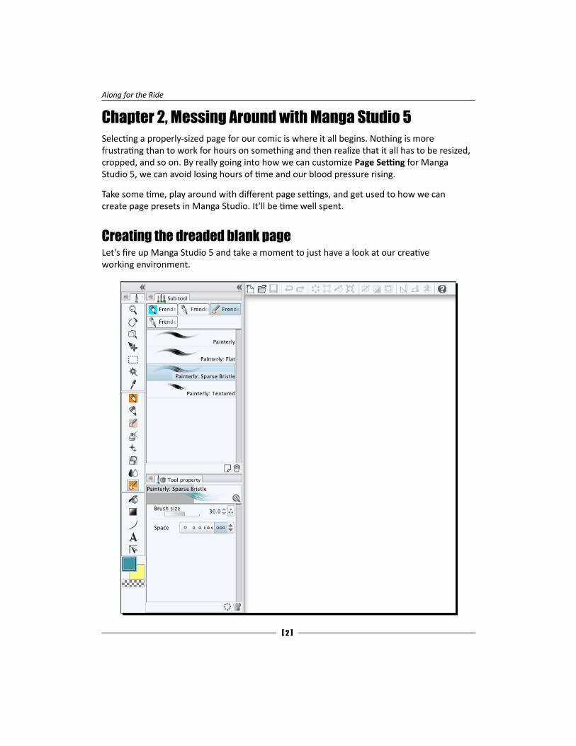
Creating the dreaded blank pageLet's fire up Manga Studio 5 and take a moment to just have a look at our creative working environment.
Chapter 12
[ 3 ]
The previous screenshot is what you should have on your screen. It's cut off on the right, so the Sub view and Material sections aren't in the screenshot. Also, the Tool palette (the vertical row of tools to the very left) may be different from yours as I've added tools to it, which is very easy and something we'll cover later. The toolbar (the horizontal line of icons at the top) is what we want to focus on.
What we'll be doing first is creating a page template for our sketching and idea roughing.
Making our page presetIn the print book's Chapter 1, Installing and Setting Up Manga Studio 5, we created a new page template and named it web comic w/bleed. Now, we're going to repeat the same thing and call this template "Character Sketching". Although Manga Studio 5 comes with many templates already installed, we can create many of our own templates to reflect the specific needs and type of work that we do using this program.
There's a number of comic template files we can download or purchase, so it's a fair question to ask, "Why spend all this time learning how to create custom templates when we can just use premade ones?" It's all about knowing how the program works and how to make it work for us. Like painters during the Renaissance, we have to know how to make a canvas frame and stretch our canvases on it. Only instead of wood, nails, and cloth, we're dealing with information, dialog boxes, and files. While most ready-made templates can serve most needs 99 percent of the time, it's that darn 1 percent that will nip our behinds when we least expect it. In my experience, the time spent learning about the "guts" of any program will be well worth it in the long run. The program will be less of a mystery, we will feel like we have a mastery over it, and we will be more confident when using it. This confidence will spill over to the art we create within the program.
So, we want to create a page template that will be our character sheet. Some questions we should ask ourselves about what we want from this template are as follows:
� Will we want to print this sheet out or will we be sharing it with others online?
� Do we want room for just a full body shot or for a few head drawings as well as a single body shot or a turnaround (a front, side, back, and three-fourth view)?
� Do we want to have room for some callouts, like anything special about this character's costume, props, and so on?
� Will a penciled drawing be fine, or should we ink and/or color it?
Along for the Ride
[ 4 ]
If we have a clear idea of what we want from this template, we'll spend less time adjusting and fussing around with it after we've already created it. So, the following are my answers to the previous questions:
� The character sheet will be printed out on a regular letter paper; we will also have the option to go crazy and print it out on a tabloid paper (11 x 17 inches in size).
� We want a front, back, and three-fourth view (we will forgo the side view) with a few head shots (one in an emotionless state and one or more in various emotional states). It's good to have a character sheet with neutral emotions so we can get a good idea of how the person looks without the distortion that smiling or grimacing can give.
� I always like to have room for callouts; you never know when you doodle a neat-looking gizmo or costume accessory and come up with ideas for it. This is where you put all that info down so it won't be forgotten.
� I love inking and coloring, so yes, it will have to be colored. How a character is rendered gives it (and our story) texture, and don't forget that color is an important part of a character.
Now, based on these answers, the page template we'll be creating will be letter sized (8.5 x 11 inches) and in landscape mode (wider than taller). This will give us horizontal room for the turnarounds, the head shots, and any callouts or other drawings that we may need to include.
Now, let's pick the resolution of the template. The subject of resolution is a tricky one. Most printers and print-on-demand (POD) places only need 300 dots per inch (DPI). That's all good, but what happens when we print our letter-sized drawings on a tabloid-sized sheet? Tabloid paper is twice the size of a letter sheet, so the drawing will print at 150 DPI on tabloid paper. If this is for your own use, the lower resolution may work out just fine. However, what if you're showing this to a publisher or collaborator? You'll want it to look as good as possible. Then, the template should be at 600 DPI. Now 600 DPI will create files that are twice the size of 300 DPI, so the file size will be larger. Don't worry; Manga Studio 5 can handle it just fine. We need to keep in mind that downsampling (reducing the image's size) will always look better than upsampling (enlarging the image's size). You can tell if something's been upsampled a lot by the amount of pixelation in the image (like in 8-bit video games). Oh, and images always look better when downsampled. Most comic art is created much bigger than the printed size. This is because when things are reduced, there's some smoothing that occurs that just makes things look more slick.
Chapter 12
[ 5 ]
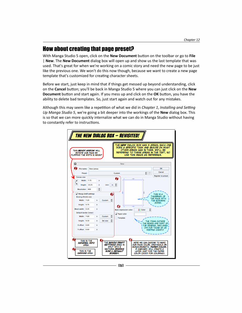
How about creating that page preset?With Manga Studio 5 open, click on the New Document button on the toolbar or go to File | New. The New Document dialog box will open up and show us the last template that was used. That's great for when we're working on a comic story and need the new page to be just like the previous one. We won't do this now though, because we want to create a new page template that's customized for creating character sheets.
Before we start, just keep in mind that if things get messed up beyond understanding, click on the Cancel button; you'll be back in Manga Studio 5 where you can just click on the New Document button and start again. If you mess up and click on the OK button, you have the ability to delete bad templates. So, just start again and watch out for any mistakes.
Although this may seem like a repetition of what we did in Chapter 1, Installing and Setting Up Manga Studio 5, we're going a bit deeper into the workings of the New dialog box. This is so that we can more quickly internalize what we can do in Manga Studio without having to constantly refer to instructions.
Along for the Ride
[ 6 ]
Some callouts were added to the previous screenshot to emphasize some important bits. Here's a breakdown of the settings in this dialog box. Whatever is in square brackets is based on the template that was last used. Refer to the following table:
Name of area Kind of setting Setting value What it does
General area
File name Textbox New canvas This allows us to give a name to our new document. We can enter any name we want here. Make sure that it's specific to the work that's going to be done. Nothing is more frustrating than to go back and try to remember which new canvas document is the one that you want to work on.
Preset Drop-down menu Either the custom settings or the name of the last preset we used
This is a drop-down menu that lists all of the templates that Manga Studio is aware of. When we make changes, this will change to custom.
Trashcan icon Button N/A If this is clicked, the current preset will be deleted. There is no undo option for this!
It's grayed out if custom is selected.
OK Button N/A Click on this when all of the settings are where you want them to be and a new page with the specifications will be created.
Cancel Button N/A Click on this to cancel out the dialog box. This is helpful if we have messed up and want to start again.
Register to preset
Button N/A When we have all of the settings just the way we want them, we just click on this button. A dialog box appears where we can name our template. Once we name our template and click on the OK button, we're taken back to this dialog box with our new template that was chosen in the Preset menu.
Chapter 12
[ 7 ]
Name of area Kind of setting Setting value What it does
Page thumbnail
Graphic of the page
N/A This thumbnail gets updated dynamically to reflect the settings in the entire dialog box. This feedback is great if we have accidentally entered the wrong information into the many text entry boxes.
Basic expression color
Drop-down menu Color, Grayscale, or Monochromatic
This sets up the color depth of the new page or how grayscale is shown. The monochromatic setting will dither grays as dots.
Paper color Color swatch Based on the chosen template
If the checkbox is unchecked, then the new document will have no Paper color layer. We can add a paper color layer if we need one after the document has been created.
Clicking on the color swatch will bring up the operating system's color selector. If we want to have a page with a blue background, then we click on the swatch and choose the blue color from the selector; after this, we click on OK on the selector's dialog box. The color swatch will now be blue. The paper color can be changed from the layer palette also.
Template Checkbox Based on the chosen template
Checking this will bring up the Material palette where we can choose panel layouts. Use this only if the given panel templates fit your concept of the page.
Canvas size
Vertical, curved, double-arrow icon—also known as The Bendy Arrow
Button N/A This button will flip the horizontal and vertical settings for the page. It makes a portrait (taller than wider) and a landscape (wider than taller) in one step. Although this doesn't change the template, it is remembered across restarts and new documents, so be sure to check the thumbnail for what the page looks like before clicking on the OK button when creating a new document.
Along for the Ride
[ 8 ]
Name of area Kind of setting Setting value What it does
Width Textbox From Preset or last use
This sets the width of the entire page.
Height Textbox From Preset or last use
This sets the height of the entire page.
Resolution Textbox / Drop-down menu
From Preset or last use
This sets the resolution (dots per the unit of measurement) of the page. The drop-down menu has predetermined resolutions, but we can type in a custom value if we need it.
Unit Drop-down menu From Preset or last use
We can choose centimeters, millimeters, inches, pixels, or points. For this book, we'll be using inches exclusively.
Manga draft settings
Binding (finish) size
Width Textbox From Preset or last use
This sets the width of the outer borders.
Height Textbox From Preset or last use
This sets the height of the outer borders.
Bleed width Textbox From Preset or last use
This establishes the bleed around the outer borders. This is a uniform amount that is applied to the top, left, right, and bottom. This is so that we have an area that may be cut off when the comic is printed through a print on demand or other, professional printer.
From template
Drop-down menu Custom This drop-down menu has preset values that we can choose from. These values are page sizes from our printer.
Default border (inner)
Width Textbox From Preset or last use
This is the width of the inner frame (commonly known as the active area—where all of the important artwork and lettering must be placed).
Height Textbox From Preset or last use
This is the height of the basic frame (commonly known as the active area).
Chapter 12
[ 9 ]
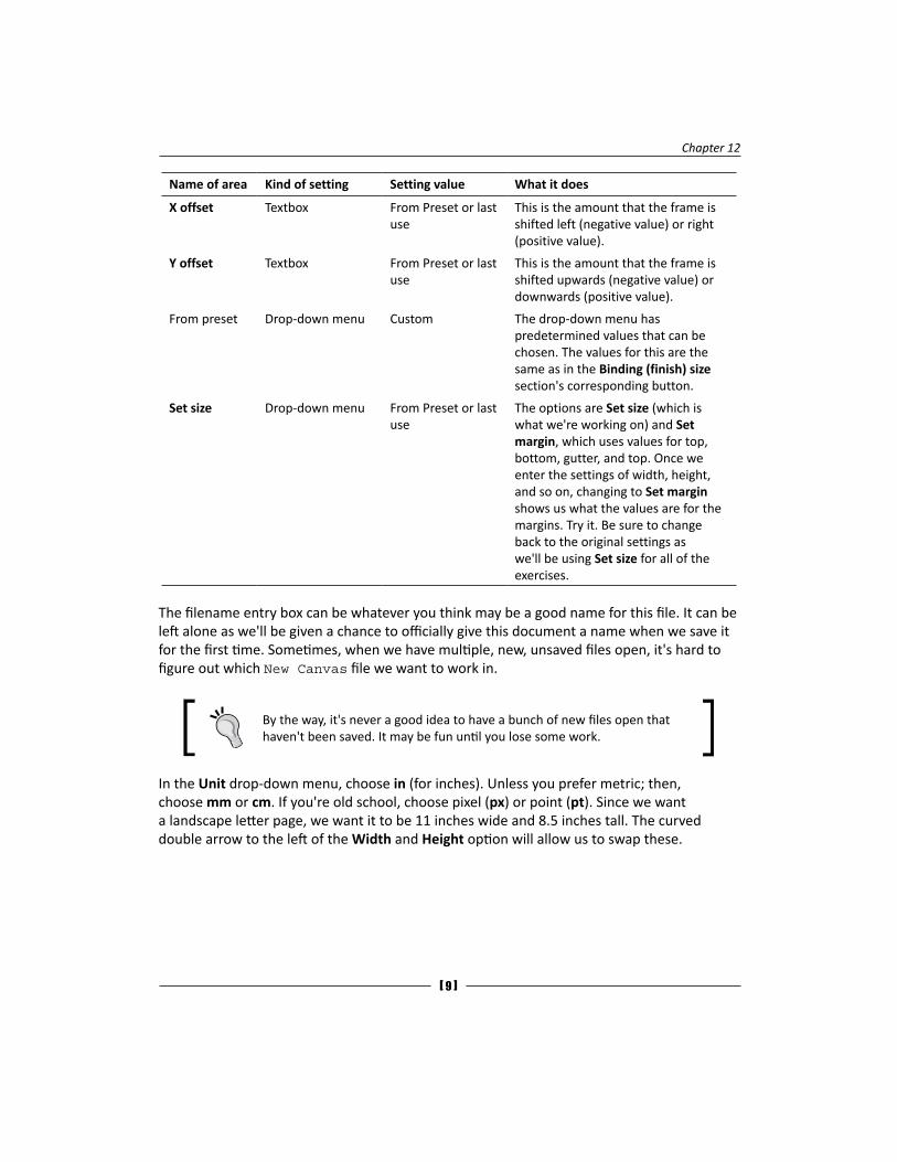
Name of area Kind of setting Setting value What it does
X offset Textbox From Preset or last use
This is the amount that the frame is shifted left (negative value) or right (positive value).
Y offset Textbox From Preset or last use
This is the amount that the frame is shifted upwards (negative value) or downwards (positive value).
From preset Drop-down menu Custom The drop-down menu has predetermined values that can be chosen. The values for this are the same as in the Binding (finish) size section's corresponding button.
Set size Drop-down menu From Preset or last use
The options are Set size (which is what we're working on) and Set margin, which uses values for top, bottom, gutter, and top. Once we enter the settings of width, height, and so on, changing to Set margin shows us what the values are for the margins. Try it. Be sure to change back to the original settings as we'll be using Set size for all of the exercises.
The filename entry box can be whatever you think may be a good name for this file. It can be left alone as we'll be given a chance to officially give this document a name when we save it for the first time. Sometimes, when we have multiple, new, unsaved files open, it's hard to figure out which New Canvas file we want to work in.
By the way, it's never a good idea to have a bunch of new files open that haven't been saved. It may be fun until you lose some work.
In the Unit drop-down menu, choose in (for inches). Unless you prefer metric; then, choose mm or cm. If you're old school, choose pixel (px) or point (pt). Since we want a landscape letter page, we want it to be 11 inches wide and 8.5 inches tall. The curved double arrow to the left of the Width and Height option will allow us to swap these.
Along for the Ride
[ 10 ]
Pixel or point? Back when the original Macintosh was made, the monitors were set to show 72 pixels per inch, which was exactly how many points there were to an inch. Back then, in the ancient times of desktop publishing, this was a big deal as typographers, designers, and other graphic artists used points as a unit of measurement. Now, over 30 years later, this distinction has been lost with the advent of retina-level displays. The real difference between points and pixels now is that points are still 72 pixels per inch, while pixels can be considered whatever the screen display's resolution is. For the sake of our sanity, we'll consider both points and pixels to be 72 pixels per inch.
There's a checkbox that's labeled Manga draft settings. If it's not checked, we won't see any further settings. Check the box and the rest of the options will appear. Although the settings here may seem to just set up margins and borders, they are used in some exporting options as well. For our use, anything outside the Binding (finish) size section will be where the printer can't print. Most printers can print to the edge of the sides of the paper; some can't. So, to make this printable on most printers, we'll need at least a quarter inch on each of the four edges. So, I subtracted half an inch from the paper size because the Binding (finish) size section in Manga Studio 5 will center the page. That's why we put in 10.5 for the width and 8 for the height. Since we won't be cutting the sheet, we don't need to worry about Bleed width, so that gets set to zero.
Don't get worried when you see Custom in the drop-down menu buttons. That's just Manga Studio 5's way to let us know that we're creating our own page template. This drop-down menu contains page sizes common to most printers. If you know how to create your own page size for your printer, then you can do so in this menu.
In the next boxed area, labeled Default border (inner), we want to describe the actual area we'll be drawing in. For our purpose, we want it to be half an inch narrower on both sides than the width of the Binding (finish) size area and 1.5 inches shorter at the top and bottom than the height of the Binding (finish) size area. This means that with a bit of math, we come up with 9.5 for the width (half inch plus half inch gives us one inch, and when subtracted from 10.5, results in 9.5). Now when we enter 6.5 as the height, we notice that the frame is centered. We want the Default border section to be a bit lower so we can put information in the top part of the page. To do this, we go to Y offset.
Computers have no sense of left, right, up, or down. They care about where things are on the x (left-right) or y (up-down) axes. By putting a value in the Y offset, we're telling Manga Studio to offset (move down) the basic frame by a specific amount.
Chapter 12
[ 11 ]
We'll just enter in 0.5 into the Y offset box. This will move Basic frame down by half an inch, and now we have an area in the top part of the sheet where we can put down the character's name and other info that we need to have. This will give us a good template to work with, and as we work, we may want to make alterations to better fit our working habits and preferences. We know how to change them now.
Basic expression color will determine the color or grayscale depth that the new layers will have. Set it to Color as we will want to color our character sheets.
We'll leave the Paper color option alone. This can be changed later, if need be.
Check the Register to preset box, and in the Save name textbox, type Character sheet. You could go all fancy and add Letter/600dpi at the end if you want. Usually, I add that extra info once I've settled on a definite template and am pretty sure I won't be making any more changes to it.
Click on OK and a new document will appear. If we were to create another new document at this time, the dialog box would be displayed in the Default size drop-down menu, Character Sheet (or whatever we named the setting's save name). If that's what you see, then our work in this section is done. Now, let's get busy with some drawing.
Before we move on...What we just did was what I call "focused play".
When I first started learning how to use computer applications, the best and least frustrating way to learn them was to start out with some modest goals that I wanted to achieve. Then I just, um, futzed around until I reached those goals. Sometimes, I would veer away from my goals, but I always learned a bit more about how to use the application. When asked about how I learned to do some of the things I did, I came up with the term "focused play", because you just can't be stressed out when you're playing around now, can you? The more relaxed the mind, the more receptive it is to learning and experimenting. Although it's easy to get lost in the numbered and bullet lists of tutorials and exercises, every one of those exercises within this book has been derived from my focused play sessions where I figured out what I wanted and then went on to accomplish them. This method of exploring a software app is a good way to internalize the operation of the app, so we can think about what we need to do within the app.
Although it did seem a bit involved, we went through the following stages of creation:
� We figured out what we wanted to do
� We thought through what we want now versus what we may want later
� We made a list of these things
� We found ways in which we could do these things in Manga Studio
Along for the Ride
[ 12 ]
In most cases, we go through these stages automatically, almost without realizing it. When we don't have a clear idea about what we want to do, we usually get frustrated and aren't happy with what we end up with.
Through the rest of this chapter, we'll be using this method or variations of it. I feel it's a good way to learn a new program and make sure we're all on the same page.
Chapter 6, Pencil MechanicsThe Tool settings have 13 categories; each category can have many individual settings that affect the way that the tool creates marks on our canvas. The following is a breakdown of all of the categories and most of the settings.
The brush settingsThe brush engine that powers Manga Studio is very powerful, and with that power comes, instead of responsibility, lots and lots of categories and settings within them. There are over a dozen different categories, and what follows is a breakdown of each one from top to bottom.
The categories are as follows:
� Brush size
� Ink
� Anti-aliasing
� Brush shape
� Brush tip
� Spraying effect
� Stroke
� Texture
� Watercolor border
� Erase
� Correction
� Starting and ending
� Anti-overflow
Before we start examining the various categories, let's look at the Tool Settings palette and get a feel for its layout. While some of the following information may be a repetition of what is in the print book, it has been provided here as a one-stop reference point.
Chapter 12
[ 13 ]
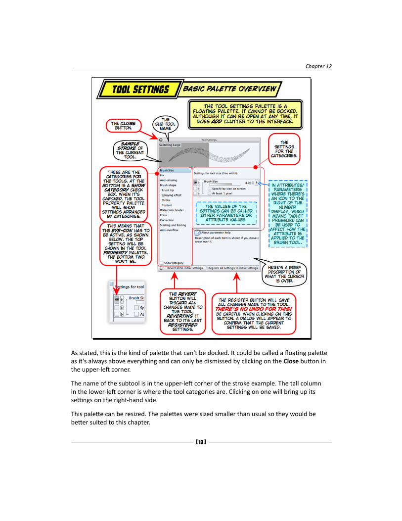
As stated, this is the kind of palette that can't be docked. It could be called a floating palette as it's always above everything and can only be dismissed by clicking on the Close button in the upper-left corner.
The name of the subtool is in the upper-left corner of the stroke example. The tall column in the lower-left corner is where the tool categories are. Clicking on one will bring up its settings on the right-hand side.
This palette can be resized. The palettes were sized smaller than usual so they would be better suited to this chapter.
Along for the Ride
[ 14 ]
The About parameter help section has a rather clunky word wrap. Words are wrapped to the next line without taking into consideration readability; words are split and continued on the next line without a hyphen or any indication. It's unclear if this anomaly will ever be fixed. Be sure to read the help twice (or resize the Settings palette) to make sure that it's comprehensible.
The terms Parameter and Attribute when used in this online chapter refer to the same things: the specific settings that change or affect how something is done. While Parameter may sound more techy, Attribute seems to be a more accurate term. These two terms have been used interchangeably.
Now, let's take a look at each category and the attributes therein. While most can be applied to nearly every tool, there will be notes on which settings work best for which tools. The selected brush is a Pencil tool. Other tools, such as the ruler, selection, and eyedropper tools, have different categories than the Brush tools. The ruler, selection, and other tools are not covered in this section; here, we'll be focusing on the tools that create marks on our digital canvas.
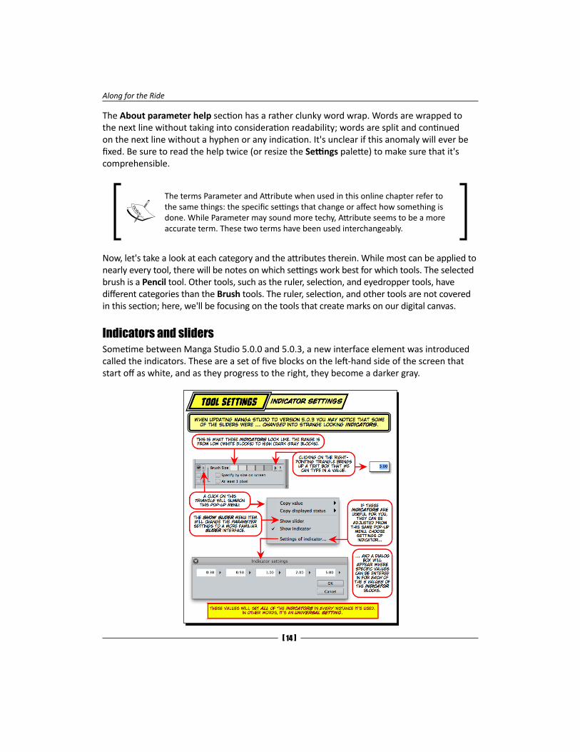
Indicators and slidersSometime between Manga Studio 5.0.0 and 5.0.3, a new interface element was introduced called the indicators. These are a set of five blocks on the left-hand side of the screen that start off as white, and as they progress to the right, they become a darker gray.
Chapter 12
[ 15 ]
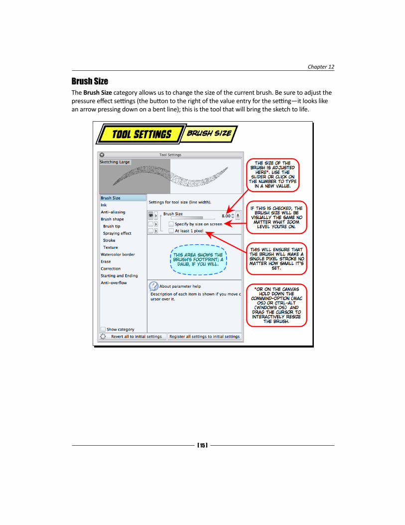
Brush SizeThe Brush Size category allows us to change the size of the current brush. Be sure to adjust the pressure effect settings (the button to the right of the value entry for the setting—it looks like an arrow pressing down on a bent line); this is the tool that will bring the sketch to life.
Along for the Ride
[ 16 ]
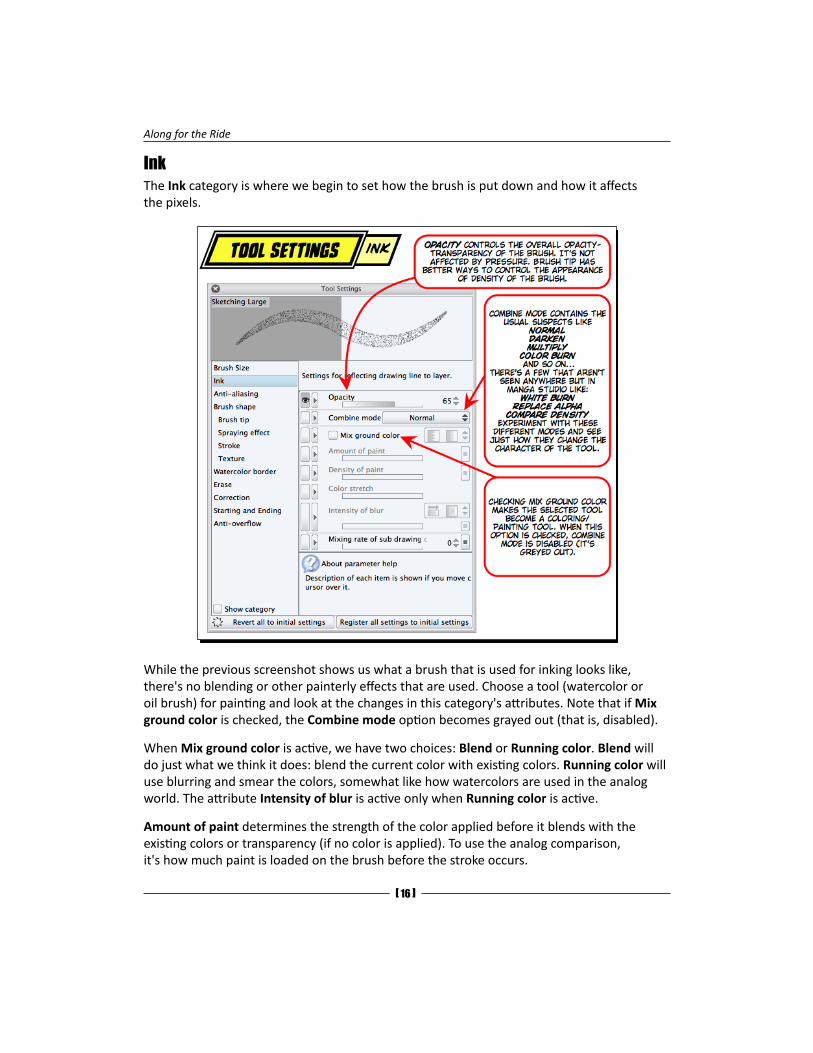
InkThe Ink category is where we begin to set how the brush is put down and how it affects the pixels.
While the previous screenshot shows us what a brush that is used for inking looks like, there's no blending or other painterly effects that are used. Choose a tool (watercolor or oil brush) for painting and look at the changes in this category's attributes. Note that if Mix ground color is checked, the Combine mode option becomes grayed out (that is, disabled).
When Mix ground color is active, we have two choices: Blend or Running color. Blend will do just what we think it does: blend the current color with existing colors. Running color will use blurring and smear the colors, somewhat like how watercolors are used in the analog world. The attribute Intensity of blur is active only when Running color is active.
Amount of paint determines the strength of the color applied before it blends with the existing colors or transparency (if no color is applied). To use the analog comparison, it's how much paint is loaded on the brush before the stroke occurs.
Chapter 12
[ 17 ]
Density of paint is how opaque the color is when it is applied. This works in conjunction with Amount of paint. The best way to really learn how these (and the following attributes) work is to spend a bit of time and just adjust the settings, choose different colors, and create some strokes. Seeing how the paint brushes that are the defaults of Manga Studio (the watercolor, oil, and pastel brushes) are set up will give us great insight into how all these attributes work together to give us some pretty great tools to paint or color with.
Color stretch will smear the existing color before applying the current color.
Intensity of blur can either be fixed or can be an amount that can be adjusted with the slider.
Mixing rate of sub drawing color is the last attribute here. This allows us to draw with a mixture of the main colors and subcolors (called foreground or background colors in other apps).
Don't forget that most of these attributes can be set to respond to various tablet input methods, such as pressure and rotation to mention a couple. If there's no tablet present on your system, be sure to check out the random option. So, be sure to check out the source dialog box (the box to the extreme right of all the attribute settings).
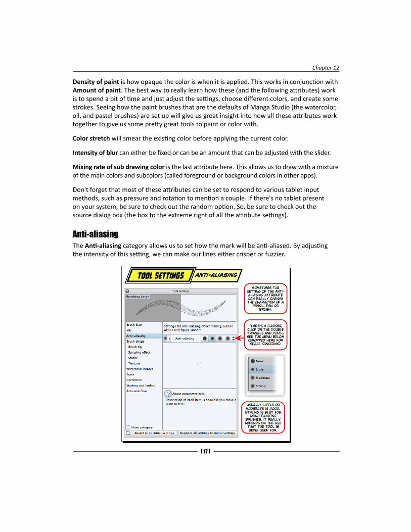
Anti-aliasingThe Anti-aliasing category allows us to set how the mark will be anti-aliased. By adjusting the intensity of this setting, we can make our lines either crisper or fuzzier.
Along for the Ride
[ 18 ]
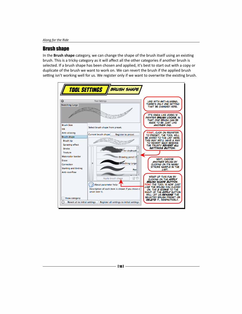
Brush shapeIn the Brush shape category, we can change the shape of the brush itself using an existing brush. This is a tricky category as it will affect all the other categories if another brush is selected. If a brush shape has been chosen and applied, it's best to start out with a copy or duplicate of the brush we want to work on. We can revert the brush if the applied brush setting isn't working well for us. We register only if we want to overwrite the existing brush.
Chapter 12
[ 19 ]
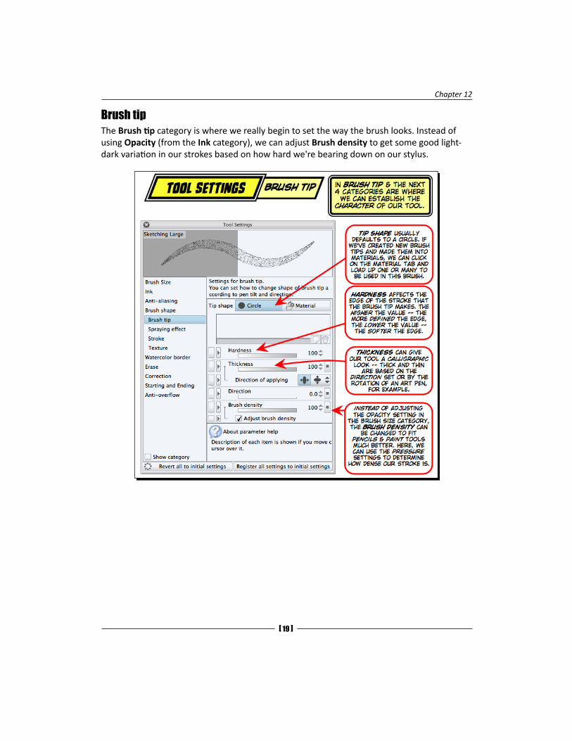
Brush tipThe Brush tip category is where we really begin to set the way the brush looks. Instead of using Opacity (from the Ink category), we can adjust Brush density to get some good light-dark variation in our strokes based on how hard we're bearing down on our stylus.
Along for the Ride
[ 20 ]
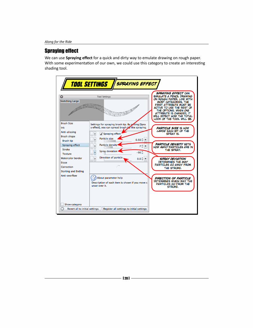
Spraying effectWe can use Spraying effect for a quick and dirty way to emulate drawing on rough paper. With some experimentation of our own, we could use this category to create an interesting shading tool.
Chapter 12
[ 21 ]
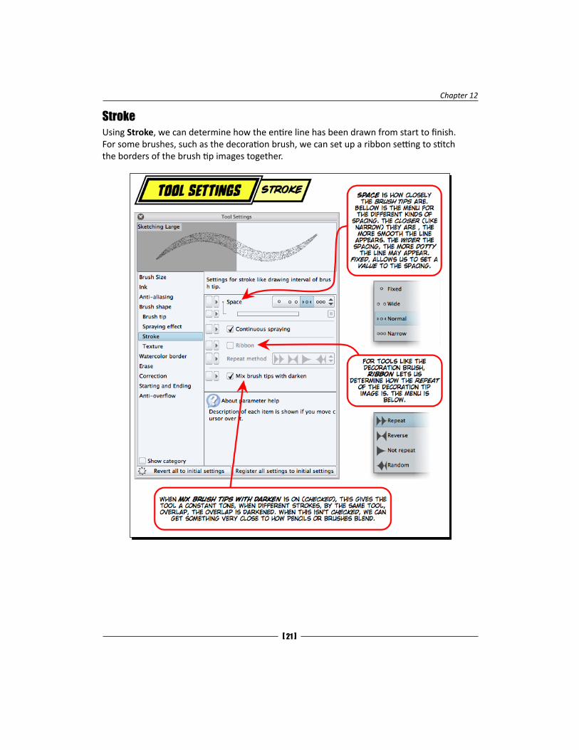
StrokeUsing Stroke, we can determine how the entire line has been drawn from start to finish. For some brushes, such as the decoration brush, we can set up a ribbon setting to stitch the borders of the brush tip images together.
Along for the Ride
[ 22 ]
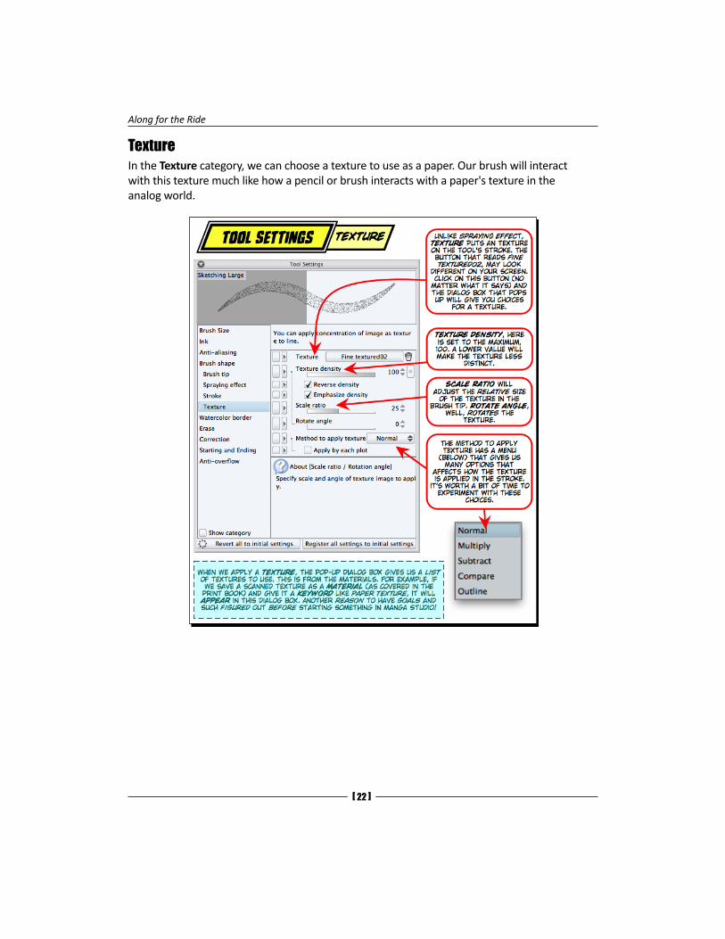
TextureIn the Texture category, we can choose a texture to use as a paper. Our brush will interact with this texture much like how a pencil or brush interacts with a paper's texture in the analog world.
Chapter 12
[ 23 ]
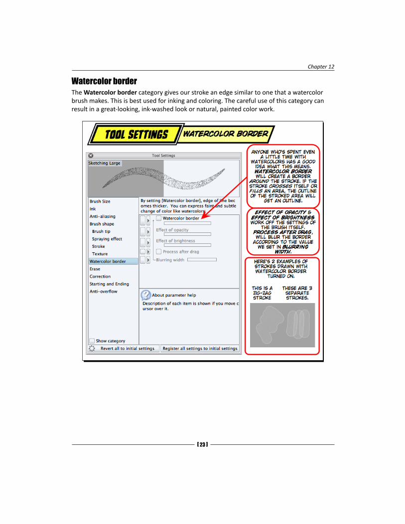
Watercolor borderThe Watercolor border category gives our stroke an edge similar to one that a watercolor brush makes. This is best used for inking and coloring. The careful use of this category can result in a great-looking, ink-washed look or natural, painted color work.
Along for the Ride
[ 24 ]
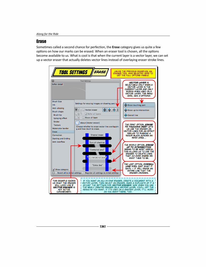
EraseSometimes called a second chance for perfection, the Erase category gives us quite a few options on how our marks can be erased. When an eraser tool is chosen, all the options become available to us. What is cool is that when the current layer is a vector layer, we can set up a vector eraser that actually deletes vector lines instead of overlaying eraser stroke lines.

Chapter 12
[ 25 ]
CorrectionThe Correction category can smooth out a line while we are drawing it. This can result in smoother and more graceful lines than we could draw unaided. If the settings are too intense, we could lose some details that would have made the drawing look hand drawn.
Along for the Ride
[ 26 ]
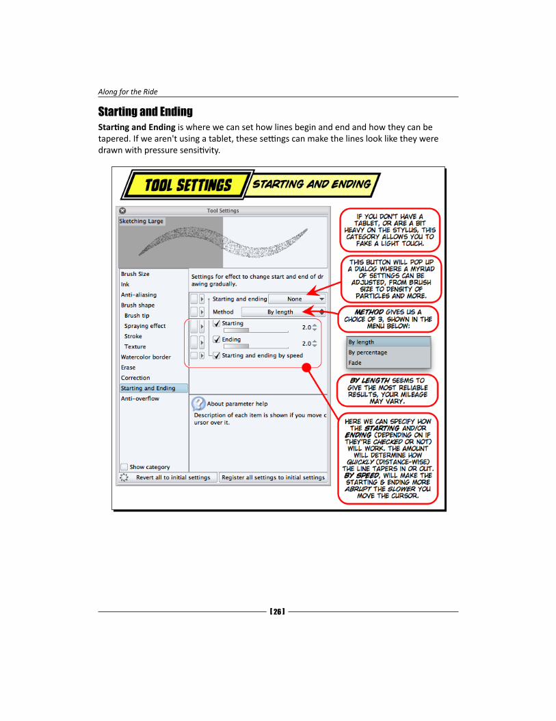
Starting and EndingStarting and Ending is where we can set how lines begin and end and how they can be tapered. If we aren't using a tablet, these settings can make the lines look like they were drawn with pressure sensitivity.
Chapter 12
[ 27 ]
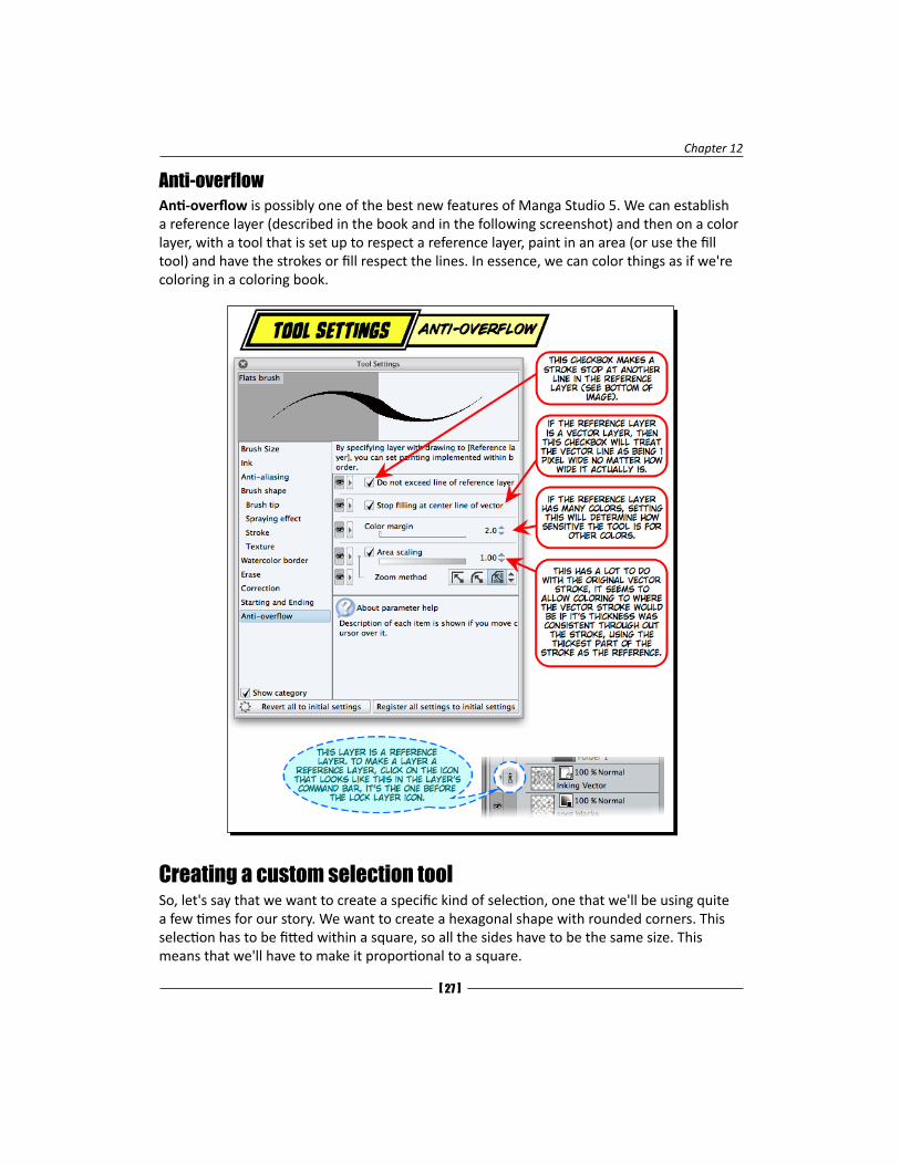
Anti-overflowAnti-overflow is possibly one of the best new features of Manga Studio 5. We can establish a reference layer (described in the book and in the following screenshot) and then on a color layer, with a tool that is set up to respect a reference layer, paint in an area (or use the fill tool) and have the strokes or fill respect the lines. In essence, we can color things as if we're coloring in a coloring book.
Creating a custom selection toolSo, let's say that we want to create a specific kind of selection, one that we'll be using quite a few times for our story. We want to create a hexagonal shape with rounded corners. This selection has to be fitted within a square, so all the sides have to be the same size. This means that we'll have to make it proportional to a square.
Along for the Ride
[ 28 ]
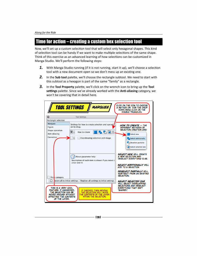
Time for action – creating a custom hex selection toolNow, we'll set up a custom selection tool that will select only hexagonal shapes. This kind of selection tool can be handy if we want to make multiple selections of the same shape. Think of this exercise as an advanced learning of how selections can be customized in Manga Studio. We'll perform the following steps:
1. With Manga Studio running (if it is not running, start it up), we'll choose a selection tool with a new document open so we don't mess up an existing one.
2. In the Sub tool palette, we'll choose the rectangle subtool. We need to start with this subtool as a hexagon is part of the same "family" as a rectangle.
3. In the Tool Property palette, we'll click on the wrench icon to bring up the Tool settings palette. Since we've already worked with the Anti-aliasing category, we won't be covering that in detail here.
Chapter 12
[ 29 ]
4. We've already discussed the different methods to create a selection. In the image, we've chosen New. We'll now click on the icon to the right of Select new, called Select additionally. We want to be able to make multiple selections, so this is the best choice for that.
5. Since we'll be using the selections that this tool makes, the Coordinating selection and image attribute below How to create needs to be unchecked. This way, we can move our selection around without affecting the contents of the layer we're on. Otherwise, we'd be moving the contents of the selections around when we moved the selection.
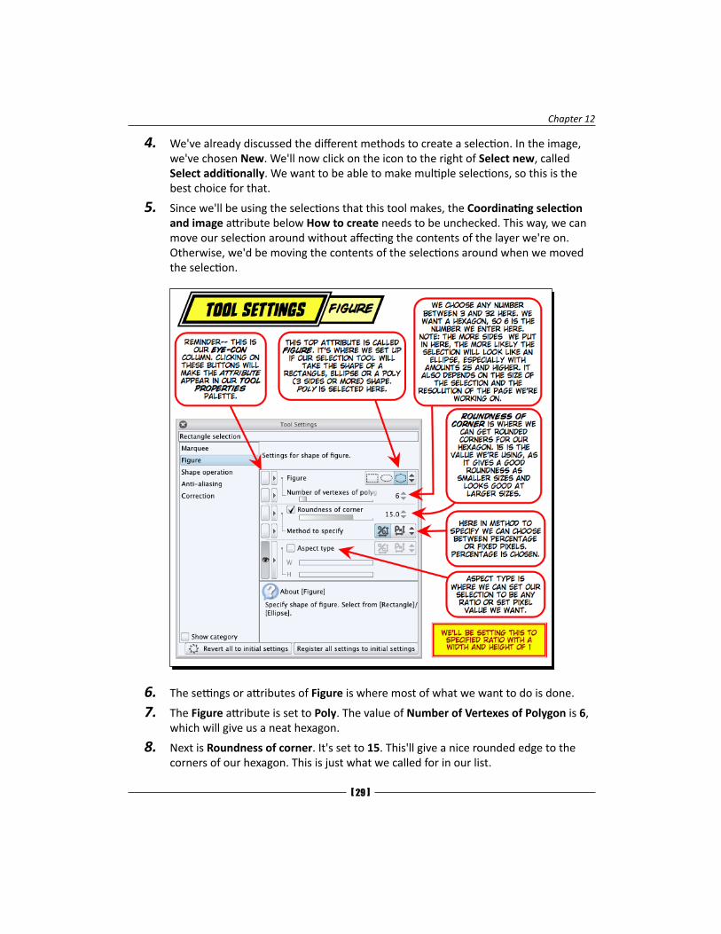
6. The settings or attributes of Figure is where most of what we want to do is done.
7. The Figure attribute is set to Poly. The value of Number of Vertexes of Polygon is 6, which will give us a neat hexagon.
8. Next is Roundness of corner. It's set to 15. This'll give a nice rounded edge to the corners of our hexagon. This is just what we called for in our list.
Along for the Ride
[ 30 ]
9. Method to specify can be tricky. The choice we have is between Percentage and Fixed pixels. If we wanted our hexagon to be the same size throughout, then Fixed pixels would have been a good choice. However, since we want more than one hexagon of different sizes, we'll choose Percentage. This way, the roundness is scaled to fit the size of the object, instead of a fixed amount of pixels being slapped on it. For smaller or very large hexagons, this would not give us the look we're after.
10. Finally, we get to the last setting, Aspect type. In our list of things, we want our hexagon to be square—our hexagon will be as wide as it is tall. Here is where the magic happens. Check this attribute. The Percentage and Pixel icons become selectable. Click on the Percentage icon (the one on the right). Right below this are two sliders, one marked W and the other marked H. We want to set the Width and Height to 1. This way, if we accidentally set Method to specify to Fixed pixel, we will notice that something's wrong because we'll be drawing hexagons that are one pixel wide and high.
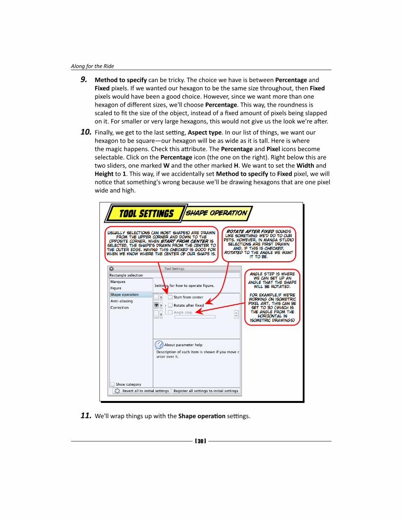
11. We'll wrap things up with the Shape operation settings.
Chapter 12
[ 31 ]
12. The first attribute of these settings is Start from center. It's a good idea to check this if we know the center from where we want to draw out our selection. If it's unchecked (as shown), our selection will be drawn from one corner to the opposite one, so it's preferable to check this attribute.
13. Rotate after fixed means that after we draw out our selection to the size we want it to be, we can rotate it. Let's check this as we would like to be able to rotate the hexagon.
14. Angle step will snap the rotation to the specific amounts that we set it to while moving our cursor to rotate the selection. We have a six-sided shape, and we'd like the two parallel sides to be either horizontal or vertical. If we divide 360 (the number of degrees it can rotate) by the number of sides (6) we get 60. If we enter that in and create a selection, nothing happens. This is because we're moving the six-sided selection a sixth of a turn at a time, and it looks like it's not rotating at all. We'll need to halve that to 30. Now, we'll get that parallel side vertical and horizontal like we want it. See, math can be fun!
15. Let's make a few selections on our scratchpad document. We'll play around with rotating it. Once the hexagon is rotated to the position we want it to be, we'll just click on the stylus or mouse and the position will be set.
16. Now, we'll go back to the Sub tool palette, and from the palette menu, we'll choose Duplicate sub tool. Let's name this bad boy MS4B Hex and give the icon a teal color.
17. We'll see it appear in the Sub tool palette. Let's test it out and see if all the attributes got copied over correctly. Once we're sure that this is the tool we've made, we'll select the Rectangle selection tool that we messed up and click on the whirlpool icon to Revert all to initial settings in either the Tool Property palette or the Tool Settings palette. Now we have got our rectangle selection tool back.
What just happened?We created a new selection tool. One takeaway from this is that a lot of the settings are the same from tool to tool. Some tools have specific things, like our Rectangle selection tool didn't have settings for Ink or Texture, and our Pencil tool didn't have settings for the Marquee or Shape operations.
Both the tools have settings for Anti-aliasing and Correction. Usually, if the setting has the same name for the A tool and the B tool, then they have the same attributes. That's why we didn't cover Anti-aliasing or Correction in this Time for action section. And when we begin to cover the drawing of shapes and the creation of rulers, this similarity will be a big help for us.
Correcting subtool misspellingsAlthough misspellings were corrected in the Version 5.0.3 update, it has been presented here as an example of how things can be changed in Manga Studio.
Along for the Ride
[ 32 ]
Time for action – correcting subtool settingsIt happens all the time; we misspell something or discover there's a typo in a subtool we've created. In the Ruler subtools, let's fix the misspelling "Lenear" so it's "Linear". As with most things in Manga Studio, we can make changes whenever we want to. So, there's no need to put up with misspellings if we don't want to. Perform the following steps to correct the misspelling "Lenear":
1. Right-click on the Lenear ruler entry in the Sub tool palette.
2. In the contextual menu, select Setting of sub tool.
3. In the dialog box that appears, replace the e alphabet in Lenear with i.
In this dialog box, we can also change the icon for the subtool and its icon color.
4. Click on OK.
Now, we have a correctly spelled subtool.
What just happened?For those of us with spelling OCD, we can relax now that one of the many misspellings in Manga Studio has been corrected. We were able to go into the Setting of sub tool option and make changes not only to the spelling but to the Background color of the icon option.
One of the most daunting tasks that I face when I upgrade to a new version of any software is to set things up in the way I'm used to working. Usually, especially when preferences aren't shared between versions, I spend an hour or more on getting the new version to the state that I'm used to. And this is one of the reasons why a lot of little exercises are present in this book. Hopefully, I've made things clear that there's so much we can do within Manga Studio's interface to speed up our workflow and make it a nice place to do work in. So, while we perform exercises that create new tools, correct spelling, or move palettes around, it's usually something we just have to do once and forget about. Not all aspects are covered; however, a brief mention is usually given. It's up to you to explore them and find the way that works best for you. Just remember that most changes can be reverted to the way the software was at the first install. Manga Studio is pretty robust and we won't break it.
Keyboard shortcutsA lot of artists who do much of their work digitally will say that they have one hand busy with the stylus and the other near the keyboard. Simple, one-key shortcuts can help speed up our work. At first, it's easier to just go to an icon and click on it or go to a menu and choose a menu item from it. However, after a while, this can become a distraction if we're "in the zone".
Chapter 12
[ 33 ]
What we're going to do is to get familiar with Manga Studio keyboard shortcuts. Instead of having some kind of table that lists all of them, we're going to look at them in the app itself and see what some of the presets are. While we're at it, we'll make a few of our own as well.
Keyboard shortcuts can be very individualized. I'm left-handed, so most of my single key shortcuts end up being on the right-hand side of the keyboard. I make great use of the number pad on my extended keyboard. I also use a lot of bottom-row keys (Z, X, C, and so on) because of the way my work area is arranged. I have my keyboard above my tablet. Right-handed people use the left-hand side of the keyboard more. So, instead of just making a "one size fits all" list of shortcuts, I opted to give you the power to decide which shortcuts work best for you. We'll go through setting up some shortcuts; feel free to substitute keys if you want. Just keep in mind that Manga Studio has a boatload of presets, and it's really easy to find a key that's already in use. What is hard is deciding if we want to overwrite the existing shortcut with our new one or not. Some of us may not even like to use shortcuts. A former co-worker of mine liked to "mouse around" as he puts it. He wanted to go to the menu and select things; he liked to click on icons. When I asked him why he didn't use shortcuts, he said that using menu commands and clicking on icons slowed him down and gave him time to think about what he's doing a bit more than just hitting a key combination. Occasionally, I think he had a point, especially after I accidentally hit a key that I didn't intend to and messed up my work.
So, as has been our habit in this chapter so far, let's figure out what we want to do.
In this chapter, we have done a lot of penciling, and in the next chapter, we'll be doing inking, so a keyboard shortcut for the Pencil and Pen tools would be nice. And, a shortcut for the Lasso tool would be helpful. Also, since we will be doing some masking work, a way to toggle between the main color and transparency would be good. Since penciling and inking are usually done with a black color, let's see if we can create a shortcut to make the main color black and the subcolor white.
To really make the most of this, the next Time for action – exploring the shortcut settings dialog box section will have Manga Studio up and running. Open up the scratchpad.lip file or create a new document. Open up the dialog boxes as instructed. However, feel free to just take as long as you'd like and explore the options. This area of Manga Studio is very customizable, and the more you know about what can be done, the more you'll feel at home in this program. Don't worry if you feel like you messed up the shortcuts; there's a Reset button that can be used to bring all the shortcuts back to the way they were when Manga Studio was first installed.
Now that we have a plan, let's get to it!
Along for the Ride
[ 34 ]
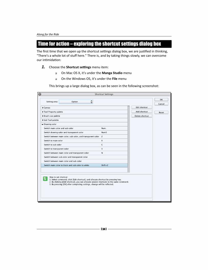
Time for action – exploring the shortcut settings dialog boxThe first time that we open up the shortcut settings dialog box, we are justified in thinking, "There's a whole lot of stuff here." There is, and by taking things slowly, we can overcome our intimidation:
1. Choose the Shortcut settings menu item:
� On Mac OS X, it's under the Manga Studio menu
� On the Windows OS, it's under the File menu
This brings up a large dialog box, as can be seen in the following screenshot:
Chapter 12
[ 35 ]
2. The top part of this dialog box has what's called Setting area. This drop-down menu has the following four items:
� Main menu: This option contains the menus and submenus for the application
� Option: This includes the various options we can choose from that aren't in the Main menu option
� Tool: All the main tools and subtools are listed here, even the tools we made ourselves
� Auto action: This includes a list of all the Auto action groups and individual actions, including custom actions
3. In the Setting area menu, choose the Tool menu item.
4. Since we want to see if there's a shortcut for the Pencil and Pen tools, let's see if there's an entry for them.
5. There's an entry for both Pencil and Pen. To the right of the name, there's a single upper-case letter. In the case of Pencil and Pen, this letter is "P."
6. This means that the shortcut has already been set. So, in the app, with this dialog box closed, if we hit the P key once, we get the Pen tool, and if we hit the P key a second time, we get the Pencil tool. That's how Manga Studio handles shortcuts that are "shared"—by pressing the key multiple times, we cycle through all the items that have the shortcut. This saves us from having to find one free key to use, but can also be confusing if we don't have a clear plan to share keyboard shortcuts among tools. We wouldn't want to hit the P key to bring up the swap color command and then the Airbrush tool.
7. Take a few moments to explore this dialog box's entries. There's a lot in here, and it's one of those things that are much better explored than read about.
The Lasso tool is a selection area tool, just in case you're looking to see if it has a shortcut already.
What just happened?By exploring the Shortcut setting menu, we learned that practically everything in Manga Studio can be assigned a shortcut. By the sheer number of choices, we can easily run out of easily remembered shortcuts. This means that we have to create the shortcuts we assign, and use frequent, memorable, and logical ones.
Along for the Ride
[ 36 ]
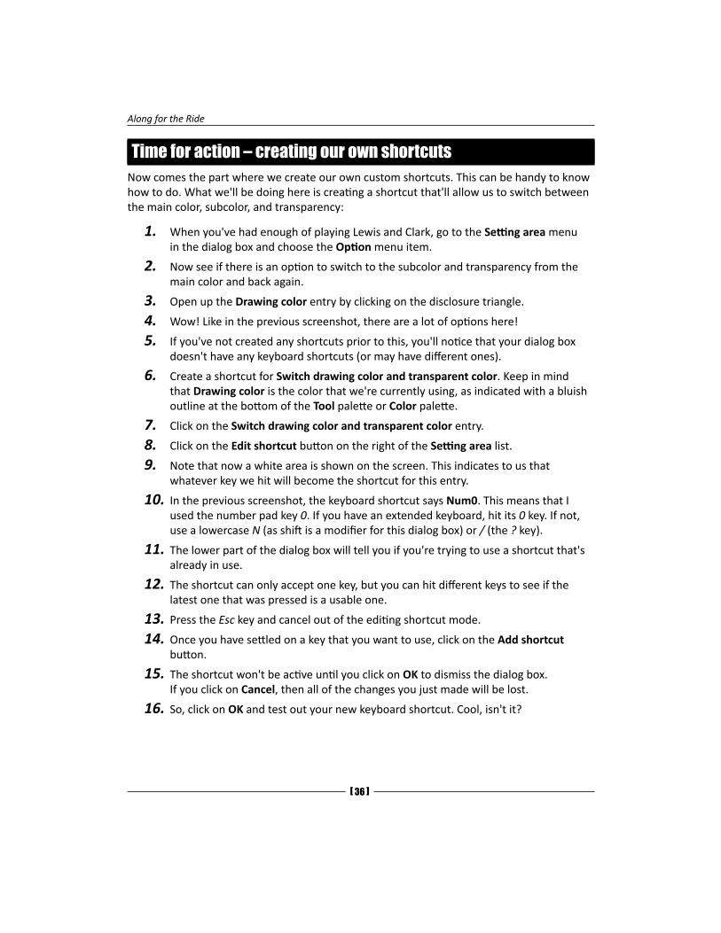
Time for action – creating our own shortcutsNow comes the part where we create our own custom shortcuts. This can be handy to know how to do. What we'll be doing here is creating a shortcut that'll allow us to switch between the main color, subcolor, and transparency:
1. When you've had enough of playing Lewis and Clark, go to the Setting area menu in the dialog box and choose the Option menu item.
2. Now see if there is an option to switch to the subcolor and transparency from the main color and back again.
3. Open up the Drawing color entry by clicking on the disclosure triangle.
4. Wow! Like in the previous screenshot, there are a lot of options here!
5. If you've not created any shortcuts prior to this, you'll notice that your dialog box doesn't have any keyboard shortcuts (or may have different ones).
6. Create a shortcut for Switch drawing color and transparent color. Keep in mind that Drawing color is the color that we're currently using, as indicated with a bluish outline at the bottom of the Tool palette or Color palette.
7. Click on the Switch drawing color and transparent color entry.
8. Click on the Edit shortcut button on the right of the Setting area list.
9. Note that now a white area is shown on the screen. This indicates to us that whatever key we hit will become the shortcut for this entry.
10. In the previous screenshot, the keyboard shortcut says Num0. This means that I used the number pad key 0. If you have an extended keyboard, hit its 0 key. If not, use a lowercase N (as shift is a modifier for this dialog box) or / (the ? key).
11. The lower part of the dialog box will tell you if you're trying to use a shortcut that's already in use.
12. The shortcut can only accept one key, but you can hit different keys to see if the latest one that was pressed is a usable one.
13. Press the Esc key and cancel out of the editing shortcut mode.
14. Once you have settled on a key that you want to use, click on the Add shortcut button.
15. The shortcut won't be active until you click on OK to dismiss the dialog box. If you click on Cancel, then all of the changes you just made will be lost.
16. So, click on OK and test out your new keyboard shortcut. Cool, isn't it?
Chapter 12
[ 37 ]
Have a go heroThere's no need to figure out what happened as it's pretty clear. We're all heroes here, so we can go through the rest of the entries and make our custom shortcuts. Feel free to use the previous screenshot for reference as it contains keys that aren't used elsewhere in Manga Studio.
Check out the Sub tool palette entry. Why, I'll bet there's a way to go up and down the Sub tool palette list. And if there isn't, we now know how to create shortcuts for this and any other entry in this dialog box.
Accessories such as Contour's Shuttle PRO can make it easier to use shortcuts. Sure, it's a separate hunk of hardware, but if we assign the buttons in a way that makes sense for us to use, we can visually remember which button does what. And as artists, we remember visual cues easier than textural ones.
The Navigator paletteThis is a good palette to find our way around. It's even better if we have a dual screen setup. The Navigator palette shows us what's on our canvas. The image displayed here is scaled to fit the palette size and cropped only to show the controls at the bottom of the palette window.
On a dual-screen setup (or monitor, if we're going old school), we can have the Navigator palette fill the entire second monitor. This is so we can see a backed-out view of our work. Too often, we can get all detail crazy and put in too many details that just aren't going to be seen clearly when this is printed out or viewed on the Internet. Having a ginormous-sized palette can help us keep our instincts in check.
Along for the Ride
[ 38 ]
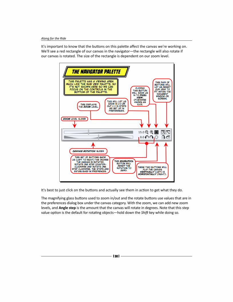
It's important to know that the buttons on this palette affect the canvas we're working on. We'll see a red rectangle of our canvas in the navigator—the rectangle will also rotate if our canvas is rotated. The size of the rectangle is dependent on our zoom level.
It's best to just click on the buttons and actually see them in action to get what they do.
The magnifying glass buttons used to zoom in/out and the rotate buttons use values that are in the preferences dialog box under the canvas category. With the zoom, we can add new zoom levels, and Angle step is the amount that the canvas will rotate in degrees. Note that this step value option is the default for rotating objects—hold down the Shift key while doing so.
Chapter 12
[ 39 ]
Rulers and vectors in Manga Studio 5This part of Manga Studio can be very hard to understand. First off, rulers and vectors are not like raster (bitmapped) images. They can be zoomed in greater than 100 percent and not look jagged with pixels that look like stair steps. This is because they are not pixel based, as mentioned in the print book. There's math behind them, and this math is independent of any pixel resolution.
Creating an abstract design rulerThis is an involved, multiple part Time for action section. So, we may want to read it through once before actually performing the steps listed. We'll be covering a lot, and most of this can be applied to general vector drawings in Manga Studio.
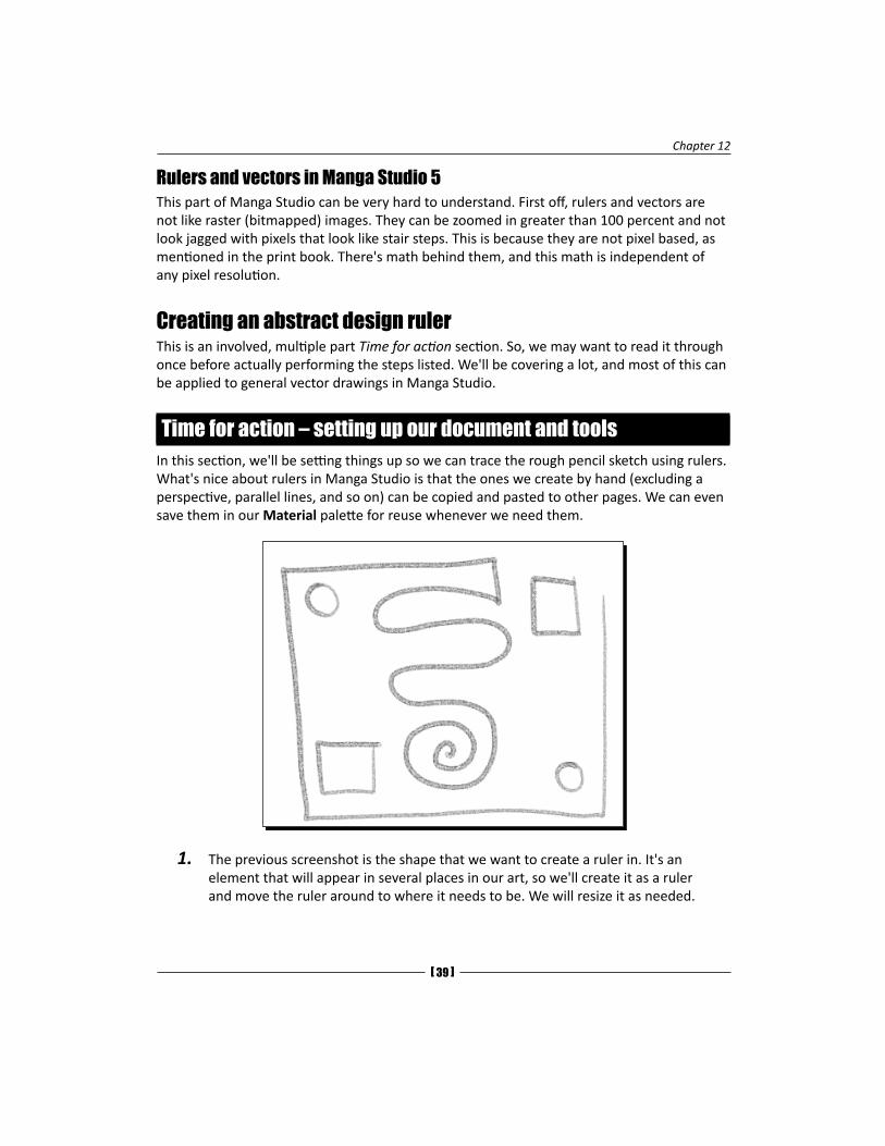
Time for action – setting up our document and toolsIn this section, we'll be setting things up so we can trace the rough pencil sketch using rulers. What's nice about rulers in Manga Studio is that the ones we create by hand (excluding a perspective, parallel lines, and so on) can be copied and pasted to other pages. We can even save them in our Material palette for reuse whenever we need them.
1. The previous screenshot is the shape that we want to create a ruler in. It's an element that will appear in several places in our art, so we'll create it as a ruler and move the ruler around to where it needs to be. We will resize it as needed.
Along for the Ride
[ 40 ]
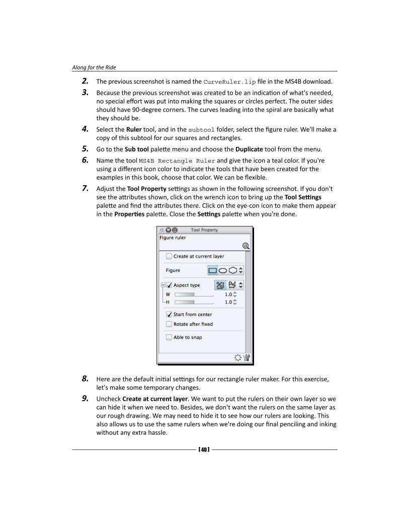
2. The previous screenshot is named the CurveRuler.lip file in the MS4B download.
3. Because the previous screenshot was created to be an indication of what's needed, no special effort was put into making the squares or circles perfect. The outer sides should have 90-degree corners. The curves leading into the spiral are basically what they should be.
4. Select the Ruler tool, and in the subtool folder, select the figure ruler. We'll make a copy of this subtool for our squares and rectangles.
5. Go to the Sub tool palette menu and choose the Duplicate tool from the menu.
6. Name the tool MS4B Rectangle Ruler and give the icon a teal color. If you're using a different icon color to indicate the tools that have been created for the examples in this book, choose that color. We can be flexible.
7. Adjust the Tool Property settings as shown in the following screenshot. If you don't see the attributes shown, click on the wrench icon to bring up the Tool Settings palette and find the attributes there. Click on the eye-con icon to make them appear in the Properties palette. Close the Settings palette when you're done.
8. Here are the default initial settings for our rectangle ruler maker. For this exercise, let's make some temporary changes.
9. Uncheck Create at current layer. We want to put the rulers on their own layer so we can hide it when we need to. Besides, we don't want the rulers on the same layer as our rough drawing. We may need to hide it to see how our rulers are looking. This also allows us to use the same rulers when we're doing our final penciling and inking without any extra hassle.
Chapter 12
[ 41 ]
10. Uncheck Start from center. This way, we'll create the square from the corner and drag it down to the opposite corner.
11. Now, draw out a square ruler.
12. Click on one corner of the rough square.
13. With the stylus still on the tablet, drag to the opposite corner and lift the stylus from the tablet.
14. Note that a few changes occurred. When we released the stylus, the ruler on the canvas turned purple. A new layer named Ruler was created. It has a snazzy ruler icon on it, and there's a new drop-down menu in the Layer palette.
15. The new menu on the Layer palette is for how the Ruler layer is visible (and can work as a guide). Click on it and see the three options it has:
� Always visible: This means the ruler will be visible no matter what other layer we'll be working on.
� Show in same folder: The ruler will be visible for all other layers in the same layer folder. Once we're working on a layer outside the folder that the ruler's in, it won't be visible any more.
� Show only when editing target: There may be times when we want to make a ruler only on the layer we're working on. When this option is selected, the ruler will only be visible when that particular layer is selected.
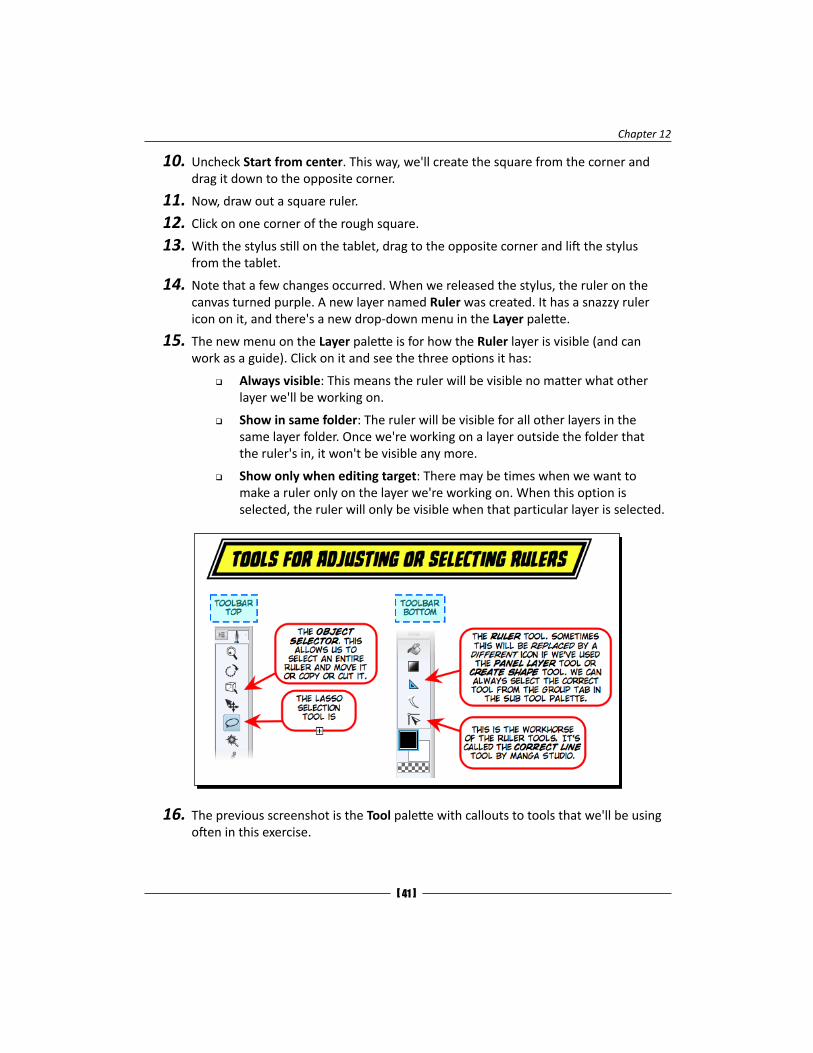
16. The previous screenshot is the Tool palette with callouts to tools that we'll be using often in this exercise.
Along for the Ride
[ 42 ]
17. Instead of drawing out another square ruler, copy and paste this one.
18. In the Tool palette, choose the Object selector tool.
19. Click on the square ruler we just created. Use the Command bar buttons, the Edit menu, or command/Ctrl + C to copy the selected ruler.
20. Paste the ruler onto the current layer.
21. With it still selected, move it to the bottom-right corner of the rough sketch. Since you're working on a rough sketch, don't stress over getting it perfect.
22. Now, create a new Ruler subtool.
23. By following the same instructions from the beginning of this exercise, create a duplicate of this rectangle ruler subtool and name it Ellipse Ruler.
24. Open up the Tool Settings palette for the new tool.
25. In the Figure category, select Ellipse from the Figure entry.
26. Repeat the same steps to make the ellipse a perfect circle.
27. Create the circles on the upper right and lower left in the same way that we did the square.
What just happened?Not only did we get an introductory tour of rulers, but we learned the advantages of creating them on their own layer and using the copy and paste methods to duplicate selected rulers.
Creating lines and curves for the designPreviously, we created shapes. Now, we'll create lines that we can use for intricate drawings. Again, although this example is simplistic, for more elaborate designs (especially ones that we'll reuse), the time spent in creating a ruler will pay off in a well-rendered drawing. Let's look at the design and see what kind of lines we'll need:
� Five straight lines
� An 'S' curve with a spiral at the end
We could try to do this as a single object, but we can join the endpoints of the lines later on. So, we can just break it down into two rulers for now: the lines and the S curve with the spirals.
Chapter 12
[ 43 ]
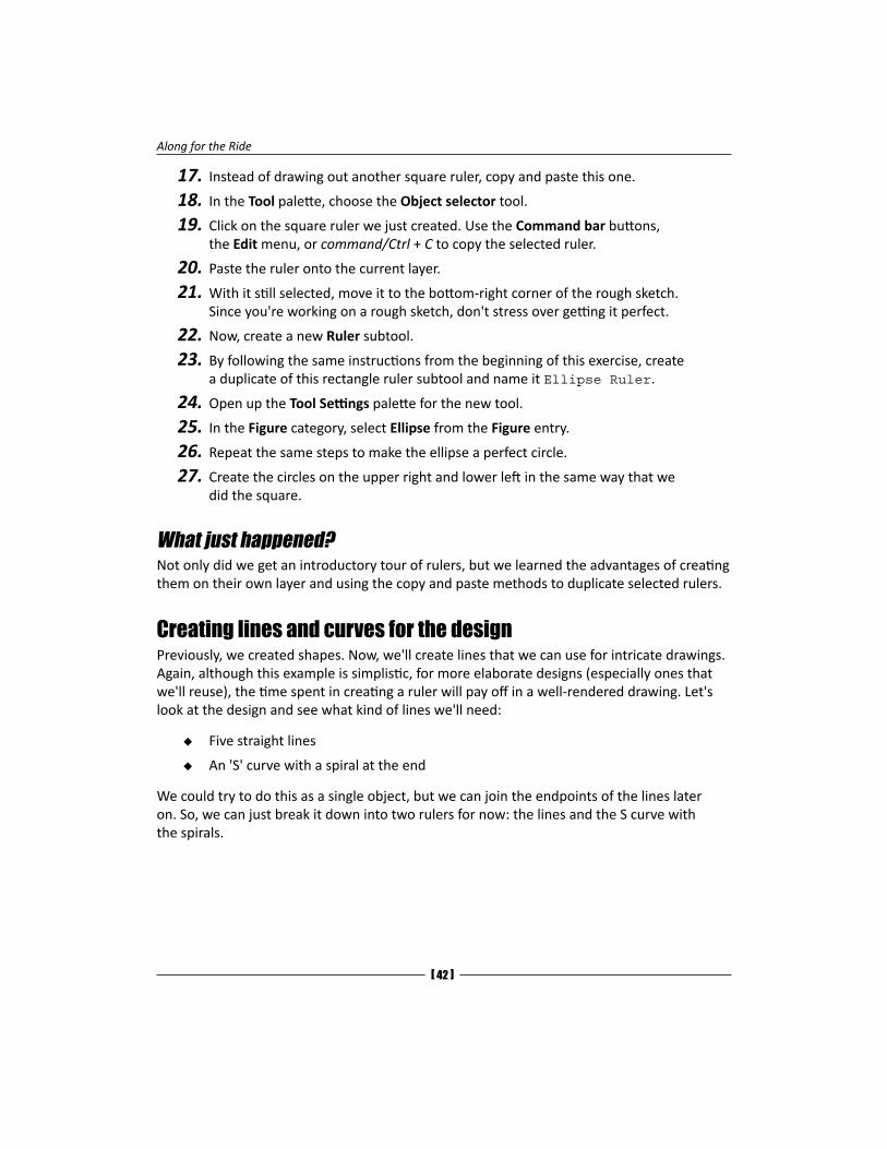
Time for action – drawing straight linesFor this section, we'll be drawing the outermost straight lines of our design by adjusting the settings so that we can do it quickly.
In the previous screenshot, there's a callout to the attributes that we'll be adjusting to create the outer edges of our design.
We're using Angle step to draw out our lines so they're 90 degrees to the edges of the window. We don't need to use the grid for this. Also note that it's 90 degrees to the window, not to the canvas or to the grid. This means that if we rotate our canvas (spacebar + the Shift key) and draw out our right-angled lines, they will be perpendicular to the edges of the window and not the canvas. This nuance of behavior can come in handy in other situations.
Along for the Ride
[ 44 ]
1. Make sure that the Angle step option is set to 90.
2. Make sure that the Able to snap and Snap to basic frame options are unchecked.
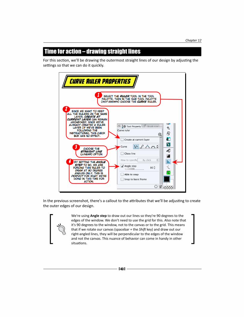
3. Follow the numbers in the following screenshot to create the outer edges of your design. Make sure that we're working on the CurveRuler.lip file (or a copy of it) in order to follow along.
4. Now, just position your cursor at position 1, click and move the cursor to position 2, and click.
5. Although it's mentioned in the screenshot, the points between 3 and 4 are off from the sketch. So, be mindful of this when clicking for the corner at 3.
6. Follow the rest of the numbered positions, and when you get to 6, click on it and press the Enter key.
You're done. If you want to, you can choose the Object selector tool from the Tool palette and click on your rectangles and ovals and reposition them as shown in the previous screenshot.
Chapter 12
[ 45 ]
What just happened?There's a lot that we can do with just drawing linear rulers. By judiciously using the Angle step option, we can have the straight lines snap to specific angles.
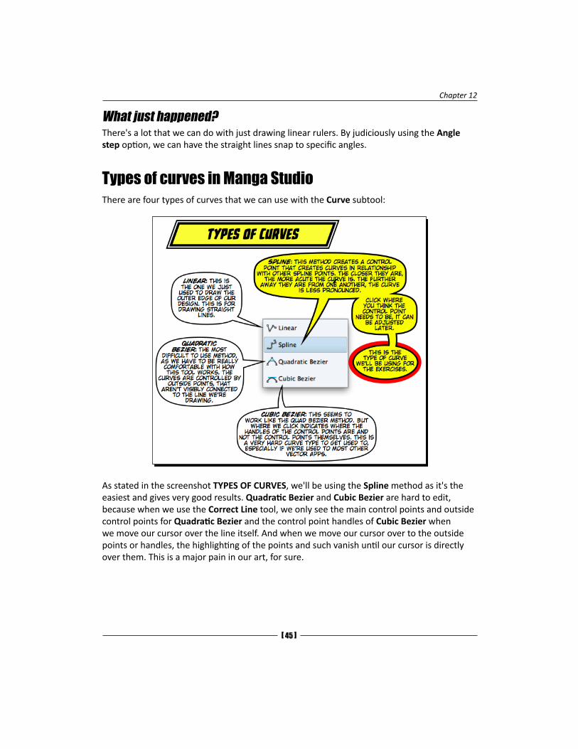
Types of curves in Manga StudioThere are four types of curves that we can use with the Curve subtool:
As stated in the screenshot TYPES OF CURVES, we'll be using the Spline method as it's the easiest and gives very good results. Quadratic Bezier and Cubic Bezier are hard to edit, because when we use the Correct Line tool, we only see the main control points and outside control points for Quadratic Bezier and the control point handles of Cubic Bezier when we move our cursor over the line itself. And when we move our cursor over to the outside points or handles, the highlighting of the points and such vanish until our cursor is directly over them. This is a major pain in our art, for sure.
Along for the Ride
[ 46 ]
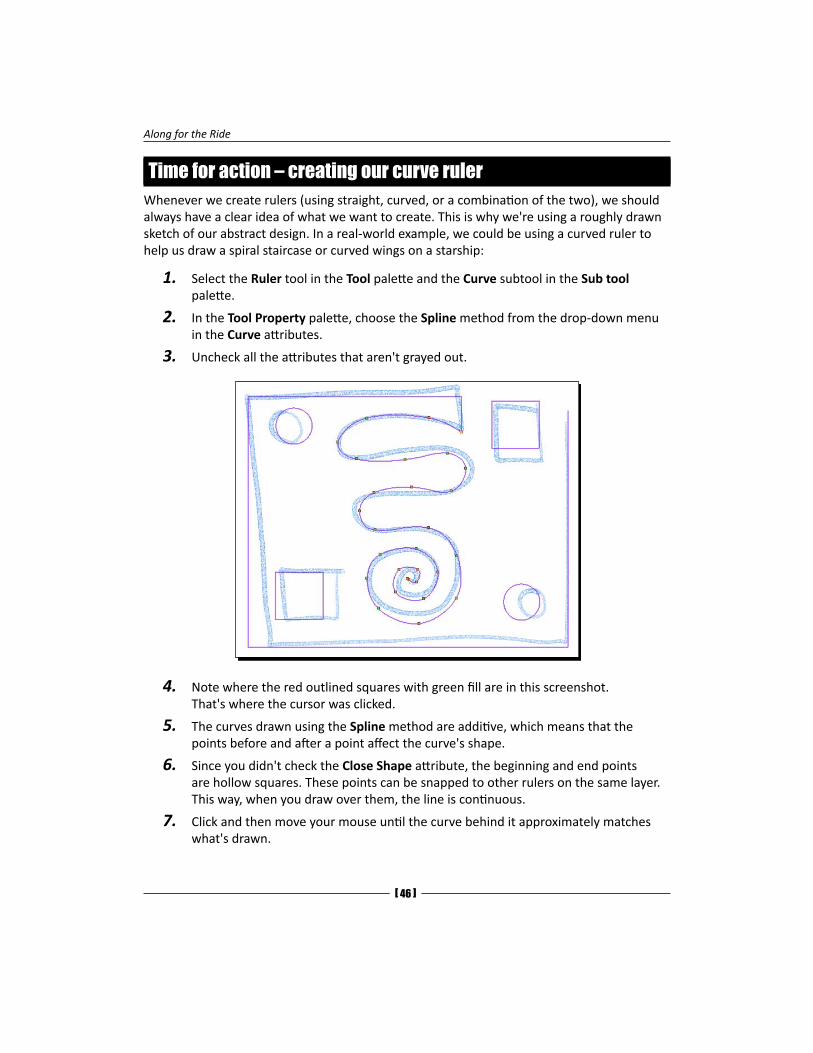
Time for action – creating our curve rulerWhenever we create rulers (using straight, curved, or a combination of the two), we should always have a clear idea of what we want to create. This is why we're using a roughly drawn sketch of our abstract design. In a real-world example, we could be using a curved ruler to help us draw a spiral staircase or curved wings on a starship:
1. Select the Ruler tool in the Tool palette and the Curve subtool in the Sub tool palette.
2. In the Tool Property palette, choose the Spline method from the drop-down menu in the Curve attributes.
3. Uncheck all the attributes that aren't grayed out.
4. Note where the red outlined squares with green fill are in this screenshot. That's where the cursor was clicked.
5. The curves drawn using the Spline method are additive, which means that the points before and after a point affect the curve's shape.
6. Since you didn't check the Close Shape attribute, the beginning and end points are hollow squares. These points can be snapped to other rulers on the same layer. This way, when you draw over them, the line is continuous.
7. Click and then move your mouse until the curve behind it approximately matches what's drawn.
Chapter 12
[ 47 ]
8. When drawing a curve, imagine a compass circle. If you click on the North, East, and South directions, you get a nice circular curve, like the second one from the top in the preceding image.
9. Once you're done with creating a ruler of this shape, select the Correct Line tool from the tool palette and choose the Control Point tool in the Sub tool palette.
10. The contents of the process tell us what selecting a control point will do. The options we're concerned with are as follows:
� The move control point
� The add control point
� The delete control point
11. Make sure that the Move control point option is chosen.
12. With the Spline method you used, there are no handles or outside points to deal with. Just click on a point and move it around.
13. Don't expect to get this right away. It can be tricky to get the curve just right. Some good practices are:
� The Add point subtool for the Line correction tool will add a point to a curve or allow you to move a point if the cursor is right over it. This is the best option to use when you're adjusting your curves as you just click on an empty line of your ruler to create a new control point.
� Don't add too many points though. Too many will make modifying your curve harder than it needs to be.
If a curve is too flat looking, it's time to add a new control point or move some points on both ends of the arc closer together. Placing two points really close together is a good way to create a rounded corner.
� When using the Object selector tool, you can use the keyboard cursor (arrow) keys to move the selected object up, down, left, and right. As with most other graphic apps, if you hold down the Shift key and press the arrow keys, it'll move the selection more. And, it's not obvious, but with nothing selected, if you press any arrow key, all the ruler objects will move! Just make sure the ruler layer is selected.
� The Switch corner option in the Process drop-down menu can make the point the opposite of what it currently is: a corner or curved.
14. Save the file.
Along for the Ride
[ 48 ]
What just happened?We went through making an abstract shape using the Manga Studio ruler tools. We covered how to set up our document for rulers, identified the attributes we need to be mindful of, created a Ruler tool that'll draw perfect squares or circles and right-angled lines, and worked with the Spline tool. Good times.
Next up, we'll draw the shapes using the rulers we just made as a guide and see how this works in an example from the dialogPage.lip file.
Have a go heroWe now have the knowledge to create our own templates, which we can use anywhere, any time!
Why not create a new document and make some curves that we may need to use over and over? If it's a superhero logo or a repeated design, make one of your own. Start with a rough sketch. It can be very rough, like our example, or a scan of something that is saved, such as a TIFF, JPG, or PNG format. Go to File | Import image to load it into the document. Make sure you save your file before and after importing. Use the Layer Color option for the layer to make the drawing blue so that it's easy to trace over. Now, use the tools and whip up a few rulers of your own. We'll learn how we can store them in the Materials palette real soon.
One step beyondWe have covered all of the mechanical aspects of penciling in this chapter. We know how to select and transform these selections. Rulers and perspectives? Been there, done that. Masks? Covered that.
Now, about the drawings themselves, the following are some pointers to keep in mind:
� Be bold. Have a distinct outline to your figures and objects. Have the shading lines be thinner. Make one line do the work of a dozen or more scratchy lines.
� Go ahead and use an extra layer to refine your drawing. Put the old layer at a lower opacity. This can sometimes make the difference between an okay drawing and a "you drew this?!" drawing.
� Don't be precious about what was drawn. Even though it was written for the written word, the phrase "kill your darlings" applies to sequential art just as well.
� The Undo option isn't an eraser. Use the Eraser tool. If a drawing or panel's not working, delete it and start over. Otherwise, just hide the older layer and make a new one. Draw on the new one. Look at the old layer only for reference, or reduce its opacity.
Chapter 12
[ 49 ]
� Keep a consistent light source. If you don't know where it is, that could be the source of your problems. Lighting can be a great storytelling tool. Avoid it, and your pages will suffer.
� Draw from life as much as you can. When watching a video, have your sketchbook and pencil at hand. Pause and draw what's on the screen. Keep in mind that this kind of behavior may cause irritation and other problems with others who are watching with you. Warn others before pausing.
� Be clear in your pencil strokes. Don't "X" out black areas until you're confident that the rest of the page will be clear. Use this as a practice to draw parallel lines and crosshatch, and be patient. Sometimes, you'll surprise yourself with the subtle shapes that emerge. What you first pictured as a pitch-black night becomes more mysterious with the addition of wispy clouds that only appeared when you filled in the night sky.
� Until you are quite confident about your inking, draw like somebody else is going to ink your lines. Don't hide the hands or feet. Learn how to draw them. This knowledge will translate into better inks.
1, 2, and 3 point perspectiveAt the beginning of this section, it was mentioned that some knowledge of perspectives is expected. If there are any of us who are a bit rusty or lack knowledge about perspectives, there are a multitude of resources on the Internet we can search for. One of my best go-to books on perspectives is Vanishing Point by Jason Cheeseman-Meyer (Impact Books, ISBN 1-58180-954-9). In addition to having one of the best cartoonist names ever (second only to Fiona Staples—you can't have comics without staples, you know), his book is great to learn how to improve one's skill in using perspectives. Also, a number of his exercises can be transferred to Manga Studio.
So, here's the assignment:
Do a few introductory perspective exercises. Draw some cubes, buildings, cars, or objects like these in multiple perspectives, either in different files or layers in one document. Get used to perspective rulers and drawing using them.
The following are some tips and hints on some perspective topics to get us started:
� A diagonal vanishing point can be considered an additional vanishing point. We can insert a new vanishing point, click on the snap diamond (so our pencil won't snap to it when drawing) for that vanishing point, and use it to create new guides for other vanishing points. Once the diagonal vanishing point has done its job, it's snap diamond can be clicked on or deleted. Or, if we were really clever, we just put it on a different layer and now need to turn off that layer's visibility.
Along for the Ride
[ 50 ]
� We can treat guides like we do guidelines on paper. They're just there for references to be used as a drawing aid.
� Like rulers, we can control how perspective rulers are visible—for all the layers, layers within the folder, or while editing the target. The menu to choose these options is in the Layer palette.
� In some cases, we need to have the guides from the two vanishing points at a 90-degree angle from each other (which happens when we have to create a diagonal vanishing point). We can create a Ruler layer with a square in it, rotate the square, and move it to where it needs to be. This square that was moved can then be used as a reference.
� We can always create a layer with a color effect of different hues to be guidelines for our use. This can be very helpful in situations where we need different colors to mean different vanishing points.
� Be mindful that there are rules to perspectives. They're not laws. If we know what rules we're breaking to make a drawing look good, the perspective cops will not come after us.
Chapter 8, Coloring the WorldThere are two palettes that we didn't cover in the print book. Their utility may depend on how we work. The Approximate Color and Intermediate Color palettes are good to view the results when two (or up to four) different colors have been blended together. These palettes give us many swatches of the various mixtures of colors. We can use them to get just the right color we're looking for without wasting time by mixing them ourselves.
The Approximate and Intermediate Color palettesThe Approximate Color and Intermediate Color palettes are like the spreadsheets of color mixing. These palettes will take one (or four) colors and create a grid of various mixtures of color. The Approximate Color palette will take one color and create variations of it with graduated amounts of luminosity and saturation. The Intermediate Color palette will take up to four different colors and give us a grid of various mixtures of the colors.
These palettes are useful in finding different tones of colors for highlights and shadows, for example. They are like a digital painter's palette, where we can mix white, black, and other colors together to create new colors that work with the established colors in our work.
The following exercises are just an introduction to these palettes. We won't be delving deep into everything they can do, but we'll cover enough area so that we can dive deeper when the occasion requires it.
Chapter 12
[ 51 ]
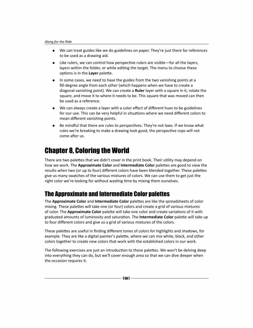
Time for action – the Approximate Color paletteIt's helpful to have all the color palette tools in one drawer in Manga Studio. Look where the Color Wheel palette is. Check to see if the Approximate Color palette is a tab within the Color Wheel palette. If so, drag the title tab over so there's a vertical red line between two rows (drawers) of palettes. Release the mouse. The appearance of the red line indicates where the palette will be placed. We want the Approximate Color and Intermediate Color palettes to be above the Color Wheel and color slider palettes for this exercise. This will make our work a bit clearer and easier. Now, let's take a look at the Approximate Color palette:
1. In the Color Wheel palette, choose a random color.
Note how the Approximate Color palette's colors change.
Along for the Ride
[ 52 ]
2. Click on one of the grid squares in the Approximate Color palette.
3. See how the selected color in the triangle changes.
4. Click-and-drag in both the vertical and horizontal sliders one at a time.
5. Notice what happens to the range of color variations.
6. Reset both the sliders back to 100 percent.
What just happened?We saw how the Approximate Color palette is changed by picking a color in the Color Wheel palette. The color variations look like the white or black colors have been mixed with the color, as stated in the previous screenshot. The color variations are good for finding darker shades of the colors in the Color Wheel palette. These colors are good for indicating the darker areas of matte metal (not shiny or reflective). Some materials may not look good with black as a shading color. On lighter-hued flesh tones, it makes the shadows look like dirt. In such cases, the Intermediate Color palette will serve us better.
Have a go heroIf we move our stylus over the percentage amount in the Approximate Color palette's value sliders (both horizontal and vertical) and click on it, we'll be treated to a drop-down menu with many choices, as follows:
� Hue
� Saturation
� Luminosity
� Brightness
� Red
� Green
� Blue
Now, go through them one at at time and see just what they do. Then, consider the possible uses that you may have for them. It's fine if you can't think of any. It's just good to know they exist because you never know when they may be needed.
Chapter 12
[ 53 ]
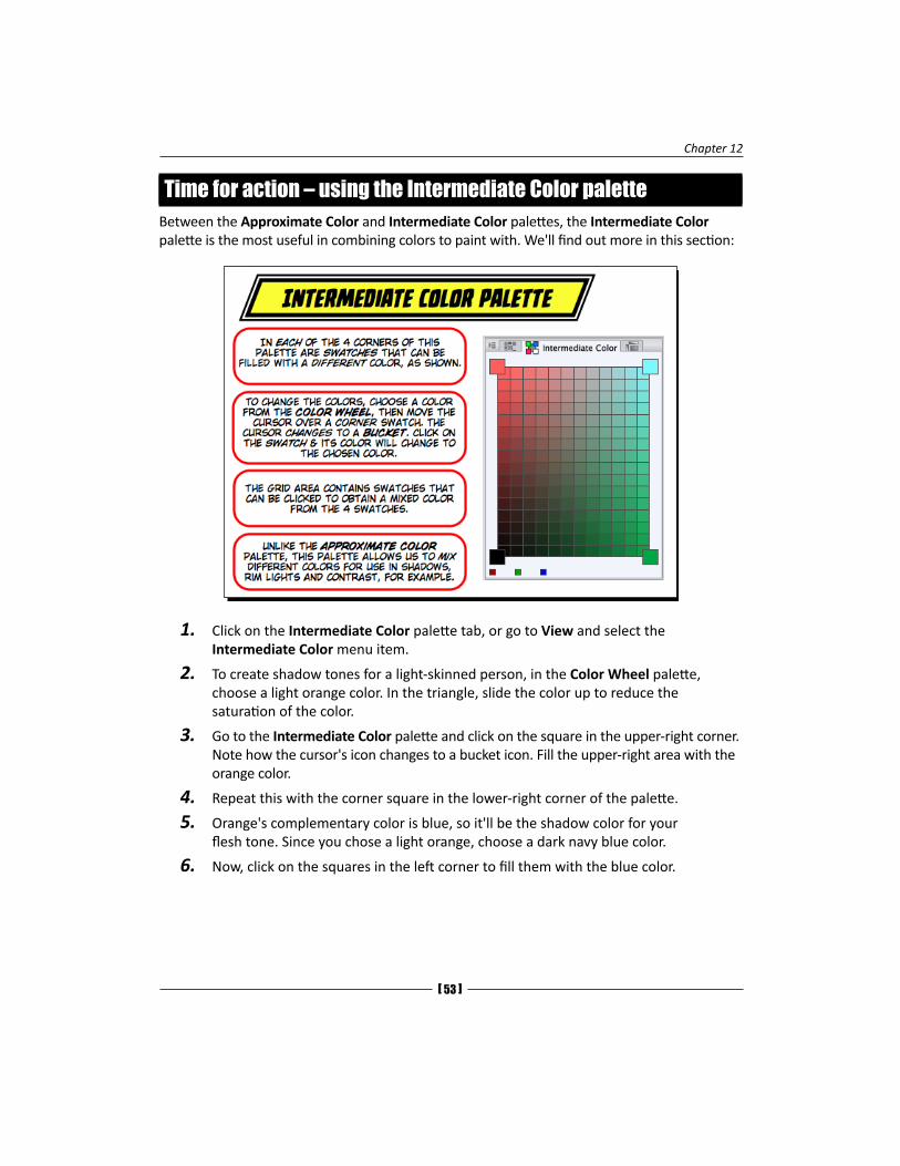
Time for action – using the Intermediate Color paletteBetween the Approximate Color and Intermediate Color palettes, the Intermediate Color palette is the most useful in combining colors to paint with. We'll find out more in this section:
1. Click on the Intermediate Color palette tab, or go to View and select the Intermediate Color menu item.
2. To create shadow tones for a light-skinned person, in the Color Wheel palette, choose a light orange color. In the triangle, slide the color up to reduce the saturation of the color.
3. Go to the Intermediate Color palette and click on the square in the upper-right corner. Note how the cursor's icon changes to a bucket icon. Fill the upper-right area with the orange color.
4. Repeat this with the corner square in the lower-right corner of the palette.
5. Orange's complementary color is blue, so it'll be the shadow color for your flesh tone. Since you chose a light orange, choose a dark navy blue color.
6. Now, click on the squares in the left corner to fill them with the blue color.
Along for the Ride
[ 54 ]
7. Note how an area of the color grid is gray. This confirms that you chose your complementing colors correctly.
8. The colors in the corner squares are independent of the color picked from the Color Wheel palette, so we can change that color all we want, and it won't change the Intermediate Color palette unless we click on one of the corner squares.
9. Now, choose a reddish color. Click on the bottom-right corner square to change that color.
10. Choose a dark green color and change the lower-left color square in the Intermediate Color palette.
11. Now you have a little palette with lots of color variation. On the right-hand side, top to bottom, you can go from orange-yellow to a light red color. On the left-hand side, also from top to bottom, you have colors between blue and green.
12. Horizontally, you have darker to lighter colors. This is color mixing that we would do in analog paint in a digital display. The best thing about this is that you'll never have a muddy color unless you want one.
13. Click on any of the grid squares to pick any color.
14. Click on one of the grid squares and see what happens to the Color Wheel palette.
What just happened?Instead of mixing colors on an analog palette, we used digital colors to achieve the same thing. We can mix just two colors that have the same color on the left-corner squares and different ones on the right-hand side. By choosing a base color for one side and a complement color for the other side, we can obtain colors that are between the two and use them to shade our art. This is how things appear to our eyes in the analog world. Black and white are not good for most shading purposes as they make objects look a bit sterile or just plain dirty. Also, we need to consider the fact that we'll be coloring inked drawings, which use black ink. Most times, color art looks better with nonblack, dark colors when combined with black ink drawings.